Moleskine Bullet Notebook Review

Moleskine came out with a “Bullet Notebook” obviously geared for Bullet Journalling (BuJo) relatively recently. The BuJo started out on a squared large Moleksine notebook (surprise, surprise), and only later Ryder Carroll moved to Leuchtturm as his notebook supplier of choice. What surprised me was that Moleskine actually cared enough about BuJo to come out with a new offering, when they aren’t known for rushing out with new notebook formats very often.
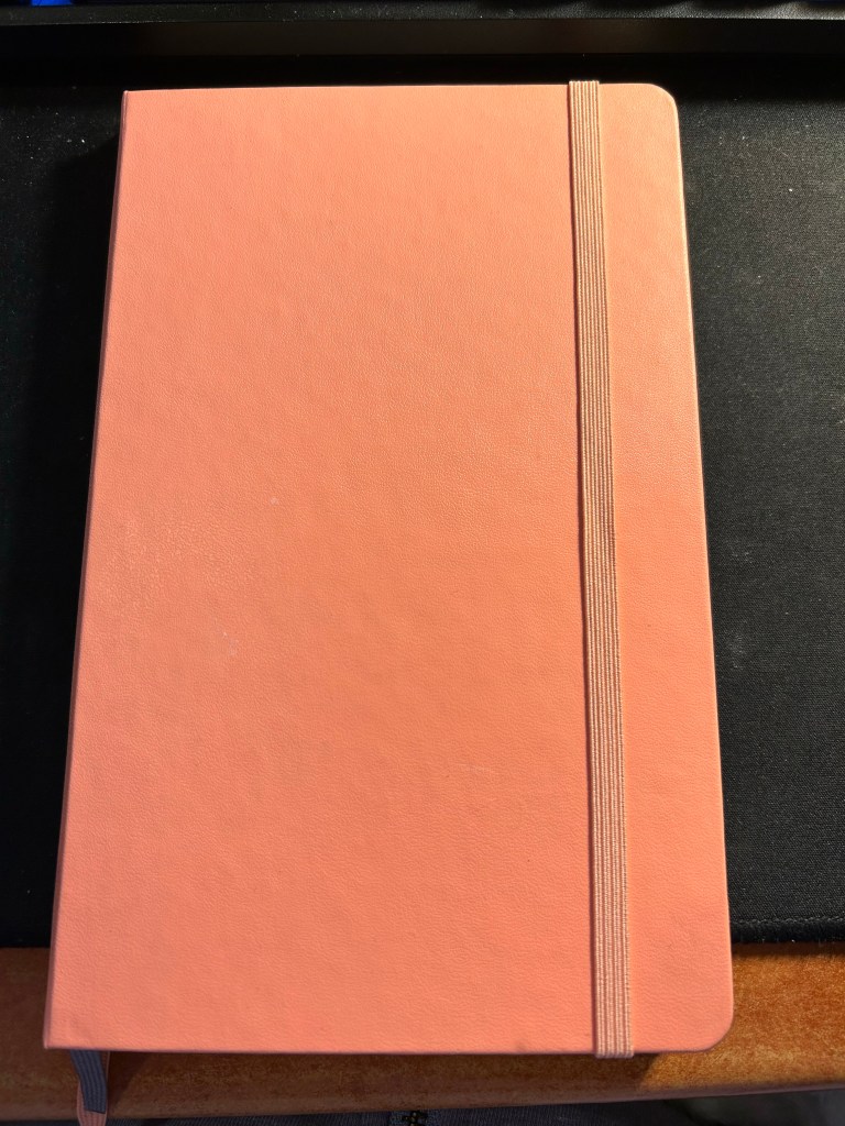
The coral pink cover.

The bullet notebook is part of Moleskine’s is part of their Art lineup, which usually has better paper than their usual lineup, as it’s used for sketching or watercolours. The choice is a bit peculiar, but it speaks to where Moleskine appears to think that BuJo fits: not in their business lineup, but within the artists’ and creatives’ one.

It comes in three cover options: black, coral pink, and aquamarine. That is also a peculiar choice for them, as normally products in the Art lineup come in any colour you want so long as it’s black. The bullet notebook comes with 120 gsm ivory coloured paper and is supposedly fountain pen friendly. Note the supposedly in that sentence, we’ll get to that later on. It is noticeably thicker and heavier than their standard large hardcover notebooks, and it comes with two bookmarks in different colours – in the case of the coral pink one is pink and one is grey. Fetching.

Now we come to where this notebook really becomes interesting, the interior. The first page of “Personal Data” is taken directly out of Moleskine’s planners. There’s a bit of fluff at the end that I don’t think comes standard with their planners, but I still recommend not filling this page, ever. Especially not the passport details, driver’s license and any other thing that can be used to ID you should you lose or misplace this notebook.

Personal data. I’ve used this notebook for over two months, and this page remains purposefully pristine.

The next spread is the very cool Moleskine world map, the same one that you can find in many of their planners and other travel related products.

I love maps, and I love this map.

The next set of pages is where the bullet notebook starts to get interesting. It’s an index, with the first entry already printed inside: Pen Test on page 149. This is classic BuJo, and Moleskine delivers. There are five index pages, which should be enough for practically anyone’s needs.
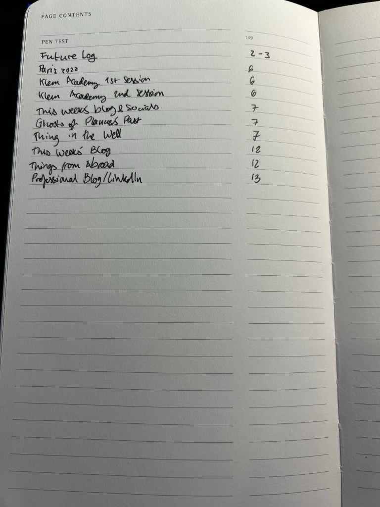
The index

Inside there are 148 pages of ivory coloured 120 gsm dot grid paper. That’s less than there is in a regular Moleskine, but the paper is significantly thicker, and already the notebook is thicker and heavier than their standard notebook. They put the maximum number of sheets they could without making the notebook too bulky. The pages lay flat, and Moleksine’s binding and covers are built for endurance. The pages are numbered, which is also something that Moleskine doesn’t normally do, but fits well with the Bullet Journalling Method.
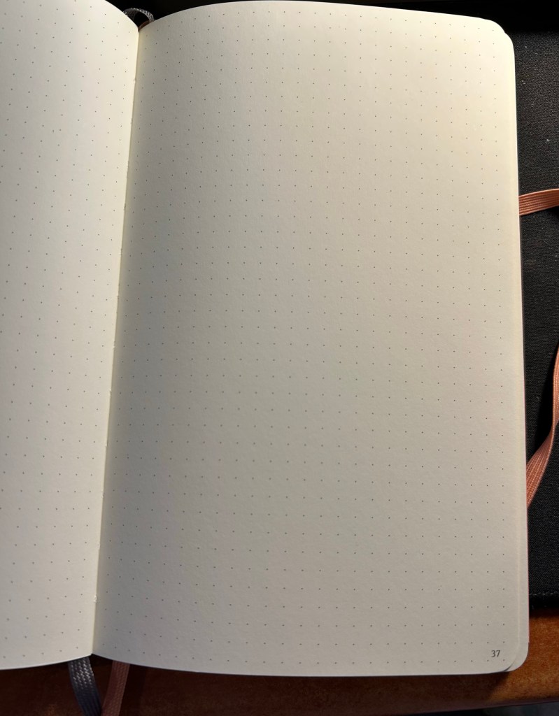
The paper inside.

There is space in the back for pen tests, so I immediately used it to test a slew of fountain pens. Moleskine claims that the bullet notebook is fountain pen friendly. It is not. There’s spread, there’s bleed-through, show through and sometimes spidering. This isn’t a fountain pen friendly paper on any count.
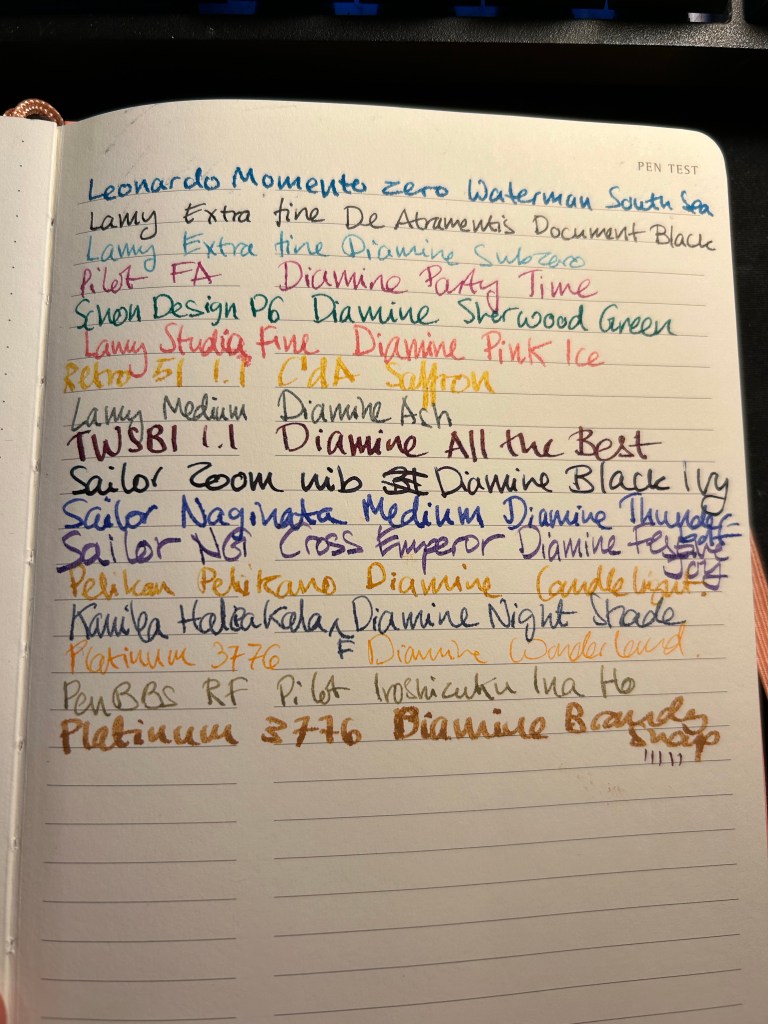
Pen test page.

The back pocket has something new and interesting going on. Moleskine stuck folded piece of paper on the back pocket and on the outside it looks like regular dot grid paper:
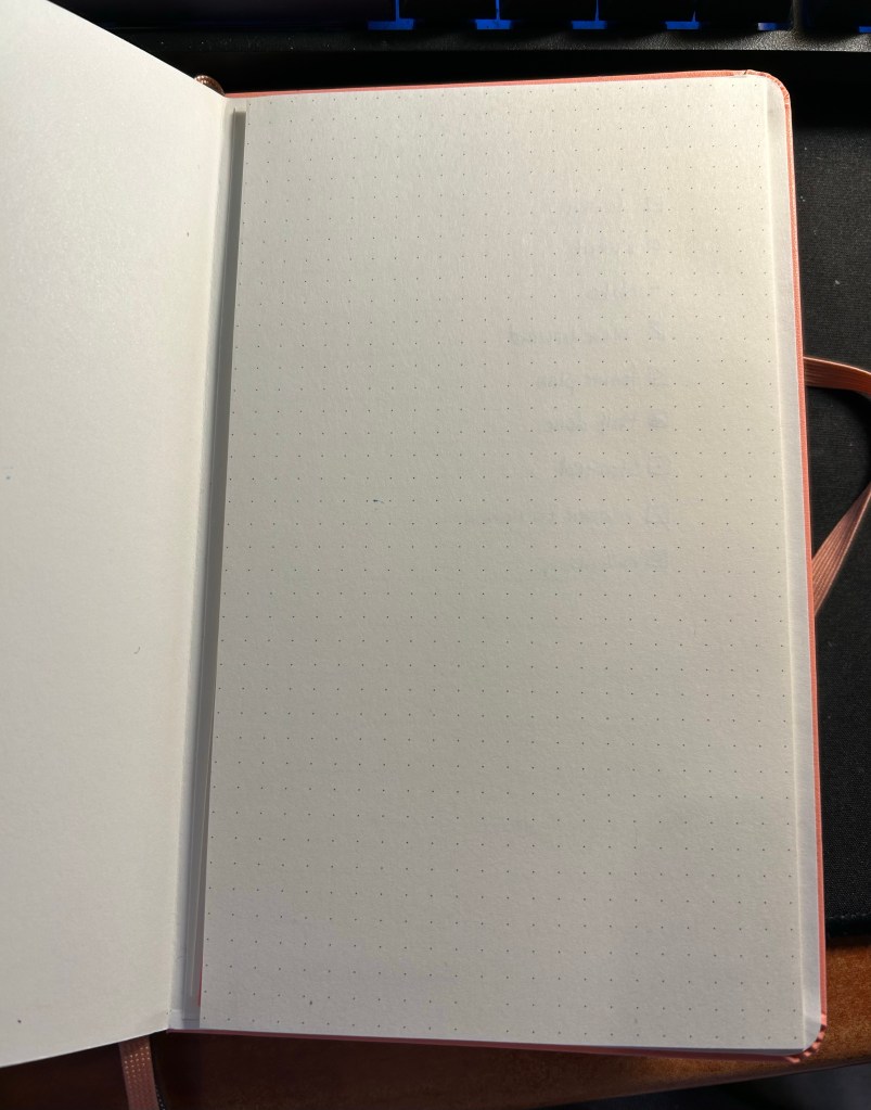
Back pocket and closed fold-out.

But when you fold it out there’s a key page inside. Very elegant and clever.

My key page.

I like that Moleskine are experimenting with new formats. I don’t like that they advertise this paper as fountain pen friendly when it clearly isn’t. The bullet notebook comes with a sheet of stickers that I didn’t bother photographing because it just looks like a sheet of solid pink, but it’s actually made of small stickers in various geometric shapes.

If you are looking to get into BuJo but enjoy working with mixed media or fountain pens, then look elsewhere. In terms of cost the Moleskine Bullet Notebook is about the same price as the official Leuchtturm one, and you get a better deal buying that if only for the official booklet. If you are looking for a more minimalist setup that what the official Bullet Journal offers and you aren’t planning on using fountain pens, than this is a decent offering, especially as it comes with more cheerful cover options. It is un-opinionated enough to be useful even to those who have never heard of BuJo in their lives. Do I see myself buying another one of these in the future? No. I am struggling to finish using the one that I have now (because I’m not a fan of dot grid). But I am glad that Moleskine is willing to give new notebook formats and paper types a try. If this notebook had this exact paper but in plain white or squared white, I would have bought a stack of them.

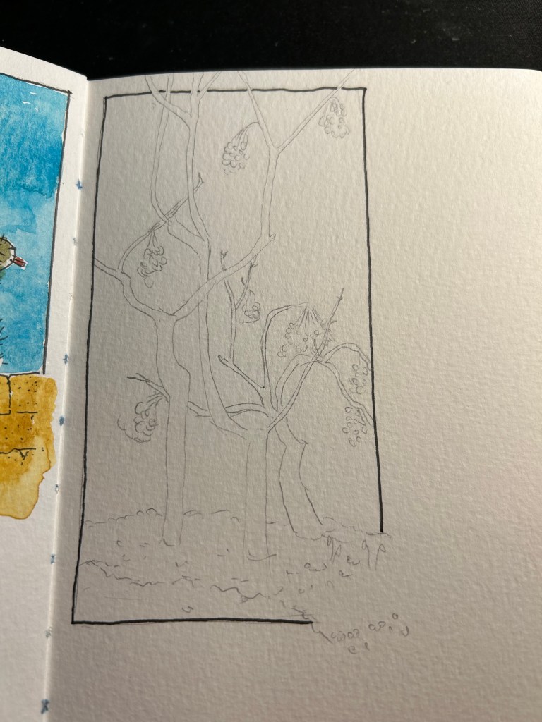
Moleskine Blue Note Limited Edition

This post has been languishing in my drafts since mid September 2022. The photos were taken using my old iPhone 11, and the lighting came out very yellow and vintage-y. I was considering photographing everything again, but then I decided that this somehow works with this Moleskine’s theme.

It’s been a while since I’ve reviewed a Moleskine, but I’ve decided to get back to regular Moleskine reviews since I’ve got so many of them, and I still think that they are masters of design, and make the best quality covers and bindings than anything else in the notebook market. And 90% of Moleskine’s limited editions are their covers.

Back in the heady days of 2015, Moleskine came out with one of their best collaborative limited editions: The Moleskine Blue Note notebooks.

Front Cover

Blue Note are a jazz icon, a record label established in 1939 and instrumental in the development of modern jazz and in album cover graphic design. This collaboration could not be more tailor made for a brand that emphasized graphic design as much as Moleksine do.
The front cover looks like a Blue Note album cover, because it is a Blue Note album cover: midnight blue by Kenny Burrell. It’s a classic Blue Note album with a classic Blue Note design, and it’s no wonder that this is one of the albums that was chosen for this collaboration. The other albums in this series (Art Blakey’s “A Night in Tunisia”, Freddie Hubbard’s “Hub Tones”, Dexter Gordon’s “Go!” and Thelonius Monk’s “Genius of Modern Music Volume 2”) are equally iconic in both sound and album design, although “Midnight Blue” is the most muted of the bunch. As usual in Moleskine limited editions, there were two large notebooks and two pocket notebook designs in this series. I can’t help wishing for more of these, because I think that it’s such a perfect fit between the brands, and because Blue Note album covers are so fantastically well designed.

The inside cover design is the same for all the notebooks in this edition (again, this is something that Moleskine does for all its limited editions), and they feature photos of many of the legendary artists that recorded Blue Note albums (how many do you recognize?). There’s also a note about the album and the famous Blue Note logo on the bottom right side of the page, and Moleskine’s on the left. I’ll note here that Moleskine gave Blue Note’s logo far more prominence on the cover than what it gives its own logo (which is simply debossed on the back).

On the back endpapers there’s a history of the Blue Note label, the famous back pocket, and again Moleksine’s phenomenal printing and assembling capabilities that make the pocket printing completely aligned with the endpaper printing. Pattern matching is hard, and it always surprises me that they get theirs perfect every time.

The sleeves on this edition are excellent. Moleskine in Jazz indeed:

There are four stickers that come with each of the notebooks in this edition, one for each one of the albums in it, and they are perfect. The look exactly like a Blue Note disc, and the details on them are magnificent. Someone really enjoyed their job here, and it tells.

Almost all of Moleskine’s limited editions feature lined paper, but the Blue Note edition was a welcome change: this notebook has blank paper! I’ve been using it, in combination with another notebook, for journalling, and it’s great! As is the case with Moleskine paper, it’s largely for gel ink, ballpoint, pencil and fineliner use, although some combinations of fine nibbed fountain pens and inks work on this paper, and blank paper tends to be the most fountain pen friendly of the bunch.

Doodle that I made in this notebook in September, when I was still struggling to get rid of steroid side effects.

If I could have any say in the matter, I would have loved to see more Moleskine and Blue Note collaborations, and I would have loved to see more blank paper limited edition notebooks. Most Moleskine users still prefer lined paper, which is why almost all of their limited editions have lined paper. But as Moleskine limited editions lately seem to skew to either book themed (Petit Price, Wizard of Oz, Lord of the Rings, Alice in Wonderland), pop-culture themed (Star Wars, various Manga and video game editions, Coke-Cola, Smiley) or designer based, I doubt that we’ll get to see more of these kinds of collaborations.

Urban Sketchers Tel Aviv: Atarim Square

Last Friday there was an Urban Sketchers Tel Aviv sketchwalk to Atarim Square, which is right near the beach. The weather was scorching hot for this season, and I hadn’t planned for it (no hat, no sunscreen) so I worked as quickly as possible on this first sketch and then looked for subjects that I could sketch from the shade.

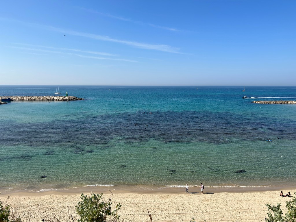
Sketch of the Tel Aviv Marina beach.

There were a lot of boats out and the sea was unbelievably blue and clear. You can see the rocks that make this beach not a bathing beach.

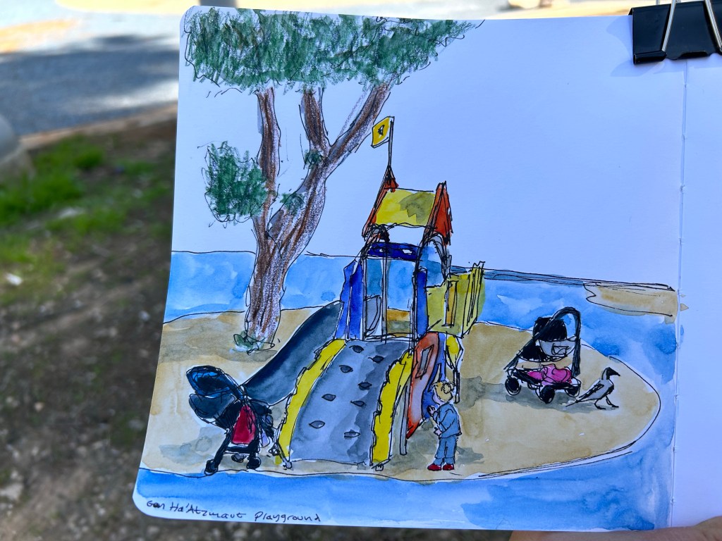
It was noon, which meant that there were very few places in the shade. I found one next to a playground and made a quick sketch of part of the scene there, making sure to obscure the little girl’s face. There was a huge crow prancing around quite fearlessly.

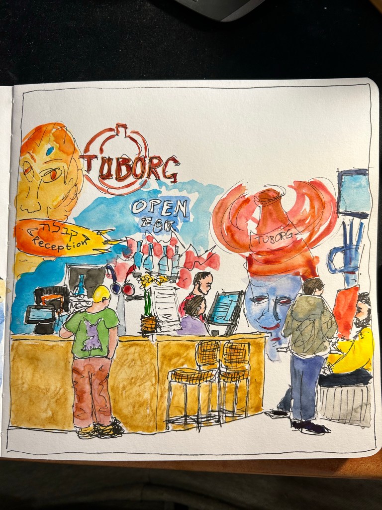
I spent a lot of time looking for places to sketch in the shade, so I ended up having to sketch this scene very quickly (less than 15 minutes), take some reference photos and add the watercolour later. It’s the local bar and reception for the nearby hostel.

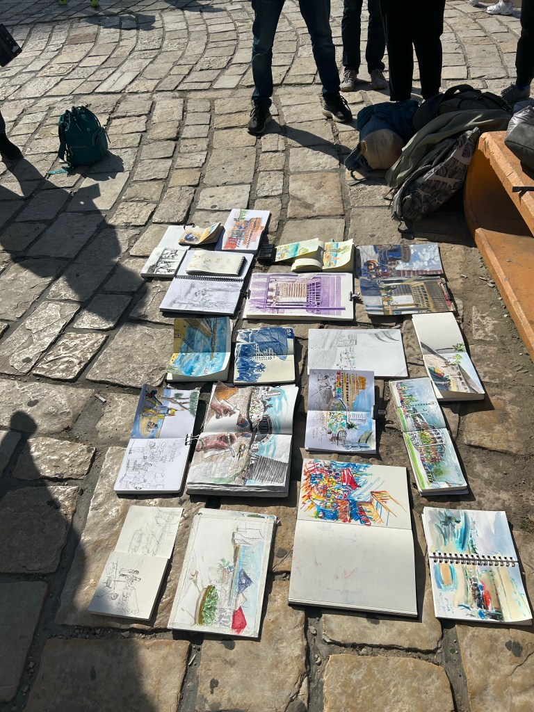
What I love about going to Urban Sketcher outings is seeing how everyone finds something different that catches their interest and is worth sketching in the same small area. Seeing all the different sketching styles is also a lot of fun.

Here’s the finished sketch of the bar/reception area from above. They have some wild graffiti on their walls, so this was really fun to paint.

Ghosts of Planners Past: Weekly Planners

As part of my struggles with planning, I’ve been reviewing the various planning systems I’ve used over the years and how they have changed. One of the most persistent of these has been the Weekly Planner.

Weekly planners generally take the form of a week on two pages, with the left page used for the actual weekly planner part and the right page used for notes. I’ve used Moleskine pocket weekly planners, I’ve used tiny weekly planners from Word Notebooks for two years (2016 and 2017), and I’ve used a large squared Moleskine notebook that I turned into a weekly planner myself. The format appeals to me, which is why I’ve had some form of a weekly planner with me for well over a decade.

The classic Moleskine weekly spread.

The pluses of the weekly format seem obvious: you can get an overview of your week at a glance without too much clutter. You can easily tell when you can block out time for things, and what is your general availability for the week. You can tell if it’s a “heavy” week or a “light” one and plan your projects accordingly, and you can schedule pre-work and prep for upcoming events. It’s the ultimate planner’s planning format.

The minuses are that you don’t have enough space to plan out the individual days, which usually necessitates a secondary planning system, and that if you live in a country that starts the week on Sunday and not on Monday (like I happen to), your choices in this category are few and hard to come by.

Yet if this format is so compelling, why did I stop keeping a dedicated weekly planner late last year?

The answer is that I wasn’t referencing it enough to justify lugging another notebook around. It was great to get a sense of the week to come as I was planning for it on Friday or Saturday, but once I finished the planning, I would reference it again maybe once or twice a week. That was just not good enough.

My solution for now is to use one of the “Stay on Target” notepads from The Well Appointed Desk‘s Etsy store to create a small weekly plan on one piece of paper that I can see at all times (I keep the pad propped up at my desk). It just has one or two major events for each day tops, and it helps me keep track of my long term goals on a weekly basis (running, blogging, sketching, reading, gym and NTC sessions, meditation sessions, vitamins and fountain pens written dry). Here’s a censored example of next week’s plan:


Like the rest of my planning, it’s messy, not Instagram ready and not festooned with calligraphy, but it’s mine and it’s useful. My handwriting these cold days is beyond appalling, but as I can barely feel my hands even as I laboriously type this out, it’s the best that I can do under the circumstances, and I understand what I’m writing so that’s good enough.

And that is the main takeaway from this entire series (there are a few more posts to come): find what works for you, and don’t create a system that makes you work for it.

SketchingNow Watercolour Course Introduction

I’m starting Liz Steel’s SketchingNow Watercolour course next week, and so I spent the weekend completing the three intro lessons to the course. It was nice practicing a bit of brush control after such a long time (for over 6 months I haven’t been able to properly hold and control a brush because of my peripheral neuropathy), and I cleaned my palette after a long time.

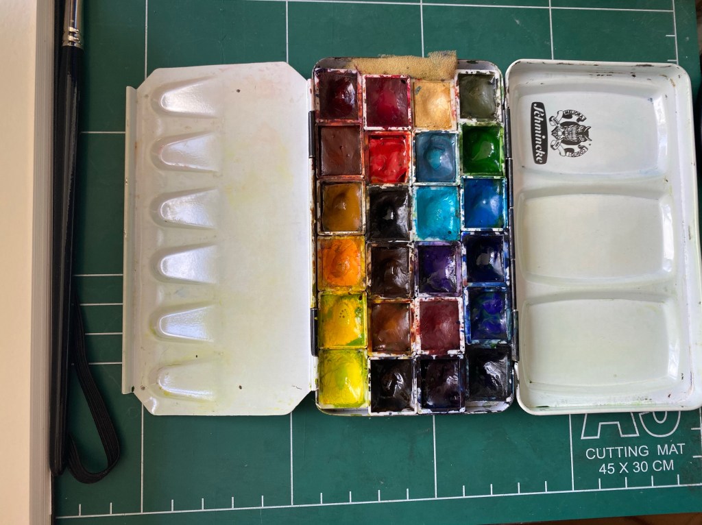
Metal watercolour tin filled with half pans of paint.
Clean palette
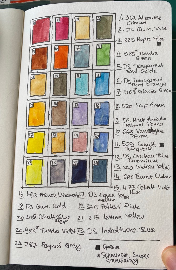
A sketch of the paints in my palette with a legend.
Intro lesson 1 exercise

My palette is large and I still have 3-4 colours on it that I’m still not sure about. This is the first page of a brand new Moleskine Large Watercolour Sketchbook, the new one in portrait format. Drawing your palette is a great way to start your sketchbook and get over the initial fear of “ruining it”.

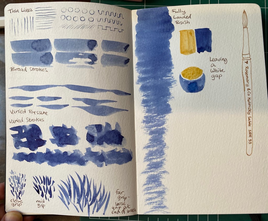
Intro 2 exercise – testing the brush

The brush is a Rosemary & Co Kolinsky Sanle one, and I haven’t used it before.

Intro 3: testing the paper. Check out the granulation on the ultramarine.

Overall these were good intro lessons to watercolour sketching and good warmup exercises.

Weekly Update: Open House at the Municipal Nursery

The past two weeks were a bit hectic, with various social gatherings (I’m not used to meeting people after being isolated for so long due to Covid and chemo) and getting ready to leave my old job and start my new one. The weather is still pretty good, and I’ve been relishing it: running, walking, and sketching a lot. As I’ve gotten used to writing and sketching with this level of neuropathy, I’m trying to take advantage of the pre-summer-heatwave weather to get as much outdoor on location sketching done as possible. I also have a backlog of London and Paris sketches to go through, complete where necessary and post.

I’m back at the gym (I had to freeze my membership during treatments), and enjoying getting back to lifting weights. And I went to see a movie for the first time in more than two years. “Dr. Strange and the Multiverse of Madness” was pretty good, but it had a few too many horror elements for my liking. Another first after a very long time was an evening out at an escape room with my friends. It was a lot of fun, and something that I really missed.

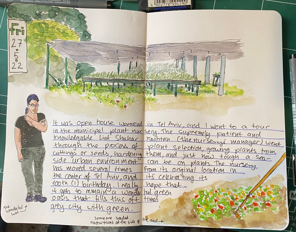
Yesterday I went an Open House Tel Aviv event at the municipal plant nursery. I learned that the nursery serves a wide variety of organizations and gardens all over the city, that urban environments, and particularly seaside urban environments are rough on plants, that the nursery is one of the few of its kind in Israel, and it has been around for 100 years. We saw plants grown from cuttings, talked about plants that can survive the salt and sand and harsh sunlight of beachfront gardens, as well as plants that can thrive in the shade. We saw plants that are pollinator friendly, and talked about local plants vs. imported and invasive plants in the city. It was fascinating, and I could have spent the entire day there. The nursery isn’t normally open to the public, so visiting it and getting such a wonderful insight into it was a real treat.

A sketch of a lady in black work clothes and purple hair, a shaded set of growing tables and a patch of nasturtiums.

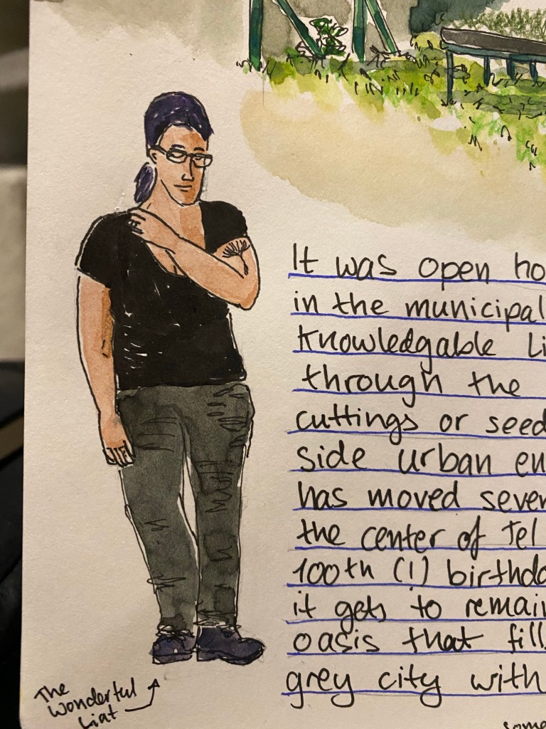
Here’s a closeup of Liat, who manages the nursery and was our fantastic tour guide for the day.

A close up of the lady in black work clothes and purple hair from the sketch above.

I’m 3/4ths done with “Our Country Friends” by Gary Shteyngart and I’m probably going to give up on the Tournament of Books reading list once I’m done. I have so many good books that I want to read, that I don’t feel like chancing another tiresome one. What will come next is Ali Smith’s “Companion Piece”, and then “The Mirror and the Light”. There are a few classics that I want to catch up on, and some very good sci fi that’s waiting for me, so as much as I’ve discovered some fantastic books through “The Tournament of Books”, I think that this is where our ways will part, at least for a while. Oh, and Agatha Christie is an excellent writer, and very addictive. I may return to her books in the near future.

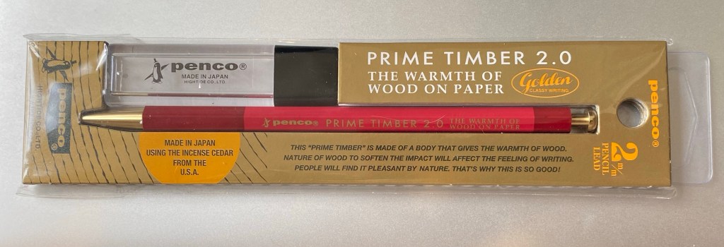
I’m exploring various ways to manage my projects, and so far I’m unhappy with all of them. When I was in London I picked up this Penco leadholder and some leads (I have another one in shades of green that part of a sketching kit that I don’t want to break up), and I’m giving the good old PigPogPDA another try while I work things out. This is always my “palate cleanser” system, something that I use while I tweak other, more complex systems into relative perfection. I’ll be using this leadholder and a Moleskine plain pocket reporter.
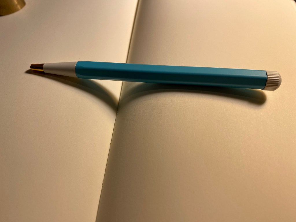
The Penco Prime Timber 2.0 leadholder in red with brass hardware.

I’ve enrolled to Liz Steel’s Watercolour course. It’s starting a runt through on the 8th of June, and as I’ve had such a long sketching break while my hands were bad, I thought that it would be a good way to refresh my skills and pick up a few tips and techniques along the way. I like Liz’s loose, non standard watercolour style, and her courses are excellent.

Next week on Tuesday is my last day in my old job, and the week after that I start my new job. Exciting times 🙂

Drehgriffel Nr. 1: A Review of the Leuchtturm1917 Gel Ink Pen

London Graphic Centre is one of my favourite stores in London. It’s tucked away in the corner of a street off of Neal street in Covent Garden, and it’s a real haven for artists, designers, architects and anyone who loves stationery and art supplies. I visit it several times whenever I’m in London, and I never fail to find something new and interesting there to try out. This time was no different, and one of the first things that caught my eye while I was there was this:

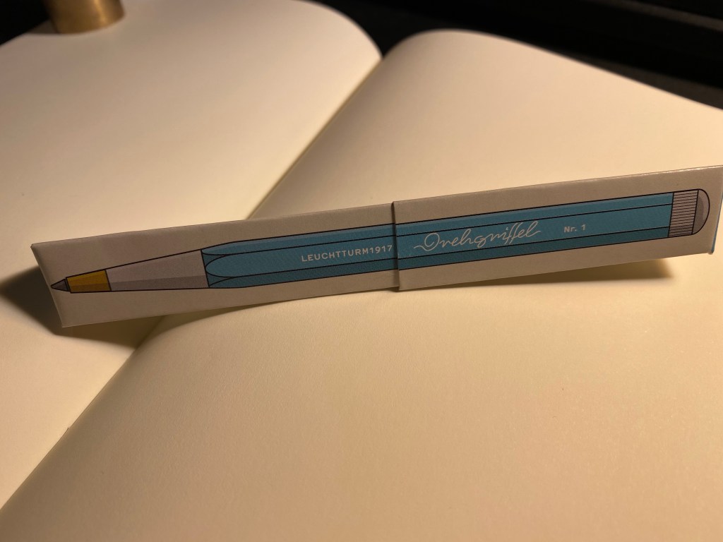
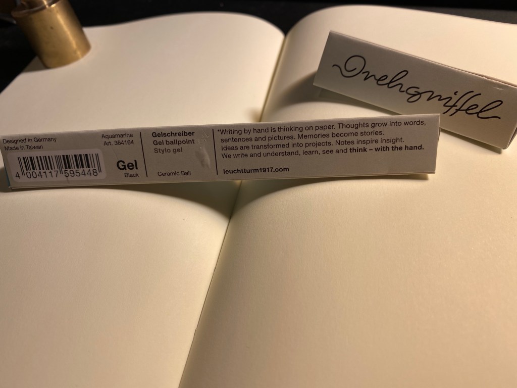
Rectangular box, Leuchtturm1917 logo, aquamarine colour, unusual pen design – of course I had to check it out.

It was just above the Leuchtturm1917 notebook display, and there were just three or four colours available, but it was obvious that this pen was designed to match the colours on offer in the Leuchtturm notebook lineup. I assumed at first that it was a ballpoint, in which case I wasn’t really interested in it, until I saw that it was prominently labeled as a gel ink pen. Now that was intriguing.

Rectangular cardboard box, with Nr. 1 and “Gel” clearly marked on it, plus the aquamarine colour.

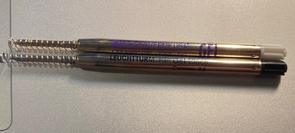
The box was a bit confusingly marked as both “Gel” and “Gel ballpoint”. Checking out the Leuchtturm site clarified that this pen (we’ll get to the name in a minute) is indeed a gel ink pen, with a Japanese refill and a “Ceramic Ball” tip. The refill itself looks very much like the Monteverde Capless Ceramic Gel ink refill. My guess would be that this is the same refill, but more on that later.

Several things of interest here: the “Designed in Germany, Made in Taiwan” that is reminiscent of Apple’s packaging. The prominent “Gel” marking and then the confusing “Gel ballpoint” designation. And the “Ceramic Ball” notation.

Somebody really took the time to design this box, but really didn’t consider how illegible the pen’s name is:

I was sure that the pen was called orehgriffel or ovehgriffel.

The pen is called Drehgriffel Nr. 1, a bit of a mouthful. Apparently Drehgriffel means “rotary stylus”, which probably refers to the pen’s twist mechanism.

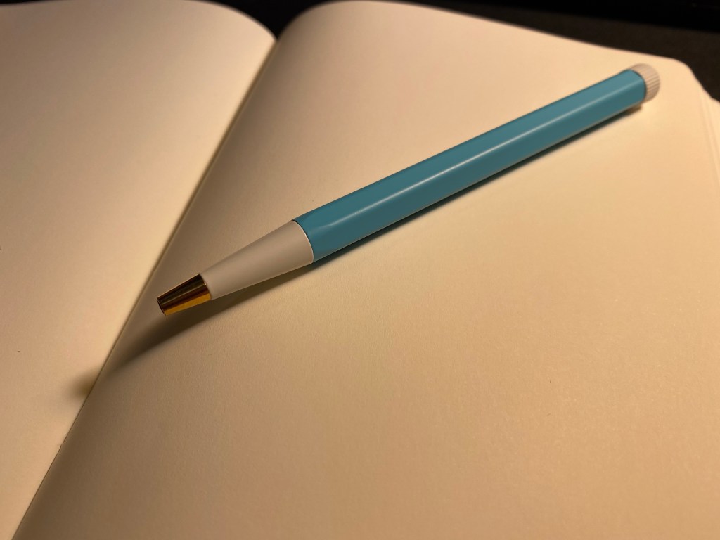
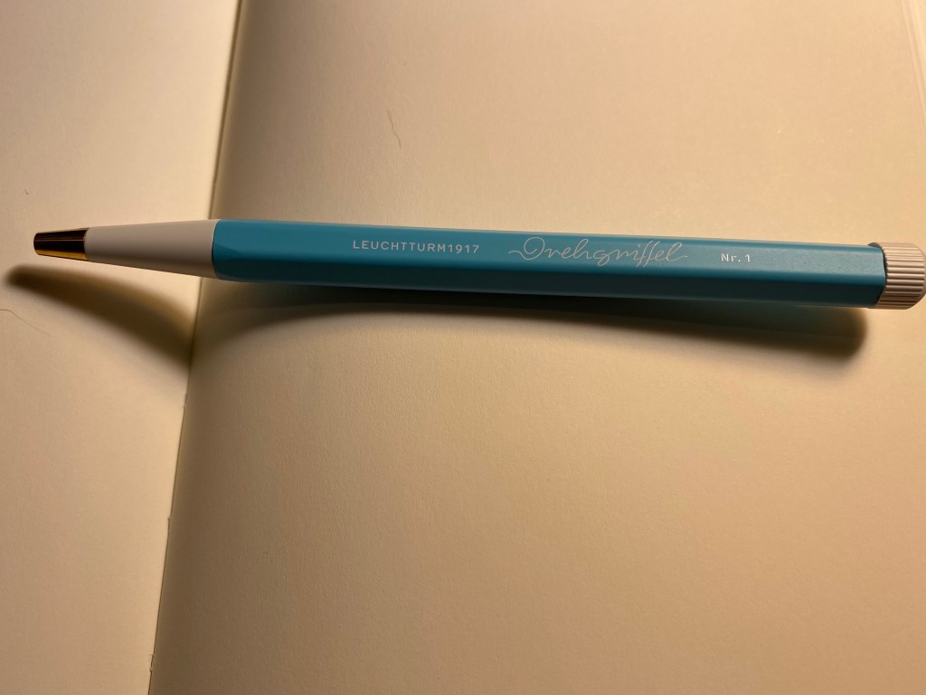
The pen has an aluminum body, a white twist nob at the end and brass pen tip. It’s well balanced, heavier than a plastic pen but lighter than a Retro 51 or a machined pen. It’s slightly heavier than a metal bodied Caran d’Ache 849, but if they were put in a boxing ring they’d both be in the same weight category.
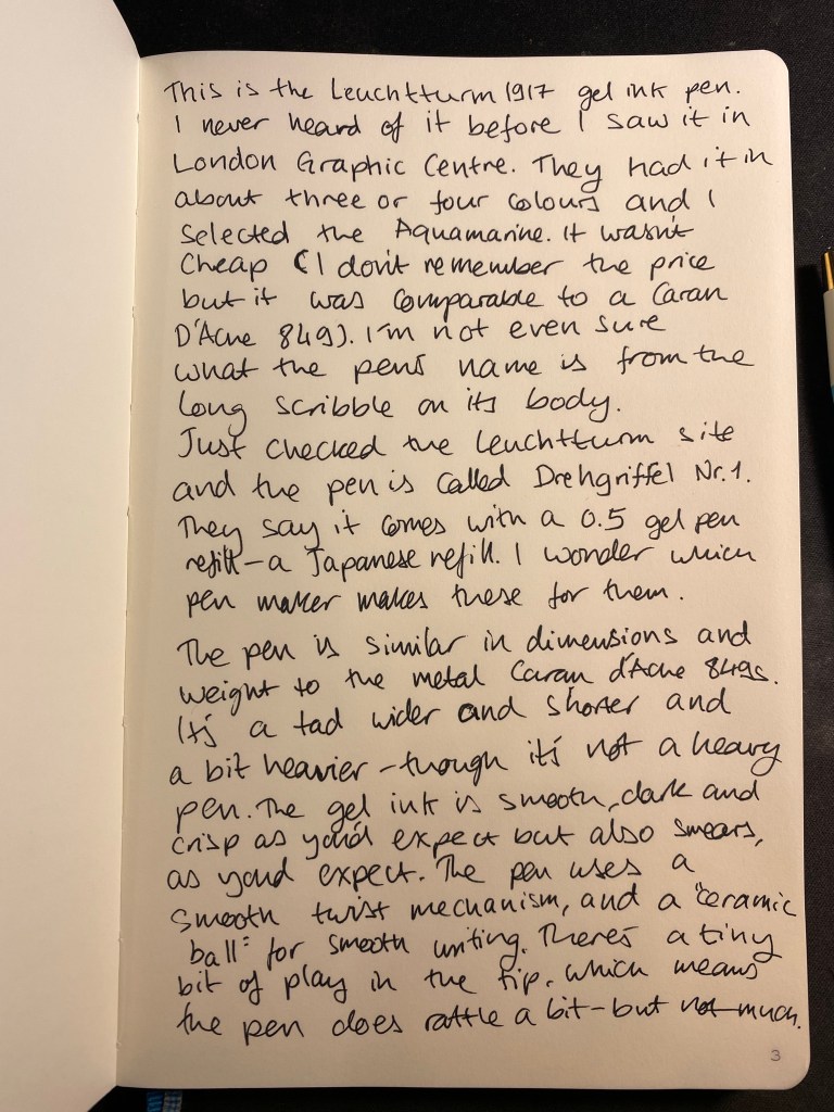
The Drehgriffel has a very 60’s look, which I happen to like, but other people may find to be dated. Also, the Nr. 1 is a weird designation when you don’t have any other pen on offer. Will there be a Nr. 2? A Nr. 3?

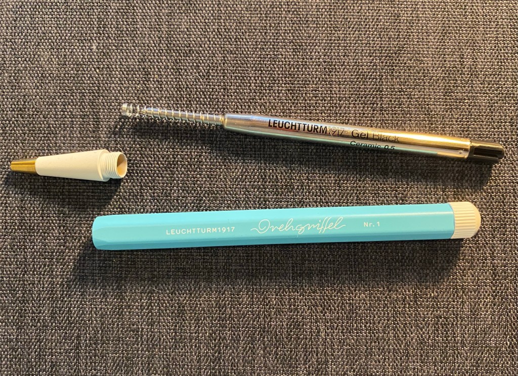
Here’s the pen’s refill and parts. It’s weighted slightly towards the tip because the tip is brass (and, of course, the pen tip will tarnish with time).

The Drehgriffel taken apart.

Here’s the Drehgriffel refill side by side with a Monteverde Capless Ceramic Gel refill, and they are exactly the same. Good to know if you’re looking to replace refills, although I suspect that it will take a while to write this pen dry.

Monteverde refill on the top, Leuchtturm refill on the bottom.

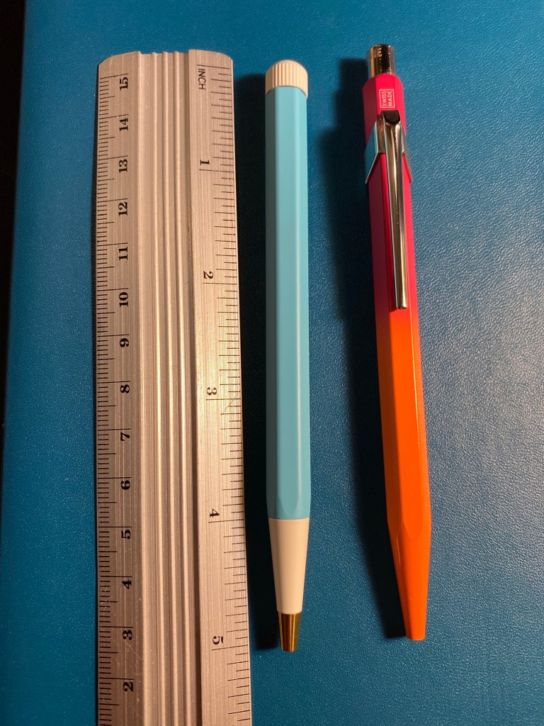
The Drehgriffel is similar in size and weight (and price) to the Caran d’Ache 849 metal barrelled pens. It’s a smidge wider and heavier than the 849, but they are very much in the same ballpark. Here they are side by side:

Leuchtturm1917 Drehgriffel on the left, Caran d’Ache 849 on the right.

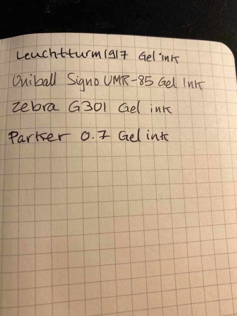
Here’s a writing sample of the Drehgriffel against a few other gel refills. It’s noticeably wider than Japanese 0.5 gel in pens, and is closer to 0.7 gel ink refills. I tested it on a Moleskine squared notebook (and further down you can see it on a Leuchtturm1917 notebook).

Writing samples.

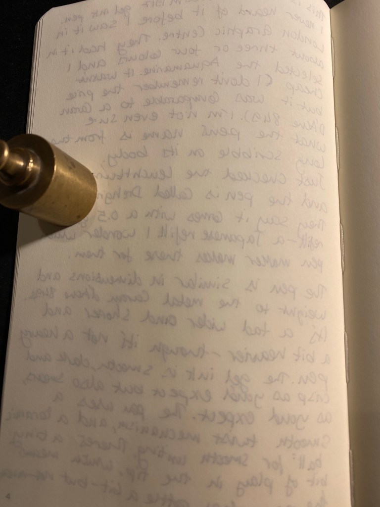
Here’s the reverse side of the Moleskine page. The Drehgriffel bled a bit more than its counterparts:

The reverse of the page.

Here’s a writing test on a Leuchtturm1917 80gsm blank notebook:

Leuchtturm1917 writing sample.

Here too there was visible show through an some bleed through, although there was less bleed through than the Moleskine.

The reverse side of the Leuchtturm1917 page.

The Drehgriffel writes smoothly, but there’s nothing in the pen’s smoothness that justifies the advertising. It’s a nice pen, that comes in a variety of colours and that has an interesting design and good refill. In my opinion it would have been more popular if it came with a click mechanism and was a little cheaper, but I still appreciate the fact that Leuchtturm chose to come out with a gel ink pen first and not the more obvious choice of a ballpoint. I like the look and feel of my Drehgriffel, although I would have liked it better if it would have been a little bit wider. As it is if I use it for more than a page or so without pause it causes my hand to ache and cramp up.

Now I’m wondering if there’s going to be a Drehgriffel Nr.2 with a click mechanism perhaps?

Weekly Update: PET CT, Pens and Mischief Movie Night In

I haven’t written an update in a long time, because my neuropathy has gotten much worse since I finished my treatments. It’s painful to type, to write or draw, and it gets worse in the cold. Of course we’ve been having a series of cold days here, which has meant that typing a blog post has been a considerable challenge.

Two Egyptian Geese are having a dip in a roadside “pond”.

Health

I went through a PET-CT, my third and hopefully my last, last Sunday. It’s a long and not very pleasant experience, but it’s not the worst thing in the world. This week I’ll get the results and discuss with my doctor what to expect over the coming months. Meanwhile, neuropathy is kicking my ass, so posts will be sporadic until things get a little better.

This contraption injected me with radioactive sugar before my PET-CT.

I also got my fourth Covid vaccine, in the hopes of staving off the dreaded Omicron variant. I’ve been constantly masked and hiding as much as possible at home, but I’ve got a series of hospital visits coming up, so I’m hoping that the vaccine (and mask) will help me avoid infection and stay safe.

Reading

I started a new reading challenge, but I’m taking my time with it. I just finished the fabulous “The Trees” by Percival Everett, and the pretty terrible “All’s Well” by Mona Awad (lots of good intentions, terrible delivery). If you enjoyed “My Sister, Serial Killer,” you’ll love “The Trees”. It is a darkly funny, fast and very clever detective/revenge story that is just a joy to read, despite the very difficult topic.

I’m not sure what’s next on my reading list, but it may just be a non-fiction book before I delve into the next Tournament of Books pairing.

Writing

My hands are making writing problematic, but I did manage to write a pretty long post on the blog this week. It’s a taste of a project that I’ve been wanting to work on even since I got sick, and I look forward to be able to actually sit down and type for longer periods of time to get it done.

Currently Inked

I finished my Diamine Inkvent 2021 reviews with 32 pens inked, and I promised myself that I will write them all dry. That’s the most pens I’ve ever had inked at one time, and it’s turning out to be quite a challenge, but a fun and interesting one. This week I’ve written four pens dry (a Lamy Safari, two Monteverde Giant Sequoias and a Sailor Pro Gear Graphite Lighthouse), bringing the count of inked pens down to 22. It’s slow going because I have trouble using my pens, but I am making an effort to journal each day with them, so I do hope to write them all dry by the end of next month. I’ve been using them in my Moleskine, because I love their format the best, and just writing on one side of the page since I have enough notebooks to afford to do that. That way I can use the pens I like in the notebook I like and not worry about avoiding bleedthrough.

Other Things

I got back to running, which is major. I’ve been a runner since November 2011, until the 7 month break in running that I was forced to take last year due to my cancer and treatments. It was very hard for me to stop running, and it is difficult to get back into it now for various reasons, but I’m lacing up and getting out there and that’s what matters at this point. The most important thing I’m having to learn is to be kind and patient with my body after all it’s been through.

I’ve also watched the charity broadcast of the Mischief Theatre group (of “The Play that Goes Wrong” fame), “Mischief Movie Night In: The Wizard of Paddington Station” . You have until the 31st of January to purchase a ticket to see the broadcast and all the profit goes to charity. It’s a fun, family friendly way to pass an evening and do some good at the same time.