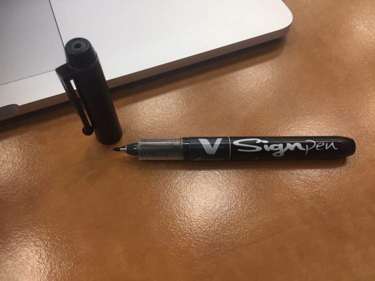
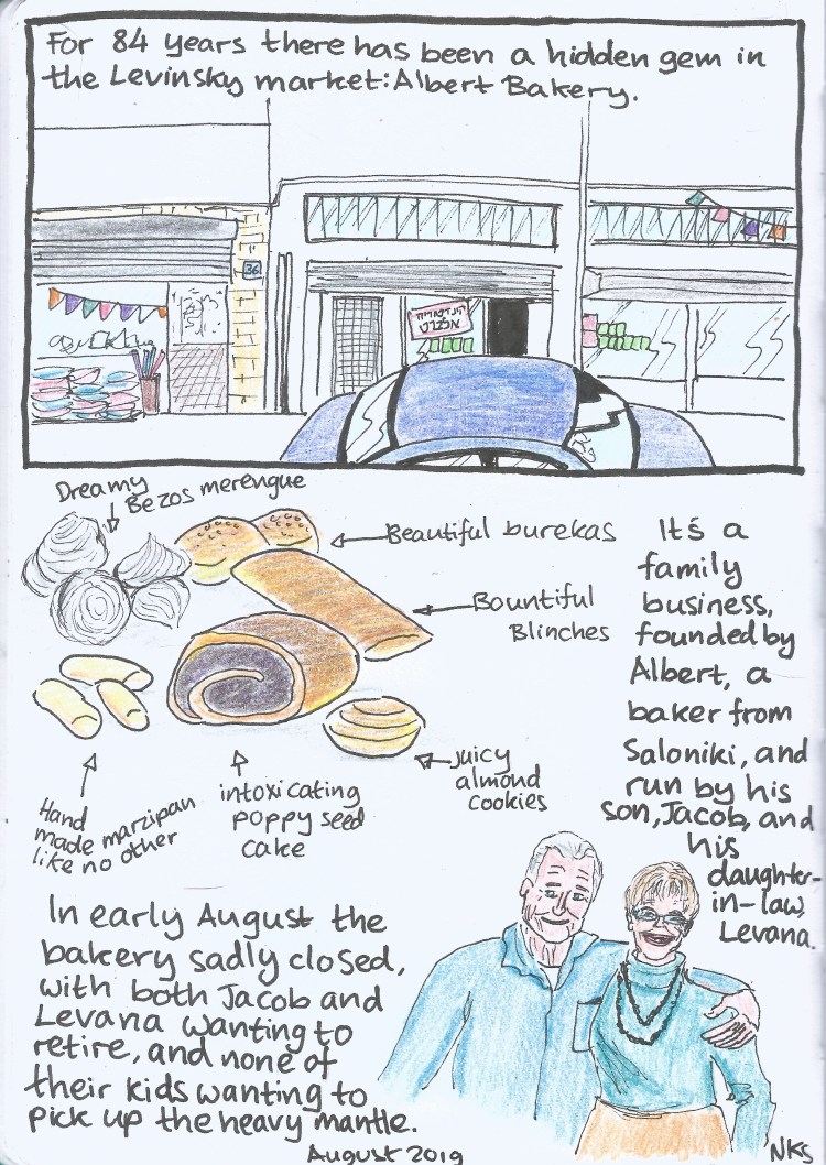
The end of summer is upon us and my services as creator of kids’ colouring pages are now in high demand in the office, as desperate parents bring their kids to work for a few hours in lieu of camp or a sitter. After ruining several brush pens on these drawings I’ve settled on the best pen for this purpose: the Pilot V Sign Pen.
The Pilot V Sign Pen is a liquid ink pen with 2.0 mm bullet tip that creates the consistent kind of lines that kids seem to prefer.
The V Sign has a cheap looking plastic body, complete with ugly barcode printed on the barrel. It’s pretty ergonomic though, with a relatively wide barrel and a light weight body.
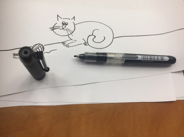
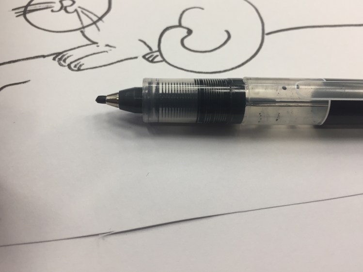
I just replaced my old V Sign Pen as it has run out of ink, and as you can see above and below, the tip does get worn down with use, though compared to most plastic tipped pens it’s super durable.
This V Sign works on cheap copier paper with a little bleed through and a lot of show through. It’s non-waterproof, and I’m pretty sure it’s not archival. It is, however, a lot of fun to use. For office doodles of this kind, it’s absolutely perfect; For anything else, I’d recommend something archival and waterproof instead.
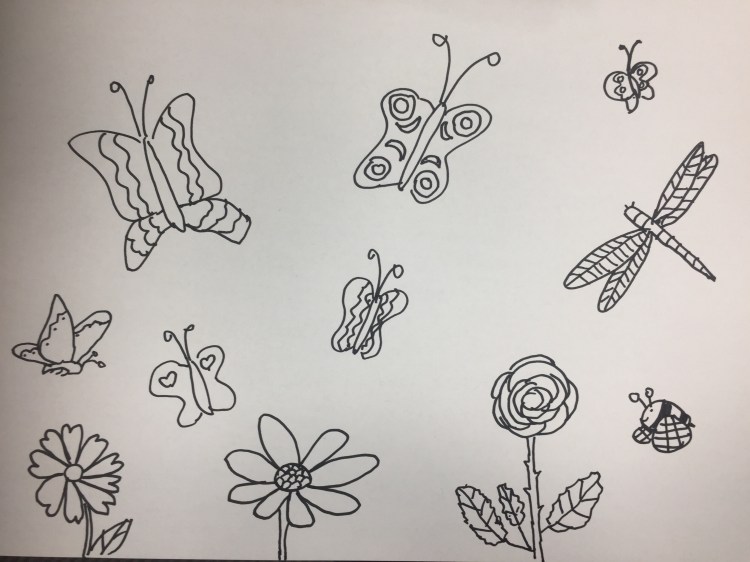
To all those parents out there, here are some colouring pages that I’ve drawn. Feel free to print them out for your own personal use, and gain a few minutes of peaceful bliss.
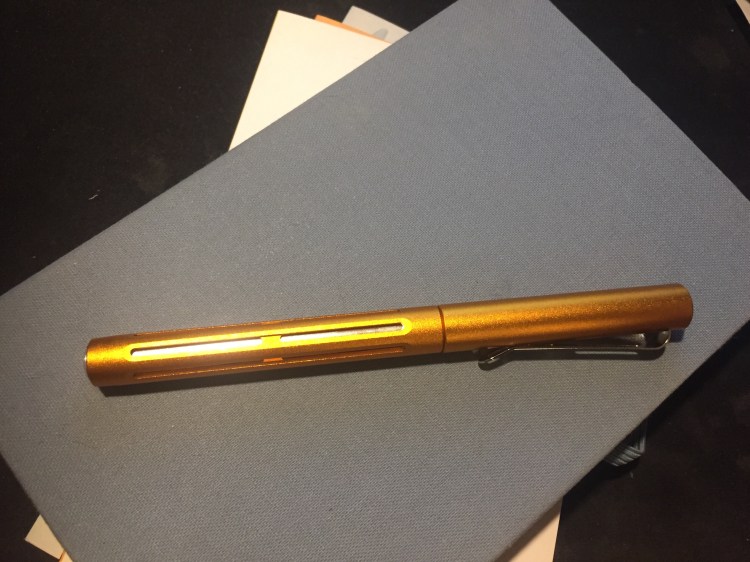
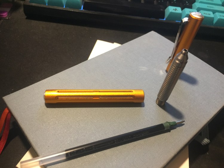
My Spoke Pen Orange Crush arrived a week ago, and I’ve been using it exclusively for journaling and meeting notes since then. How do I love thee? Let me count the ways…
First comes the colour, because there’s just absolutely no way to ignore it. It’s nothing like I would have expected orange pen to be: it’s like an amalgamation of gold and bronze with a dash of copper. This is a rich and SHINY finish that sparkles and glows. You cannot ignore it, the very opposite of subtle, and yet it isn’t gaudy and doesn’t look cheap. Orange isn’t a colour that I’m overly fond of, but I’m glad that I picked it out for this pen: it’s perfect.
The second thing you notice about this pen is the weight. It’s super light, though it appears to be a solid and heavy looking pen. It shouldn’t have surprised me, as it’s made of aluminum, but the Spoke Pen still looks like it a heavy pen because there appears to be so much metal in use in it that it seems impossible for it to be so light. The first time I picked it up it really surprised me. It’s lighter than my beloved Ti Arto, even though it looks like it should be heavier. At first I had to consciously remind myself to use the Spoke Pen and not the Ti Arto when journaling, but now it’s become the pen I turn to for long writing sessions because it fatigues my hands less. Could it replace my Ti Arto as my favourite pen? Time will tell, but it’s entirely possible the way things stand now.
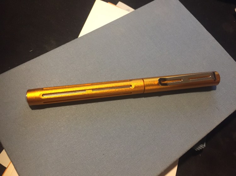
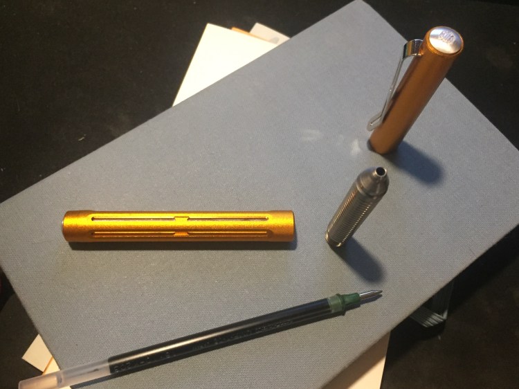
The Spoke Pen was designed entirely around Brad Dowdy‘s beloved Uni-ball Signo DX refill (UMR-1), but also accepts the Uni-ball Signo UMR-85N (my favourite refill), UMR-87N, and other refills of the same size. To change refills you unscrew the section, take out the old refill, and then the magic starts. When you put in a new refill it will appear to jot out quite a bit from the pen body. “There’s no way this thing will close back up again,” you think to yourself. Have faith, it does: there’s a hidden spring in the back of the pen, and you’re going to have to apply a tiny bit of force to push the section back close to the body, but once you start screwing the section back everything fits snugly back in place. The tolerances on this pen are flawless, as I’d expect from a pen with this provenance.
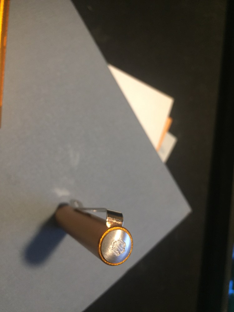
Machined pens seem to be divided into two schools of thought when it comes to branding: either the over the top, in your face, you can’t miss it branding style, or the barely branded one. The Spoke Pen belongs to the latter group, as there’s a discreet stamp of the Spoke logo on the top finial and that’s it. Very classy move.
The third great thing about this pen is the magnetic closure. I actually thought that this would be a more significant feature than the colour or the weight of the pen, but after using the Ti2 Techliner for a while the novelty of magnetic cap closures must have worn off for me. If the most important thing for you is the magnetic closure, then I recommend the Ti2 Techliner instead, as its magnets are significantly more powerful, and you can both cap and post the pen with them, even from a distance. The Spoke Pen’s cap magnet engages only halfway through capping the pen, basically functioning like the click at the end of a regular pen capping. It’s fun to use, and fun to fidget with, but I don’t think that it’s the pen’s main selling point.
Are there any cons to this pen? Of course, rarely anything in life is perfect. You may not like the Spoke Pen’s tactical aesthetic. If you carry the Spoke Pen in your pocket lint will probably get wedged in its “fins”. The clip looks like a determined person with something to prove could bend it out of shape (for normal use I think it’s perfectly fine). These are not issues for me personally, but they may be issues for you.
As it is, the Spoke Pen Orange Crush is one of my favourite (non-fountain) pens ever, and is looking to replace the Ti Arto at the top of my list. Kudos to Brian Conti and Brad Dowdy for creating such a great product out of the gate.
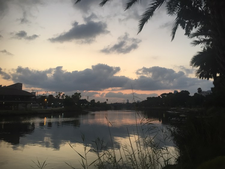
It’s that boiling hot and extra humid time of year, which means I hit the road at 5:15 today to get my 10k run in. It was dark when I set out, but I was awarded with this sunrise by the time I reached the park:
Is that not worth the early rise?
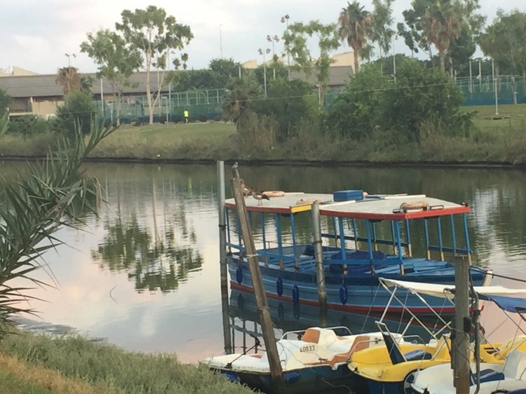
There was a convention of birds on the boat pier in the river: a pied kingfisher and two Egyptian geese were perched pretty close to each other (the kingfisher is the tiny bird on top of the pole in the centre of the photograph).
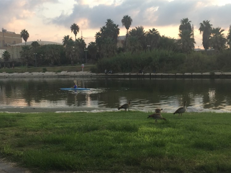
Then I saw a man paddling a blue kayak down the river, past a flock of grazing geese, and even though I hadn’t planned on taking another photo stop, I just had to get this shot.
I ran a little over 10k, just before the heat started to set in, and then rewarded myself with two coffees for my pre-dawn effort 🙂
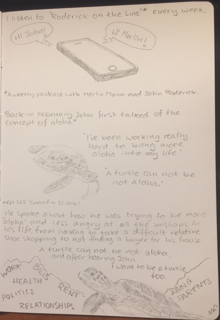
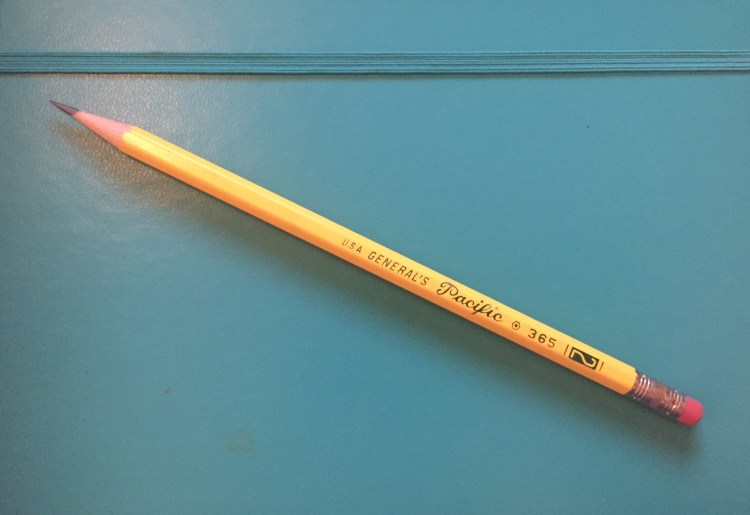
I have too many pencils which I don’t take the time to use. Inspired by this episode of the Pen Addict podcast I decided to literally do a random draw: I randomly drew a pencil from the pile, and then I randomly drew something with it. Today’s pencil: the General’s Pacific 365 #2.
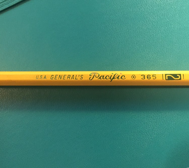
It’s a classic looking #2 (or HB) pencil, with for some reason three or four fonts on the barrel, depending how you count the numerals. It’s made in the USA, out of California incense cedar, and has a little red thing on the top that looks like an eraser, but trust me, I wouldn’t try to use it as one.
Why so many fonts?
The green foil imprint quality is not great, with the “Pacific” imprint chipping the pencil’s coating. The coating itself is pretty thinly layered, but the core is perfectly centred and sharpens like a charm.
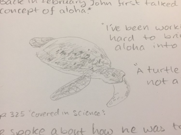
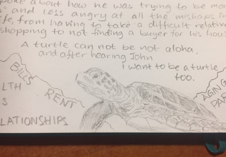
You can see the available shades that the General’s Pacific is capable of producing in the closeup of the sea turtle above. If you’re looking for a #2 writing pencil that could do for a quick sketch in a pinch, the Pacific ought to do the job. It doesn’t smudge and holds a point very well.
I erased a word between the “S” and the “LATIONSHIPS” on the left side of the closeup above. It erased out pretty well, even though the writing was dark and done with some pressure.
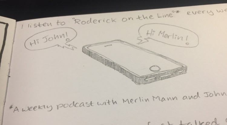
The phone above shows you the maximum darkness I was able to produce with the General’s Pacific. It’s not bad, considering that this is clearly not a pencil made for drawing, but one made primarily for writing.
If you’re buying from CW Pencils and are looking to add a workhorse cedar pencil with a fondness for fonts to your order, the General’s Pacific is a pretty good choice.
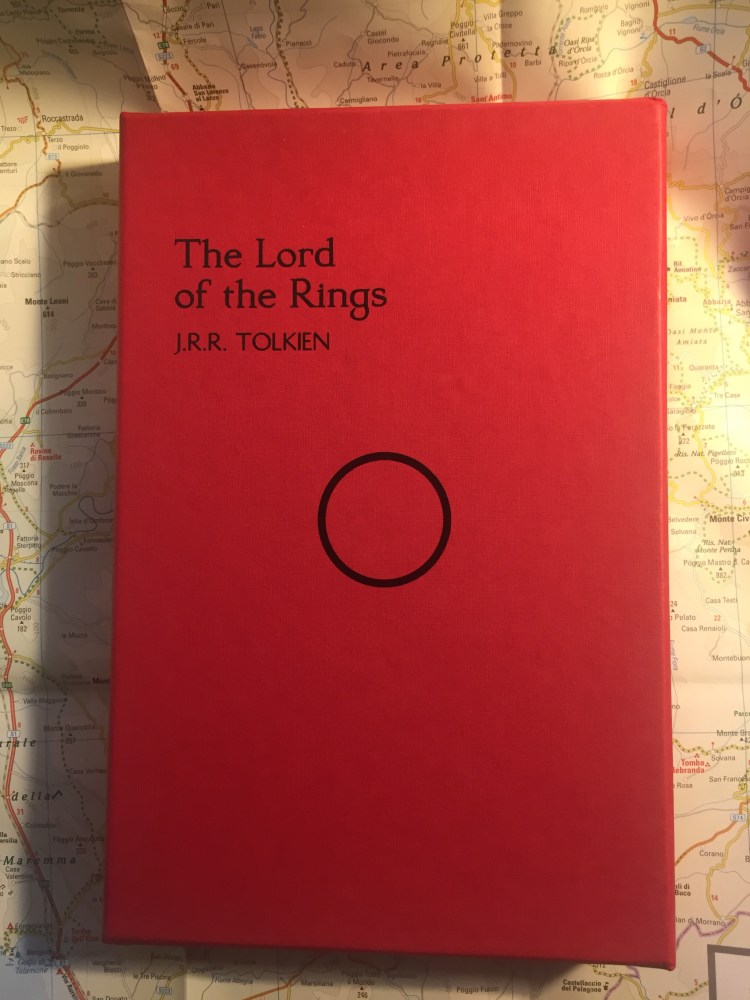
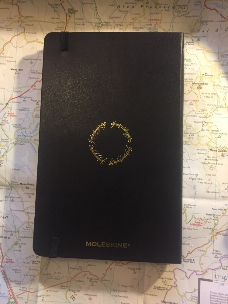
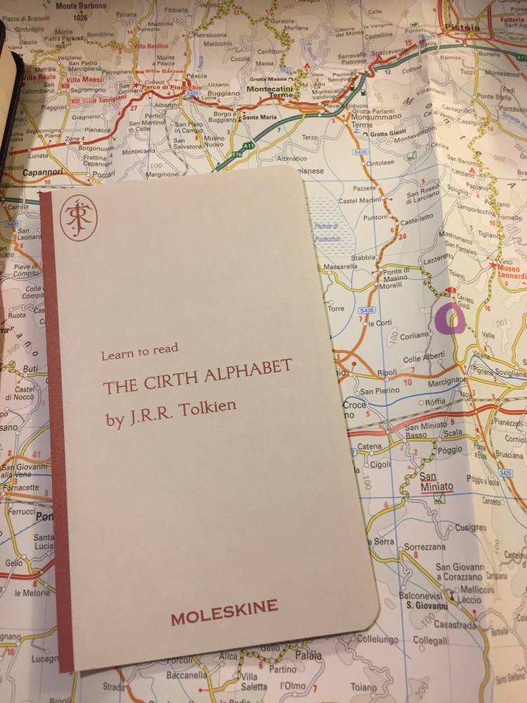
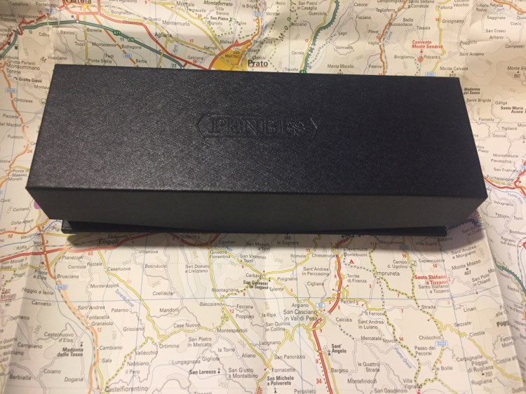
Say hello to the limited edition, numbered Lord of the Rings Moleskine box:
Bold and beautiful, right? This box is new to the 2019 edition of the LotR limited edition Moleksines (reviewed here and here), not to be confused with the more muted LotR limited edition notebooks that Moleskine published back in 2012.
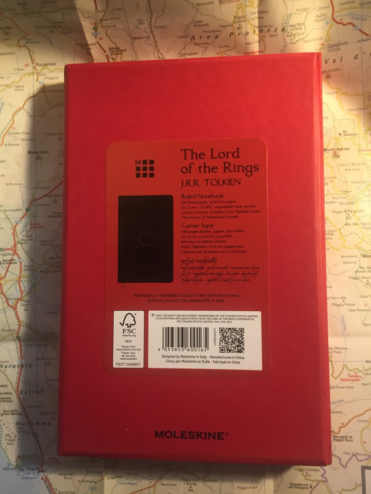
This limited edition box is numbered, like all limited edition Moleskine boxes, and there are 9999 boxes available worldwide. For me this edition is all about the typography and the homage to Tolkien’s illustrations. Notice the fonts used on the front and back of the box, and the fact that the notebook’s details are printed in English, French and Tengwar, an Elven alphabet that Tolkien invented.
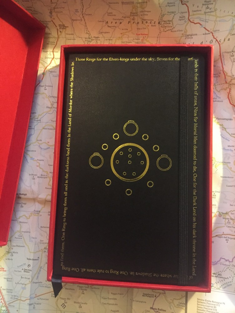
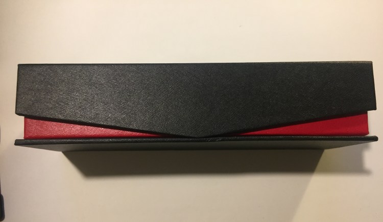
You open the box, and are met with this:
The contrast is impressive, and the combination of red, black and gold is striking.
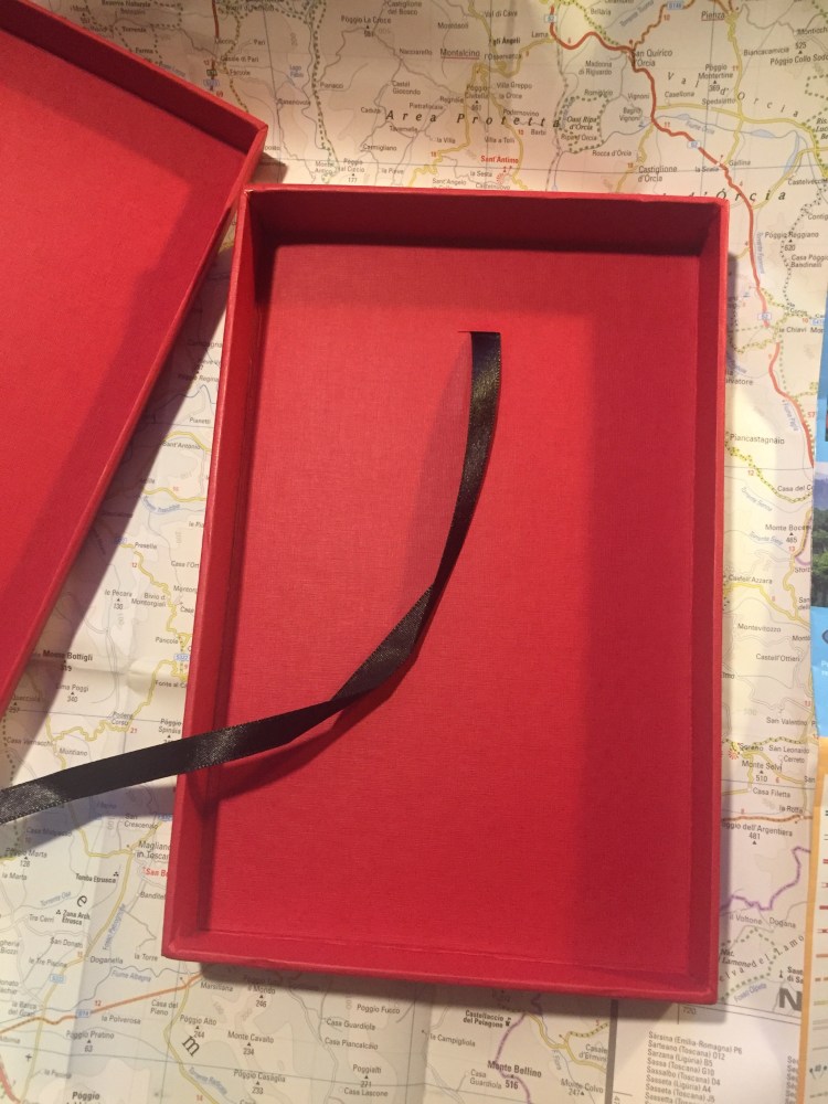
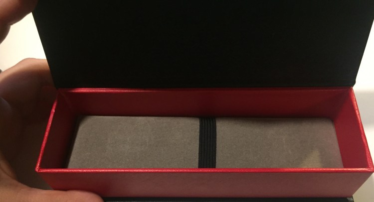
The box itself is a well made cardboard box that can be used to store the notebook, or appropriated to store pens, pencils, pocket notebooks, etc. There’s a black satin ribbon attached so that you can easily pull the notebook out. Very elegant.
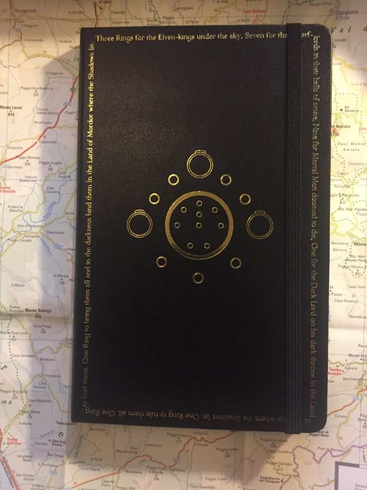
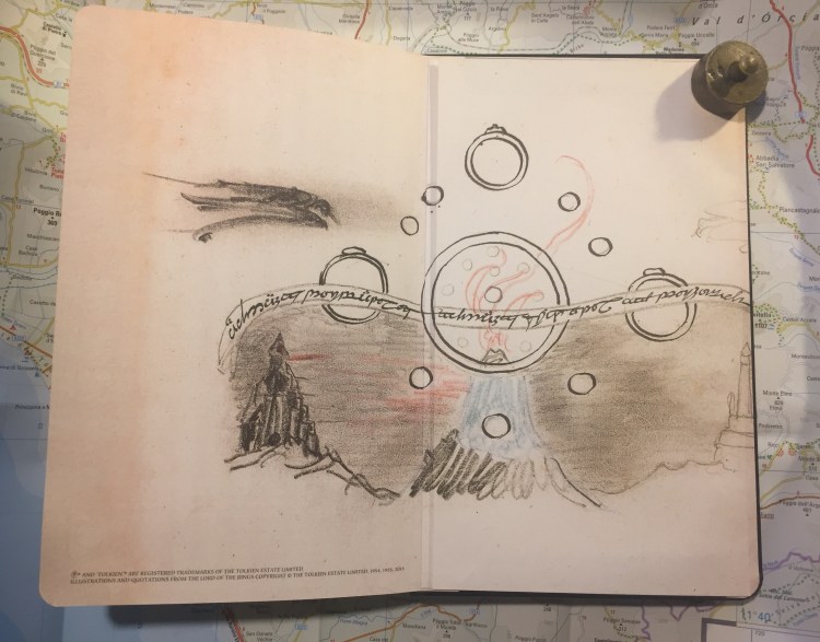
Now comes the notebook, the main event. It’s a large ruled Molkesine, with the famous “One ring to rule them all” poem embossed in gold all around the margins, and Tolkien’s illustration of all the rings embossed in gold in the centre.
On the back the inscription on the One Ring appears, embossed in gold:
One Ring to rule them all, One Ring to find them, One Ring to bring them all and in the darkness bind them
Again, a dramatic edition that is still elegant and understated.
Inside is where all the fun is. The front endpaper shows a Tolkien illustration of Sauron presumably reaching over the Mountains of Shadow, ready to take over Middle Earth. It looks like this illustration inspired the red and black colour theme of this edition.
On the back is Tolkien’s illustration of the rings over Mount Doom with Barad-dûr in the background, and again the “One Ring to rule them all, One Ring to find them,/One Ring to bring them all and in the darkness bind them” inscription.
The illustration is aligned with the back pocket, and runs into the pocket itself.
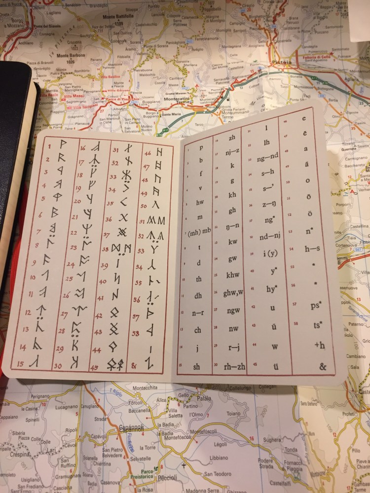
The add-on is the Cirth alphabet, as it is for all the notebooks in this series:
Which brings us to the one minor thing I don’t like about this edition: the colour of the ribbon bookmark. It’s a light yellow that glitters in the light because of the material its made of, and it’s clearly meant to evoke the One Ring. That’s a lovely idea, but I think that it fails on execution. The bookmark looks pale and vapid compared to everything else about the notebook, almost disappearing into the page. A red bookmark would have probably been better, since a gold one would probably come out tacky.
The 2019 Lord of the Ring Moleskine limited edition notebooks are very well designed. They pay beautiful homage to Tolkien’s illustration and work, and the limited edition box is no different. These are much better than their 2012 counterparts, and make great gifts for the LotR fan in your life.
As usual, these are well made, robust notebooks that can handle a beating with aplomb, but they aren’t, nor are they meant to be, fountain pen friendly. I use gel ink pens or ballpoints in mine, and recommend that you do too.
Leuchtturm1917 sketchbook, Kuretake Zig Mangaka pens, Deleter Neopiko-Line-3 pens, Caran d’Ache Pablo coloured pencils, Faber Castell Albrecht Dürer coloured pencils.
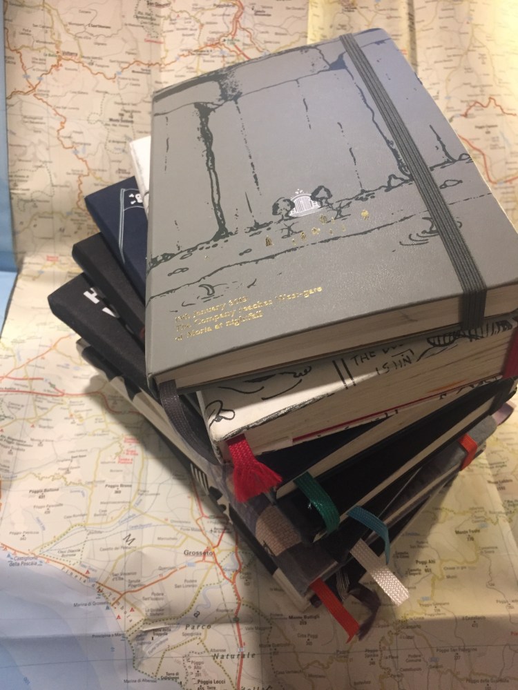
This week I celebrated two years of daily journaling. While I’ve been keeping journals for years, until the last two years I’ve only done so sporadically. Journaling was something that I did only when things got really rough, to keep myself going, or when I was travelling, to preserve the memories of my trip. I used pocket notebooks for my sporadic journals, as it was more important for me to capture things than to reflect on them. It was a utilitarian process, not an enjoyable one. I knew that once I decided to really start a journaling habit, that would have to change.
These are all the journals which I’ve used during the past two years.
So the first thing I did was pick a notebook that I knew I’d want to use, and use daily. The only rules were that it had to make me happy, and that it had to be large enough for me to be able to actually write in it, not just jot things down. I wasn’t looking for the best notebook with the best paper in the best format (I don’t think that exists, actually, but for us stationery geeks the search is always on), just a good enough notebook for me.
My notebooks of choice.
I also decided very early on that I couldn’t use a fountain pen for this, because I wanted a pen that I could write with even not under the most ideal circumstances. I was also planning for both the notebook and the pen to bash around freely in my bag. These were going to be used and look used.
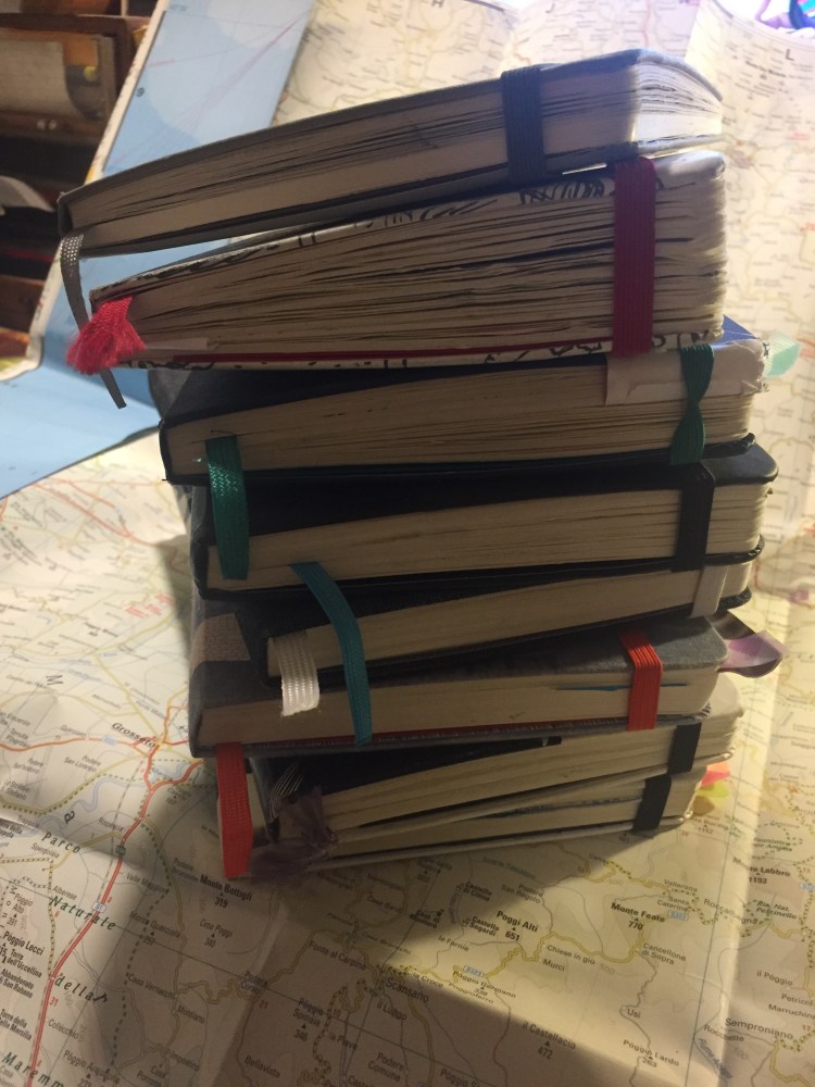
Can you see how bloated these notebooks are? Moleskine makes them sturdy enough to take a beating.
I chose Moleskine large ruled hardcover notebooks as my notebook of choice, and the uni-ball Signo RT 0.5 gel ink pen as my pen/refill (UMR-85N) of choice. I wanted a sturdy lined notebook that I’d enjoy using and looking at once it was done, and after years of neglecting the Moleskine for other notebooks I came back to it because of some of their limited edition designs. I knew that I was going to use the uni-ball Signo RT 0.5 as my pen or refill of choice (inside a BigiDesign Ti Arto or Ti Arto EDC), so I didn’t need fountain pen friendly paper. I had decided to pick up the steady journaling habit by starting with a travel journal, which I already had some experience with, and then carrying on from there. On the first evening of a trip to London I happened to walk by the Moleskine store in Covent Garden, and I decided to go in and check out what they had. There was a beautifully designed Batman limited edition notebook in exactly the kind of format I was looking for, and it was only available for sale at the Moleskine stores. I bought it, unwrapped and stamped it with the Moleskine Covent Garden stamps, and I haven’t looked back.
That pen and notebook combo has hardly changed over the years. What has changed is the format I use to journal, and the amount of daily journaling I do. When I started out I was used to only jotting a few lines down here and there when I journaled, so I knew I couldn’t expect to write 4-5 pages per day right from day one. Starting with just a paragraph to half a page a day, I pretty quickly moved to one page per day of just writing.
Then I saw a Neistat Brothers video on Youtube and realized that I could use my journal as a visual capturing device as well, and anything could go in it, so long as it made me remember a moment or a place.
Limited Edition Cola Zero tab created for the 2019 Eurovision song contest in Tel Aviv. I don’t even drink Cola Zero, but this little piece of metal is still totally evocative to me.
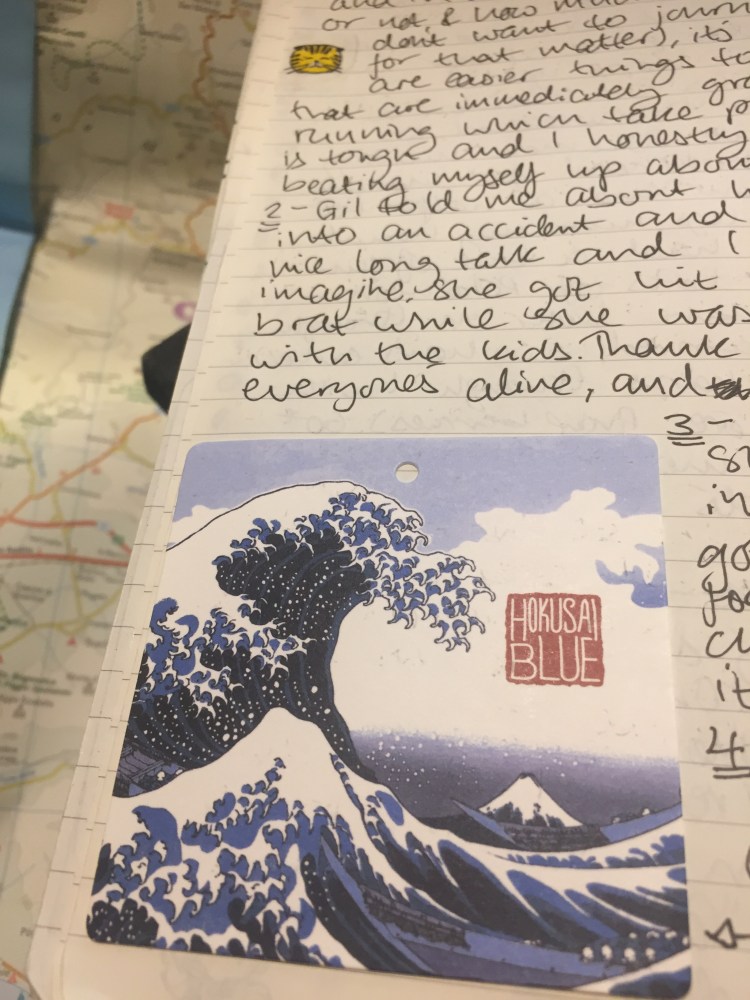
That’s when the notebooks really started to get bloated. From clothing labels to business cards and ticket stubs, if I can put glue on it and it’s visually appealing or evocative, it goes in. I almost always also write a little note for future me, to remind myself what I’m looking at and why it’s there. That change really made these notebooks a kind of personal artifact for me, and I can’t say how precious they’ve all become.
A bit of cat themed washi tape and a Uniqlo shirt label. Sometimes things go in because I find them visually appealing or they make me smile.
At a certain point I started getting ambitious, moving from writing one page a day to two pages, then four pages, then six. That’s when I had to take a step back and make sure that I wasn’t burning out on journaling for all the wrong reasons. I enjoy writing and I enjoy journaling, but I’m also trying to write fiction, and my journal can’t become something that consumes that, an excuse for not writing. It’s also easy to get carried away and want to finish the notebook as fast as possible just so you can open a fresh one, or brag (even if it’s only to yourself) that you’ve finished a notebook. Nowadays I write one or two pages a day for most days, moving up to more pages only if I really have something special to write about.
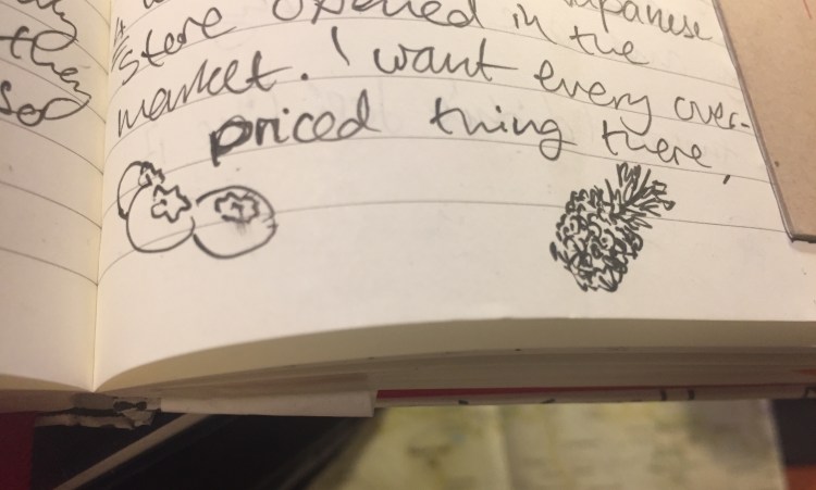
Doodling seasonal fruit in the margins.
Life also happens, and oftentimes it’s scary and ugly, a black hole that threatens to consume all that is good in your life, including journaling. My mom got unexpectedly and very seriously ill last year, and we’ve been struggling with her disease ever since. When she was in hospital I couldn’t bring myself to journal. I backlogged those (thankfully few) dark days, and I realized that I would have to accept that as much as journaling is important to me, family comes first, so backlogging is going to have to become acceptable. I try to backlog as little as possible, but some days just demand that.
If I want to remember a good meal I’ll sometimes draw it.
I also draw a little in my notebook, tiny thumbnails of things that I want to remember later, or that I just feel like drawing. These are usually food doodles, as I don’t really like to photograph my food.
I still use my journal in trips, and ticket stubs and bit and bobs like these make it more interesting.
If you’re looking for some journaling tips, I wrote two posts on that subject here and here. If there’s one thing I can leave you with it’s that if you want to journal, you need to figure out a way to it make it work for you, and be ready to adapt as your life changes over time. There is no perfect journaling system, or perfect journaling notebook, there’s only what works for you.
I’ve been on a fountain pen purchasing hiatus for a while, as I’ve been trying to use what I have rather than buying more pens that will see little or no use. Also, money is a thing, and this hobby can get really expensive really quickly.
So when reviews of the PenBBS pens started coming out I largely ignored them, even though they were generally very positive. That changed when I saw the PenBBS Hawaii: here was a chance to get a pen with a Kanilea Pen Company kind of vibe, but at a price that I can afford. To be honest, despite the reviews, at this price point ($39) I thought that I’d get a cheap, plasticky feeling pen that wouldn’t really be a piston filler.
I was wrong.
This is what arrived in the mail:
Then I took this out of the sleeve:
I don’t usually care much about packaging, but this is worth noting. Even if the packing would have just been a sturdy cardboard box inside a sleeve it would have been mind-blowing for this price. But it’s so much more than that.
That black box is designed like the boxes high end Pelikans come in (including a cushioned interior). It’s designed. There’s texture to it, a logo and the edges are rounded up so you can see the red colour underneath. The box even comes with magnetic closure. It’s well-made enough and good-looking enough to be used as a display box.
But that’s not enough for PenBBS. You paid $39 remember? You’re going to get so much more than your money’s worth. The pen comes in a beautifully made sleeve. Somebody bothered to make a sleeve (a lined and sewn sleeve, not a cheap felt glued one, mind you), and then took the time and effort to make it a display piece: something that you’d proudly carry around with you.
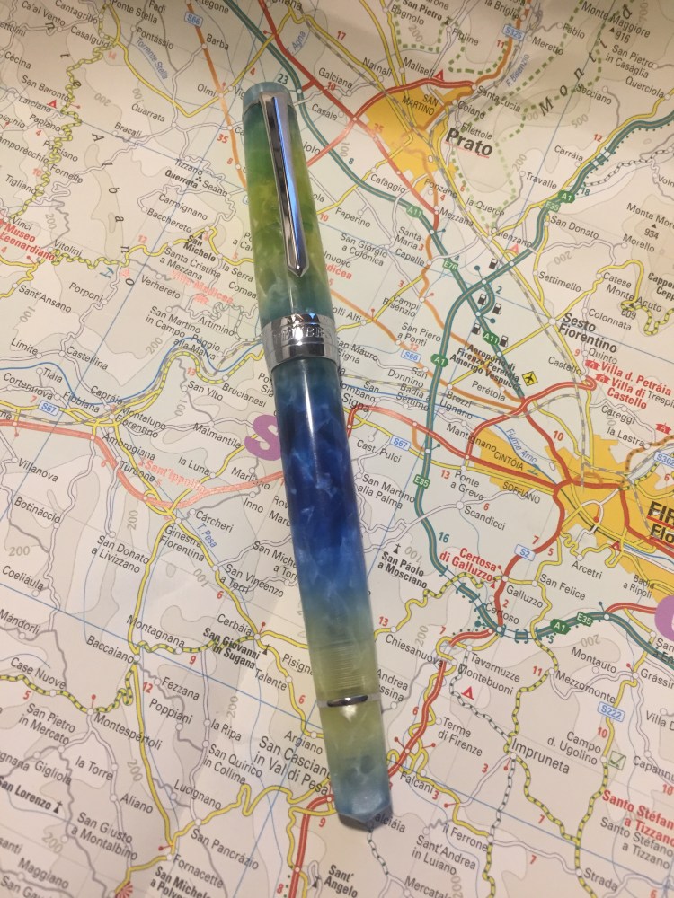
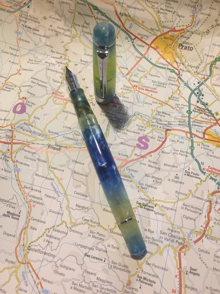
But the pen is the thing, right? As amazing as the packaging is, we’re here for the writing experience, not the unboxing one. So here it is, the PenBBS 309 Hawaii:
Isn’t it pretty? The pen is semi-translucent, with a lot of depth and chatoyance. It’s also pearlescent in places, as you can see in the tip or near the section. I filled it with Sailor Bungubox June Bride Something Blue ink and you can see some of the colour coming through the body (and a slight smear of ink in the cap, where I didn’t clean it properly after filling before capping it).
The only thing that I don’t quite like about the pen design is the super wide metal band on the cap. It has “PenBBS” and “309” engraved on it, but it cheapens the pen because of its width, not because of the branding.
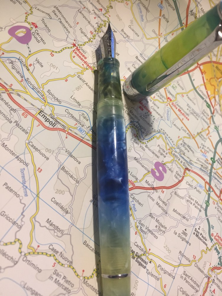
The nib looks great, with some thoughtful scrolling engraved on it, as well as the nib width (fine. It only comes in fine). The pen is quite standard in its width and weight, and very comfortable to use in long writing sessions. The section looks sleek, but is much less so than the Lamy Studio, and the lip on the edge prevent your fingers from accidentally hitting the nib and getting inky.
The fine steel nib offers a tiny bit of line variation as you tilt in (not the flex kind of line variation that appears as you apply pressure on the nib). It’s smooth but does provide feedback, and depending on how you hold it, you may feel more or less of that slight feedback as you write. I enjoyed writing with it, and because it’s a light acrylic pen, its comfortable for really long writing sessions.
Because its a fine nibbed pen I thought that I’d try it on my current journalling Moleskine. To my surprise this pen and ink combo worked fine on that paper. There are a few dots of show through here and there, but nothing that bothers me. Again, YMMV, and this LotR Moria Moleskine isn’t advertised as having fountain pen friendly paper, but I’ve been enjoying journaling with my PenBBS on it.
The PenBBS 309 is a piston filler, which for this price is unconscionable, especially considering that the piston mechanism works smoothly (and without squeaking) out of the box. The Pelikan piston fillers do feel better than the PenBBS one, but they come at a much higher price.
Whether you’re just starting with fountain pens or you have a sizeable collection already, the PenBBS 309 is well worth purchasing and trying out. I look forward to trying other PenBBS pens after this one, and I love that companies like PenBBS allow people to have a great fountain pen experience at such an affordable price.
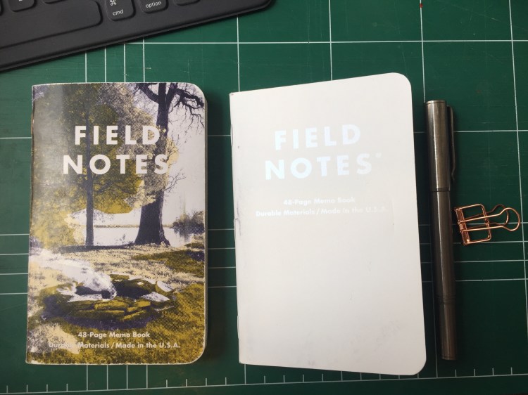
Out: Campfire Dawn. This is one of the editions that I learned to love the more I used it: it just wears out so well.
In: Snowblind. Somewhat ironically this edition shows itself off best in the summer. It’s going to get dinged up and grimy, but that’s just what happens to used notebooks, especially ones with light coloured covers.