Two Caran d’Ache 849 Ballpoints Limited Editions – Keith Haring and Nespresso Kazaar edition
The Caran d’Ache 849 ballpoint is a classic which I have already reviewed in the past. While I rarely use ballpoints, I have several of these pens (all with gel refills that I have swapped instead of the Caran d’Ache Goliath ballpoint ones). Why? Because of their excellent limited edition designs.
While I was in London in April I picked up two new limited edition 849s – The Keith Haring edition in red and white, and the latest 849 Nespresso collaboration.
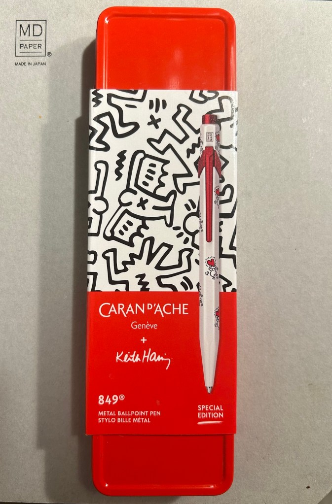
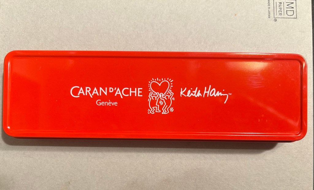
The Keith Haring edition comes in black and in red and white. I think that the red and white edition is nicer, and it appears that so do other 849 fans: the black edition is still widely available but most places have long sold out of the red and white edition.
The box is very nice, and makes for a nice gift pack.
Inside the box you also get to see some of Haring’s work.

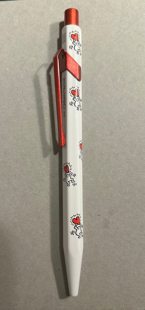
The pen itself is white, with a sparkly red knock and clip. The paint on these feels like lacquer, and the look is sleek and bold. There are dancing people holding red hearts all over the pen (so you get some Keith Haring artwork, but it’s not overcrowding the pen), and the pen body’s finish is the standard 849 glossy finish.
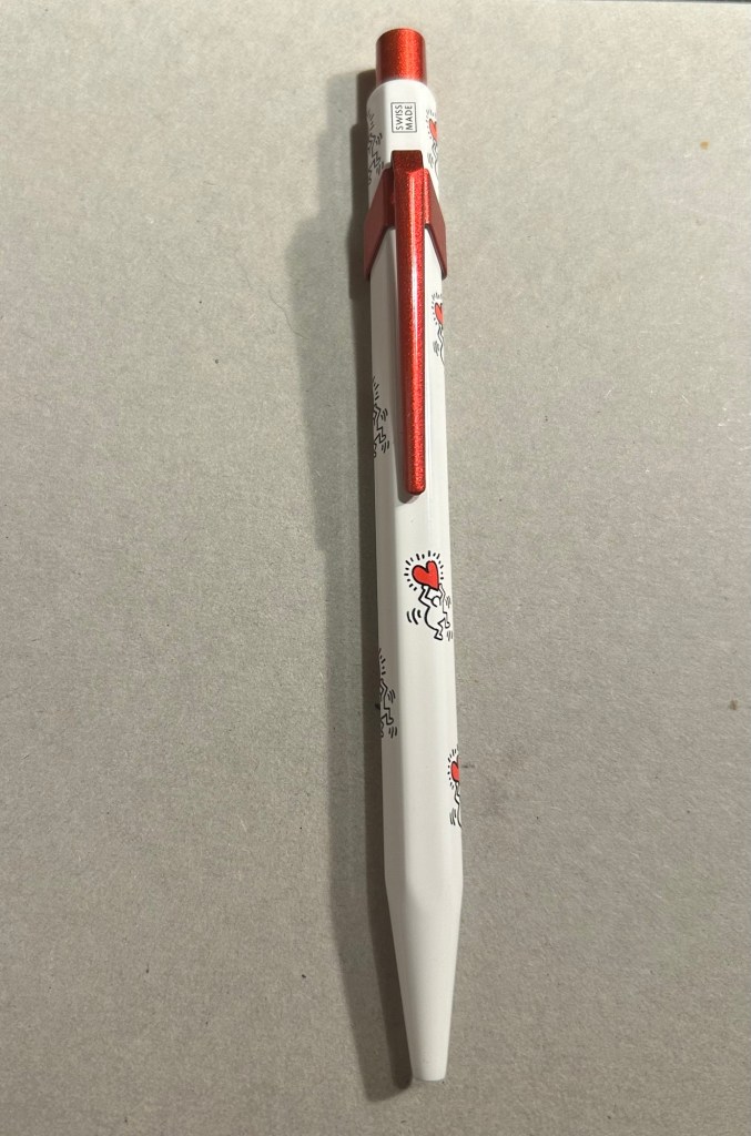
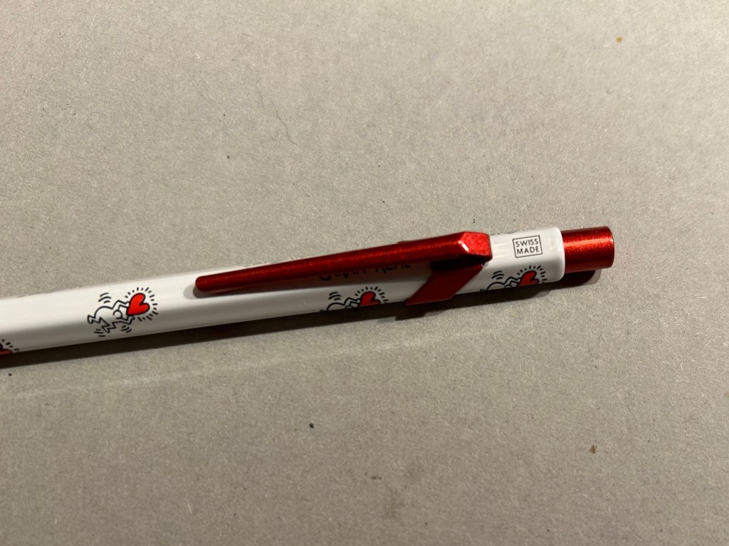
The knock and clip are probably the most striking thing about this pen. Surprisingly Caran d’Ache didn’t put any Haring branding on the pen, not even hidden with their branding under the clip.
The paint on the clip and knock look like someone poured them out of red glitter paint, and then waited until they set. All in all the result, together with the Keith Haring artwork and the included box, is one of the best 849 gift pens I have seen.
The Caran d’Ache Nespresso Kazaar edition, the 6th Caran d’Ache and Nespresso shared edition, is a bit different than previous editions. Unlike previous editions that featured a silver clip and knock, the Kazaar edition is monochrome. The dark blue pen has a clip and knock in matching colours, and the result is much better than previous pens in this series.

As usual the pen is made at least in part from aluminium from Nespresso Capsules. The pen body has a bit of a matte texture to it, which makes it slightly easier to grip. It comes by default with the excellent Goliath refill, this time in black (the Keith Haring 849 also came with a black Goliath refill).
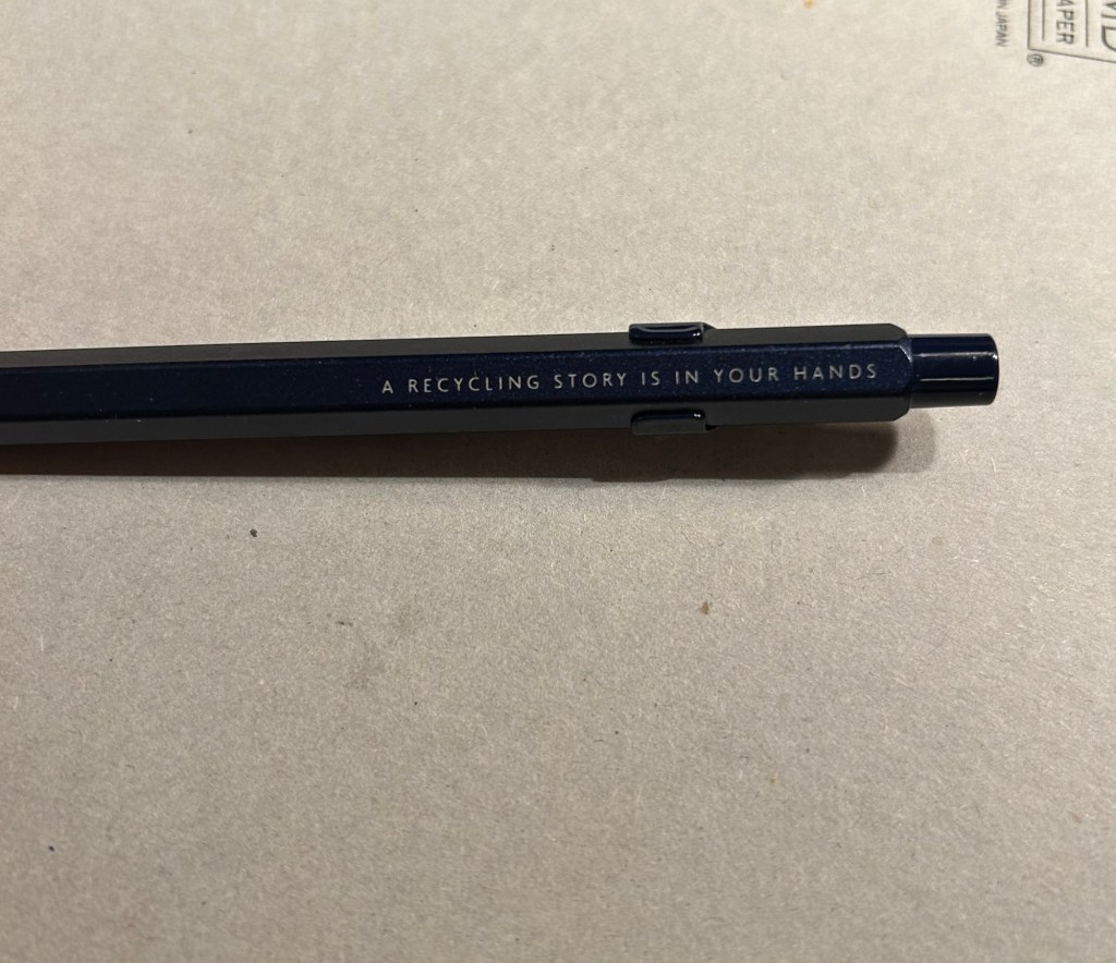
The 849 Nespresso came in the same sort of recycled cardboard box that previous editions came in. It makes for a good gift pen, even though some may find the dark navy blue colour a bit… boring.

If you like the idea of the 849 Nespresso but don’t much like the colour of the Kazaar one, I’d recommend waiting for the next edition. I have a feeling that it too will feature monochrome hardware, and it might be in a brighter colour as Nespresso are starting to run out of drab capsule colours.
Note to those who prefer gel ink refills and plan to swap the 849 refill out: the tolerances on these 849 pens are a bit weird. There are 849’s in which you can easily swap the refill for any Parker style refill with no issue, and those in which if you swap the refill you find that the knock won’t properly engage it. This is something worth taking into account if you plan on swapping the refill in the pen – there’s a risk that it won’t work with the specific pen you own. I’d recommend in this case to try swapping the refill before you purchase the pen if possible, or resign yourself to using a ballpoint. The Caran d’Ache Goliath refills are several cuts above what you get in a standard, disposable ballpoint, so the loss shouldn’t be too great.
What about you? Do you like the 849? Do you swap its refill?