Once a year Schmincke, the German art supply company (makers of the best watercolours in the world) produce a limited edition colour out of the leftover pigments they have. The pigments come from their pastel production- which uses almost 100% pigment.
In 2024 the made an acrylic Random Grey. In 2023 the Random Grey was a pastel.
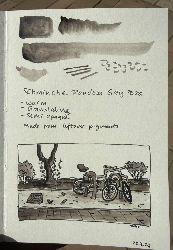
This year’s Random Grey is a watercolour. It’s a warm grey, granulating, and semi opaque. While I normally prefer cool or neutral grey’s, this colour looked interesting enough for me to give it a try.
The paint comes in a 15ml tube and though it’s a series 1 pigment it cost double the price of Schmincke’s usual series 1 watercolours (note: professional watercolours are usually priced differently by the kind of pigment they use. Blues tend to be more expensive than earth tones, for example. Schmincke’s series 1 are the cheapest and series 4 the most expensive). I’m not surprised as it’s a limited edition, but if you’re just looking for a warm grey Random Grey isn’t the most cost effective option.
Sample sketch and swab
I filled three half pans with Random Grey (one for me and two to gift) and there was plenty more to go around, so if you’re interested in this watercolour but are price conscious you can try finding other artists in your area that would be willing to split the tube. Schmincke’s watercolours are superb and it’s very easy to fill a pan or half pan with paint, let it set for a day or two and then use it.
The shade really surprised me. Yes, it’s a warm grey, but it’s not too far away from a neutral grey to become unusable for all but certain lighting conditions. It does not have that yellowish brown tinge that makes warm grey’s so… atmospheric. I enjoyed using this pigment, its granulation and layering possibilities enough to add it (at least temporarily) to my watercolour palette.
Is this a bit of a gimmick? Yes. Is it also a fun and interesting grey to have around? Also yes. I look forward to mixing and combining it with some pinks and reds and seeing what comes out.
Note: I sketched this on Pith paper, which is not watercolour paper. On watercolour paper Random Grey’s granulating properties will be even more pronounced.
John McPhee is a master creative nonfiction writer. He excels at bringing people and places to life, bringing interest and life into topics that seem at first esoteric or dull (like oranges).
The Pine Barrens is a huge near wilderness sandy pine forest in New Jersey, enclosed by suburban industrial sprawl. A handful of people live there, (“pineys”) many of them living an almost pioneer way of life, steeped in folklore and local traditions. The pine, cedar and oak forest ecosystem is also unique, tempered seasonally by fire, growing on poor sandy soil, with cranberry and blueberry bogs dispersed among them.
McPhee zigzags across the land, painting a portrait of people and places, moving between past and present, science, history, folklore and myth like the master storyteller he is. It’s clear from the elegiac tone of this book that McPhee circa 1967-68 was expecting the place to be gone within a few years. Plans for a monstrous jetport, a sprawling city, industrial estate and housing was in the works, and the ecology, history and spirit of the place was about to be utterly destroyed. McPhee was there to document the Pine Barrens, preserve what he could before they were gone. They are still there, and the development fell through, like most other Pine Barren real-estate bonanzas.
Being McPhee he also shows you the developer’s side of the story, the state’s view of the place, and the darker side of the Pine Barrens and its people.
While I understand McPhee’s deliberate choice to make this a wandering narrative, much like the sandy trails in the forest that people get lost in, I think that The Pine Barrens isn’t the best of his writing precisely because of this structural choice. The resulting charm of the piece doesn’t make for the lack of “oomph” that other McPhee pieces have. Comparing The Pine Barrens with another elegiac book of his, Looking for a Ship, and you see that the ending lacks something. Perhaps a wildfire would have brought home the fragility and resilience of this unique place.
All in all, a recommended book, well worth your time even if it isn’t McPhee’s masterpiece.
I bought A Visit from the Goon Squad back in 2011, as it was part of that year’s Tournament of Books. It has languished on my Kindle ever since. This year, however, I have decided to read the oldest unread books on my Kindle, and so it was A Visit from the Goon Squad’s turn.
First of all, the book has a dreadful name. It’s trying to be sophisticated, it ends up being uninformative and unappealing. It’s sounds like a book about comedians, or maybe a family saga of some kind, but it’s basically a string of partially connected episodes about people that work or have worked in the music industry.
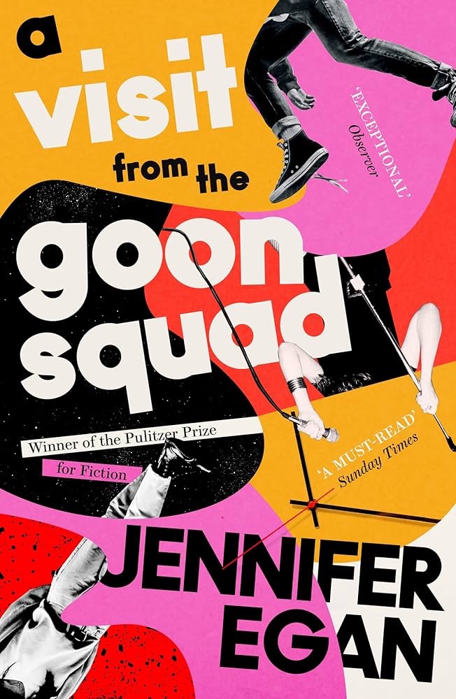
The post Pulitzer win book cover
I almost gave up on this book as about 50 pages in I found myself not liking any of the characters and finding the narrative dull and bland. Then Rhea appeared, and I found myself pulled into the story. She redeemed the book, and it got better and better as I read along.
A Visit from the Goon Squad is a very readable book, apart from the deliberately dreadful writing of the only writer in the novel, Jules Jones. There’s a character that didn’t redeem himself – the more I saw of him the less I liked.
The book didn’t age well, and will likely age even worse with time. It’s embedded in a certain era – pre smart phones, social media and AI – but it’s not written in a way that will allow it to be timeless. The powerpoint penultimate chapter reads as a dated gimmick, and the last, “futuristic” chapter is truly terrible. It really brings the book down, as even for its time it serves mainly as a window to Egan’s biases and anxieties more than to the true zeitgeist of the time.
Egan’s choice to build the narrative on episodic encounters with loosely connected characters was groundbreaking for the time, and the book won a Pulitzer Prize. In 2019 Bernadine Evaristo will take this concept and do it much, much better with Girl, Woman, Otherthus leaving Egan’s novel in the dust.
While I don’t regret reading A Visit from the Goon Squad I wouldn’t recommend it. It didn’t stand the test of time, there are much better books to read, and it’s attempt to capture the zeitgeist of a time so fleeting it practically didn’t exist (the oughts) isn’t worth the reader’s time. Read Evaristo’s novel instead.
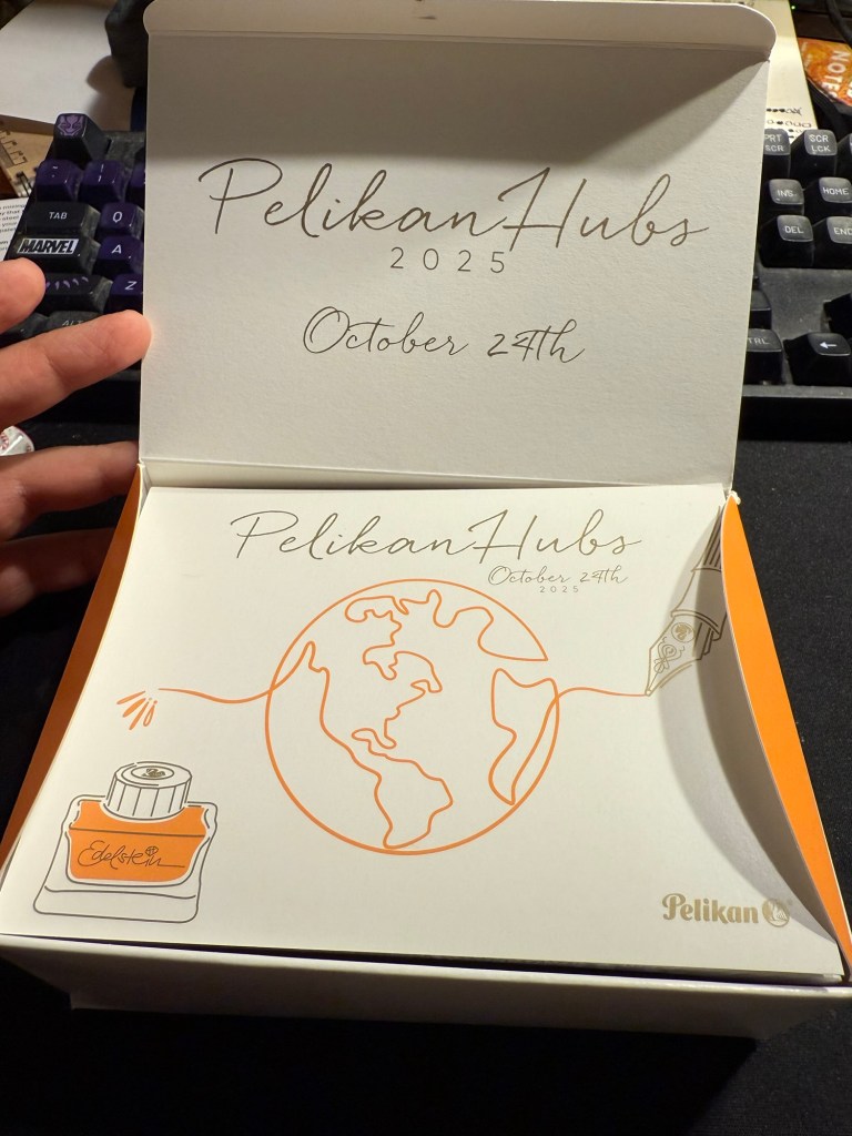
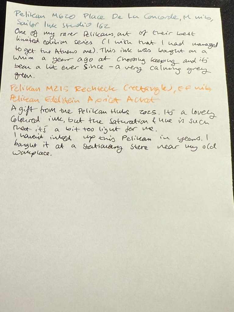
Yesterday was the 2025 Pelikan Hubs event. Pelikan is so wonderful to organize these events, so generous and thoughtful with their gifts, and I love the company and their pens so much that I’m really heartbroken that this isn’t just a glowingly happy post.
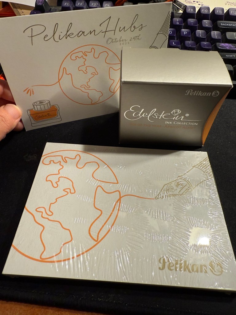
This isn’t Pelikan’s fault. Their organization was as usual, impeccable. Their gift was tremendous – a beautiful box, with the Edelstein’s ink of the year Apricot Achat, a postcard and a notepad. Everything was so well designed it was breathtaking to open the box and see it all laid out perfectly.
The box
Here’s the open box and the postcard:
The open box and the postcard
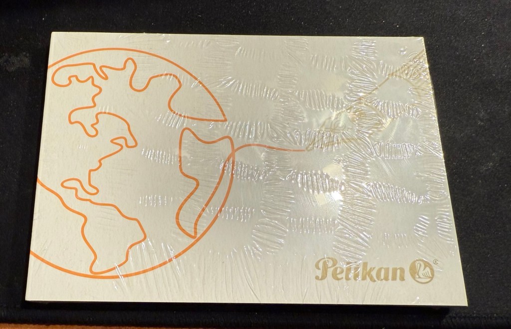
Here’s the notepad. You can see the design on the cover better in the next photo, but the paper is smooth, thick and perfectly fountain pen friendly.
Small notepad
I love the design of the cover of the box, the postcard and the cover of the notepad. It’s playful but elegant, and it works well together and ties in well with the typography and the design of the Edelstein box. That’s a 10/10 for design and quality.
Everything that was in the box: postcard, Edelstein Apricot Achat ink, and notepad
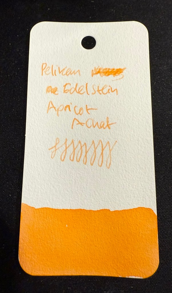
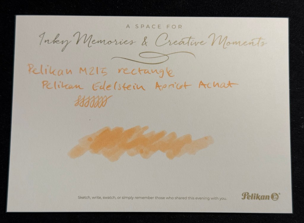
The that we received is the Edelstein Apricot Achat, which is the ink of the year 2025. The bottle is gorgeous, and the ink is non-shimmer this year, so it should be easy to clean out of pens.
Edelstein Apricot Achat
The ink itself is indeed an apricot ink, with a hint of shading. It’s bright but light – a tad too light for me if I’m honest. I think that this exact ink just slightly more saturated would have been the perfect orange for people who like their orange right in the middle of the orange spectrum – not too yellow or too red.
Swab on Col-o-Ring
I filled a Pelikan M215 Rechteck (rectangle) with this ink, but I chose poorly, forgetting that it has an EF nib. Pelikan EF are on the wide side, but this ink would fare better in a medium or even a broad nib. I will still enjoy it as it works well with the other inks I currently have in rotation, but if you are looking to use this ink I’d suggest wide and generous nibs for it.
Writing sample on Kokuyo paper.
I tried it on the Postcard. The paper isn’t coated but is still rather sleek:
The postcard with an ink swab and writing sample
So thank you very much Pelikan for organizing this worldwide event and for your wonderful gift! I am actually considering buying the matching M200 because I like the look of the ink.
Now for the sad and ugly part:
Pen collection has a misogyny problem. I have experienced it during the previous Pelikan Hubs, I have experienced it when I tried to buy pens in brick and mortar shops, in flea markets, from pen makers. I experienced it during this year’s Pelikan Hubs and I’m tired of it, and kind of tired of all the talk about how wonderful and welcoming the pen community is. It’s wonderful and welcoming if you’re a guy, and time and again I have seen it close ranks and snarl if you’re a gal.
Just during yesterday’s event, where I stayed on for less than an hour (and even that was just to be at the edge of the group photo), I was told several times that:
Women don’t collect pens.
Only men collect pens.
I am not a real pen collector.
I can’t possibly be a pen collector.
I can’t possibly have enrolled to the Pelikan hub.
I am there as someone’s plus one.
Women don’t understand pen collecting.
I am a rare bird, the exception to the rule.
They had facts to back it up, they said. Their closed pen collectors group only had three women in it. That proved the point. I eye-rolled so hard. I had met and talked to one of the other female collectors at last year’s event and I fully understand why she didn’t brave this treatment to collect her gift this year. It’s because nobody wants to go out of their way to spend their precious free time with a bunch of *holes.
There are women collectors, they have every right to enjoy this hobby, and if you’re a guy and you don’t see women in your group, it’s not because they don’t collect pens. It’s because you’ve created a group that women don’t want to join.
Do better.
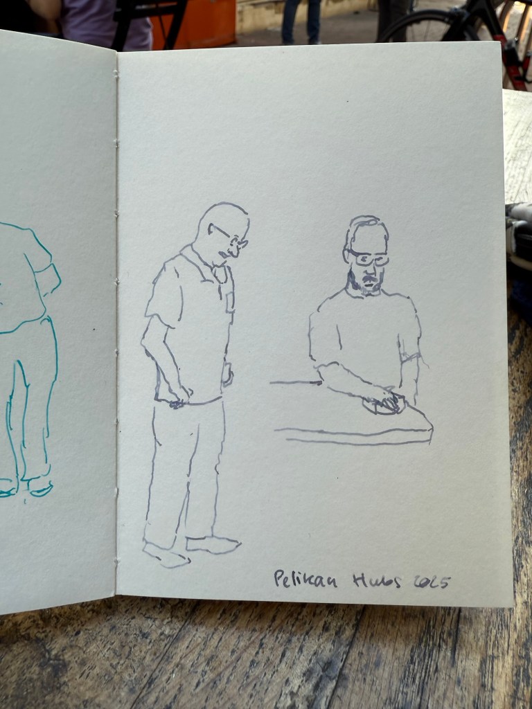
End of rant – and to end on a more positive note, I did manage to do a few 2-3 minute sketches while I was waiting for the group photo:
Sketched with Pelikan M805 Ocean Swirl F nib and Montblanc Maya Blue on a Pith Kabosu SketchbookSketched with Pelikan M605 Stresemann M nib and Sailor Ink Studio 123 on a Pith Kabosu Sketchbook
Thank you again Pelikan for the wonderful event. I intend to return next year even if the menfolk find my presence abhorrent. There were a few nice fellows that were willing to talk to me, and I will not let the trolls dissuade me from participating in a hobby that I have been enjoying for close to 20 years.
The final post of this series, you can find part one here, part two here, and part three here. Grab a cup of tea or coffee and settle in – this one is long but there’s a lot going on here that’s worth your time.
32. I have been tracking my memory recall issues (a chemotherapy side effect) using the Tally app, which I’m hesitant to recommend. On the one hand it does work as a quick tracking app for a handful of things, but on the other hand it has a scammy pricing model – a fair price for the first year (and free if you just track up to three things, like I do), but then the subscription jumps to about $5 a month. That may be justified for apps that have a lot of features and utility, but Tally is not one of those apps. Day One, a magnificent journaling app for those who prefer to digitally journal, does much more and costs much less.
33. If you haven’t heard of KT tape and you’re a runner or athlete of any kind (or just injury prone) I highly recommend it (and no, I’m not getting paid for this). It’s a roll of pre-cut elastic fabric tape strips that you use in various configurations and levels of tension to relieve the pain and take some of the load off of injured muscles, tendons or joints. It eases recovery and it’s worth having a roll of it in your house and travelling with a few strips when you go abroad. There are YouTube videos that show you how to apply the tape- just search for the area or injury you want to address and “KT tape” and you’ll find official videos and ones made by physical therapists that will guide you. I recommend going for the Pro or Pro Extreme – they cost a bit more but last longer as their adhesive is stronger so you can keep them on for a few days. The tape leaves no residue and is easy to apply by yourself, although there are areas where another pair of hands does help. If you don’t want to buy the tape online, you can find it at your friendly local running store or in certain sporting goods stores.
34. If you are planning on travelling abroad with older relatives or people with a mobility disability, here are some tips that may help:
Ask for special assistance when you book the flights (there’s an option there). It helps with the long distances and long lines in the airport. Arrive early and wait patiently for the assistance – it’s worth it.
Book hotels and not Airbnbs. You want a place, preferably a well established chain, that you can rely on in terms of catering for your accessibility needs. I can’t tell you how many times we arrived at an Airbnb only to discover that the promised elevator has been broken for weeks, or the place has stairs to the elevator, stairs in the apartment and a bath instead of the promised shower. You want a hotel and not a boutique one because they’ll have an elevator bank, accessible rooms, and someone you can talk to if you run into issues. Chains are good because if there’s an issue with your room there’s a possibility of being catered in another hotel in the network. Contact the hotel ahead of time in writing and reconfirm your needs – elevator, shower with no lip or step, mini-fridge for medication, etc.
Use taxis (or rideshares) and buses, not the metro/underground/subway. There’s less walking involved, there’s less stairs involved, and it’s worth the additional time and money.
Check the parks you plan to visit – some have motorized tours for disabled patrons.
Talk to the staff at museums and exhibitions, preferably ahead of time. There may be an accessible route in that Dior special exhibition that isn’t advertised (there is), or they may tell you that it’s better to arrive at a certain entrance.
Theatres oftentimes have special accommodation and pricing for disabled people and their companions. If it’s not on their official site, email or call them and they will likely be able to help.
Don’t pack your days full, but rather plan or returning to the hotel for an afternoon nap before the evening’s activities.
Plan ahead as much as possible. You are less flexible in your needs so this is not the time to be spontaneous.
I can’t stress this enough: spend time, effort and money when selecting travel insurance. Don’t go for the cheapest option because it’s likely to leave you hanging when you need it. Pay a premium for insurance that pays back upfront and doesn’t have you chasing after it if possible. Take the time to read the small print and talk to them if possible.
35. I have gotten several questions about rucking, so here’s a good article describing what it is and the benefits and risks involved. I will add that you need a good pair of shoes with decent ankle support, you need moisture wicking socks to help avoid blisters (I just use my running socks), and you don’t need to buy a GoRuck bag. In fact I don’t recommend them – they’re heavy, overpriced and don’t provide the back support you want. Instead buy a good hiking day pack (I use the Osprey Manta 24) for about half the price and twice the support. My Osprey Manta comes with a hydration system (2.5 litres, which is a good chunk of the weight in my bag), wide padded straps, load lifters, a great hip belt and sternum strap, plus a mesh that is fantastic for the hot climates I ruck in. Also weigh your bag with useful things – water, food, first aid, extra layers, flashlights, sunscreen, etc. – and not with useless weight plates. Put the heaviest things on top, as close as possible to your shoulder blades and upper back. I use a waterproof Rumpl travel blanket at the bottom of my bag, and 80% of my weight is water. The rest is books, which I don’t mind using as weights as I’m rucking in a city park really close to home. If I was hiking in the great outdoors, I wouldn’t carry anything that wasn’t useful if I somehow got stuck on the way.
36. Do you have to generate QR codes and are tired of the spammy, ad filled sites that provide the service when you Google for it? As Cory Doctorow puts it:
“Just a QR Code” is a new site that generates QR codes, operating entirely in your browser, without transmitting any data to a server or trying to cram ads into your eyeballs. The fact that it runs entirely in-browser means you can save this webpage and work with an offline copy to generate QR codes forever – even if the site goes down:
37. My journal is at that delicious phase where it’s passed the 3/4 full mark but hasn’t reached the “only a handful of pages left” mark. I recommend making it a goal to reach that phase in every notebook you use – it’s the best.
38. These little fans are a lifesaver. I’ve used them on trips, on buses with fault ACs, when I’m outdoors waiting in the sweltering heat, etc. Again, not an affiliate link and this isn’t a paid anything – it’s purely a recommendation of a product that I’ve been using and enjoying for a few years.
39. Journaling Tip #4: Did you have weird, overblown reaction to something or someone recently? Take the time to journal about the experience. Write down what happened (facts only), what was your reaction/feeling (be honest), why it’s surprising under the circumstances and finally why do you think that you reacted the way that you did? Does it reveal something about how you view yourself, your insecurities or fears?
40. Lightening Book Review #7: What We Talk About When We Talk About Love, by Raymond Carver. This is a collection of 17 short stories set in rural American in the 70’s first published in 1981 and it hasn’t aged well. The protagonists drink a LOT, they are violent, sexist, despairing and desperate. It’s like watching a series of car crashes – you become numb to the experience after the third or fourth. Carver can write, and there are a few gems here, but it’s all so very miserable and depressing – like hosting an alcoholic for a week. Their stories may be intriguing, but they’re also all so very terrible and tragic that there’s only so much of it that you can take.
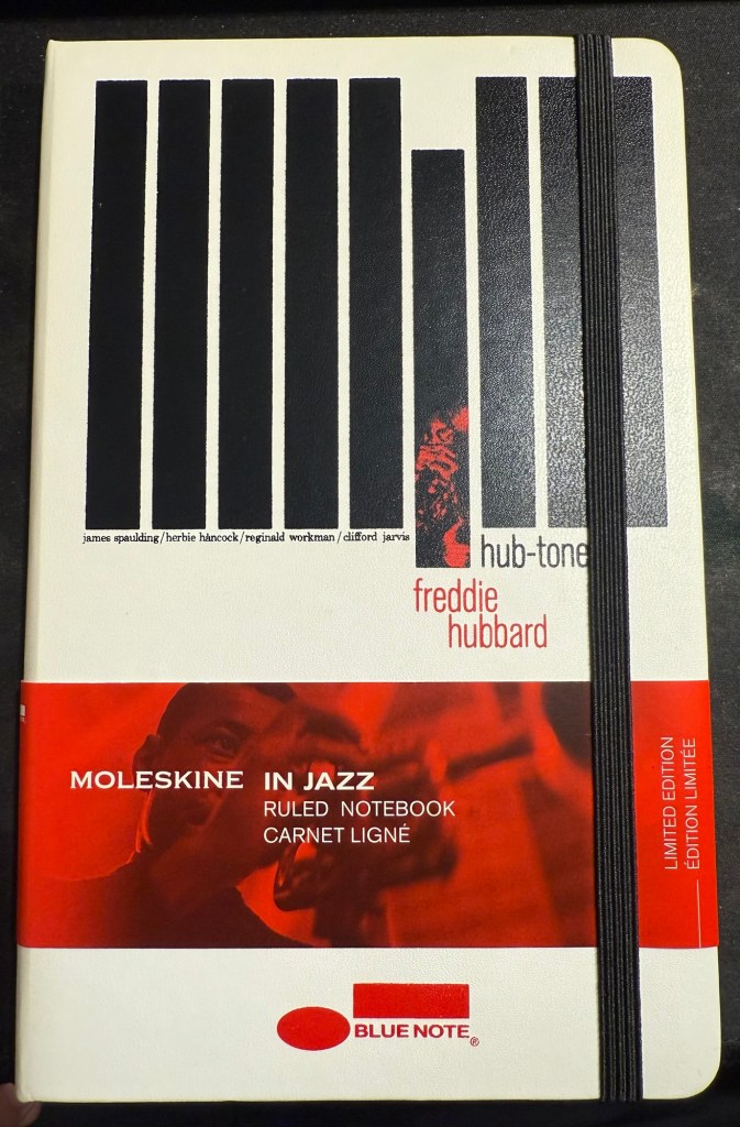
41. I opened a new Moleskine notebook – after not having opened a new one in over a year. This is the one will be used for some writing projects, and it’s one of my favourite limited editions, the Blue Note Hub Tones edition. I’ll maybe post a review of it later, but for now, this is a reminder to use the good china.
Moleskine Blue Note
42. Journaling Tip #5: look at someone close to you, someone you admire for having a skill or approach to life that you don’t have, and write down what you can do over the next few days, week, month to be more like what you like them. That’s what got me to go to more plays, concerts, shows and exhibitions now instead of just waiting until I’m on holiday abroad.
43. Great advice from Adam Savage’s latest Tested livestream – Q-Tip: Quit Taking It Personally. More often than not other people’s behaviour and choices has nothing do with you and everything to do with them.
That’s it – 43 points for 43 years. Have a great week!
A smorgasbord of stuff for your delectation to celebrate my birthday. You can read part 1 here and part 2 here. Only one more part after this one…
23. Lightening Book Review #3: The Vinyl Detective – Noise Floor by Andrew Cartmel. This is the the 7th Vinyl Detective book and possibly the weakest so far. Set in the world of 1980s electronic music it’s not about finding a rare vinyl record this time, but rather finding an aging electronic musician. There’s the usual hipster/foodie/audiophile vibes but the plot is air thin, you will immediately know whodunnit in the whodunnit, and there’s a desperate attempt to give this Scooby-Do style adventure an “edginess” using aging threesomes and references to John Fowler’s The Magus. There is the usual boring insistence on describing every turn in every journey the protagonists take, and the characters are even more cartoony than usual. The only truly enjoyable scene is the village fête in the end, and even that is highly unbelievable. Feel free to skip this one, unless you’re looking for a cozy, featherlight read between other books and there’s nothing better lined up.
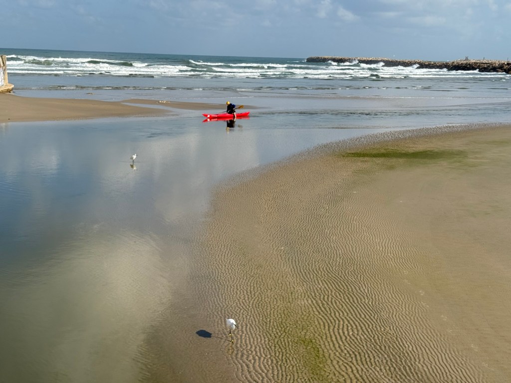
Scene from today’s run
24. Lightening Book Review #4:The Vinyl Detective – Underscore, by Andrew Cartmel. This is why I still read this series – a cozy and highly imaginative adventure with a likeable cast, in a charming and vivid setting. The crime is stylized, the new characters are vivacious and it reminds me of my favourite book in the series, Victory Disc (book #3). Take a trip back to London in the 60s, with a dash of family drama, a hint of Italian passion thrown in, and of course a sprinkling of good music.
25. Lightening Book Review #5:The Thursday Murder Club, by Richard Osman. While we’re on the topic of cozy mysteries, this one was a treat. Unexpected plot full of twists and turns, a memorable and original cast of characters, a unique setting, humour and heartache, and a it dared to touch on actual issues with substance (aging, sickness and death, religious oppression, capitalism and corruption, and the limitations of the law and its enforcers). A very enjoyable read and not just because Elizabeth is now one of my favourite fictional characters.
26. My Apple Watch Ultra 2 has been acting up lately – it’s almost 2 years old and it’s been losing battery power and struggling to keep track of my laps in the pool. So far a full charge and a restart before every swim have helped, but it’s annoying. A watch at this price level should be able to last for 3 years at least, and yet we’ve somehow been trained to expect to upgrade our watches every year or two at the most, if only because they lose their ability to keep a charge after the first year or so. Originally my watch lasted almost 3 days between charges (and I’m a very active person). Now I have to charge it once a day. I’ve been contemplating moving to a Garmin for my workouts and switching back to an analog watch, but I use some of the Apple Watch capabilities to keep track of my health post treatments, so we’ll see.
27. I have ordered the Moleskine Limited Edition Peanuts notebooks (the yellow lined large hardcover and two sets of the extra large cahier notebooks). There’s something about this collection that I find irresistible, and so they will be part of my birthday gifts this year.
28. There’s something tragic about an unfilled and unfulfilled notebook and I have too many of those lying around. I’m considering what to do with them, especially with those that I’ve started using and have abandoned after a few pages. Let me know in the comments if you have any ideas.
29. Tomorrow I start reading Ulysses having just finished The Obstacle is the Way, the last book that I planned to read in May.
30. Lightening Book Review #6:The Obstacle is the Way by Ryan Holiday. I read the 10th anniversary edition of this book, which has a new introduction and a few additions to it. This is a very digestible intro to stoicism, competently written and researched by a man with a marketing background, but it had the same affect on me that Seth Godin’s books have: it glanced on my brain and left no mark. It was hard to concentrate on this book not because it was challenging but because it was not: it was like eating easily digestible, flavourless popcorn with sprinklings of anecdotal salt at the beginning of each tiny chapter. You are left hungry and unsatisfied at the end, not sure what exactly you consumed. Philosophy should make you sit up and pay attention, think, stretch your mind and sweat a bit. It was divorced from its gravitas, substance and challenge in this book, and that’s a pity.
31. There’s no greater joy than crumpling yesterday’s to do list and tossing it out.
It’s been a long while since I’ve posted a weekly update, and it’s my birthday week, so to celebrate I decided to write 43 points (split up to several posts to make them more manageable), in no practical order:
After a bit of drama I have managed to enrol to the 2025 Urban Sketchers’ Symposium in Poznan, Poland. I will be posting about my sketchbook and art supplies packing list later on, but do let me know in the comments if you’ll be there.
Rising tariffs and shipping costs have made online pen, ink and paper purchases prohibitively expensive for me. This may not be a bad thing, as it should encourage me to use the large stash of “stuff” that I already have.
I have been gifting people nice notebooks and pens lately, and it’s been a surprisingly heartwarming success. Giving people a notebook that matches their style and needs, coupled with a pen that suites them and an encouragement to start journaling about their lives has been one of the joys of my life in recent months.
Moleskine came out with a cool Peanuts collection of notebooks and Blackwing pencils (plus a backpack and set of pins). It’s refreshing to see them use the XL cahiers for a limited edition, as I don’t think they’ve done that since the Art collection about a decade ago.
Lightening Book Review #1 (I have a huge pile of books to review and not enough time to write a dedicated post for all of them): When the Moon Hits Your Eye, John Scalzi. Scalzi is normally very good at humorous sci-fi, but this book is not one of his successes. It’s an overtly silly, very lightweight book that is not on par with the other books he groups in this loosely thematic trilogy, The Kaiju Preservation Society and Starter Villain. It really suffers from the constant jumping around amongst a giant cast – the plot loses momentum, and you find it hard to connect to any set of characters. While it was not great hardship reading it and it’s a decent light read, feel free to skip this one and wait for the next instalment of his “Old Man’s War” series.
It’s OK to splurge and buy yourself flowers every once in a while, if you enjoy flowers.
I’ve started rucking, which is basically walking at a brisk pace outside with weight on your back. I use an Osprey hiking daypack weighed down mostly with water, but also with a giant cookbook, my journal and kindle, which brings it to around 10kg of weight. I take a break about 15 minutes into my session to sit outside and journal or meditate. If you’re curious, start with a bag that has a waist belt and not too much weight for too long, and skip the $400 overhyped specialized bags and weight plates.
Go see a play (not a musical or comedy) at your local theatre. It’s a great way to open yourself to new ideas and perspectives – especially those that you don’t agree with.
Lightening Book Review #2: Lessons in Chemistry, Bonnie Garmus. I really wanted to like this book, but the combination of graphic, repetitive and unrelenting “period piece” misogyny and sexual assault coupled with a frankly unbelievable, non-relatable and largely unlikable heroine made it impossible. Couple this with an even less believable daughter and dog (though the dog is cute), lots of didactic and condescending lecturing that is so blatantly not period true and can at times be needlessly offensive (was the vegetarian bashing necessary?) and this was a book that I didn’t really enjoy. The cooking show, dog and rowing bits were nice, though.
Marvel’s Thunderbolts*/New Avengerts is a delightful, touching, thrilling and generally great movie. It’s well worth the cinema visit, and I plan to rewatch it once it lands on Disney+.
Please don’t do things just so that you can post about them on social media. That’s no way to live your life. It’s the equivalent of voluntarily turning yourself into one of the Matrix human batteries – for AI training models’ and advertisers' use.
I mostly use fountain pens when I write. If not fountain pens then gel ink pens. I rarely write in pencil, but I often sketch with pencils, and sometimes when I plan, I pencil things in. Pencil is great for writing impermanence, even though pencil marks last longer than pen ones – unless erased.
Yet there’s always a ballpoint on my desk and in my bag. I don’t like writing with ballpoint – the lines are as dark as I prefer, even with hybrid ballpoints like Uniball Jetstreams, and they oftentimes streak and blob. So why do I have a ballpoint at hand at all times?
Because ballpoint pens are a useful tool. The ink is waterproof , they’re good for signing things, and they’re robust enough to handle being tossed into a bag or a pocket. Ballpoint pens are also good for sketching – you can get a decent amount of shading and character with them (providing you don’t use a Jetstream).
One of the best bang for your buck ballpoints is this pen:
Zebra 301A BP
So why do I like the Zebra 301 A BP 0.7?
It’s made from aluminium, so it’s light and ultra durable. It also wears really well.
I love the pen body design and colour.
The grip and click mechanism are good: well designed and well made. You get a decisive click from this pen, and the plastic grip has enough texture to it to make writing as comfortable as possible without all the lint gathering, stickiness and durability issues of softer grips.
No tip wiggle.
It comes with a good, dependable, black refill that is replaceable.
Clip and click mechanism
I like the Zebra 301 A BP enough that I bought a large box of them and I frequently give them away as gifts. People like getting nice pens and if you’re used to cheap, plasticky, disposable ballpoints it’s nice getting a pen that’s a grade or two above what you find in the office supply cabinet.
Grip
Here’s a quick sketch done with a Zebra 301A BP 0.7 on a Field Notes Sketchbook. Ballpoint pen sketching isn’t my favourite technique, but it is a very useful technique for quick urban sketching.
I’m a big fan of Big Idea Design pens, ever since I bought their Ti Arto (still their most innovative and all around useful pen). I have their Ti Click EDC and liked it enough to buy the Cerakote version, their Ti Arto EDC, the Ti Mini (and the Mini Click and Mini Bolt), their Dual Side Click, their Fountain Pen EDC, their Bolt and Slim Bolt, Pocket Pro, some of them in several versions. I’m on their mailing list whenever they come out with a new Kickstarter (Big Idea Design use Kickstarter as a pre-order system, with very little risk to backers and a nice discount on whatever new product they’re working on), and I tend to back almost every new pen they come out with.
Base Line Bolt Action sketched on Moleskine paper with a Base Line Bolt Action
So when I got the email about the new Base Line Bolt Action titanium pen Kickstarter, I backed it. Unsurprisingly the Kickstarter was successful and the pen arrived in time. While the base price of the Base Line Bolt Action pen is $65 (including free world wide shipping), the Kickstarter price I paid was $55. I’m mentioning the price up front because this is one of the main selling points of this pen.
So what do you get for $65 all-inclusive? The Base Line Bolt is a short (116mm or 4.59 inch length, 11 mm or 0.435 width) full metal machined pen, with a titanium (or brass, or copper) body and clip, a Schmidt P900 ballpoint refill (it’s compatible with Parker style refills) and a bolt action mechanism that is smooth and fun to fidget with. As usual for Big Idea Design, the brass and copper versions cost the same as the titanium one.
You also get a decent enough package, one that is good enough to ship to someone as a gift. Even after our local post office mangled the package, it came out mostly intact with just a few dings. It’s a solid shrink wrap covered cardboard box, with the pen nestled inside on a foam insert.
The front of the box
The pertinent information about the pen is printed on the back of the box, with a reference to the Big Idea Design YouTube channel, where you can learn more about the pen.
The back of the box
The pen itself is well protected inside the box and comes wrapped in a plastic sheath. While I would have preferred a more environmentally friendly box, I appreciated the packaging because considering the shape that the padded envelope came in, I would have likely gotten a less than pristine pen without it.
The Base Line Bolt arrives well packaged.
Moving on to the pen itself, the Base Line Bolt is an interesting departure for Big Idea Design. Normally the pens that they make feature some sort of clever mechanism that allows for things like supporting every kind of pen refill there is, or having two kinds of click mechanisms on the same pen. The Base Line Bolt is instead focused on price point: when everyone else is raising their prices, can Big Idea Design make a good, affordable, machined metal bolt action pen?
The Base Line Bolt
The answer is “it depends”. Big Idea Design isn’t really inventing the wheel with the Base Line Bolt – the pen itself is a combination of the Ti Pocket Pro, and the Slim Bolt Action pen. It is, however, cheaper than both of these pens, which is again, the Base Line Bolt’s main selling point. As the name suggests – if you’re looking to get into your first machined pen, or you’re looking for a bread-and-butter EDC pen, the Base Line Bolt is what Big Idea Design expect you to buy. I largely agree with them, but more on that later.
The bolt mechanism, clip and finial of the pen, down to the T8 Torx screw and stepped machining, was first conceived with the Bolt Action pen. If you sliced off the business part of these two pens (and ignored the orange Cerakote on the Carryology pen), these two pens would be identical:
The Carryology version of the Bolt Action pen on top, and the Base Line Bolt on the bottom
Compare the Ti Pocket Pro with the Base Line Bolt and you can see what Big Idea Design were going for: they’re almost identical in length and in design (and they ship with the same refill), with the Base Line Bolt just being a slimmer, slightly longer version of the Pocket Pro, that supports less refill types. The difference here lies in the mechanism – the Ti Pocket Pro is a twist pen, and the Base Line Bolt is a bolt action pen. My guess is that the bolt action will be more popular because it looks good, works well, and is a fun fidget toy.
Ti Pocket Pro in metallic Cerakote blue on top, Base Line Bolt pen in the middle, black DLC with Damascus bolt and clip Bolt Action pen on the bottom
Another way to look at the Base Line Bolt is as an oversized Mini Bolt Action pen, but one way or another, this isn’t a pen that they had to factor in a lot of R&D time to design. They’ve done it before, and they know that it works. Thus the innovation in this pen lies mostly in its price point, which is also what Big Idea Design emphasizes in their marketing.
Mini Bolt in black DLC on top Base Line Bolt in the middle, Uniball Signo RT on the bottom
The Base Line Bolt is great as an everyday carry pen that you have in your bag or pocket and use to jot down a few words, maybe sign a document, or leave a note on someone’s desk. It’s too small and the Schmidt P900 ballpoint refill that it comes with is too frustrating to use in long writing sessions (the refill skips every once in a while). The choice of the design, the refill it comes with, and the refill compatibility (Parker style refills) is geared towards that – a pen used to write a paragraph or two at a time, not much more.
If you want a pen for longer writing sessions, you need to look at Big Idea Designs larger pens: the Ti Arto, the Bolt Action or Slim Bolt, the Click or Dual Click pens, etc. The Base Line Bolt is build to be the Ti Pocket Pro’s counterpart: the same pen with a bolt mechanism that supports only Parker refills, for a lower price.
Close up on the bolt and the finial
The biggest minus of the Base Line Bolt is that you need a separate tool to take the pen apart and change the refill. This isn’t the first Big Idea Design pen to require this, but I still don’t like this design choice. That being said, my assumption is that the audience for this pen (namely the EDC crowd) will have a way to deal with a T8 Torx screw. The pen ships with a decent enough refill (the Schmidt P900 costs around $1 retail, while the Parker costs $4-5, which explains why you won’t find pen sellers that use the Parker refills), and a ballpoint is the obvious choice for an EDC pen. Gel refills tend to deal poorly with temperature swings, and aren’t normally waterproof, which makes them less viable as an EDC pen refill choice.
Should you buy this pen? It depends:
If you’re looking for a gift pen for someone new to machined pens, this is a great choice that costs a fraction of what other machined pen manufacturers ask for titanium, copper or brass machined pens. The closest competitor in price and quality is Karas Kustoms, and you’re getting a different beast there (they make great pens, just not as compact).
If you’re new to machined pens and want a compact EDC pen, then the Base Line Bolt is a great choice for you.
If you’re curious about bolt action pens, or copper and brass machined pens, then this is likely the cheapest way you can try them out for yourself (using a high quality pen with great warranty and support).
If you’re looking for an EDC pen that is sleek and without the “tacticool” vibe of aggressive knurling or glass breakers, then the Base Line Bolt is a great choice.
If you are looking for a workhorse pen, one that you can write your next novel with, the Base Line Bolt isn’t for you.
If you already have a good selection of machined pens, particularly Big Idea Design pens, then you’ll likely not find the Base Line Bolt to be very exciting or particularly interesting. I’d skip this pen.
If you want to experiment with many refill types, pick the Ti Pocket pro or any one of the Big Idea Design’s full sized pens (the Ti Arto supports the most refills).
The Base Line Bolt is a solid addition to the Big Idea Design pen portfolio, and at $65 all-inclusive you get a lot of pen. Mine will reside permanently in my bag, as an “emergency pen” for those times where I need a pen but I haven’t brought my pen cases with me.
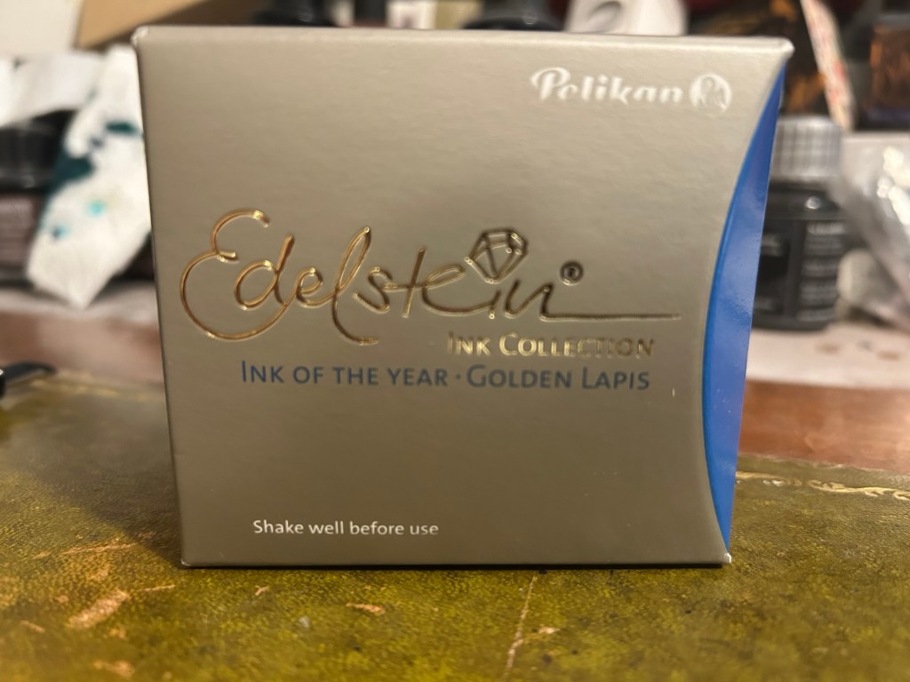
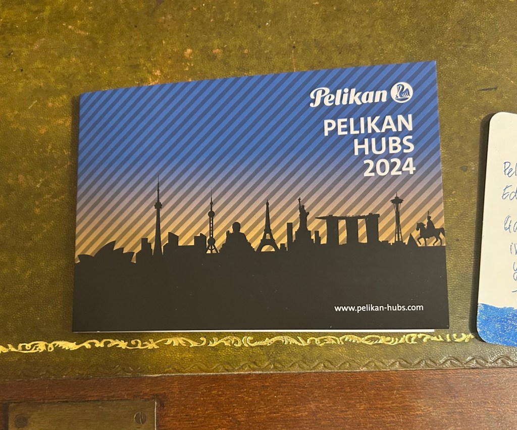
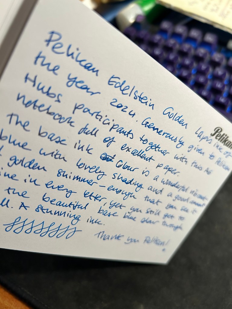
Yesterday Pelikan celebrated their annual Pelikan Hubs event, and we had a local Pelikan Hub. Since 2014 the German pen company has invited its fans to gather in groups all around the world and for one evening celebrate their love of Pelikan fountain pens and ink. The events are well organized, with a local volunteer in each country organizing the Hub location and orchestrating the event. And every year Pelikan gives Hub participants a generous gift for their participation.
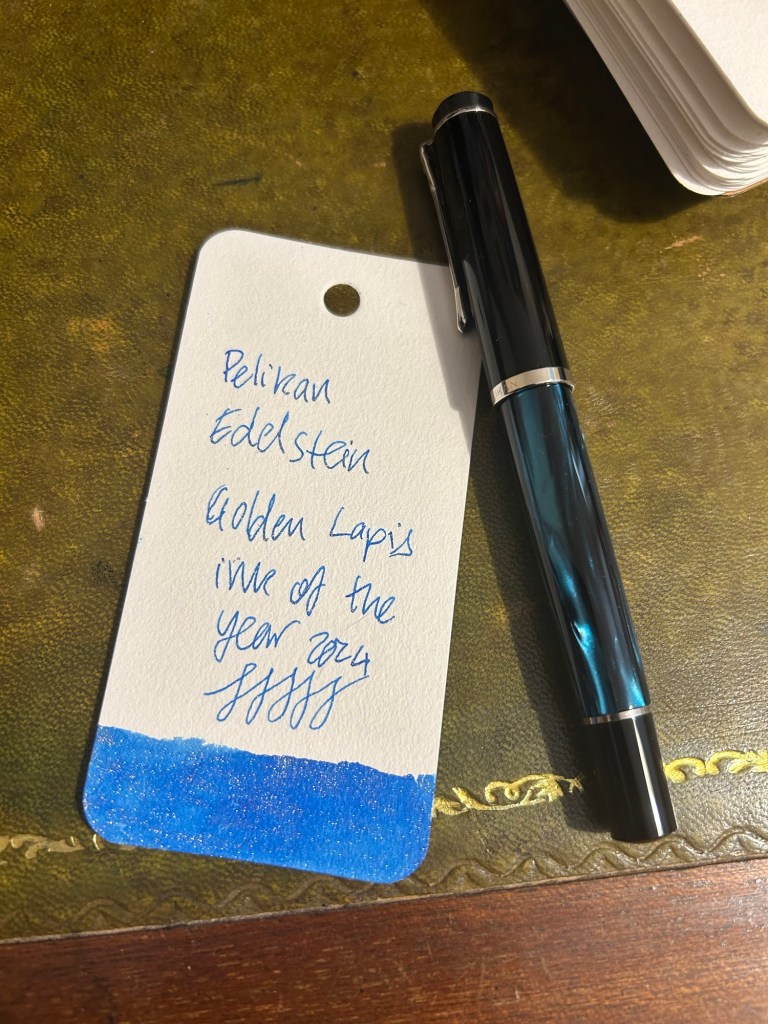
This year was no different, and Pelikan Hub participants got a full sized bottle of Pelikan’s premium ink collection, Edelstein, in the Ink of the Year 2024 colour: Golden Lapis.
Pelikan Edelstein Ink of the Year Golden Lapis
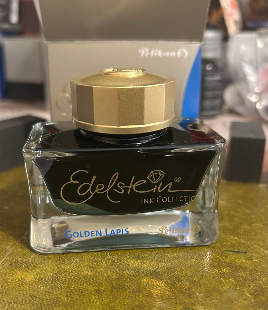
As is customary with luxury inks, the bottle is a glass work of art:
Edelstein ink bottle.
The extra thick base and wide opening work well with Pelikan Souveran pens which tend to be wider barrelled and often difficult to impossible to fill with certain ink maker’s narrow and tall ink bottles. With certain Sailor ink bottles and Diamine’s 30ml plastic bottles there’s a risk of your M400 or M800 not fitting into the bottle or of tipping the bottle while trying to fill the pen with ink. There’s no risk of that with Edelstein bottle design, though when the ink level runs very low its likely you’ll need to get creative when trying to fill your pens with ink.
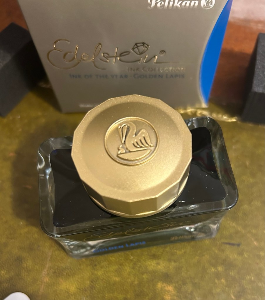
The golden cap has the modern Pelikan logo on it, with a Pelican and one chick:
The Edelstein cap
I filled a Pelikan M205 Petrol Marbled EF pen with the ink and used it for the swab and writing sample below. Here’s Golden Lapis on a Col-O-Ring card:
Pelikan Edelstein Golden Lapis ink swab
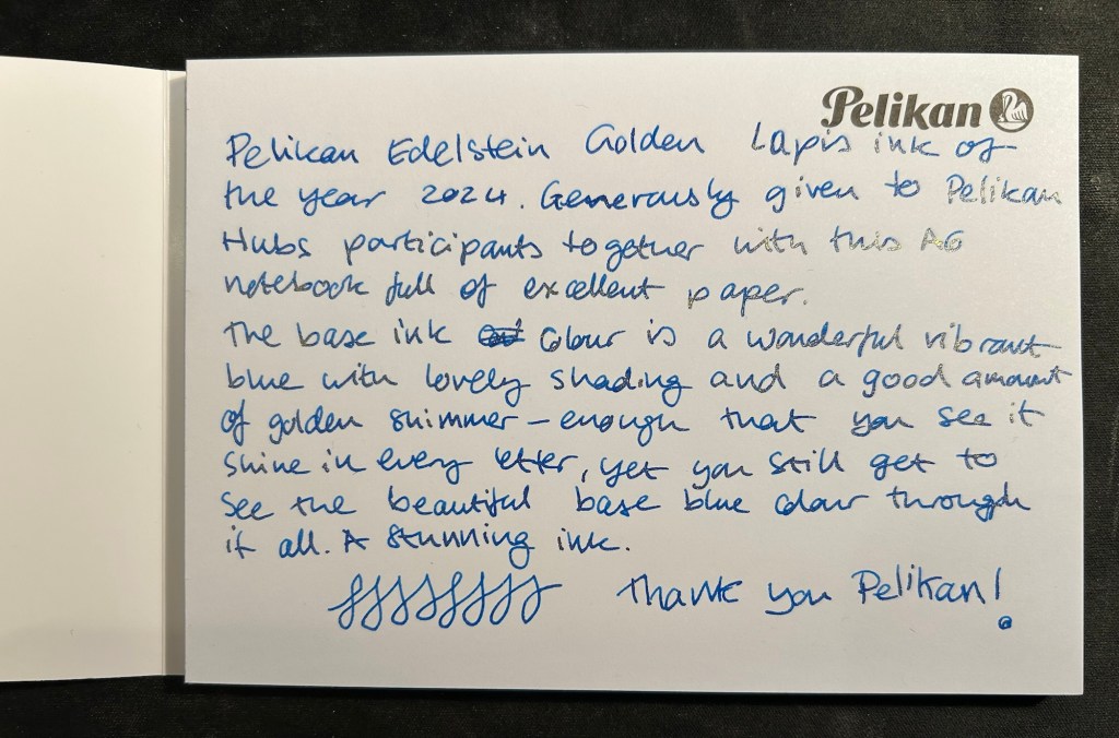
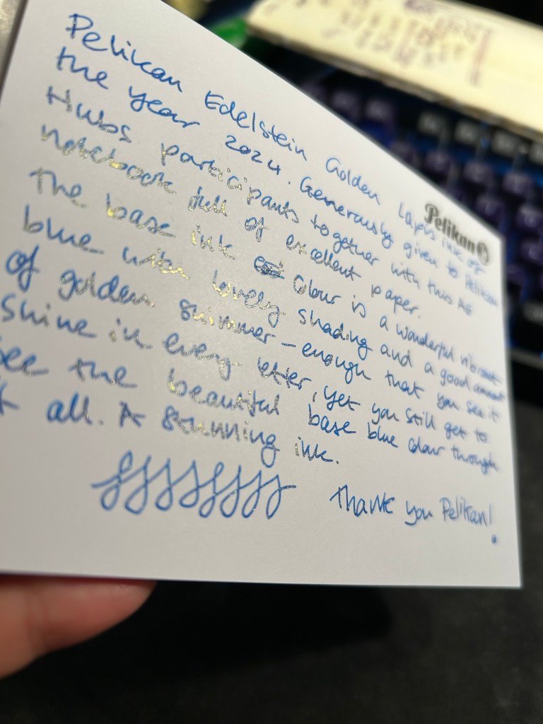
We got a nice A6 writing pad with bristol thick fountain pen friendly paper in it as part of the Pelikan Hub 2024 gifts. The paper is great though I wish there wasn’t a Pelikan logo on each page mostly because it takes so much space. The paper is thick enough for both sides of it to be useful, so it’s a shame to have to flip the page over and write only on one side if you want the full A6 page to yourself.
The A6 notepad that we received as part of the Pelikan Hub
Pelikan Edelstein Golden Lapis is a gorgeous ink, period. The base rich, turquoise-y blue reminds me of Pilot Iroshizuku Asa Gao and that is high praise. The colour is rich, vibrant and has a good amount of shading that sets it apart from standard blues. To this fantastic base ink Pelikan added lots of fine, golden shimmer, and the result is stunning. Viewed directly from above the shimmer is present but subtle, oftentimes taking on the look of sheen:
Writing sample on the Pelikan A6 pad
But tilt the page slightly and the amount of gold in each letter makes the page glow:
Tilt it to the other side and the shimmer “vanishes”, which allows you to see the lovely blue ink’s colour shading much better:
Pelikan Edelstein Golden Lapis is a spectacular ink that manages to be unique in a market overflowing with blue inks with gold shimmer. The combination of the base colour, its shading properties, and the good spread of the shimmer make this an ink worth having in your collection if you’re a shimmer ink fan.
As for the Hub I participated in: it was fantastically well organized and I had a lot of fun meeting other fountain pen enthusiasts and seeing the pens they brought.