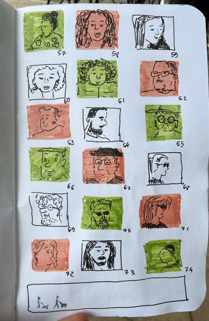
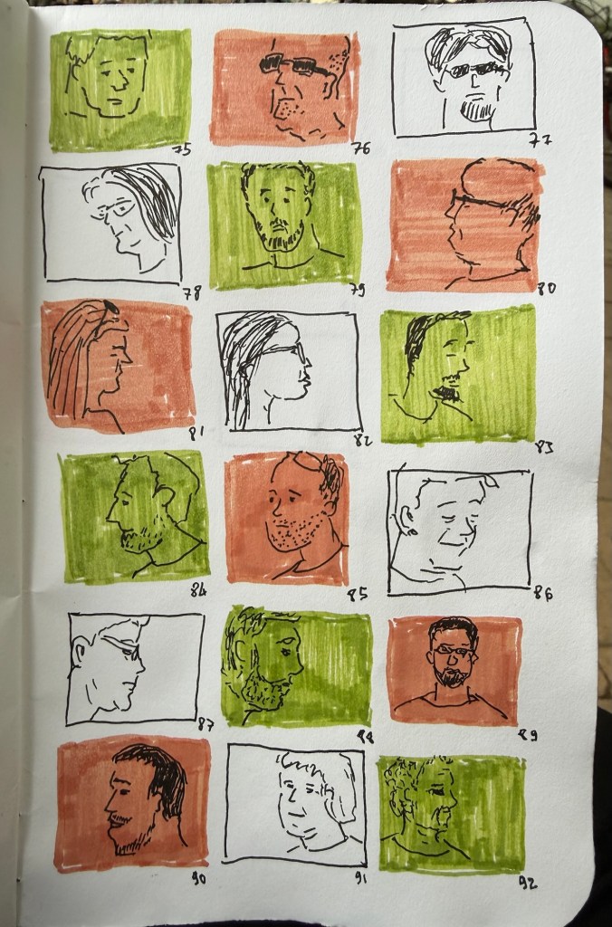
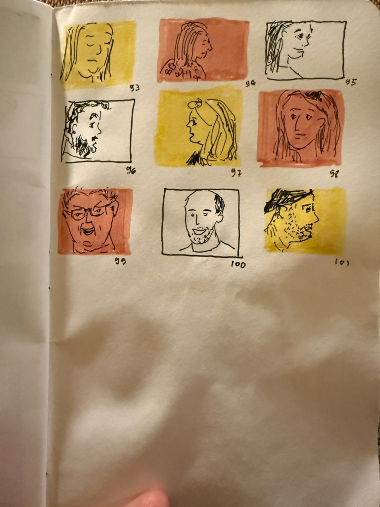
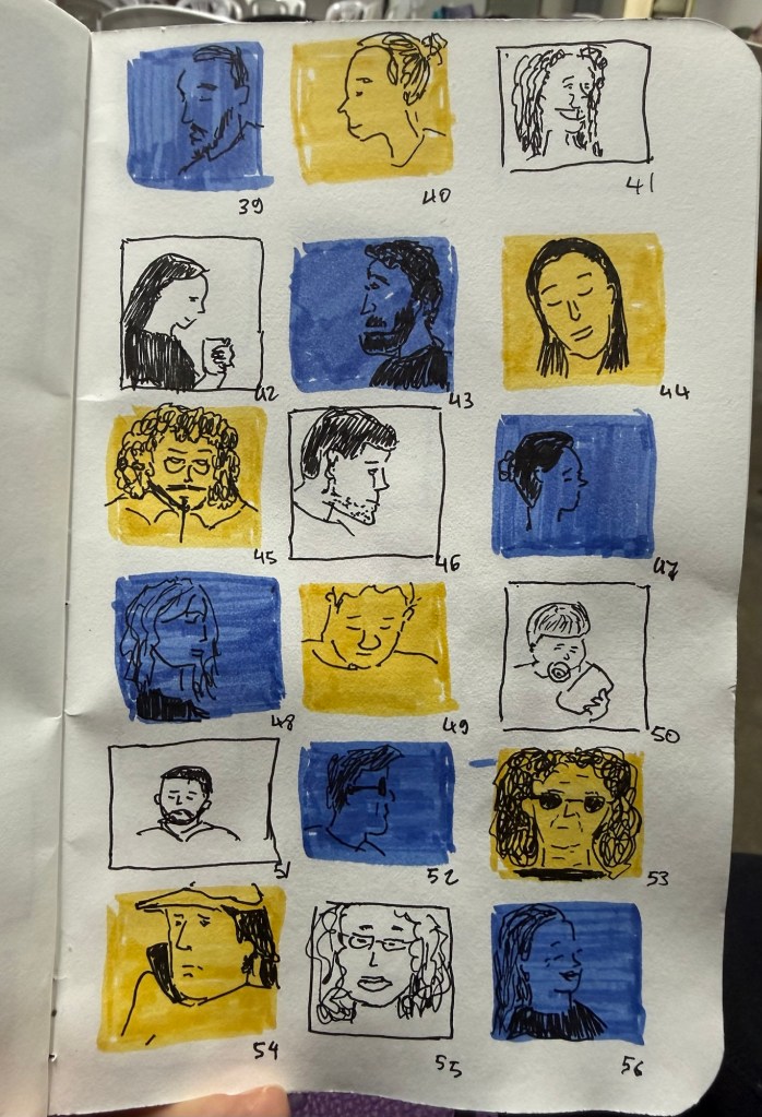
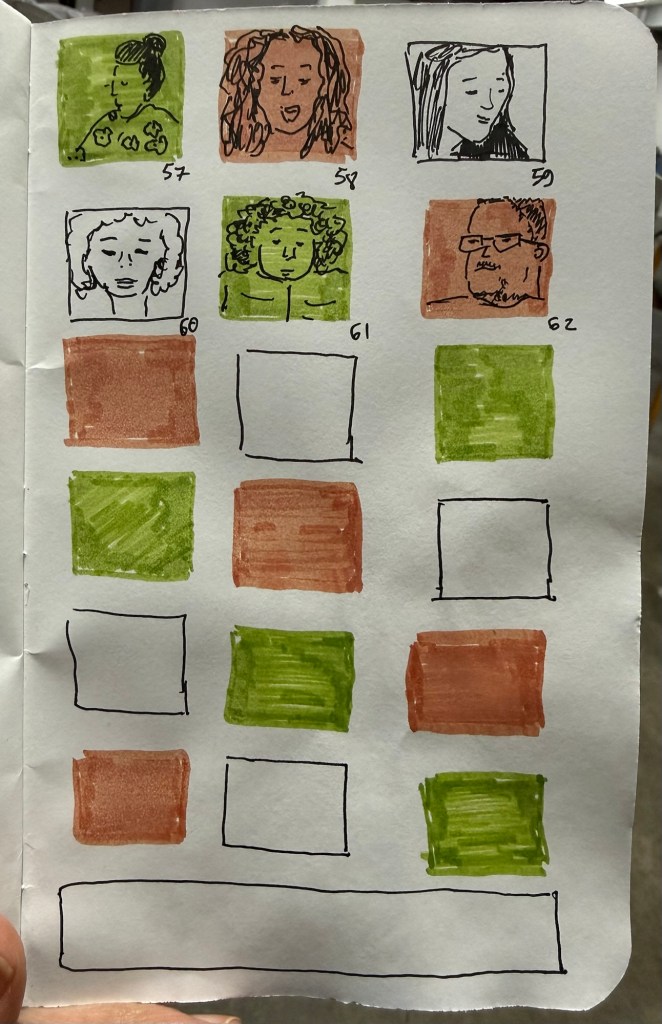
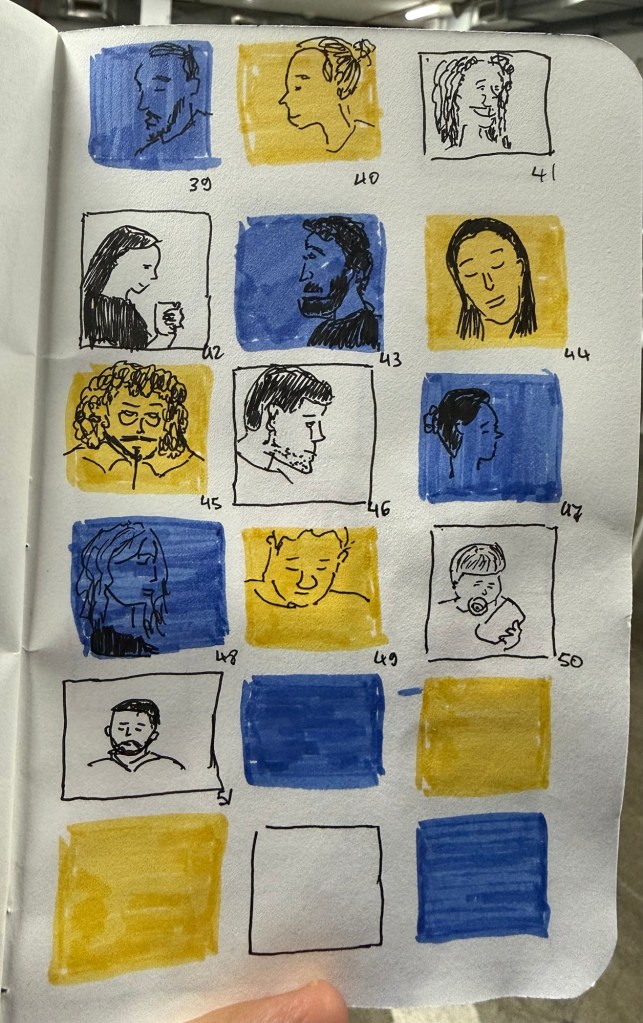
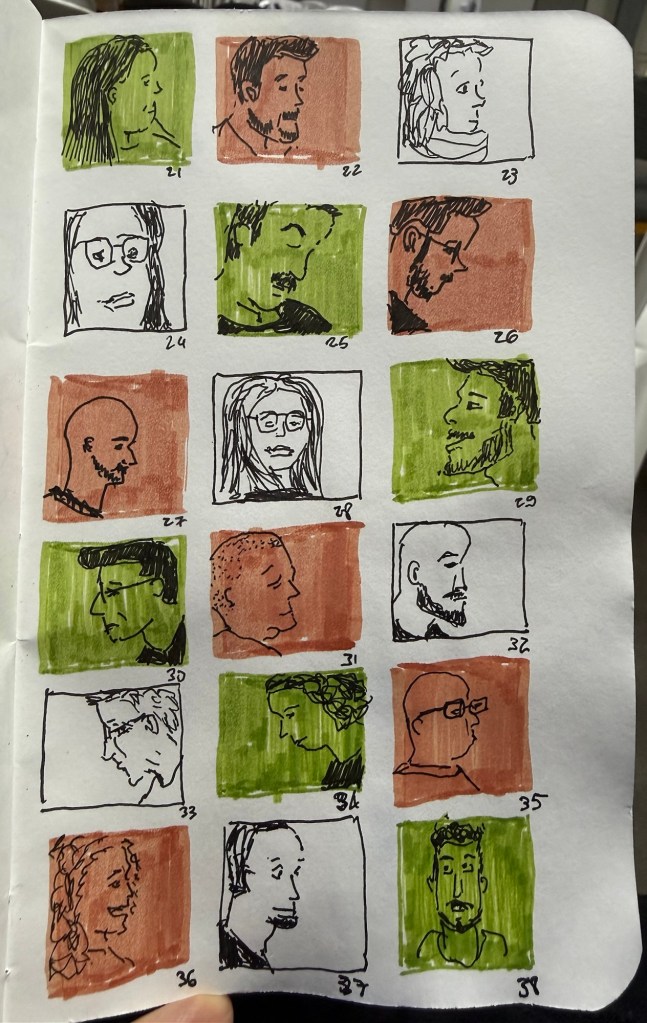
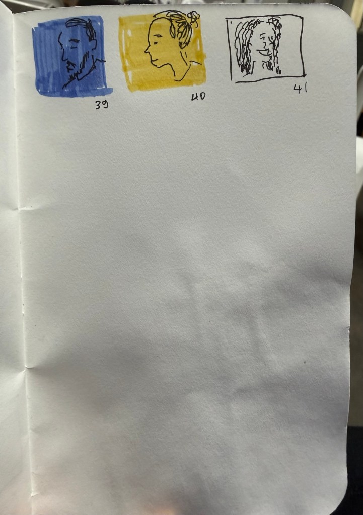
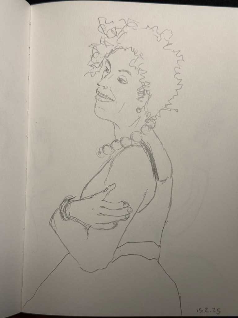
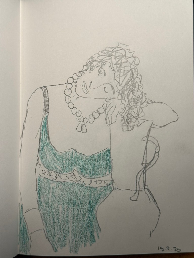
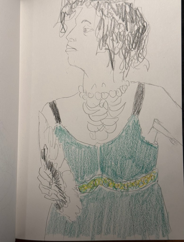
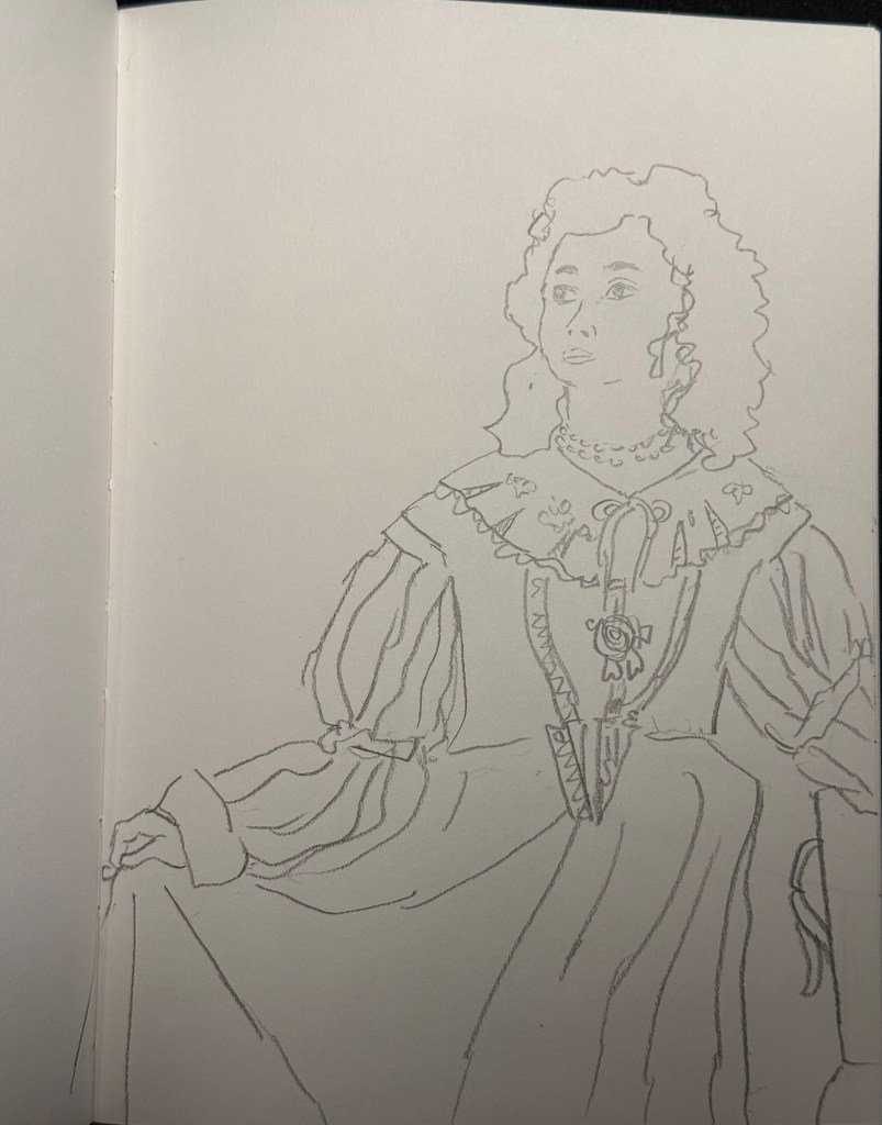
Last day of the challenge and I got all 100 (well, 101) people done. Today includes people in the streets near my house as well as people in the shelter.
Field Notes sketchbook and Faber Castell Pitt pens.
The bottom panel was supposed to a panorama in fountain pen ink but this is very unfountain pen friendly paper
As usual this was a fun and challenging challenge to do, and I hope to get to do it again next year.
We had a rocket attack every three hours last night so I was very tired today. Got only 10 sketches out of the 20, although I may be able to get some more tonight.
Shelter sketches today as well, on a battered Field Notes sketchbook using Faber Castell Pitt pens. I have a cold, so it was a struggle to get these done today.
It’s nice to have new pens and inks in rotation. I’m enjoying Diamine’s Writer’s Blood more than I expected, Diamine Autumn Oak is fantastic with a Waterman superflex nib, and Pilot Iroshizuku Tsuki-yo is becoming one of my favourite inks.
Liz Steel and Marc Taro Holmes are hosting the OneWeek100People challenge again this year, and I intend to participate again. The challenge starts on the 3rd of March and officially lasts 5 days. I normally sketch from photos, but this time I want to see if I can do the entire challenge from observation only. It may take me more than 5 days, but I’m OK with that. Are you planning on joining the challenge?
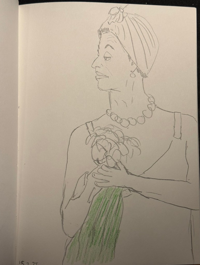
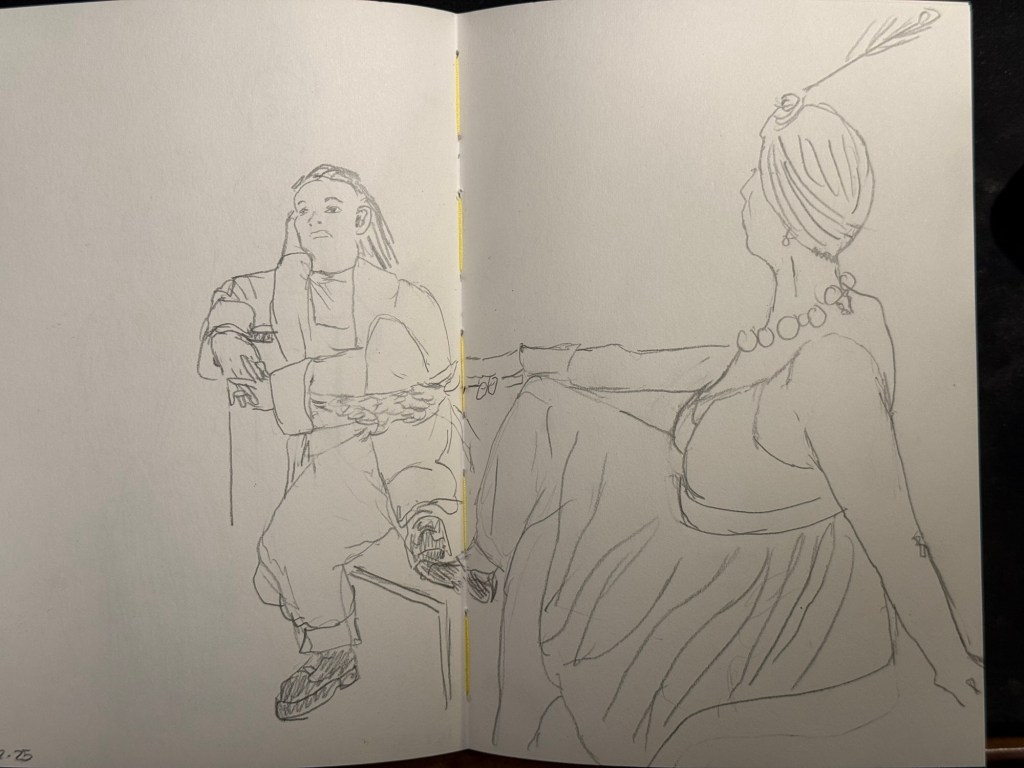
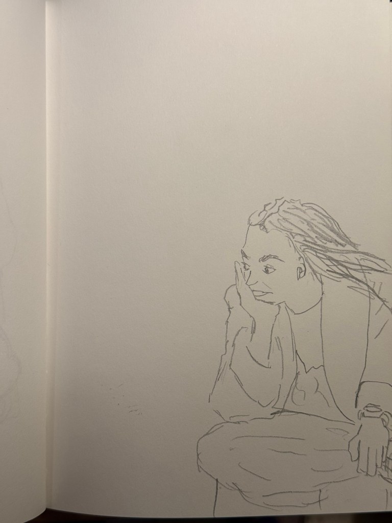
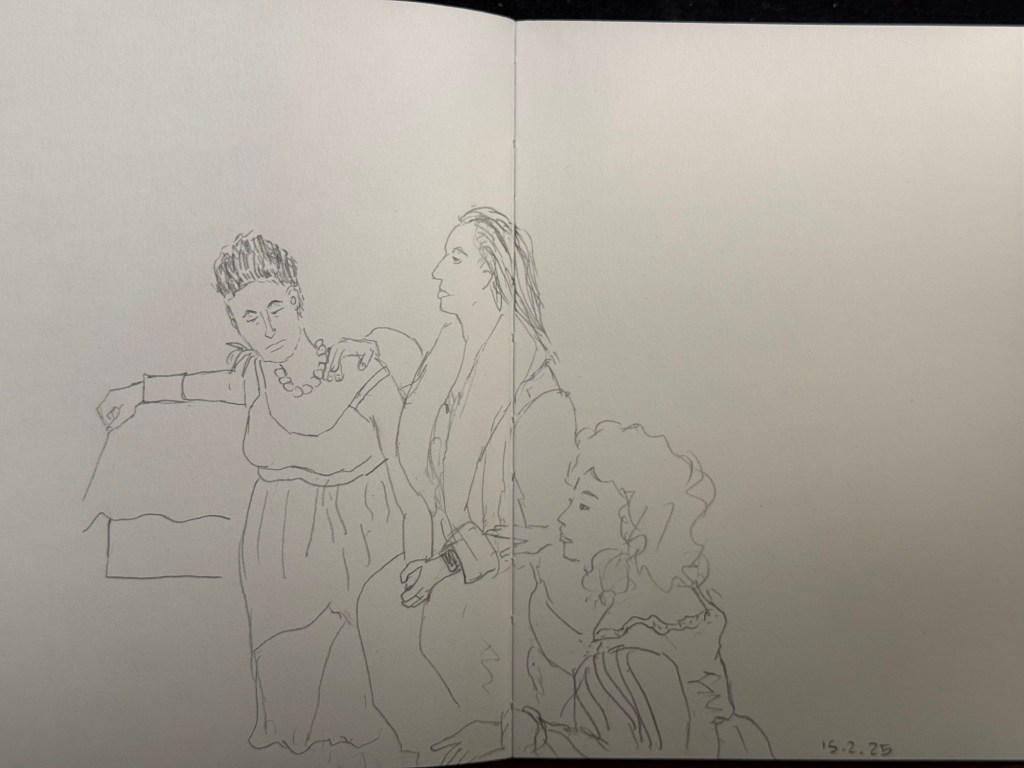
I went to the local art museum again this week, to sketch models in the museum. This was the last time this event was run, and the place was packed with sketchers. I didn’t have the best of locations, but I made the most of it. I sketched with Faber Castell 9000 2B and 3B pencils mostly, and added a touch of colour with Faber Castell Polychromos. The ink sketches were done with a Staedtler Pigment Liner 0.5. The sketchbook I used was once again the French Pascale Éditions. The models did fewer 20 minute poses and more 10 minute ones, which meant scrambling a lot. I wanted to visit the museum after the event, but I was so tired from 3 hours of non-stop sketching that I just went home.
Harman Photo just came out with a brand new colour film, Harman Red. It’s a red-scale film, and I’m curious enough to try and buy a roll or two and test them out. I love the wild, wild results I got with Harman Phoenix and the Harman Red is basically Phoenix pushed even more into red-scale.
Here are the sketches from today, and I hope that you have a great week!
10 minute pose.10 minute pose.10 minute pose.10 minute pose – the hardest pose to draw because of the angle of the head. Had a false start on this one, so had only about 8 minutes for this. 10 minute pose – Staedtler 0.5 pigment liner10 minute pose10 minute pose10 minute poseThe three models. The pose started with just the two top models, and then the third one joined, and it was a 10 minute pose.A challenging composition, 20 minute pose10 minute pose. I like the composition on this one – I placed her on the side of the page to give her room for thought. Final pose, 20 minutes
These two sketches were both done on the soft covered vegan Italian made Cass Art sketchbook. It has recycled paper inside which doesn’t look like or behave like recycled paper.
I sketched this in 3-4 minutes while sitting in the Phoenix Community Garden in London, and then took a lot of reference photos with my phone.
Later on I added watercolour to the sketch:
This is a 5-7 minute sketch of the stalls in Spitalfield market done with a sepia Faber Castell Pitt pen on the same Cass Art notebook.
I bought this sketchbook on a complete whim, because it was relatively inexpensive and I liked the look of it. I liked it so much I returned later on and bought a second sketchbook with a different cover colour.
What surprising and unexpectedly good products have you found lately?
While most of my fountain pen collection consists of vintage fountain pens, I understand that for many people purchasing vintage fountain pens is too risky. You might get a pen that needs repair, you might misjudge the value of the pen and overpay considerably, you might be buying a fake. As even the cheapest of vintage pens isn’t just a few bucks, making a mistake here could end up being very expensive.
Yet there’s a joy in vintage items, in seeing the craftsmanship, design and care put into them, in learning their history and placing them on a timeline, and in the knowledge that you saved something from the landfill. If you want to experience some of that joy with less of the risk of buying vintage fountain pens, vintage pencils are your friend. Flea markets are full of vintage pencils, pencil tins, pencil sharpeners, leadholders, etc that are usually very cheap to buy, and hold little to no risk.
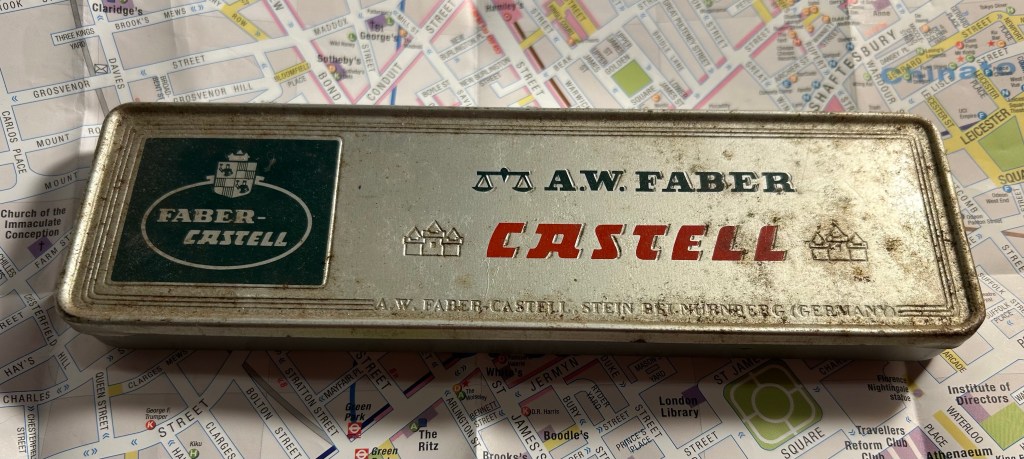
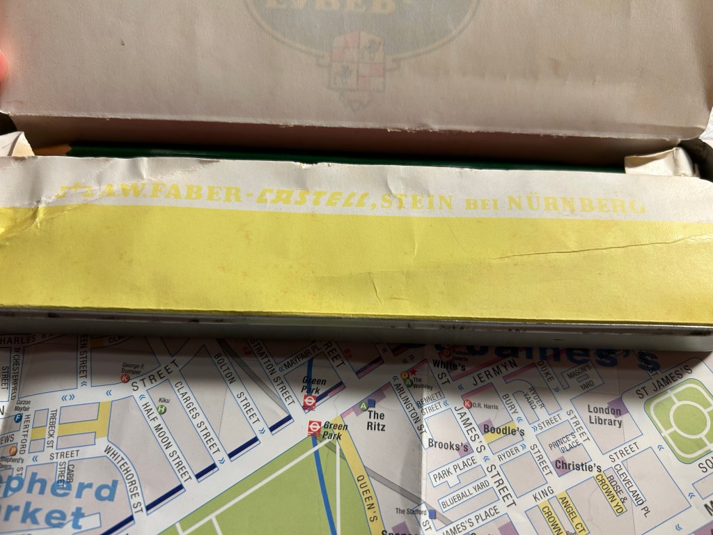
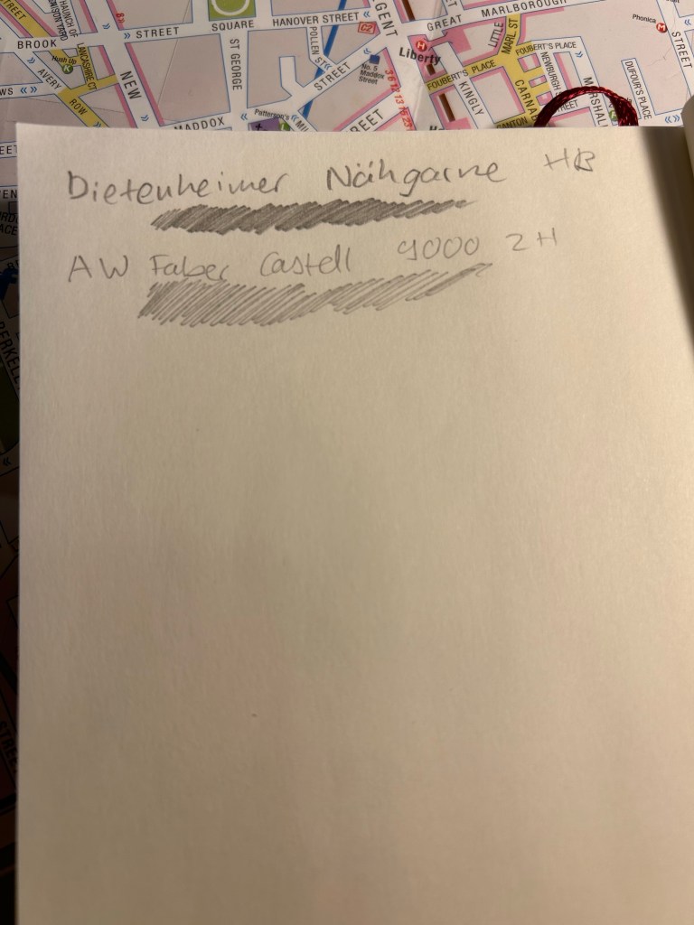
When I was in Spitalfields market, buying vintage books, I saw this tin propped up against a bookshelf in the stall I was purchasing my Arthur Ransome books from. This is how it looked:
Grimy but not full of rust or beaten up A.W. Faber Castell pencil tin.
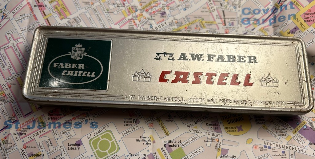
It’s an A.W. Faber Castell pencil tin, and after just a few minutes with some wet wipes it already started to look better:
A bit cleaned up.
The tin and the pencils inside cost me only a few pounds, and truth be told I would probably have purchased the tin even if it was empty. The design and typography are absolutely delightful:
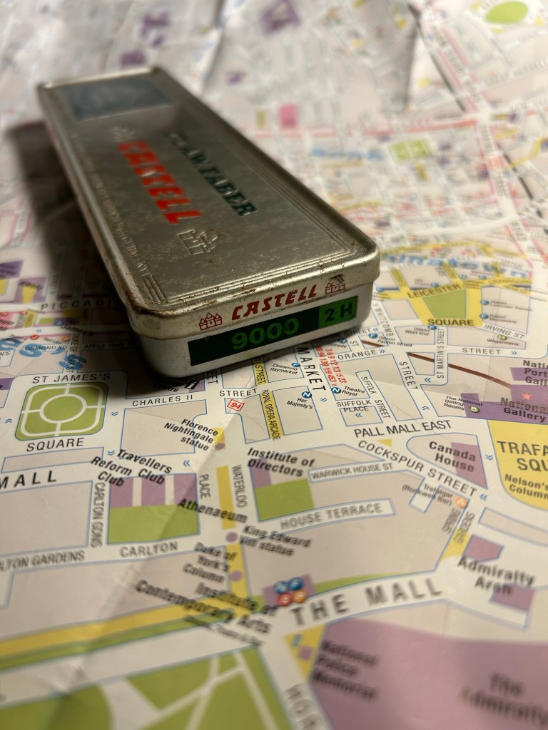
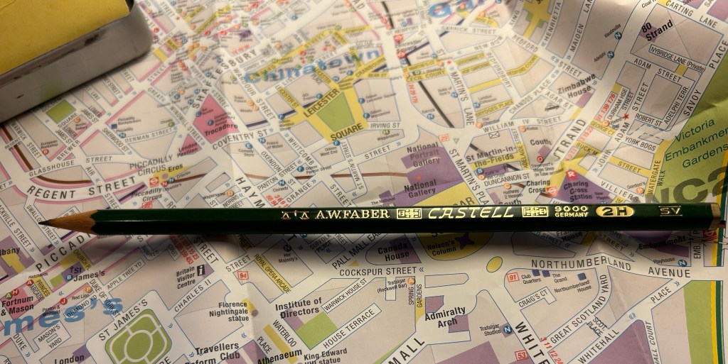
Castel 9000 2H. I can imagine having a stack of these in different lead grades on a shelf.
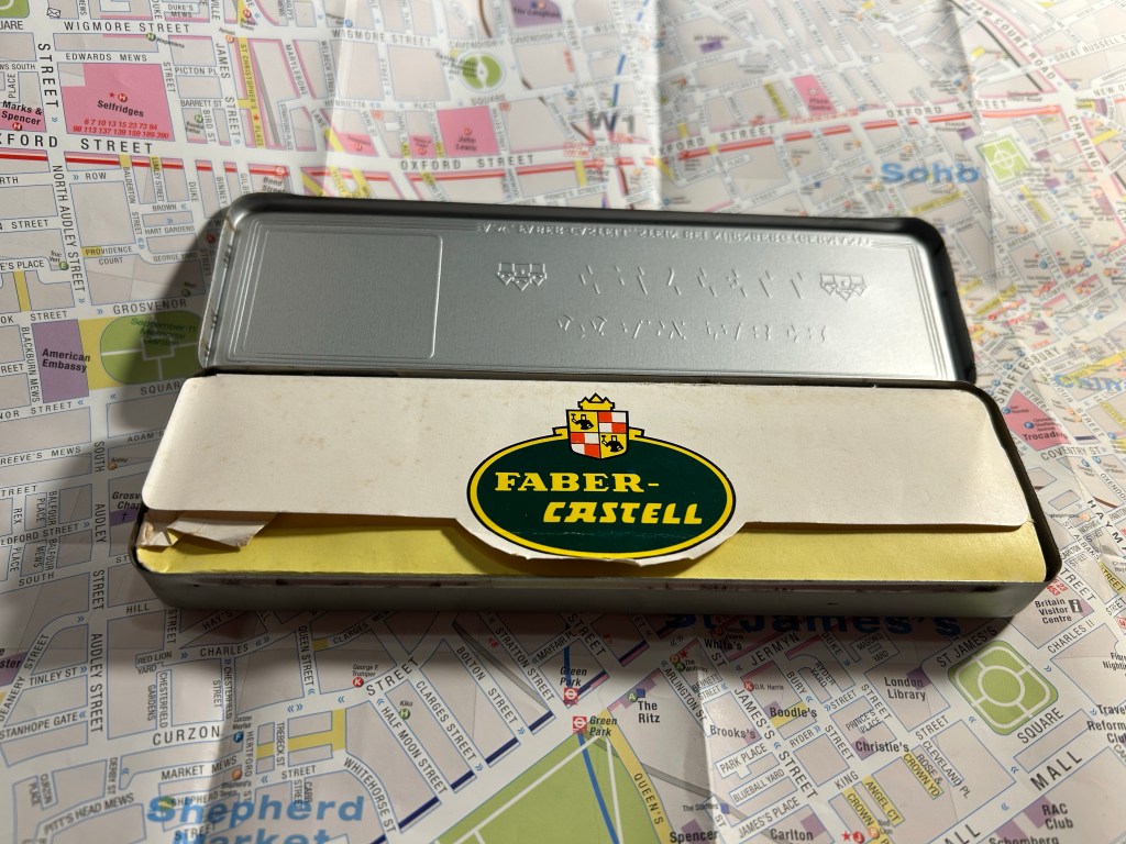
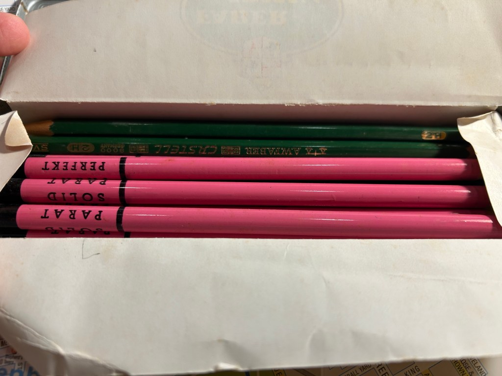
The over packaging continues inside – you wouldn’t want your pencils rattling around in the tin, would you?
Paper insert to protect the pencils inside.
Faber Castell’s factory in Stein proudly represented on the outer tin and here too:
A.W Faber-Casterll, Stein Bei Nürnberg
Inside were about half of the original Faber-Castell 9000 2H pencils, and half pink advertising pencils for a thread company that I think no longer exists.
It’s like opening a box of chocolates – you never know what you get
Faber-Castel 9000 are excellent artist pencils, and the vintage ones are just as great as the current ones in production, only they’re usually cheaper and have much better typography and logos on them. Look at this little masterpiece:
Vintage pencils always have a ton of stuff stamped on them. You needed the INFO, right?
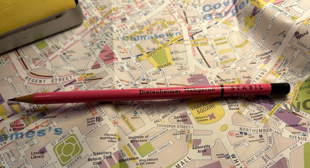
The pink pencils were round advertising pencils, for a German thread making company that seems to no longer exist. They are solid HB pencils, and have an 80s sort of vibe to them.
Advertising pencils.
The great joy of vintage pencils is that they of course write just as they used to when they were originally made. If they have erasers they’re going to be unusable (these pencils don’t), and sometimes the wood is a bit brittle and dried out so a bit more care needs to be taken whilst sharpening them (these pencils are in excellent condition), but otherwise time affects pencils very little.
Writing samples
So next time you’re at a flea or antique market, rummage around its hidden corners for some cool old pencils to try out. You never know what you’ll find — I picked up some Sanford Noblots from a giant jar of pencils that way.
P.S. If you’re wondering, 2H pencils are perfect for watercolour under-sketches, as so long as you keep your pressure light, they disappear beneath the paint.
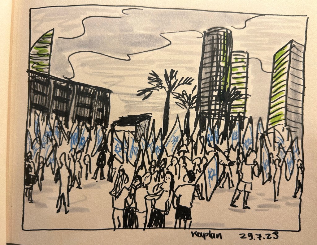
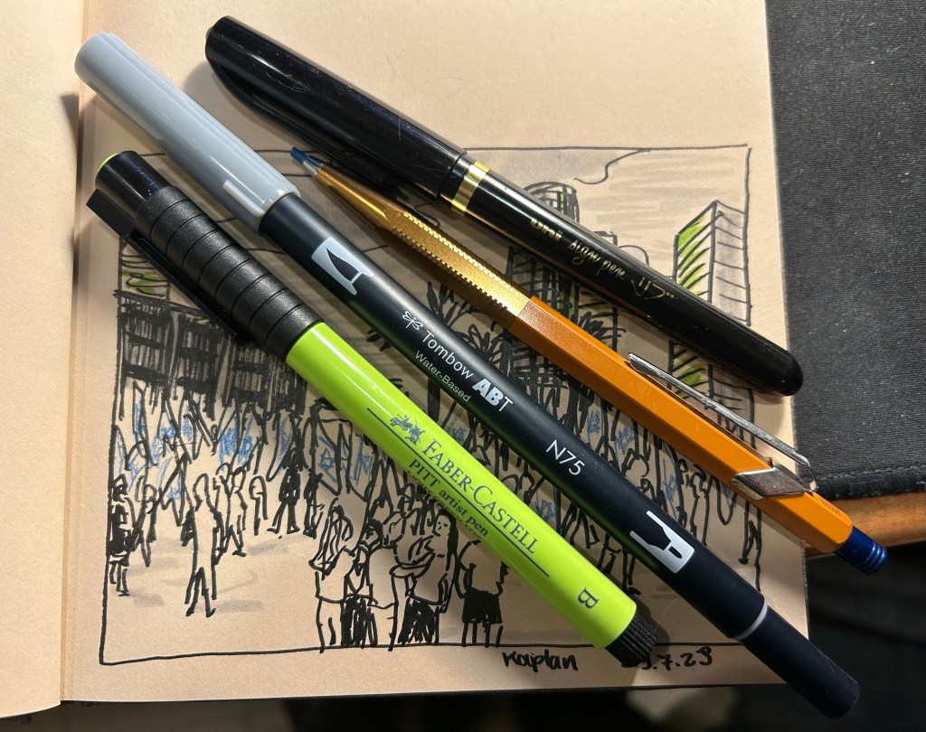
I went “shopping” in my stationery and art supply stash again, and this time used a Hahnemule Cappuccino sketchbook, a uni-ball sign pen, a Faber Castell PITT artist brush pen in light green (171), a Tombow ABT water based dual brush pen (I only used the brush side not the felt tip pen side) in light grey (cool grey 3 – N75), and a Caran d’Ache + Alfredo Haberli Fixpencil with a blue 2mm lead.
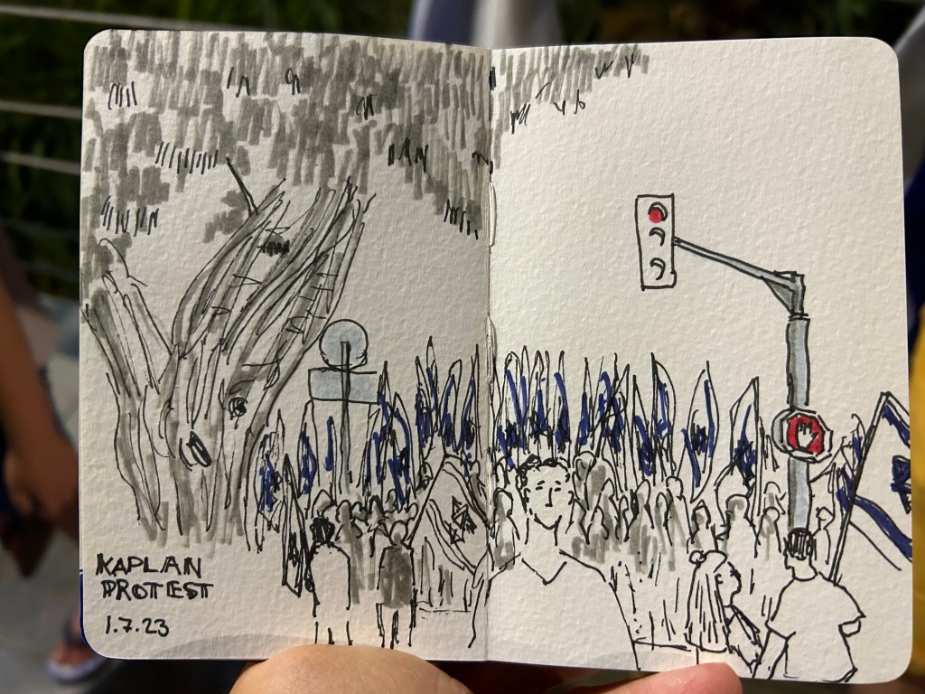
protest sketch
I used them all to draw the protest scene from this Saturday, using a photo I took during the protests. It was intensely hot and humid, and I went to the protests right after running a Dungeon World game at a small local tabletop roleplaying convention. With no art supplies on me, the best I could do was try and capture the scene to sketch later. When I was pulling things out to try out with this sketch, I decided to veer away from my comfort zone: I used tinted paper, a sign pen, mixed media, and an unusual colour. I like the result – for a quick sketch it captures the energy of the moment well.
tools used.
I like the Hahnemule Cappuccino sketchbook. The paper is smooth but has a touch of grain to it that makes it work for pencils as well. It’s way too thin for wet media, but works great for brush pens, pencils, markers, etc.
My main sketching tool was the Uni Sign Pen. This is the first time I’ve used a sign pen for “serious” sketching, as I normally only use them for illustrations that I gift to friends’ kids. I like it – it has relatively little line variation, but on the other hand offers more control, and a good bold line. If you are dipping your toes into brush pens for sketching for the first time, this might be a good place to start to get a feel for the kind of thick lines these kinds of pens create.
The Faber-Castell PITT brush pen is a classic, one that I’ve used many times before in sketches. I’d love to say that they don’t disappoint, but like most soft and medium soft brush pens, the tip doesn’t last for long. They do come in lots of great colours and if you cap them they last much more than many other markers and brush pens in the market. They’re also waterproof, which is a bonus if you’re mixing them with wet media.
The Tombow dual brush pen is completely new to me, and I liked it enough to want to add it to my current sketching setup. It works well for quick shading (and shading and colour make sketches pop).
The Caran d’Ache + Alfredo Haberli Fixpencil… This is something that I want to properly review sometime in the future, so it’s been waiting on my desk for a while. For now I’ll just say that it did the job, although I have other pens and pencils that would have done the job better.
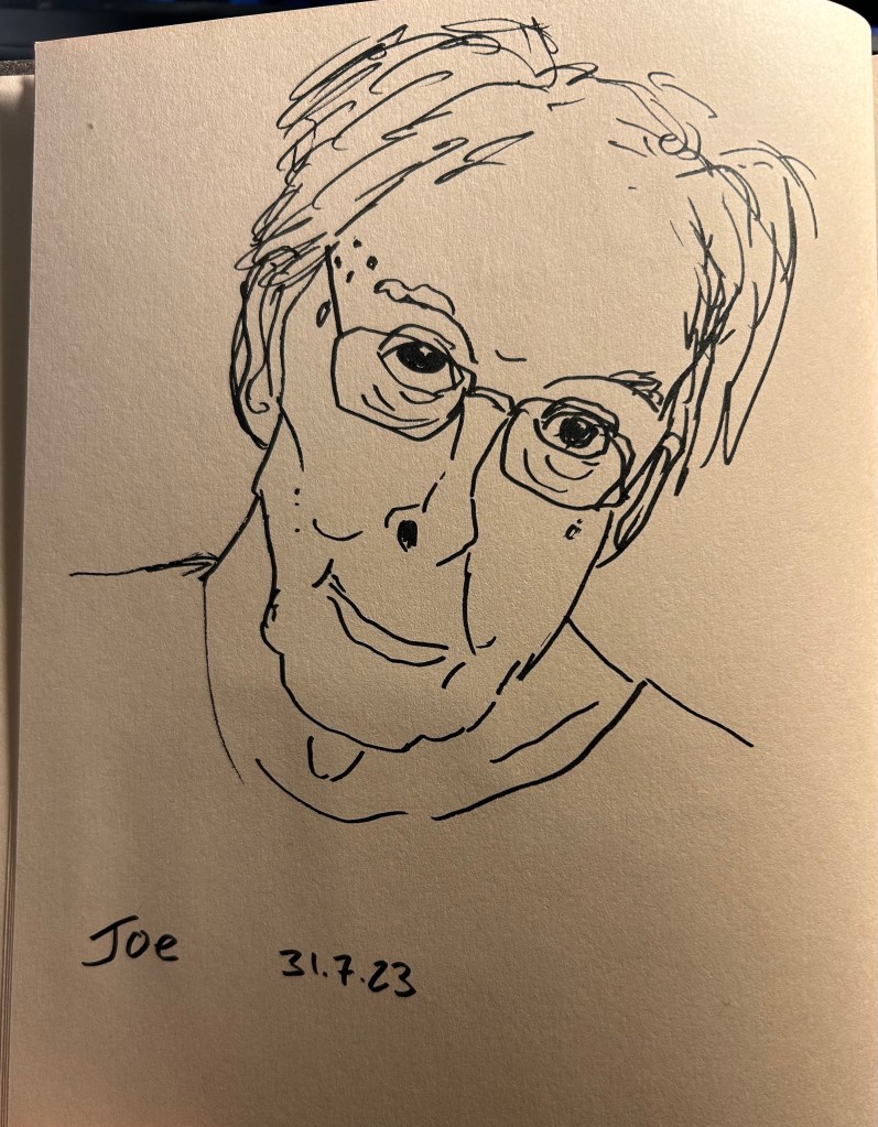
I also sketched our friend Joe during our weekly Zoom meeting, also on the Hahnemule Cappuccino and using the Uni Sign Pen. This was a very quick sketch, done it 2-3 minutes, and the sign pen does well with expressive lines.
Our friend Joe.
Now go rummage in your stationery/art supply stash and find something new to play with. It’s guaranteed to make you smile.
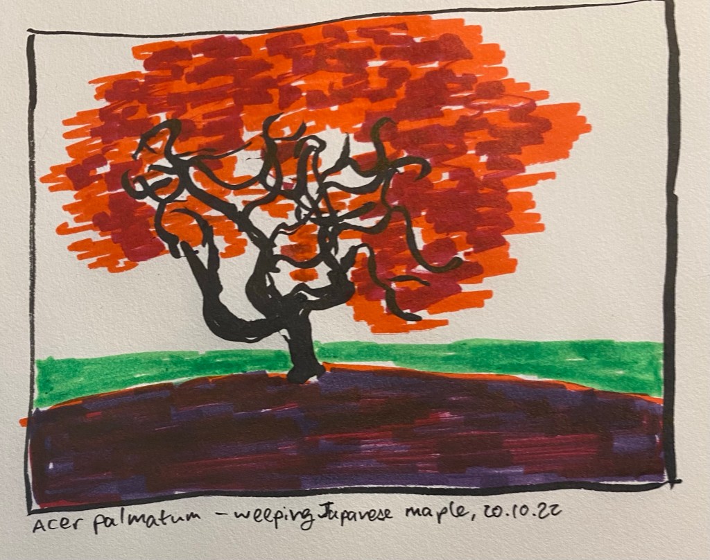
This is the last sketch that will focus on individual tree foliage, and this one is dedicated to the striking Japenese Weeping Maple and it’s vivid red leaves. Midori MD A4 Cotton notebook and various brush pens.