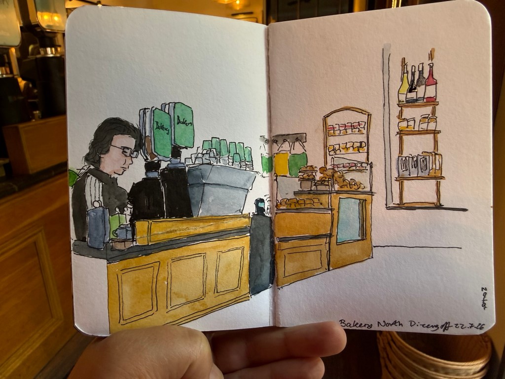
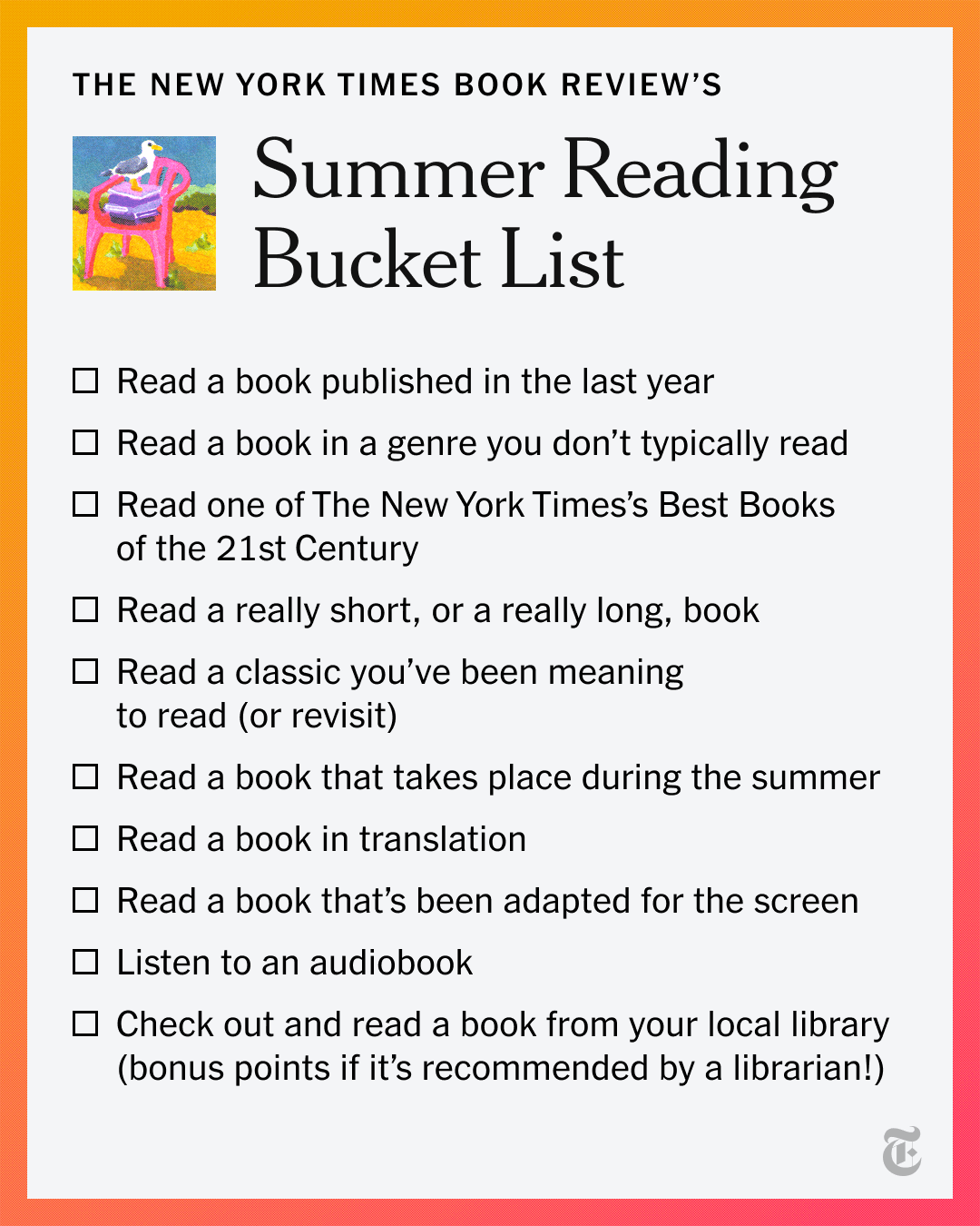
I really like today’s cafe sketch, so I decided to post it.
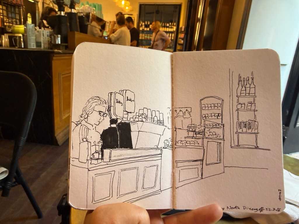
Here’s the line work before I added watercolour:
Cafe sketches are a great way to get used to sketching people in real life. If you want to get started, take a sketchbook and a pen to a cafe near you, and just spend 10-15 minutes drawing as many people as you can.
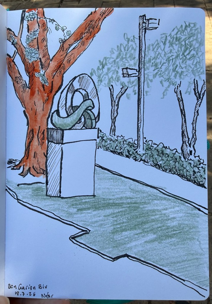
I wasn’t feeling well earlier this week, so I decided to sketch close to home and to simplify my setup. I was feeling the “Toulouse Blues” (where you’re part of the urban sketchers community but miss out on the urban sketchers symposium in Toulouse), so I wanted to sketch to cheer myself up.
The sketch
The setup was unusual for me on all counts:
The notebook is a Leuccchturm1917 sketchbook that I’ve had since my first urban sketchers symposium in Porto back in 2018. It was Leucchturm’s first foray into sketchbooks, and so the paper isn’t the best. They have since improved it somewhat, even though it’s still far from a high end sketchbook. In this case I wanted something simple and serviceable, and it helped that this evoked fond memories of symposiums past.
The pen is a Sailor Fude Mannen fountain pen with De Atramentis Black Document ink. I usually don’t bother with the Fude pen and use fineliners but in this case I wanted something more expressive.
Two colors only – the green is a Faber Castell Polychromo earth green (172) and the Sienna is a Daniel Smith Quinacridone Sienna watercolor stick. That with a waterbrush provided the reddish earth tones on the tree trunk. The stick was a gift from the Poznan symposium goody bag, and I still find it very cumbersome and messy to use.
I kind of like the result, and I’ll try to create more experiments like it in the future.
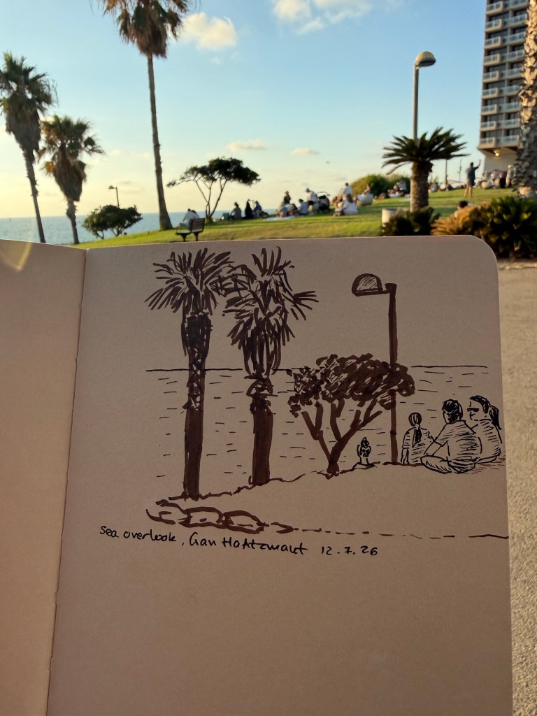
I had about 10 minutes to sketch yesterday, so I took my new Stillman & Birn Nova sketchbook (5 1/2 in. x 8 1/2 in.) a fineliner in sepia and black and a sepia brush pen and sketched this:
Sketch of people waiting to see the sunset over the Mediterranean.
I edited out the bench in this scene as the people were more interesting.
I’m trying to get back into regular sketching, and I think that simplifying both the scene and my selection of tools will help. This experiment sadly badly failed – I put so many restrictions on myself that I got paralyzed into not sketching at all.
We try. Sometimes it works, sometimes it doesn’t – but the point is to keep on trying. Sketch on!
As part of the Urban Sketchers symposium in Toulouse and general summer travel I know that a lot of sketchers will be visiting Paris this summer. Paris is full of wonderful art supply shops but I wanted to highlight three in particular that are worth visits. Each store caters for a different need, at a different price range, and with a different ambience. If you can, I recommend visiting all three, but if you can’t hopefully this will help guide to the store that best suits your needs.
Rougier & Plé Saint German – the most centrally located and accessible of the three stores, Rougier & Plé is on boulevard Saint German not far from Saint Michelle. This multi-level store is easy to navigate and expansive. The top floor is for sketching supplies – pencils, pens, markers, charcoal, sketching paper, glue, erasers, measuring and cutting tools, etc. The second floor is dedicated to watercolors, ink, printmaking and their related materials (brushes, paper, masking fluids, etc). The first floor is where you’ll find the discounted section, student art supplies, packing materials, hobby materials (beads, clay, etc) and stationary items. They provide tax free forms if you spend more than 100 euros (which won’t be hard), they have a very good selection of brands (this is a good place to buy Schmincke watercolors) and they usually have a good selection of products on sale – particularly paper. This is the “bread and butter” store and if you only have time for one I’d select this one. There’s also a good selection of stores nearby that can interest other members of your party, a nice coffee shop (Cuvée Noire) and a nice park just around the corner (Jardin médiéval du Musée de Cluny) so if you’re traveling with none-sketchers you don’t have to drag them in with you. There is an elevator so if you have accessibility needs this store caters for you. The staff is a bit surly and I wouldn’t go in looking for assistance, but they do have a decent website so you can check things out before you go.
Magasin Sennelier – You’ll find this store all over Paris art supply store recommendations but this is a store with quite a few caveats. On the pro side it’s beautiful, it has a wide selection of supplies that you just won’t find anywhere else (like Etchr sketchbooks for instance, Japanese fountain pen ink, certain sketching supplies), the staff is knowledgeable, and they have tax-free shopping over 100 euros. However the store is open in very particular hours (10:00-12:45 after which they close until 14:00 when they open until 18:30) and they will kick you out at 12:45 regardless of whether you’re just about to pay them or not. It is also inaccessible in terms of public transport because it’s on a one way street with no nearby metro station (so you can take the bus one way to the place, but you’ll have an issue getting back – or vice-versa, depending on where you’re coming from). It’s best to pair a visit to the store with a visit to the d’Orsay or the Louvre but make sure that you don’t end up there when they’re closed for lunch. The store is on two floors, but there’s no elevator and the place is very cramped and chaotic. It’s most likely that you’ll need to ask for help finding things, and you may have to rummage around or ask the staff to bring up things from the back. The staff is helpful (up until lunchtime when they become surly and brusque), and while the prices aren’t the best to be found they do have things that you just can’t get anywhere else so it may be worth scheduling a visit there. This is, however, not a store that you can spontaneously slip into your schedule. Plan your visit carefully so as to not be disappointed.
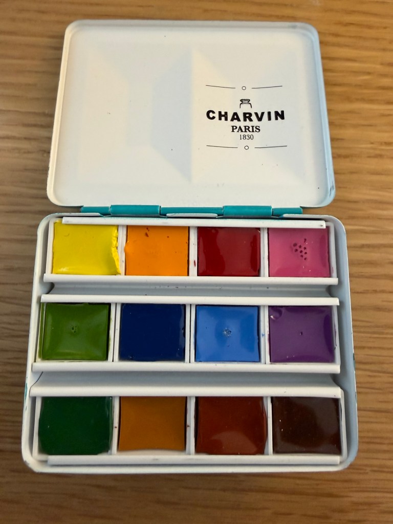
Charvin watercolours purchases in Le Géant des Beaux-Arts
Le Géant des Beaux-Arts – this store is not as centrally located as the other two, but is still not too far away from public transport to make in inaccessible. This is a warehouse kind of store, huge, sprawling, and the cheapest by far of the three. You won’t get a tax return here, but you will get a significant discount on practically everything you buy (the cashiers will sign you up as a member for free if you aren’t, so you’ll get the most discounts on your shopping). They have a very wide selection of supplies and brands (though not everything – it’s worth checking their website first), and the biggest problem there is not getting lost in the cavern of supplies or overdoing it. There are stairs here and there so if you have accessibility issues I’d stick with Rougier & Plé, and there is only some method to the madness (particularly in the paper section). The staff is largely busy stacking art supplies and while they’re nice and try to be helpful, usually only the staff behind the till is knowledgeable. You will find Paris exclusive brands like Charvin and the widest array of Clairfontaine paper you could ever want, so it’s worth visiting the store even if you’re not particularly in search for bargains.
Paris is a wonderful city for artists in terms of its art supply stores, so this is far from a comprehensive list (there’s Charvin, various Sennelier stores, etc). Use this if you are short on time and want to hone in on which store best suits your needs and budget.
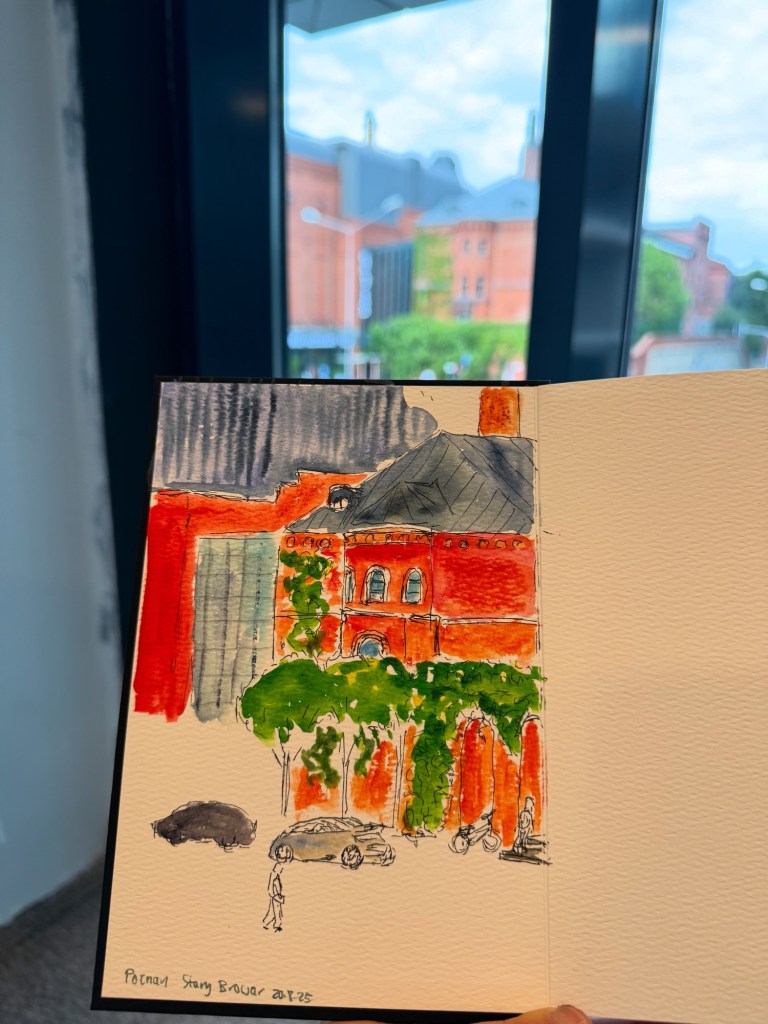
The Urban Sketchers Symposium in Toulouse is starting next week, and this year I won’t be participating. For the lucky few that are going to be there, whether as official symposium participants or as “free range” sketchers I thought I’d write down some insights and tips that I gathered from last year’s symposium in Poznan.
In no particular order, here they are:
Talk to people – even if you’re shy or an introvert, the symposium is THE place to connect with people not only because everyone will be nice and kind and many are also introverts, but also because you have a guaranteed shared interest: urban sketching. If you’re unsure how to approach people, just ask them about their favorite sketching setup or tool and see what happens.
Wear your badge everywhere, even at breakfast at the hotel, even if it’s “just” an urban sketcher ID tag. This lets other sketchers know who you are, and opens up opportunities to connect and share with other sketchers. Invite them to join your table at the busy hotel buffet, or ask them where they had lunch or where they’re going to sketch next.
Swap and share art supplies. People rush from place to place, and people forget or misplace art supplies all the time. It’s worth packing some extras and sharing them around – pencils, pens, a tube of paint, etc. You could save someone’s workshop experience with this simple gesture, and it costs you next to nothing. And swapping art supplies, even for a brief sketch is a great cost-effective way to try before you buy. I packed a whole pencil case full of a range of pencils for a workshop and then forgot it on the desk in my hotel room. Thankfully the wonderful instructor and workshop participants had enough to share to help me out and allow me to fully participate in the workshop.
Don’t be afraid to ask for help – whether it be directions to the starting point of the sketchwalk, help with understanding something you didn’t get in a workshop or demo, or assistance with your gear, people are ready to help if you just ask them.
Quick sketch made from goody bag supplies just outside the art market
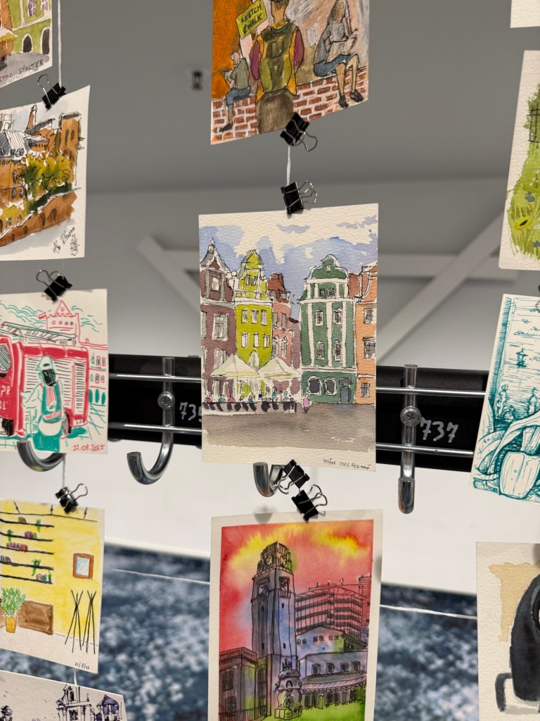
Go early to collect your badge and goody bag and take time to appreciate them. The symposium crew put in a LOT of effort to create amazing goody bags with the sponsors. Collect the bags early and help the symposium and sponsor out by posting about them on social media (Instagram in particular, using the correct tags), and by using them and enjoying them. In Poznan most of the attendees sat in a room adjacent to the one where we collected the bags, did a throw down post and then a sketch with lovely supplies that we got. There was a wonderful view of a historic building next door and it was really fun to create this shared sketching moment. Also remember to share and swap with other sketchers and the volunteers.
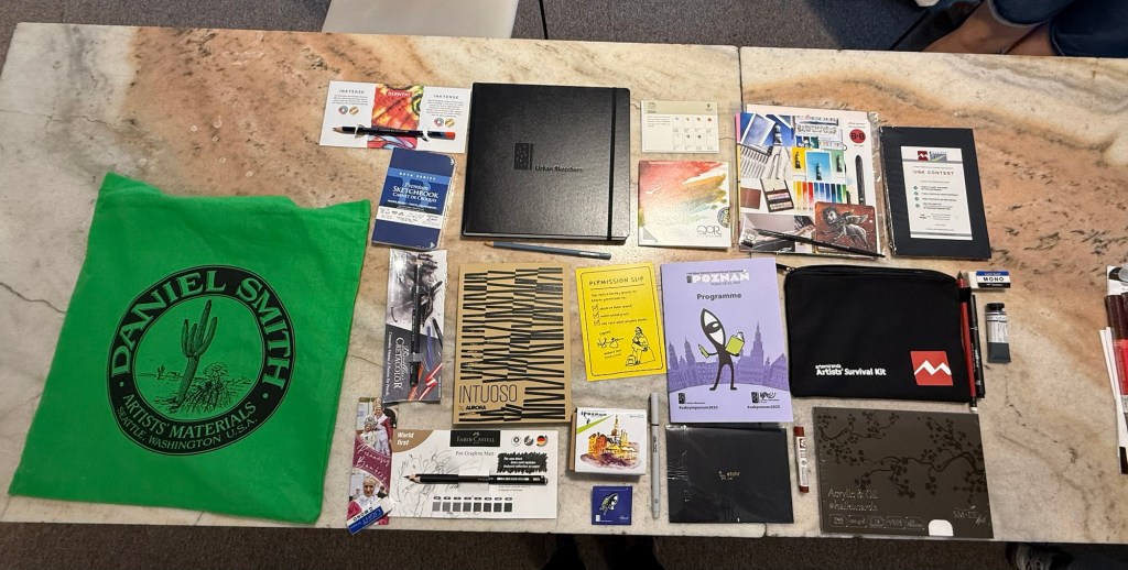
Goody bag from the Poznan symposium
Follow the official symposium instagram and use the official tags. The Instagram will have giveaways and useful information (some of the giveaways are also open to non-symposium participants), and the tags help spread the word around and bring positive attention to the city and the sponsors. It was amazing to see as the symposium advanced how much attention Poznan got due to hundreds of talented sketchers bringing it to life.
Embrace the locals. They will notice you because you’ll be noticeable – large groups of sketchers call attention to themselves. Remember to represent the urban sketchers community, be kind and welcoming, and answer any questions they have. From my Poznan experience the locals will embrace you in return – with kind words, tips, stories and sometimes a free drink or a bite to eat (but don’t do it for the freebies!). Children in particular are attracted to sketchers, and we oftentimes shared bits of sketching paper and art supplies and invited them to join in.
Respect the instructors and lecturers. It’s tough to stand in front of a crowd and talk about your art. Don’t mess with your phone during lectures, listen to the instructors, be kind and respectful, and be open to learning. This is a given, but it’s worth stating anyway just in case because it’s that important.
Be nice and kind to the volunteers and talk to them. Many of them are sketchers, many of them are just locals who answered ads and are curious about sketching and the symposium. Share your work and be kind to them – it’s a tough job performed by a dedicated and small group. People gave them stickers, sketches, art supplies, and just chatted with them. A great volunteer can really improve a workshop, and it’s worth acknowledging their work.
Be nice and kind to restaurant and cafe waiters, baristas and owners. Urban sketchers love to camp in these locations to sketch, but be aware of your surroundings. Don’t hog tables during rush hour, be sure to order food and drink (don’t share one dish for four people, even if you’re broke. It’s not fair for the waiter or for the restaurant), tip well, and clean up after yourself. Tag places if you sketch them to raise awareness to the meal you enjoyed there, and remember that you represent urban sketchers everywhere.
Come with art supplies to donate. There will be an opportunity to do so throughout the symposium. We all have too much or supplies that we no longer use, so donate them (if they’re in good condition) to the local charity the symposium is sponsoring. The front desk volunteers usually start the collection on the first full day of the symposium.
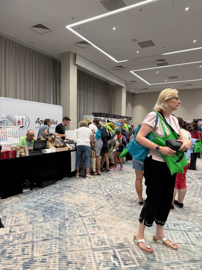
Go to the art market. Make sure to visit all the stalls – many if not all of them are sponsors, and there will be local suppliers that are worth checking out. Try new things, talk to the vendors (they’re usually very knowledgeable), and be prepared for the rush of the first day crowds. Many stalls will also have giveaways and contests set up, so be sure and ask about them.
Art market first day madness
If you are looking for deals, go the art market during the final hours it is open. Although you will find many things out of stock, most vendors will have deals on the last hour or two of the market, to avoid having to ship back supplies.
Talk to the locals, whether they are sketchers, volunteers or instructors. Ask them for good, cheap restaurants for lunch, cafes worth visiting, shops and market stalls of note, cool places to sketch in, and where they get their art supplies. Their local knowledge is priceless.
Sketch a postcard. Even if you don’t work in postcard size, or you don’t love the paper, or you feel self-conscious about your work, sketch a postcard and participate in the postcard exhibition. It’s fun to see your work out there, and most participants get prizes, plus you can always donate the postcard for the silent auction and help raise some money for the organization.
Go to the daily morning briefing. Even if you’re tired, even if you don’t feel like it. It’s short, it starts on time, and it has a lot of important information that you just won’t get anywhere else. Also there are giveaways, but I won’t ruin the surprise…
Go to the demos, lectures, drink and draws – the morning lectures were great, and worth listening to and learning from. The demos were a fantastic way to get to experience the techniques of sketchers that you couldn’t get a workshop with, and the drink and draws are just a nice way to connect with people and share your sketching love. I will confess that I was so tired at the end of each day that I missed out on the drink and draws and I regret it.
Be ready to be tired, and try to pace yourself. It’s a lot of fun but very draining to run around town and sketch all day. If you take a lot of workshops or go to all the sketchwalks you will have very little down time between events. Be sure to hydrate, rest, and know your limits. Take into account that you’ll be lugging a lot of weight around (art supplies, a stool, water), and that adds to the fatigue. Check your schedule and if you have only an hour or so between workshops, find someplace close and convenient to grab a bite to eat. Save the fancy restaurant for the evening.
Share knowledge among the group – found a great place to sketch in? A wonderful restaurant or patisserie? A clean toilet or a decent supermarket? Share that information with other sketchers.
Follow people on Instagram. Even if you normally avoid social media, this is how you can stay connected with other sketchers after the symposium, and be inspired by other artists.
Never, ever, ever critique someone’s work. Ever.
We share, we don’t compare. This is a Liz Steel mantra and something you should carry with you during the symposium. Be inspired, not intimidated, by other sketchers’ work.
Follow along with the demos – if you’re going to a demo, it’s OK to watch and listen but it’s equally valid to sit down and sketch while the demo is going on, trying to follow along as you work. There is value in both these approaches – don’t be afraid to start out by observing and then dig in with a sketch of your own.
Try new things, and don’t worry about the results. This is a tough one, but an important one – the point of the workshops and demos isn’t for you to come out with masterpieces, but for you to try out new things. When you do that, you may not like the results, or it may take a few tries. That’s OK. The best workshop I had in Poznan was also “traumatic” in this way – I made several sketches and they were all terrible. Only on the last sketch did things click, and I got one of the best sketches I have ever made – and one that took third place in the postcard exhibition.
My postcard on display (it’s the one in the middle)
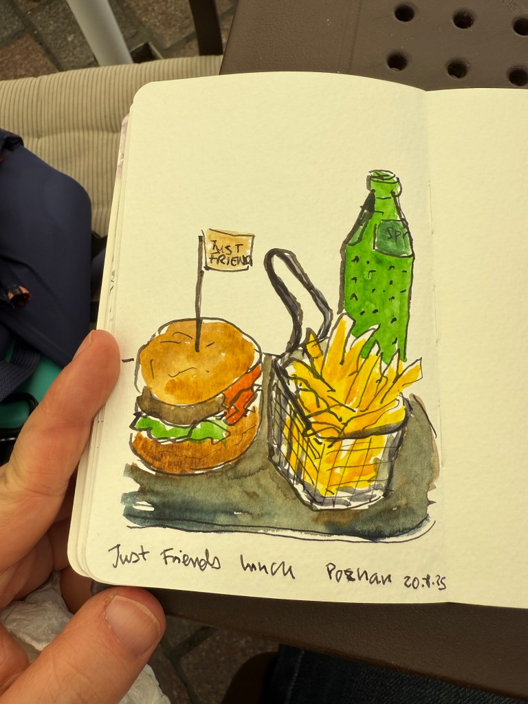
Draw your food. It’s an urban sketchers tradition and a great way to remember a restaurant or cafe.
Drawing food
Take reference photos – you may not be able to finish a sketch, but if you have reference photos you can return to it later on and complete it.
If you can, give away sketches. People who were kind to you love receiving sketches as a gift, and you should see them light up when you give them that quick napkin sketch, or a page from your sketchbook. Also consider donating artwork to the silent auction if you can – it helps Urban Sketchers raise money for the great work they do.
Tell the instructors how great they are. They really are amazing, and they’re artists so they all have imposter syndrome and they love to hear good feedback about their demo, workshop or compliments about their sketches. They are all volunteers and they put in a LOT of work and research into their sessions so be generous with your praise.
Tell the organizers how great they are. They’re also volunteers and they work like crazy before, after and during the symposium. Let them know that you see them and appreciate them.
Be very, very kind to the symposium correspondents – they put in a crazy amount of work and effort into bringing the symposium to life for those of us who can’t be there. That means that while you were at that one workshop they zigzagged across the city and went to three, making sure to sketch and take photos in each. And while you were sleeping they were staying up late editing photos and posting to social media. They do a mammoth amount of work every single day, so take the time to be extra nice and helpful to them.
Be kind. People can get tired, hot, blustered, overwhelmed. Give them the benefit of the doubt and be kind. Look out for each other and help each other through the whirlwind of this symposium.
Take time after the symposium to decompress and process what you’ve learned. Go over your notes and sketches, look back and what you’ve learned, try out the new techniques and supplies that you’ve gathered, and go out there and sketch!
Have fun, remember to hydrate and use sunscreen, and bring Toulouse to life with sketches!
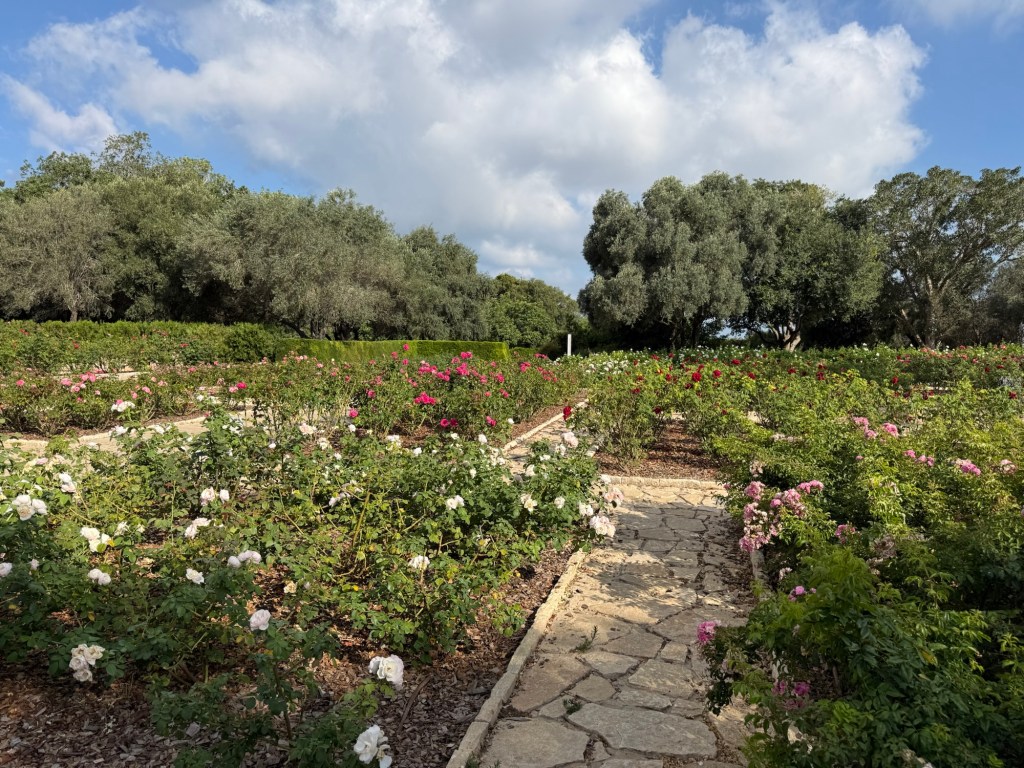
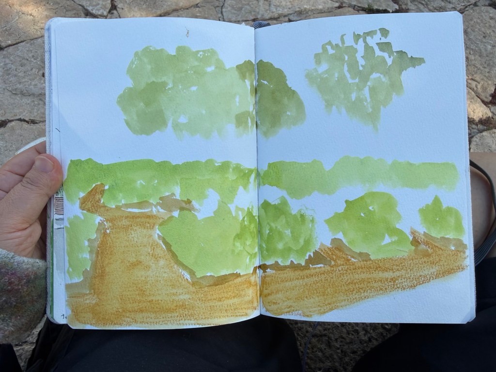
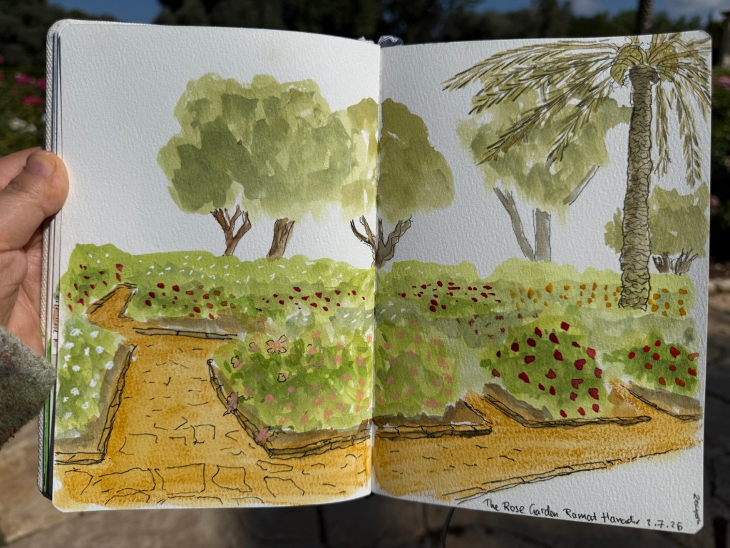
I went to Ramat Hanadiv garden today, and created a quick watercolour sketch on location. There were a lot of details in the scene, and I wanted to capture a relatively wide angle, so I had to do a little planning ahead. I normally don’t take photos or videos when I sketch (only once I’m done), but this time I made some unusual choices for me, so I decided to document them as I went along.
This is part of the scene that I was sketching:
The rose garden. This is about half the scene that I was sketching, and by the time that I was done the sun was fully up overhead so I lost the interesting shadows.
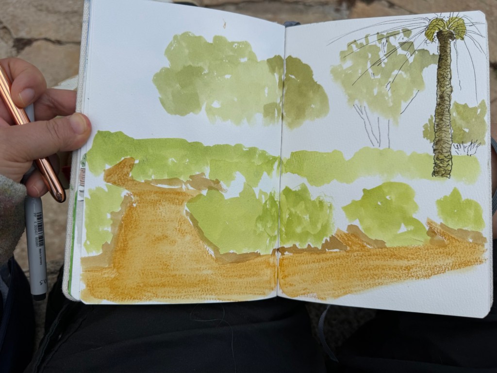
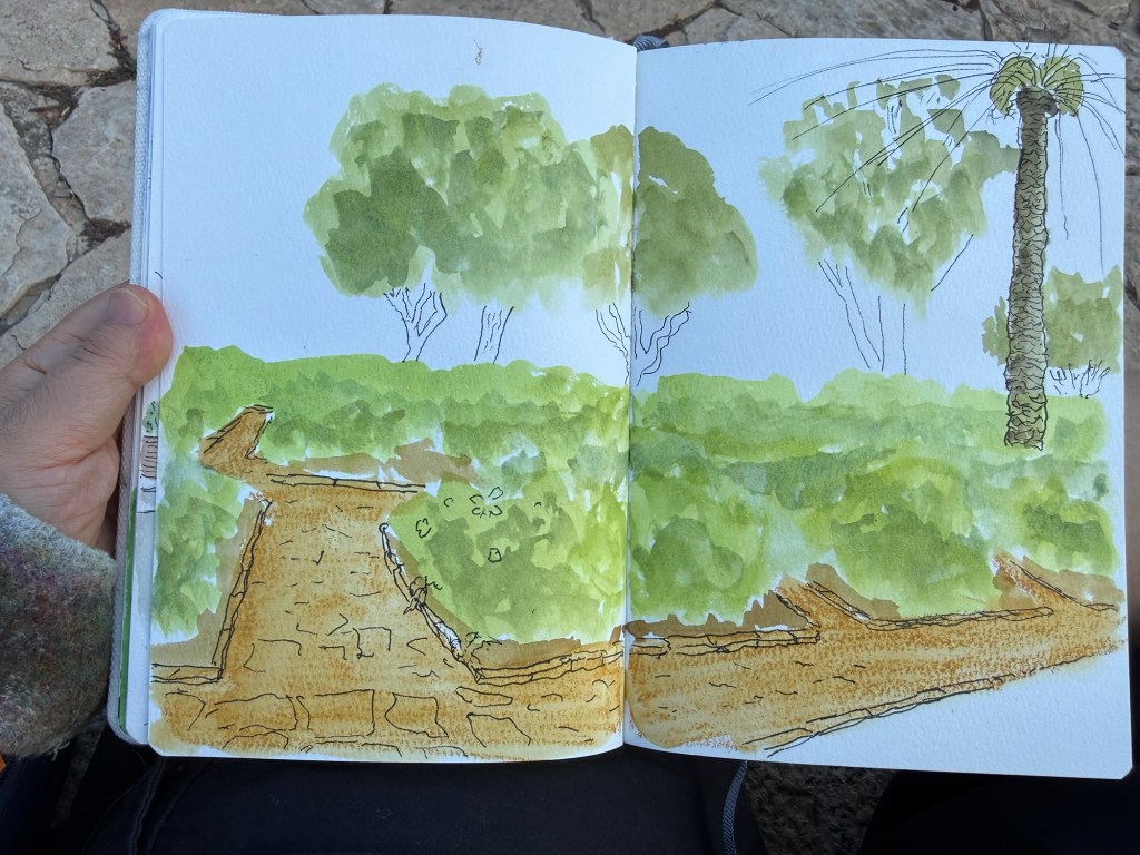
I was using a cold pressed Etchr watercolour sketch book. It’s wonderful for watercolours, but pen and ink struggle on this paper. I usually start the sketch with pen and ink (a fineliner or a fountain pen) and then move to watercolours, but since there was so much detail here and I didn’t want to get carried away by it, I started with a Caran d’Ache Neocolor II crayon:
Laying down the rough location of the path.
Then I blocked in the greens of the roses, the trees, and a bit of the ground. I’m using the lightest green hues as this point – I’ll add darker greens later to add volume and depth. In watercolour you work light to dark. I also went over the Neocolour II with some water.
Blocking things in.
At this point I took out the fineliner and sketched out the palm tree and started sketching in the tree trunks. I also added colour to the palm tree trunk. The palm isn’t supposed to be the focal point of this sketch, the roses are, but it’s there to give things perspective (and it literally was standing nearby – I just pulled it into the frame because I thought the sketch needed it).
Palm tree in.
At this point I finished the line work, and then moved to adding depth to the greens. I deliberately left the path largely flat because I wanted the roses to be the focus, not the cobble stones. There’s only so much detail our eye can take, so you need to be mindful of that when sketching. This is something I’ve been struggling with for years – what to leave in and what to edit out.
Line work done and some depth added.
This is the finished sketch. There are roses added in, some shadows under the plants, tree trunks, the palm fronds. I was tempted to add the sky after I was done, which is why I knew I shouldn’t add the sky. Never add anything after the bulk of the sketch is done just because you had the idea as an afterthought. It’s the best way to “ruin” a painting.
The finished sketch
This took me about 40 minutes, much of the time spent waiting for the paint to dry or mixing greens.
What do you think? Would you try and sketch something like this – by blocking it in paint first before moving to pen and ink?
Emily St. John Mandel’s “Sea of Tranquility“ is difficult to review because the less you know about it going in, the more impactful it will be when you read it.
Sea of Tranquility cover
Like “This is How You Lose the Time War” this book has time travel as major plot element. Unlike that book, “Sea of Tranquility” is less a work of sci-fi and more of an exploration of human connection, hope and dare I say it, ethics. It just happens to use time travel as a way to introduce the main ethical conflicts to the main character (and his sister).
In an ever more isolated and isolating world, where events beyond our control often tear us apart “Sea of Tranquility” asks what does it mean to care about others? To seek connections with other people despite differences of time, space and circumstance? What price would you pay to preserve that connection with humanity?
This is a beautifully written and carefully plotted novel that doesn’t sacrifice its characters on the alter of its ideas. It will leave you pondering its depths long after you’ve turned over the last page – a sublime novel if ever I read one.
My reading hit a bit of a slump in May, so when the New York Times came out with their summer reading challenge I decided to use it as an excuse to not only read more books, but also to read books that have been languishing on my shelves and my Kindle.
If you’re looking for a way to boost your attention span and get back to reading books and not just 3 minute social media posts, participating in a challenge such as this one is very beneficial. Since the challenge calls for you to make your own list of ten books to read during the summer, you can easily tailor it to your tastes. That means that you have a higher chance of both completing the challenge and enjoying it than if your would have been assigned a set list of books to read.
Inès Gradot
Here is the list of books that I selected and why I chose them:
Read a book published in the last year – I selected “The Faith of Beasts” by James SA Corey. It’s the second book in their new series, The Captive’s War, and though this will be a challenging book because it’s a dystopian sci-fi novel and it isn’t particularly short, I wanted to keep following this series to its conclusion. I expect good writing, a gripping plot, and some thought provoking ideas about human beings as a species.
Read a book in a genre you don’t typically read – I struggled a bit trying to decide which book to select for this category. I never read horror or romance, but I really don’t like these genres and I wasn’t willing to subject myself to them just for the sake of this challenge (if you love horror and romance that’s great! It’s just my personal taste that makes me avoid them). The NYT selected “Yesteryear” for their choice for this category, and since I very rarely read psychological thrillers I decided to select it too. This was just one of two books that I purchased for the sake of this challenge.
Read one of The New York Times’s Best Books of the 21st Century– The list is long so it took me a while to go over it and select a novel. I was debating whether to select “Bel Canto” or “Pachinko” and went with “Pachinko” in the end since I had already purchased it (it was part of the Tournament of Books a few years back). It’s on the long side, but so are most of the books that I had selected.
Read a really short, or a really long, book – since I have so many long books on my list, I selected to go with a short book for a change – James Stockdale’s “Courage Under Fire“. It’s a transcript of an address that he gave, and it’s less than 30 pages long – but a very impactful set of pages they are.
Read a classic you’ve been meaning to read (or revisit) – this one was easy – I was in the middle of reading “Meditations” by Marcus Aurelius so I selected it for the classic I was reading. Of course my choice for audiobook also fits this category.
Read a book that takes place during the summer – this was hard to select, because it’s not a category that is easy to filter books by (unlike genre or length). Eventually I settled on “One Summer America 1927” which is a very long book (600 pages) but one that clearly fit the bill.
Read a book in translation – I debated whether to read “Breasts and Eggs” or “When the Cranes Fly South” and selected “Breasts and Eggs” because I had a feeling that it would be a more challenging book to read.
Read a book that’s been adapted for the screen – I’ve had the book “No Picnic on Mount Kenya” gathering dust on my shelf for years. I bought it at the legendary travel bookstore Standfords in London back when the store was a giant one at the end of Long Acre (it’s now not far from there, at Mercer Walk). It’s the story of three prisoners of war who escaped their camp just to climb mount Kenya, and it turns out that it’s been made into a pretty terrible film. I have no intention of watching the film, but this seemed like a good excuse to finally read this book, thus it was chosen.
Listen to an audiobook – I don’t listen to books – I read them, which made this one a serious challenge. Eventually I purchased “The Odyssey” audiobook, read by Sir Ian McKellen. It was the first audiobook that I’ve ever listened to, a 13 hour event. The book itself could have worked for the “(Re)read a classic” category of course, but I wanted to hear Ian McKellen’s rendering of this text – especially since it’s a work of poetry.
Check out and read a book from your local library – I went to the local library and after much debate picked up “Sea of Tranquility” even though I had never heard of it before. Emily St. John Mandel has written “Station Eleven,” which I have heard about and is considered to be a very good book, so I decided to give this book a try. It turned out to a real gem, so I’m glad that I found it and that this challenge pushed me to check it out.
The challenge officially ends at the end of August, but you can set your own rules and deadlines of course. I would recommend setting a deadline though, since they are useful motivators and will encourage you to read more every day.
As of writing this I have finished reading five out of the ten books that I’ve selected, and I’m almost three quarters through the sixth one. My secondary goal is to get back to reviewing books on this blog, so I will try and post a review for each of the books that I’ve read.
What do you think? Would you join such a challenge?
The last post I made was a month and half ago. My life has gone through quite a lot of turmoil in the interim.
I lost my job due to downsizing in the small startup that I was working in. This was a shock to the system that has still left me reeling. I’m good at my job and a dedicated worker, so I didn’t see it coming – but I’m also highly paid, and I guess that I should have seen the signs that the company wasn’t doing as well as it should have. I’m deep in the job search process, and learning a lot about myself and the industry as I go along. I enjoy the challenge of technical interviews and I enjoy meeting and talking to new people, but I wish that I could have done this under different circumstances. This is just a reminder that no, it doesn’t matter if you’re the best at what you do, and no, the company isn’t your family. It’s a business interest that sees you as a number, and it is your responsibility to ensure that your worth and your identity is never in their hands, but only in yours.
Cafe sketch
I lost my remaining grandparents – both my father’s mother and father died just three weeks apart. They were old and in poor health so it wasn’t a shock, but it’s still a “memento mori” sort of moment.
We’ve had more rockets, on-again off-again peace agreements, and are now in constant existential murk of “what does the future hold?” The only clarity from all this is that if we want a future here, we absolutely must have a new and better government come autumn.
My journaling practice has become patchy – the more stress I’m under the more I need it, and the more stress I’m under the less likely I am to pick up a pen and actually journal. I am still trying to figure out how to get back into the habit.
I got a cold, so the past two weeks my training has suffered. I only just got back to weight lifting, and I’ll see if my battered lungs can handle a bit of run and swim this weekend. Ever since my chemotherapy upper respiratory infections have been taking me longer to recover from (it’s a known long term side effect of the treatment), and as my mood is directly tied to how much exercise I manage to get in, it’s been rough.
I have been rucking more, to make up for not being able to run or swim. Rucking is just a fancy name for walking with weight on your back. As a treat for finishing my certification earlier in the year, I bought myself a GoRuck Basic Rucker and a 10lb ruck plate. I’ve been using it a few times a week to get more out of walks in my neighbourhood.
I’ve been using social media to numb some of these anxieties, and it’s not a good thing. It’s time for a “detox” and to get back to using my free time for things that actually benefit me and the world, not a group of billionaires.
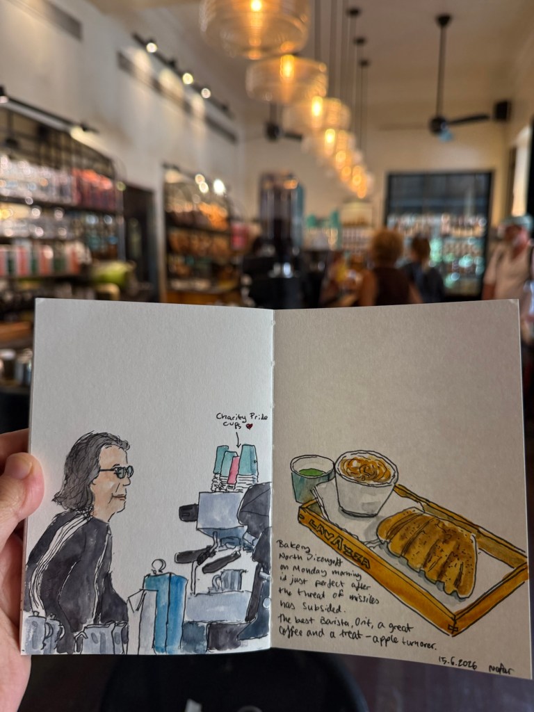
It’s been a while since I’ve inked up new fountain pens, and this month’s pen roster is both much larger than usual and has some rarely inked pens and new inks.
The list totals 16 pens, which is the most that I’ve had inked since the Inkvent days. It’s split into three major categories: leftover pens from previous months, pocket pens filled with cartridges, and full sized newly inked pens. The last category has a small sub-category of pens in it – the “use the good china” pens. I’ll explain it when we get there.
Leftover Pens
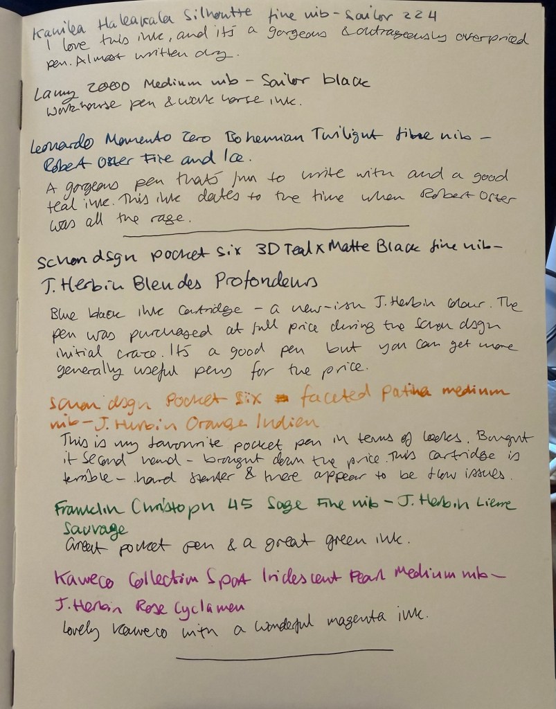
These pens were inked in the end of February (Kanilea, Lamy 2000) or the end of March (Leonardo).
Kanilea Haleakala Silhoutte – fine nib – Sailor Ink Studio 224. I bought this pen secondhand on the Pen Addict slack channel, and it’s a gorgeous pen that is absolutely not worth its retail price. Am I glad that I got it? Yes. Would I ever purchase a Kanilea pen again? No. There are better pens to be had for much less money. The Sailor Studio ink is also overpriced, but in this case the price difference isn’t such that it would hurt to buy it. 224 and 123 are my favourites of the series, but you can get a similar enough experience for less money with Diamine Earl Grey.
Lamy 2000 – medium nib – Sailor Black – workhorse pen, workhorse ink.
Leonard Officina Italiana Bohemian Twilight Momento Zero – fine nib – Robert Oster Fire and Ice – a gorgeous pen that’s one of my favourites. Robert Oster Fire and Ice is a good teal ink, and this bottle dates from the days that Robert Oster was new to the ink scene and all the rage. It’s a good ink but again, the hype was overblown. It’s taken me a long time, but I’m less and less interested in following the latest pen or ink craze. It has rarely been worth it. That being said Robert Oster makes good inks at decent prices, it’s just that they may be harder to obtain depending on where you live. Don’t feel like you’re missing out if you don’t get to try one of their inks.
Leftover pens from left to right – Leonardo, Kanilea, Lamy 2000
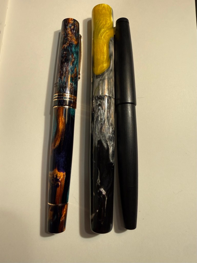
Pocket Pens
I bought a good amount of ink cartridges when I was in Paris and I wanted to test a few of them out. I don’t usually ink up pocket fountain pens as I find them inconvenient to use (they require posting and unposting every time you use them), so it’s been a while since I’ve used these (with the exception of the Franklin Christoph).
The pocket pens from left to right – Franklin Christoph, Pocket Six Patina, Pocket Six 3D Teal, Kaweco Sport
Schon Design Multi-color Pocket Six w/ Matching Grip, 3D Teal x Matte Black – fine nib – J. Herbin Bleu des profondeurs – my first Schon Design pen (I only have two) and the only one that I bought full price directly from Schon Design. The ink is a relatively new offering from J. Herbin (released in 2018) and wasn’t part of their offering when I started collecting pens and got into J. Herbin inks. It’s a good blue-black with a tiny bit of shading, and it’s a “wet” ink, which means that with more generous or wider nibs it’s likely to feather on the page.
Schon Design Faceted Multi-color Anodized Aluminum “Pocket Six” – Patina – medium nib – J. Herbin Orange Indien – my favourite pocket pen in terms of looks, but still overpriced for me, so I bought this one second hand. This ink is a hard, hard starter, and I’ve had a lot of trouble with it before. I don’t know how it behaves in bottle form, but I really don’t recommend these cartridges as there’s clearly a flow issue with this ink.
Kaweco Collection Sport Iridescent Pearl – medium nib – J. Herbin Rose Cyclamen – a really nice Kaweco Sport with a magenta ink. There’s some nice shading with this ink.
Franklin Christoph 45 Sage – Fine nib – J. Herbin Lierre Sauvage – the most comfortable and ergonomic pocket pen of the four that I have inked. Lierre Sauvage is the perfect green for spring and summer.
Writing Sample – Leftover pens and pocket pens
Full Sized Newly Inked Pens
I’m dividing this category into two – the “use the good china pens” and just pens that I wanted to use.
Just Pens
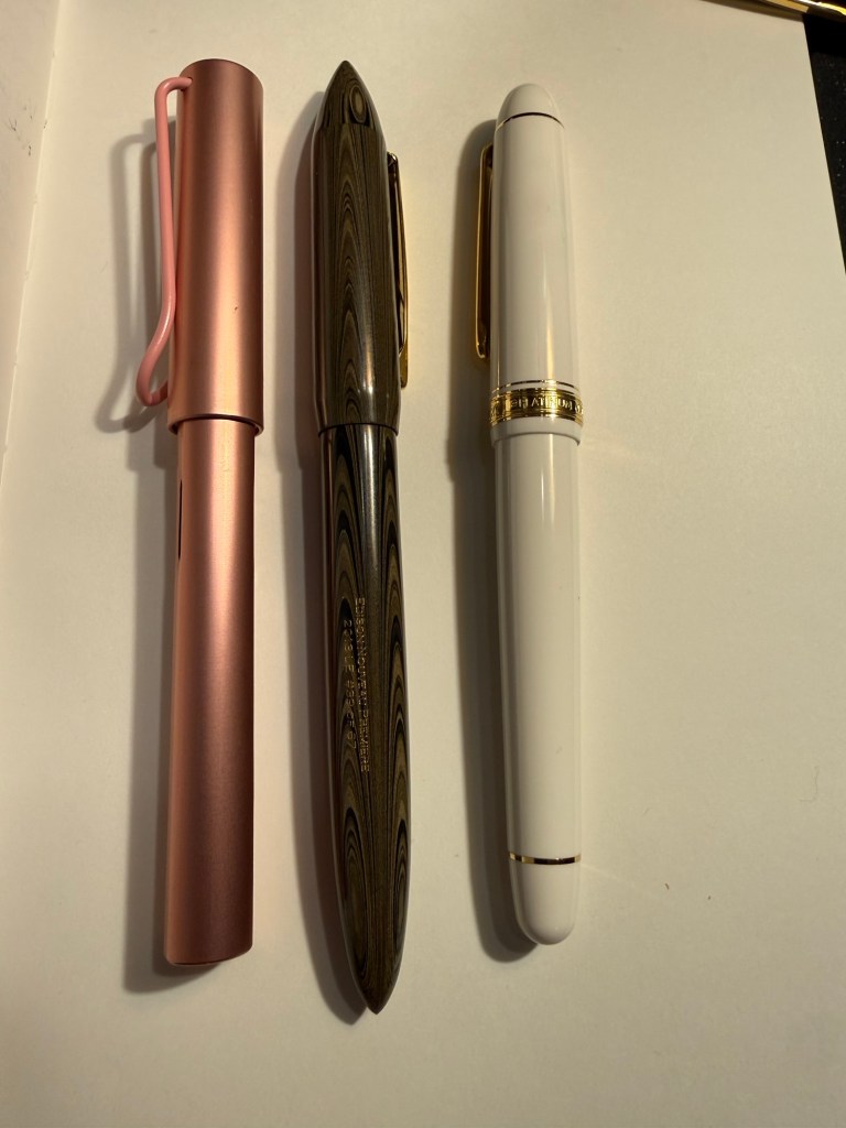
Just pens – from left to right – Lamy AL Star, Edison, Platinum 3776
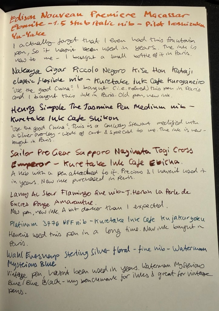
Edison Nouveau Premiere Macassar Ebonite – 1.5 stub italic – Pilot Iroshizuku Yu-Yake – I had managed to misplace this pen and so for years it hasn’t seen use. It’s a 2013 limited edition Edison pen made in collaboration with Goulet Pens. I love the shape of this pen, and the ebonite feels warm and light and just right in the hand. The nib is wide and generous, and felt suitable for the Iroshizuku Yu-Yake orange ink that I just bought. This combination will be used for titles, highlighting and journaling.
Lamy AL Star Flamingo – fine nib – J. Herbin La Perle des Encres Rouge Amarante – A new Lamy AL Star. Do I need it? No. But I like Lamy pens and they’re solid enough yet not precious enough to be great for ink testing and as workhorses. The J. Herbin is a new ink, and I bought it mostly because it was the last bottle in this hue in the store. I love Diamine Amaranth and I’m curious to see how this ink measures up against it.
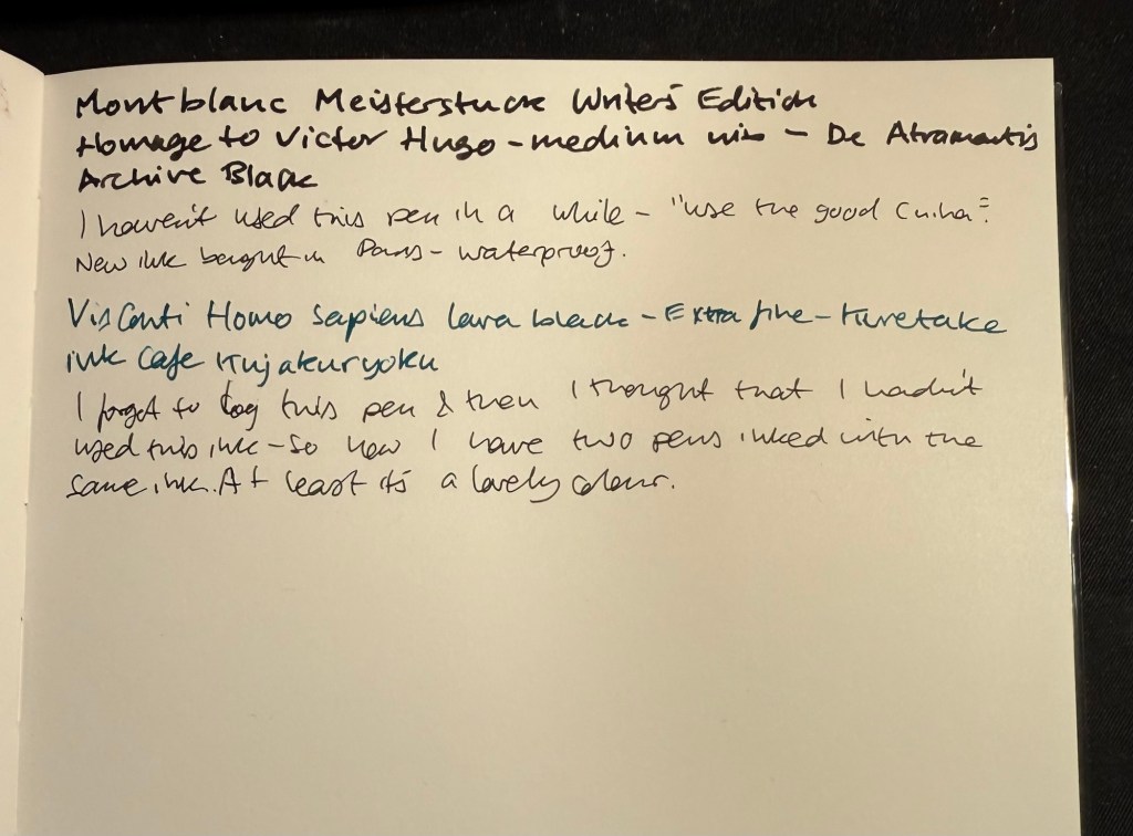
Platinum 3776 White – Ultra Extra Fine nib – Kuretake Ink Cafe Kujakuryoku – I haven’t used this fountain pen in a while. I love the nib but it does provide a lot of feedback when writing – not scratchy, but very close to it. I purchased four Kuretake Ink Cafe inks and wanted to use all of them – but I forgot to log this ink once I filled my Visconti Homo Sapiens. I then decided that I must have forgotten to use it, and so I inked up this pen. The result is two pens with the same ink in rotation at the same time – something that I don’t think I’ve ever done. At least it’s a colour that I love…
Use the Good China Pens
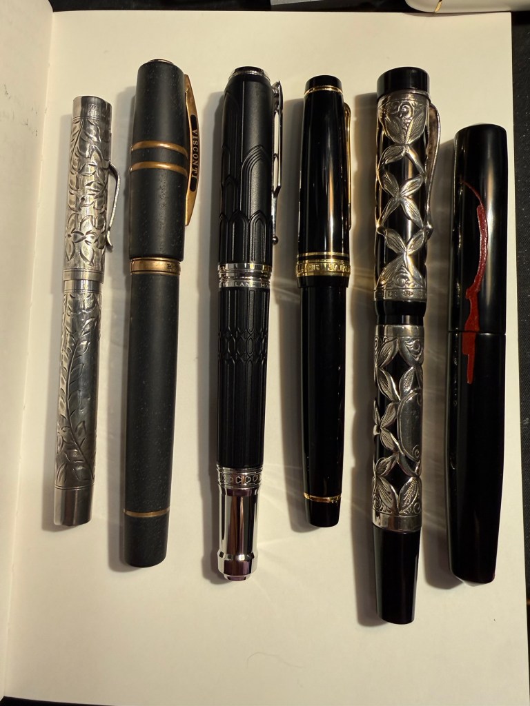
Use the good china pens – from left to right – Wahl Everysharp, Visconti, Sailor Pro Gear, Heny Simpole Jasmine pen, Montblanc, Nakaya
I recently filling in paperwork to get insurance for some of my most expensive pens – which made me realize that I haven’t used most of them in years. So I pulled some of them out and decided to “use the good china” because they’re meant to be used, not admired from afar.
Montblanc Meisterstuck Writers Edition Homage to Victor Hugo – medium nib – De Atramentis Archive Black – this is a relatively new addition to my “expensive pens” collection. I don’t buy limited edition Montblancs, and my other Montblancs are all vintage ones. I purchased this one at a discount on the last week that Mora Stylos in Paris was open, and even though it’s heavy and I don’t love the death mask on it, it commemorates the Notre Dame, and that’s one of my favourite spots in Paris. The ink is a new (to me) waterproof black from De Atramentis. I’m interested in seeing how it works for sketching.
Nakaya Cigar Piccolo Negoro Kise Hon Kataji – elastic flexible fine nib – Kuretake Ink Cafe Kuroganeiro – My one and only Nakaya, ordered from Mora Stylos and it was a whole thing to get it delivered. The price, the effort, and the fact that it was made to order makes it so, so special. It also has one of my favourite nibs – a bouncy flexible fine. The ink is a Kuretake Ink Cafe ink, this one a dark pine green.
Henry Simpole The Jasmine pen – medium nib – Kuretake Ink Cafe Shikon – A pen that is a work of art. I used to visit Henry the Pen Man’s stall every year in Portobello Road, and I always wanted one of his overlay pens. Eventually I purchased this one, and I regret not buying another one when I had the chance. It’s a Conway Stewart button giller with a fantastic gold nib and a wonderful sterling silver overlay designed and made by Henry. The ink is a lovely dark purple, one of the four Kuretake inks that I purchased.
Sailor Professional Gear Sapporo – Naginata Togi Cross Emperor – Kuretake Ink Cafe Ebicha – a nib that has a pen attached to it – that’s the story of this pen. I purchased this pen solely for the Naginata Togi Cross Emperor nib, which is a nib that behaves more like a brush than a standard fountain pen nib. The Ebicha ink is an interesting maroon colour that shows a lot of shading with this nib. It will be interesting using this pen after so many years, as the nib takes some getting used to in terms of writing angles.
Visconti Homo Sapiens – Extra Fine nib – Kuretake Ink Cafe Kujakuryoku – The original Visconti Homo Sapiens, bought at Mora Stylos the year that it was issued and took the pen world by storm. The lava like material, the brass, the nib, the weight – this is a pen with a presence. It will be interesting comparing it to the Platinum 3776 as they are both inked with the same turquoise/teal ink – Kujakuryoku.
Wahl Eversharp (Vintage) Sterling silver floral – fine nib – Waterman Mysterious Blue – I wanted to ink up a vintage pen, and this one is very “bling-y” and sports a truly flexible vintage nib. It’s also a lever filler, which I hate cleaning out, so Waterman Mysterious Blue (i.e. Blue Black) to the rescue. This ink is my benchmark, my desert island ink, the one ink that I can trust in any pen.
Writing sample – newly inked full-size pens part 1Writing sample – newly inked full-size pens part 2
This was a long list of pens and a long post – I hope that you enjoyed it, and I hope that you have some nice pens inked up and ready to use.