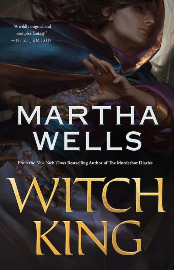
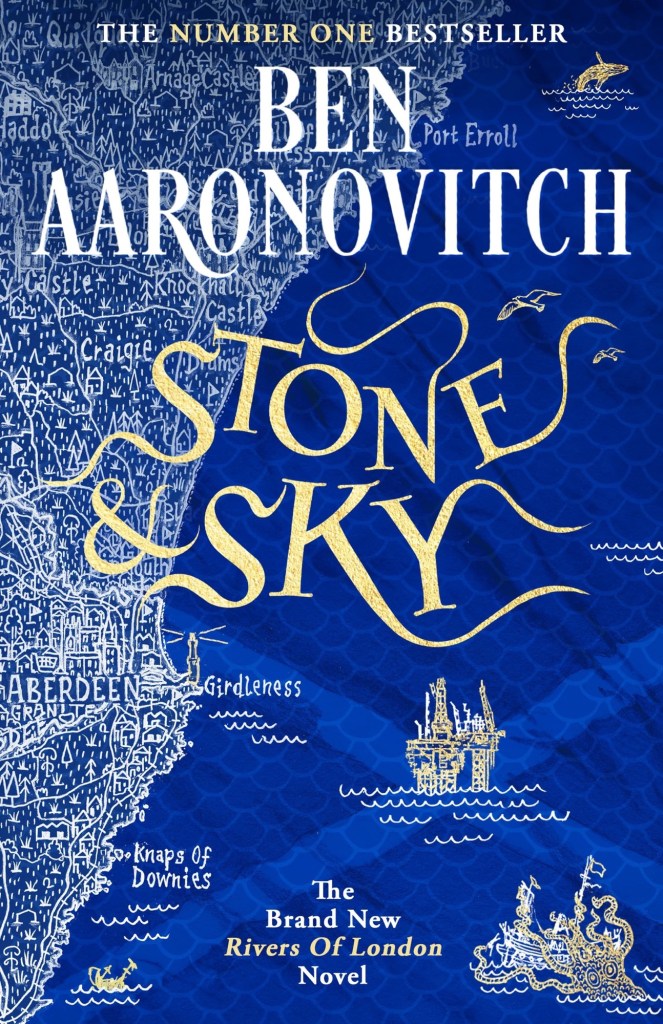
Quick Update and Currently Inked

I returned on Saturday afternoon from a 17(!) day trip to London, York and Paris, and I’m still in the process of adjusting back to my routine. It was a perfect trip and a perfect break from the hard reality that I normally live in, and so it’s been tough getting back. I missed my cats, and I missed my running routine, but I didn’t miss the slew of doctor appointments and medical related bureaucracy surrounding my cancer and my mom’s cancer, and I didn’t miss the political situation here at all.

So I’m trying to find comfort in journalling, in talking to friends, in enjoying the things that I got from abroad (of course I bought pens, paper, pencils, ink, cool vintage stationery, art supplies, etc). And I’m returning to blogging regularly. I have quite a few reviews in the works, and one more post in the “Ghosts of Planner’s Past” series, plus as I’m getting back to my reading routine more books will be featured here.

For now I’ve filled up four new fountain pens (none of which I’ve bought on this latest trip). The ASC Triangolo is a pen that I don’t remember buying at all, which is extremely unusual, and likely means that I bought it at Mora Stylos in 2022, on my first trip after finishing Chemo. Chemo brain is a real thing and I have chunks of that time (during treatment and a few months after it) that are completely missing in a very scary sort of way. The pen itself is an Omas 360 look alike, made with gorgeous arco verde material and has a “magic flex” nib. It’s the largest and one of the heaviest pens that I own, and the nib has issues (both problems starting and issues where it puts down too much ink). I filled it with Faber Castell Deep Sea Green, which from my experience is a drier ink, but that didn’t seem to affect it much. I doubt that I’d get much help from the Pen Family (their QC and service isn’t known to be the best though I will give them a try), so it’s a matter of seeing if I can fix it myself, and seeing what I can do to get it tuned locally, considering that the main guy working on pens here has recently retired. The ASC Triangolo is the big green striped triangular pen right beneath the writing.

The Sailor Pro Gear Slim Manyo Cherry Blossom is a pen that I bought on a whim in Choosing Keeping in London last year. I haven’t inked it since I bought it, but now I did, using the bottle of Sailor Manyo Sakura ink that came with it. This pen, unlike the Triangolo, perfectly fits my tiny hands (it’s the pink pen with the blue finials).

The two Lamy AL Stars (one on each side of the page) are a recent purchase from Pen Chalet. I wanted to try out a Lamy B nib, and I really liked the AL Star Petrol 2023 special edition, and the Tourmaline (2020?) one. They’re filled with Sailor Ink Studio inks that I purchased in Choosing Keeping during my last trip there.

The Leonardo Momento Zero Blue Hawaii and the FC Sparkling Rock travelled with me to London and back. They were a joy to use, and I’m glad that I took them along as they caused no issues – no leaks, etc – and were fun to use when I journaled during my trip.

Here’s a bit of a closer look at the writing sample. The Triangolo’s is unfortunately a mess. The Ink Studio 340 and 224 are my favourite inks of the bunch, though the Ama Iro and 743 are also great. The Sailor Manyo Sakura is too light of my tastes, especially in such a fine nib (the Sailor MF is like a Lamy EF).

Break out a nice pen or pencil to use. It’s the little things that can help make your day.

Phoenix Community Garden

The Phoenix Community Garden at the heart of Soho, London is one of my favourite places on earth. How much do I love this place, that was brought to greenery out of the ashes of a parking lot? I visualised it while I was going through my first and very painful biopsy. I won’t go into the gory details, but suffice to say that it took a very powerful positive memory to help me keep my body still during the intense pain of the procedure.

I love this new sign.

The garden is a haven for plants, people and wildlife in the heart of a busy city, and it is full of character. You get to see how bits of masonry and bobs of donations are recycled into a joyful mishmash of urban gardening.

No two benches here are alike, every pot and container has something weird or unique going on (from smurfs to little signs).

There’s a pond surrounded by broken paving that even has some goldfish moseying along in it.

And the place is cleverly built to be full of books, crannies, corners and elevation shifts, making it look much larger than it is.

I managed to get a quick sketch in before the rain started, nothing too fancy as my neuropathy was terrible today.

Find yourself a bit of green to find joy in today. We could all use a bit more of that.

Urban Sketchers Sketchwalk: Dizengoff Square

I went on a sketchwalk with our local Urban Sketchers chapter to Dizengoff Square, a central square in Tel Aviv that has been a gathering place since before there was a state of Israel. It was hot for the season, and the place was jumping with colour and activity.
This was sketched on a Moleskine Watercolour A5 portrait sketchbook, with Staedtler fineliners and Schmincke and Daniel Smith watercolours. The white was added with a Uniball Signo Broad UM-153 gel pen. You can see some process photos below.

Moleskine Bullet Notebook Review

Moleskine came out with a “Bullet Notebook” obviously geared for Bullet Journalling (BuJo) relatively recently. The BuJo started out on a squared large Moleksine notebook (surprise, surprise), and only later Ryder Carroll moved to Leuchtturm as his notebook supplier of choice. What surprised me was that Moleskine actually cared enough about BuJo to come out with a new offering, when they aren’t known for rushing out with new notebook formats very often.

The coral pink cover.

The bullet notebook is part of Moleskine’s is part of their Art lineup, which usually has better paper than their usual lineup, as it’s used for sketching or watercolours. The choice is a bit peculiar, but it speaks to where Moleskine appears to think that BuJo fits: not in their business lineup, but within the artists’ and creatives’ one.

It comes in three cover options: black, coral pink, and aquamarine. That is also a peculiar choice for them, as normally products in the Art lineup come in any colour you want so long as it’s black. The bullet notebook comes with 120 gsm ivory coloured paper and is supposedly fountain pen friendly. Note the supposedly in that sentence, we’ll get to that later on. It is noticeably thicker and heavier than their standard large hardcover notebooks, and it comes with two bookmarks in different colours – in the case of the coral pink one is pink and one is grey. Fetching.

Now we come to where this notebook really becomes interesting, the interior. The first page of “Personal Data” is taken directly out of Moleskine’s planners. There’s a bit of fluff at the end that I don’t think comes standard with their planners, but I still recommend not filling this page, ever. Especially not the passport details, driver’s license and any other thing that can be used to ID you should you lose or misplace this notebook.

Personal data. I’ve used this notebook for over two months, and this page remains purposefully pristine.

The next spread is the very cool Moleskine world map, the same one that you can find in many of their planners and other travel related products.

I love maps, and I love this map.

The next set of pages is where the bullet notebook starts to get interesting. It’s an index, with the first entry already printed inside: Pen Test on page 149. This is classic BuJo, and Moleskine delivers. There are five index pages, which should be enough for practically anyone’s needs.

The index

Inside there are 148 pages of ivory coloured 120 gsm dot grid paper. That’s less than there is in a regular Moleskine, but the paper is significantly thicker, and already the notebook is thicker and heavier than their standard notebook. They put the maximum number of sheets they could without making the notebook too bulky. The pages lay flat, and Moleksine’s binding and covers are built for endurance. The pages are numbered, which is also something that Moleskine doesn’t normally do, but fits well with the Bullet Journalling Method.

The paper inside.

There is space in the back for pen tests, so I immediately used it to test a slew of fountain pens. Moleskine claims that the bullet notebook is fountain pen friendly. It is not. There’s spread, there’s bleed-through, show through and sometimes spidering. This isn’t a fountain pen friendly paper on any count.

Pen test page.

The back pocket has something new and interesting going on. Moleskine stuck folded piece of paper on the back pocket and on the outside it looks like regular dot grid paper:

Back pocket and closed fold-out.

But when you fold it out there’s a key page inside. Very elegant and clever.

My key page.

I like that Moleskine are experimenting with new formats. I don’t like that they advertise this paper as fountain pen friendly when it clearly isn’t. The bullet notebook comes with a sheet of stickers that I didn’t bother photographing because it just looks like a sheet of solid pink, but it’s actually made of small stickers in various geometric shapes.

If you are looking to get into BuJo but enjoy working with mixed media or fountain pens, then look elsewhere. In terms of cost the Moleskine Bullet Notebook is about the same price as the official Leuchtturm one, and you get a better deal buying that if only for the official booklet. If you are looking for a more minimalist setup that what the official Bullet Journal offers and you aren’t planning on using fountain pens, than this is a decent offering, especially as it comes with more cheerful cover options. It is un-opinionated enough to be useful even to those who have never heard of BuJo in their lives. Do I see myself buying another one of these in the future? No. I am struggling to finish using the one that I have now (because I’m not a fan of dot grid). But I am glad that Moleskine is willing to give new notebook formats and paper types a try. If this notebook had this exact paper but in plain white or squared white, I would have bought a stack of them.

Cortex Brand Sidekick Review

The Cortex Brand Sidekick is a notepad that is designed to sit between you and your keyboard. The Sidekick’s layout is a bit unusual: it’s mostly a dot grid pad, but there’s a checklist on the right-hand side of the page, and there’s a titlebar above both the dot grid side of the page, and above the to do list side of the page.

Page layout: dot grid on three quarters of the page on the left, checklist on a quarter of the page on the right.

The Sidekick is bigger than I expected. The full specs aren’t stated on the page (or on the notepad), which is disappointing, but it’s about 18cm tall by 30cm wide, has 60 perforated sheets printed one sided in dark grey and 100gsm Munken Lynx paper (that is stated on the back of the Sidekick). The paper is smooth (but not Rhodia coated smooth), white and fountain pen friendly.

Front cover with Rhodia pad like folding crease lines and prominent Cortex logo embossed.

The cover material is made from recycled coffee cups, which is very cool conceptually. Coffee cups aren’t otherwise recyclable because of their coating, and this is a way to make good use of them. The front cover is rather thin cardboard, but the back is substantial. As the front cover is designed to fold over and leave the pad itself open for writing, it doesn’t close very elegantly when not in use. It’s not a major issue, but you do have to be careful when slipping it into your bag to make sure that it is covering the pad, and I flip the Sidekick on its back when not in use to help the front cover retain its shape. This issue occurs with Rhodia pads as well, and is inherent to the fold back design.

Front cover popping up.

Although the Sidekick seems to want you to use a page a day, that is too wasteful and expensive for me (more on the price later). I’ve been using this page from the 27th of February and I’ll be finishing with it sometime in the coming week – so that’s almost a month of use. I keep a Field Notes “Heavy Duty” nearby for jotting down and doodling things, and I use my Sidekick to help me manage my current project. I’ve found the checklist on the side to be a bit baffling. It’s too narrow for me, and I have small handwriting, and there aren’t enough checklist items to actually cover a day if I was using the page as a daily page. The checklist could perhaps work in a meeting setup, but unlike what Myke and Grey (the makers of the Sidekick) I think that the Sidekick is not a good meeting notepad.

The Sidekick in use. These are my actual notes, censored. As you can see I used multiple kinds of fountain pens and inks with great success.

So why do I think the Sidekick isn’t a good meeting notepad? Its size. It is way too big and it really would call attention to itself in a “LOOK AT ME, I AM TAKING NOTES IN THIS MEETING” kind of way. There is no discreet way to carry it or use it, and you will be taking a lot of real-estate on any meeting table. What is does do well is sit between yourself and your keyboard (provided you have room for it) and allow you to take notes that way. If you plan on using it for Zoom meetings it may work, but personally my meeting notes tend to be messy, so I wouldn’t want to waste a Sidekick page on them.

The back of the Sidekick comes with a page that has a Daylight Savings Time table for various places and product info. I have no idea why it’s there, but I assume that there’s a design decision behind it. I would have preferred to just have another standard page, and have the product info printed on the back cover or available on their site.

DST page.
Product info with Made in Britain proudly displayed.

I bought the Cortex Brand Sidekick the moment that it became available for purchase (I also added my first Theme System Journal to the order, but I’ll discuss that in a different post). I like good stationery and I know Myke Hurley does as well. I had no doubt that this would be a well-made product, fountain pen friendly, and that Myke would agonize on every aspect of this notepad’s design. He did. The Sidekick is a high quality, premium notepad. It is hand assembled in Britain. It uses cool and sustainable materials.

It’s very expensive.

Now, I understand the price and I had no problem paying for it (and I bought this before the YouTube product video came out or the podcast episodes discussing the design and manufacturing process were published). This isn’t a mass market product, it uses high quality and expensive materials, and it is hand assembled in a small shop. These things make the price add up. The Sidekick is $32 dollars, to which you add shipping. That makes it a $40-50 notepad. If I were to use a page for every workday, I would be looking at around $200 a year on Sidekicks and shipping.

This is what makes the Sidekick a niche product, in my opinion. Myke said that there’s no other product like it, and that is partially true. If you like the page layout and the size, there is no other notepad but the Sidekick for you. However, I have been using a notebook that goes between me and my keyboard for quite a while before the Sidekick came out. It is small enough to fit on the most narrowest of desks, it has a plastic double cover and a chipboard backing that make it very portable, it is much smaller than the Sidekick, and you can take it to meetings without drawing attention to yourself (I have done so many times). It is also much, much cheaper than the Sidekick (coming in at less than $12 at time of writing, it is less than half what a Sidekick costs, not including shipping), and alas, as Amazon ships it, it is likely to be available with free shipping.

It’s the Maruman Mnemosyne horizontal A5 notebook and it is one of my favourite notebooks out there.

The Mneomosyne on top of the Sidekick, just so you’ll see the size difference.

This isn’t a Mnemosyne review, but I will point out that this notebook has 70 sheets of 80gsm 5mm grid paper that is fountain pen friendly. The Mnemosyne also has perforated sheets, plus space to write a title in. It is ring bound, which is normally not my favourite, but works well with the horizontal format (the rings don’t get into the way of your writing hand). It carries well both in the bag and around to meetings – I am never without one in my bag. While like the Sidekick the grid is printed only on one side of the page, because it is ring bound you can use both sides of the page if you so choose. To do so with the Sidekick necessitates tearing the page out first.

Maruman Mnemosyne

The Sidekick is larger, which gives you more room to think. It also has thicker paper, and better perforation. The Mnemosyne doesn’t have rounded corners, and so the corners do sometimes get dinged. I’ve used them both over the past month, and while I treat using the Sidekick as a luxurious treat, the Mnemosyne is my workhorse. I don’t coddle it or think twice about scribbling something illegibly on it.

Do I recommend buying the Sidekick? Yes, if you can afford it. It is a premium product for a premium price. There is a place for those kinds of products in the market, and perhaps there is a place for them in your life. I see myself buying one Sidekick a year, two tops. That makes it a product that I use with consideration, but that is not necessarily a bad thing. It’s good to be considerate of what you use and why. The Sidekick is a beautifully made and thoroughly considered desk companion, and I suggest that you give it a try to see if it fits in your life.

Book Review: Erebus: The Story of a Ship, Michael Palin

I enjoy reading Michael Palin’s (he of Monty Python fame) travel books. Palin is a good travel writer, combining keen observations of humanity, nature and location with a good sense of history and a sprinkling of oftentimes self-depreciative humour. “Erebus: The Story of a Ship” differs from his other travel writings in that it mostly isn’t his travels that are narrated, but those of the Erebus and its sister ship, Terror. These two former bomb ships spent the mid 19th century exploring the antarctic and then the arctic, with great success and to great acclaim. And then they disappeared for 160 years.

Palin starts the story with the crew, and the crew are at the heart of his tale. He could have focused on the tenacious people trying to piece together the story of the ship over the decades. He could have focused on Erebus’s last voyage and the long and oftentimes disastrous search attempts after it. But he chose to bring the ship to life through its crew, the era it was built in, and the state of the world around it. He masterfully weaves charming anecdotes of the ship’s daily life together with serious discussions of corporal punishment, racism, colonialism and the ecological damage mindlessly wrought by the Victorians. You get to hear about astoundingly brave and talented men doing the impossible, and about how ego and rigid thinking could be the downfall of their peers.

Palin traces the story of the Erebus from before it was built, through the story of its would be captain and crew and their Arctic exploits. He then goes through its creation, to its early days as a bomb ship with nothing to bomb, to its early retirement, and then its resurrection as an Antarctic explorer. He is sympathetic to its crew even as he pokes fun at some of them, and he always does his best to bring the daily life on the ship alive to the reader. There are a few well selected photos, prints and some excellent maps in this book, and they go well with Palin’s narration.

He also traces part of the Erebus’s journey himself, either by recalling past visits to certain key locations, or by actually travelling to remote places around the globe in the wake of this ship. He doesn’t sugarcoat its demise, the hardship its crew suffered, or the mistakes that they and their peers made.

“Erebus” was found in 2014 and “Terror” in 2016. They appear larger than life in many bits of literature, music and art, and it is worth learning their story. What Palin does in this book is not merely tell it as it was, but bring it vividly to life, and tie it inexorably to our lives right now.

P.S. I bought this book at the National Maritime Museum at Greenwich, which is very apt, as a branch of the museum appears in this book, and the museum helped Palin with the research for it. If you haven’t visited this wonderful museum, I highly recommend it.

Ghosts of Planners Past: GTD and Friends

This is probably going to be the hardest post to write in this series, and so I’ve been postponing it.

I got into Getting Things Done around 2005, when it was really starting to gain momentum with tech workers online. I first heard about it via PvP Online’s creator, Scott Kurtz. Yes, I found a productivity and planning system via one of the first webcomic creators. The internet is funny that way.

Notes from 2011 on doing GTD better

If you have no idea what GTD is, then I suggest starting here. It’s a 15 minute guide to David Allen’s all-encompassing planning and productivity system. If it resonates with you, then the GTD book is pretty good for a book in the productivity genre. Books in this genre tend to be repetitive, padded with anecdotes, and oftentimes poorly written. The GTD book is readable, and while it contains the inevitable productivity guru anecdotes, there aren’t very many of them.

There are a few things to note about GTD that set it apart from other productivity systems, and make knowing about it worthwhile:

  • While it was developed for a paper office based world and appears on the face of it to be very rigid, it is in fact extremely customizable and flexible, and it converts very well to digital planning and to do list systems. Many of the most popular to list applications have their roots in GTD, for good reason.
  • While it was developed for an office setting and busy executives, it easily works well for students, designers and other creatives, developers, teachers, and just about anybody that doesn’t lead a leisure filled life. If you have “stuff to do”, if you feel overwhelmed, then GTD in some form or another could very likely help you.
  • This system spawned dozens and dozens of other systems. You can see the roots of GTD in BuJo (Bullet Journalling), there’s a monster list of GTD implementations, and 43folders (Merlin Mann’s old productivity site) is full of info on various GTD tweaks and variants. This, by the way, is my favourite one.
  • The basics of GTD are worth implementing no matter which system you use, because they just work, and because they will likely fit whichever system you use. They are:
    • Make a list of all the things you have on your mind that you need to do. They need to be actions that you can perform in the real world, and you need to be able to clearly envision what “done” means.
    • Curate that list – make sure that things on it are actually ACTIONS that you can take IN THE IMMEDIATE FUTURE. Break big tasks into little ones, things that you are able to do it small chunks of time. Make sure there aren’t any hidden dependencies or prerequisites to these tasks. Make sure you know what DONE looks like. Make sure that they are REAL and actually need to be done, and need to be done by YOU. If things on that list take less than 2 minutes to do, just do them. T
    • Go over that list and do the things. If you’re stuck, make sure the thing was properly defined and isn’t a hidden project (i.e. isn’t actually one task but rather 20), something that you can delegate or not do, or something that you can’t start working on now. If you’re balking at doing it open a timer (the famous pomodoro technique enters here).
    • Once a week prune the list. Be ruthless.
    • Don’t schedule anything on your calendar unless it absolutely has to be on your calendar – a doctor’s appointment, a child’s graduation, an exam date, etc.
  • You can get carried away by GTD and become more interested in the organizational part of it (“Productivity Pr0n”) than in actually getting the work done.

The last bullet is what earned GTD a place in this blog post series.

I love GTD. I’ve been using it in various form for almost two decades. I have the book and have read it twice, and I have a good grasp of the major players in the GTD cinematic universe. I know the system well enough to be comfortable to get rid of its mannerisms and streamline it to my own needs. I can see its influences in Jira, in BuJo, in Omnifocus and other to do apps. And it’s very powerful dark side is that it really invites you to tweak and tinker with it. You are tempted to make your system a little bit sleeker, better, more efficient, better suited for your needs, to the point where you suddenly find yourself spending more time and care on the system than the tasks that it is supposed to help you manage. So while GTD taught me how to define and manage my tasks, it also taught me to be constantly aware of how much time I’m spending on my task management systems.

So if you are worried about being carried away by GTD’s siren call to tweak, tweak, tweak, here are some basic ideas from the system that I think are worth taking with you or thinking about no matter what:

  • Our minds aren’t good at keeping track of things. Write them down.
  • Not everything is a real task. It if it isn’t an action that you need take in the world, then it needs to be trashed/delegated/better defined.
  • Tasks that languish in your planner/to do system are either ill defined (see bullet above) or require deliberate action to get out of the way (see pomodoro technique, dashes and timers).
  • Don’t clutter your calendar. It just adds needless stress to your life.
  • The best definition of a task is a physical action, that can be accomplished at a sitting, supports valuable progress towards a recognized and desirable goal, and something that YOU are the most appropriate person to perform.

Weekly Update: Short Edition

I’m in a bit of a rush, so this one’s going to be quick:

Fountain pens: I’m down to 11 inked fountain pens, with most of them being half empty at least. I’ve been writing a pen or two dry a week, which is good.

Reading: I’ve got a few reviews to post, and I’m now reading the stunning “Drive Your Plow Over the Bones of the Dead” by Olga Tokarczuk, the Noble prize in literature winner. The prose in this is something else.

Running: I’ve upped my long runs to 10.5-11k, and with the weekly walks to the protests have reached around 19k of running and walking every Saturday. I’ve also enrolled to my first every 12k, and will be enrolling to a few more races this month.

Drawing: One Week 100 People is over and already I miss sketching people daily. It was a tough but fun challenge, and messing around with different medium types really added an interesting dimension to it all.

Apart from all that I have several projects in the works, including a few long blog posts, some volunteer work, a good amount of decluttering, a bit of professional up-skilling and more.

Have a great week!

One Week 100 People Day 8: Protest Bookend

I started the One Week 100 People challenge with the pro-democracy protests last week, and I finished it with them this week.

Fighting for the soul of our country
Every week more people take to the streets.

These were sketched with watercolour and a 0.1 Staedtler pigment liners. As I was drawing a 3-year-old girl snuck up to see what I was doing, and we had a lovely chat with her and her parents. I ended up drawing dinosaurs in a forest for her to take home and colour, while she explained the merits of democracy and pizza with olives to us. I was enchanted.

I finished the challenge with 112 people sketched. I had a lot of fun sketching people, and there’s something in playing with various medium types that made it more fun and expressive than my attempts in previous years, at least to me.

One Week 100 People Day 7: Mixed Media

Today turned out to be busier than I planned so I struggled getting these 12 in. They are sketched in ballpoint, red and blue Caran D’Ache pencil, a Caran D’Ache coloured lead, a vintage Mongol pencil, Faber Castell Pitt brush pens, and two different fountain pens. Can you guess which is which?

That makes 72.