Vengeful Fortress Part 5: Split Party

A blog about writing, sketching, running and other things

I haven’t run in the park for a while, at first because I wanted to distance myself from other runners, later on because it wasn’t allowed, and recently because I wanted to distance myself from other people. But I’ve gained some confidence that things with the Coronavirus have chilled sufficiently for me to indulge in a quick morning run in the least popular place in the park.
I saw a pair of graceful prinias, some of my favourite birds. They’re shy and skittish but you can catch a glimpse of them here:
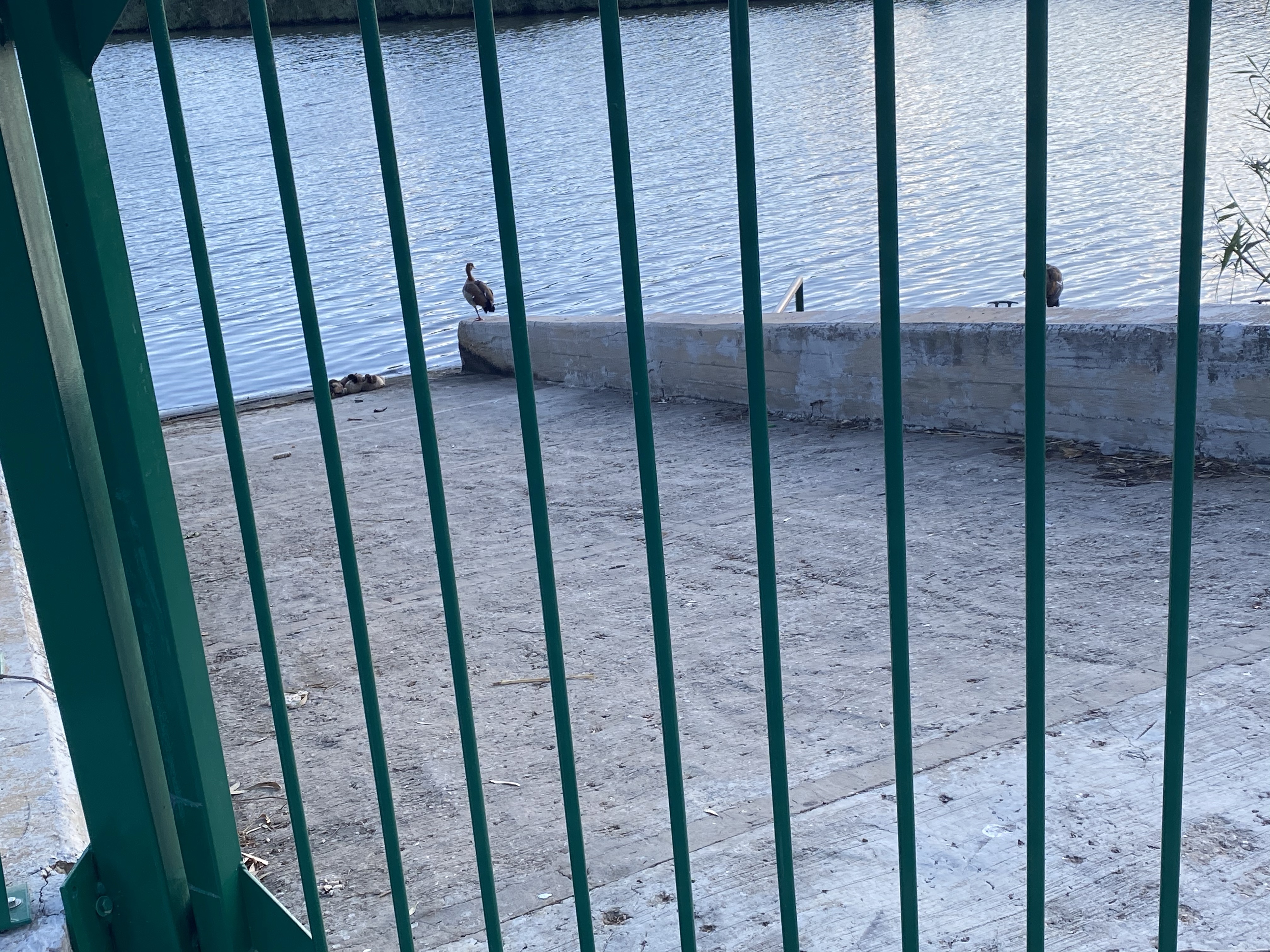
My favourite moment was catching sight of a flock of sleeping Egyptian geese and their two faithful watch-geese:
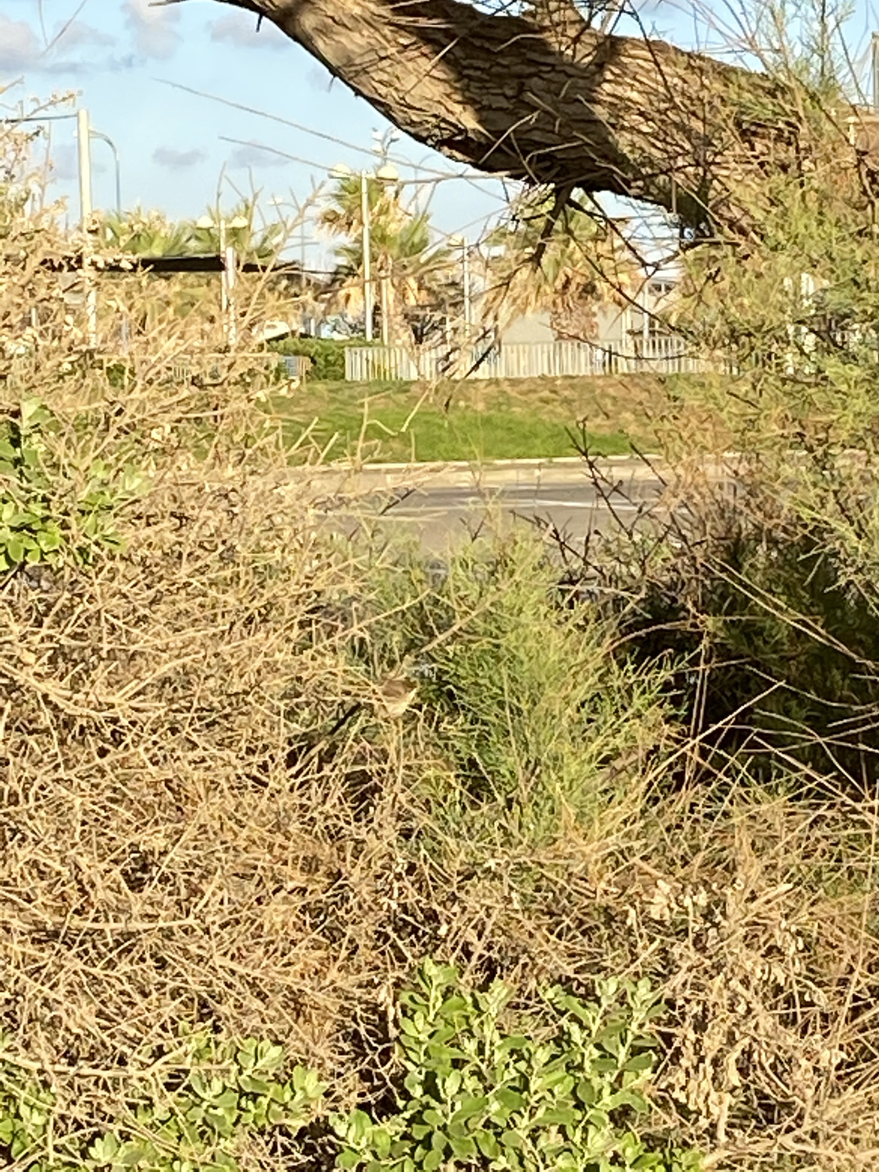
It was fun to see some of my old haunts, even if they have changed slightly:

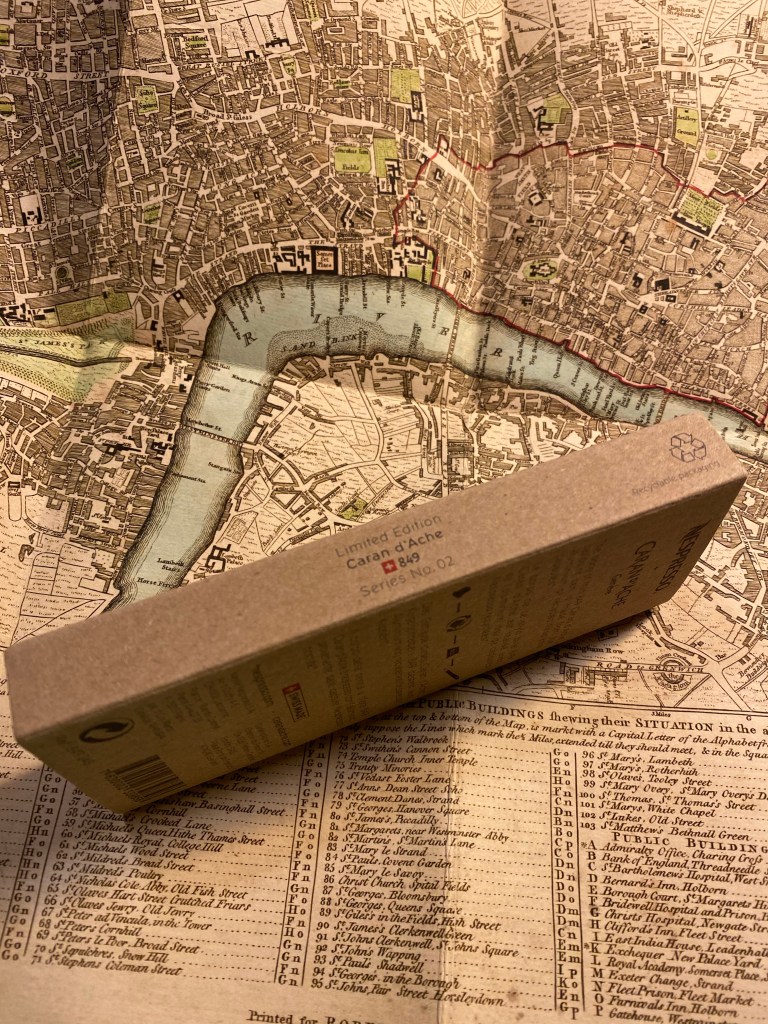
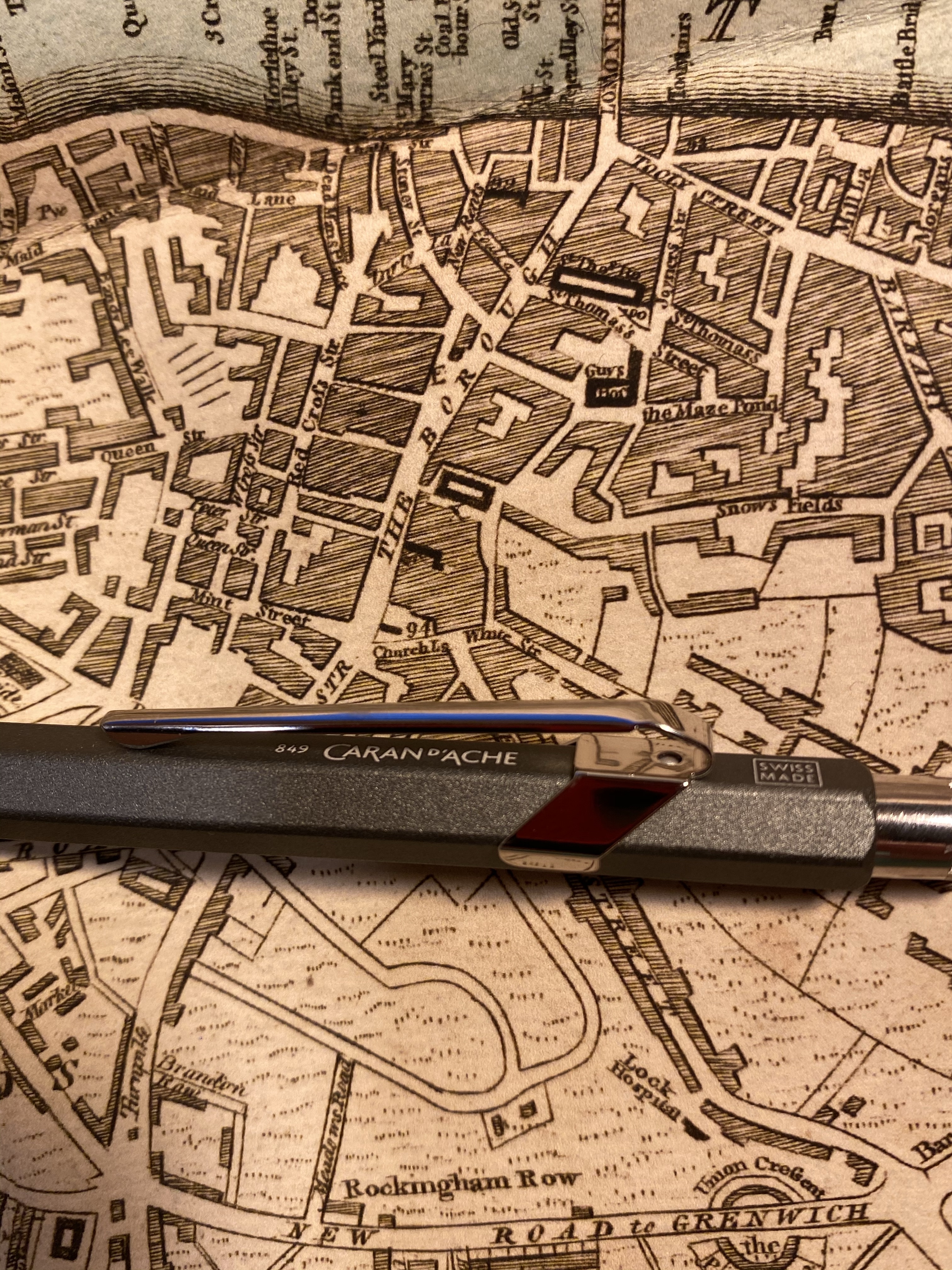
When Caran d’Ache came out with this year’s limited edition Nespresso capsule 849 pen I breathed out a sigh of relief. I’m not a fan of their India capsules, and their olive green colour doesn’t speak to me, so I thought that it would be an easy pen to skip. Their previous collaboration, the Darkhan, was an excellent pen overall, especially as a gift purchase to the Nespresso or pen lover in your life, and I also loved the capsules and loved their colour.
Well Cult Pens celebrated their 15th anniversary, and I needed some refills, and somehow or other the India 849 found itself in my basket. I thought I would gift it away, but once it arrived I knew that this pen is staying with me.
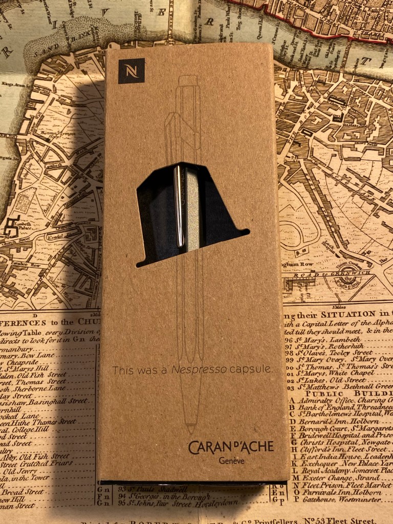
As with the previous edition, the packaging on this pen is genius. It shows off the pen and what it is beautifully, and it’s so well made and well considered. On the front there’s the “This was a Nespresso capsule” label, and a sketch of the pen that fits perfectly with the way the pen is presented in the box (that’s not left to chance. The box is designed so the pen will stay put in semi profile and show off the subtle “Caran d’Ache” logo underneath the clip).
On the back there’s a short explanation about what makes this pen special:

Inside the pen is securely slotted in its superbly designed cardboard housing, and here you can catch the first glimpse of why I decided to keep this pen: its colour.
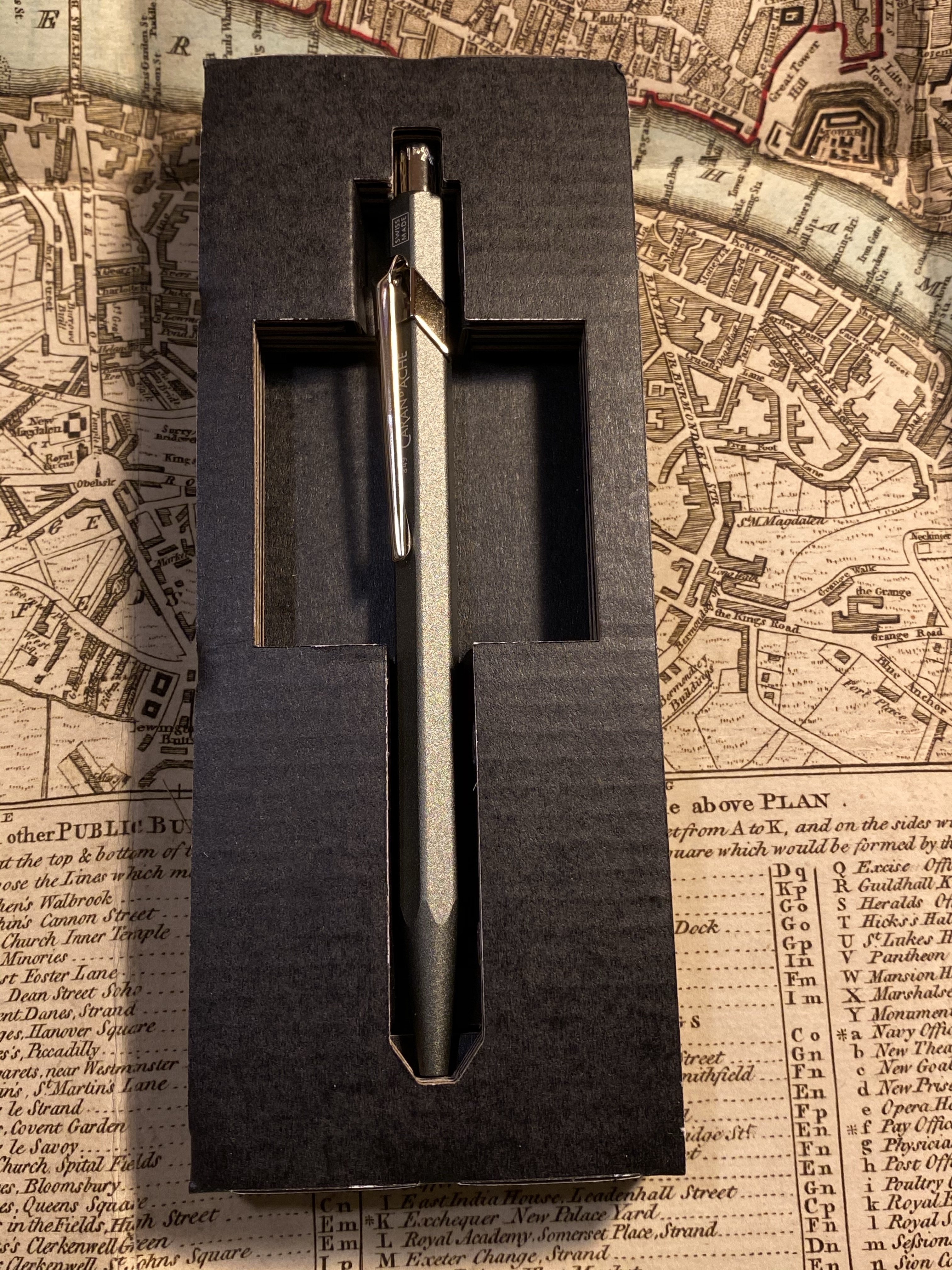
This is a beautiful pen that doesn’t photograph well. Its colour is wild, if subtle could be wild. It’s a cool grey with a slightly green hue. I’ve never had a pen like it, and the result is very, very cool.
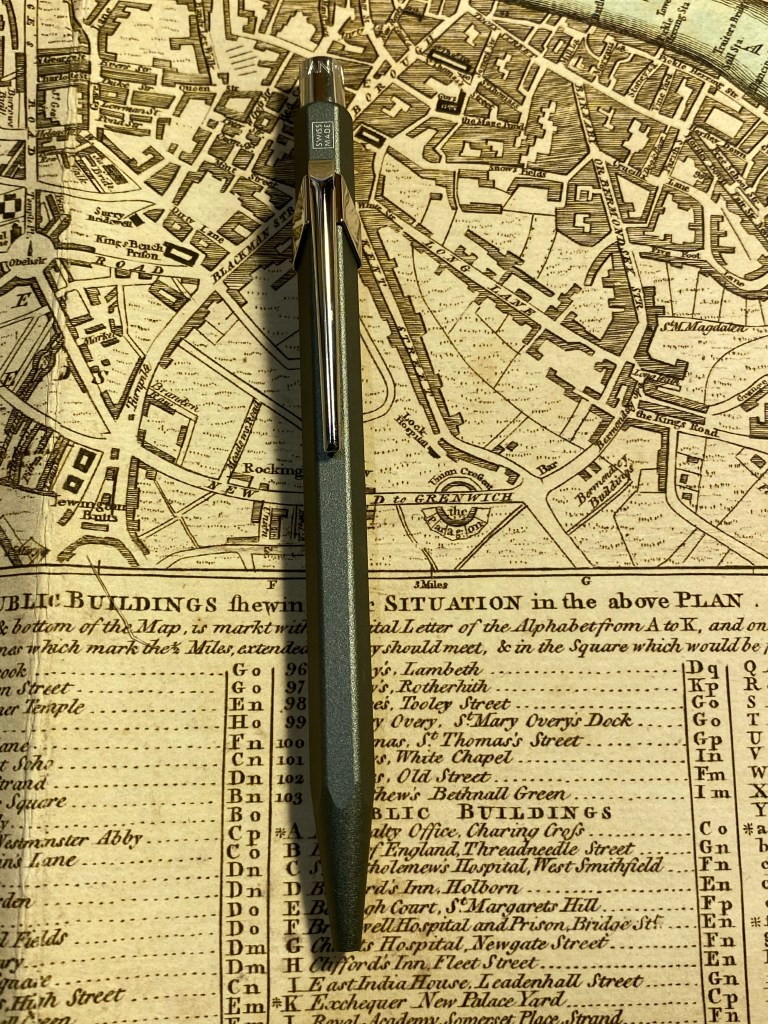
Unlike most 849’s and just like the Darkhan edition, this pen has writing on it beyond the hidden Caran d’Ache and the “Swiss Made”:
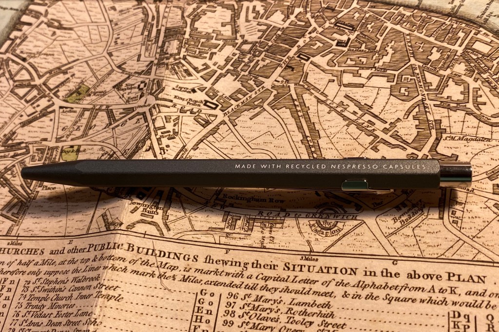
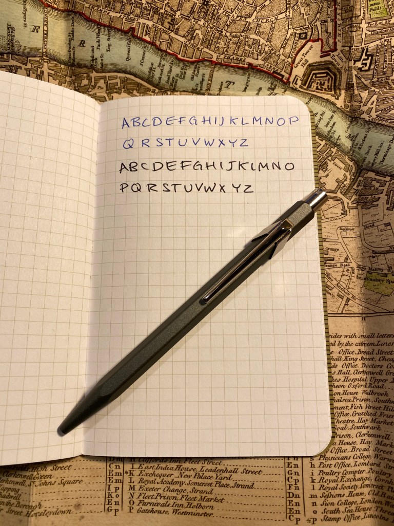
The 849 is a ballpoint and has an excellent out of the box Goliath Caran d’Ache refill. I’m not a fan of ballpoints, so I switched my refill out with the 0.7 Parker gel refill in black, and now I can’t put this pen down. This pen weighs more than the featherweight 849, and it has a textured finish. The result is the 849 pen, only better.
I highly recommend this pen to anyone who is even slightly interested in the Caran d’Ache 849, as it’s a significant improvement over an already great pen design. It makes for a great gift, and a great pen to carry around with you (just make sure nobody tries to nick it from you). I hope that Caran d’Ache and Nespresso continue this collaboration, and I can’t wait to see which capsule colour they select next.
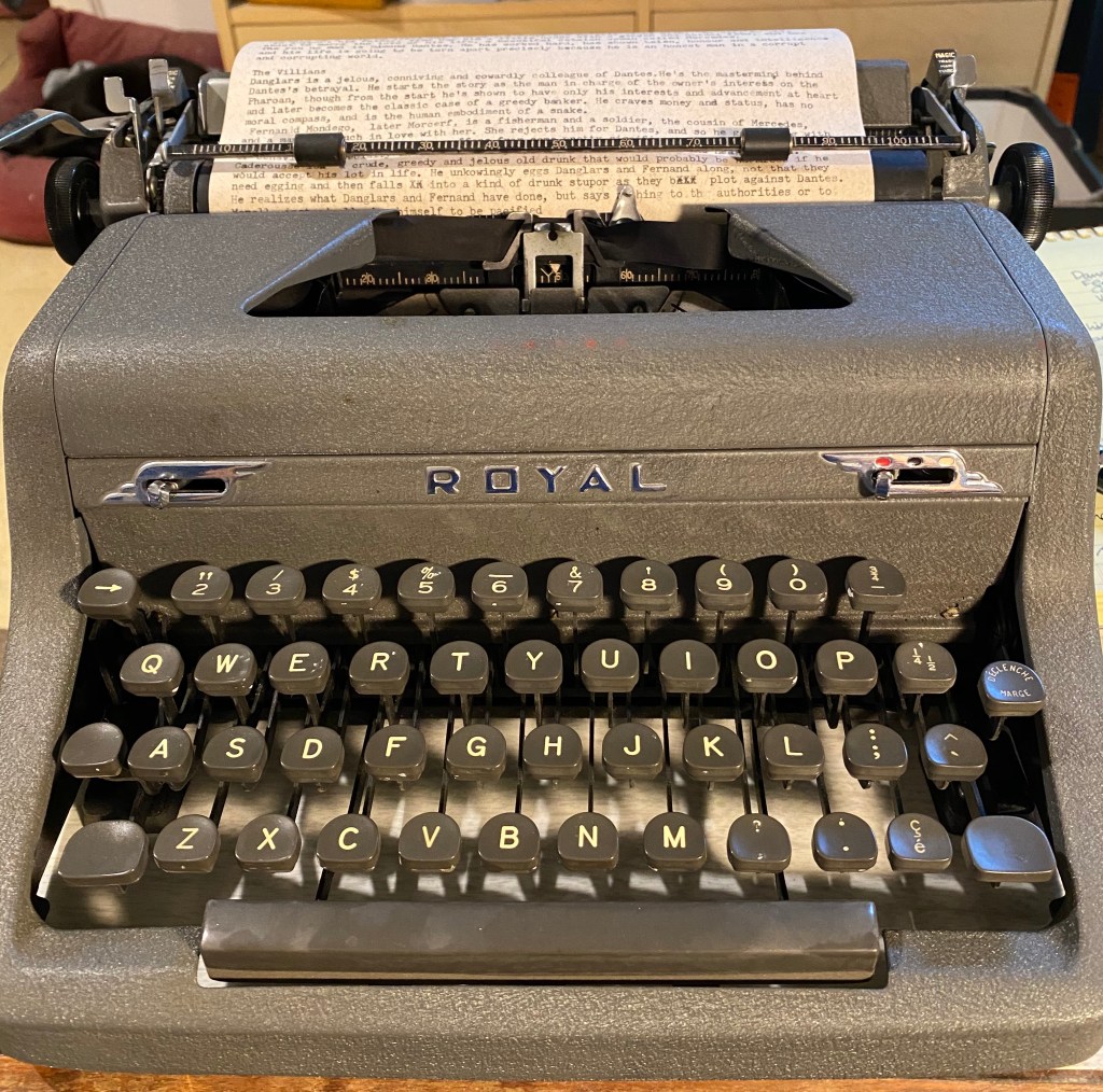
I am working on a script for a podcast, and I was utterly failing at it. I was writing too much, not focusing on what was important, getting lost in the text that I was working on. After trying to write the script in Google docs and failing, and trying to record without a set script and failing, I tried a trick that helped me before when I was stuck with a writers block.
I used a typewriter.
For me typewriters are magical machines that on the one hand force me to slow down and consider every word, and on the other hand let me get into a writing rhythm that other writing instruments just don’t allow for. There’s a beat to writing with a typewriter. It makes you earn every word.
If you’re a writer, get thee a typewriter, and earn every word.

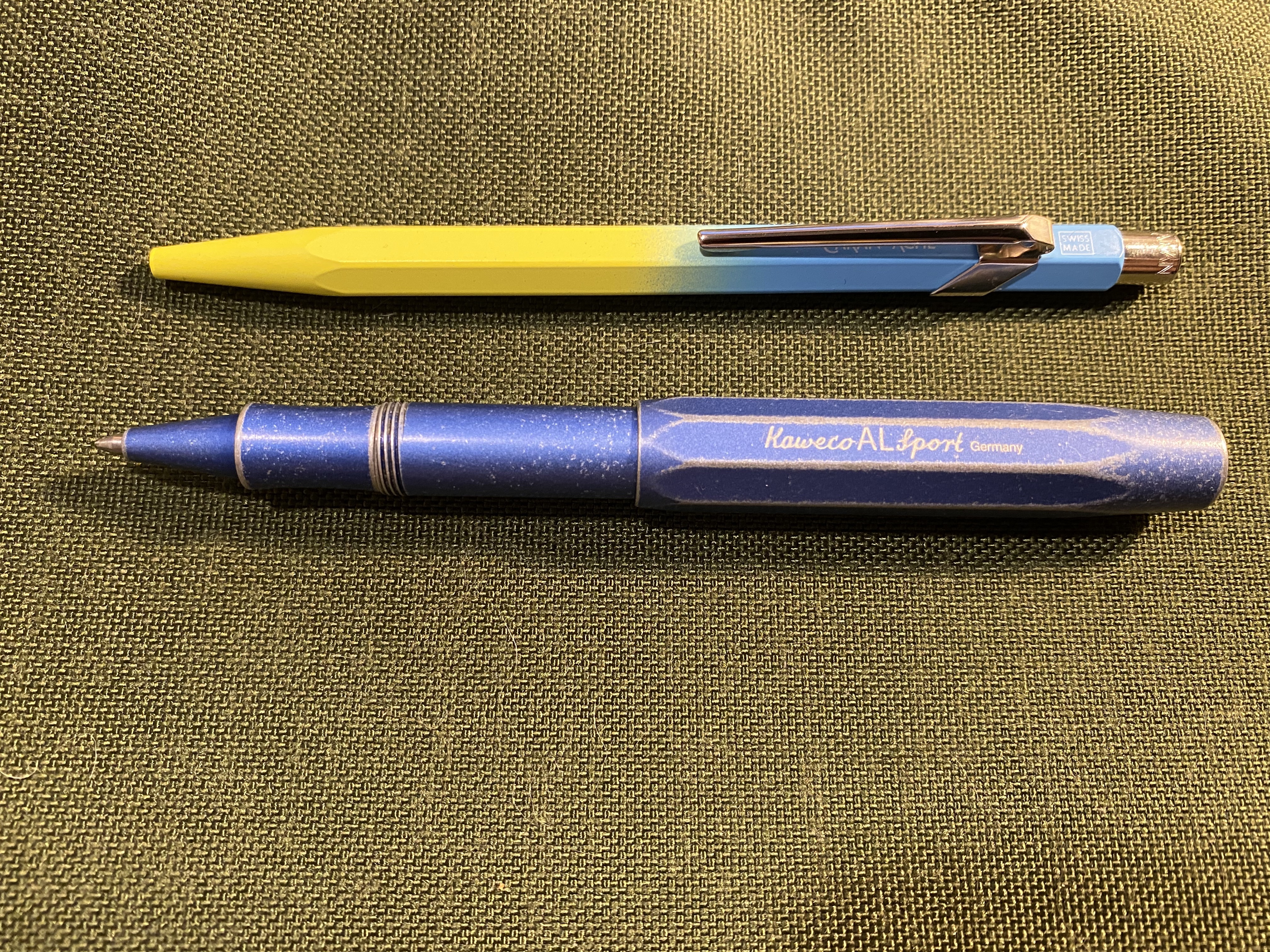
I’m not a fan of pocket pens, mostly because women’s pants usually don’t have room for them. Couple that with my fear of forgetting a pen in my pocket and then putting the pants through the wash, and you can see why I have so few of them. However, in 2014 Kaweco came out with the AL Sport Stonewashed and I just couldn’t resist.
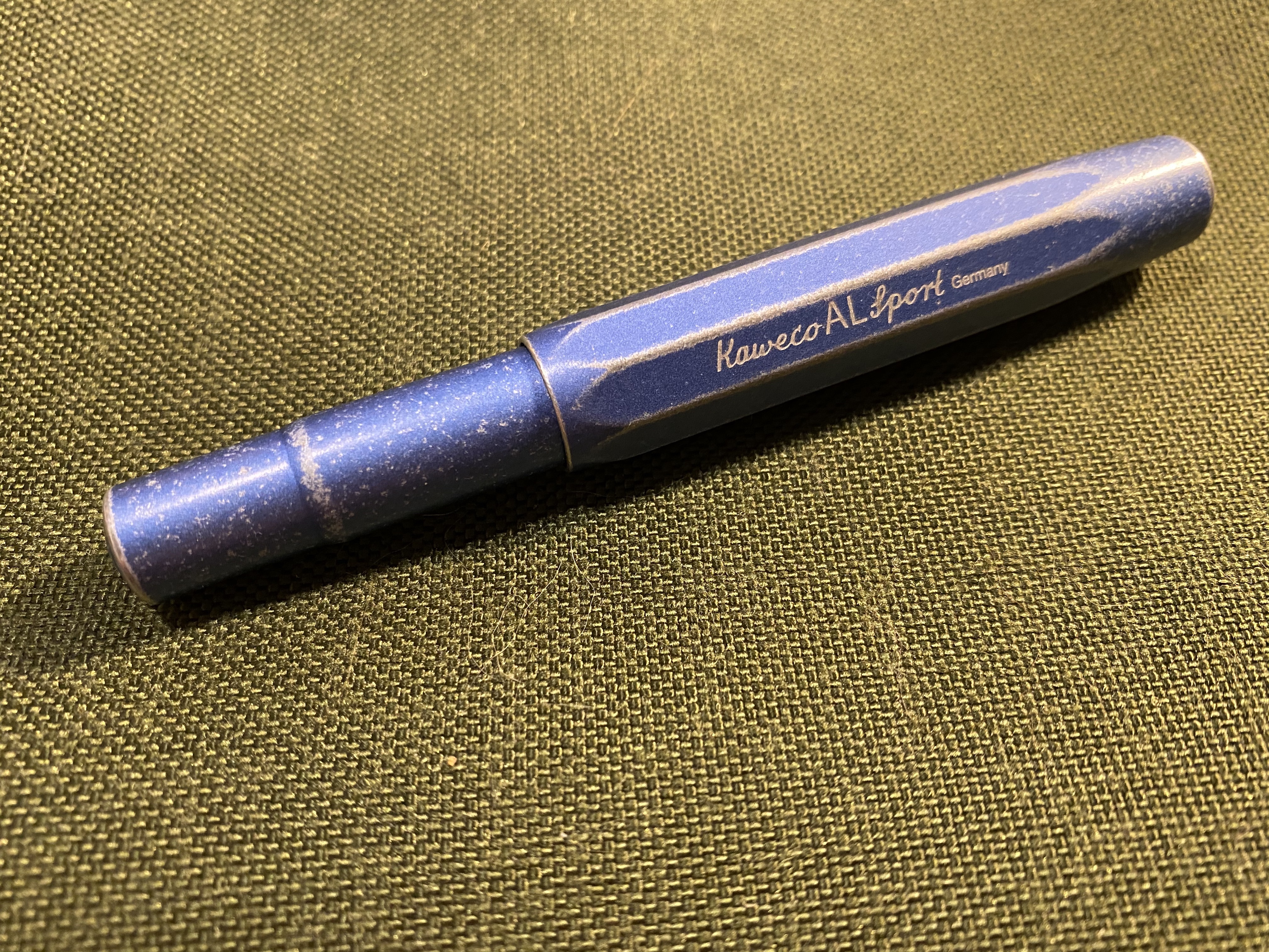
The Kawecon AL Sport Stonewashed is the classic Kaweco Sport pen, in aluminum, stonewashed to give it a worn denim look (especially in the blue version of this pen). The pen really has been worn down, so each pen is unique, and the chips and dings have been smoothed over so it still feels great to write with.
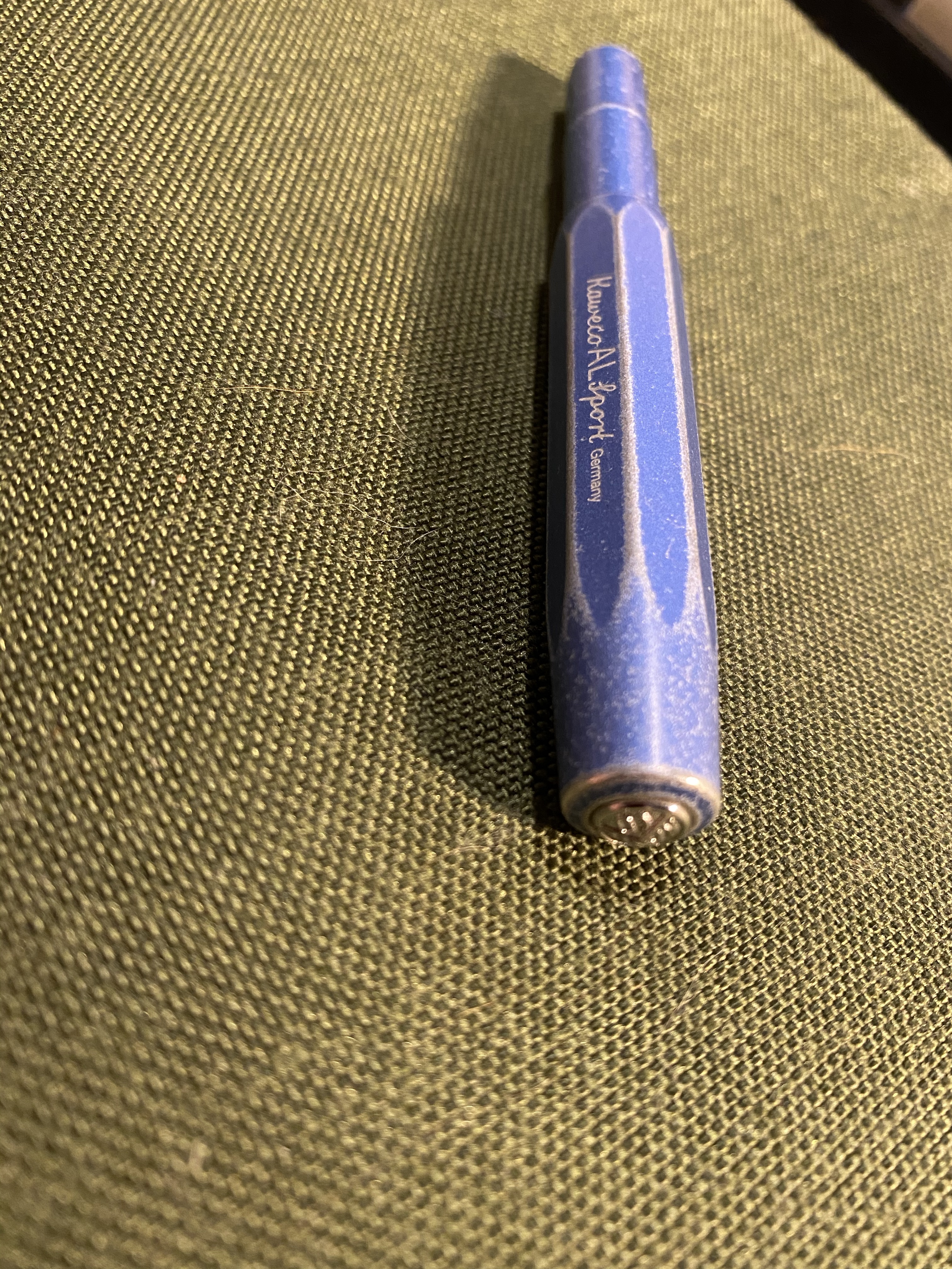
You can see the finish best on the various edges of the pen, and they just work so well with the Kaweco Sport design. This is a pen that’s meant to bash around in your pocket or bag, and the stonewashed finish just highlights that.

The AL Sport is ridiculously small when uncapped to the point where it’s unusable, but this is a pen that never was designed to be used uncapped.
Capped it becomes a standard length pen with a pretty wide barrel, which makes it surprisingly comfortable to write with even on longer writing sessions.
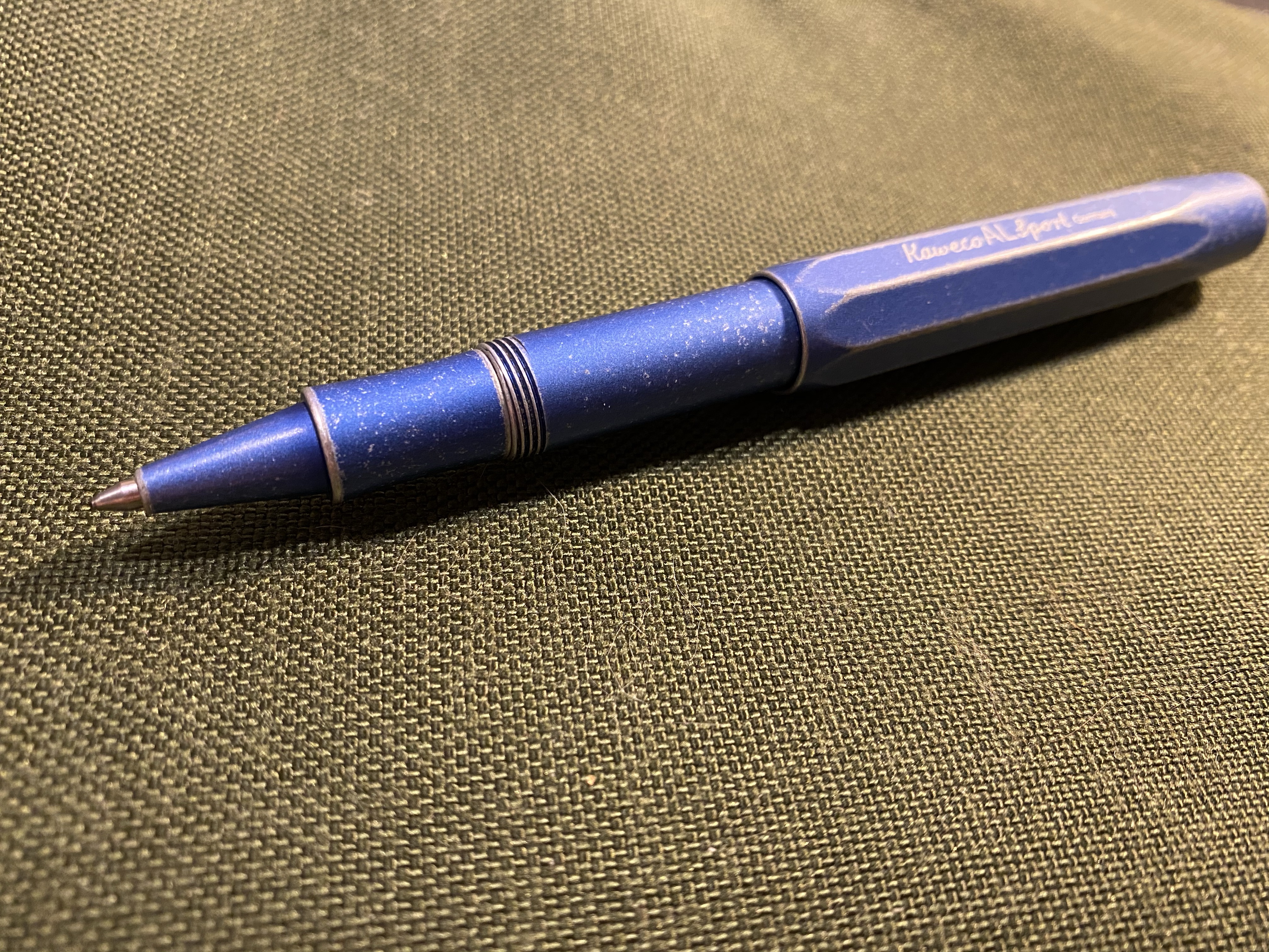
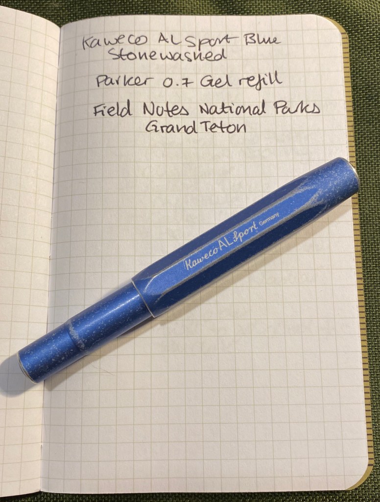
The only flaw in this pen is the way that the refill tip clicks when you lift it off the page. There’s some play at the tip end, so while it won’t affect your writing style, you will hear it when you write. This is the case with the original refill and the Parker 0.7 gel refill that I replaced it with.
If you can live with that minor annoyance, then the Kaweco AL Sport Stonewashed is a marvellous pen to buy. As someone who uses mechanical keyboards, I like objects that add sound effects to my writing progress, so the little clicks this pen makes only make it more charming to me.

What would you have done?
So back in the beginning of February I published a post about how I use my notebooks to manage my “New Year’s Resolutions” (i.e. yearly goals) in the hope that it will help people craft SMART goals for themselves that they can actually achieve. I explained in that post that I use a “stretch goal system” that allows me to hit my goals if I put in some basic regular effort into them, and then push myself gradually as I see how the year develops. For each “stretchable” goal I tailor the stretch goals based on my performance in previous years, and based on where I want to put more effort in any given year.
I wrote these goals at the end of 2019, and then, by the end of February and the beginning of March Covid-19 turned my life upside down. More and more restrictive “stay at home” directives have been issued, my travel plans were cancelled, I cancelled my participation in one 10k race, and my participation in the Disneyworld Star Wars Rival Run 5k and 10k races was cancelled, my dentist cancelled my yearly checkup appointment, I started working from home, the last few weeks of my DevOps course moved to remote Zoom lessons, and my planned move to a DevOps team required a bigger struggle than I anticipated. Also, unrelated bad things happened in my family, because that’s how life is.
Never have my stretch goals or resolution planning been tested to such an extreme, and that includes the annus horribilis of 2018. So how did my resolutions fare?
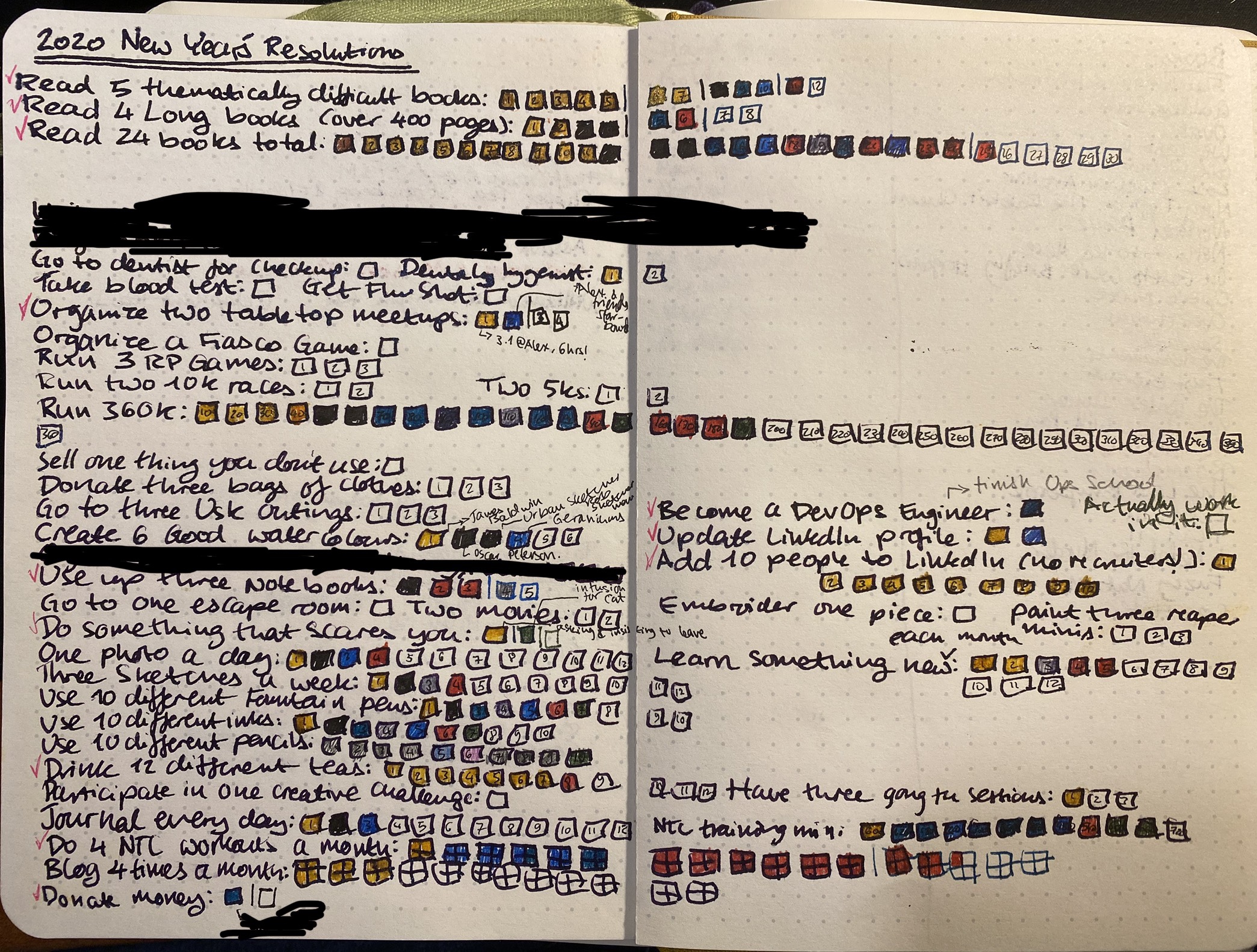
Overall, better than I expected. Here’s the breakdown and some (hopefully helpful) thoughts:
Exercise goals: These were a mixed bag, but they could have been much worse. All my races were cancelled and it appears that there won’t be any races this year. This just means that I had to get back into Virtual Races, and I’ve enrolled into the Disney one (so expensive, but I decided to splurge because it looks like I’ll be saving a lot on racing fees). That will take care of some of my race goals, and I’ll just have to figure out one or two more to take care of the rest. My running at first really hit a snag because of the restrictive lockdown, so I had to learn to run in really tight circles. The plus side? I managed to break my 5k record, and I’m challenging myself to run hills more. My NTC workouts got a huge boost because I’ve been staying at home and Nike has been killing it with some great workouts lately. After the first two weeks of lockdown depression, alone and away from my family, I realized that not exercising was practically killing me. So I’m running and training every single day now, no matter what. I highly recommend the NTC app: it’s free, has great workouts, and a super friendly design.
Writing goals: These took the biggest hit, because of the terribleness of things around here and in the world, and because until April I was swamped with DevOps course work. I’m forcing myself back to writing, and it has been slow, but hopefully it will pick up.
Reading goals: I’ve managed these the best, despite everything, and it’s mostly because reading has been a blessed escape during my darkest hours. I can still completely disappear into a book, and even terrible books give me things other than current affairs to be mad about.
Drawing goals: These also initially took a hit, but I’ve put some effort into them, and with ideas like my “Vengeful Fortress” one I get a drawing, writing and a somewhat D&D-esque game all in one. My drawing classes have been on hiatus since March, and I have no idea when they’ll return.
“Using my stuff” goals: In March and April things got worrying job-wise, so I put shopping on hiatus, and I’m even now careful about stationery shopping sprees. My notebook use needed some rethinking as I started working from home, but I’m back on track now, and using a lot more of the stuff that I’ve purchased. The only downside is that some of my stuff is at work, and right now I have no way of getting to it.
Journaling goals: This has been a rollercoaster in April and this month as well, partly because I was swamped and partly because I was too depressed to write. Trying to get back on track and deal with the feelings of those days that I’ve missed now.
Social goals: These are the only goals that I’m going to utterly have to rethink. Some of them have moved online (board games, meetups), others will just have to be postponed to later this year or to next year.
I’m trying not to be too hard one myself, but also challenge myself to get things done. Past me thought these goals were important, and present me still thinks most of them are. Where an extra effort or some extra creativity needs to happen I’m trying to make that more conscious effort. I’ll see by the end of summer where things shape out and re-tailor everything for what looks to be a difficult winter.
Keep moving, keep looking ahead, take care of yourself and your loved ones, stay at home, and be kind to yourself.

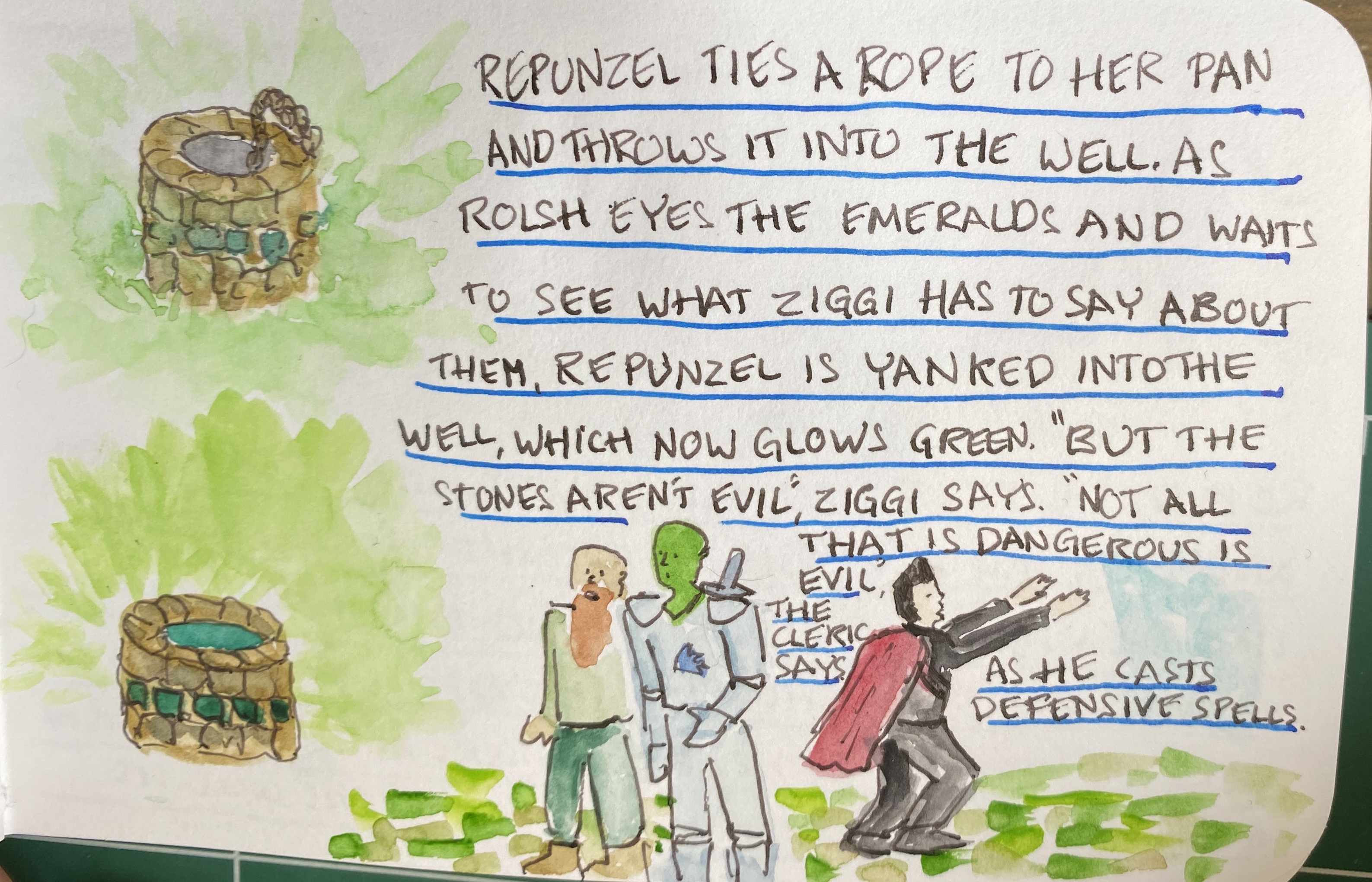
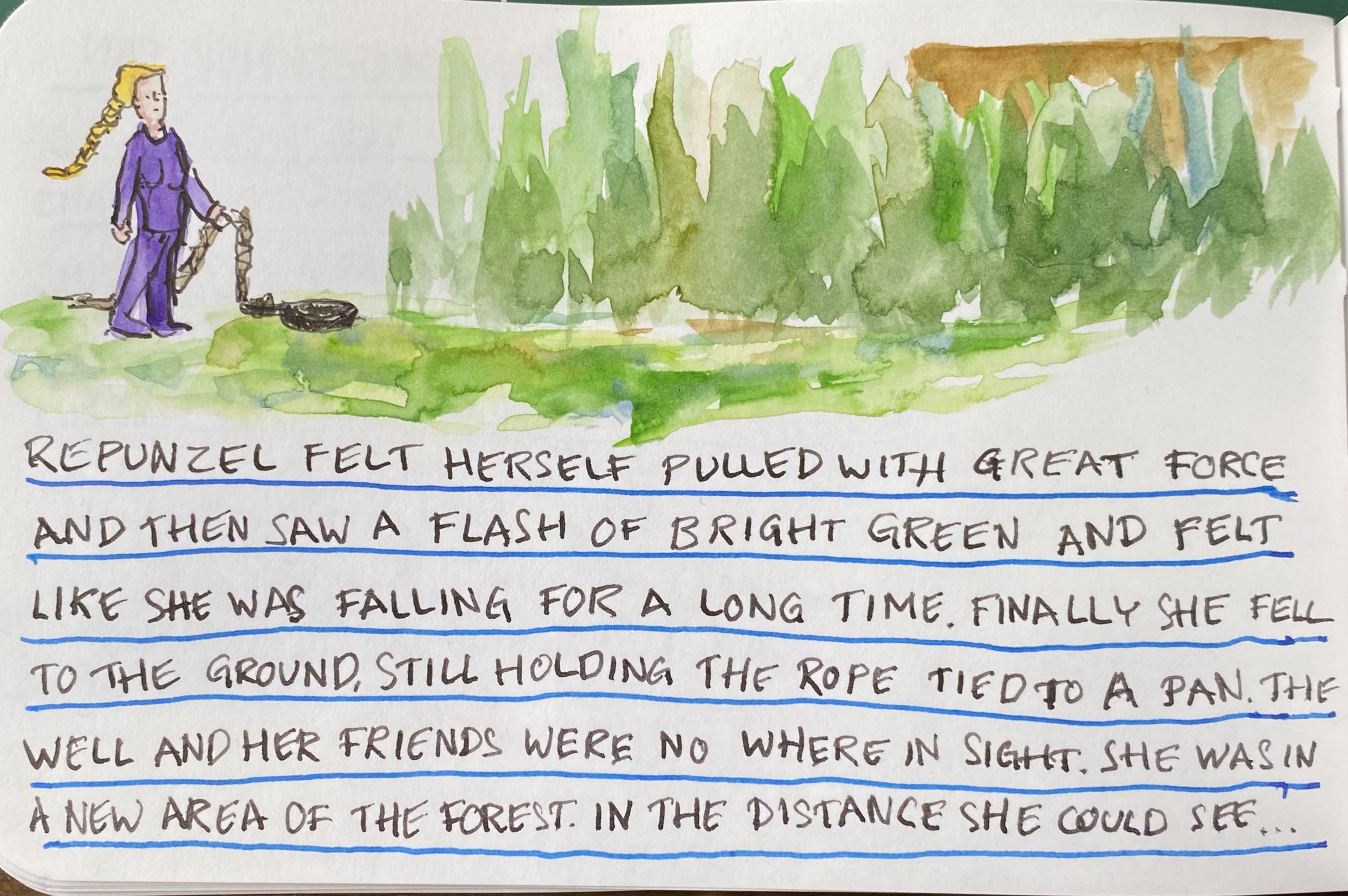
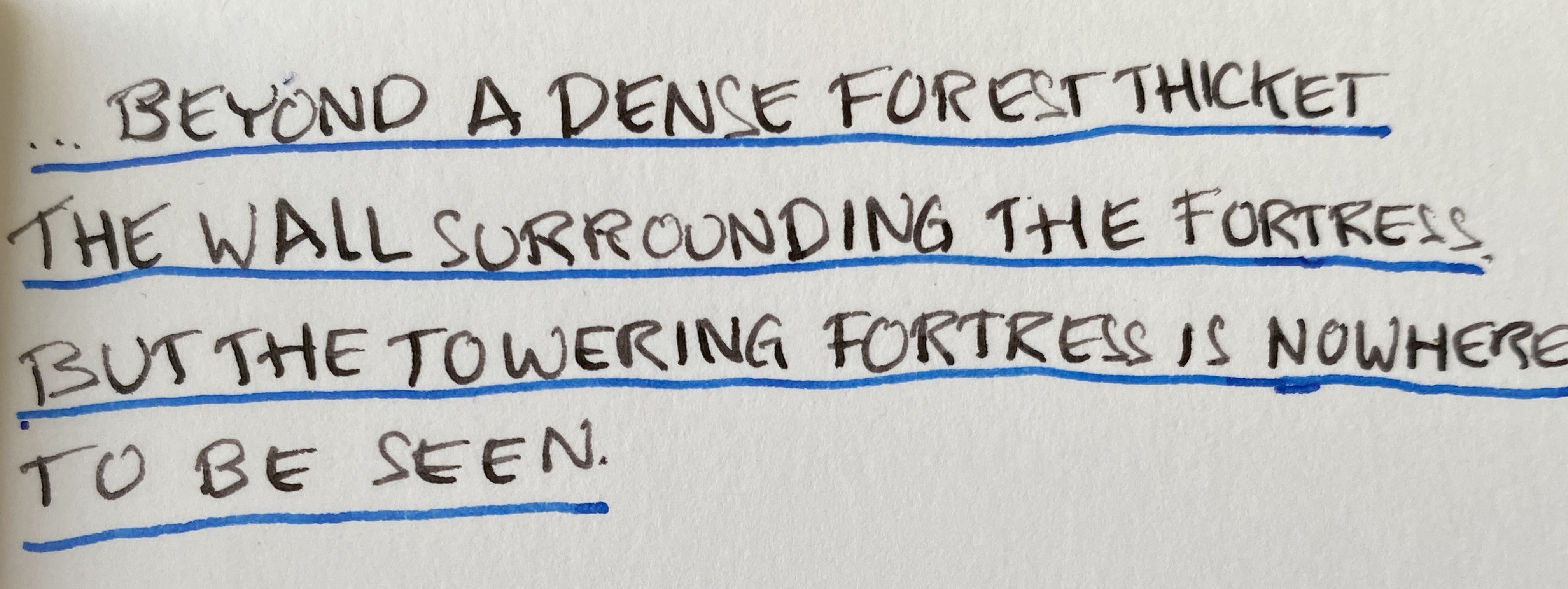
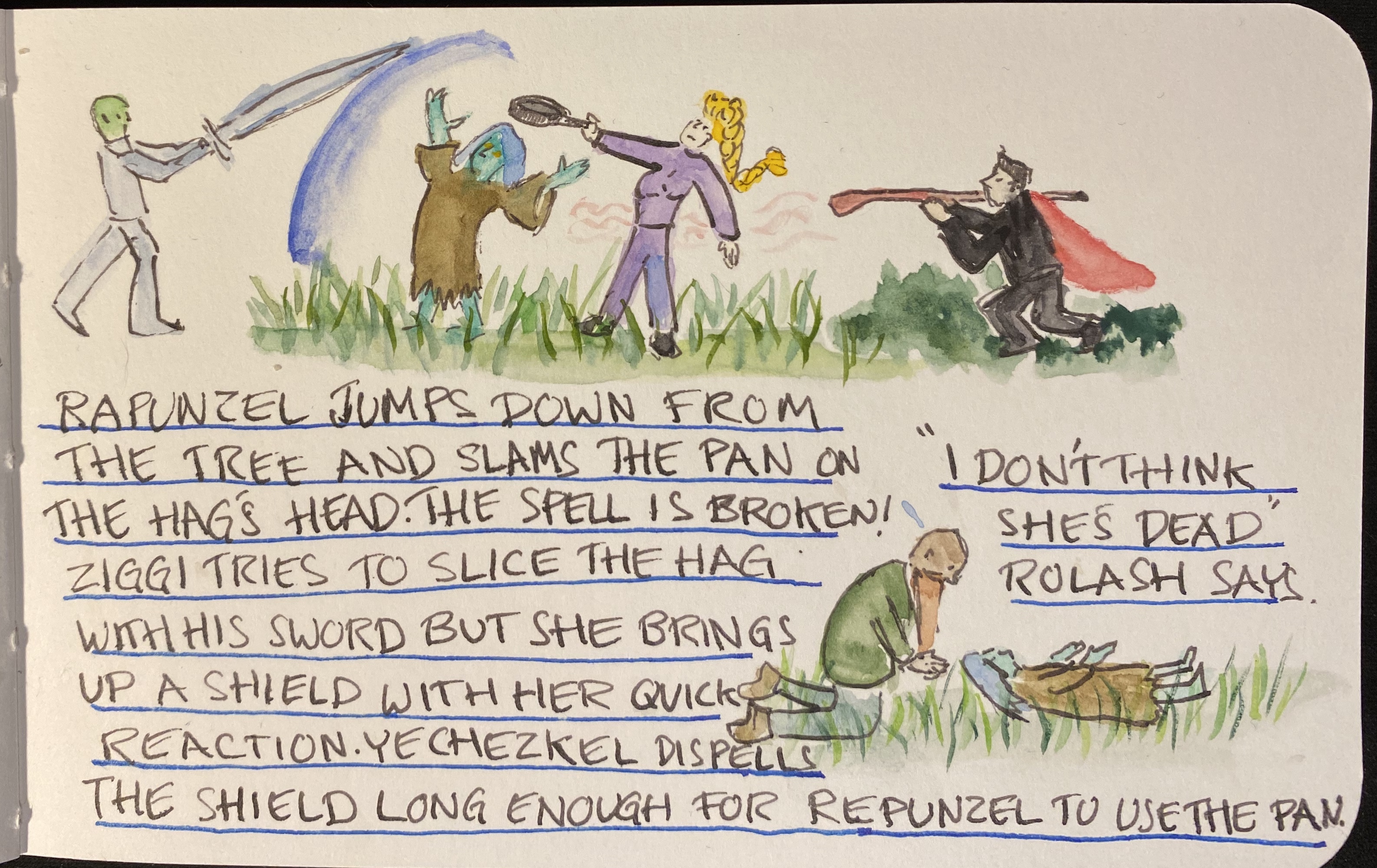
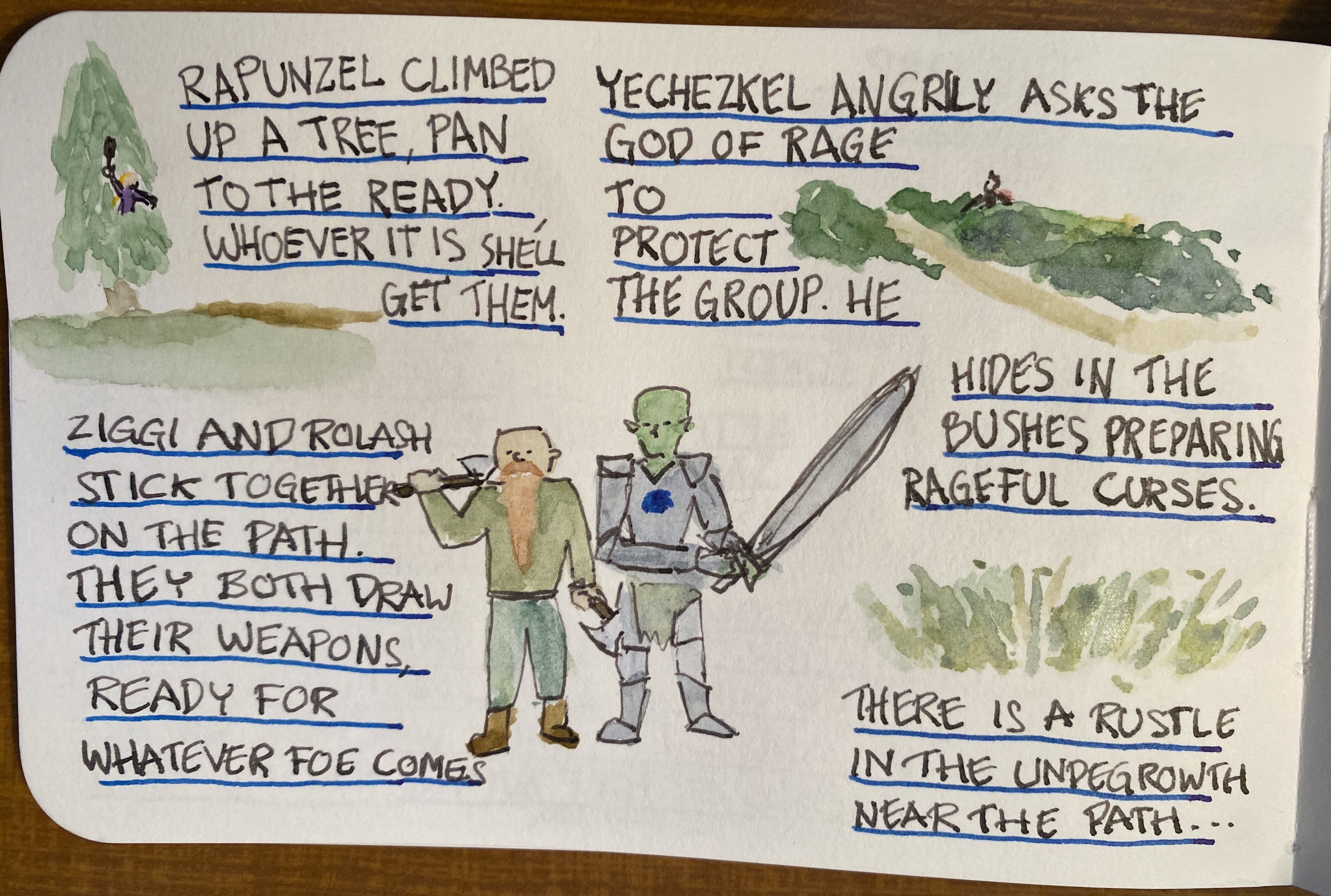
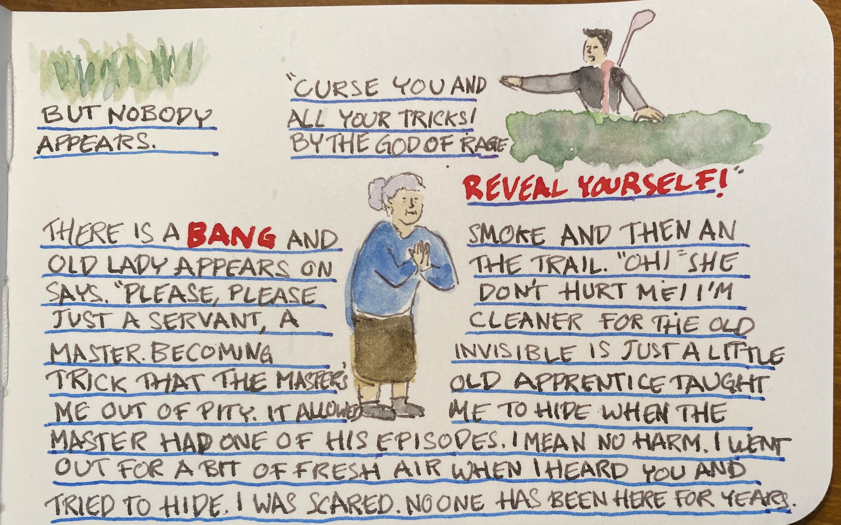
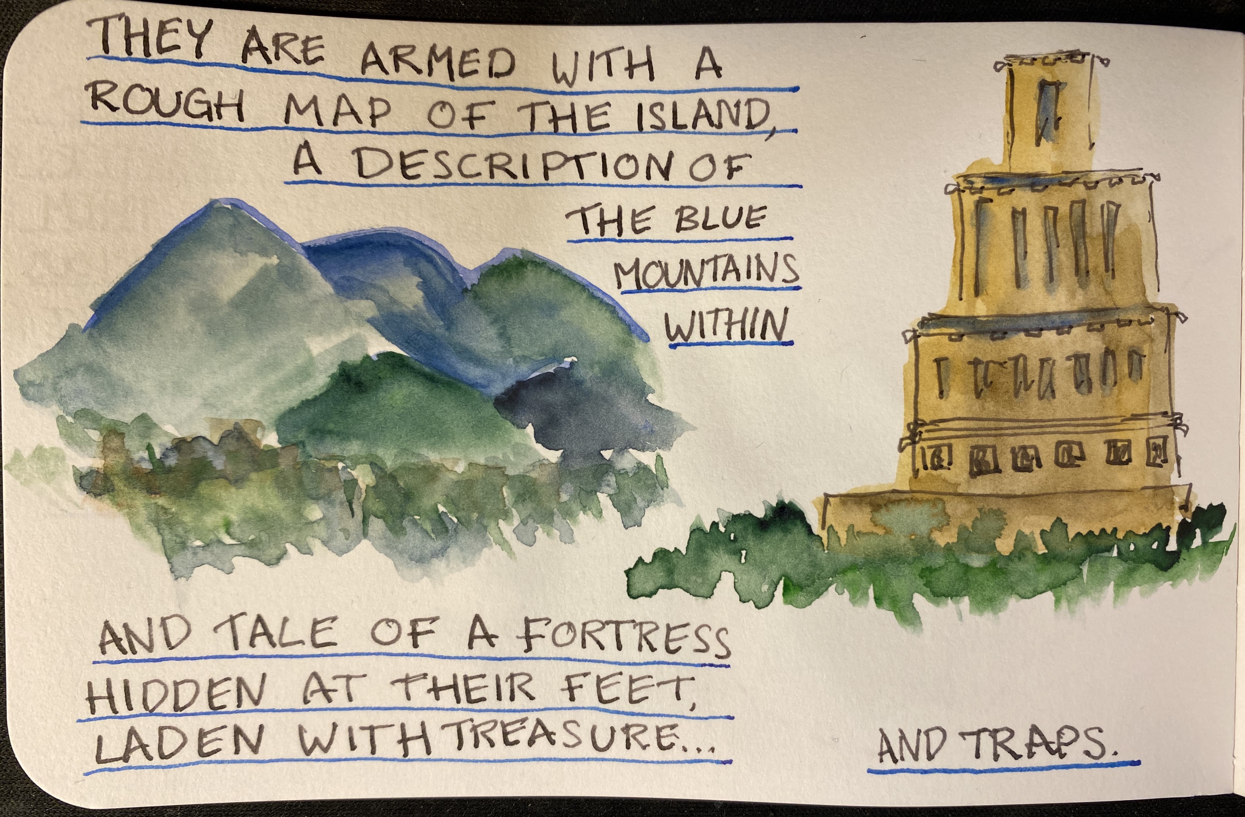
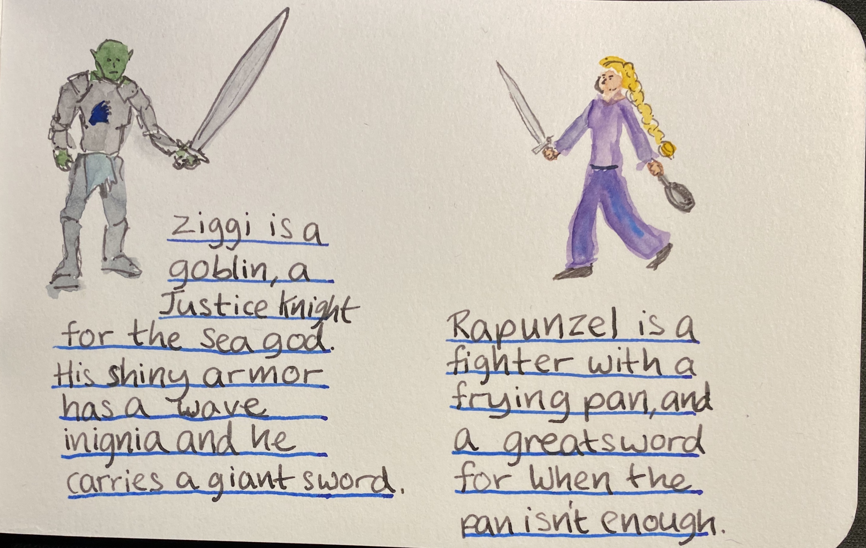
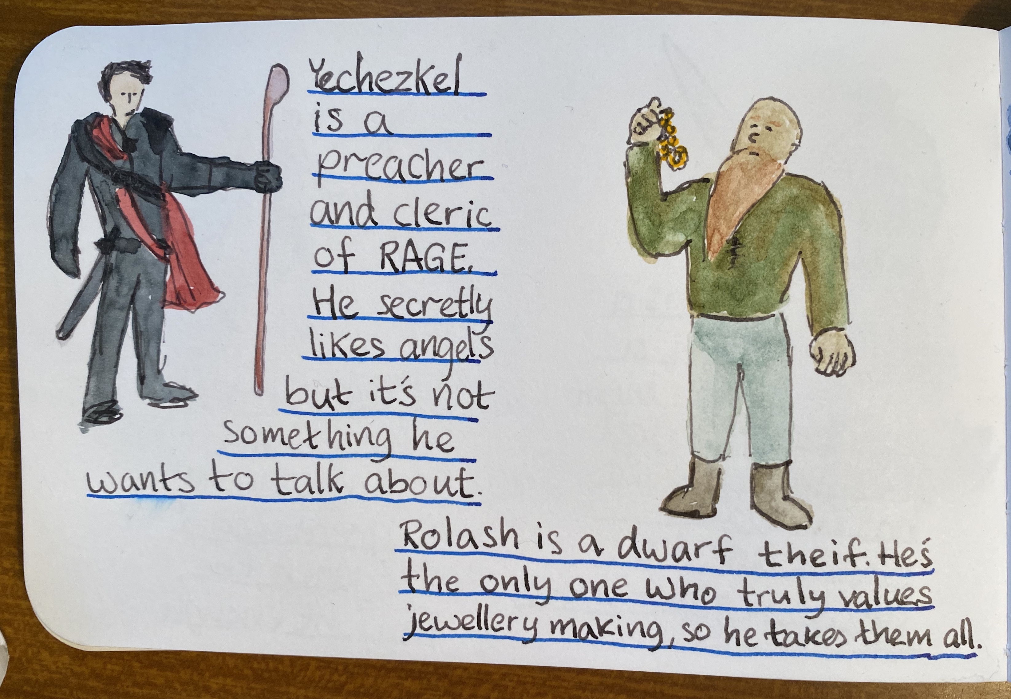
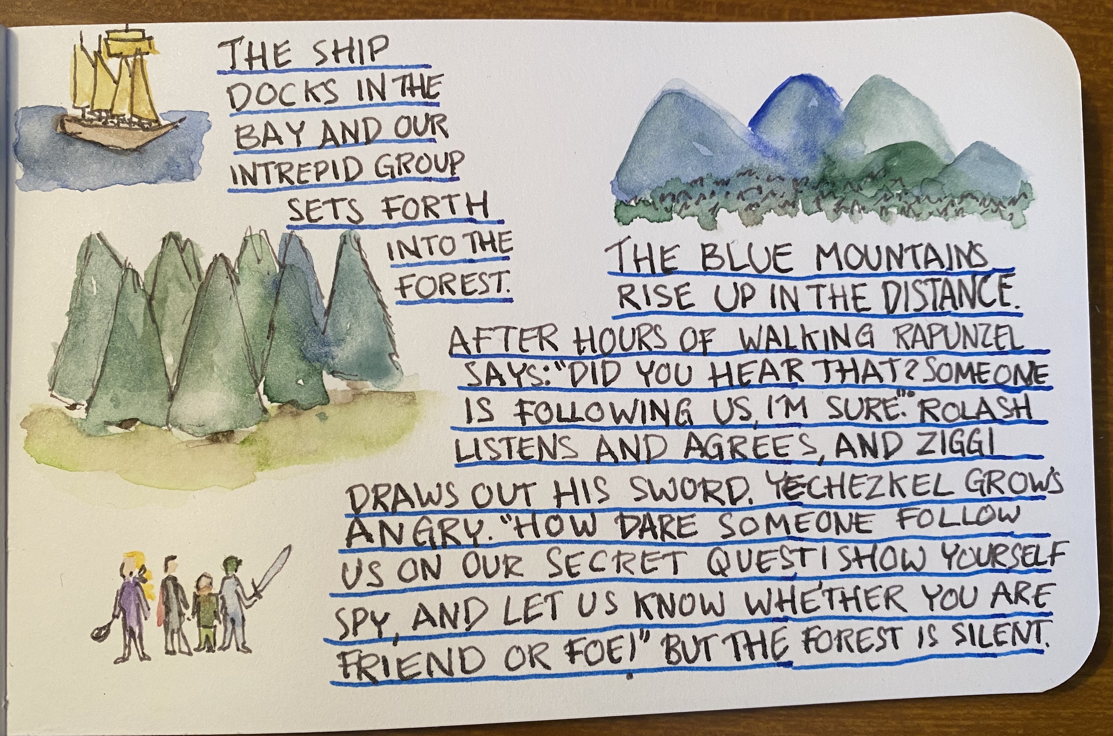
Welcome back to Vengeful Fortress, a fantasy roleplaying game that I’m drawing in ink and watercolour (no pencil underdrawing, to save time) as I’m running it for my group of players. We’re now in Part 3, and here are Part 1and Part 2 (which also include a review of the sketchbook I’m using, the Stillman and Birn Epsilon).
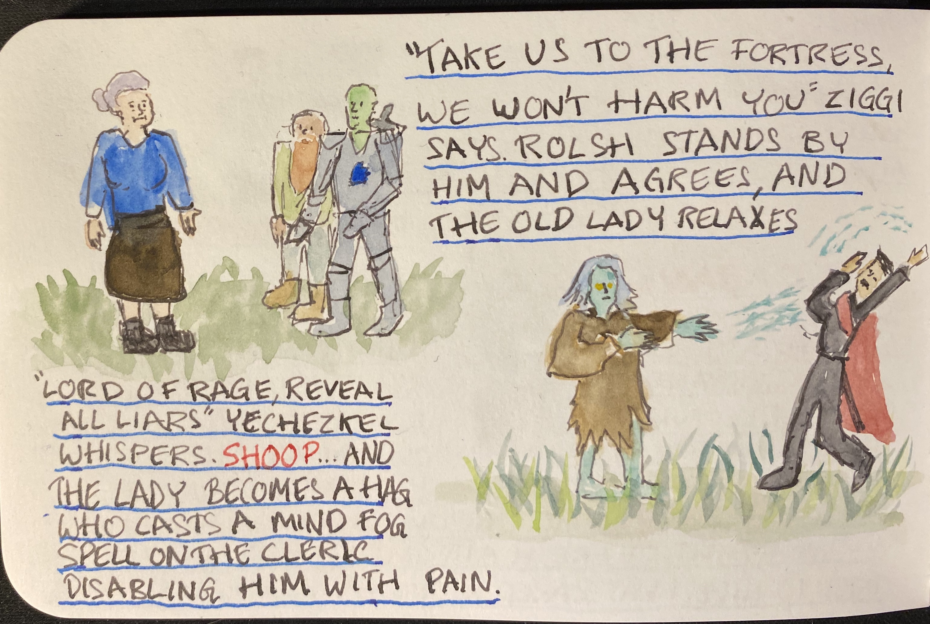
As you can see, things are starting to heat up. I’m using a TWSBI Diamond 540 fountain pen with a fine nib, filled with Rohrer and Klingner SketchINK Lotte. SketchINK Lotte is a black pigmented and waterproof fountain pen ink. It’s not a saturated ink, and you can see the grey shading quite clearly here in the lettering and the line work. R&K SketchINK Lotte is also a hard starter, so while it does flow well enough when you get it primed up with a few preliminary scribbles, if you put the pen down for even a few minutes, you’re going to have to prime it again. It is, however, waterproof and relatively fast drying, which makes it worth my time using it. In case you’re wondering if “hard starting” is just an issue with this pen or this nib, I have tried R&K SketchINK Emma and Lotte in a Lamy Safari and a Super5 pen and they are hard starters in all cases. It seems to be a property of the ink, perhaps because it dries to relatively quickly, or because of the particular waterproof formula R&K are using here.
So know that you can trust the Rohrer and Klingner SketchINKs with your watercolours, and know that they’re great for when you’re in a rush and don’t want to wait for the ink to dry, but also have a bit of scrap paper for the first few seconds before you use them .

You can find part 1 here. You can see that there is a slight bit of show through with the Stillman and Birn Epsilon, but at only 150 gsm that’s to be expected.
I decided to play a bit more with ink colours and wider nibs here, so that’s a Sailor medium stub nib and Diamine Inkvent Blue Edition Candy Cane ink for spells and effects:
There’s no show through for the ink, and though it may not seem that way, there was no spreading. Also, if you like granulating watercolour effects, the Stillman and Birn Epsilon paper seems to be a champ for that.

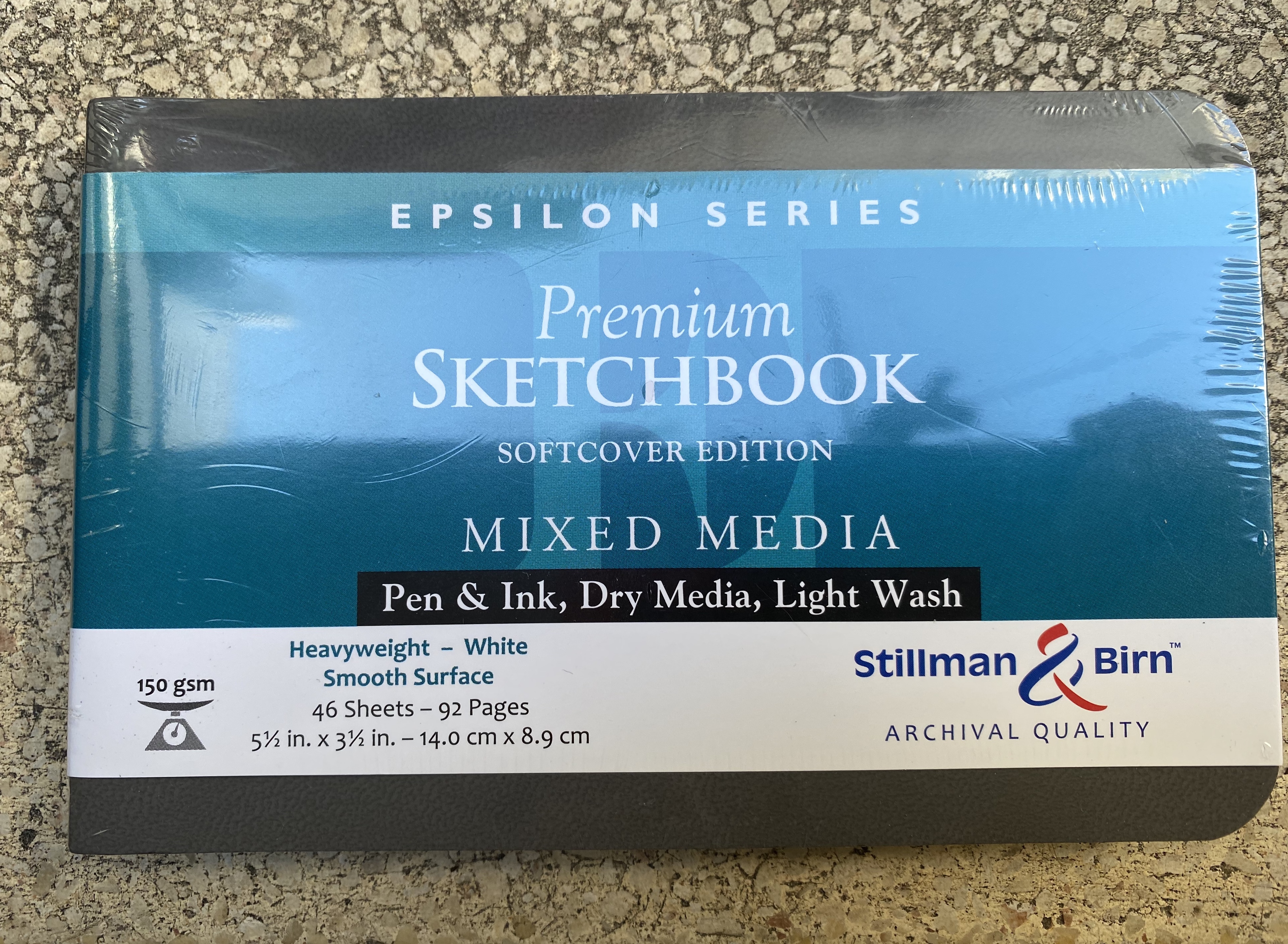
A while ago a local art supply shop started stocking a wider variety of Stillman and Birn sketchbooks. I currently use the Stillman and Birn pocket Alpha as my daily sketchbook, but I decided to give the pocket Epsilon a try. The Epsilon features smooth, white 150 gsm pages which should work for pen, ink, dry media and light washes.
This sketchbook is in landscape format, which is what I normally prefer. I was planning to use it once I’ve finished with my current Alpha, but weeks stretched to months and meanwhile this sketchbook has been languishing away, unused.
So when I saw Liz Steel going on a virtual sketch tour in Italy, I was inspired to grab this notebook and fill it with a sketch tour of my own. I initially planned to sketch out my cancelled London trip, and I may yet do that, but something inspired me to take this idea to a completely new direction.
I’m going to sketch out a freeform fantasy roleplaying adventure for my regular D&D group, and use that as a way to test out this sketchbook, and to make good use of my fountain pens.
So without further ado: Vengeful Forest, a fantasy freeform adventure.
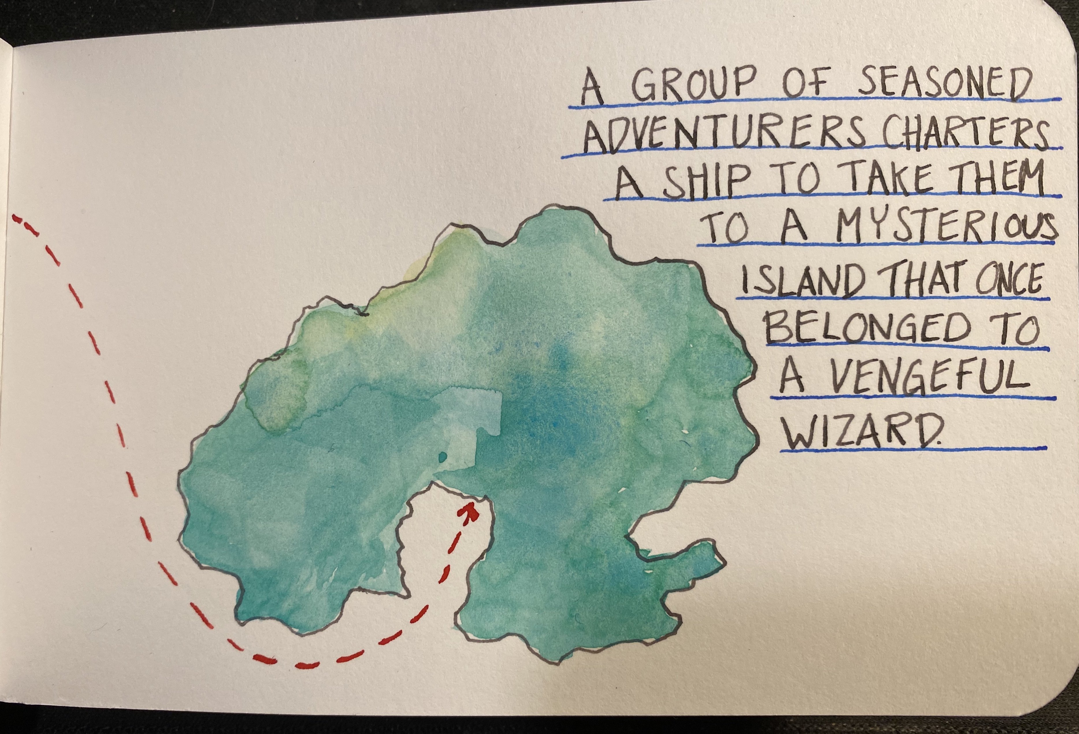
The watercolours are Schminke and I used a Windsor and Newton Series 7 number 2 brush and a Rosemary and Co 772 brush
I’ll continue posting as the adventure progresses, but so far this has been a lot of fun, and the players seem to be enjoying it too. The Stillman and Birn Epsilon has been an absolute champ: it takes light washes beautifully, with very little buckling, allowing me to use both sides of each page. It also works well with fountain pens, especially fine nibbed ones, which are commonly used for sketching. The white paper makes everything pop, and even though 150 gsm isn’t much when it comes to watercolour, it did allow for some layering and reworking without turning into a messy paper pulp. This is a sketchbook that I’m definitely going to purchase again.