How to Buy Your First Vintage Fountain Pen

I just listened to the latest Pen Addict Podcast, where a listener asked for tips on buying their first vintage fountain pen. I have well over 100 vintage fountain pens, and I’ve been buying vintage fountain pens since the early 2000s, so I decided to take the time and write a guide to buying your first vintage fountain pens (for the sake of this guide vintage fountain pens are those made before the ’70s).
  1. First, set a budget. Vintage pens are no different than modern pens in this respect, but somehow vintage fountain pen buying guides tend to skip this step. You can get great vintage fountain pens for under $50 and well over $500. Pick a number you’re comfortable with, and stick to it, no matter what.
  2. Decide why do you want a vintage pen:
    1. Flex – You’re looking to add line variation to your writing or drawing. Apart from dip pens, vintage fountain pens are the cheapest way to get that desirable flex. No modern fountain pen, despite any manufacturer promises, offers the line variation of a vintage flex fountain pen, and the premium you pay for a bit of springiness in modern nibs is painfully high. Vintage fountain pens also offer flex “combos,” such as italic flex, needlepoint flex, etc. And if you’re considering the Noodler’s fountain pen lineup, I recommend going dip pen instead. They require less fiddling and are more reliable.
    2. Gold/Specialty Nib – You want to get into gold nibs as cheaply as possible, or you want non-standard nib configurations (a fountain pen that works on carbon copy paper, perchance?). You can get fantastic gold and crazy nibs on vintage fountain pens for much, much less than certain manufacturers ask for a generic steel nib pen with a colourful plastic body.
    3. Looks – You can find a vintage fountain pen that utterly matches your style, whether it’s an understated elegant pen, a stunning showstopper one, or an out of this world wacky wildcard pen. Did I mention also that these lookers will likely cost you much less than any modern equivalent?
    4. History – You’re looking for something with a past, with a story. It can be something that’s passed down the family, a treasured pen found in an estate sale and begging to be researched, or a bold attempt by a brazen small company to create something completely new.
    5. Quirkiness – Things were wild in the heyday of the fountain pen, and you want  a piece of that. Retractable and adjustable nibs, crazy filling mechanisms, pens made out of strange materials: works of genius and madness that call out to you.
    6. Collectable Value – This is the first thing people think about when they hear about vintage fountain pens, and there’s a reason it’s the last on my list. If this is what interests you, I highly recommend walking away before you even start. This isn’t a money making venture. There are no great deals or finds to be made. All the good ones have been taken long before you, and are now passing from hand to hand, available only to people in the know. If you get into vintage pens for another reason and then decide you want to collect a few of the same kind, maybe nab one that’s a bit hard to get – fine. Otherwise, you’re getting into a losing game.

    P1010319
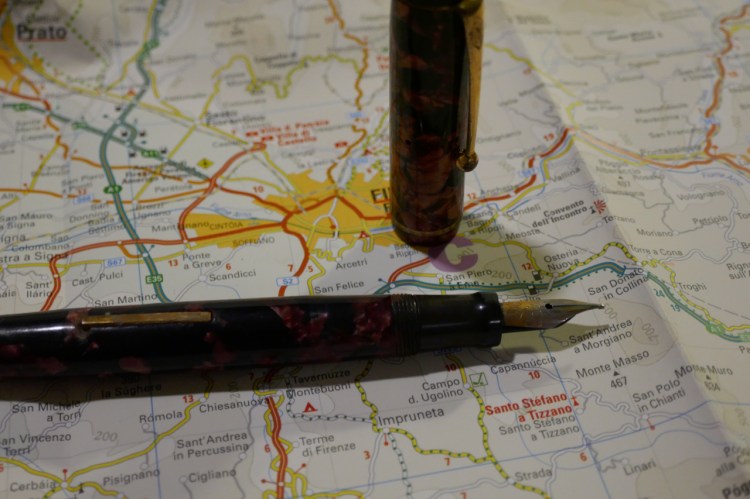
    Ugly no name lever filler with phenomenal gold wet noodle nib and feed, in utter user-grade condition. Bought for $30. 
  3. Your next move depends on what you chose in the last step:
    • Flex – Get thee to a vendor. Writing samples on the internet are lovely, and they’re a great way to shop for inks. Vintage flex needs to be held in hand and tested. Go to a pen show or a vendor and specifically ask for pens with a flex nib. Then ask to dip them, and try writing with them. Be very gentle at first, until you figure out how the nib works. The magic of vintage flex isn’t so much the nibs themselves, it’s the feeds. A good vintage wet noodle can keep the ink flow going even when you’re writing in giant poster letters. A modern pen’s feed will give up and you’ll end up with railroading. Things to remember:
      • A vintage flex nib may look wonky (dropping, slightly wavy). Ignore that – the test is in the writing. If the vendor won’t allow you to dip test, say thank you politely and walk away.
      • You’re interested in the nib, not the pen. Ask if the filling mechanism works (99% of the time vintage flex are lever fillers), and check the body for cracks. That’s it. It can be a black chased hard rubber (BCHR) Waterman brown with discolouration, brassing, and 3 different personalizations, it shouldn’t matter. You’re there for the nib, and the uglier the pen, the cheaper it’s likely to be. Vendors used to not even repair these ugly ducklings until recently, when the interest in vintage flex spiked and people figured out that you can get a wet noodle for $30.
      • The maker doesn’t matter. Waterman made great vintage flex nibs, but people know that, so you’re going to pay a premium for it. Some of my best flex nib pens are from no-name small manufacturers, and I got them all for a song. Waterman is great, just don’t get locked in to looking only at them. Test the nib and let it speak to you.
      • If you want to be extra sure that the pen works, ask the vendor to fill the pen for you once you’ve completed the purchase but before you’ve left the table. Just don’t forget to empty the pen out if you’re going on an airplane later on.
      • Never touch a pen, especially not a flex nib pen, without talking to the vendor first.
P1010317
Ugly no name Italian pen with personalization, bought for the phenomenal flex italic nib. Bought for £25
    • Gold/Speciality Nib – Much of what applies to flex nibs applies to these types of nibs. Unlike with flex nibs, online shopping for vintage gold/specialty nib pens is an option, but going to to a pen show or a vendor and try them out is still the best and safest approach. Don’t buy for the pen’s looks or condition (beyond checking that it works and there are no visible cracks), but for how it feels to write with this nib. Things to remember:
      • Great vintage pens with gold nibs are very common. If the price for a pen is high, you’re not paying for the nib, you’re paying for something else. Walk away.
      • If you just want your first gold vintage fountain pen, I recommend the Parker 51. You can get a great one for well under $100 (often under $50 if the body’s been personalized), so long as you aren’t fixated on one of the rare colours or an early year. Focus on aeromatics, in Black, Navy Grey, Burgundy, Forest Green, Midnight Blue, Teal Blue with a lustraloy cap. You pay a premium for special colours, caps in gold and sterling silver, red band vacumatic filling systems, and the cap condition. If the cap is dinged or lost its frosting, or if the pen is personalized, you can get it for a song. The Parker 51 nibs are PHENOMENAL. There’s absolutely nothing like them, and they make your writing look great. This is a large part of their appeal. The nibs aren’t graded, and most of them are in the fine-to-medium range. Just make sure there’s plenty of tipping material when you buy the pen (try out the pen and feel if it’s scratchy/look at the tip/ask to see a close up of it when buying online). The Parker51 website and the Parker forum on the Fountain Pen Network are a great place to learn more about these pens.
      • Speciality nibs are harder to find, so focus on two companies: Esterbrook or Pelikan. Both made great pens with a wide variety of interesting nibs, and both can be had relatively cheaply. These pens were also built like tanks, so they’re very likely to be in great working condition when you buy them, just be sure to ask. If you’re in Europe, Pelikans will be cheaper for you to acquire, and if you’re in the US Esterbrook is your friend. These are also pens that you can buy online relatively safely. Start with the Fountain Pen Network Esterbrook/Pelikan forums (FPN is still the #1 resource for vintage fountain pens), Esterbrook.net or the Pelikan’s Perch to educate yourself and purchase pens. I’ve purchased great vintage Pelikans from Berlin Collectibles, but again, I’d recommend trying the pen in person before going to the online shopping route. Esterbrook is going to be significantly cheaper than Pelikan, and you can buy one pen body (I recommend the J) and several nib units. But Pelikan has phenomenal OB, OBBB, OBBBBB… nibs that Esterbrook just never made.
P1010318
Esterbrook J double jewel (i.e. super common) with a 9556 nib. Bought for $16.5
P1010310
Pelikan 140 with a flexible OM gold nib. Piston filler, bought for 120 euros.
    • Looks – this is probably the hardest one to give recommendations for, except go to a pen show and look around to see what catches your eye, but there is one thing worth noting. If there’s a particular design you like but it’s beyond your budget, look for “knock offs” made in the same era. Smaller makers made great pens “inspired” by more expensive ones made by the big manufacturers. You can get a Parker Vacumatic Golden Web look alike for $50-$80, gold nib and all, and only you’ll know that it’s a lever filler made by a no-name Italian maker and not the real deal (don’t sell it as such, though).
  • P1010309
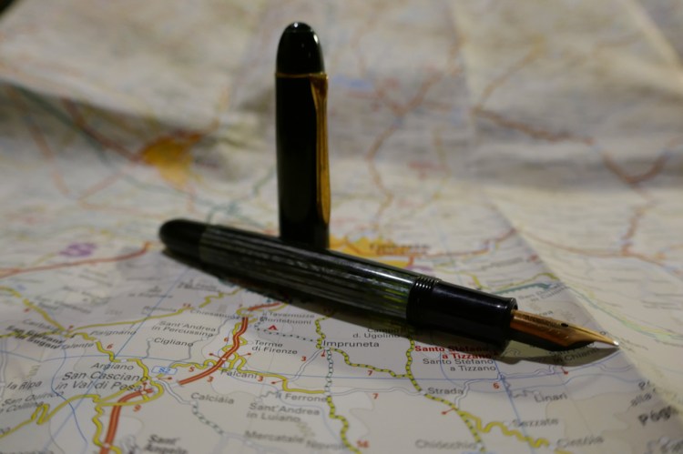
    Waterman, bought for the crazy look and the superflex nib. Notice how the nib looks dented.
    • History – tell friends and family that you’re into fountain pens, and you’ll likely be inundated with old pens that they’ve found in the back of desk drawers. Most of them will be ruined, but you may get grandpa’s Parker 51, or grandma’s Esterbrook nurse pen, you never know. If it’s something from the family, I recommend investing in having it professionally repaired and restored if the history aspect interests you. Otherwise, this category of purchase requires dedicated research. I’d check the Fountain Pen Network, and go on from there. If you like to know that your pen had a past, skip stickered pens and go for personalized ones and you’ll also save a lot of money.
    • Quirkiness –  this is the most fun category. Go to a pen show or vendor and ask if they’ve got anything strange. A pen with a weird body design/colour. A pen with a strange filling mechanism. Something wild engineering attempt to make the pen leak proof. The prices here can vary a lot, depending on whether the pen works or not, and if you plan on restoring one of these and they have a strange nib or filling mechanism take into account that it will add a lot to the price, and not every restorer will take the job. I wouldn’t start with one of those.
    • Collectable Value – don’t. If you really, really want to, go to the relevant Fountain Pen Network forum and check what everybody’s wild about. Don’t go by what eBay sellers call “rare,” and remember that not everything that’s rare is desirable.
P1010308.jpg
One of these is a user grade black Parker 51, and the other is a plum Parker 51. Would you pay well over 4 times the price of one for the other?

Ti Arto EDC Review

While the original Ti Arto is my favourite machined pen, the newer Ti Arto EDC comes in at a close second. Like its older BIGiDESIGN brother, the Ti Arto EDC is a machined titanium pen which can accept hundreds of different refills with no need for hacks or spacers and with no tip wiggle. Unlike the Ti Arto it comes in three different finishes, accepts many more refills, and can be adjusted in length.

The Ti Arto EDC looks a lot like a slightly slimmer version of the Ti Arto, with a bigger step down in the end section, and almost no gap between the section and the body.

Those looks are a little deceiving, because this the Ti Arto EDC has a completely different build. The end of the pen can be extended or retracted, unlike the Ti Arto, where it is static. In the Ti Arto EDC the end of the pen is also what you unscrew to change refills, unlike the Ti Arto, where the grip unscrews. If you assume that they’re the same, as on a cursory glance it looks like the Ti Arto EDC’s grip section unscrews (and it really, really doesn’t).

The body of the Ti Arto EDC is slightly slimmer, and the entire pen is slightly lighter than the Ti Arto. It comes in a machined raw finish (like the Ti Arto), in a stonewashed finish (which you can see in the pictures) and in a midnight black finish (which you can see on my Ti Click EDC). Of the three, the stonewashed finish has the best grip and feel, and it also shows wear and tear the best.

The trick with the extendable end section is where the cleverness of this pen lies, and that’s what allows you to use more refill types in this pen, and to extend or compress this pen’s length (to the limits of the refill size). The two o-rings make the end section action super smooth, and the same dual thread design allows you to cap and post this pen super securely. Nothing on this pen is going anywhere without your permission.

The Ti logo, elegant and understated, is the only branding on this pen. You can see how substantial the clip is and how the pen wear in the photo above. It’s like an old pair of jeans, so the stonewashed name for this finish is totally appropriate.

Fully extended, the Ti Arto EDC is the same length of the Ti Arto. However, depending on the refill you use, this pen can get pretty tiny.

I use the Uni-ball UMR-85N refill in this pen, and this is as far as it will contract. If you use a Parker or Schmidt refill the end section can be screwed in almost all the way. However, even partially extended the Ti Arto EDC is a more pocketable pen than its predecessor.

So why do I prefer the Ti Arto more? For longer writing sessions the Ti Arto’s wider girth makes it more comfortable to use than the Ti Arto EDC, although the difference is minor. The Ti Arto is also slightly less ungainly than the Ti Arto EDC, having a more streamlined design, with no step down. I don’t mind the Ti Arto’s gap between the grip and the pen body, and I don’t need a pen that accepts more refills than the Ti Arto. As you may have noticed by now, the choice between the Arto and the Arto EDC is likely going be one of personal taste and preference. Either pen is an excellent choice for a machined pen, an EDC pen, or a titanium pen.

Leuchtturm1917 Sketchbook Review

Leuchtturm1917 entered the busy sketchbook market about a year or two ago, with a lineup of A6, A5 and A4 sketchbooks with white 180 gsm paper.

The covers of the Leuchtturm1917 sketchbooks come in a wide variety of colours, which is a rarity in this market. Usually you find sketchbooks in black, or maybe one or two other colours, but Leuchtturm has decided to offer these in all the colour options available in their regular lineup.

The sketchbook contains 96 pages of acid free 180 gsm paper, and it opens flat. There’s a note in the back packaging that says that the paper is colourfast, and shows a sketch made with a fineliner and markers. More on that later.

There’s a place to write your name and address on the front cover. I recommend writing your name and email address instead. It’s more practical, and more secure.

There is a back pocket. I don’t really think that it’s necessary in a sketchbook, but it’s nice to have.

Leuchtturm offers two unique things with its sketchbook. One is the offer to personalize it with an embossing of your choice. During last year’s Urban Sketchers they personalized the sketchbooks that they gave away as part of the symposium’s package, and the result is very nice.

Now for the heart of the notebook, it’s paper. The pages lie flat with a bit of coaxing, and are thick and substantial. You have to really layer down markers for them to bleed through, and there’s no show through, meaning you can use each page on both sides.

So how does the paper behave? It depends on the medium. This sketchbook excels at dry media (pencils, couloured pencils, conte crayons, etc).

It’s pretty horrible with wet media, including fountain pen ink, watercolour washes, and ink washes. The paper buckles, shows off colour poorly, turns into a grainy mess, and and the ink feathers and spreads. I wouldn’t recommend it even for the lightest washes. All the vibrancy of my schminke watercolours turned into a muddy mess here (the sketch was done with a medium nibbed fountain pen and R&K Emma SketchINK):

Even with fineliners you’re going to have spread. If you like sharp lines, find a different sketchbook.

Again, even from a bit of a distance you can see the spread. That’s just a shame, because if the paper was a little less absorbent then this would be an excellent sketchbook.

This brings me to my frustration with the picture on the back end of the paper band, the one showing a tiny marker and fineliner drawing. This is my experience using markers and fineliners on this notebook:

There’s no option to layer or blend the markers, but that’s OK. This isn’t marker specific paper after all. But even for casual use, or just for use with fineliners/brush pens this paper isn’t great.

So do I recommend this sketchbook? It depends. If the way it looks makes you want to use it, then yes, it’s a notebook for you. I’ve been using this sketchbook for my journal comics mainly to test it out. Will I continue using it? Only because I already have a body of work in it. Otherwise, there are better options out there, ones that aren’t only pencil great, but also work with pen, ink and light watercolour washes (the Stillman and Birn Alpha sketchbooks come to mind).

This Week’s Long Run: Parakeets in the Sunrise

The heat here is getting more intense, which means that I’m moving more of my runs to the mornings, and setting out earlier each time. It was completely dark when I set out on my long run today, and my running app (NRC) clocked my run as a night run. For some reason I found that hilarious.

There are green parakeets all over the park, but they’re usually too flighty for me to photograph them. Today they stayed and played a bit in the trees, so I got get a few blurry shots of their silhouettes. Yay!

My iPhone 8 had a much better camera, but I’m on an iPhone 6s now because my iPhone 8’s modem shorted for no reason and can’t be fixed. So for now, this is the best that I’ve got.

A night heron was also obliging enough to strike a pose on the river bank. I love how elegant they are.

There was a photographer on a nearby bench taking pictures of this fellow, so he must have felt popular today.

Another night heron had an even better perch, on top of the peddle boats pier.

And we end with a photo from the beginning of my run, with the sun rising over the river.

Moleskine Lord of the Rings Mount Doom Limited Edition Review

“Frodo gave a cry, and there was, fallen upon his knees at the chasm’s edge. But Gollum, dancing like a mad thing, held aloft the ring, a finger still thrust within its circle.
“Precious, precious, precious!” Gollum cried. “My Precious! O my Precious!” And with that, even as his eyes were lifted up to gloat on his prize, he stepped too far, toppled, wavered for a moment on the brink, and then with a shriek he fell. Out of the depths came his last wail precious, and he was gone.”

J.R.R. Tolkien, The Return of the King

The Mount Doom Moleskine limited edition is the most dramatic of the Lord of the Rings themed notebooks to come out this year, and justifiably so. The red and black provide eye catching high contrast that are in complete opposition to the grey on grey Moria notebook.

This notebook will pop out the moment you see it on the store shelf.

Sauron’s eye gazes upon you. Notice the use of the LotR typeface, and Elven script, on the paper band.

The front cover shows Mount Doom in all its Tolkien illustrated glory, with Frodo and Samwise as little golden dots against its grey and red horror.

The design continues on the spine, with Tolkien’s sign on embossed in red at the top.

The back cover, with the edge of mount doom and Sauron’s all seeing eye in red.

The choice of red elastic closure and a black cover is perfect for this notebook, and the gold embossing of the date, the scene and Frodo and Samwise really pops.

The front end page with Tolkien’s pencil drawings of an aerial view of Mordor. The drawing is very nice, but it does make the “In case of loss” pretty obscure. You can either go extra bold here, or try to blend in and hope that someone will notice.

The aerial map of Mordor continues on the back end page. As usual, but still worth noting, the map is completely aligned with the back pocket.

The extra with this edition is the Cirith alphabet booklet.

The red and black theme continues here.

A closeup on the back pocket, with its red sides and the map that continues into the back pocket.

This is a ruled notebook, and it comes with a red ribbon bookmark. Unless you use inks like Noodler’s bulletproof black, it isn’t fountain pen friendly. Then again, it isn’t marketed as such (Moleskine has other notebooks for that).

The B-side of the paper band details Frodo and Sam’s journey.

I love these Lord of the Rings limited editions (I’m using the Moria one as my daily journal). The mount Doom edition is befitting of the dramatic climax of The Lord of Rings trilogy. If you’re a LotR fan this is definitely a must buy, and probably the best designed notebook of this edition.

Uni Do! Posca Paint Marker White Extra Fine Review

I am on a quest in search for a white, waterproof pen that reliably lays down a thin, opaque line. You’d think that this wouldn’t be so hard to find, but this combination (opaque-and-thin-and-waterproof-and-reliable) has so far proven to be elusive. The closest so far has been the Uni-ball Signo Broad UMR-153 white gel ink pen, but it tends to dry out and blob, so it is far from perfect.

The Uni Do! Posca paint marker in white, extra fine (0.7) is a welcome addition to the white pen field. It’s waterproof, water-based (so not smelly like other paint markers), lightfast, and can be used on a multitude of surfaces. I’m going to focus its use on paper, but if you’re looking for a way to label a dark coloured object, this may be the pen for you.

The Do! Posca’s design is pretty well designed. The pen is narrow enough in diameter for you to comfortably use it like a regular pen, and the square cap keeps the pen from rolling off the table, and looks great. The pen body is much too busy for my liking, but that’s a minor quibble.

There’s a tiny metal ball inside the pen, and you need to shake it well before use to get the paint ink flowing. When you use the Do! Posca for the first time you need to prime it by shaking the pen thoroughly and then pressing the plastic tip in several times until the white paint flows. I had no problem getting the pen to start up after a good shake, but I’d recommend keeping it horizontally and cap it immediately after use.

The Uni Do! Posca doesn’t blob, and it’s excellent for small details. I wouldn’t use it to fill in large expanses of white, as it offers pretty poor coverage and doesn’t layer well. If you’re looking to use it for highlights, correction or detail work, this is the pen for you.

I drew this journal comic on a Clairefontaine Paint On Naturel A5 pad.

The Uni Do! Posca extra fine paint marker in white was available for a time at Jetpens, but now you can find it easily enough on eBay. If you’re looking for an opaque, extra fine, waterproof white pen, I highly recommend it.

The Master Pencils Union No. 84 Pencil Review

My latest flea market find is a red/blue Union No. 84 pencil from The “Master” Pencils Ltd, the English pencil company that also created the Golden Master pencils that I reviewed in the past.

The Union No. 84 is an oversized pencil, with a red and navy core. I love the choice of font for the imprint: it looks clean and professional.

The pencil is thick, built like a children’s pencil, and so the cores are extra large as well.

The navy core, almost black in appearance:

Finding a sharpener that can sharpen this pencil was a challenge. You’ll need one that’s designed for children’s pencils, yet is high quality enough to handle wood that has toughened over time, and a core that is still soft and brittle. I went with the M+R double brass sharpener Nr. 0603. Beware of the red core when you sharpen this pencil, as it can stain your hands.

Here’s the Union No. 84 next to the Caran d’Ache Bicolor 999, the golden standard for red/blue pencils. You can see their size differences quite clearly.

The navy tip of the pencil:

The red tip of the pencil:

The red tip of the pencil was much softer and more crumbly than the navy tip, but even though I was worried about it, it didn’t break with use.

I tested the Union No. 84 against the Bicolor 999, and discovered a few interesting things. The Union’s blue is indeed a shade darker than the Bicolor’s but it’s not as dark as I would have expected. The red shades of both pencils are virtually identical. The Union feels more like a pencil than the waxy Bicolor, with more feedback, and more shading possible when some pressure is applied. Both pencils erase poorly, but the Union erases better than the Bicolor, particularly the Union red, which doesn’t stain the paper.

I tested the pencils on a Baron Fig Confidant, my go-to pencil testing paper, and erased them with the Maped Technic 600.

The Master Union No. 84 is a lot of fun to draw with, beyond being useful for highlighting and correcting text. It feels like a proper pencil, and not a waxy crayon, and it shades enough to allow for doodles like this one:

The Union No.84 is great and fun, and so was the Spiderman movie. I highly recommend them both.

This Week’s Runs: Golden Jackal, Sunset, Sunrise and the Sea

On a midweek run I encountered one of the famous Golden Jackals that live in the Yarkon Park in Tel Aviv. As usual, he was more interested in keeping his distance than bothering anyone of the runners on the trail.

The first time I saw a Golden Jackal I was sure that it was someone’s dog let loose. They are the ancestors of many dog breeds, so I guess that’s not surprising.

Yesterday’s run rewarded me with a beautiful sunset over a pretty stormy sea.

Today’s long run started with a sunrise over a calm river, with a night heron…

… and some mallards dozing off on the pier.

Check out those waves! Not the best sea for swimmers.

Writing Update

  • I’m still editing my novel after getting notes from my beta readers. Most of the notes are super helpful, and it’s good also to go over the book after a while.
  • I’ve tightened the prose in places, plugged a few plot holes, and clarified a few scenes — which is not something that I expected to do on the third or fourth draft.
  • Scrivener is life. Thankfully my novel was split to scenes, so it was easy to move things around to restructure the narrative after the feedback I got. It was also easy to split the scenes into new chapters, and take quick snapshot backups of each scene before I edited it.
  • As usual, the first third of the novel is the part that needed the most editing. I’ll give it another once over once I’ve finished editing the final chapters.
  • It took me a long time to get into the editing mood, but things are going pretty fast now. I’ve started using a task list in Drafts and it’s proven useful in keeping me organized and motivated, without allowing me to be sucked into productivity pr0n.

Moleskine Time Blue Limited Edition Review

Every once in a while Moleskine comes out with something completely new. About a year ago it was the Time limited edition notebooks: a new format of notebook, with thicker paper, and a distinct new design.

This is the Blue Time notebook. Each one has a different colour theme (blue, black, green and brown), a different motif embossed on the cover in foil, and comes in either ruled (lined) or plain (blank) pages.

The Time notebook is thinner than a regular Moleskine, but feels substantial because of its thick chipboard covers. This is a notebook clearly designed to sit on your desk and not be bashed around in your bag, as the covers bruise and stain easily.

The Time notebooks have 140 pages of 100 gsm white, acid-free paper. They are themed around old ornamental motifs and paper making techniques, and so they feature marbled paper for their endpapers.

The spine is fabric covered, and the pages are set and sewn like any Moleskine notebook, so apart from the very first and very last page, they all open flat.

The foil emboss/deboss on the cover is beautiful and understated. The Time notebook features an elastic band and a back pocket, but no ribbon bookmark. Perhaps Moleskine thought that the index and numbered pages are enough.

I love the transparent band, and the way they dealt with the “In case of loss” area on the front endpaper.

The marbling effect on the endpapers is gorgeous, even though it’s a print and not actual hand marbled paper.

Again, someone bothered to align the pocket and back cover prints. Well done.

Since the first page of the notebook doesn’t open flat, Moleskine just put a blank page with a title there. I wish they would have done another throwaway page like that after the last page, but they didn’t.

The index! Two pages, and suitable for people with tiny hand writing and short titles for their pages. It’s a nice idea, though.

The pages of this notebook are numbered, and… fountain pen friendly. Not sort of fountain pen friendly, actually, deliberately fountain pen friendly. This is a notebook “for precious thoughts” after all.

I deliberately tested this notebook with juicy, italic and stub nibs, and it handled it like a champ. The paper shows some shading, though not as much tomoe river paper, obviously, and fast drying times. If you use nibs that lay down a lot of saturated ink there will be a tiny bit of bleed through and some show through, but for medium or fine nibs you likely won’t encounter this issue.

The other side of the page:

The paper is smooth, but not glass smooth, so it will work well with pencil if that’s what you prefer to use.

Moleskine doesn’t make the Time notebook collection anymore, but you can still find them pretty easily. I wish that this paper and format were available in other editions, or even in their regular lineup, and I’m glad to see that they’re still experimenting with their formats, not just with cover designs.

If you can get your hands on one of these notebooks and the format appeals to you, I recommend it.