Last day to Donate to St. Jude During Childhood Cancer Awareness Month
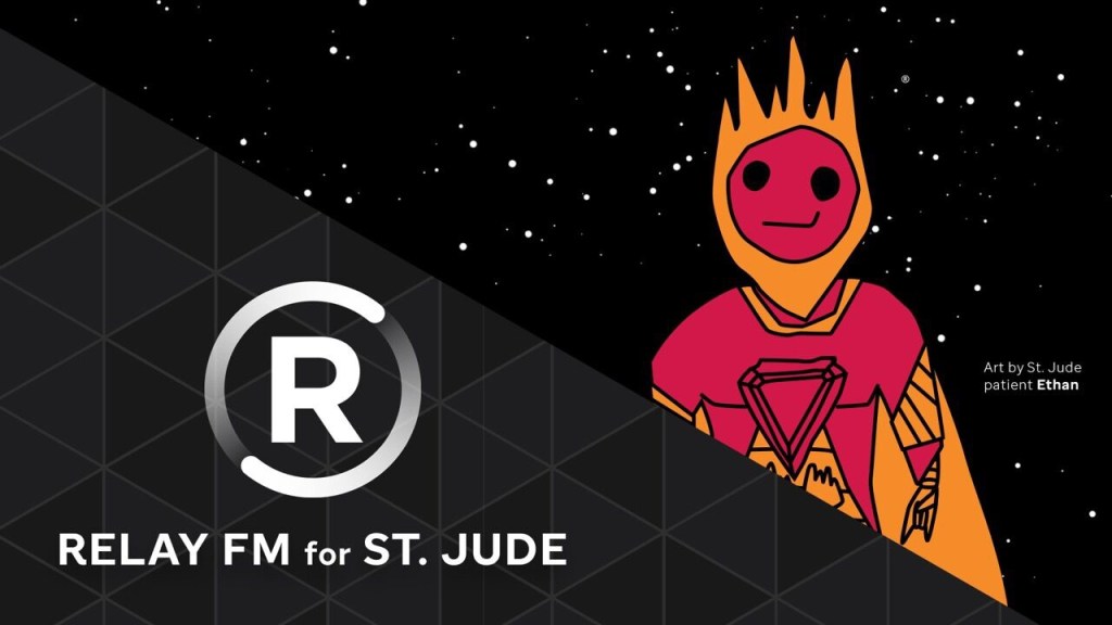
Please consider donating to St. Jude Children’s Research Hospital if you haven’t already. They really do excellent work and deserve all the support that they can get.
A blog about writing, sketching, running and other things
Please consider donating to St. Jude Children’s Research Hospital if you haven’t already. They really do excellent work and deserve all the support that they can get.
A few days ago I found Moleskine’s Winter 2021 Catalog, and was dismayed to discover that many of my favourite notebooks are discontinued (“while supplies last”). So this is going to be mostly a “stock up on these if you like them” review of the catalog, not so much a “look at these cool new things from Moleskine,” mainly because most of the cool new things were published earlier in the year.
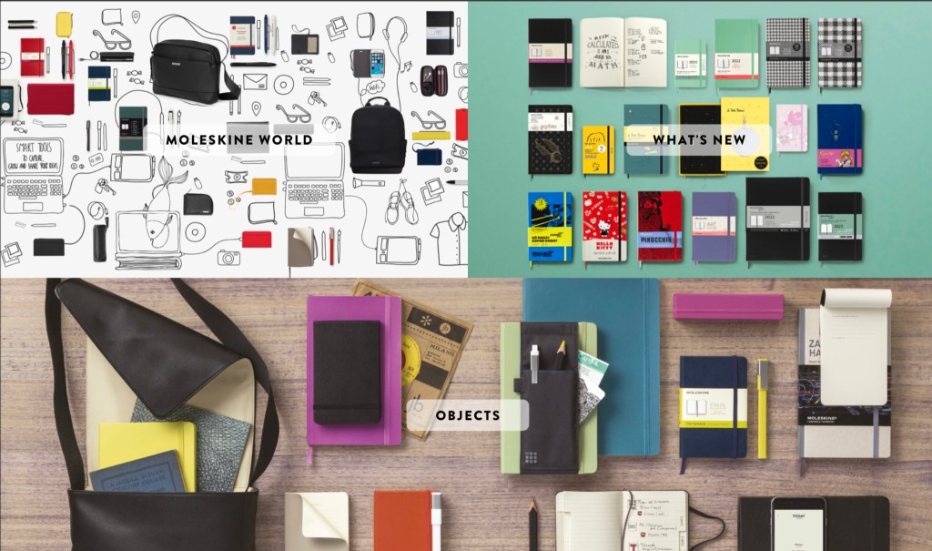
So here are the main discontinued notebooks, in order of their (dis)appearance in the catalog:
Here are the new additions to the lineup, in order of their appearance in the catalog:
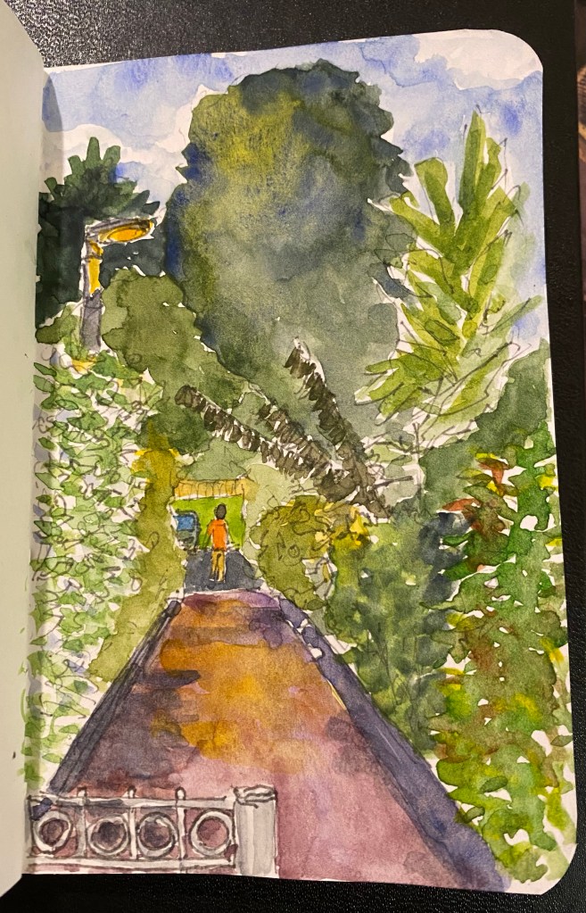
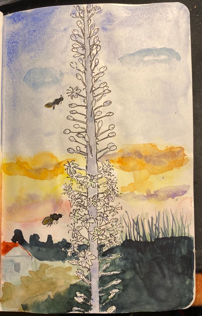
I’m playing with green watercolour mixtures and drawing better foliage, so I took the opportunity to make this quick line sketch during one of my walks. I worked on the watercolours later, and I’m pretty happy with the results.
While I was taking a walk a few days ago I saw this tree branch grow out of a tiny crack in a solid stone wall and I was impressed enough by its tenacity and resilience to draw it. By chance this drawing is on the opposite page of the one I made for my last health update, which seems appropriate.
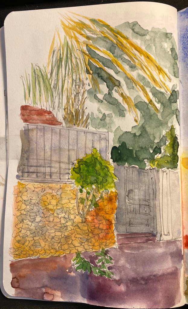
I underwent a PET CT on the 9th of September, and thankfully the results were good. The treatment is working, kicking my cancer’s ass and not just making me feel bad. I went through another round of Chemo on the 12th, my fifth round so far, and the side effects are stronger and taking longer to fade away between sessions. This is to be expected, as the Chemo’s effects are cumulative, but I’ve decided to be like that tree: resilient. I’m making minor adjustments to get me through the post-Chemo days, working out ways to help me ride out the pain and unpleasantness of the worst of the side effects. It’s hard to pick up a pen or brush in the first days after treatment, and I sometimes lose fine motor control. So I’m using larger and lighter pens, and I take photos of things that I want to draw instead of working on location. At home I can take my time while sketching, take breaks, experiment with looser drawing. The drawing above isn’t large or complicated, but it took me two days to complete (one for line work and one for the watercolour).
Resilience. One treatment at a time.
I had a strange Yom Kippur this year, as is to be expected. I decided to commemorate it in my sketchbook, this time using Faber Castel Albrecht Durer watercolour pencils in addition to my usual Schmincke and Daniel Smith watercolour mixture.

Drawn on a Stillman and Birn Alpha. Ink is Iroshizuku Ina Ho (lines), Robert Oster Fire and Ice (heading and text) and Sailor 123 (2021).
I am a huge fan of the original, vintage Esterbrook fountain pens. They are beautiful, versatile workhorses that are easyto find and affordable, provided you’re not after the rarer colours/models/nibs. If only they didn’t have lever fillers, one of my least favourite filling systems, they would have been my go to vintage pens.
I don’t buy vintage brand reboot pens. In my early days of fountain pen use there was a lot of hype about the reboot of Conklin. Conklin fountain pens had an interesting filling mechanism that I wanted to check out, but they were all too expensive for me at the time. Then came the brand reboot in the mid 2000’s which made the pens more affordable and more widely available. So I bought a Conklin Mark Twain in 2009, and it was terrible. It looked and felt like a $10 pen, it skipped and hard started all the time, and it fell to pieces after the first use. I still keep it as a reminder to be circumspect with my purchases in the future. The experience made me leery of vintage brand reboots, and so when Esterbrook was rebooted I stayed clear of their pens. They didn’t look like Esties, they looked like generic fountain pens, so I decided that this too must be a QC nightmare money grab that would ruin the Esterbrook name.
I was wrong.

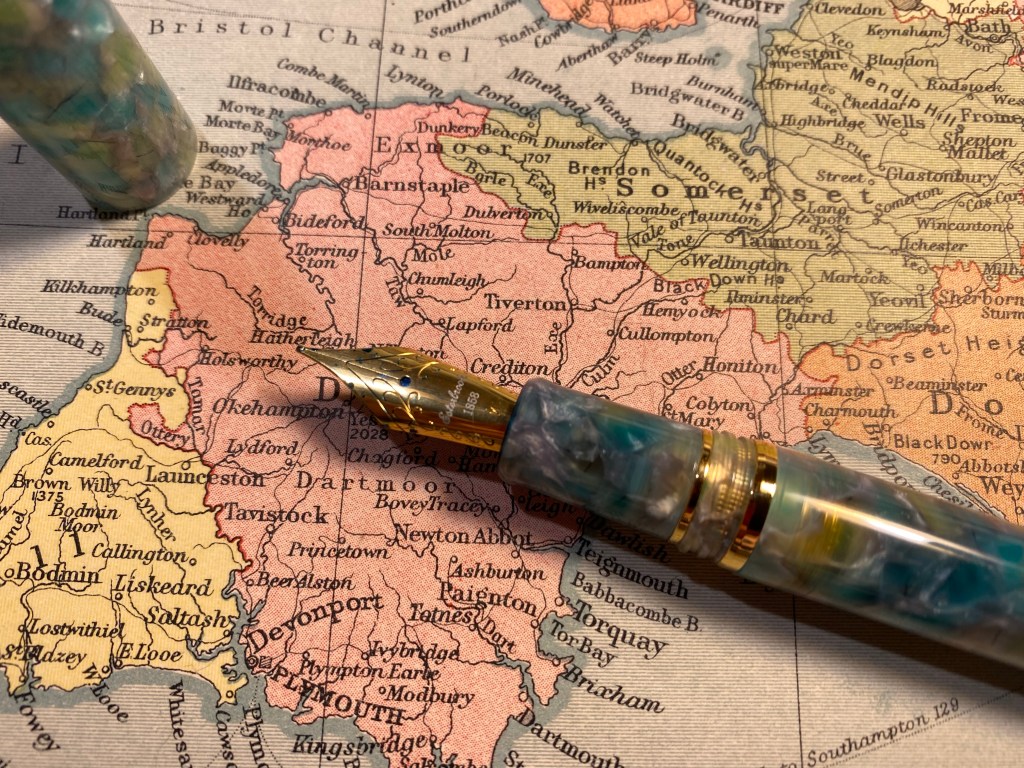
After a mountain of good new Esterbrook reviews came in, and after I reconciled myself to the idea that the new Esterbrooks did not look like the old Esterbrooks I decided to give the Esterbrook Estie a try, and picked up a Sea Glass with a journalling nib. I normally don’t buy pens with gold hardware, but this was what was available at the time, and so a gold hardware Esterbrook Estie Sea Glass it is.
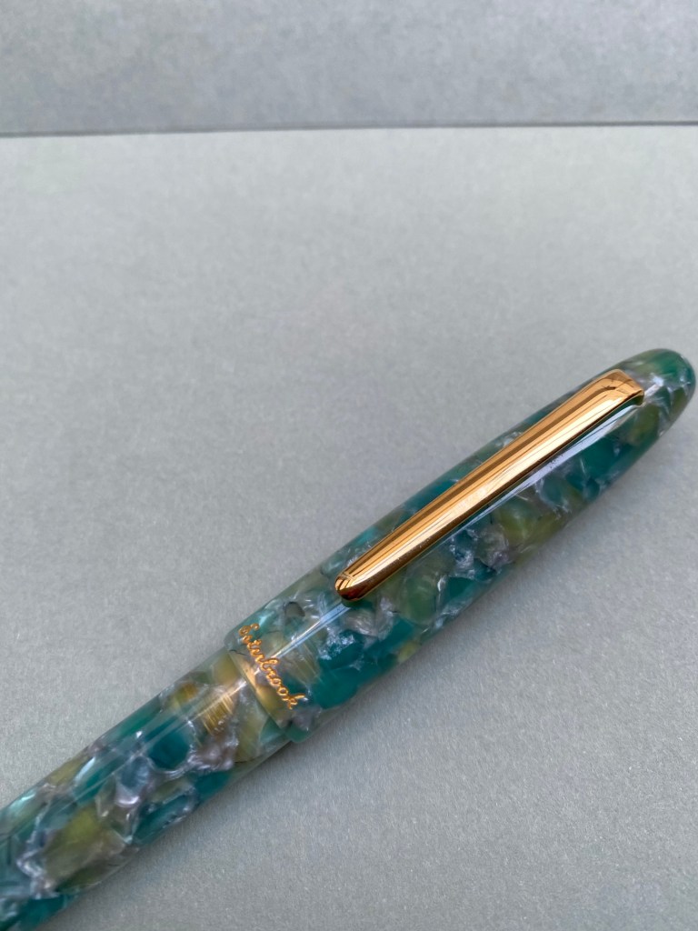
First of all, the pen is gorgeous. It has the classic cigar/torpedo shape that many fountain pens share, but the material of the Sea Glass pen sets it apart. It’s partly translucent, partly chatoyant, and vibrant without being Benu loud.

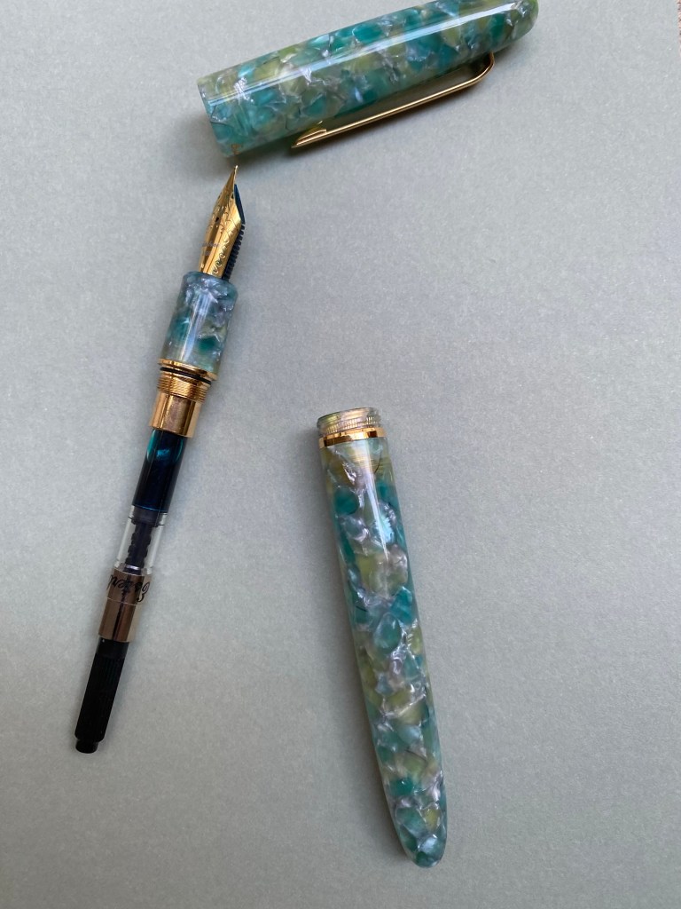
What took me by surprise is the capping mechanism. It reminded me of a child safe pill bottle, where you also have to push down as you twist to get the bottle to open. The mechanism does work well to make sure that the Estie doesn’t dry up or accidentally uncap itself, but it also means that it takes longer and a bit more effort to uncap the pen. If you write in short bursts this mechanism is going to be an annoyance.

The “cushion cap” mechanism is well made and is attractive and unobtrusive when writing, so I don’t think it detracts from the pen. It’s just something to be aware of, since it is so unusual. It reminds me a bit of the Visconti Homo Sapiens caps.

The nib has scrolls and the Esterbrook branding on it, as well as a four digit number, like the old Esterbrook nibs. You can unscrew the nib and replace it with a vintage Estie nib, though I’ve been enjoying my Gina Salorino medium stub journalling nib enough to not want to change it. The fact that Kenro industries, the makers of the new Esterbrook, have teamed up with nibmeisters to offer custom nib grinds is amazing. Apart from the journalling nib they also offer an architect grind.
The pen is branded on the cap lip below the clip with an “Esterbrook” imprint in gold script. I really don’t like the branding, as I feel like it cheapens the pen. If it were just an imprint then I think it would have been classier.
The Esterbrook Estie is a cartridge-converter pen, and it comes with an excellent converter. The fact that this isn’t a lever filler like vintage Esties is great, as it’s much easier to fill, clean and check how much ink you have left in a converter, plus sometimes cartridges are convenient.
The Esterbrook Estie is on the larger side but not heavy, with its weight distributed closer to the nib. It makes for a very comfortable writing experience, especially for me now. The cap posts, but I wouldn’t post it because it makes the pen overly long and unwieldy.
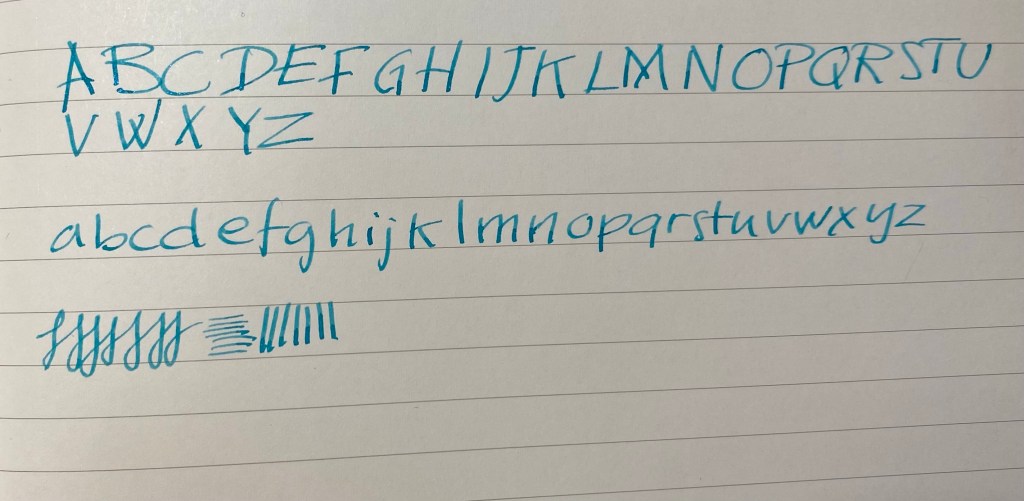
Here’s a writing sample with the journalling nib. It’s a lot of fun to use, and very forgiving to whatever writing angle you use it with:
The Esterbrook Estie is more than a reboot to an old beloved brand. It’s a fantastic pen to select as your first “more than $100” fountain pen. It’s very well made, comfortable to use, has a classic fountain pen look, and an interesting selection of nibs that you can get directly from the manufacturer. It’s also very forgiving: easy to clean due to the combined cartridge-converter system and nib unscrewing, not likely to dry up or leak due to the cushion cap, and comes with easy and cheap ways to customise the nib post-purchase if you find that your tastes have changed. There are a lot of vintage Estie nib units out there.
The pen that I was leery of buying turned out to be one of the best fountain pens I have.
It’s been a while since my last update, so I thought that I’d write a new one. On August 24th I had my fourth chemo treatment, and it went rougher than the ones before it in terms of side effects. The worst of the bunch has been my neuropathy, which until now has been not so bad. This time however, both my hands were numb and tingly, and the tips of my fingers actually hurt. It’s been hard typing, holding a pen, drawing. It’s not that I’ve stopped doing these things, it’s just that it’s been a challenge to overcome the pain, to focus more to get my hands moving the way that I want them to. But I haven’t given up, and I’ve managed to type, write with my pens, and even create this drawing:
Not bad for someone with semi functioning fingers, right?
My hands have gotten better with time, but they are getting better slowly, and they still haven’t returned to normal. I’ve discovered that lighter fountain pens with bigger barrels are the best in terms of being easy on my hands, and although my handwriting has suffered a bit due to the pain, it is still recognizably my handwriting.
What’s next? On Thursday I have a PET CT which will determine what the rest of my chemo treatment will be, and on Sunday I’ll have the fifth chemo treatment. I’m not looking forward to either of these things, and as the PET CT is approaching my anxiety levels are rising (I really need good results on it). Meanwhile I’m trying to distract myself with work, books and season 2 of “Ted Lasso”. Here’s hoping for good results, and less pain for the Jewish New Year.
This is a super quick review because the Tactile Turn Nautilus is available only until the 8th of September, and I can’t write a more detailed review in my current circumstances (more on that in a later update).
This is the Tactile Turn Nautilus (the standard version), a limited edition Tactile Turn side click pen. Photographs do not do this pen justice. It’s stunning in person:

It’s a titanium bodied pen with a metallic, colour shifting Cerakote finish, and it’s that finish that transforms this pen from a good machined pen into a triumph of craftsmanship and design.

There are gold undertones to the finish that, coupled with the grooves on the pen body, the glittering gold clip and the Cerakote finish texture on everything, make this pen mesmerising.
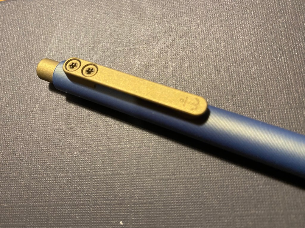
The clip has a gold Cerakote finish that evokes the golden undertones of the blue metallic Cerakote finish on the pen body. The gold is muted, and helps make the pen classy not flashy 🙂
The finish adds texture to an already textured pen (due to the Tactile Turn rings that are engraved on all the body). This makes the pen easy to grip, as it has an almost sandy feel to it.
The Tactile Turn Nautilus isn’t a light pen and is top heavy, but it’s still a pen that’s a joy to write with. If you’re considering a Tactile Turn pen, or any machined pen for that matter, I recommend giving the Nautilus a try.
In lieu of a longer review, if you have any questions, please post them in the comments and I’ll be glad to answer.
