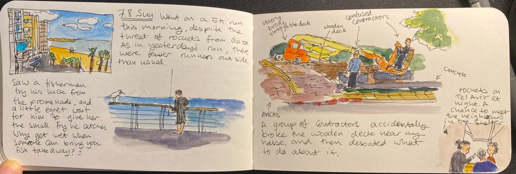
Rockets on Tel Aviv
Woke up at 6:30 to rocket sirens. Multiple barrages, terrorists breached the fence, dead and wounded on the morning of the Sukkot holiday. Sketched this between barrages.

A blog about writing, sketching, running and other things
Woke up at 6:30 to rocket sirens. Multiple barrages, terrorists breached the fence, dead and wounded on the morning of the Sukkot holiday. Sketched this between barrages.
It’s been a busy time, what with my new job taking a lot of time and effort, my running and training taking up a good bit more, and the rest of my spare time going mostly to reading lately, I found myself creating less. That’s not great. My journalling has suffered, my drawing has suffered, my blogging has suffered. The truth is that creating is like running: I feel good during my runs and great after them, but it doesn’t make lacing up and getting out the door any less of a struggle some days. It takes more effort to sketch and blog (I’ve been utterly unable to write since my cancer diagnosis, so at the moment writing is off the table), than to curl up with a book, so I’ve been consuming more content than I’ve been creating.
That’s something that I hope will change over the next few days and weeks. I have a lot of catching up and different kinds of posts that I’ll publish here (pen reviews, sketch posts, art supply reviews, planners and Moleskines, etc). And as September is lymphoma awareness month, and childhood cancer awareness month, expect some posts related to that in the near future.
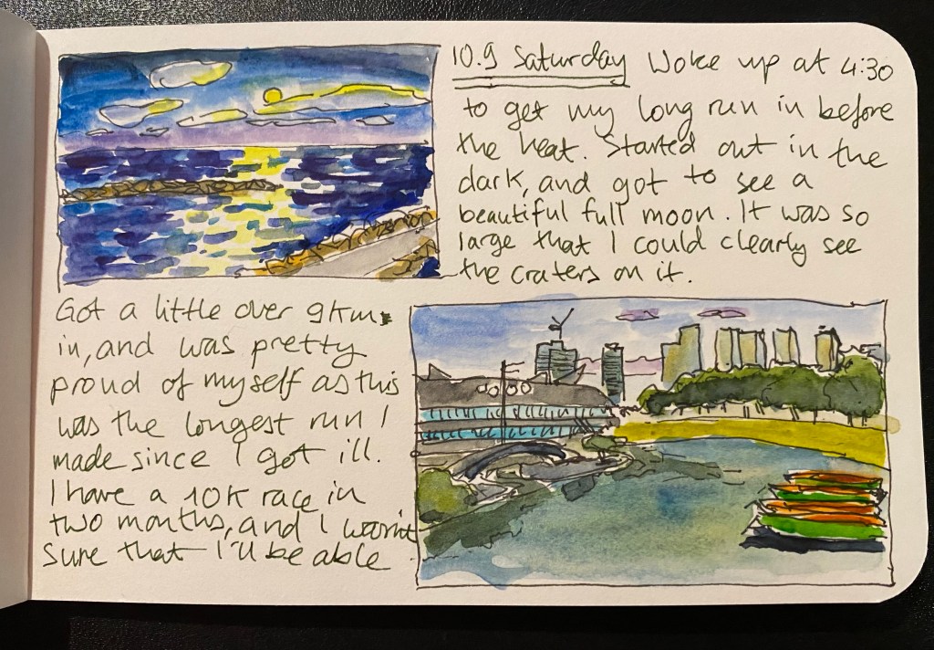
Despite the heat and humidity my running has stayed on track. This morning I woke up at 4:30 to get my long run in before the heat made things too unbearable. The weather is starting to get a bit better now, and I managed to run a little over 9 kilometres. That’s the longest run I managed to finish since my breathing issues started, and it’s a big milestone. I have a 10k race in two months and when I enrolled I wasn’t sure that I’ll be able to complete it. Today was a good indicator that I have a just may be able to do it despite having a busted lung.
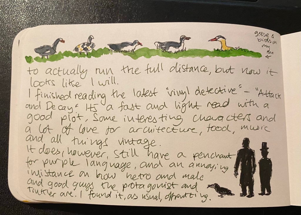
I finished reading Dr Jen Gunter’s “The Vagina Bible,” which I recommend that anyone with a vagina read (it’s very informative and empowering), and Andrew Cartmel’s latest Vinyl Detective novel, “Attack and Decay”. It was a fun and fast read, and Cartmel knows how to write compelling plots and off beat characters, but his insistence on using purple language and calling attention to his protagonist’s hetro maleness is annoying at times. We get it, he’s a dude and he finds women attractive.
Next up on the reading list is likely “The Sentence” which is a Tournament of Books book (and I decided not to continue with the tournament reading list this year), but as I’ve already bought it and it seems interesting, I’ve decided to give it a go.
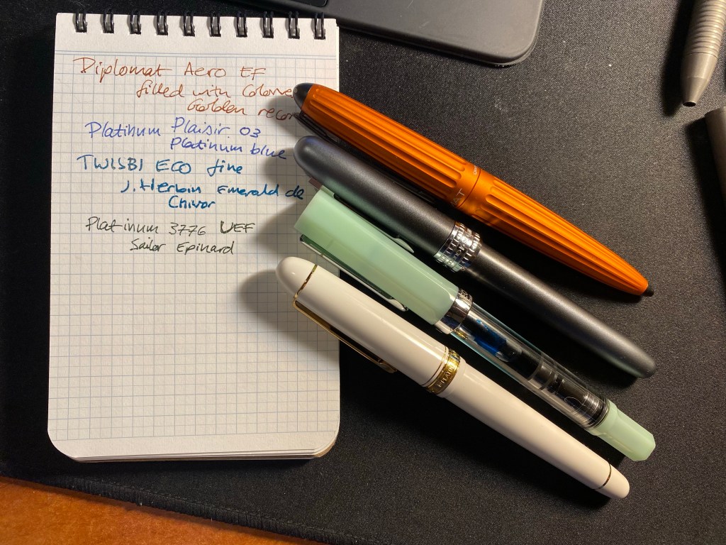
I’m using four fountain pens at the moment, and none of them are for sketching (although I write my sketch journal’s out with my Platinum 3776 UEF). All of these are new pens, inked for the first time. The Diplomat Aero is an excellent pen at a great price point with a very unique and elegant streamlined design. The Colorverse Golden Record, on the other hand, is a disappointing ink. This is the second time that I’m using it, and it darkens considerably when left in the pen, becoming more brownish than golden orange.
The Platinum Plaisir 03 is a pretty decent pen for anyone first venturing into fountain pens. It’s a cartridge pen, and I’m not a fan of the Platinum blue it came with, but I’m not going to invest in trying to find other ink options for it.
The TWSBI ECO is an excellent pen, particularly for the price point, and J. Herbin Emerald de Chivor is a really fun, utterly impractical ink. This ECO is the jade one, and it doesn’t glow in the dark, despite its looks.
The Platinum 3776 UEF is one of the best pens that I’ve bought in a long time, because of the nib. Yes, it’s scratchy, no I don’t mind. It doesn’t feel different than my beloved, finicky Pilot Hi-Tech-C and I get more personality from its fine lines than I get with something like a fineliner. Sailor Epinard (this is from a bottle of the discontinued ink, which is now no longer discontinued), is a good, dark and muted green that has a good amount of personality.
Have a great week, and take care of yourselves in these hectic times.
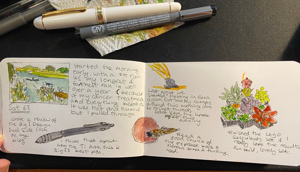
The Lego set came out well:

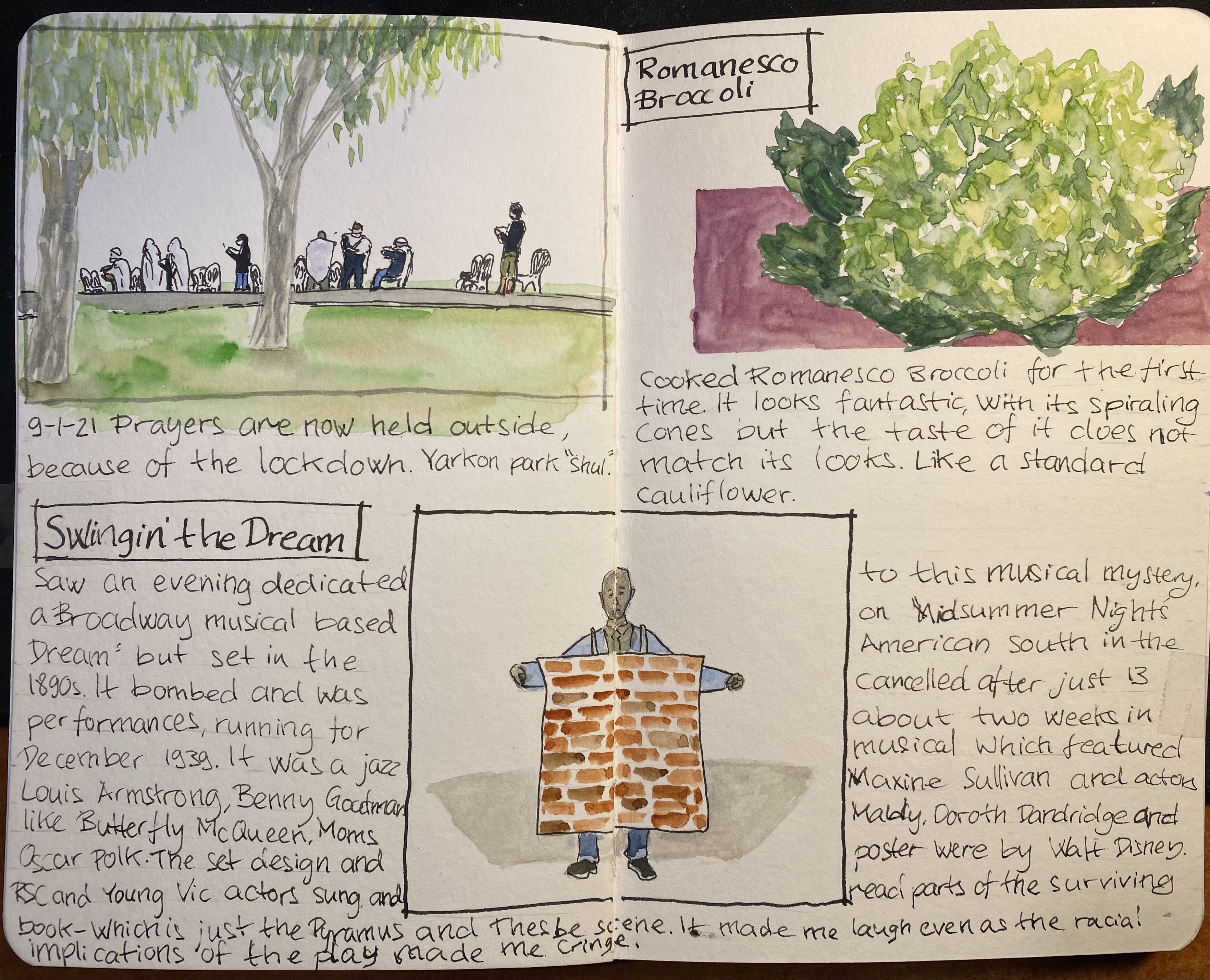
Another page from my sketchbook, created as part of Liz Steel‘s excellent Sketchbook Design course. Went on a run and saw a makeshift outdoors synagogue in the park. Prayers take place outside now, as we’re in lockdown number three.
Saw an RSC and Young Vic production about “Swingin’ the Dream” a 1939 musical that had a star studded cast and seemingly checked all the boxes for success (jazz musicals and Shakespeare were popular at the time, so why not create a mashup of the two?), yet tanked and was canned after only 13 performances. What is fascinating isn’t just the failure itself, but that there is so little evidence of the musical ever existing. A musical number and a Pyramus and Thesbe scene are all that is left. The evening I saw was a one off, but it piqued my curiosity enough for me to want to learn more and see more about it. You can read more about the production here and here.
Material list: Stillman & Birn A5 Beta, Schminke watercolours, Lamy Safari (medium and fine nibs), Lamy Joy 1.1 nib, Noodler’s Lexington Grey and Noodler’s Black.
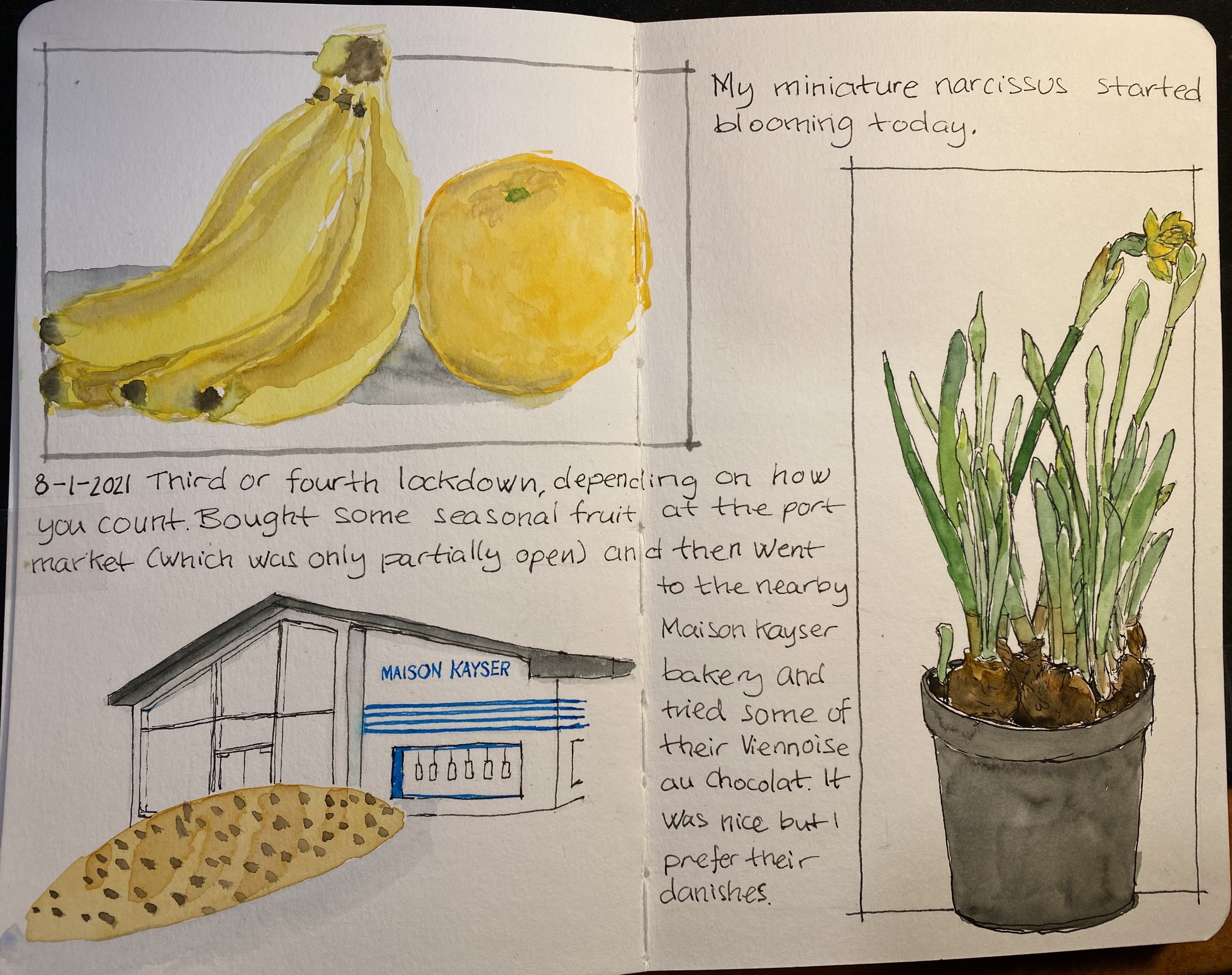
This page, created for Liz Steel‘s Sketchbook Design course, is about secondary sketches and borders, and has a little hidden colour block in it. The original spread was a little lacklustre and disjointed. The Viennoise in the corner looked particularly sad. Adding a secondary sketch of the Maison Kayser bakery (where I bought it), with a touch of blue and bluish grey to the background really brought it to life.
The bananas and orange got a shadow which serves more as a grey colour block, making their warm colours more prominent. Adding borders in Noodler’s Lexington Grey (to the bananas and orange watercolour) and Noodler’s Black (to the narcissus) was the final touch that pulled this page together.
I’m enjoying the course very much, even though the past two weeks have been personally hectic. I’ve been working on a short story to submit to a competition (got it done in time and accepted), and some bad news regarding the health of a family member have meant less sketching time than I would have liked. Hopefully the coming weeks will be better.
By the way, the local branch of Maison Kayser, in Tel Aviv’s port (I haven’t visited the Rothschild one yet), is excellent. Their vanilla chocolate chip danish, sandwiches, and baguettes are sublime, and it’s a fun place to visit. They had the misfortune of opening after the pandemic started, but they seem to be managing well, so I think we’ll be seeing them around for a good while yet.
Drawn on a Stillman & Birn Beta, with Lamy fountain pens, Noodler’s ink and Schminke watercolours.
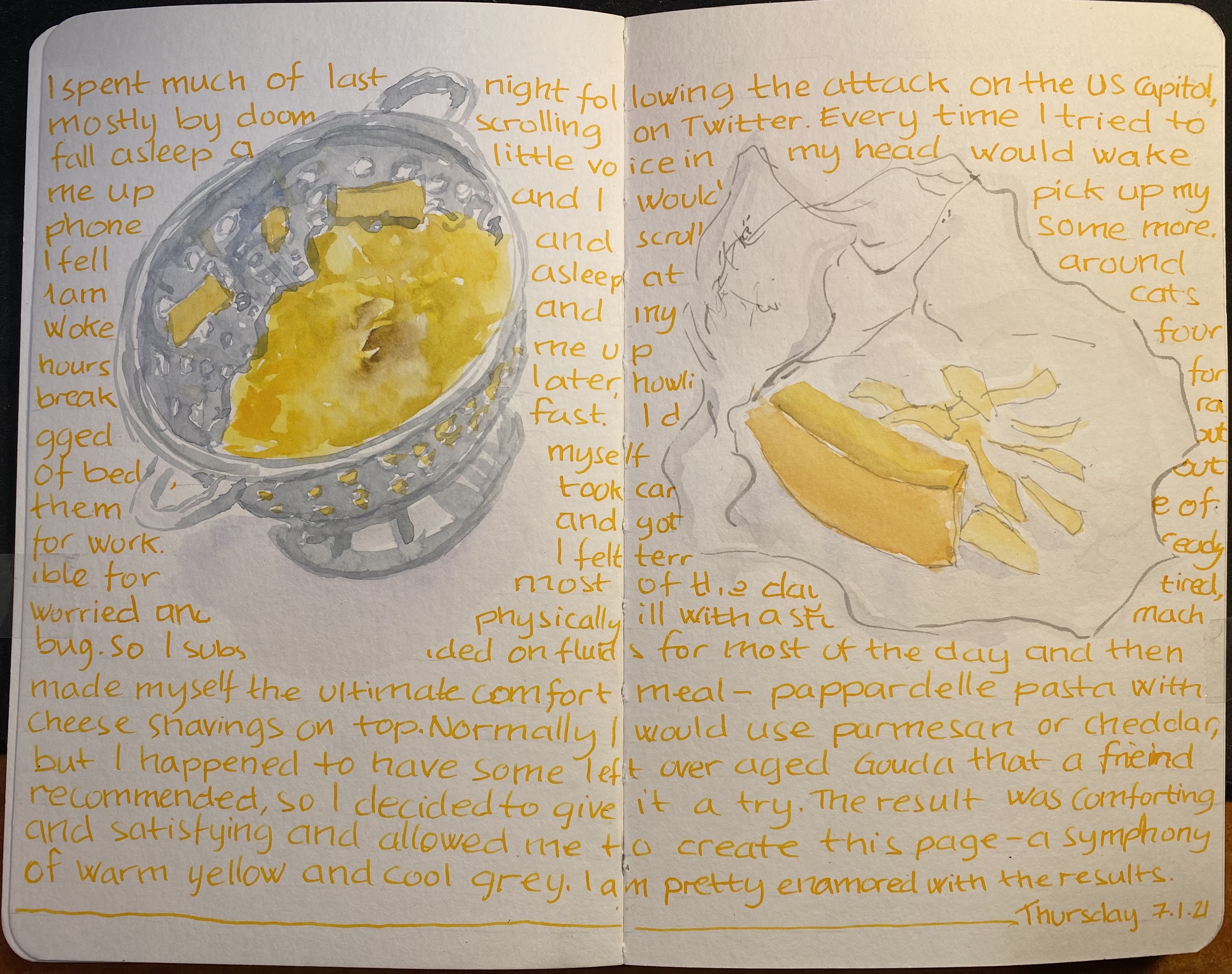
I think that there’s nothing better than plain pasta or pasta with a little cheese if you’re not feeling your best: it’s perhaps the ultimate comfort food.
I created this page as part of my Sketchbook Design course with Liz Steel, and this one is all about exploring how to use text as part of my page design. Gave Rohrer & Kilngner Helianthus ink a spin, which is also something that I decided to experiment with. Like many yellow/orange inks it tends to crystallize on the nib and feed, so I’m “sacrificing” a Pelikan Pelikano for the effort. Pelikanos are great beginners pens that don’t get much love in the community probably because they are less ubiqutous than Lamy Safaris and their standard nib offering is a Pelikan medium which is very wide. If you’re an artist I recommend purchasing one (with a converter), as they have less tendency to dry out (with permanent inks) than Lamy Safaris and they indestructible workhorses that have very smooth (and wide) nibs.
Drawing made with Schmincke watercolours on a Stillman & Birn Beta which I’m still on the fence about. It’s better than the Alpha for watercolour washes, but it’s still not great, and it’s not great for pen and ink or fineliners. Also the glue connecting the sections isn’t the best, as it needs forcing apart once you hit a new section, and oftentimes leaves an unseemly tear in the middle. The sketchbooks are good, I just wish that the sections were sewn together and that the paper would lean into being watercolour paper more – so that they would be perfect. However, changes like these would mean a price increase, which would make them unappealing, since a large part of the Stillman & Birn softcover sketchbook appeal is their price. In the end it’s a nice sketchbook that I don’t feel too precious about, which is the main point, and is why I’ll continue using it.
Used a Bic Crystal ballpoint pen, a set of Stabilo Pastel highlighters and a pocket Moleskine sketchbook to create this journal comic. Was inspired to use things that I already had laying around, not in use, to fill in a page in a long abandoned sketchbook. I was actually surprised at how relatively well the highlighters worked here.


You can find part 1 here. You can see that there is a slight bit of show through with the Stillman and Birn Epsilon, but at only 150 gsm that’s to be expected.
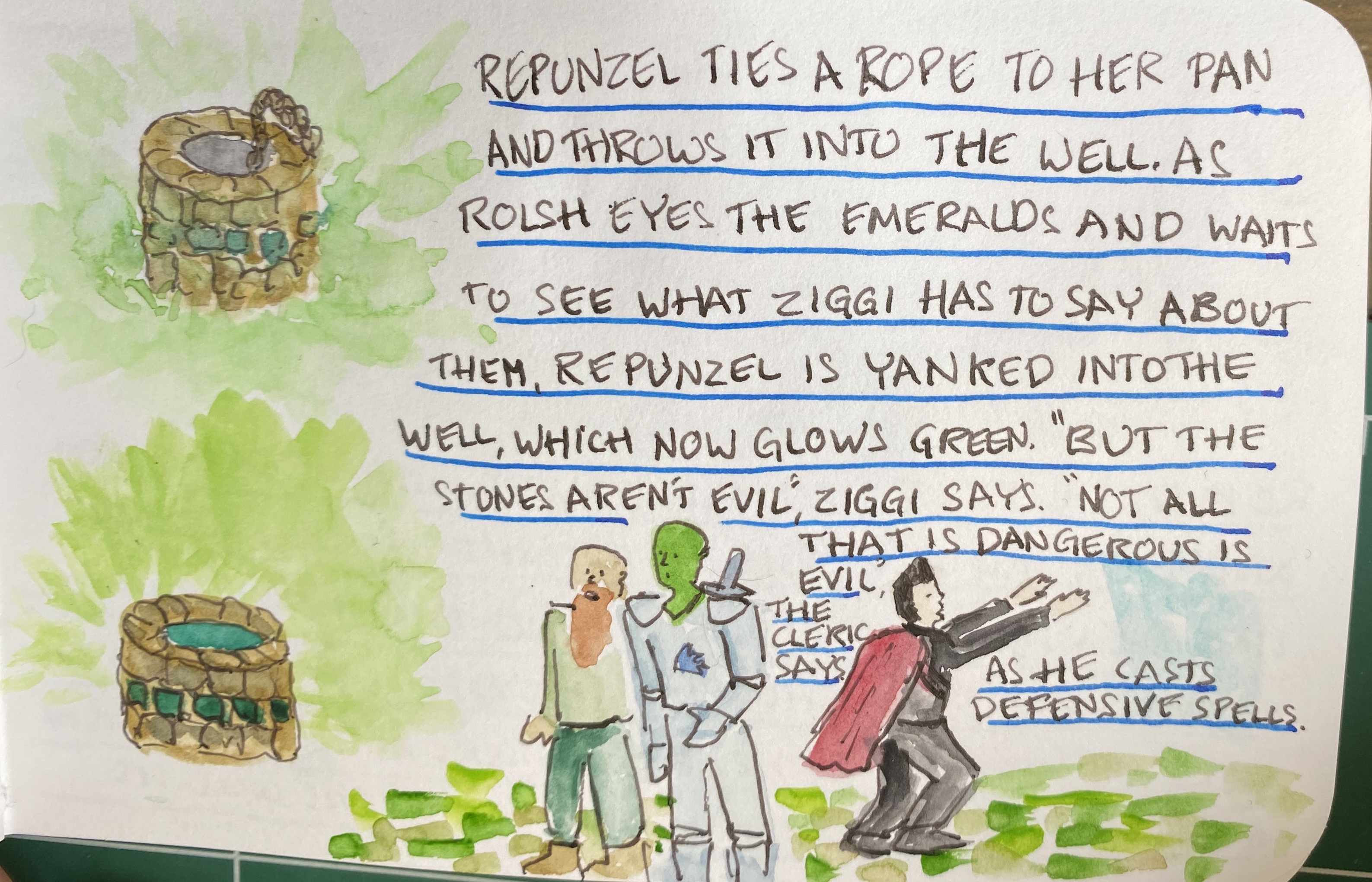
I decided to play a bit more with ink colours and wider nibs here, so that’s a Sailor medium stub nib and Diamine Inkvent Blue Edition Candy Cane ink for spells and effects:
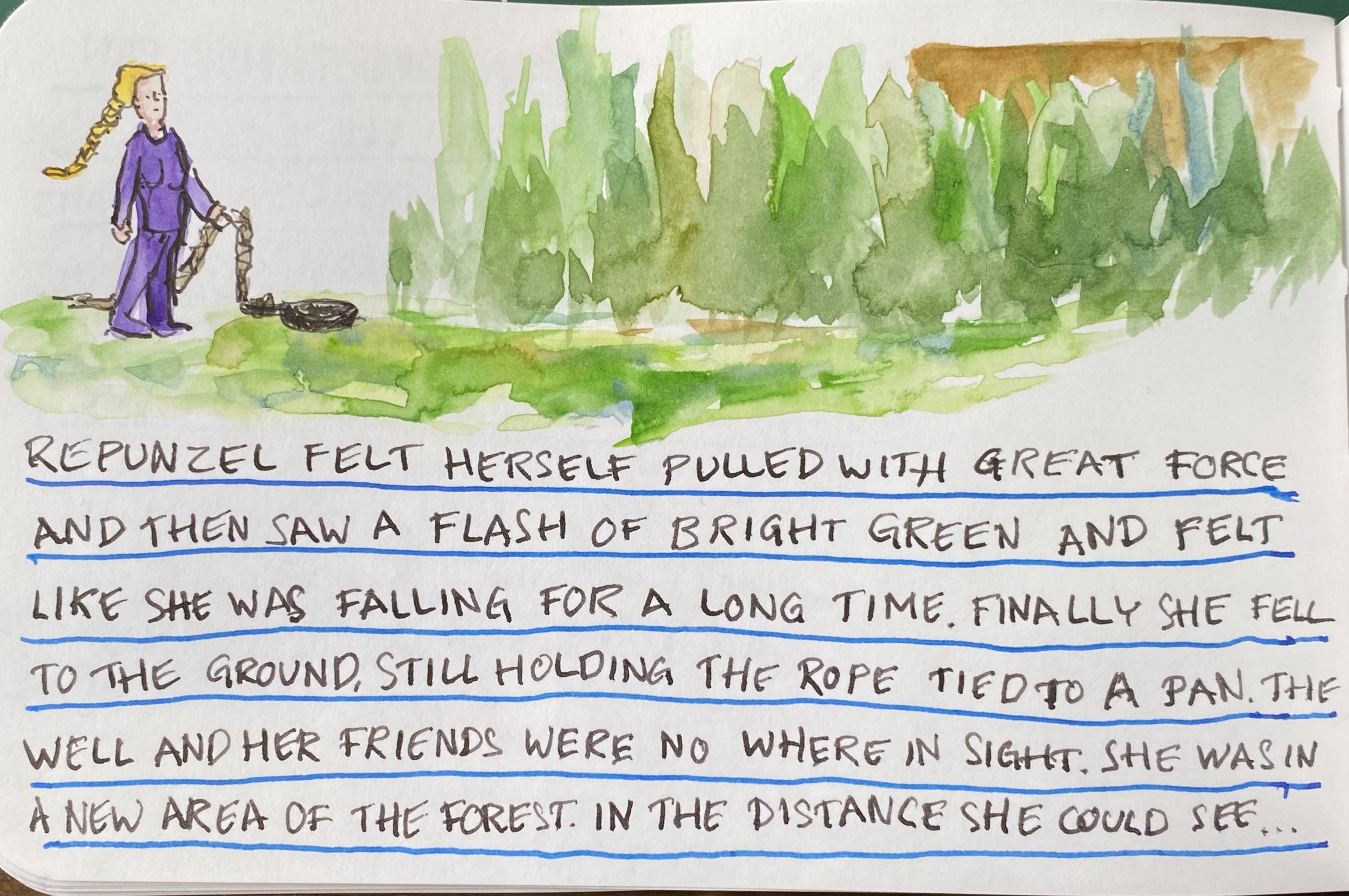
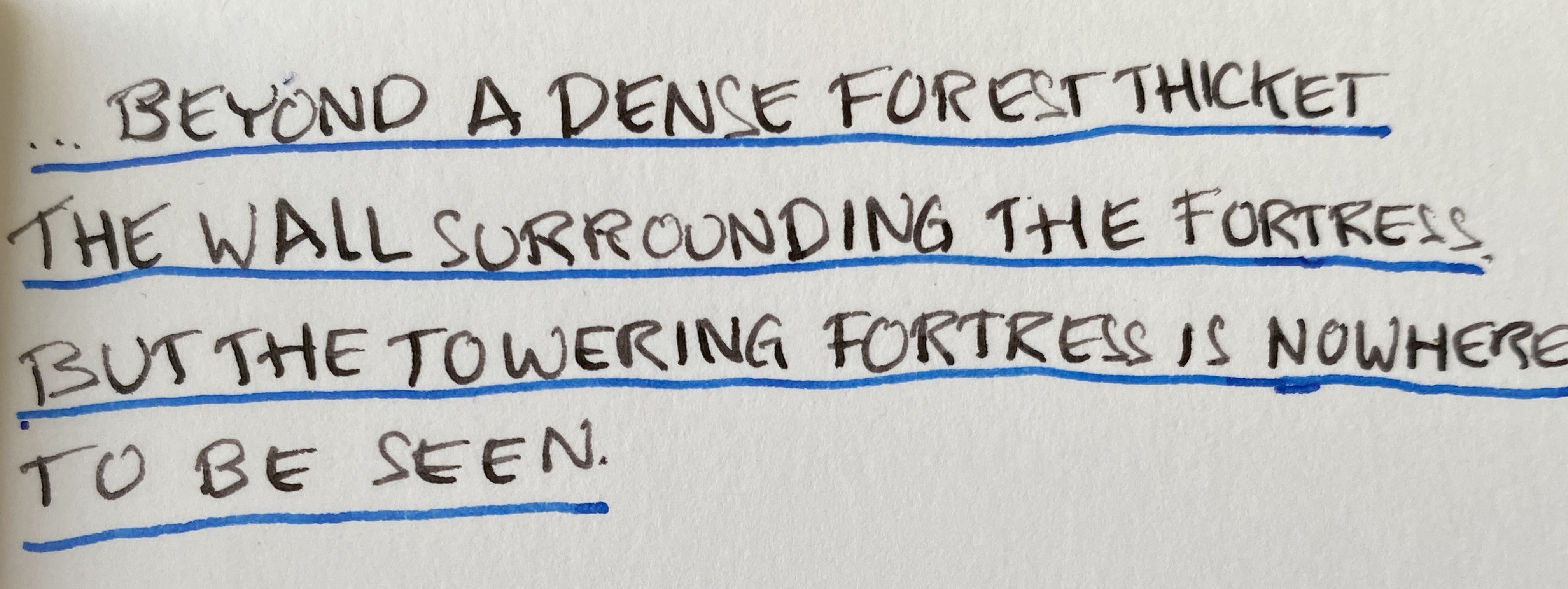
There’s no show through for the ink, and though it may not seem that way, there was no spreading. Also, if you like granulating watercolour effects, the Stillman and Birn Epsilon paper seems to be a champ for that.