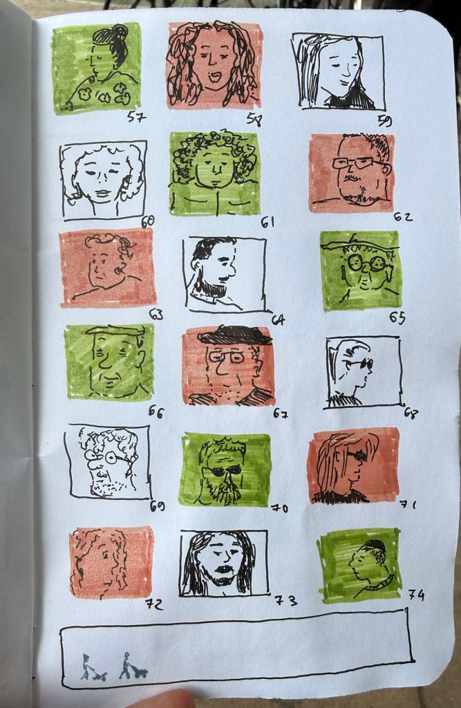
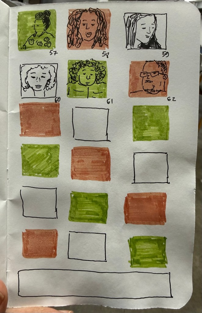
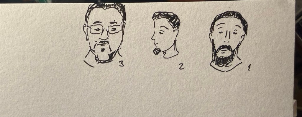
Last day of the challenge and I got all 100 (well, 101) people done. Today includes people in the streets near my house as well as people in the shelter.
Field Notes sketchbook and Faber Castell Pitt pens.
The bottom panel was supposed to a panorama in fountain pen ink but this is very unfountain pen friendly paper
As usual this was a fun and challenging challenge to do, and I hope to get to do it again next year.
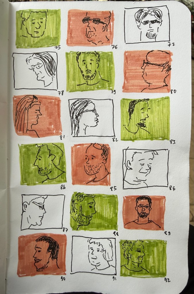
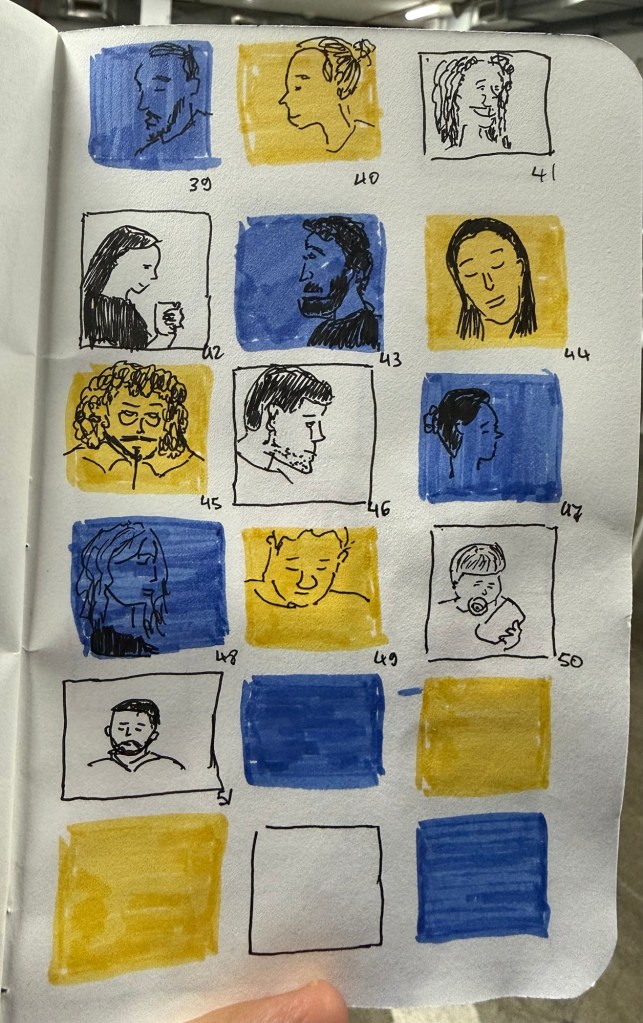
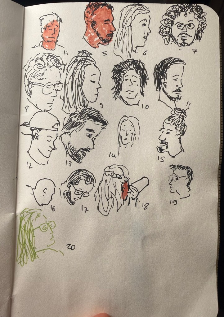
We had a rocket attack every three hours last night so I was very tired today. Got only 10 sketches out of the 20, although I may be able to get some more tonight.
Shelter sketches today as well, on a battered Field Notes sketchbook using Faber Castell Pitt pens. I have a cold, so it was a struggle to get these done today.
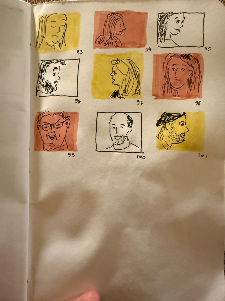
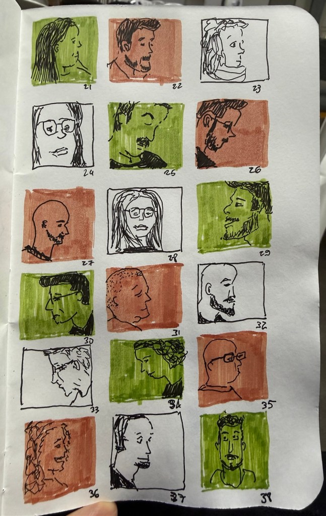
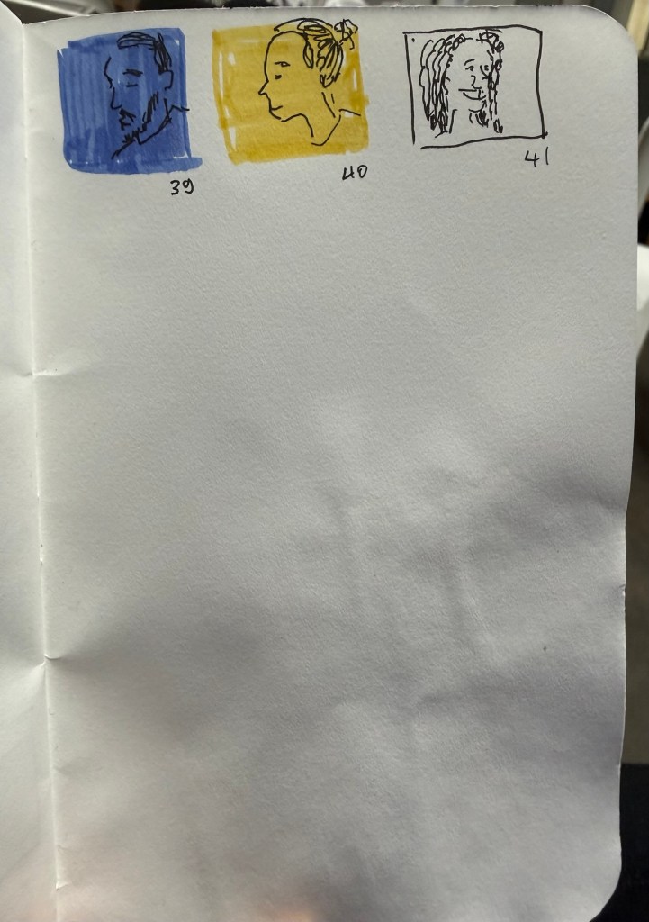
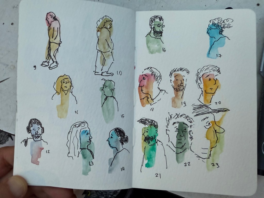
I went out for 45 minutes after work and sketched all of these as fast as I could. I only stopped when it got too dark outside. Yesterday’s sketches were done with a Staedtler 0.5 pigment liner on a Field Notes sketchbook. Today’s sketches were done on a pocket Moleskine watercolour sketchbook using a 0.3 Staedtler pigment liner, a water brush and watercolour.
First batch when it was still light outside
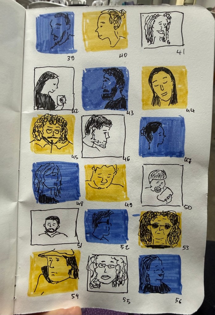
People moved by in the street so I had seconds to capture each figure (the more detailed ones stopped for a minute or two). As this is what normally happens when you urban sketch, I found this exercise to be very useful.
I mostly use fountain pens when I write. If not fountain pens then gel ink pens. I rarely write in pencil, but I often sketch with pencils, and sometimes when I plan, I pencil things in. Pencil is great for writing impermanence, even though pencil marks last longer than pen ones – unless erased.
Yet there’s always a ballpoint on my desk and in my bag. I don’t like writing with ballpoint – the lines are as dark as I prefer, even with hybrid ballpoints like Uniball Jetstreams, and they oftentimes streak and blob. So why do I have a ballpoint at hand at all times?
Because ballpoint pens are a useful tool. The ink is waterproof , they’re good for signing things, and they’re robust enough to handle being tossed into a bag or a pocket. Ballpoint pens are also good for sketching – you can get a decent amount of shading and character with them (providing you don’t use a Jetstream).
One of the best bang for your buck ballpoints is this pen:
Zebra 301A BP
So why do I like the Zebra 301 A BP 0.7?
It’s made from aluminium, so it’s light and ultra durable. It also wears really well.
I love the pen body design and colour.
The grip and click mechanism are good: well designed and well made. You get a decisive click from this pen, and the plastic grip has enough texture to it to make writing as comfortable as possible without all the lint gathering, stickiness and durability issues of softer grips.
No tip wiggle.
It comes with a good, dependable, black refill that is replaceable.
Clip and click mechanism
I like the Zebra 301 A BP enough that I bought a large box of them and I frequently give them away as gifts. People like getting nice pens and if you’re used to cheap, plasticky, disposable ballpoints it’s nice getting a pen that’s a grade or two above what you find in the office supply cabinet.
Grip
Here’s a quick sketch done with a Zebra 301A BP 0.7 on a Field Notes Sketchbook. Ballpoint pen sketching isn’t my favourite technique, but it is a very useful technique for quick urban sketching.
I used to be a heavy Twitter use. I discovered the service pretty early on through webcomic artists like Scott Kurtz, and I found the challenge of crafting short tweets to be a fun writing exercise. Yes, I was among those disappointed when they raised the character limit – half the fun of the service was trying to be as clear and concise as possible.
When Twitter stopped supporting third-party clients like Tweetbot, and started becoming an unpleasant place to hang out, I left. It hasn’t gotten better in the interim years and as I have largely cut social media out of my life so I have no plans of ever going back. However, while I don’t miss Twitter (not as it is, not even as it used to be) I do miss the challenge of crafting short and punchy snippets of text: the haiku like nature of tweets. I also have a large pile of unused Field Notes pocket notebooks, and a not insignificant stock of really cool gel ink pens, rollerballs and ballpoints that are all seeing very little use.
Could I put these together to achieve an analog version of what I enjoyed most about Twitter?
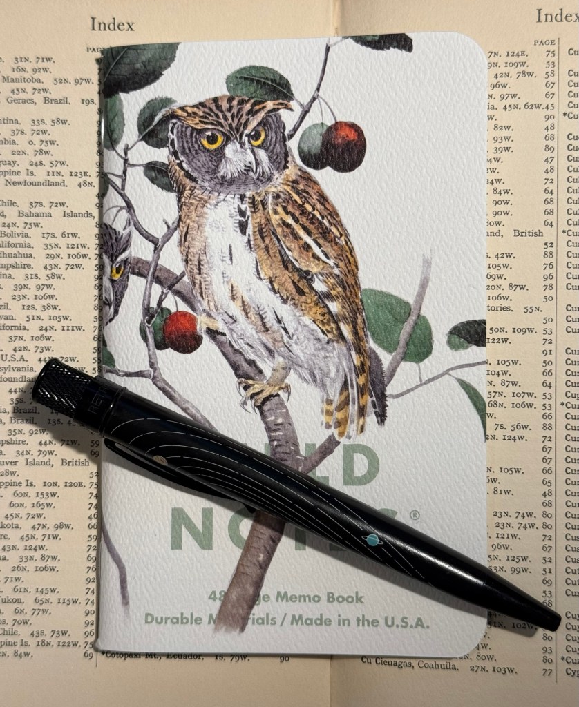
The Birds and Trees of North America, Fall 2024 seasonal edition of Field Notes.
Yes, I could and I did and it has been glorious.
I selected a Field Notes notebook out of the the Fall 2024 “Birds and Trees of North America” edition because it’s a beautiful edition, it has lined paper (which I rarely have use for in pocket notebooks), and it seemed appropriate. I randomly selected a Retro 51 Tornado – The System limited edition one which has Uniball Jetstream SXR-600-05 hybrid ballpoint refill in it instead of the original Schmidt refill which I don’t like. Then I started writing down “tweets” in it throughout the day.
Rocky Mountain and Mexican Screech Owls Field Notes notebook (illustrated by Rex Brasher) and Retro 51 Tornado The System limited edition pen
I’m not dating them, I’m not counting characters, I’m just limiting myself to a few rows for each entry, and I’m writing them as if I would be publishing them. The writing style is therefore different than what I would write in my journal, and so far it’s also focused exclusively on things that I don’t write about in my journal (mainly reactions to things I did or saw or read). I have no intention of ever publishing anything in this notebook, but I do enjoy the challenge of writing it as if it would be something that I would post somewhere.
So I get to practice my writing skill in a new way, I get to use some of my wonderful Field Notes stash, and I get to use some of my great standard pens. All this without filling the pockets of various billionaires with my work, and without encountering the bots and the foaming hordes of professional haters and rabble rousers online.
I highly recommend this practice, whether you do it with a fancy Field Notes or just any pocket notebook you have on hand. Using a notebook of this size will remind you to keep your entries short, and it’s something that you can easily carry with you and use in waiting rooms, boring meetings, or when you need a little break between tasks throughout the day.
Is there a book that you want to read but scares you? It’s too long, or too technically demanding, or its subject matter is challenging — is there such a book on your virtual or physical bookshelf?
I have several such books waiting to be read. I also make a point to read several such books each year. They’re nearly always worth the effort.
Goodreads and its annual reading challenge make readers favour short, quick reads, skim reading and light reading. This is not by chance, but this isn’t a post about the failures of Goodreads as a platform. This is a post about reading difficult books, and the point is that if you want to challenge yourself you’re going to have to make a concerted effort on your own.
You will have to motivate yourself because reading platforms and book clubs skew towards books that can be read quickly and relatively easily, and we’re being trained daily to shorten our attention span and ruin our capacity to concentrate and think by platforms like TikTok, Instagram and YouTube. To read difficult books is to go against the grain, to retrain your mind to deep, meaningful thought, to long stretches of concentration, to a higher level of empathy. It’s the difference between a fast food burger and an evening with a 3 star Michelin chef showing off his best work. It’s worth it, but it costs more.
If you chose to go on that challenging but worthwhile journey, here are some tips to help you along the way:
Build up to it – don’t start with the toughest, longest, scariest book on your list and try to white knuckle your way through. Build up to it by stretching and building up your reading and concentration “muscles” first. If you’re building up to length, for example, fantasy and space opera sci-fi novels are a great way to get there, as they’re usually well paced, relatively easy reads. Historical fiction and family sagas can train you to follow multiple timelines and characters, and short stories utilizing modernist and post-modernist techniques can offer an easier way to encounter them for the first time.
Have a light read going simultaneously – this is particularly effective if the book you’re tackling has a difficult subject matter. Have a light, fun read going on at the same time and switch between the two, allowing yourself a break from the difficult topic and time to process it every once in a while.
Find a partner for the journey – find a friend, online or in real life, who’s interested in reading the same book as you are, and help each other through it.
Find a community – it’s difficult to find a friend interested and able to dedicate time to take the reading journey with you, but it may be possible to find a community of readers going through the book at the same time as you are. It can be through a local bookclub, a virtual bookclub, a reddit community, a Goodreads group, a discord channel – whatever group you can find and suits you. Just make sure you’re comfortable with the group rules in terms of code of conduct and spoilers, and feel free to leave if you encounter toxic behaviour.
Create a framework to help you through – ideas for this can include various trackers, reminders, applications like Forest or other Pomodoro like counters that help you focus, little treats or incentives after reaching certain milestones. If I’m reading a particularly long book, I set up a dedicated tracker and a page count I want to hit every day, to make sure that I don’t feel overwhelmed and can visually see my progress. It somehow helps me deal with the goblin in my mind that is screaming that this book is too much for me and I don’t have time for it. Field notes are great for this, especially the squared and reticle grid ones.
Start by reading a good chunk – on your first read at least the first chapter or several chapters, so that you get into the flow and tone of the book as soon as possible. I tend to aim for 30-50 pages on the first sitting.
Get a physical copy of the book, not a digital one. Paper books are easier and more enjoyable to read than digital ones, as our mind finds them easier to process because of the way we read (oftentimes returning a page or two back to check on something, or flipping to a previous chapter to remind ourselves who that character is or what happened last time). Whenever I’ve tried to read a difficult book on my Kindle, I’ve regretted it (The Alexandria Quartet is the latest example).
Feel free to give up, tomorrow – if the book is too much for you, it’s OK to decide that you’re not going to finish it, or you’re going to get back to it at a later date. But before you do that, take one more day to make an effort and read another chunk anyway. Why? Because you may have just reached a particular tough spot, and in a few pages things clear up, or become easier to digest. Also, you may just be having a bad day, or you’re particularly distracted or tired and so the writing becomes more opaque or more of a slog. Give it another day and if it doesn’t improve, move on.
Tracker for Paul Auster’s 4321 on a Field Notes Snowy Evening with a Spoke Design pen.
I’m currently reading Paul Auster’s 4321, which is a challenging read due to its length and its structure. Later on this year I plan to reread James Joyce’s Ulysses (I read it twice cover to cover already, and studied it while taking my degree). I’m considering tracking my rereading here, in case someone wants to follow along. Let me know in the comments if that’s something that may interest you.
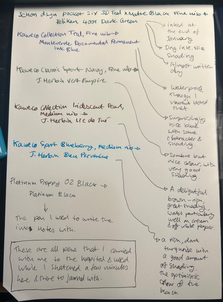
I started the month ready to spend the first half of it in hospital, with my dad. So the fountain pens I chose were all expendable pocketable pens that I was willing to have stolen (apart from the Schon Design Pocket 6 which was a leftover from January and never left my desk). So that meant I inked 4 Kaweco Sport fountain pens using various ink cartridges that I had on hand.
The portable lineup:
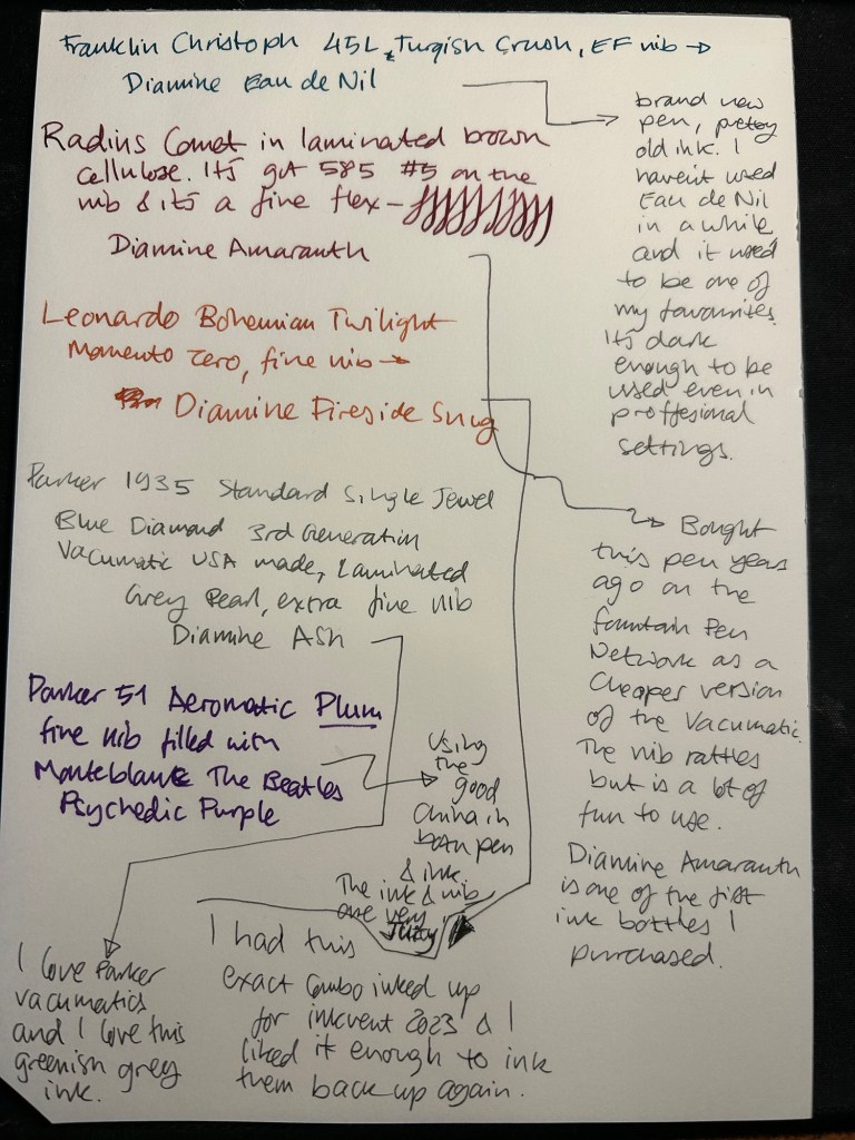
Once my dad got out of hospital and back home, I decided to celebrate by “shopping” from my collection. I inked up a Parker 51 Plum (use the good china!), a Parker Vacumatic, a Franklin Christoph 45L Turqish (spelled like that on their site) Crush that I had purchased but hadn’t inked before, and a vintage Radius Comet (because I heard that the brand was being revived).
The Franklin Christoph EF nib isn’t the best companion to the Eau de Nil as the ink tends to dry in the nib, causing hard start issues. The Radius is a flexible nib of the vintage kind, which means it’s really flexible and not just springy. It also rattles, which makes me not carry it around with me — it stays at home at my desk. The Leonardo is a beautiful pen with a beautiful ink that I refilled immediately — the only Inkvent 2023 ink I did that with. The two vintage Parkers are phenomenal, as usual. The extra fine nib on the vacumatic somehow really well with Diamine Ash, though I was worried at first that the combination would be too light to be readable. The Parker 51 Aeromatic is a treat to use. It’s the rare Plum colour, and it’s got a fantastic nib (as all 51’s have) which pairs very nicely with the Monteblanc The Beatles Psychedelic Purple.
In terms of paper I’ve been using Kokuyo A4 KB paper which I cut to half size (so A5) to manage my daily to do list. The paper is relatively cheap and very fountain pen friendly. I’m also able to use both sides of the page despite there being some show through.
Kokuyo A4 KB paper cut in half to A5 size. This is why standards are great.
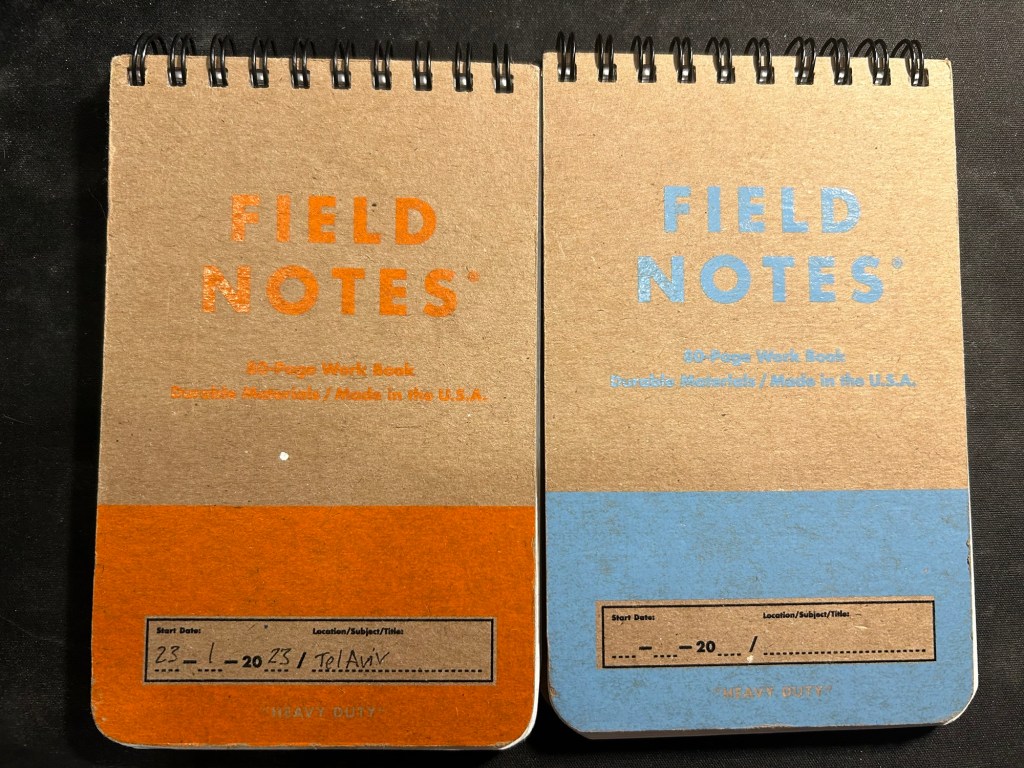
I’ve got a Field Notes Heavy duty on my desk at home and at work, and I just bought a new stock of them. These are where I jot down quick notes, phone call details, doodles during boring meetings. When they’re filled up they get tossed out as nothing in them is permanent — everything important in them moves to somewhere else as I work my way through them.
Field Notes Heavy Duty pocket spiral bound reporter notebooks
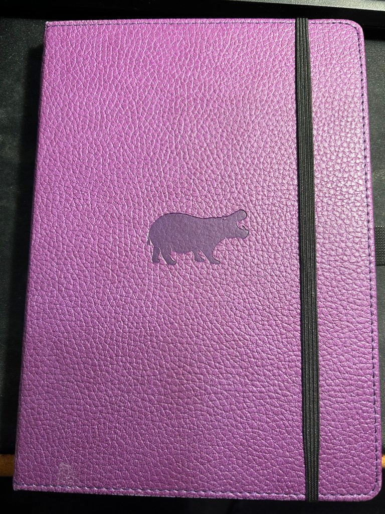
I have finally found a use for my Dingbats notebooks (beyond giving them away as gifts, as I have in the past): this lined purple hippo one is my blog notebook. I discovered that I have a much easier, much quicker time writing blog posts if I first draft them on paper, and this is where I do it in. I’ll likely write a dedicated post to this notebook soon.
Dingbats Puple Hippo A5 lined notebook
Apart from them I still use the notebooks I used last month.
Pencils
I’ve been using the Drehgriffel Nr. 2 as my daily driver. I use pencils extensively to plan, as my plans tend to change, and there’s something about this solid little mechanical pencil that makes me want to use it.
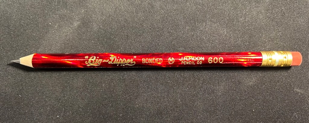
Apart from that I brought two pencils into the rotation, to try to use. One is from my last purchase from the late and great C.W. Pencils Enterprise, and it’s the “Big Dipper” J.R. Moon Pencil Co 600. It’s an oversized pencil, the kind of pencil that kids who are learning to write are expected to use. I’ve been having pretty significant neuropathy in my hands lately and I thought that this would be nice and easy to use, as after all it’s designed for kids just learning to develop their fine motor skills. So far it’s been a disappointment – the eraser and ferrule make it very top heavy, and I’ve been having a hard time manipulating it. I can’t imagine kids using this pencil and having an easy time with it. I like the over the top red foil with gold writing look though, so I haven’t given up on it yet.
Big Dipper J.R. Moon 600
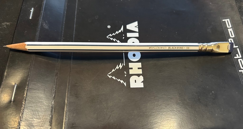
The second pencil is a Blackwing Volumes 56, the baseball themed one. The core is soft and dark, and I’ve been using it for quick and loose sketches. I’m trying to ease into one week 100 people by training myself to work faster than I normally would.
Blackwing Volumes 56
What did you use in February? Any planner changes? Pencil revelations? Pen preferences?