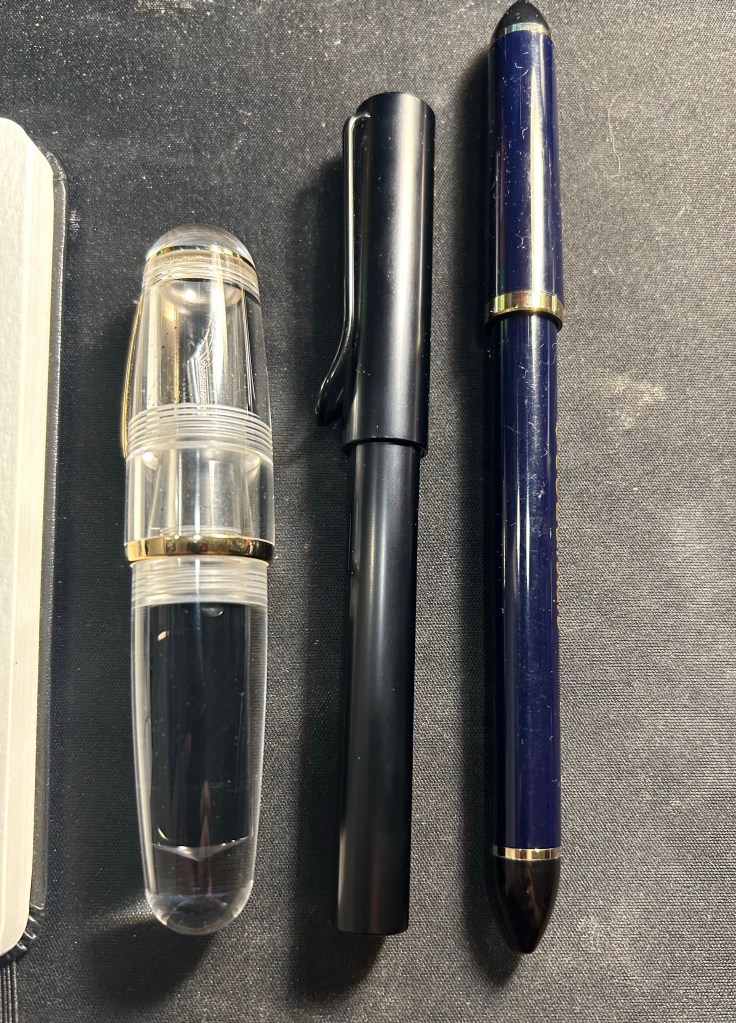
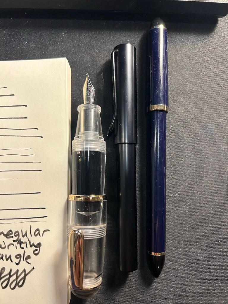
May 2026’s Currently Inked Fountain Pens
It’s been a while since I’ve inked up new fountain pens, and this month’s pen roster is both much larger than usual and has some rarely inked pens and new inks.
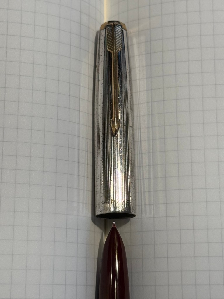
The list totals 16 pens, which is the most that I’ve had inked since the Inkvent days. It’s split into three major categories: leftover pens from previous months, pocket pens filled with cartridges, and full sized newly inked pens. The last category has a small sub-category of pens in it – the “use the good china” pens. I’ll explain it when we get there.
Leftover Pens
These pens were inked in the end of February (Kanilea, Lamy 2000) or the end of March (Leonardo).
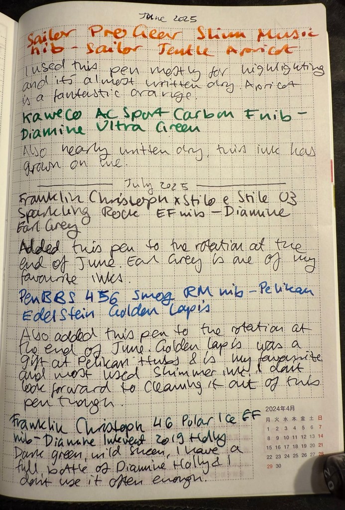
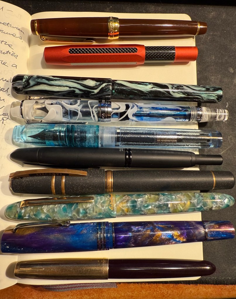
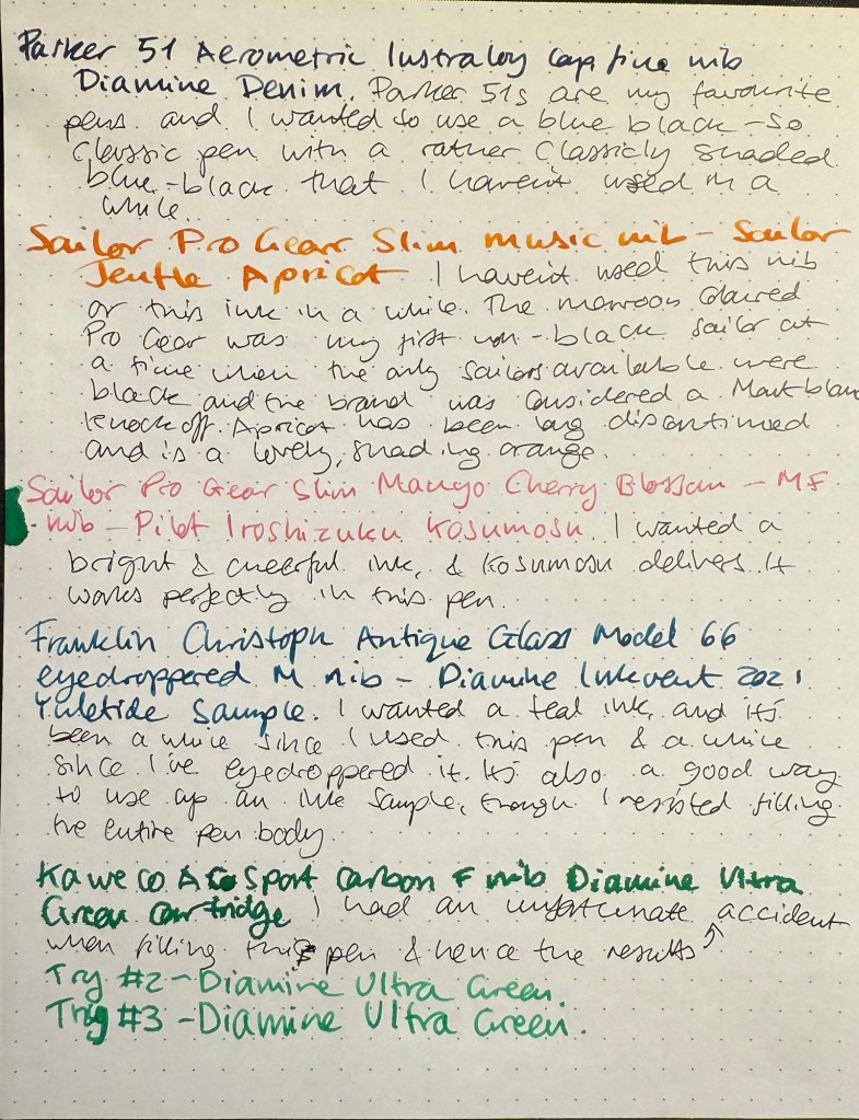
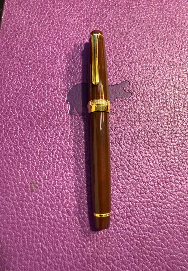
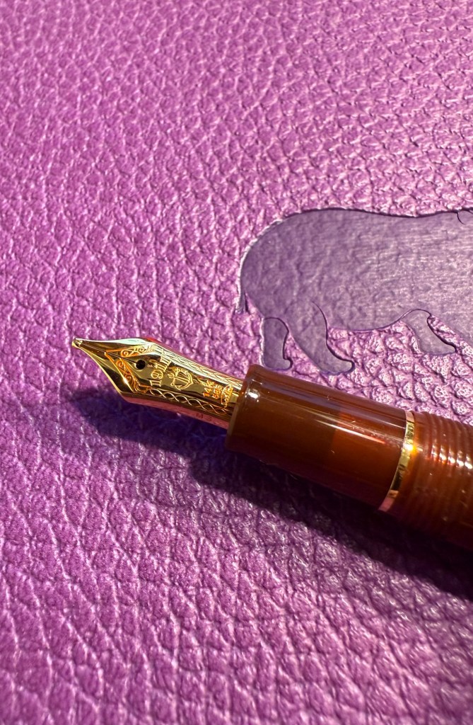
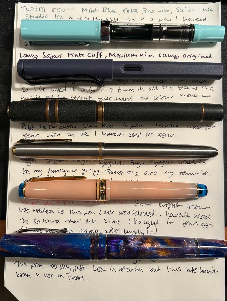
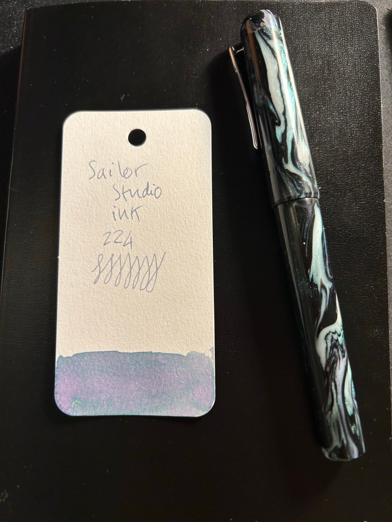
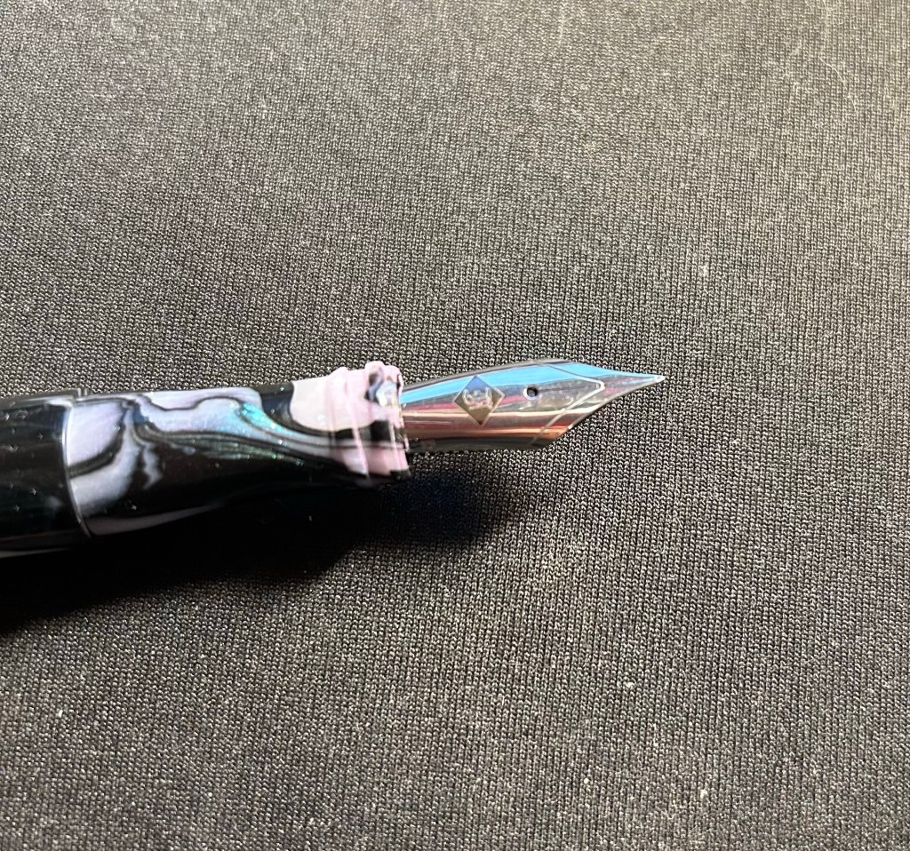
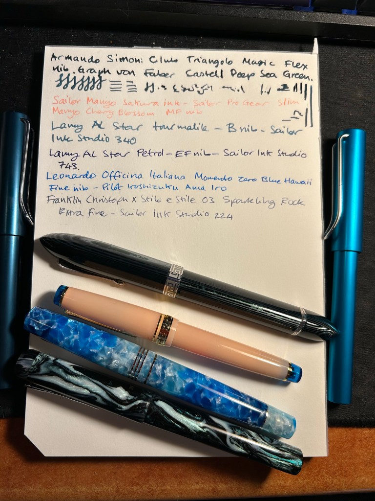
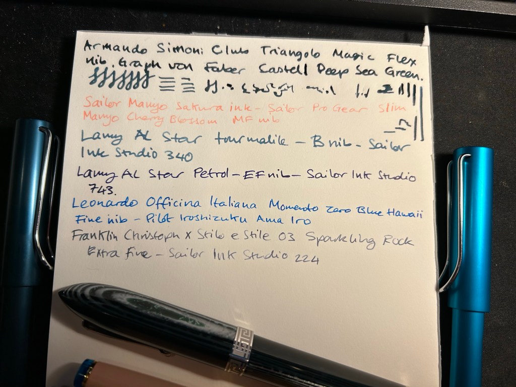
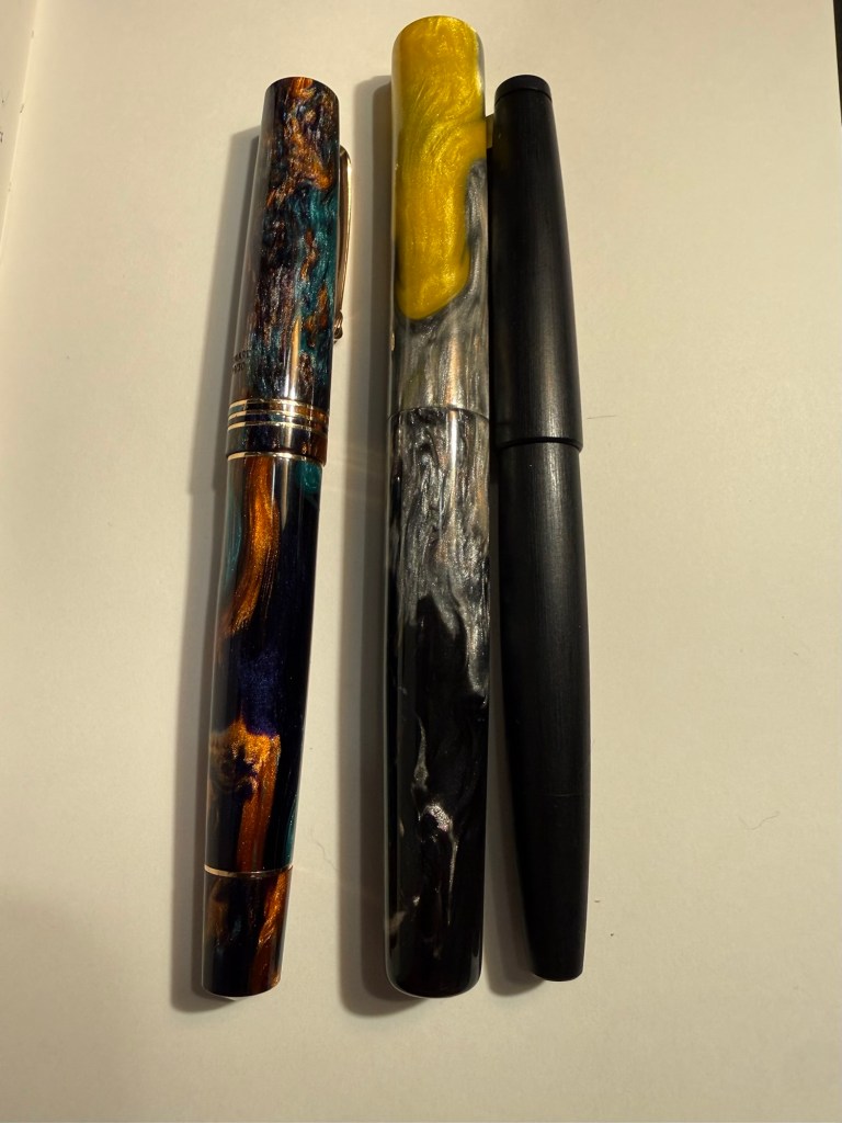
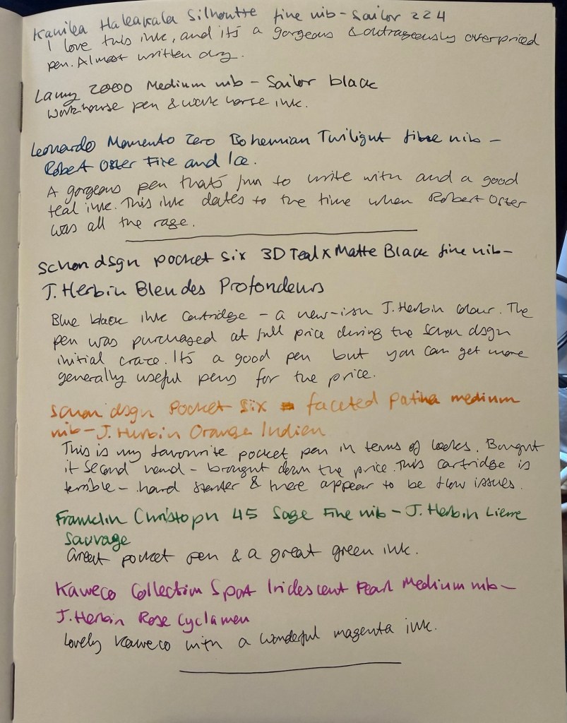
Kanilea Haleakala Silhoutte – fine nib – Sailor Ink Studio 224. I bought this pen secondhand on the Pen Addict slack channel, and it’s a gorgeous pen that is absolutely not worth its retail price. Am I glad that I got it? Yes. Would I ever purchase a Kanilea pen again? No. There are better pens to be had for much less money. The Sailor Studio ink is also overpriced, but in this case the price difference isn’t such that it would hurt to buy it. 224 and 123 are my favourites of the series, but you can get a similar enough experience for less money with Diamine Earl Grey.
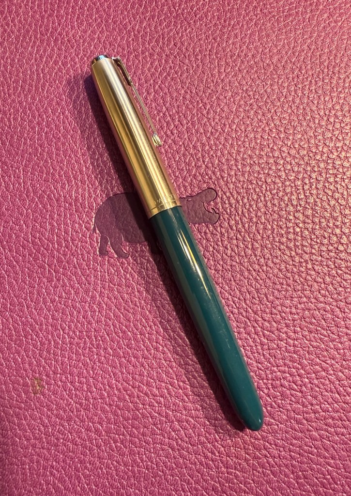
Lamy 2000 – medium nib – Sailor Black – workhorse pen, workhorse ink.
Leonard Officina Italiana Bohemian Twilight Momento Zero – fine nib – Robert Oster Fire and Ice – a gorgeous pen that’s one of my favourites. Robert Oster Fire and Ice is a good teal ink, and this bottle dates from the days that Robert Oster was new to the ink scene and all the rage. It’s a good ink but again, the hype was overblown. It’s taken me a long time, but I’m less and less interested in following the latest pen or ink craze. It has rarely been worth it. That being said Robert Oster makes good inks at decent prices, it’s just that they may be harder to obtain depending on where you live. Don’t feel like you’re missing out if you don’t get to try one of their inks.
Pocket Pens
I bought a good amount of ink cartridges when I was in Paris and I wanted to test a few of them out. I don’t usually ink up pocket fountain pens as I find them inconvenient to use (they require posting and unposting every time you use them), so it’s been a while since I’ve used these (with the exception of the Franklin Christoph).
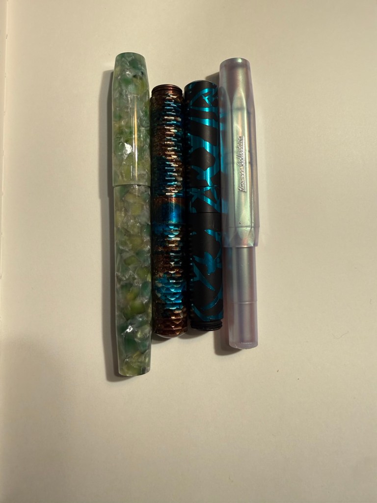
Schon Design Multi-color Pocket Six w/ Matching Grip, 3D Teal x Matte Black – fine nib – J. Herbin Bleu des profondeurs – my first Schon Design pen (I only have two) and the only one that I bought full price directly from Schon Design. The ink is a relatively new offering from J. Herbin (released in 2018) and wasn’t part of their offering when I started collecting pens and got into J. Herbin inks. It’s a good blue-black with a tiny bit of shading, and it’s a “wet” ink, which means that with more generous or wider nibs it’s likely to feather on the page.
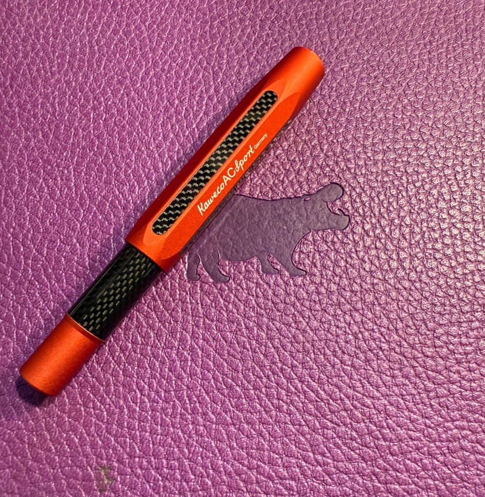
Schon Design Faceted Multi-color Anodized Aluminum “Pocket Six” – Patina – medium nib – J. Herbin Orange Indien – my favourite pocket pen in terms of looks, but still overpriced for me, so I bought this one second hand. This ink is a hard, hard starter, and I’ve had a lot of trouble with it before. I don’t know how it behaves in bottle form, but I really don’t recommend these cartridges as there’s clearly a flow issue with this ink.
Kaweco Collection Sport Iridescent Pearl – medium nib – J. Herbin Rose Cyclamen – a really nice Kaweco Sport with a magenta ink. There’s some nice shading with this ink.
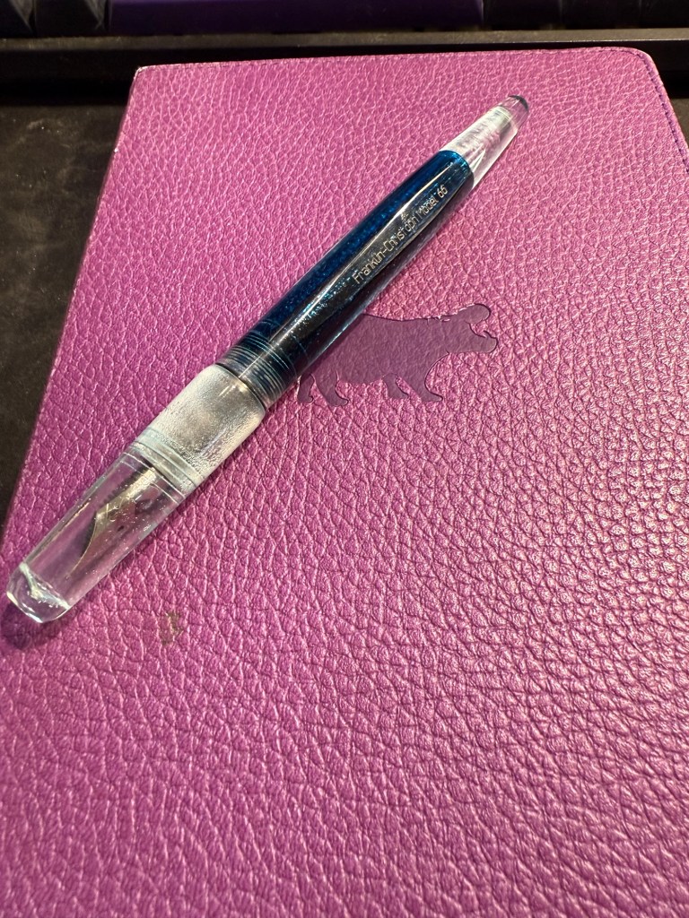
Franklin Christoph 45 Sage – Fine nib – J. Herbin Lierre Sauvage – the most comfortable and ergonomic pocket pen of the four that I have inked. Lierre Sauvage is the perfect green for spring and summer.
Full Sized Newly Inked Pens
I’m dividing this category into two – the “use the good china pens” and just pens that I wanted to use.
Just Pens
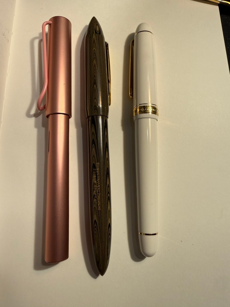
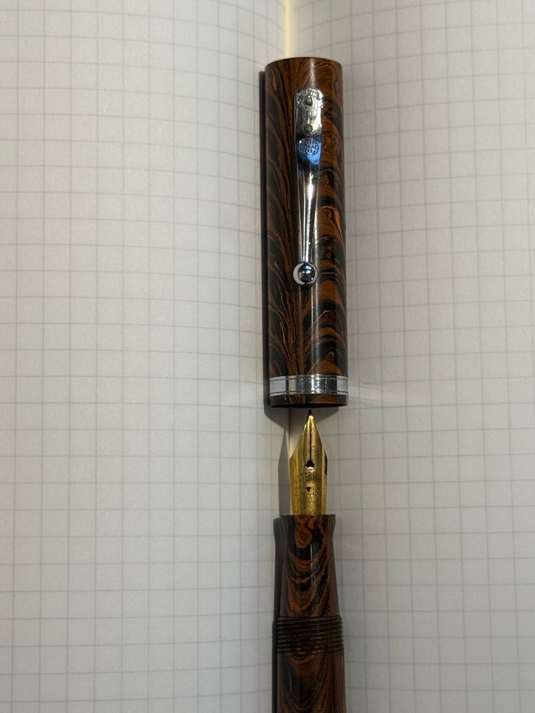
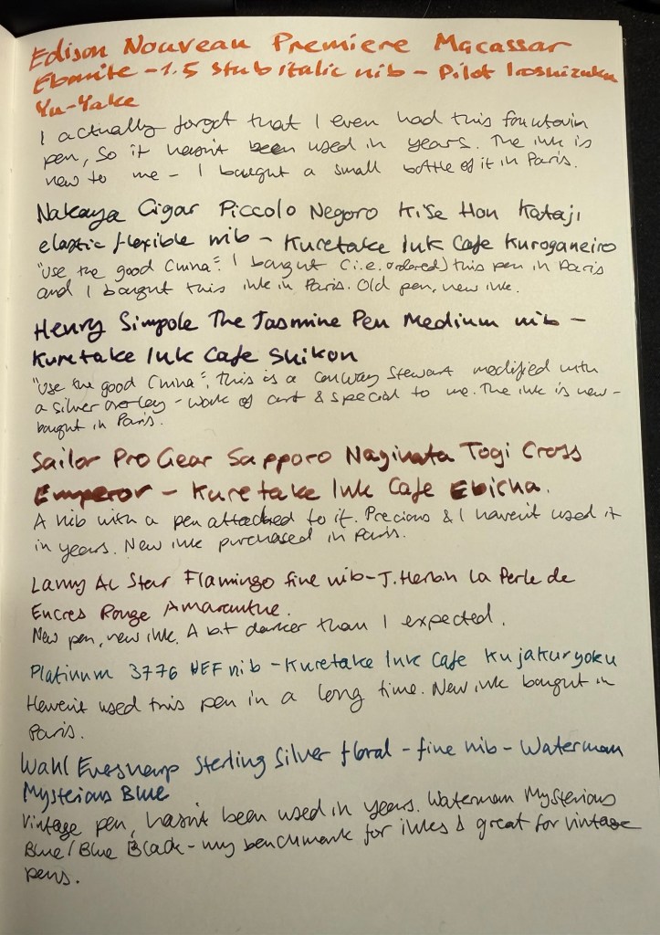
Edison Nouveau Premiere Macassar Ebonite – 1.5 stub italic – Pilot Iroshizuku Yu-Yake – I had managed to misplace this pen and so for years it hasn’t seen use. It’s a 2013 limited edition Edison pen made in collaboration with Goulet Pens. I love the shape of this pen, and the ebonite feels warm and light and just right in the hand. The nib is wide and generous, and felt suitable for the Iroshizuku Yu-Yake orange ink that I just bought. This combination will be used for titles, highlighting and journaling.
Lamy AL Star Flamingo – fine nib – J. Herbin La Perle des Encres Rouge Amarante – A new Lamy AL Star. Do I need it? No. But I like Lamy pens and they’re solid enough yet not precious enough to be great for ink testing and as workhorses. The J. Herbin is a new ink, and I bought it mostly because it was the last bottle in this hue in the store. I love Diamine Amaranth and I’m curious to see how this ink measures up against it.
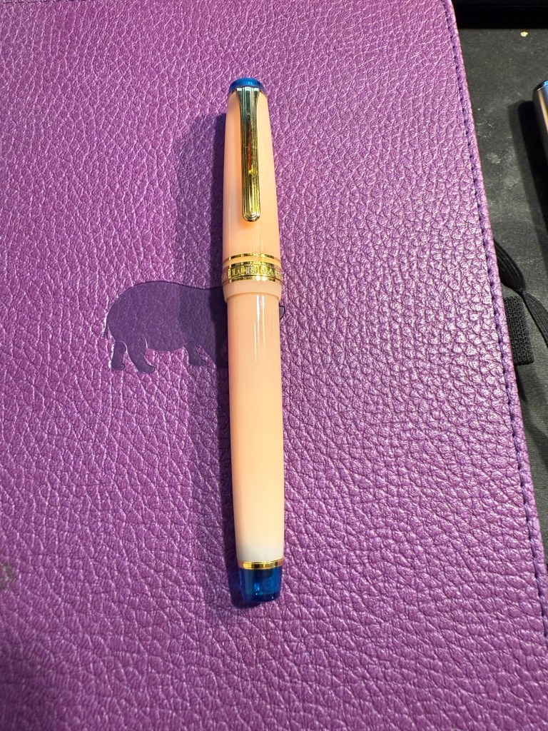
Platinum 3776 White – Ultra Extra Fine nib – Kuretake Ink Cafe Kujakuryoku – I haven’t used this fountain pen in a while. I love the nib but it does provide a lot of feedback when writing – not scratchy, but very close to it. I purchased four Kuretake Ink Cafe inks and wanted to use all of them – but I forgot to log this ink once I filled my Visconti Homo Sapiens. I then decided that I must have forgotten to use it, and so I inked up this pen. The result is two pens with the same ink in rotation at the same time – something that I don’t think I’ve ever done. At least it’s a colour that I love…
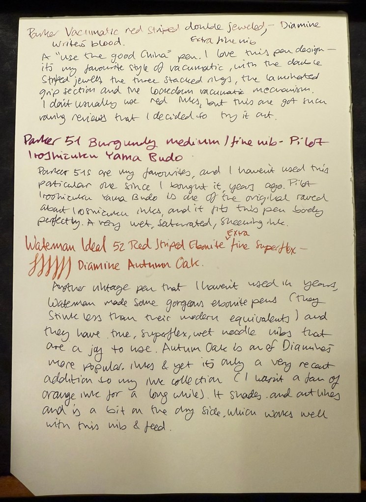
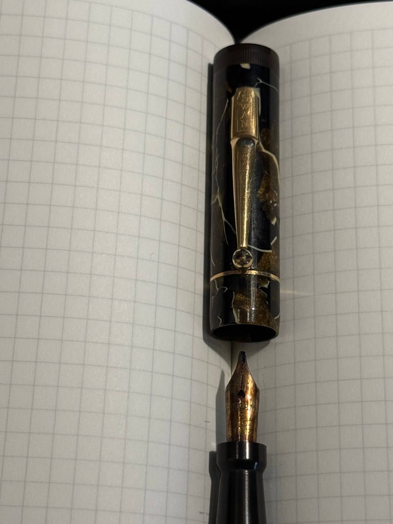
Use the Good China Pens
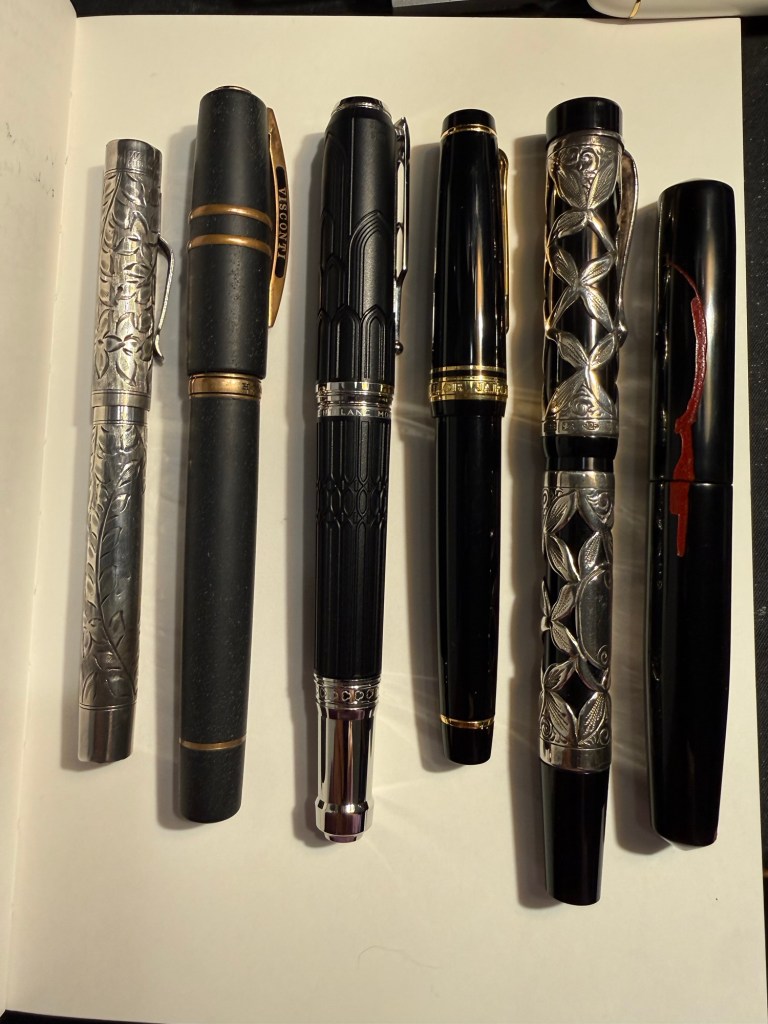
I recently filling in paperwork to get insurance for some of my most expensive pens – which made me realize that I haven’t used most of them in years. So I pulled some of them out and decided to “use the good china” because they’re meant to be used, not admired from afar.
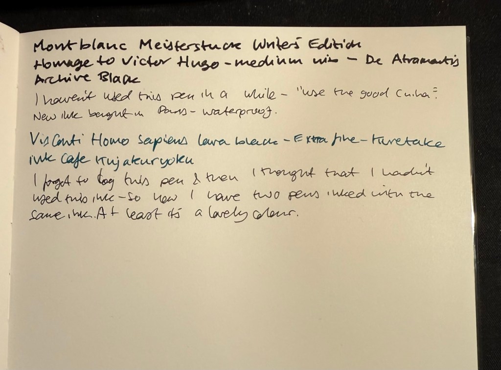
Montblanc Meisterstuck Writers Edition Homage to Victor Hugo – medium nib – De Atramentis Archive Black – this is a relatively new addition to my “expensive pens” collection. I don’t buy limited edition Montblancs, and my other Montblancs are all vintage ones. I purchased this one at a discount on the last week that Mora Stylos in Paris was open, and even though it’s heavy and I don’t love the death mask on it, it commemorates the Notre Dame, and that’s one of my favourite spots in Paris. The ink is a new (to me) waterproof black from De Atramentis. I’m interested in seeing how it works for sketching.
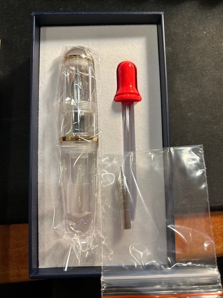
Nakaya Cigar Piccolo Negoro Kise Hon Kataji – elastic flexible fine nib – Kuretake Ink Cafe Kuroganeiro – My one and only Nakaya, ordered from Mora Stylos and it was a whole thing to get it delivered. The price, the effort, and the fact that it was made to order makes it so, so special. It also has one of my favourite nibs – a bouncy flexible fine. The ink is a Kuretake Ink Cafe ink, this one a dark pine green.
Henry Simpole The Jasmine pen – medium nib – Kuretake Ink Cafe Shikon – A pen that is a work of art. I used to visit Henry the Pen Man’s stall every year in Portobello Road, and I always wanted one of his overlay pens. Eventually I purchased this one, and I regret not buying another one when I had the chance. It’s a Conway Stewart button giller with a fantastic gold nib and a wonderful sterling silver overlay designed and made by Henry. The ink is a lovely dark purple, one of the four Kuretake inks that I purchased.
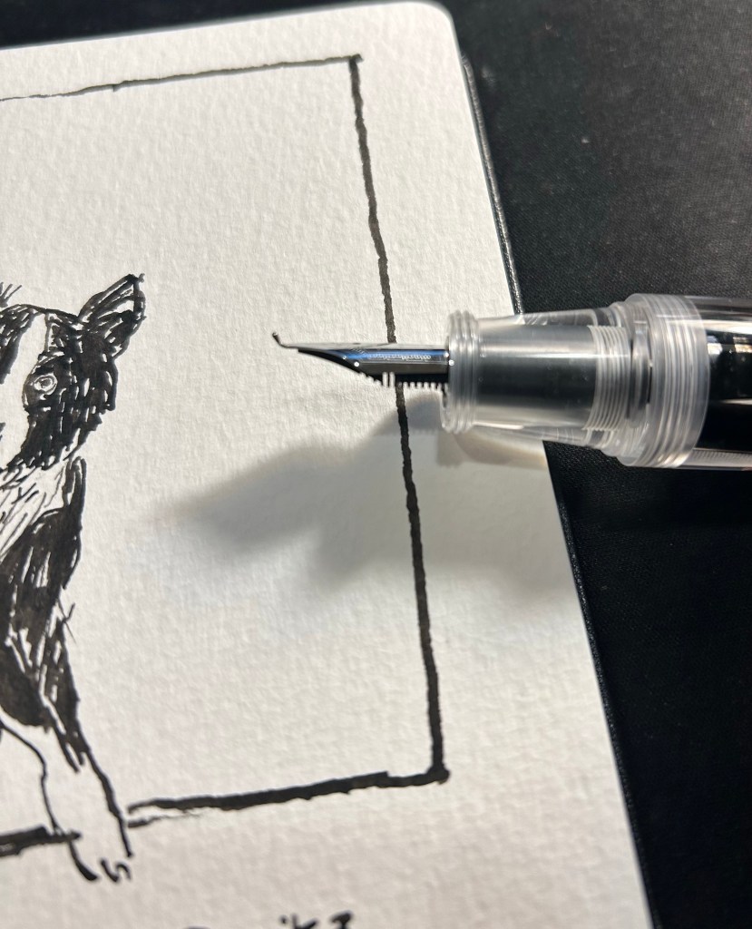
Sailor Professional Gear Sapporo – Naginata Togi Cross Emperor – Kuretake Ink Cafe Ebicha – a nib that has a pen attached to it – that’s the story of this pen. I purchased this pen solely for the Naginata Togi Cross Emperor nib, which is a nib that behaves more like a brush than a standard fountain pen nib. The Ebicha ink is an interesting maroon colour that shows a lot of shading with this nib. It will be interesting using this pen after so many years, as the nib takes some getting used to in terms of writing angles.
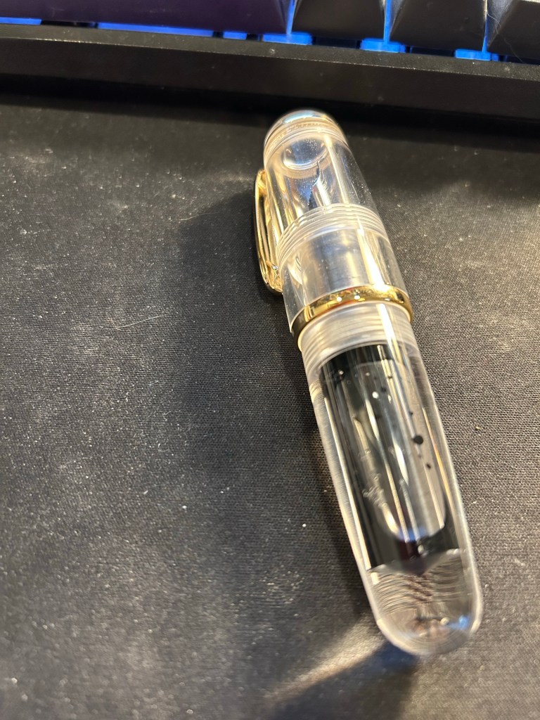
Visconti Homo Sapiens – Extra Fine nib – Kuretake Ink Cafe Kujakuryoku – The original Visconti Homo Sapiens, bought at Mora Stylos the year that it was issued and took the pen world by storm. The lava like material, the brass, the nib, the weight – this is a pen with a presence. It will be interesting comparing it to the Platinum 3776 as they are both inked with the same turquoise/teal ink – Kujakuryoku.
Wahl Eversharp (Vintage) Sterling silver floral – fine nib – Waterman Mysterious Blue – I wanted to ink up a vintage pen, and this one is very “bling-y” and sports a truly flexible vintage nib. It’s also a lever filler, which I hate cleaning out, so Waterman Mysterious Blue (i.e. Blue Black) to the rescue. This ink is my benchmark, my desert island ink, the one ink that I can trust in any pen.
This was a long list of pens and a long post – I hope that you enjoyed it, and I hope that you have some nice pens inked up and ready to use.