Grosvenor Square Sketch
Quick sketch of the renewed Grosvenor Square garden in London.
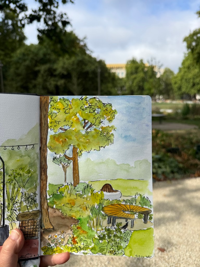
Sketched on a Hahnemuhle A5 watercolour sketchbook.
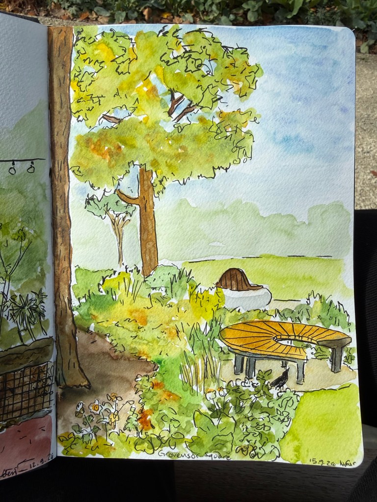
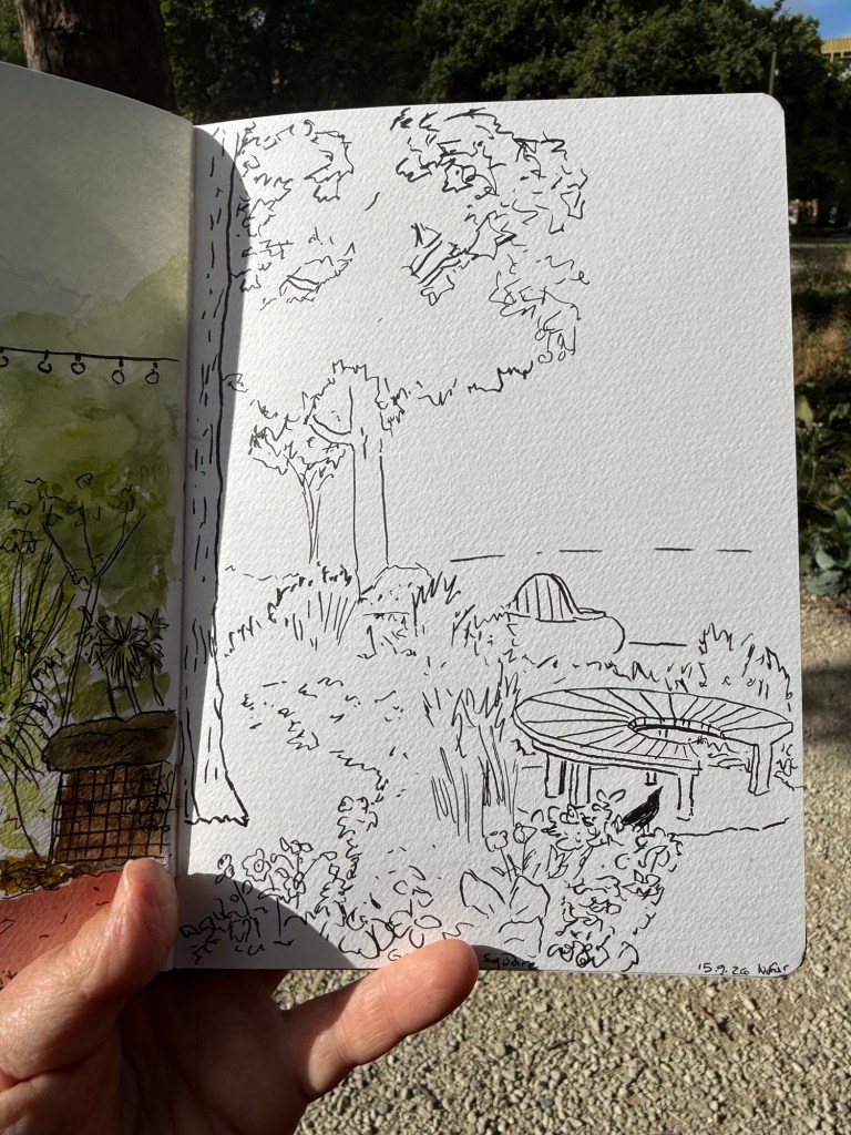
The line sketch was done with a brush pen.
A blog about writing, sketching, running and other things
Quick sketch of the renewed Grosvenor Square garden in London.
Sketched on a Hahnemuhle A5 watercolour sketchbook.
The line sketch was done with a brush pen.
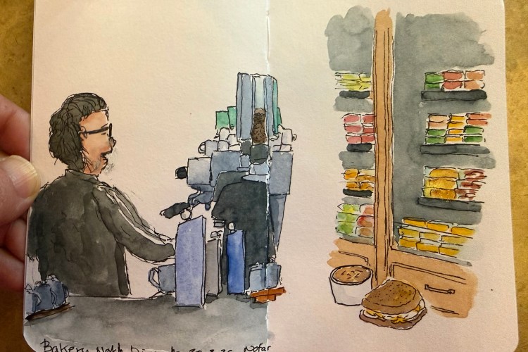
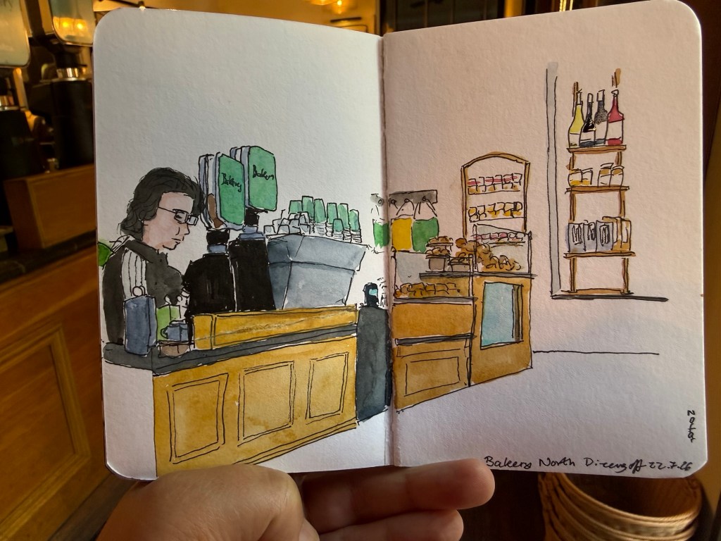
After finishing my previous Stillman and Birn pocket Beta sketchbook I started a new one. I normally use the first page to draw my palette, but this time I just skipped the first page and started a full page spread. I was sketching in my favourite cafe after a hot and humid run and for a change I decided to also sketch the fridge full of deli food.
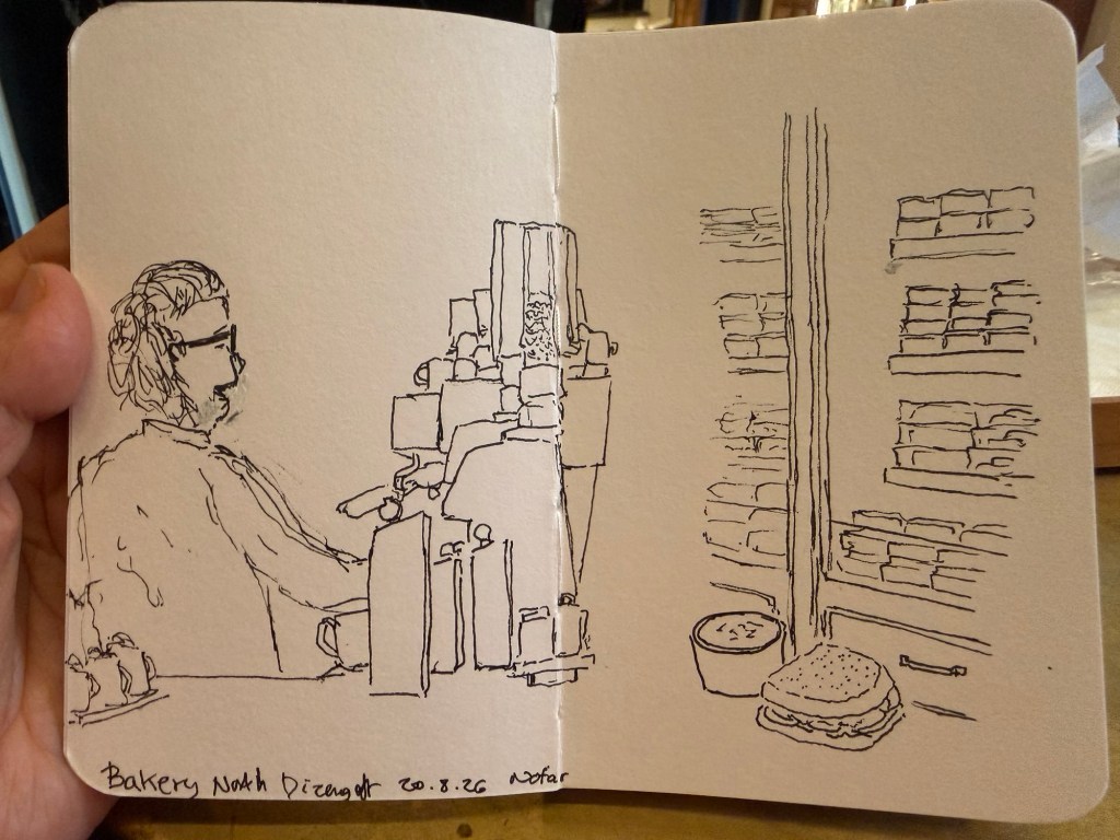
I made a few mistakes with the original barista sketch, which I erased with a white gel pen. It’s not the cleanest, but that’s the nature of urban sketching. I also forgot to colour in the tomatoes in my sandwich – an omission that I’ll correct later.
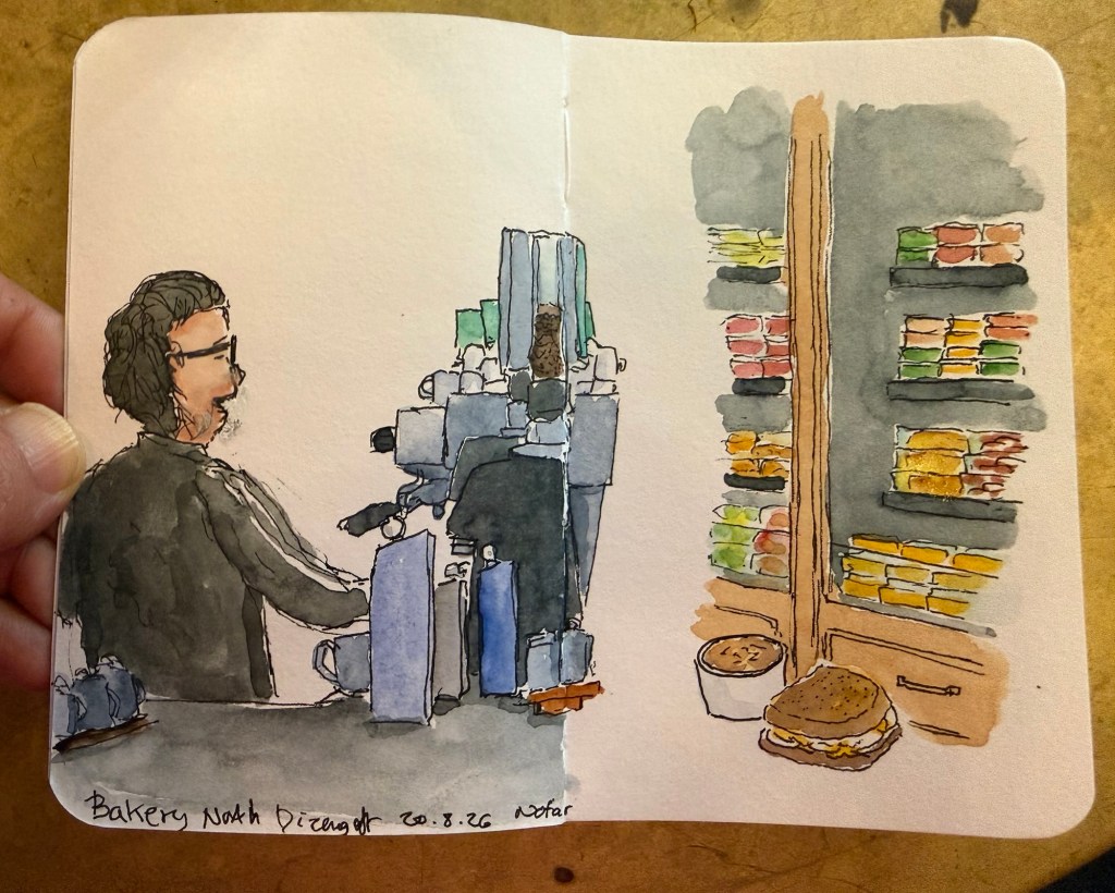
It’s a bit of an unusual spread for me, but I like it enough to continue experimenting with spreads like it in this sketchbook.
It’s been a while since my last update, and though I drafted a post in my blogging notebook over a month ago, I didn’t get to posting it here.
I got a new job! The process was much quicker than I expected both because of my excellent friends and colleagues network and because I aggressively pursued new employment opportunities. I was getting three interviews a day plus sending several applications a day despite being sick and having another “delightful” rocket round from Iran to deal with. In the end it took me two and a half weeks to find a new (and better) place, and I learned a lot from the process.
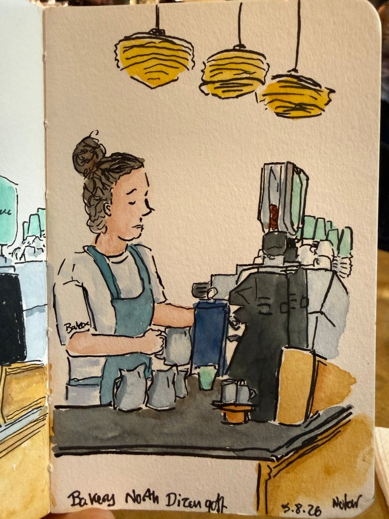
I had a little time off before I started my new job (I started two weeks ago) and I spent most of it on catching up with friends, getting on top of doctor’s appointments, decluttering and honing my technical skills. I didn’t get half of what I planned on doing done, but that’s the nature of the beast. I am very glad that I prioritised meeting friends because it was so energising and fun and fulfilling to be able to do that. It made me realise yet again just how important real life meetings with friends are.
I finished the NYT Summer Reading Challenge on the 6th of August, well before the deadline. I enjoyed the challenge and I’m glad that I participated as it got me reading books that have long been languishing on my reading list. I decided that I will review each of the ten books that I read, so expect those reviews up shortly.
I saw the new Spiderman movie (Spiderman: Brand New Day) and it’s very good. It reminded me of The Thunderbolts, which I loved. It was well written and performed, and Florence Pugh and Jon Berenthal steal every scene they’re in they are so magnetic.
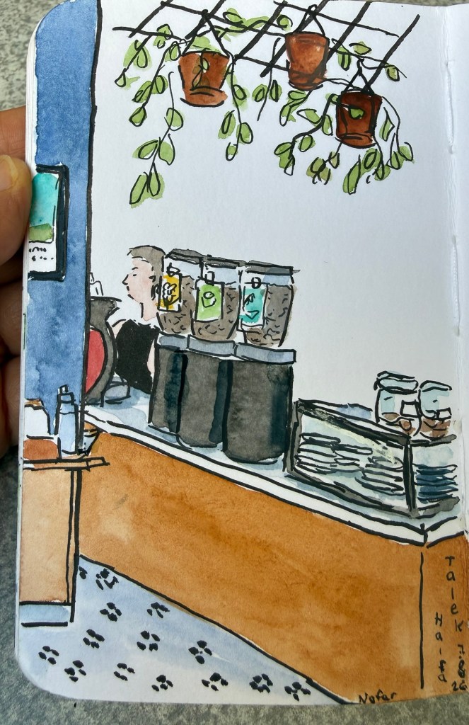
I’m almost done with my Stillman and Birn pocket beta sketchbook and I might post a flip-through here. I normally take ages to finish a sketchbook because I have so many sketchbooks running in parallel, but this one took about a year, which is super fast for me. Most of it is full of cafe sketches, because I’ve put a focus on sketching people on the move. I do plan on getting back to more landscape and other sketches in my next sketchbook.
I’m still struggling with my journaling, and I also have a large pile of notebooks that I was planning to review but I’m not so sure how to go about that. Standard reviews take a lot of time and I’m not sure that they’re that enjoyable or interesting to read. I don’t want to spew a fact sheet of information on paper weight and binding types as you can find more accurate information on the manufacturer’s website these days. Even Moleksine, who had been elusive about their paper weights in the past, now publish all the relevant details on their website. I think it would be more interesting to read about why I selected a notebook, who I think would enjoy it, and who I think should steer clear of it. What do you think?
I really like today’s cafe sketch, so I decided to post it.
Here’s the line work before I added watercolour:
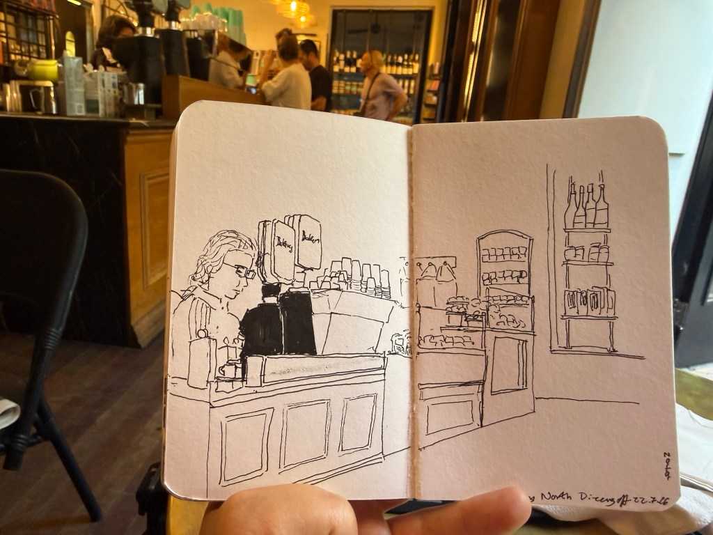
Cafe sketches are a great way to get used to sketching people in real life. If you want to get started, take a sketchbook and a pen to a cafe near you, and just spend 10-15 minutes drawing as many people as you can.
I wasn’t feeling well earlier this week, so I decided to sketch close to home and to simplify my setup. I was feeling the “Toulouse Blues” (where you’re part of the urban sketchers community but miss out on the urban sketchers symposium in Toulouse), so I wanted to sketch to cheer myself up.
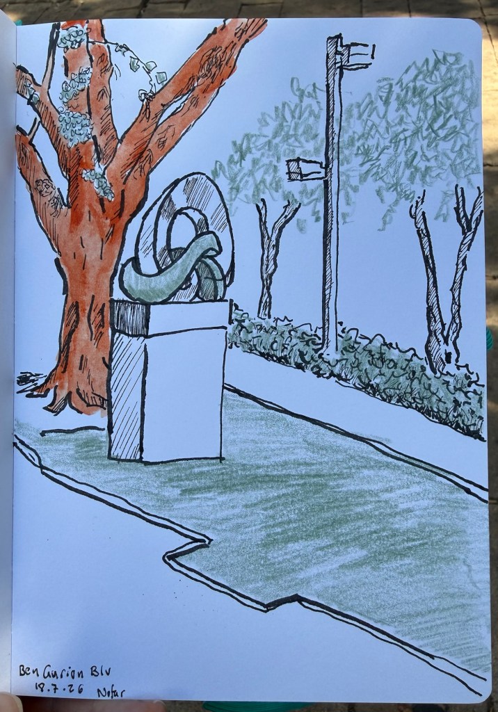
The setup was unusual for me on all counts:
I kind of like the result, and I’ll try to create more experiments like it in the future.
I had about 10 minutes to sketch yesterday, so I took my new Stillman & Birn Nova sketchbook (5 1/2 in. x 8 1/2 in.) a fineliner in sepia and black and a sepia brush pen and sketched this:

I edited out the bench in this scene as the people were more interesting.
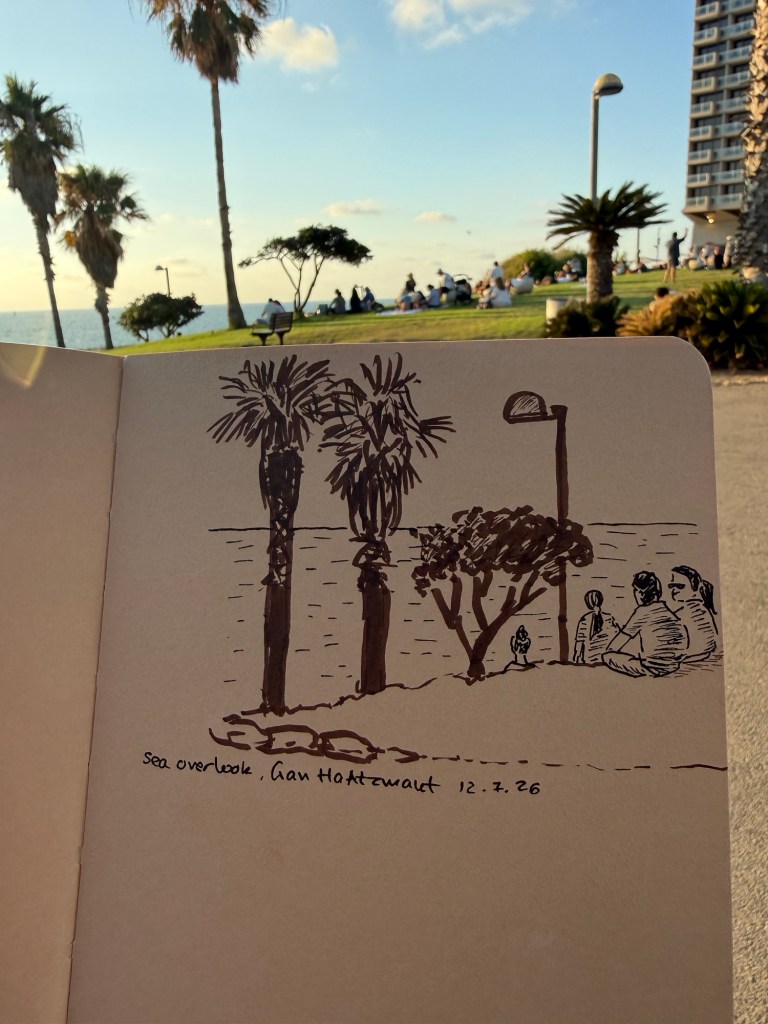
I’m trying to get back into regular sketching, and I think that simplifying both the scene and my selection of tools will help. This experiment sadly badly failed – I put so many restrictions on myself that I got paralyzed into not sketching at all.
We try. Sometimes it works, sometimes it doesn’t – but the point is to keep on trying. Sketch on!
As part of the Urban Sketchers symposium in Toulouse and general summer travel I know that a lot of sketchers will be visiting Paris this summer. Paris is full of wonderful art supply shops but I wanted to highlight three in particular that are worth visits. Each store caters for a different need, at a different price range, and with a different ambience. If you can, I recommend visiting all three, but if you can’t hopefully this will help guide to the store that best suits your needs.
Rougier & Plé Saint German – the most centrally located and accessible of the three stores, Rougier & Plé is on boulevard Saint German not far from Saint Michelle. This multi-level store is easy to navigate and expansive. The top floor is for sketching supplies – pencils, pens, markers, charcoal, sketching paper, glue, erasers, measuring and cutting tools, etc. The second floor is dedicated to watercolors, ink, printmaking and their related materials (brushes, paper, masking fluids, etc). The first floor is where you’ll find the discounted section, student art supplies, packing materials, hobby materials (beads, clay, etc) and stationary items. They provide tax free forms if you spend more than 100 euros (which won’t be hard), they have a very good selection of brands (this is a good place to buy Schmincke watercolors) and they usually have a good selection of products on sale – particularly paper. This is the “bread and butter” store and if you only have time for one I’d select this one. There’s also a good selection of stores nearby that can interest other members of your party, a nice coffee shop (Cuvée Noire) and a nice park just around the corner (Jardin médiéval du Musée de Cluny) so if you’re traveling with none-sketchers you don’t have to drag them in with you. There is an elevator so if you have accessibility needs this store caters for you. The staff is a bit surly and I wouldn’t go in looking for assistance, but they do have a decent website so you can check things out before you go.
Magasin Sennelier – You’ll find this store all over Paris art supply store recommendations but this is a store with quite a few caveats. On the pro side it’s beautiful, it has a wide selection of supplies that you just won’t find anywhere else (like Etchr sketchbooks for instance, Japanese fountain pen ink, certain sketching supplies), the staff is knowledgeable, and they have tax-free shopping over 100 euros. However the store is open in very particular hours (10:00-12:45 after which they close until 14:00 when they open until 18:30) and they will kick you out at 12:45 regardless of whether you’re just about to pay them or not. It is also inaccessible in terms of public transport because it’s on a one way street with no nearby metro station (so you can take the bus one way to the place, but you’ll have an issue getting back – or vice-versa, depending on where you’re coming from). It’s best to pair a visit to the store with a visit to the d’Orsay or the Louvre but make sure that you don’t end up there when they’re closed for lunch. The store is on two floors, but there’s no elevator and the place is very cramped and chaotic. It’s most likely that you’ll need to ask for help finding things, and you may have to rummage around or ask the staff to bring up things from the back. The staff is helpful (up until lunchtime when they become surly and brusque), and while the prices aren’t the best to be found they do have things that you just can’t get anywhere else so it may be worth scheduling a visit there. This is, however, not a store that you can spontaneously slip into your schedule. Plan your visit carefully so as to not be disappointed.
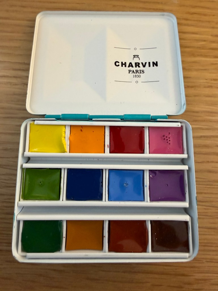
Le Géant des Beaux-Arts – this store is not as centrally located as the other two, but is still not too far away from public transport to make in inaccessible. This is a warehouse kind of store, huge, sprawling, and the cheapest by far of the three. You won’t get a tax return here, but you will get a significant discount on practically everything you buy (the cashiers will sign you up as a member for free if you aren’t, so you’ll get the most discounts on your shopping). They have a very wide selection of supplies and brands (though not everything – it’s worth checking their website first), and the biggest problem there is not getting lost in the cavern of supplies or overdoing it. There are stairs here and there so if you have accessibility issues I’d stick with Rougier & Plé, and there is only some method to the madness (particularly in the paper section). The staff is largely busy stacking art supplies and while they’re nice and try to be helpful, usually only the staff behind the till is knowledgeable. You will find Paris exclusive brands like Charvin and the widest array of Clairfontaine paper you could ever want, so it’s worth visiting the store even if you’re not particularly in search for bargains.
Paris is a wonderful city for artists in terms of its art supply stores, so this is far from a comprehensive list (there’s Charvin, various Sennelier stores, etc). Use this if you are short on time and want to hone in on which store best suits your needs and budget.
I went to Ramat Hanadiv garden today, and created a quick watercolour sketch on location. There were a lot of details in the scene, and I wanted to capture a relatively wide angle, so I had to do a little planning ahead. I normally don’t take photos or videos when I sketch (only once I’m done), but this time I made some unusual choices for me, so I decided to document them as I went along.
This is part of the scene that I was sketching:
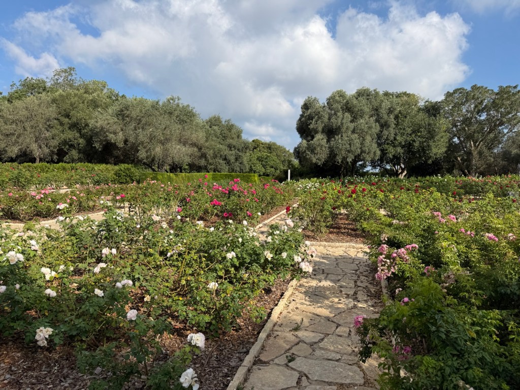
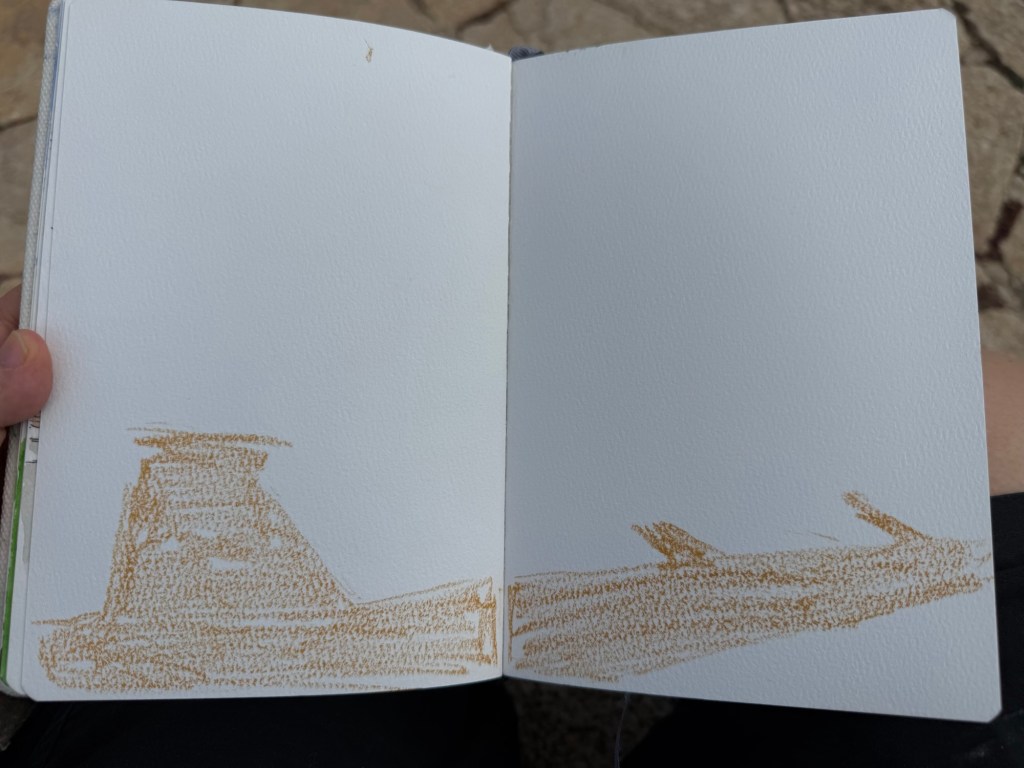
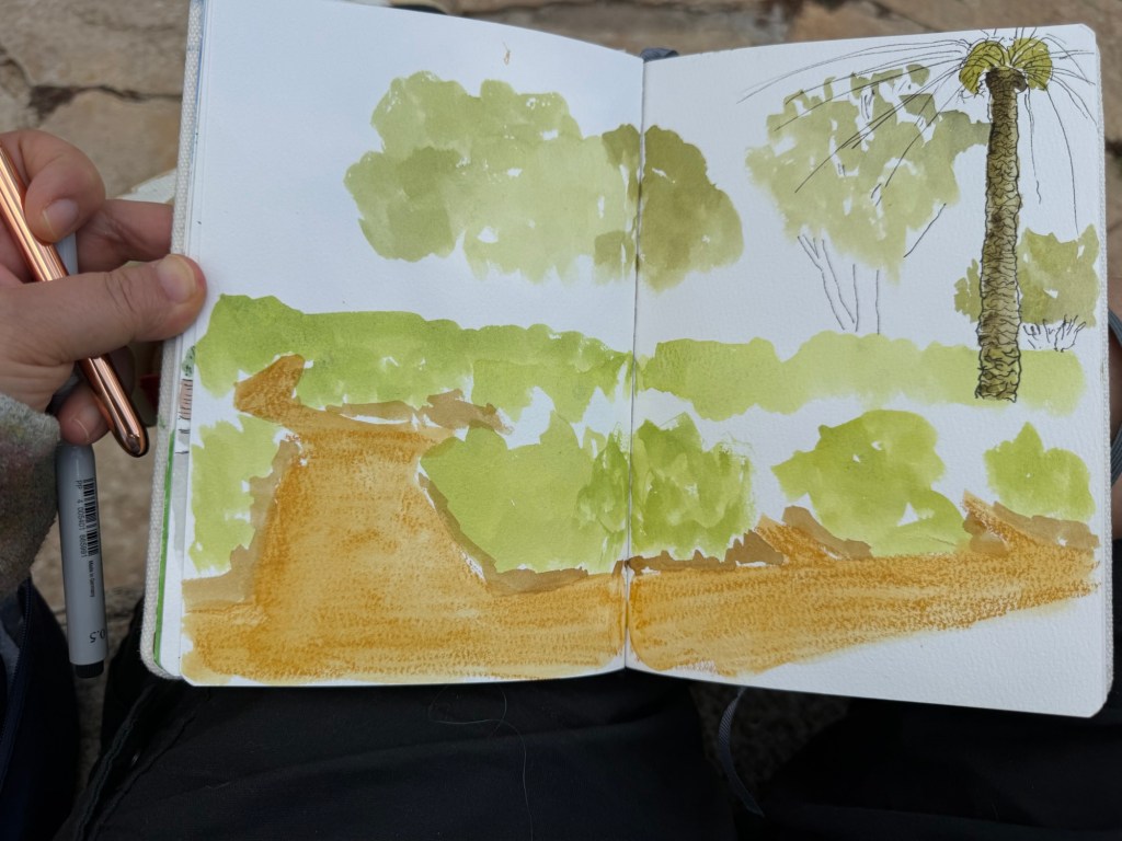
I was using a cold pressed Etchr watercolour sketch book. It’s wonderful for watercolours, but pen and ink struggle on this paper. I usually start the sketch with pen and ink (a fineliner or a fountain pen) and then move to watercolours, but since there was so much detail here and I didn’t want to get carried away by it, I started with a Caran d’Ache Neocolor II crayon:
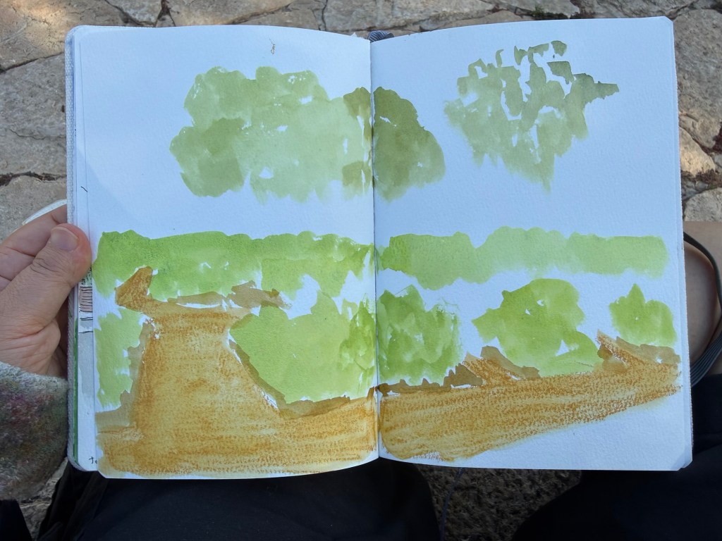
Then I blocked in the greens of the roses, the trees, and a bit of the ground. I’m using the lightest green hues as this point – I’ll add darker greens later to add volume and depth. In watercolour you work light to dark. I also went over the Neocolour II with some water.
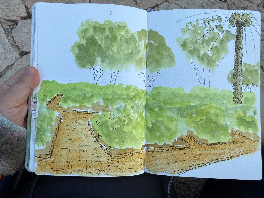
At this point I took out the fineliner and sketched out the palm tree and started sketching in the tree trunks. I also added colour to the palm tree trunk. The palm isn’t supposed to be the focal point of this sketch, the roses are, but it’s there to give things perspective (and it literally was standing nearby – I just pulled it into the frame because I thought the sketch needed it).
At this point I finished the line work, and then moved to adding depth to the greens. I deliberately left the path largely flat because I wanted the roses to be the focus, not the cobble stones. There’s only so much detail our eye can take, so you need to be mindful of that when sketching. This is something I’ve been struggling with for years – what to leave in and what to edit out.
This is the finished sketch. There are roses added in, some shadows under the plants, tree trunks, the palm fronds. I was tempted to add the sky after I was done, which is why I knew I shouldn’t add the sky. Never add anything after the bulk of the sketch is done just because you had the idea as an afterthought. It’s the best way to “ruin” a painting.
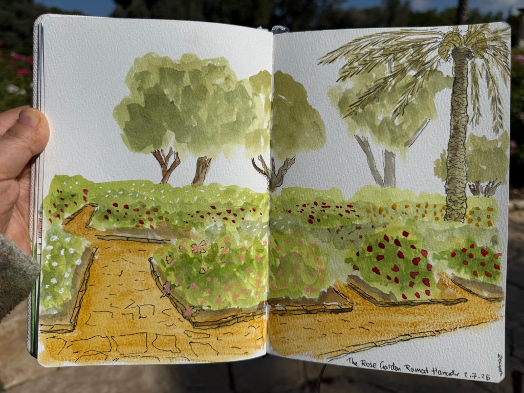
This took me about 40 minutes, much of the time spent waiting for the paint to dry or mixing greens.
What do you think? Would you try and sketch something like this – by blocking it in paint first before moving to pen and ink?
On Friday we went to an Urban Sketchers outing in Jaffa. It was celebrating local designers, and there were street performances as well as open studios and an arts and crafts market. The weather was hot and sunny, and the place was pretty packed with people and full of interesting old buildings. The main trouble I had was focusing on what to draw, as there were so many subjects.
I took a new sketchbook, a Pith Oroblanco in A4 size, and an A5 portrait Etchr Labs 100% cotton watercolour sketchbook. I don’t normally work in such a large format, but I decided to challenge myself to use the Oroblanco as much as possible. The 170gsm paper is identical to the one in the smaller Pith Kabosu, and so is great for mixed media and light washes. The Etchr Labs sketchbook is the best watercolour sketchbook that I’ve ever used – the paper works wonderfully with washes, and is very forgiving for mistakes and reworking.
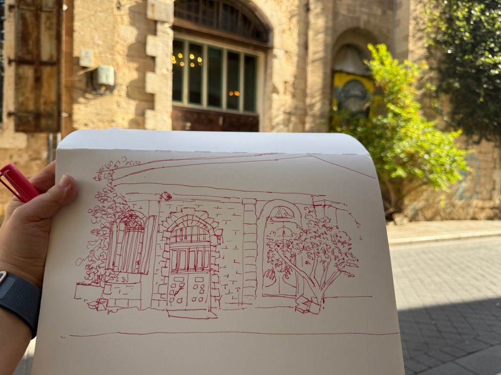
I started out 30 minutes before the official start time, and sketched a local building. I liked the combination of the beautiful old stone building together with the graffiti and the semi wild trees and shrubs. Inspired by Liz Steel’s Patreon sketching community (I just joined it) and December’s theme of “Red” I selected to sketch this building with Diamine Inkvent 2025 Day 3’s Carousel – a red ink – and to highlight the rust colour in the shutters and door. I had enough time to finish the line sketch before going to say hello to Marina, our local chapter head and the organizer of this sketchwalk (a wonderful person and artist). I took reference photos just in case, and then returned and quickly finished the sketch:
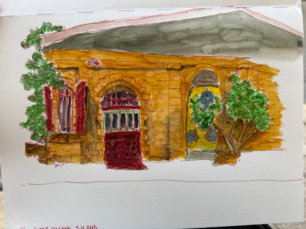
To avoid having to lay down a large wash I used Caran d’Ache Neocolor II to lay in most of the base colour – except for the roof bit (where you can see why laying down a large wash on this paper was problematic).
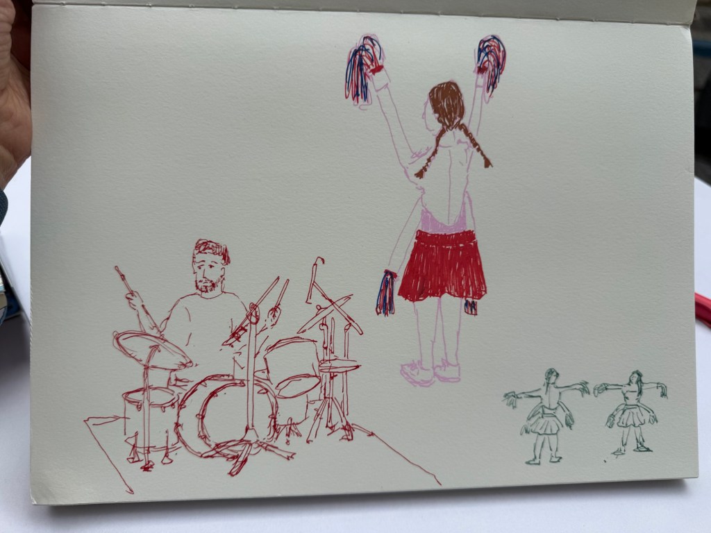
I then went in search for the music performance that was supposed to take place in an adjacent street. I managed to sketch the drummer as he was doing a sound check, but then he left and two girls in peculiar 4 armed cheerleader outfits came out and did a sort of otherworldly dance-march. They kept moving but I did manage to capture them. I used Diamine Carousel in a Lamy Safari medium nib for the drummer, and Posca markers for the cheerleader. The tiny cheerleader thumbnail was sketched with a TWSBI Eco 1.1 fountain pen and De Atramentis Document Ink Green Grey.
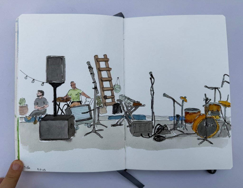
I then settled in to prepare to sketch the musicians when they returned. There was a Flamenco dancer in a nearby stage, but the place was too crowded for me to get a good viewing angle of her dancing so I spent the time creating a detailed fountain pen and watercolour sketch of the location where the musicians were supposed to play in. I was hoping to add them in once they started, but their show was delayed and i had to get back to the throwdown. I did get a sketch of their instruments and some local viewers, but I rushed in the end and didn’t get a chance to get proper shadows in. Oh well.
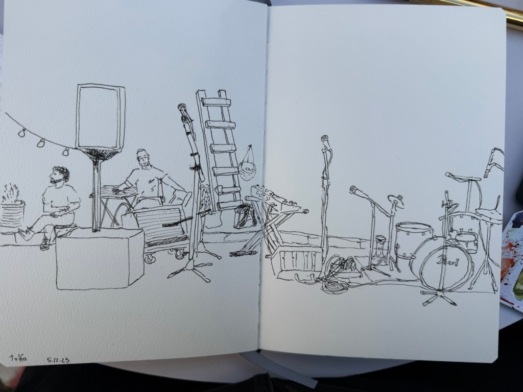
The line work was done with a Platinum Preppy 0.3 filled with De Atramentis Document Ink Black on an Etchr sketchbook:
There was a lady there that was clearly on her first every Sketchwalk, and my heart went to her. Seeing her struggle made me realize that there are so many things that are obvious to me as a seasoned “sketchwalker” that aren’t obvious to people going out with an Urban Sketchers chapter for the first time. Here are a few useful tips:
If you go on Urban Sketcher Sketchwalks and have tips for newcomers, I would love it if you could reply with them.
In September I traveled to Paris and London. See part 1 of my travelogue here and part 2 here.
I met up with a dear friend for a pre-theatre tasting meal at Chotto-Matte, a trendy restaurant that combines Mexican and Japanese cuisines. I am not a foodie, and I will now confess that this was the first time that I’ve had sushi (I hate the smell and taste of fish and seaweed and everything that comes from the sea and so I’ve avoided it), and I really enjoyed it. It was the best meal that I had in London, and the company, the weird design and the very attentive service added to it.
I had the vegetarian pre-theatre menu, which meant that mine had no fish, seafood, meat or chicken in it. It was phenomenal.
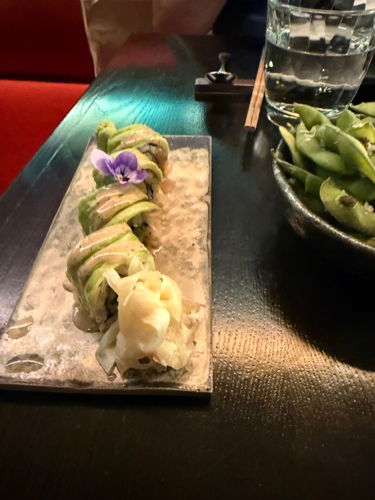
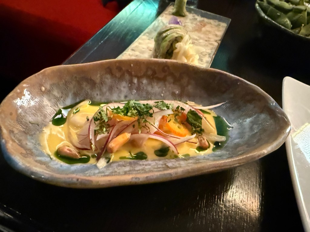

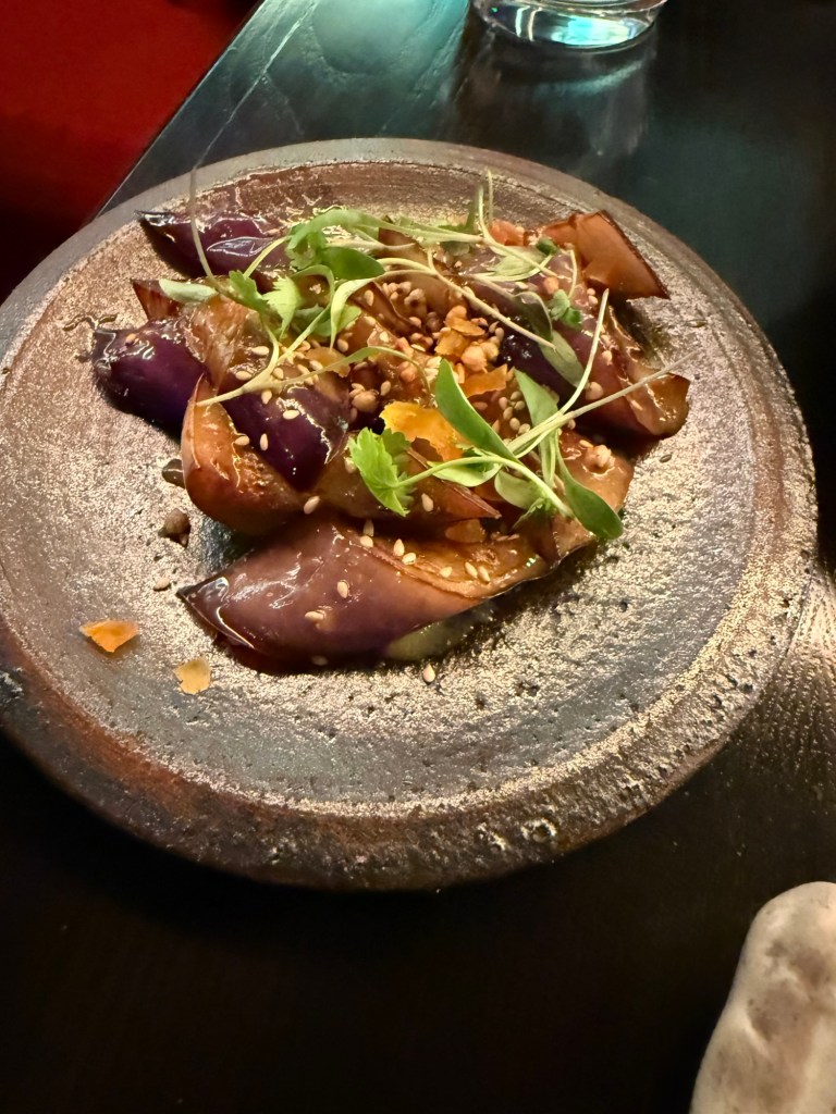
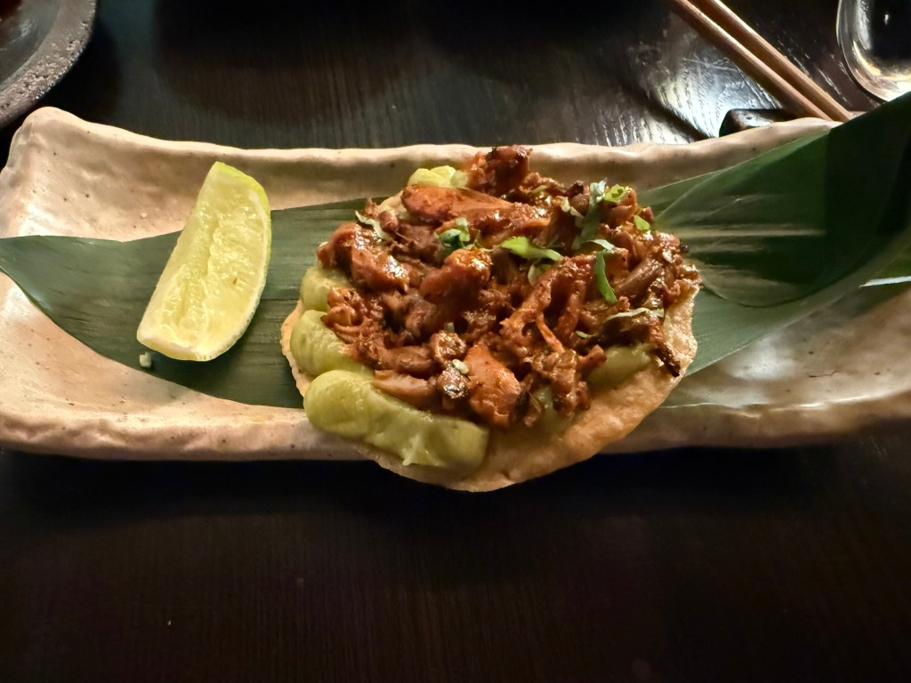
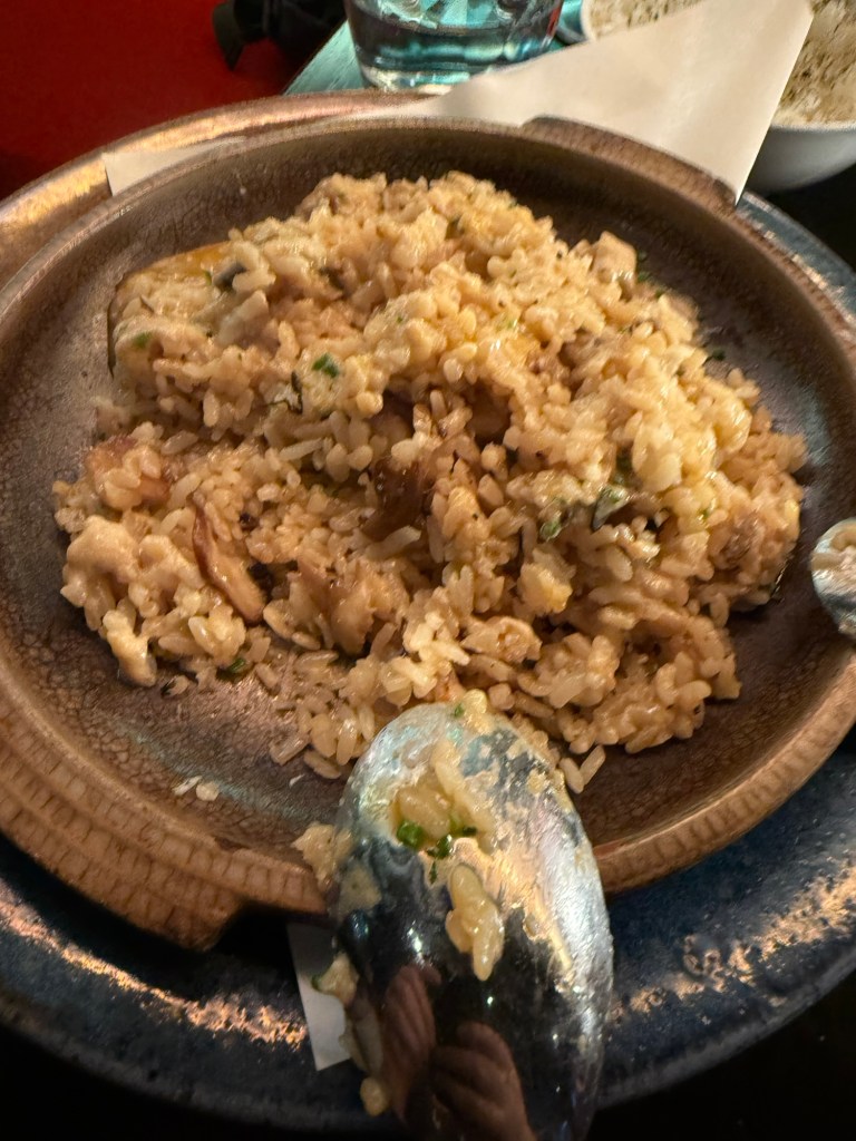

This is definitely a place that I’d return to for a special occasion.
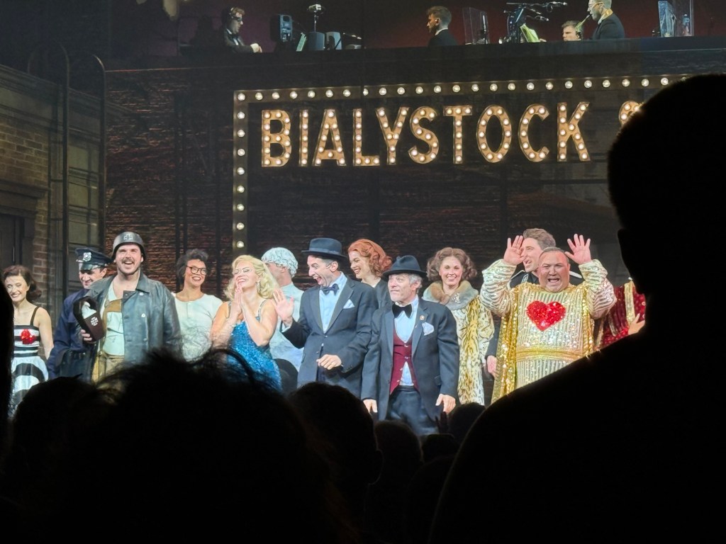
We then went to see the classic musical, “The Producers”, and it was excellent. The cast was brilliant, and it’s a very good musical with some great (if disturbing) songs. Mel Brooks is a comedy genius, and this musical still packs a punch.
We also went to Spitalfields market, which meant that I could sketch this guy:
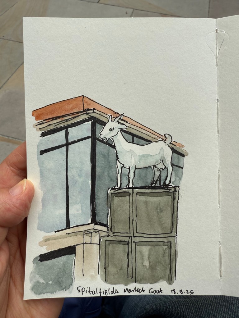
This was my very first sketch in the new Pith Kabosu sketchbook that I purchased at Cass Art. I debated whether to buy this sketchbook or not, as it had smooth, 200gsm paper and it opened flat, but I wasn’t sure it would work with watercolours. The great sellers at Cass Art told me it would, as they use it themselves, and they were right. It’s now my “daily driver” having replaced the Stillman and Birn pocket beta. The beta has thicker and more textured paper but the Pith Kabosu is slightly larger, has a more durable cover, and opens flat much better than the Stillman and Birn does. I later returned and purchased two more of these sketchbooks, they were so good.
I later sketched this seller in his stall, after purchasing an old set of folding rulers from his stall. I decided to paint him and the flag but left the rest of the stall as line drawings.
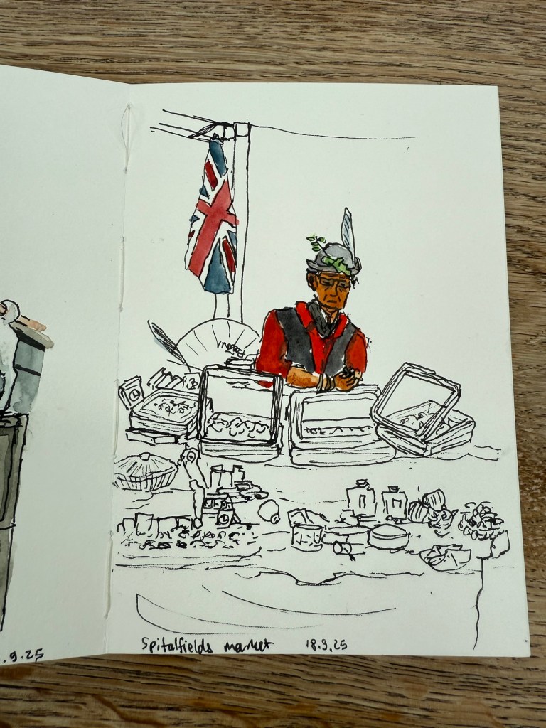
The Pith Kabosu is also cheaper than the Stillman and Birn and as it has smoother paper, works better for ink sketches and dry medium (pencils of various kinds, for example). It means that I’m more inclined to bring it out and make quick sketches in it, even if I don’t get to adding watercolour to them.
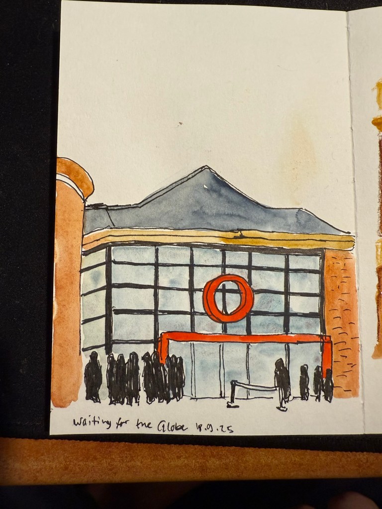
We then went to the second play at The Globe – Shakespeare’s Twelfth Night. We arrived early so I sat in the Starbucks across the entrance and sketched the place:
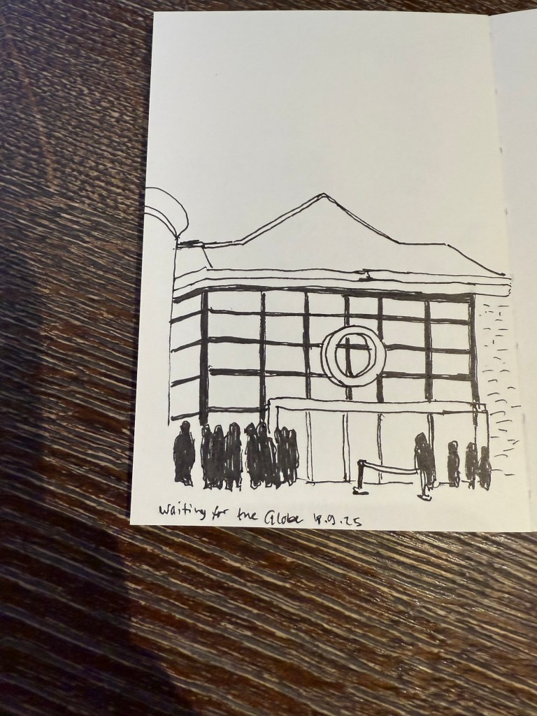
I later added colour to the sketch. In hindsight I would have gone for a looser sketch, but I was still unsure what this paper could and couldn’t do. The answer is – practically everything. Only very heavy washes make the page buckle.
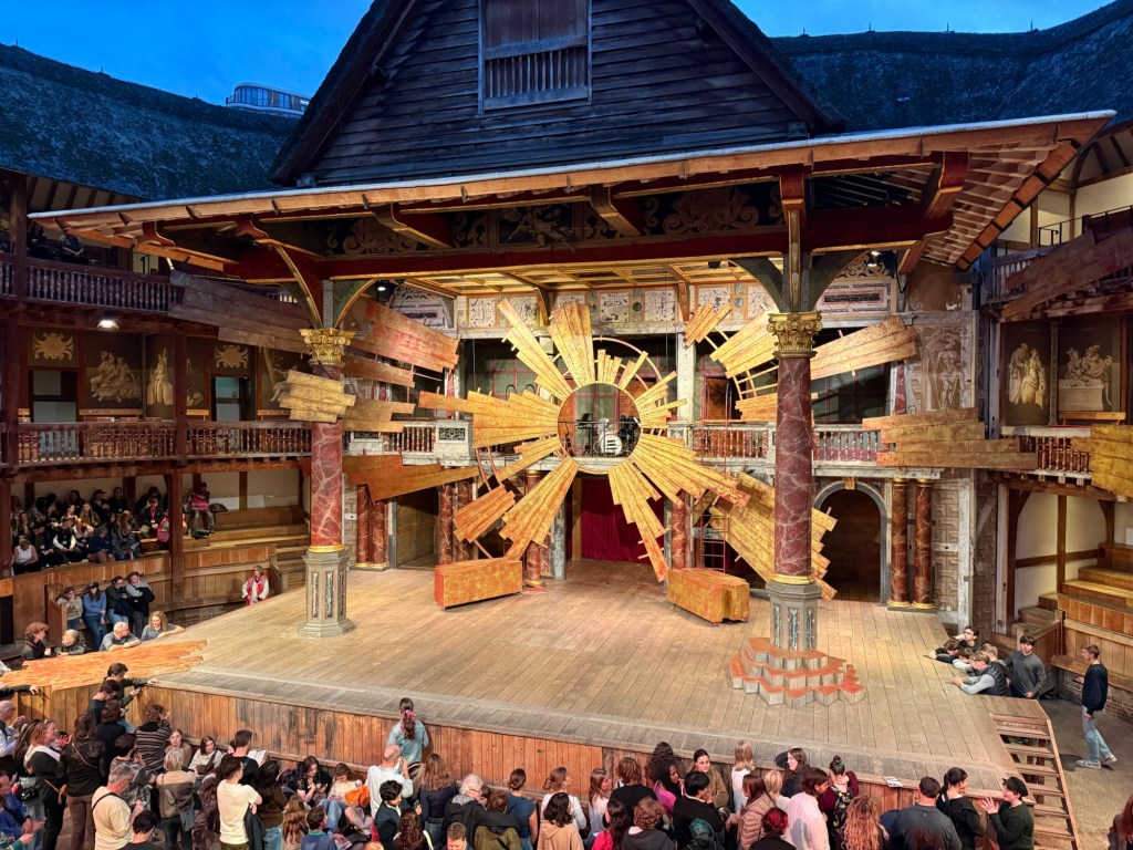
This was a regular Shakespeare play, and so there was some set design. this is the stage:
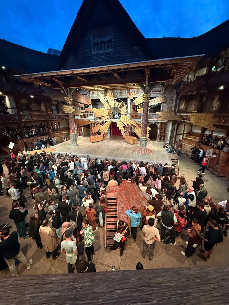
And in the yard where the groundlings are you can see another bit of the stage that isn’t normally there, but was used to represent the beach and other locales in the play.
I enjoyed the play a lot, and would recommend seeing plays at the Globe if you can tolerate the extremely uncomfortable seats (yes, even with the cushions).
We went to the Cartier exhibition at the Victoria and Albert museum. The exhibition is sold out, and it’s well considered, but we found it a bit dull compared to the Marie Antoinette exhibition at the same museum.
This is the Patiala necklace that was part of the exhibition. It was made by Jacques Cartier for the Maharaja of Nawanagar in 1928. He also made the Maharaja of Nawanagar’s necklace, later named the Jeanne Toussaint in the “Ocean’s 8” movie (it was a recreation made by Cartier for the movie).

My favourite parts were the film where they showed how a Cartier leopard is made, and the famous mystery clocks. There was a whole room dedicated to them, and it was fabulous.

Next post will be the last in the series. You can read it here.

