Sketch/Doodle Session

There is a local group of illustrators and animators that have set up a delightful new tradition during the pandemic: they meet up every Tuesday morning on Zoom for a sketch/doodle session, where they do quick, loose sketches and doodles just to warm up and experiment. Once a month the morning Tuesday meeting is replaced by a night Monday meeting with a guest artist leading the session with various prompts. Tonight my Urban Sketchers chapter head lead the session, and through her I joined the fun.

As I’m neither an illustrator or an animator, I’m posting everything here as quickly as possible before I see the other artists’ amazing work and lose my nerve.

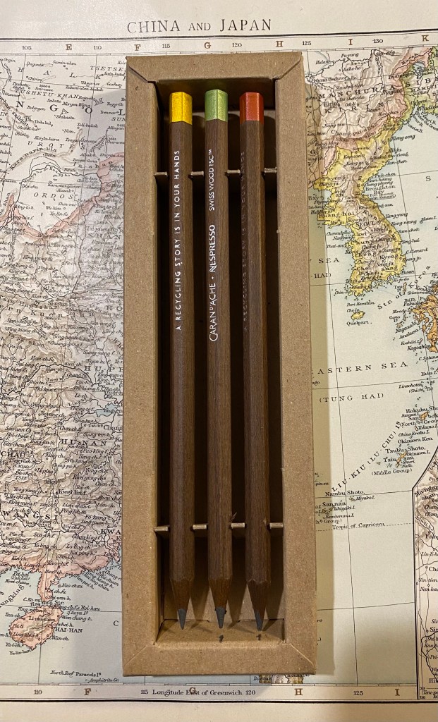
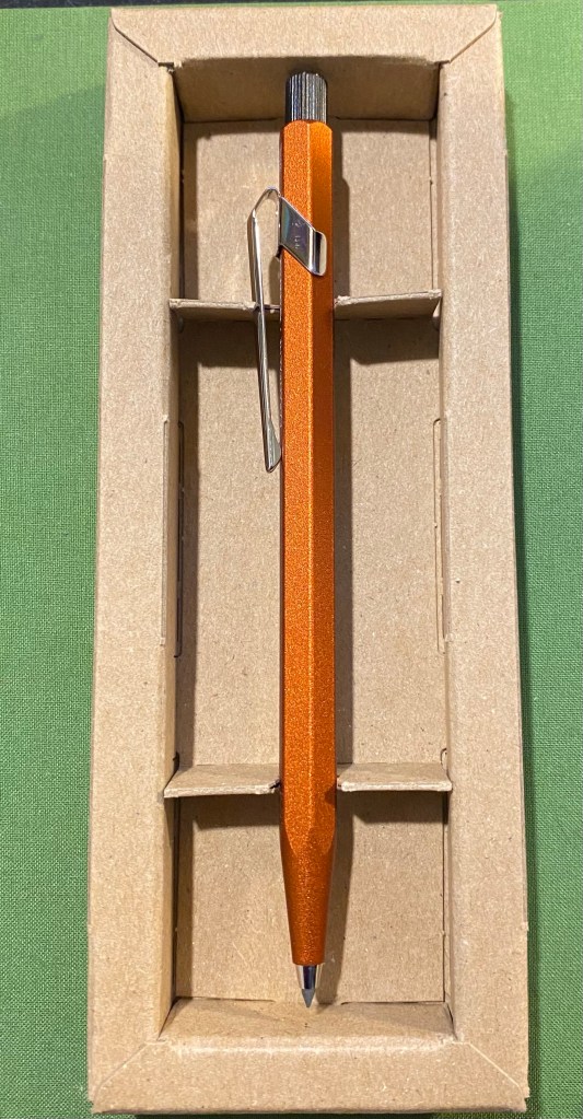
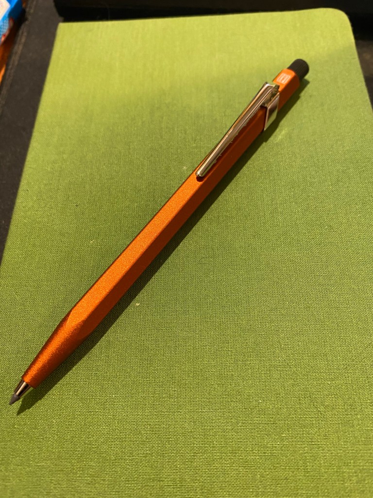
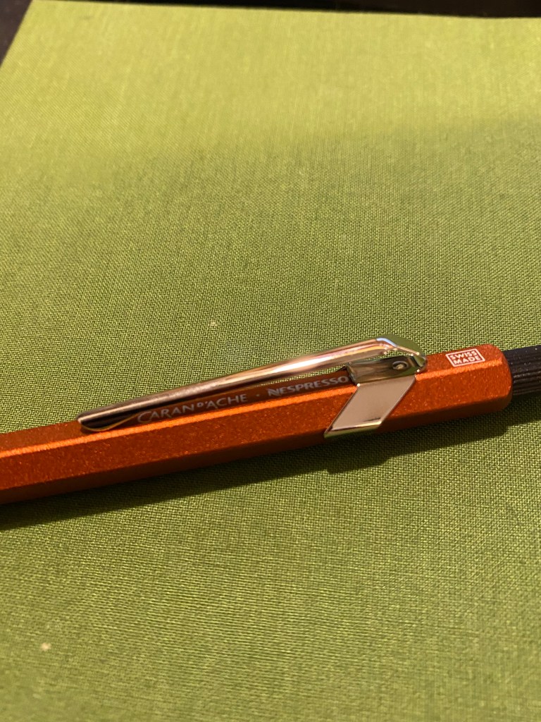
We started with the suggestion to just doodle while we waited for people to join. I was using a new sketchbook that was very cheap, laid flat and had thick textured paper (good for pencil). I used a Caran d’Ache Fixpencil with a 2B lead, and a Tombow brush pen throughout this one hour session.

Doodling before we started. Testing out the paper. Warming up.

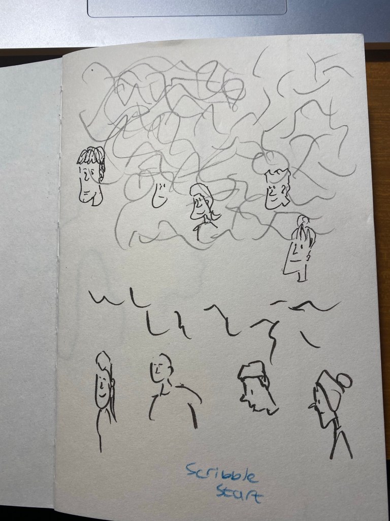
We started with a few blind contours, which I haven’t done for years, and so I kept catching myself automatically glancing down at the page. Definitely something I need to practice to get used to drawing these again. We were using Shutterstock films as our models, so that subject was moving around, some of them quite a lot. The idea was to get used to sketching people in motion, grasping as quickly as possible what captured their character.

Not so blind contour.

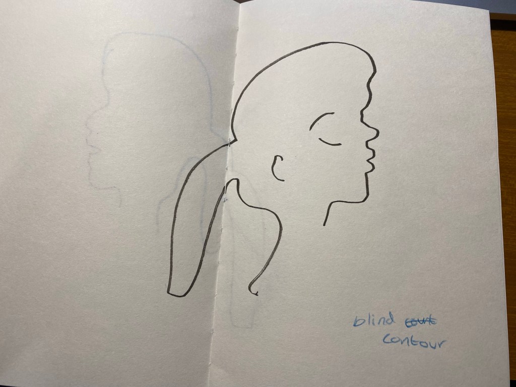
This looks good if you don’t know what the original looked like. I do, however, like the boldness and flow and expressivity of the lines here. Something to recapture in the future.

Blind contour.

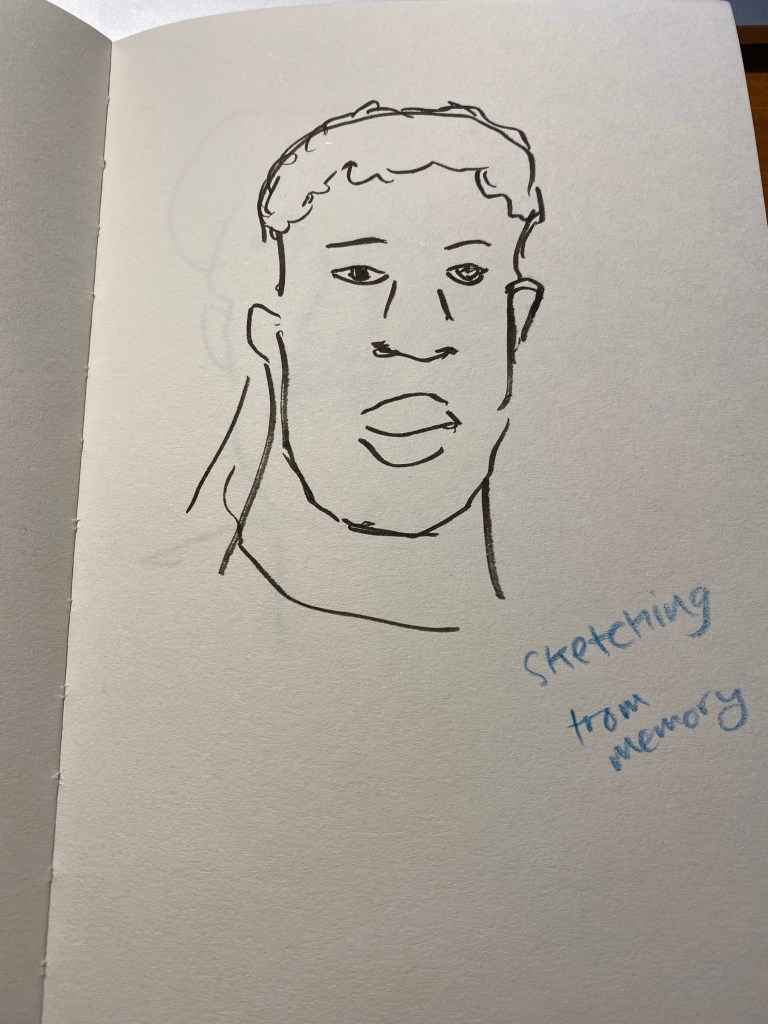
Then we did an exercise where we had 10 seconds to look at a moving person and try to remember what made them them, and then draw a portrait of them from memory. As Marina suggested, it’s easier if you describe the person to yourself in a few sentences.

Portrait from memory.

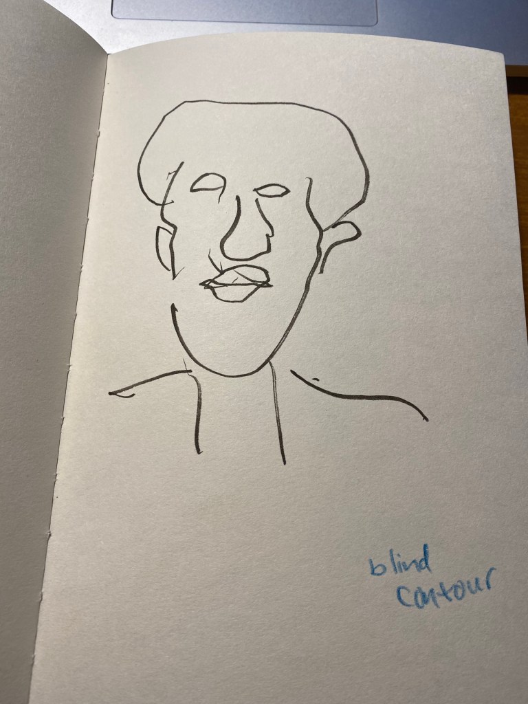
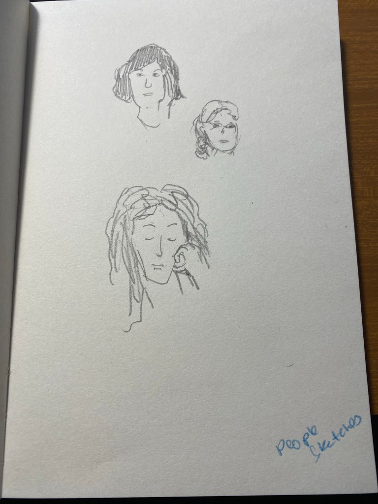
The second subject drawn as a blind contour:

Blind contour.

And from memory:

Portrait from memory in a minute.

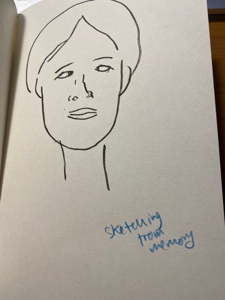
We only had a minute for each portrait, and that was too little for me. It’s a good challenge to practice in the future (working under such short time limits with such complex, moving subjects).

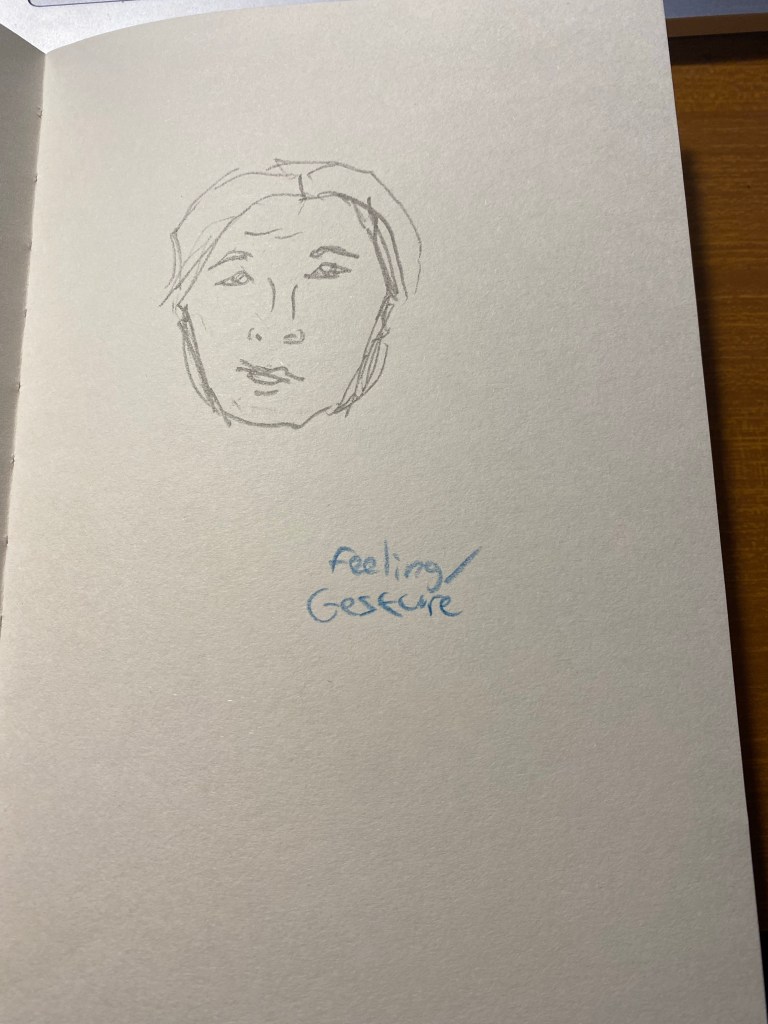
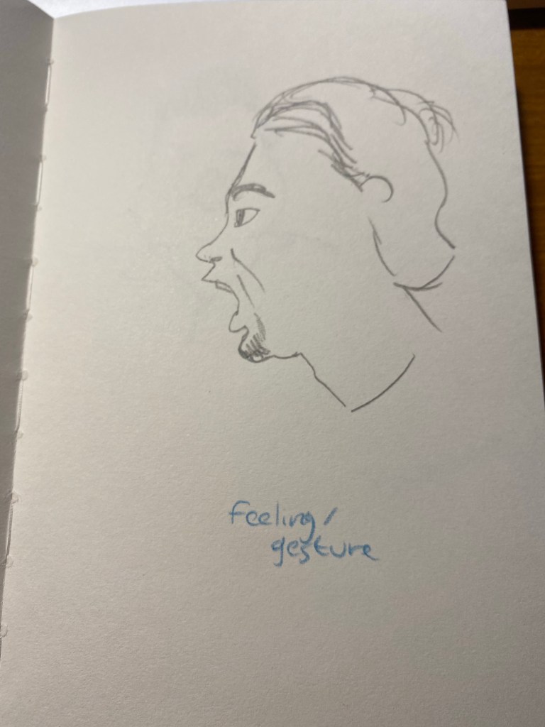
The next exercise was to capture the subjects feelings. Again, a 2 minute time limit would have been more in my wheelhouse.

Can you guess what he’s feeling?

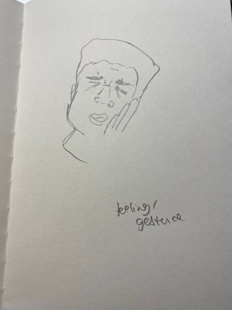
The second subject for this exercise went through every emotion in the book so I couldn’t settle on one.

Feeling? Gesture?

The third was just fun though:

What is he feeling?

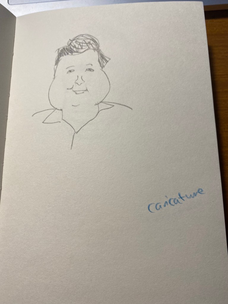
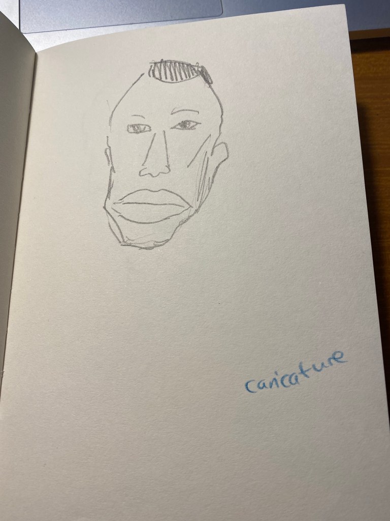
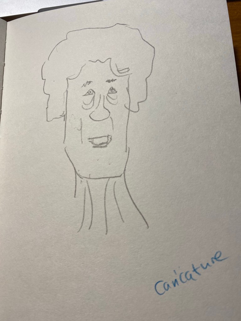
Then we did a caricature exercise, where we tried to draw people as not overly stylized caricatures. We has a minute for each, and I was starting to warm up at this point:

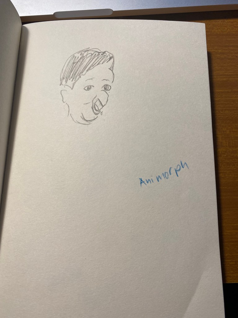
The next exercise was a strange one – to draw a person as if he was morphing into an animal and we caught them in the middle of the morph.

Bulldog man.

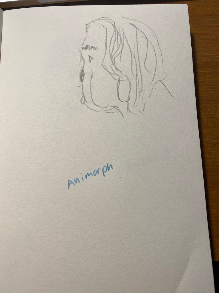
This was fun and very creative:

Parrot man.

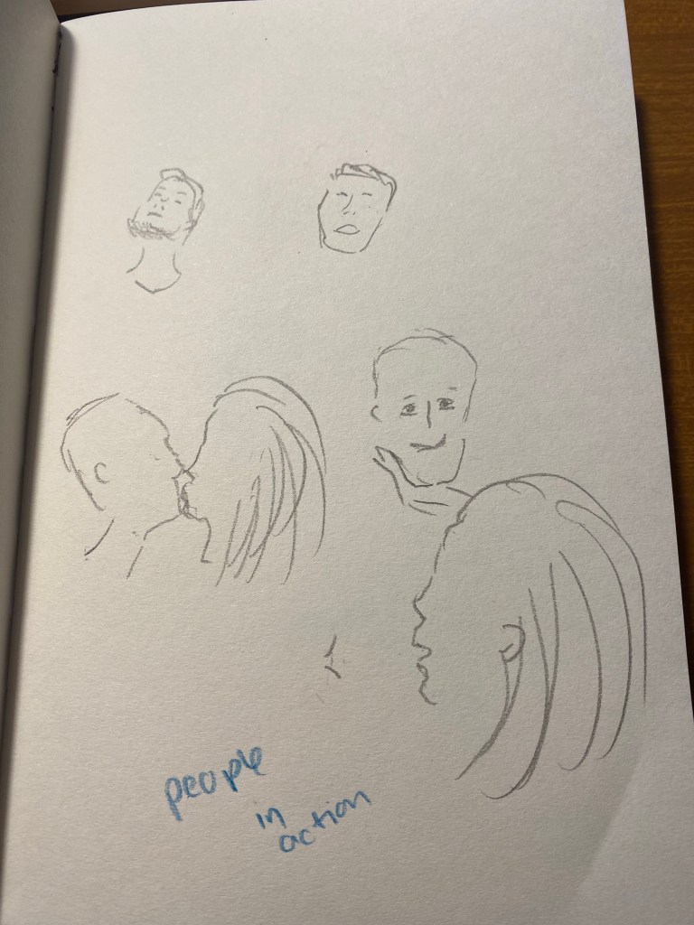
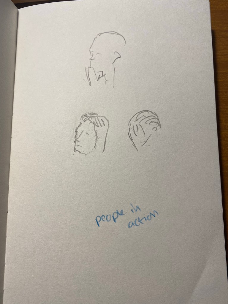
The next one was to draw people in action, in one minute. To capture as many gestures as possible. I guess that the animators had a field day with this one, but I really struggled.

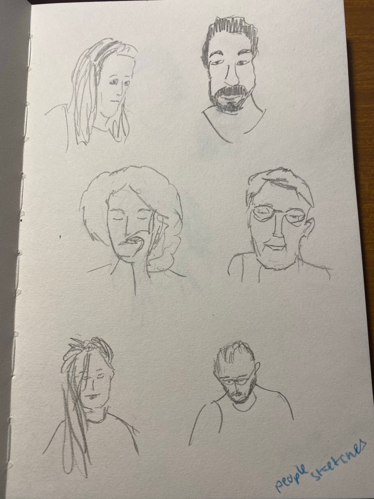
Finally we had 15 minutes to draw each other. I had a lot of fun with this, and the earlier exercises really did help me warm up and loosen up and work faster.

These exercises are definitely something that I’ll try to warm up before drawing portraits, and they’re also just a lot of fun to do. If you have a minute, a pencil and a blank page I recommend that you give them a go.

Drop + Marvel Black Panther Keycap Set Review

Drop is continuing its cooperation with Marvel and is issuing Infinity Saga themed keycap sets. The first set issued was of course, the Captain America one. Alas, it featured dark red modifiers with light red text on them, which is unfortunate. Next came the Iron Man set, which was better than the Captain America one but still too red for my liking. Third in line was the Black Panther set and it is gorgeous.

The set comes with a nice poster-like sleeve around the box that contains the keycap trays. It’s a nice added bonus, and something that you can easily cut out and display as a mini poster.

Outside wrapper with cool T’Challa themed art.

The box the keycap set comes in has the same design as the custom keycap that Drop sold before they started selling sets. It’s elegant and functional and I love the logo design on this.

Drop + Marvel debossed on the box.

The set itself comes in three trays, ready to easily assemble, and carefully packed so that the keys don’t move around or get scratched in transit:

Keycap tray with the clear cover and protective bubblewrap still on.

The first tray contains the purple alphas:

Purple alphas plus two spacebars in different sizes.

This is a full set that will fit practically any keyboard layout so there are a lot of “extra” keycaps here.

The second tray contains black modifiers as well as purple numpad keycaps and some extras.

Black modifiers and purple numpad keycaps.

The third and final tray contains the novelties (which are excellent) and more black modifiers. The novelties are T’Challa’s mask, necklace, a silhouette of the ancestor tree scene from the movie, and two Marvel logo keycaps.

Novelties and more modifiers.

The keycaps are doubleshot ABS and thick. You can see one of them compared to a keycap from the SA Dasher set.

Black Panther keycap on the left, Dasher keycap on the right.

Here are the keycaps on my Code TKL keyboard, without backlighting. Yes, I know that the spacebar is flipped. That’s how I use it.

Keycaps assembled 🙂

And here they are with backlighting:

I really like how elegant this keycap set looks like.

You can see the texture of the keycaps in the photo below. They are really fun to type with. I usually use SA keycaps, so it took me a minute or two to get used to smaller keycaps again. However, the MT3 profile is really comfortable to use, with the same feeling you get with SA keycaps of the keyboard coming to meet you. As with SA sets, the homing keys are just the same keycaps with a deeper scoop to them.

The keycap texture and a closeup of the sculpt on the keys.

Here are the novelties in action. The ancestor tree:

And the mask, logo and talon necklace keycaps:

I haven’t bought a new keycap set in years, but this one really called out to me and I’m glad that I purchased it. It’s elegant, understated but not pedestrian, and its a joy to use. I can only hope that future sets in this collaboration come out as well as this one.

The Field Notes Sketchbook: Field Notes Maggie Rogers

I am a big fan of Field Notes, so when I saw that they came out with a sketchbook in collaboration with musician Maggie Rogers, I had to give it spin. The Maggie Rogers Field Notes are in the “Dime Novel” size, and are bound with and contain Strathmore paper. That is a promising start: an uncommon sketchbook size, with artist quality paper inside.

The Maggie x Field Notes edition comes with two sketchbooks in each pack, one with a red tinted spine and one with a blue tinted spine. On the cover of each is a Joshua Meier photo that was featured on Maggie Rogers’s first two albums: Blood Ballet is on the red tinted one on the left, and The Echo is on the blue tinted one on the right.

Blood Ballet is on the red tinted one on the left, and The Echo is on the blue tinted one on the right.

Beyond the normal “Pertinent Coordinates” design on the front cover, there is a vellum fly-sheet in each sketchbook featuring Maggie Rogers’s original hand-written lyrics. It’s a nice touch that really adds to this edition’s design.

Hand written fly-sheet in the blue The Echo sketchbook.

I also like the decision to print these on vellum and not on Strathmore paper that is in the rest of the sketchbook. It gives the words an airy feeling that doesn’t weigh too heavily on the user. You don’t feel the need to compete with them, so to speak.

Reverse side of the vellum fly-sheet in the blue The Echo sketchbook.

The inside of the back cover features Field Notes’ usual spiel and some information about Maggie Rogers and this collaboration. As usual, it also lists all of the technical details of this sketchbook, which I love. It would have been nice to get the Strathmore paper weight in a more standard gsm notation.

The inside of the back cover of the The Echo edition of the sketchbook.

The red, Blood Ballet edition of the notebook is the same as the blue one, just with a red brown tint to it.

Front page of the Blood Ballet edition. Vellum fly-sheet and pertinent coordinates.
Reverse side of the vellum fly-sheet with hand-written lyrics.
The back page of the Blood Ballet edition.

So, to business. How does the Maggie Rogers Field Notes perform as a sketchbook? For that I tested it with some Uni Pin fineliners and brush pen, a Fixpencil with 2B lead, and finally with light watercolour use. Unsurprisingly, considering the paper inside is light weighted Strathmore, it’s a good sketchbook to have in your bag or coat pocket. It’s versatile and not too precious to make you feel bad about “ruining” pages.

The first sketch that I made was done with a grey Uni-Pin 0.5 fineliner. The paper isn’t entirely smooth, but I no problem using the fineliner on it. The ink doesn’t spread or feather, but it does show through and even bleed through to the other side. I won’t be using both sides of the paper here.

You can see through the relatively thin paper to the drawing on the next page. Not ideal, but that’s part of what makes this sketchbook not precious.

You can see the show through and even a spot or two of bleed through here. I really don’t recommend drawing on both sides of the page here.

Show-through and bleed-through even with a 0.5 fineliner.

The next drawing was done with a Uni Pin brush pen. The paper isn’t glass smooth, and that actually makes it more fun to draw on. There was no spread and less bleed-through than with the fineliner somehow. I still wouldn’t use the other side of the page, because it will show through.

Brush pen drawing.

The paper shines with pencil, and I had a lot of fun sketching this palm using a Fixpencil with a 2B lead. If pencil is your medium of choice, you are going to love this little sketchbook.

This paper made even a relatively pedestrian subject like a palm tree really fun to sketch.

As for watercolour, you can use the Maggie Rogers Field Notes sketchbook for light washes in a pinch, but it’s clearly not made for this. Washes come out patchy and grainy, and while the paper holds and doesn’t buckle too much if you are vey careful and only use a small amount of water on it, I really wouldn’t use it for watercolour.

Watercolour sketch featuring the work of local graffiti artist Erezoo.

The reverse side of the paper shows just how much it buckled under the strain of even a small amount of water (pun intended).

Buckling on the left is the reverse side of the drawing in the previous picture.

I think that the Maggie Rogers Field Notes is a nice sketchbook to try out quick ideas and vignettes in. It’s a nice sketchbook that’s not too nice, the vellum fly-sheet actually reduces the pressure of the first blank page, and so long as you don’t insist on using watercolour with it, it’s versatile and will do as your main pocket sketchbook in a pinch. Its main weaknesses (the thinness of its paper and the binding that doesn’t allow the pages to open flat so you can’t use a whole spread) actually work together to make this a sketchbook that encourages you to burn through it. It’s not precious. It’s not too nice. It’s a workman-like sketchbook, which works perfectly with the Field Notes brand.

How I Use My Notebooks: Three Good Things

I’ve been going through a rough time lately, and as many people have been so kind to say, staying optimistic despite all the bad things that I’ve had to deal with lately is key to getting through this terrible time. That is, of course, easier said than done. My mind tends to latch on to the painful and scary parts of the day, to the bad feelings, anxiety and doubt. It doesn’t help that we are all living through difficult times, and it’s hard to see and end in sight.

So I’ve started a new habit during the past month, and it’s helping me end the day on a positive note, with an added bonus of helping me use up some of my many notebooks.

I end each day by writing at least three good things that happened that day. I dedicate a page for each day, in my Dingbats notebook, with “Three Good Things” as the title, the date and day, and then the list of good things. It doesn’t take more than a few minutes to find that day’s three good things, and for most days so far I’ve managed to find more than three good things to reflect on. They are usually conversations that I had with friends, or moments where I felt like my old self, or things that I enjoyed reading or watching.

Writing these down has been so helpful in getting me to see the good in each day, and in trying to stay positive when life is pretty tough.

Princess Diana’s Wedding Dress

On the day before our last of our latest trip to London we went to see the Royal Style in the Making exhibition at Kensington Palace, colloquially known as the “Diana Wedding Dress Exhibition”. The tickets included a visit to Victoria’s childhood rooms in the palace, and the exhibition had other dresses on display, but you knew immediately what it was about once you entered the exhibition pavilion.

The dress was prominently displayed, most of the visitors (not many, due to Covid restrictions) were congregated around it, and it was HUGE. The thing was large, and puffy like an overdecorated wedding cake, and had a train that was just bananas. I can’t imagine what it was like being cramped with so many meters of lacy, embroidered fabric in the back of a car on her way to St. Paul’s Cathedral. Looking at that dress I thought to myself that it ended up being more symbolic of Diana’s life than designers Elizabeth and David Emanuel had envisioned. She was stuffed into an overly symbolic, stifling, uncomfortable life that made it difficult for her to show her best qualities: her warmth, her ease with human connection, her genuine care for people, and the simple way she just lit every room she entered.

Royal Style: The Wedding Dress and Two Better Dress Designs.

There were two other dress designs in the exhibition that caught my eye. The first was a salmon coloured dress that David Sassoon created for Princess Diana as her wedding day dress and she ended up wearing as a “working” dress. It’s much more sensible, colourful, chic and warm and it although it still has terrible 80’s style stamped over it, you can see how it would have worked well on her at the time.

The second dress is prototype of the Queen Mother’s Coronation dress, and it is sleek, chic, and yet also intricate and sophisticated. Of all the dresses in the exhibition, this dress best stood the test of time, and I could see it be worn by an A-level star at the Met Gala.

If you are in London and you can get tickets to this exhibition, I do recommend going, both to see Victoria’s childhood rooms, and to see the dresses on display (although fair warning, there aren’t many of them). Princess Diana had a good eye for fashion and how it would allow her to connect with people (she didn’t wear hats because you can’t cuddle a child with a hat, and she liked costume jewellery because it gave the children she picked up something to play with), and to send subtle and not so subtle messages about what was going on in her life (search for the black sheep sweater or the fabulous “revenge dress” to see what I mean).

Caran d’Ache x Nespresso Swiss Wood Pencils Set Review

The Caran d’Ache Swiss Wood is one of my favourite pencils. There are those who hate its burnt caramel smell and have nicknamed it “the stink wood,” but I am not one of them. I love how the Swiss Wood smells like, how it looks like, and especially how it writes like. The pencil is a joy to hold, the tip lasts forever, and it puts down a dark and smooth line that is great for writing and sketching. Its only real downside for me is its price — the Swiss Wood is expensive, and only getting more expensive with time.

So when I saw that Caran d’Ache was creating a Swiss Wood in collaboration with Nespresso, I added it to my Cult Pens basket together with the Nespresso Fixpencil. What can be more cool that the Swiss Wood with a Nespresso theme and some added recycling thrown in? This three pack of pencils was very expensive, but I decided to treat myself.

Boy do I wish I hadn’t.

The front of the recycled box.

As with the rest of the Caran d’Ache x Nespresso collaboration, the pencils come in a 100% recycled box. The box is cleverly designed with coffee bean shaped cutouts that show glimpses of the pencils inside, and debossing that shows off the pencils’s shape and coffee beans to highlight what the recycling story in this collaboration is about.
The rest of the “recycling story” is in the pencils’ lead, which is made of 25% coffee grounds. The pencils are made of FSC certified beech wood, which is the same as the normal Swiss Wood. You can find all this information on the back of the box:

The back of the box.

Inside the box are three very expensive pencils. They look (and smell) just like the Swiss Wood except for the imprint on the pencil body, and the dipped end-caps.

Three very expensive pencils.

The end-caps are metallic, and come in golden yellow, light green, and a bronzish red. They aren’t metal end-caps, but simply end-caps dipped in paint, just like the red Swiss Wood end-cap, only in different colours.

Closeup on the end-caps.

The imprint on the pencil is very similar to the original Swiss Wood, with the addition of the Nespresso logo, and the sentence: “A Recycling Story is in Your Hands”. The imprint is very crisp, and I like the font they chose for it.

The imprints on the pencils.

Here is where things started to go downhill. The clever and beautifully designed box that holds the pencils chipped into one of them, taking out a chunk. Not great for such an expensive set.

Damaged expensive pencil.

The end-cap is only dipped in paint. For this collaboration, especially considering the price, I expected the end-caps to be made of aluminium from recycled Nespresso pods. As it is, painted end-caps are a disappointment. Here are a bunch of modern and vintage pencils that cost much less and have better end-caps than the Nespresso Swiss Wood:

End-cap comparison.

Here’s a close up of the end-caps. From top to bottom they are: Nespresso Swiss Wood, Tombow Mono 100, Eberhard Faber Colorbrite (vitage), Mitsubishi Hi Uni, General’s Kimberly, Eberhard Faber No Blot (vintage). If they could do it why couldn’t Caran d’Ache?

Caran d’Ache Swiss Wood painted end-cap vs cheaper, more premium end-caps…

Here’s the Caran d’Ache Swiss Wood next to the original Swiss Wood. They look very much alike, apart from the imprint and the colour of the end cap. However, it’s not what’s outside that makes or breaks the pencil (pun intended) — it’s the core.

Caran d’Ache Nespresso Swiss Wood (top) vs the original Swiss Wood (bottom).

The core of the Nespresso Swiss Wood is made of 25% recycled coffee grounds from Nespresso capsules. The Nespresso Fixpencil had a similar recycled coffee ground core and was terrible. Is the core in these pencils as bad?

Writing sample of the Nespresso Swiss Wood vs the original Swiss Wood. Written on a Baron Fig Confidant.

It’s not that bad, but it isn’t great. The original Swiss Wood has a dark and smooth core that holds a point for a long time. The Nespresso Swiss Wood has a fragile core that is scratchy and lighter than its counterpart. It isn’t unpleasant to use to the point of being unusable, but it feels cheap, it looks cheap, it’s everything but a premium pencil in a world full of excellent premium pencils that cost less. There are actual white streaks in the writing it produces. If I want white streaks in my writing I can pick up a cheap ballpoint. For the price of these pencils I expect a better writing experience than the Swiss Wood, not a worse one.

Close up the writing, where you can see the white streaks.

The Caran d’Ache x Nespresso 849 collaboration produced some stunning pen designs. So far the pencil part of the collaboration hasn’t gone so well. I’d buy the Nespresso Fixpencil and toss out the lead, but I’d utterly avoid the Nespresso Swiss Wood. You get a worse pencil for a higher price, and the veneer of being good for the planet. Reduce, reuse, recycle are said in that order for a reason. In this case reduce, as I wish I had.

Phoenix Garden Take 2

I finished the spread that I started here, drawing another view of the Phoenix Garden in London’s West End.

Caran d’Ache Fixpencil 22 Nespresso Ochre

Caran d’Ache’s Fixpencil is their legendary clutch pencil offering. While the classic Fixpencil has a plastic body, the Fixpencil 22 is made of aluminum, giving it both an added weight and a more luxurious finish. The Nespresso Fixpencil 22 is also made of aluminum, hence the 22 in the name, but it’s aluminum body is partially made from a recycled Nespresso capsule, and it comes with a lead that’s partially produced from recycled coffee grounds. Just like the previous Caran d’Ache x Nespresso 849 pens, this brand collaboration is all about recycling with class.

The front of the Caran d’Ache Nespresso Fixpencil box. ​A recycled cardboard box, in light brown, set on a green background. There’s a cutout in the box that shows the orange coloured Fixpencil.
The front of the Caran d’Ache Nespresso Fixpencil box.

The box that the Nespresso Fixpencil arrives in is similar to its 849 counterparts: it’s made of 100% recycled cardboard and there’s a Nespresso capsule shaped cutout in the box that shows off the colour and texture of the Fixpencil. Clever embossing and tasteful design and branding make this a superb gift to give to someone who enjoys using pencils (with a caveat that I’ll get to later). The box is the most recycled thing about the product (being 100% recycled), but at least Caran d’Ache is honest and transparent about the quantity of recycled materials inside the fixpencil and lead: 25% of each, respectively. So there is a fair bit of “greenwashing” going on here.

Back of the Caran d’Ache Nespresso Fixpencil box.

The clever design of the box continues once you open it. It really shows off the beauty of the Fixpencil design and just how vibrant and warm the orange “ochre” colour is. It glows. You can also see the subtle texture the Fixpencil has.

Gorgeous orange Fixpencil nestled in a cardboard box.

Here is my first, albeit minor, quibble with this product: it’s not ochre. It’s reddish orange. It’s mandarin. It’s anything but the yellowish brown that ochre brings to mind. I have no idea why it was so poorly named.

Fixpencil ochre? More red than yellow by far to be called that.

Caran d’Ache 849s and Fixpencils normally have very little branding on them. The Caran d’Ache brand is tucked discreetly under the clip and generally all that you see is the “Swiss made” with a white border around it just above the clip. The Nespresso collaborations are different in that Caran d’Ache adds an additional imprint to the pen/pencil: “A Recycling Story is in Your Hands”.

A recycling story (of sorts) is in your hand.

Of course the normal logos are where they usually are, with the addition of the Nespresso logo to the Caran d’Ache logo under the clip.

Logos discreet and visible.

The Fixpencil is a joy to use because of its form factor, which is just like the 849, and the wonderful finish on the pencil body, which adds subtle texture that makes the Fixpencil fun and easy to hold.

A close up on the Fixpencil’s texture.

And now we come to the worst part of this collaboration: the pencil lead. The Nespresso Fixpencil doesn’t come with the normal fabulous Caran d’Ache pencil leads. Instead it comes with a pencil lead that has 25% coffee grounds in it and is supposedly a B grade lead. It’s terrible. The lead is scratchy, so light that it writes like an F or even an H grade lead, and hard to erase. After testing in on my standard pencil testing Baron Fig notebook, I threw it out and replaced it with a standard 2B lead from my regular stash. Not recycled, but actually usable.

Terrible pencil lead in action.

Here’s a close up where you can see in the word “scratchy” where the lead actually dug into the paper.

Closeup on the scratchy writing and some lead comparisons.

The Caran d’Ache Nespresso Fixpencil is a joy to use and will make for a fabulous gift once you pair it with a box of good quality B or 2B pencil leads. It’s a beautiful take on an already great product that I just wish also included the normal Caran d’Ache lead lineup.