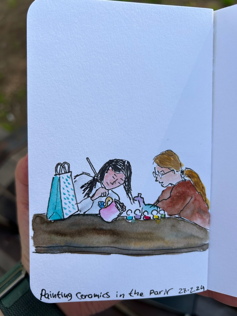
Quick Sketch: Girls Painting Ceramics at the Park
A 5 minute sketch in pen and watercolour on a Stillman and Birn Pocket Alpha.
A blog about writing, sketching, running and other things
A 5 minute sketch in pen and watercolour on a Stillman and Birn Pocket Alpha.
So after writing this post about the physical side of building a new watercolour paint box, here is my updated palette. I’m using a new Moleskine Portrait Watercolour Sketchbook as my sketchbook of choice for the watercolour part of Liz Steel’s teacup course (that starts today), and so I used the first page to create an index for my current palette.
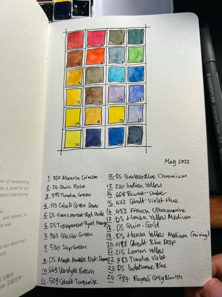
Every watercolourist’s palette is unique and full of choices that reflect their subject matter preference, the place they live in, and various personal idiosyncrasies. Please don’t copy anyones palette as-is (including mine), but rather understand the artist’s choices and tailor your palette choices to your own needs. To this end, I will explain some of the choices behind my paletter.
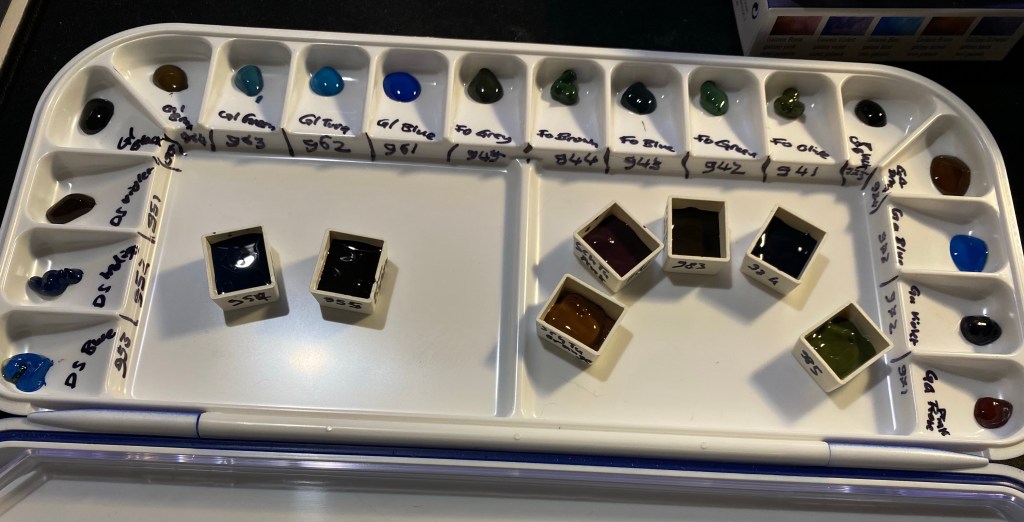
There are 24 half-pans in my palette, and 23 unique colours. Daniel Smith Hansa Yellow Medium now appears twice in my palette, once for mixing and once for using as an unmixed mid warm yellow. Yellow paints get dirty if you even look at them, and they are difficult to clean after a dab of this or that paint made its way to them. Of the three yellows in my palette I use DS Hansa Yellow Medium the most for mixing, which is why I opted to have a second half-pan of it this time (it’s a new change that I’m trying out).
Of the 23 paints, 15 are Schmincke Horadam and the rest are Daniel Smith. I’m pointing this out so that you feel comfortable mixing between paint manufacturers on your palette. This can be done so long as you are using the same grade of paint in each maker (artist grade, for example).
There are some classic examples of watercolour palette building in this palette and some that are a bit off. There are warm and cold sets of yellow (Hansa Yellow Medium, Lemon Yellow), red (Quin. Rose and Alizarin Crimson) and blue (French Ultramarine and Cobalt Blue deep), and there’s a rather standard set of earth tones (Pyrol Oxide, Monte Amiata Natural Sienna, Van Dyke Brown and Burnt Umber) but there’s some weird stuff too. I’ll be focusing mostly on the weird stuff.
There are three greens in my palette. I sketch mostly landscapes and having premixed greens saves a LOT of time. Of the three greens I use Sap Green the most, either by itself or lightening it with yellow or darkening it with blue. It also has a brightness and vivacity that you cannot obtain by mixing your own green. The two other greens are opaque (which means they don’t mix well), and cover two very common and difficult to mix green shades. Schmincke Tundra green is part of their super-granulating series, and has some pink undertones to it. It also covers a wide variety of olive coloured local plants. The Cobalt Green Dark is a brand new addition to the palette, replacing Schmincke’s forest green. This paint works as an “artificial” green, for things like benches and fences that were painted green, and a greyish-green for the many greyish-green local plants.
Then there are some “magic” paints. Schmincke Glacier Green is on the palette as a cool “glass” and sea blue, and it’s super-granulating and dual pigmented. You can see the pigment party going on with it in my swatch of this colour.
Liz Steel has influenced me to add an orange and a turquoise to the palette. They bring joy to the painting, the turquoise is useful as “glass” and “windows” when I want something brighter than the Glacier Green and the orange paint is much brighter and more alive than any mixed orange that I could ever hope to create. It’s useful to add a splash of colour to a painting, to help focus the eye in a certain area. The two Daniel Smith blues on my paletter are also Liz Steel inspired, and at least one of them may be on its way out due to low use.
Paynes Grey Bluish is one of my most heavily used pigments, as part of sky and sea scenes, denim jeans, as a shadow colour, for asphalt and to darken other mixes. A must have for me.
The two violets on the palette are also personal choices, though the Tundra Violet will likely be replaced with something else in the near future. Purples are very difficult to mix without getting muddy not registering as purple, which is why the Cobalt Violet Hue paint on my palette. The super-granulating Tundra Violet is much less useful, and may find its way out my palette.
I hope this gave you some insight as how to think about the pigment choices that you make for your palette. Again – create your own palette and don’t just force yourself to use a copy of someone else’s
I’ve recently misplaced my beloved watercolour paint box and after searching for it for more than two weeks, I gave up and decided to build a new paint box, with the hopes that the old one will show up one day. Good quality watercolour paint boxes and artist grade watercolours aren’t cheap, which is why I put this off for a while, but they do last for a very long time if you invest a little bit in them.
This post won’t be so much about my palette choices but rather more about the physical properties of the box that I use and the paints within it. If you have had a taste of watercolours and decided that you enjoy the medium and would like to create a long lasting field paint set, this post is for you.
For years I used the excellent Windsor Newton Cotman Watercolour Field Box. The box comes with a set of Cotman student grade watercolours that I gifted away (they aren’t worth your time. If there’s something worth investing in when it comes to watercolours it’s the paints. The order is paints -> paper -> brushes), a handy little built in water bottle and water cup, a sponge, and a foldable brush that is mediocre but usuable in a pinch (you’ll probably lose it shortly after buying the box, but that’s ok). The box officially holds 12 half pans, but in reality you can squeeze 14 half pans in with no effort. If you are getting into Urban Sketching this is an excellent set to have, a nifty little workhorse that will last you easily for a few years. For a very compact size you get a surprisingly large set of mixing areas, and while I’d only use the included water bottle as a backup because it holds very little water, it’s good to have around.
The pros of this kit are many: it’s small, light, well designed, cheap, easy to use, and holds a lot for such a small, pocketable package. The cons are why after three Field Boxes I finally switched over to my current setup: the boxes deteriorate and fall apart after 2-3 years of use at most, they are difficult to clean, and it’s difficult to switch out paints if you’re experimenting with your palette.
The build quality in particular has taken a hit in recent years, to the point where I cannibalise old Field Boxes for parts for the new ones. However, even the old boxes didn’t last for more than 3-4 years, because the plastic would deteriorate and the attached mixing flats would drop off, leaving you with very few mixing space in the end.
Enter my current setup, one that I’ve been using for a few years now: the Schmincke 12 half pan metal paint box, filled with 24 half pans.

There are many pocket sized enamelled paint boxes, but after trying several generic ones, I found that Schmincke’s box is worth the extra money. Generic boxes didn’t have such a good mixing area configuration, and they tended to rust off on me. The Schmincke box can take a hell of a beating without the enamel flaking off, and when working with watercolours, as soon as there’s a chip in the enamel, rust will take hold of your box.
The box comes with an insert meant to allow for two rows of six half pans and a compact, foldable brush in the middle. I take that insert out and toss it. That leaves me the whole box for a whopping 24 half pans, or a mix of half pans and full pans. Here I my usual setup, which is about 60% Schmincke and 40% Daniel Smith watercolours. Some of them are paint filled half pans that I purchased, and most of them are half pans that I filled with paint myself. Buying tubes and filling your own pans is cheaper in the long run, particularly for paints that you use often.
Filling your own half pans with paint is very easy, and also exposes interesting properties of the paints that you use. For instance, Van Dyke Brown takes ages to cure, while all my yellow paints cure super fast. I’ll also note that Daniel Smith watercolours loose A LOT of volume after drying up, shrinking at times to almost 50% of their original volume. It always takes 2-3 passes to fill a Daniel Smith half-pan, and with Schmincke one pass is enough. So you can see the ugly crack in my Hansa Yellow Medium, where the paint shrunk to half its size and I filled the other half of the pan again.
On the other hand, Schmincke’s half pan packaging is infuriating. The pans come wrapped in wax paper which often sticks to the paint as you unwrap it (imagine peeling off a sticker and having bits of sticker left behind). You can see this on the Lemon Yellow on the bottom left and on the Cobalt Blue Deep on the second to last row, on the right. After much of a struggle I got the residue off the Cobalt Blue, but I left it to scrape off later from the Lemon Yellow. It is a hassle to remove these bits of leftover paper, and they ruin the paint.

As there’s a bit of a gap left that allows the pans to travel freely in the box, I cut a bit of foam and put it in the box, creating a friction fit for all the pans. Removing a pan and switching it over is a breeze this way – you can always lift out the foam and then easily remove the paint pan.
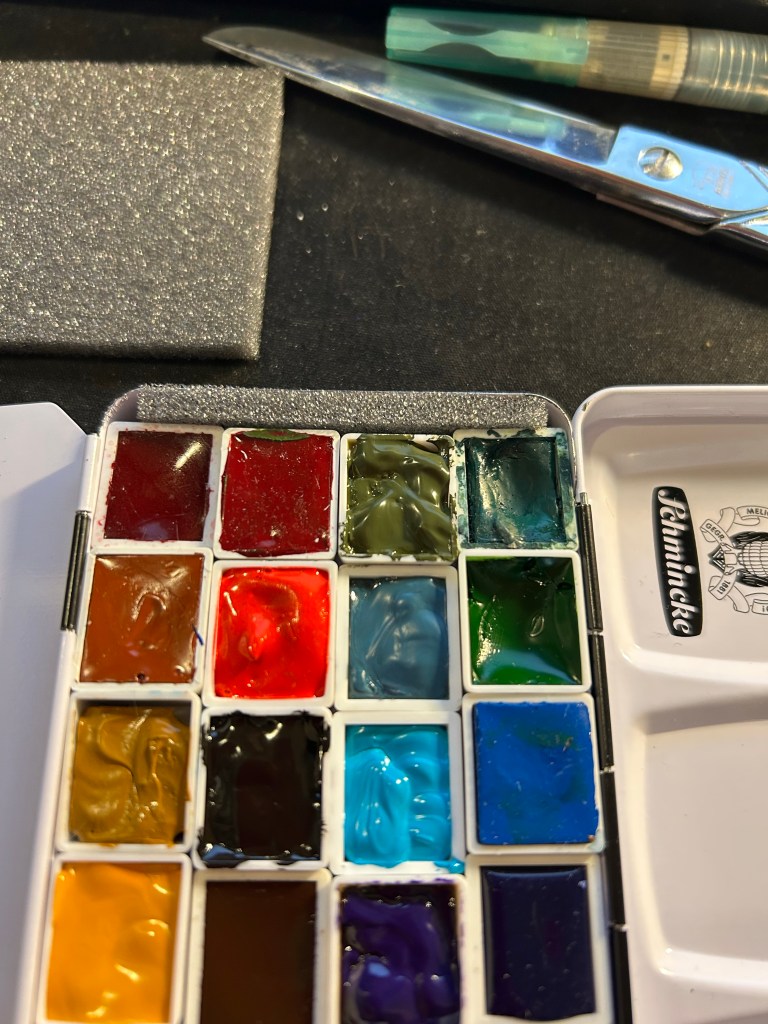
The box has two large mixing areas, one divided into three large wells which I use to mix often use colours or paint for large areas. The second area is divided into six small wells (you can see this all in the first photo of the set) which are good for small mixes. As it’s enamelled metal it’s very easy to clean, and the set is much more robust than the W&N Field Box.
If you like to experiment with your palette (I always have 2-3 paints that I switch out every 3-4 months), and you are looking for an ultra durable compact field set, I highly recommend investing in the Schmincke 12 half-pan box and filling it with whichever paints you choose. Pre-made watercolour sets are always terrible (they include at least 1-2 colours that you will never ever use), and building a set that fits your needs is a crucial step in making your watercolour painting more streamlined and enjoyable.
What watercolour box do you use? Let me know in the comments, as I love hearing from other sketchers about their tool choices.
My hands have been killing me with the worst neuropathy since my treatments began, so I’ve been trying to limit my typing to what I need to do for work. That is why this post took so long to write, and why my posting schedule may be a little off until things improve with my neuropathy.
2021 was a hell of a year for me. It started with me doing Liz Steel‘s excellent Sketchbook Design course. I also took some fantastic and very illuminating tea seminars with Juyan Webster from the Chinese Tea Company. If you have any interest in tea and you get a chance to have a tea seminar with her, I highly recommend it.
Early on in the year is also when a close family member got diagnosed with thyroid cancer, and that’s also when my journalling went on the fritz. This was the notebook I was using at the time, a Moleskine Pokemon Charmander limited edition and I abandoned it 2/3rds of the way through.

Covid was raging, I was working from home, at a new job, and I spent the first quarter of the year trying to fit my drawing and running into the new quarantine rules that kept getting both stricter and more confusing with each iteration. I happily got vaccinated as soon as I could, and I’m still very grateful to the amazing scientists and doctors who came up with vaccines in such a short time frame.
I managed to participate in the OneWeek100People challenge, which is very demanding but also a lot of fun. If you can spare the time I recommend giving it a try.
In the beginning of April I started having shortness of breath (dyspnea) while running. It got worse with time and soon I couldn’t run at all, and then I couldn’t walk very fast or far, climb stairs, etc. After a long and laborious road to get a diagnosis, in the beginning of June I learned that I had cancer, and in the beginning of July I got a diagnosis and started ABVD chemotherapy to treat Hodgkin’s Lymphoma.
A few things helped me get through that incredibly difficult time. First and foremost, my phenomenal family (mother, father and brother) that rallied around me and took care of me from the moment of the first diagnosis and to this day. I can’t imagine going through this process without them. Almost as important were my friends, who visited me in the hospital and cheered me up, and kept in touch and cheered me on during the treatments. Finally it was journaling and reading. I started this Moleskine “I am New York” on the day I was first admitted to hospital, and writing in it gave me perspective and kept me sane.

And books? Books have always been my comfort and escape. I saw a few things on Disney+ while I was hospitalized, but books helped distract me from a lot the most unpleasant and painful parts of this journey.
I was happy to discover that one of my favourite Moleskine limited edition series, the denim ones, was back in stock, and so once I finished the “I am New York” journal I moved into this Moleskine “Skinny. Flared. Bookcut.” one. It’s such a well conceptualized and executed design, it was a joy to use. This was when I decided to regularly use fountain pens to journal with, and just use only one side of the page. I have more than enough notebooks to support that decision.

And now, and the beginning of 2022 I started a new journal, a Moleskine Peanuts Sakura. Pretty, right? Let’s hope I get to fill it with good news and positive thoughts.
Some favourites from the past year:
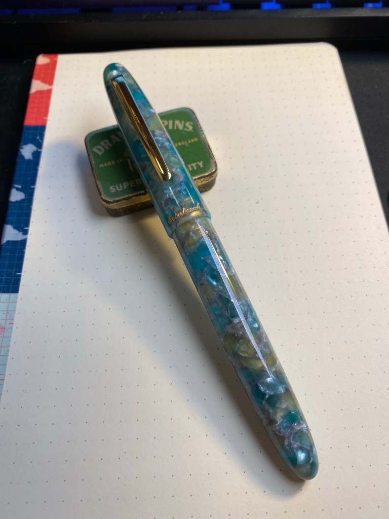
My favourite pen was the Esterbrook Estie Sea Glass. Quite a surprise for me, but it hasn’t been out of rotation since I got it.
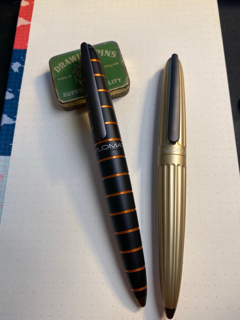
Another pen purchase that came in at a close second was the Diplomat Elox Rings and the Diplomat Aero (basically the same pen with a slightly different body design). These are wonderful workhorses, and a joy to use.
I didn’t read as much this year as last year, but I did read a few really great books. Here’s a list of a few standouts among them:
In terms of art supplies, 2021 was the year of the super-granulating watercolours from Schmincke, and also when I added Daniel Smith watercolours to my palette. Schmincke just announced that the super-granulating colours will be permanently added to their offerings, and that they are issuing three more permanent sets into this series (Desert, Shire and Vulcano), and another limited edition set, Haze.
I’ll be talking about planning for 2022 on one of my next posts. In the meanwhile, have a great new year, and don’t forget to take time and breath.
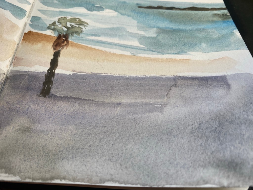
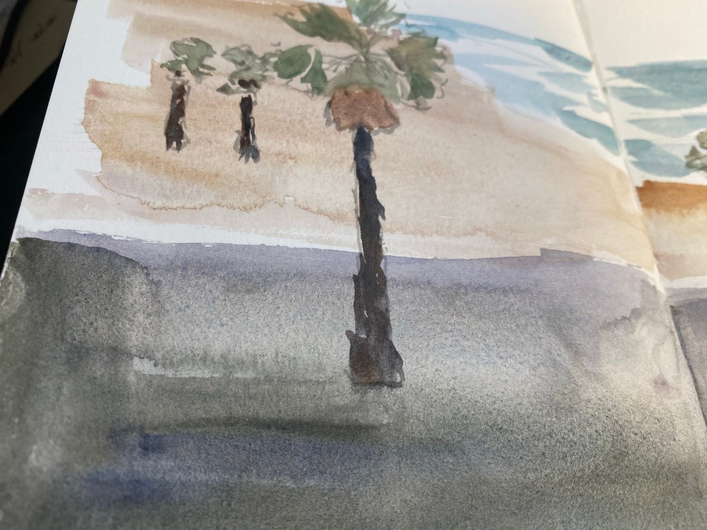
I finished the Ramat Hanadiv spread today, drawing the second page from photos, as I had a few moments when I could sort of feel my hands.
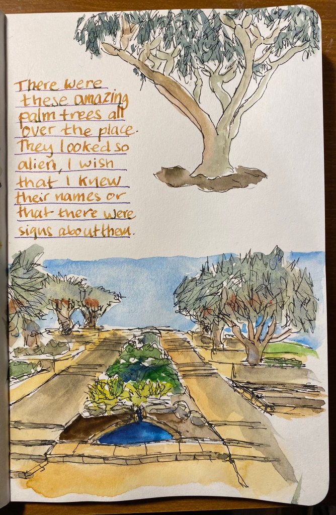
I wish I knew what these palm trees were called. They looked amazing.
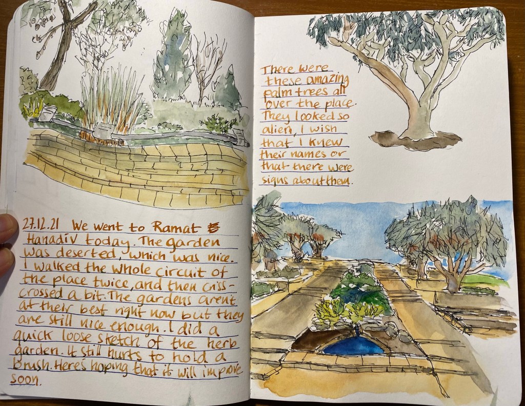
I’ve been trying to draw better foliage, which made me want to investigate the various greens I can mix from my current palette. So for the first time I dedicated time and a few sketchbook pages to experiment with green watercolour mixes. I thought that the process would be tedious and boring, but it ended up being very interesting. Mixes that looked like mud on the palette came to life on the page. I discovered a whole host of green hues that I had no idea that I had access to. And once again I fell in love with Schmincke’s Glacier Green.
Note: DS stands for Daniel Smith and Sch for Schmincke. The paper is Stillman and Birn Alpha.


On the day before our last of our latest trip to London we went to see the Royal Style in the Making exhibition at Kensington Palace, colloquially known as the “Diana Wedding Dress Exhibition”. The tickets included a visit to Victoria’s childhood rooms in the palace, and the exhibition had other dresses on display, but you knew immediately what it was about once you entered the exhibition pavilion.
The dress was prominently displayed, most of the visitors (not many, due to Covid restrictions) were congregated around it, and it was HUGE. The thing was large, and puffy like an overdecorated wedding cake, and had a train that was just bananas. I can’t imagine what it was like being cramped with so many meters of lacy, embroidered fabric in the back of a car on her way to St. Paul’s Cathedral. Looking at that dress I thought to myself that it ended up being more symbolic of Diana’s life than designers Elizabeth and David Emanuel had envisioned. She was stuffed into an overly symbolic, stifling, uncomfortable life that made it difficult for her to show her best qualities: her warmth, her ease with human connection, her genuine care for people, and the simple way she just lit every room she entered.

There were two other dress designs in the exhibition that caught my eye. The first was a salmon coloured dress that David Sassoon created for Princess Diana as her wedding day dress and she ended up wearing as a “working” dress. It’s much more sensible, colourful, chic and warm and it although it still has terrible 80’s style stamped over it, you can see how it would have worked well on her at the time.
The second dress is prototype of the Queen Mother’s Coronation dress, and it is sleek, chic, and yet also intricate and sophisticated. Of all the dresses in the exhibition, this dress best stood the test of time, and I could see it be worn by an A-level star at the Met Gala.
If you are in London and you can get tickets to this exhibition, I do recommend going, both to see Victoria’s childhood rooms, and to see the dresses on display (although fair warning, there aren’t many of them). Princess Diana had a good eye for fashion and how it would allow her to connect with people (she didn’t wear hats because you can’t cuddle a child with a hat, and she liked costume jewellery because it gave the children she picked up something to play with), and to send subtle and not so subtle messages about what was going on in her life (search for the black sheep sweater or the fabulous “revenge dress” to see what I mean).
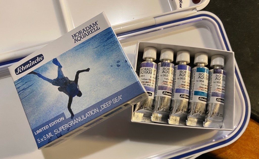
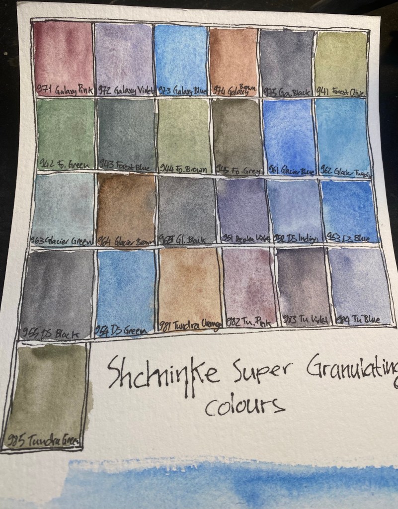
Schmincke recently came out with a new series of limited edition Horadam (artist grade) watercolour paints that are super-granulating.Granulation in watercolour is the an affect that is created when the pigments in the paint separate and settle in a diffused patten on the paper, oftentimes allowing other pigments that they are mixed with to show through. In my everyday watercolour palette Schmincke’s Ultramarine Finest (494) is a prime example of a granulating paint that I use both for its effect as an individual paint and when mixed with various browns and greens. The new 900 limited edition series of Horadam watercolours that Schmincke has issued is composed of 25 paints that are divided into five sets: Galaxy, Glacier, Deep Sea, Forest and Tundra. I decided to purchase all five sets out of curiosity, since limited editions in artist grade watercolours aren’t common, I already use Schmincke almost exclusively, and I’ve been embracing granulation more lately in my work.

The paints can be purchased in individual 15ml tubes (which is a lot of watercolour paint), in fancy wooden boxed sets of 15ml tubes and in cardboard boxes of 5ml tubes, which is what was available at my local art supply shop and what suited me to buy anyway. 15ml of watercolour paint is a commitment, and artist grade watercolour in general and Schmincke in particular aren’t cheap. The paints aren’t sold in half pans, which I would have preferred over the tubes, and which means that you are going to need empty pans or a palette to use them.

The Galaxy set includes Galaxy Pink, Violet, Blue, Brown and Black. There are some naming peculariaries in this entire series of paints, such as the fact that the paints are super-granulating but the set is called: Supergranulation on the box, and Super Granulation by the dealers. In any case, like all the colours in this set the paints in the Galaxy set have good lightfastness. They are all non-staining (which means that they can easily be lifted off the paper), the Violet and Blue are semi transparent, the Pink and Brown and Black are semi-opaque. This is the most vibrant of the sets, but don’t believe the photos on the package or in the various marketing materials, none of the colours in any of these sets really pops or is as vibrant as they appear to be. All these colours tend towards naturalistic, landscape painting tones.

The colours in the Forest Set are: Olive, Green, Blue, Brown and Grey. They are all extremely lightfast, the Olive and the Brown are semi transparent, the Blue and the Grey are semi opaque and the Green is opaque. I have no idea why the Forest Brown (944) is called Forest Brown as it’s not a brown at all, it’s more of a greyish green. Forest Blue is also a misnomer, as it’s also a green, this time one that looks like it was mixed with indigo. This is the most monotone of the sets, though if you are focused on landscapes, there are some interesting greens here.

The Glacier set boasts the best paint in the series in my opinion, the Glacier Green which is just a delicious paint to have on your palette – a phenomenal and unique green with pronounced brown undertones. I can’t wait to use it in my work, and I’ll be buying a 15ml tube of this. The rest of the colours in this set are Glacier Blue, Turquoise, Brown and Black. Despite what the marketing material may say, there is very little difference between the various blacks in these sets, and if I could I would have skipped all of them and used the Forest Grey and the Tundra Violet instead. All the colours in this set rate in the 4-5 star lightfastness range and all apart from the Brown (which is semi-staining) are non-staining. The Blue is semi-transparent, the Turquoise, Green and Black are semi-opaque and the Brown is opaque.
The Deep Sea set features the following colours: Violet, Indigo, Blue, Green and Black. The Green here is a misnomer, as it’s also a blue (with only the slightest green tinge) and the violet is greyish and flat compared to the Glaxy Violet (and in any case if you’re looking for a vibrant violet look elsewhere in Schmincke’s lineup). This is probably the most redundant set of the five, and you can pretty much skip the colours here without missing on much. Indigo, Blue and Green are semi-transparent, Violet and Black are semi-opaque. Lightfastness is very good to excellent and non of these are staining.

The Tundra set contains Orange, Pink, Violet, Blue and Green. Tundra Violet is another misnomer as the paint is practically black with a tinge of purple. This is the most staining set (Violet and Green are staining, the rest are semi-staining), but also a pretty mixable one. Orange, Blue and Pink are transparent, Violet is semi-transparent and only Green is opaque. It’s also one of the most compelling greens in the set, with it’s olive like tones and its pinkish undertones it’s both unique and generally useful for landscapes.
Schmincke aren’t selling these in pans, which is pretty inconvenient if you just want to swap one or two of these into your existing palette.

I first saw these paints on Schmincke’s Instagram and then on the Jackson’s Art blog. In both the paints are much more vibrant and with much more pronounced granulating, to the point of almost marbling, than what I got when I first created a the above reference drawing. I had a feeling that this was somewhat due to the extreme closeups that they took, and likely also the paper that they used.

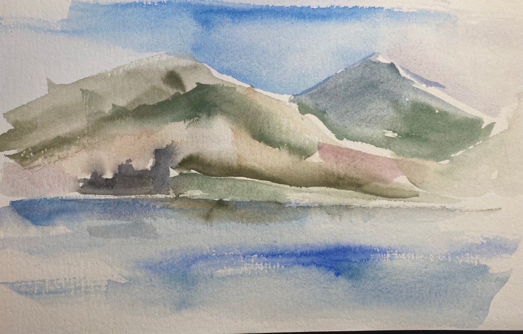
In any case, since I and many others also use Stillman and Birn Alpha paper for watercolours, I decided to try and create a painting using these paints exclusively. In the end I also added Schmincke Indian Yellow (220) for the signs, but I didn’t mix it with anything else. As you can see, the granulation is still pretty pronounced throughout, but the colours, with the exception of the Glacier Blue aren’t exactly vibrant or saturated.

I then decided to break out the good paper, and tested the paints on 100% cotton 300gsm cold pressed rough watercolour paper. Here you can see the granulation at its best, and yes, as promised it is pronounced in all of these paints. Yet as I suspected the choice of paper does nothing to make these paints more vibrant, which means that I certainly won’t be using them to replace large swaths of my current palette or recommending that you use them exclusively (especially since there are no yellows here and the red selection is pretty poor).
Here are the paints all labeled (I got the Deep Sea Black and Green swabs out of order).
Here’s a very quick sketch with these paints on the cold press paper. They are built for washes and wet on wet work, and so relish this paper.

And here they are on Stillmand and Birn Beta paper, which is better watercolour paper than the Alpha but still not good watercolour paper. You still get much of their effect here, especially if you don’t much around too much with the paint. These aren’t the best for mixing on the palette but do work well with layering and working wet on wet on the page. If you like to put down paint in washes and see what it does, these paints are for you. If you like to work in a more controlled fashion, you likely aren’t a fan of granulating watercolours anyway.
You can see the granulation here, and some of the best colours in this set at work (Tundra Orange, Glacier Green, Tundra Violet, Forest Green, Tundra Green and Glacier Brown).
Again you can see the granulation at work and how the effect lets the whiteness of the page show through, bringing light to a dark patch.
So, would I recommend all 25 paints? Of course not. Of the paints in these sets here are the ones that seem worthwhile:
963 Glacier Green (the best of the bunch!)
983 Tundra Violet (a great replacement for black in your palette, if you have it)
952 Deep Sea Indigo (bonus points for a transparent indigo with reddish purple undertones!)
964 Glacier Brown (the best brown of the bunch and the most saturated of them, with dark black green undertones)
942 Forest Green (a saturated green in a natural but not easy to mix colour with reddish undertones)
985 Tundra Green (a natural greyish yellow green that is not easy to mix and has brown undertones)
981 Tundra Orange (because this is a transparent paint in a colour that is rarely otherwise granulating, with pinkish undertones and a good generally useful hue that will work well in mixing).
If you’re looking to buy sets, the Tundra set and the Glacier set are the best in my opinion, but it depends on what colours you use most often in your palette.

A drawing of a decrepit, old building in central Tel Aviv. Painted only using the new Schmincke super-granulating watercolours (Galaxy, Glacier, Deep Sea, Forest and Tundra). The only exception is the yellow, which doesn’t exist in this range.
My review of these colours will probably be up this weekend.
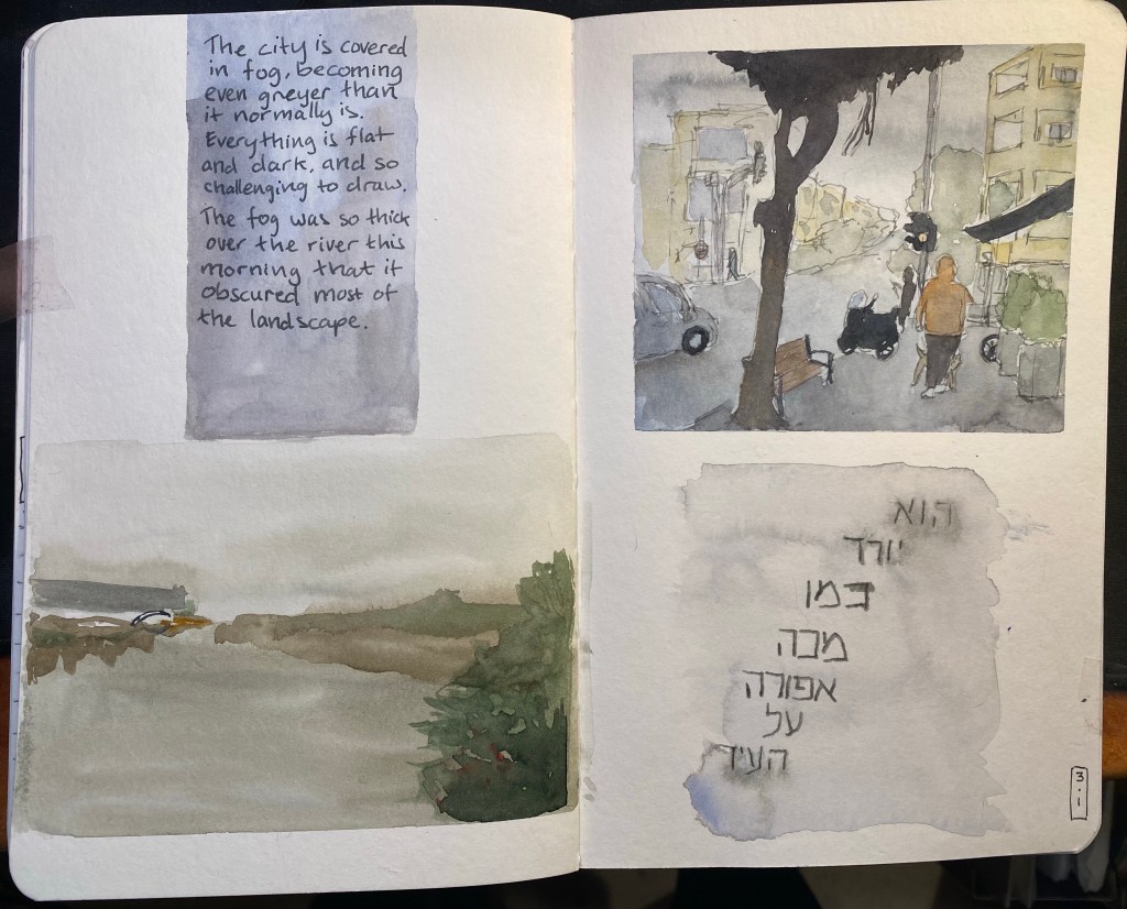
In early January we had a bout of very foggy days and I took photos of various city scenes in the lockdown and the fog thinking that I’d later draw them. I thought that drawing fog in watercolour would be pretty straightforward, because what is easier than just drawing wet on wet and letting the watercolour do its thing? But after looking more closely at the photos I realized that fog isn’t just grey sky melting into the landscape, it’s also a muting of colours, a flattening of the landscape, the lack of shadow. In the end I drew two small landscapes, one urban and one of the park, and although they were challenging I enjoyed drawing them enough to want to have the same experience with the text. The grey writing in Hebrew in the bottom right corner is a line out of a well known rock song that embodies a lot of the spirit of Tel Aviv. It was written using Diamine Silver Fox on a semi-wet background, to facilitate ink spread.
These drawing also showcase a shift I have made in my palette and my mixing over the past few weeks. Once things settle down I’ll probably post about my new palette.
