Tournament of Books: My Sister, Serial Killer

I finished reading the thirteenth (how appropriate) Tournament of Books 2019 book, Oyinkan Braithwaite’s “My Sister, Serial Killer“, which is running against Richard Power’s “The Overstory” in the fifth round of the competition.

This was a fast, sharp read, so I’ll try to make it a fast, sharp review.

I was worried that this would be horrible slasher novel, and it was far from it. Yes, it’s full of dark humour, but it’s also full of intense understanding of how family ties work, especially ties between sisters. It can be read as a lightweight, lighthearted humour piece, or as something that explores the darker sides of female bonds and male and female power relationships, but either way, you’re in for an enjoyable two hour ride.

Read it, ma. It’s worth it.

Tournament of Books: The Overstory

I finished reading the twelfth Tournament of Books 2019 book, Richard Power’s “The Overstory“, which is running against Oyinkan Braithwaite’s “My Sister, Serial Killer” in the fifth round of the competition.

“The Overstory” is a good book that’s difficult to recommend. Why? Because this is not an easy read, both in terms of material and structure. The question in this case is always: “Is it worth the effort?” In this case, the answer is “sometimes”.
There are parts of this novel that could have been pollarded, parts where Powers was clearly very much in love with the words that he was producing. Other parts are a joy to read, pure poetry brilliantly written. The structure is stunningly complex: Powers introduces each character in a story of their own, and then weaves some of those stories together tightly, and others just tangentially. The result is a dizzying book that will make you love trees and love those who love them.
If the book was shorter and the structure clearer (note that I say structure. The book has very little going on in terms of pure plot), it would have been a must read. As it is, if you decide to put an effort in a book of this kind, allow me to recommend “Milkman“. If you’ve read that and are ready for more, much more, then “The Overstory” is for you.

Ti2 Techliner Review

Ever since I first saw a review of the Ti2 Techliner on The Pen Addict I have wanted this pen. At the time it was on Kickstarter, and I wasn’t comfortable with paying that much for a pen that I wasn’t sure that I would get.

Later on it was for sale on the Ti2design website, but that site looked dodgy enough for me to hesitate giving them my money. This is an expensive pen, especially considering that it’s not a fountain pen, and I was unsure if I wanted to spend the money on it. It didn’t help that Ti2design noted that it was no longer using the Uniball Signo 207 refills (which are my absolute favourites), but have switched to Uniball Jetstream refills (which I’m not a fan of). As the FAQ at the Ti2design site said, the two were not interchangeable, due to different nose cone designs on the refill, each requiring a different combination of magnets, spacers and o-rings.

That turned out to be wrong, but more about that later.

When JetPens got the Ti2 Techliners, I decided to take the risk and buy the fallout titanium edition, hoping that I could hack a Uniball Signo 207 refill into it. It arrived super fast in the ugliest, cheapest looking packaging I have ever seen. It was just a plastic tube with a bit of paper stuck on it, not even in a clean and professional way. I don’t care about packaging, but if I would have bought this as a gift for someone I would be hugely embarrassed if it arrived like that. It’s a $92 pen — they couldn’t even splurge for a nicely designed cardboard tube? The TWSBI GO costs a third and comes with much, much nicer packaging.
IMG_3525

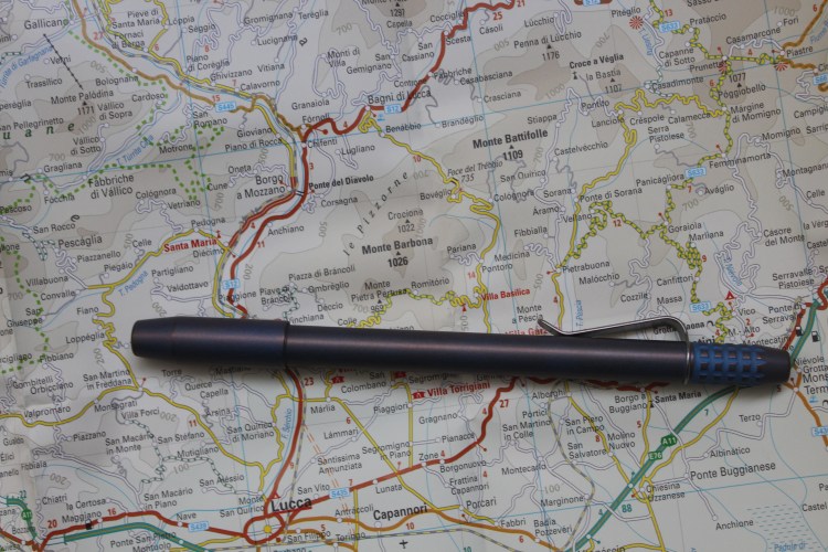
The pen itself is gorgeous in my opinion. It’s obviously got a design that not everyone will like, but you can see that every detail has been considered and designed. The fallout finish is stunning, with a blue hue over the tumbled titanium finish giving it a purplish glow, especially at the raised edges of the pen (the top of the cap, the grip knurls, etc.).

IMG_3527

The cap closes magnetically, which is very satisfying, and it posts magnetically too. Those magnets close with a satisfying click (what a great fidget toy), and they are STRONG. That means that the pen will attract various metal knickknacks lying around, and you need to be careful where you place it.
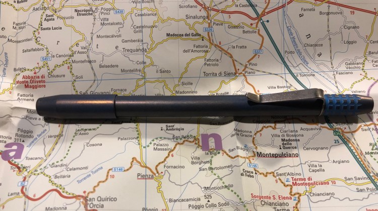
I photographed it both in natural light and warm light, just to try and bring out the colour a bit more, but neither photo does it justice.
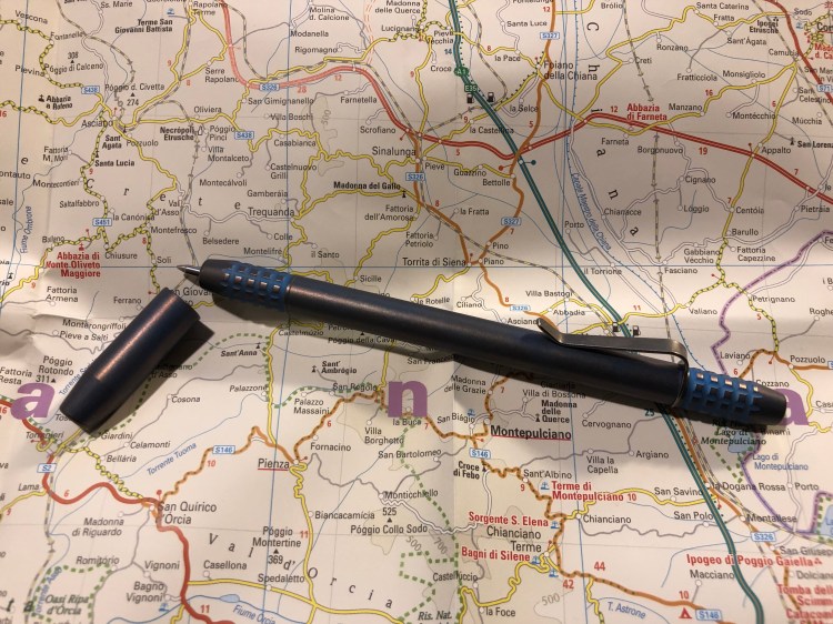
The knurling on the grip is pretty comfortable to use, but if you have a death grip and you use it for long periods of time, it will start digging into your fingers. This is also a long pen, both capped and uncapped, at 14.1 cm uncapped, 14.7 capped and 15.5 posted. It is well balanced though, so even with my tiny hands it didn’t feel unwieldy.
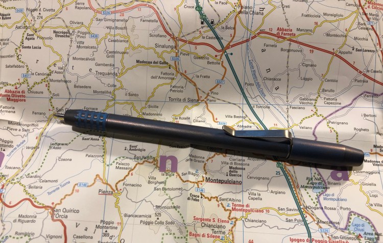
The knurling is tumbled so that it won’t cut into your hands, and it looks great with the fallout finish. It’s one of the most comfortable machined pen grips that I’ve used so far, and the only reason that it may encourage a bit of “death grip” is that the pen is long and it may feel like you need to. You don’t.
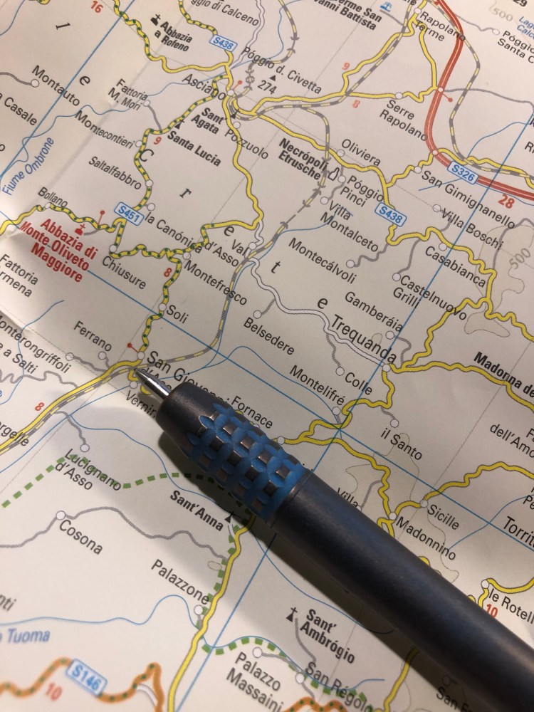
You can see the purply-copper finish a bit here, on the capped end, and see the clip too. JetPens only sells the Ti2 Techliner with the clip, but if you go to Ti2design’s site they’ll sell you one without one. The clip looks nice and does a decent job.

The uncapped end of the pen also has knurling on it, and looks cool.
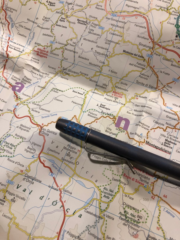
I like the truncated nose cone design, and it shows off the magnet that holds the refill in place and allows the cap to snap on. There may be those that don’t like it, but I really think that it works on this pen, especially since it’s repeated on the end of the pen.
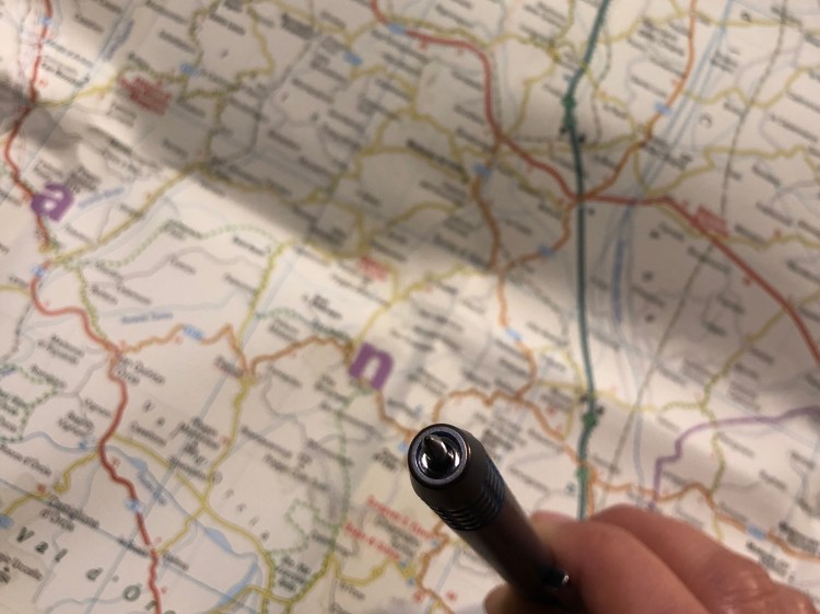
The end of the pen is also truncated, and you can see the magnet that allows posting here too.
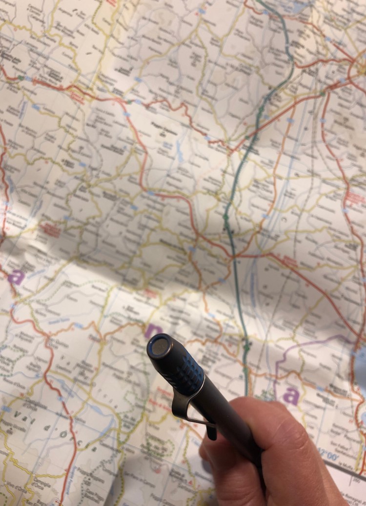
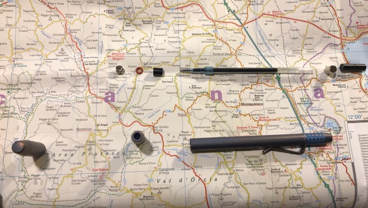
This brings us to the insides of the pen and some things worth knowing before you buy this pen. The pen comes with two magnets, two spacers and an o-ring, and a Uniball Jetstream SXR 0.7 ballpoint refill. That’s a great refill if you like ballpoint pens, but otherwise and unlike what the Ti2design FAQ says, you can totally use other refills in this pen. Jetpens has a list of compatible refills here, and the Uniball UMR gel refills (the Signo 207 refills) totally fit. You could have 0.38 mm gel refill in this pen!

Before unscrewing the pen and changing the refill, do take a moment to:

  1. Go to the Ti2 Techliner FAQ page, just to understand which parts go where. The magnets are directional, so if you put them back the wrong way in your pen won’t cap or post. Just take it apart again and flip the magnets. You can’t get the front and back end magnets or spacers confused, as the front ones have a hole in them for the refill, and the back ones are solid.
  2. PUT THE CAP FAR, FAR AWAY BEFORE STARTING!!!! The cap has a magnet inside it, and if you’re not careful you front magnet (which is tiny and light) will get sucked into it, and you’ll need a pair of tweezers and some effort to get it out. Save yourself the hassle and put the cap away first before you disassemble the pen.
I love the Ti2 Techliner and I’m happy with my purchase. Do I recommend it? If you like the aesthetic and aren’t shocked by the price, then yes. I wouldn’t give it as a gift (not until the packaging is sorted out), and I’d recommend the Ti Arto over it because it’s much more versatile, but in my opinion this is still a very well designed, beautiful pen.

Just beware of the magnets…

Tournament of Books: The Golden State

I finished reading the eleventh Tournament of Books 2019 book, Lydia Kiesling’s “The Golden State“, which is running against Jesse Ball’s “Census” in the fourth round of the competition.

You would be forgiven if you read the premise of “The Golden State” book and thought that you are about to read an “Eat, Pray, Love” kind of book. This is nothing of the sort. Kiesling has written an intensely realistic and touching piece about loneliness, particularly female loneliness.
The heroine of “The Golden State”, Daphne, is a young, neurotic mother to a precocious 2 year old, left alone due to the machinations of the US Immigration system. The daily grind at her unfulfilling job finally makes her snap, and she decides to take her toddler and run back to Altavista, where her late grandparents lived. The narrative follows her through the 10 days of her escape. So far the “Eat, Pray, Love”.
Daphne is a victim of a society that does nothing to help young mothers (except pile guilt and anxiety on them in the form of study after study), especially young mothers who marry outside the tribe. She is caged in a pointless job that is full of daily humiliation, but the money is “good” (not good enough for SF) and the health insurance… She has no friends, no family, nothing of interest in her life except her daughter, who she can’t afford to spend time with. Her husband and his loving family is in Turkey, and apart from skype calls, she has very little chance of seeing them any time soon. No wonder she snaps.
Altavista is no paradise, and isn’t portrayed as such. It’s a semi-deserted place full of angry white people, only a handful of which remember Daphne and her grandparents. She has unknowingly fled to the only place where she could be more lonely than she was back home. So when an old lady who visited Turkey one time befriends her, she can’t help but reach out.
This novel would not work in any place but today’s US. It’s a novel of time, place and character more than plot. Every breathless rush to change diapers or calm a screaming toddler becomes momentous once you realize just how alone Daphne is, just how alone the society she lives in wants her to be.
The novel is interesting, fresh, sharp and well written, and it beautifully breaks down large political ideas to small, everyday encounters.

This book is running against “Census” in the fourth round of the Tournament of Books, and though they have very little in common apart from being stories about single parents and their children out on a trip, it was not hard for me to pick “The Golden State” as a winner. It’s a better book in terms of writing accomplishment, and it has much more heart than “Census”. I highly recommend skipping “Census” entirely, and reading “The Golden State”. It’s a very good piece of contemporary fiction.

How I Use My Notebooks: Running Planner

The thing that you learn very quickly about running is that no matter which Couch to 5k plan you started with, if you want to have any hope of persisting with your running you are going to have to tailor make your own running plan.

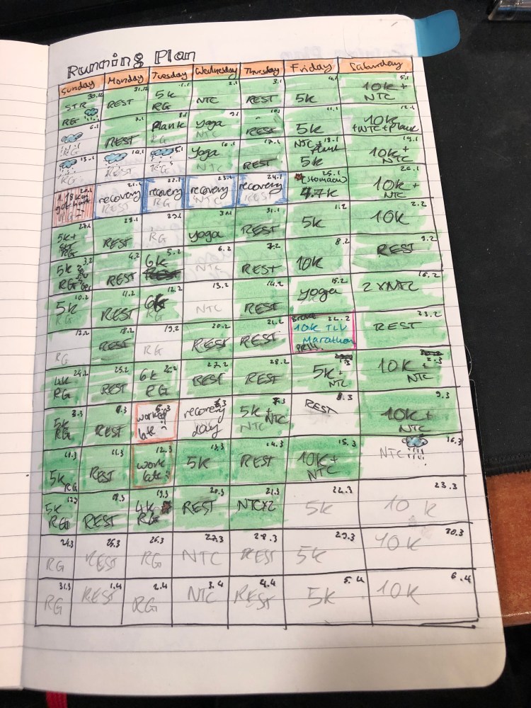
I make a fresh plan every three months or so, and I always create it in my current Moleskine journal. In the spirit of showcasing notebooks in use, that are not created for Instagram, this is my latest running plan:

Things are penciled in with an H pencil, and I ink them in with gel ink pens as they happen. Green highlighted blocks show me where things went according to plan, and other blocks represent where things had to change due to injuries or circumstances.

I’ve been running for 8 years now, and I have around 6 years of running plans in all my previous notebooks, each one looking pretty much the same: messy and functional.

Moleskine Wonder Woman Blue Notebook Review

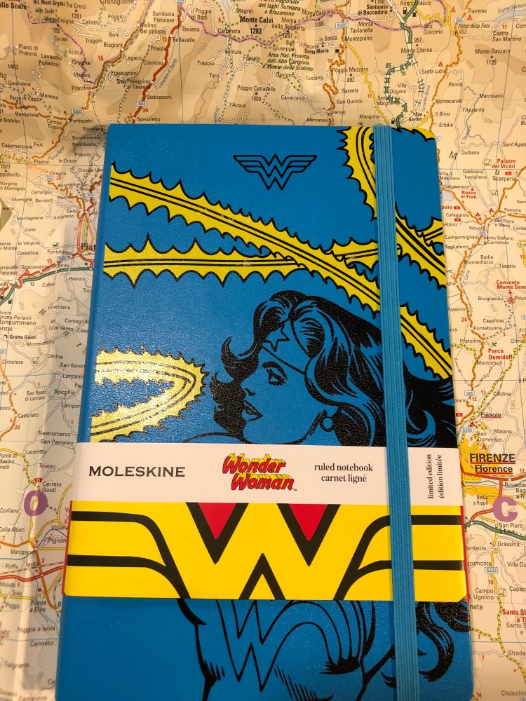
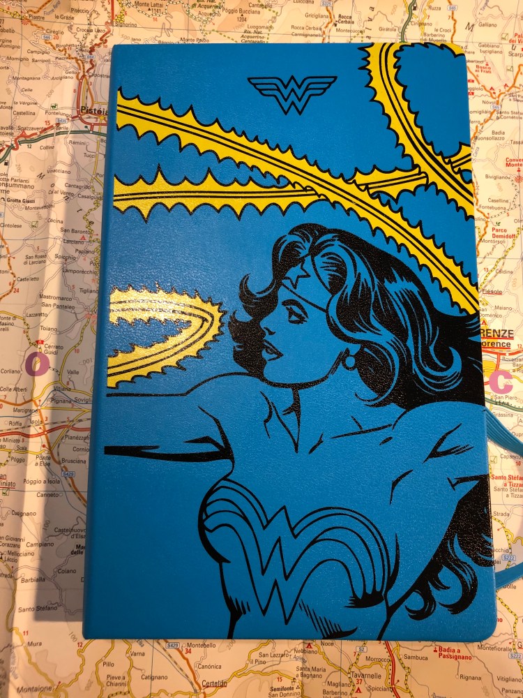
It’s the Moleskine of Truth! No, it’s actually just the Moleskine Wonder Woman Blue limited edition notebook. This is a brand new edition for Spring 2019, and there’s a red one too (expect a review later on).

The notebook with the wrapper on makes you think that there will be a red element on the cover, but the print on it is only in black and yellow on the blue background.

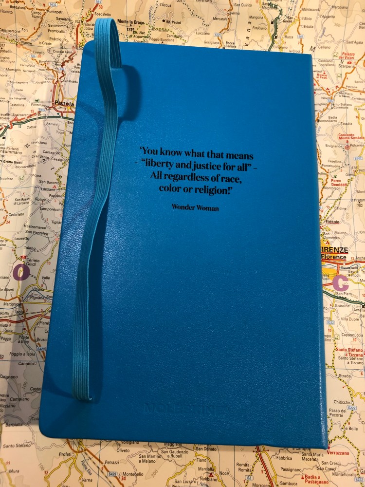
There’s a quote on the back of the notebook (there’s a different one on the red notebook), and it’s lovely. Go, Diana!

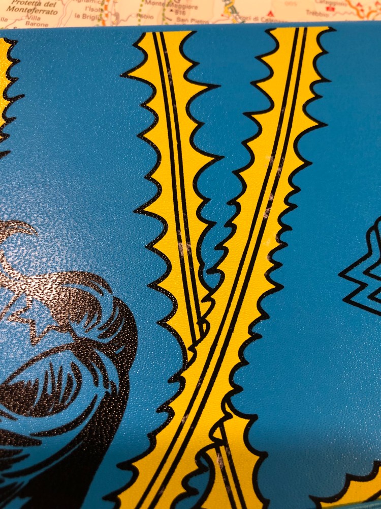
Now we come to the biggest issue I had with this notebook: it has some printing quality control issues. If you look closely you can see that on the yellow lasso print there are tiny bits of paper stuck to the cover. It feels as if there was a sticker there and someone removed it with bits left behind. They aren’t sticky and they are very easily removed with a wet wipe, but that’s not something I enjoy dealing with when unwrapping a brand new notebook. It’s only on the yellow parts of the print, so it is probably a leftover of the printing process, but it shouldn’t have slipped through.

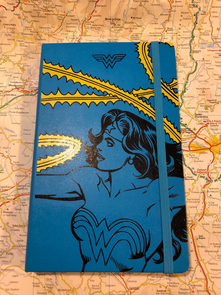
The front cover unwrapped:

I understand the design aesthetic here, but I don’t agree with it. It would have been nicer if it was black, yellow and red and it would have been even nicer if Diana (Wonder Woman) was in full colour. As it is, the lasso is more attention grabbing and vivid than she is, and it’s not the main point. This isn’t the “Lasso of Truth” limited edition notebook, is it?

Here’s the unwrapped back cover, which is a little plain compared to what Moleskine have done for Batman in past limited editions.

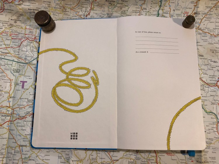
The front end paper plays with the lasso of truth design element, and again, I really wish that Diana was more represented in this edition. Maybe her doing her thing, or even a comic book page. She deserves the same excellent design that Moleskine made for Batman and Star Wars.

This is better! The back end page is where it is. You see Wonder woman using her lasso which… is mysteriously cut out mid back-pocket. What? Why? If only they hadn’t done that, or at least if it would have vanished into the pocket. It just looks weird here. I get that it disappears into the page so that it looks like she’s shutting the notebook’s cover, very clever and comic book-like, but take a step back and just look at the page layout. It’s… not good.

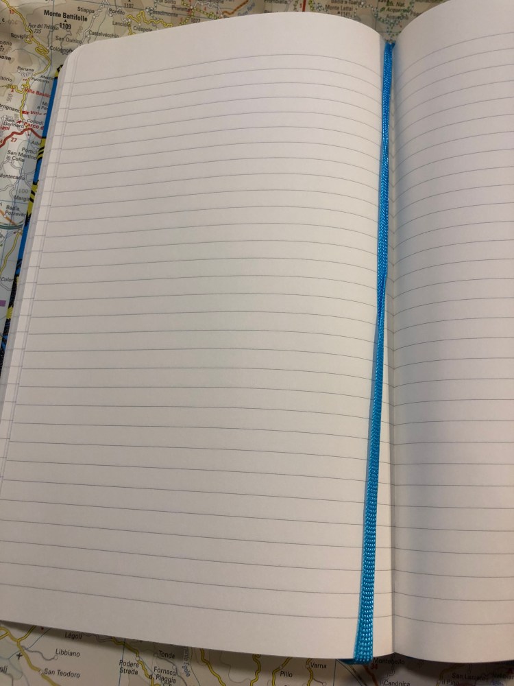
Inside are lined pages and a blue ribbon. The paper is the newer kind, so there’s no weird spidering, it’s good for gel ink pens, ballpoint, pencil, and certain fountain pens and inks (Noodler’s Black works with every fountain pen, all else needs testing, but generally speaking fine and extra fine nibs and inks that aren’t overly saturated or wet will work fine. The paper is thin, so there will be show through).

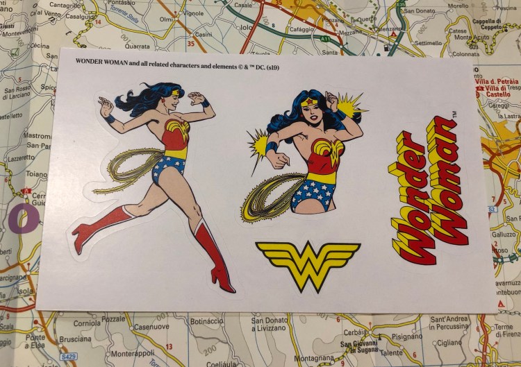
This edition comes with some nice stickers, and it would have been great if they would have been part of the cover or end paper design, but I’m not complaining, you’re complaining!

The best thing about this edition is the B-side of the wrapper, which explains what Wonder Woman’s stuff does. Of course the Lasso of Truth is there, it’s the Lasso of Truth edition, didn’t we already go over that?

The Wonder Woman fan in your life is probably going to love this edition, even though Moleksine can and does do better. It’s fun, it’s unusually colourful (most Moleskine limited editions feature black covers. They’re like Ford that way), and it will probably be on deeply discounted sale soon, so stock up then for gifting or as an everyday notebook.

Tournament of Books: Census

A few days ago I finished reading the tenth Tournament of Books 2019 book, Jesse Ball’s “Census“, which is running against Lydia Kiesling’s “The Golden State” in the fourth round of the competition.

Perhaps unfairly, but when I first saw “Census” I thought that it was going to be novel in the vein of Max Porter’s “Grief is a Thing With Feathers”. I blame the the cormorant on its cover and the published blurb about it for putting me in that frame of mind. It was very clear a few pages in that “Census” would not survive that comparison. Then again, so few books could.

“Census” is book with a very moving preface and some very moving photos at the end. In the middle is a featureless wasteland. It is populated by unnamed characters that function in an unnamed, ill defined world that is maybe desolate, where a peculiar census is conducted each year in which people are asked questions by a census taker who then marks them and posts their answers onwards. Nothing in this novel is given edges, well defined. Everything is wishy washy, vague, seen through thick, milky glass. But that preface… so you stick to it, and it helps that the book is short, though it has no plot to speak of and the setting is bleak and bland. The key to this novel is its characters then, and that’s not surprising because after all, you’ve read the preface and that’s what’s keeping you here.

And that’s the biggest frustration, because when Jesse Ball lets himself write good characters then by God the man knows how to write good characters. There’s a tiny vignette of a ex-fossil loving boy that’s so precise, so concise and so convincing that you want to howl that the rest of the novel isn’t like that. That the surgeon-father-protagonist isn’t like that. That the son, the whole reason for this novel, remains a shapeless mass with nothing making him hum – no distinct feature, tic, preference. That the wife is the best defined major character and even she is seen through thick fog. It’s never personal, emotional, realistic or if he’s really going for the absurdist (which is a poor stylistic choice for the subject matter IMHO) then it’s far from fully embracing that even.

What is feels like is that the writer took a subject that was too close to home, too painful, and tried to deal with it while not dealing with it at the same time. The result is a novel that does everything possible to make it difficult for you to feel anything for any of its characters, including empathy. It very easily lets you slip into the “oh this has nothing to do with me” mode, and from there to “none of these characters are likable, hate-able or even interesting, so why should I care” mode.

But then, the preface…

Vintage Faber Castell Sharpener

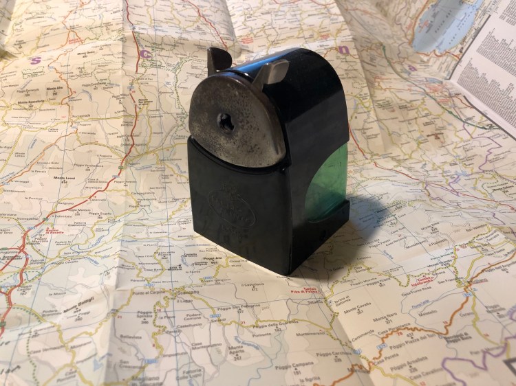
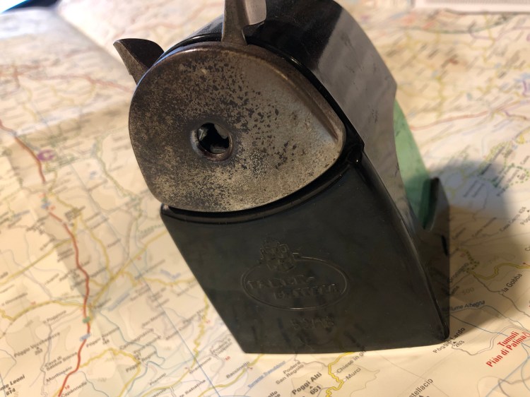
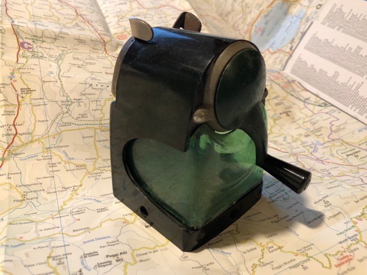
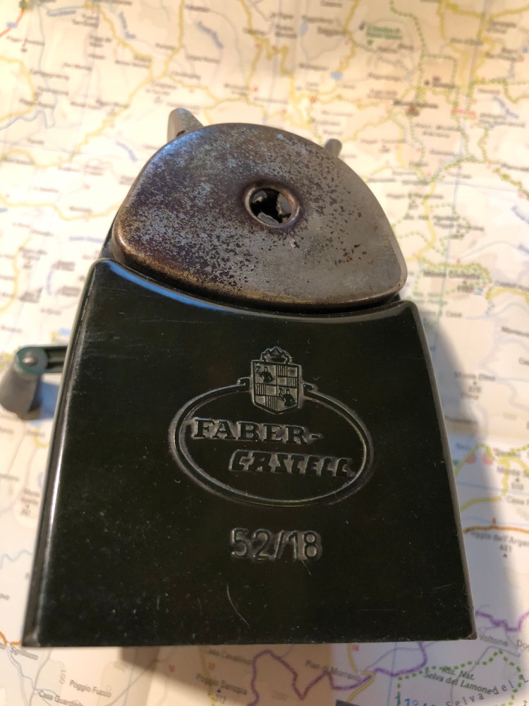
I found this beast in a dusty corner of my favourite vintage shop in Jaffa. It’s far from pristine, but it’s so overbuilt that it still works. The body is Bakelite and somehow still whole, and even the green shavings receptacle isn’t cracked. I haven’t been able to find anything about the Faber Castell 52/18 (except for an eBay listing that says that it’s rare), but I love the design enough to wish that they were still being made today. Something about that green cutout in the black body just works.

This Week’s Long Run: Evening Birds

Saturday was supposed to rain cats and dogs, so I pushed my Saturday morning 10K to a Friday evening one.

This is a terrible picture of a heron, but that’s what I have I’m afraid.

Momma Egyptian goose keeps an eye on her swimming little ones. Not pictured, the rat that was foraging for food a few meters from them.

Sea scouts out in their boats:

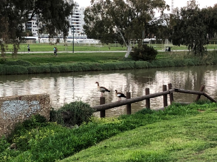
A pair of Egyptian geese watching over the river:

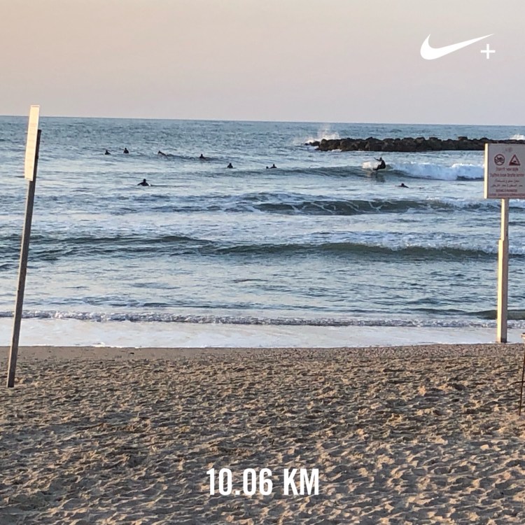
It was very windy, so the surfers were out in force: