When I received the Nock Co newsletter Brad Dowdy sent, letting people know that he was closing the company down, the first thing I did was rush to buy every case I could lay my hands on. After I had secured my order I let myself feel the full measure of regret that such a great company is soon going to be no longer.
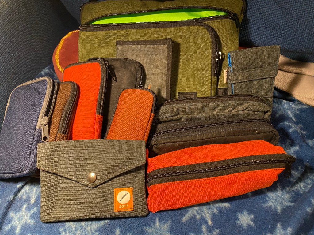
I use Nock Co cases a lot. This is just what I scrounged from a quick pass around the house:
Final Nockshot? A bevy of Nock Co cases.
The Nock Co website is still up and there’s still some stock left, so I thought this would be a good opportunity to write how I use some of my Nock Co cases, and recommend that you go get a case or two or more while they’re still around.
Sadly the Sinclair, my go to Urban Sketching case is out of stock at the moment. If it will be restocked or you find one in the secondary market I highly recommend it. Like all Nock Co cases it is built to last, and like all Nock Co cases it can hold much, much more than is advertised. My Sinclairs hold a slew of brush pens, fineliners, a mechanical pencil and an eraser, a waterbrush and a folded up piece of paper towel. I have several of these Urban Sketching kits deployed in several sketching bags, ready to go when I am.
The Tallulah is not sold out, and is also a must have case for Urban Sketchers. It holds a mini version of what my Sinclairs hold (again, it can hold so much more than the advertised two pens) and is compact enough for me to be able to toss it and a Stillman and Birn pocket alpha into my purse as an ultra portable urban sketching kit.
Got coloured pencils? Like sketching with woodcase pencils? The Chimneytop is for you. That’s where I keep my coloured pencils and their graphite counterparts. The design is simple but effective in that the middle zipper allows you a better view and access to the pencils you’ve placed inside.
The Brasstown is also sold out at the moment, but if it comes back in stock it’s a must have. This is where I keep the fountain pens and machined pens that I have in rotation. If they aren’t in a Sinclair, they are in a Brasstown. The Brasstown keeps them safe from scratches, and can hold even the widest barrelled pen. Like all the other cases, it can hold much more than advertised.
You really can’t go wrong with a Nock Co case, and I’m really going to miss them. The design, the material, the construction quality – there are many case makers out there but not many that get it so right all the time.
Cult Pens offered a paper box about a month ago. For £25 you got 3 notebooks, 2 sketchbooks, 1 fineliner, 1 marker, 4 pencils, 4 pens and a handful of Smile Clips. I don’t usually buy boxes of stationery (I especially avoid mystery boxes), but as I was interested in trying out the Moleskine Studio that was already part of the box, and as I was interested in most of the rest of the box’s contents, I decided to give it a try.
The box is no longer being offered, but if it was I’d suggest that Cult Pens would do better to pack the notebooks in an actual well-fitted box and not in a zip-lock bag that bumps around in a large box. The result is that the corner of the Moleskine Studio box was crushed, and one of the pads that came in the box was also damaged.
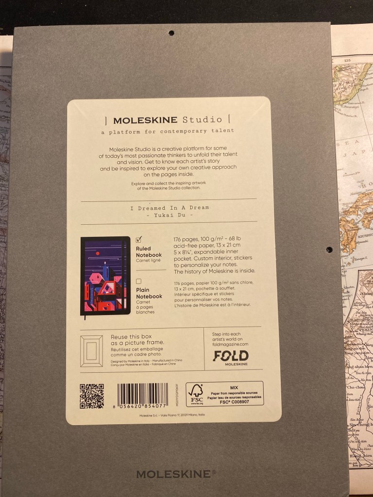
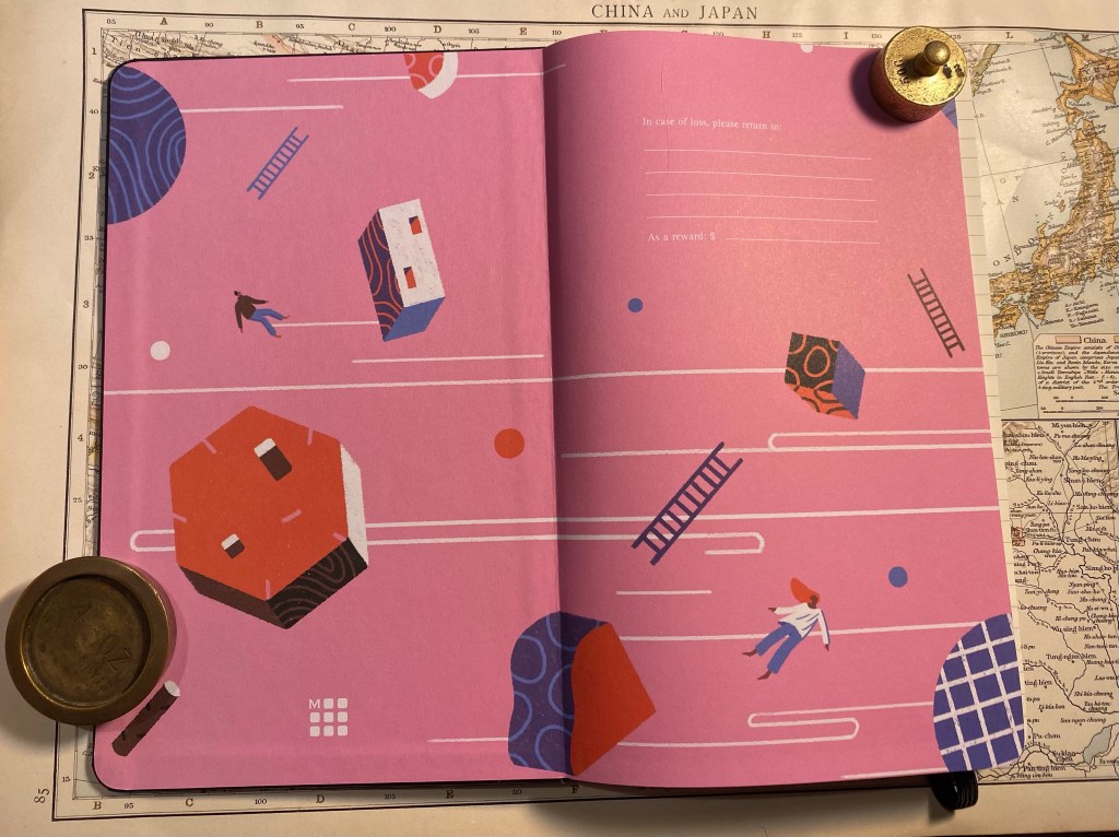
Now for the Moleskine Studio: this is a new offering from Moleskine, made in collaboration with six artists. Each artist’s artwork is featured on the front cover, on the end papers, on a sheet of themed stickers, and on the box the notebook comes in. The box serves as a frame for the artwork, allowing you to hang it if you wish. The notebooks are available in Plain or Ruled layouts, and, here’s the really interesting bit, contain 100 gsm ivory coloured paper.
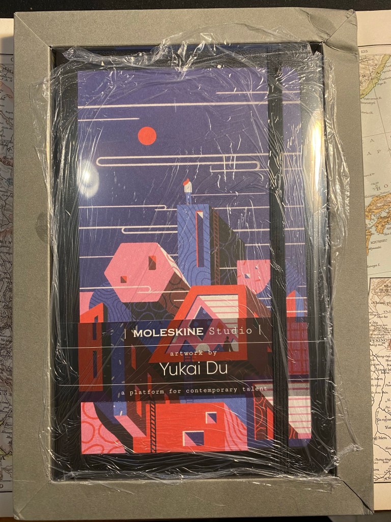
Here’s the box as I received it:
Crushed corner, weird cling film wrapping – there’s a lot going on here
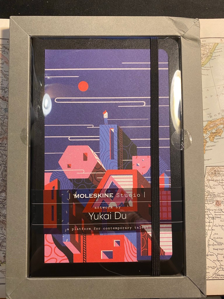
So the notebook’s box/frame came with a crushed top right corner, which is unfortunate. The notebook itself was covered with cling film, a form of packaging I’ve never seen come from Moleskine before, and a plastic cover that was attached to the box/frame. While the frame is designed to be reusable, I’ve purchased another Moleskine Studio that came completely without it, and I have a feeling that there’s very little chance for the frame to survive shipping without being mangled. As it is, I feel that there’s way too much packaging here.
Box frame, notebook, and plastic cover.
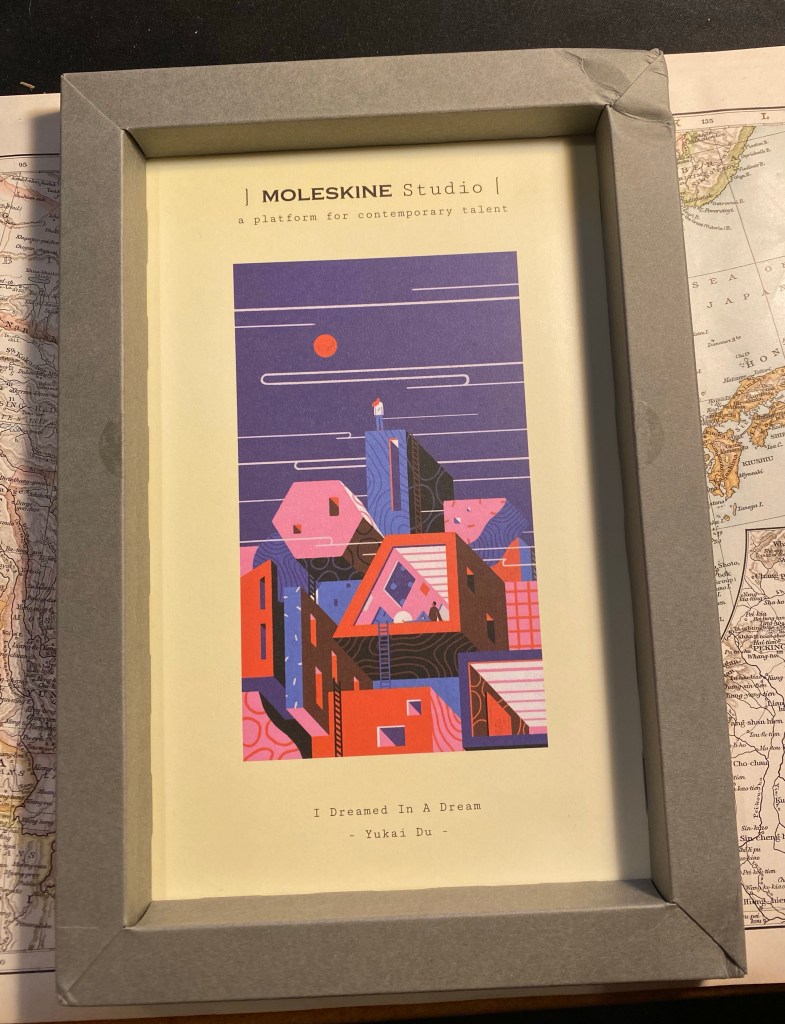
The frame with the artwork inside:
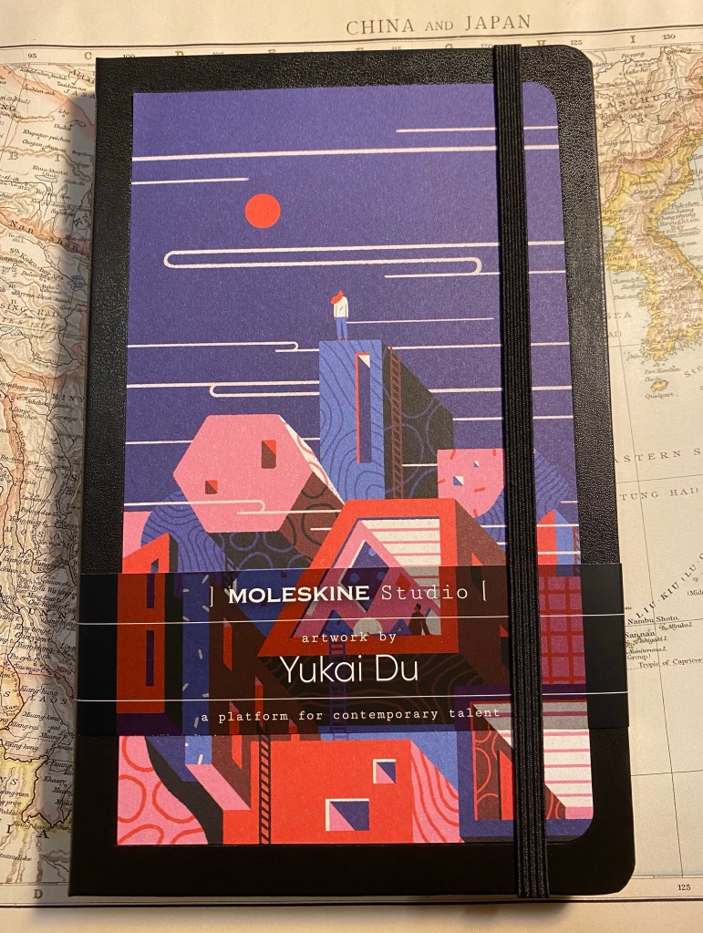
Yukai Du’s “I Dreamed In A Dream”
The flip side of the frame. You can see that there are holes for hanging the frame, as well as information about the paper in the notebook (gasp!). I wish Moleskine would print this info on every notebook they sell.
The back of the frame box.
Here’s the notebook, and here’s where I start having more serious reservations about Moleskine’s manufacturing choices regarding this lineup. The artwork isn’t printed on the notebook cover, it’s glued onto it. I have a feeling that the glue isn’t going to last long, and in general it just cheapens an otherwise premium notebook experience.
Front cover (with paper wrap still on)
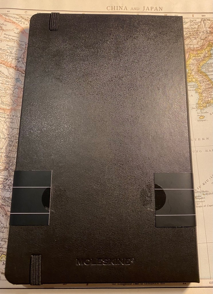
The back cover is a bit weird in that the paper wrap doesn’t reach all the way around and is just stuck to the cover with two stickers. The stickers are easy to remove and don’t leave any residue, but it’s the only Moleskine I’ve seen with this setup and I can’t help but wonder why.
Back cover.
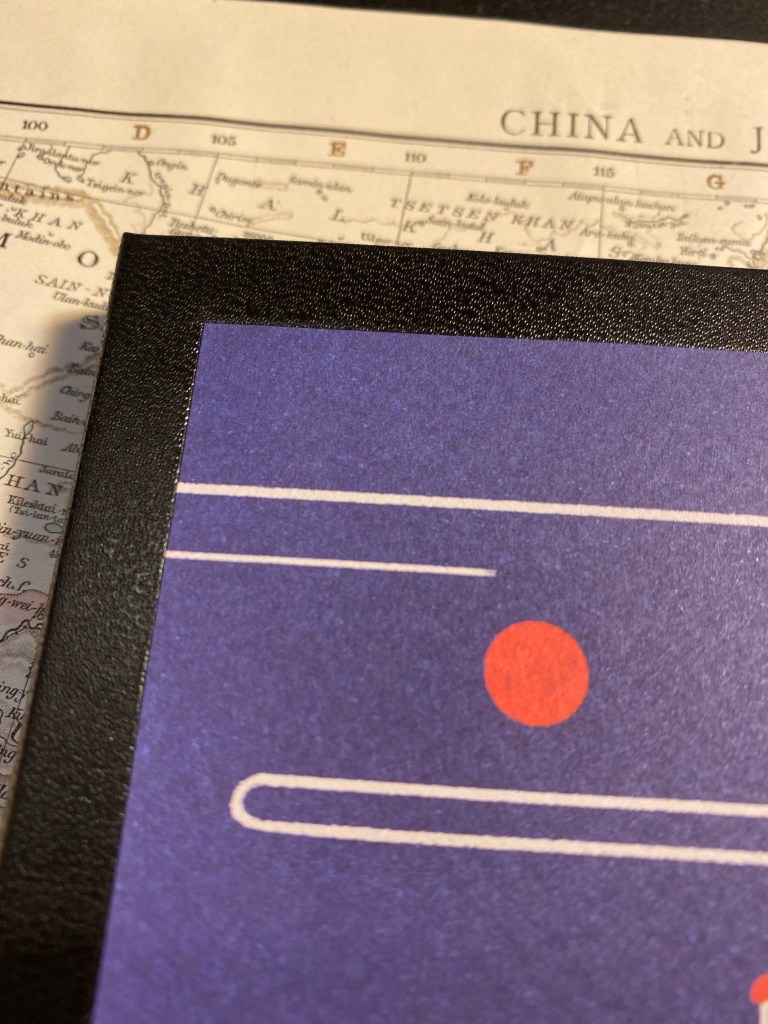
Here’s a closeup to the glued artwork on the cover. I’m also a little disappointed that the artwork hasn’t been signed by the artist, Yukai Du.
Closeup on the glued corner of the artwork.
Inside the front covers is more of Yukai Du’s work, and it’s wonderful. This is where Moleskine shines, and I wish these artists could have had their work properly printed or even embossed on the covers of a Moleskine. They deserve it.
Inside the front cover, with “In case of loss”.
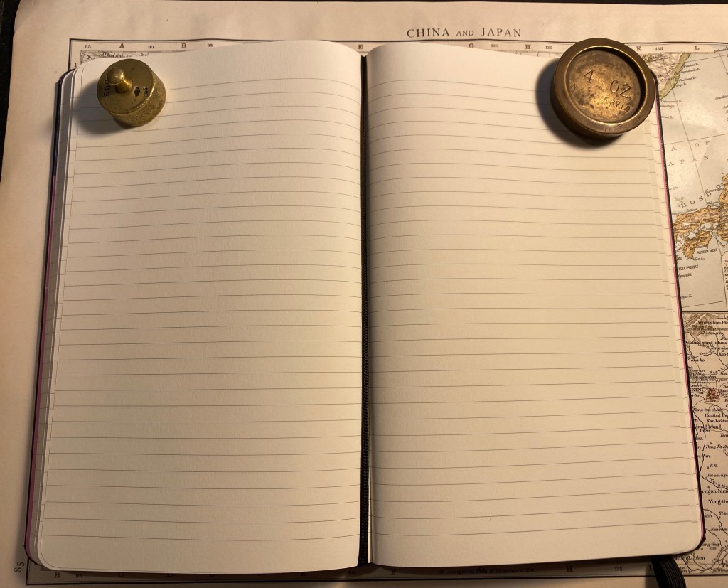
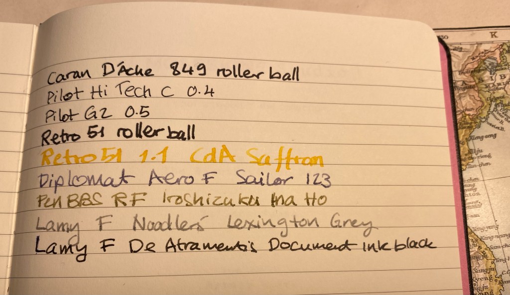
The paper is very good (not your standard Moleskine affair, which has its particularities). Ivory coloured, 100 gsm, not glass smooth but not textured, and it lays flat. There’s some writing samples ahead, but spoiler alert, yes it’s fountain pen friendly. There’s also the famous ribbon bookmark, which I wish was pink but in this case is black.
Paper and bookmark.
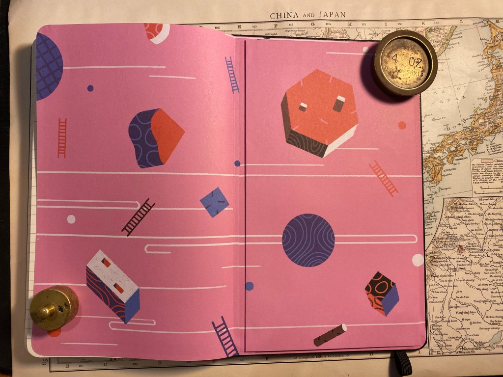
The back cover end papers feature more of Yukai Du’s artwork, perfectly aligned on the back pocket.
Inside the back cover.
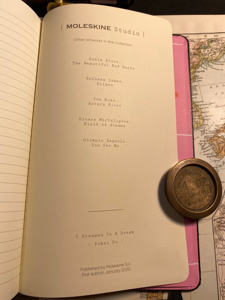
On the last page in the notebook, usually left blank, Moleskine has featured more information about the Moleskine Studio edition. In their marketing they’re calling this a new platform for collaboration with artists, and this page makes me think that this is going to be an ongoing project for them. I hope that they do continue with these, as the overall result is very good.
The last page.
Here’s the sticker page that comes with this edition. Again, very well made:
Sticker page.
Finally, the paper. I was hoping that this is going to be a fountain pen friendly Moleskine and it is. There’s no feathering, no spreading, no bleed through and very little show through with this paper (there’s more show through with the rollerballs than with the fountain pens). Your milage may vary, but I am very happy with this paper, and a Moleskine Studio is going to be my next journalling notebook.
Ink test.
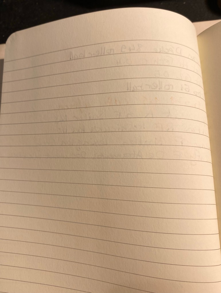
The reverse side of the page:
The reverse side of the page.
Overall, the Moleskine Studio is a strong new offering from Moleskine, one that really plays to their design strengths. It’s not perfect, but I hope to see them iterate and improve on it with time, and I hope that many artists get to have their artwork featured on an iconic notebook.
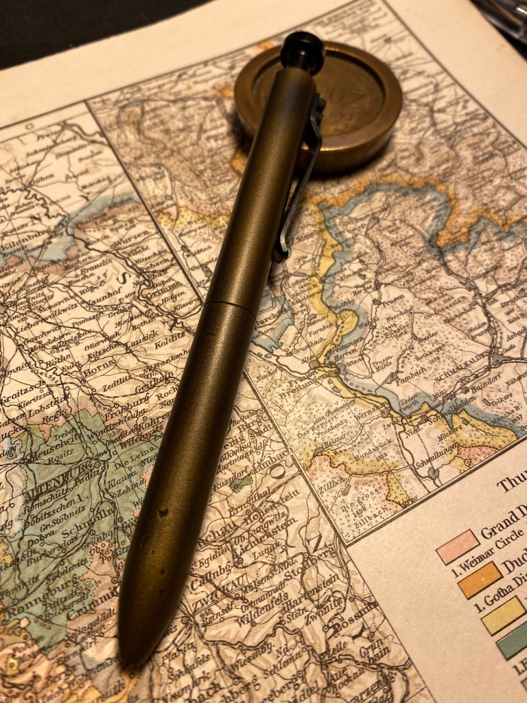
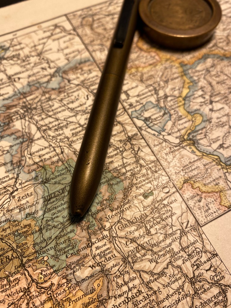
I wasn’t planning on reviewing the Karas Kustoms Steampunk Bolt V2 pen because I was sure that it would be sold out by the time I got to it. Somehow, however, there appear to be a few still on sale on the Karas Kustoms site.
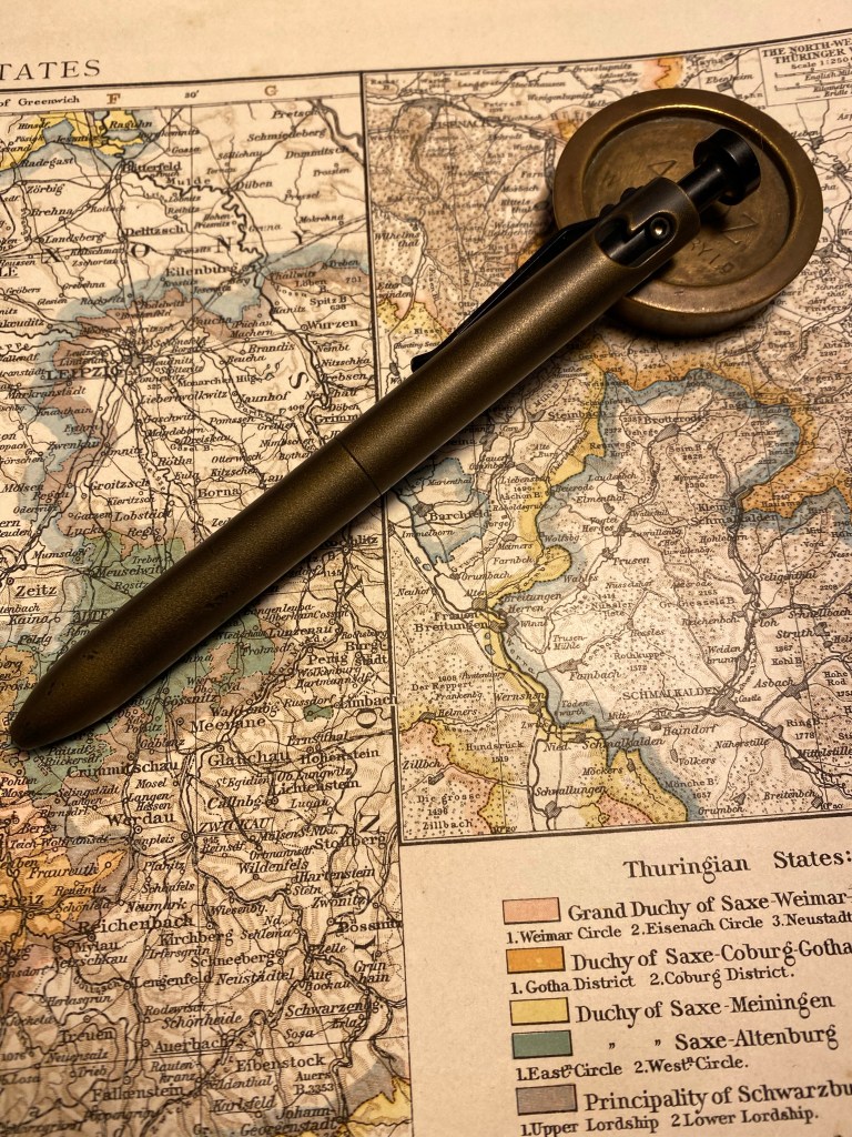
Dinges and Cerakote finish work together to create a really unique pen.
The Steampunk Bolt v2 has the same aluminium body and shape as the anodised Bolt V2, but it’s gotten a distressed bronze treatment in Cerakote. The basic Bolt pen has been dinged before the Cerakote finish has been applied, and the result is fantastic. The pen really earns the “Steampunk” title.
Big dent in the end of the pen, smoothed over and covered with bronze coloured Cerakote.
The Cerakote finish is smooth but not slippery, and really fantastic to hold. It’s also nothing like any other Cerakote finished pen that I’ve seen so far: it really gives the pen a bronze look without the bronze weight or smell. The pen is light (for a machined pen – don’t compare it to plastic), and well balanced. The black anodised bolt mechanism is as smooth to engage as ever, and works well with this finish.
Every ding adds to this pen’s looks. It’s just going to look better with time, I think.
There are two caveats to take into account with this pen (and other Karas Kustoms Bolt V2 pens):
The pen comes with a Pilot G2 LG (as in large) 0.5 refill. I haven’t been able to customise it to work with my beloved Uni-Ball UMR-85 refills (the bolt won’t engage). It’s a decent enough refill, but I wish that it had been built around the standard G2, and so had more customisation options.
There is a slight amount of play in the tip which makes it faintly click at times when you write.
All in all this is a very good machined bolt action pen, with a fantastic and very unique finish.
I last posted about my planner and to do list setup here. To recap, my planning system includes two large Moleskine hard cover squared notebooks, one in which I plan my week, and one in which I use as a daily to do planner. I started using this setup once Covid hit and I started working from home. It worked very well for a year and a half.
I was hospitalized for a month, in which I discovered that I have zero control over my time or how my day will shape out. When I got out I was already on a Chemo regiment. I had to make adjustments to my life, this time because of my personal health, not a global pandemic.
Score (another) one for self-made planners.
My old system was generic enough that it fit into my new lifestyle with very little adjustment. The weekly notebook stayed mostly the same, as you can see below. The main difference is that I manage less stuff there and more using reminders in Fantastical. It’s not that I don’t like paper planners any more, it’s just that Chemo Brain is a possible side effect of my treatment and I don’t want to risk not getting something important done because I forgot to check my weekly planner at the right moment, or I saw something there but didn’t remember it after I’ve seen it.
So why keep the weekly planner at all? Because it helps me see how the week is shaping up, and because it allows me to do a little long term planning, despite everything. All my plans at the moment are in two week batches (dictated by my chemo regiment), and this layout allows me to manage them.
Another addition to this notebook is a few tracker pages, marked by tabs. Some track purchases that I’m waiting for, some track bureaucracies that I need to take care of, others list things that I want to get done eventually but I haven’t decided yet when or how.
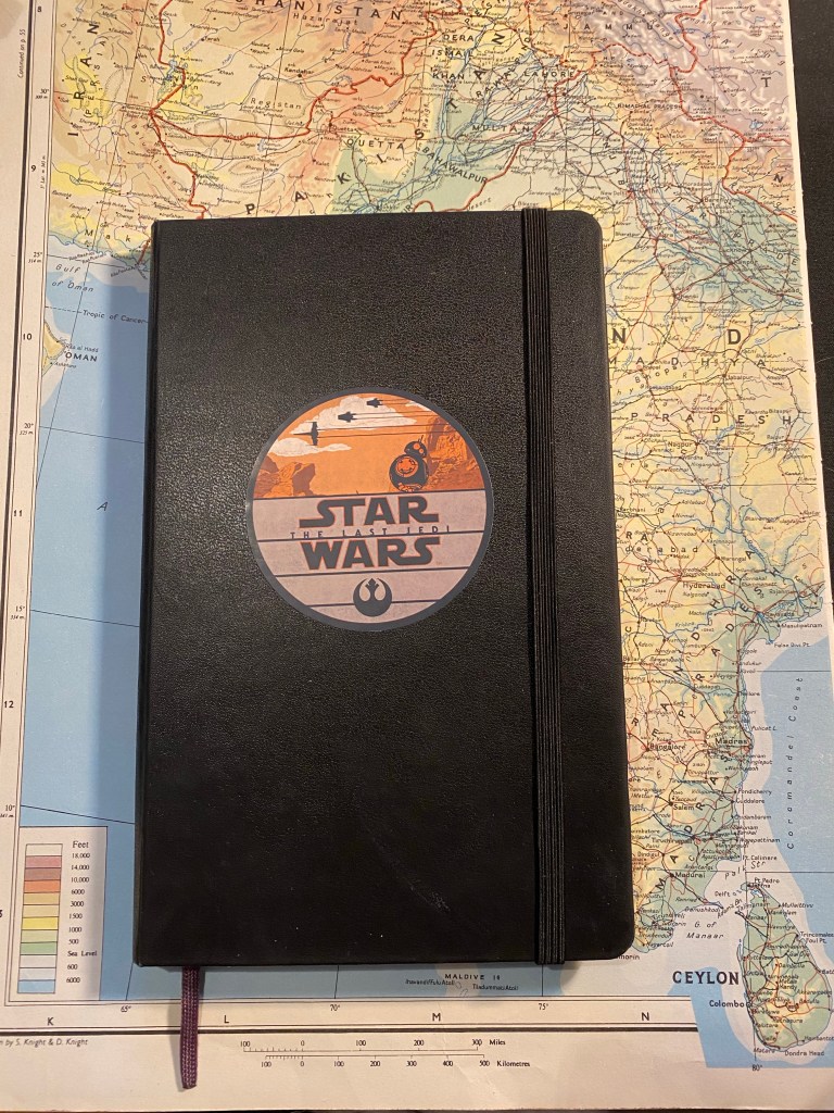
As for my daily planner notebook, I just finished one and started another. Here’s the finished notebook:
Moleskine Large Hardcover squared with a Star Wars The Last Jedi decal on the cover.
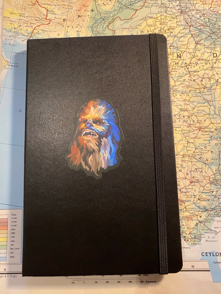
Here’s the new notebook. I love using these decals to make these notebooks my own:
Moleskine Large Hardcover squared with a Star Wars Chewbacca decal on the cover.
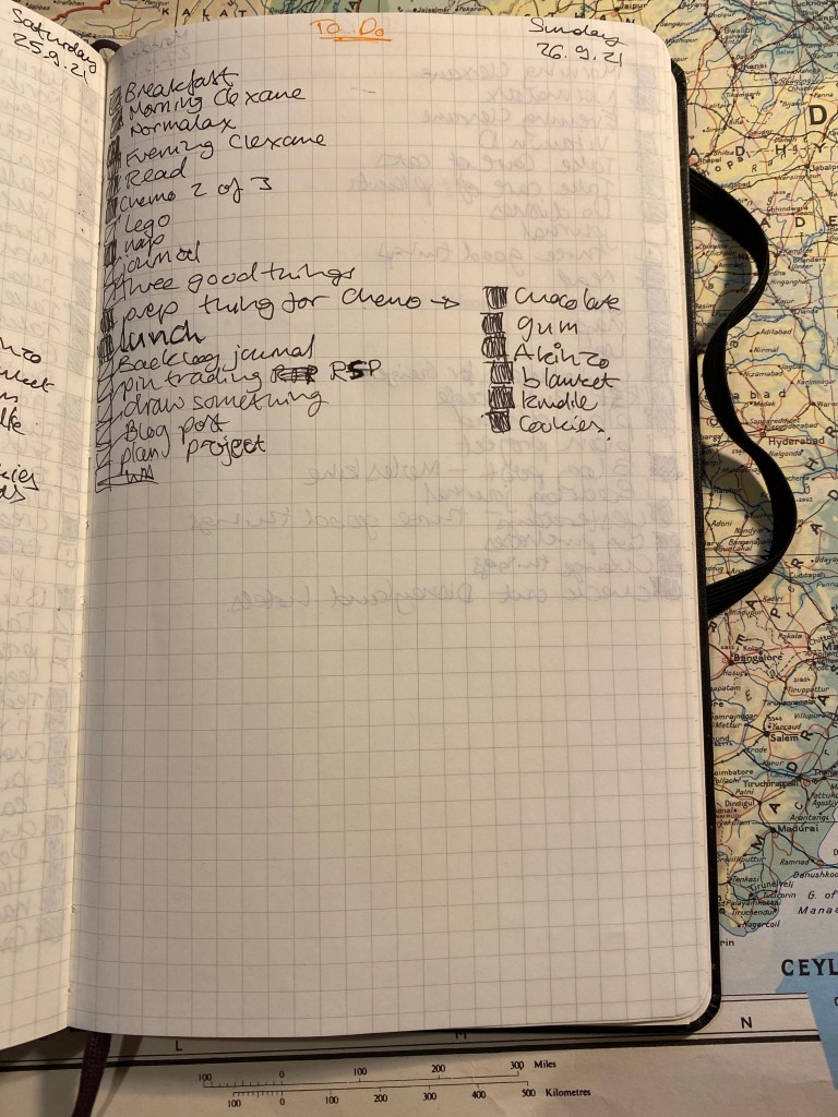
I used to manage every day on a full spread, with personal to dos on one side of the page and professional ones on a another. Since my life is less busy now than it used to be, I’ve downsized my to do to one page per day, with personal and professional mixed in (I work from home). This is a sample of my least busiest day: it’s a chemo day and I wasn’t planning on working after this treatment since it was a long one. Door to door I was in the hospital from 6:40 to 14:00, and completely wiped out after it. I don’t usually list my meals or naps in my notebook, but chemo days are so crazy (in terms of what my brain does on steroids) that I have to write everything down. Things that I didn’t do get a strike in them and are moved forward to another day.
Everybody has different needs from their planner, and those needs oftentimes change unexpectedly, and out of sync with “planner season”. It’s one of the reasons why I find making your own planner, working just a few days or a week or two ahead is the best and most consistent way for me to manage my time. There are some great planning systems out there, but if you’ve struggled with using them, or if your circumstances make you need a very flexible system, I highly recommend picking up a squared or lined notebook and creating your own.
I’ve been trying to draw better foliage, which made me want to investigate the various greens I can mix from my current palette. So for the first time I dedicated time and a few sketchbook pages to experiment with green watercolour mixes. I thought that the process would be tedious and boring, but it ended up being very interesting. Mixes that looked like mud on the palette came to life on the page. I discovered a whole host of green hues that I had no idea that I had access to. And once again I fell in love with Schmincke’s Glacier Green.
Note: DS stands for Daniel Smith and Sch for Schmincke. The paper is Stillman and Birn Alpha.