Retro 51 Blue Acrylic Tornado

The Retro 51 Blue Acrylic is the last Retro 51 that I have yet to review as part of my Retro 51 challenge (minus the Retro 51 Flower and Retro 51 Coffee which are quarantined in my office). I bought this pen years ago in the Latin Quarter in Paris, in a little store on Boulevard Saint-Michel. The store had a few Retro 51 tornados in their dusty window display, and after some hemming and hawing I went in and asked about the pens. The proprietor had no idea what I wanted to buy from, but after some pointing he brought out his Retro 51 tray. The moment I saw this pen, I knew that I had to have it:

Is it not pretty?

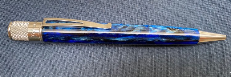
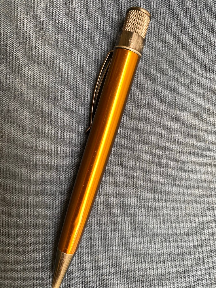
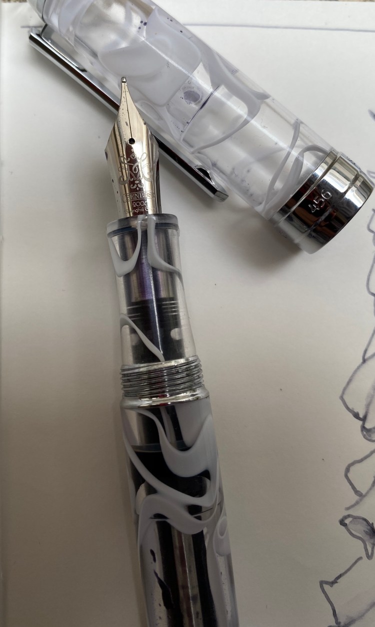
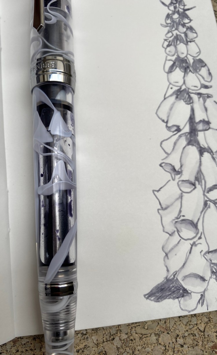
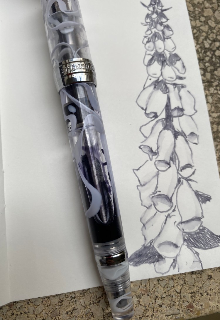
The Retro 51 Blue Acrylic features chatoyant acrylic swirls in blue and navy, and it’s somewhat transparent, which means that you can see glints of the metal refill tube below the material. Like the Pelikan M800 Ocean Swirl there’s a dark side to the material, and a light side.

The dark side of the pen.

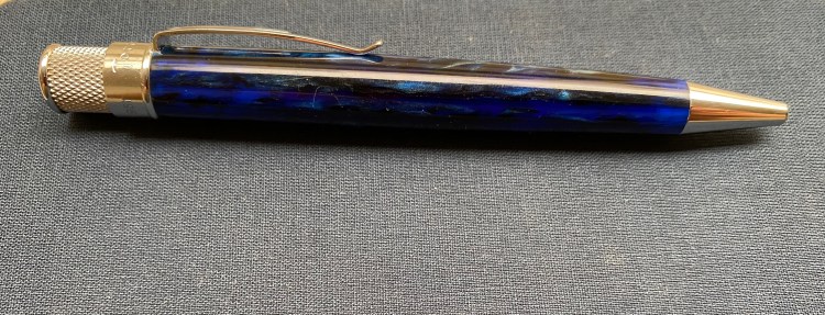
The hardware is chrome, and so very bright. This works well with the overall colour scheme. The acrylic body does pick up lint in a way that Retro 51’s metal-bodied pens do not.  I’m not sure this would make for a good pocket carry pen because of that.

Between light and dark.

Weight wise it doesn’t feel significantly lighter than Retro 51’s metal-bodied pens. If that’s you’re draw to this pen, then you’ll be disappointed. But how can you be disappointed in a pen that looks like this?

Look at that!

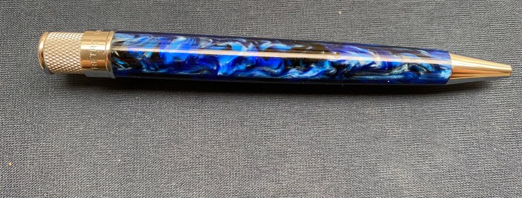
The finial features a dark navy blue, almost black, disc. I kind of wish that Retro 51 had made the finial out of the swirly acrylic material, but I guess that would have hiked up the price significantly.

The finial/top disc.

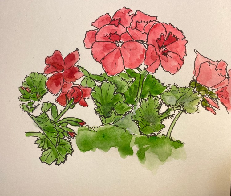
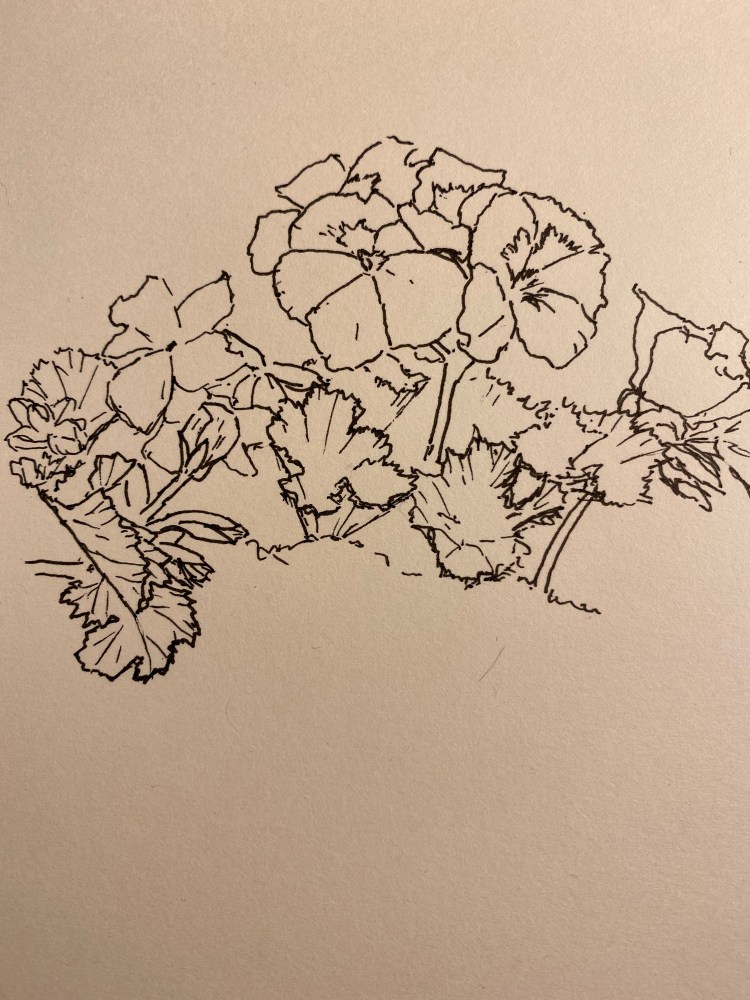
I changed out the refill for my favourite Ohto FlashDry refill, mostly because the old refill dried out. I used to use the semi-dried out old Schmidt refill for sketching, as it was pretty perfect for that.

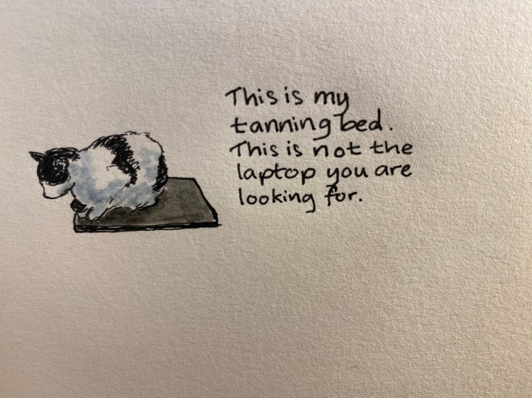
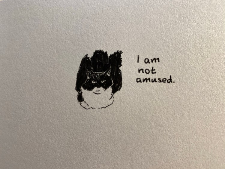
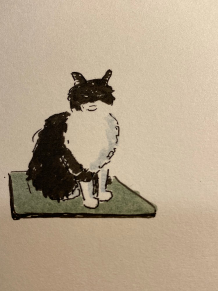
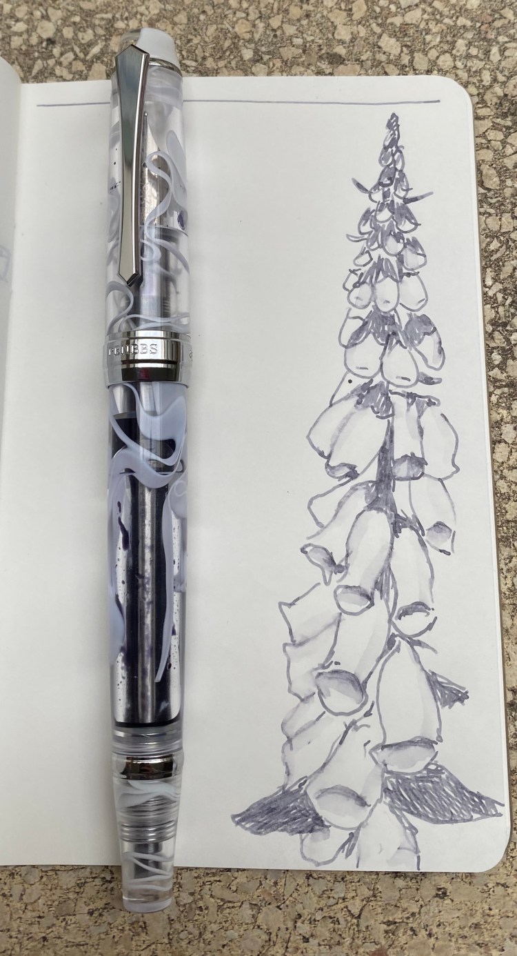
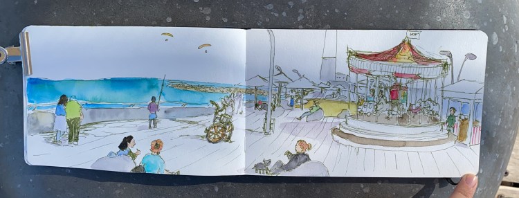
The above drawing was drawn with the Retro 51 Blue Acrylic and the Ohto FlashDry 0.5 gel ink refill, plus some Faber-Castell PITT brush pens. My parents’ cats have ideas about my dad’s laptop that don’t coincide with his.

If you stumble upon one of these Retro 51 Acrylic Tornado pens, snap them up. They’re gorgeous, and life is too short to carry an ugly pen.

Retro 51 Pen Addict

The quarantine distracted me from reviewing the two final Retro 51 pens that I have on hand (the Coffee and Flower edition are regrettable locked away at work), and the first of these two is the original Retro 51 Pen Addict limited edition tornado.

The Pen Addict Retro 51 was the first pen that Brad Dowdy had made for his shop, and it embodies both the Pen Addict aesthetic and the Retro 51 motto: “Life is too short to carry an ugly pen”.

The ding near the tip is my fault. There’s no chip off the pen and you hardly notice it, but it’s still there.

This is not an ugly pen. Orange isn’t my favourite colour, but it totally works on this pen, both because of the specific metallic orange hue used here, and because of the dark hardware. The Pen Addict Retro 51 just glows:


img_4661

It also is a numbered edition (I have number 77) and has one of the best Retro 51 top discs/finials: the Pen Addict logo.

The Pen Addict logo finial.

This is one of the few Retro 51s that I own that still have the Schmidt refill installed. I’m not a fan of this refill, but there are times when I’m looking for big, bold lines and it just fits the spot. This is the first time I used it for drawing:

My brother’s cat has opinions.


The Retro 51 Pen Addict original limited edition is still a great, classic Retro 51 tornado design. It’s no longer offered for sale on the Pen Addict shop, but if you find it reasonably priced on the secondary market, it’s totally worth buying.

Cat Tales

I’m in the process of testing out a set of Uni-ball Pin fineliners and I thought that I’d share a few test runs with the pens. The linework is done with the Ubi-ball Pin fineliners (0.1, 0.3 and 0.5 in black and grey) and the rest is with Deleter Neopiko-Line-3 pens (2.0 and a brush pen) and Faber-Castell Pitt brush pens.

My parents’ cats are very expressive and fun to draw. The cat above is super mellow, and the cat below is gorgeous but not happy to see you.

Creative Draw: Koh-I-Noor Magic pencil, TWSBI JR Pagoda 0.7 and Pilot Juice Up 0.4

Things have been tough lately and I haven’t been in the mood to draw anything, write anything, post anything. So I decided to make myself create something, as silly and small as it could turn out to be, just to see if I can draw myself out of the funk.

I dug into my largest art and stationery supply drawer, and picked out three random items: a Koh-I-Noor Magic pencil, a TWSBI Jr Pagoda 0.7 mechanical pencil, and a Pilot Juice Up 0.4 in blue ink. Nothing good could come out of this random draw, I thought to myself, but I’ll draw something anyway:

The Koh-I-Noor Magic pencil comes in many varieties, some of the actually pragmatic. This Magic pencil is just ridiculous. It’s a giant, glittery, neon mess that makes me smile.

The TWSBI Jr Pagoda is a solid mechanical pencil, but in the battle against the Uni-ball Kuru Toga or any kind of drafting pencil it is always going to lose. I enjoyed using this underdog, and I think that design-wise it’s a very good mechanical pencil.

The Pilot Juice Up is excellent, and Pilot should replace all of its Hi-Tec-C pens with this refill (and perhaps even with this design). The refill gives Uni-ball gel refills a run for their money, and the barrel design is both sleek and ergonomic. This is a phenomenal pen that I really need to use more.

This turned out to be a fun exercise in creativity, and it made me smile for a bit. Will I do it again? Perhaps, perhaps, perhaps.

Field Notes In and Out: National Parks

Out: Field Notes National Parks Mount Rainier (the last of series B that I’ve been using).

In: Field Notes National Parks Grand Teton (the first of series D to be put to use).

National Parks is my favourite Field Notes edition since Two Rivers. I’ve bought additional packs of series B and series C, beyond what I received with my subscription. I highly recommend splurging on a pack or two of these pocket notebooks.

PenBBS 456 Smog RM and Pilot Iroshizuku Fuyu-Syogun

I ordered the PenBBS 456 Vacuum Filling Smog 54 RM at the same time I ordered the PenBBS 500, because I was intrigued by the filling system, and I wanted a PenBBS 500 with the Smog design but there weren’t any available. I was expecting to like the PenBBS 500 more because from the pictures it seems to have a more classic design, but the PenBBS 456 is the perfect example of how pen pictures often misleading.

The 456 is a much sleeker pen than its chubby 500 counterpart. There’s also significantly less hardware on the 456, which makes it both lighter and better looking. Massive chrome details on fountain pens just seem to cheaper their look in my eyes. If the cap band had been about half the size then the 456’s design would be better, but as it is it’s not a pen that I’d be ashamed to carry, and it looks more expensive than it actually is.

The steel nib on this is a medium, and it writes at about a 0.7mm line, as described. The nib design itself is elegant and clever, with a calligraphy “M” designating its width. The nib itself is smooth with some feedback, and has little or no give.

I purposefully filled this pen only about a third of the way up once I realized what a massive ink capacity it has. The filling mechanism is somewhat elaborate, like all vacuum fillers, but it works, and unlike the end-cap on the PenBBS 500, the PenBBS 456’s end-cap doesn’t twist off unintentionally.

The smog material is really beautiful, and it’s a way to get some of that Visconti vacuum-filler, London Fog feel without breaking the bank. This pen proves that you don’t have to pay hundreds and hundreds of dollars to have a nice pen that you enjoy writing with.

Some more closeups on the overly large cap band (if only it had ended on the line below the “Shanghai”) and the lovely smog material. You can also see the filling mechanism clearly:

The material looks even better when the pen is filled up with ink, but I just wasn’t willing to dump out so much ink, and I knew that I would be forced to do that if I topped the pen up:

Pilot Iroshizuku Fuyu Syogun was one of the first Pilot Iroshizuku inks that I splurged on. It shades beautifully, and is a lovely cool (i.e. bluish) grey that is utterly not waterproof, and so can be “stretched” and reworked as you can see in the small sketch that I did:

This was drawn on Tomoe River paper, but you’ll see shading on Rhodia and Clairefontaine paper as well. Of all the grey inks I own, this one is still my favourite. It’s dark enough to be readable (and appropriate for office use), and offers a lot of interest and drawing potential with its shading.

Like all pens that aren’t cartridge converters, cleaning this pen out will take a bit of effort, and vacuum filling pens are more difficult to clean out than piston fillers or lever fillers (only button fillers are worse IMHO). It just means that you’ll need to have patience when filling and cleaning this pen out, and that you probably shouldn’t put shimmering inks or inks that are difficult to clean out (or stain the pen body) in a pen like this. Then again, the pen costs $32, so if worst comes to worst, you haven’t ruined an expensive pen.

I wish that PenBBS would pick a naming convention that is easier to remember than the one it is currently using. But other than that and the not great cap band, for double the price the PenBBS would still be a great buy.

One month in

PenBBS 456 Vacuum filler Smog RM nib with Pilot Iroshizuku Fuyu-Syogun on Rhodia dot pad.

Diamine Inkvent Blue Edition

Diamine came out with the very successful Inkvent advent calendar last year, and now they are bringing out all of the inks in the calendar in a special “Blue Edition” box and bottle. Cult Pens had them first in stock, and had a nice 10% discount on them, so I decided to splurge on some ink bottles (after not buying any for years).

The Inkvent Blue Edition boxes evoke the beautiful design of the Inkvent calendar, which makes them great gift inks to give. Everything about the boxes, the labels and the bottles is of the highest quality, and is well thought out. These are pretty enough to keep on your desk, whether they are in their blue box or not.

The bottles themselves, of course, are the main design event. They are glass bottles with thick legs, and an ingenious design. They look gorgeous, but they’re also very practical. The cap is large enough to allow the widest nibs in, and the actual part of the bottle that holds the ink is built so that there won’t be any awkward corners that your pen can’t get into. The bottles are tall enough to allow for larger pens to be filled with ease.

Did I mention that they look stunning?

You can see the design of the legs and the ink reservoir here:

The bottles of shimmer ink (and shimmer and sheen ink) come with this handy little insert:

The bottles of sheen ink come with this insert:

This is more proof of the amount of thought that went into designing this edition. I don’t know if Diamine planned on issuing the Blue Edition ahead of time or only once it saw the success of its Inkvent calendar, but either way, this isn’t some hastily dashed out ink edition.

When it came to selecting the inks that I wanted to buy, I ended up surprising myself with my selection. I expected to buy the Solstice, but I ended up buying theBlue Peppermint instead. I love turquoise inks, and I don’t yet have one that shades and shimmers. I never thought that I’d buy Candy Cane, but not only did I buy it (I wanted something to brighten up my life a bit right now), but it’s the first ink that I used in the set.

Holly was also not an obvious choice, but it’s an interesting ink and I don’t have many green inks on hand.  Seasons Greetings was wild enough and unique enough for me to add it first to my cart. Nutcracker is here because I think that it will be a great (albeit not waterproof) drawing ink.

If money and space weren’t an issue, I’d probably add Solstice, Snow Storm, and Polar Glow to my shopping cart. Maybe I will, in the future. For now I’m tremendously happy with the Diamine Blue Edition inks that I bought, and if you’re looking for a small pick me up or an inexpensive gift for the pen addict in your life, I highly recommend these.

Happy Passover!

It’s a weird one, but the flowers are still blooming and there’s still hope in the world. Try to stay happy and healthy, even if it means staying away from your family this holiday (as I am).

Here’s the drawing before I applied watercolour to it. Feel free to print it out for your personal use, and colour it yourself.

Tel Aviv Port: Memories of Better Days

I drew this during an Urban Sketchers sketchwalk to the Tel Aviv port, but I never posted it online because life got in the way.

Here’s hoping better days return soon.