January 2026’s Currently Inked Fountain Pens
It’s been a while since I’ve posted one of these, mostly because through November I was still working through the Pelikan Hubs pens and then December was Inkvent time. However, I have just cleaned out all of my fountain pens and started out with a fresh batch for the new year. Here’s the lineup for January, and it’s mostly dedicated to new pens with interesting inks.
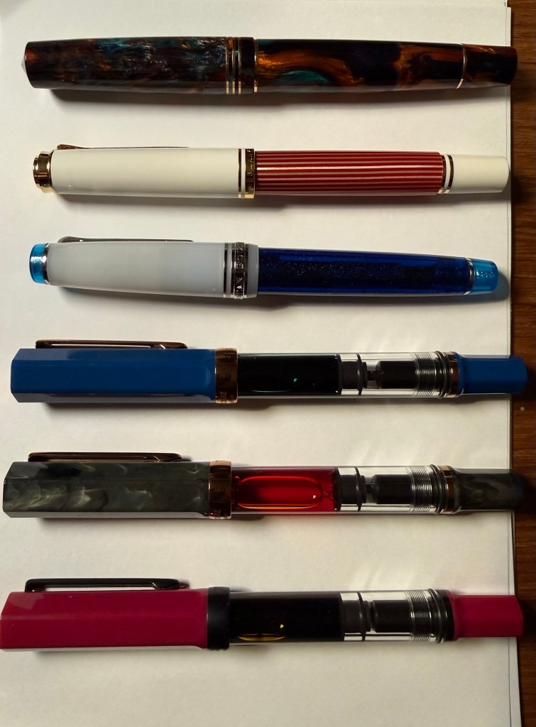
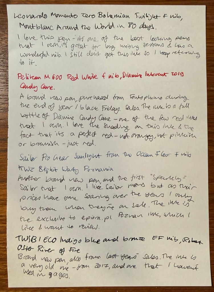
- Leonardo Momento Zero Bohemian Twilight fine nib inked with Montblanc Around the World in 80 Days. I love this pen so much – the minute I saw it as I was stowing away my cleaned out pens I realised that I have to ink it again. It hasn’t been far from rotation from the minute I purchased it, because it’s a gorgeous pen with a wonderful nib that is comfortable for long writing sessions. The ink is beguiling – ever since I realised that it isn’t the mustard green that I was expecting I keep trying to figure it out. It’s on the spectrum between dark grey and blue-black, and there’s something about weirdly undefinable inks that appeals to me.
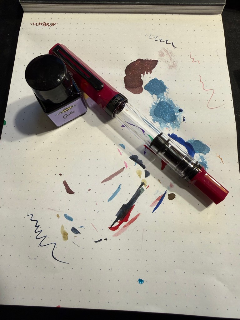
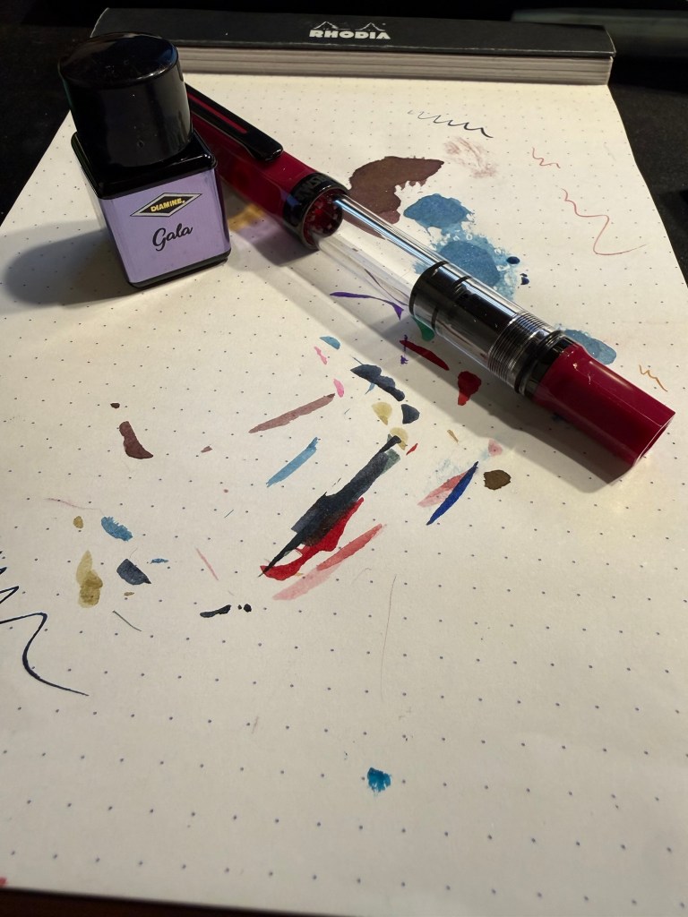
- Pelikan M600 Red and White fine nib inked with Diamine Inkvent 2019 Candy Cane. I reviewed the ink here (it was from the first Inkvent calendar) and I liked the ink enough to buy a full bottle of it. Pelikan M600 is my favourite Pelikan size (even though there’s not much difference between it and the M800) and I didn’t have any of the red editions of the Pelikan Souveran line. When this one went on sale I just had to buy it. Pelikan’s are workhorses with a giant ink capacity and fantastic nibs. If you don’t have one, I recommend buying an M200 at least, and splurging on the M600 or M800 when you can. Note that Pelikan nibs are wider than their Japanese counterparts.
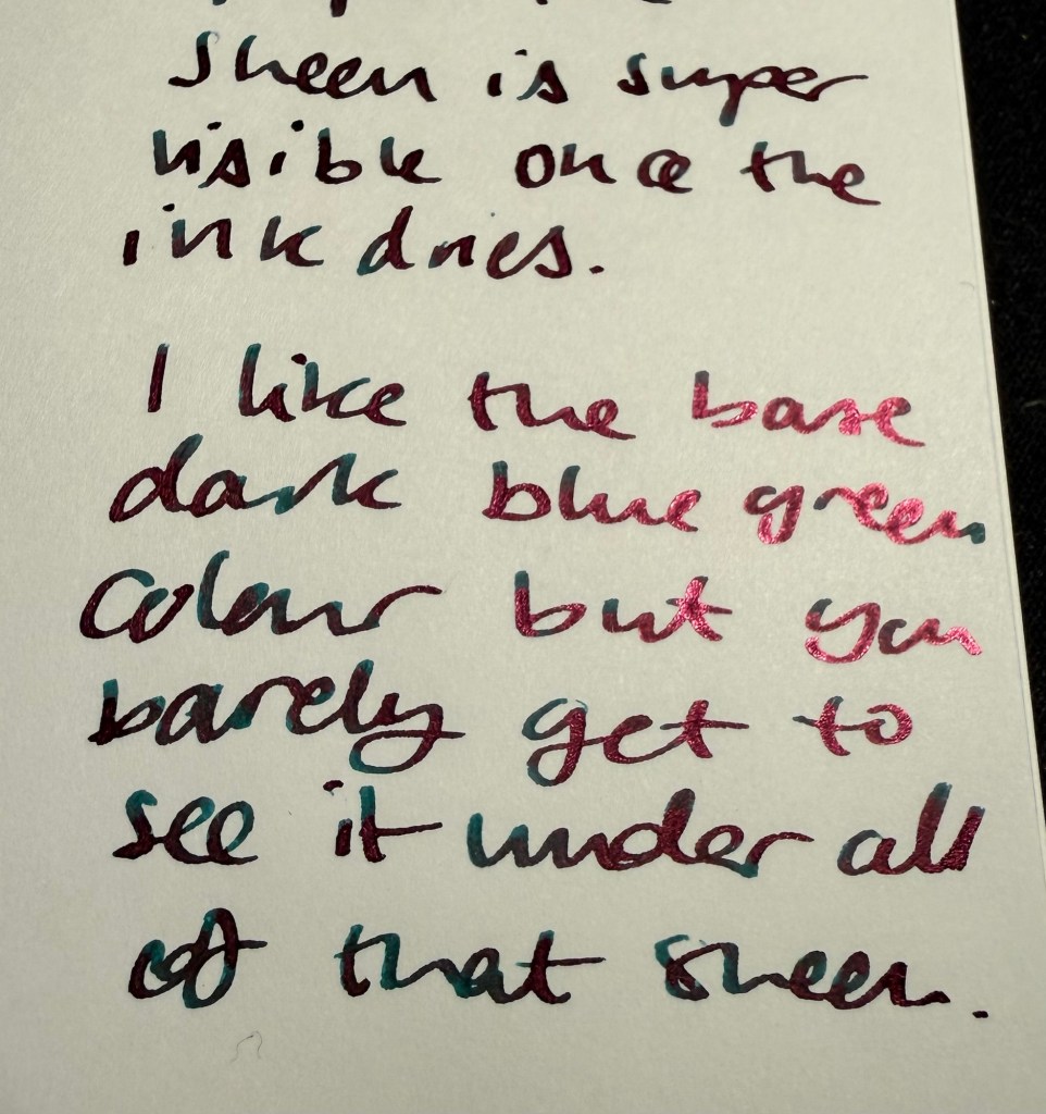
- Sailor Pro Gear Sunlight from the Ocean Floor fine nib inked with KWZ Exclusive for epiora.pl Błękit Warty Poznani. This is my first sparkly Sailor fountain pen (most of my Sailor fountain pens are black, from the time before they started issuing pens in wild colours and sparkly finishes) and I bought it on sale. As Sailor have raised and raised their prices over the years I only buy them when they’re heavily discounted. Sailor fine nibs as usual are very fine and with plenty of feedback. The ink is an exclusive that KWZ created for a lovely local fountain pen store in Poznan, Poland called Epiora. I bought my Pelikan Art Edition there during the last day of the Urban Sketchers symposium and I got this ink for free. My plan is to review it, as it’s an attractive blue-black.
- TWSBI ECO Indigo blue and bronze extra fine nib inked with Robert Oster River of Fire. A brand new pen for me, purchased at the same time as the other TWSBI ECOs in this rotation. The ink is old, from 2017, and an ink that I haven’t used in years. It’s very saturated, we’ll see how well it behaves on various notebooks.
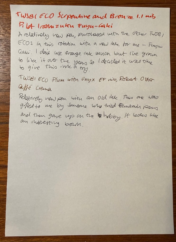
- TWSBI ECO Serpentine and bronze 1.1 nib inked with Pilot Iroshizuku Fuyu-Gaki. A new TWSBI ECO with a new (to me) classic Pilot Iroshizuku ink – Fuyu-Gaki. I’ve learned to love orange inks in recent years, and so I’ve decided to purchase this most classic of orange inks. Looking forward to giving it a try.
- TWSBI ECO Plum with onyx extra fine nib inked with Robert Oster Caffe Crema. New pen with an old ink – recently gifted to me from an ex-fountain pen user. It’s an interesting shade of brown and I look forward to giving this ink a try.