Grosvenor Square Sketch
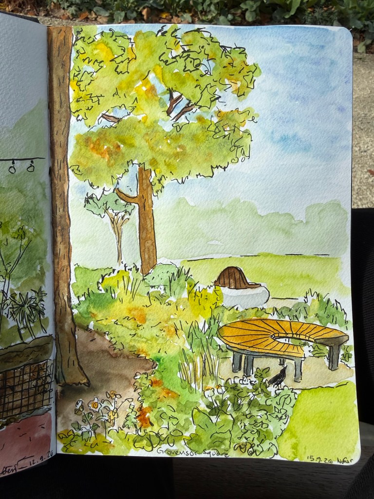
Quick sketch of the renewed Grosvenor Square garden in London.
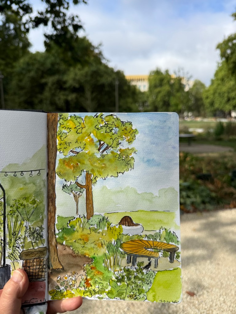
Sketched on a Hahnemuhle A5 watercolour sketchbook.
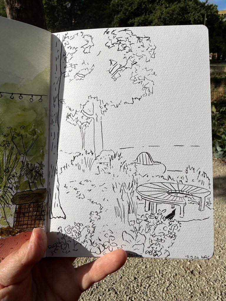
The line sketch was done with a brush pen.
A blog about writing, sketching, running and other things
Quick sketch of the renewed Grosvenor Square garden in London.
Sketched on a Hahnemuhle A5 watercolour sketchbook.
The line sketch was done with a brush pen.
In September I traveled to Paris and London. See part 1 of my travelogue here, part 2 here and part 3 here.
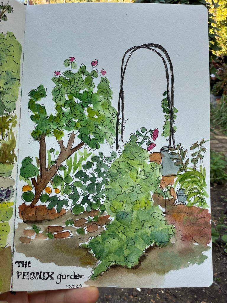
Another visit to the Phoenix garden resulted in this sketch in my Etchr lab sketchbook. I love the paper so much – even a super quick sketch pops on it.
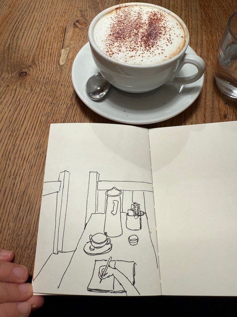
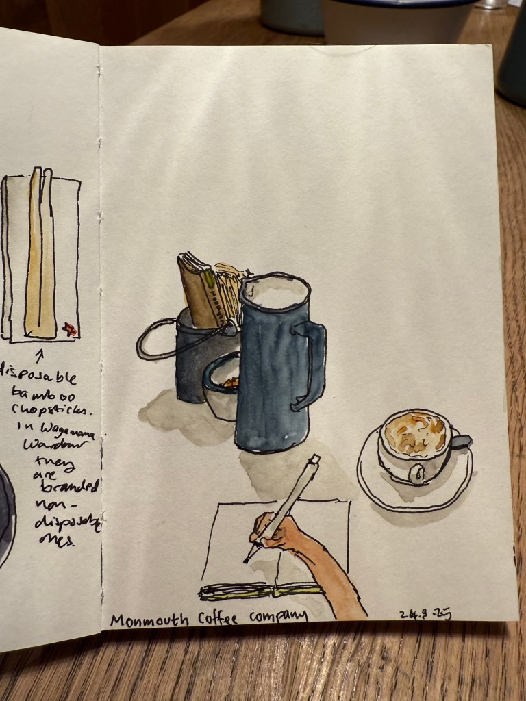
I had a coffee at the Monmouth Coffee Company. I love their coffee, but the place was both packed and super hot and stuffy so I made this quick sketch in my Pith Kabosu sketchbook and didn’t bother to add watercolour to it. It’s the first time I tried a POV sketch, and you can see the weird way I oftentimes hold my pen. I got to talk to a super nice young South Korean woman, as I shared the table with her and a young Japanese father and his 4 year old son.
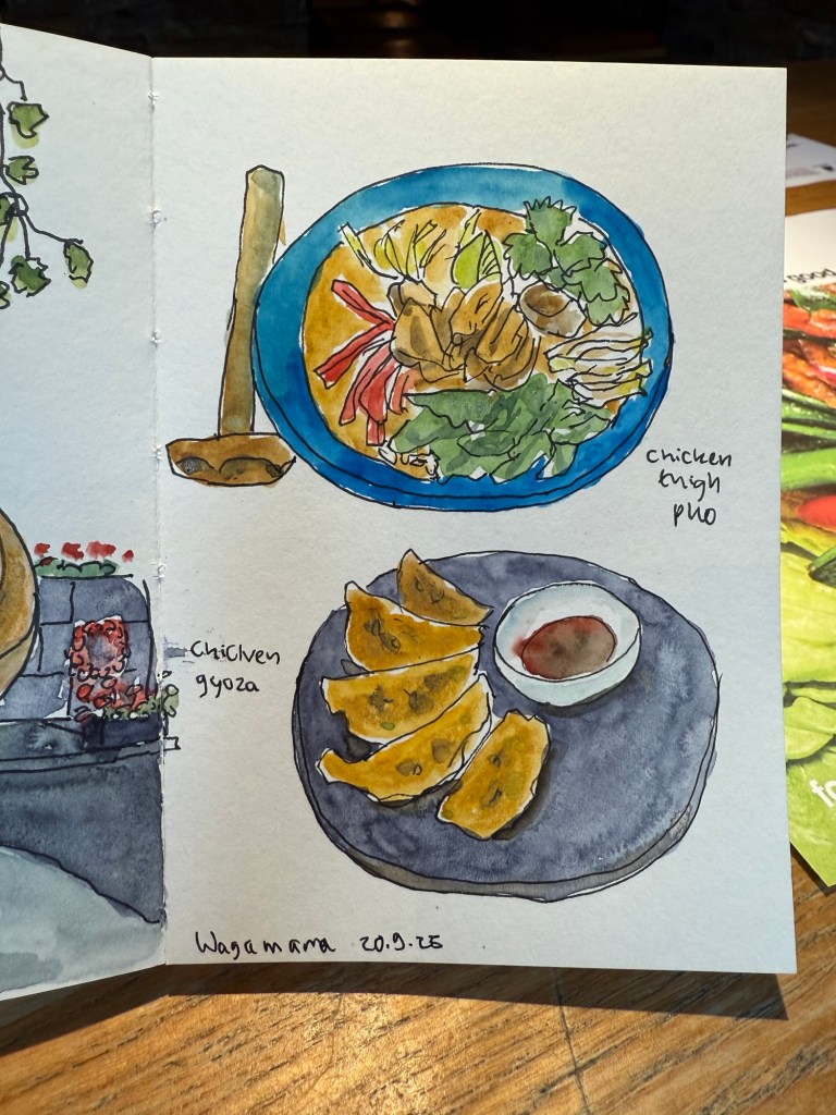
Lunch was at Wagamama again. I tried their pho for first time (it’s new on the menu) and really liked it.
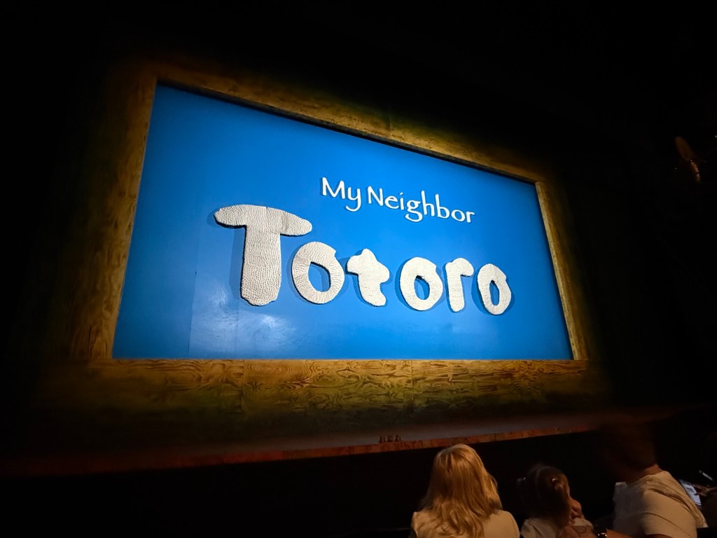
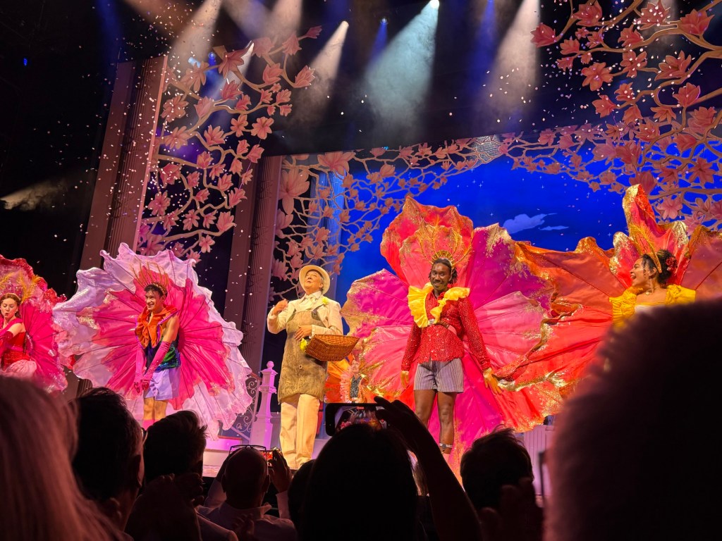
In the evening we went to see My Neighbour Totoro. It’s a lovely play, very well considered and beautifully acted and puppeteered.
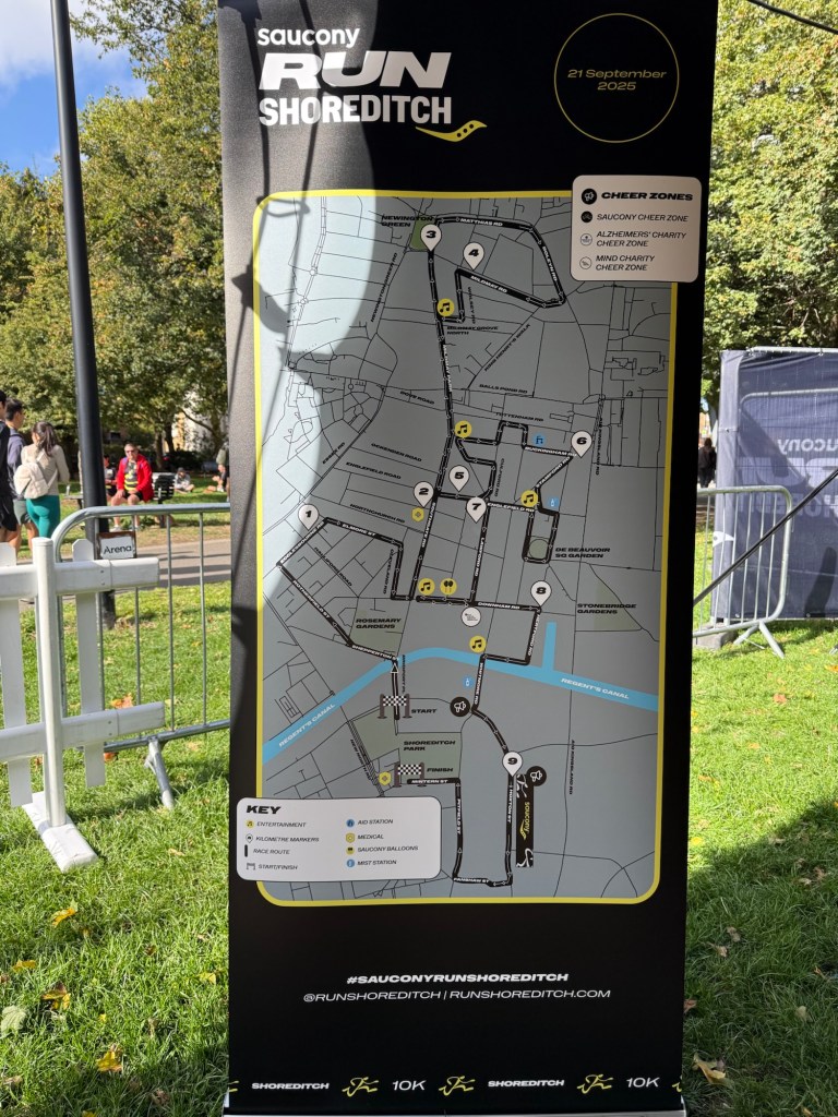
On Sunday my family went to Greenwich and I went to the Saucony Run Shoreditch 10k race. It was bright and cold, perfect running weather, and the route was pretty flat – but chock full of speed bumps, which really hampered the race flow and caused a few nasty spills.
Here’s the route:
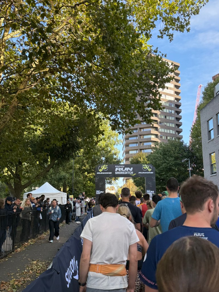
And the starting line:
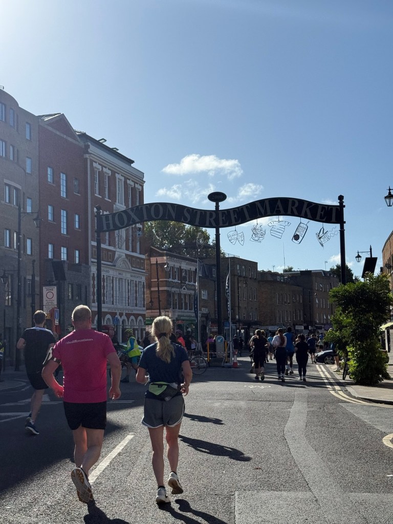
And some of the entertainment on the way:

We ran a lot of loops, mostly through pretty dull residential streets. Only in the final kilometre or so did we get to see a bit of Shoreditch high street etc.
Overall the race was fairly well organized, and not overly crowded (about 6,000 runners), but I didn’t enjoy the route mostly due to the speed bumps. They seem to have taken the worst out of the local runners, as people pushed, jostled and shoved to avoid running over them (I just started running over them from around the 3rd kilometre or so).
Here’s the medal:

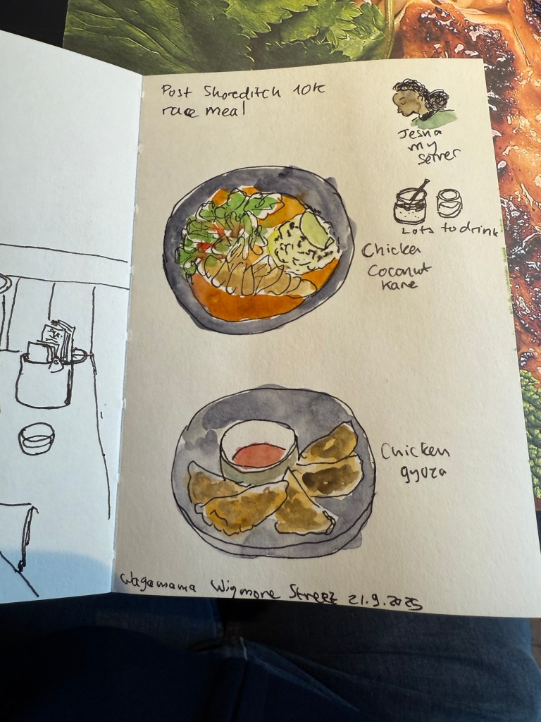
After the race I went for a celebratory meal at Wagamama. I hadn’t had breakfast and I was parched so I had a ton to drink and tried one of their new curries. Jesna, my server, was really curious about the sketches and we got to talk a bit.
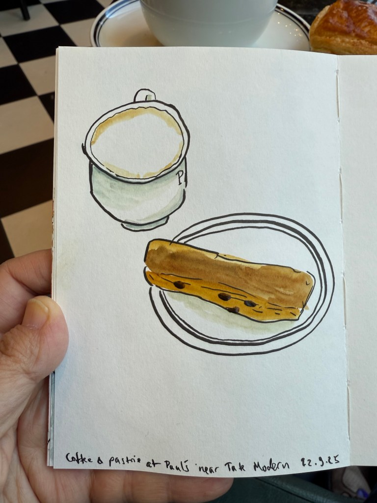
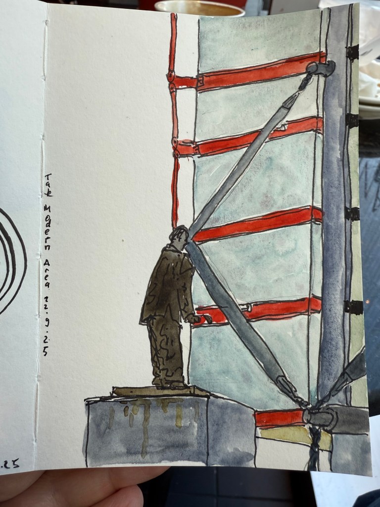
On Monday my dad and I went to Tate Modern to see a Picasso and the Theatre exhibition. We arrived early so we sat at Paul’s and sketched.
I also sketched the statue and part of the modern building across the street.
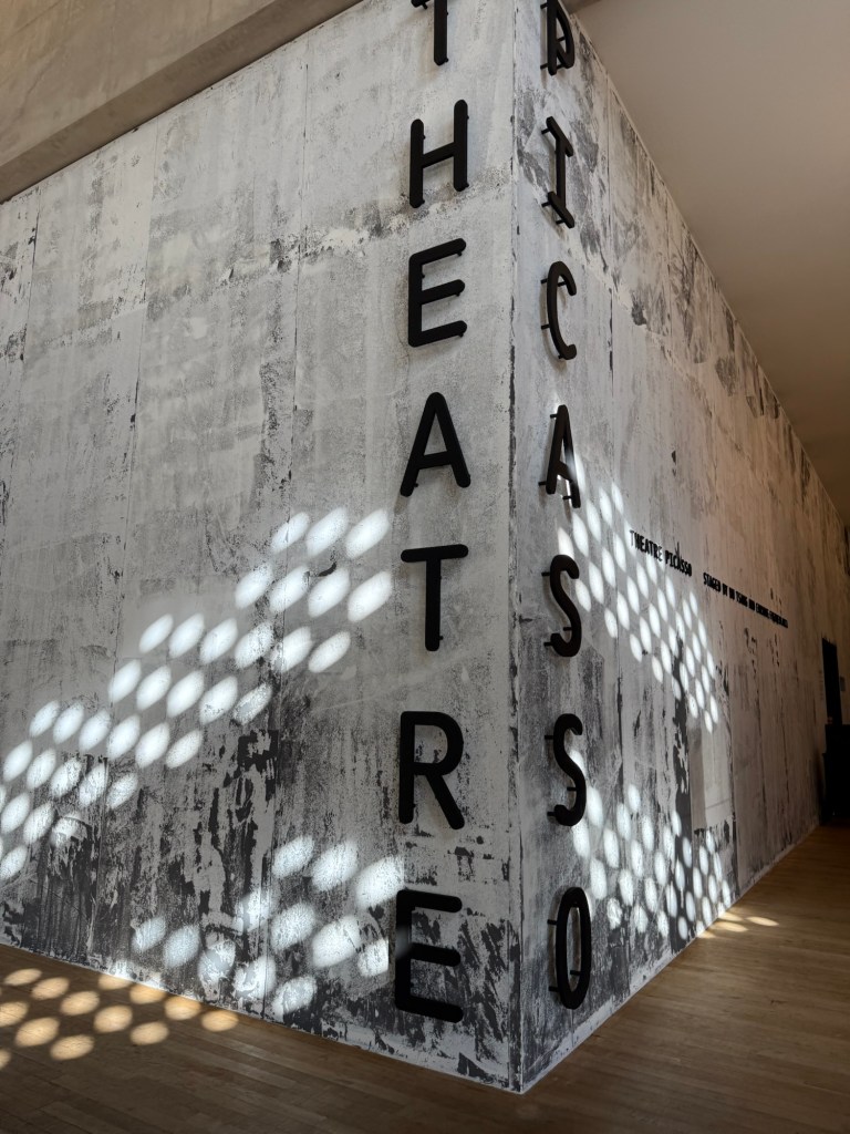
The “Theatre Picasso” exhibition was hands down one of the biggest disappointments of the trip. Never have I felt my intelligence or interest in art more insulted than in this exhibition, and I left after about 20 minutes.
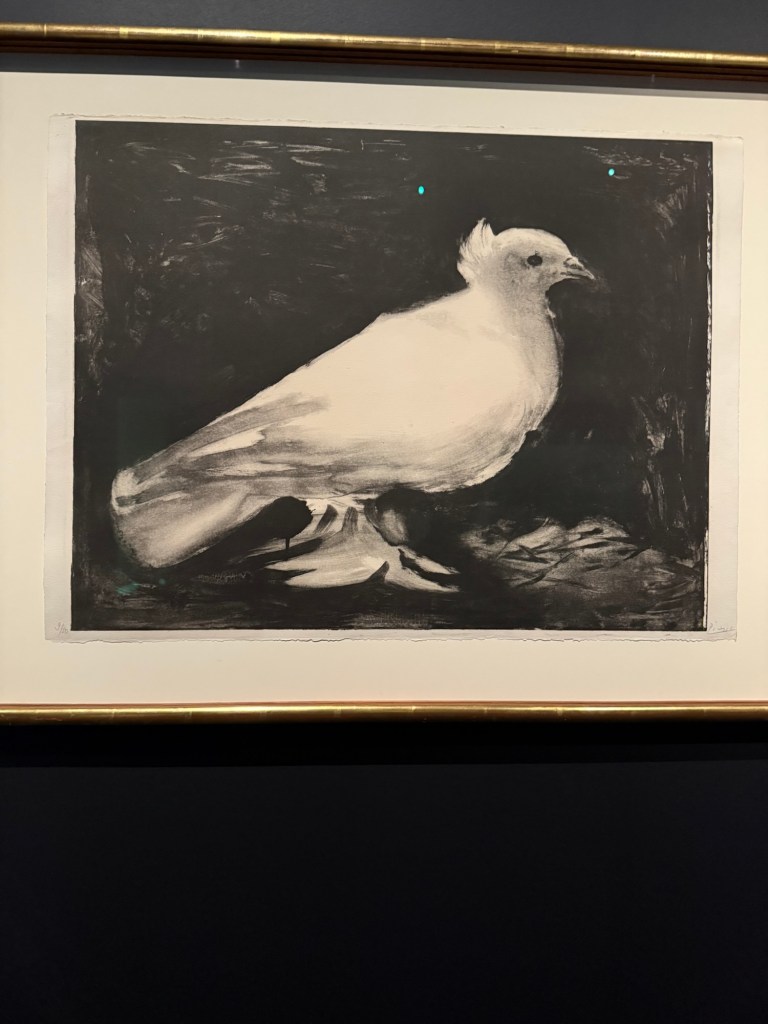
Here’s a Picasso dove to relax for a bit:
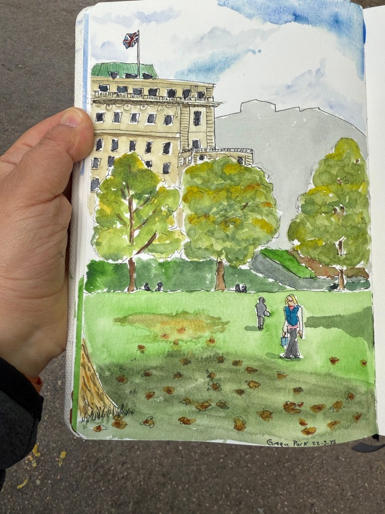
I was in a bad mood when I left and I didn’t know what to do with myself so I made my way to Green Park and sat and sketched there for a while:

The final sketch:
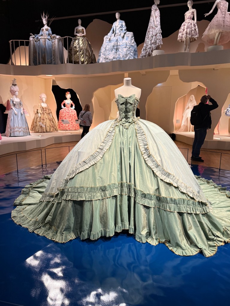
Thankfully the best exhibition was still ahead of me – Marie Antoinette Style at Victoria and Alberts. The thought, curation, staging, flow, items – everything about this exhibition was perfection. You saw Marie Antoinette as a style icon, as a woman trapped in a role, as a doomed queen, as a harried and slandered victim, and as a larger than life figure. Her foibles, her eye for fashion, her courage, her very flawed life and her terrible death made her immortal in a way she likely could never have imagined.
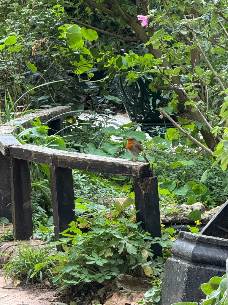
We don’t have robins here, so it was nice to get to see a few of them at Hyde park during my morning runs and at the Phoenix garden.
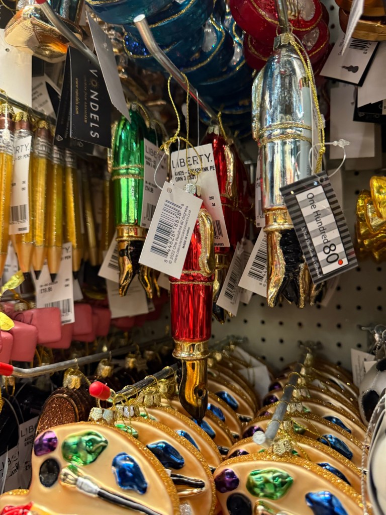
There were surprisingly few Halloween decorations out but the Christmas shops were on full blast in all the big stores. Of course I had to buy this red fountain pen ornament from Liberty:
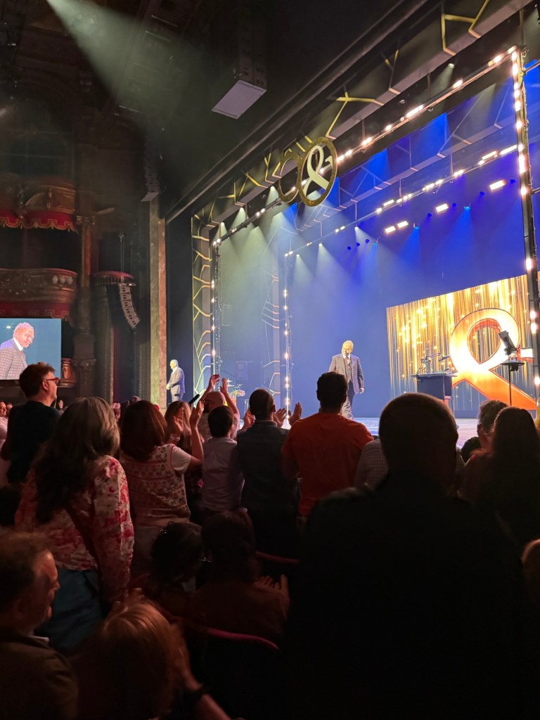
We then got to see Penn and Teller’s 50th anniversary show (and first West End tour). They were funny, surprising, and wonderful, and it was an overall delightful and very memorable evening. I even got a signed poster of their show!
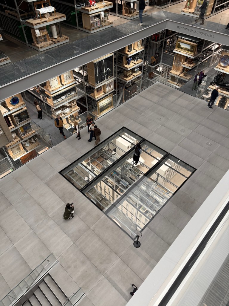
On one of the last days of the trip I went to see the new Victoria and Albert East Storehouse museum. It’s a unique experience, and it’s worth the visit – but I recommend planning to go there well ahead of time and ordering items to interact with. It’s not a standard museum by any stretch of the imagination – it’s more of a museum about museums and how they handle their collections.
While I found many of the explanations to be overly politicized, it nevertheless is a place that I’d return to – provided I manage to book a “meeting” with an item (Order and Object at the study centre). It’s also interesting to see what other people ordered and how they interact with their chosen objects.
I had lunch at the nearby Wagamama for the last time, and sketched my lunch for the last time:

And then went for my last coffee at Monmouth Coffee Company:
In the evening we went to see “The Importance of Being Earnest”. Stephen Fry was excellent as Lady Bracknell, but I didn’t like the director’s interpretation of the play (Algernon is gay, Jack is gay, Cecily is gay, Gwendolen is gay), and the two main actors weren’t very good. For the life of me I don’t understand the director’s need to try and outsmart Oscar Wilde. Wilde’s work is polished to a mirror finish – there really is no need to be clever with it. It packs enough punch as it is.
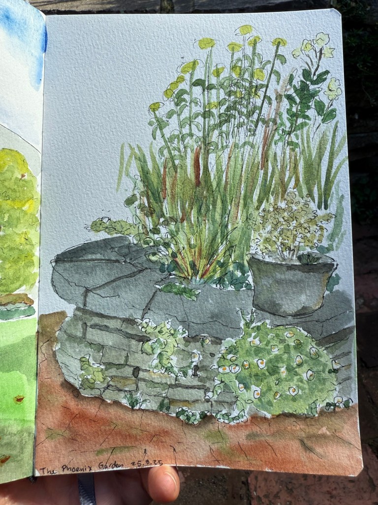
On the last day of the trip I went to the Phoenix garden for a last sketch:
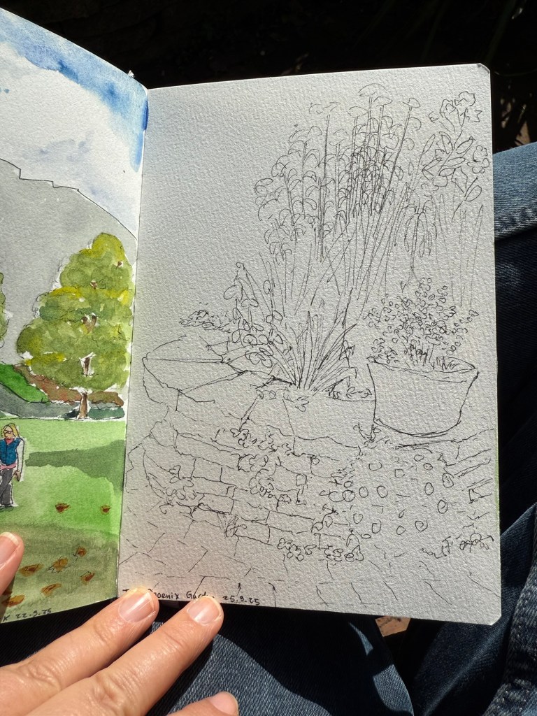
I got to talk to a lady that works in the garden, and it was nice showing her all of my various sketches of the place.
And we went to The Parlour at Fortnum and Mason for celebratory Sundaes before the flight.
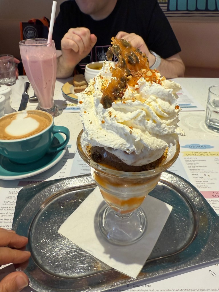
Overall it was a great trip even though I was sick during its first leg. I’ve never sketched so much during a trip before, largely thanks to some recently acquired sketchbooks and watercolour palettes, and some skills I learned during USK Poznan. I got a ton of watercolours, pens, pencils, inks and art supplies that I can’t wait to try out, and I got a nice stack of books to peruse over the coming months. Hopefully this was fun to read, and perhaps you got some inspiration for your next trip to Paris or London.
In September I traveled to Paris and London. See part 1 of my travelogue here and part 2 here.
I met up with a dear friend for a pre-theatre tasting meal at Chotto-Matte, a trendy restaurant that combines Mexican and Japanese cuisines. I am not a foodie, and I will now confess that this was the first time that I’ve had sushi (I hate the smell and taste of fish and seaweed and everything that comes from the sea and so I’ve avoided it), and I really enjoyed it. It was the best meal that I had in London, and the company, the weird design and the very attentive service added to it.
I had the vegetarian pre-theatre menu, which meant that mine had no fish, seafood, meat or chicken in it. It was phenomenal.
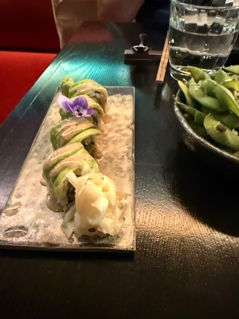
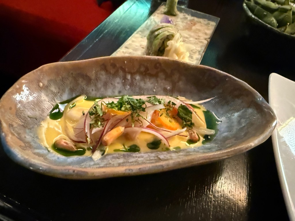

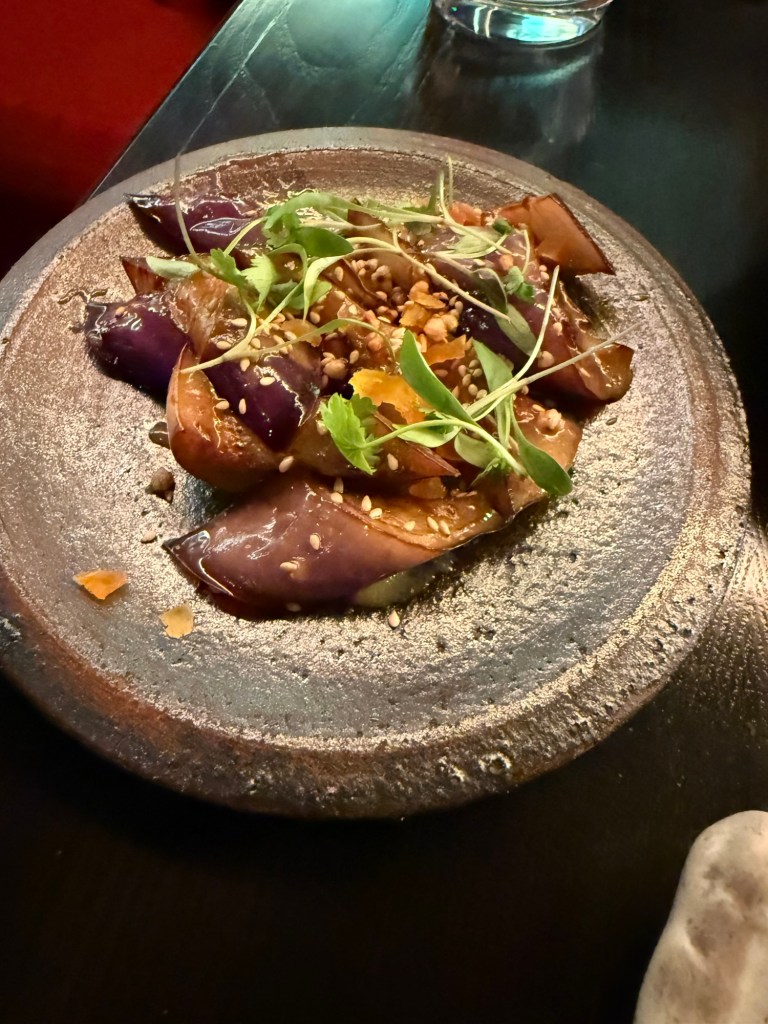
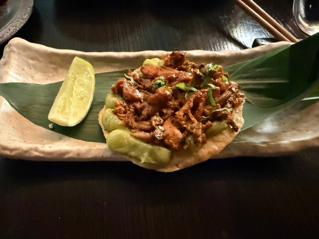
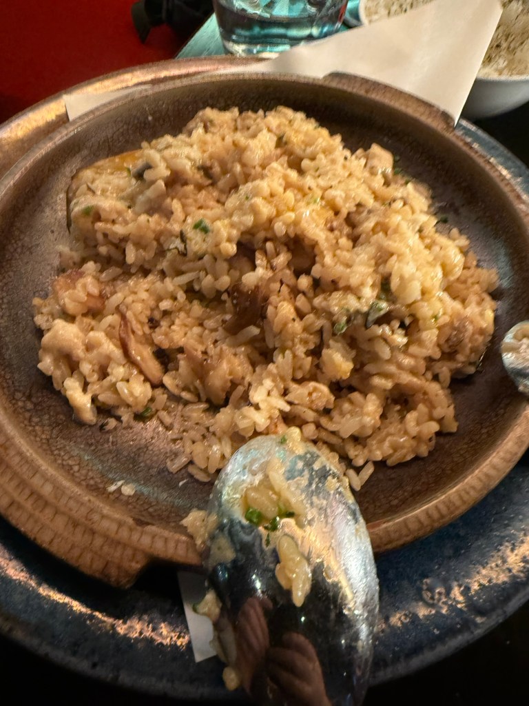

This is definitely a place that I’d return to for a special occasion.
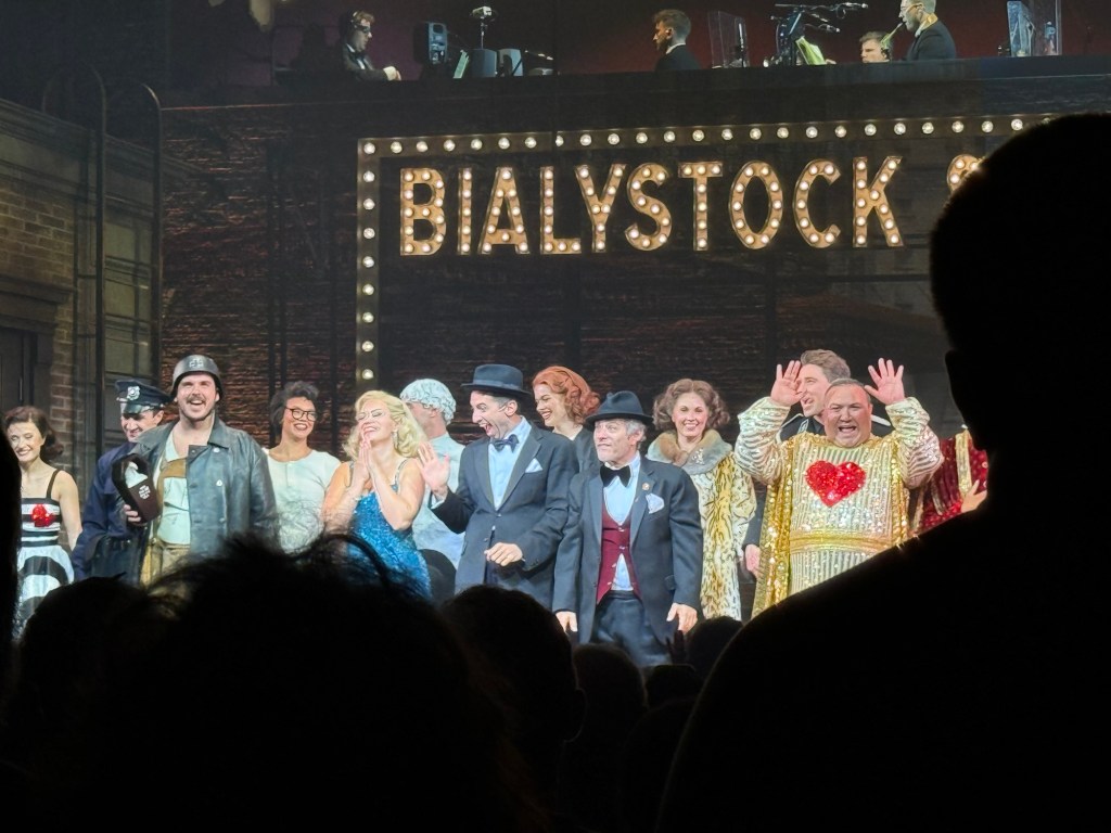
We then went to see the classic musical, “The Producers”, and it was excellent. The cast was brilliant, and it’s a very good musical with some great (if disturbing) songs. Mel Brooks is a comedy genius, and this musical still packs a punch.
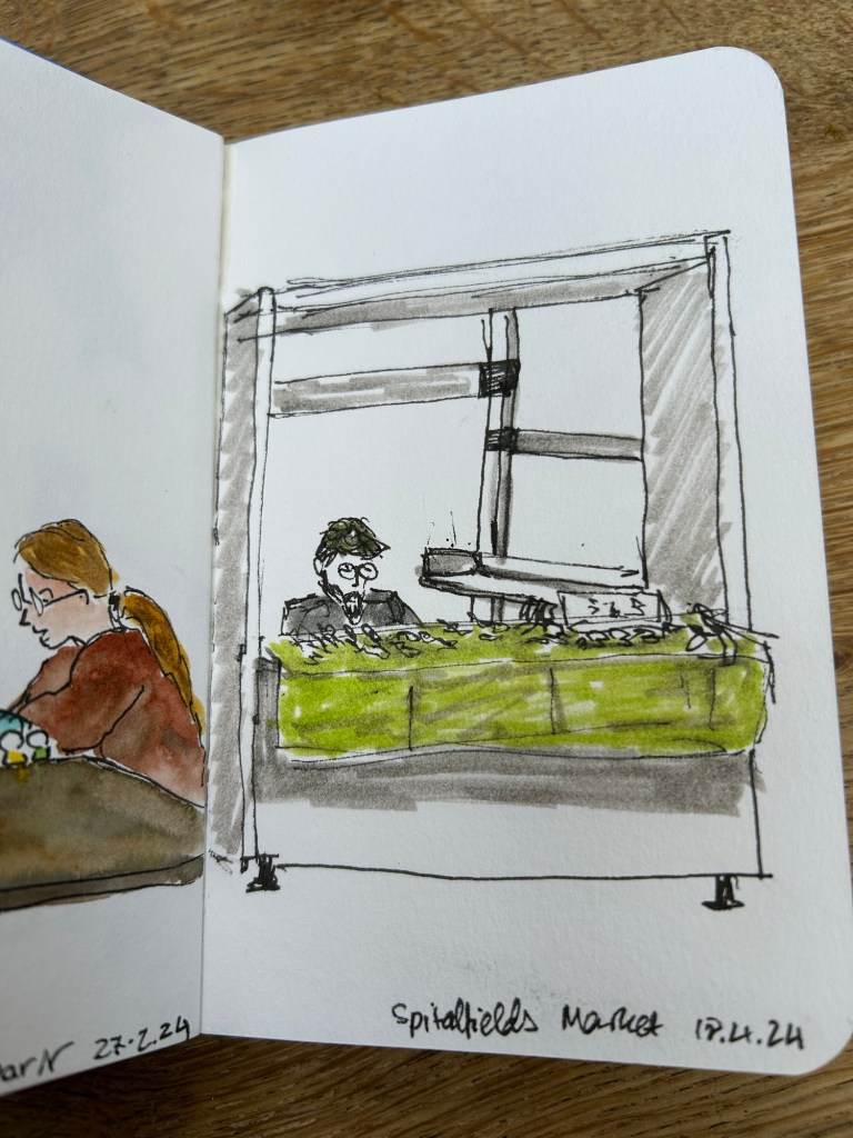
We also went to Spitalfields market, which meant that I could sketch this guy:
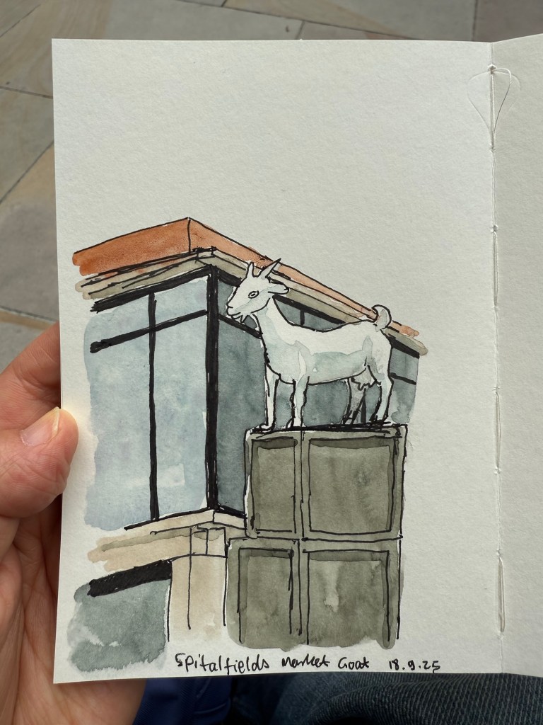
This was my very first sketch in the new Pith Kabosu sketchbook that I purchased at Cass Art. I debated whether to buy this sketchbook or not, as it had smooth, 200gsm paper and it opened flat, but I wasn’t sure it would work with watercolours. The great sellers at Cass Art told me it would, as they use it themselves, and they were right. It’s now my “daily driver” having replaced the Stillman and Birn pocket beta. The beta has thicker and more textured paper but the Pith Kabosu is slightly larger, has a more durable cover, and opens flat much better than the Stillman and Birn does. I later returned and purchased two more of these sketchbooks, they were so good.
I later sketched this seller in his stall, after purchasing an old set of folding rulers from his stall. I decided to paint him and the flag but left the rest of the stall as line drawings.
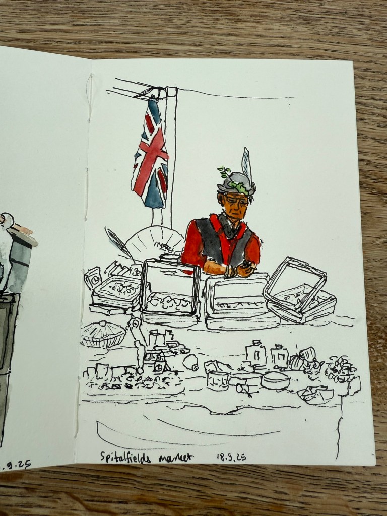
The Pith Kabosu is also cheaper than the Stillman and Birn and as it has smoother paper, works better for ink sketches and dry medium (pencils of various kinds, for example). It means that I’m more inclined to bring it out and make quick sketches in it, even if I don’t get to adding watercolour to them.
We then went to the second play at The Globe – Shakespeare’s Twelfth Night. We arrived early so I sat in the Starbucks across the entrance and sketched the place:
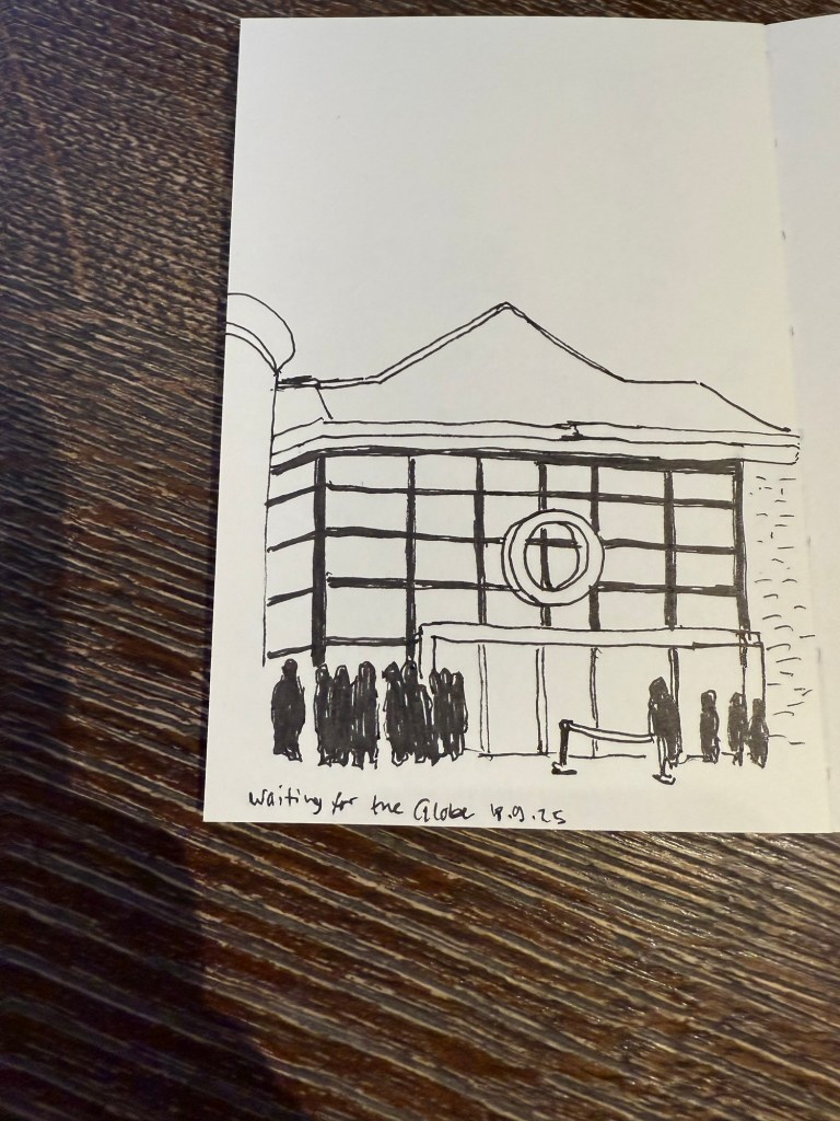
I later added colour to the sketch. In hindsight I would have gone for a looser sketch, but I was still unsure what this paper could and couldn’t do. The answer is – practically everything. Only very heavy washes make the page buckle.
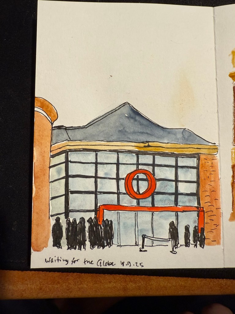
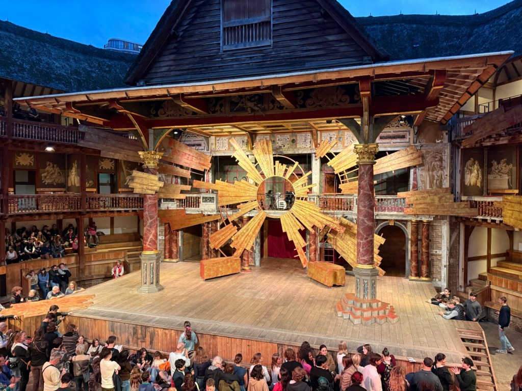
This was a regular Shakespeare play, and so there was some set design. this is the stage:
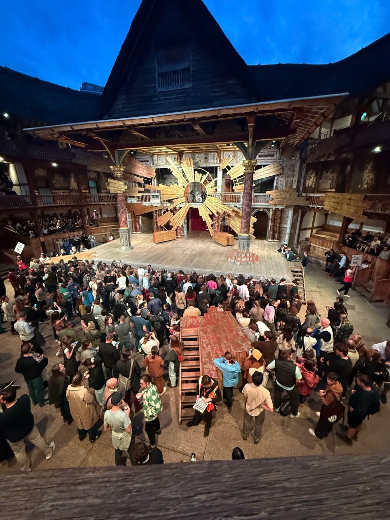
And in the yard where the groundlings are you can see another bit of the stage that isn’t normally there, but was used to represent the beach and other locales in the play.
I enjoyed the play a lot, and would recommend seeing plays at the Globe if you can tolerate the extremely uncomfortable seats (yes, even with the cushions).
We went to the Cartier exhibition at the Victoria and Albert museum. The exhibition is sold out, and it’s well considered, but we found it a bit dull compared to the Marie Antoinette exhibition at the same museum.
This is the Patiala necklace that was part of the exhibition. It was made by Jacques Cartier for the Maharaja of Nawanagar in 1928. He also made the Maharaja of Nawanagar’s necklace, later named the Jeanne Toussaint in the “Ocean’s 8” movie (it was a recreation made by Cartier for the movie).

My favourite parts were the film where they showed how a Cartier leopard is made, and the famous mystery clocks. There was a whole room dedicated to them, and it was fabulous.

Next post will be the last in the series. You can read it here.
In September I traveled to Paris and London. See part 1 of my travelogue here.
I went to see two plays in The Globe theatre in London. The first was a one night only performance of Midsummer Night’s Dream that was a reenactment of how the actors in Shakespeare’s time would have performed a play. The actors didn’t rehearse the play beforehand, and they didn’t have the full text of the play to work with, just their lines and their cues and staging directions. They practiced the dances alone, and they had no idea what their fellow actors would do during the performance. Now this is Midsummer Night’s Dream so all the actors and everyone in the audience knew exactly how the story unfolds, but the lack of rehearsals made this a very live performance.
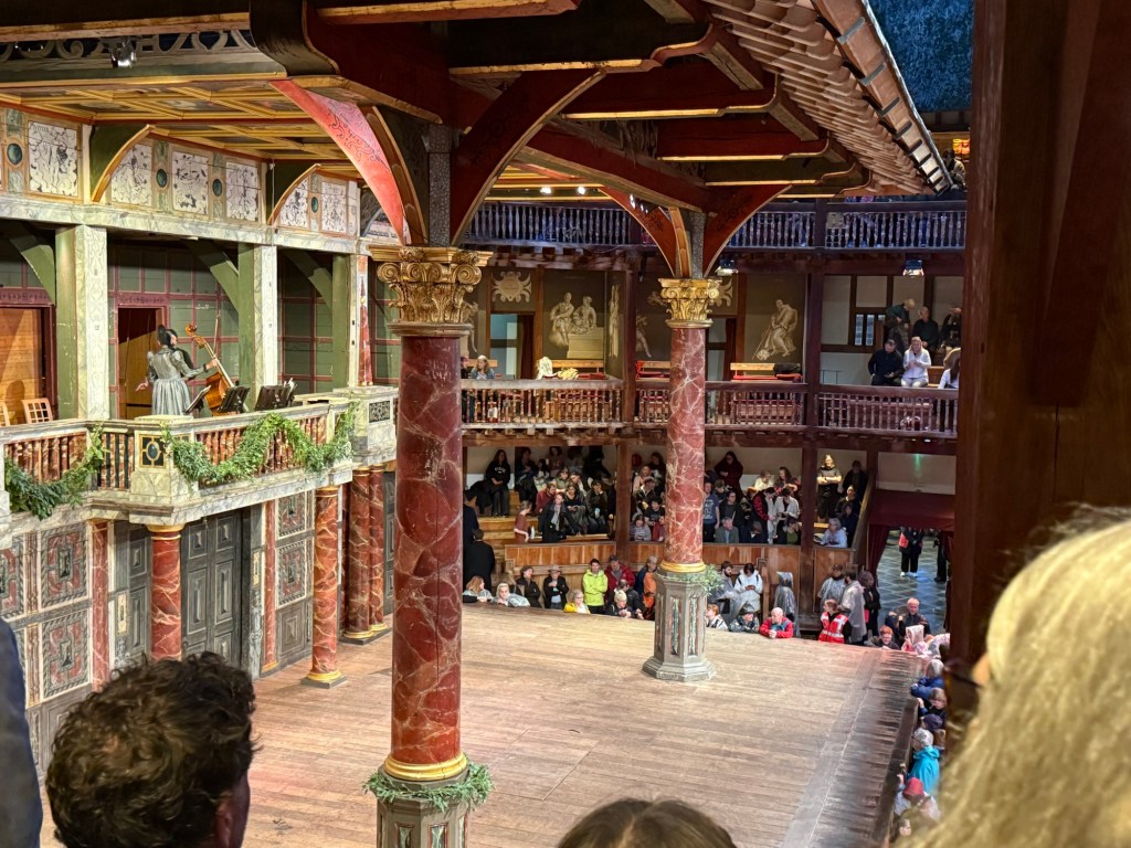
The play was sold out in minutes and I’m glad that I managed to get tickets at all. It was an amazing experience. As this was a one night performance the stage was the bare Globe stage – nowhere to hide as the audience surrounds the actors practically from all sides. There was a lady on stage in period costume, sitting with the full text and helping actors in the very few times that they fumbled. The energy was beyond description. It was the most electric staging of Shakespeare that I have ever seen. Everybody was “on” all the time because they weren’t entirely sure what would come next.
It was a raw performance – I later saw another, standard Shakespeare play there and it was much more polished because it was clearly rehearsed and performed several times before we saw it. Yet that was what made this performance so special – the actors’ reaction to their fellow actors was genuine and unvarnished. They were having fun, improvising, owning the text in a way they normally never do. The highlight was the play within the play at the end – seeing the actors laugh to the point where they had trouble saying their lines because Bottom was so very, very hilariously over the top was amazing.

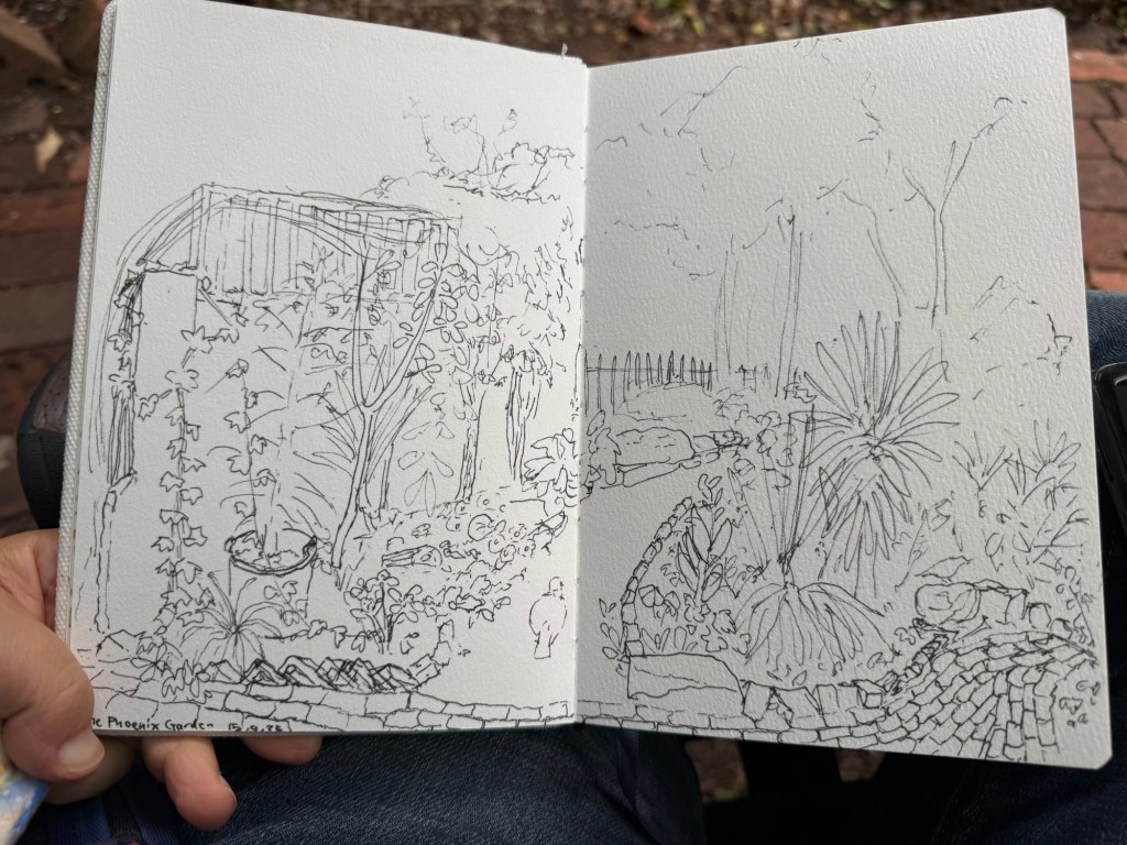
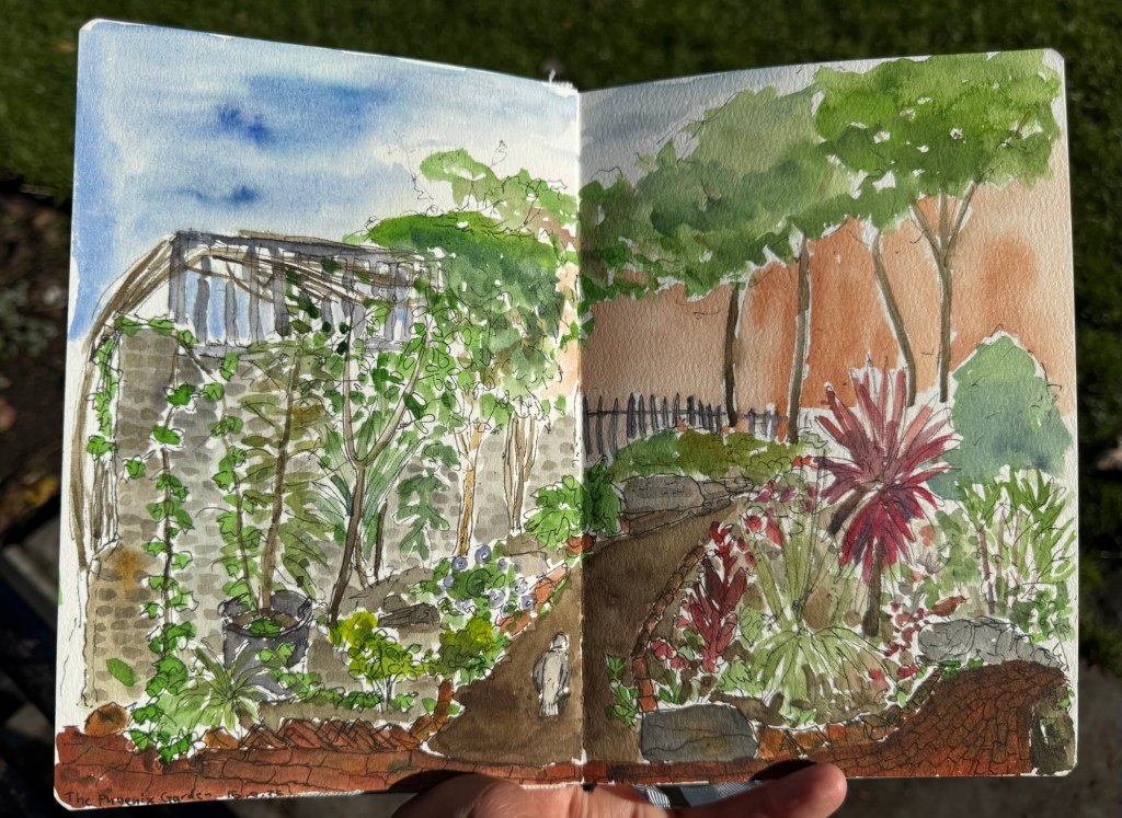
One of my favourite places in London is the Phoenix community garden. I spent a lot of time there, and sketched it several times. This was my first and longest sketch of the garden, done on the wonderful Etchr Lab cold pressed watercolour sketchbook:
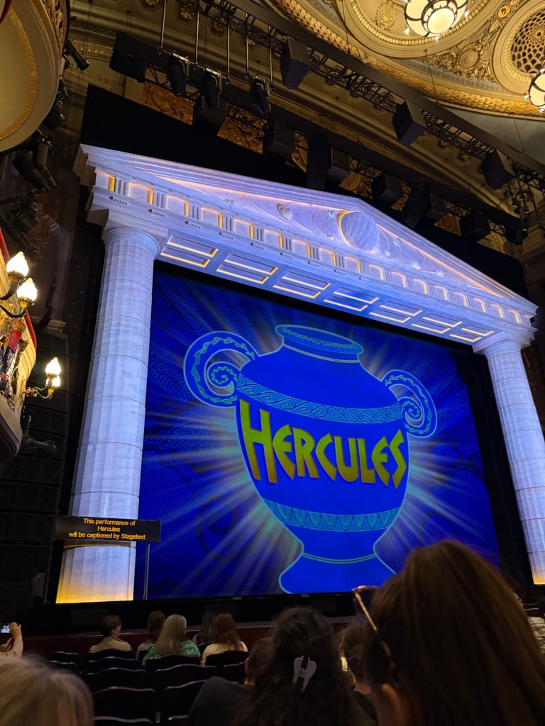
We went to see Disney’s Hercules – a new musical in West End. I wasn’t expecting much as I’m not a fan of the movie, but the musical was one of the best that we saw in the London. The production is stunning, the music is great, the actors were talented – particularly Megara – and the only minus is that Hades was a bit over the top even by the movie standards. They would do better to cut down on the amount of his jokes because they lose their impact otherwise. The Disney merch machine was out in full force that night, and I was one of only a handful that didn’t leave with something from their store.
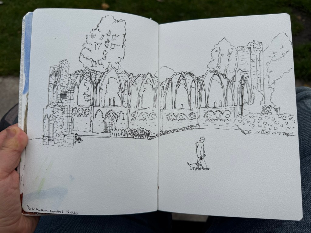
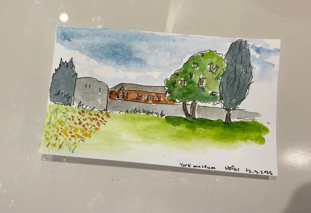
We spent a day in York, and I started it with a sketch of the York Museum grounds, also in my Etchr Labs watercolour sketchbook:

York is full of wonderful bits of history that are just layered freely on each other:
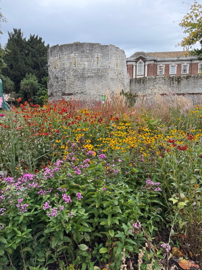
I did a very quick sketch of this scene later on, on an Exacompta Bristol card:
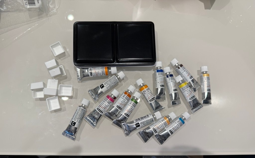
I also bought a decent amount of watercolour paints – enough to build out two new palettes that I want to try.
This post is getting long and photo heavy, so I will be completing this trip journal in two additional posts.
Edit: you can read part 3 here.
I recently returned from a pretty long trip to Paris and London with my family. I ended up sketching a lot more than I normally do during trips, largely thanks to things that I learned during the Urban Sketchers Symposium in Poznan (more on that in a later post). Here is part 1 of some highlights from my trip.
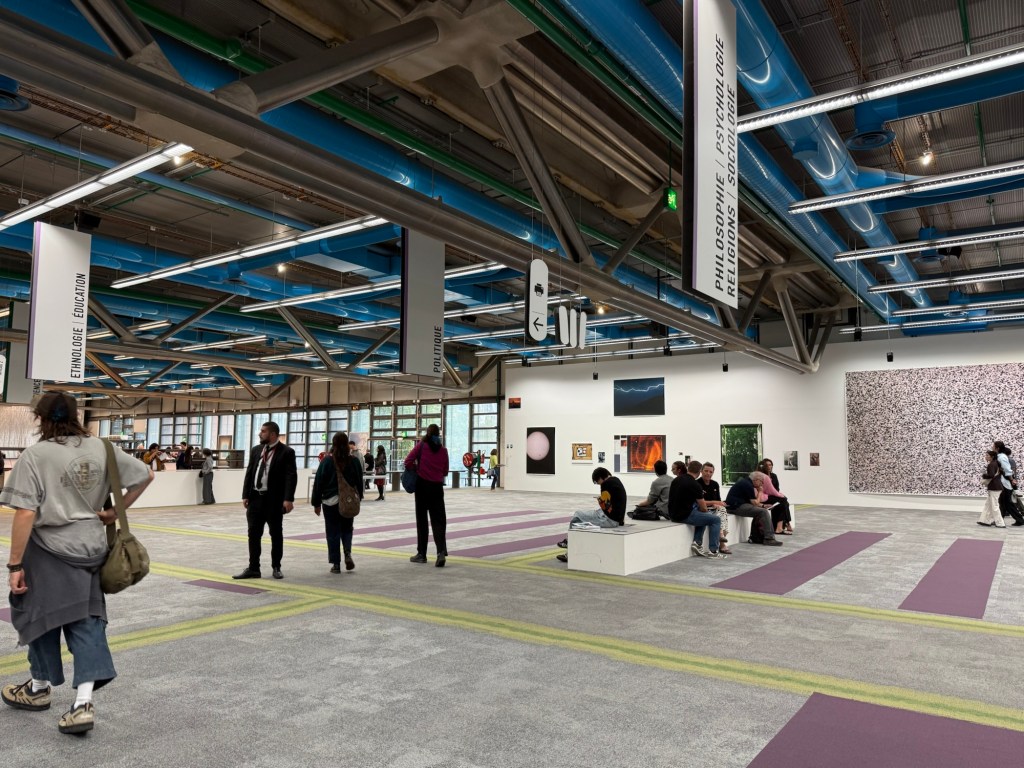
Centre Pompidou, my favourite museum in the world, was closing down until 2030 (!) so I went to pay it a last visit. Already parts of the colourful outside facade have been repainted white, and I’ve never seen the area around the museum so deserted.

The library was the only area still accessible, and it had been turned into a giant project playground for German photographer Wolfgang Tillmans to work with. It was something that only Pompidou could do, and it was breathtaking, thought provoking, fun, interesting, and unique. I wish I could have spent hours there, but at this point in my trip I became badly ill and for the entire Paris leg of the trip I was struggling.
I ended up largely not eating in Paris, but this was my first meal there – in the fantastic Patisserie Viennoise in the Latin Quarter.
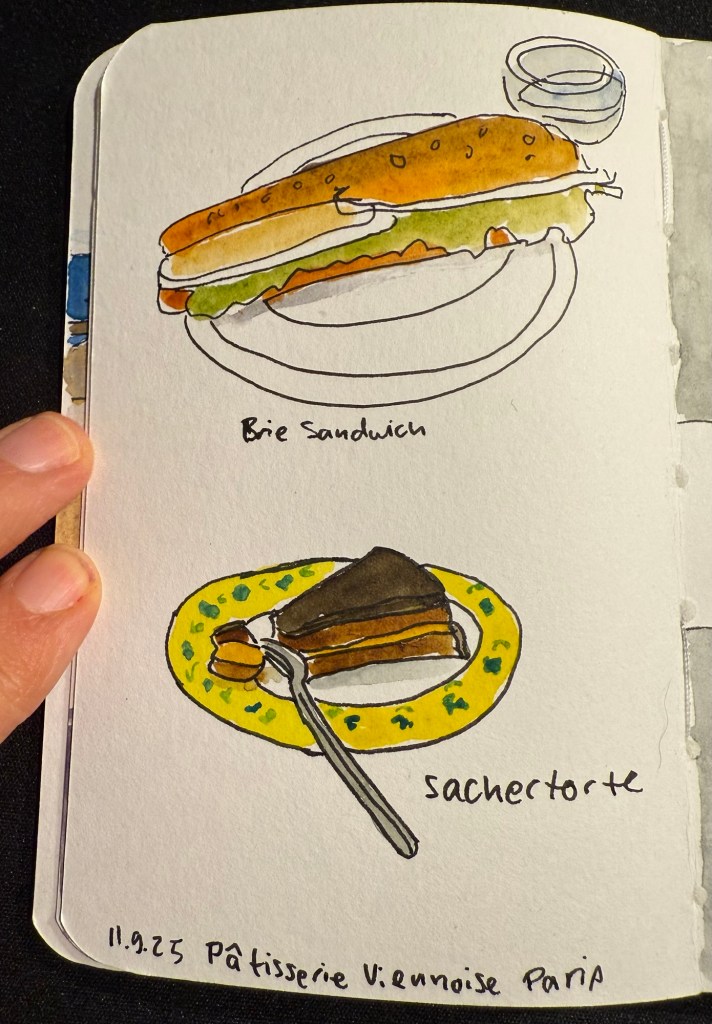
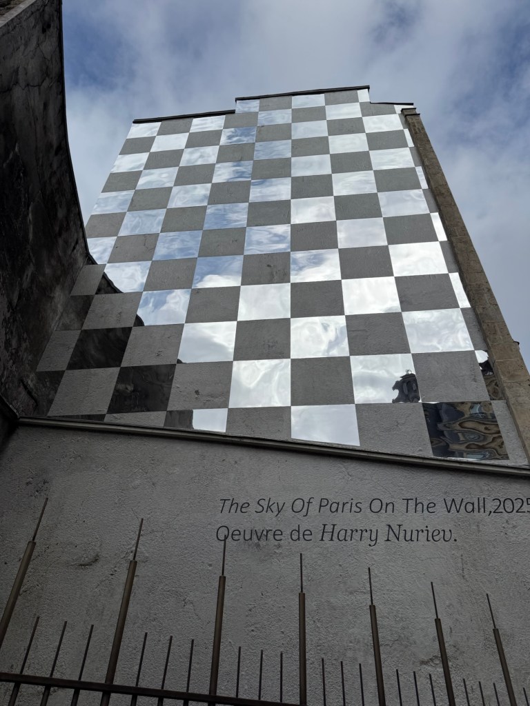
We also went to a new museum, the Bourse de Commerce and I saw this great artwork on the way there:
The museum was in between putting up exhibitions, so while a large part of it was closed we managed to view some great and moving art pieces with relatively few crowds and at a discounted price. I did a VERY quick sketch while I was there:
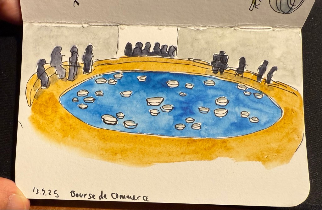
This is the artwork that I was sketching.

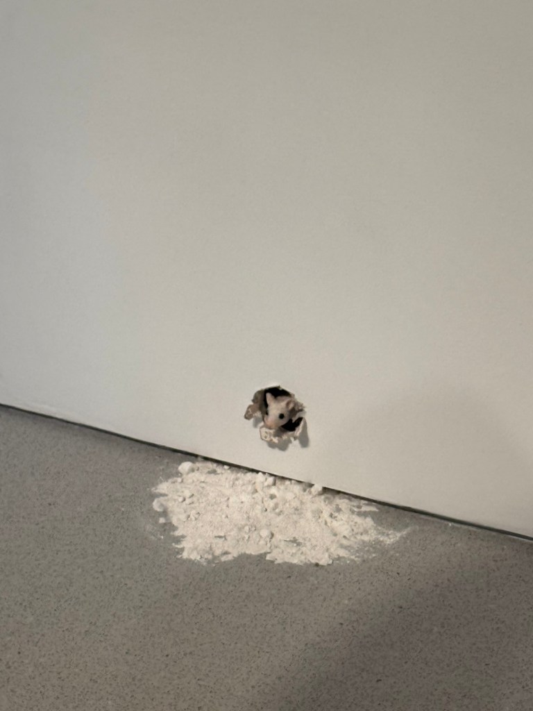
And this little fellow is also part of the art exhibits there:
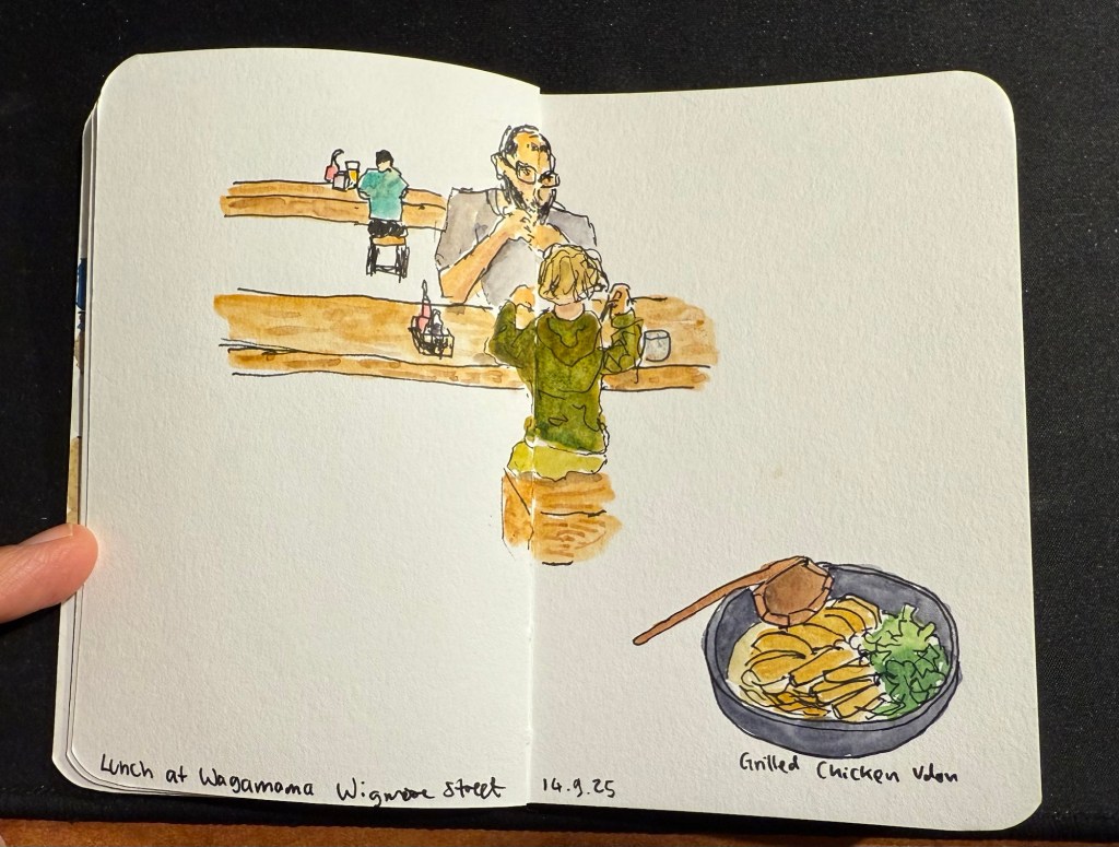
We then took the Eurostar to London. This is where I switched sketchbooks – this sketch of a boy and his father having lunch at a table across from me at Wagamama is the last sketch I created in my Stillman and Birn pocket beta. The beta has decent watercolour paper but it’s not half as good as the paper in my Etchr labs watercolour sketchbook, and the glued in pages make it a struggle to create full page spread sketches, as you can see here:
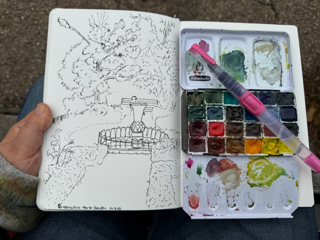
I created my first sketch in an Etchr lab cold pressed watercolour notebook while in the Greenwich Park herb garden and the paper is astonishingly good. Here’s the ink sketch (my tree sketches have gotten so much better thanks to a workshop I took in Poznan):
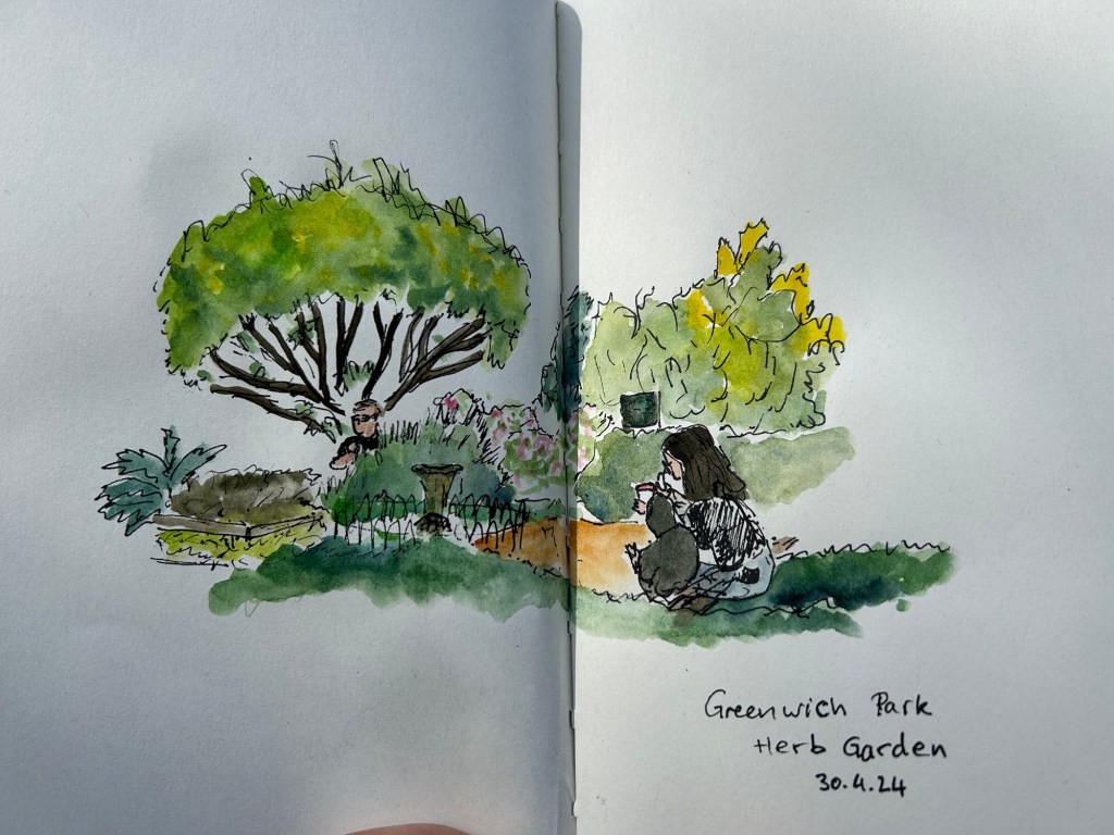
And here is the watercolour:

The paper not only makes the colours pop, it actually allowed me ample time and space to work with the washes, adding layers of well blended colours that gave depth and life to the scene. Never have I ever seen the importance of good quality watercolour paper demonstrated so well. I have about half a dozen sketches of this garden throughout the years and this is by far the best one.
That’s it for part 1, I’ll try and upload part 2 later this week.
Edit: part 2 can be found here.
These two sketches were both done on the soft covered vegan Italian made Cass Art sketchbook. It has recycled paper inside which doesn’t look like or behave like recycled paper.
I sketched this in 3-4 minutes while sitting in the Phoenix Community Garden in London, and then took a lot of reference photos with my phone.

Later on I added watercolour to the sketch:

This is a 5-7 minute sketch of the stalls in Spitalfield market done with a sepia Faber Castell Pitt pen on the same Cass Art notebook.

I bought this sketchbook on a complete whim, because it was relatively inexpensive and I liked the look of it. I liked it so much I returned later on and bought a second sketchbook with a different cover colour.
What surprising and unexpectedly good products have you found lately?
Still travelling. This one is a 10 minute sketch of the herb garden in Greenwich park, London. Paper is a Cass Art notebook with non watercolour paper that held up surprisingly well.

3-4 minutes sketches on location in London.

Over the past 24 hours things have gotten very depressing and very scary here. To distract myself a little bit, I decided to start working on a new project: Going Shopping in My Stationery/Art Supply Stash. I have a lot of stuff. I don’t use enough of the stuff that I have, to the point where I don’t even remember what I have. As I’ve significantly cut down on buying new stationery and art supplies, I’ve decided this would be a good time to go “shopping” for new things to use in whatever it is that I already have.
I bought this fancy looking A5 composition notebook from Choosing Keeping in London this April, after eyeing their gorgeous notebooks the last time that I was there.

The endpaper is also very good looking:
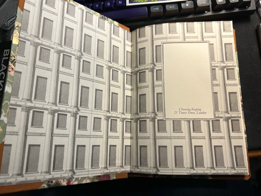
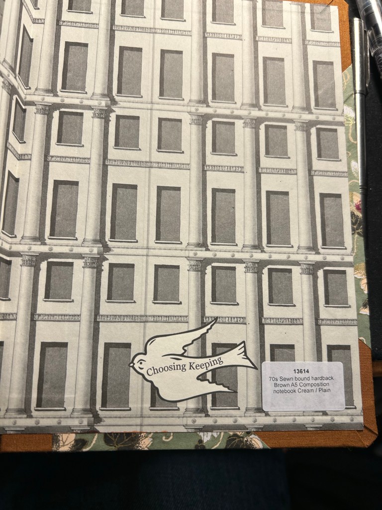
The paper is cream and unruled, and the edges of the paper are mottled brown. It is one of the best looking notebooks that I have:
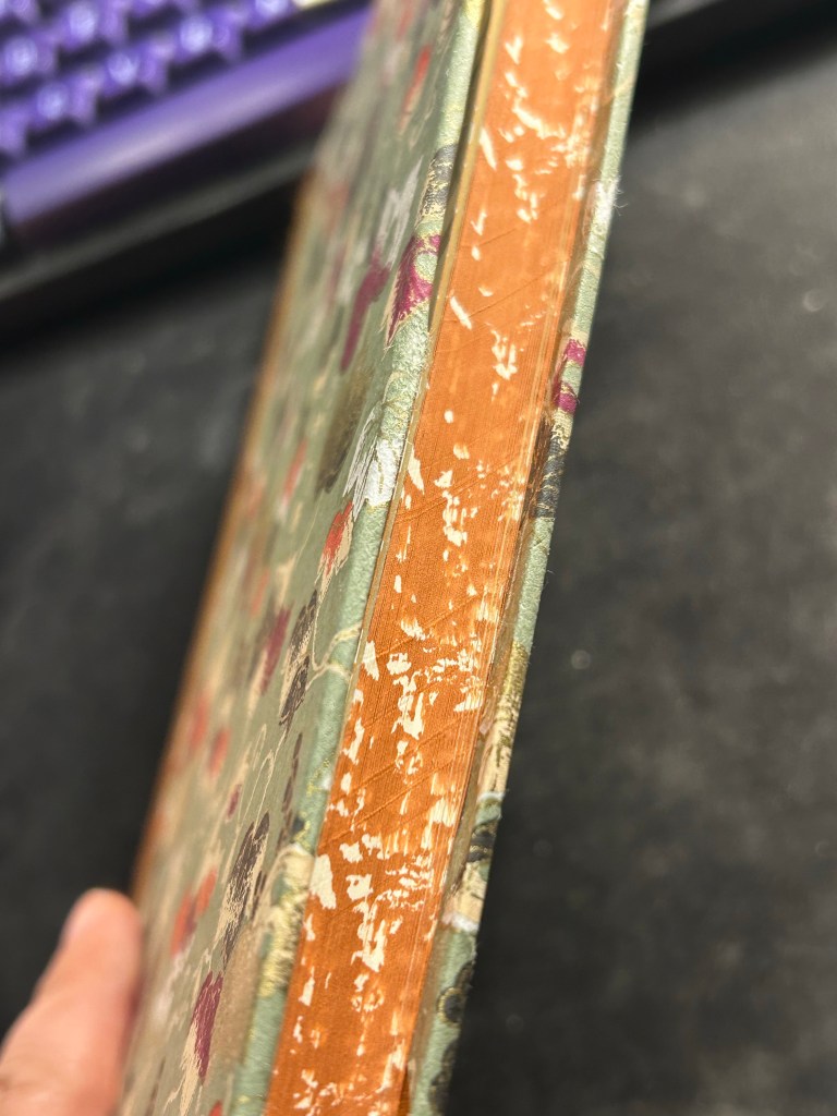
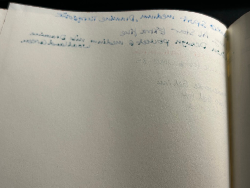
I was planning on using it as a journal, but the paper was an utter disappointment. It is not fountain pen friendly, which really surprised me — the ink spreads and feathers and bleeds through. I could have used a gel ink pen with this notebook, but it somehow seemed incongruous with how fancy and special (and expensive) the notebook is.
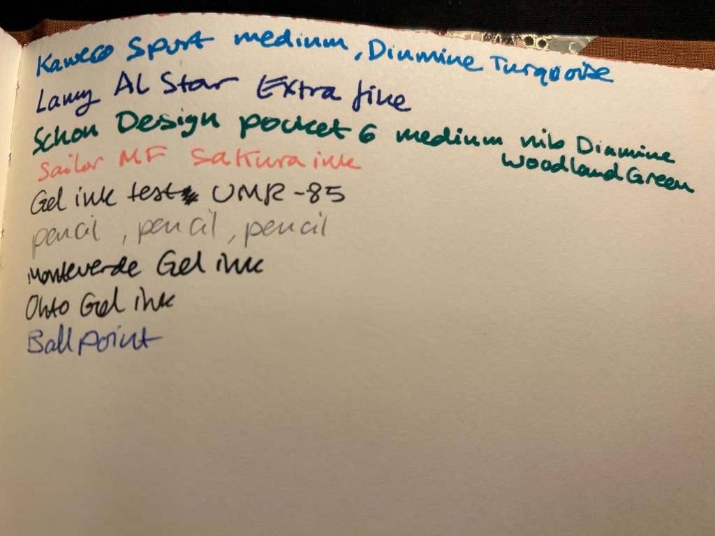
So I shelved it and I haven’t touched it in months, until today. My eye caught it as I was looking for a notebook to sketch in, and I remembered that the paper had some tooth and texture to it.
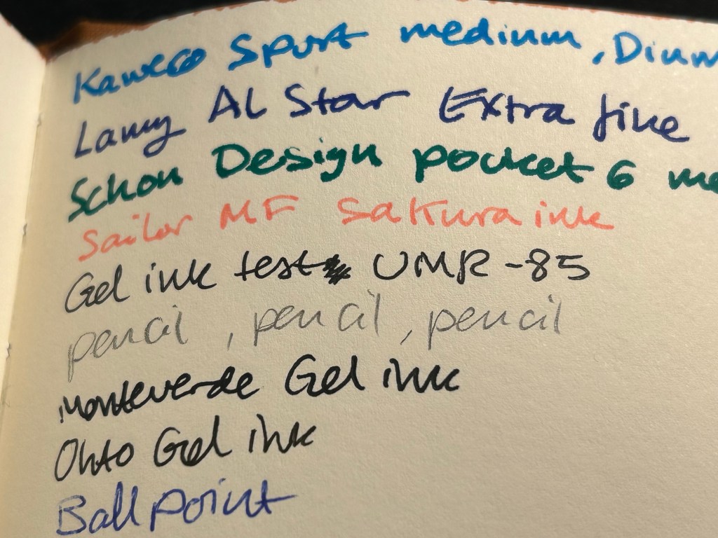
It’s a soft, velvety kind of paper, which made me thing that it might work with pencil quite well. I also had some pencils I wanted to try out, so it seemed like a good opportunity to not let a fancy notebook go to waste.
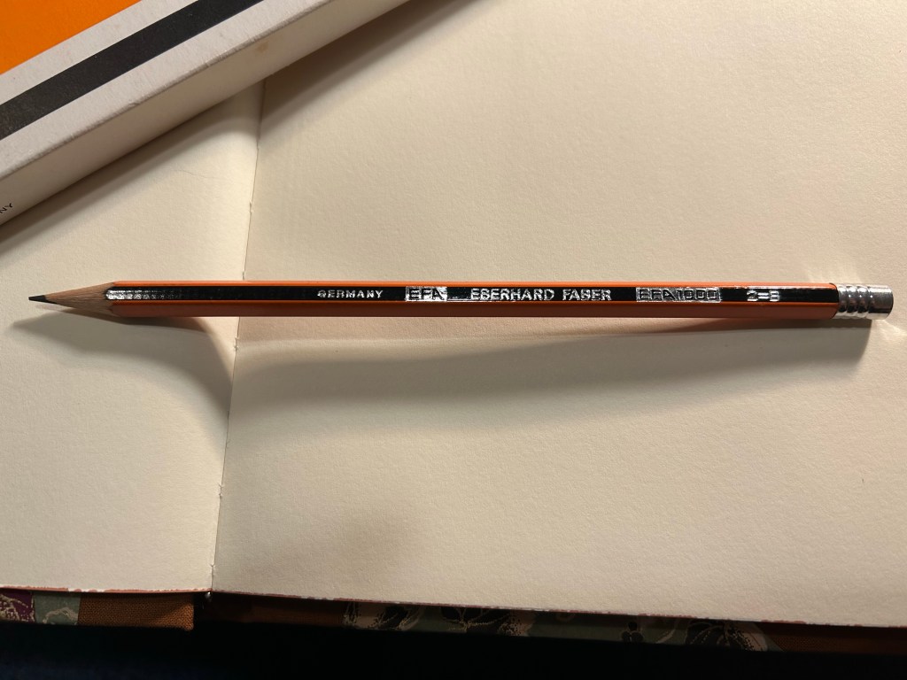
Enter the pencil that I wanted to try out most: the Eberhard Faber EFA 1000 vintage pencil in 2=B grade. I know, it’s weird. I don’t get it either. 2 is supposed to be HB.
I bought a box of these beauties at during my last visit at Present and Correct, and I’ve been wanting to use them since. They’re made in Germany, the lead is a B grade (slightly softer and darker than HB), very smooth and it retains its point surprisingly long for a soft pencil.

The pencil comes pre-sharpened, and has an orange and black body that looks a bit like the Staedtler Noris, but in orange instead of yellow. It has “Germany”, “EFA”, “Eberhard Faber”, “EFA 1000” and “2=B” embossed on it silver foil. The fonts used look very futuristic and modern, which makes me think that this is a ‘70’s pencil.
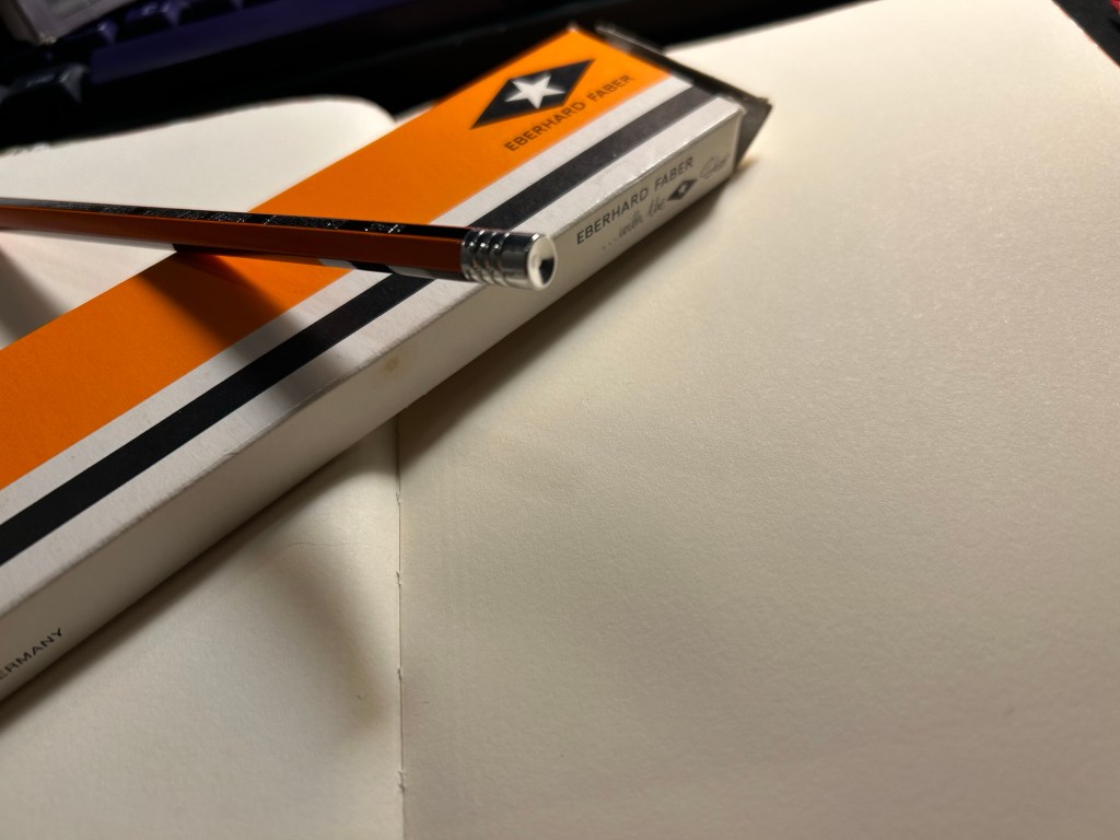
The biggest issue with vintage pencils is the eraser, which is always dried up and completely unusable. For this reason I prefer vintage pencils that don’t have erasers, or better yet, those that have endcaps. Well the EFA 1000 gets lots of bonus points for not only having an endcap, but having a really good looking one. It’s also silver in colour, and it features three rings and a concave top.
I then sat down to create this quick sketch of the latest round of pro-democracy protests. The pencil was a joy to use, and it worked very well on the paper. I was very happy with the feel of them both, and with the sketch results:
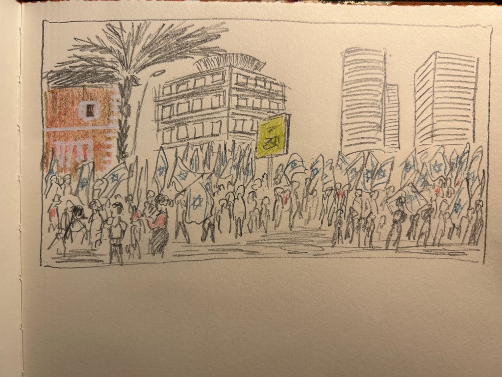
I added some colour with three Tombow Irojiten coloured pencils and a Koh-I-Noor brown Magic Pencil. The Tombow Itojiten was an utter disppointment. The green pencil crumbled twice, the others were mediocre at best. The Koh-I-Noor was a lot of fun, but brown works best with other coloured pencils layered on top, to give it some life.
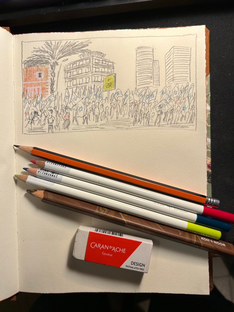
All in all this first attempt at shopping from my own stationery stash was a success. The EFA 1000 is staying on my desk, I learned things about the Tombow Irojiten (I’m glad I only have three Itojiten pencils and not a box of them), and I got to use a notebook that I’d thought would just gather dust. This is definitely something I will try to do again.
I was about to write a post about my currently inked pens, when I realized that I hadn’t finished writing up and publishing this post. Such is the state of my blogging backlog that things have been languishing in it since May.
My April London-Paris trip was the first one I made where I had nowhere to buy vintage fountain pens from. Henry the Pen Man (Henry Simpole) had passed away, and Mora Stylos in Paris had closed his shop in the end of December 2022. Would I even buy any fountain pens?
The answer is of course, yes. None of these pens are rare or expensive, but they are fountain pens nonetheless.
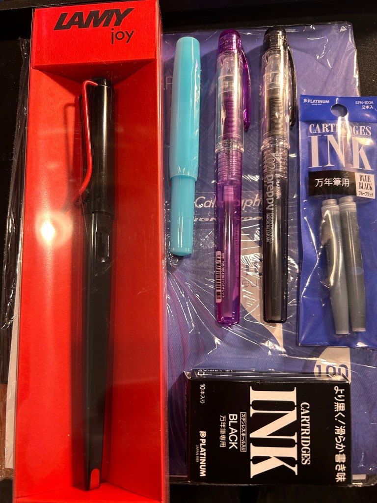
I had one thing that was a “must buy” for this trip, and I almost didn’t find it: blotting paper. I’m using a Stalogy notebook as my journal these days, and with some juicy ink and nib combinations a piece of blotting paper is necessary. Alas, I was unable to find any in London: not in Choosing Keeping or in Present and Correct or in any bookstore, stationery store or antique/vintage/flea market that I looked in.
Here Paris came to my rescue, with its fabulous Latin Quarter stationery and art supply shops. I found blotting paper, and then got carried away and added a few cheap fountain pens and ink cartridges to my bag.
I already have a Lamy Joy, and they make for great sketching pens, but I wanted one in black and red and to try and sketch with the included 1.5 nib instead of automatically switching it out for a fine or extra fine. There’s a charm to sketches made with bold, thick lines, after all.
The Kaweco Sport in Blueberry was just an impulse buy, because I liked the colour and I have cartridges languishing around that I want to start using. The Platinum Preppies though, there’s a bit of a story there.
I bought a few Platinum Preppies in my very early days with fountain pens, and I purchased o-rings and silicon grease with them, intending to convert them to eye-dropper pens. They all cracked. Immediately. After the first use. One of them was even cracked before I used it.
I’m very gentle with my fountain pens, so I was very disappointed with the plastic quality on these, especially after I learned on the Fountain Pen Network that this was a common occurrence. Well, as I couldn’t care less for the ink cartridges supplied with this pens, I didn’t use them. For me the Platinum Preppy was trash.
Time passed and the Preppy kept getting recommended as a great beginner fountain pen, to my bafflement. It cracks, so why recommend it? Then again, I stopped seeing reports of cracked Preppies. Could Platinum have changed the plastic? Were they all using boring old Platinum blue cartridges and ignoring the cracks?
So when I saw a bunch of Preppies in a Paris art supply store (the wonderful Rougier & Plé) I decided to take a closer look. Wow! They come with purple ink now! And there’s a black ink one too… I decided to give them a try and add a few ink cartridges to my purchase too. The Platinum cartridges are proprietary ones, but I do have a Plaisir, so if all my Preppies crack, I can always use them with the metal-bodied Platinum Plaisir.
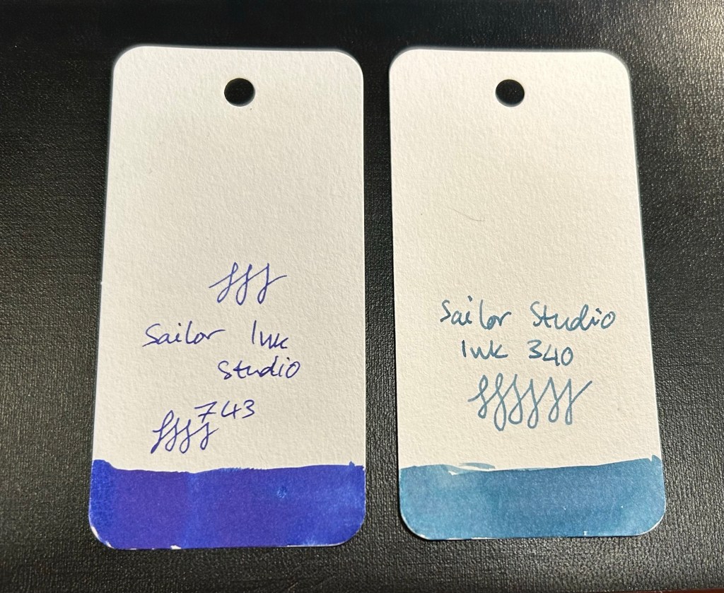
I also purchased two Sailor Studio inks at “Choosing Keeping” in London. The Sailor Studio 340 is a calm greyish powder blue and the 743 is an electric purply blue, and I love them both. These are expensive inks, and so they’re a rare treat for me, one that I indulge in rarely.

