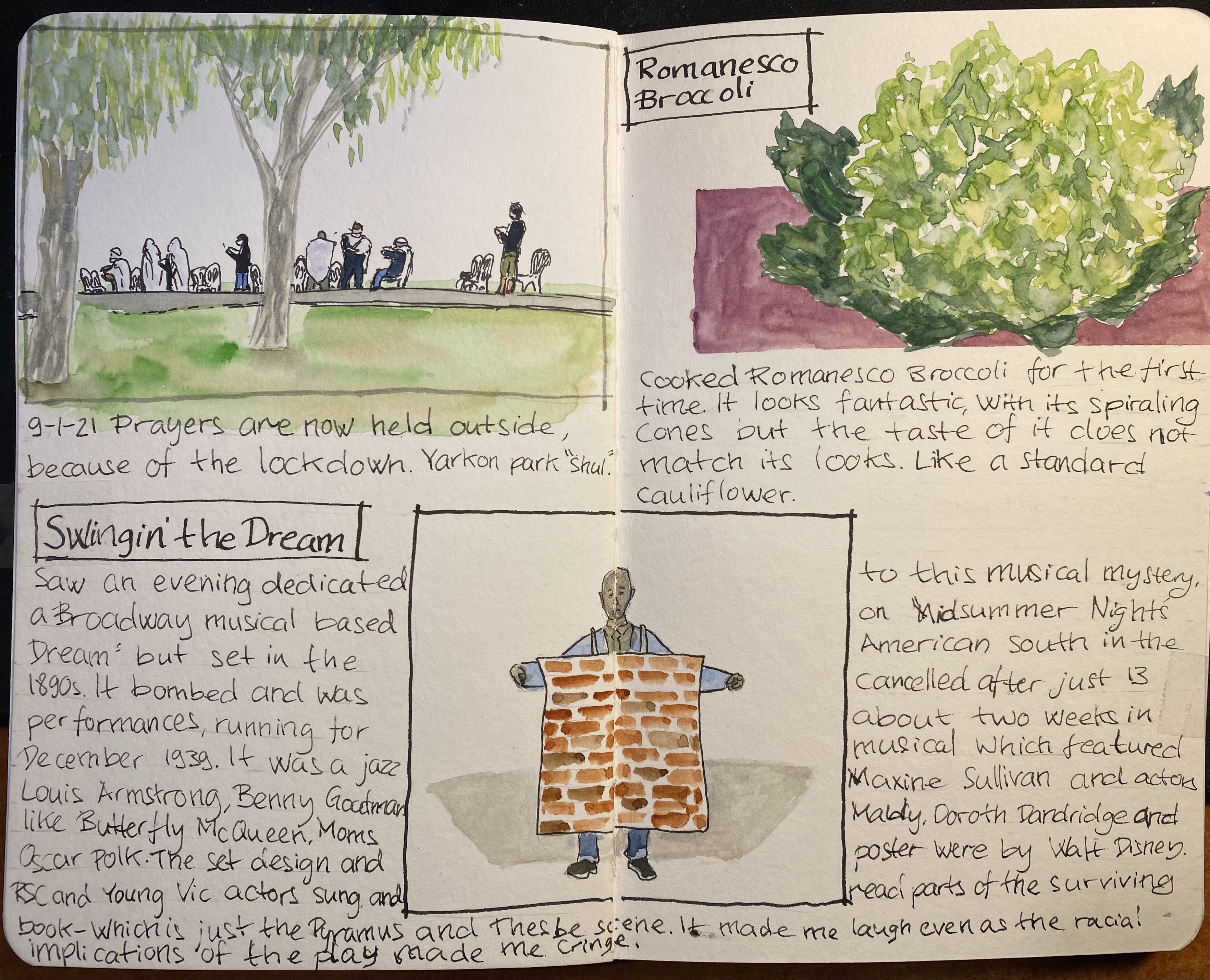
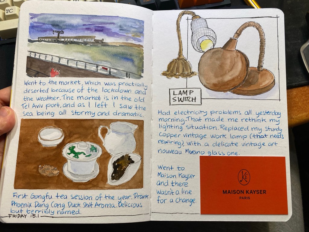
Another page from my sketchbook, created as part of Liz Steel‘s excellent Sketchbook Design course. Went on a run and saw a makeshift outdoors synagogue in the park. Prayers take place outside now, as we’re in lockdown number three.
Saw an RSC and Young Vic production about “Swingin’ the Dream” a 1939 musical that had a star studded cast and seemingly checked all the boxes for success (jazz musicals and Shakespeare were popular at the time, so why not create a mashup of the two?), yet tanked and was canned after only 13 performances. What is fascinating isn’t just the failure itself, but that there is so little evidence of the musical ever existing. A musical number and a Pyramus and Thesbe scene are all that is left. The evening I saw was a one off, but it piqued my curiosity enough for me to want to learn more and see more about it. You can read more about the production here and here.
Material list: Stillman & Birn A5 Beta, Schminke watercolours, Lamy Safari (medium and fine nibs), Lamy Joy 1.1 nib, Noodler’s Lexington Grey and Noodler’s Black.
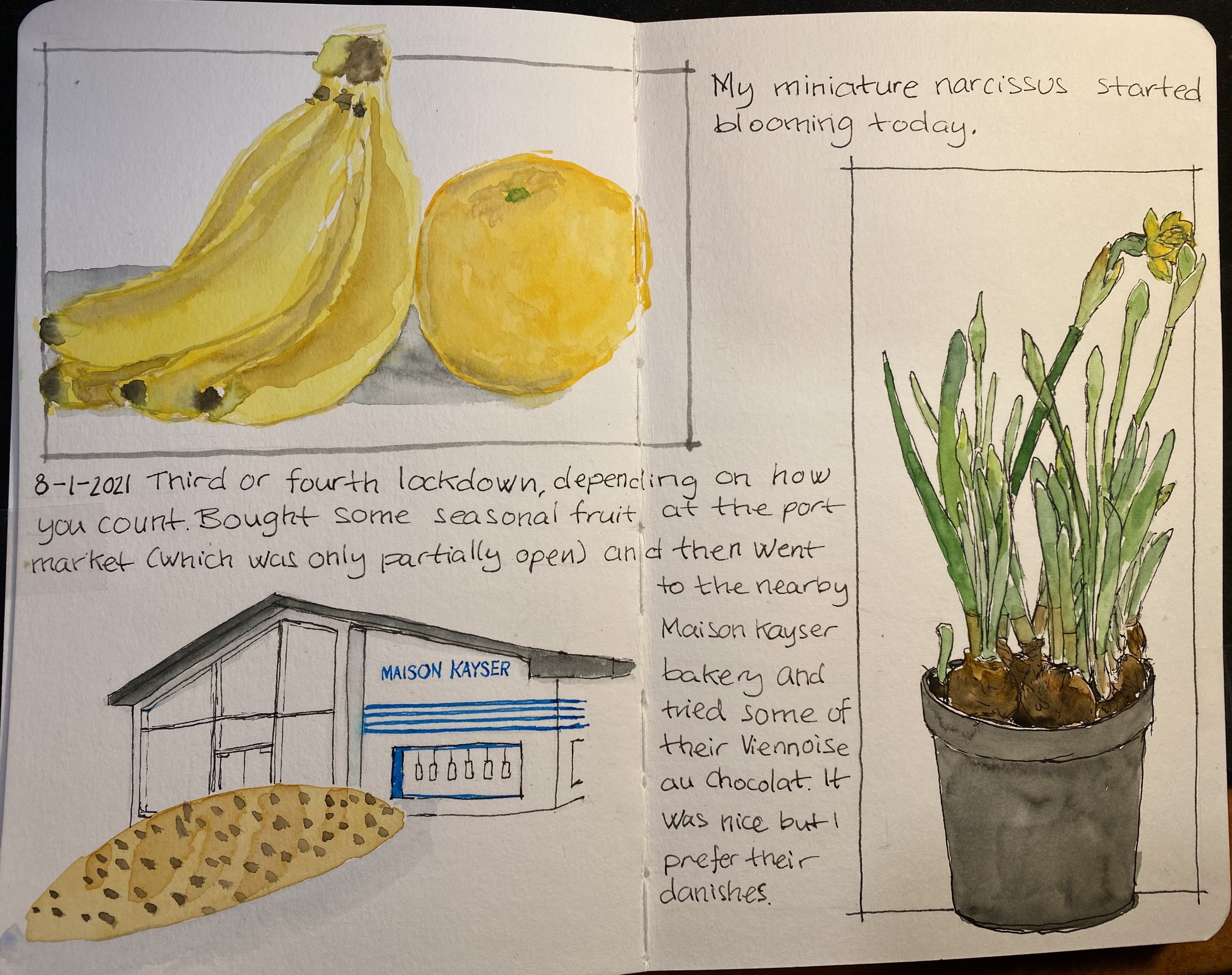
Bananas, orange, narcissus and Viennoise – an eclectic page
This page, created for Liz Steel‘s Sketchbook Design course, is about secondary sketches and borders, and has a little hidden colour block in it. The original spread was a little lacklustre and disjointed. The Viennoise in the corner looked particularly sad. Adding a secondary sketch of the Maison Kayser bakery (where I bought it), with a touch of blue and bluish grey to the background really brought it to life.
The bananas and orange got a shadow which serves more as a grey colour block, making their warm colours more prominent. Adding borders in Noodler’s Lexington Grey (to the bananas and orange watercolour) and Noodler’s Black (to the narcissus) was the final touch that pulled this page together.
I’m enjoying the course very much, even though the past two weeks have been personally hectic. I’ve been working on a short story to submit to a competition (got it done in time and accepted), and some bad news regarding the health of a family member have meant less sketching time than I would have liked. Hopefully the coming weeks will be better.
By the way, the local branch of Maison Kayser, in Tel Aviv’s port (I haven’t visited the Rothschild one yet), is excellent. Their vanilla chocolate chip danish, sandwiches, and baguettes are sublime, and it’s a fun place to visit. They had the misfortune of opening after the pandemic started, but they seem to be managing well, so I think we’ll be seeing them around for a good while yet.
Drawn on a Stillman & Birn Beta, with Lamy fountain pens, Noodler’s ink and Schminke watercolours.
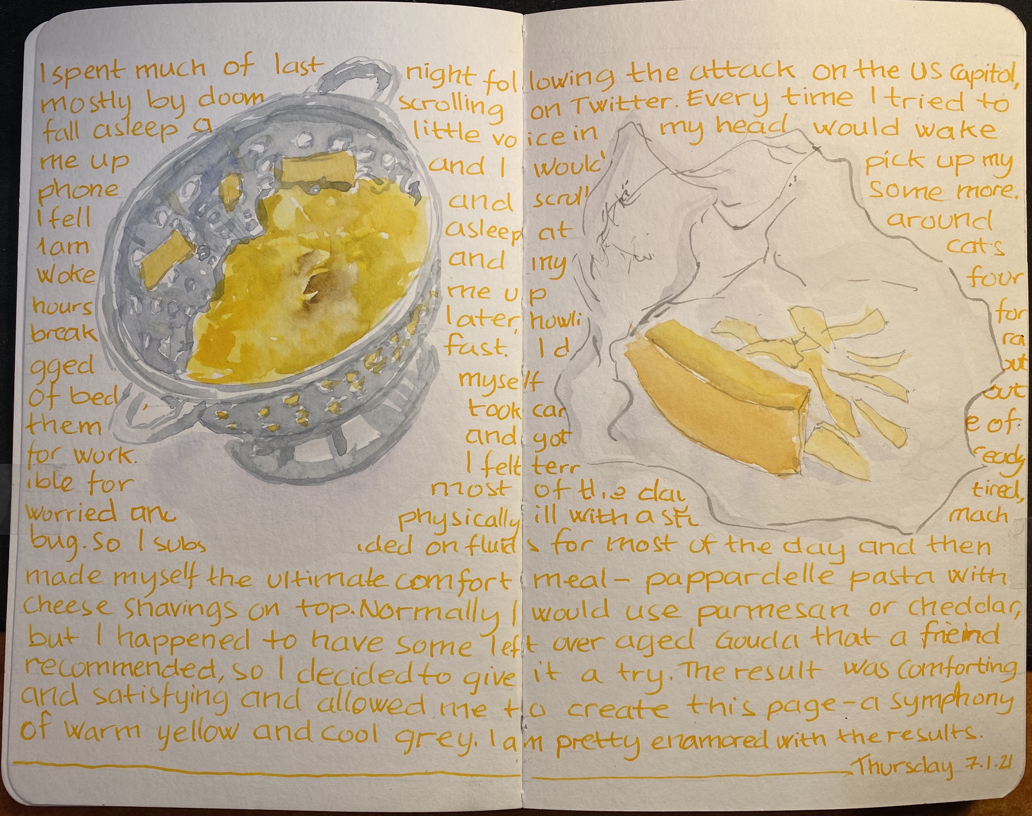
I think that there’s nothing better than plain pasta or pasta with a little cheese if you’re not feeling your best: it’s perhaps the ultimate comfort food. I created this page as part of my Sketchbook Design course with Liz Steel, and this one is all about exploring how to use text as part of my page design. Gave Rohrer & Kilngner Helianthus ink a spin, which is also something that I decided to experiment with. Like many yellow/orange inks it tends to crystallize on the nib and feed, so I’m “sacrificing” a Pelikan Pelikano for the effort. Pelikanos are great beginners pens that don’t get much love in the community probably because they are less ubiqutous than Lamy Safaris and their standard nib offering is a Pelikan medium which is very wide. If you’re an artist I recommend purchasing one (with a converter), as they have less tendency to dry out (with permanent inks) than Lamy Safaris and they indestructible workhorses that have very smooth (and wide) nibs.
Drawing made with Schmincke watercolours on a Stillman & Birn Beta which I’m still on the fence about. It’s better than the Alpha for watercolour washes, but it’s still not great, and it’s not great for pen and ink or fineliners. Also the glue connecting the sections isn’t the best, as it needs forcing apart once you hit a new section, and oftentimes leaves an unseemly tear in the middle. The sketchbooks are good, I just wish that the sections were sewn together and that the paper would lean into being watercolour paper more – so that they would be perfect. However, changes like these would mean a price increase, which would make them unappealing, since a large part of the Stillman & Birn softcover sketchbook appeal is their price. In the end it’s a nice sketchbook that I don’t feel too precious about, which is the main point, and is why I’ll continue using it.
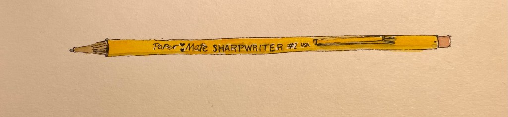
If you follow any makers on YouTube you probably saw this ugly yet somehow charming little mechanical pencil in action. The Paper Mate SharpWriter is a strange beast, full of surprises. It’s a mechanical pencil with a twist mechanism in the tip instead of a click mechanism under the cap, it actually has a serviceable eraser, and it’s non-refillable. It’s as if Paper Mate saw the “Think Different” ad and said, “yes, but how can we apply that to a mechanical pencil?”
Paper Mate SharpWriter.
First of all, you can buy the Paper Mate SharpWriter in many different widths, as long as they’re all 0.7mm. This has the added value of saving Paper Mate the need to indicate the lead width on the pencil, because there’s only one width to rule them all. I can’t honestly fault them for that. It’s a pencil that’s meant for students and bills itself as having less lead breakage, and so 0.7mm is the way to go.
There are some interesting things going on with the business side of this pencil. First and foremost, that’s where the lead propelling mechanism is, which caught me by surprise. It’s a twist mechanism, and it’s pretty sophisticated as it allows you to easily extend and retract the lead to suit your needs. The second part is the “lead cushioning mechanism” which means that the lead springs up and down as you right, preventing you from breaking it if you exert too much pressure. It works, but I’m not a fan as it makes me feel as if the lead is broken inside and I have to extend it to get rid of the small broken piece and reach the “real” lead left inside. It’s going to take some time for me to get used to it.
Writing and erasing sample.
The eraser is downright phenomenal, as it actually erases things quite well, and doesn’t tear into the page. The lead itself is a solid HB 0.7mm lead that is smooth and on the slightly darker side of HB.
The Paper Mate SharpWriter isn’t a pretty of fancy mechanical pencil, but it’s comfortable to hold, lightweight, and has a playful colour scheme that recalls a woodcase pencil. And like a woodcase pencil, it’s disposable, which is where my only real beef with this pencil lies. Yes, this is a student pencil, and so it’s likely to get lost or somehow broken (it’s far from flimsy, but where there’s a will, there’s a way), and if the pencil won’t be lost, the leads will, and yet… The last thing the world needs is more plastic waste.
So, do I recommend the Paper Mate SharpWriter? No, and not because there’s anything wrong with the pencil, it’s just that there’s very little justification for a disposable mechanical pencil when there are cheap, good and even great refillable options to be had in the market.
But I do understand the makers who have fallen for this ugly duckling.
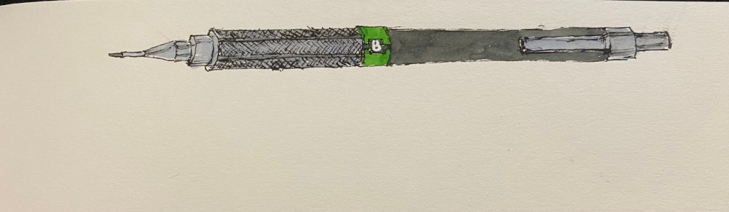
First review of the year! I bought the Uni Pro M9-552 mechanical pencil a while ago in London, I believe. Never having heard of it before, and noting that it was an inexpensive drafting pencil, I decided to give it a try. I wasn’t disappointed: the Uni Pro M9-552 has a terrible name, but it’s a very good drafting pencil AND a very good mechanical pencil, which is not the same thing.
Illustration of the Uni Pro M90552 mechanical/drafting pencil.
The Uni Pro has a plastic body, a knurled aluminium grip and an aluminium cap and clip. This makes for a light pencil that is weighed towards the tip, which is what makes this a good mechanical pencil and not just a good drafting pencil. It’s very comfortable to hold and write or draw with, even for long periods of time, because of the weight distribution and the knurling on the grip. The knurling provides excellent grip without cutting into your hands.
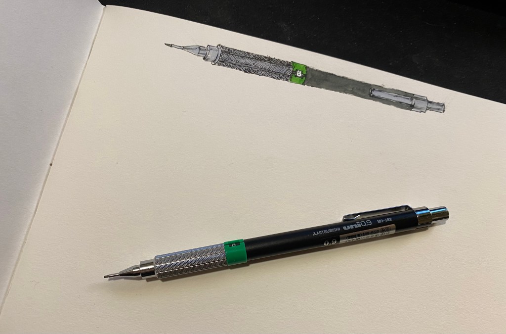
Illustration of the Uni Pro M9-522 with the pencil itself.
Like all drafting pencils, it has a long lead sleeve and a lead grade indicator. I like the touch of colour that it provides to this otherwise very utilitarian design. The cap has the lead width, 0.9, engraved into it, and under it is the usual refillable eraser. It will do in a pinch, when you don’t have a block eraser around and have very little to erase.
This isn’t a lead review so I’m not posting a writing sample, but I will say this – if you haven’t tried writing or drawing with a 0.9 lead mechanical pencil, I recommend giving it a go. You get most of the line variation and expressiveness of a woodcase pencil, but without having to stop and sharpen it all the time.
Closeup of the knurling.
The Uni Pro M9-552 is a good choice of drafting pencil, with its light weight making it a good choice for people with small hands or those that are looking for a drafting pencil that can also serve as a mechanical pencil (i.e. a daily writer). The Uni Pro 552 series also includes a 0.5 pencil (with a red lead grade indicator), 0.7 pencil (blue indicator), 0.3 pencil (yellow indicator), and even a 0.4 pencil (orange indicator, at a rare lead width).
My sketchbook design course goals, and a drawing of the Phoenix community garden in London.
The first week of Liz Steel’s Sketchbook Design course is underway, and so far I’m having a blast and drawing much more than I used to. I’m also learning a lot not just from Liz, but also from the other participants in the course. One of exercises this week was to create a page with our Sketchbook Design course goals, and here is mine. I also drew the Phoenix Community Garden in London’s West End to accompany my goals. Hopefully I’ll be able to return to it later this year.
Tools used: Stillman & Birn A5 Beta, Lamy Safari pens with J. Herbin Bleu Pervenche and Noodler’s Black, Schmincke watercolours.
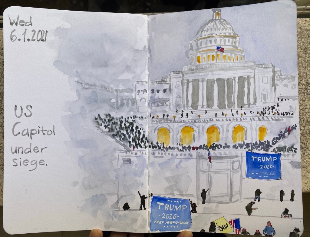
I was very shaken by what happened on the US Capitol on the 6th of January. The images were scary, and so I sat down to sketch one of them, to get off twitter for a while.
Stillman & Birn A5 Beta, Schminke watercolours, Noodler’s Black (Lamy Safari fine nib), Uni ball Sign broad white.
2021 has finally arrived! Every year since 2015 I’ve kept a list of yearly goals in a Baron Fig Confidant. I still call “New Year’s Resolutions” despite their being SMART goals and not pie in the sky resolutions. Over the years they have expanded to be ever more specific and quantifiable: I started with one page, and now have a main two spreads with related lists spilling out to adjacent spreads, and an entire notebook dedicated to capturing my reading goals.
2020 was a weird and challenging year, and it managed to land a large, hard hit on me on its very last day. These goals were written before I got bad news regarding the health of a close family member (Cancer, not Covid), which means that there’s a good change that 2021 will shape out worse than 2020 in terms of my goals. However, ever since 2018 I build my goals with those kinds of emergencies in mind, and so most of my goals, if not all of them, should be attainable.
2021 goals and theme in my Baron Fig Confidant
Some of my usual goals are off this list, because I’m afraid that Covid will not be over so soon. For the first time ever a significant chunk of these goals is professional. I’ve changed careers, and new opportunities have opened before me – creating professional goals makes sure that I take advantage of those opportunities.
My writing and journalling have taken a hit in 2020 (particularly the latter part). Hopefully with some concerted effort that will change in 2021. I’ve made significant progress in terms of fitness in 2020, and I plan on maintaining the course in 2021. I’m also putting some effort into taking time to enjoy my hobbies. If I don’t prioritize them, then they just get left by the wayside.
Finally, for the first time I’ve created a yearly theme, that is part of the yearly goals and yet also a separate entity. 2021 is the “Year of Clearing Out”. That means decluttering my apartment, pruning my podcast/book/viewership lists, and getting rid of some recently acquired bad habits (mostly doom scrolling on Twitter, but not just). This may end up being a theme that will spill into 2022, but the idea is to try and tackle it in 2020, to build a good foundation for the years to come.