I wrote about my newest notebook, my “Work in Progress” notebook here. It’s basically a notebook that I use for self improvement, dedicated for various exercises in focused meditation, working through gnarly personal issues, and for more intense personal journaling.
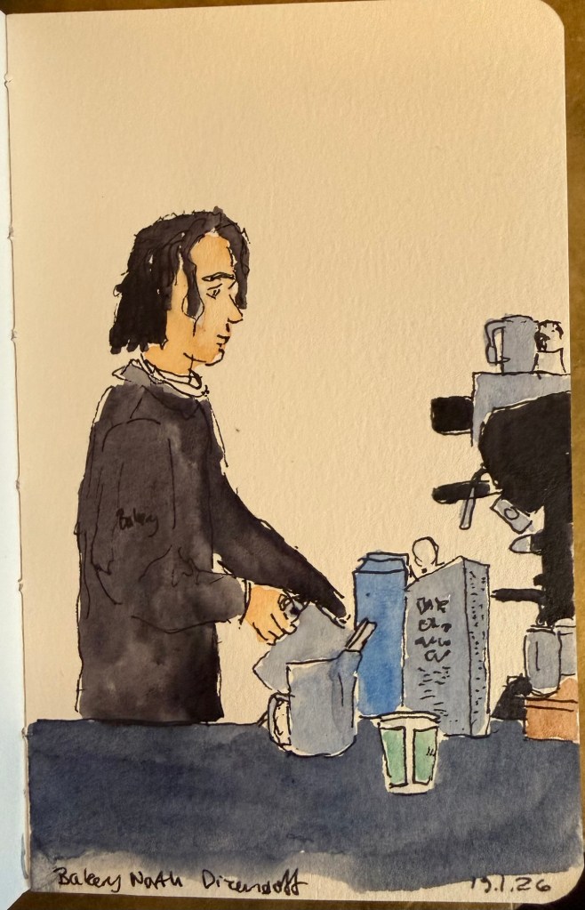
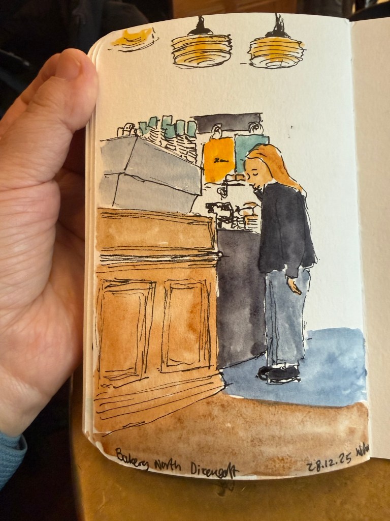
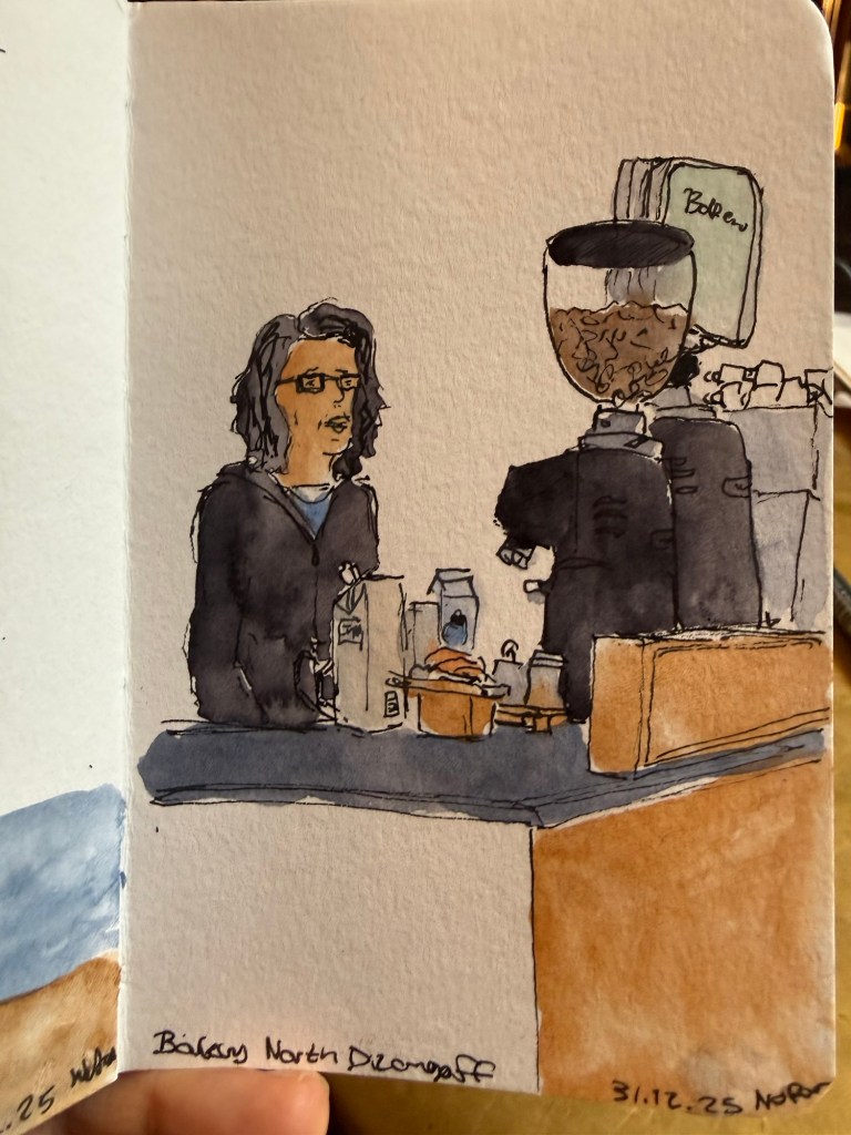
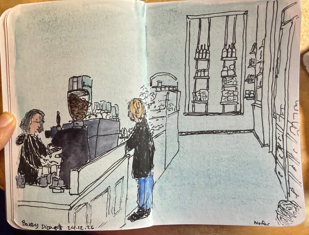
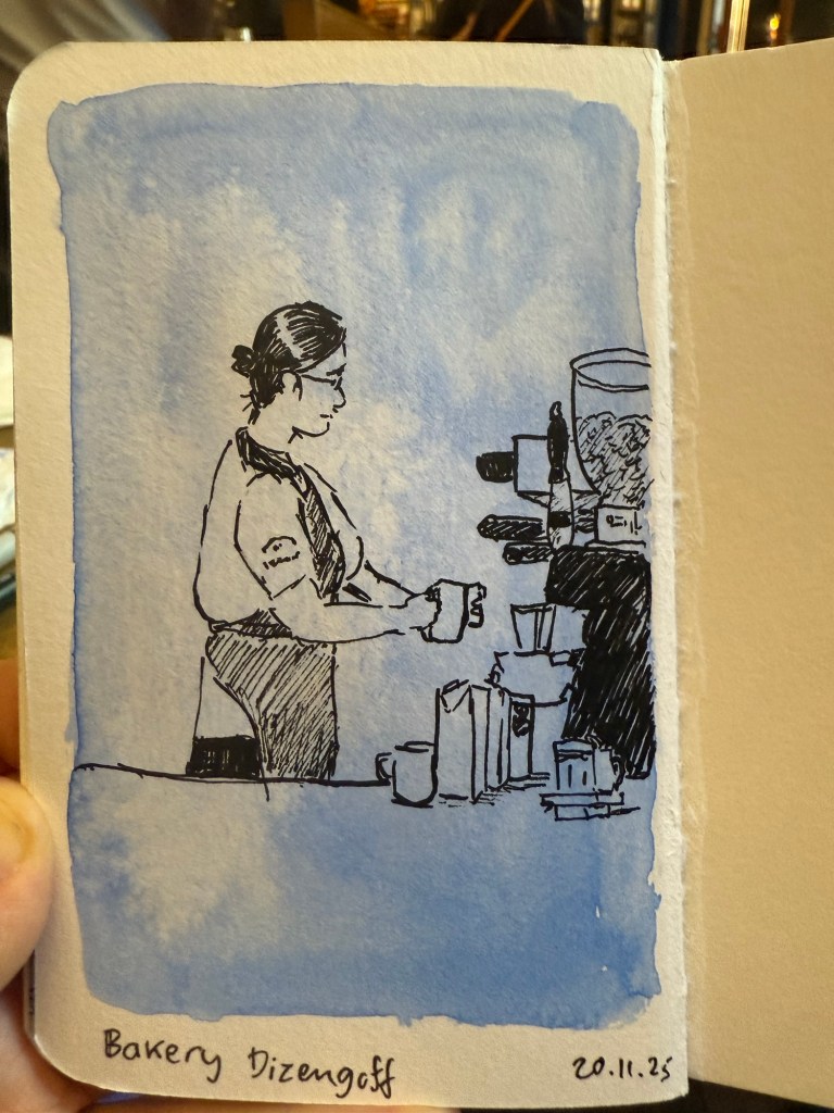
Barista sketch because people need pictures in posts or they get bored.
One of the things that I do as an ongoing exercise in this notebook is keep a list of people that I personally know (so no celebrities or influencers) and what I learned from them. The idea came to me as I was reading Marcus Aurelius’s Meditations.
The book starts with a list of people that Marcus is indebted to – from his immediate family, then onwards to friends, teachers and advisers. This inspired me to create a similar list of my own, also starting from my immediate family and expanding onwards from that.
Some people are kind, inspiring, provide a good example and so they were easy to add to the list. Others were more challenging, but I forced myself to confront my relationship to them, and to find the valuable lessons that I learned from them. The point isn’t to be vicious, cynical, or facetious, but rather to take a second look at people and relationships that you have labelled in a certain way. So the terrible boss taught me what I value in myself and in my managers, certain mean people taught me how to recognise hypocrites, and bad teachers taught me to appreciate good ones and to learn on my own.
I highly recommend doing this exercise and returning to it. It will make you appreciate and feel grateful for the people in your life, and you may even be moved to thank a few of them, even though that’s not the point of this. The point is to realise that:
No man is an island,
Entire of itself;
Every man is a piece of the continent,
A part of the main.
If a clod be washed away by the sea,
Europe is the less,
As well as if a promontory were:
As well as if a manor of thy friend’s
Or of thine own were.
Any man’s death diminishes me,
Because I am involved in mankind.
And therefore never send to know for whom the bell tolls;
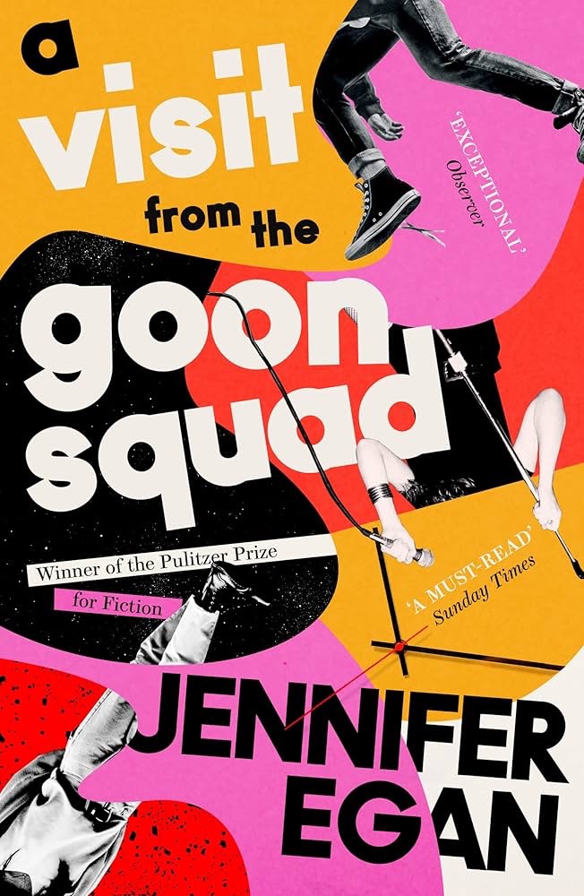
I bought A Visit from the Goon Squad back in 2011, as it was part of that year’s Tournament of Books. It has languished on my Kindle ever since. This year, however, I have decided to read the oldest unread books on my Kindle, and so it was A Visit from the Goon Squad’s turn.
First of all, the book has a dreadful name. It’s trying to be sophisticated, it ends up being uninformative and unappealing. It’s sounds like a book about comedians, or maybe a family saga of some kind, but it’s basically a string of partially connected episodes about people that work or have worked in the music industry.
The post Pulitzer win book cover
I almost gave up on this book as about 50 pages in I found myself not liking any of the characters and finding the narrative dull and bland. Then Rhea appeared, and I found myself pulled into the story. She redeemed the book, and it got better and better as I read along.
A Visit from the Goon Squad is a very readable book, apart from the deliberately dreadful writing of the only writer in the novel, Jules Jones. There’s a character that didn’t redeem himself – the more I saw of him the less I liked.
The book didn’t age well, and will likely age even worse with time. It’s embedded in a certain era – pre smart phones, social media and AI – but it’s not written in a way that will allow it to be timeless. The powerpoint penultimate chapter reads as a dated gimmick, and the last, “futuristic” chapter is truly terrible. It really brings the book down, as even for its time it serves mainly as a window to Egan’s biases and anxieties more than to the true zeitgeist of the time.
Egan’s choice to build the narrative on episodic encounters with loosely connected characters was groundbreaking for the time, and the book won a Pulitzer Prize. In 2019 Bernadine Evaristo will take this concept and do it much, much better with Girl, Woman, Otherthus leaving Egan’s novel in the dust.
While I don’t regret reading A Visit from the Goon Squad I wouldn’t recommend it. It didn’t stand the test of time, there are much better books to read, and it’s attempt to capture the zeitgeist of a time so fleeting it practically didn’t exist (the oughts) isn’t worth the reader’s time. Read Evaristo’s novel instead.
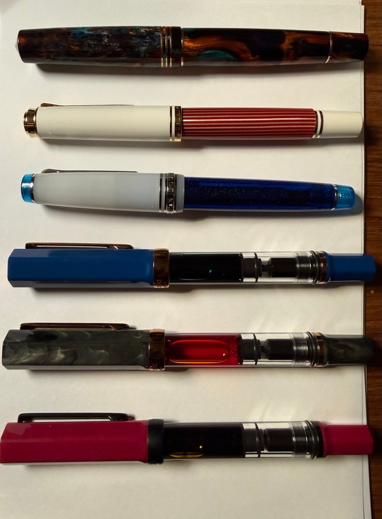
It’s been a while since I’ve posted one of these, mostly because through November I was still working through the Pelikan Hubs pens and then December was Inkvent time. However, I have just cleaned out all of my fountain pens and started out with a fresh batch for the new year. Here’s the lineup for January, and it’s mostly dedicated to new pens with interesting inks.
The pens top to bottom: Leonardo Bohemian Twilight, Pelikan M600 Red and White, Sailor Pro Gear Sunlight from the Ocean Floor, TWSBI ECO indigo blue and bronze, TWSBI ECO Serpentine and bronze and TWSBI ECO Plum and onyx
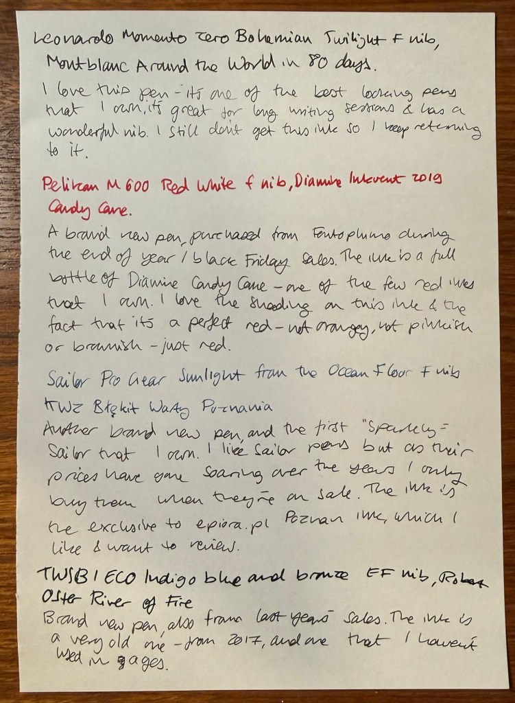
Leonardo Momento Zero Bohemian Twilight fine nib inked with Montblanc Around the World in 80 Days. I love this pen so much – the minute I saw it as I was stowing away my cleaned out pens I realised that I have to ink it again. It hasn’t been far from rotation from the minute I purchased it, because it’s a gorgeous pen with a wonderful nib that is comfortable for long writing sessions. The ink is beguiling – ever since I realised that it isn’t the mustard green that I was expecting I keep trying to figure it out. It’s on the spectrum between dark grey and blue-black, and there’s something about weirdly undefinable inks that appeals to me.
Pelikan M600 Red and White fine nib inked with Diamine Inkvent 2019 Candy Cane. I reviewed the ink here (it was from the first Inkvent calendar) and I liked the ink enough to buy a full bottle of it. Pelikan M600 is my favourite Pelikan size (even though there’s not much difference between it and the M800) and I didn’t have any of the red editions of the Pelikan Souveran line. When this one went on sale I just had to buy it. Pelikan’s are workhorses with a giant ink capacity and fantastic nibs. If you don’t have one, I recommend buying an M200 at least, and splurging on the M600 or M800 when you can. Note that Pelikan nibs are wider than their Japanese counterparts.
Sailor Pro Gear Sunlight from the Ocean Floor fine nib inked with KWZ Exclusive for epiora.pl Błękit Warty Poznani. This is my first sparkly Sailor fountain pen (most of my Sailor fountain pens are black, from the time before they started issuing pens in wild colours and sparkly finishes) and I bought it on sale. As Sailor have raised and raised their prices over the years I only buy them when they’re heavily discounted. Sailor fine nibs as usual are very fine and with plenty of feedback. The ink is an exclusive that KWZ created for a lovely local fountain pen store in Poznan, Poland called Epiora. I bought my Pelikan Art Edition there during the last day of the Urban Sketchers symposium and I got this ink for free. My plan is to review it, as it’s an attractive blue-black.
TWSBI ECO Indigo blue and bronze extra fine nib inked with Robert Oster River of Fire. A brand new pen for me, purchased at the same time as the other TWSBI ECOs in this rotation. The ink is old, from 2017, and an ink that I haven’t used in years. It’s very saturated, we’ll see how well it behaves on various notebooks.
Writing sample
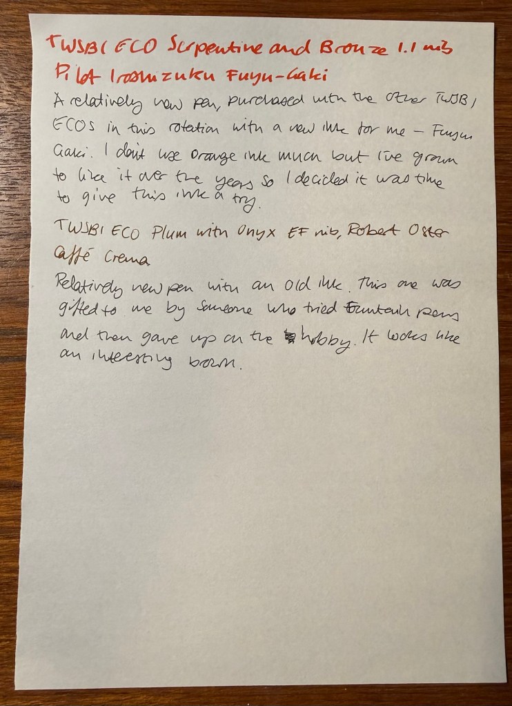
TWSBI ECO Serpentine and bronze 1.1 nib inked with Pilot Iroshizuku Fuyu-Gaki. A new TWSBI ECO with a new (to me) classic Pilot Iroshizuku ink – Fuyu-Gaki. I’ve learned to love orange inks in recent years, and so I’ve decided to purchase this most classic of orange inks. Looking forward to giving it a try.
TWSBI ECO Plum with onyx extra fine nib inked with Robert Oster Caffe Crema. New pen with an old ink – recently gifted to me from an ex-fountain pen user. It’s an interesting shade of brown and I look forward to giving this ink a try.
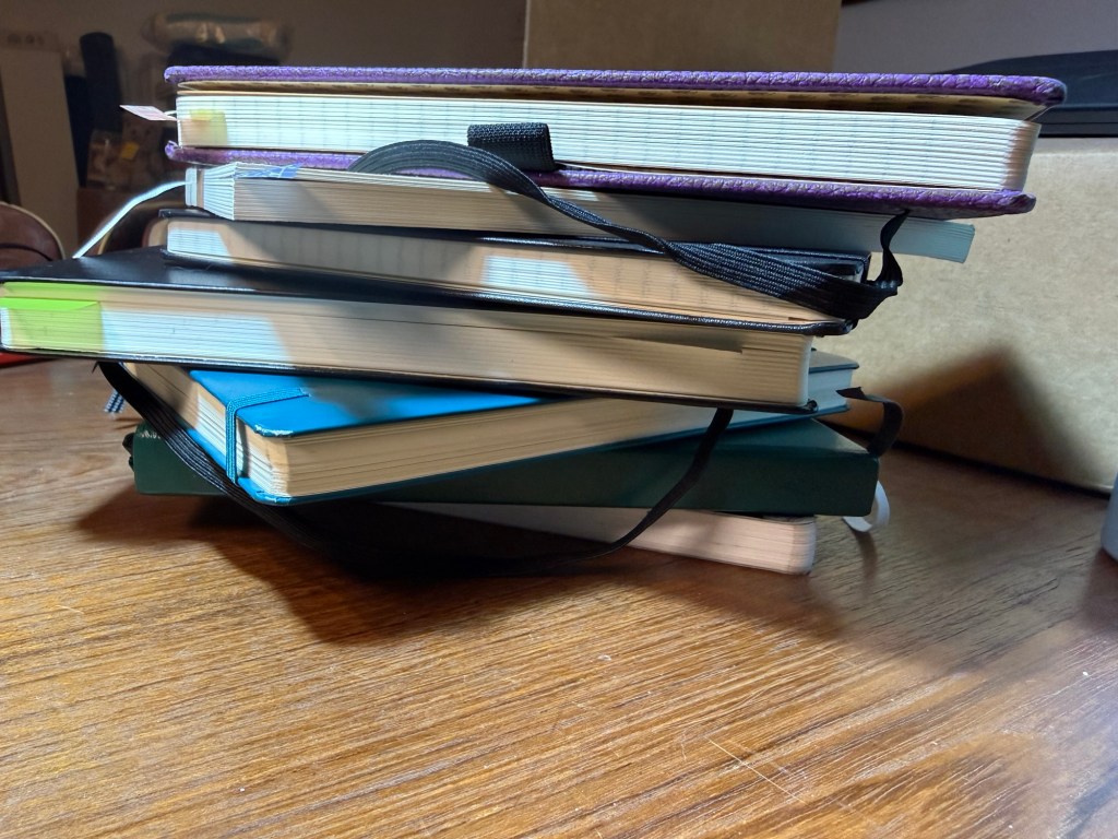
From top to bottom: single project notebook (blog drafts), single project notebook (study notes), single project notebook (D&D planning), work-in-progress notebook, work planner, personal planner, journal
Hi there, do you have a big stack of beautiful, brand new notebooks just waiting to be used? Do you have goals and plans for the new year? Do you want to improve your life in many different areas? Great! This post is for you.
Go grab a handful of those notebooks. We’re going to take the dust off them and get them to work for you. Remember: a beautiful notebook looks even better once it’s full. Notebooks are meant to be used as tools, not stared at like art objects.
Here are a few kinds of notebooks you should keep in 2026:
Journal – this is an absolute must for everybody. I know it’s hard to be consistent – believe me I struggle with it daily – but journaling is a habit that is guaranteed to pay back dividends. I start mine daily with a list of things that I’m grateful for, and end with a mini review of the day (did I fulfil my five ACT values?). In between is a running log of the day, and sometimes a section where I work things out on the page. Don’t post your opinions and thoughts on social media – write them in your journal instead. A journal will give you peace of mind, perspective, joy and a safe place to vent. Don’t take it out on people, put it on the page. I currently use a Stalogy 365 B6 for my journal, though for years I have used limited edition lined Large Moleskine hardcovers, and I may yet return to them.
Work In Progress notebook – this is the newest addition to my notebook rotation and I wish I had started a notebook like this sooner. What is a Work In Progress notebook? It’s where I spend time working on things in my life that I want to reflect on and change. You can do this in your journal, but as I’m dedicating time and effort this year to make some significant behavioural changes I wanted the place to work through these things. This is also a place where I reflect and take notes about the non-fiction, history, philosophy and self-help books that I’m reading, and it’s a place where I take time to consider my values and purpose in life. Heady stuff that we’ve been encouraged to abandon in this cynical and commercial age – much to our detriment. You can change and evolve, it’s worth investing time in trying to become a better version of yourself, and consistent daily work and reflection in this area is worth doing. I highly recommend keeping a notebook dedicated to this endeavour.
Planners – I believe that the best planner is the one that you customise for your needs. This is why I recommend not buying a pre-formatted planner, and instead making a planner yourself. I keep a work planner and a personal (home) planner and I recommend that you do the same – keep work at work and home at home whenever possible. Take into account that you’ll have to experiment to see what works for you, and that there will be a level of compromise that you’ll have to grow comfortable with. There is no “perfect” planner – there is a planner that works for you. Planners don’t replace reminders or calendar appointments – they’re there to give you a broader view of your week, month and year, and let you make some long term plans.
Single Project notebooks – “Single Project” notebooks are exactly that – a notebook dedicated to a single project or area in your life. It can be a hobby (I have one dedicated to my D&D plans, and I used to have one dedicated to my running), an actual project that you’re working on (I’m studying for a certification so I have a dedicated notebook for my study notes), or an idea that you want to develop. I try to select a notebook that fits the project that it’s dedicated to in terms of size, format, cover and number of pages. My running notebook was a Field Notes, my study notebook is a Midori MD notebook. If it’s something that you’re working on for a while and that’s important to you, I recommend dedicating a notebook for it.
Daily To Do List – I don’t use a notebook for this at the moment, but I used to use a large squared Moleskine for this. I currently use Kokuyo KB A4 loose leaf paper that I cut in half to A5 size. These lists are disposable to me, so I have no problem crumpling the daily list away and tossing it into recycling. You can use a notebook, index cards, loose leaf paper – but I recommend keeping a hardcopy, analog version of your daily to-do list. Why? Because to-do apps give you excuses to pick up your phone, because writing things down makes you stop and consider what you’re committing to, and because you’ve got all those pretty notebooks and pens and it would be a shame not to use them.
Scratch pad – keep one at hand to doodle on, for quick capture and to test out pens and inks.
Hopefully this will help you get more enjoyment and use out of that big pile of notebooks in your closet. Let me know if this helps or if you have more ideas on how to use your notebooks.
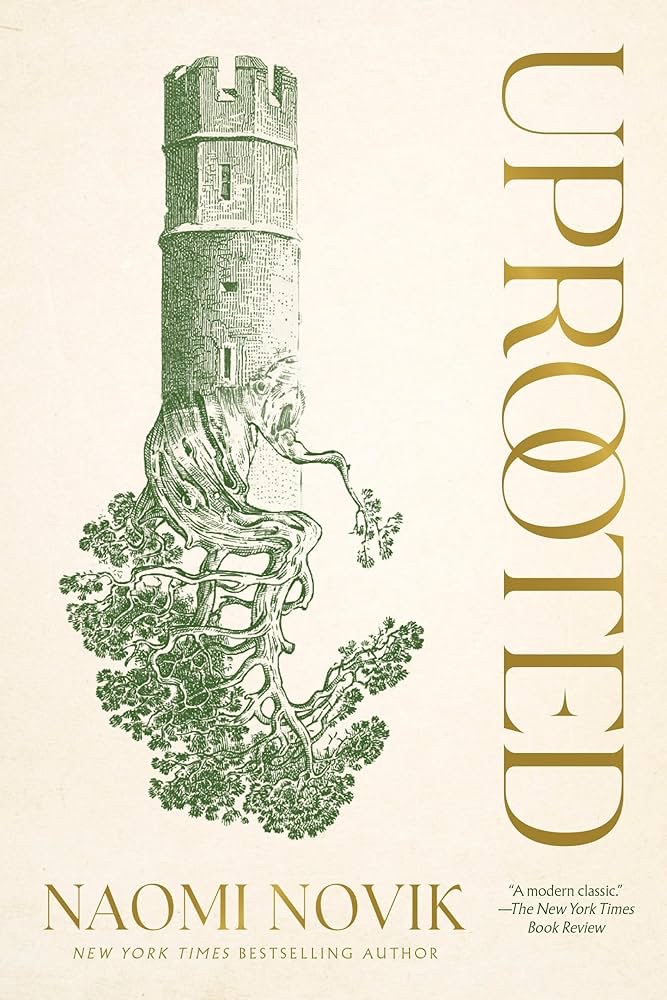
A fairy tale for grown ups, Uprooted by Noami Novik is a beguiling novel about being deeply rooted in a place, and yet also uprooted, a perpetual stranger in your homeland and community.
“Our Dragon doesn’t eat the girls he takes, no matter what stories they tell outside our valley. We hear them sometimes, from travelers passing through. They talk as though we were doing human sacrifice, and he were a real dragon. Of course that’s not true: he may be a wizard and immortal, but he’s still a man, and our fathers would band together and kill him if he wanted to eat one of us every ten years. He protects us against the Wood, and we’re grateful, but not that grateful.” Agnieszka loves her valley home, her quiet village, the forests and the bright shining river. But the corrupted Wood stands on the border, full of malevolent power, and its shadow lies over her life. Her people rely on the cold, driven wizard known only as the Dragon to keep its powers at bay. But he demands a terrible price for his help: one young woman handed over to serve him for ten years, a fate almost as terrible as falling to the Wood.
The next choosing is fast approaching, and Agnieszka is afraid. She knows-everyone knows-that the Dragon will take Kasia: beautiful, graceful, brave Kasia, all the things Agnieszka isn’t, and her dearest friend in the world. And there is no way to save her. But Agnieszka fears the wrong things. For when the Dragon comes, it is not Kasia he will choose.
Like all good fairy tales and myths, Uprooted has a compelling, readable narrative that sweeps you from the first paragraph about “Our Dragon” to the very end (which like good fairy tales also ends with Agnieszka talking about the Dragon). It evokes Polish and Russian folklore, Greek mythology, and classic fairy tales in a Polish medieval setting. You can tell just how much Novik knows and loves the source material she draws on, and how much respect she has for the cultures that wove these stories of magical beings, wizardry and mythic beasts to deal with the dark terrors of their world.
Novik is a magical story teller and Uprooted manages to be both very much part of the fantasy world that she creates, and also a timeless tale about identity, belonging, and love. There is a lot of heart in this adventure, a lot of compassion for the characters within it. Novik manages to create not only a very believable world, but a cast of real, nuanced characters: heroes with flaws, villains that you understand and feel compassion for.
Naomi Novik is a phenomenally good fantasy author, and this book justifiably won awards. If you liked her Scholomance series you will love Uprooted, and I am looking forward to reading more of Novik’s work.
Have a happy new year! Here’s hoping that 2026 will be much better than 2025 was.
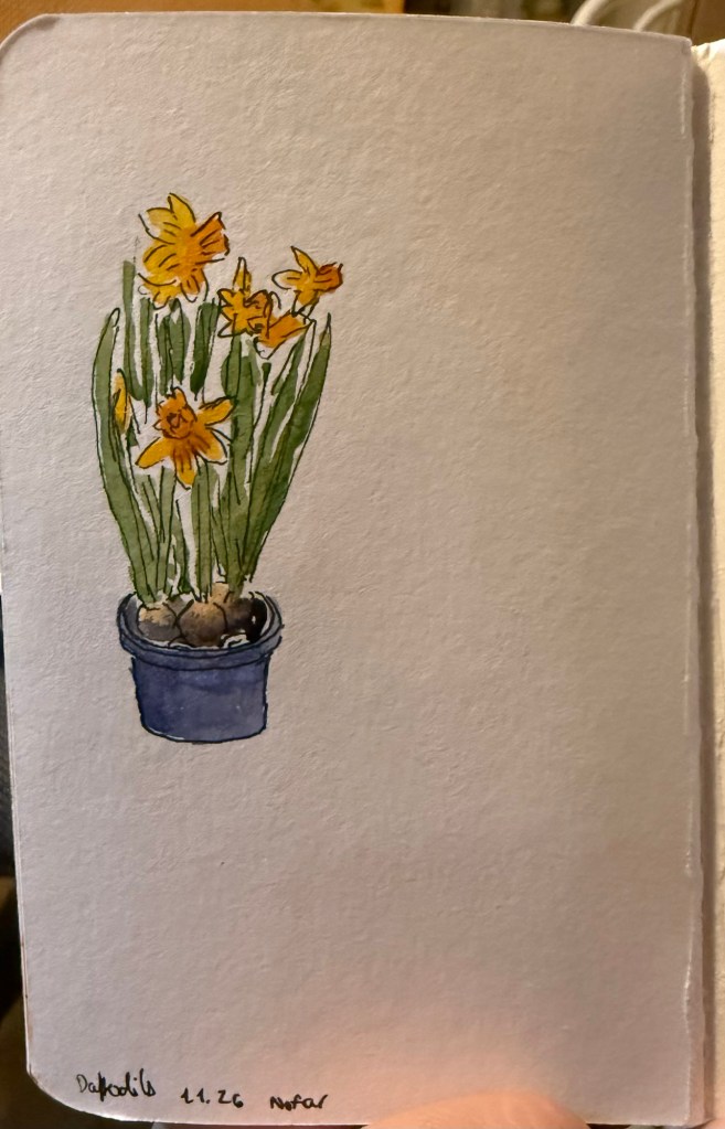
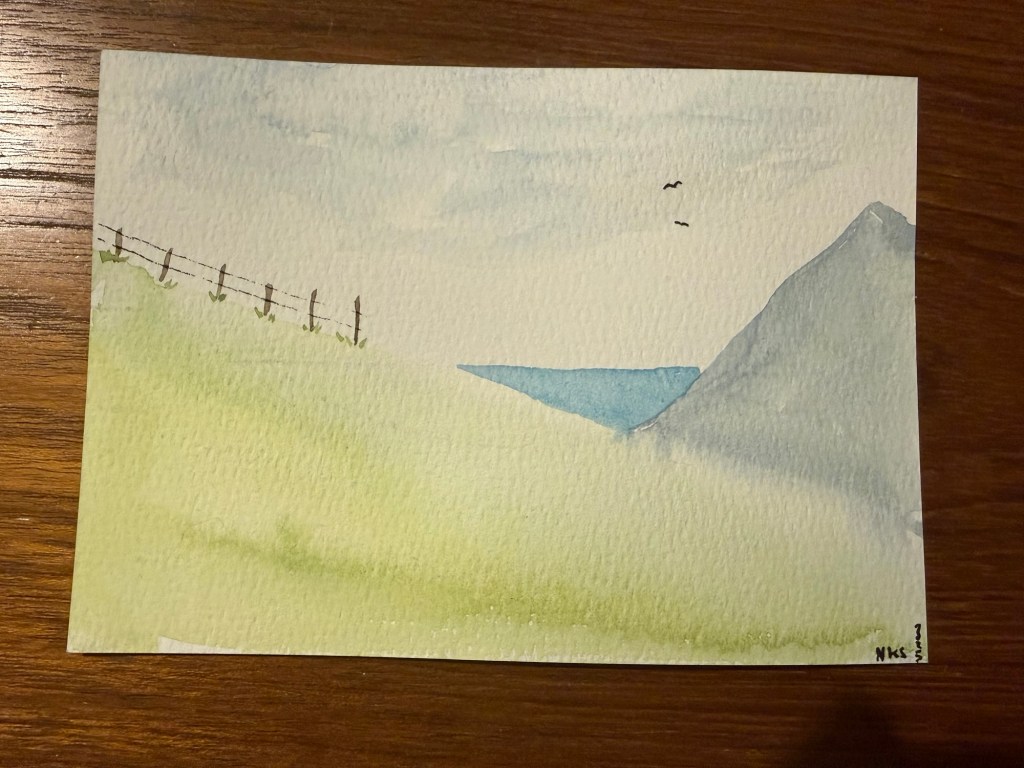
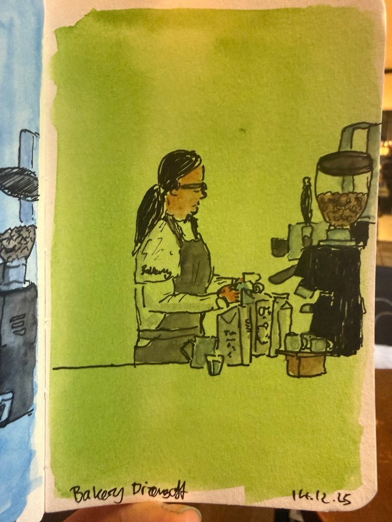
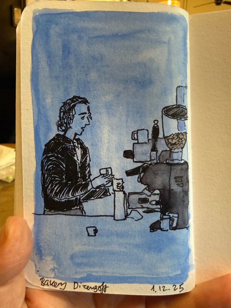
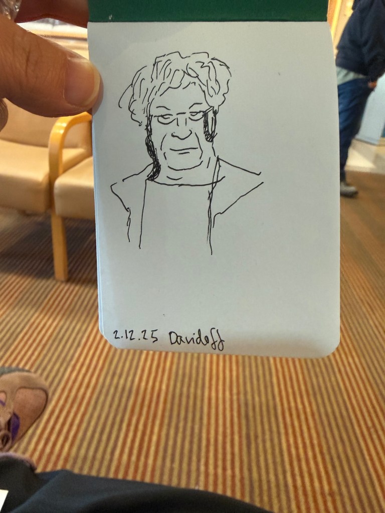
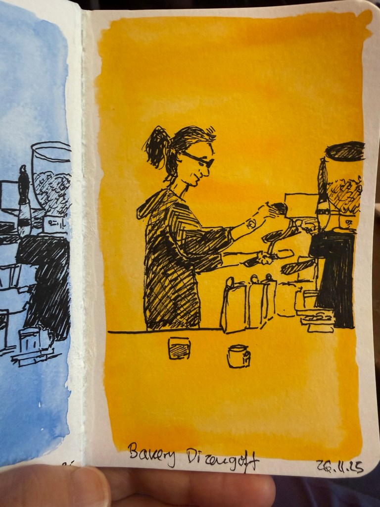
Here are a few recent sketches (mostly) from my Stillman and Birn pocket beta notebook.
Daffodils What to choose? Cafe sketchBarista at work (very fast sketch)Favourite cafe spreadTiny landscape (not from my sketchbook- drawn on a card as a gift)Barista sketch on green background Barista sketch on blue background Sketch in a doctor’s waiting office (not on Stillman and Birn)Barista sketch on a yellow background Barista sketch on a blue background
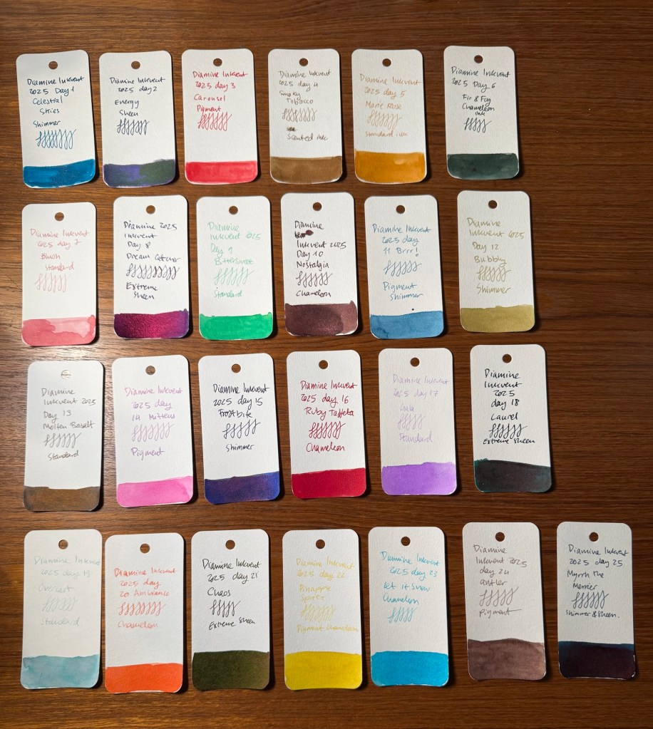
Diamine Inkvent 2025 the Teal Edition is over, and what a wild ride it has been. The 2025 edition introduced Pigment inks, which are waterproof when dry, and some interesting ink colour and property combinations.
Inkvent for me is a chance to play with inks that I normally wouldn’t try out, and it’s also a blogging, sketching and writing challenge. This year was more challenging than previous years, as I had received this calendar late, and so about half of the reviews were done on the actual day they were published, and the rest were only done a day or two in advance. I’m glad that I got it done, and I’m also glad that I chose a new streamlined format, as it helped me focus and get the reviews done on time.
Its the 6th year in a row that I’ve been creating these review posts, from the very first Inkvent calendar in 2019 (Blue Edition), through 2021 (Red Edition), 2022 (Green Edition), 2023 (Purple Edition), 2024 (Black Edition) and now this year, 2025 Teal Edition (Diamine didn’t create a 2020 Inkvent calendar. That was the Covid year).
Here’s a summary of this year’s Inkvent, first by ink colour, then property, and finally my personal favourites.
By Ink Colour
This is the full lineup of the Inkvent 2025 Teal Edition inks:
All the Inkvent 2025 inks
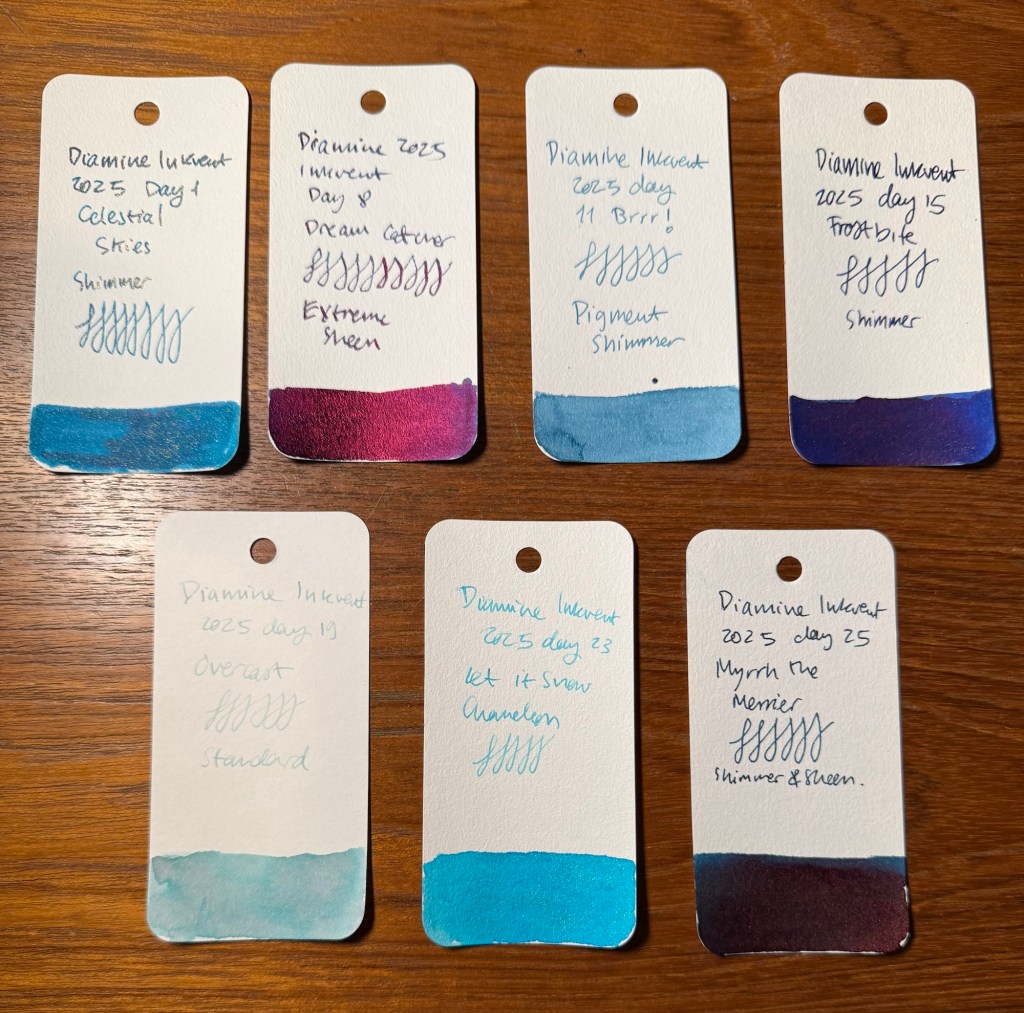
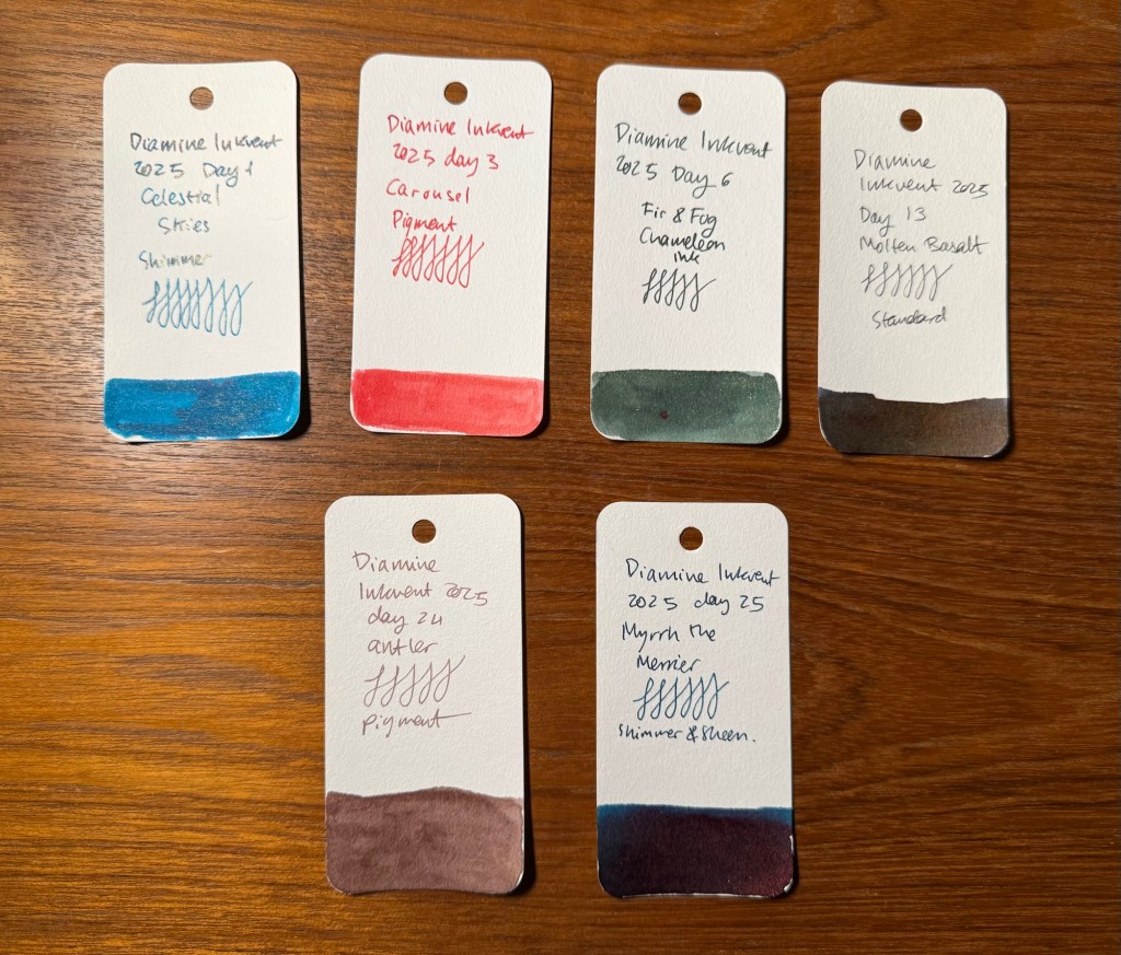
Unsurprisingly blue inks dominated this year’s calendar with a total of 7 inks in the blue/turquoise/Teal range. Both the first and the last inks for this year were teal inks, which is a given considering this is the Teal Edition of the calendar. Of these inks Dream Catcher is a sorry miss for me, as you don’t get to see the lovely base ink colour due to the extreme sheen (which also makes this a messy, slow drying ink with potential flow issues) and Overcast is lovely but much too light to be readable for me.
The blues
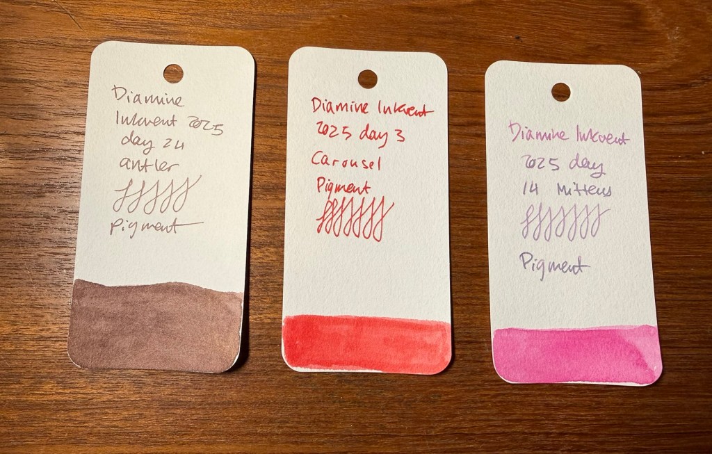
Four reds and pinks were in this year’s Inkvent, which is a pretty low number for an average Inkvent calendar. These were all decent Inkvent inks, and I’m pretty pleased with this lineup.
Reds and Pinks
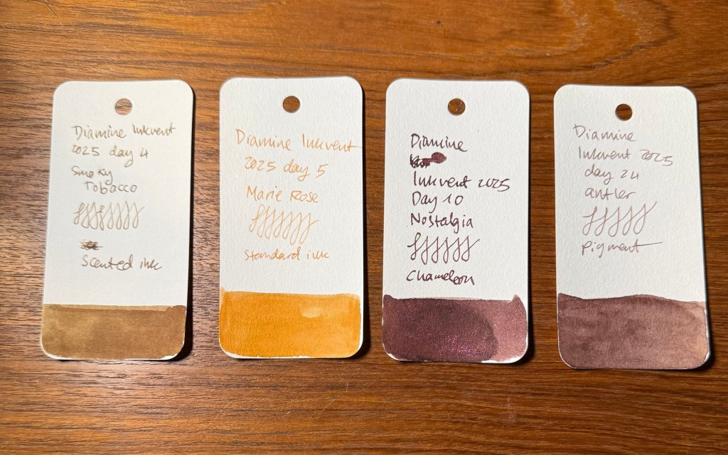
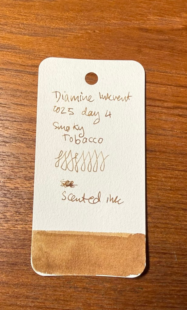
There were four earth tones in the calendar, with Smoky Tobacco being my least favourite ink ever. Apart from that, it was a good and interesting year for earth tones inks.
Earth tones
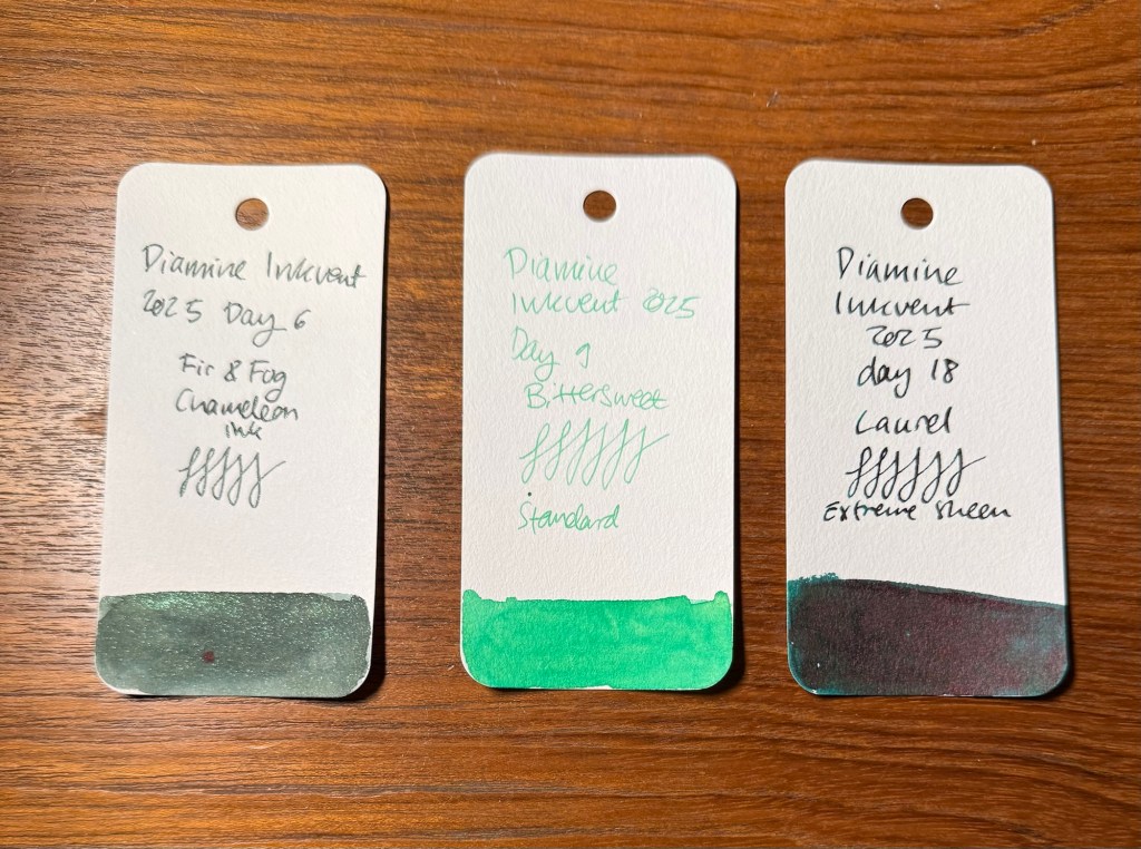
There were only 3 green inks in this year’s inkvent, with Fir & Fog being one of my favourites, Bittersweet being too light for my tastes and Laurel being gorgeous but made worse by extreme sheen.
Greens
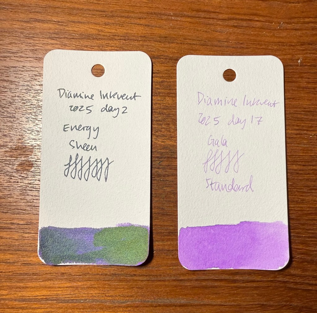
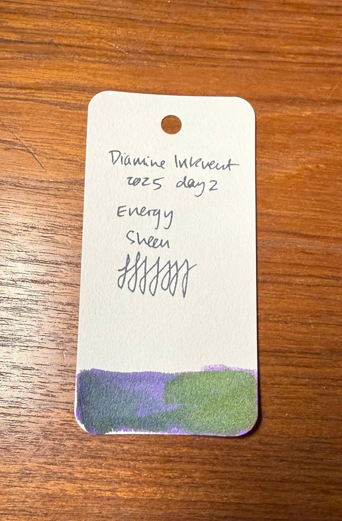
Only two purple inks were in this year’s inkvent, with Energy being destroyed by sheen, and Gala being nice but a bit bland and light for my tastes.
Purples
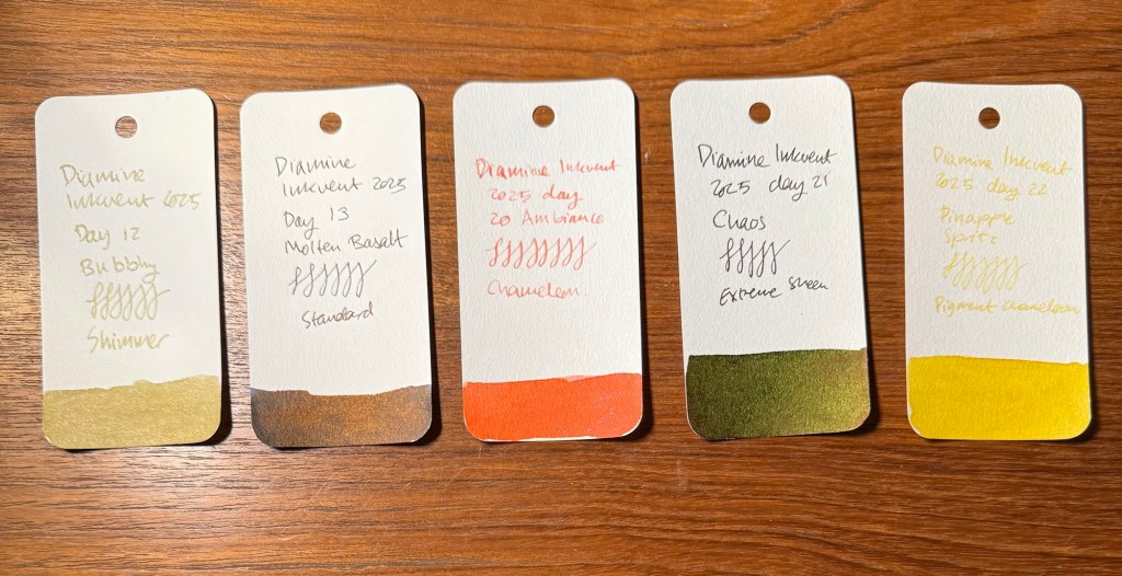
And then there were 5 “wildcard” inks. Bubbly in gold, Molten Basalt the weird unspecified dark colour, Ambiance the only orange ink, Chaos the other weird ink and Pineapple Spritz the only yellow ink.
Wildcards
By Ink Properties
This year was a year for Standard, Chameleon, Shimmer, Extreme Sheen and Pigment inks. I would have liked to see more Pigment inks and less Extreme Sheen ones, but that’s because I want to use them in my sketching.
There were three Shimmer inks, all of them pretty and fitting a holiday themed calendar. Shimmer inks have sparkly bits in them, but unlike Chameleon ink it’s one shade of shimmer, and usually larger shimmer particles.
Shimmer
There was thankfully only one Scented ink this year, but to make up for that, it was truly, truly awful.
Scented
There were three Pigment inks, and while I liked antler and carousel I wish that they hadn’t chosen to make the bubblegum pink ink a Pigment ink. Pigment inks are waterproof.
Pigment
The only Sheen ink this year was Energy, and the sheen really detracted from it. It made it look like there was a thick layer of dust on this ink.
Sheen
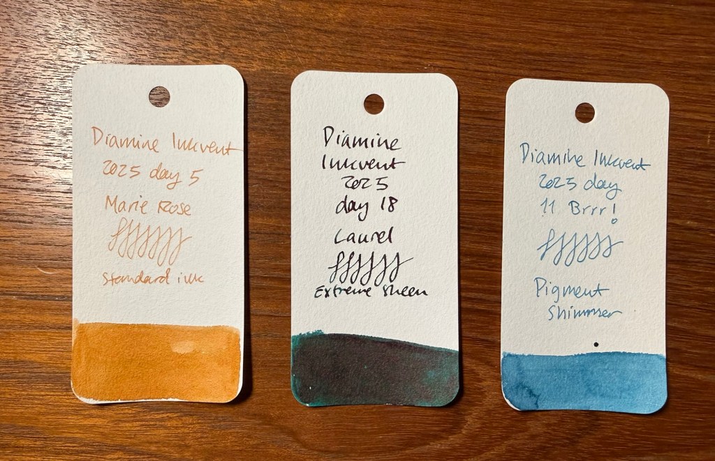
There were three Extreme Sheen inks, and all of them would have been better served by not being extreme sheen inks. In particular Laurel suffered from the extreme sheen treatment, because the base dark green is very nice, but you get to see so little of it through the red sheen.
Extreme Sheen
There was one Pigment Chameleon ink, Pineapple Spritz. I would have really liked this ink to have been just a pigment ink and not a pigment chameleon (with fine glitter in multiple shades).
Pigment Chameleon
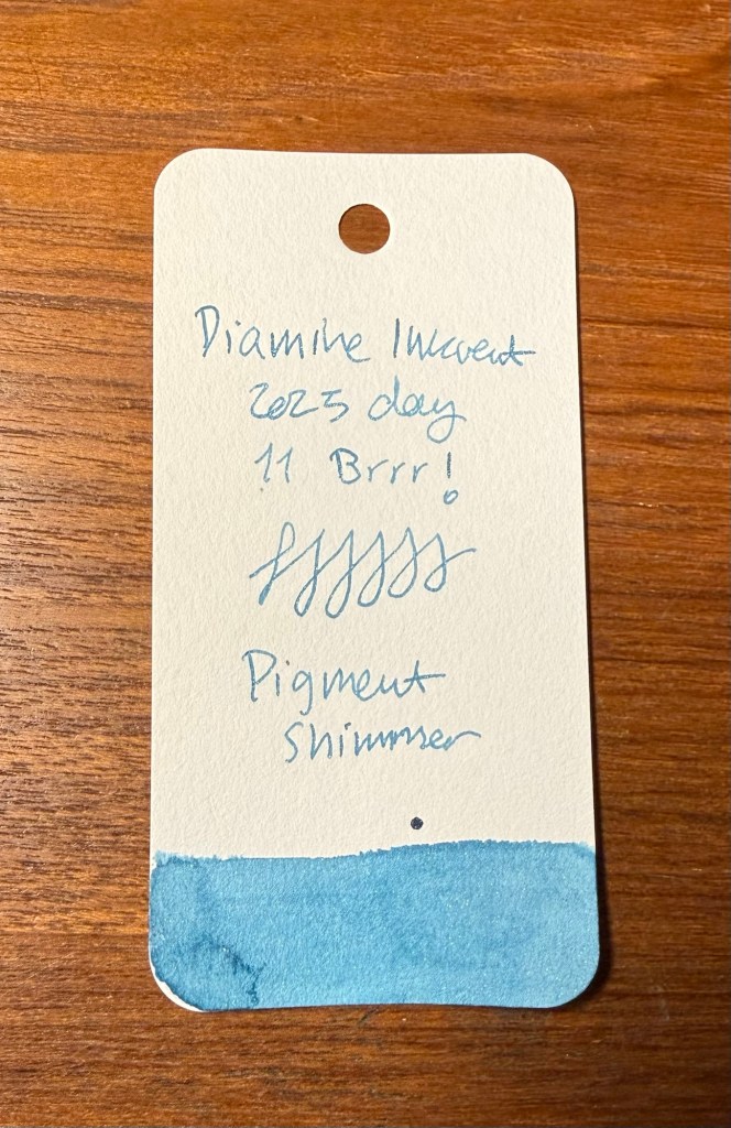
There was one ink with Pigment Shimmer, Brrr! and again, I would have probably selected this ink as one of my favourites if it didn’t have both the Pigment and Shimmer properties.
Pigment Shimmer
There was one Shimmer and Sheen ink, the last but not least Myrrh the Merrier. I expect the last ink in the calendar to have Diamine going all out, and they did well with this ink.
Shimmer and Sheen
There are no less than five Chameleon inks in this calendar, and it’s clear that Diamine are (rightfully) proud of their Chameleon shimmer.
Chameleon
There were 6 Standard inks, which is always good to see. These inks may be shading, or have a bit of sheen to them, but they’re generally good, well behaved inks that you can use with the knowledge that they won’t be too difficult to clean out of a pen.
Standard
My Favourites
While I have more than enough inks in my collection so I’m probably not going to rush out to buy any of these once Diamine issues the Teal Edition full bottles of them some time in July 2026, these inks are my favourites this year:
My favourites
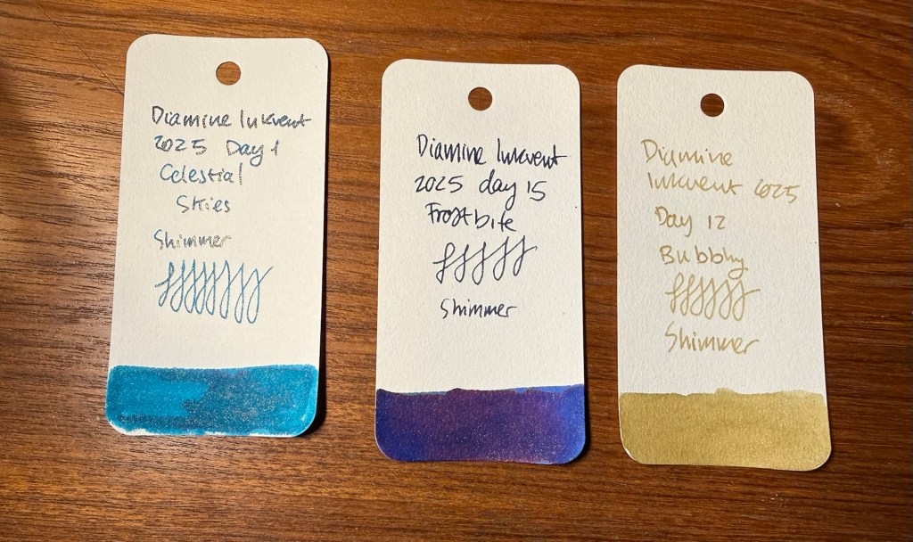
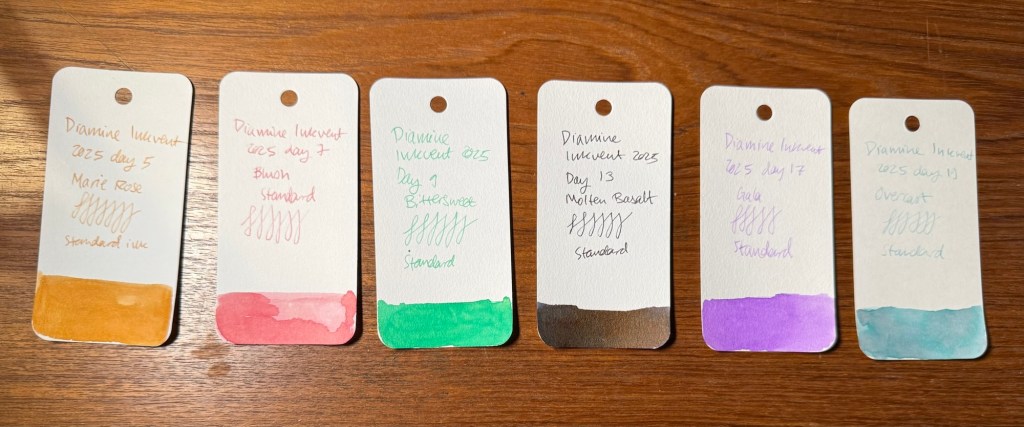
Celestial Skies is just a pretty teal with excellent shimmer that makes it truly shine. Carousel is one of the pigment ink that I’ve had the most fun sketching with. Fir & Fog is so excellent that it’s the first and only ink that I’ve written dry. Molten Basalt is an interesting alternative to black ink. Antler will be a useful sketching ink, and Myrrh the Merrier is delightful.
These inks almost made the cut, but there’s just something about them that made them a bit of a disappointment:
Almost there
Marie Rose is interesting, but I found that I personally don’t enjoy using the colour. Laurel would be perfect without the extreme sheen, and Brrr! should have been a pigment ink and lost the shimmer.
Will I be doing Inkvent next year? Probably. It’s a challenging challenge to get all the reviews up, but in the end I do find that I enjoy the process.
What was your favourite Inkvent ink? Will you be participating next year?
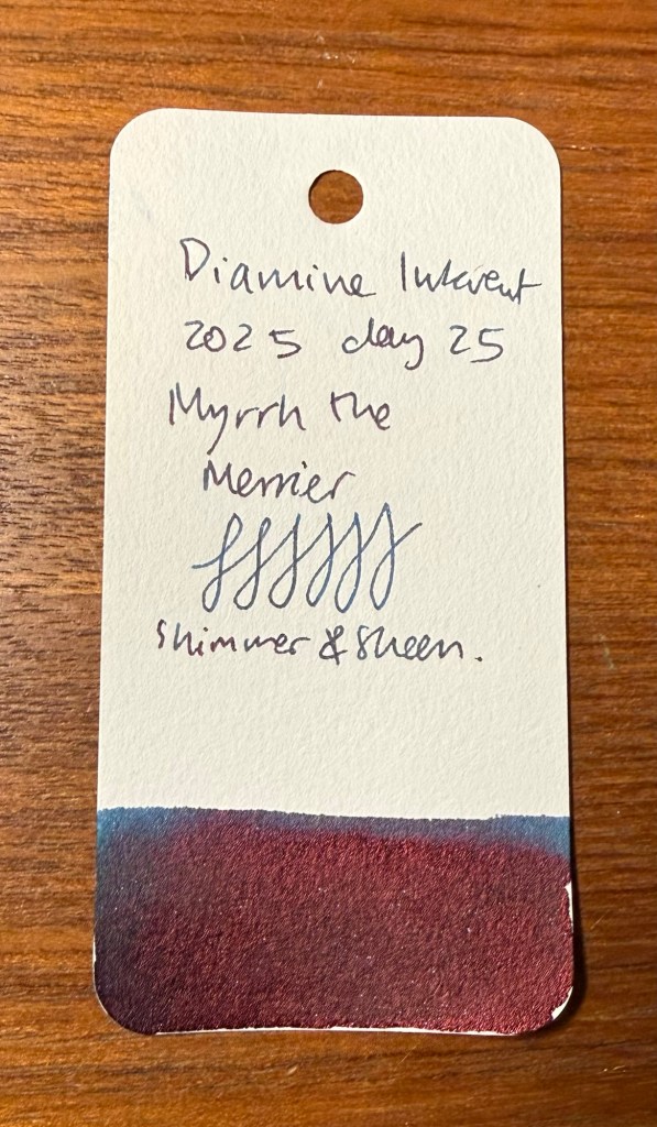
The final day! The day we’ve all been waiting for! The day with a full bottle of ink in the colour of this year’s calendar (i.e. teal)! And they let the resident dad on the team name it…
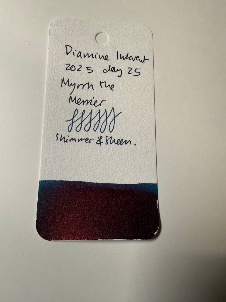
Day 25’s ink is Diamine Myrrh the Merrier. I told you it was named by a dad – and a dad that’s very pleased with himself right now 🙂
It’s a shimmer and sheen teal ink, with blue shimmer and red-purple sheen.
Col-o-ring swab
This ink is pretty, it’s got character and shimmer and sheen – but thankfully it’s still a teal ink. You can see the lovely base colour beyond all the pizzazz.
Close up on the sheen and shimmer
I have been using Myrrh the Merrier for my journaling and general writing for the past three days, and it flows well for a shimmer and sheen ink. Yes, if you leave it uncapped for a while you’ll have a hard start, but for a sheen and shimmer ink it’s been impressively well behaved.
Sketching and writing sample on Apica CD paper
You can see the sheen, but you can also see the ink colour.
Close up on the sheen
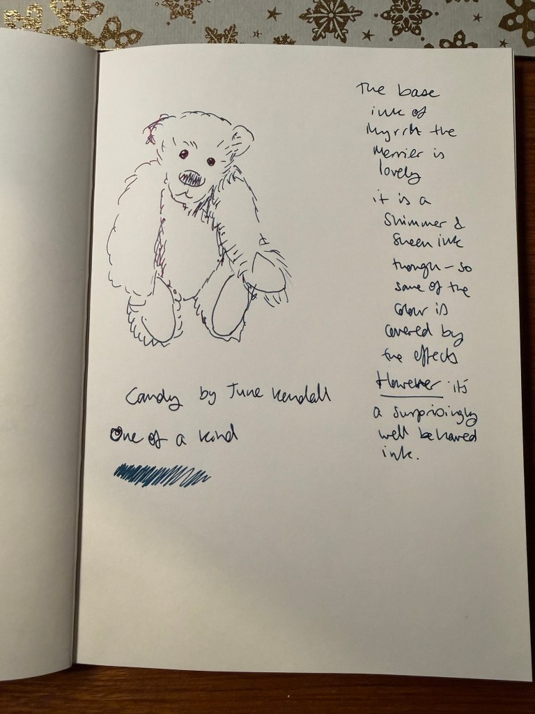
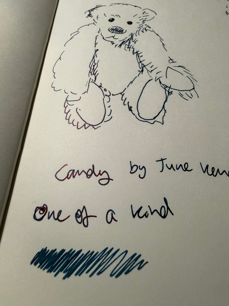
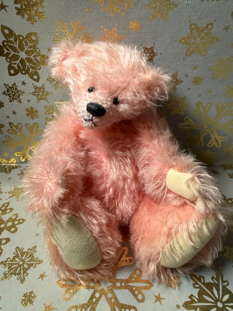
This year’s final bear is Candy by June Kendall, a one of a kind British artist bear.
The bear
As opposed to last year’s day 25 ink which was disappointing and an ink that I don’t ever see myself using, this year’s Myrrh the Merrier ink is delightful and actually fun to use.
That’s all for the individual ink reviews for this year’s inkvent. In a day or two I’ll post my summary post, discussing the calendar as a whole and highlighting some of my favourites.
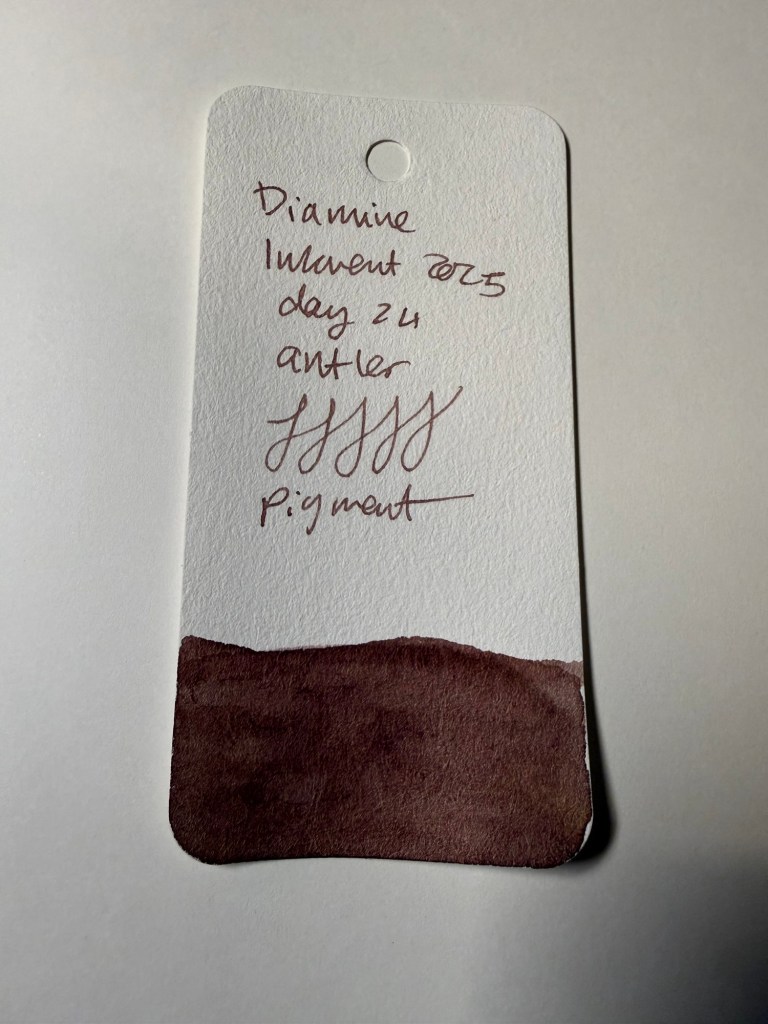
Day 24’s ink is Diamine Antler, a raw umber (i.e. brown) pigment ink. This is the perfect classic shade of ink for sketching, and I can’t wait to use it with my watercolours.
Col-o-ring swab
Diamine Antler won’t be a favourite for everyone, being a brown ink, but it’s a useful colour for sketching, and it’s an interesting brown. It’s “flat” in terms of shading (or in this case, lack thereof), but the colour itself has a hint of red in it, and yet isn’t a strictly warm colour. It’s hard to explain, but if you’ve used raw umber in sketching you’ll know what I mean.
Sketching and writing sample on Apica CD paper
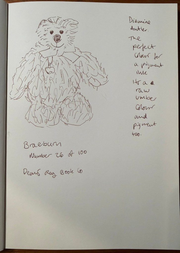
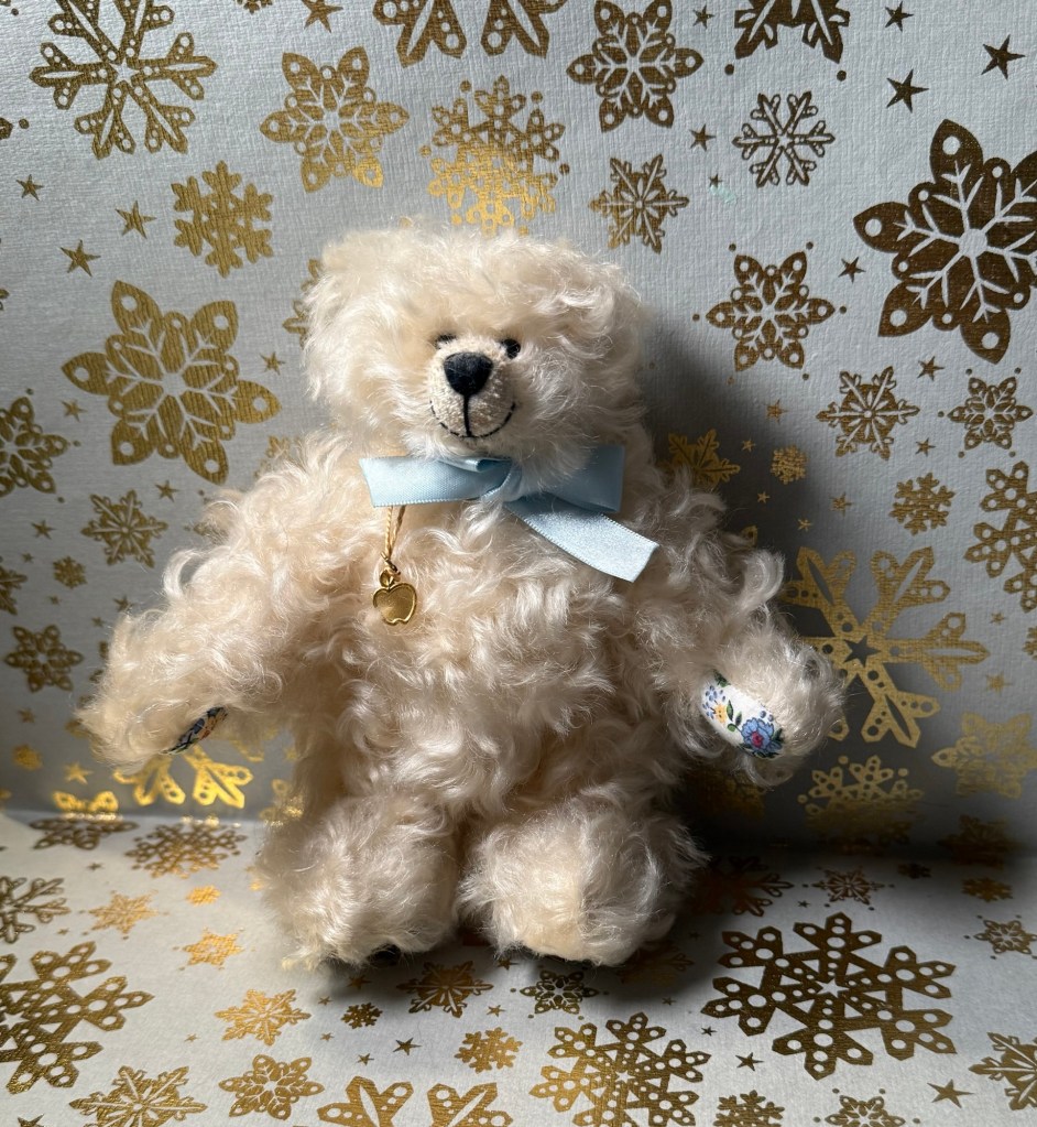
Today’s bear is Braeburn, the only bear that I’ve ever bought online. He was part of a limited edition series that Dean’s Rag Book Co (my favourite bear makes, now defunct) issued, with each bear themed around a species of apple. This fellow is Braeburn:
The bear
I will be testing out Diamine Antler with some watercolours. I think that it could be a good ink to have in rotation – provided I don’t already have a similar pigment ink on hand.
Did you like Diamine Antler or was it too boring and brown for you?