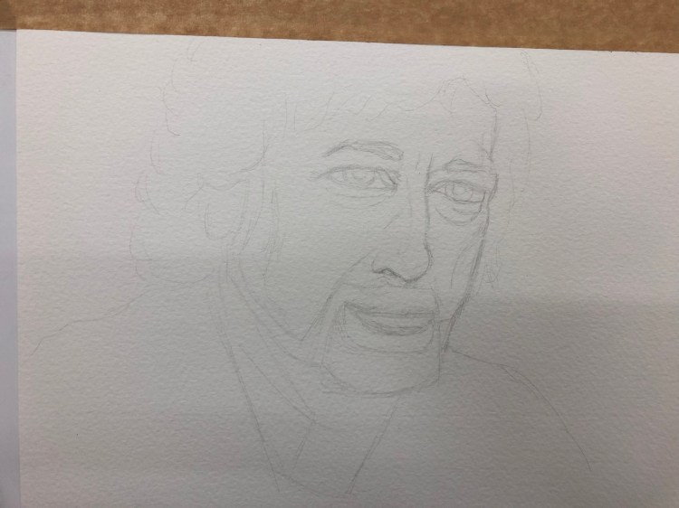
On Sunday’s running group meet I tripped on a bit of uneven sidewalk in an unlit section of the park. I blocked my fall with my hands and knees, saving my head but tearing my tights and the skin off my knees. So I’ve been on a running hiatus until Friday, giving my knees time to heal. This meant that this week’s 10k was slow, as I was both out of shape and wary of the sidewalk, but at least I got it done.
Spur-winged lapwings waded along the riverbank:
The cormorants, wintering near the river, have a thing for this eucalyptus:
Two Egyptian geese perched on the river edge:
Rowing on the river:
A little egret fishing:
I also saw a moorhen and a pied kingfisher, but didn’t get the chance to photograph them.
Here’s a break down of what’s new and changed this season, as well as my take on some of their decisions. Some of these notebooks are already available, others will become available over the next few months. Pour yourself a cup of coffee, open the catalog, and dive in:
Classic Notebooks
Of the seasonal colours, I’m pretty sure Reef Blue and Daisy Pink will do well. It’s nice to see Scarlet Red, Sapphire Blue and Myrtle Green join their regular lineups. In the past black was pretty much their only offering, with an occasional red thrown in, but it looks like regular colour options are here to stay.
I’m curious about their new “medium” size, between the pocket and the large. There’s no sizing info in the catalog for this option and it appears to be available only in the hardcover notebooks. My guess is that it will be in the “Two-Go” size, which I think is a pretty useful size (11.5×18 cm or 4 1/2×7”).
Sad to see that they still haven’t brought back the reporter notebooks in squared paper, and how little love in general squared paper gets from Moleskine.
Great to see the new dotted (dot grid) options. These ought to be popular, and Moleskine didn’t dip their toe in with just pocket and large black hardcover notebooks, but is offering them in all their core colours and in what will likely be their best selling seasonal colour, Reef Blue. As is stands, dotted paper is getting more love than squared paper, which is not surprising. Squared paper is niche outside the stationery blogger/podcaster world.
“Classic notebooks expanded” is a new offering from Moleskine — a large hardcover or softcover notebook that has almost twice as many pages as a regular large Moleskine, with two ribbons instead of one. This may seem a bit unwieldy, but I use a large Moleskine daily planner as a meeting notebook and because of its size it’s still pretty convenient to use. If you plan on using your notebook a lot (as a daily journal for a year perhaps?) this may be a good option to check out.
Non-Standard Cover Material Notebooks
Leather notebooks – these aren’t available everywhere (Barnes and Noble have them), and I haven’t tried them, but they’re still on offering, with or without a box. I’d recommend that you spend your money elsewhere, unless you’re really looking for a corporate executive gift to put the company logo on.
Two-Go notebooks are still on offer, with four colour options (added last year) and in an excellent size, with thicker than usual paper and a surprisingly useful albeit non-standard blank-and-ruled format. If you haven’t given these a try I highly recommend them. They can handle fountain pens pretty well.
Blend notebooks, with their tactile, super fun and durable fabric covers now come in four new colours that promise to blend better in office settings than their current (and still produced) camouflage Blend offering. Black, Green, Blue and Beige are offered in a woven, slightly distressed look with contrasting elastic closure, as usual only in large size and with ruled pages. Definitely worth trying out if you haven’t had a chance to give their fabric covers a spin.
Denim notebooks, which first came out as a super popular and a very well designed limited edition offering, are now part of the regular lineup, sort of. The limited edition notebooks are still more attractive in my opinion, with their white contrasting branding label on the back and their white print on the front, but these notebooks, in Antwerp Blue and Prussian Blue (pocket and large, ruled only) are a great way to get some of that denim feel in your life without trying to get a hold of overpriced LE notebooks on the secondary market. Of the fabric covered notebooks that Moleskine (and Baron Fig) offer these feel the best, and I recommend these over the Blend notebooks for that reason.
I’m not a planner person, so I’m not going to go over Moleskine’s extensive planner collection.
Limited Edition Notebooks
This is where Moleskine excels beyond all current competition, and in my opinion they’re starting this year stronger than they finished last year.
Fall-Winter 2018 limited edition notebooks, Looney Tunes, Super Mario, 007, Astro Boy and Harry Potter are still available, though the very attractive Harry Potter notebooks (especially The Marauders’ Map edition) are starting to be harder to find.
Spring-Summer 2019 limited edition notebooks are Lord of the Rings, Basquiat, Wonder Woman, Bob Dylan and Gundam. Each is designed to appeal to a different demographic, and I think that they really nailed it this time.
This is not the first time that Moleskine is tackling the Lord of the Rings in a limited edition, but this edition is much, much more attractive and well designed than their previous rather lackluster attempt years ago. The covers, endpapers and special insert all seem spectacular, and this is one edition that I’ve already preordered and plan to review. The “geek” edition, this notebook is designed to appeal to the same people that bought the Harry Potter and Alice editions
Basquiat limited edition notebooks are for the hipstery crowd that liked the Kieth Haring limited editions, Dr Seuss editions and probably also enjoyed the Monopoly limited edition, but in an ironic way. These are extra expensive but they’ll probably be popular, considering Basquiat’s success on Uniqlo t-shirts. They’re offered in plain and ruled paper, though I wish Moleskine would have stepped up and offered a sketchbook Basquiat edition. In terms of the boxed set, this one comes with a pen (the regular editions come with stickers), so it’s probably a better deal than the slightly lackluster LotR boxed edition (comes with nothing, will sell like hotcakes, because LotR).
Wonder Woman is the comic book edition, and as usual it is the most colourful one, and where Molskine allowed themselves more creative freedom. Bold red and blue action packed covers that really celebrate the character in drawings and text, what more could you want? Ruled only, comes with stickers.
Bob Dylan limited edition notebooks are aimed at music lovers, as the Beatles, Rolling Stones and Blue Note editions were before them. These are really reminiscent of the Blue Note limited editions, and like other music themed limited editions, are pretty tame, design-wise. If you’re a Dylan lover, you’ll likely love this edition, and it will make for a great gift, especially around father’s day. Is it surprising then that these come out in April? Ruled only, comes with some pretty dull stickers. The numbered boxed edition is the best designed of the bunch in my opinion. These too are relatively expensive limited editions, though of course expect a difference between RRP and what you actually pay online and anywhere but the official Moleskine stores.
Gundam is the anime edition, and as usual is more subdued than the comic book edition, but still pretty colourful. Ruled only, comes with stickers.
Journals
I’ve no idea why Moleskine calls their Cahier and Volant offerings “journals” and not notebooks, but I guess you have to differentiate them somehow.
Cahiers, formerly available only in Kraft Brown and Black have been expanded to include Cranberry Red (a darker shade of red than the Scarlet Red, likely because of printing limitations) and Myrtle Green, but that’s not that new. What’s new is the three new seasonal colours, Brisk Blue (a darker shade of Reef Blue), Kinetic Pink, and Tender Yellow. I’d stay away from the yellow, as it will turn dirty and blah in about a day’s use, but the other colours are solid and fun. Kraft Brown is the most fun to decorate and make your own (with black in second place), but the other colours seem pretty vibrant for cardboard covers.
It is worth saying that of all of Moleskine’s offerings, the Cahiers got the most paper love in recent years, which is a very good thing as the old paper used in these notebooks was garbage. Not acid-free and super thin, it turned yellow and brittle with age very, very quickly. Now the Cahiers use the same paper as the regular notebooks, and they even got some dotted paper love.
Subject Cahiers, a new offering that is geared for academic note-taking (Cornell Notes anyone?), and is offered only in large and extra-large. If I was still working on my degree this would be something that I would probably look into using.
Volants have become more colourful as time has passed, with Moleskine moving them from a light and dark shade of the same colour to complimentary colours instead. They also got stickers to boost, but still only come in plain and ruled paper. They are the only notebook left that Moleskine offer in extra small, which is both not surprising and a bit of a shame.
There’s nothing new in the Pro Collection and I don’t use any of these business focused notebooks (I like to build my own meeting notes formats), and so I won’t go over these.
Art Notebooks
Moleskine’s art collection has gone through a significant overhaul in recent years, all for the better. The sketchbook paper is less pronouncedly ivory coloured, and the paper has less coating on it, which means that it can now take things like light washes, fountain pens, rollerballs, etc without them beading up on it.
The sketchbook also got some love in the form of new colours (Red and Sapphire Blue), which is always nice.
The recently added sketch album (which is a landscape formatted notebook with cahier covers) is now available in Kraft Brown, which is awesome, because they’re so fun to customize.
There’s also a sketch pad, which has less pages and I completely don’t understand. It appears to be a more expensive way to get a sketch album with less pages. Huh?
The ever popular (and justly so) Watercolour Album got recently expanded into a Watercolour Notebook (standard format, as opposed to the landscape album format). Now the Watercolour Notebook has been expanded to include the pocket, A4 and A3 size. This is a must buy for me, and will probably be pretty popular amongst urban sketchers.
The Music Notebook got a surprising new addition, a Music Cahier in extra large. Moleskine is one of the few stationery companies to offer this layout, and good for them for expanding it.
The Japanese Album and Storyboard notebooks are niche products and so unsurprisingly, got no love.
Themed Notebooks
Not much is new in this area. There are no new Passion Journals, no new City Notebooks and not much new with the Voyageur.
What is new is a Travel Kit, that contains the Ocean Blue Voyageur, a pen and a luggage tag. The Voyageur appears to be more popular than the Travel Journal, so I wonder how long before the Travel Journal is phased out.
As for the rest (the non notebook stuff), here my interest wanes, and this post has been long enough as it is. The catalog is 151 pages long, and full of eye candy, so even if you aren’t a Moleskine fan, take a look.
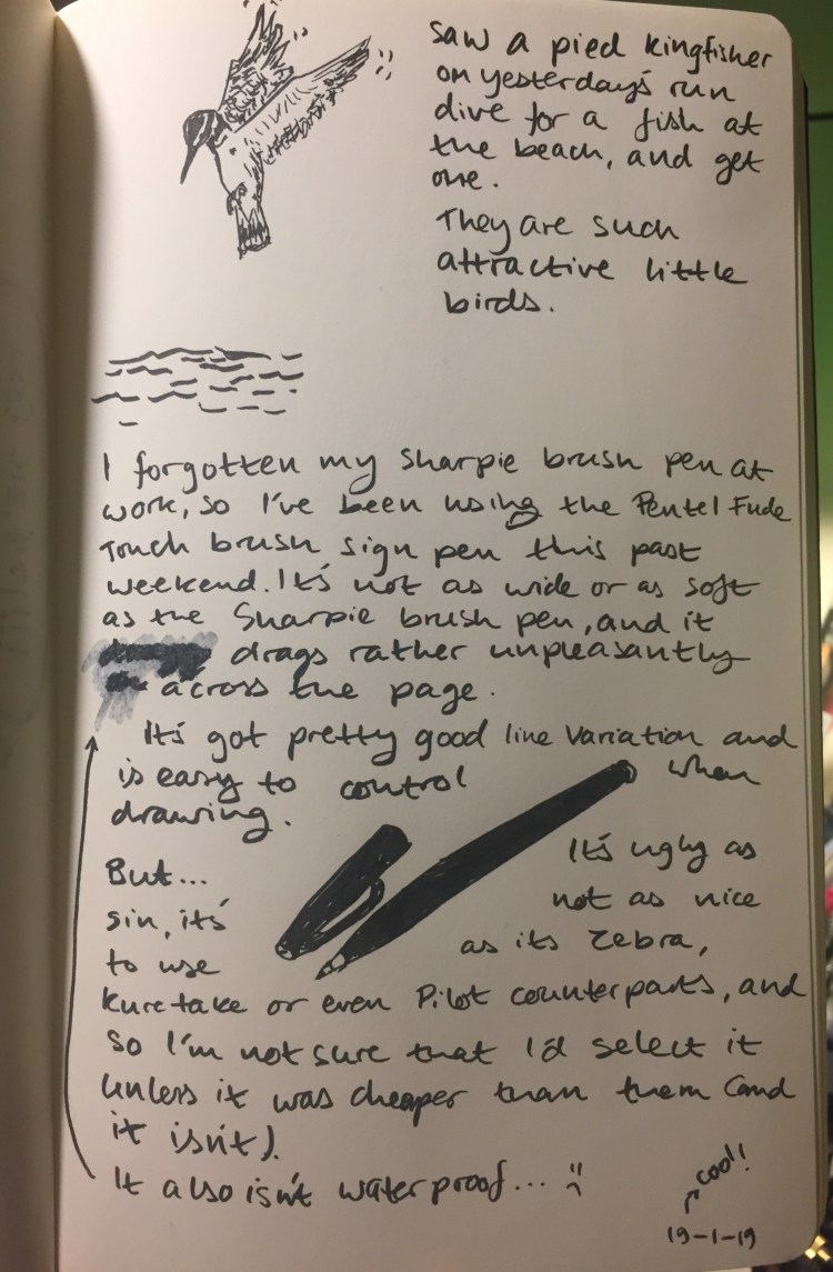
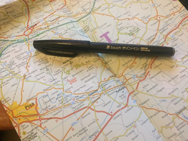
I planned to review the Sharpie brush pen, after spending the best part of a week with it, but as it turns out, I forgot it at the office. I’ve been using the Pentel Fude Touch Brush Sign Pen instead, so here’s a review of this boring little brush pen instead.
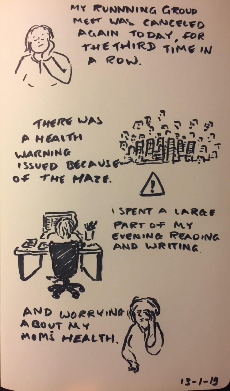
Today’s journal comic/review, drawn on a Moleskine Star Wars crawl text blank notebook. This paper is smooth, although not Rhodia smooth, but the pen still really dragged on it. It was worse on any sort of paper with even the slightest tooth, making it super not fun to use.
The brush pen tip is pretty firm, which means that you get a medium amount of line variation, but that it’s very easy to control. If you’re starting out in the wild world of brush pens, either for drawing or lettering, this tip grade is probably the best for you.
The black ink is black, and not greyish or brownish, and completely not waterproof, which can be a good thing (if you want to “stretch” it or use it for shading, as wet it produces a good 50% cool grey), or a terrible thing (if you want to combine it with watercolours).
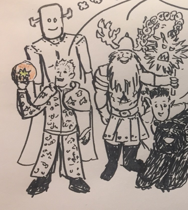
A closeup of a D&D character group drawing that I did with the Pentel Fude Brush Sign Pen.
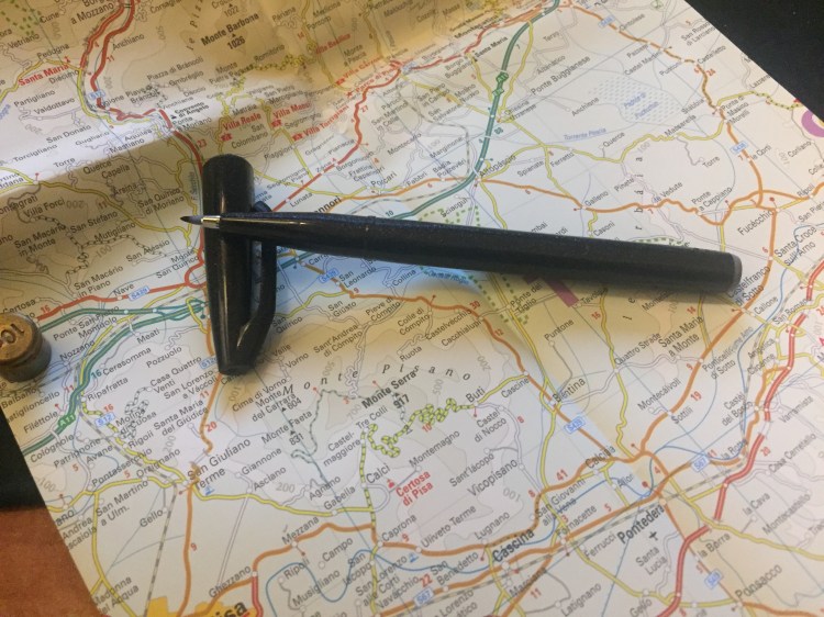
The pen body itself looks and feels cheap and plasticy, which isn’t too unusual in the disposable brush pen market. Why do all these companies have a thing for a dark pen body with pronounced gold lettered marketing splashed all over it? Pentel’s also put sparkles in its, body, just for some extra garish fun.
The pen is torpedo shaped with facets along the body that somewhat help keep the pen from rolling. It’s borderline too thin to use for long periods of time without cramping, but otherwise it’s comfortable to hold and use.
The Pentel Fude Brush Sign Pen would be a good beginners’ brush pen if there wasn’t so much competition at the same price. As it is, buy a Zebra brush pen, which allows for greater line variation, or a Kuretake brush pen, which is also waterproof, or add a little more and get the experience of two brush pens in one with the Pilot Futayaku. As it is, this Pentel pen lacks enough line variation to make it fun and interesting to use, and it isn’t cheap enough to justify buying it over the competition.
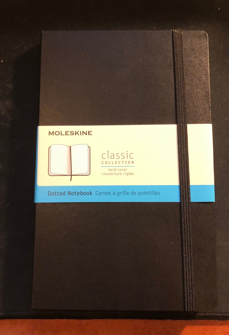
So it appears that Moleskine has finally hopped on the dot grid bandwagon, releasing several of their classic collection notebooks in dot grid, even going as far as creating dot grid versions of some of their seasonal colours (gasp!). Next thing you know they’ll be releasing limited edition notebooks in squared and dot grid paper, and then where will we be? (Don’t worry, it’s not going to happen).
The classic Moleskine collection consists of their hardcover and softcover notebooks, in pocket, large and extra large. Currently the dot grid is offered in black covers, both in hardcover and softcover, and in underwater blue (such a pretty seasonal colour) and beige in softcover. However, it apparently was enough of a success for them to issue the dot grid option in all their classic collection core colours (black, red, blue sapphire, and myrtle green), and in seasonal reef blue (both hardcover and softcover). These colours will start being available in February-March, so it may be worth waiting a little while before purchasing (although some of the hardcover core colour options already seem available).
Now to the review. I got the classic large black hardcover notebook, as it’s probably Moleskine’s best selling notebook, and what people have in mind when they say “Molekine”.
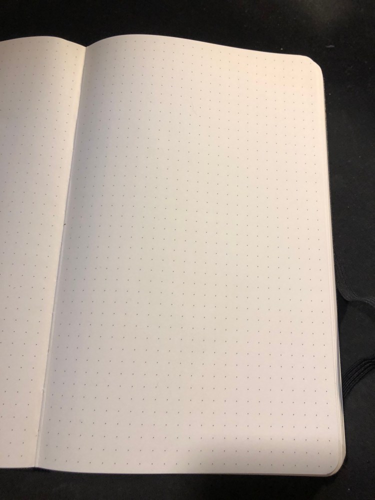
Dotted paper gets a new band colour – blue.
First thing’s first, Moleksine have listened to customer feedback and significantly strengthened their notebooks’ elastic bands. They’re a little thicker and wider, and there’s little chance that they’ll turn into the floppy mess that some of their earlier elastic closures turned into after a few months of use.
The sleeve also has a B-Side, this one is pretty travel oriented, and I love it because maps!
Phileas Fogg would have been proud.
Which brings us to the paper. The dot grid pattern is medium grey, dark enough to be visible, light enough to not be too distracting. It also is very precisely aligned on all pages, if those kind of things bother you.
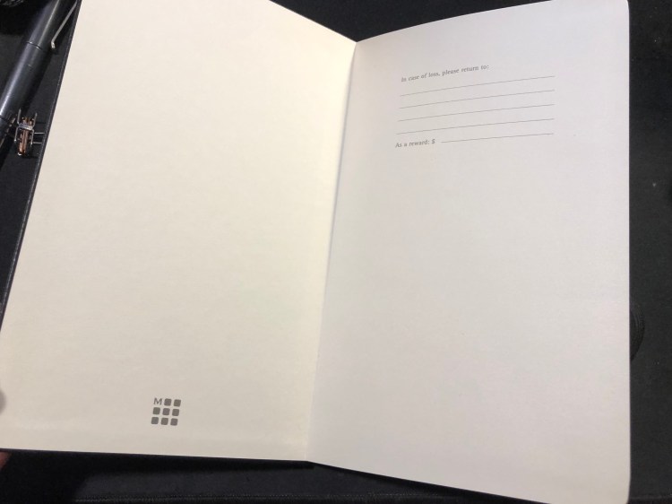
The “In case of loss” endpaper, with the Moleskine logo, a relatively recent addition.
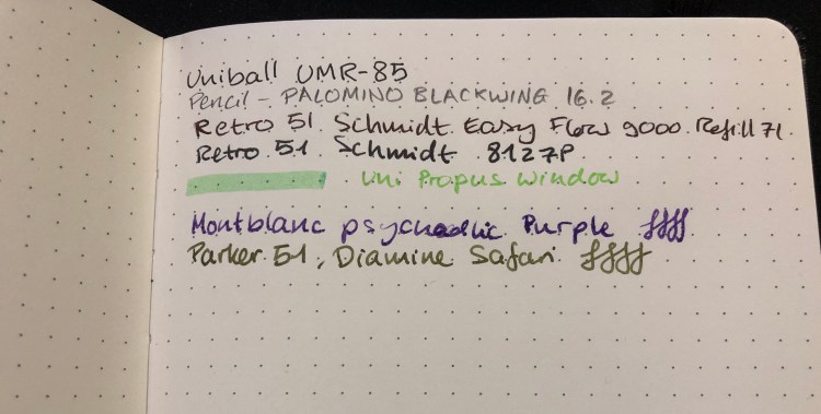
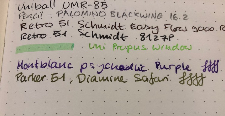
How does the paper perform? Better than you’d expect. Gel, ballpoint and pencil work well with the paper, but even fountain pen inks, including pretty saturated messes like the Montblanc psychedelic purple work pretty well. There’s no more weird spidering, as there used to be and the spreading is minimal (better than Baron Fig, well above average). If you don’t insist on super saturated inks, you’ll be able to enjoy using fountain pens in this notebook.
A closeup of my writing samples. Montblanc purple has behaved this way on Rhodia paper too, so I blame the ink, not the notebook:
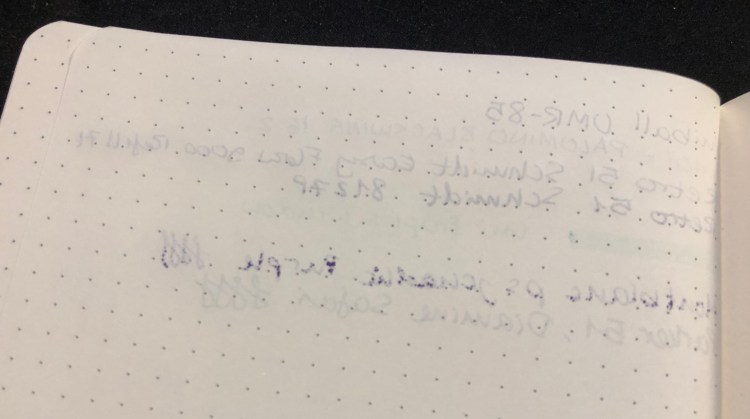
Show through is better than tomoe river paper, but not as good as Rhodia (I’ve had mixed results with Baron Fig, so I’m not using them for comparison here). Again, the only real problem was with the Montblanc ink, which is a problematic ink in general, so I’m not using it for comparison. I’d find this notebook to be usable on both sides of the page, but again, that comes down to preference.
Moleskine seems to be making an effort not only to come up with innovative limited editions, but also to give their regular line-up a bit of a refresh (with new added colours) and boost (with new dotted paper, better quality paper, and a fix for their elastic closure problems). That’s a move in the right direction, and one that I plan to enjoy.
I still need to figure out what’s going on with that Montblanc ink, though…
I wrote the first few chapters of my first novel longhand, with fountain pen on loose sheets of A4 tomoe river paper. As I realized that I would have to type everything into Scrivener before I could even start editing, the lazy programmer within me balked. It was fine doing this with quick drafts, but writing an entire novel longhand was not for me.
I still use pen, pencil and paper a lot in my writing though. I use a fountain pen (anything that doesn’t have a flex or novelty nib will do — from extra-fine to 1.1mm stubs) and loose sheets of A4 and A5 tomoe river paper to work on my outlines, for quick drafts, to test plot options out, or when I’m really, really stuck in my writing. A Field Notes Byline is constantly under my keyboard, horizontally. Yes, I know that the lines don’t go that way, but I ignore them. The form factor is perfect for that, and the ruling is pale enough for me to easily ignore it. I use a Blackwing 16.2 or 24 with it, to quickly capture any ideas that may come up during my writing, to remind myself where I was going with an idea or what I need to fix a previous place, to brainstorm names, etc. It serves as a scratch pad that allows me to maintain my writing flow and still remember things along the way.
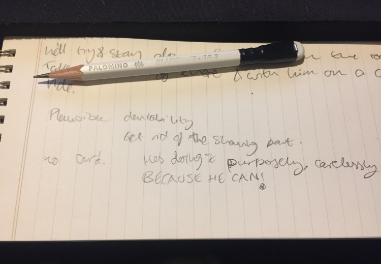
Messy, messy handwriting, because getting things down on paper is more important to me then keeping them pretty.
So, even if you do all your writing using Ulysses or Scrivener (hopefully not Word), I recommend that you incorporate some analogue tools in your process. You’re bound to find them useful, particularly when you’re stuck or you’ve dug yourself into a hole.
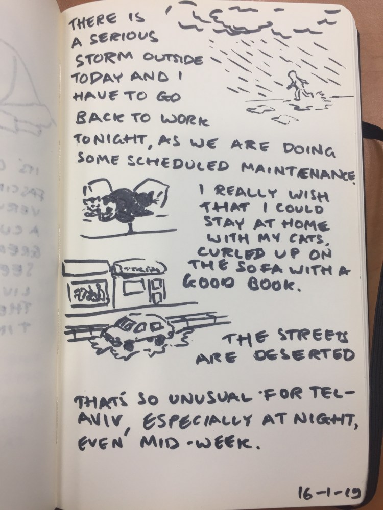
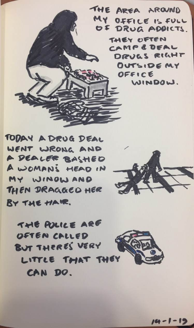
Journal comic drawn with a Sharpie brush pen, Pilot Hi Tec-C pens, and a Zebra grey mildliner highlighter on a Moleskine Star Wars scroll text limited edition blank notebook.