I stopped using streaming services for a few months as I was studying for a certification exam, but as I now have more time in the evenings I’ve been back to watching stuff on my iPad. Here are a few things that I’ve watched over the last month or so.
“Shrinking” (Apple TV) – I bought a new iPad in December and so I got three free months of Apple TV. After I finished watching the fifth season of “Slow Horses” (excellent as usual), I watched the three seasons of “Shrinking”. It’s a wonderful show that manages to be both upbeat and constantly make you cry. The actors, the writing, the concept are all fantastic, and Harrison Ford (like Gary Oldman in “Slow Horses”) steal every scene he’s in. You tend to generally dislike the characters when they first appear on screen, and they gradually earn your respect and compassion, which is refreshing. My last experience with therapy was not good, and all three of the therapists in this show are deeply flawed, if very well meaning. It speaks to the quality of the writing and the acting that despite this I would be happy to have either one of them as my therapist.
“Murderbot” (Apple TV) – I love Matha Wells’s Murderbot Diaries series of books that this is based on, so I was apprehensive about this series. After watching the first season I can say that it’s a good series, although it isn’t as good as “All Systems Red”, the novella that it is based on. The novella was adapted for the format, and while the result works and it’s a good sci-fi series, the TV murderbot lacks the humour and heart of the book one. I recommend watching it, and I recommend even more reading the books.
“Lilo & Stitch” and “Lilo & Stitch Live Action” (Disney+) – I didn’t watch the original animated film when it came out and until now I haven’t taken the time to watch it. I wish that I had – it’s an unexpected gem, a lovely story about family, love, being unique and belonging. I generally don’t watch live action adaptations of Disney animated features, but this one was highly recommended and it is very good. The story was changed to update it and fit the format and to update it for the times, and the result is delightful. I highly recommend both.
“Elio” (Disney+) – this Pixar film isn’t one of their classics, but it’s still a cute sci-fi story, with charming humour, and whimsical world-building. It lacks the depth or punch of “Up”, “Inside Out”, “Wall-E” and other Pixar classics, but it’s still a fun way to pass an evening.
“Elemental” (Disney+) – this Pixar film is supposed to be a rom-com but ends up being a preachy and lackluster story about first and second generation immigrants. “Turning Red” dealt with the immigrant story much better than “Elemental” – it was funnier, more interesting, and more relatable. The world-building in “Elemental” is patchy as is the animation (it moves from weirdly hyper realistic backgrounds to almost 2D characters), and I didn’t feel that there was chemistry between the two main characters. The world has some charming moments, but doesn’t hold a candle to that of “Inside Out”, “Monsters Inc” or “Wall-E”, and the humour isn’t really there. It ends up being a mediocre movie, and there are too many good things to watch to justify spending any time with this film.
“Scrubs” (Disney+) – the team is back after years for a new season, and it’s an absolute delight. I like the new interns, and I love how they accounted for the growth and age of the original cast – and yet how at their core they remain the same. The series manages to deal with the many shortcomings of the American health system without becoming preachy, and it still keeps a balance between humour and heart.
“Star Trek: Starfleet Academy” (Paramount Plus) – before this series aired I thought that only Star Wars had “anti-diversity bro” reviewers, but boy was I wrong. The pilot is important story-wise but is far from perfect, but the rest of the series has the Star Trek heart and vibe that are missing from “Star Trek: Discovery” and “Star Trek: Picard”. The mean reviewers seem to forget that Star Trek was always both “woke” and campy, and this series is both (it features a pacifist gay Klingon, which apparently is a bridge too far for the dudes). While I don’t like Captain Ake (I find her mannerisms more annoying than charming) the rest of the cast is wonderful and the cadets grow and evolve significantly throughout the series. This series features the best Klingon episode to date, as well as lovely homage to my favourite Star Trek series, “Deep Space Nine”. I recommend this series, despite the pilot and Captain Ake and her weird mannerisms, as it has a lot of heart, a lot of humour and a lot of good stories and good characters.
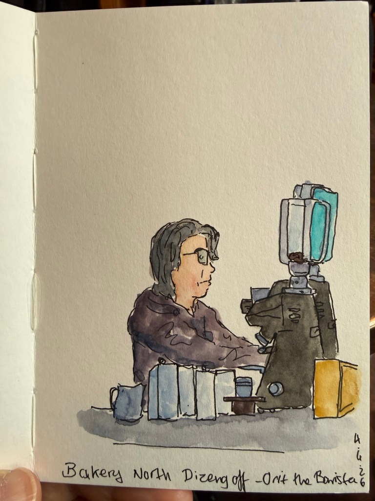
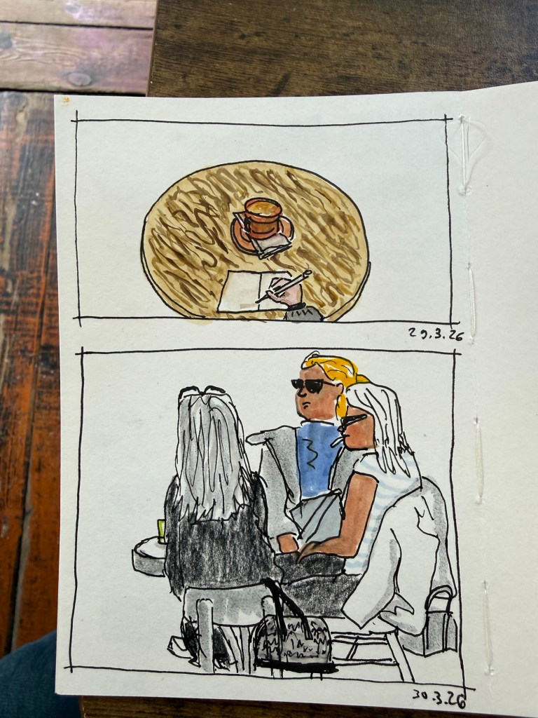
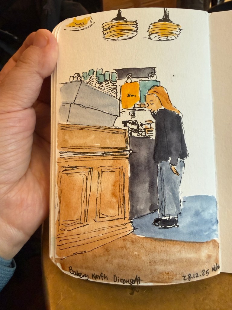
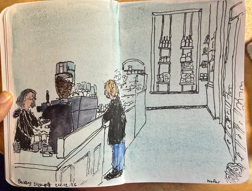
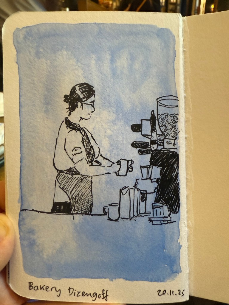
Apart from that I managed to get four short runs in this week (my runs are now laps around the bomb shelter) and I went to my favourite cafe and sketched my favourite barista at work:
Watercolours and fineliner on Pith sketchbook
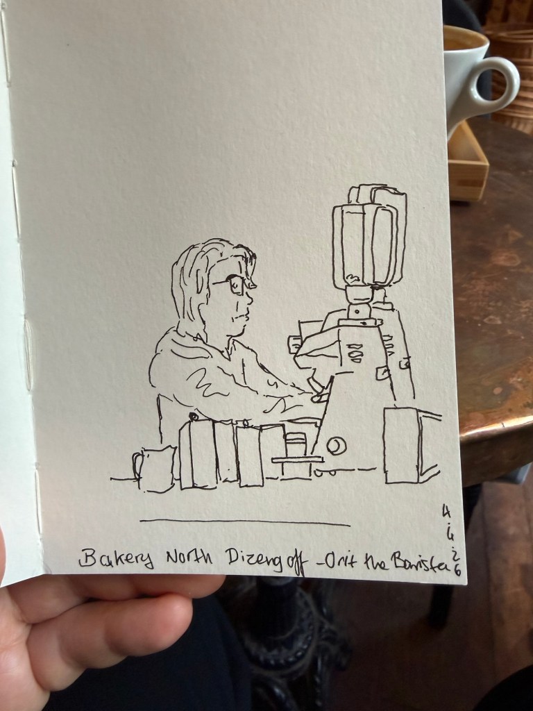
Here’s the sketch before I added watercolours:
Faber Castell 0.3 fineliner on Pith sketchbook
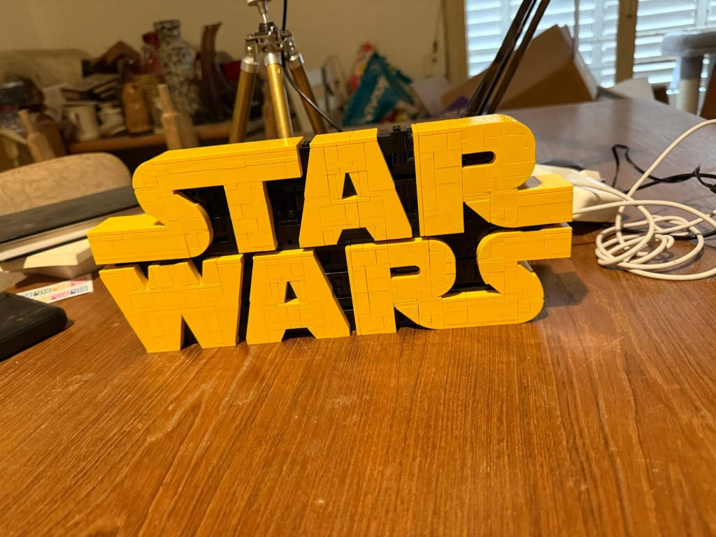
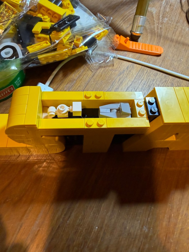
And I’m back to building Lego, as it really helps reduce stress (at least for me). My brother bought me this set for my birthday last year and I haven’t had the chance to build it yet. It took me about two hours:
Star Wars logo Lego
There’s a nice hidden Star Wars scene at the top of the “T”. Can you guess what it is?
Hidden Star Wars scene
Hoping that the downed airman is safely recovered and this war ends.
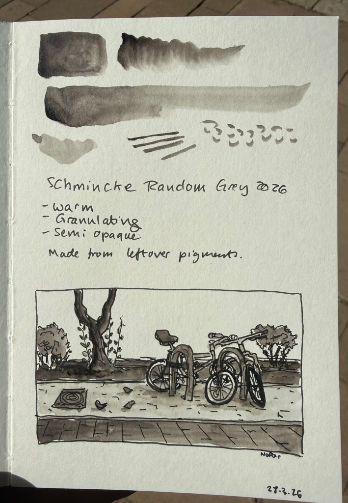
Once a year Schmincke, the German art supply company (makers of the best watercolours in the world) produce a limited edition colour out of the leftover pigments they have. The pigments come from their pastel production- which uses almost 100% pigment.
In 2024 the made an acrylic Random Grey. In 2023 the Random Grey was a pastel.
This year’s Random Grey is a watercolour. It’s a warm grey, granulating, and semi opaque. While I normally prefer cool or neutral grey’s, this colour looked interesting enough for me to give it a try.
The paint comes in a 15ml tube and though it’s a series 1 pigment it cost double the price of Schmincke’s usual series 1 watercolours (note: professional watercolours are usually priced differently by the kind of pigment they use. Blues tend to be more expensive than earth tones, for example. Schmincke’s series 1 are the cheapest and series 4 the most expensive). I’m not surprised as it’s a limited edition, but if you’re just looking for a warm grey Random Grey isn’t the most cost effective option.
Sample sketch and swab
I filled three half pans with Random Grey (one for me and two to gift) and there was plenty more to go around, so if you’re interested in this watercolour but are price conscious you can try finding other artists in your area that would be willing to split the tube. Schmincke’s watercolours are superb and it’s very easy to fill a pan or half pan with paint, let it set for a day or two and then use it.
The shade really surprised me. Yes, it’s a warm grey, but it’s not too far away from a neutral grey to become unusable for all but certain lighting conditions. It does not have that yellowish brown tinge that makes warm grey’s so… atmospheric. I enjoyed using this pigment, its granulation and layering possibilities enough to add it (at least temporarily) to my watercolour palette.
Is this a bit of a gimmick? Yes. Is it also a fun and interesting grey to have around? Also yes. I look forward to mixing and combining it with some pinks and reds and seeing what comes out.
Note: I sketched this on Pith paper, which is not watercolour paper. On watercolour paper Random Grey’s granulating properties will be even more pronounced.
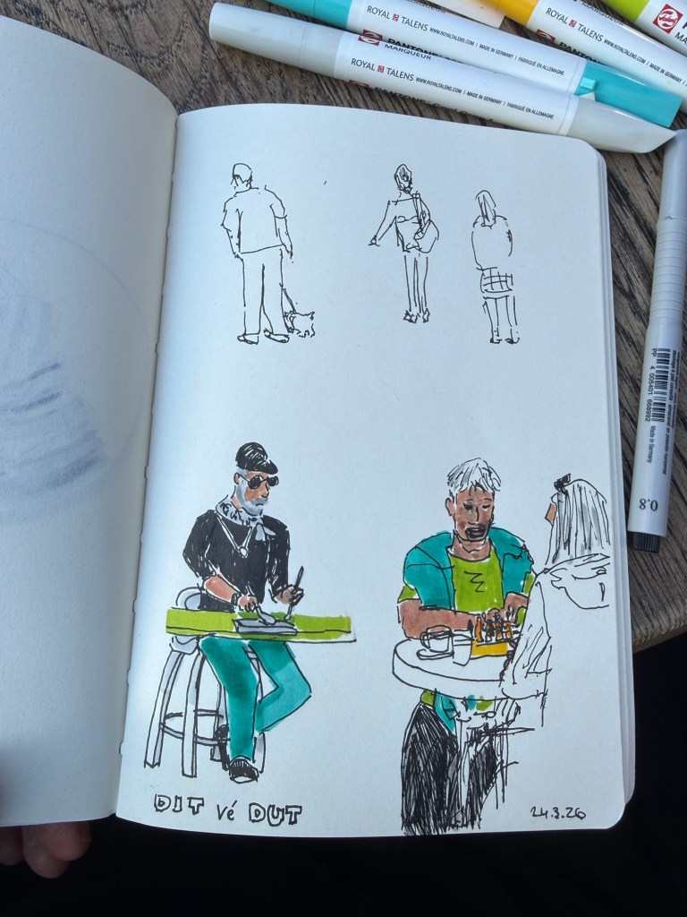
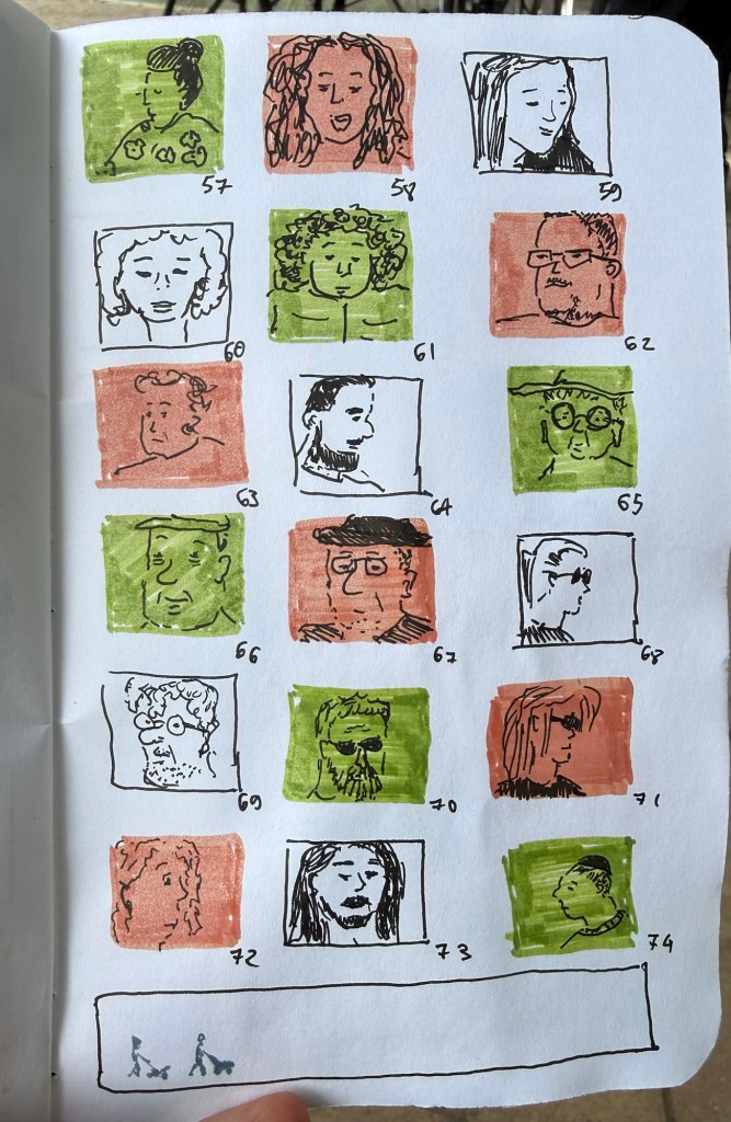
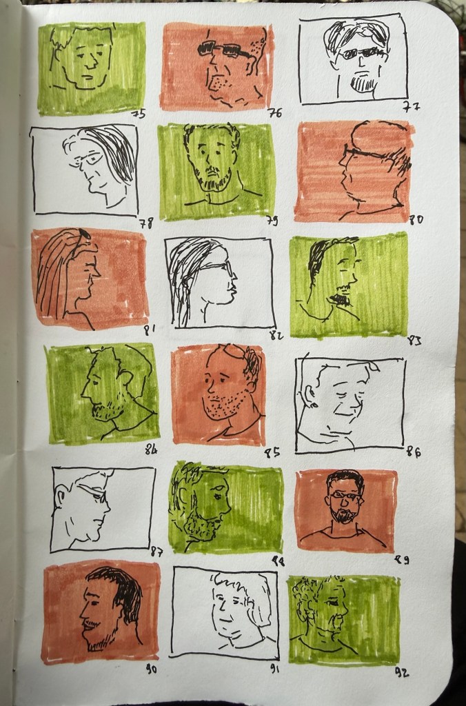
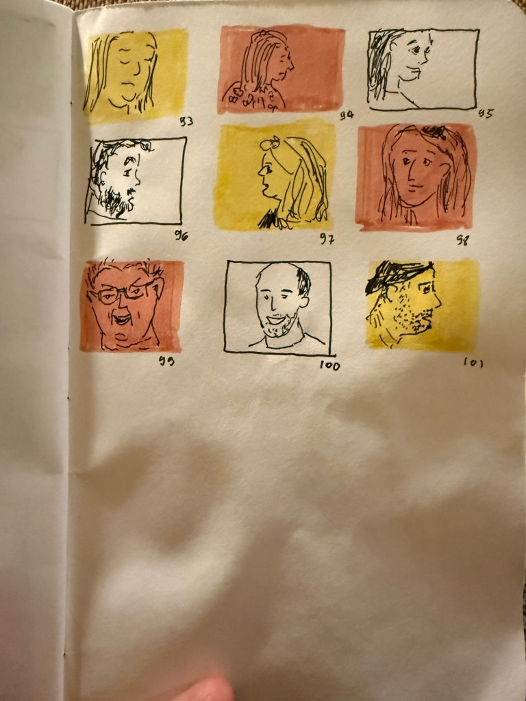
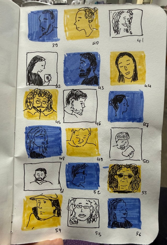
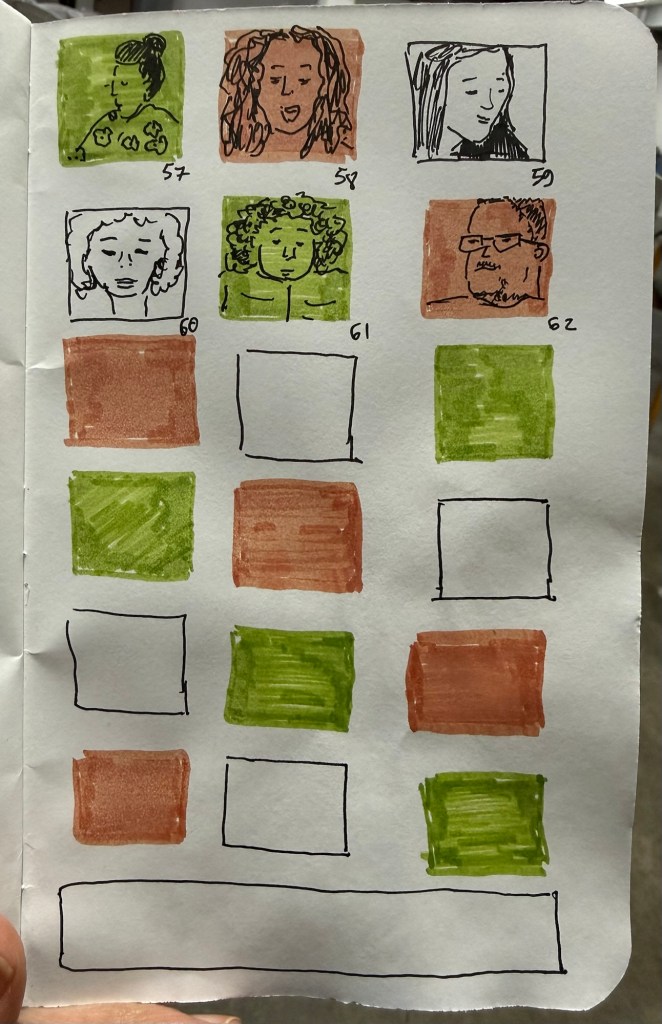
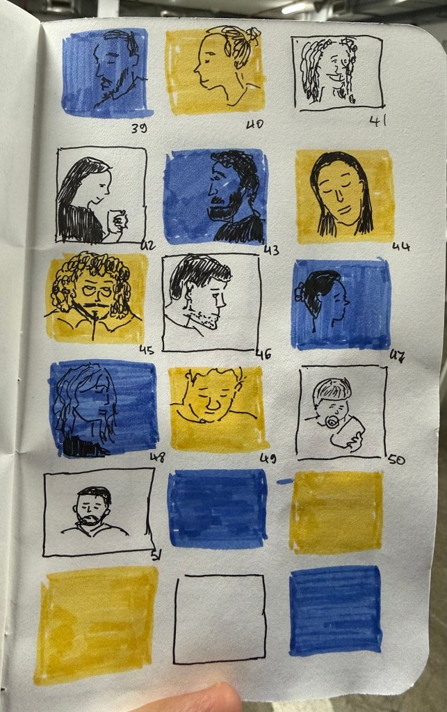
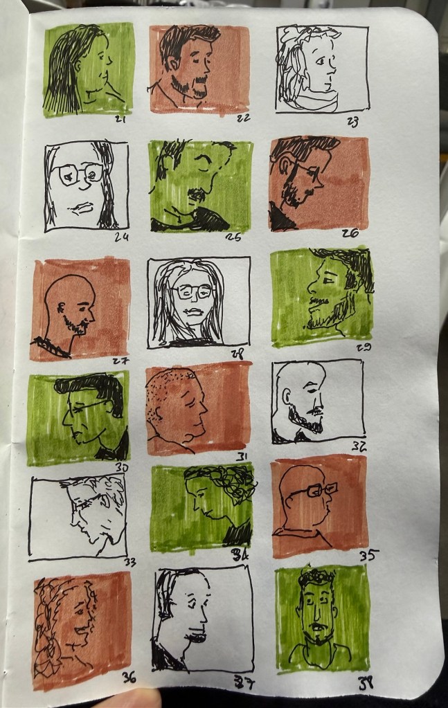
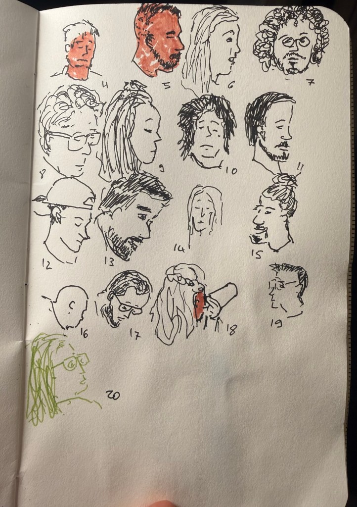
Last day of the challenge and I got all 100 (well, 101) people done. Today includes people in the streets near my house as well as people in the shelter.
Field Notes sketchbook and Faber Castell Pitt pens.
The bottom panel was supposed to a panorama in fountain pen ink but this is very unfountain pen friendly paper
As usual this was a fun and challenging challenge to do, and I hope to get to do it again next year.
We had a rocket attack every three hours last night so I was very tired today. Got only 10 sketches out of the 20, although I may be able to get some more tonight.
Shelter sketches today as well, on a battered Field Notes sketchbook using Faber Castell Pitt pens. I have a cold, so it was a struggle to get these done today.
Have a happy new year! Here’s hoping that 2026 will be much better than 2025 was.
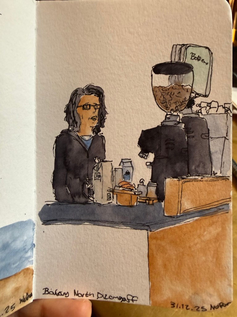
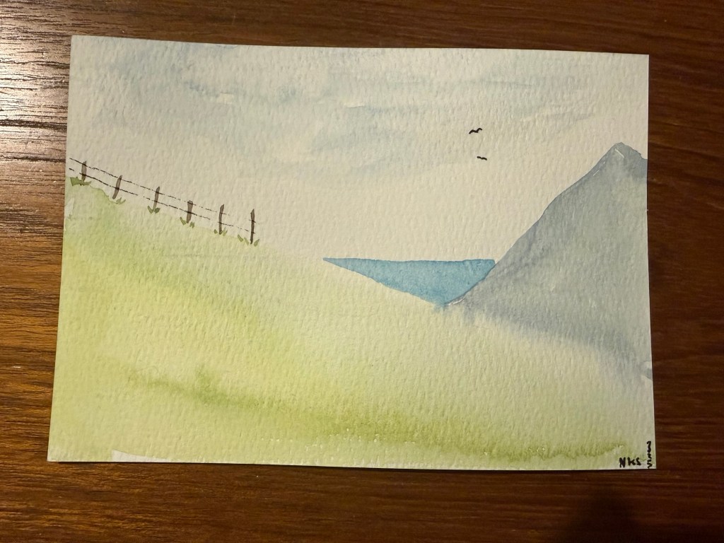
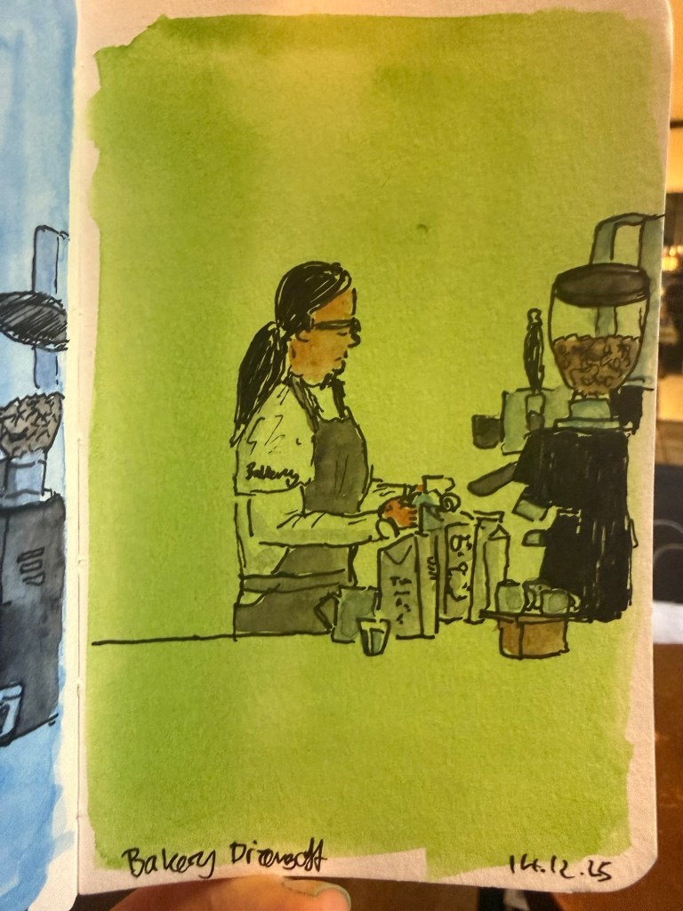
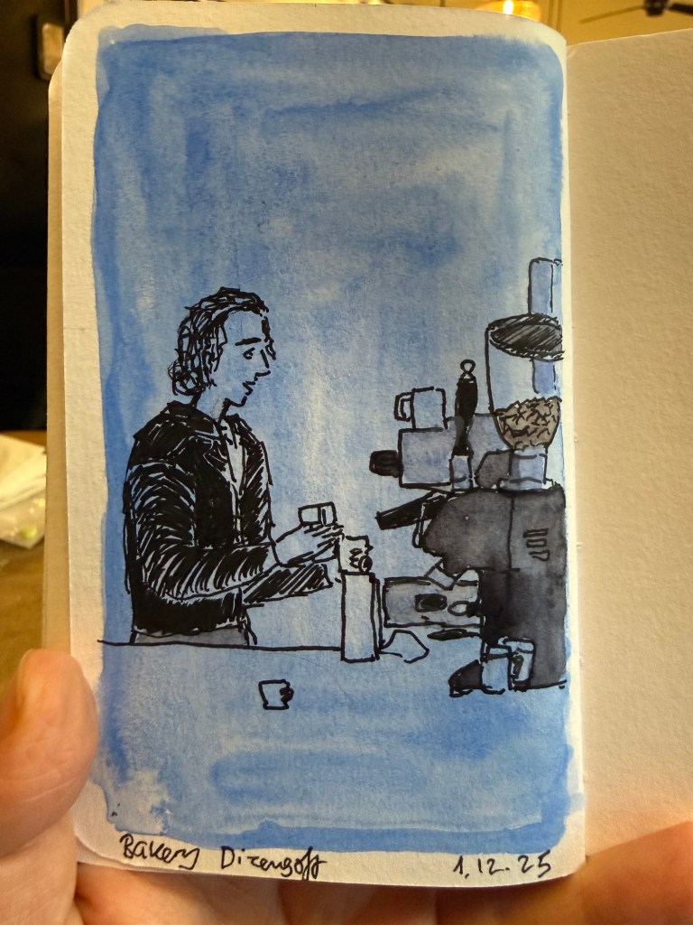
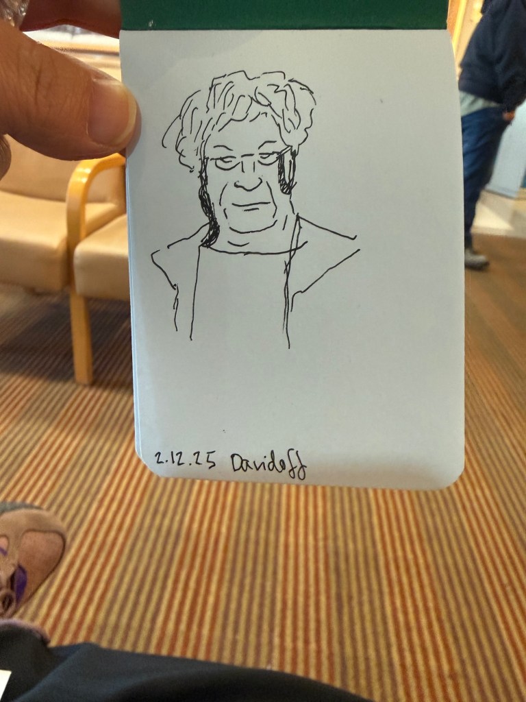
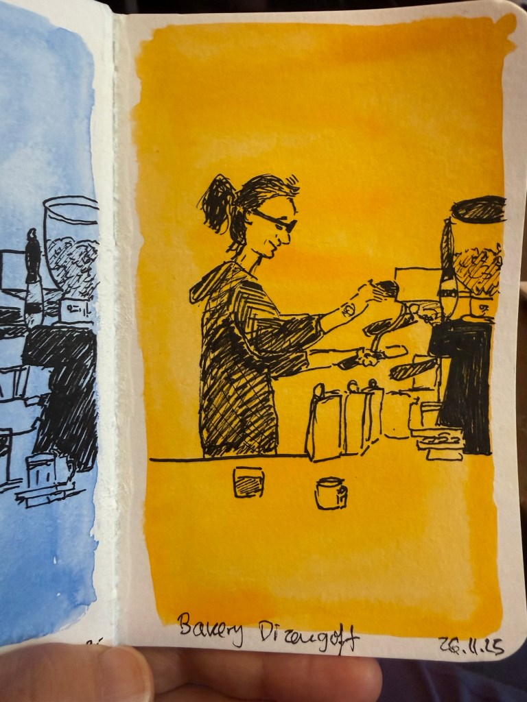
Here are a few recent sketches (mostly) from my Stillman and Birn pocket beta notebook.
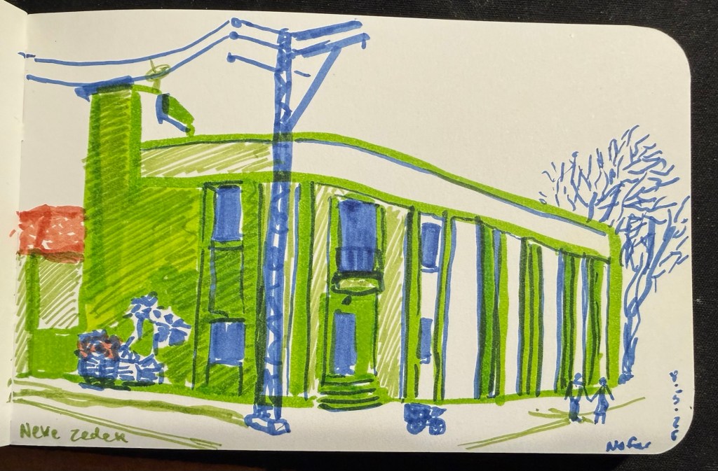
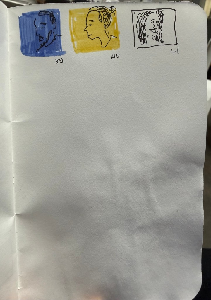
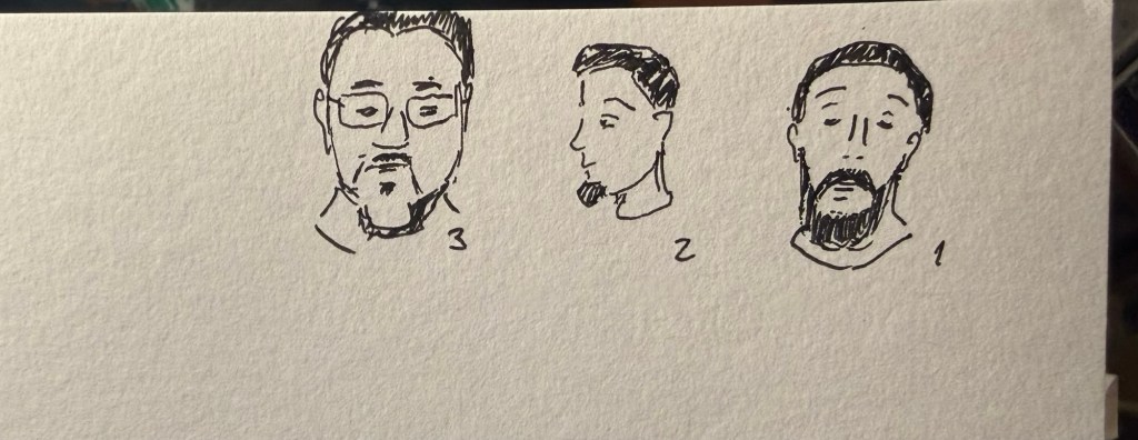
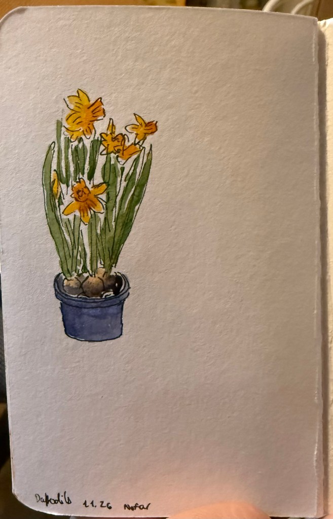
Daffodils What to choose? Cafe sketchBarista at work (very fast sketch)Favourite cafe spreadTiny landscape (not from my sketchbook- drawn on a card as a gift)Barista sketch on green background Barista sketch on blue background Sketch in a doctor’s waiting office (not on Stillman and Birn)Barista sketch on a yellow background Barista sketch on a blue background