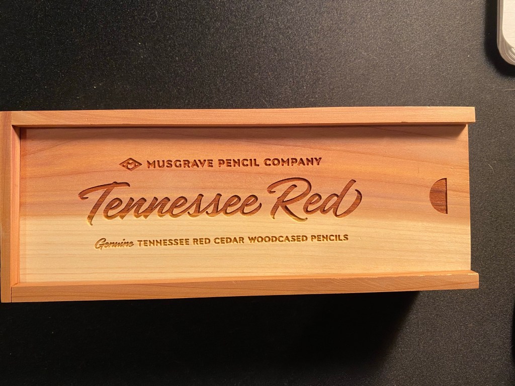
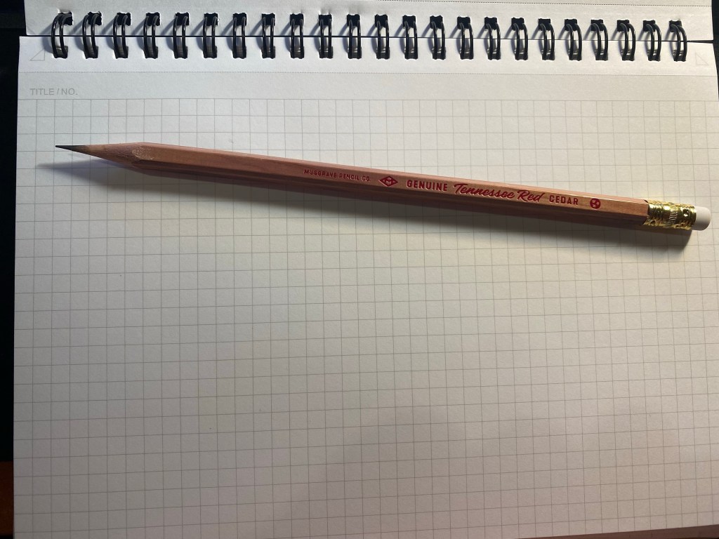
This is the Musgrave Tennessee Red pencil presentation box:
Gorgeous, isn’t it? Just look at that reddish and golden timber. It glows:
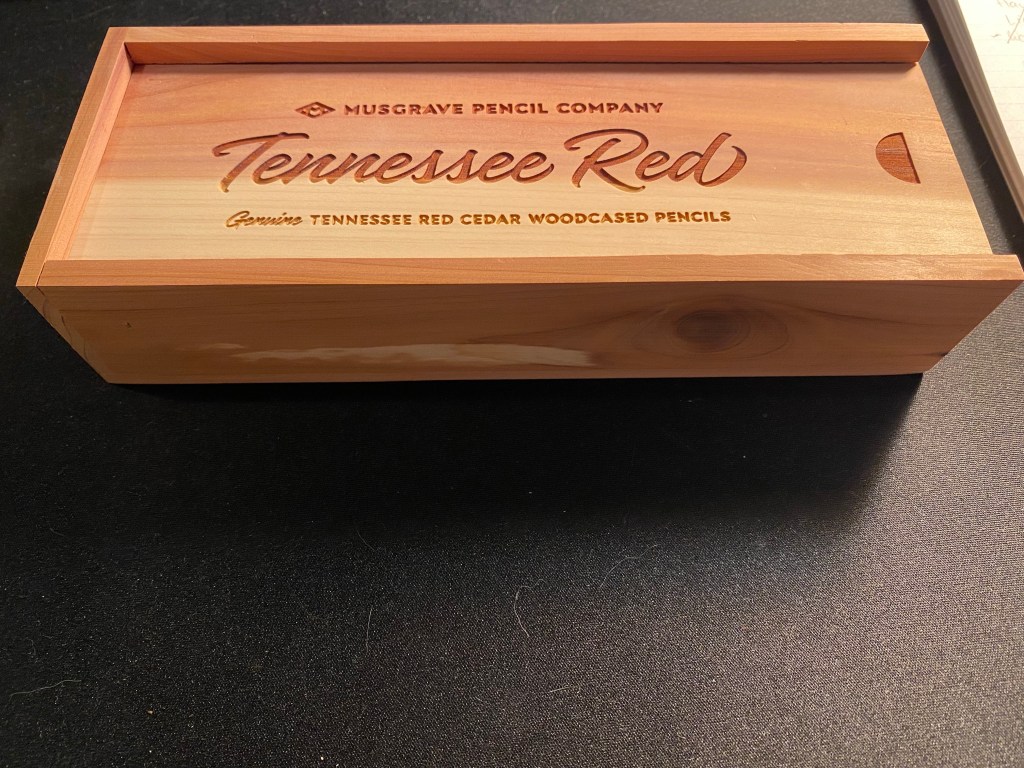
The pencils inside are equally beautiful. They’re made of Eastern Red Cedar, in the USA, and this is the 24 pencil presentation box. I have two of these, as well as a paper box that has 12 pencils. I’ve had them for a few months, but I haven’t had the nerve to sharpen them until earlier this week. They were just too good looking to sharpen.
24 Tennessee Red pencils in a cedar presentation box.
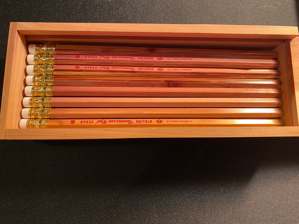
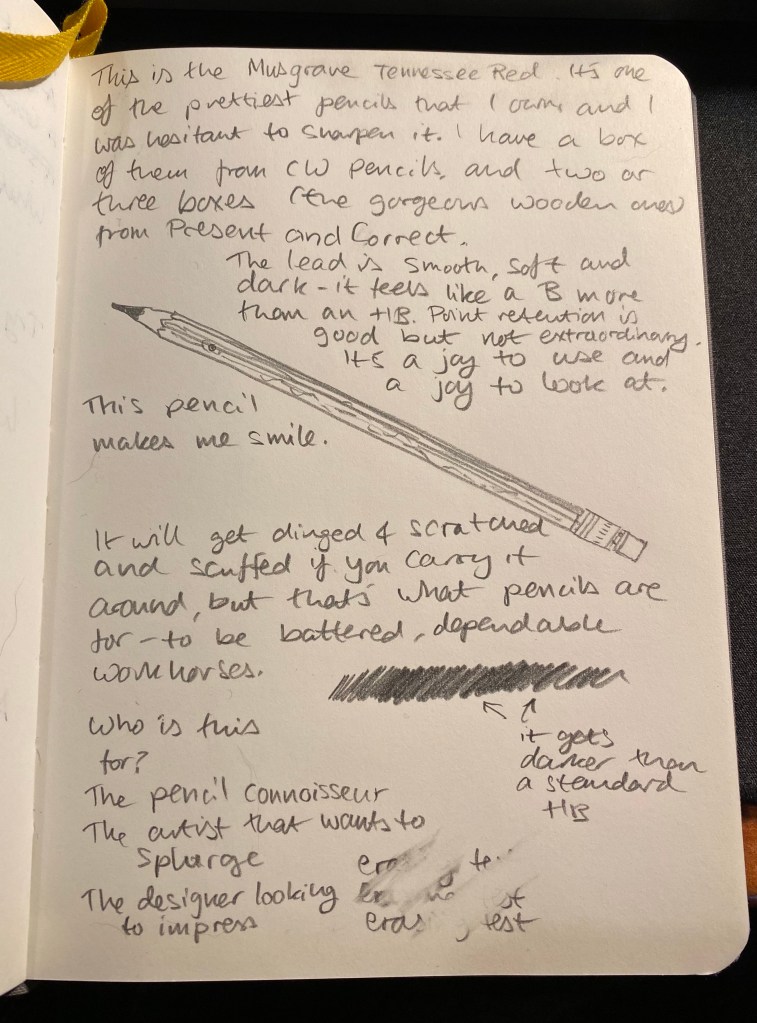
Now this isn’t to say that these pencils are perfect. Musgrave points out on their site that these pencils can have modest visible wear due to the soft nature of the wood, and the core may be slightly off centre. A rummage through the pencils that I have proves that these warnings are justified. But it still is a gorgeous pencil:
Just look at it.
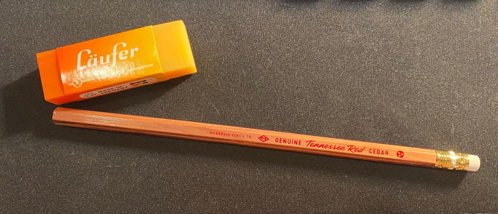
The pencil is lacquered which does protect the wood somewhat, and a lot of thought and care went into designing the imprint on the barrel (text, colour, font, symbols) – and a lot of restraint too. The imprint, ferrule, and eraser don’t call attention to themselves. This is a pencil that’s all about its beautiful, sweet smelling wood.
See how the imprint and everything else fade out of sight? An beautiful and understated pencil.
The Tennessee Red is a joy to sharpen. The cedar smell is intoxicating, and if the pencil wasn’t such a good one I may have just sharpened it all away. But it comes with a smooth, dark lead that feels and behaves like a B grade despite being a #2 (or HB) pencil. It’ll be a delight to sketch with this beauty. You can see it in action below, on a Baron Fig Confidant.
These aren’t cheap or widely available, and if you are outside the US they are even less cheap and more hard to come by. They are, however, worth the price and worth making an effort to find, and not because they are the best pencils in the world, but because it is clear that someone made an effort to make a modern American pencil that doesn’t shame its Eagle and Eberhard Faber vintage counterparts. It’s a beautiful, sweet smelling, wonderful woodcased pencil that is a joy to use and would make any stationery lover smile. And who can’t use a reason to smile these days?
The Caran d’Ache Swiss Wood is one of my favourite pencils. There are those who hate its burnt caramel smell and have nicknamed it “the stink wood,” but I am not one of them. I love how the Swiss Wood smells like, how it looks like, and especially how it writes like. The pencil is a joy to hold, the tip lasts forever, and it puts down a dark and smooth line that is great for writing and sketching. Its only real downside for me is its price — the Swiss Wood is expensive, and only getting more expensive with time.
So when I saw that Caran d’Ache was creating a Swiss Wood in collaboration with Nespresso, I added it to my Cult Pens basket together with the Nespresso Fixpencil. What can be more cool that the Swiss Wood with a Nespresso theme and some added recycling thrown in? This three pack of pencils was very expensive, but I decided to treat myself.
Boy do I wish I hadn’t.
The front of the recycled box.
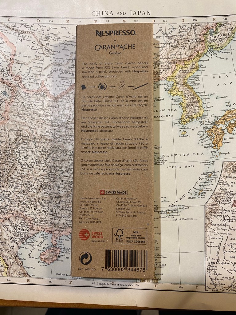
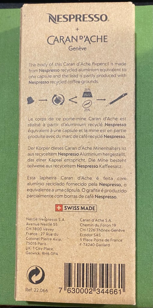
As with the rest of the Caran d’Ache x Nespresso collaboration, the pencils come in a 100% recycled box. The box is cleverly designed with coffee bean shaped cutouts that show glimpses of the pencils inside, and debossing that shows off the pencils’s shape and coffee beans to highlight what the recycling story in this collaboration is about. The rest of the “recycling story” is in the pencils’ lead, which is made of 25% coffee grounds. The pencils are made of FSC certified beech wood, which is the same as the normal Swiss Wood. You can find all this information on the back of the box:
The back of the box.
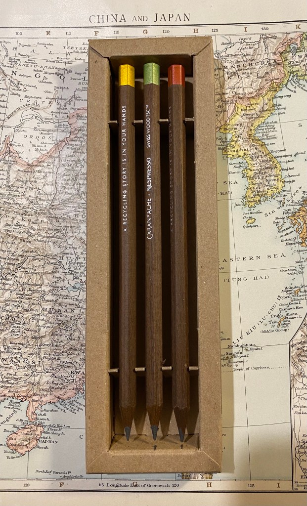
Inside the box are three very expensive pencils. They look (and smell) just like the Swiss Wood except for the imprint on the pencil body, and the dipped end-caps.
Three very expensive pencils.
The end-caps are metallic, and come in golden yellow, light green, and a bronzish red. They aren’t metal end-caps, but simply end-caps dipped in paint, just like the red Swiss Wood end-cap, only in different colours.
Closeup on the end-caps.
The imprint on the pencil is very similar to the original Swiss Wood, with the addition of the Nespresso logo, and the sentence: “A Recycling Story is in Your Hands”. The imprint is very crisp, and I like the font they chose for it.
The imprints on the pencils.
Here is where things started to go downhill. The clever and beautifully designed box that holds the pencils chipped into one of them, taking out a chunk. Not great for such an expensive set.
Damaged expensive pencil.
The end-cap is only dipped in paint. For this collaboration, especially considering the price, I expected the end-caps to be made of aluminium from recycled Nespresso pods. As it is, painted end-caps are a disappointment. Here are a bunch of modern and vintage pencils that cost much less and have better end-caps than the Nespresso Swiss Wood:
End-cap comparison.
Here’s a close up of the end-caps. From top to bottom they are: Nespresso Swiss Wood, Tombow Mono 100, Eberhard Faber Colorbrite (vitage), Mitsubishi Hi Uni, General’s Kimberly, Eberhard Faber No Blot (vintage). If they could do it why couldn’t Caran d’Ache?
Caran d’Ache Swiss Wood painted end-cap vs cheaper, more premium end-caps…
Here’s the Caran d’Ache Swiss Wood next to the original Swiss Wood. They look very much alike, apart from the imprint and the colour of the end cap. However, it’s not what’s outside that makes or breaks the pencil (pun intended) — it’s the core.
Caran d’Ache Nespresso Swiss Wood (top) vs the original Swiss Wood (bottom).
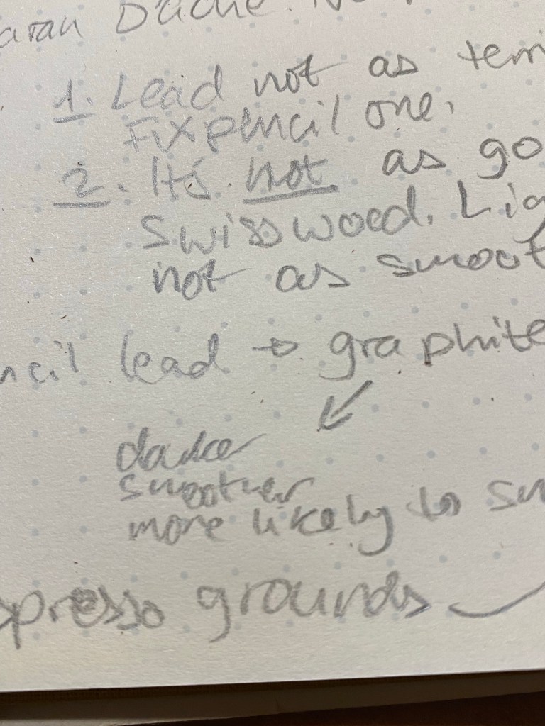
The core of the Nespresso Swiss Wood is made of 25% recycled coffee grounds from Nespresso capsules. The Nespresso Fixpencil had a similar recycled coffee ground core and was terrible. Is the core in these pencils as bad?
Writing sample of the Nespresso Swiss Wood vs the original Swiss Wood. Written on a Baron Fig Confidant.
It’s not that bad, but it isn’t great. The original Swiss Wood has a dark and smooth core that holds a point for a long time. The Nespresso Swiss Wood has a fragile core that is scratchy and lighter than its counterpart. It isn’t unpleasant to use to the point of being unusable, but it feels cheap, it looks cheap, it’s everything but a premium pencil in a world full of excellent premium pencils that cost less. There are actual white streaks in the writing it produces. If I want white streaks in my writing I can pick up a cheap ballpoint. For the price of these pencils I expect a better writing experience than the Swiss Wood, not a worse one.
Close up the writing, where you can see the white streaks.
The Caran d’Ache x Nespresso 849 collaboration produced some stunning pen designs. So far the pencil part of the collaboration hasn’t gone so well. I’d buy the Nespresso Fixpencil and toss out the lead, but I’d utterly avoid the Nespresso Swiss Wood. You get a worse pencil for a higher price, and the veneer of being good for the planet. Reduce, reuse, recycle are said in that order for a reason. In this case reduce, as I wish I had.
Caran d’Ache’s Fixpencil is their legendary clutch pencil offering. While the classic Fixpencil has a plastic body, the Fixpencil 22 is made of aluminum, giving it both an added weight and a more luxurious finish. The Nespresso Fixpencil 22 is also made of aluminum, hence the 22 in the name, but it’s aluminum body is partially made from a recycled Nespresso capsule, and it comes with a lead that’s partially produced from recycled coffee grounds. Just like the previous Caran d’Ache x Nespresso849pens, this brand collaboration is all about recycling with class.
The front of the Caran d’Ache Nespresso Fixpencil box.
The box that the Nespresso Fixpencil arrives in is similar to its 849 counterparts: it’s made of 100% recycled cardboard and there’s a Nespresso capsule shaped cutout in the box that shows off the colour and texture of the Fixpencil. Clever embossing and tasteful design and branding make this a superb gift to give to someone who enjoys using pencils (with a caveat that I’ll get to later). The box is the most recycled thing about the product (being 100% recycled), but at least Caran d’Ache is honest and transparent about the quantity of recycled materials inside the fixpencil and lead: 25% of each, respectively. So there is a fair bit of “greenwashing” going on here.
Back of the Caran d’Ache Nespresso Fixpencil box.
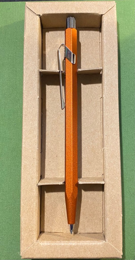
The clever design of the box continues once you open it. It really shows off the beauty of the Fixpencil design and just how vibrant and warm the orange “ochre” colour is. It glows. You can also see the subtle texture the Fixpencil has.
Gorgeous orange Fixpencil nestled in a cardboard box.
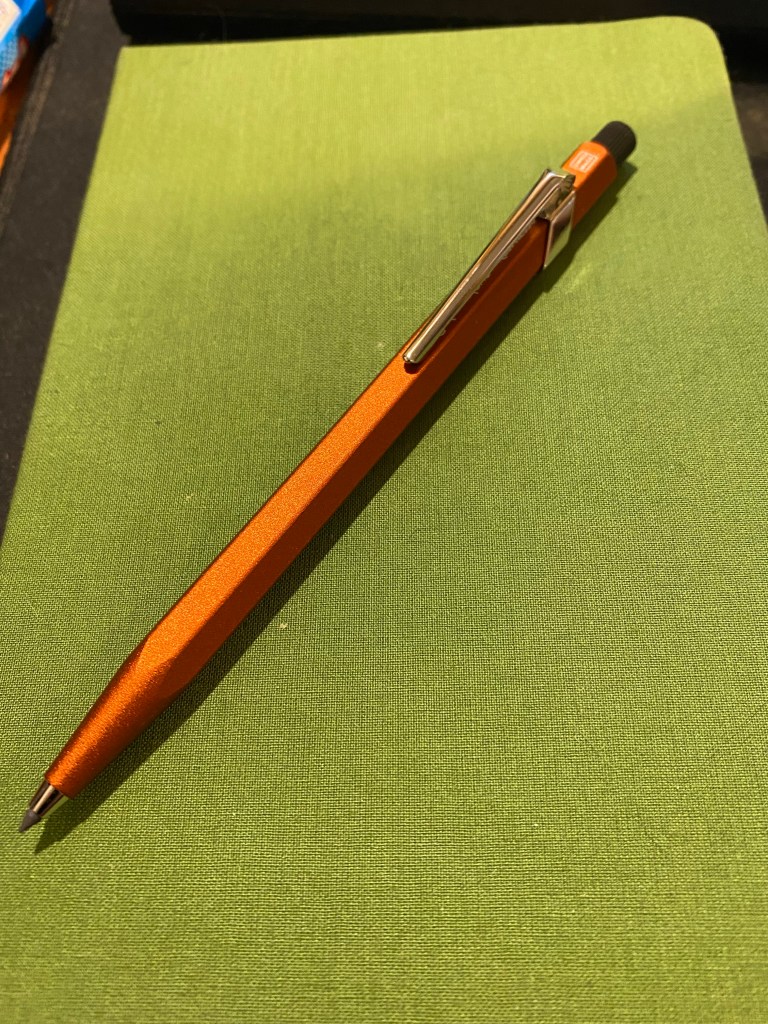
Here is my first, albeit minor, quibble with this product: it’s not ochre. It’s reddish orange. It’s mandarin. It’s anything but the yellowish brown that ochre brings to mind. I have no idea why it was so poorly named.
Fixpencil ochre? More red than yellow by far to be called that.
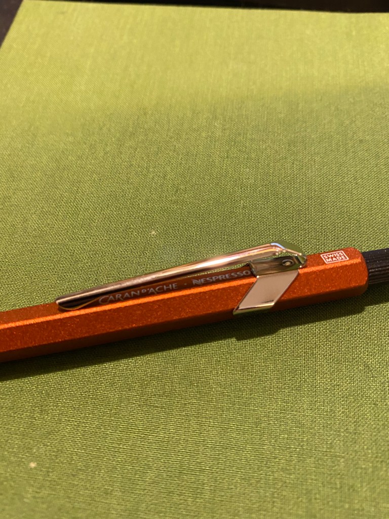
Caran d’Ache 849s and Fixpencils normally have very little branding on them. The Caran d’Ache brand is tucked discreetly under the clip and generally all that you see is the “Swiss made” with a white border around it just above the clip. The Nespresso collaborations are different in that Caran d’Ache adds an additional imprint to the pen/pencil: “A Recycling Story is in Your Hands”.
A recycling story (of sorts) is in your hand.
Of course the normal logos are where they usually are, with the addition of the Nespresso logo to the Caran d’Ache logo under the clip.
Logos discreet and visible.
The Fixpencil is a joy to use because of its form factor, which is just like the 849, and the wonderful finish on the pencil body, which adds subtle texture that makes the Fixpencil fun and easy to hold.
A close up on the Fixpencil’s texture.
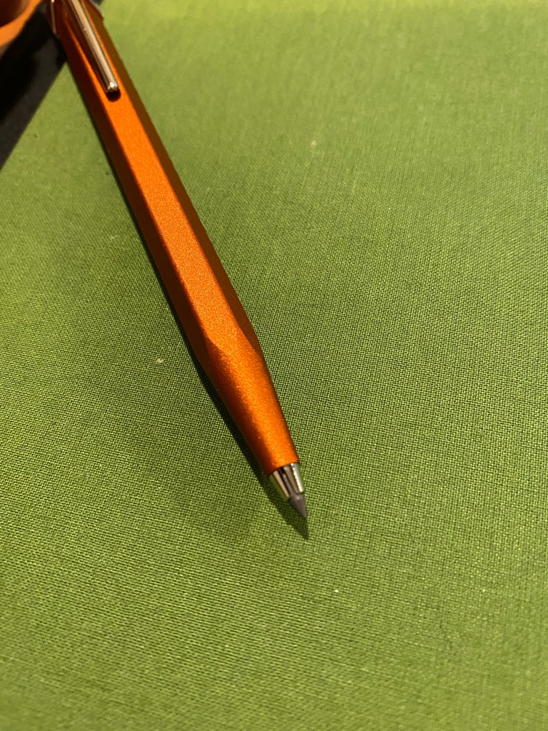
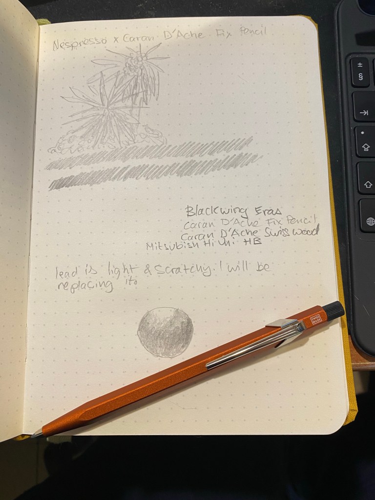
And now we come to the worst part of this collaboration: the pencil lead. The Nespresso Fixpencil doesn’t come with the normal fabulous Caran d’Ache pencil leads. Instead it comes with a pencil lead that has 25% coffee grounds in it and is supposedly a B grade lead. It’s terrible. The lead is scratchy, so light that it writes like an F or even an H grade lead, and hard to erase. After testing in on my standard pencil testing Baron Fig notebook, I threw it out and replaced it with a standard 2B lead from my regular stash. Not recycled, but actually usable.
Terrible pencil lead in action.
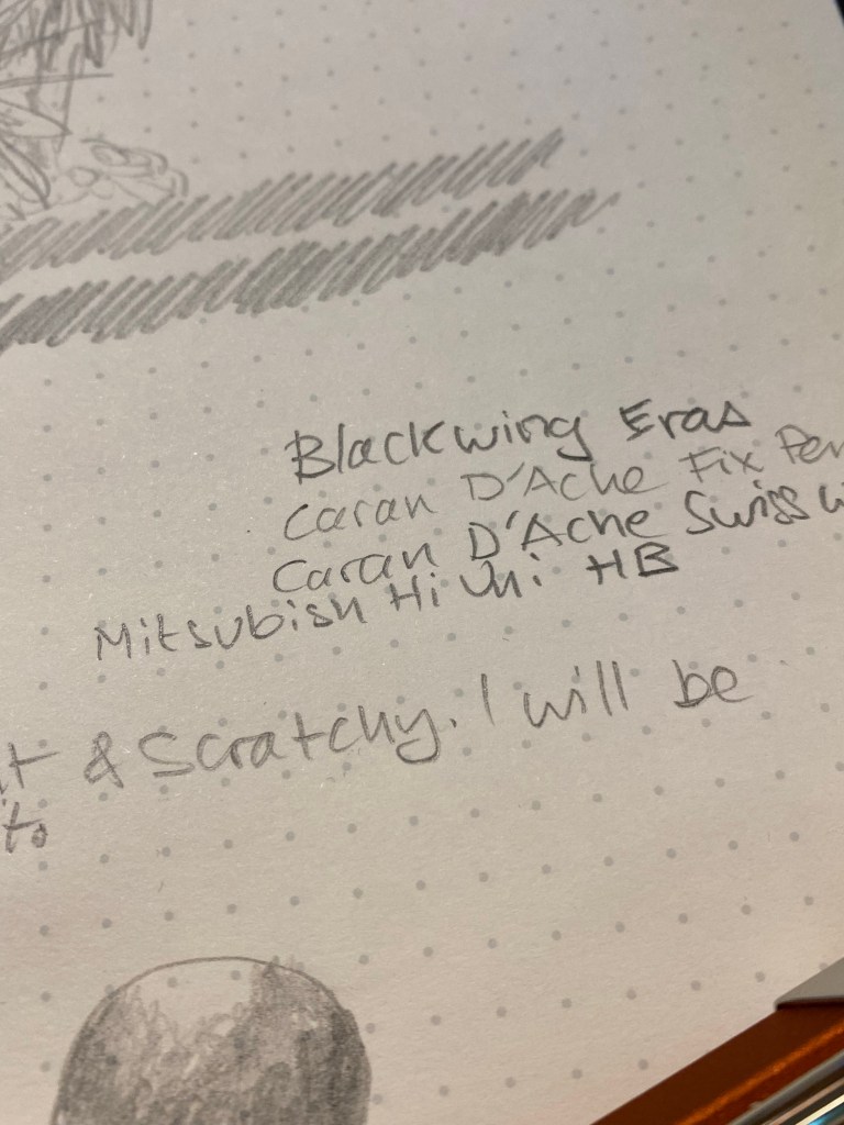
Here’s a close up where you can see in the word “scratchy” where the lead actually dug into the paper.
Closeup on the scratchy writing and some lead comparisons.
The Caran d’Ache Nespresso Fixpencil is a joy to use and will make for a fabulous gift once you pair it with a box of good quality B or 2B pencil leads. It’s a beautiful take on an already great product that I just wish also included the normal Caran d’Ache lead lineup.
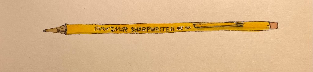
If you follow any makers on YouTube you probably saw this ugly yet somehow charming little mechanical pencil in action. The Paper Mate SharpWriter is a strange beast, full of surprises. It’s a mechanical pencil with a twist mechanism in the tip instead of a click mechanism under the cap, it actually has a serviceable eraser, and it’s non-refillable. It’s as if Paper Mate saw the “Think Different” ad and said, “yes, but how can we apply that to a mechanical pencil?”
Paper Mate SharpWriter.
First of all, you can buy the Paper Mate SharpWriter in many different widths, as long as they’re all 0.7mm. This has the added value of saving Paper Mate the need to indicate the lead width on the pencil, because there’s only one width to rule them all. I can’t honestly fault them for that. It’s a pencil that’s meant for students and bills itself as having less lead breakage, and so 0.7mm is the way to go.
There are some interesting things going on with the business side of this pencil. First and foremost, that’s where the lead propelling mechanism is, which caught me by surprise. It’s a twist mechanism, and it’s pretty sophisticated as it allows you to easily extend and retract the lead to suit your needs. The second part is the “lead cushioning mechanism” which means that the lead springs up and down as you right, preventing you from breaking it if you exert too much pressure. It works, but I’m not a fan as it makes me feel as if the lead is broken inside and I have to extend it to get rid of the small broken piece and reach the “real” lead left inside. It’s going to take some time for me to get used to it.
Writing and erasing sample.
The eraser is downright phenomenal, as it actually erases things quite well, and doesn’t tear into the page. The lead itself is a solid HB 0.7mm lead that is smooth and on the slightly darker side of HB.
The Paper Mate SharpWriter isn’t a pretty of fancy mechanical pencil, but it’s comfortable to hold, lightweight, and has a playful colour scheme that recalls a woodcase pencil. And like a woodcase pencil, it’s disposable, which is where my only real beef with this pencil lies. Yes, this is a student pencil, and so it’s likely to get lost or somehow broken (it’s far from flimsy, but where there’s a will, there’s a way), and if the pencil won’t be lost, the leads will, and yet… The last thing the world needs is more plastic waste.
So, do I recommend the Paper Mate SharpWriter? No, and not because there’s anything wrong with the pencil, it’s just that there’s very little justification for a disposable mechanical pencil when there are cheap, good and even great refillable options to be had in the market.
But I do understand the makers who have fallen for this ugly duckling.
2021 has finally arrived! Every year since 2015 I’ve kept a list of yearly goals in a Baron Fig Confidant. I still call “New Year’s Resolutions” despite their being SMART goals and not pie in the sky resolutions. Over the years they have expanded to be ever more specific and quantifiable: I started with one page, and now have a main two spreads with related lists spilling out to adjacent spreads, and an entire notebook dedicated to capturing my reading goals.
2020 was a weird and challenging year, and it managed to land a large, hard hit on me on its very last day. These goals were written before I got bad news regarding the health of a close family member (Cancer, not Covid), which means that there’s a good change that 2021 will shape out worse than 2020 in terms of my goals. However, ever since 2018 I build my goals with those kinds of emergencies in mind, and so most of my goals, if not all of them, should be attainable.
2021 goals and theme in my Baron Fig Confidant
Some of my usual goals are off this list, because I’m afraid that Covid will not be over so soon. For the first time ever a significant chunk of these goals is professional. I’ve changed careers, and new opportunities have opened before me – creating professional goals makes sure that I take advantage of those opportunities.
My writing and journalling have taken a hit in 2020 (particularly the latter part). Hopefully with some concerted effort that will change in 2021. I’ve made significant progress in terms of fitness in 2020, and I plan on maintaining the course in 2021. I’m also putting some effort into taking time to enjoy my hobbies. If I don’t prioritize them, then they just get left by the wayside.
Finally, for the first time I’ve created a yearly theme, that is part of the yearly goals and yet also a separate entity. 2021 is the “Year of Clearing Out”. That means decluttering my apartment, pruning my podcast/book/viewership lists, and getting rid of some recently acquired bad habits (mostly doom scrolling on Twitter, but not just). This may end up being a theme that will spill into 2022, but the idea is to try and tackle it in 2020, to build a good foundation for the years to come.
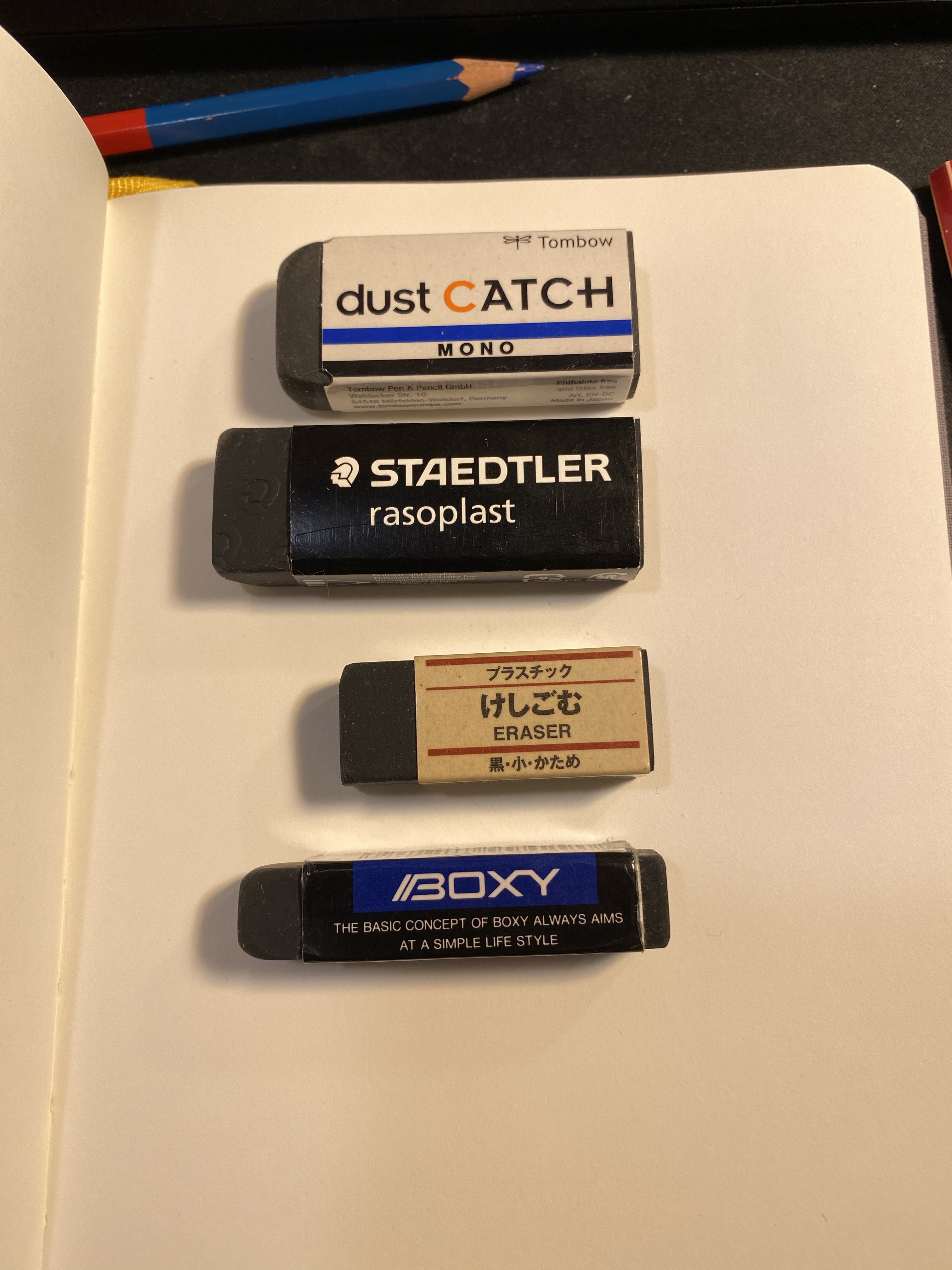
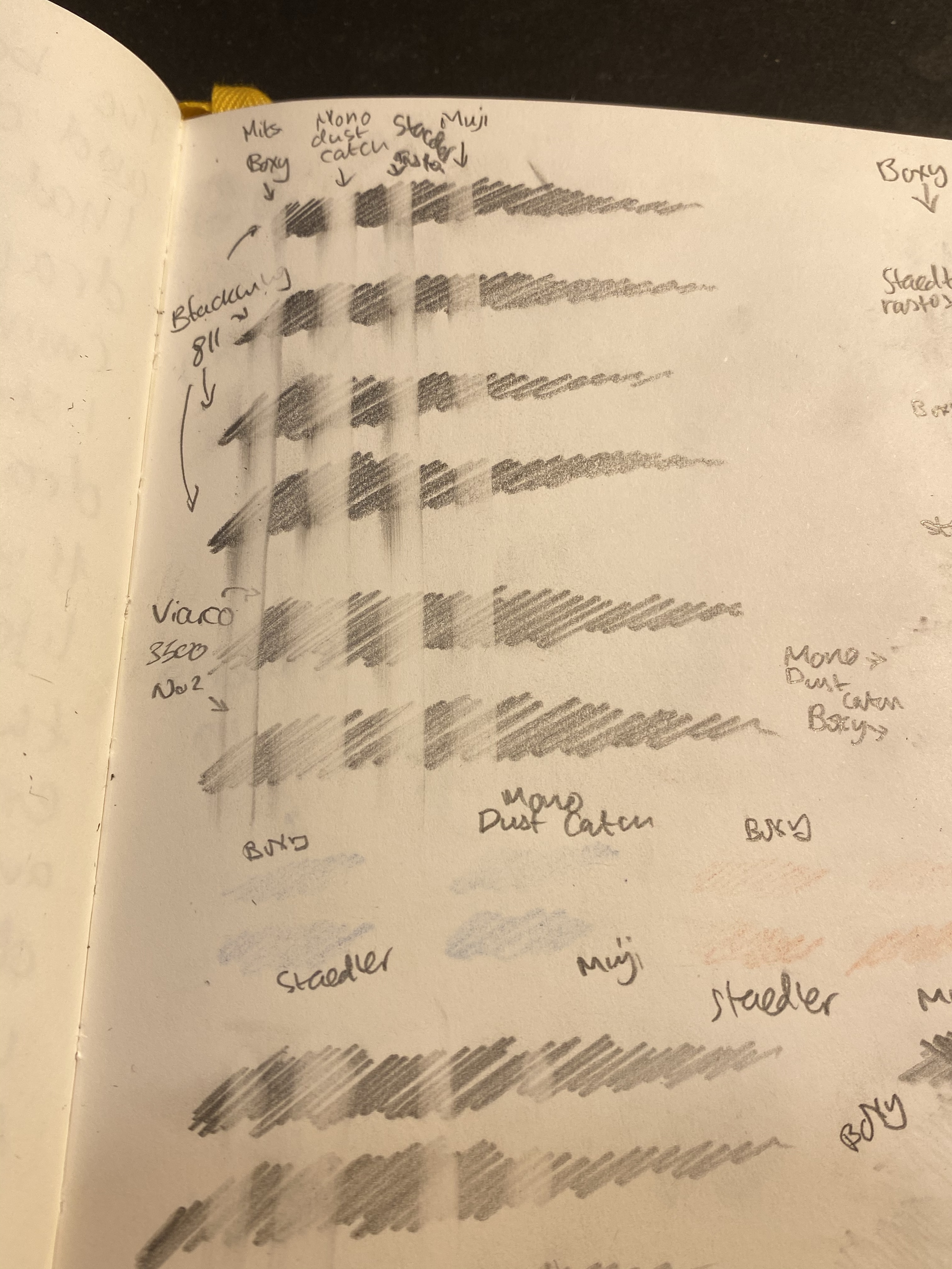
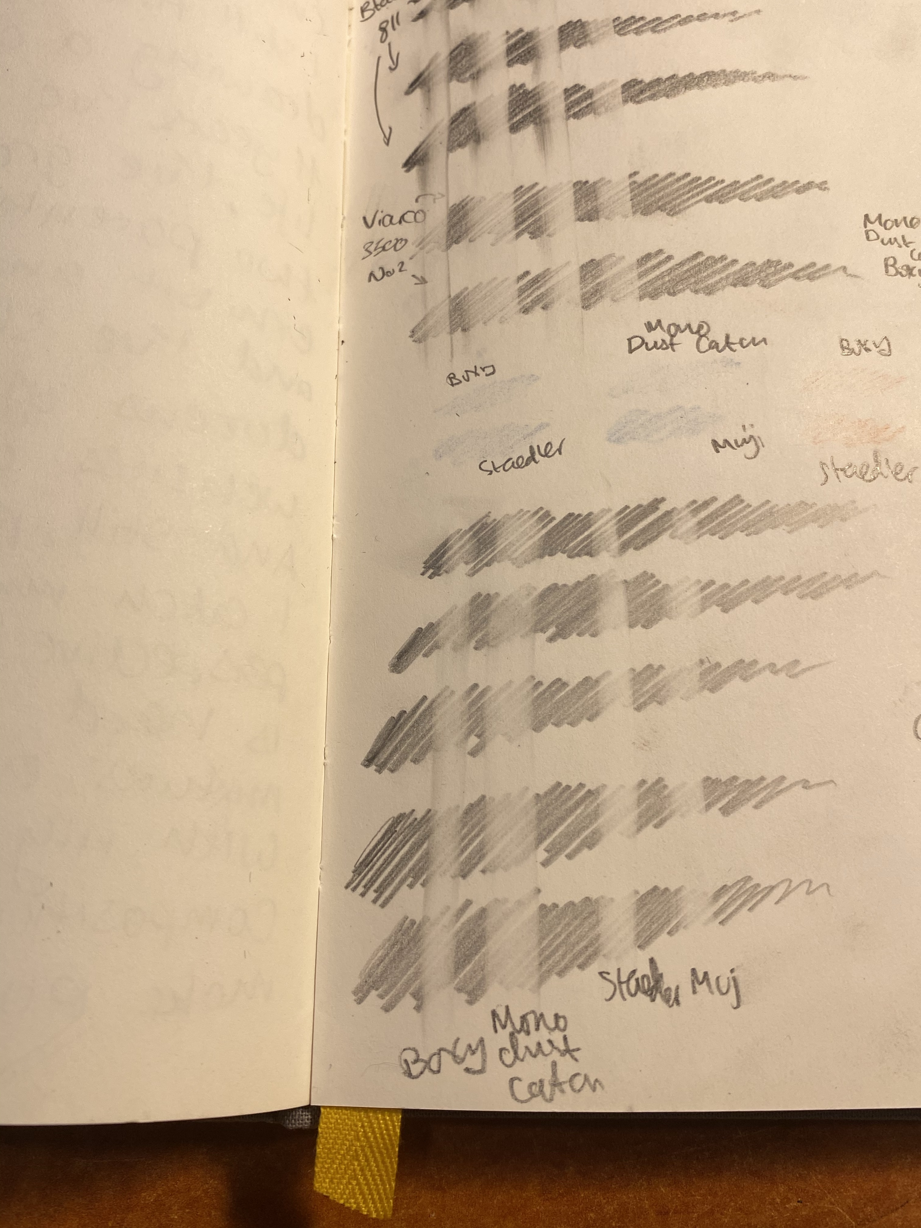
Black erasers have become more common in recent years, with the Boxy perhaps being the most well known of the bunch. I have a few that I use regularly, and a few that just lounge in my stationery drawers waiting to be used. As I’m streamlining my sketching kit and the boxy is now the eraser I carry in it, I decided to test it out against the competition, starting with other black erasers.
In terms of price they’re all around the same price range with the Muji eraser being the cheapest of the bunch, and the dust catch and boxy being on the more expensive side of things.
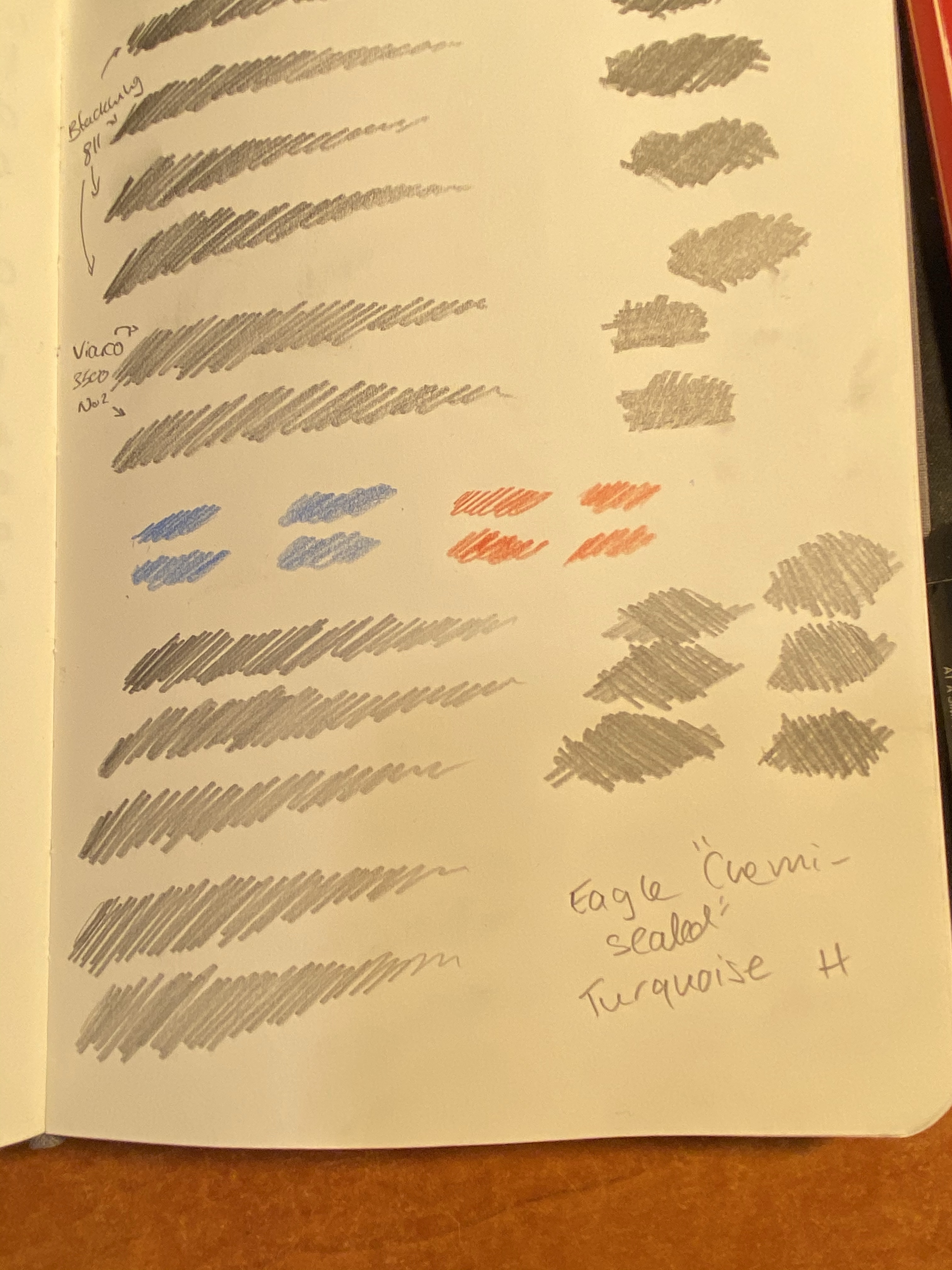
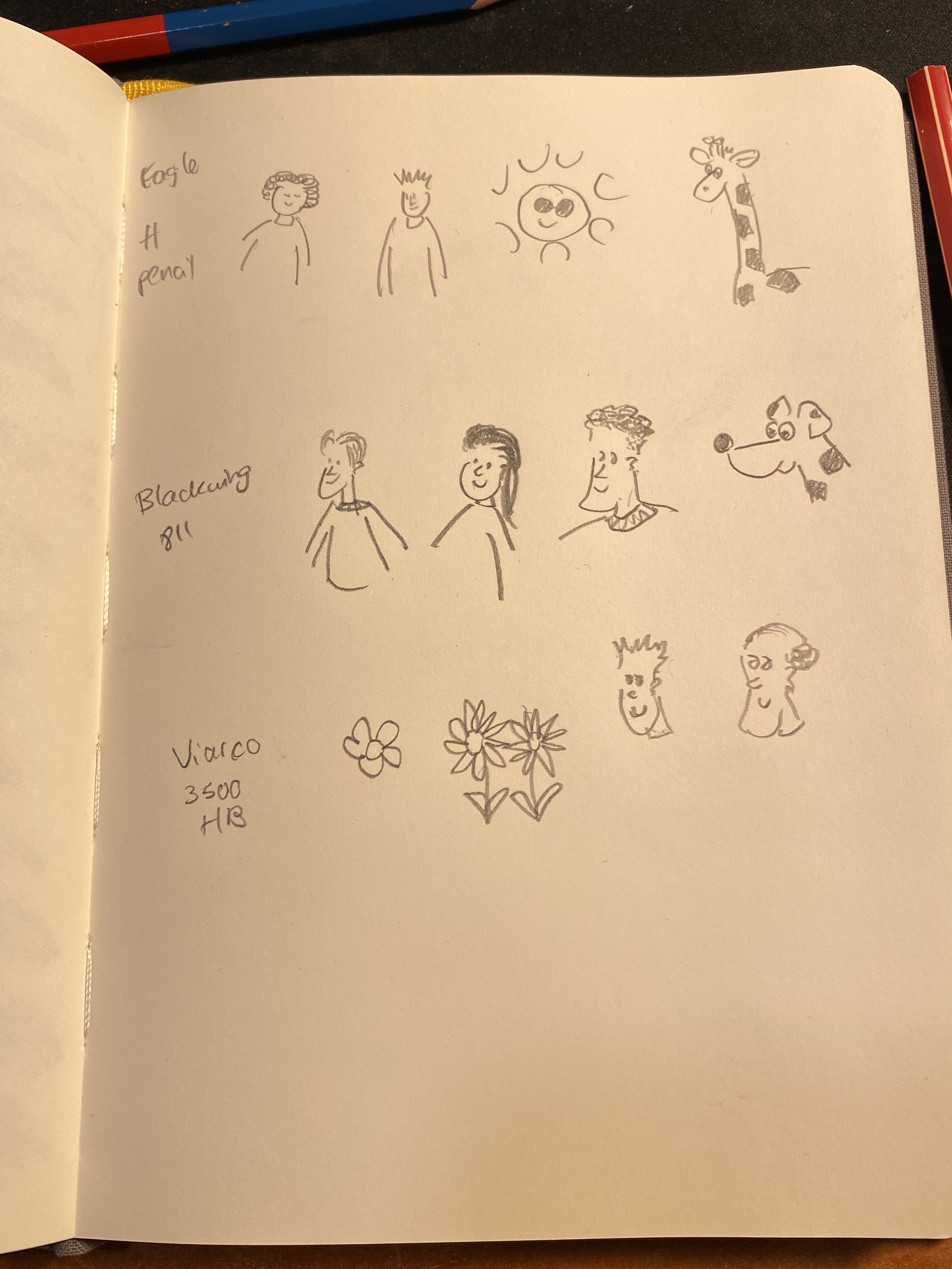
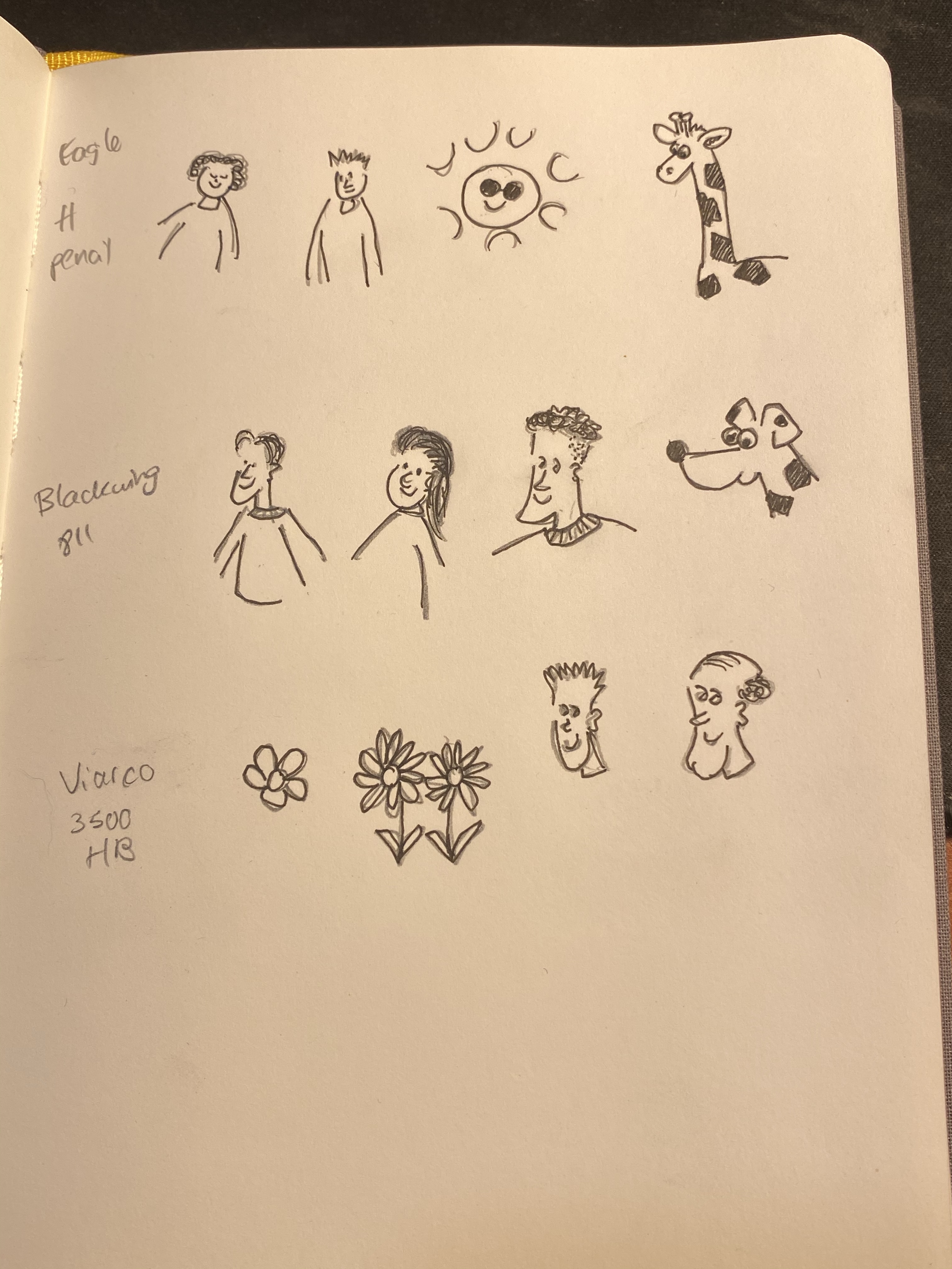
I took out my Baron Fig Confidant, since I do all my pencil tests on it, and scribbled in it in a variety of pencils and even using a Caran d’Ache red blue pencil, though I don’t expect regular erasers to do well with coloured pencils.
The pencils that I used were the Blackwing 811 (a darker, softer pencil), a Viarco 3500 No. 2 (a standard HB pencil) and a vintage Eagle “Chemi-Sealed” Turquoise H pencil. These seemed like a fairly representative bunch of general writing pencils, at least in terms of graphite behaviour. Though I did later check them for art use, these erasers are meant to be used when writing more than when drawing.
I did a single eraser pass on the left hand side of the page, and on the right side I split each scribble into two and tried to erase it completely (leaving an untouched graphite barrier in between each side).
Then I tried to erase the coloured pencil, which I wasn’t expecting much success in, and here are the results:
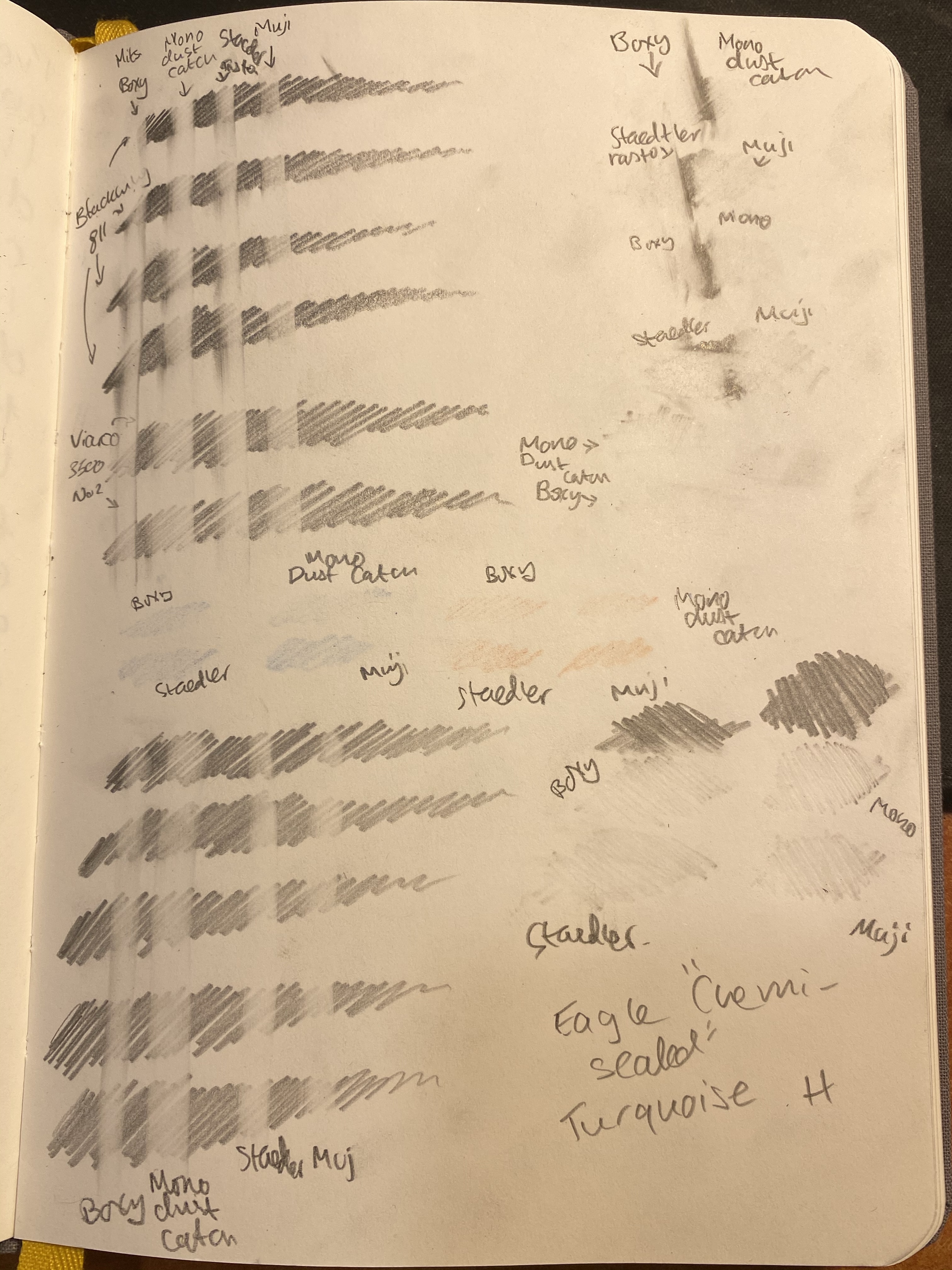
A closeup on the one pass side. You’d normally not erase this way, but it does give a good indication of how good the eraser is going to be:
From left to right: Boxy, Dust Catch, Rasoplast, Muji.
A closeup on the H pencil one pass attempt. I deliberately pressed down on the H pencil, because from my experience H pencils are easy to erase when you apply little or no pressure to them, but they’re pretty tenacious if you apply normal or strong pressure on them.
Here’s the split scribble test above and the H scribble test below:
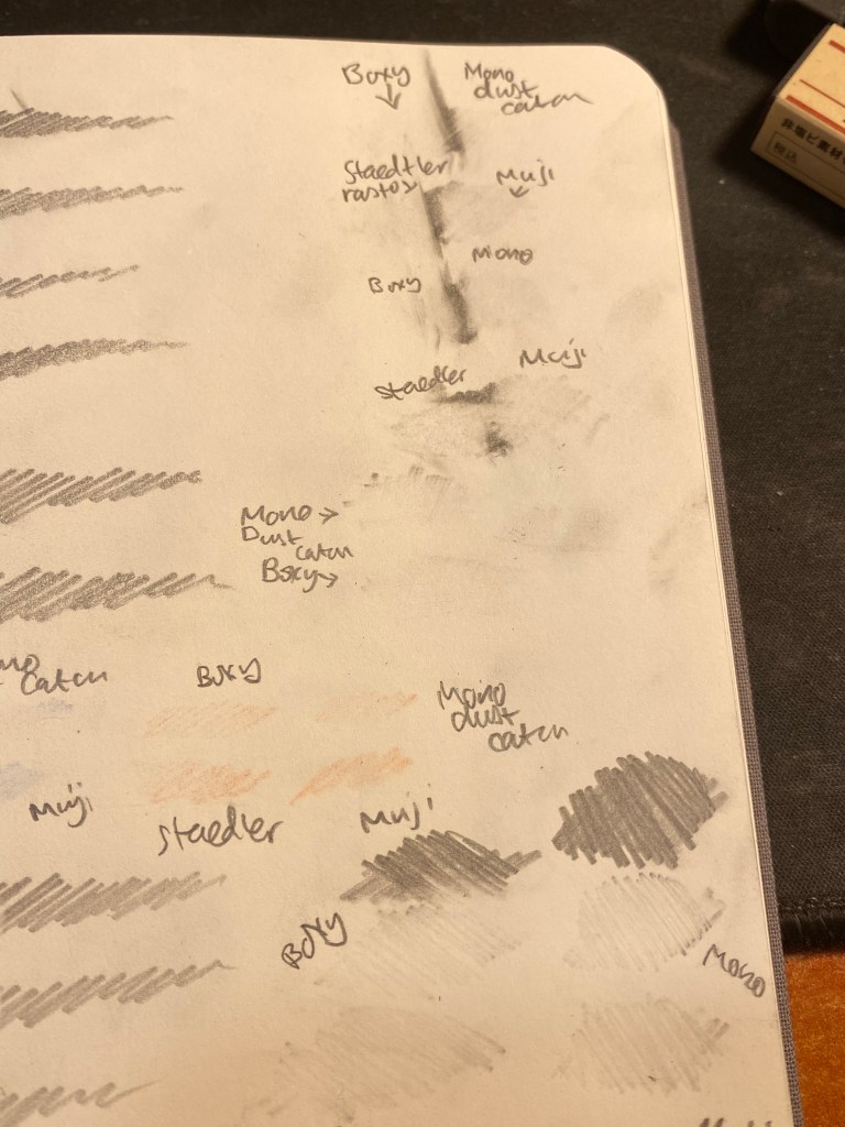
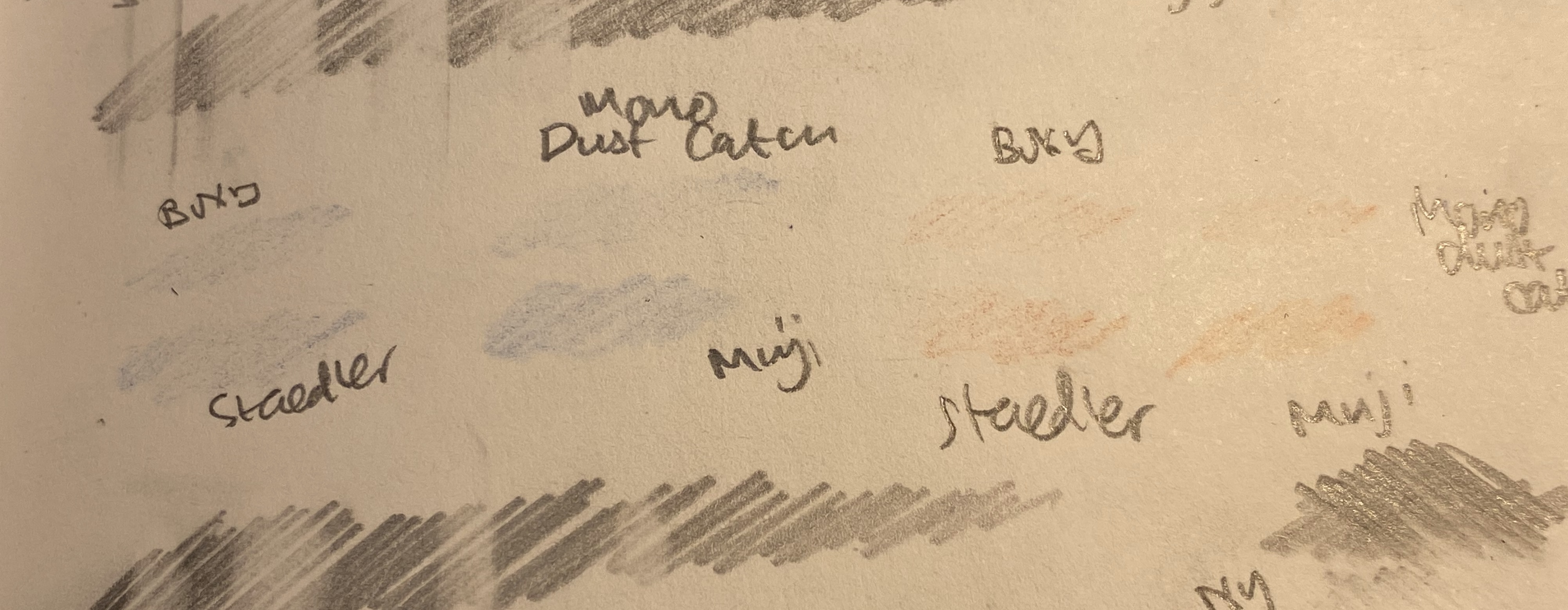
Finally the Caran d’Ache red/blue eraser test:
At this point I was ready to give the victory to the Boxy, with the Mono Dust Catch a pretty close second, the Staedler Rasoplast in third place and the Muji eraser trailing behind. The Boxy and the Dust Catch also had the easiest “eraser crumbs” to clean (long threads of the stuff, easily brushed aside), and the Muji had the smallest and the worst. None of the erasers damaged the paper, which perhaps isn’t surprising considering that they’re all pretty soft.
I’d also point out that none of these erasers are what I’d call “best”. They’re good erasers, but even the boxy left graphite ghosts behind. There are better erasers on the market, but these in general behaved better than average (even the Muji), and the Boxy and Dust Catch are pretty good. They held up well even against the Caran d’Ache red/blue pencil, which surprised me.
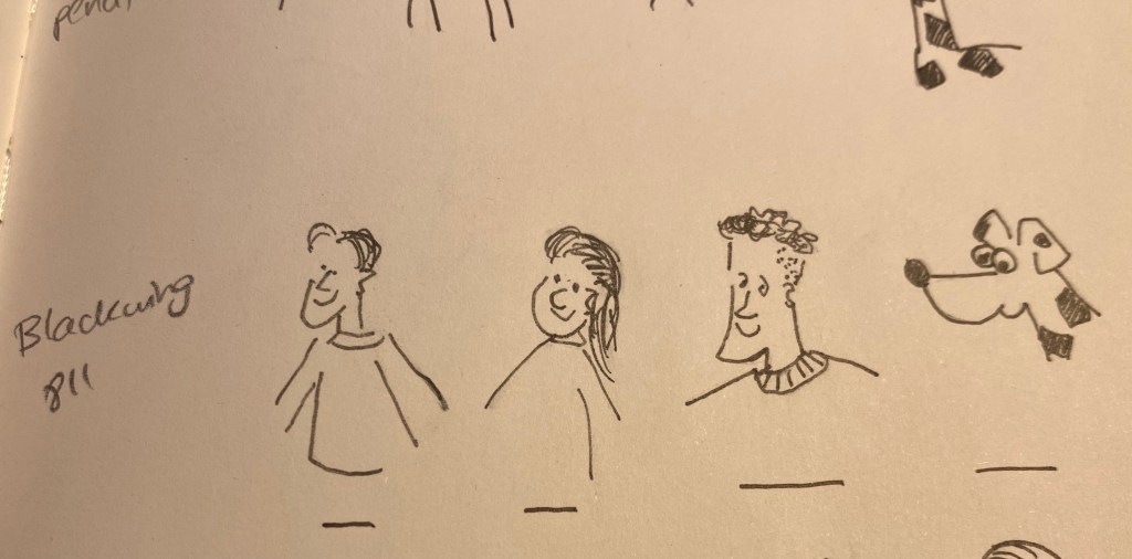
Even though these aren’t “art” erasers, I decide to try to draw some doodles in pencils, ink them with a fine liner and check how much ink each of these erasers lifted.
The pencil doodles.
Here’s the inking. You can see the pencil marks beneath, and I waited for the ink to completely dry before trying to erase the underdrawing.
Inked in.
The results were “ravishing” as to be expected:
All the erasers lifted a significant amount of ink, leaving the resulting ink grey and muted.
You can look at the closeup below and see just how much ink was lifted. These are all terrible for art use, which again, isn’t surprising. I drew an ink line for reference under these, just so you can see how much ink was lifted. Also the top line of left hand dude’s sleeve wasn’t erased so you can compare that too:
The Muji erased faired the best at this part of the test, although I still wouldn’t recommend using it to erase underdrawings.
Of the four erasers that I tested, the Boxy and Dust Catch are the best, and of these two the Boxy is the one I would choose, because of its compact size and its slightly better performance. None of these erasers are terrible, but if you’re investing in a good box eraser (and you should) the Boxy is definitely one to consider.
And why are these black? Presumably to not show dirt, though I find that both frivolous and counterproductive. If the eraser shows dirt, then you know that may need to clean it on a bit of scrap paper before using it, so that it won’t transfer that dirt onto your clean paper. However, I suspect that the real reason is that black erasers just look cool, and the rest is just plain marketing.
I was going to write a blog post reviewing the Viarco 3500, and so I started writing a page of notes in my usual pencil review notebook (the Baron Fig Confidant). Once I started writing I realized two things:
The Viarco 3500 is a good looking but boring pencil. It’s an HB/No. 2 pencil that’s slightly gritty, slightly dark and soft and not much different than other branded pencils of its kind, like the Ticonderoga or the Palomino Golden Bear.
I wanted to reflect about the difficulties of drawing.
Pretty but dull, the Viarco 3500 No. 2 pencil.
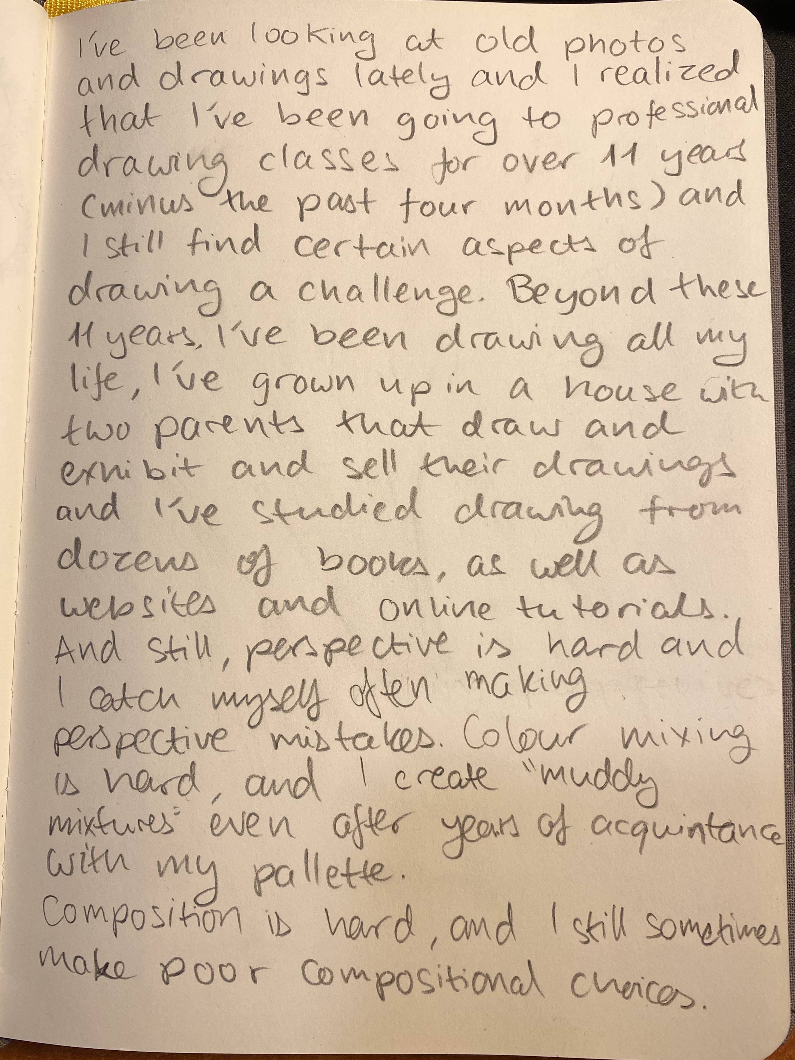
So here’s my page of notes on the Viarco turned into reflections on the drawing process:
This isn’t a “woe is me” post. It’s a “embrace the suck and take courage” post. Perspective is HARD. But it’s worth learning. And learning again. And learning again. And boy is it worth practicing. Why? Because while nobody is born knowing how to draw in perfect perspective, practically everybody can tell when the perspective is “off”. You can tell yourself that it’s an “aesthetic choice,” however, I do believe that you are cheating yourself out of something when you don’t even try to get the basics down. I know, I tried to do that for literally years. I have good enough hand-eye coordination that I could cheat some people some of the time. Then I tried learning it from books. I drew the boxes, the shaded ball, the room with the door and window, and I told myself that since I copied them so well, I now “knew perspective”. Hah. The minute a teacher sat me down and told me to draw the corner of a room, a still life of some boxes and a vase, and an old shoe the truth was all too apparent. I didn’t grok the principles behind those boxes and skylines and spheres and so I couldn’t extrapolate from them to the real world. I now have 11 plus years of knowing groking those principles and I still tell you that it’s hard.
Can you catch the perspective mistakes here? This is from 2009 and it makes me cringe.
You can cheat, and I did and sometime do cheat, the eye with colour and crosshatching, but it doesn’t take an art critic to point out that something is “off” in the drawing. The same goes for poor composition choices, muddy pigment mixtures, colours that unintentionally clash and cause unease. These are all very technical skills that require a good amount of studying and a great amount of practice to master. It doesn’t help that most of them are difficult to learn from books and tutorials and are still best taught in a live art class. It’s also frustrating that you usually work and work and work with little or no progress for some time and then suddenly your hand and eye and mind click and you jump forward a level or two. It’s so easy to give up before that. I have several times in the past. Then I found a new teacher and I got back to the grind.
Why do it? You don’t have to. Instagram and Facebook likes are independent of your drawing skills, and more related to tags, followers and how colourful and eye catching your work is. If you’re doing it for that, then there’s no point in doing it. But mastering the basics allows you to advance all your drawing skills at once, with great leaps and bounds. Every breakthrough I had with the basics allowed me to draw better, faster, with more confidence and to tackle subjects and locations that I otherwise would have avoided.
So, the Viarco 3500… It’s a good looking pencil to have around. Perspective, colour theory and composition? If you have any interest in drawing I highly recommend investing in mastering them.
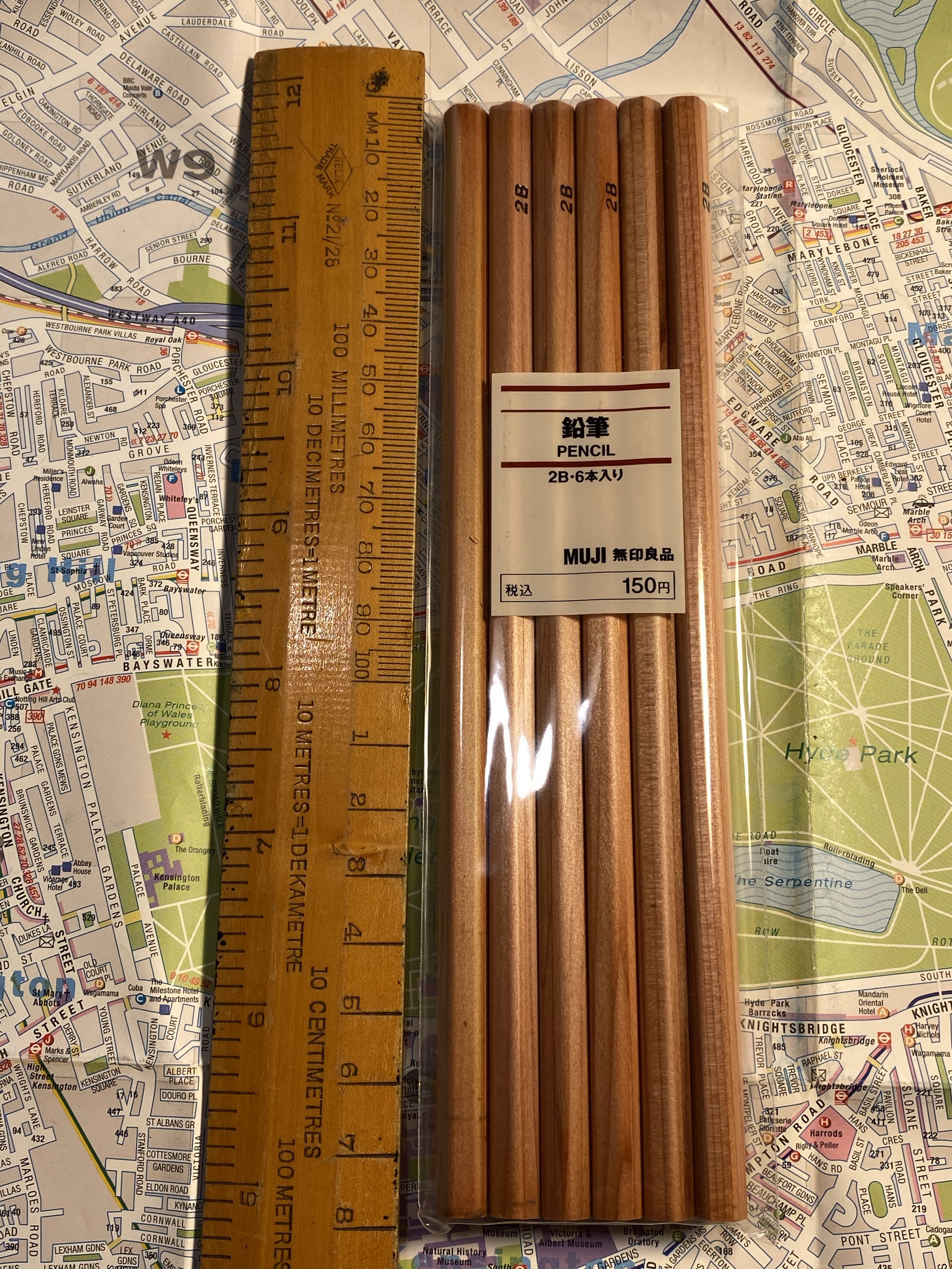
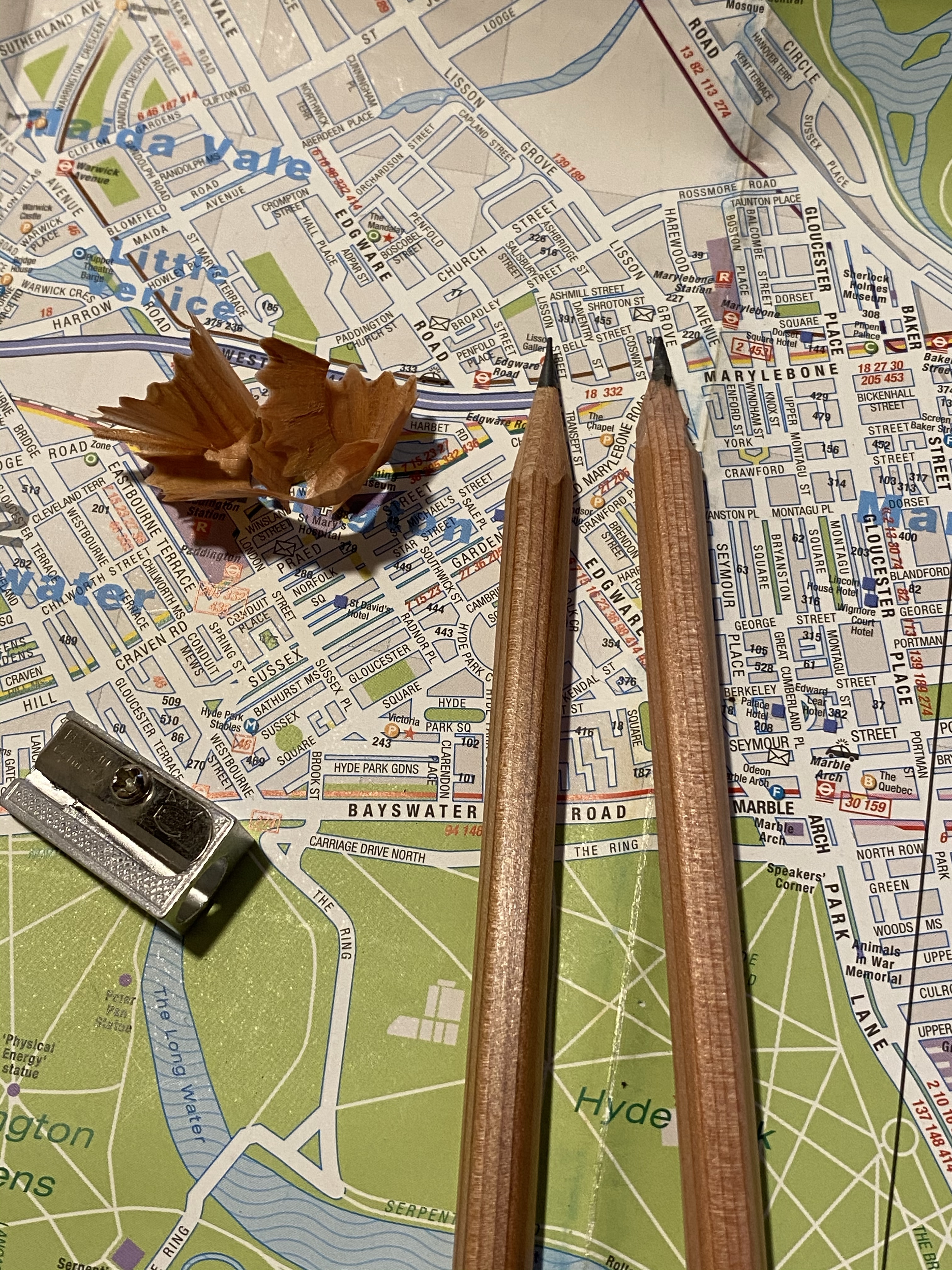
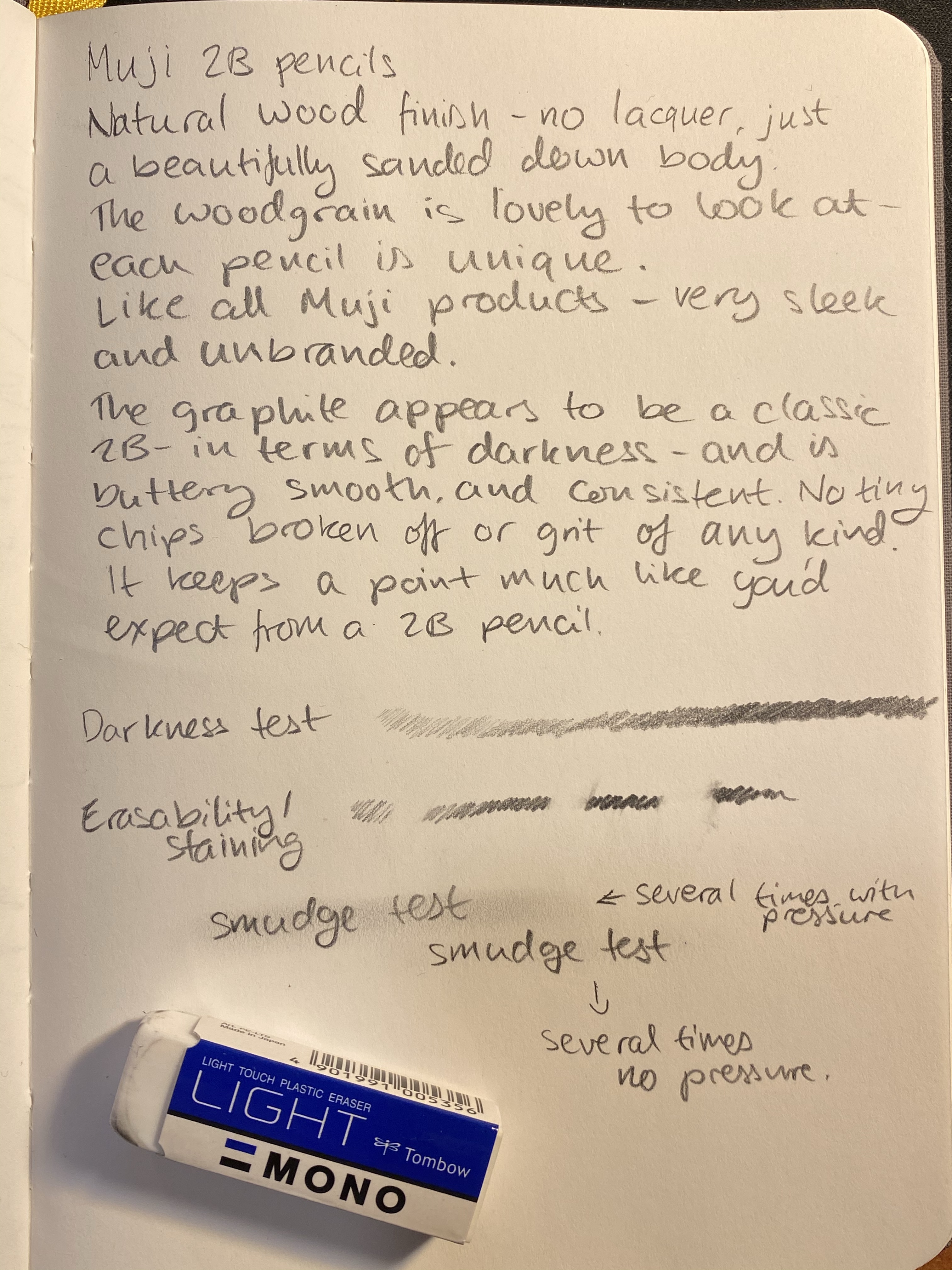
When I was in London last year I picked up a few stationery items from Muji, most of them pencils that I hadn’t seen at Muji’s before. One of these items was a six pack of 2B natural wood-cased pencils. They looked gorgeous, they were very fairly priced, and 2B wood-cased pencils are my go to sketching tool (unless I think that there’s a chance that I may want to watercolour over the sketch, in which case it’s H for the win). If you have any interest in sketching, the 2B pencil is your best friend.
For some reason I decided to photograph these next to a vintage wooden ruler. They’re standard pencil sized.
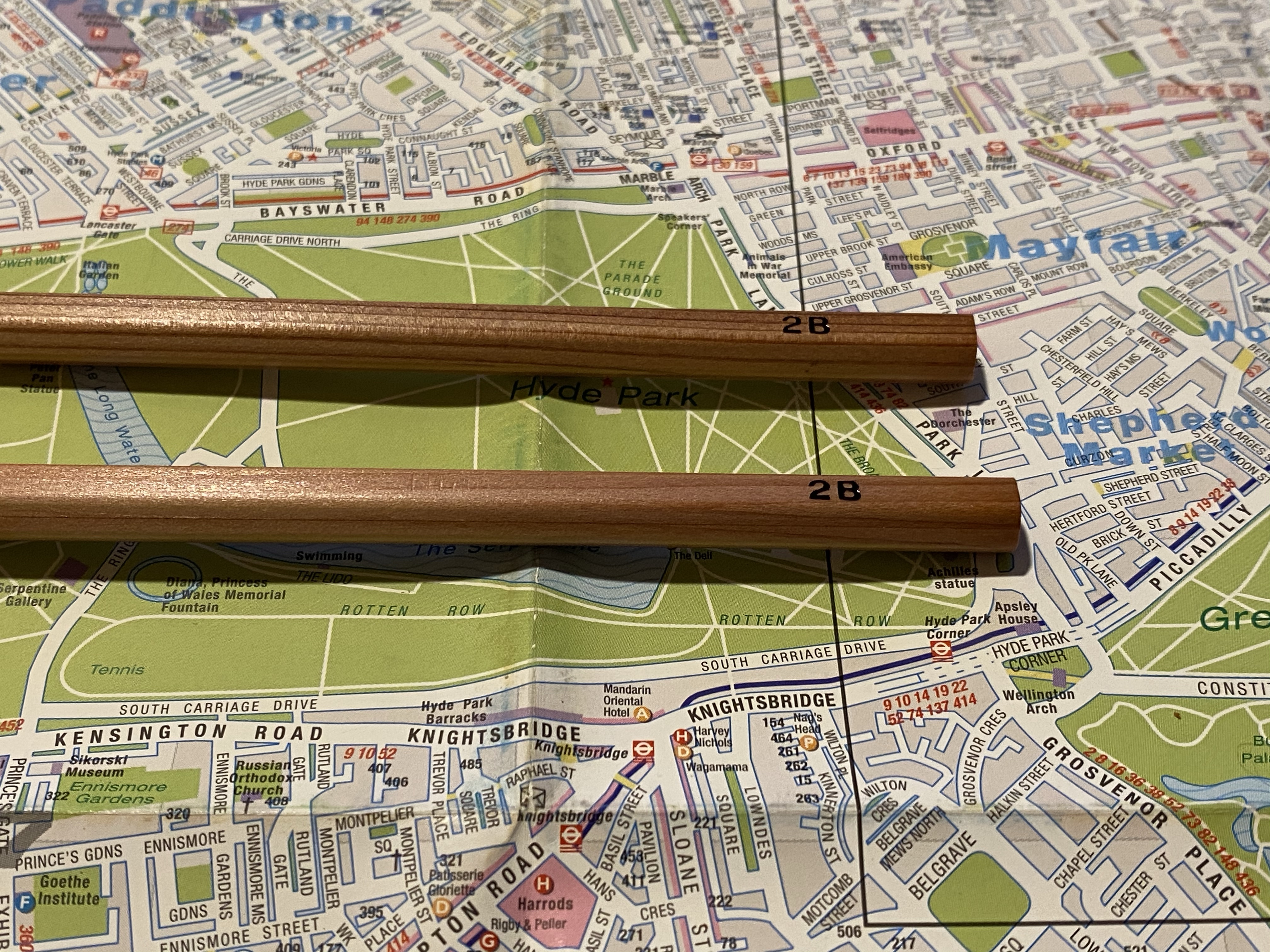
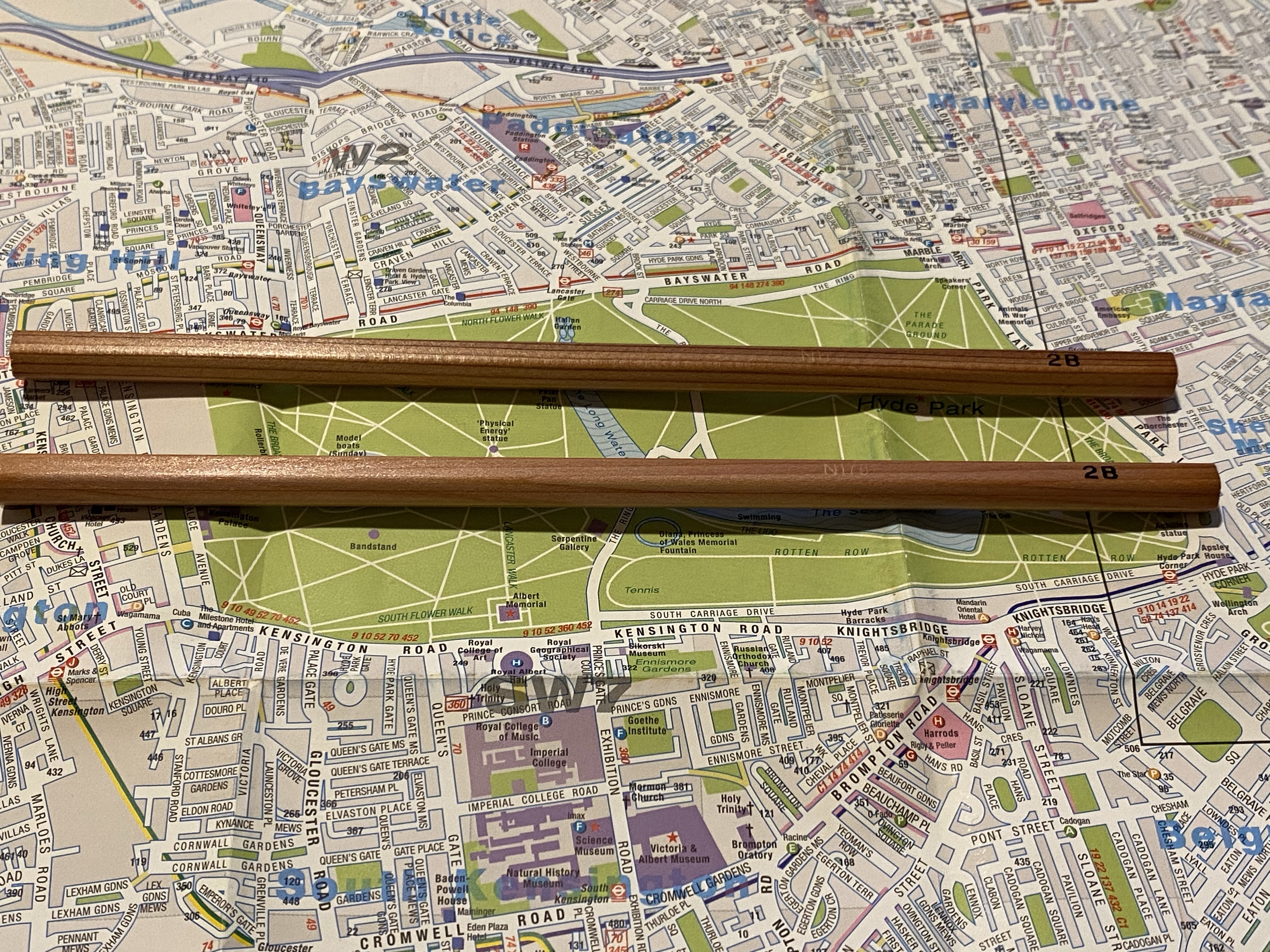
I don’t know what kind of wood the Muji natural wood-cased pencils are made of, but whatever it is it has a beautiful grain, it sharpens very well, and it smells lovely (though I doubt that it’s cedar). The pencils aren’t lacquered, but they do have a satiny finish that makes them lovely to hold and use, and like other Muji products, they have no logo on them, just the 2B grade boldly stamped in black foil.
Look at that satiny finish and lovely woodgrain.
Because of the natural finish and the woodgrain each pencil is unique and distinct, which is a nice bonus to natural pencils. They have no attached eraser, which is standard for sketching pencils.
They sharpen really well, whether using a knife or a sharpener. They don’t hold a point for long, but if you’re using them for sketching, you can just use a knife sharpened pencil and rotate the pencil to get much longer use out of it. The graphite doesn’t crumble or break easily, and it’s got a standard 2B darkness and point retention.
Left pencil was sharpened with a sharpener, the right one was sharpened with a knife.
The Muji 2B natural wood-cased pencil writes a smooth, dark line that doesn’t smudge (unless you’re very determined), erases well and has the shading range that I expect from a 2B pencil (this shading range is what makes the 2B pencil the “goldilocks” sketching pencil grade). These are totally going into my sketching kit, and if I ever get a chance I’ll be buying at least another six pack again. I “chew” through 2B pencils at a terrifying rate, so these will come in handy. They are an absolute joy to use.
Written on a Baron Fig Confidant, erased with a Tombow Mono Light plastic eraser.
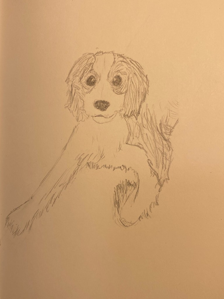
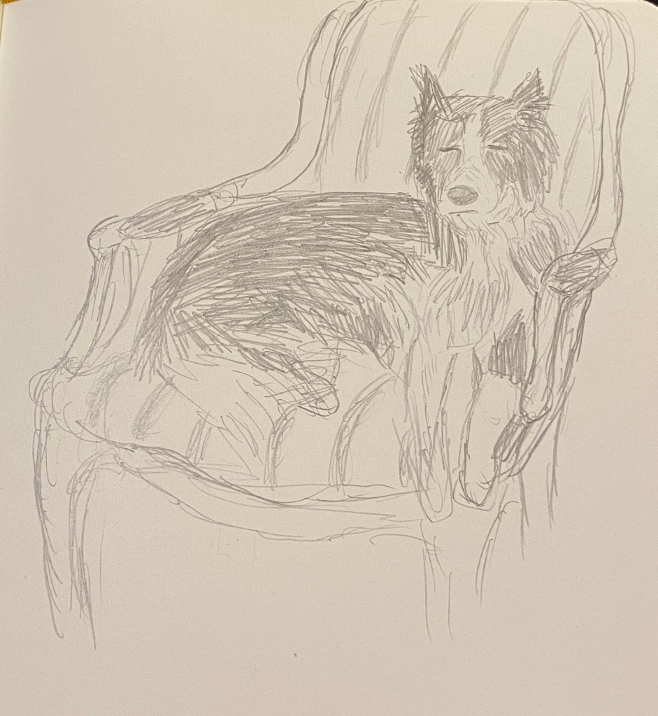
Yesterday was International Dog Day and so I decided to draw my friend’s rescue puppy. Nobody wanted this fellow because he’s blind in one eye, and it’s their loss because he’s a delightful scamp and a 14/10 dog. I’m so glad that he got a forever home.
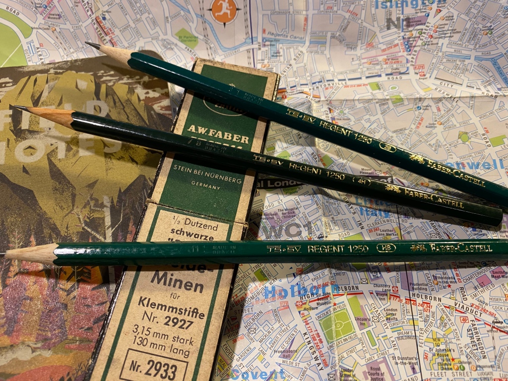
So a few years back I was at the main branch of a local art supply change while they were getting rid of a large amount of inventory by slashing down its prices. I was there to stock up on art supplies, and most of the sale inventory consisted of poorly made knock-off pens and no-name novelty print pencils, so I skipped the sale baskets and made a beeline for the tills. As I was standing in line my eye caught a small basket in the corner of the nearest sale table. It looked like it was full of Faber-Castell 9000 pencils offered at a 10th of the price of a Faber-Castell 9000. I left the line and went to investigate.
Don’t they look like Faber-Castel 9000s?
Now my go to pencil for sketching is the Faber-Castell 9000, and although they are excellent pencils, they are not cheap, and I use to go through quite a lot of them. Here I was offered a pencil that looked like a Faber-Castell 9000, was made by Faber-Castell, at a “practically free” price. I couldn’t test them, as they were all unsharpened, but I dug in and grabbed a few of the weird assortment of harnessed on offer: 2B, HB and 4H.
They were Faber-Castell Regent 1250 pencils made in Brazil, and what little I could find about them was people saying that they don’t compare to 9000s. I of course planned to add them into my rotation, which is why I almost immediately lost them. This happens quite often with pencils in my house, since my cat loves to steal them and play with them, so I usually hide the good ones and let him play with ones that I care less about. The result is that when it comes time to looking for a certain pencil I only have a vague idea about the various areas it can be in.
Now that I’ve found them, to the review:
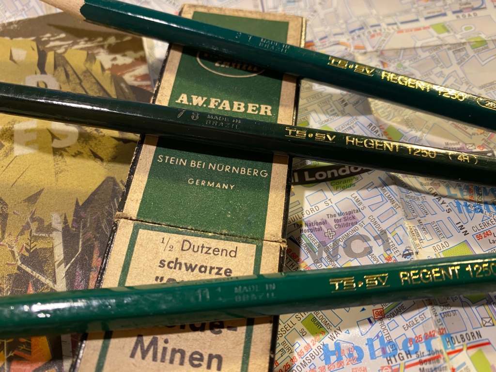
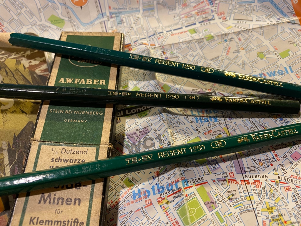
The Faber-Castell Regent 1250 are Brazilian made pencils that look like twins of the Faber-Castell 9000, minus the grey band on the tip. They don’t seem to be widely available outside Brazil, which is both frustrating and understandable. The Regent 1250 poses a risk to the 9000 sales: it’s a much cheaper counterpart that offers graphite performance that’s on par with the 9000. Artists aren’t usually swimming in money, and if FC made the 1250 widely available my guess is that their 9000 sales would take a significant hit.
The gold foil branding appears on only one side of the pencil, and the lacquer appears rough, but not to a point where you’d actually feel it in use.
The Regent 1250’s body is where is where it falls short of the 9000, though I sincerely believe that not enough to justify the reviews that it has gotten so far. The 1250 is cheap and offered in Brazil because it’s made of abundant cheap Brazilian wood. The result is a pencil with a woodcase that doesn’t sharpen as nicely or easily as a 9000, and that has a somewhat rougher finish when it comes to the lacquering.
Made in Brazil. The 4H is a darker green and has a different imprint on it, which makes me thing that it was made during a different time period that the 2B and HB.
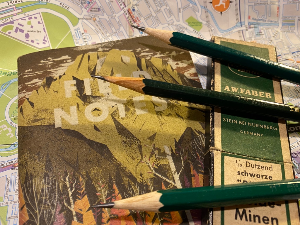
The wood is not terrible, and it doesn’t chip and break in large chunks. You just have to put a little more elbow grease when sharpening with a sharpener. If you sharpen with a knife you probably won’t feel the difference at all. The lacquer isn’t pretty: you can see pits and bumps in it, though they are not deep enough for you to actually feel them. The wood on the pencil isn’t consistent in its looks or particularly attractive.
The different appearance of the wood between the 4H and the other two pencils leads me to believe that it was made during a different time period.
These pencils only look premium from a distance. Up close they look battered and bruised. However, these are meant to be artist tools not museum pieces, and what’s most important about them is their graphite. Everything else has to be good enough, and so far it’s been good enough.
I doubt that if I saw two sketches, one made with 9000s and one made with 1250s, that I could tell the two apart. The graphite looks and behaves practically the same, both in drawing and erasing.
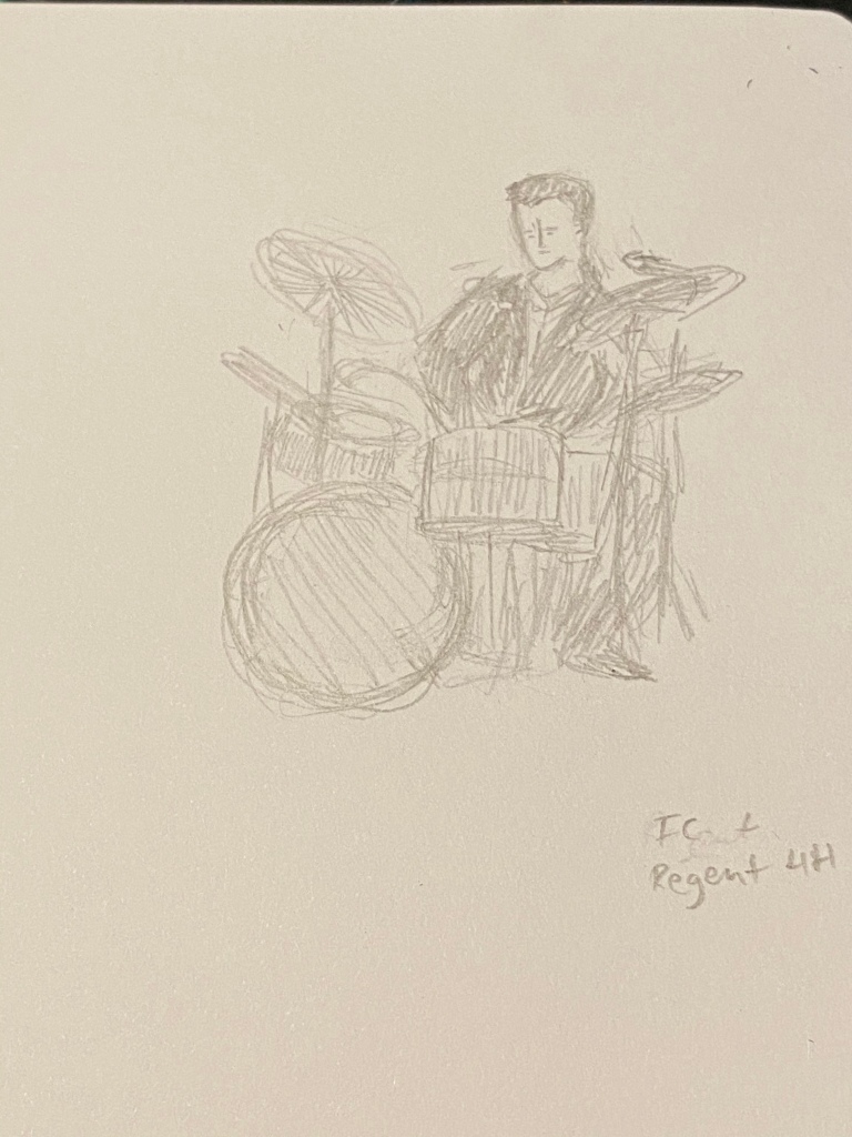
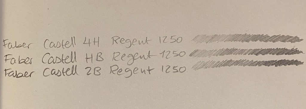
Regent 1250 4H on Baron Fig Confidant
It’s so tempting to look down at these pencils as cheap trash, but look what you can create with them:
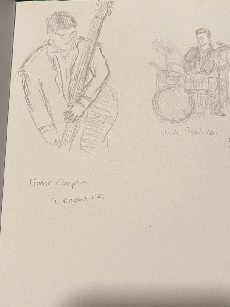
Regent 1250 HB at work.
The graphite is smooth, the pencils hold a point for a long, long time, and they’re a joy to use, especially since I don’t have to feel so precious about them.
Regent 1250 2B
If anything I wish I could have purchased a wider range of Regent 1250, but seeing how they work I doubt that FC would ever widely offer them outside Brazil, as they would cannibalize the sales of their 9000.
Regent 1250 HB on a Baron Fig Confidant.
It’s frustrating knowing that a company has the ability to offer a good product for artists at a non-premium price and chooses not to. I understand the market forces at play, but I still find them annoying. And to all those who had a chance to use a 1250 and looked down on it: don’t judge a pencil by its lacquer.
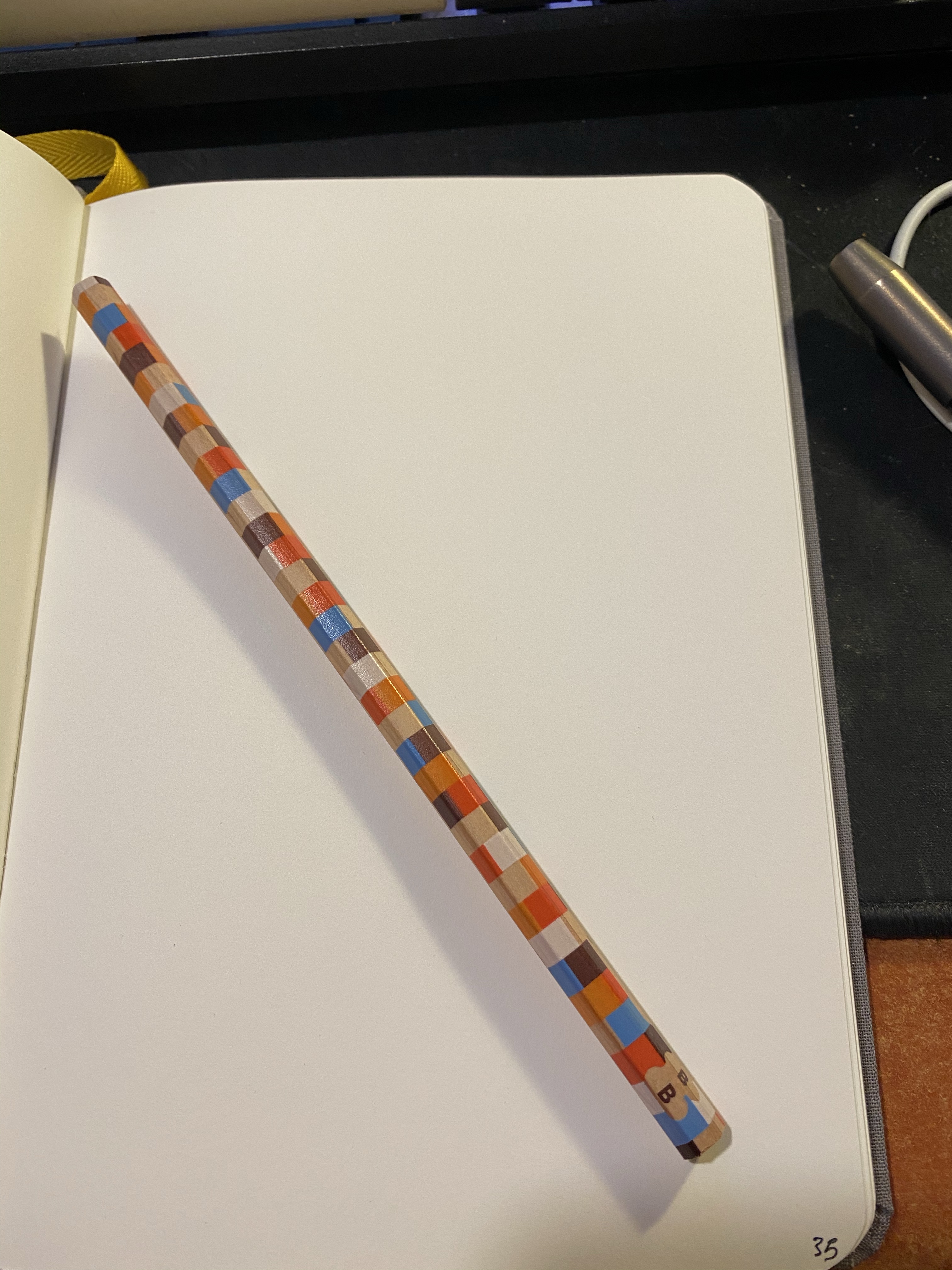
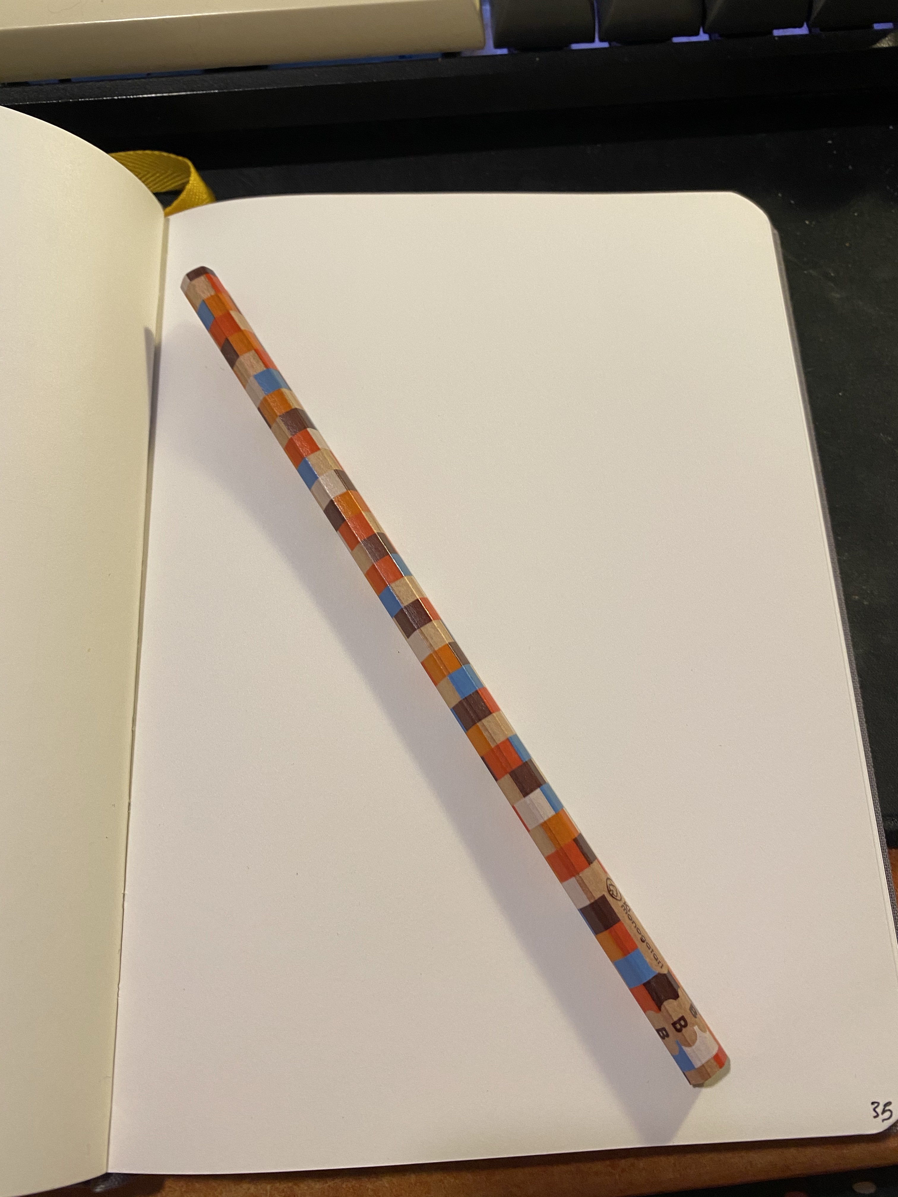
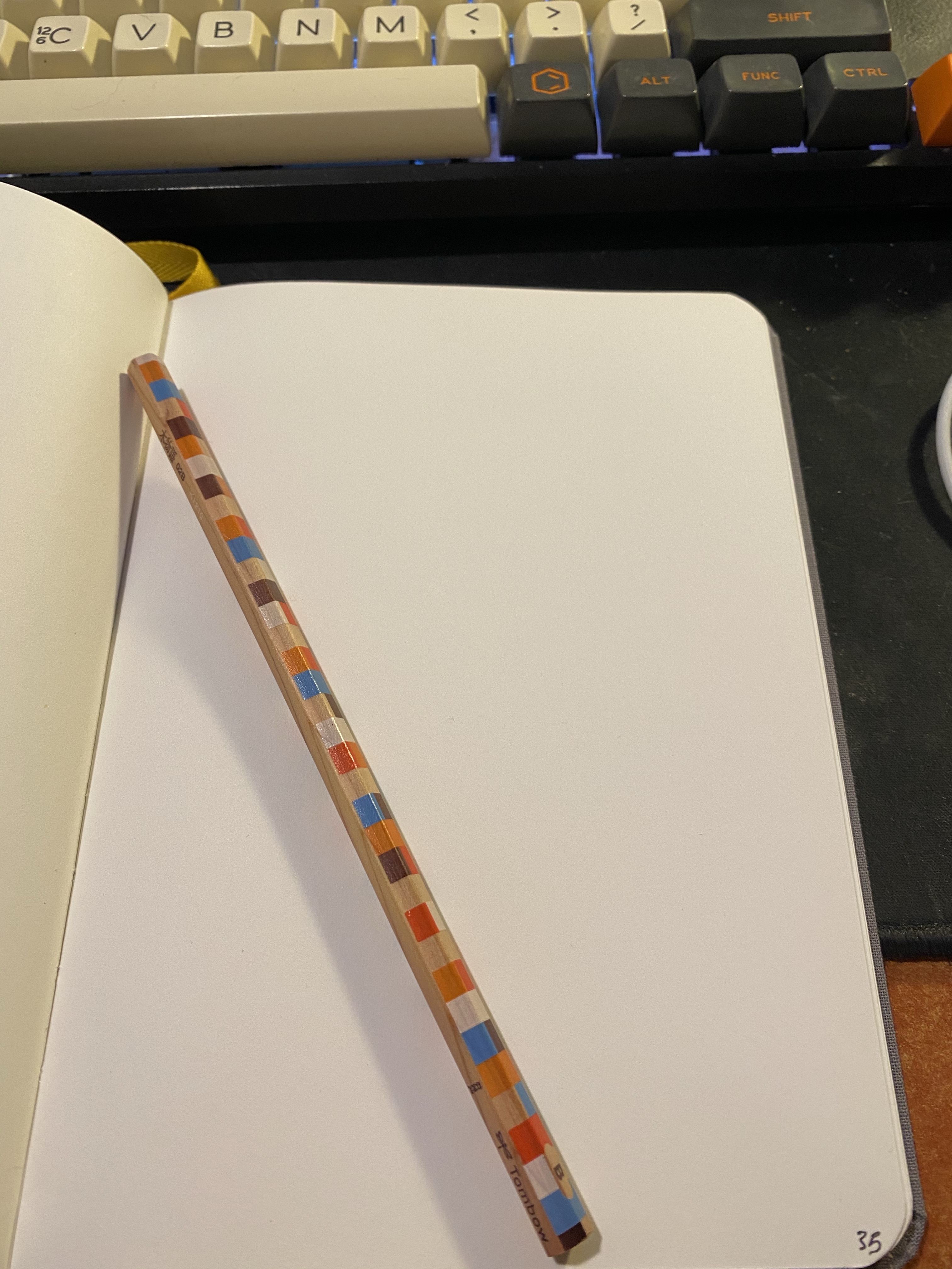
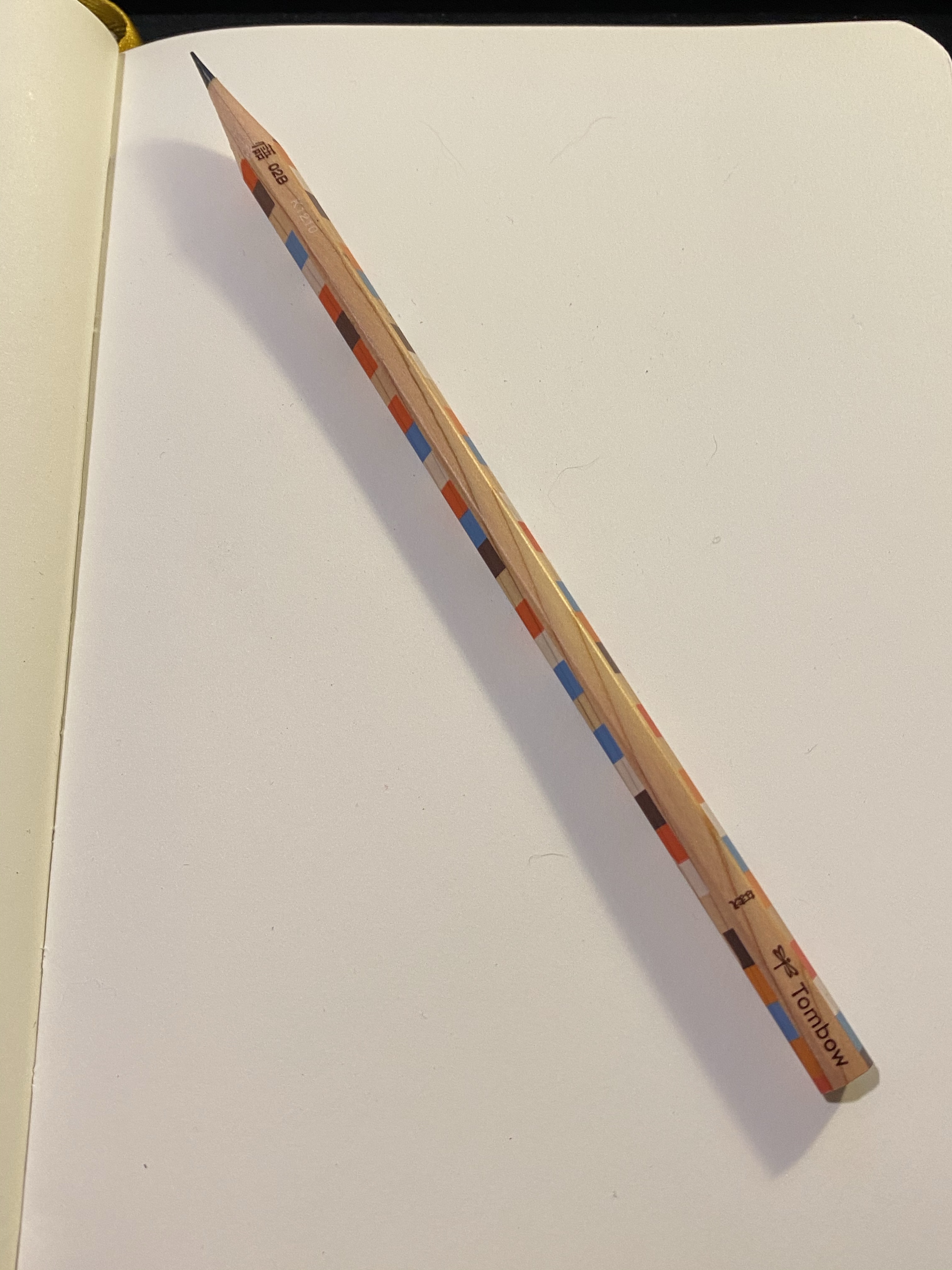
I was searching for a craft knife when I stumbled upon this cool pencil just lying around, being beautiful but of no use to anybody:
I’m pretty sure that I bought it somewhere in London, perhaps in the London Graphic Centre or in stationery section of Foyles, but in any case it isn’t new.
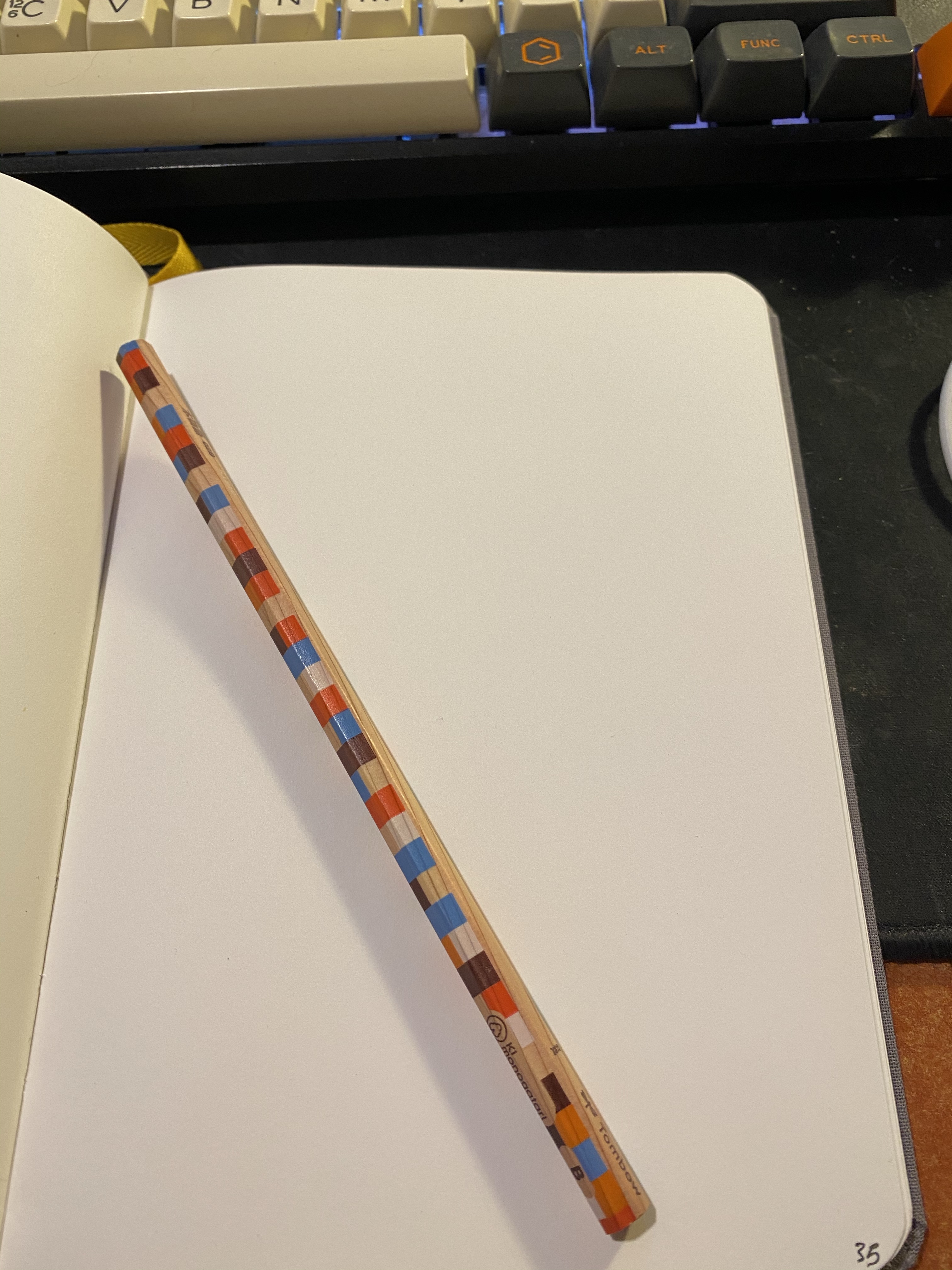
It’s an unlacquered woodcase pencil with a chequered print, a B grade core and it appears to be a Tombow Ki-Monogatari, part of their eco pencil range.
It has a silky smooth finish, and it’s one of the most attractive woodcase pencils I own. The wood is not cedar, but by the way it sharpens and feels it’s high quality stuff.
Tombow has one of the best logos in the business.
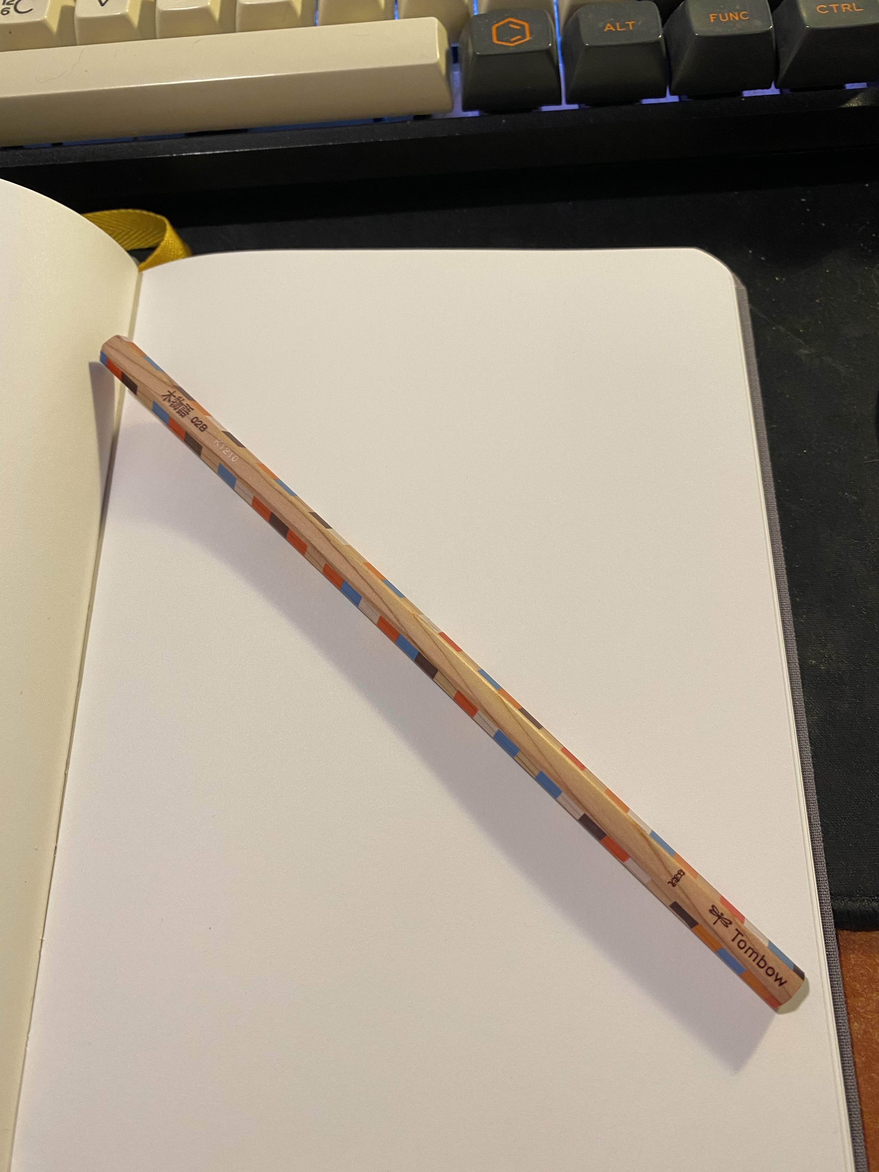
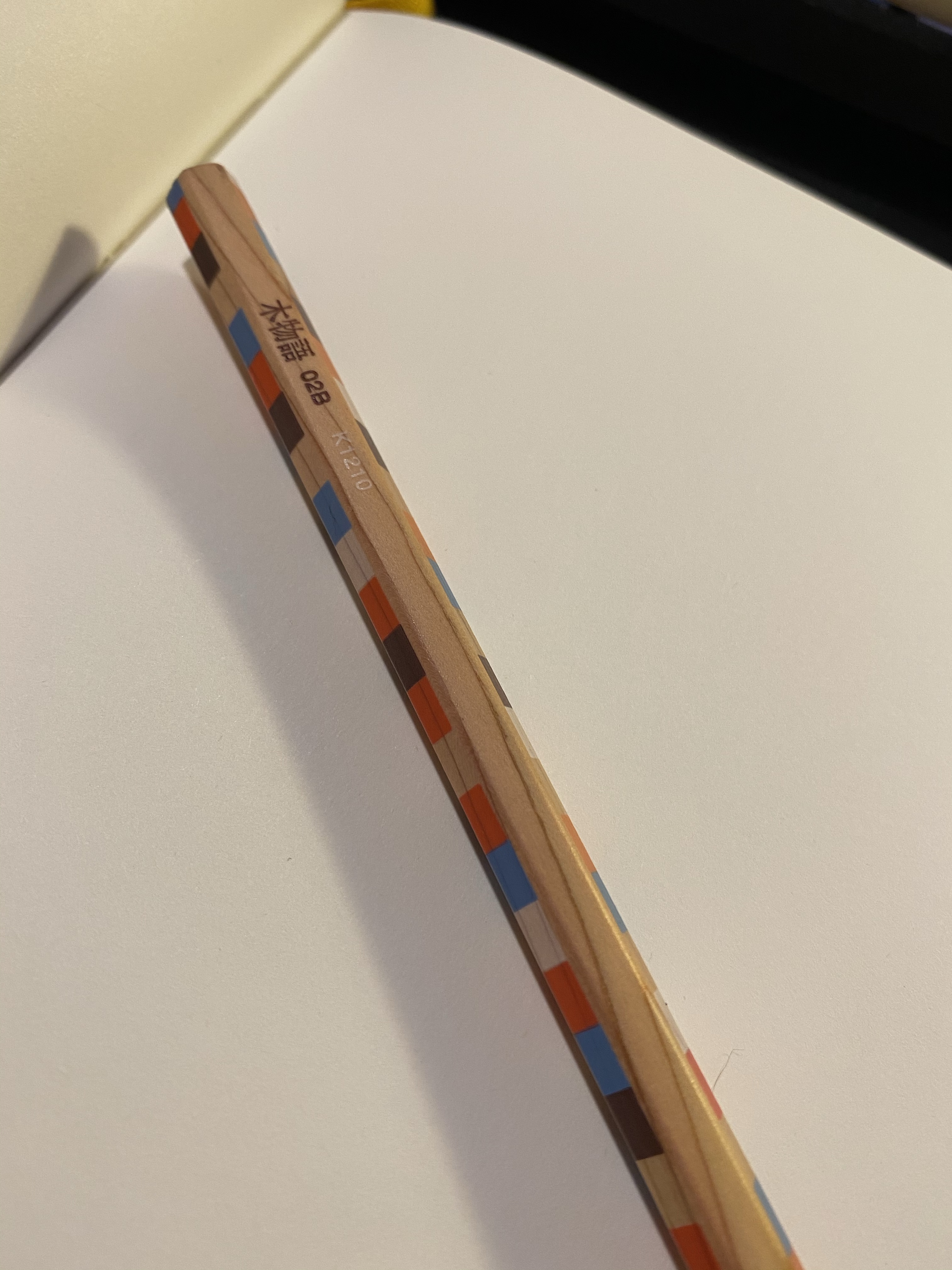
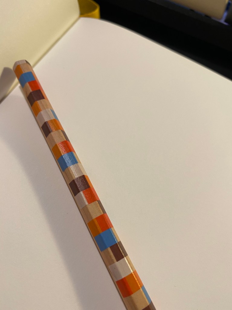
You can see the grain of the wood very nicely here:
And also come through the chequered pattern:
It sharpens like a dream, with a perfectly centred core and no splinters or chunks falling out. High quality wood, high quality design, so what about the core?
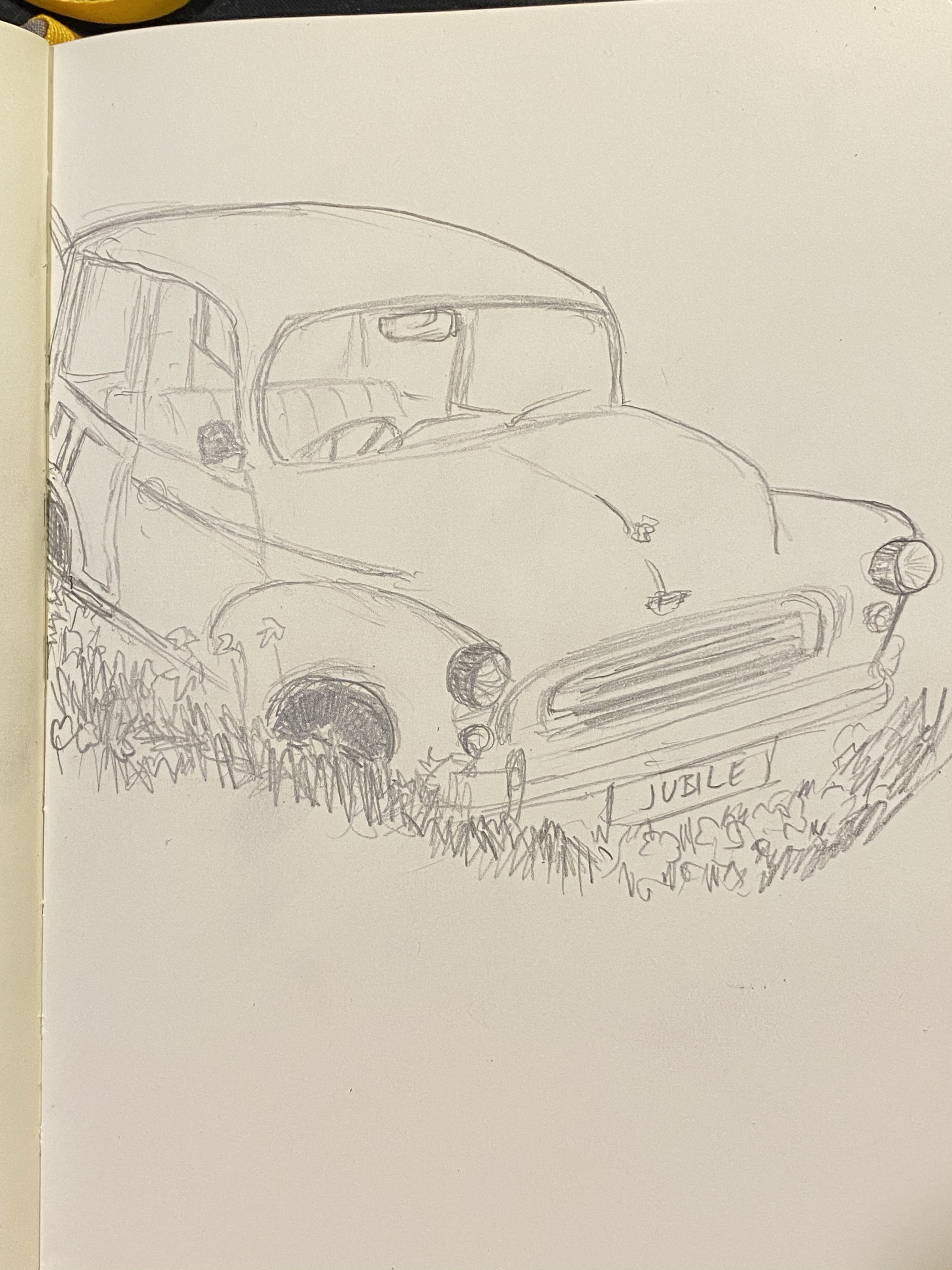
This is a Tombow pencil and one of the things that Tombow do exceedingly well is make woodcase pencils. Drawing with this pencil is a dream – it glides on the page, there’s no “grit” to the core, it offers a good range of shading for a B grade, it doesn’t smudge and it keeps a point really, really well. This is a grade A drawing pencil.
Drawn on a Baron Fig Confidant. You can barely see where I tried to smudge the graphite near the front tire.
I found this pencil by accident, totally forgetting that I ever bought it. I have cool stuff, so why don’t I use it?
I have no idea what the actual model of the pencil is, I’m just guessing that it’s a Ki-Monogatari, which means that this isn’t a “you should buy it” review. It’s a “go open you stationery drawer(s) and see what cool stuff you find there” post. Treat yourself to the stuff you already own.