2020 Yearly Goals (New Year’s Resolutions)

2020 was a pretty terrible year for most people, which is why I debated whether to even go over my 2020 goals or just talk about my 2021 ones. In the end I decided to talk about them, because 2020 really stress tested my system of yearly goals/resolutions.

At around March I thought that I’d have to trash the whole thing, as we went into our first lockdown of the year. My travel plans were cancelled. Any option to meet friends went out the door. My plans to change careers were at risk. I couldn’t even run, because the first lockdown involved extremely strict rules and the police were constantly around my house, yelling at people to go home and fining people. My writing was on the rocks, my drawing course was cancelled, and for the first time in my life I spent Passover alone.

Journal spread with my 2020 goals filled in with my terrible handwriting.
How 2020 looked like.

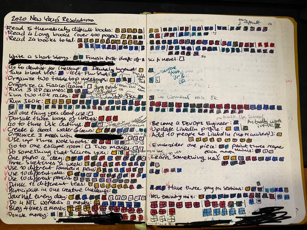
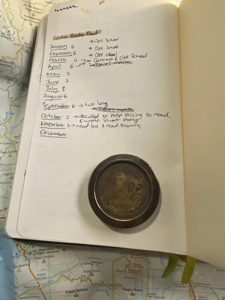
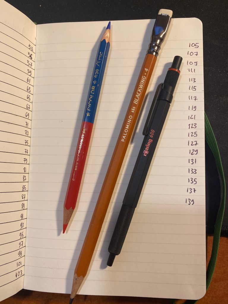
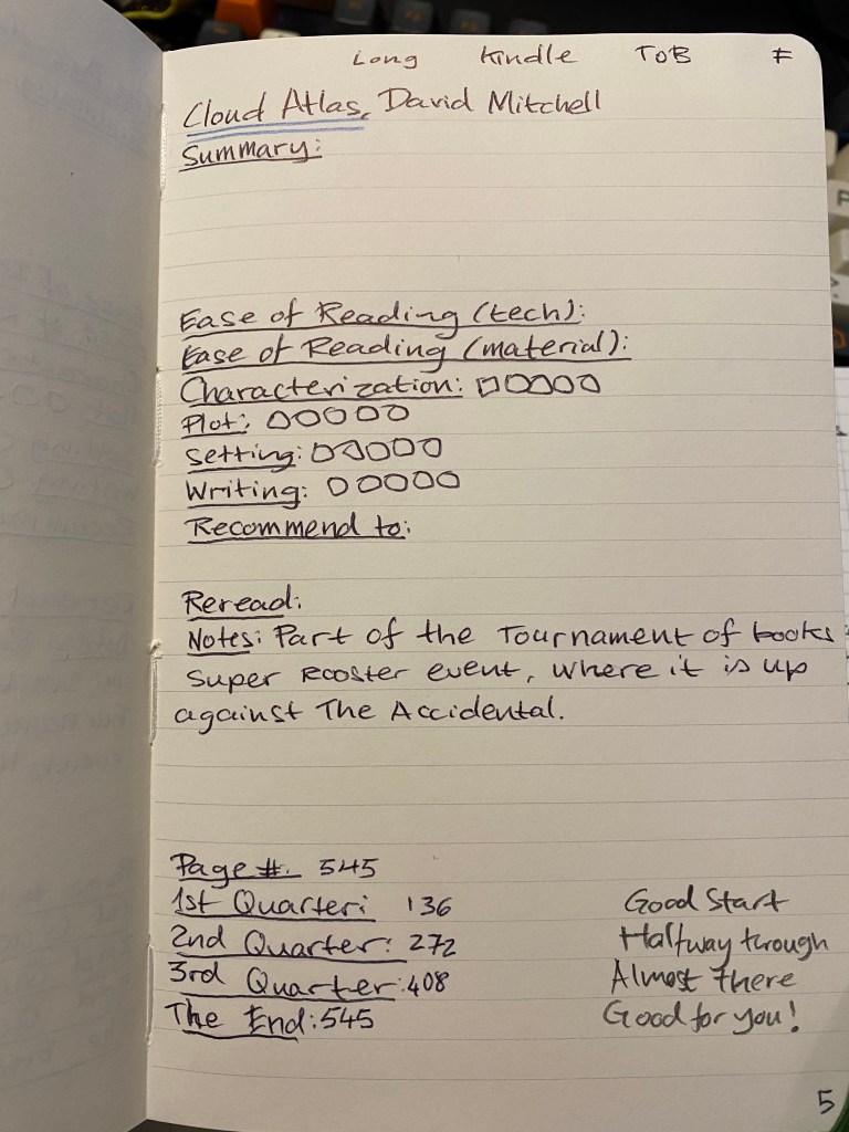
After some debate I reminded myself that my goals were built with failsafes in mind, since my 2018 annus horribilis, and so I had a chance of completing most of them, even if I’d miss any “stretch goals” that I had in mind. The basic goals were there to keep me focused, motivated and moving in the right direction. In the end they worked. The got me working out when I couldn’t run, running in circles (literally) when I could only move in a 500 meter radius from my house. They got me to keep on reading, keep on writing (not as much as I would have liked, but I’ll take it), and to dare to make the career change that I promised myself.

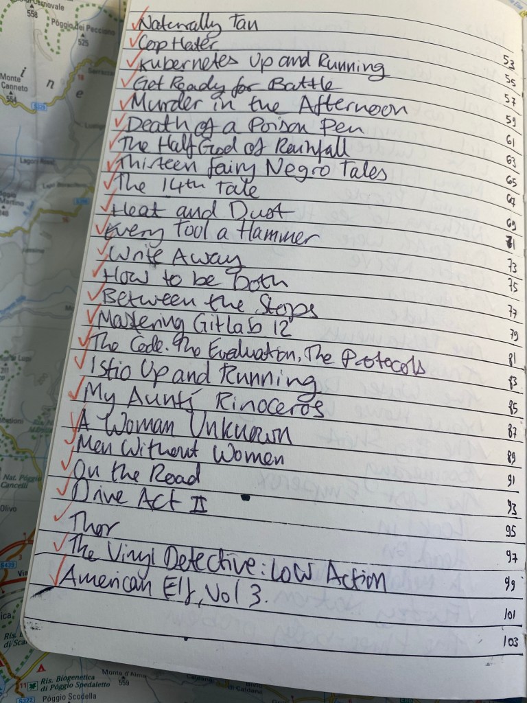
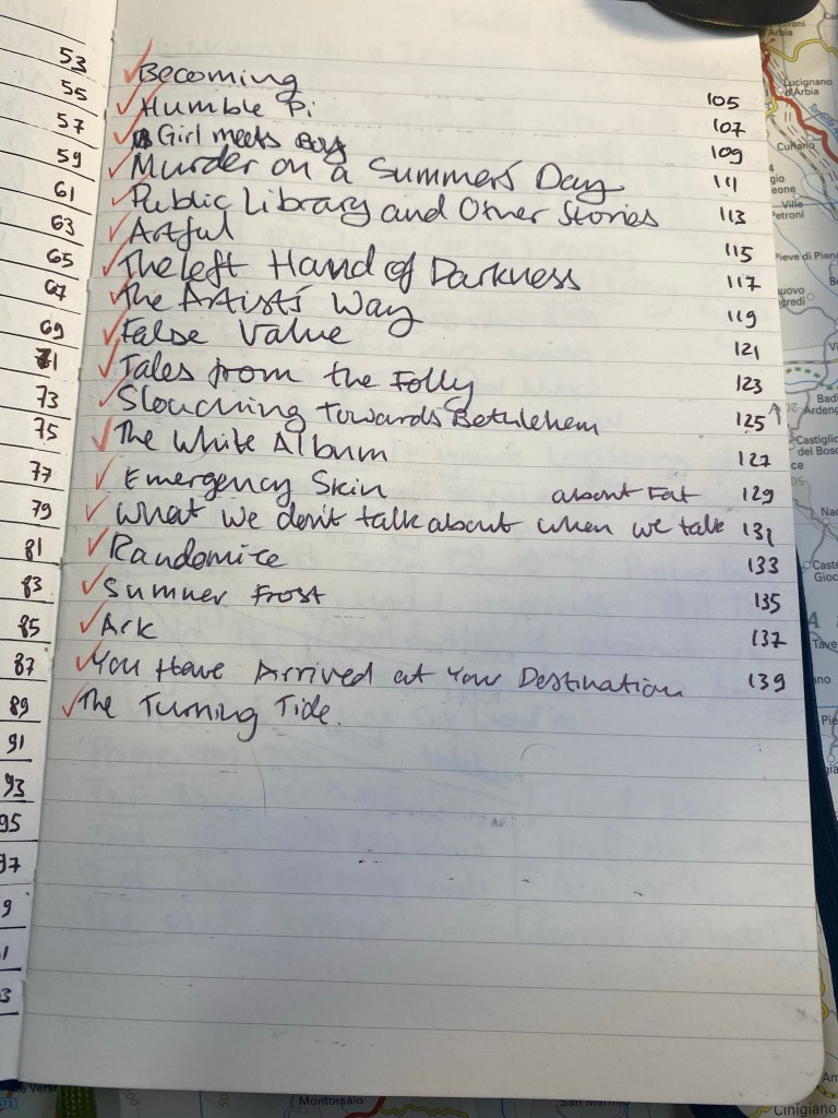
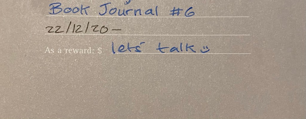
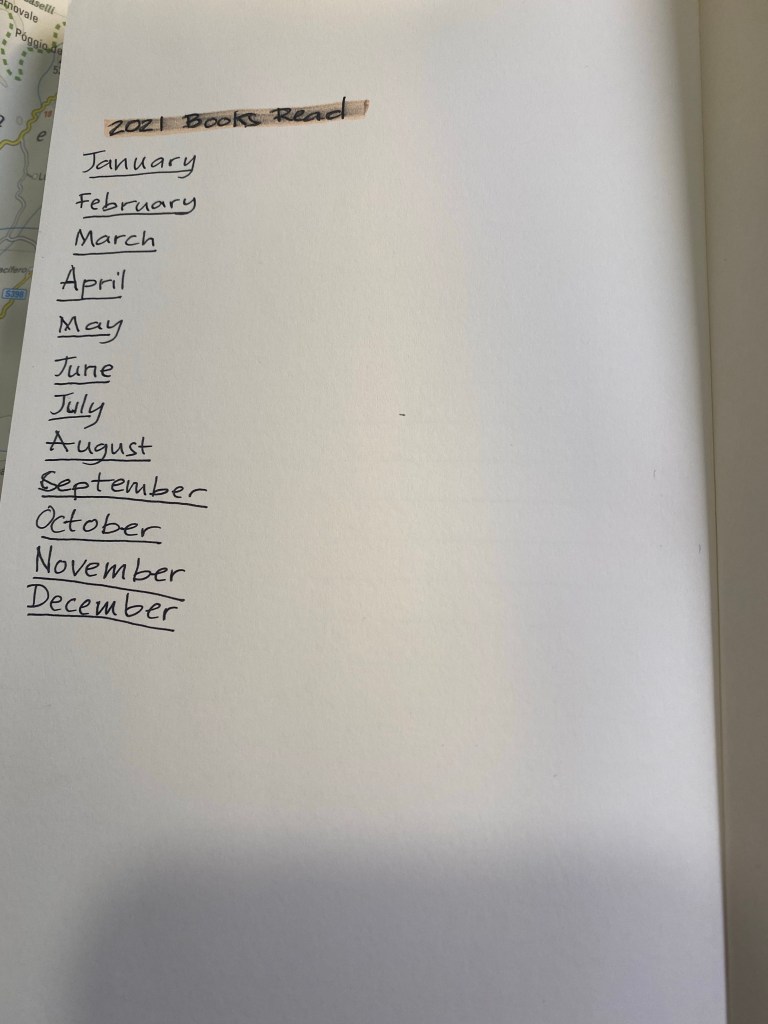
I hit most of my basic goals, missed a few completely, and got a few more partially. Yet the point of this post isn’t to brag, as my year could have shaped out worse than it had. The point is that I would have given up on myself if I didn’t have a plan that I thought that I had a fighting chance to accomplish, given the circumstances. I couldn’t participate in any races, but I enrolled and ran in several virtual races. Races keep me motivated to run, and running makes me feel better and gets me out of the house. I couldn’t go the gym, but I could do NTC workouts at home, so I had a chance to get that in. Reading provided me with an escape, and my reading goals and reading journal provided me with motivation to read, and to read books that were challenging as well books that were comforting. I couldn’t meet up with friends to play tabletop and RPG games, but thanks to Discord, Steam and Zoom we could still play together.

All of these things required extra effort in a year that really did its best to convince me that it would be a good idea to give up in advance and write the year off. The infrastructure that my goals provided kept me on track, and helped me salvage something of this terrible year. They also taught me how to structure my goals for 2021 better, but more on that in a separate post.

Sketchbook Design: My Tools

I’ve enrolled into Liz Steel’s Sketchbook Design online course, as I like the way Liz designs her notebook pages and I’ve taken an Urban Sketchers workshop (in Porto, 2018) which was excellent. Liz sent the first intro videos to the course to her newsletter subscribers, and so I decided to pick a sketchbook for the course (which starts on January 4th) and draw the tools that I plan on using in it.

The sketchbook that I chose is a Stillman and Birn Beta softcover A5 sketchbook, because it has watercolour friendly paper and I wanted to try that paper out. Here’s a sketch of my tools done with a Lamy Safari Petrol fine nib fountain pen and a Lamy Safari Dark Lilac medium nib fountain pen, both with Noodler’s Bulletproof Black.

I got carried away with the lines when drawing my palette, so I decided to roll with it and just use it to write down the paint details.

Here it is after applying watercolour:

It’s not perfect, but I like the way this page looks.

Here’s my Winsor & Newton Travel Watercolour box, filled with Schminke watercolours (some of them on their second or third refill from the tube). I love this paint box so much that I used my previous one until it fell to pieces. This is my new one, and it’s holding up well so far.

The fountain pens that I’ll be using: Lamy Safari Petrol F nib with Noodler’s Bulletproof Black, Lamy Safari Dark Lilac M nib with Noodler’s Bulletproof Black, Lamy Safari Charcoal EF nib with J. Herbin Bleu Pevench, Sailor Fude MF pen with Noodler’s Lexington Grey (Bulletproof ink).

My non fountain pens are my beloved Saedtler pigment liners in 0.3 and 0.7 and a Uni-ball Signo broad white.

The pencil I will use is a vintage Eagle Turquoise “Chemi Sealed” H drawing pencil. I just love everything about these pencils, and I really wish that they were still in production.

My brushes: a Raphael round travel brush, I’m not sure what size. There’s a good chance that I’ll replace it with a better round brush as the course progresses, as I’m not enamoured with it. The black brush in the middle is a Winsor & Newton Series 7 no 2 Kolinsky sable brush. The white and silver brush below is a Rosemary & Co R12 Sable/Nylon Dagger brush, and it’s a brush that I haven’t 100% mastered but that I’m growing to like with use.

That’s it for my tools at the moment. I’ll update this blog with my progress as the course takes place, and I’ll be sure to note if my tools change throughout.

New Reading Journal

Yesterday I finished my fifth reading journal, and so I thought that it would be a good opportunity to write a post about how I set up my reading journal.

I use my reading journal to keep track of what I read and to encourage me to read more. This is the journal that I’ve just finished, a Moleskine Two-Go:

Moleskine Two-Go. The perfect size and format for my needs.

I used to use a Field Notes Arts and Sciences notebook for my reading journal, but once I got back to reading more it made sense to move to a larger journal. For the past three years I’ve used the Moleskine Two-Go, and I fill one book journal a year (70 books are logged in each notebook).

Start and end date for this reading journal.

This is the setup in my old reading journal. Three pages of index:

First index page. Red checkmarks for books that I’ve read.

The Moleskine Two-Go comes with pages that are blank on one side and lined on another, which is perfect for my use case, except for the second index page, which I need to rule myself:

Ruled second index page.

I missed a line on the second index page, so the index numbering came out a little wonky. It’s only for me, so I don’t mind.

Off by one error in my index.

Here’s a sample of a complete page. I talked more about my thoughts behind the design in a previous post, but you can get the gist by looking at this sample. I like drawing something that captures the book for me on the opposite page, which is why I love the Moleskine Two-Go format.

I remember really not liking this book, and this is a reminder of why.

At the very last page of the journal I keep a log of how many books I read that month. It’s ten books so far for December, but the month isn’t done yet so that line isn’t filled.

Number of books per month tracker.

Here is my new reading journal, a Moleskine Two-Go, this time in green (my previous ones were in light grey, dark grey and navy):

Front cover.

I love the texture of the fabric colours on this, and the shade of green is interesting. The two contrasting bookmarks and the endpapers are grey.

Back cover

The first page, marking when I started the notebook and which journal number it is. This notebook doesn’t leave my desk yet I still write my name and email in case I misplace it somehow.

Front page

Next comes the index page. Since this is my third Two-Go reading journal I already know to number the pages until 139 (I number odd pages only, since my reviews are on odd pages), which comes out to 70 books.

Index page.

I rule the second page, because I tried just winging it on the first year and it didn’t come out great.

Spoke pen for the win.

On the last page I create my books per month tracker:

Zebra mildliner highligher smears gel ink, but I still like it.

I number all the pages of the index, but only the first 25 pages of the actual book journal. I will continue numbering pages in batches as I add books to the journal. The great advantage of using a completely unstructured book here is that I can do whatever I want with it, including starting the numbering after the index pages and not on the first notebook page.

These are the pen and pencils that I’ll be using in this journal. The Rotring 600 is a ballpoint, and the only ballpoint that I regularly use. The Caran d’Ache Bicolor has been my companion in these notebooks for several years. I use it to highlight things, and sometimes in my book scene sketches. I used the Blackwing 611 in my previous reading journal, and this time I’ll be using the Blackwing 4.

Caran d’Ache Bicolor, Blackwing 4, Rotring 600 ballpoint.

The first non fiction book in this journal:

The Good War

The first fiction book in this journal:

Cloud Atlas. ToB means Tournament of Books.

That’s my new reading journal all set up and ready to go. I hope that this inspires you to keep a reading journal of your own, one that will encourage you to read more and help evoke the memories of reading a specific book.

Four Watercolour Tips

Four quick tips for those using watercolours:

  • Write the colour number on the pan with a Sharpie (or a similar) pen. Inevitably the sticker or stamp with the watercolour’s number will fade away or peel off and you’ll be left trying to guess what it was when it’s time to replace it. If you mix watercolours by different makers then also give an indication of the maker on the pan.
  • Replace unused paint with something else that you may actually use. This is important particularly if you’re working with a small portable palette. If you see a pan with paint that hasn’t got a dent in it, consider replacing it with something else that you may use. Ask yourself why it’s just sitting there (it’s too opaque and hard to mix? You don’t need it much because of the subjects you draw?), and replace it with something that will better fit your needs. Palettes evolve with time, and yours should evolve to better fit your needs and drawing goals.
  • Buy tubes of paint to refill well used paint pans. When your starting out and still building up your palette and skills, work with pre-filled half-pans (the small square pans of paint). After a while you’ll start to see a few colours that you use more heavily than others, and for those paints you can either go for full pans, or buy paint tubes and refill them, giving them some time to set. It’s much more economical, with the caveat that you need to look up the paint maker that you’re using to see if there’s any difference between the paint in the pans and the paint in tubes. I use Schminke Horadam and there is none, so I’ve been refilling my pans for a few years now.
  • Check transparency and staining before selecting a paint. This is particularly important if you plan on mixing paint or lifting paint (using a brush to remove paint from the paper while it’s still wet or flooding the paper to remove paint). Paint that is opaque will not mix well with other paints (you’ll get a muddy effect), and you need to be aware of it while drawing. Transparent paints may not be as vibrant as their opaque counterparts, but they work very well with others. Staining paints will stain your paper, leaving a shadow of themselves as you try to lift them. These are not bad things in and of themselves, these are just things that you need to be aware about before adding a paint to your palette.

Diamine Monboddo’s Hat Ink Review

Diamine Monboddo’s Hat intrigued me from the moment I heard the name and saw the colour, but I have too much ink already, so it took a while before I caved in and bought a small bottle of it, and then a while more before I had the chance to use it.

Ever since Lamy Dark Lilac made its appearance a few years ago all dark purple inks have been judged against it, perhaps unfairly. There is more than one shade of dark purple in the world, and in any case unless you’re really set on trying to replicate Dark Lilac’s hue there’s really no need to create that comparison. Let inks stand for themselves first, and then let people know how close they are to an ink they may own or look to purchase.

Diamine Monboddo’s Hat has a delightful name and was made in collaboration with the Fountain Pens UK Facebook group. Diamine’s collaborations have all been interesting so far, and this one isn’t different. Monboddo’s Hat is a reddish leaning deep purple with a green gold sheen that can easily be slipped into office use rotation without anybody noticing. I have used Tomoe River paper to bring out the most of its sheen and shading, but even here it’s not a wild ink.

It’s hard to get the lighter hue of the ink to show while writing, but I made a quick sketch which shows the colour variation Monboddo’s Hat has:

Use Tomoe River paper and tilt it a bit to see the greenish-gold sheen this ink provides.

You can see the sheen on the top row here. Looking at the writing without tilting the paper makes them just look like an almost black purple.

It was fun doodling around with this ink. Here’s a closeup on all that Monboddo’s Hat has to offer:

The sketch was done using a Nakaya fine elastic nib. Where I put less pressure and moved the nib faster you see the lighter shades of purple and less sheen:

I used a fine brush to draw this flower, and a drop of water to show that Monboddo’s Hat isn’t waterproof or water resistant (nor does it claim to be):

Sheen on display:

Regardless of if it’s a good substitute for Lamy Dark Lilac or not, Monboddo’s Hat is a wonderful ink that is worth buying. The shade is dark but still vibrant, the sheen adds interest and pizzaz, and it’s a lot of fun to draw with if you have that inclination. Being a Diamine ink it’s also affordable and easily obtainable, with the added plus of being part of a welcome collaboration between a very old brand and a very modern community.

Short Story Published: “Star-Waze: Changing Course”

I got published for the very first time, and it was totally not what I expected.

First of all, here is the story. It’s in Hebrew, and it’s a lighthearted story about changing your route when life takes you by surprise:

Now about the process: it was tough but exhilarating to work with an editor for the first time. The editor asked me to change a major part of the story, which ended up in me choosing to rewrite most of the story from scratch. The resulting story is much better than the original, so it was worth the effort. It also taught me a lot about the editing process and what I need to focus on in my work to make it connect better with readers. So apparently it helped me change my writing course, not just my characters.

Moleskine Sakura Peanuts Pink Limited Edition

This is the second of the two Moleskine Sakura Peanuts limited edition notebooks, the pink version. To read about the white version click here.

The first three photos of this edition came out wonky, particularly the first one. I’m still waiting on a better light so that I can take better photos, but for now just look at the photo of the cover without the band to see this notebook’s true colour.

You can see how well Moleskine can design things when it tries, as the bellyband Sakura leaves align exactly with the print on the cover. This too is a fabric covered notebook with no 3D effect and a shiny, silky texture to the fabric. Moleskine seems to be letting the vibrant (ignore the colour in the photo below) pink of the cover to do the heavy lifting here, and I don’t think that’s warranted.

Front cover with band.

The back cover is a repeat of the white version back cover. The paper is 70gsm, but that’s not listed on the bellyband. It does state that it is acid-free and 240 pages, so I have no idea why the paper weight isn’t listed here but is listed on Moleskine’s site.

Back cover with band.

The spine is also plain, which is a shame. A nice Snoopy print on it would have made it much more appealing.

Spine with band.

So here we have the front cover, minus the bellyband, and in its true colour. I find this cover aggravating. Unlike the white version of this notebook there is no unifying colour scheme between Snoopy and the falling Sakura petals. Snoopy’s white fur doesn’t count here when he’s hugging a bright red heart, and not a pink one. Here there is no excuse for Woodstock not being on the cover (Snoopy’s heart already breaks the pink and white colour scheme). There’s also no real design here: there’s a bunch of falling petals and a Snoopy stuck on top.

Front Cover.

Incidentally you can see how well the fabric is attached to the covers by taking a look at this back cover. The notebook got dinged in shipping, which caused the cover to crinkle (bottom right corner of the photo). The fabric is still firmly attached, with no air bubbles or separation between it and the boards below. Impressive.

Back cover.

If the front and back endpapers of the pink edition would have been different from the white edition then this would have redeemed this notebook in my eyes. As it is they are exactly the same as their white counterpart, and as in the front cover the disconnect between the Sakura petals and the Peanuts characters is jarring.

Front endpaper.

That white page on the left of the back endpapers is just tragic.

Back endpaper.

I like the choice of pink in the ribbon and elastic, as it’s more vibrant and pops off the page.

Page layout and ribbon bookmark.

The B-side is a repeat of the white version. Again the theme of Sakura and Peanuts is side by side, with no real connection between them.

B-side of bellyband.

And the same rather depressing sticker selection as an added bonus to this edition. Rarely ahve stickers made me sad, but here they have.

Stickers.

The Moleskine Sakura Peanuts pink limited edition notebook makes me angry. This edition is a clear, phoned in, money grab. People pay a premium for Moleskine’s design, and this notebook wasn’t designed. It was cobbled together from a bunch of unrelated images, with no effort made to meld the two themes, to do something creative with them, or to even give the notebook user the feeling that someone put time and attention into this edition. Its highlight is the fabric on the cover, which is something that Moleskine nailed a few years ago. This edition will sell out, and I will use these notebooks, but I hope that this is not going to be the direction Moleskine chooses for its limited editions in the future.

Moleskine Peanuts Sakura White Limited Edition

I haven’t been able to find the fall/winter Moleskine 2020 catalog, so the Moleskine Peanuts Sakura edition caught me by surprise. The edition includes two cloth covered large lined notebooks, one in pink and one in white, each with the Sakura theme and the Peanuts theme combined.

I’ll start by reviewing the white cover edition of this notebook. First thing is first: Moleskine always nail the design details. The falling Sakura petals on the cover and on the band match:

Front cover with band and elastic.

The back cover is plain white with just the edges of the pale pink elastic in view, plus the Moleskine brand in a medium pink. Moleskine still don’t reveal their paper weight on the cover which is not cool, Moleskine, not cool. The catalog at least used to list that, but it was never made publicly available by Moleskine themselves (I got it through a Chronicle Books upload to scribd). Moleskine’s site does do a better job, listing the paper as 70 gsm so I have no idea why it’s still not listed on the back of the notebook’s bellyband.

Back cover with band and elastic and Moleskine branding.

There’s even a little Snoopy character on the bellyband spine, but not on the notebook itself, which is a shame. You can also see where the cover got dinged in shipping. I don’t mind, but if you do then you’ll probably do best to avoid the white covered notebook anyway. Unless you plan to write with gloves in a clean room this cover is not going to stay pristine. I personally believe that notebooks should show that they’ve been “lived in,” so that’s not going to be a problem for me.

Spine with band.

Here is the front cover without the bellyband. I like the clever colour combination of the Sakura petals, on the white background, Snoopy’s white fur and the pink heart on the card he’s holding. I wish Woodstock would have been on the cover and not just the bellyband, but that would have ruined the lovely black, white and pinks colour scheme.

Front cover.

The cover is cloth covered, with a synthetic shiny fabric that has a silky finish to it. Unlike the original Moleskine Sakura limited edition notebook the print is not raised above the notebook fabric so there’s no depth to the print at all. It would have been nice to get that here, but I have a feeling that the money that would have gone to create that effect went to the licensing part of the notebook.

Closeup of front cover texture.

The front endpaper has the falling Sakura petals and all the Peanuts gang together. It made me smile to see it, and will likely be a hit with the fans.

Front endpaper.

The back endpaper contains more falling Sakura petals and the classic Woodstock sitting on Snoopy lying on the roof of his doghouse setup. I’m a little disappointed that the design appears only on the notebook’s back pocket and isn’t spread across the actual notebook back endpaper. Also while both designs tick all the right fandom boxes, they are far from imaginative. Moleskine have done more interesting things with other franchises in the past.

Back endpaper. Can you see the Sakura petals falling on Snoopy’s doghouse?

There’s a set of stickers that come with this edition, and I find them underwhelming. The Sakura stickers are nice, but it looks like someone stuck three vaguely Peanuts themed stickers on the page. Again, not their best design work, and in this case it really looks like someone phoned it in.

Stickers.

Both Moleskine Sakura Peanuts limited edition notebooks come with lined pages, like most Moleskine limited editions. The ribbon bookmark here is a very pale pink that matches the elastic. It’s not my favourite colour and I wish they would have gone with a punchier pink for both.

Ribbon and ruling.

As usual in recent years the B-side of the bellyband comes with a little something extra, and this time it’s with an illustration of the Peanuts characters running with Sakura leaves on both sides. This is something nice to stick in your notebook, but I wish it was at least in bookmark shape. I still intend to make a bookmark out of it, but the characters will be running up the page in a weird way.

Bellyband B-side.

The Moleskine Sakura Peanuts limited edition notebooks will sell out in no time (they are already out of stock in some places), and the white edition of this notebook is an attractive notebook with a beautiful cover. Yet I have a feeling that the design itself was a bit of an afterthought, a money grab designed to mash together two of their most popular designs in the most obvious way possible. So while I am going to enjoy using this notebook, I can’t help but wonder what its design would look like if the Moleskine designers had been let a little more loose here.