This is the second of the two Moleskine Sakura Peanuts limited edition notebooks, the pink version. To read about the white version click here.
The first three photos of this edition came out wonky, particularly the first one. I’m still waiting on a better light so that I can take better photos, but for now just look at the photo of the cover without the band to see this notebook’s true colour.
You can see how well Moleskine can design things when it tries, as the bellyband Sakura leaves align exactly with the print on the cover. This too is a fabric covered notebook with no 3D effect and a shiny, silky texture to the fabric. Moleskine seems to be letting the vibrant (ignore the colour in the photo below) pink of the cover to do the heavy lifting here, and I don’t think that’s warranted.
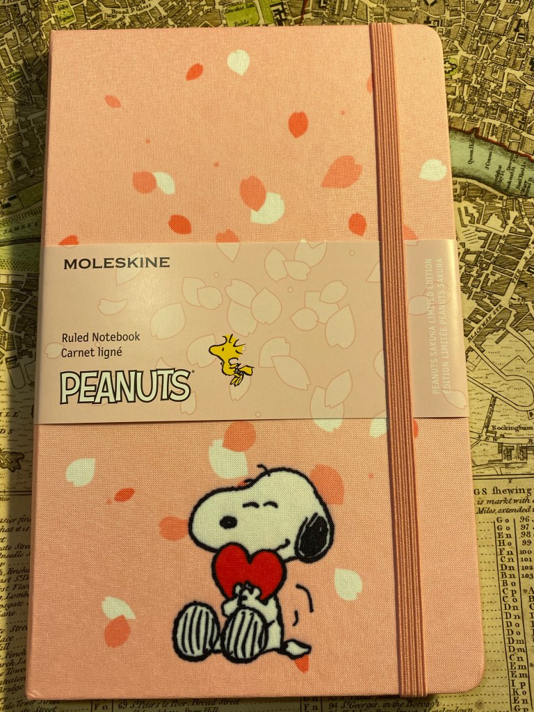
The back cover is a repeat of the white version back cover. The paper is 70gsm, but that’s not listed on the bellyband. It does state that it is acid-free and 240 pages, so I have no idea why the paper weight isn’t listed here but is listed on Moleskine’s site.
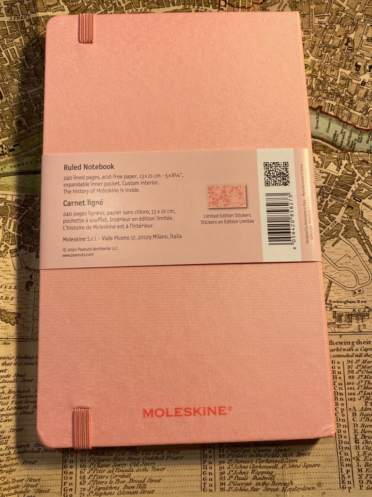
The spine is also plain, which is a shame. A nice Snoopy print on it would have made it much more appealing.
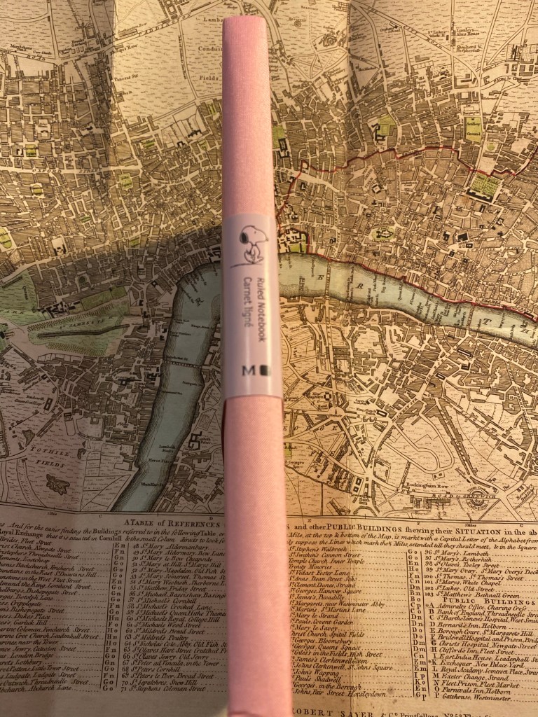
So here we have the front cover, minus the bellyband, and in its true colour. I find this cover aggravating. Unlike the white version of this notebook there is no unifying colour scheme between Snoopy and the falling Sakura petals. Snoopy’s white fur doesn’t count here when he’s hugging a bright red heart, and not a pink one. Here there is no excuse for Woodstock not being on the cover (Snoopy’s heart already breaks the pink and white colour scheme). There’s also no real design here: there’s a bunch of falling petals and a Snoopy stuck on top.
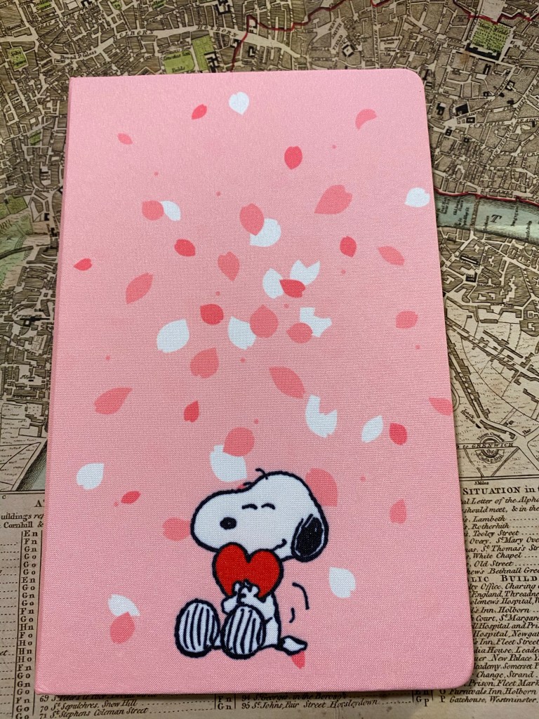
Incidentally you can see how well the fabric is attached to the covers by taking a look at this back cover. The notebook got dinged in shipping, which caused the cover to crinkle (bottom right corner of the photo). The fabric is still firmly attached, with no air bubbles or separation between it and the boards below. Impressive.

If the front and back endpapers of the pink edition would have been different from the white edition then this would have redeemed this notebook in my eyes. As it is they are exactly the same as their white counterpart, and as in the front cover the disconnect between the Sakura petals and the Peanuts characters is jarring.

That white page on the left of the back endpapers is just tragic.
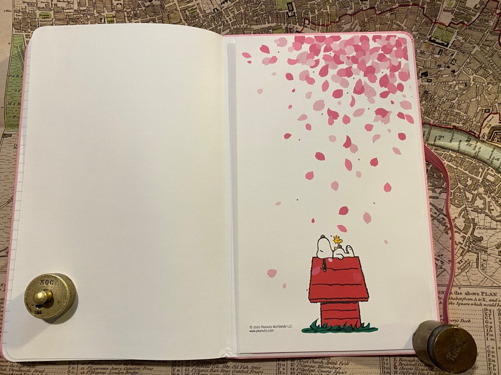
I like the choice of pink in the ribbon and elastic, as it’s more vibrant and pops off the page.
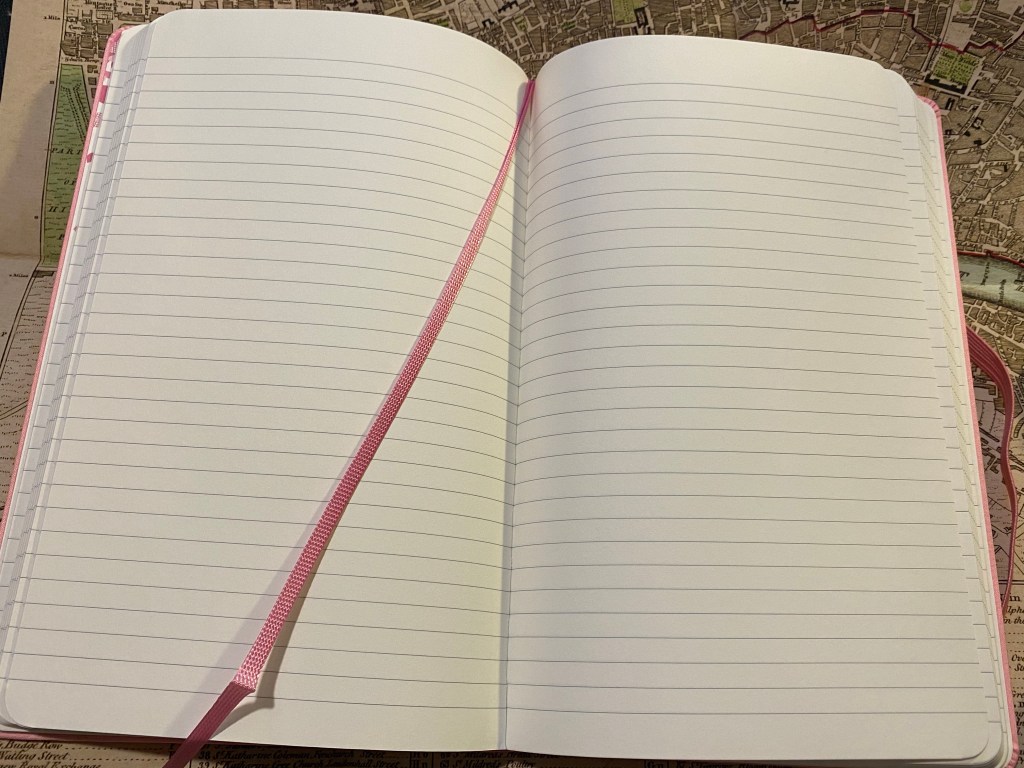
The B-side is a repeat of the white version. Again the theme of Sakura and Peanuts is side by side, with no real connection between them.

And the same rather depressing sticker selection as an added bonus to this edition. Rarely ahve stickers made me sad, but here they have.

The Moleskine Sakura Peanuts pink limited edition notebook makes me angry. This edition is a clear, phoned in, money grab. People pay a premium for Moleskine’s design, and this notebook wasn’t designed. It was cobbled together from a bunch of unrelated images, with no effort made to meld the two themes, to do something creative with them, or to even give the notebook user the feeling that someone put time and attention into this edition. Its highlight is the fabric on the cover, which is something that Moleskine nailed a few years ago. This edition will sell out, and I will use these notebooks, but I hope that this is not going to be the direction Moleskine chooses for its limited editions in the future.