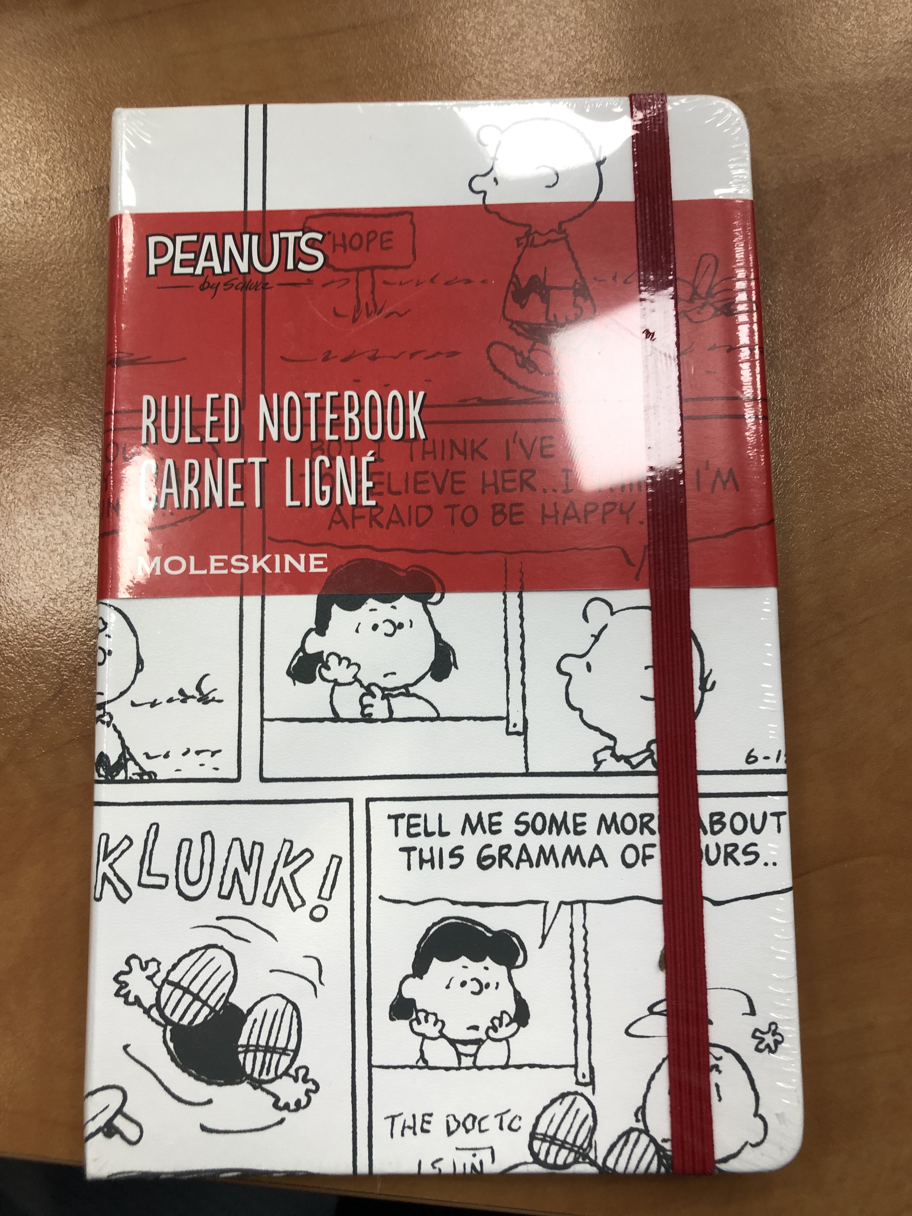
Moleskine Sakura Peanuts Pink Limited Edition

This is the second of the two Moleskine Sakura Peanuts limited edition notebooks, the pink version. To read about the white version click here.

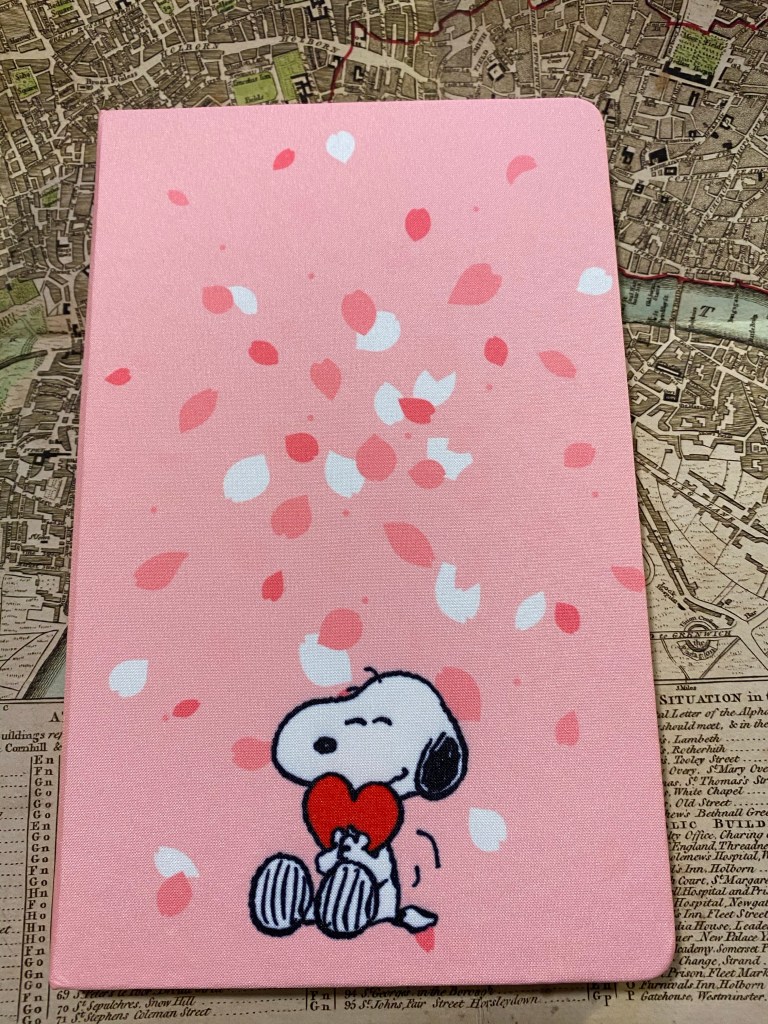
The first three photos of this edition came out wonky, particularly the first one. I’m still waiting on a better light so that I can take better photos, but for now just look at the photo of the cover without the band to see this notebook’s true colour.

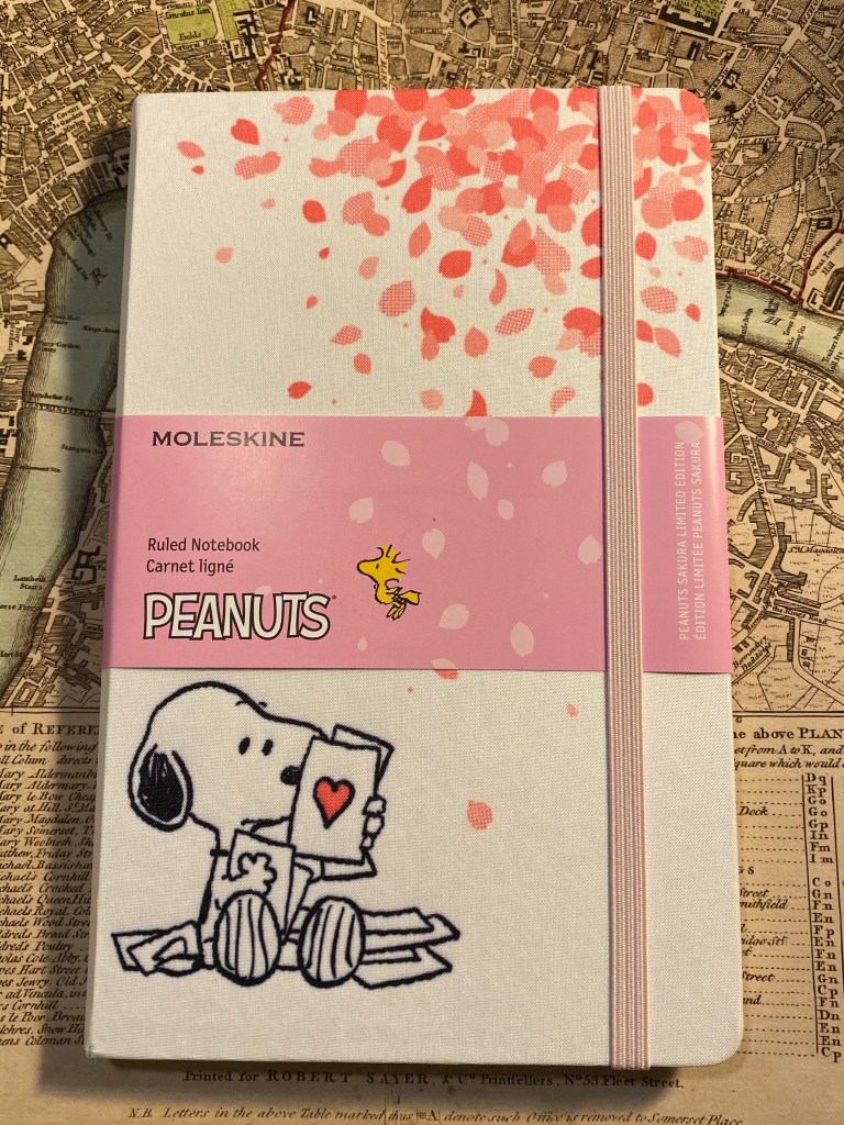
You can see how well Moleskine can design things when it tries, as the bellyband Sakura leaves align exactly with the print on the cover. This too is a fabric covered notebook with no 3D effect and a shiny, silky texture to the fabric. Moleskine seems to be letting the vibrant (ignore the colour in the photo below) pink of the cover to do the heavy lifting here, and I don’t think that’s warranted.

Front cover with band.

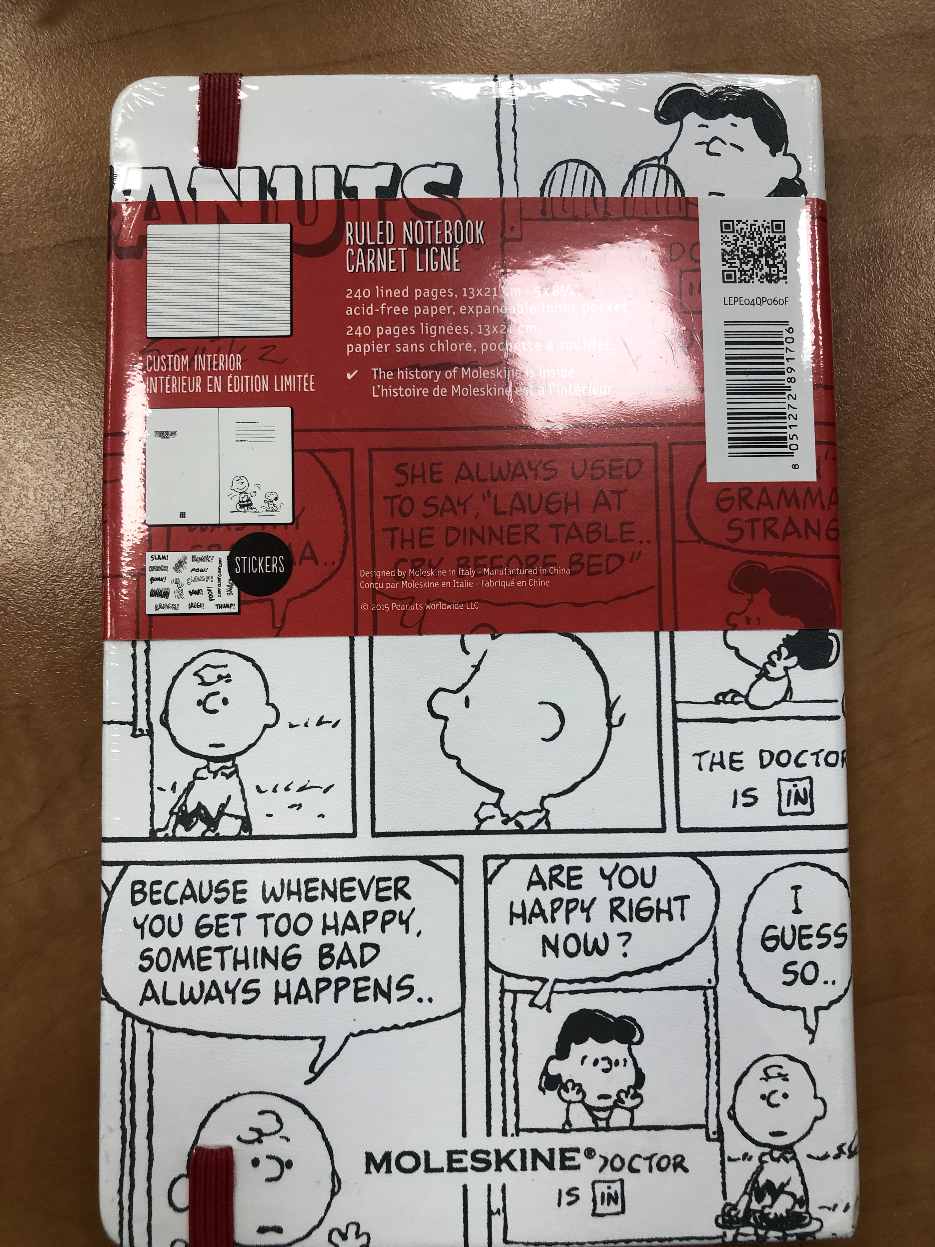
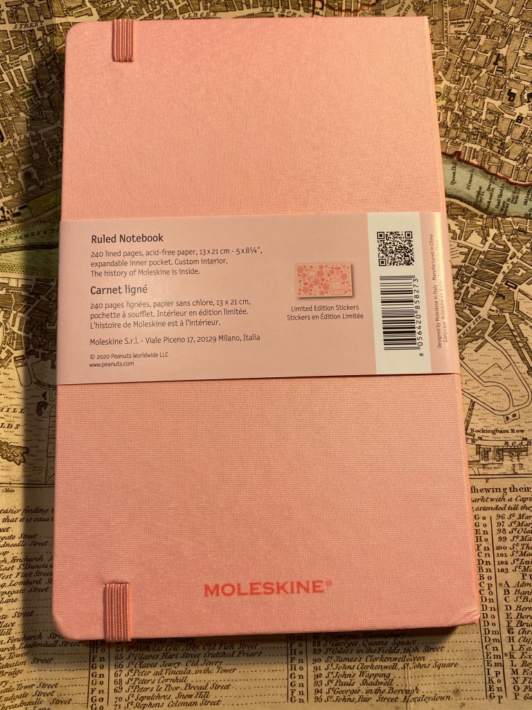
The back cover is a repeat of the white version back cover. The paper is 70gsm, but that’s not listed on the bellyband. It does state that it is acid-free and 240 pages, so I have no idea why the paper weight isn’t listed here but is listed on Moleskine’s site.

Back cover with band.

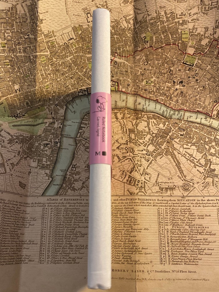
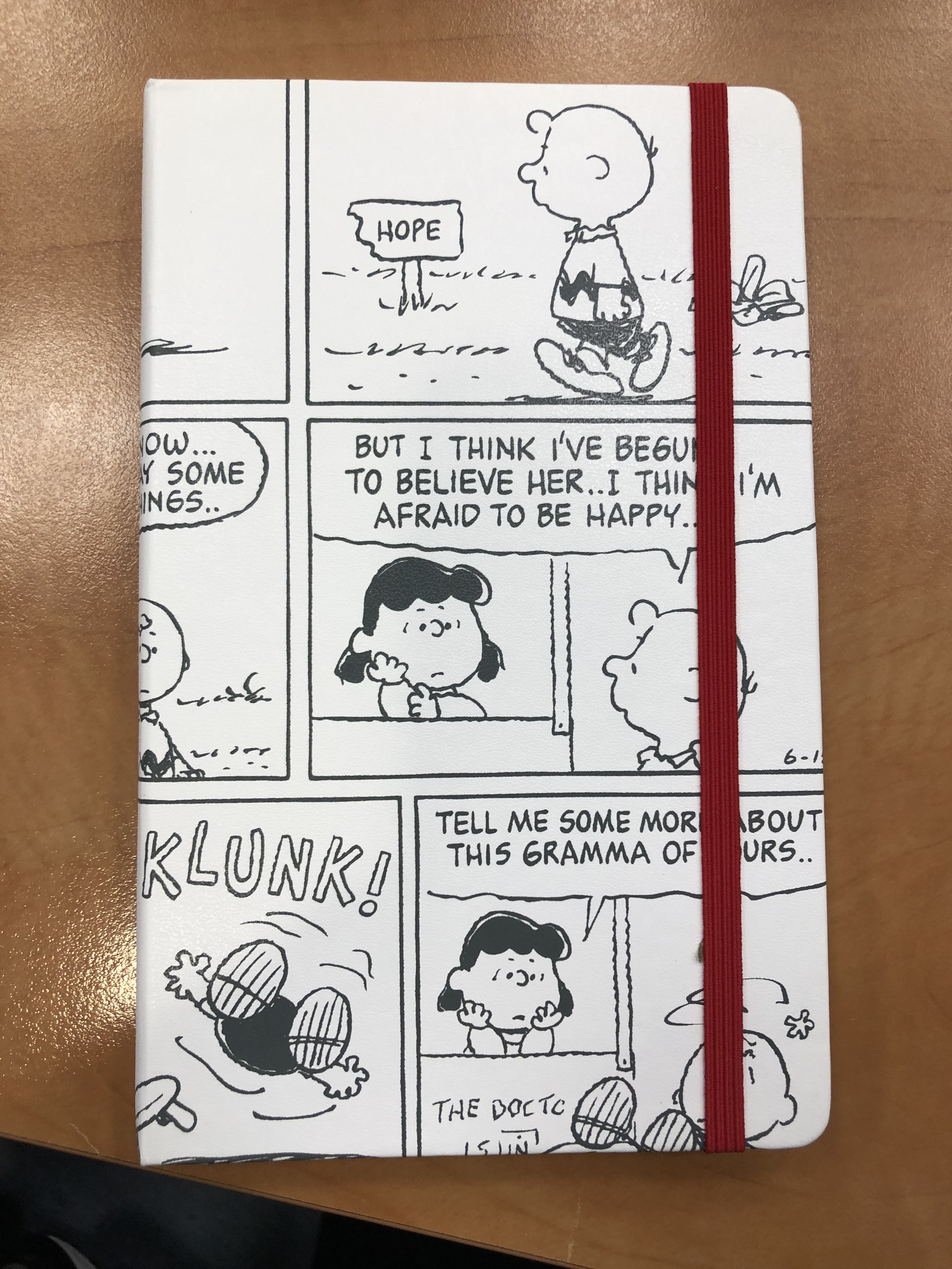
The spine is also plain, which is a shame. A nice Snoopy print on it would have made it much more appealing.

Spine with band.

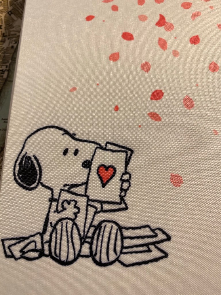
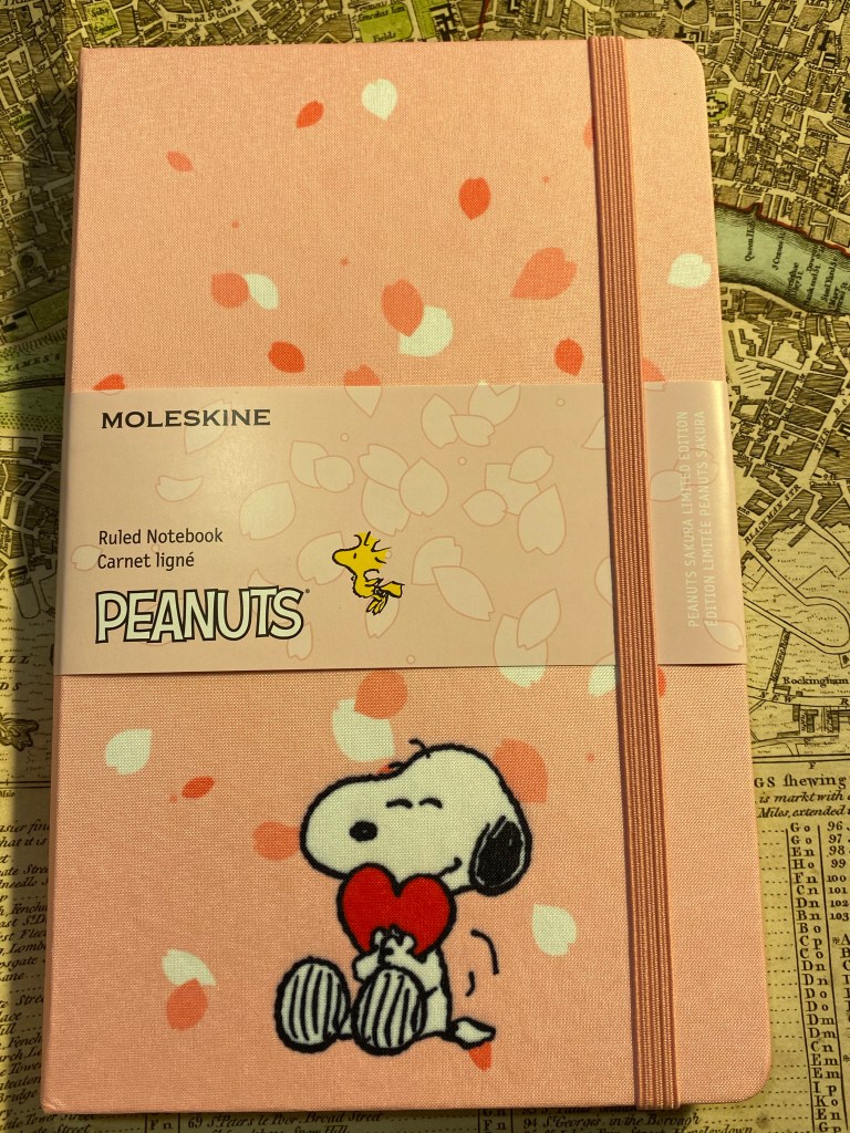
So here we have the front cover, minus the bellyband, and in its true colour. I find this cover aggravating. Unlike the white version of this notebook there is no unifying colour scheme between Snoopy and the falling Sakura petals. Snoopy’s white fur doesn’t count here when he’s hugging a bright red heart, and not a pink one. Here there is no excuse for Woodstock not being on the cover (Snoopy’s heart already breaks the pink and white colour scheme). There’s also no real design here: there’s a bunch of falling petals and a Snoopy stuck on top.

Front Cover.

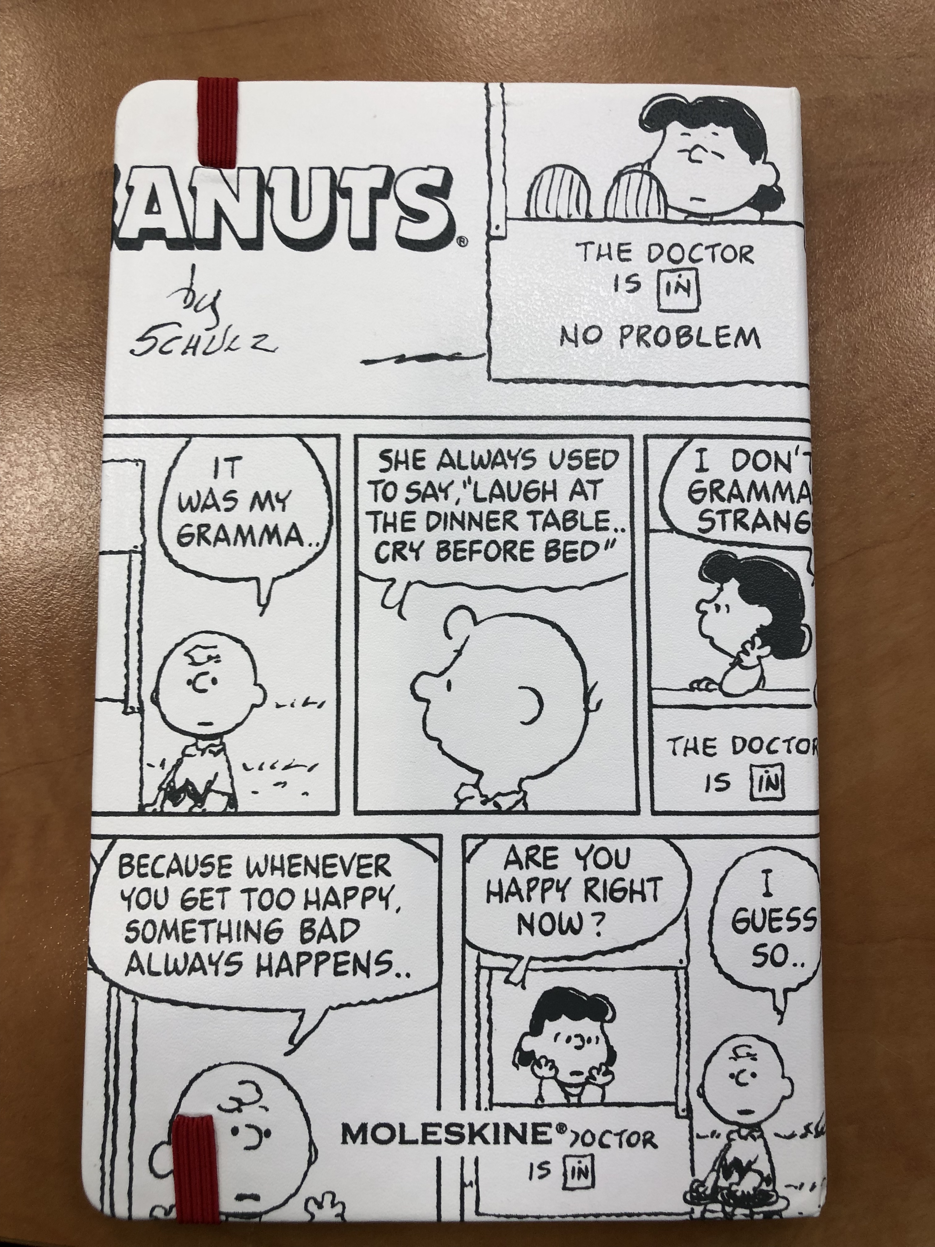
Incidentally you can see how well the fabric is attached to the covers by taking a look at this back cover. The notebook got dinged in shipping, which caused the cover to crinkle (bottom right corner of the photo). The fabric is still firmly attached, with no air bubbles or separation between it and the boards below. Impressive.

Back cover.

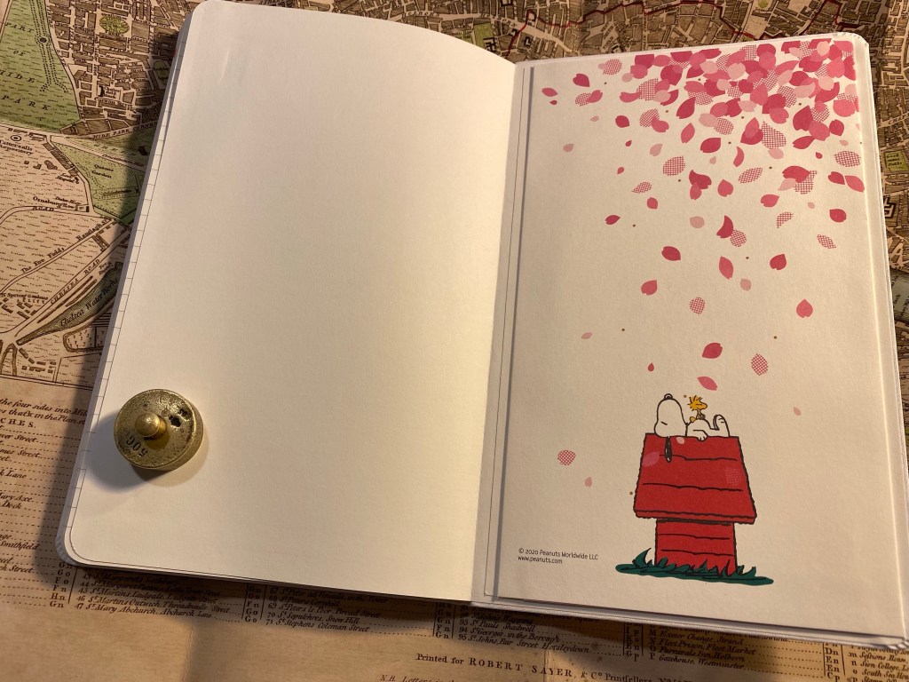
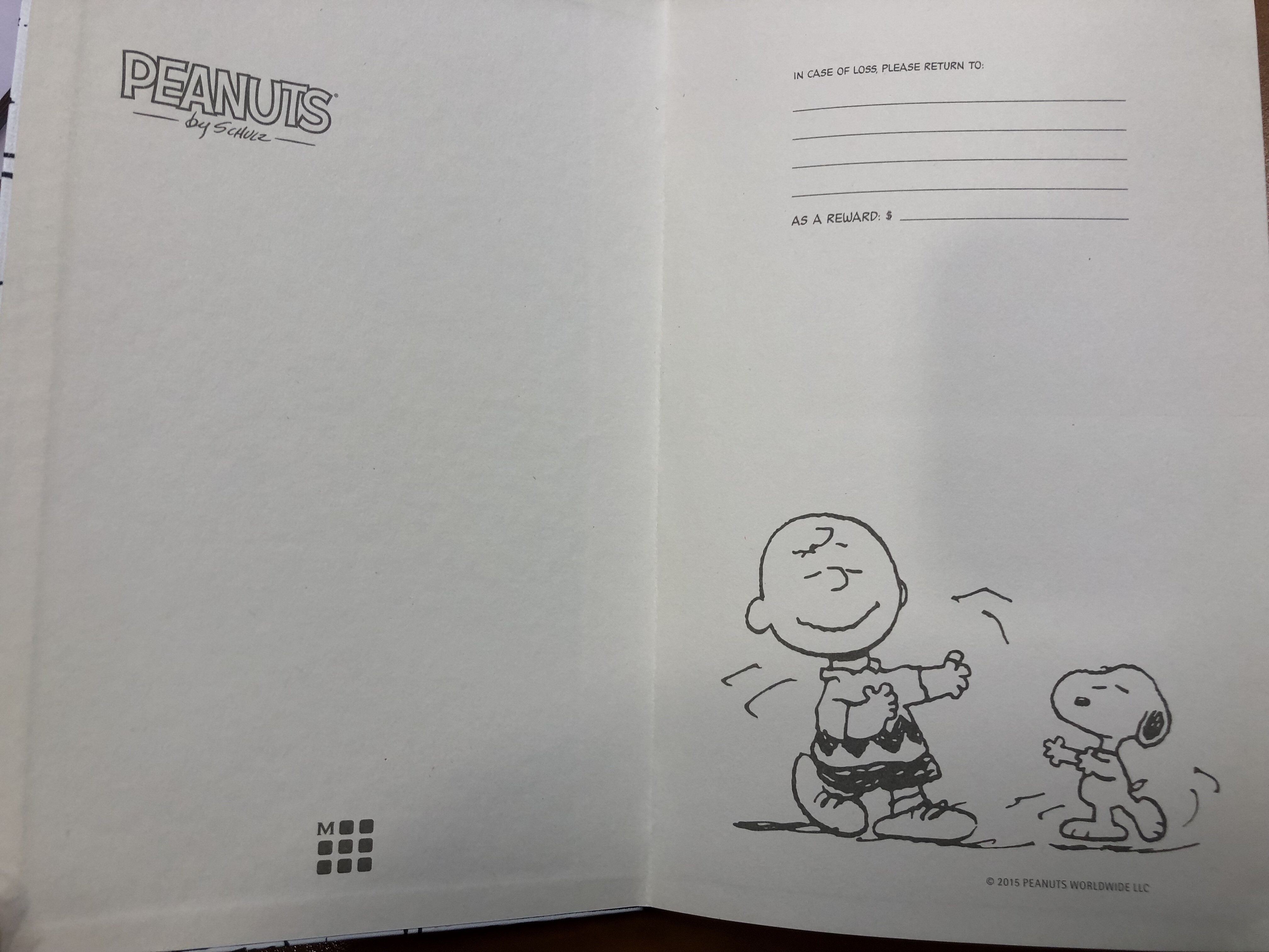
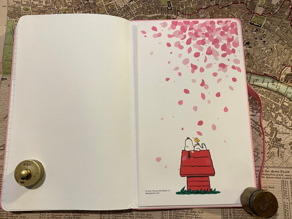
If the front and back endpapers of the pink edition would have been different from the white edition then this would have redeemed this notebook in my eyes. As it is they are exactly the same as their white counterpart, and as in the front cover the disconnect between the Sakura petals and the Peanuts characters is jarring.

Front endpaper.

That white page on the left of the back endpapers is just tragic.

Back endpaper.

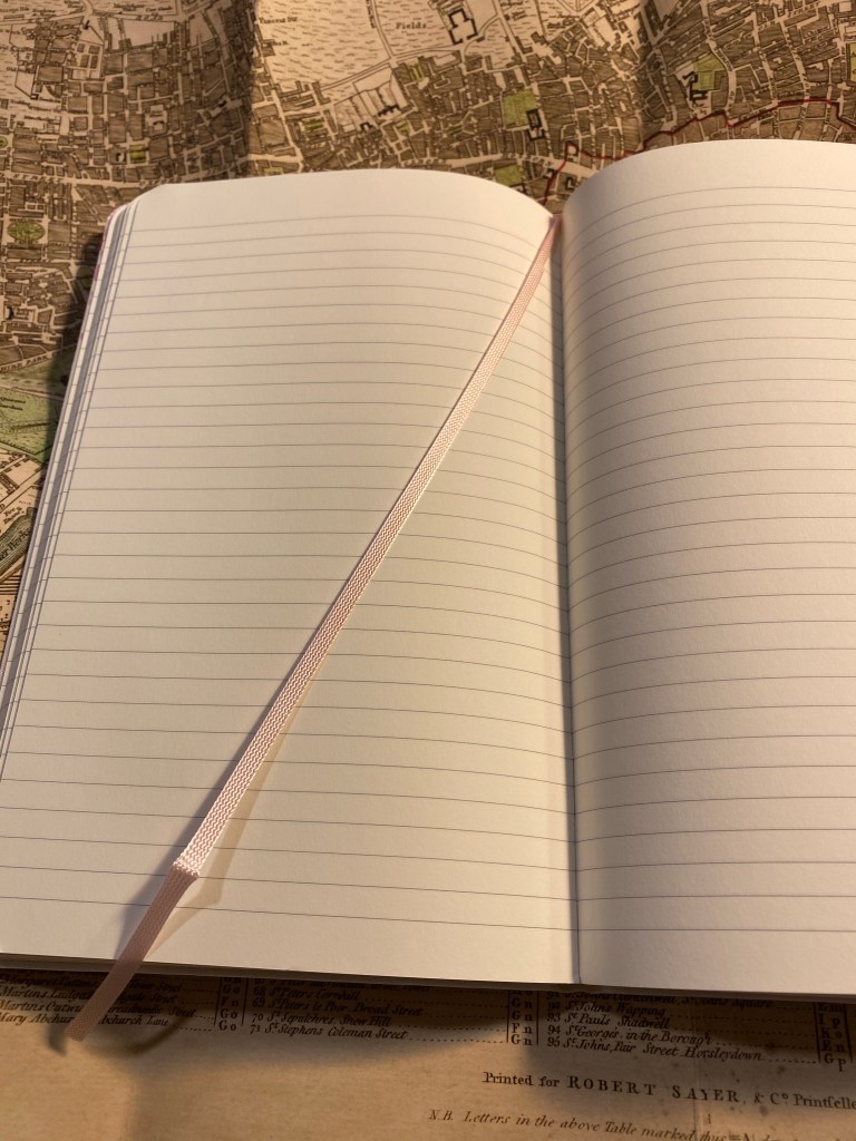
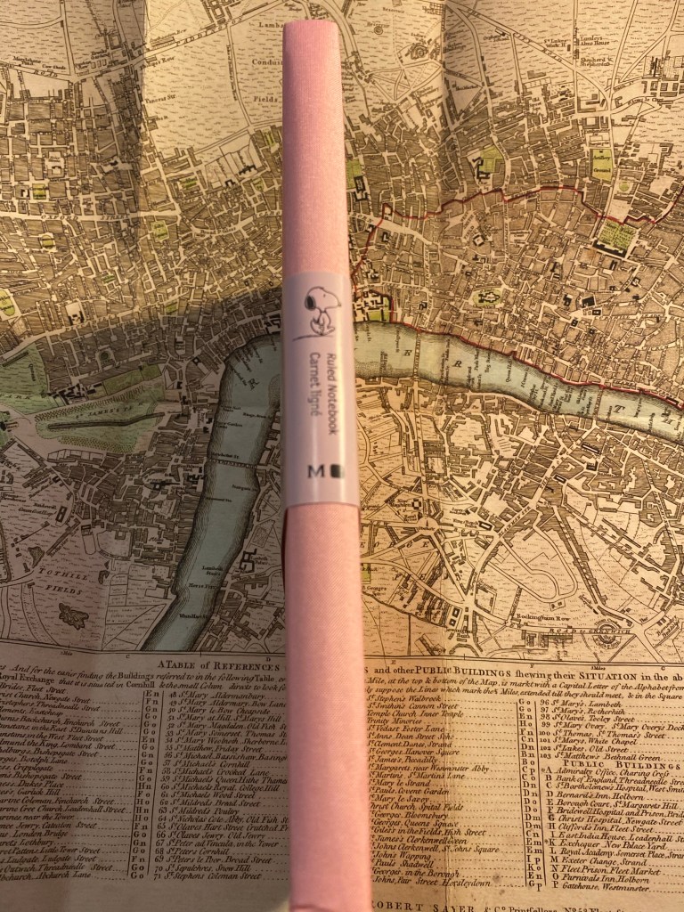
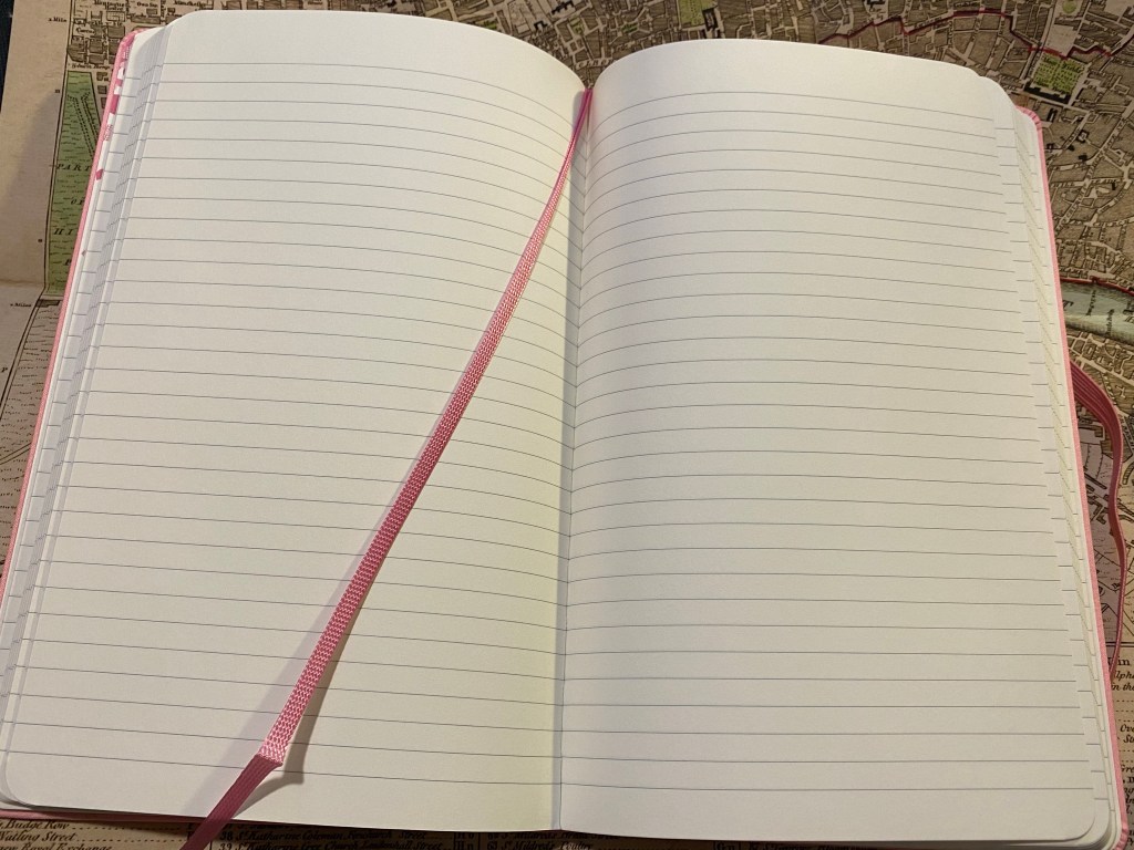
I like the choice of pink in the ribbon and elastic, as it’s more vibrant and pops off the page.

Page layout and ribbon bookmark.

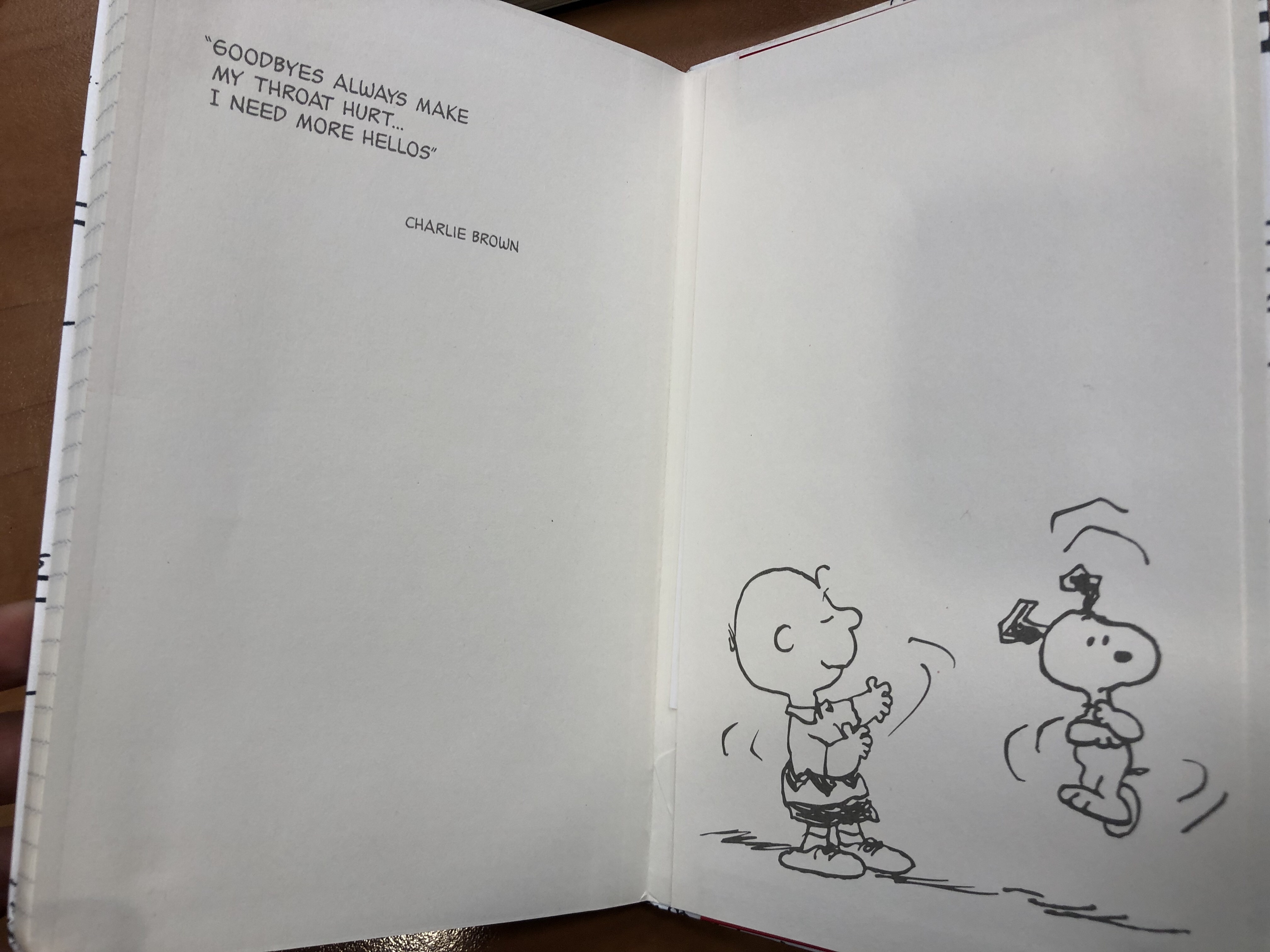
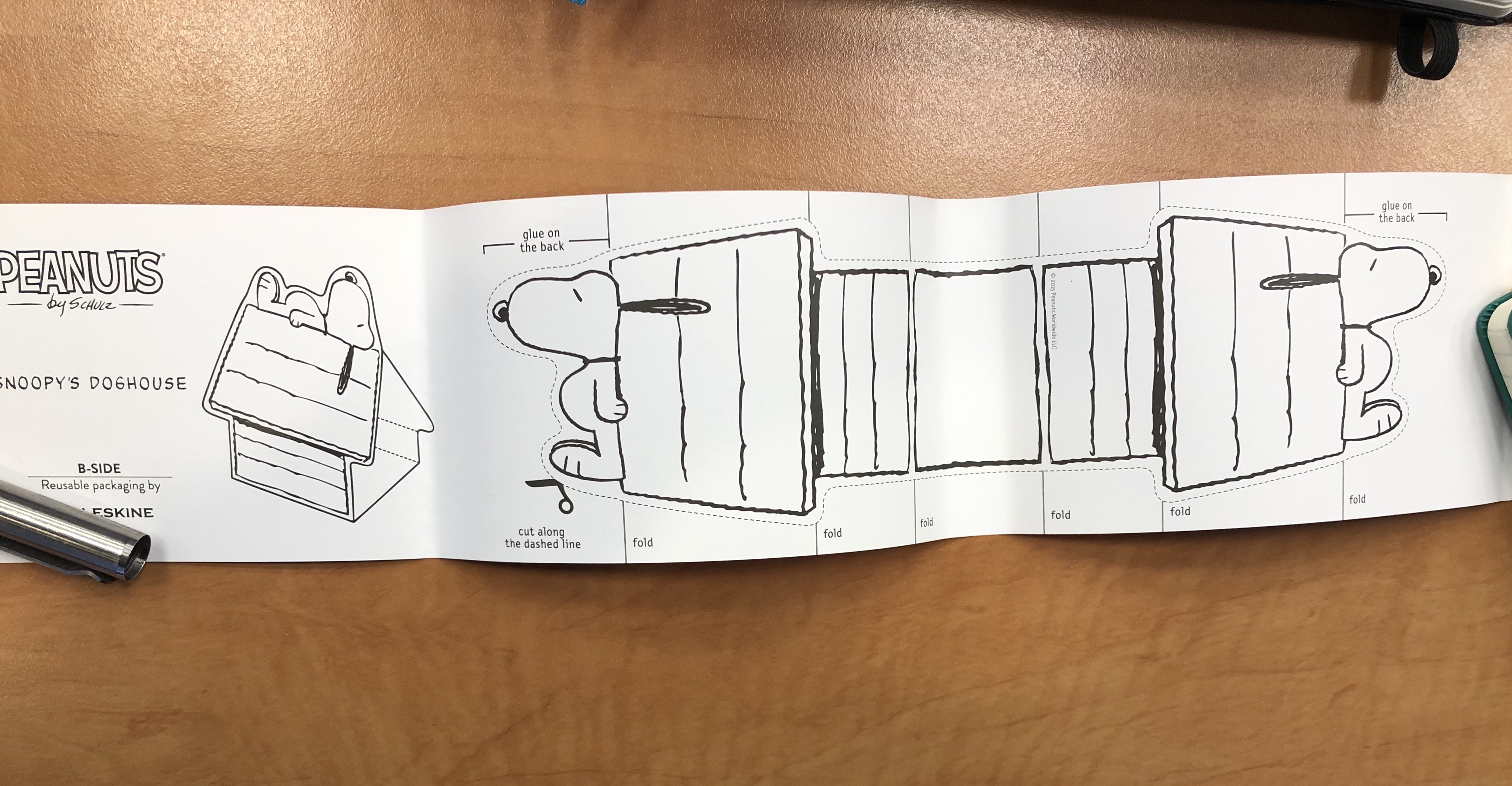
The B-side is a repeat of the white version. Again the theme of Sakura and Peanuts is side by side, with no real connection between them.

B-side of bellyband.

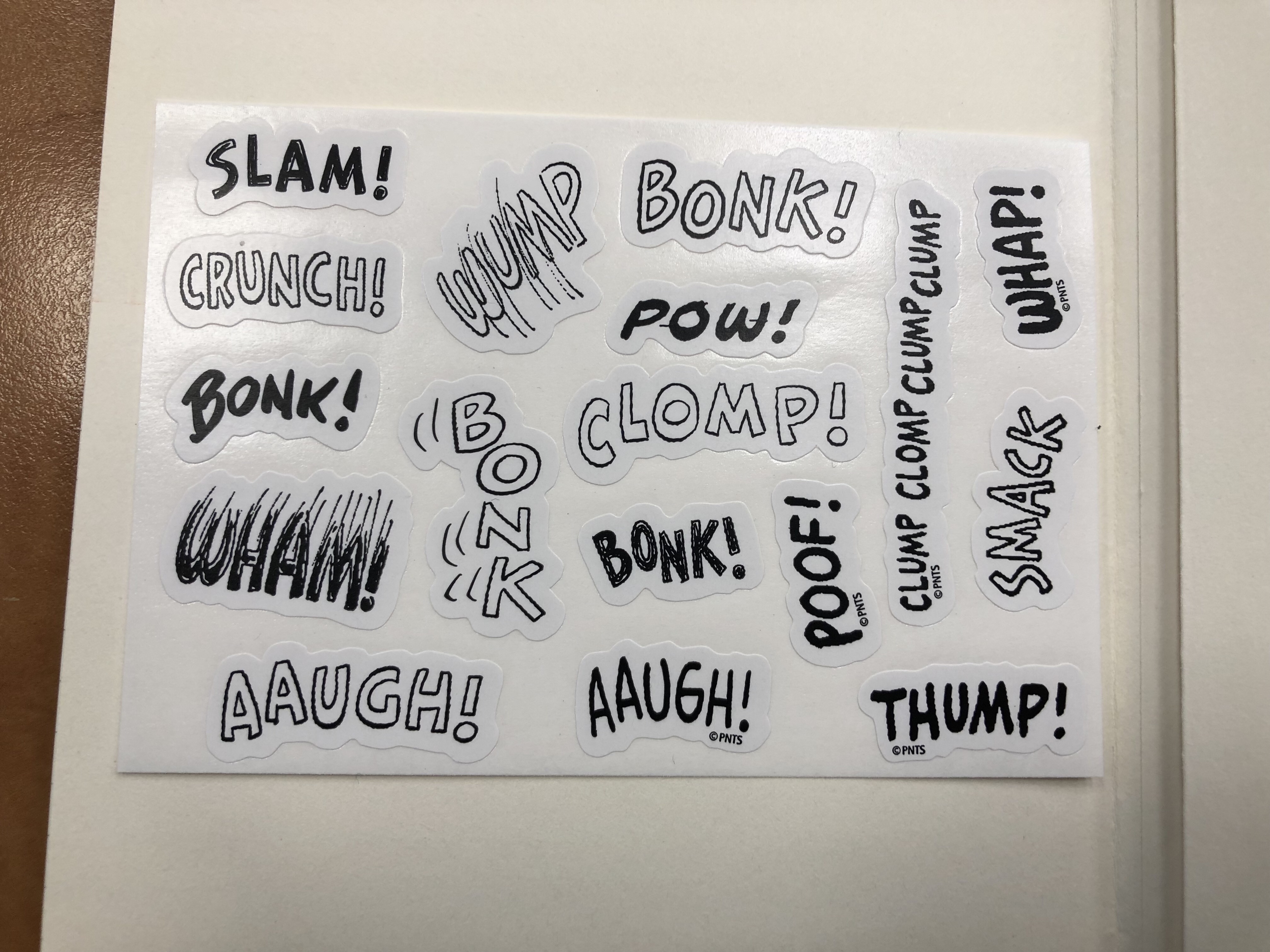
And the same rather depressing sticker selection as an added bonus to this edition. Rarely ahve stickers made me sad, but here they have.

Stickers.

The Moleskine Sakura Peanuts pink limited edition notebook makes me angry. This edition is a clear, phoned in, money grab. People pay a premium for Moleskine’s design, and this notebook wasn’t designed. It was cobbled together from a bunch of unrelated images, with no effort made to meld the two themes, to do something creative with them, or to even give the notebook user the feeling that someone put time and attention into this edition. Its highlight is the fabric on the cover, which is something that Moleskine nailed a few years ago. This edition will sell out, and I will use these notebooks, but I hope that this is not going to be the direction Moleskine chooses for its limited editions in the future.

Moleskine Peanuts Sakura White Limited Edition

I haven’t been able to find the fall/winter Moleskine 2020 catalog, so the Moleskine Peanuts Sakura edition caught me by surprise. The edition includes two cloth covered large lined notebooks, one in pink and one in white, each with the Sakura theme and the Peanuts theme combined.

I’ll start by reviewing the white cover edition of this notebook. First thing is first: Moleskine always nail the design details. The falling Sakura petals on the cover and on the band match:

Front cover with band and elastic.

The back cover is plain white with just the edges of the pale pink elastic in view, plus the Moleskine brand in a medium pink. Moleskine still don’t reveal their paper weight on the cover which is not cool, Moleskine, not cool. The catalog at least used to list that, but it was never made publicly available by Moleskine themselves (I got it through a Chronicle Books upload to scribd). Moleskine’s site does do a better job, listing the paper as 70 gsm so I have no idea why it’s still not listed on the back of the notebook’s bellyband.

Back cover with band and elastic and Moleskine branding.

There’s even a little Snoopy character on the bellyband spine, but not on the notebook itself, which is a shame. You can also see where the cover got dinged in shipping. I don’t mind, but if you do then you’ll probably do best to avoid the white covered notebook anyway. Unless you plan to write with gloves in a clean room this cover is not going to stay pristine. I personally believe that notebooks should show that they’ve been “lived in,” so that’s not going to be a problem for me.

Spine with band.

Here is the front cover without the bellyband. I like the clever colour combination of the Sakura petals, on the white background, Snoopy’s white fur and the pink heart on the card he’s holding. I wish Woodstock would have been on the cover and not just the bellyband, but that would have ruined the lovely black, white and pinks colour scheme.

Front cover.

The cover is cloth covered, with a synthetic shiny fabric that has a silky finish to it. Unlike the original Moleskine Sakura limited edition notebook the print is not raised above the notebook fabric so there’s no depth to the print at all. It would have been nice to get that here, but I have a feeling that the money that would have gone to create that effect went to the licensing part of the notebook.

Closeup of front cover texture.

The front endpaper has the falling Sakura petals and all the Peanuts gang together. It made me smile to see it, and will likely be a hit with the fans.

Front endpaper.

The back endpaper contains more falling Sakura petals and the classic Woodstock sitting on Snoopy lying on the roof of his doghouse setup. I’m a little disappointed that the design appears only on the notebook’s back pocket and isn’t spread across the actual notebook back endpaper. Also while both designs tick all the right fandom boxes, they are far from imaginative. Moleskine have done more interesting things with other franchises in the past.

Back endpaper. Can you see the Sakura petals falling on Snoopy’s doghouse?

There’s a set of stickers that come with this edition, and I find them underwhelming. The Sakura stickers are nice, but it looks like someone stuck three vaguely Peanuts themed stickers on the page. Again, not their best design work, and in this case it really looks like someone phoned it in.

Stickers.

Both Moleskine Sakura Peanuts limited edition notebooks come with lined pages, like most Moleskine limited editions. The ribbon bookmark here is a very pale pink that matches the elastic. It’s not my favourite colour and I wish they would have gone with a punchier pink for both.

Ribbon and ruling.

As usual in recent years the B-side of the bellyband comes with a little something extra, and this time it’s with an illustration of the Peanuts characters running with Sakura leaves on both sides. This is something nice to stick in your notebook, but I wish it was at least in bookmark shape. I still intend to make a bookmark out of it, but the characters will be running up the page in a weird way.

Bellyband B-side.

The Moleskine Sakura Peanuts limited edition notebooks will sell out in no time (they are already out of stock in some places), and the white edition of this notebook is an attractive notebook with a beautiful cover. Yet I have a feeling that the design itself was a bit of an afterthought, a money grab designed to mash together two of their most popular designs in the most obvious way possible. So while I am going to enjoy using this notebook, I can’t help but wonder what its design would look like if the Moleskine designers had been let a little more loose here.

Zebra Sarasa Clip Peanuts Limited Edition Review

The Zebra Sarasa Clip is an excellent gel ink pen, with a unique and well done clip design. I have a bunch of the black and blue black pens laying around at home and in the office, and although I prefer the Uniball Signo line of pens, I do use them and recommend them to people looking for an upgrade from the Pilot G2.

I don’t usually buy limited edition disposable pens because there has to be a limit, and I already own way too many pens. I can’t afford to start collecting all the Uniball and Zebra collaborations with various (usually animated) IPs. But sometimes Japanese makers manage to floor you with just how far they’ll go with their big-box, disposable pen lines, and the Zebra x Snoopy Sarasa clip line is that case. I just had to buy it once I saw it surface on JetPens.

Yes, I bought all of them. I don’t have a problem, you have a problem!

This is the 4th (!) limited edition Zebra Sarasa Clip Peanuts limited edition, and it consists of two sets of 4 pens (each in a plastic, resealable pouch), plus three extra stand-alone pens (two black and one blue-black). The clips have a drawing on Woodstock on the top and Snoopy’s head near the Sarasa logo. Each pen body has an opaque drawing of Snoopy and Woodstock doing something together, and two of the pens (the orange, which is part of a set B, and one of the black pens, which is part of set A) are Halloween themed.

The pen body is still the usual Sarasa transparent body, which brings us to what made me do a double take:

The refills have Peanuts drawings on them.

If you look closely at the transparent part of the pen body you can see the refill prints.

Here’s a close up of the “Boo” black pen:

And here’s the blue “Saxophone” pen:

The green pen has the most transparent parts, and so shows it off the best:

This is so wild. You can barely see the refills from up close, not to mention from a distance, so Zebra totally did not need to do this. Regular refills would have worked just fine. Instead, this is what you get:

This is why I love Japanese stationery so much: the utterly unnecessary but charming attention to detail.

The Sarasa pens are excellent gel ink pens, and I like the colour choices in this set (especially the orange). I personally would have replaced the red in the set with a blue black, but red is a classic pen colour so I guess it would have been strange if it wasn’t there:

Sometimes you just want a pen that will make you smile when you pick it up, and Zebra has really delivered on that with these limited edition pens. For $12 a set and $3 a single these are a nice, not overly expensive pick-me-up. They aren’t available on JetPens anymore, but you can probably still find them on Etsy or eBay (or just wait for the 5th limited edition, which will surely show up eventually).

Moleskine Limited Edition Peanuts and How to Start a New Journal

I started a new journal this month, this time a Peanuts limited edition Moleskine. This is one of Moleskine’s best designed limited editions in recent years, because of the simplicity of the design and the limited palate choice (white, black and red). So first up, here are some pretty pictures, and then I’ll get into how I start a new journal.

That sleeve looks transparent, but is just perfectly aligned, that’s all. 

“Are you happy right now?” “I guess so..”

Gramma knows best.

No Problem

Only the best end papers in any Moleskine edition to date.

The back end paper is a sweet and a little heartbreaking – like the best Peanuts strips.

Bonk! Stickers galore.

Red detail on the famous back pocket.

Build your own Snoopy’s doghouse from the B-Side of the sleeve. 

So this is definitely a top 10 edition for me, both because I love Peanuts so much, and because it is such a well-designed notebook.

Now to how I actually start a new journal:

I’ve noticed that the hardest part of journaling for me is when I’m just getting started with a new notebook. Blank pages are scary and discouraging, and at that point I’ve invested so much time and effort in my old notebook that I really don’t feel like moving to a new one. Like Charlie Brown says, “Goodbyes always make my throat hurt… I need more hellos”.

The trick is to get the new journal started well before you actually “move into” it, so that by the time you start using it full-time it’s already an old friend.

Once I get to about 20 pages before the end of my current journal I select a new one, fill in my personal info, and start filling the first few pages with various project ideas/running and training plans/writing plans/home improvement plans. These are specifically things that I know that I’ll need to start updating and referencing before I start using the new journal, so that it’ll start filling up with meaningful content ahead of time. I also use the last pages of the journal to test new pens, jot notes for myself or just for various stamps. By the time I start using it, the notebook isn’t just randomly used or “wrecked”, but meaningfully mine. It’s already working for me, being my outboard brain and eye and heart. And it doesn’t take a lot — I was too preoccupied this time to notice that my old Star Wars Duel notebook was running out, so I started the Peanuts one in a rush, only a few days before I fully moved into it. All it took was a running plan and a list of things that I want to pack up and give to charity for me to easily transition into it, as if I was merely turning another page in my old notebook.

If you have trouble starting new notebooks, give this idea a try, it may help you out.