It’s nice to have new pens and inks in rotation. I’m enjoying Diamine’s Writer’s Blood more than I expected, Diamine Autumn Oak is fantastic with a Waterman superflex nib, and Pilot Iroshizuku Tsuki-yo is becoming one of my favourite inks.
Liz Steel and Marc Taro Holmes are hosting the OneWeek100People challenge again this year, and I intend to participate again. The challenge starts on the 3rd of March and officially lasts 5 days. I normally sketch from photos, but this time I want to see if I can do the entire challenge from observation only. It may take me more than 5 days, but I’m OK with that. Are you planning on joining the challenge?
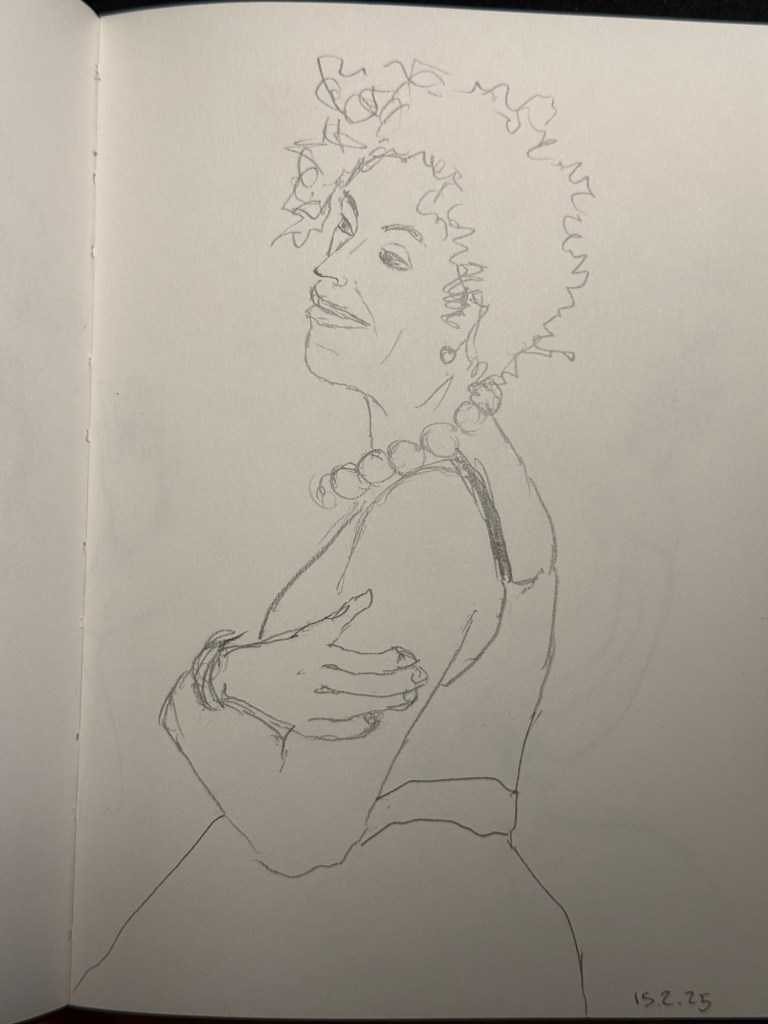
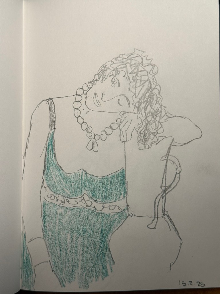
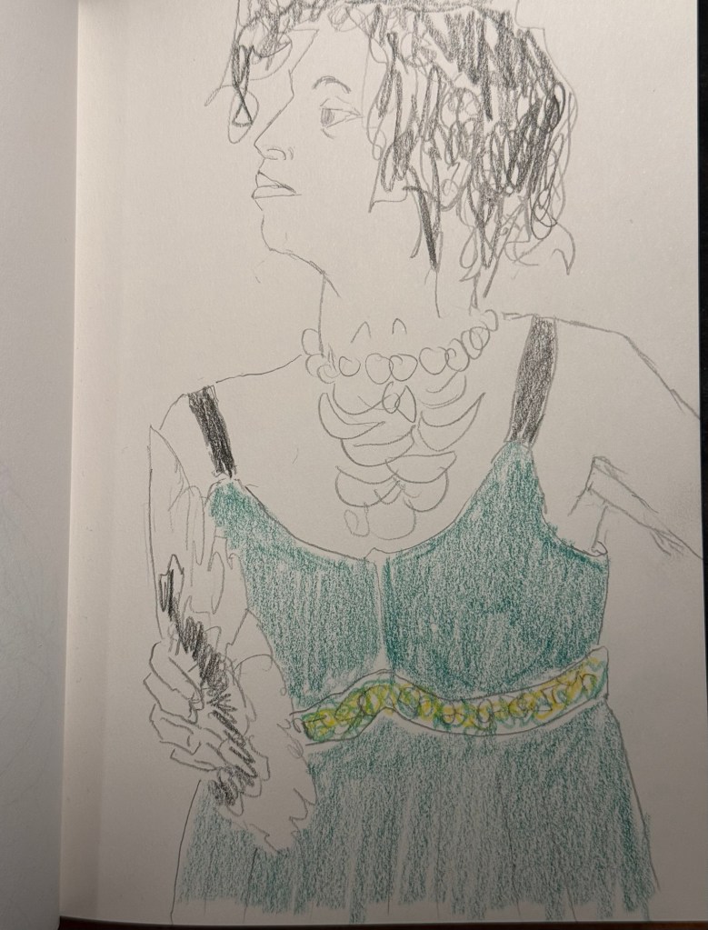
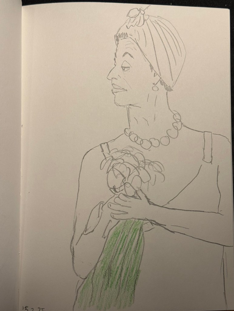
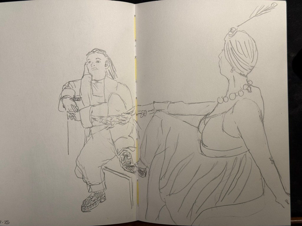
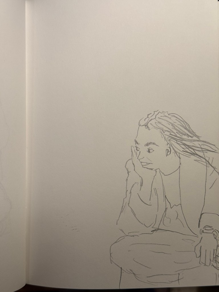
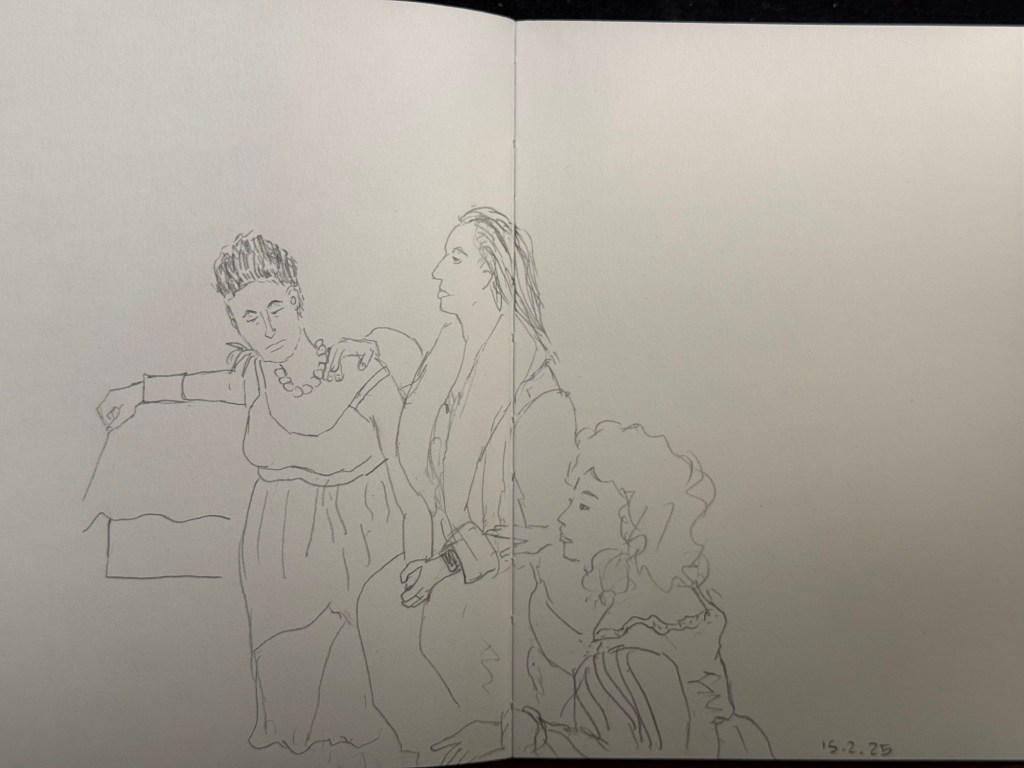
I went to the local art museum again this week, to sketch models in the museum. This was the last time this event was run, and the place was packed with sketchers. I didn’t have the best of locations, but I made the most of it. I sketched with Faber Castell 9000 2B and 3B pencils mostly, and added a touch of colour with Faber Castell Polychromos. The ink sketches were done with a Staedtler Pigment Liner 0.5. The sketchbook I used was once again the French Pascale Éditions. The models did fewer 20 minute poses and more 10 minute ones, which meant scrambling a lot. I wanted to visit the museum after the event, but I was so tired from 3 hours of non-stop sketching that I just went home.
Harman Photo just came out with a brand new colour film, Harman Red. It’s a red-scale film, and I’m curious enough to try and buy a roll or two and test them out. I love the wild, wild results I got with Harman Phoenix and the Harman Red is basically Phoenix pushed even more into red-scale.
Here are the sketches from today, and I hope that you have a great week!
10 minute pose.10 minute pose.10 minute pose.10 minute pose – the hardest pose to draw because of the angle of the head. Had a false start on this one, so had only about 8 minutes for this. 10 minute pose – Staedtler 0.5 pigment liner10 minute pose10 minute pose10 minute poseThe three models. The pose started with just the two top models, and then the third one joined, and it was a 10 minute pose.A challenging composition, 20 minute pose10 minute pose. I like the composition on this one – I placed her on the side of the page to give her room for thought. Final pose, 20 minutes
With One Week 100 People I’ve been using my fountain pens much more to sketch with, and I fell in love with them again as sketching tools. There’s something about the expressiveness of the line that they bring in that reminds me of pencil more than of fineliner pens when it comes to sketching – a combination of their varying line width and the varying ink shade.
I’ve also purchased more fountain pens than I planned, buying two Franklin Christoph pens from the pen models that they’re retiring: A model 46 in Polar Ice with an extra fine nib and a pocket 66 Italian Ice with a flex extra fine nib. These two join the Leonardo Momento Zero Grande 2.0 Galattica that I purchased from Pen Chalet last month, and the Leonardo Momento Zero Nuvola rose gold that finally arrived this month after I purchased it from Fontoplumo and it was stolen during transit. Fontoplumo were wonderful, and replaced the pen immediately, so I intend to purchase from them again.
I haven’t purchased so many new fountain pens since before the pandemic, but the Leonardo Nuvola was a gift to myself to celebrate two years from chemo, and the Galattica was a gift to myself for surviving a hellish month with my father in hospital. The Franklin Christophs were unexpected purchases made only because they were retiring these models and I was curious about these materials (I already have an Antique Glass model 66 and I love it).
Writing samplesThe pens
So far the biggest success in terms of nib has been the flex extra fine Franklin Christoph Pocket 66 Italian Ice. The nib has only a slight springiness to it, and I wouldn’t call it a flexible nib in the true sense of the word, but it works well for both sketching and writing. Diamine Earl Grey is one of my favourite inks (a bluish grey with tons of character that is legible even with very fine nibbed pens), so I didn’t hesitate filling an eyedropper pen with it. As eyedroppers have such a tremendous ink capacity, you always need to take into account just how much you love the ink you use in them.
The Leonardo Momento Zero Nuvola was a surprise in terms of the resin on the pen body (I was already familiar with LMZs fantastic fine flex nibs, and great pen and converter design). I was expecting a light blue pen with white “cloud” blotches and black outlines. In reality the black outlines are in a semi transparent brown resin, the white is more off-white/cream, and there’s real depth to the design. A very unusual resin that is both classic and unexpectedly unique.
Caran d’Ache discontinued their ultra-expensive and ultra-sought-after ink series “Colours of the Earth” in 2013 and I managed to get a bottle of the entire series besides Carbon right after they announced they wouldn’t be making them (I had bottles of Amazon, Safron and Sunset before they were discontinued because those were the ones that interested me the most). These inks are well over 10 years old and still fantastic, though the Amazon (the green ink) has darkened a bit and so lost some of its depth. The Caran d’Ache bottles are both gorgeous to look at and terribly designed.
Diamine Coral is the most optimistic of inks, a brightly bright coral ink that glows on the page and works best in generous nibs. I felt like a pick-me-up so I filled the Woodshed pen with it.
I made some interesting eexperiments with notebooks and tried a few new pencils, but this post is getting a little out of hand and so I’ll write about those in a separate post.
Did you use any interesting stationery last month?
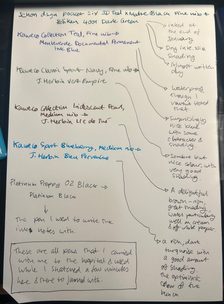
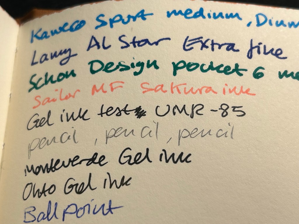
I started the month ready to spend the first half of it in hospital, with my dad. So the fountain pens I chose were all expendable pocketable pens that I was willing to have stolen (apart from the Schon Design Pocket 6 which was a leftover from January and never left my desk). So that meant I inked 4 Kaweco Sport fountain pens using various ink cartridges that I had on hand.
The portable lineup:
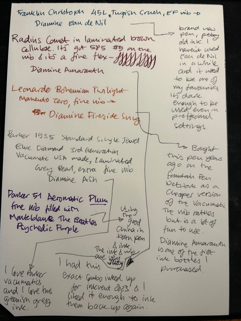
Once my dad got out of hospital and back home, I decided to celebrate by “shopping” from my collection. I inked up a Parker 51 Plum (use the good china!), a Parker Vacumatic, a Franklin Christoph 45L Turqish (spelled like that on their site) Crush that I had purchased but hadn’t inked before, and a vintage Radius Comet (because I heard that the brand was being revived).
The Franklin Christoph EF nib isn’t the best companion to the Eau de Nil as the ink tends to dry in the nib, causing hard start issues. The Radius is a flexible nib of the vintage kind, which means it’s really flexible and not just springy. It also rattles, which makes me not carry it around with me — it stays at home at my desk. The Leonardo is a beautiful pen with a beautiful ink that I refilled immediately — the only Inkvent 2023 ink I did that with. The two vintage Parkers are phenomenal, as usual. The extra fine nib on the vacumatic somehow really well with Diamine Ash, though I was worried at first that the combination would be too light to be readable. The Parker 51 Aeromatic is a treat to use. It’s the rare Plum colour, and it’s got a fantastic nib (as all 51’s have) which pairs very nicely with the Monteblanc The Beatles Psychedelic Purple.
In terms of paper I’ve been using Kokuyo A4 KB paper which I cut to half size (so A5) to manage my daily to do list. The paper is relatively cheap and very fountain pen friendly. I’m also able to use both sides of the page despite there being some show through.
Kokuyo A4 KB paper cut in half to A5 size. This is why standards are great.
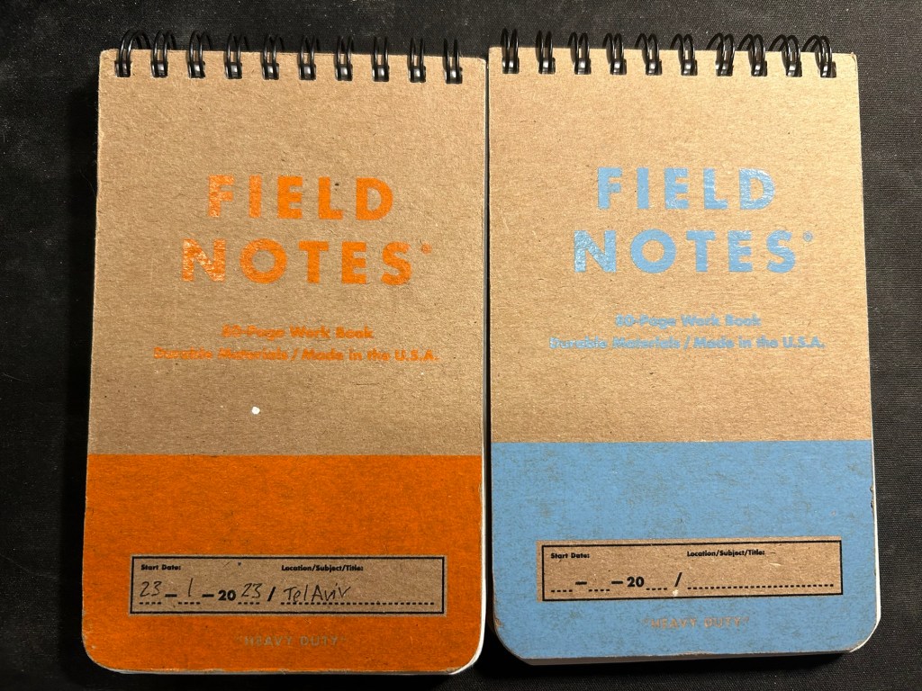
I’ve got a Field Notes Heavy duty on my desk at home and at work, and I just bought a new stock of them. These are where I jot down quick notes, phone call details, doodles during boring meetings. When they’re filled up they get tossed out as nothing in them is permanent — everything important in them moves to somewhere else as I work my way through them.
Field Notes Heavy Duty pocket spiral bound reporter notebooks
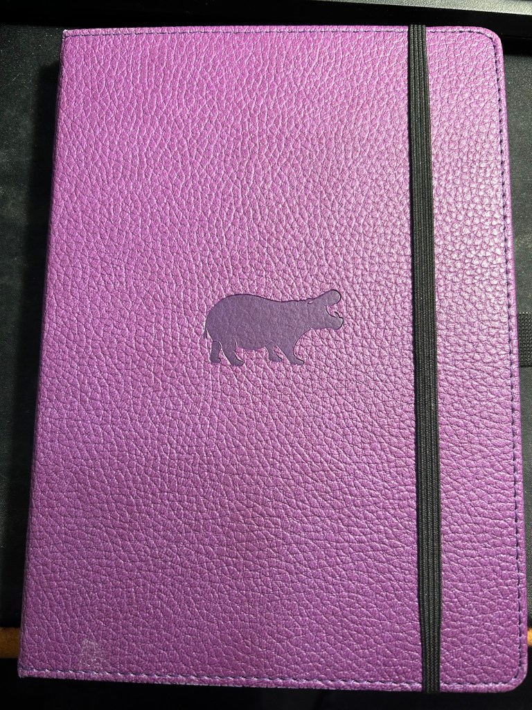
I have finally found a use for my Dingbats notebooks (beyond giving them away as gifts, as I have in the past): this lined purple hippo one is my blog notebook. I discovered that I have a much easier, much quicker time writing blog posts if I first draft them on paper, and this is where I do it in. I’ll likely write a dedicated post to this notebook soon.
Dingbats Puple Hippo A5 lined notebook
Apart from them I still use the notebooks I used last month.
Pencils
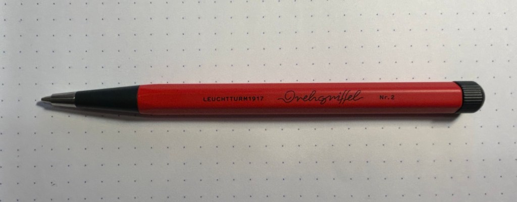
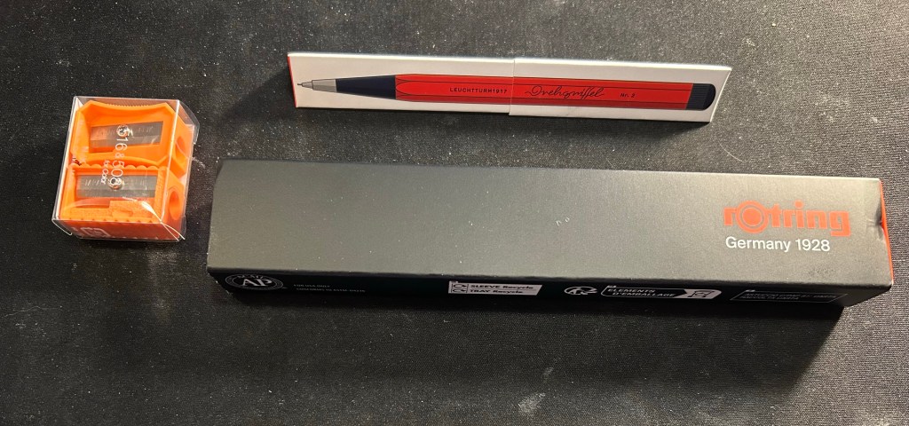
I’ve been using the Drehgriffel Nr. 2 as my daily driver. I use pencils extensively to plan, as my plans tend to change, and there’s something about this solid little mechanical pencil that makes me want to use it.
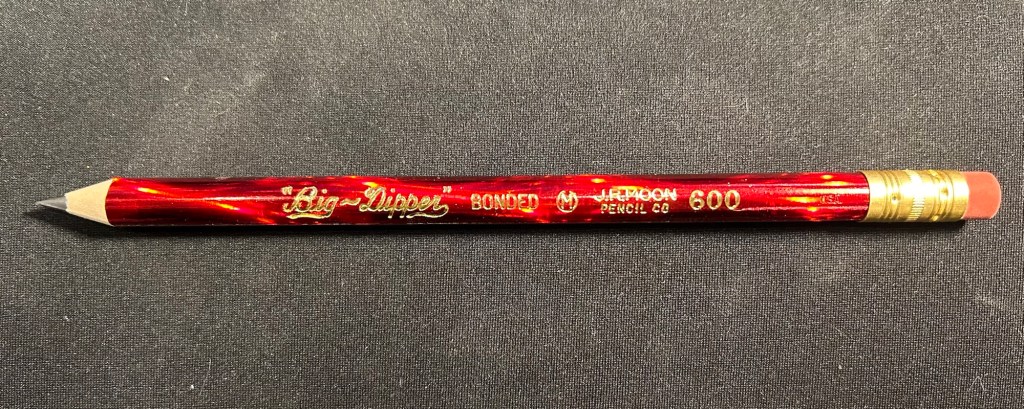
Apart from that I brought two pencils into the rotation, to try to use. One is from my last purchase from the late and great C.W. Pencils Enterprise, and it’s the “Big Dipper” J.R. Moon Pencil Co 600. It’s an oversized pencil, the kind of pencil that kids who are learning to write are expected to use. I’ve been having pretty significant neuropathy in my hands lately and I thought that this would be nice and easy to use, as after all it’s designed for kids just learning to develop their fine motor skills. So far it’s been a disappointment – the eraser and ferrule make it very top heavy, and I’ve been having a hard time manipulating it. I can’t imagine kids using this pencil and having an easy time with it. I like the over the top red foil with gold writing look though, so I haven’t given up on it yet.
Big Dipper J.R. Moon 600
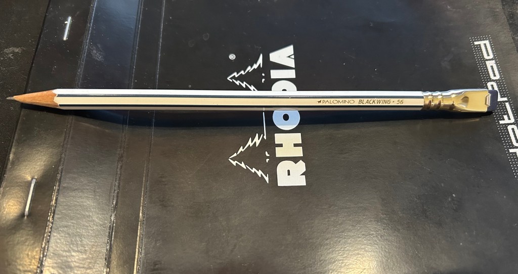
The second pencil is a Blackwing Volumes 56, the baseball themed one. The core is soft and dark, and I’ve been using it for quick and loose sketches. I’m trying to ease into one week 100 people by training myself to work faster than I normally would.
Blackwing Volumes 56
What did you use in February? Any planner changes? Pencil revelations? Pen preferences?
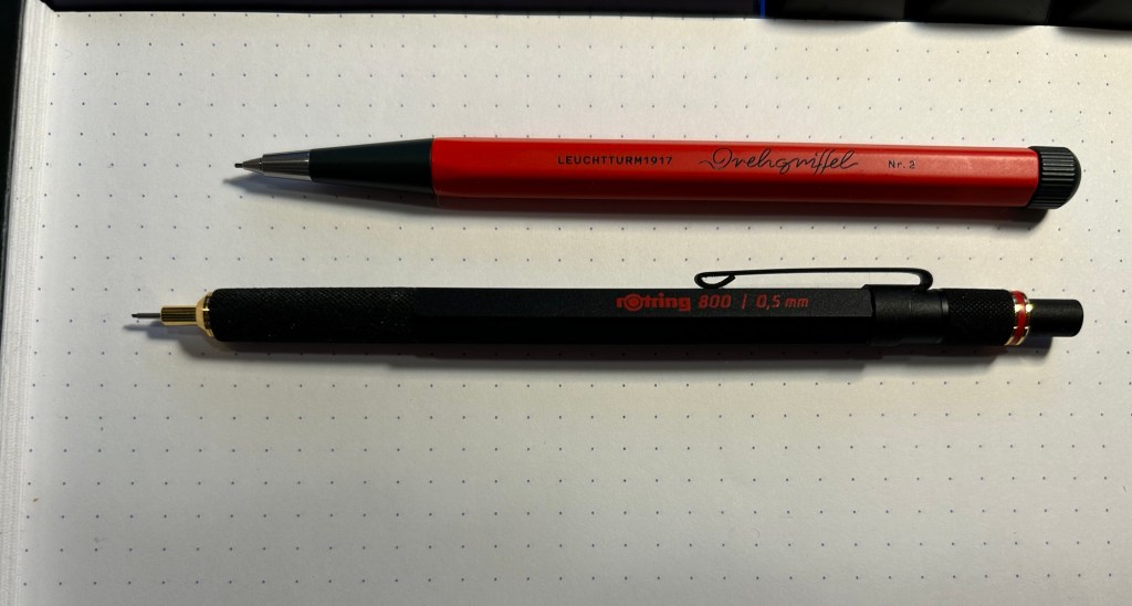
The Leuchtturm1917 Drehgriffel Nr.1 is a charming little pen that comes with either a gel refill or a ballpoint refill. The Drehgriffel Nr. 2 is its pencil counterpart: a short but hefty mechanical pencil with a twist mechanism that comes in a variety of colours. My pencil is a bright red and dark grey one, and it has quickly become my most used pencil by far.
Small but mighty, the Drehgriffel Nr. 2
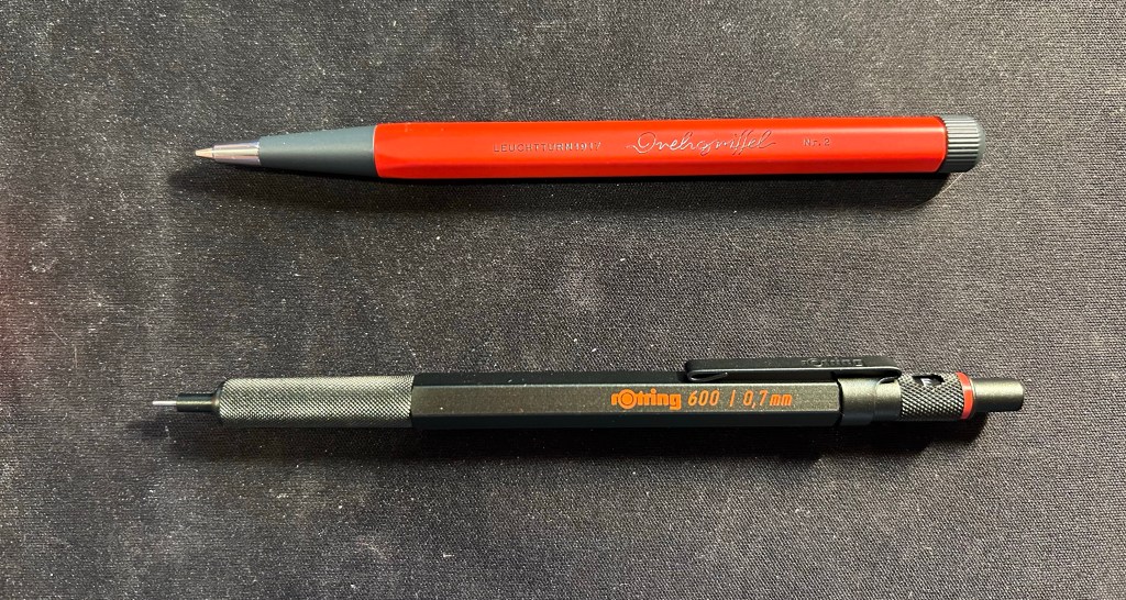
The pencil is shorter than other mechanical pencils, but as it’s an aluminium bodied pencil with a steel tip it has some weight and heft to it. It’s lighter than the Rotring 800, and the weight is balanced towards the tip so it’s very comfortable to use.
Drehgriffel Nr. 2 on top, Rotring 800 on the bottom
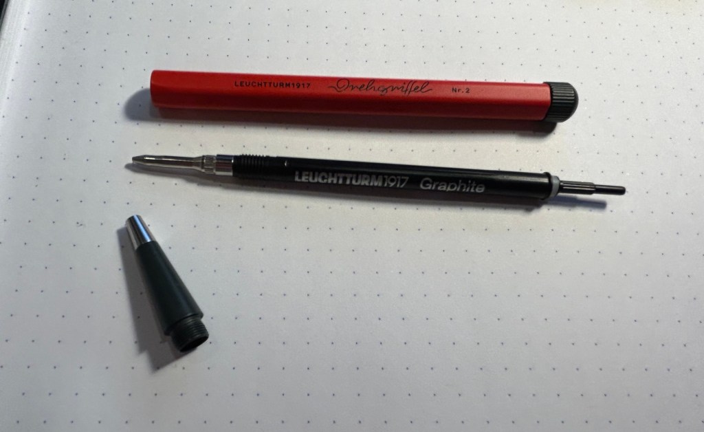
The pencil mechanism is proprietary to Leuchtturm, and it’s a pretty unique affair. You give the nob on the top a quarter twist and then you hear a satisfying click and the lead advances. The pencil mechanism looks like a gel ink or ballpoint refill, but the little pole on the top pulls out and you can add more pencil leads to the pencil that way. You get to the mechanism through unscrewing the front cone tip of the pencil.
The Drehgriffel Nr. 2 and its mechanism
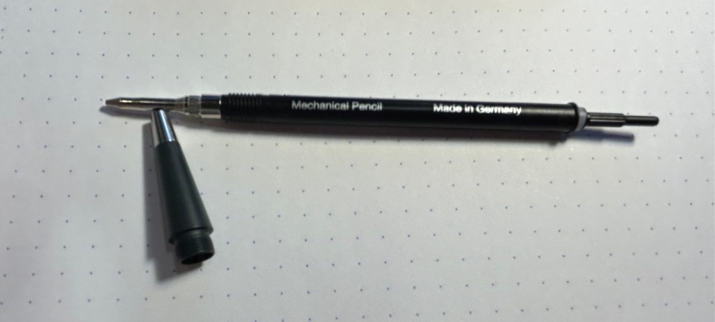
Here’s a closeup of the mechanism (my camera had issues focusing on the lettering):
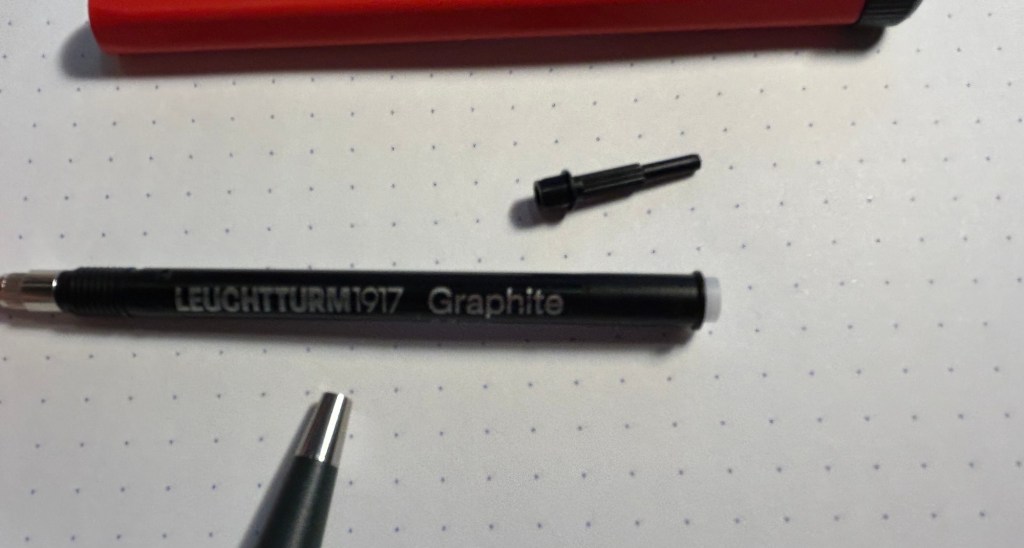
Here you can see where the leads go in:
The Drehgriffel Nr. 2 is a 0.7 mechanical pencil and it comes with HB leads inside. It’s a great pencil with a classic, sleek design, and a very solid and unique mechanism. The size is plus as it makes it ideal for everyday carry, and it doesn’t have the silly little eraser that certain mechanical pencils have and is always terrible. The only minus to this design is that to add more leads to it you basically have to take the pencil apart. That’s no big chore, but the end bit (the little pole thing) is very small and would be easy to misplace. I’d suggest doing the refilling in batches of a few leads at a time, and being careful to not lose sight of the mechanism end bit.
Otherwise this is an excellent mechanical pencil, a solid and handsome little workhorse that’s a joy to use and would make for a great gift even for people who are not great pencil lovers.
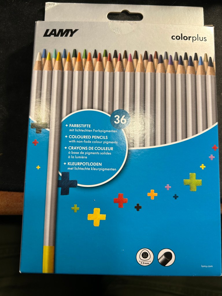
I rarely write reviews that trash products— because I tend not to waste my time and money on products that could potentially be bad. However, I was stuck in Tampa’s airport on a very long connection due to inclement weather and so I browsed their bookstore and found this:
Lamy ColorPlus 36 coloured pencils
Well it says Lamy on the box, so it can’t be bad, right? And it was just $15 for 36 pencils…
This is where the red flags should have popped up, but they didn’t. I bought the pencils.
When I got home and opened the box, my heart sank. The leads were broken on almost all of the pencils. Now the box was in my trolley, well protected from dropping or crushing, so there was really no reason for this amount of damage. I checked the back of the box:
“Highly resistant to breakage” it is not.
The pencils are triangular shaped, which is supposed to make them ergonomic. It makes them more unpleasant to sharpen, as there’s a steep “bump” whenever you turn the pencil to another side.
Triangular pencils
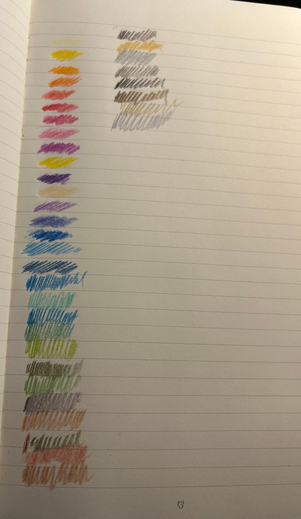
The colour selection is weird — there are a lot of various shades of brown, but no ochre. The browns themselves are nothing like the colours that you’d expect from their labelling. I use the term “labelling” loosely here, because there’s no colour labelling on the pencils, just a dip of colour that is vaguely similar to the actual pencil colour produced.
Pencil samples
The 36 shades chosen are wild – way to many similar brown, not enough greens, too many purples and blues, and of course utterly useless white and the bewildering gold and silver which are neither gold nor silver. Obviously the pencils crumbled while creating these samples so there are some duplicates here.
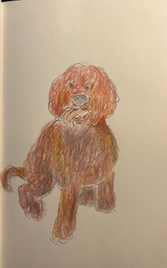
The pencils are very waxy, which means after 2-3 layers maximum the paper will be clogged and subsequent layers won’t be registered. The pencils also crumble easily —- even with very light pressure applied. Creating this sketch with them was nightmarish, as the leads kept crumbling, and I couldn’t get the shades that I wanted to the layering that I was trying to achieve.
Quick dog sketch
I honestly don’t understand why this product exists. It’s too expensive and not robust enough for children’s use, it’s definitely not artist grade (poor pigment, layering and no labelling), and even student grade pencils are properly labelled these days. In any case, save your money to buy better pencils. You deserve them.
While most of my fountain pen collection consists of vintage fountain pens, I understand that for many people purchasing vintage fountain pens is too risky. You might get a pen that needs repair, you might misjudge the value of the pen and overpay considerably, you might be buying a fake. As even the cheapest of vintage pens isn’t just a few bucks, making a mistake here could end up being very expensive.
Yet there’s a joy in vintage items, in seeing the craftsmanship, design and care put into them, in learning their history and placing them on a timeline, and in the knowledge that you saved something from the landfill. If you want to experience some of that joy with less of the risk of buying vintage fountain pens, vintage pencils are your friend. Flea markets are full of vintage pencils, pencil tins, pencil sharpeners, leadholders, etc that are usually very cheap to buy, and hold little to no risk.
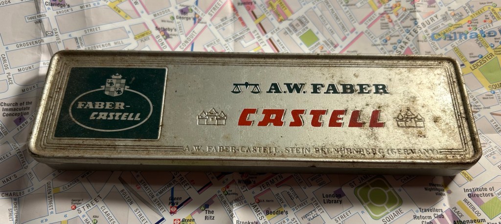
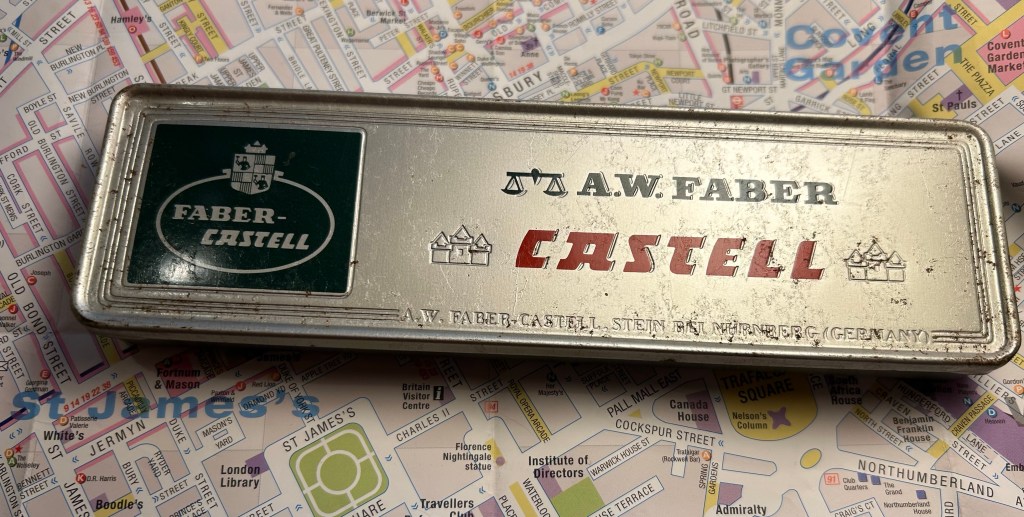
When I was in Spitalfields market, buying vintage books, I saw this tin propped up against a bookshelf in the stall I was purchasing my Arthur Ransome books from. This is how it looked:
Grimy but not full of rust or beaten up A.W. Faber Castell pencil tin.
It’s an A.W. Faber Castell pencil tin, and after just a few minutes with some wet wipes it already started to look better:
A bit cleaned up.
The tin and the pencils inside cost me only a few pounds, and truth be told I would probably have purchased the tin even if it was empty. The design and typography are absolutely delightful:
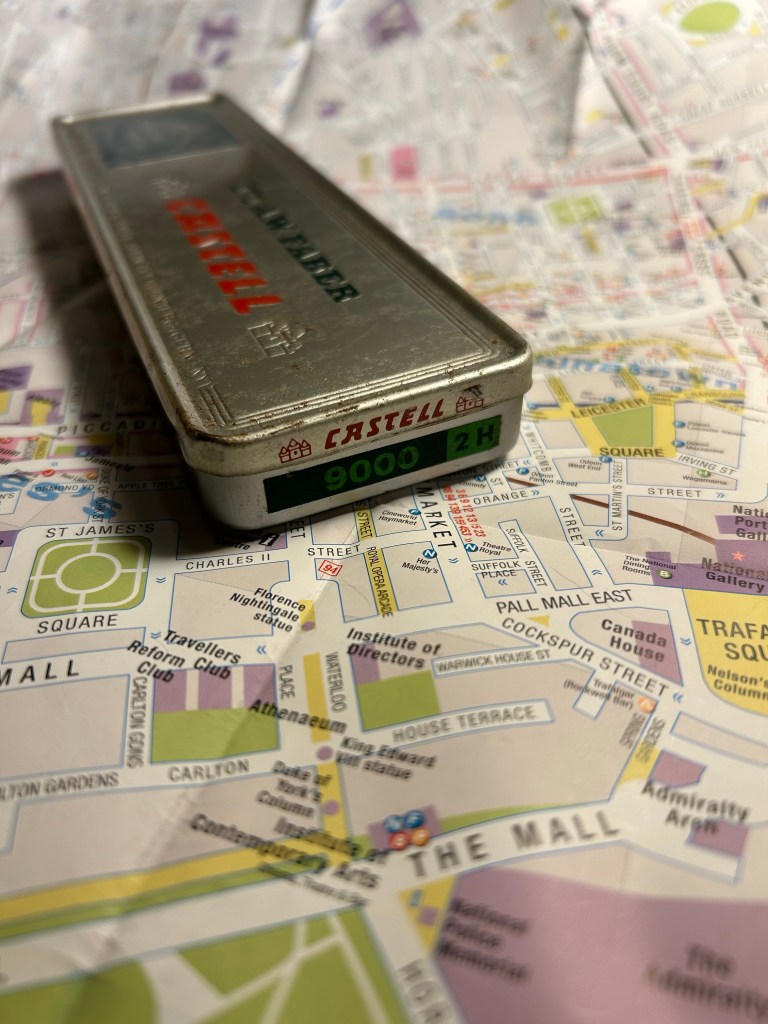
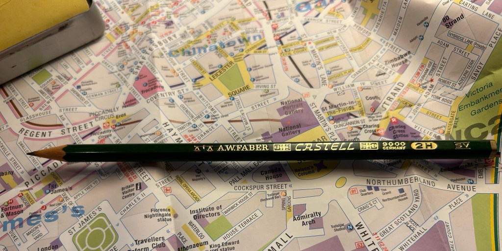
Castel 9000 2H. I can imagine having a stack of these in different lead grades on a shelf.
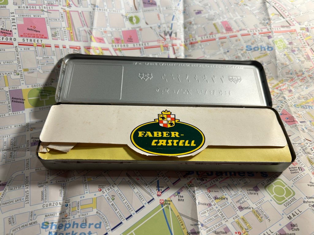
The over packaging continues inside – you wouldn’t want your pencils rattling around in the tin, would you?
Paper insert to protect the pencils inside.
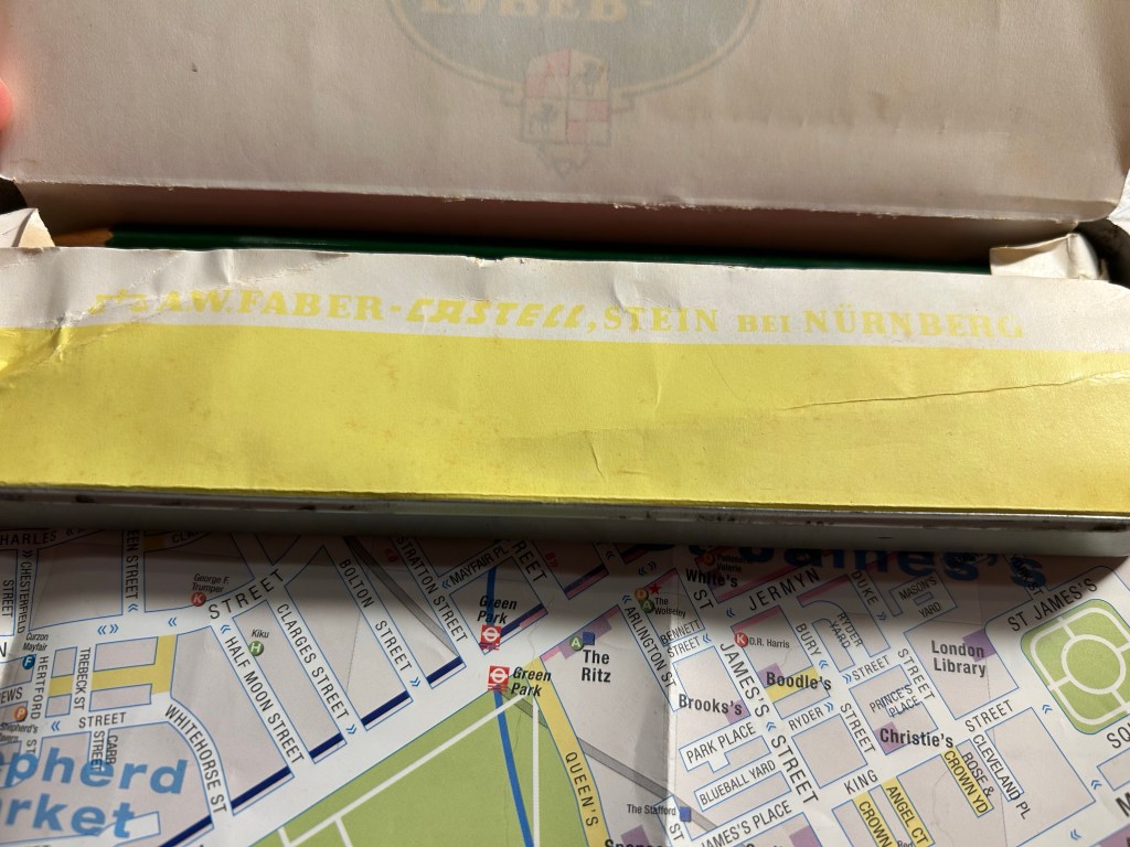
Faber Castell’s factory in Stein proudly represented on the outer tin and here too:
A.W Faber-Casterll, Stein Bei Nürnberg
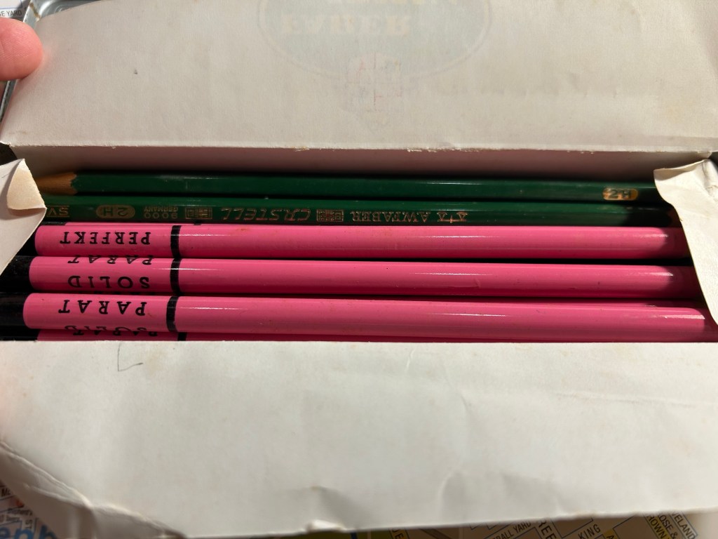
Inside were about half of the original Faber-Castell 9000 2H pencils, and half pink advertising pencils for a thread company that I think no longer exists.
It’s like opening a box of chocolates – you never know what you get
Faber-Castel 9000 are excellent artist pencils, and the vintage ones are just as great as the current ones in production, only they’re usually cheaper and have much better typography and logos on them. Look at this little masterpiece:
Vintage pencils always have a ton of stuff stamped on them. You needed the INFO, right?
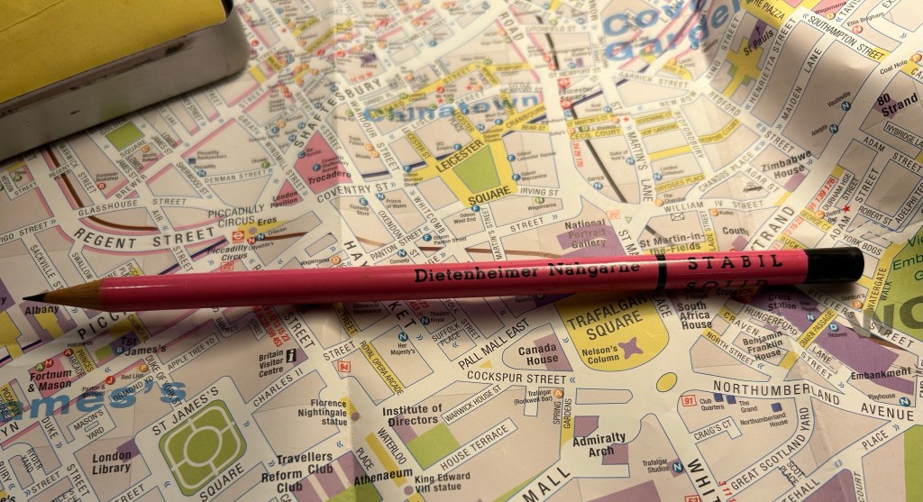
The pink pencils were round advertising pencils, for a German thread making company that seems to no longer exist. They are solid HB pencils, and have an 80s sort of vibe to them.
Advertising pencils.
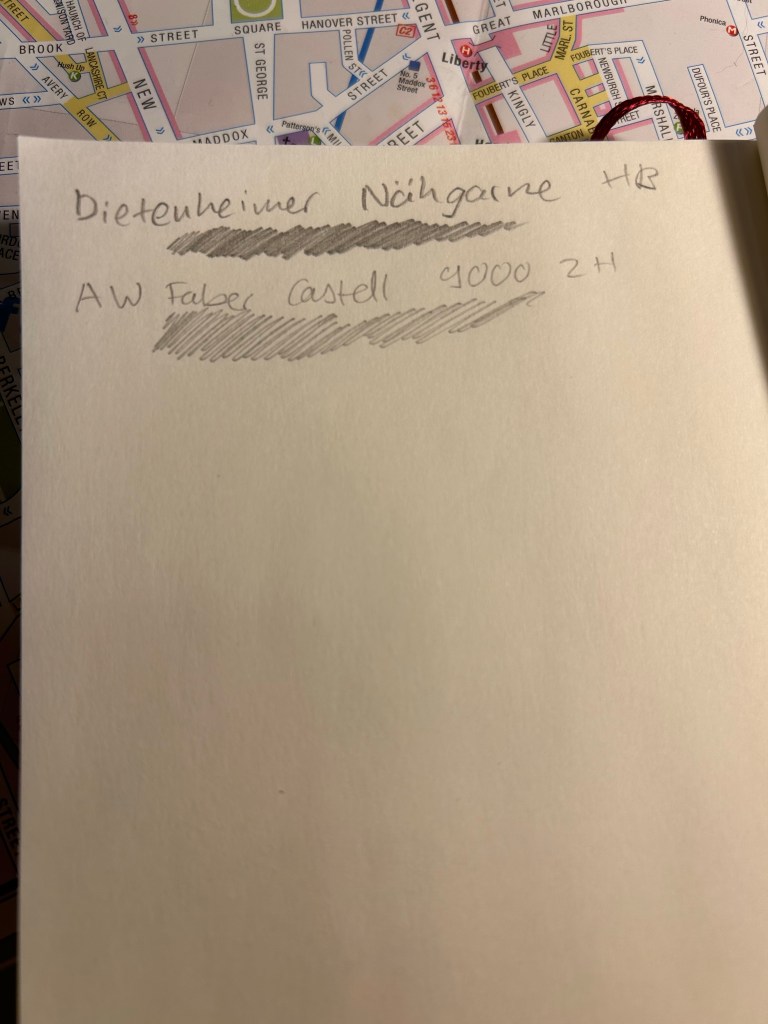
The great joy of vintage pencils is that they of course write just as they used to when they were originally made. If they have erasers they’re going to be unusable (these pencils don’t), and sometimes the wood is a bit brittle and dried out so a bit more care needs to be taken whilst sharpening them (these pencils are in excellent condition), but otherwise time affects pencils very little.
Writing samples
So next time you’re at a flea or antique market, rummage around its hidden corners for some cool old pencils to try out. You never know what you’ll find — I picked up some Sanford Noblots from a giant jar of pencils that way.
P.S. If you’re wondering, 2H pencils are perfect for watercolour under-sketches, as so long as you keep your pressure light, they disappear beneath the paint.
Over the past 24 hours things have gotten very depressing and very scary here. To distract myself a little bit, I decided to start working on a new project: Going Shopping in My Stationery/Art Supply Stash. I have a lot of stuff. I don’t use enough of the stuff that I have, to the point where I don’t even remember what I have. As I’ve significantly cut down on buying new stationery and art supplies, I’ve decided this would be a good time to go “shopping” for new things to use in whatever it is that I already have.
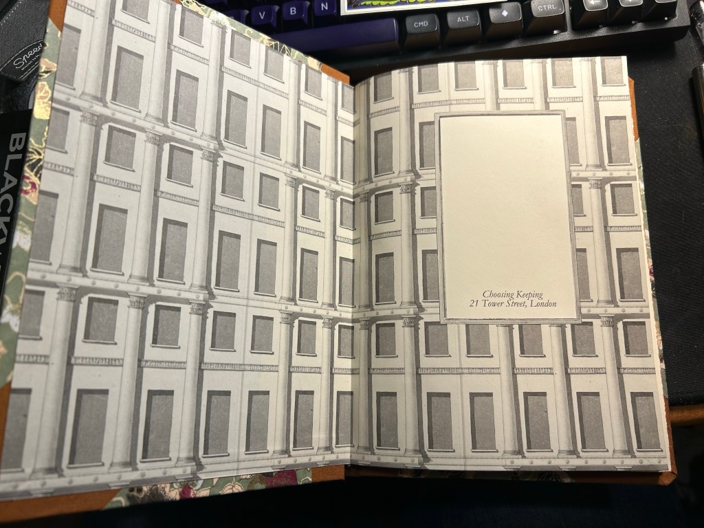
I bought this fancy looking A5 composition notebook from Choosing Keeping in London this April, after eyeing their gorgeous notebooks the last time that I was there.
Such a great looking notebook. Yes, the cover has gold foil on it.
The endpaper is also very good looking:
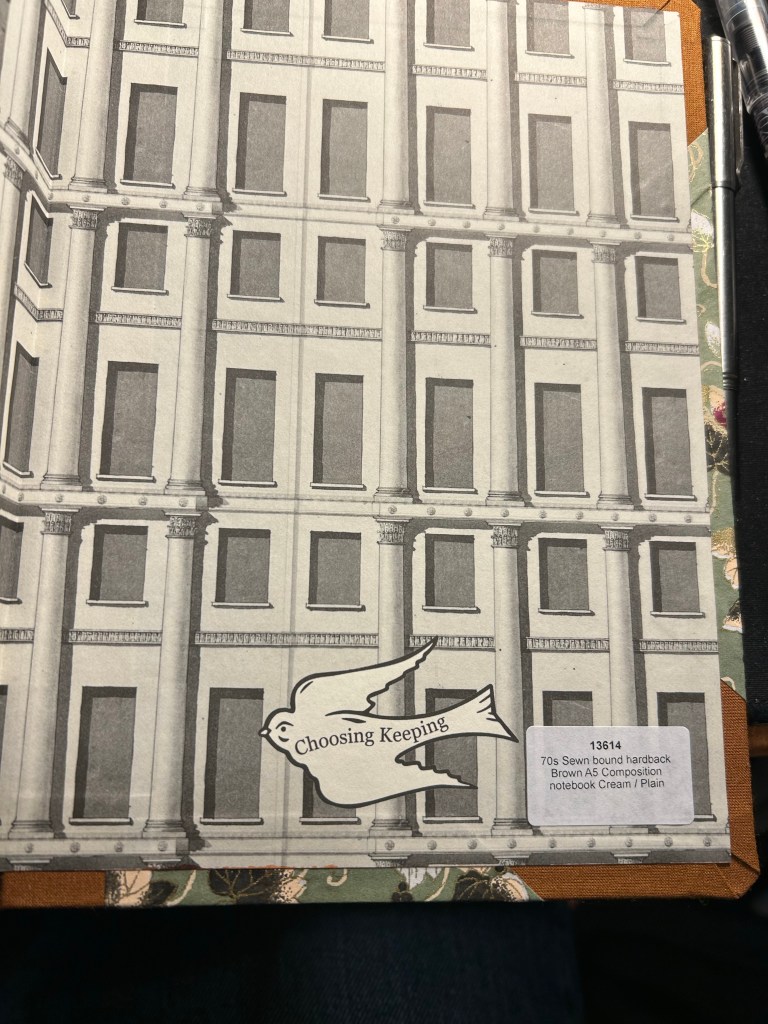
Front endpaperBack end paper with the Choosing Keeping bird sticker, and details on the notebook.
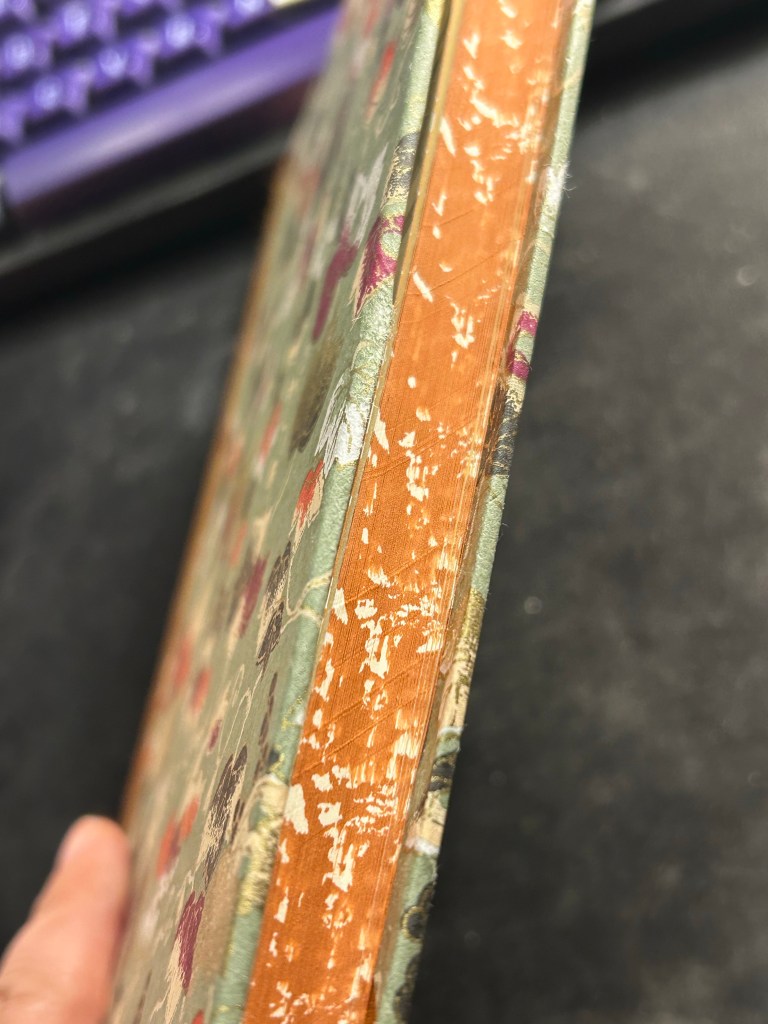
The paper is cream and unruled, and the edges of the paper are mottled brown. It is one of the best looking notebooks that I have:
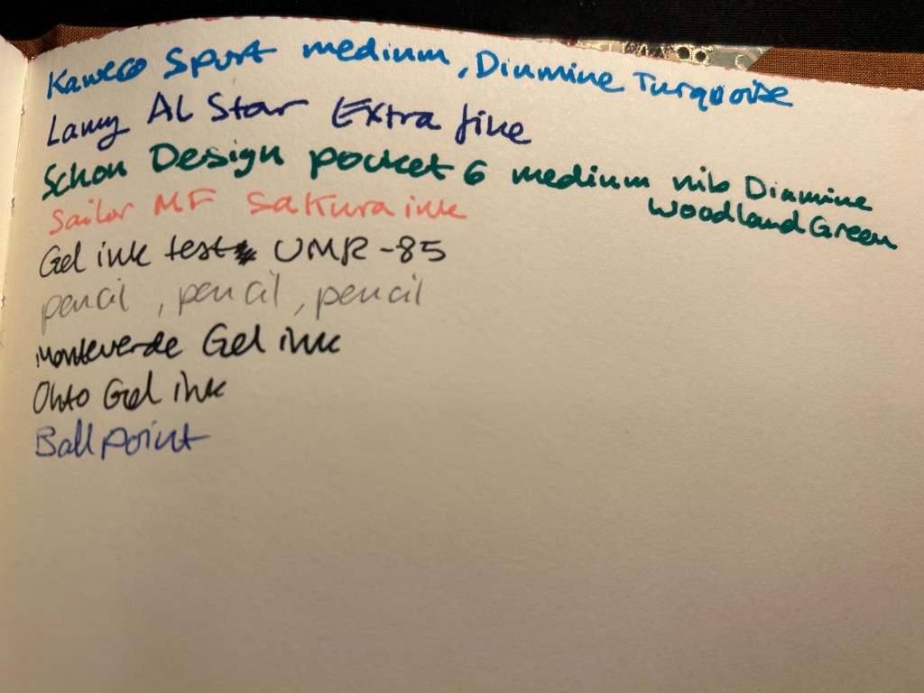
I was planning on using it as a journal, but the paper was an utter disappointment. It is not fountain pen friendly, which really surprised me — the ink spreads and feathers and bleeds through. I could have used a gel ink pen with this notebook, but it somehow seemed incongruous with how fancy and special (and expensive) the notebook is.
Ink test page
So I shelved it and I haven’t touched it in months, until today. My eye caught it as I was looking for a notebook to sketch in, and I remembered that the paper had some tooth and texture to it.
Closeup on the paper and the ink results.
It’s a soft, velvety kind of paper, which made me thing that it might work with pencil quite well. I also had some pencils I wanted to try out, so it seemed like a good opportunity to not let a fancy notebook go to waste.
Massive bleed-through
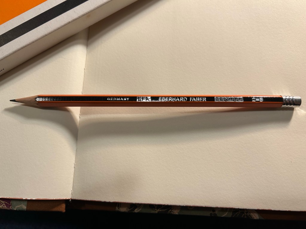
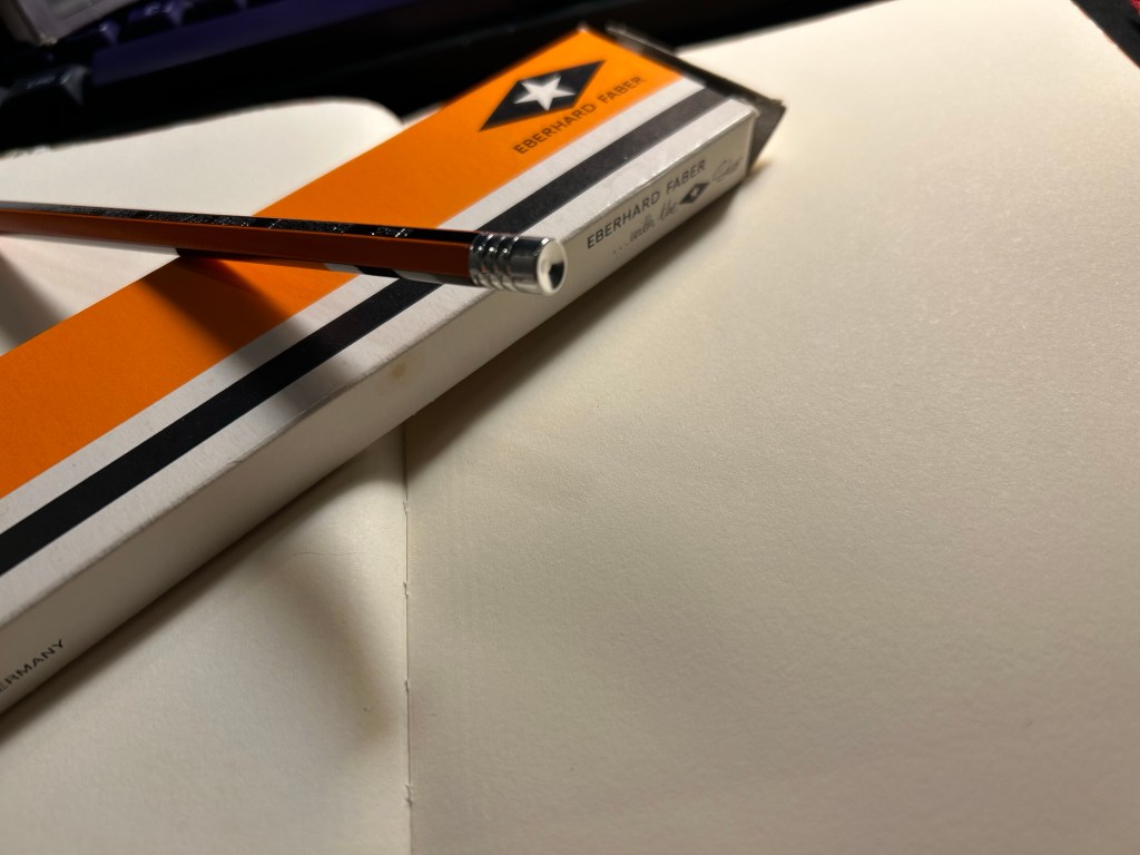
Enter the pencil that I wanted to try out most: the Eberhard Faber EFA 1000 vintage pencil in 2=B grade. I know, it’s weird. I don’t get it either. 2 is supposed to be HB. I bought a box of these beauties at during my last visit at Present and Correct, and I’ve been wanting to use them since. They’re made in Germany, the lead is a B grade (slightly softer and darker than HB), very smooth and it retains its point surprisingly long for a soft pencil.
Eberhard Faber… with the Star. I love everything about the design of this pencil and this box.
The pencil comes pre-sharpened, and has an orange and black body that looks a bit like the Staedtler Noris, but in orange instead of yellow. It has “Germany”, “EFA”, “Eberhard Faber”, “EFA 1000” and “2=B” embossed on it silver foil. The fonts used look very futuristic and modern, which makes me think that this is a ‘70’s pencil.
Very fetching design
The biggest issue with vintage pencils is the eraser, which is always dried up and completely unusable. For this reason I prefer vintage pencils that don’t have erasers, or better yet, those that have endcaps. Well the EFA 1000 gets lots of bonus points for not only having an endcap, but having a really good looking one. It’s also silver in colour, and it features three rings and a concave top.
The endcap
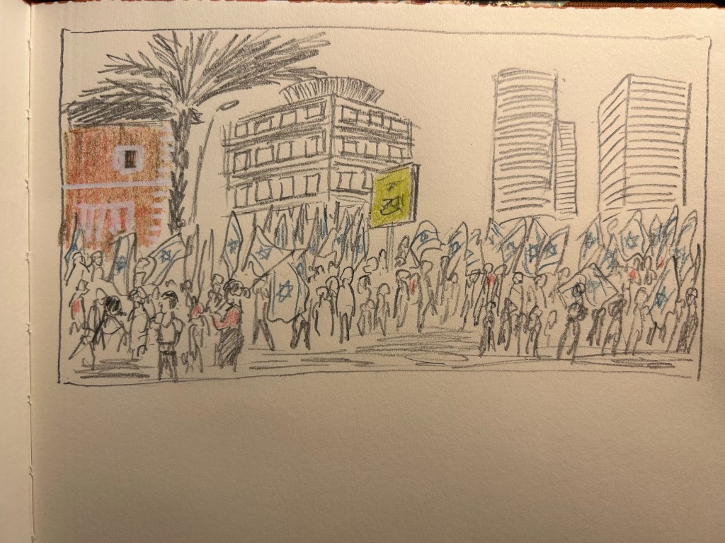
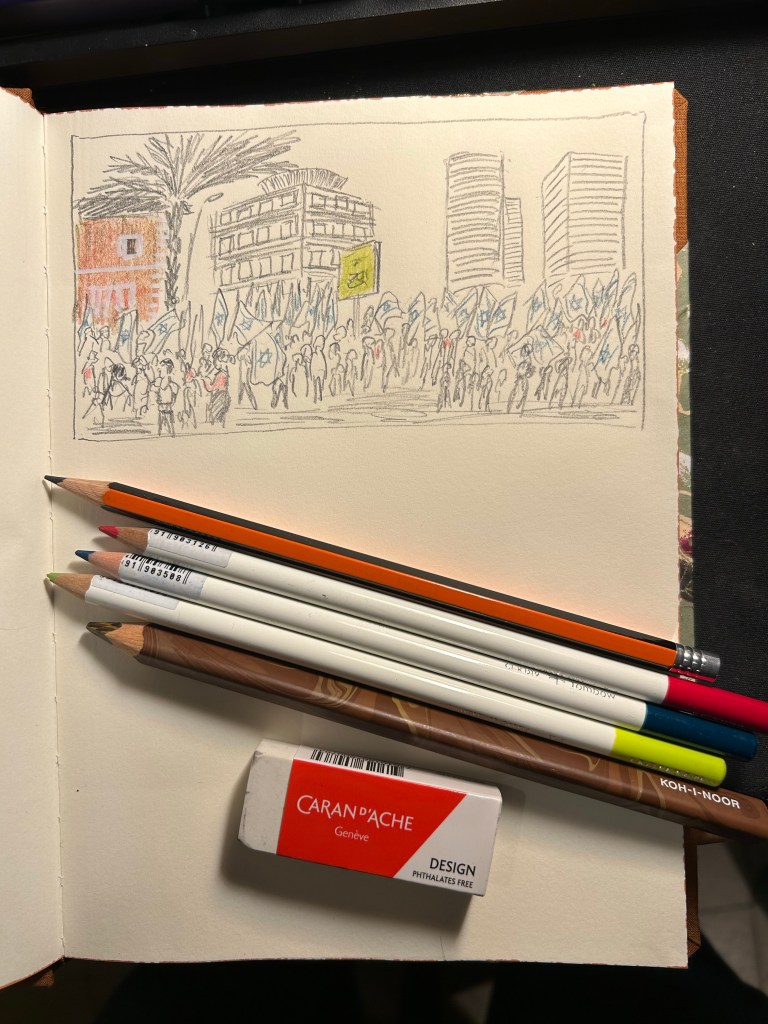
I then sat down to create this quick sketch of the latest round of pro-democracy protests. The pencil was a joy to use, and it worked very well on the paper. I was very happy with the feel of them both, and with the sketch results:
I added some colour with three Tombow Irojiten coloured pencils and a Koh-I-Noor brown Magic Pencil. The Tombow Itojiten was an utter disppointment. The green pencil crumbled twice, the others were mediocre at best. The Koh-I-Noor was a lot of fun, but brown works best with other coloured pencils layered on top, to give it some life.
Tools used here. Eberhard Faber EFA 1000, Tombow Irojiten, Koh-I-Noor Magic Pencil, Caran d’Ache Design eraser
All in all this first attempt at shopping from my own stationery stash was a success. The EFA 1000 is staying on my desk, I learned things about the Tombow Irojiten (I’m glad I only have three Itojiten pencils and not a box of them), and I got to use a notebook that I’d thought would just gather dust. This is definitely something I will try to do again.
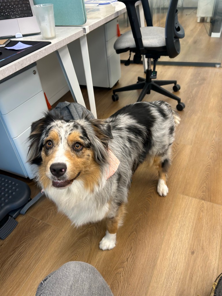
Trying out a new sketching setup so I decided to sketch Belle. She’s a young Australian Shepherd that belongs to a colleague and regularly comes to the office.
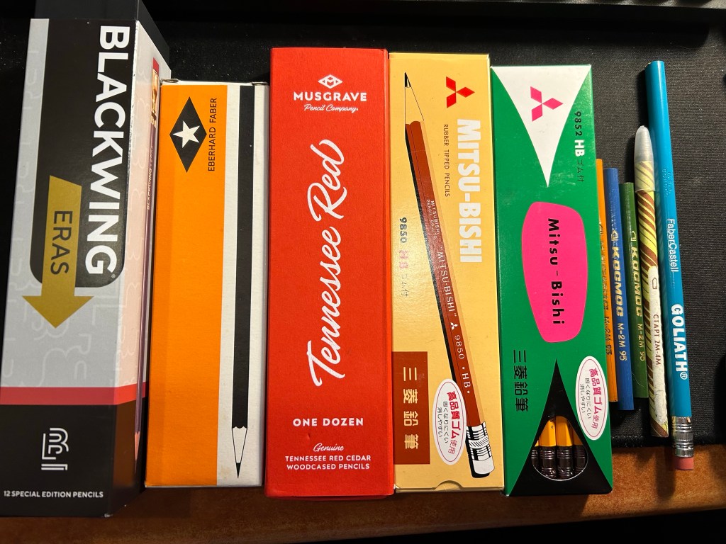
While I was in London I went to Present and Correct and purchased mostly woodcase pencils (and some paraphernalia). Here’s a breakdown of what I got there and why:
Blackwing Eras – I also purchased the previous Eras pencils from Present and Correct. These are very expensive (and overpriced) but after hemming and hawing I decided to splurge. These have the extra firm Blackwing core, which I enjoy writing and sketching with, with a little bit of zing with the nostalgic arrow punch design. I have a project in mind for them, and will feature them in a separate post them.
Eberhard Faber pencils. These are vintage, and I’ll post a review of them separately, but they are gorgeous and I love vintage pencils, so these were the first thing that I got once I saw them.
Musgrave Tennessee Red – I have several boxes of these, and yet I got another one. These pencils are gorgeous, and they’re great for both writing and sketching. Some people find their corners too sharp and prefer the rounds, but I’ve yet to obtain the round Tennessee Reds, so I can’t compare between them. I wrote a review of them here.
Mitsu-Bishi 9850 and 9852 – Japanese pencils. The 9850 is for “office use” and the 9852 is a “master writing” pencil. I have only one or two 9850s and I wanted a pack because they are excellent pencils. I haven’t tried the 9852s I think, and anything with that wild green and pink package with “master writing” on it is a must.
Loose USSR vintage pencils and graphite stick – I got these as a gift for my purchase at Present and Correct, together with the…
Faber Castell Goliath – a wide barrelled vintage, USA bonded pencil that was meant for school children just learning to write.
Woodcased pencil haul (and one graphite stick – the one to the immediate left of the Goliath)
I also got a set of salmon coloured Japanese pencil sharpeners there – I have another two sets that I bought there and enjoyed – one that I’ve gifted and one that I regularly use. There are surprisingly few pencil sharpeners of this kind that are actually good, and these are very convenient for my sketching kits as they are small and light.
I also got two mechanical pencils, one from London Graphic Centre in Covent Garden, and one from Gibert Joseph in Paris:
Sharpener set and two mechanical pencils
The top pencil is the Leuchtturm1917 Drehgriffel Nr. 2 mechanical pencil (purchased at London Graphic Centre). I will be writing a review of it once I get to use it a bit more, but for now I’ll just say that it’s an attractive desk object.
The bottom pencil is the rotring 600 in camouflage green. It’s the rotring 600 – one of the best drafting pencils out there – and the colour is a dark racing green that makes it look black upon casual glance. I bought this pen at Gibert Joseph in Paris and was about to go for the red rotring 600 when I realized that what I had thought was a standard black rotring 600 was indeed the green one. The colour is difficult to reproduce, but I find it fetching and intriguing, so I’m glad that I went for it instead of its red or blue counterparts.
Drehgriffel above and rotring 600 below
Overall I’m happy with my purchases, and can’t wait to start using them.
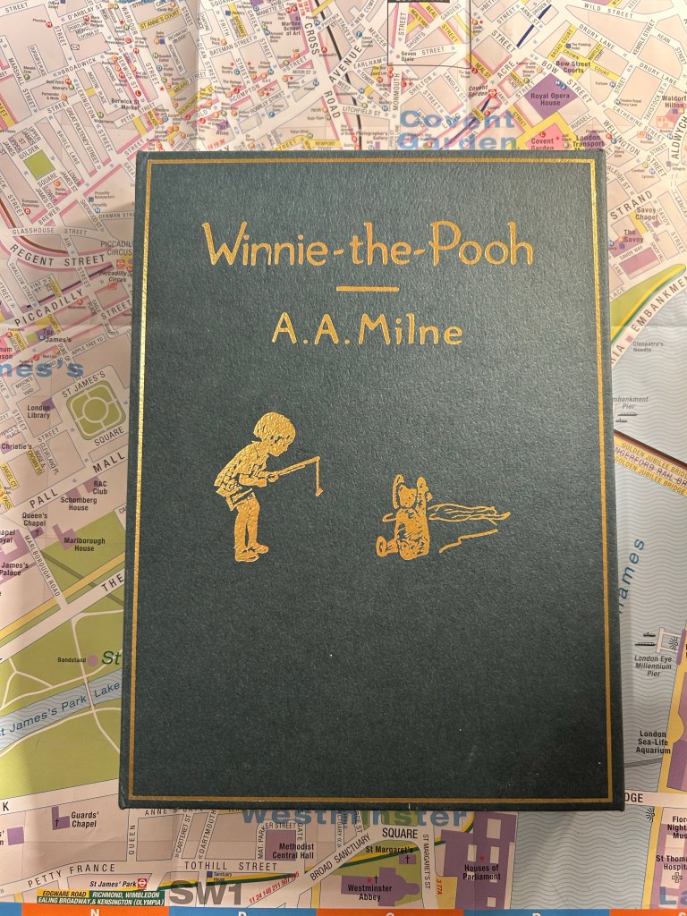
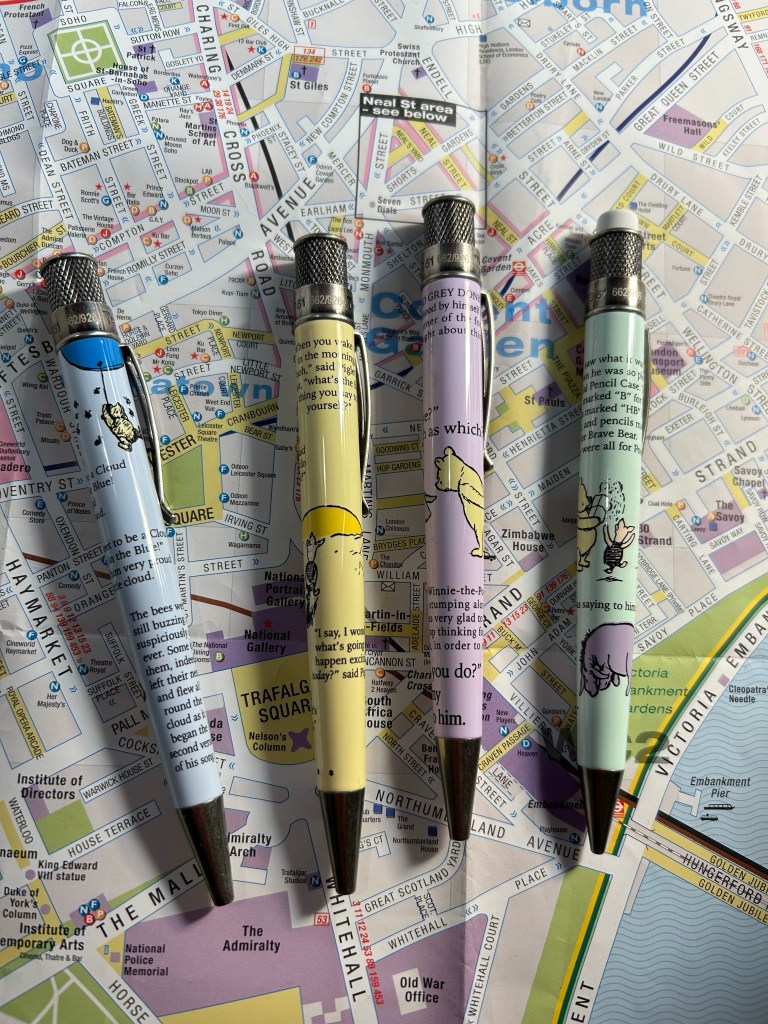
There’s a renewed interest in Winnie-the-Pooh lately, as it has come into the public domain (the copyright has expired). Retro 51 issued a pen and pencil set recently, which reminded me that I haven’t reviewed this Winnie-the-Pooh Retro 51 collection set, which came out last summer.The set included a box that looked like the original hardcover book, with three Retro 51 tornado rollerball pens and one mechanical pencil inside.
The box.
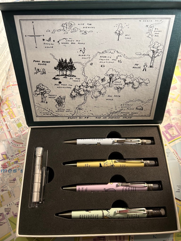
I’m usually not someone who cares very much for packaging, but in this case the cardboard box was too nice to toss out. It’s not just the outer cover that is thoughtfully designed, but there’s the famous map of 100 acre wood inside, and it is a delightful touch. Inside the box you get the three pens, the pencil, pencil leads and a tube of pencil erasers. Everything is held snugly inside, and the box has magnetic closure.
The full set inside the box.
The pens and pencil feature E.H. Shepard’s charming original illustrations, as well as various sections of the book. The blue pen features the scene where Pooh tries to fool a nest of bees into believing that he’s a cloud (from the chapter “Winnie-the-Pooh and Some Bees”). The purple pen features the first appearance of Eyeore in the book, and is a mashup of two Eyeore chapters (from “Eyeore Loses a Tail and Pooh Finds One” and “Eyeore has a Birthday”). The yellow pen features the final chapter in the book, a delightful conversation between Pooh and Piglet (from “Christopher Robin Gives Pooh a Party and We Say Goodbye”) and the green pencil features an excerpt from the scene where Winnie-the-Pooh gets a pencil case with pencils in them that say B for Bear, BB for Brave Bear and HB for Helping Bear. This is of course a clever reference to HB, B and 2B pencil grades, and Retro 51 decided to not only use this excerpt very appropriately on a pencil, but also…
Three pens and a pencil.
To put B, HB, and BB on the pens’ finials. That’s the kind of thoughtful design touch that I appreciate. The pens have stonewashed pewter accents on their hardware, and the pastel bodies are lacquered, like most Retro 51 pens. The set was limited to 926 sets worldwide (the original book was published in 1926, which is the reason for this peculiar number), and as it was very popular, I doubt that you’ll manage to get your hands on one unless they pop up on the secondary market.
Clever finials.
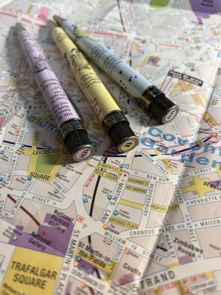
So why review a pen set that’s out of stock? Because less than a year later Retro 51 issued a Winnie-the-Pooh pen and pencil set that are equally charming, but lower priced (as it’s just one pen and one pencil). The stationery scene is full of limited edition pens, pencils and notebooks and it’s very easy to get carried away on the FOMO train. This is a gentle reminder that after every limited edition pen or ink, there’s another one not very different from it, if you chanced to miss out. Don’t pay crazy prices on the secondary market or beat yourself up for missing out on something without taking a pause and remembering that there are very few stationery items that are ever truly limited and irreplaceable.
Oh, and how are the actual pens and pencil? The same as all the non-limited Retro 51 pens and pencils: I dislike the Schmidt refill they use for the pens and almost always replace it with something else, and the pencil is ok – it features a 1.15mm lead that most people will find way too wide, and it’s hard to find replacement leads for it.