Carthage and Rome
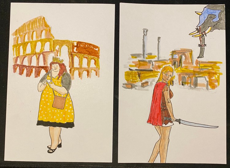
Drawn with Staedtler fineliners, Copic Sketch markers and Faber-Castell PITT brush pens. The actresses from the wonderful play “The Mystery of the Lost City Guardian (of Doom)”.
A blog about writing, sketching, running and other things
Drawn with Staedtler fineliners, Copic Sketch markers and Faber-Castell PITT brush pens. The actresses from the wonderful play “The Mystery of the Lost City Guardian (of Doom)”.

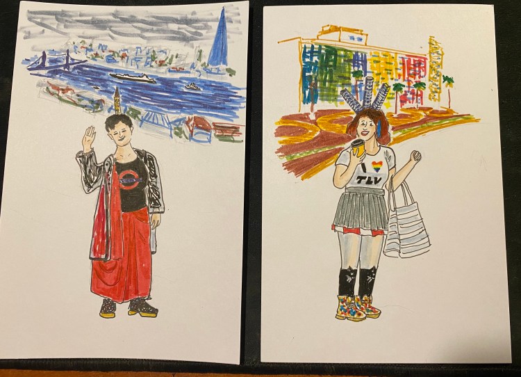
Tel Aviv at night is something else.
Drawn with Staedtler fineliners and various markers. The actresses from the wonderful play “The Mystery of the Lost City Guardian (of Doom)”.
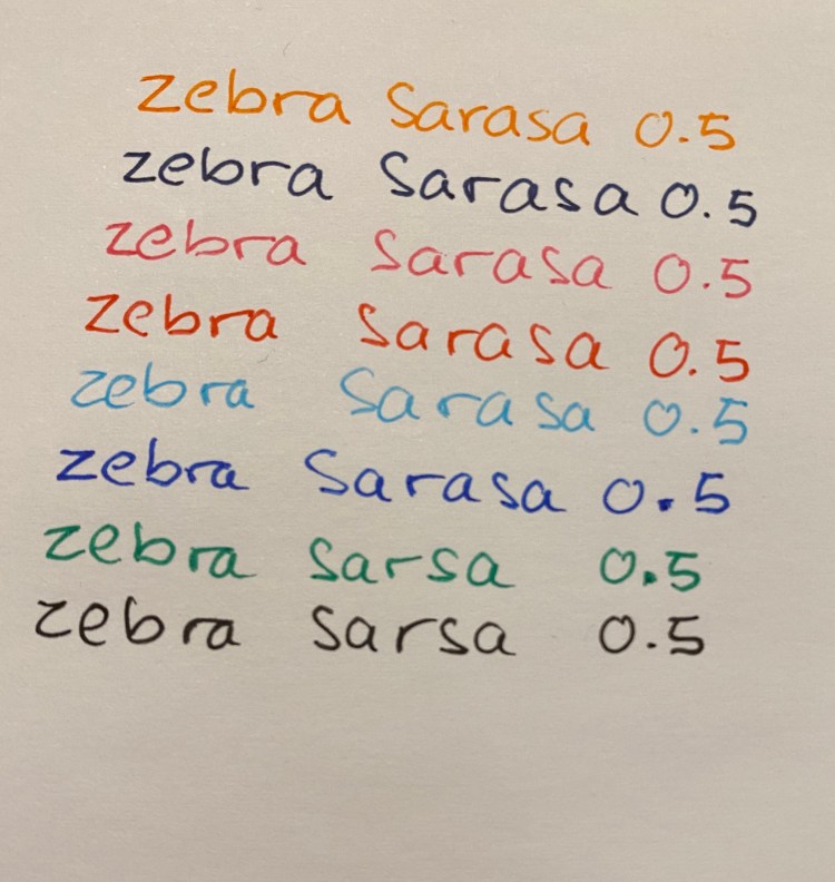
The Zebra Sarasa Clip is an excellent gel ink pen, with a unique and well done clip design. I have a bunch of the black and blue black pens laying around at home and in the office, and although I prefer the Uniball Signo line of pens, I do use them and recommend them to people looking for an upgrade from the Pilot G2.
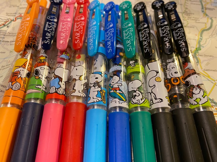
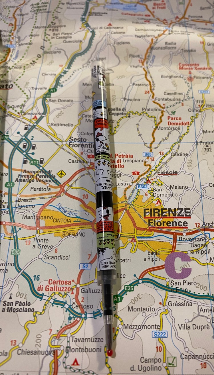
I don’t usually buy limited edition disposable pens because there has to be a limit, and I already own way too many pens. I can’t afford to start collecting all the Uniball and Zebra collaborations with various (usually animated) IPs. But sometimes Japanese makers manage to floor you with just how far they’ll go with their big-box, disposable pen lines, and the Zebra x Snoopy Sarasa clip line is that case. I just had to buy it once I saw it surface on JetPens.
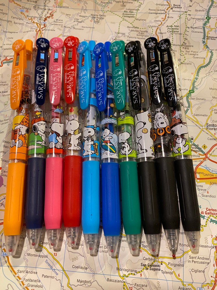
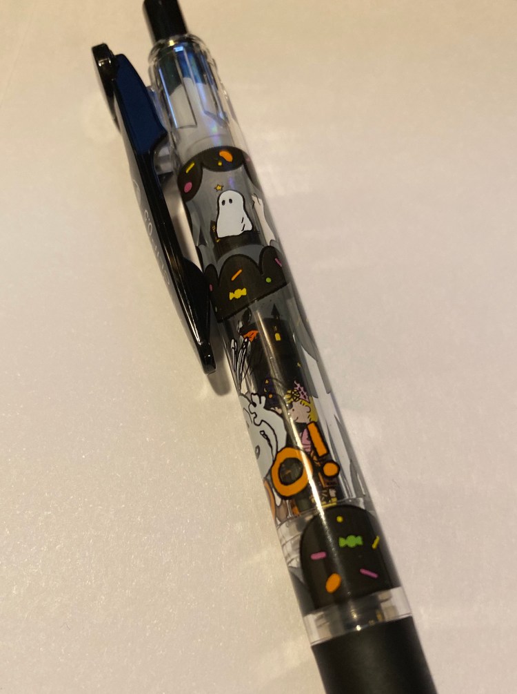
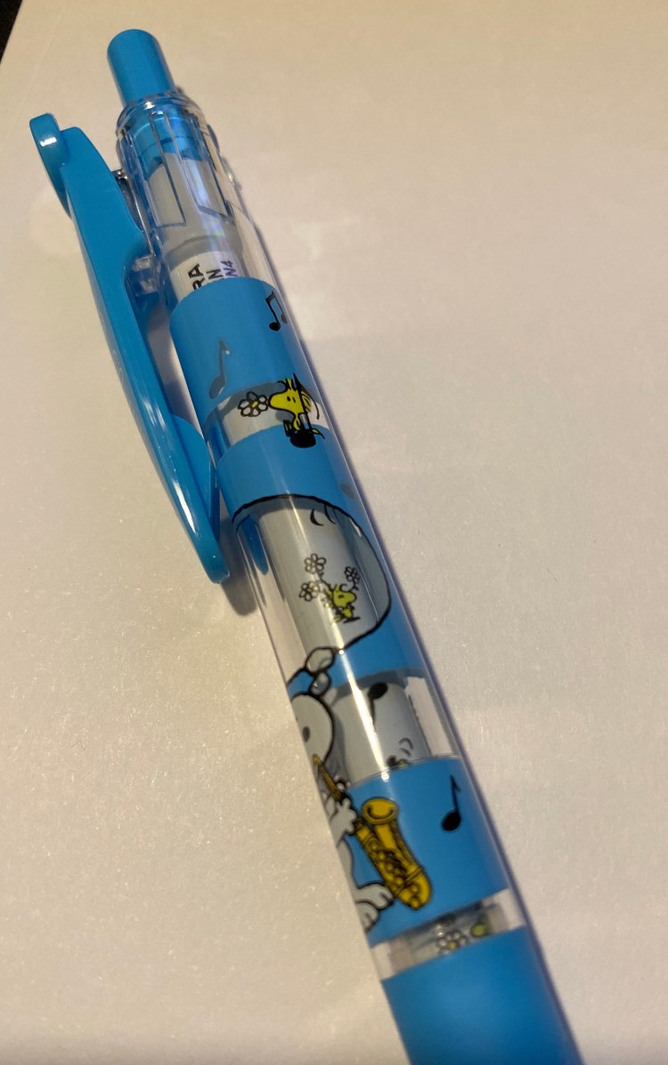
This is the 4th (!) limited edition Zebra Sarasa Clip Peanuts limited edition, and it consists of two sets of 4 pens (each in a plastic, resealable pouch), plus three extra stand-alone pens (two black and one blue-black). The clips have a drawing on Woodstock on the top and Snoopy’s head near the Sarasa logo. Each pen body has an opaque drawing of Snoopy and Woodstock doing something together, and two of the pens (the orange, which is part of a set B, and one of the black pens, which is part of set A) are Halloween themed.
The pen body is still the usual Sarasa transparent body, which brings us to what made me do a double take:
The refills have Peanuts drawings on them.
Here’s a close up of the “Boo” black pen:
And here’s the blue “Saxophone” pen:
The green pen has the most transparent parts, and so shows it off the best:
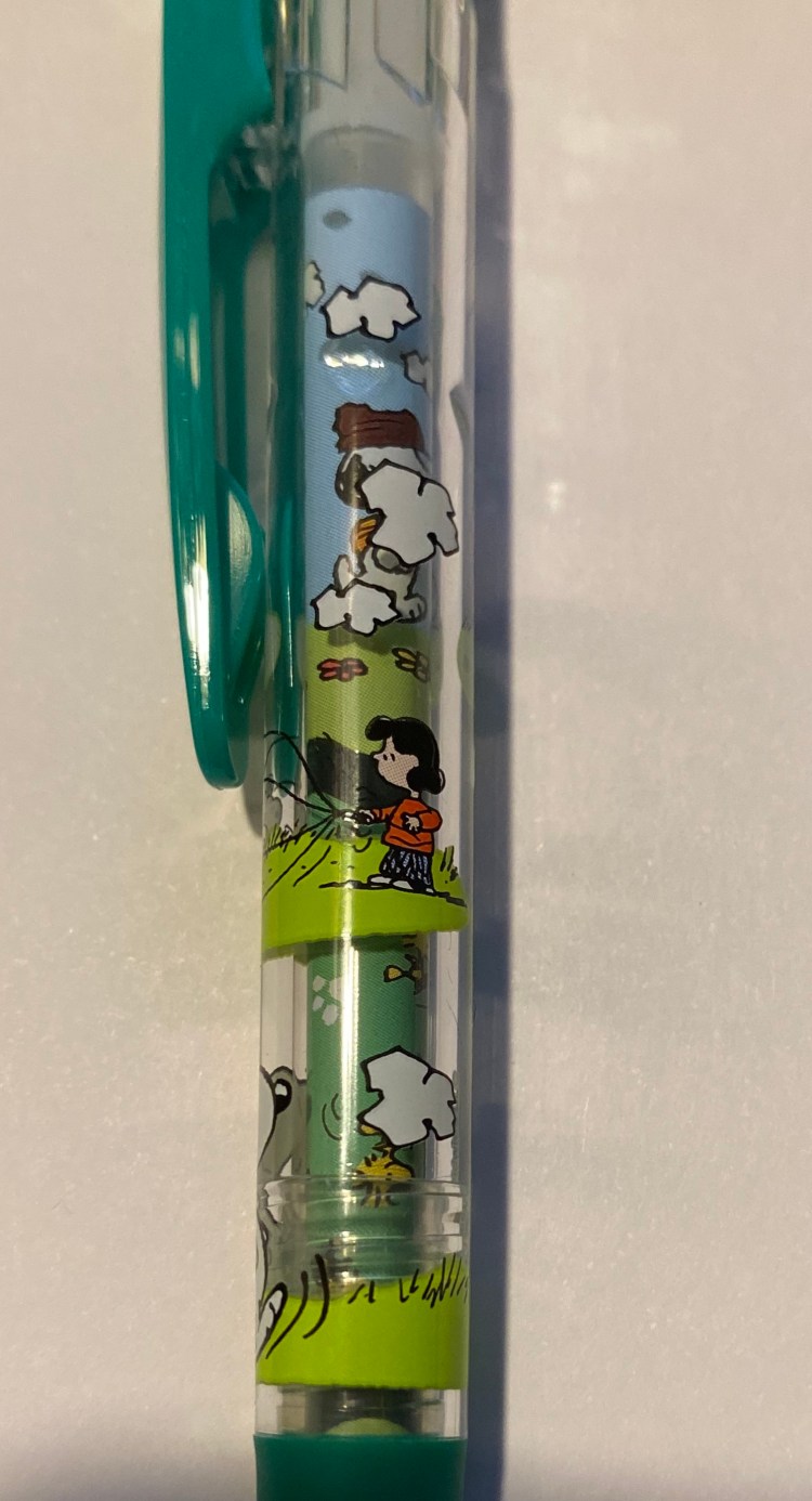
This is so wild. You can barely see the refills from up close, not to mention from a distance, so Zebra totally did not need to do this. Regular refills would have worked just fine. Instead, this is what you get:
This is why I love Japanese stationery so much: the utterly unnecessary but charming attention to detail.
The Sarasa pens are excellent gel ink pens, and I like the colour choices in this set (especially the orange). I personally would have replaced the red in the set with a blue black, but red is a classic pen colour so I guess it would have been strange if it wasn’t there:
Sometimes you just want a pen that will make you smile when you pick it up, and Zebra has really delivered on that with these limited edition pens. For $12 a set and $3 a single these are a nice, not overly expensive pick-me-up. They aren’t available on JetPens anymore, but you can probably still find them on Etsy or eBay (or just wait for the 5th limited edition, which will surely show up eventually).
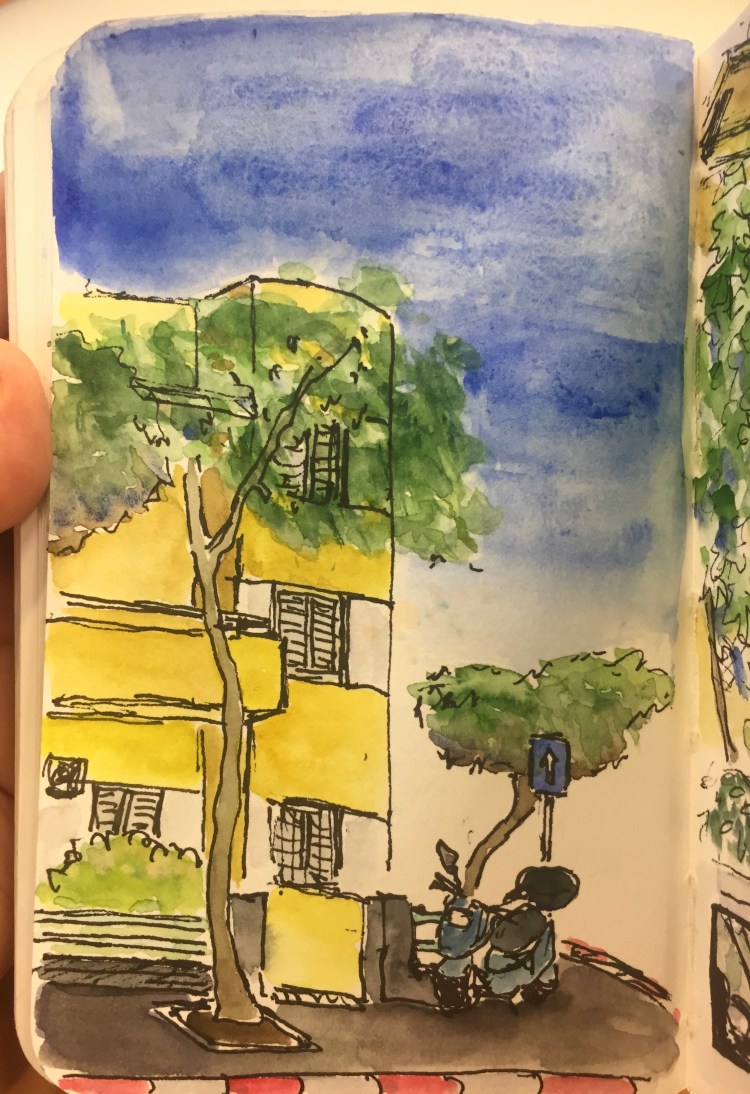
A 10 minute sketch of a Bauhaus building in Tel Aviv, and less than 5 minutes of watercolour. This proved to me that I have time to draw even when I’m super busy.
After I reviewed the Waterman Phileas I noticed that I have hardly reviewed the writing/drawing tools that I use most. So I making it a point to start to rectify that, at least a little bit.
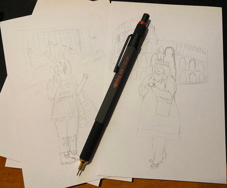
The Rotring 800 is Rotring’s high end drafting pencil, and it costs significantly more than its popular counterpart, the Rotring 600. It’s also my preferred drafting pencil, and the one pencil that’s a constant in my drawing kit. While I own the Rotring 600, and I agree that it’s a very good drafting pencil, I’ve abandoned it entirely for it’s more big brother, the Rotring 800.
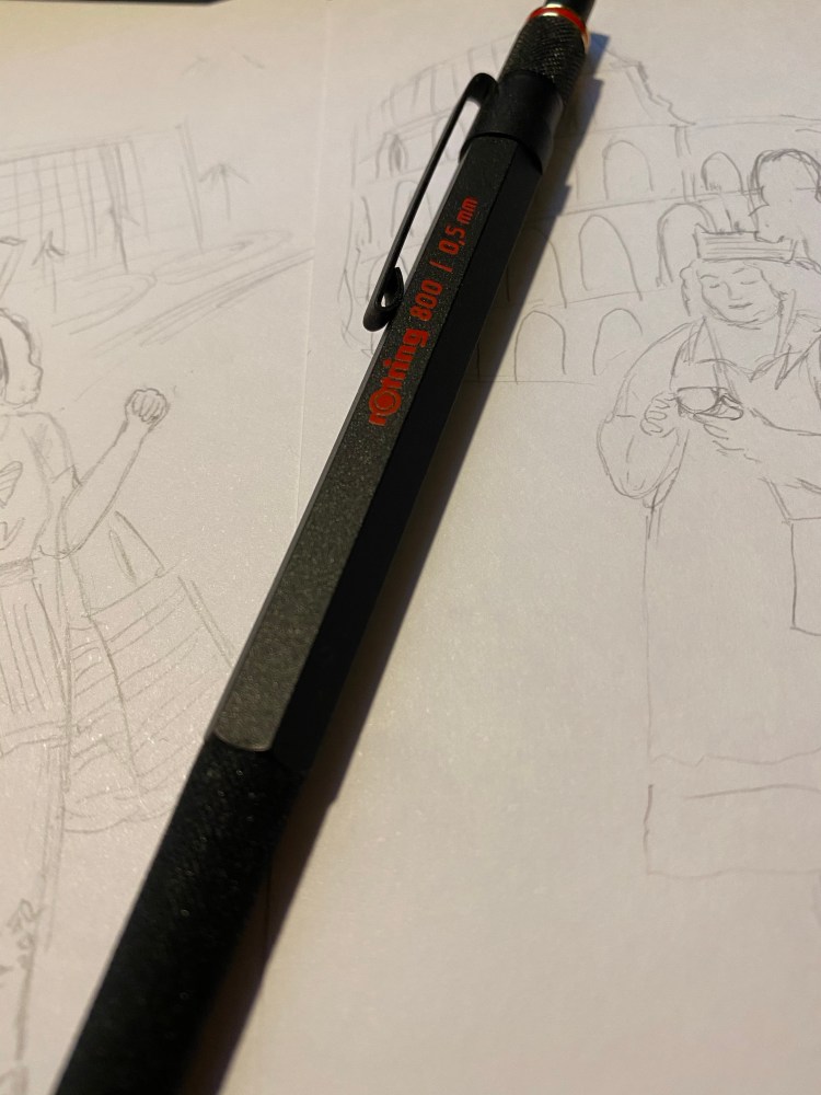
The Rotring 600 and 800 are both full metal (brass) bodied drafting pencils. This means that they were built for drafting (architectural plans) and sketching, not so much for writing. You can use a drafting pencil for writing, but they’re not built for that (that’s what mechanical pencils are for). Drafting pencils are metal bodied with a knurled grip, a lead grade indicator, and a sleeve that both protects the lead and allows you to more easily use it with rulers and templates, and to get a better view of what you’re drawing.
Herein we get to the problem: both the Rotring 600 and the Rotring 800 are almost perfect drafting pencils. Each one has a significant flaw, which means that you have to decide when purchasing what are you willing to live without.
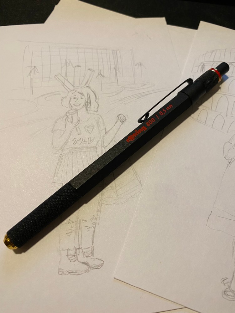
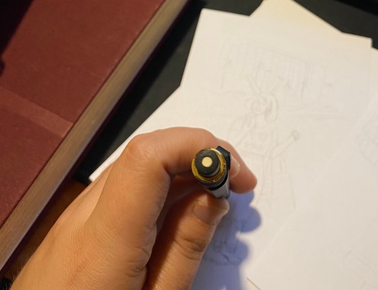
I think that the Rotring 800 is a slightly more good looking drafting pencil than the Rotring 600, and it weighs more than the 800. That’s nice, but that’s not “$20 more” nice. The reason to buy the Rotring 800 is the retractable tip. That’s it. The Rotring 600’s non-retractable, sharp-yet-delicate tip makes carrying it around an issue. It can bend and it can do damage – piercing through case fabric, clothes, and I wouldn’t carry it in my pocket (ouch!).
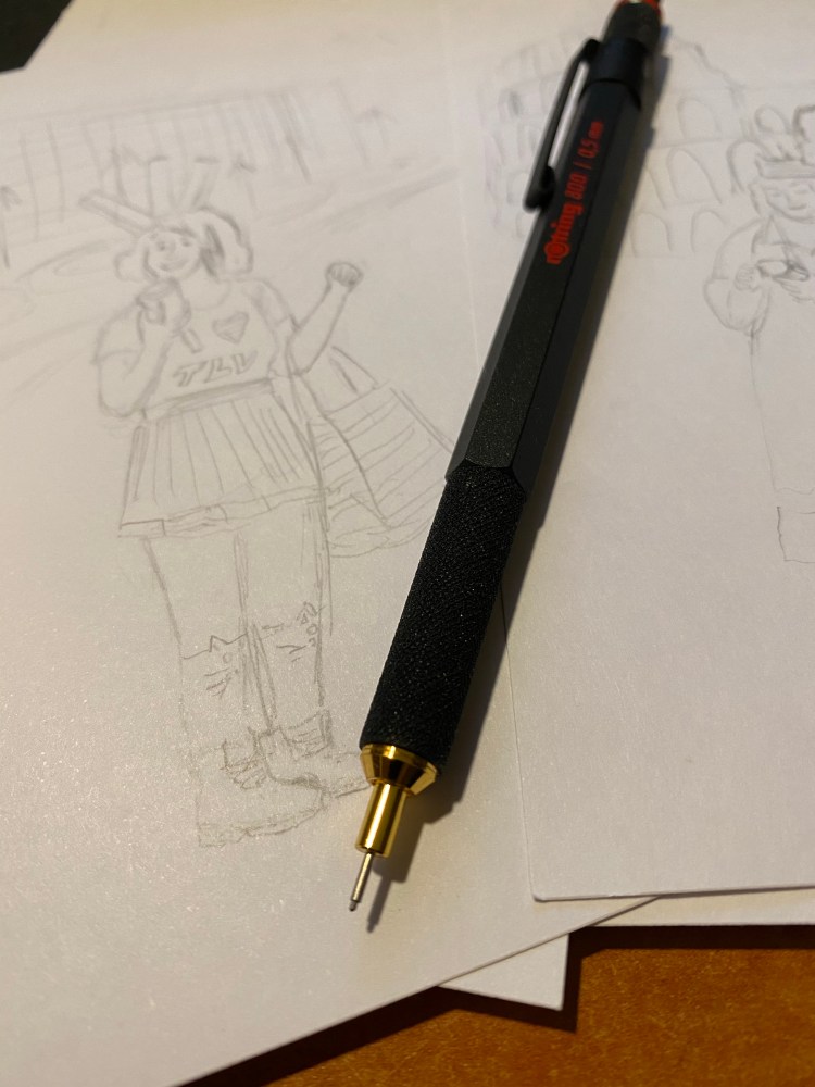
I carry my Rotring 800 in a Nock Co Sinclair, together with the rest of my sketching kit, and I really needed the retractable tip. For that I had to pay extra, and I also had to give up on a crucial drafting pencil feature that the Rotring 600 has and the Rotring 800 doesn’t have: the lead grade indicator. This is a basic feature of drafting pencils, and I have no idea why Rotring didn’t add it here. It doesn’t bother me too much as I don’t switch lead grades that often, but it’s still a baffling choice on Rotring’s part.
I love the texture on the pen grip and the pen itself: it’s beautiful and functional at the same time. This is a pencil that will not budge from your hands as you’re working with it. Also, the added weight of the retractable mechanism means that it’s perfectly balanced and you need to apply zero pressure on the lead.
The Rotring 800 is a handsome, heavy and expensive drafting pencil. If you’re just getting to know drafting pencils the Pentel Graph Gear 1000 is what I’d recommend (it’s cheaper, lighter, has a great design, more tip sizes, and a lead indicator), as it really works as an excellent mechanical pencil as well as a drafting pencil. The Rotring is what I use because it aggravates my RSI least (YMMV),the added weight lets me work faster and yet retain control over my line, and I really needed the retractable tip (I ruined a Rotring 600’s tip). If you’re wondering whether to purchase a Rotring 800 (or 600) I highly recommend testing it out first, especially if you have small hands or have a “non-standard” way of holding a pencil, since you may find its weight uncomfortable.
This is an unusual Moleskine limited edition notebook, and I wasn’t planning on reviewing it, but I just finished my Moleskine Moria journal and my hand just reached for this one as my next Moleskine, so here we are.
The Bradley Theodore limited edition Moleskine came out in 2017 as part of Moleskine’s lineup for the Milan Design Week. As far as I can tell the notebooks where designed primarily as a giveaway for the Moleskine’s and Bradley Theodore’s bag collection, and for some reason the three notebook designs somehow landed in the Moleskine UK physical stores. That’s where I found this fellow, languishing on a high shelf in the Moleskine Covent Garden shop, nestled above the Bradley designed bags. The design was bold enough to make me interested.
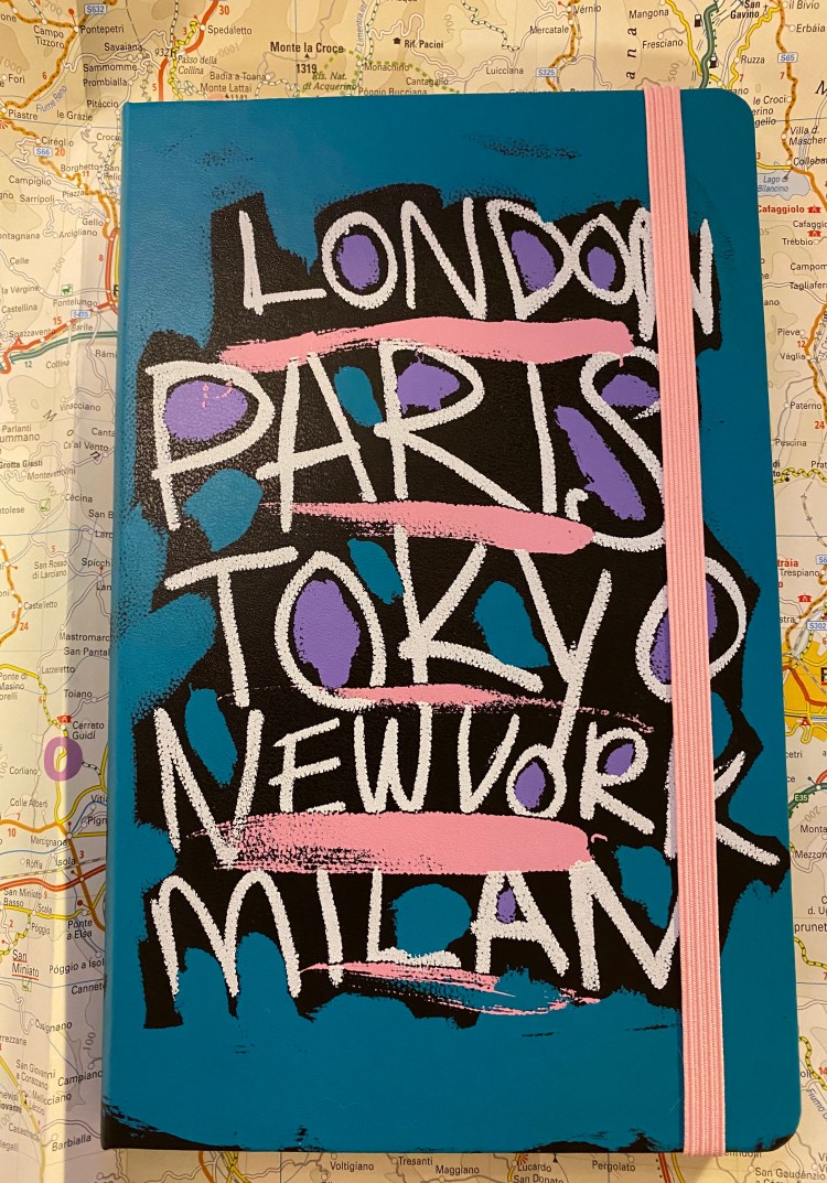
This notebook is just that front cover, and in this case it’s enough. If I remember correctly it was priced like a regular edition Moleskine, and considering the amount of work that went into the design, I think that it’s a fair price. I don’t like reviewing products that are out of stock, but you may be able to find one on eBay or Amazon marketplace, and there’s a point to this review, trust me.
The ribbon, elastic band and the back pocket hinges are a shade of pink that matches the graffiti design on the cover:
Bradley Theodore’s signature is on the left side of the front endpaper:
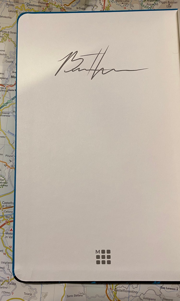
And that’s it. The back cover is plain black, there are no stickers/add-ons/cute side-B of the paper band, and there is no real design on the front or back endpapers. It’s probably the cheapest limited edition that Moleskine could make, which brings me to my point:
This notebook is an outlier. It actually surprised me when I opened it up, how little there was here. That made me appreciate even more just how much design work goes into a “regular” Moleskine limited edition notebook.
I’m “moving into” this notebook tomorrow, but it already has one entry that I slipped in from October, and a cool promotional postcard that I stuck inside, plus my “In case of loss” all filled in. If you’re looking for tips on how to start a new journal, I recommend reading the end of this post.

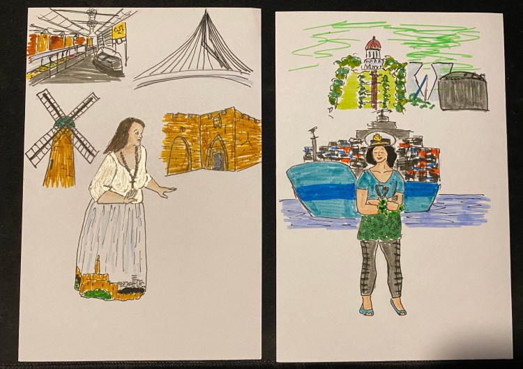
This time in pen and markers. The actresses from the wonderful play “The Mystery of the Lost City Guardian (of Doom)” strike again.
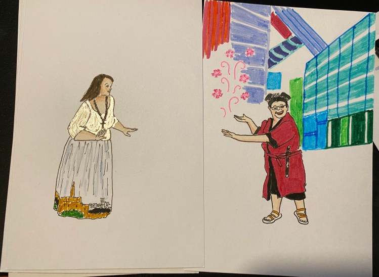
This time in pen and markers. The actresses from the wonderful play “The Mystery of the Lost City Guardian (of Doom)” strike again. I still don’t know what to do with Jerusalem’s background, but I’ll figure something out.
