Big Celebratory Birthday Update Part 4
The final post of this series, you can find part one here, part two here, and part three here. Grab a cup of tea or coffee and settle in – this one is long but there’s a lot going on here that’s worth your time.
32. I have been tracking my memory recall issues (a chemotherapy side effect) using the Tally app, which I’m hesitant to recommend. On the one hand it does work as a quick tracking app for a handful of things, but on the other hand it has a scammy pricing model – a fair price for the first year (and free if you just track up to three things, like I do), but then the subscription jumps to about $5 a month. That may be justified for apps that have a lot of features and utility, but Tally is not one of those apps. Day One, a magnificent journaling app for those who prefer to digitally journal, does much more and costs much less.
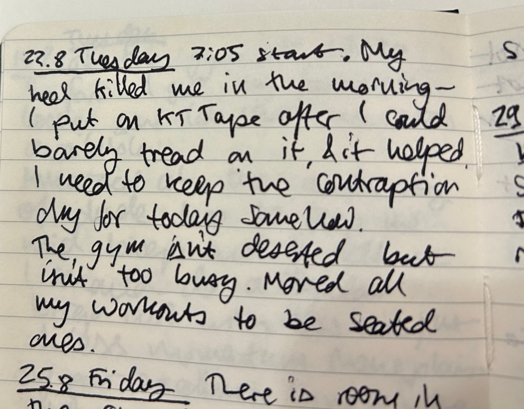
33. If you haven’t heard of KT tape and you’re a runner or athlete of any kind (or just injury prone) I highly recommend it (and no, I’m not getting paid for this). It’s a roll of pre-cut elastic fabric tape strips that you use in various configurations and levels of tension to relieve the pain and take some of the load off of injured muscles, tendons or joints. It eases recovery and it’s worth having a roll of it in your house and travelling with a few strips when you go abroad. There are YouTube videos that show you how to apply the tape- just search for the area or injury you want to address and “KT tape” and you’ll find official videos and ones made by physical therapists that will guide you. I recommend going for the Pro or Pro Extreme – they cost a bit more but last longer as their adhesive is stronger so you can keep them on for a few days. The tape leaves no residue and is easy to apply by yourself, although there are areas where another pair of hands does help. If you don’t want to buy the tape online, you can find it at your friendly local running store or in certain sporting goods stores.
34. If you are planning on travelling abroad with older relatives or people with a mobility disability, here are some tips that may help:
- Ask for special assistance when you book the flights (there’s an option there). It helps with the long distances and long lines in the airport. Arrive early and wait patiently for the assistance – it’s worth it.
- Book hotels and not Airbnbs. You want a place, preferably a well established chain, that you can rely on in terms of catering for your accessibility needs. I can’t tell you how many times we arrived at an Airbnb only to discover that the promised elevator has been broken for weeks, or the place has stairs to the elevator, stairs in the apartment and a bath instead of the promised shower. You want a hotel and not a boutique one because they’ll have an elevator bank, accessible rooms, and someone you can talk to if you run into issues. Chains are good because if there’s an issue with your room there’s a possibility of being catered in another hotel in the network. Contact the hotel ahead of time in writing and reconfirm your needs – elevator, shower with no lip or step, mini-fridge for medication, etc.
- Use taxis (or rideshares) and buses, not the metro/underground/subway. There’s less walking involved, there’s less stairs involved, and it’s worth the additional time and money.
- Check the parks you plan to visit – some have motorized tours for disabled patrons.
- Talk to the staff at museums and exhibitions, preferably ahead of time. There may be an accessible route in that Dior special exhibition that isn’t advertised (there is), or they may tell you that it’s better to arrive at a certain entrance.
- Theatres oftentimes have special accommodation and pricing for disabled people and their companions. If it’s not on their official site, email or call them and they will likely be able to help.
- Don’t pack your days full, but rather plan or returning to the hotel for an afternoon nap before the evening’s activities.
- Plan ahead as much as possible. You are less flexible in your needs so this is not the time to be spontaneous.
- I can’t stress this enough: spend time, effort and money when selecting travel insurance. Don’t go for the cheapest option because it’s likely to leave you hanging when you need it. Pay a premium for insurance that pays back upfront and doesn’t have you chasing after it if possible. Take the time to read the small print and talk to them if possible.
35. I have gotten several questions about rucking, so here’s a good article describing what it is and the benefits and risks involved. I will add that you need a good pair of shoes with decent ankle support, you need moisture wicking socks to help avoid blisters (I just use my running socks), and you don’t need to buy a GoRuck bag. In fact I don’t recommend them – they’re heavy, overpriced and don’t provide the back support you want. Instead buy a good hiking day pack (I use the Osprey Manta 24) for about half the price and twice the support. My Osprey Manta comes with a hydration system (2.5 litres, which is a good chunk of the weight in my bag), wide padded straps, load lifters, a great hip belt and sternum strap, plus a mesh that is fantastic for the hot climates I ruck in. Also weigh your bag with useful things – water, food, first aid, extra layers, flashlights, sunscreen, etc. – and not with useless weight plates. Put the heaviest things on top, as close as possible to your shoulder blades and upper back. I use a waterproof Rumpl travel blanket at the bottom of my bag, and 80% of my weight is water. The rest is books, which I don’t mind using as weights as I’m rucking in a city park really close to home. If I was hiking in the great outdoors, I wouldn’t carry anything that wasn’t useful if I somehow got stuck on the way.
36. Do you have to generate QR codes and are tired of the spammy, ad filled sites that provide the service when you Google for it? As Cory Doctorow puts it:
“Just a QR Code” is a new site that generates QR codes, operating entirely in your browser, without transmitting any data to a server or trying to cram ads into your eyeballs. The fact that it runs entirely in-browser means you can save this webpage and work with an offline copy to generate QR codes forever – even if the site goes down:
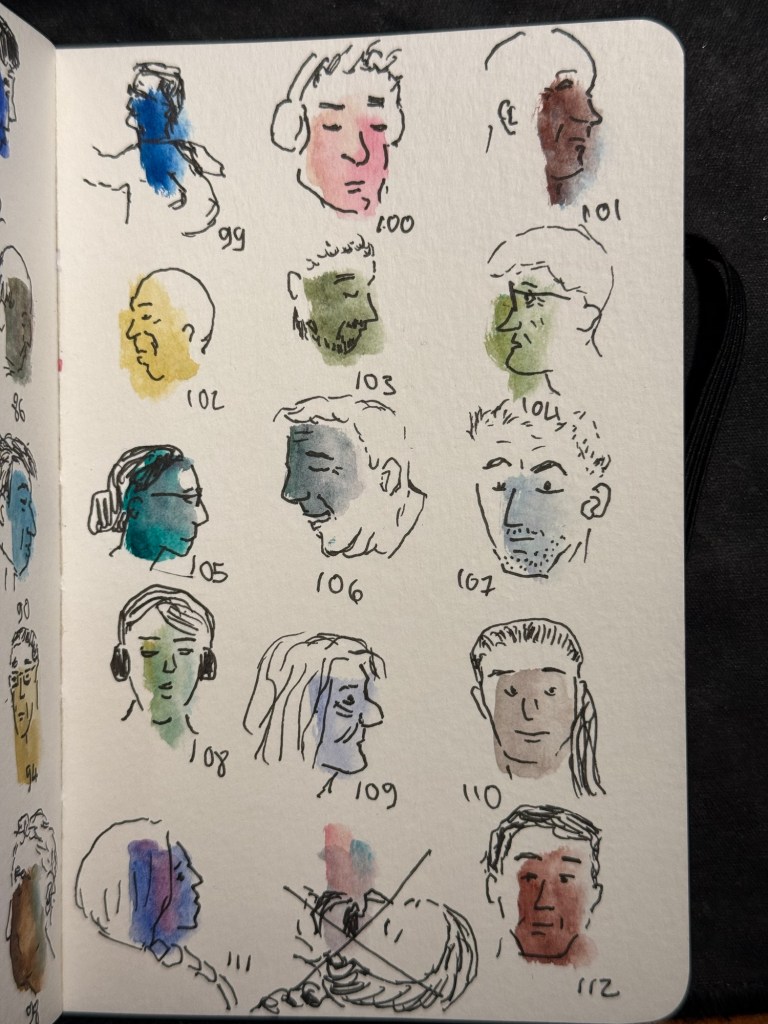
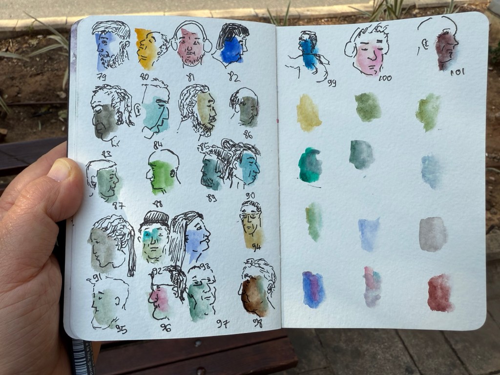
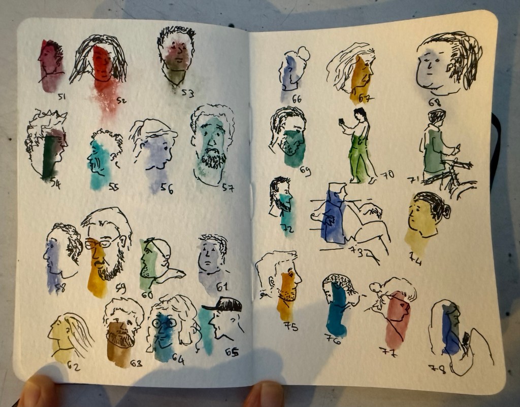
37. My journal is at that delicious phase where it’s passed the 3/4 full mark but hasn’t reached the “only a handful of pages left” mark. I recommend making it a goal to reach that phase in every notebook you use – it’s the best.
38. These little fans are a lifesaver. I’ve used them on trips, on buses with fault ACs, when I’m outdoors waiting in the sweltering heat, etc. Again, not an affiliate link and this isn’t a paid anything – it’s purely a recommendation of a product that I’ve been using and enjoying for a few years.
39. Journaling Tip #4: Did you have weird, overblown reaction to something or someone recently? Take the time to journal about the experience. Write down what happened (facts only), what was your reaction/feeling (be honest), why it’s surprising under the circumstances and finally why do you think that you reacted the way that you did? Does it reveal something about how you view yourself, your insecurities or fears?
40. Lightening Book Review #7: What We Talk About When We Talk About Love, by Raymond Carver. This is a collection of 17 short stories set in rural American in the 70’s first published in 1981 and it hasn’t aged well. The protagonists drink a LOT, they are violent, sexist, despairing and desperate. It’s like watching a series of car crashes – you become numb to the experience after the third or fourth. Carver can write, and there are a few gems here, but it’s all so very miserable and depressing – like hosting an alcoholic for a week. Their stories may be intriguing, but they’re also all so very terrible and tragic that there’s only so much of it that you can take.
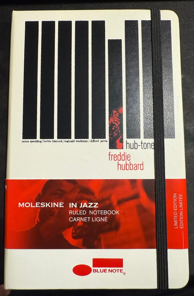
41. I opened a new Moleskine notebook – after not having opened a new one in over a year. This is the one will be used for some writing projects, and it’s one of my favourite limited editions, the Blue Note Hub Tones edition. I’ll maybe post a review of it later, but for now, this is a reminder to use the good china.
42. Journaling Tip #5: look at someone close to you, someone you admire for having a skill or approach to life that you don’t have, and write down what you can do over the next few days, week, month to be more like what you like them. That’s what got me to go to more plays, concerts, shows and exhibitions now instead of just waiting until I’m on holiday abroad.
43. Great advice from Adam Savage’s latest Tested livestream – Q-Tip: Quit Taking It Personally. More often than not other people’s behaviour and choices has nothing do with you and everything to do with them.
That’s it – 43 points for 43 years. Have a great week!