Moleskine Embossed Pocket Notebooks

My brother went to Hamburg to see the Taylor Swift Eras concert, and while he was in the city he went to the Mokeskine store and bought me these two embossed Moleskine pocket softcover blank notebooks:

They were already embossed, even though it was clear that the embossing had been done manually in store and not in a factory. How can you tell? Look at the Hamburg coat of arms notebook (the left one in the picture). Can you see how it was embossed and then the notebook moved and it was embossed again, causing a double outline? Also the left part of the embossing is fainter than the right one.

I don’t mind it – it gives the notebook character and a human touch. It makes it less precious on the one hand and more unique on the other, as it’s literally a one of a kind notebook now. But it’s this embossing that got me thinking about the Moleskine store experience again.

I used to love going to Molesking stores. There wasn’t one locally so everywhere I would travel to I’d check if there was a Mokeskine store in the area and make a point to visit it. This was for two reasons:

  1. Moleskine stores used to have store exclusive limited editions of their notebooks. It usually meant that one of the their limited edition collections had a specific notebook design that was only available for purchase in a Moleskine store.
  2. Moleskine store used to have large rubber stamps specific to that store that you could freely use to personalize your notebook.

Both things are no longer true, but the second of these – the stamps that Moleskine no longer puts in their stores – is what I want to focus on.

The stamps were a great idea: there was a standard Moleskine logo stamp, but there was also a local stamp (similar in concept to the design embossed on the notebooks above). Those were the best, as you could mark your notebook with a memory of the place you visited. What was even better was that you didn’t have to purchase anything or even use the stamp on a Moleskine notebook. I had a Moleskine pocket reporter that I travelled with and stamped, but I also stamped Field Notes notebooks.

Lots of people came into the store for the stamps, even those who were clearly not regular Moleskine users. And while you’re in the store, you browse the notebooks, you check out the pens and the bags, and you usually leave with a few of them. If you’re a Moleskine collector you of course pick up one of the store exclusive designs.

Lord of the Rings Gates of Moria notebook that was my journal from July 6th 2019 to November 16th 2019

So what happens today when you go into a Moleskine store?

Well there are no store exclusives anymore, and instead of the free stamps you can purchase add-on personalizations to your Moleskine. Note the word purchase – these add-ons aren’t for free. You can add patches and hot foil printing (of the kind done on the Hamburg notebooks), or add charms to your notebook’s elastic closure. You can only do it on a Moleskine product, and even then not all personalizations are available for all notebooks (you can’t foil print on certain covers, for example). Also to make a notebook like the little Hamburg ones you are talking about almost doubling the price of the notebook. Yikes.

I don’t understand why Moleskine don’t:

  1. have at least one or two limited editions only available in store. It seems like they have enough stores to justify this.
  2. keep the free stamps in store as well as offer personalization services for those who want them.

The stamp overhead in particular seems to be negligible, particularly in comparison to the foot traffic it drove into their stores and the delight it gave to their fans. In an age where we are constantly being pushed to make impersonal purchases online, a touch of something kind, creative and whimsical like the Moleskine stamps is much needed and appreciated.

Moleskine store stamps in the Lord of the Rings journal

Journaling Series: My Current Journaling Setup

I realized that the last journaling sample that I uploaded is three years old and my setup and journaling format changed considerably, so I decided to post an update.

I currently use a Stalogy 365Days B5 grid notebook in light blue. This is the second such notebook that I’ve used, the previous one being black. Before that I used Moleskines, and it’s quite possible that I’ll return to using Moleskines, but currently I enjoy both the smaller format of the Stalogy B5, and its fountain pen friendly pages. The notebook is thick but the pages are thin, so there’s show through (and sometimes bleed through) on every page. It doesn’t bother me, but if it bothers you then you’ll need to either write on only one side of the page or choose a different notebook.

I exclusively use fountains pens in this notebook, whatever is currently inked, though I prefer fine nibbed pens.

My journaling format has also changed, and it’s now as follows:

  • Gratitude – I tried writing this in the evening but I found that it works better to write this part as early as possible in the morning. Sometimes it’s divided into sections (health, family, work, home, etc), but it’s usually a bulleted list of around 4-5 things. I try to be specific, and I try to remember even the most mundane of things. Especially during tough times it’s super helpful, and it also serves to get me journaling early in the day. Some days I only get this done, but those days are rare.
  • Notes on what happened during the day. I used to try and be a completionist, but that was just a source of frustration and eventually gaps in my journaling practice. Instead I now journal only things that are meaningful, which means that I journal less to record the day and more to reflect on key moments in it. I try to include a story of some kind (like seeing something interesting on the bus drive to work), and a reflection or insight of some sort (for example, my thoughts on someone being fired, or what the news appears to do to people’s mood and patience).
  • I end with something out of Acceptance Commitment Therapy (ACT), which is a note on how I tried to advance each of my chosen values (for me it’s self development, courage, creativity, fitness and friendliness). This helps me manage my PTSD, especially during tough days. I know that I’ll be keeping myself accountable in the evening, so I try to keep them top of mind throughout the day.

I journal in the morning, and usually also once or twice during the day and once in the evening. I’m trying to develop both a shutdown routine and a task switching routine, and use them both as opportunities to journal and reflect.

Apart from these, once a week ever since the beginning of the year I reflect on how well I achieved my goals for the week, and once per month I reflect about the month. At the end of the year I review the entire year, and that’s usually the longest entry in my journal for that year. I tend to write 2-3 pages a day, though some days it’s just one page, and some days it closer to 5-6.

Sometimes I sketch in my journal, but it’s rare, and unlike my Moleskines, I don’t glue things in my Stalogy (so not ticket stubs, tags, stickers, business cards, etc).

Sketch sample on the right, the blotting paper on the left, and the fountain pen I used.

I keep a folded piece of A5 blotting paper in my journal, as the ink takes time to dry in the Stalogy, and without it the whole page becomes a mess.

Dip Pens Part 2: Ink and Watercolour

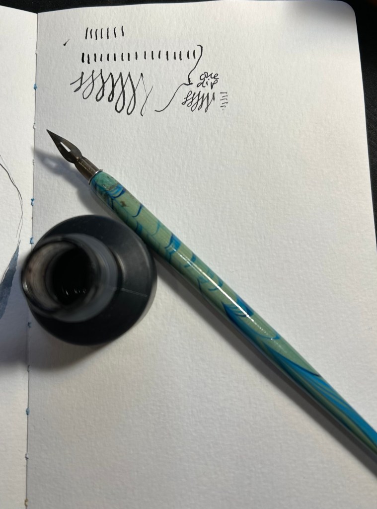
This time I decided to combine testing out a new (to me) India ink, a new (vintage) nib and watercolours. The ink is US made Higgins Black Magic. The bottle shape is unique, and it’s a plastic bottle, not a glass one like my British made inks. While the very wide base of this bottle does cut down the possibility of you accidentally tipping it over, I don’t like the bottle design. The bottle opening is too narrow and tall, and it’s very easy to get ink on your nib holder and hands this way. The ink itself is less shiny and flows wetter than other India inks that I’ve tried, but that’s not a bad thing.

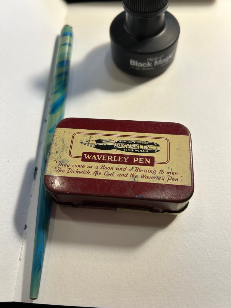
The nibs are Waverley Pen nibs, made in Birmingham (a British steel producing city), and made by Macniven and Camron Ltd.

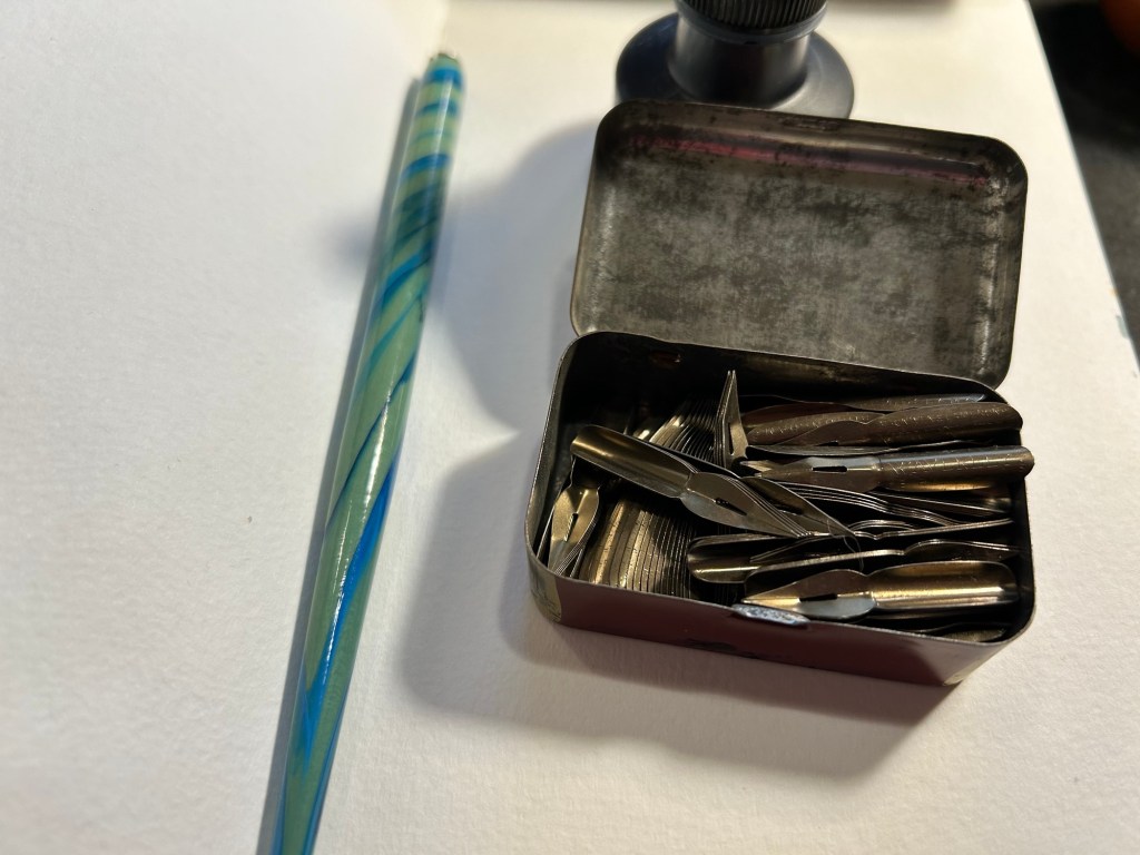
The tin itself is a delight, with the Waverley Pen advertising doggerel on it (the Pickwick, Own and Waverley were all nibs made by the Macniven & Cameron company). I bought it for a few pounds at Spitalfields market, London, and would have bought the tin even if it was empty:

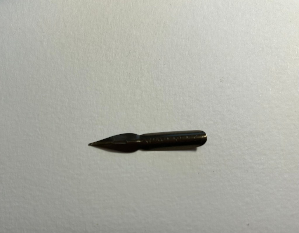
It’s not empty, but rather filled with dozens of Waverley nibs in excellent condition. I took one out, tested its flexing properties (medium flex), and then primed it as described here. To test a nib for its flexing properties you gently push the tines against your thumbnail (don’t ever do this with fountain pen nibs!).

Here’s the nib. It has a bit of kink to it that helps it hold more ink than it otherwise could hold:

I took one dip and tested out how much ink it holds. It’s quite a lot:

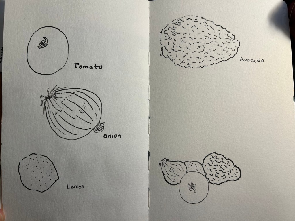
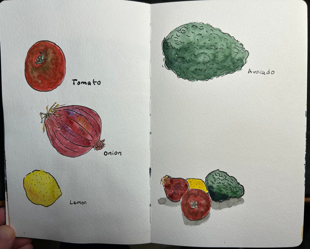
I decided to use it on a Moleskine Watercolour sketchbook. The paper isn’t ideal for dip pens (it’s not smooth and the properties that make it watercolour friendly mean that the ink will spread and feather no matter what), but I wanted to use it with watercolours. As in this case the line sketch wasn’t crucial to me (i.e. it didn’t need to be particularly accurate), I decided to accept some level of feathering and spread for a decent watercolour wash.

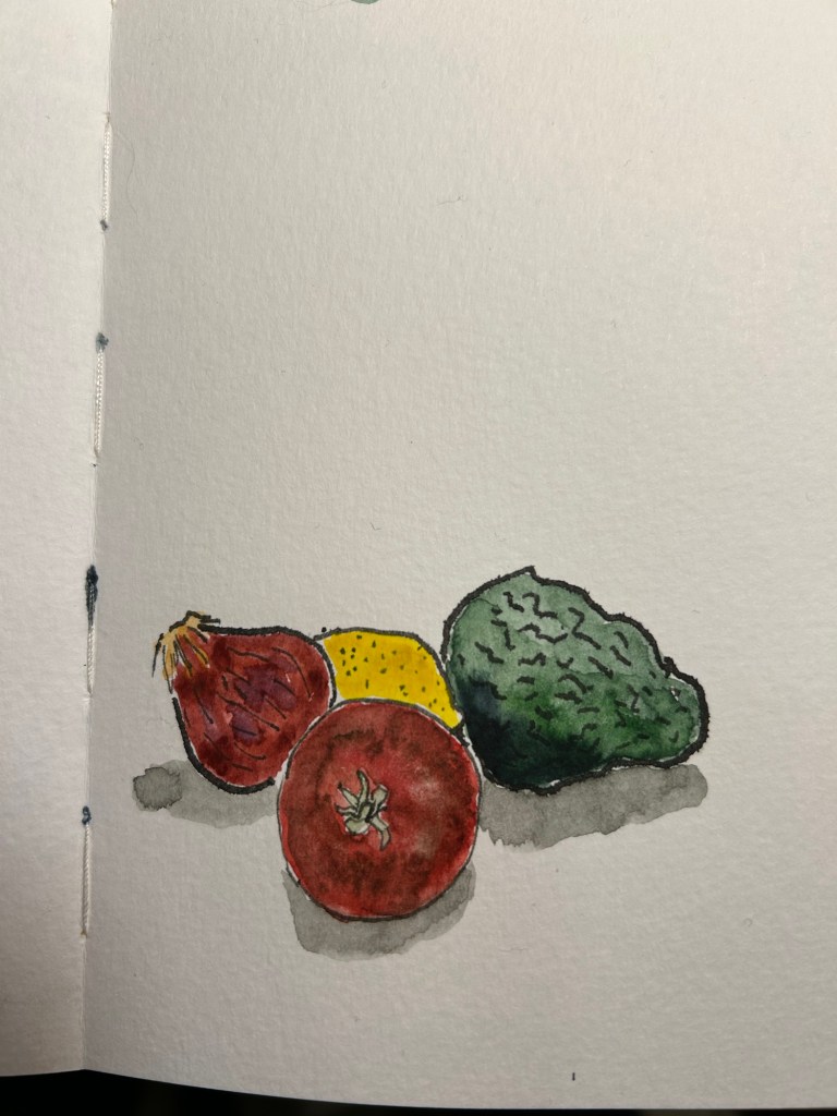
Here’s the ink sketch:

A closeup on the onion sketch shows how much line variation you can get from this kind of nib, just how expressive these nibs are, and some of the feathering and spread that I talked about earlier:

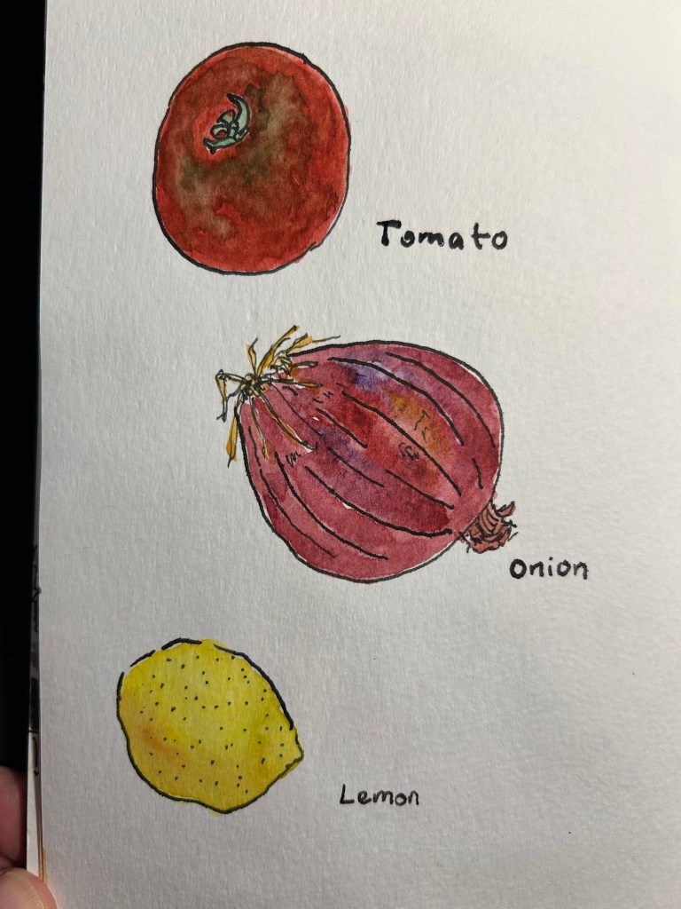
Watercolour brings these sketches to life, and makes the ink compromises worth it:

A closeup on the sketches:

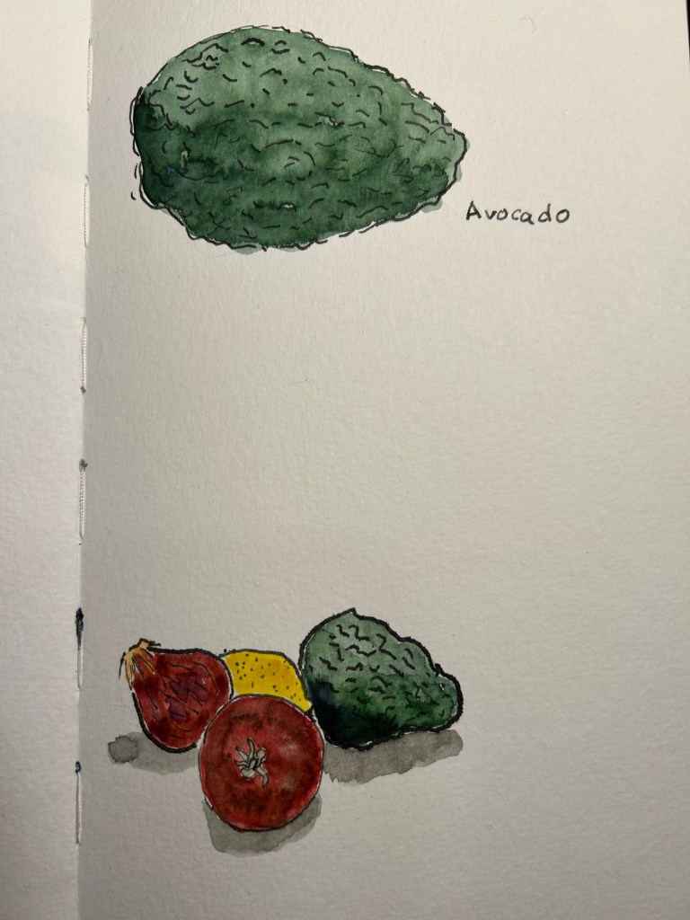
The second page:

The group thumbnail:

There are a few things that you need to remember when combining dip pens and watercolours:

  1. You must let the ink completely dry or you’ll have a ruined drawing, and potentially a ruined brush (if this happens immediately wash your brush well, as India ink will destroy it if left to dry).
  2. The more cotton content in your paper the better the watercolour washes will be, and the worse the India ink will behave. I wouldn’t go over 25% cotton content.
  3. The rougher the paper the better the watercolour washes will be, and the worse the ink sketches will be.
  4. Hot pressed watercolour paper will give you washes with more sharp edges and hard transitions, but will be best for the India ink in terms of smoothness.
  5. Mapping nibs provide less dramatic lines, but they also lay down less ink and so the ink will dry faster and spread less. On the other hand they will snag more easily on rougher watercolour paper.

Have you tried combining the two mediums? If so, let me know how it went.

Rockets on Tel Aviv

Woke up at 6:30 to rocket sirens. Multiple barrages, terrorists breached the fence, dead and wounded on the morning of the Sukkot holiday. Sketched this between barrages.

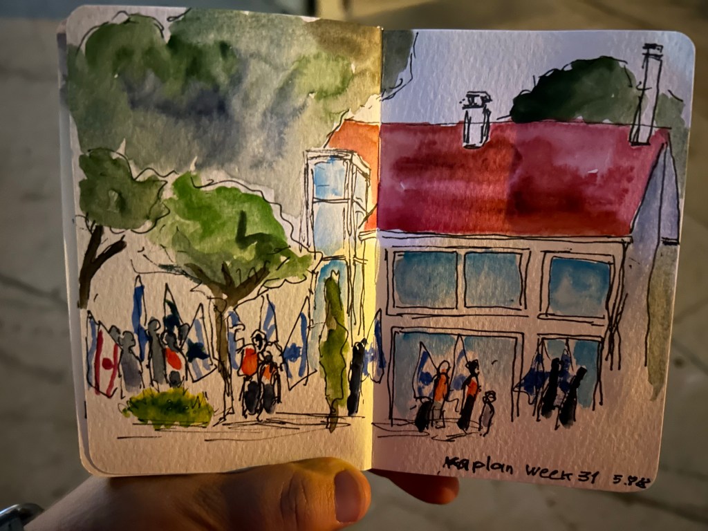
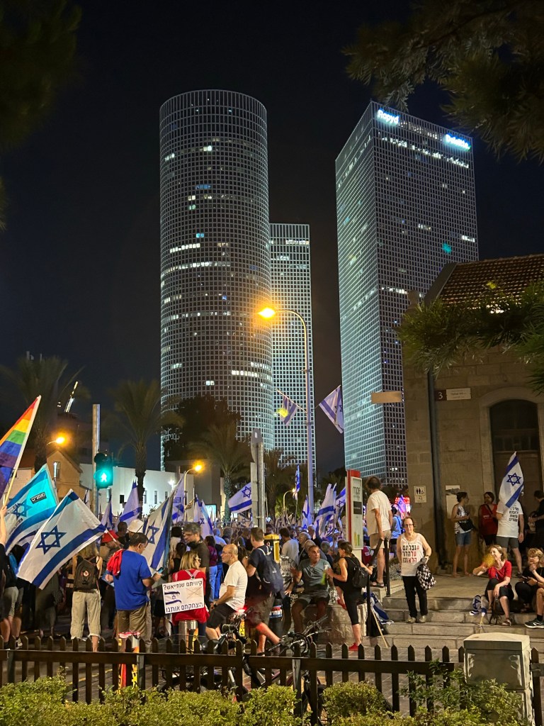
Week 31 of the Pro Democracy Protests

I had a tough week, hence the delay in some posts. I did go to the weekly central protest tonight, despite the terrorist attack earlier this evening in Tel Aviv.

Sketched this very quickly in the dark. Them took a photo of it in the dark, and decided that it captures the moment well.

Have a great week, and if you live in a democracy, don’t take it for granted.
Majohn Q1 Bent Nib Fude Fountain Pen Review

First thing’s first: if you are looking for a writing pen, then the Majohn Q1 mini fountain pen is likely not for you. While you can purchase it with an extra-fine, fine or medium nib, it’s weird body shape would likely make it uncomfortable for long writing session, and as it’s an eyedropper filler, it’s designed to have a giant ink capacity, normally suitable for long writing sessions.

If, on the other hand, you are looking for a fountain pen to sketch with, the Majohn Q1 may be a very worthy addition to your kit.

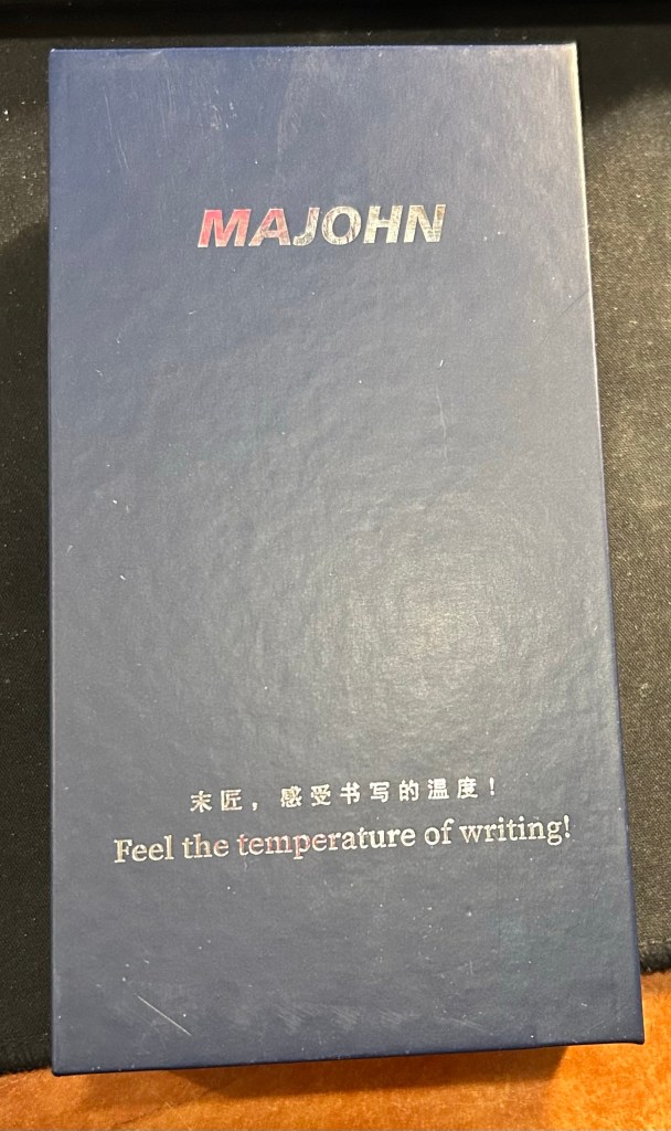
The box. I love the “Feel the temperature of writing!” inscription on it.

I purchased the Majohn Q1 bent nib fountain pen after seeing Paul Heaston use it in one of his sketches. “What is THAT?!” I asked, and immediately set out on getting one. This weird looking fountain pen reminded me of the Tombow Egg pen (google it. I’ll wait), which I always wanted and never got because I couldn’t afford one at the time. The Majohn Q1 appears to have almost the exact same design as the Tombow Egg, with a few minor details in the trim and molding of the grip section. I purchased mine on Amazon for $22.

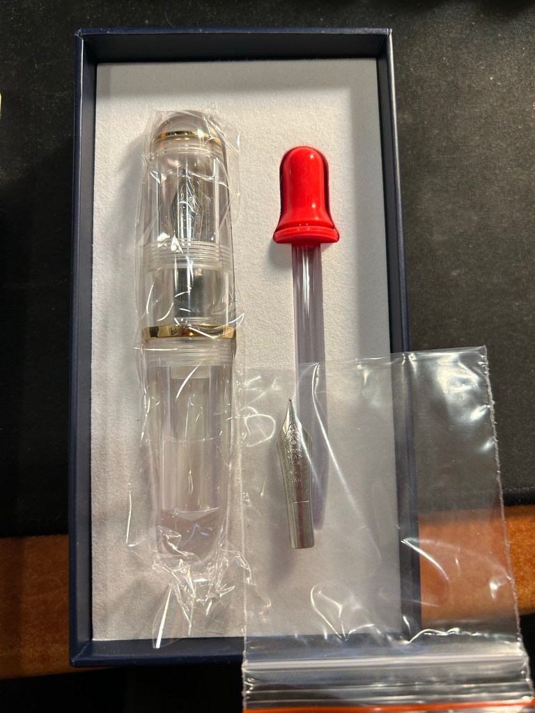
What’s in the box: fountain pen with bent nib installed, eyedropper, and a spare medium nib.

The box the Majohn Q1 arrives in is good looking enough to gift someone. Inside there’s the pen with the Fude/bent nib installed, a spare medium nib (the bent nib is an “aftermarket” installation) and a glass eyedropper that you can use to fill the pen with. The pen itself comes installed with an o-ring so that it can safely be eyedroppered. I filled mine with De Atramentis Black Document ink, which is waterproof when dry.
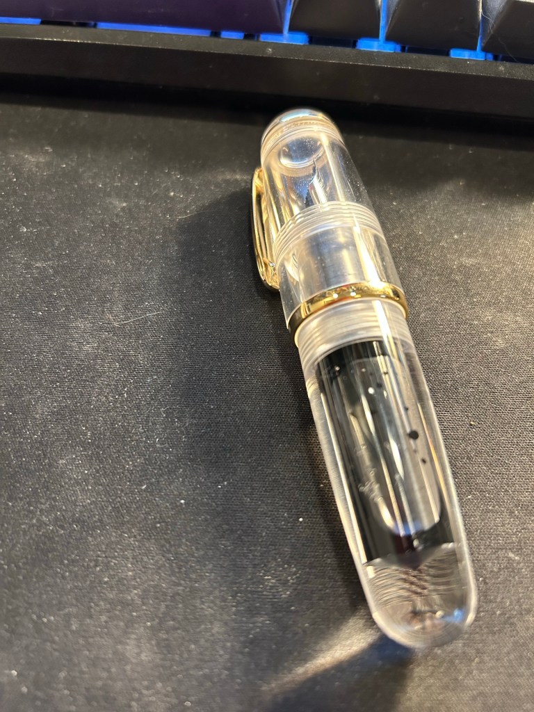
I filled the pen only to 3/4 and still it holds a tremendous amount of ink, especially for such a small pen.

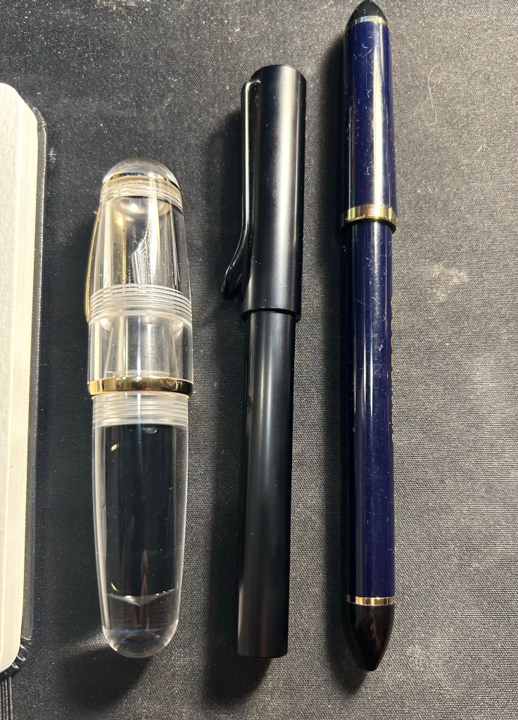
Now the Majohn Q1 is a very small pen, that holds a very, very large amount of ink. That’s why I was interested in it, as I thought that it would be a perfect fountain pen to add to my urban sketching kit. I currently use a Sailor Fude DE Mannen fountain pen for my urban sketching, and it’s a favourite among urban sketchers for the expressive, painterly lines it creates. It is, however, very long and pretty unwieldy: difficult to pack, and sometimes awkward to hold. Here are the Majohn Q1, a Lamy AL Star and a Sailor Fude pen laid next to each other, for size comparison:
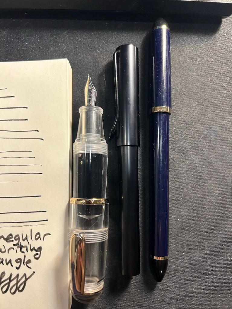
As you can see, the Majohn Q1 is pocket pen sized in length, and very, very wide. It can’t be used unposted, as is to be expected with pocket pens, but once it’s posted, it just becomes an extra wide standard length fountain pen:
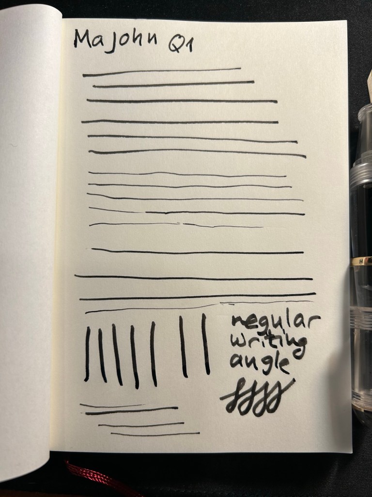
The point of this pen is the bent/Fude nib, so here it is, in all the different line widths it can create:

And here’s the Sailor Fude for comparison:

The Majohn Q1 offers much more line width control and consistency than the Sailor Fude, but you sacrifice some of the painterly quality and dynamism of the Sailor Fude to achieve that control.

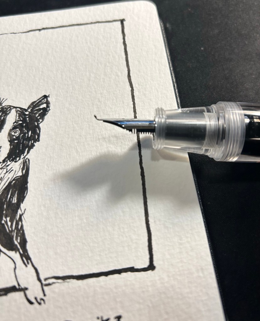
The Majohn, like the Sailor, isn’t perfect in terms of gripping experience. While it’s much easier to grip the Majohn in a variety of different angles to get a variety of different lines, there’s a pretty pronounced step between the pen body and the grip section that can be uncomfortable if that’s where your fingers naturally land on. For me, I grasp the pen either closer to the nib, or not on the section at all but rather on the pen body. I’d recommend trying it out first, but for $22, it might be worth it just to buy the pen and try it out for a while.

Bent nib and grip section closeup.

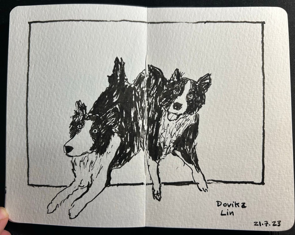
Here’s a sketch of a friend’s border collies sketched with the Majohn. As you can see, it’s relatively easy to get both a good level of control with this pen, a lot of line variation, and some of that painterly quality to the line that makes it more interesting and expressive.

Majohn Q1 bent nib, De Atramentis Document Ink Black, Moleskine Pocket Watercolour notebook.

Here’s the complete sketch, just for fun:

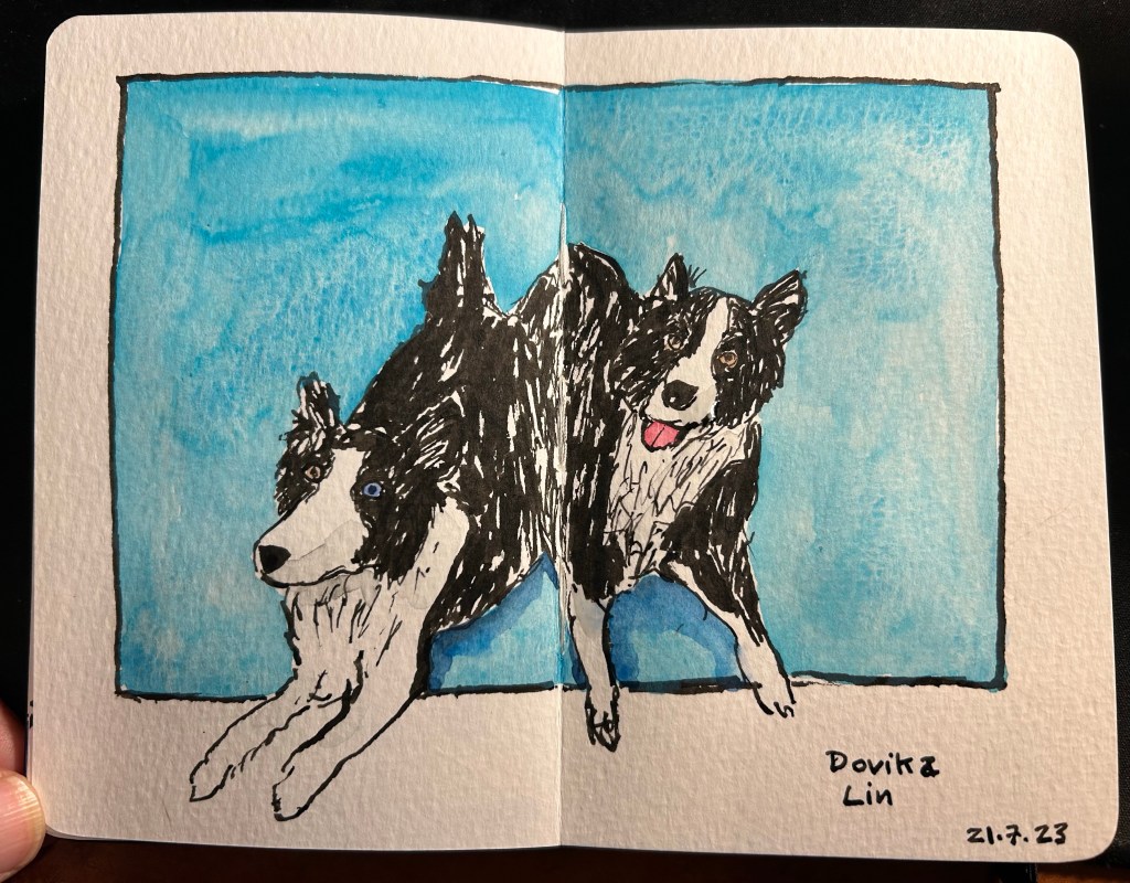
Schmincke watercolours added.

If you’re at all interested in fountain pen sketching, and especially if you are an urban sketcher, I recommend giving the Majohn Q1 bent nib fountain pen a try. It’s easier to control and to transport that a Sailor Fude, and holds a much larger ink capacity, which is great for long sketching sessions or when you need to block out a large section with ink. For such a low price you get quite a lot, and the learning curve is much less steep than with a Sailor Fude DE Mannen fountain pen. I don’t do calligraphy, but I assume that it could be worth a try for calligraphy as well, especially if you are looking for a travel friendly solution. And who knows, maybe you’ll get to feel the temperature of writing while using it…

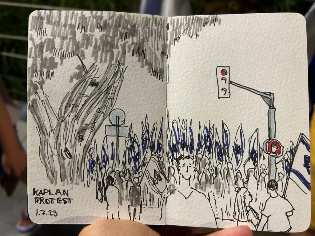
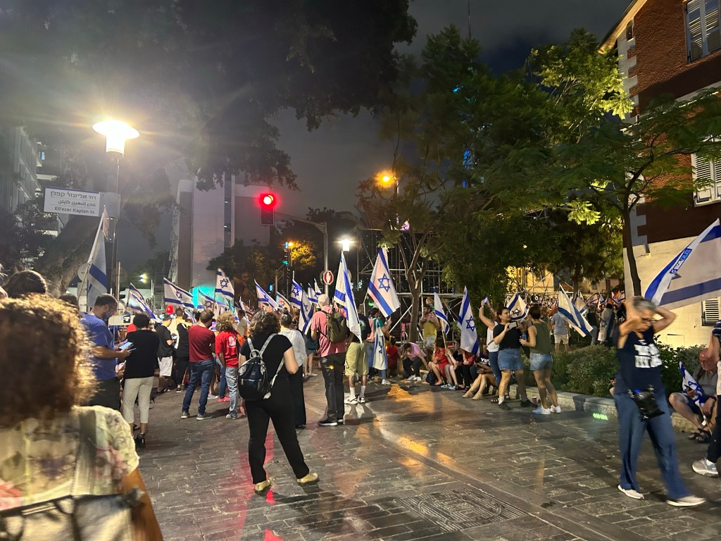
At today’s pro democracy protest

10 minute sketch using a Staedtler 0.8 fineliner, Faber Castell Pitt brush pens and a pocket watercolour Moleskine notebook.

Protesting
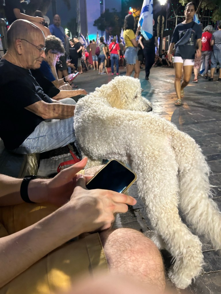
He was protesting too

Urban Sketchers Sketchwalk to Gan Meir

I went to a very special Urban Sketchers sketchwalk and drink and draw today. The event celebrated the end of a special sketch swap between a group of sketchers in Barcelona and in Tel Aviv, and there were sketchers there from all over the world (Spain, the Netherlands, Canada, India, etc). We met at Gan Meir in central Tel Aviv for a sketchwalk followed by a drink and draw at the top of Libling house. It was hot, it was humid, and I needed a break by the time I got to the garden, so I went to the nearby Stephan Austrian Bakery for a cold coffee and a Sachertorte, a rare but much needed treat.

Coffee and cake.

A lot of people came in to pick up an ice cream cone, including this little fellow:

For some reason he didn’t get any ice cream.

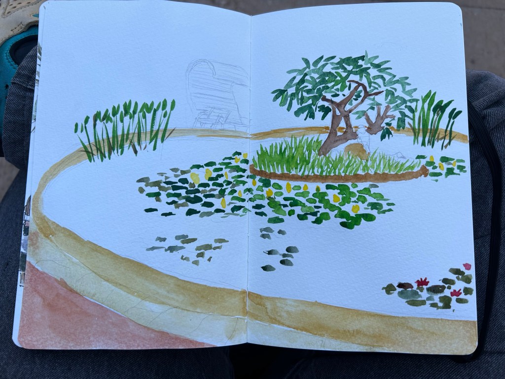
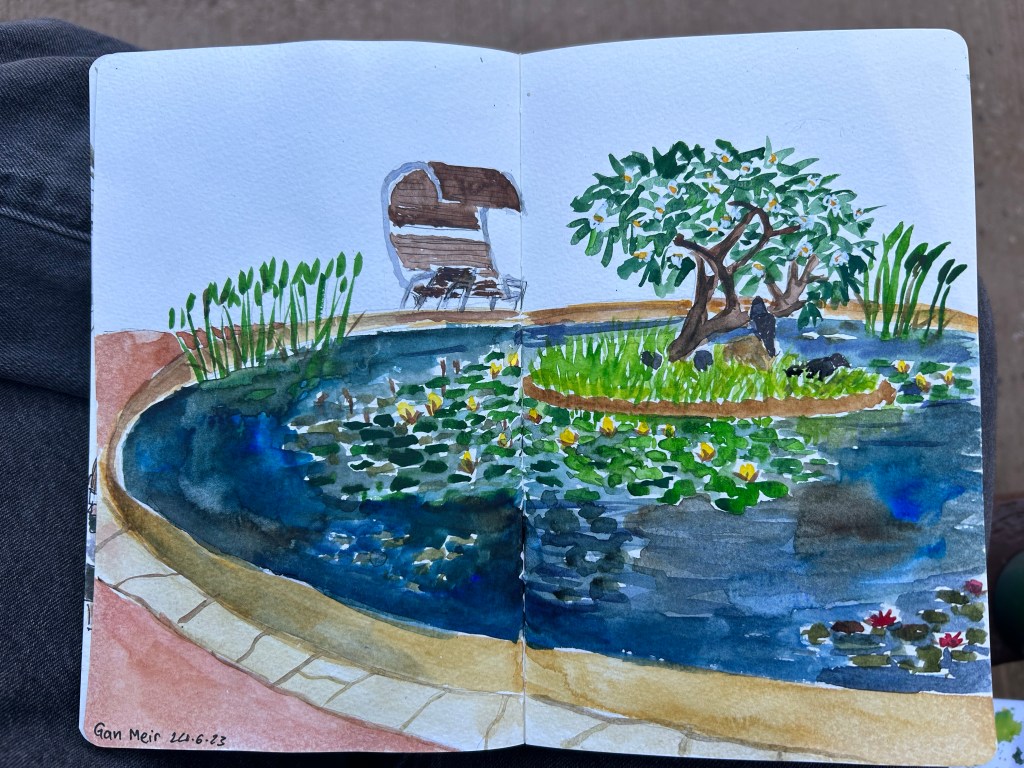
I then went back to the garden and started sketching the waterlily pool:

Work in progress

There was a group of ping pong players nearby, and I got hit by balls several times. I was also visited by several curious children. It’s all part of the Urban Sketching charm.

The waterlily pond complete

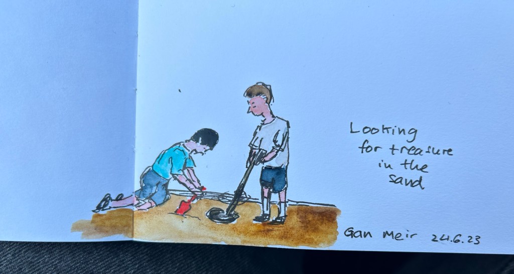
I then saw a group of kids with a metal detector, searching for treasure in the sand, so I sketched them quickly:

Treasure hunters.

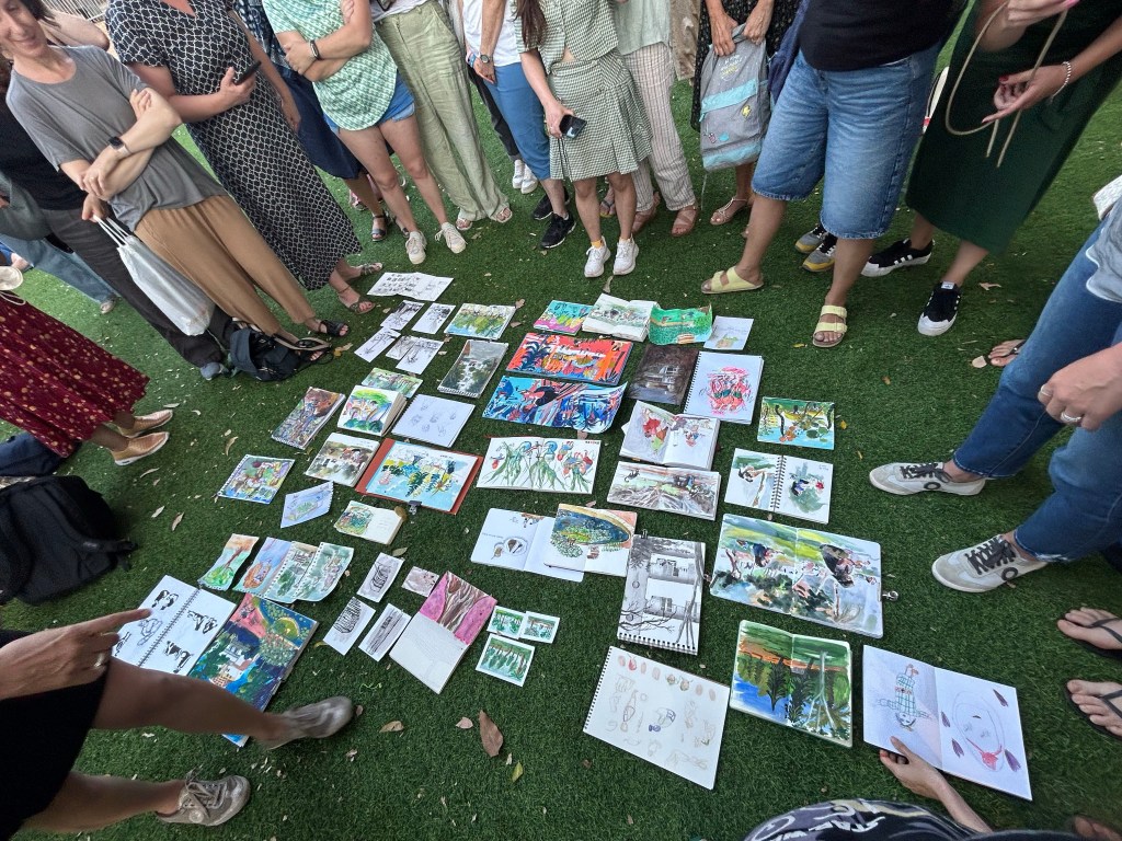
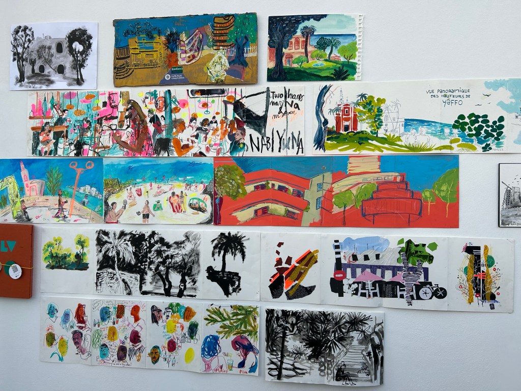
This was our sketchbook throw down, and I loved seeing all the different styles and sketch subjects together,

Sketchbook throw down.

We then went to Leibling House nearby, and there saw some of the sketch swap participants’ work. We had a party on the roof, and I got to talk to sketchers from all over the world, and see so many different sketching styles.

The exhibition

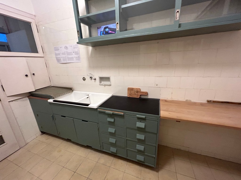
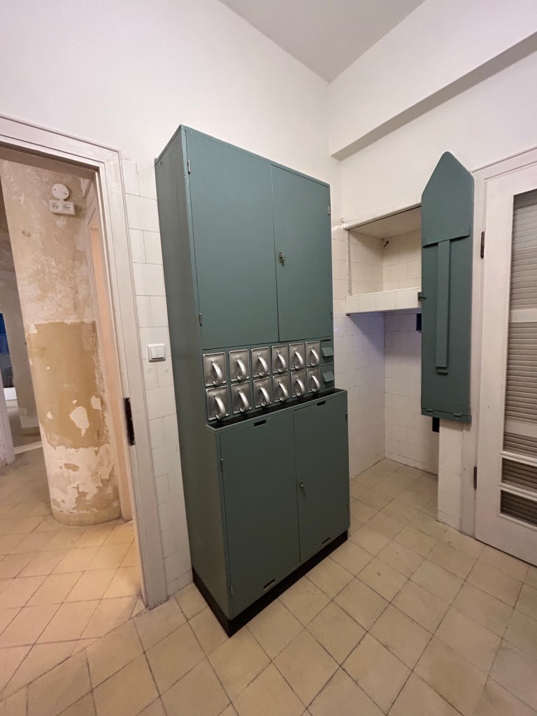
I had to leave early, but I did get to check out Leibling House and see their Frankfurt Kitchen, which is pretty amazing:

Actual storage space, proper sinks for washing dishes and room to dry the dishes.
Storage space for dry goods, and foldable iron board. Perfect use of space.

What struck me most is how the sketchers from abroad saw and sketched the same tired old local monuments and tourist attractions. Through their work I got to see them with new eyes, and it made me want to visit them and try to sketch them myself. I also got to see Leibling House for the first time, and I plan on returning to it in the future, as it’s a wonderful museum and exhibition space.

My Current Palette

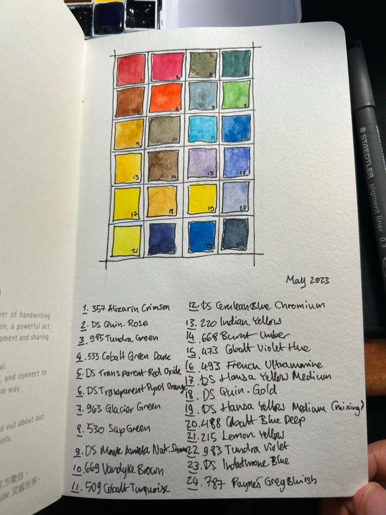
So after writing this post about the physical side of building a new watercolour paint box, here is my updated palette. I’m using a new Moleskine Portrait Watercolour Sketchbook as my sketchbook of choice for the watercolour part of Liz Steel’s teacup course (that starts today), and so I used the first page to create an index for my current palette.

My watercolour palette for May 2023

Every watercolourist’s palette is unique and full of choices that reflect their subject matter preference, the place they live in, and various personal idiosyncrasies. Please don’t copy anyones palette as-is (including mine), but rather understand the artist’s choices and tailor your palette choices to your own needs. To this end, I will explain some of the choices behind my paletter.

There are 24 half-pans in my palette, and 23 unique colours. Daniel Smith Hansa Yellow Medium now appears twice in my palette, once for mixing and once for using as an unmixed mid warm yellow. Yellow paints get dirty if you even look at them, and they are difficult to clean after a dab of this or that paint made its way to them. Of the three yellows in my palette I use DS Hansa Yellow Medium the most for mixing, which is why I opted to have a second half-pan of it this time (it’s a new change that I’m trying out).

Of the 23 paints, 15 are Schmincke Horadam and the rest are Daniel Smith. I’m pointing this out so that you feel comfortable mixing between paint manufacturers on your palette. This can be done so long as you are using the same grade of paint in each maker (artist grade, for example).

There are some classic examples of watercolour palette building in this palette and some that are a bit off. There are warm and cold sets of yellow (Hansa Yellow Medium, Lemon Yellow), red (Quin. Rose and Alizarin Crimson) and blue (French Ultramarine and Cobalt Blue deep), and there’s a rather standard set of earth tones (Pyrol Oxide, Monte Amiata Natural Sienna, Van Dyke Brown and Burnt Umber) but there’s some weird stuff too. I’ll be focusing mostly on the weird stuff.

There are three greens in my palette. I sketch mostly landscapes and having premixed greens saves a LOT of time. Of the three greens I use Sap Green the most, either by itself or lightening it with yellow or darkening it with blue. It also has a brightness and vivacity that you cannot obtain by mixing your own green. The two other greens are opaque (which means they don’t mix well), and cover two very common and difficult to mix green shades. Schmincke Tundra green is part of their super-granulating series, and has some pink undertones to it. It also covers a wide variety of olive coloured local plants. The Cobalt Green Dark is a brand new addition to the palette, replacing Schmincke’s forest green. This paint works as an “artificial” green, for things like benches and fences that were painted green, and a greyish-green for the many greyish-green local plants.

Then there are some “magic” paints. Schmincke Glacier Green is on the palette as a cool “glass” and sea blue, and it’s super-granulating and dual pigmented. You can see the pigment party going on with it in my swatch of this colour.
Liz Steel has influenced me to add an orange and a turquoise to the palette. They bring joy to the painting, the turquoise is useful as “glass” and “windows” when I want something brighter than the Glacier Green and the orange paint is much brighter and more alive than any mixed orange that I could ever hope to create. It’s useful to add a splash of colour to a painting, to help focus the eye in a certain area. The two Daniel Smith blues on my paletter are also Liz Steel inspired, and at least one of them may be on its way out due to low use.

Paynes Grey Bluish is one of my most heavily used pigments, as part of sky and sea scenes, denim jeans, as a shadow colour, for asphalt and to darken other mixes. A must have for me.

The two violets on the palette are also personal choices, though the Tundra Violet will likely be replaced with something else in the near future. Purples are very difficult to mix without getting muddy not registering as purple, which is why the Cobalt Violet Hue paint on my palette. The super-granulating Tundra Violet is much less useful, and may find its way out my palette.

I hope this gave you some insight as how to think about the pigment choices that you make for your palette. Again – create your own palette and don’t just force yourself to use a copy of someone else’s

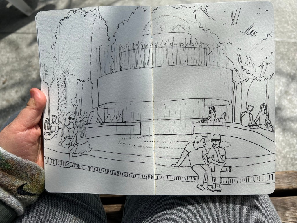
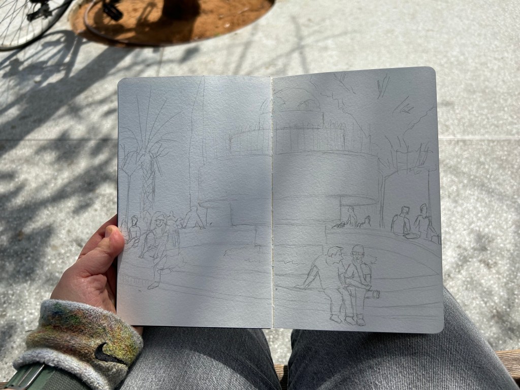
Urban Sketchers Sketchwalk: Dizengoff Square

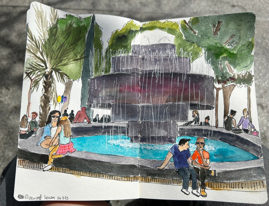
I went on a sketchwalk with our local Urban Sketchers chapter to Dizengoff Square, a central square in Tel Aviv that has been a gathering place since before there was a state of Israel. It was hot for the season, and the place was jumping with colour and activity.
This was sketched on a Moleskine Watercolour A5 portrait sketchbook, with Staedtler fineliners and Schmincke and Daniel Smith watercolours. The white was added with a Uniball Signo Broad UM-153 gel pen. You can see some process photos below.