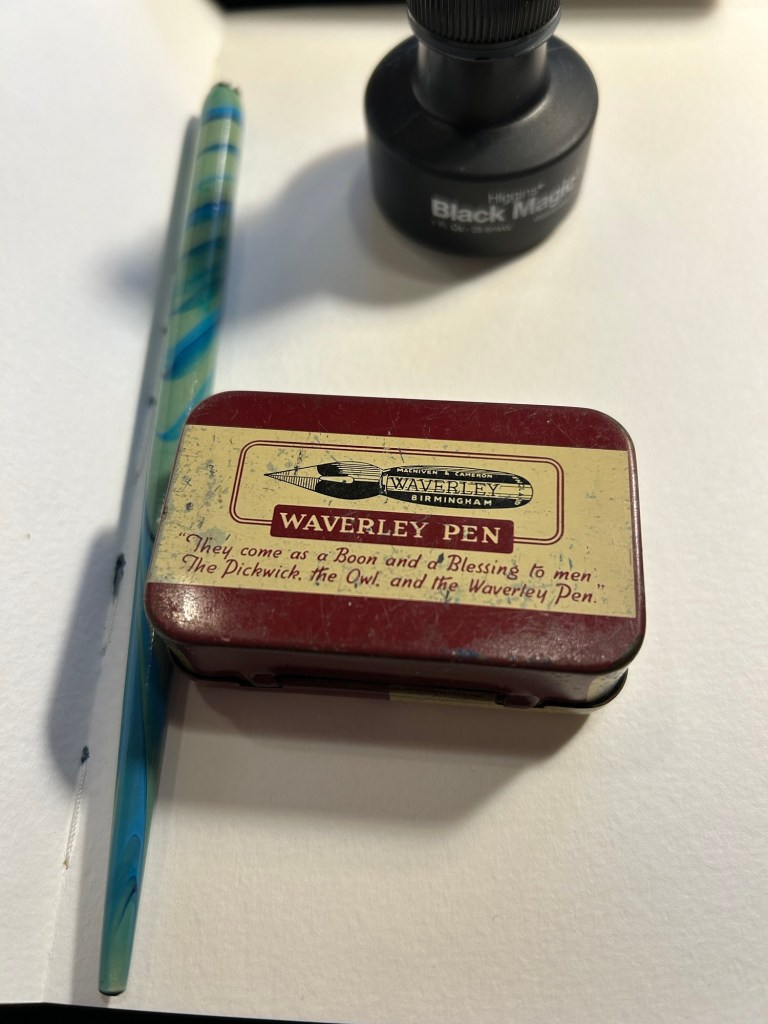
This time I decided to combine testing out a new (to me) India ink, a new (vintage) nib and watercolours. The ink is US made Higgins Black Magic. The bottle shape is unique, and it’s a plastic bottle, not a glass one like my British made inks. While the very wide base of this bottle does cut down the possibility of you accidentally tipping it over, I don’t like the bottle design. The bottle opening is too narrow and tall, and it’s very easy to get ink on your nib holder and hands this way. The ink itself is less shiny and flows wetter than other India inks that I’ve tried, but that’s not a bad thing.
The nibs are Waverley Pen nibs, made in Birmingham (a British steel producing city), and made by Macniven and Camron Ltd.

The tin itself is a delight, with the Waverley Pen advertising doggerel on it (the Pickwick, Own and Waverley were all nibs made by the Macniven & Cameron company). I bought it for a few pounds at Spitalfields market, London, and would have bought the tin even if it was empty:
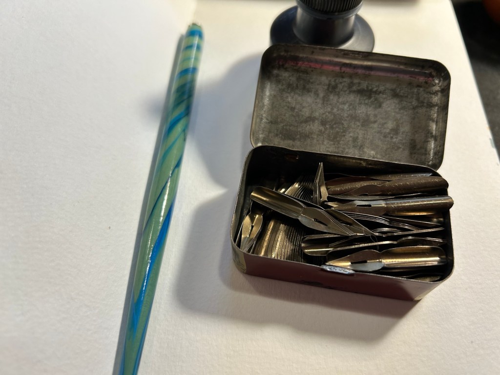
It’s not empty, but rather filled with dozens of Waverley nibs in excellent condition. I took one out, tested its flexing properties (medium flex), and then primed it as described here. To test a nib for its flexing properties you gently push the tines against your thumbnail (don’t ever do this with fountain pen nibs!).
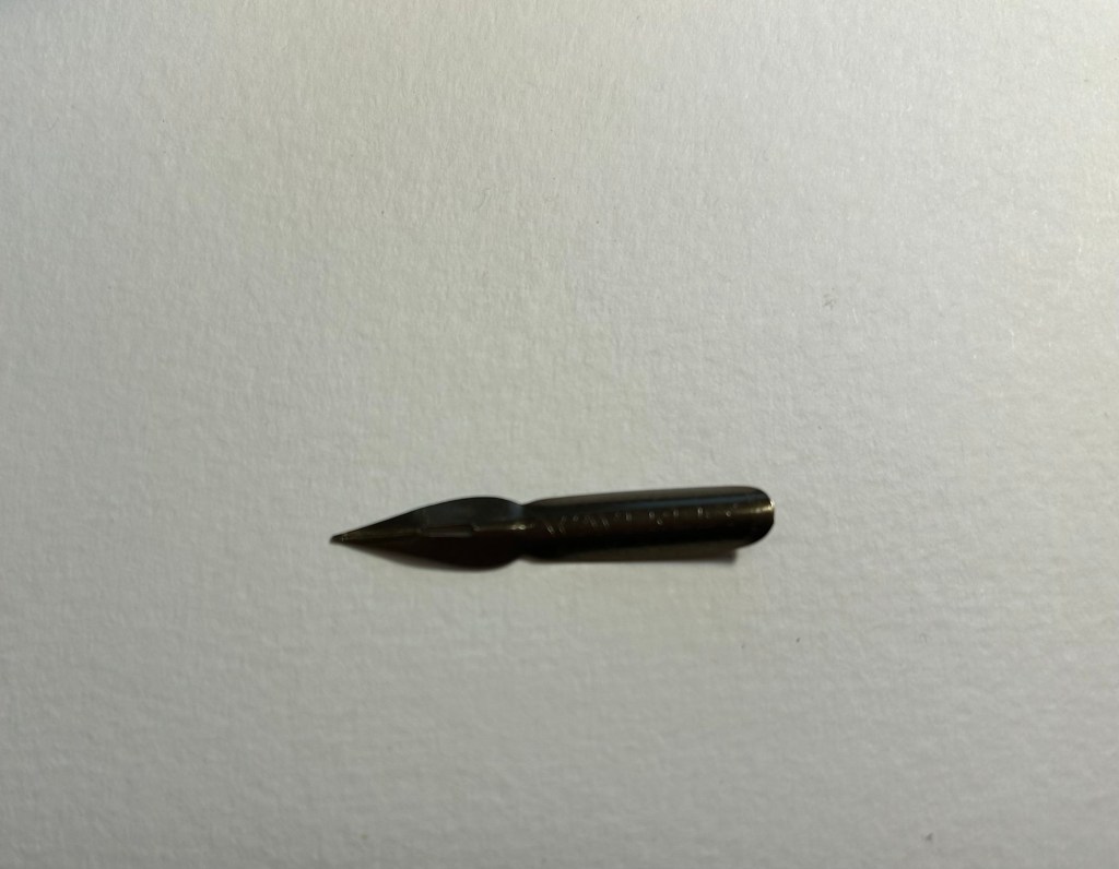
Here’s the nib. It has a bit of kink to it that helps it hold more ink than it otherwise could hold:
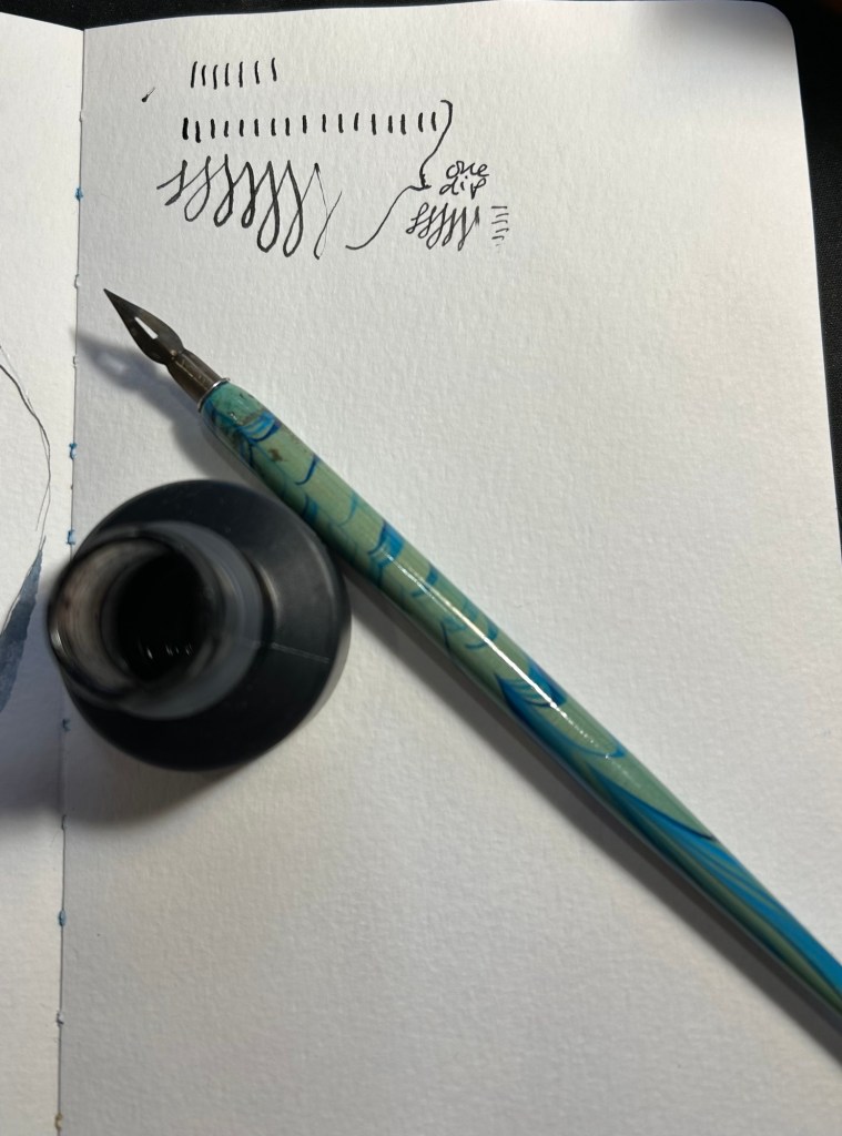
I took one dip and tested out how much ink it holds. It’s quite a lot:
I decided to use it on a Moleskine Watercolour sketchbook. The paper isn’t ideal for dip pens (it’s not smooth and the properties that make it watercolour friendly mean that the ink will spread and feather no matter what), but I wanted to use it with watercolours. As in this case the line sketch wasn’t crucial to me (i.e. it didn’t need to be particularly accurate), I decided to accept some level of feathering and spread for a decent watercolour wash.
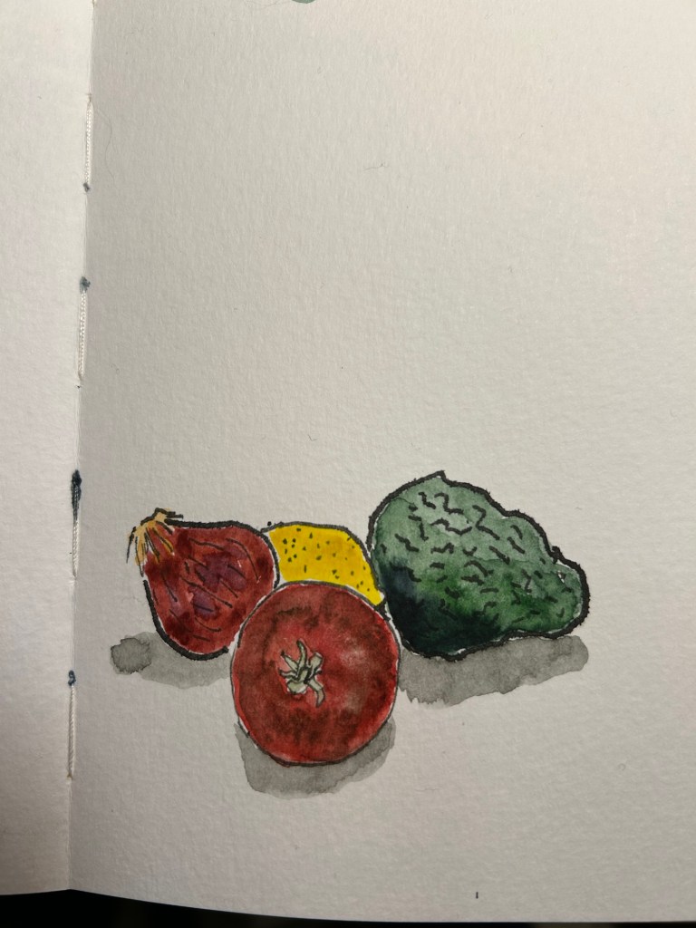
Here’s the ink sketch:
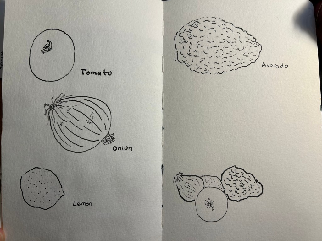
A closeup on the onion sketch shows how much line variation you can get from this kind of nib, just how expressive these nibs are, and some of the feathering and spread that I talked about earlier:

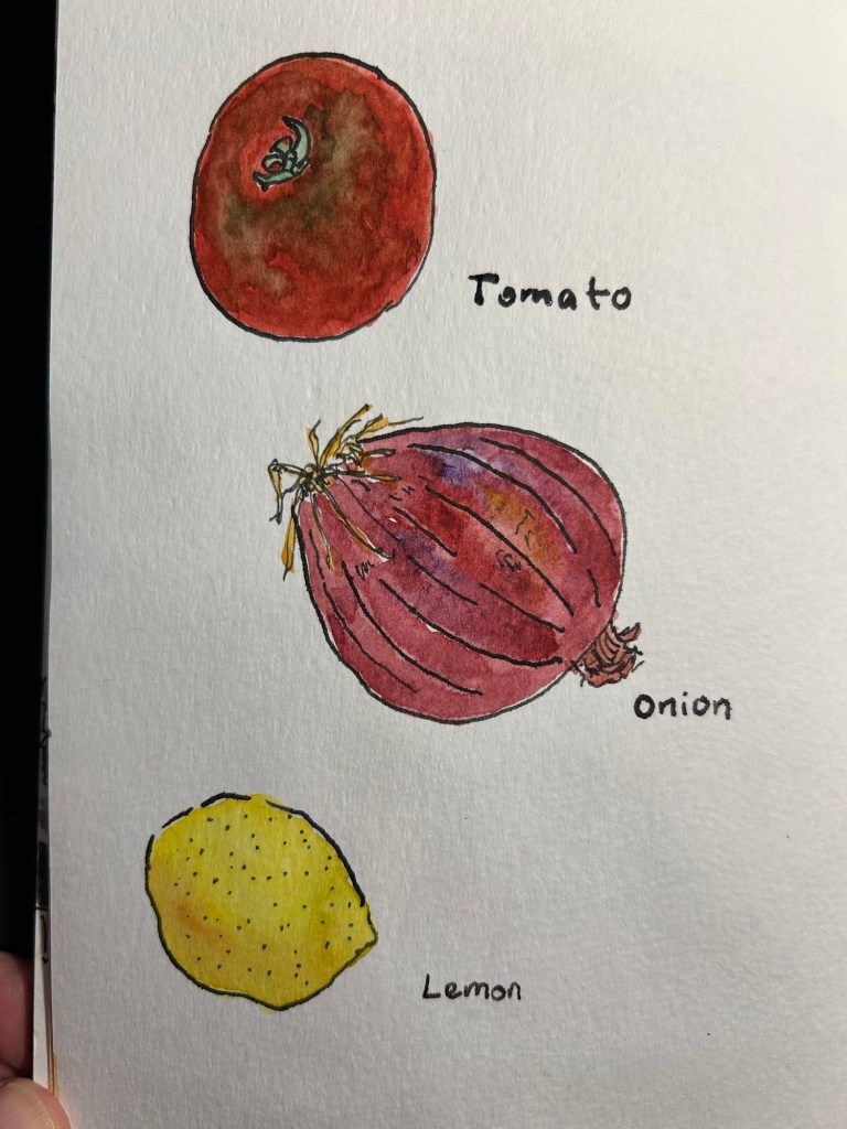
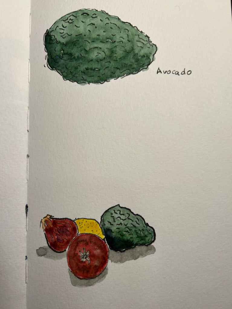
Watercolour brings these sketches to life, and makes the ink compromises worth it:
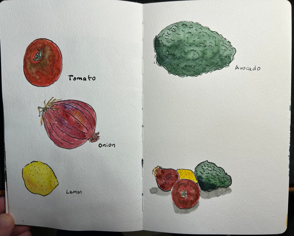
A closeup on the sketches:
The second page:
The group thumbnail:
There are a few things that you need to remember when combining dip pens and watercolours:
- You must let the ink completely dry or you’ll have a ruined drawing, and potentially a ruined brush (if this happens immediately wash your brush well, as India ink will destroy it if left to dry).
- The more cotton content in your paper the better the watercolour washes will be, and the worse the India ink will behave. I wouldn’t go over 25% cotton content.
- The rougher the paper the better the watercolour washes will be, and the worse the ink sketches will be.
- Hot pressed watercolour paper will give you washes with more sharp edges and hard transitions, but will be best for the India ink in terms of smoothness.
- Mapping nibs provide less dramatic lines, but they also lay down less ink and so the ink will dry faster and spread less. On the other hand they will snag more easily on rougher watercolour paper.
Have you tried combining the two mediums? If so, let me know how it went.

Danny Watts
Yes, we rented a small cabin in the mountains and I took a selection of dip pens/nibs, inks and my watercolor book – left the paint at home as I wanted to focus on the dip pens. The paper was too rough. You really don’t realize the significance of the texture until nib hits the paper. Yet in some instances it made the sketch look better (rocks, leaves etc). The watercolor was added later. Light amounts, more so as a suggestion, painting inside and out of the lines.
LikeLiked by 1 person
writingatlarge
So true that it’s difficult to assess the paper before you try it out. Sounds wonderful!
LikeLiked by 1 person
Danny Watts
And I apply too much pressure when sketching, it can get ugly.
LikeLiked by 1 person