Staedtler Pigment Liner Review
I somehow managed to not review my favourite pigment/fine liner, despite it being one of the sketching tools that I use the most. While I know that the pigment liner from Sakura is more popular is stationery blogger circles, and Copic is thought to be the elite offering (it sure is in terms of price), Staedler’s pigment liners have been my go to pigment liners since I was a teenager, and they have always been the ones I compare all others to.
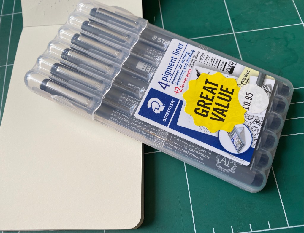
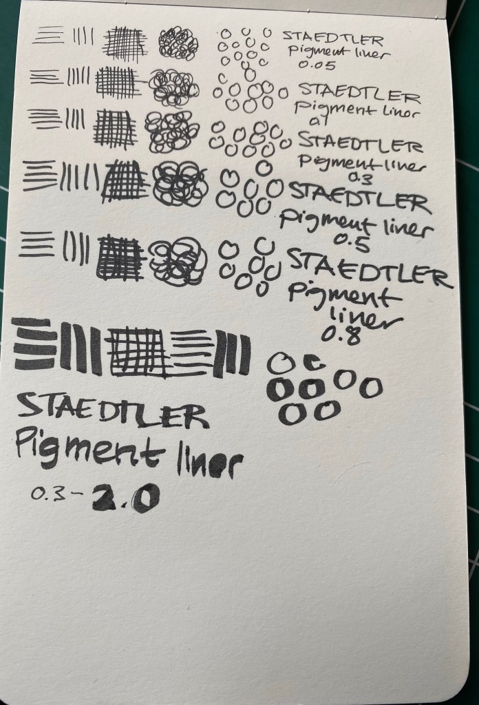
All pigment liners are expensive to purchase here, and Staedler is no different, which means that I always stock up on them when I go to Cass Art in London. This 6 pen set is always on sale, and you get a useful selection of pen widths. However, if you are just starting out, don’t buy a set – buy a 0.3 and a 0.5 and if you want to splurge add the 0.1 and the 0.8.
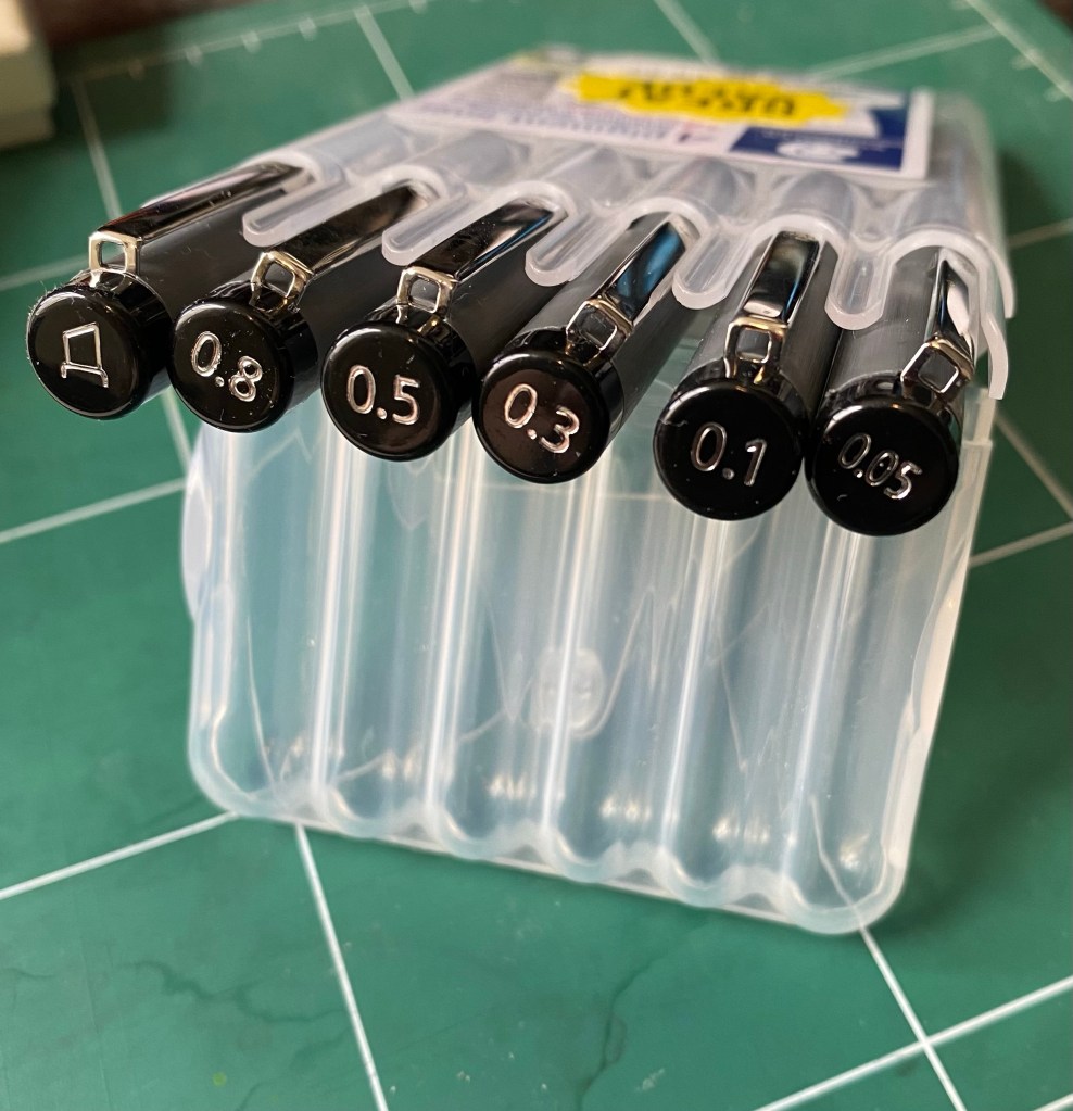
Whether you use Staedler pigment liners or ones from another brand (Sakura, Faber Castell, Copic, Uni-ball, etc), the 0.3 or 0.5 will likely be your base, bread and butter pen. I generally use the 0.3, unless I’m feeling shaky, I’m in a hurry and want to churn out sketches/illustrations, or I want to go for a dramatic effect, in which case I go for the 0.5 or the 0.8. The 0.1 is a pen that I use for the opposite effect – when I plan to use watercolour or an ink wash and I want the colour or wash to take precedent. The 0.05 is a pen that I used to use when I was younger and drew comics (it’s excellent for fine details), but I hardly ever reach for it now, unless it’s to work in small format with a colour wash of some sort following. It’s a fragile pen, so if you tend to lean on your pens, this one is not for you. How can you tell if you put a lot of pressure on your pens? Write a page with a gel ink pen and check the back of the page. Does it feel like braille lettering? Does your wrist hurt? Then you’re putting to much pressure to use this pen without ruining the tip, and you may have issues with the 0.1 tip as well. I used to write like that and it took some practice for me to be able to use these ultra fine tipped pens.
So, why do I love the Staedtler pigment liner so much?
- It puts down a consistent, black line. This seems obvious, but I’ve tried more than one pigment liner that puts down a dark grey or washed out black line and it’s always disappointing.
- It’s a rock solid pen that won’t dry out, and has a robust tip. I’ve had terrible luck with Faber Castel and other makers where a capped (mind you, capped) pigment liner stopped writing reliably after a month or two. This has never happened with my Staedler’s, and I’ve had some for years.
- The pen body. This is what makes the Staedler’s the best of the best in my personal opinion.
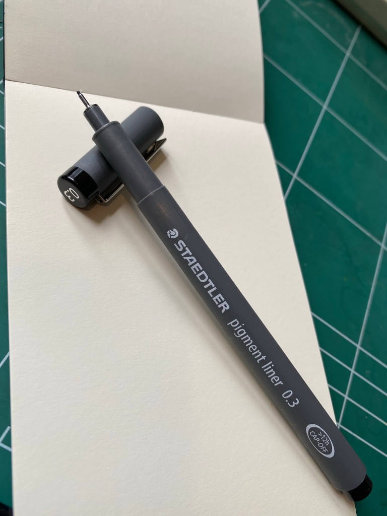
So, what makes the Staedler pen body so great? It’s a whole lot of small things that just add up. It’s light weight but doesn’t feel flimsy, and it has a matte finish with a subtle lined texture all around, so its easy to grip. It’s also a bit wider than many of its competitors, and unlike many of them, it has the pen width clearly marked on both the pen body and the pen cap. It also doesn’t have any sharp edges, which you’d think would be an obvious in pen design, but sadly isn’t. Finally, it caps and posts and uncaps with a solid click, and without having to apply a lot of pressure. You know the pen is capped and the pen is uncapped when you need it. And if you so care to uncap it with one hand, you can.
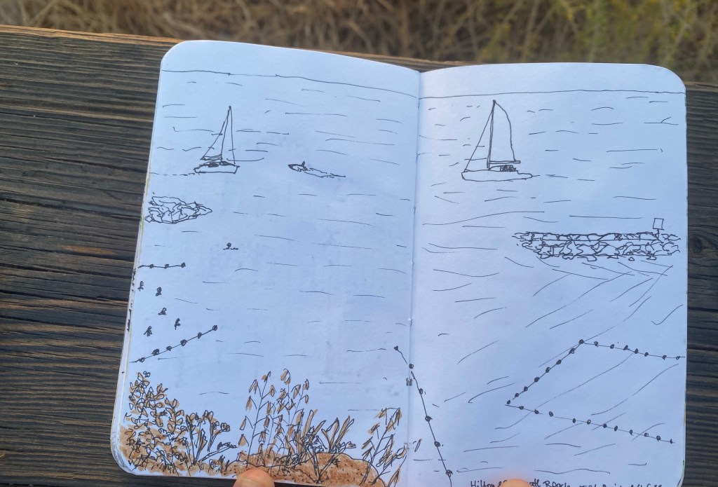
Here’s the 0.1 Staedtler in action. There’s a photo of the sketch I made after applying an ink wash (Sennelier Burn Sienna India Ink diluted in water and applied with a brush pen), and one of the same sketch after I applied blue watercolour.

During a private tour of Nazareth last year (a present from my wonderful family in between chemo treatments), I met the guide’s young boy. His father told me that he wanted to be a clothing designer when he grew up, so I broke out my sketching kit and gave him every Staedler pigment liner that I had on me. His eyes lit up once his father explained what these pens were. If you have a budding artist, designer, sketcher, doodler in your life and you’re wondering which gift to give them, two or three Staedler pigment liners will always be welcome.