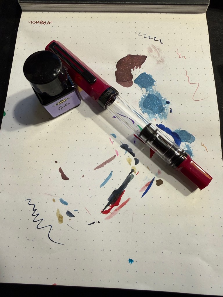
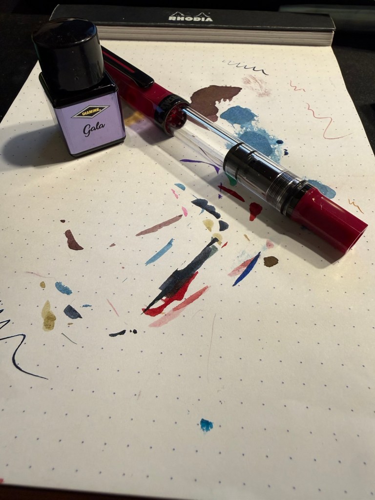
March 2026 Currently Inked Pens
I haven’t had the time or headspace to post this until now, but here’s March spring themed currently inked fountain pens.
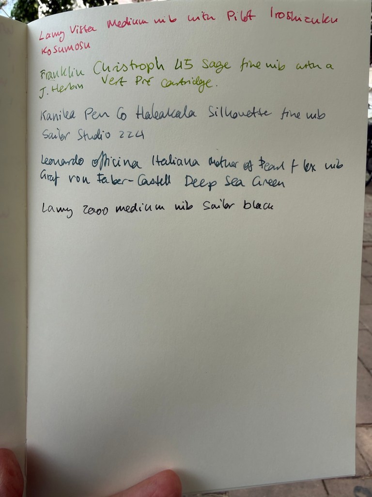
Lamy Vista medium nib with Pilot Iroshizuku Kosumosu ink. I wanted a pink ink in rotation and this is a new pen that I wanted to use. Kosumosu is a lighter pink so it benefits from wider nibs.
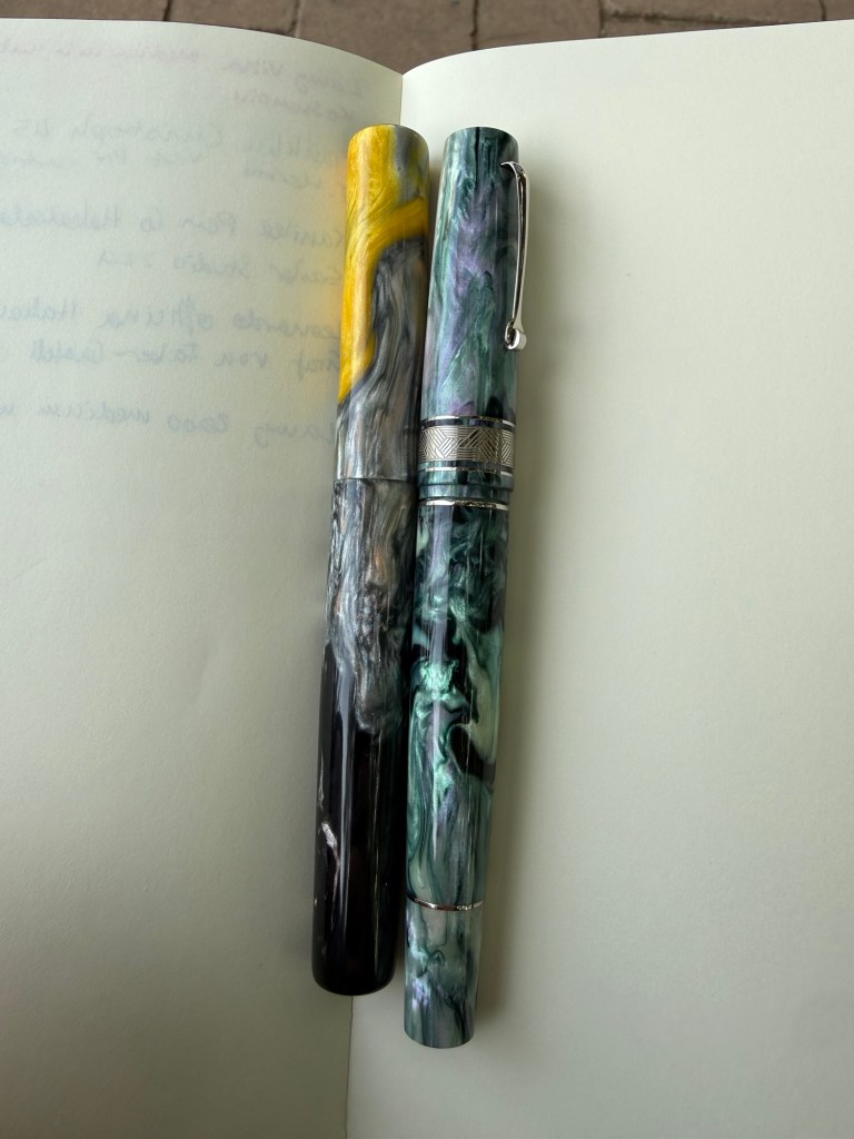
Franklin Christoph 45 Sage fine nib with a J. Herbin Vert Pré cartridge. Spring means grass green ink and Vert Pré fits the bill perfectly and works well with this pen. It was a little light at start but darkened with time.
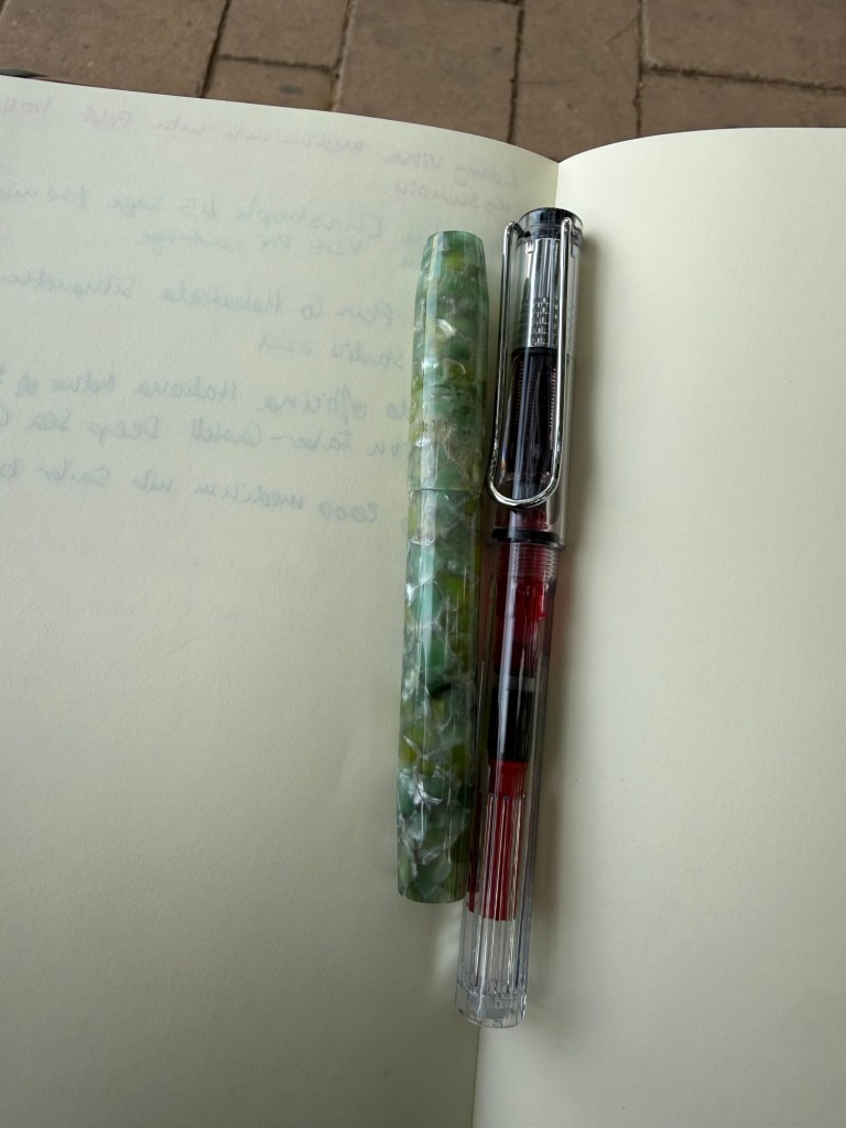
Kanilea Pen Co Haleakala Silhouette fine nib with Sailor Studio 224. I haven’t used this pen in a while and I like grey inks, which is why I almost always have one in rotation. Sailor 224 is one of my favourites.
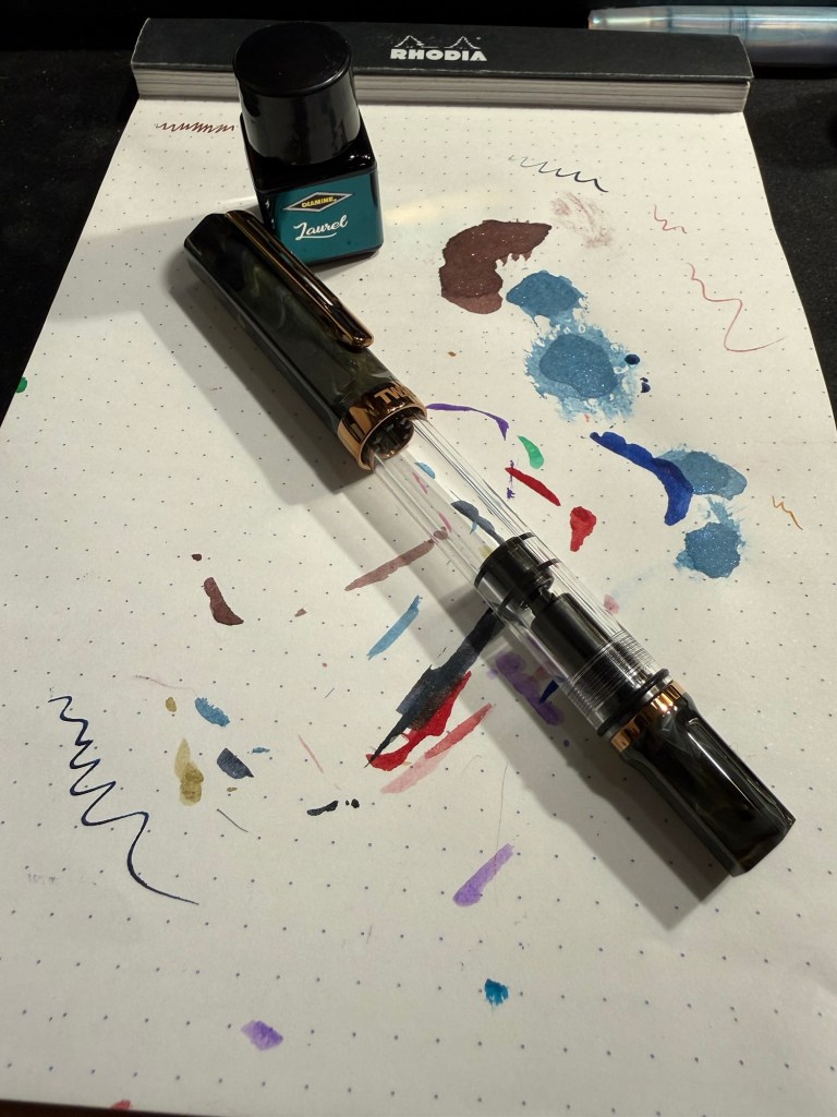
Leonardo Officina Italiana Mother of Pearl fine flex nib with Graf von Faber-Castell Deep Sea Green. I love this pen and this nib and I haven’t used this grey green ink in a while.
Lamy 2000 medium nib with Sailor Black. Workhorse pen with workhorse ink.