It’s nice to have new pens and inks in rotation. I’m enjoying Diamine’s Writer’s Blood more than I expected, Diamine Autumn Oak is fantastic with a Waterman superflex nib, and Pilot Iroshizuku Tsuki-yo is becoming one of my favourite inks.
Liz Steel and Marc Taro Holmes are hosting the OneWeek100People challenge again this year, and I intend to participate again. The challenge starts on the 3rd of March and officially lasts 5 days. I normally sketch from photos, but this time I want to see if I can do the entire challenge from observation only. It may take me more than 5 days, but I’m OK with that. Are you planning on joining the challenge?
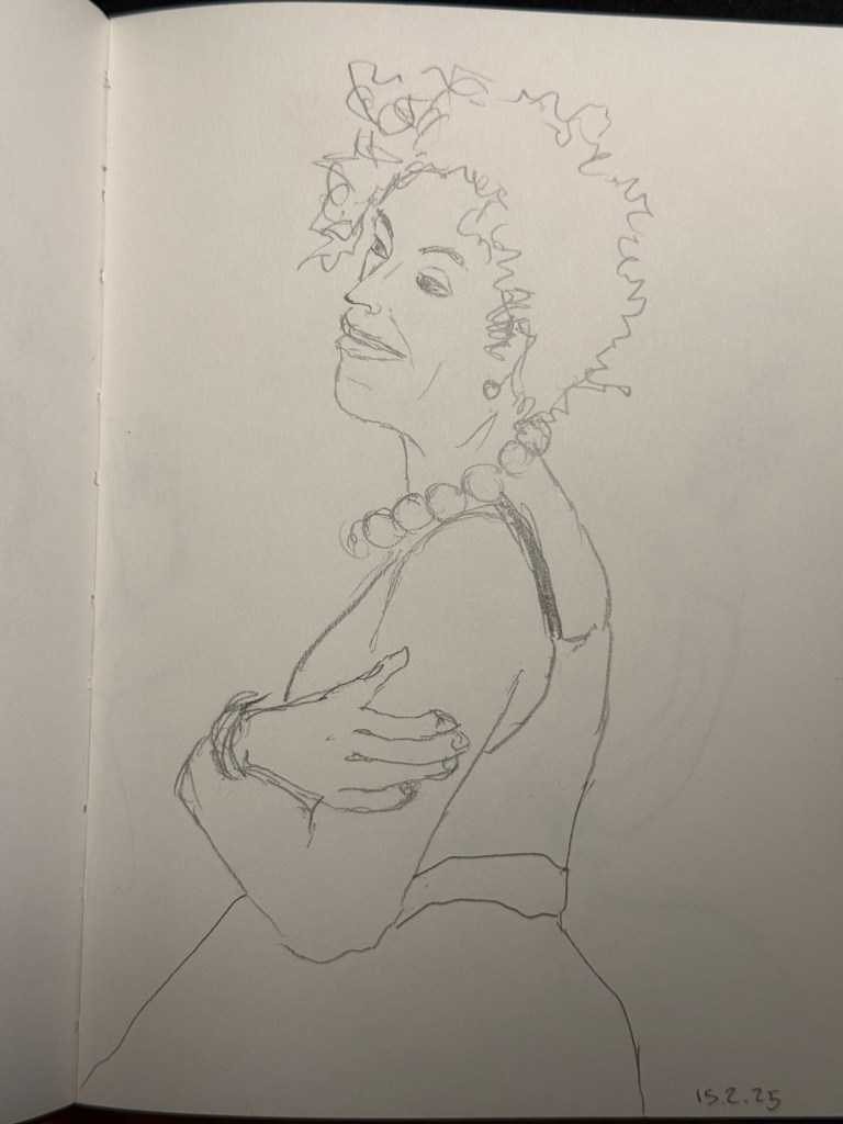
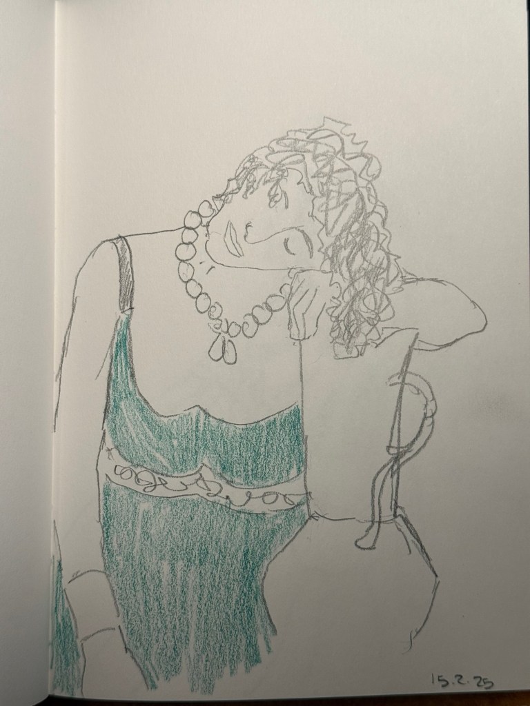
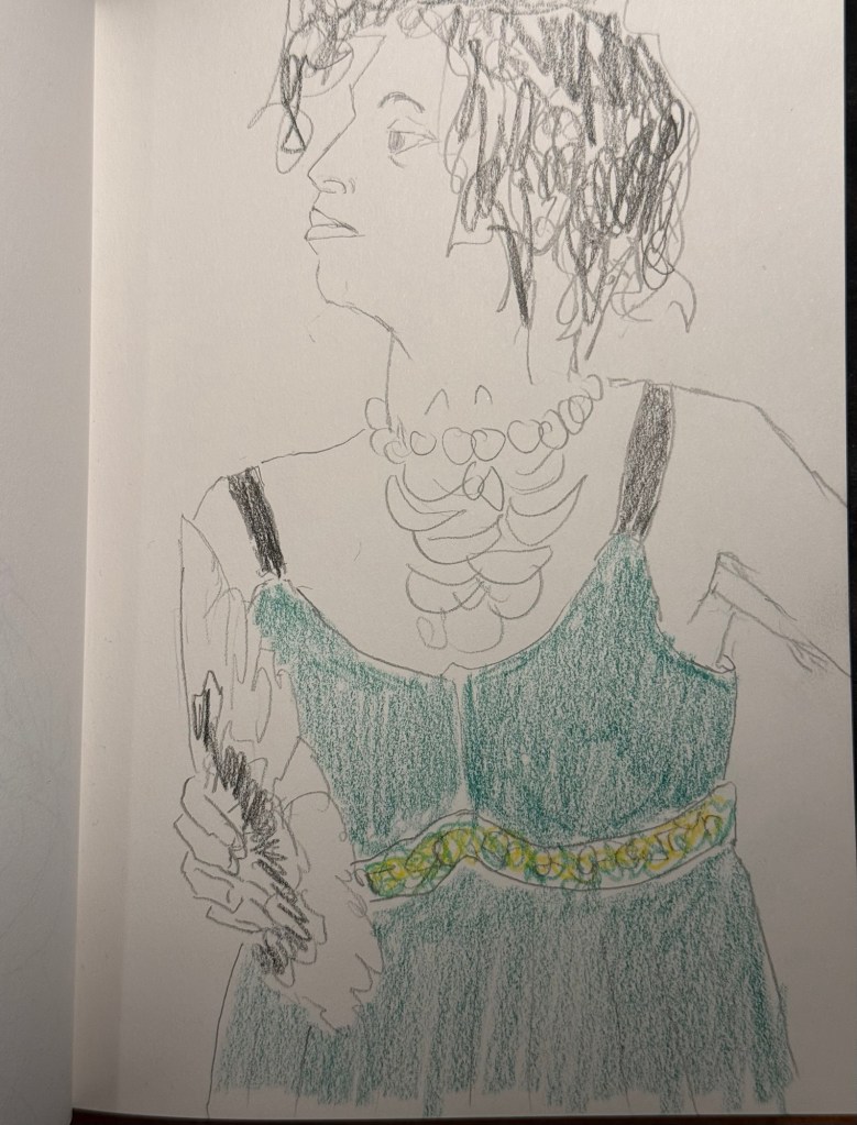
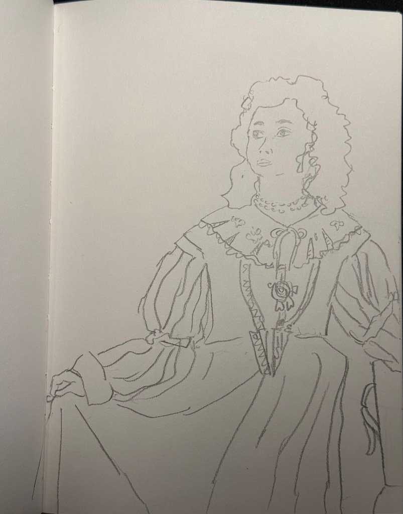
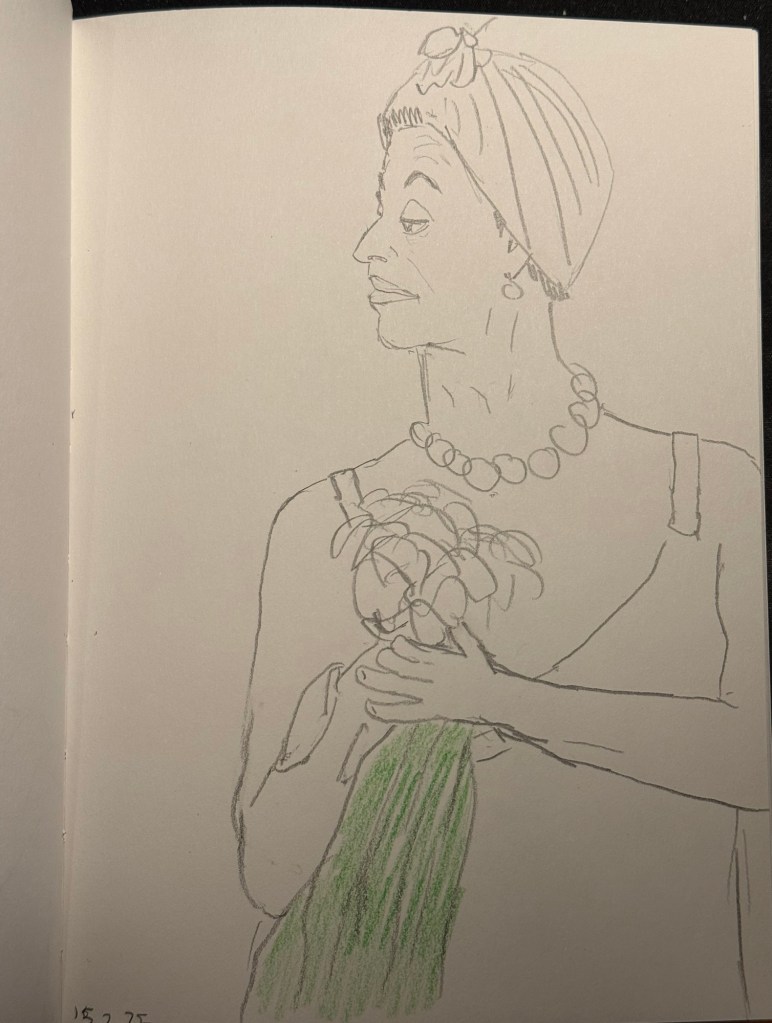
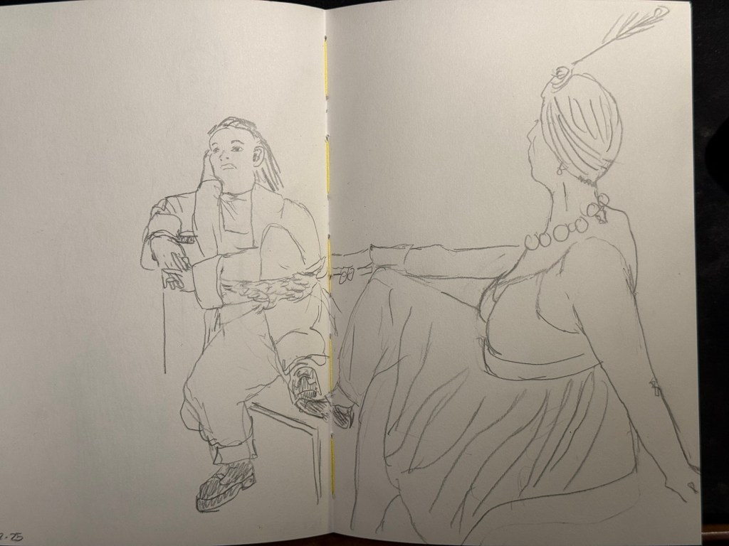
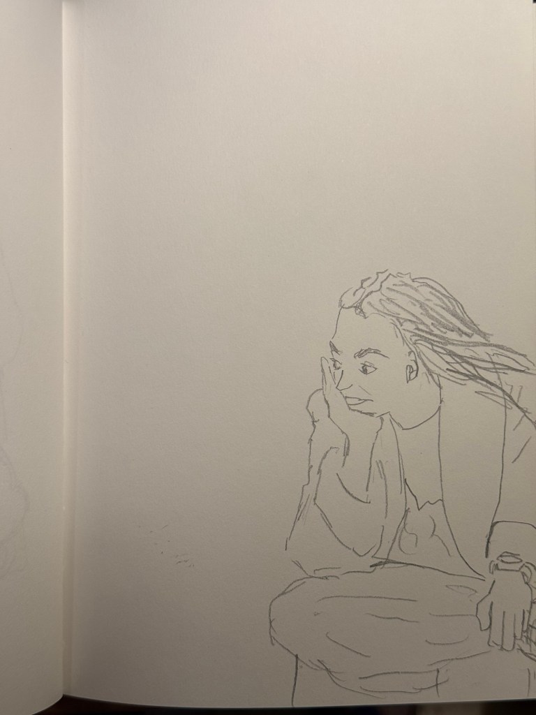
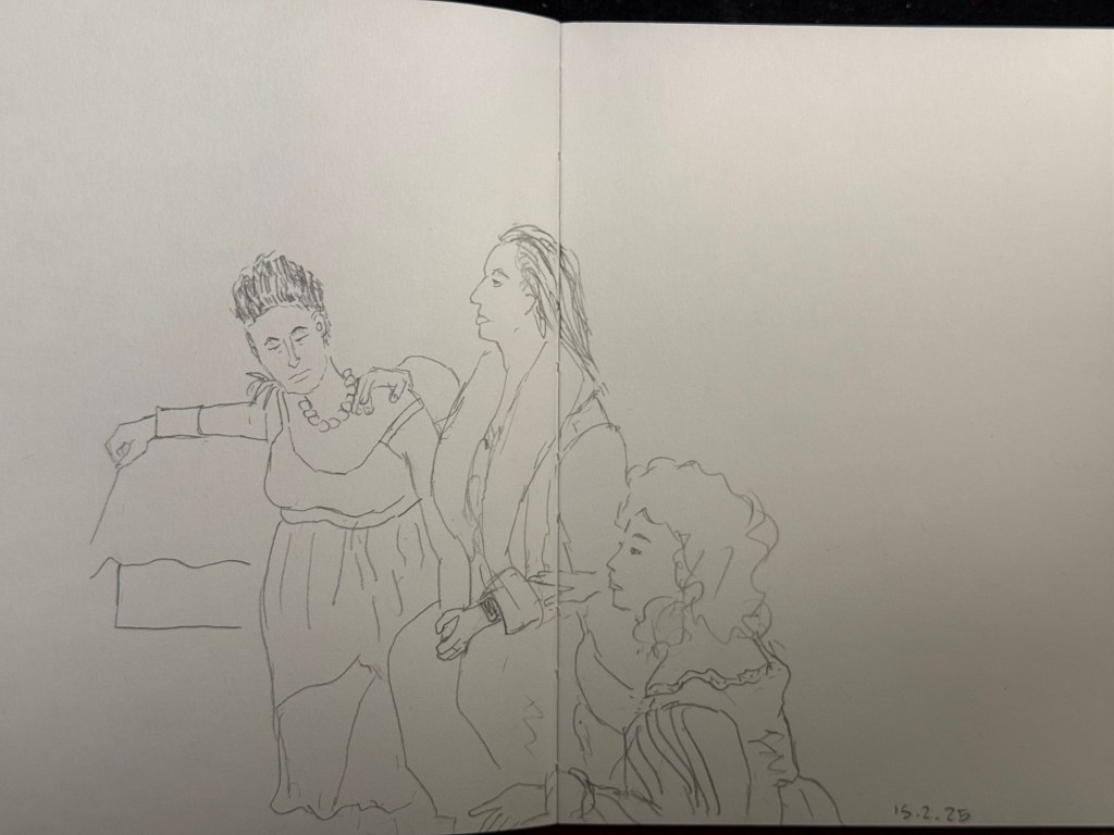
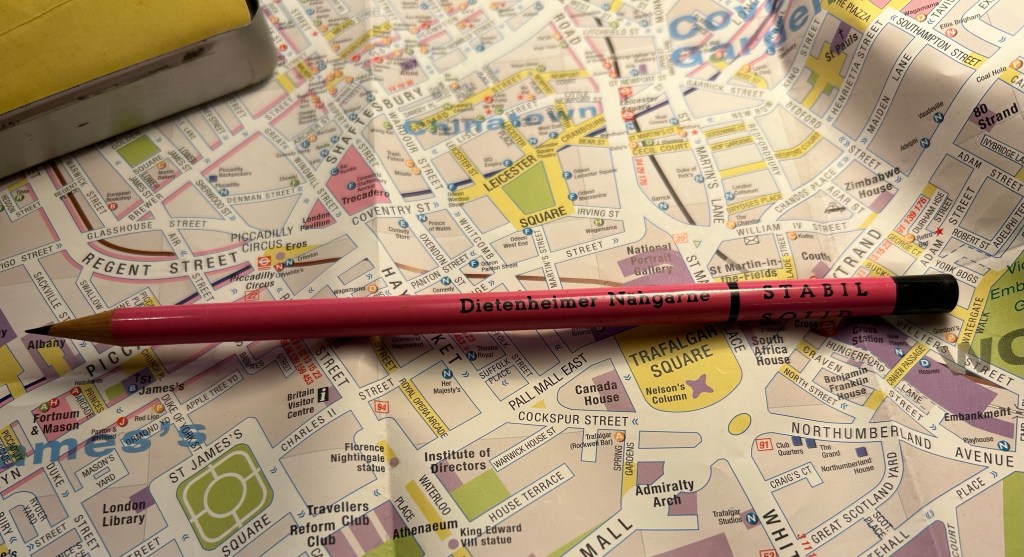
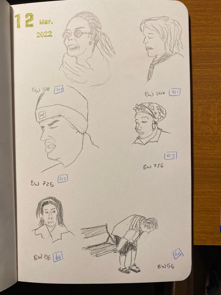
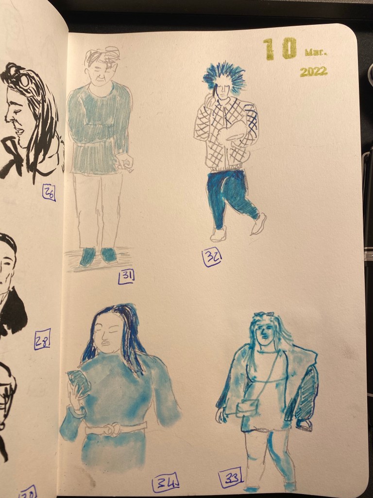
I went to the local art museum again this week, to sketch models in the museum. This was the last time this event was run, and the place was packed with sketchers. I didn’t have the best of locations, but I made the most of it. I sketched with Faber Castell 9000 2B and 3B pencils mostly, and added a touch of colour with Faber Castell Polychromos. The ink sketches were done with a Staedtler Pigment Liner 0.5. The sketchbook I used was once again the French Pascale Éditions. The models did fewer 20 minute poses and more 10 minute ones, which meant scrambling a lot. I wanted to visit the museum after the event, but I was so tired from 3 hours of non-stop sketching that I just went home.
Harman Photo just came out with a brand new colour film, Harman Red. It’s a red-scale film, and I’m curious enough to try and buy a roll or two and test them out. I love the wild, wild results I got with Harman Phoenix and the Harman Red is basically Phoenix pushed even more into red-scale.
Here are the sketches from today, and I hope that you have a great week!
10 minute pose.10 minute pose.10 minute pose.10 minute pose – the hardest pose to draw because of the angle of the head. Had a false start on this one, so had only about 8 minutes for this. 10 minute pose – Staedtler 0.5 pigment liner10 minute pose10 minute pose10 minute poseThe three models. The pose started with just the two top models, and then the third one joined, and it was a 10 minute pose.A challenging composition, 20 minute pose10 minute pose. I like the composition on this one – I placed her on the side of the page to give her room for thought. Final pose, 20 minutes
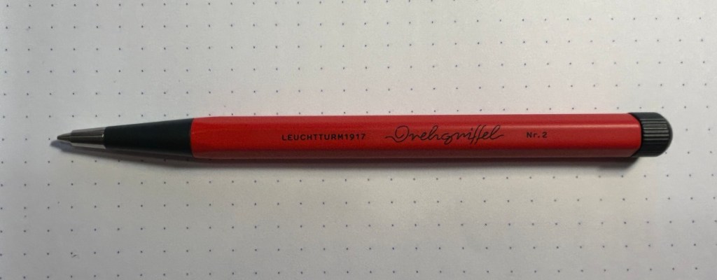
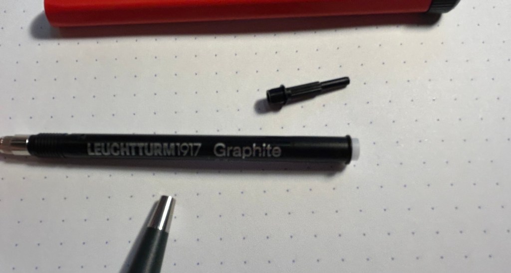
The Leuchtturm1917 Drehgriffel Nr.1 is a charming little pen that comes with either a gel refill or a ballpoint refill. The Drehgriffel Nr. 2 is its pencil counterpart: a short but hefty mechanical pencil with a twist mechanism that comes in a variety of colours. My pencil is a bright red and dark grey one, and it has quickly become my most used pencil by far.
Small but mighty, the Drehgriffel Nr. 2
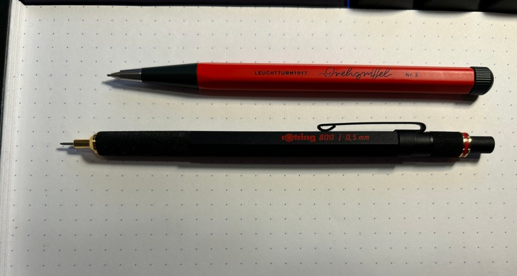
The pencil is shorter than other mechanical pencils, but as it’s an aluminium bodied pencil with a steel tip it has some weight and heft to it. It’s lighter than the Rotring 800, and the weight is balanced towards the tip so it’s very comfortable to use.
Drehgriffel Nr. 2 on top, Rotring 800 on the bottom
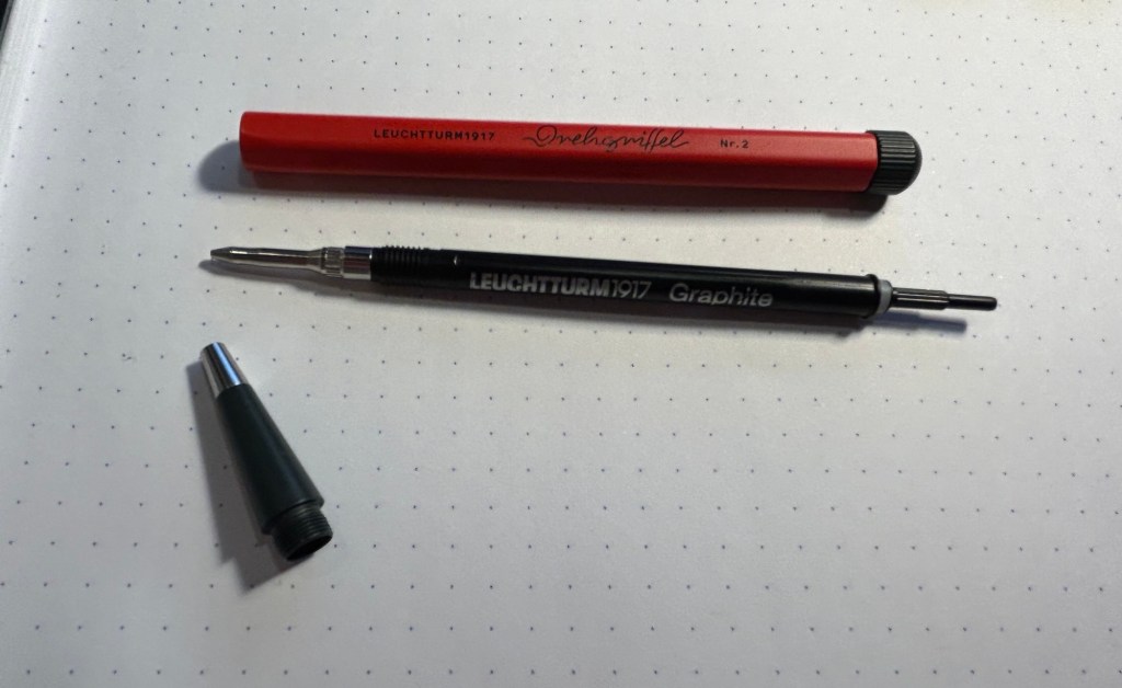
The pencil mechanism is proprietary to Leuchtturm, and it’s a pretty unique affair. You give the nob on the top a quarter twist and then you hear a satisfying click and the lead advances. The pencil mechanism looks like a gel ink or ballpoint refill, but the little pole on the top pulls out and you can add more pencil leads to the pencil that way. You get to the mechanism through unscrewing the front cone tip of the pencil.
The Drehgriffel Nr. 2 and its mechanism
Here’s a closeup of the mechanism (my camera had issues focusing on the lettering):
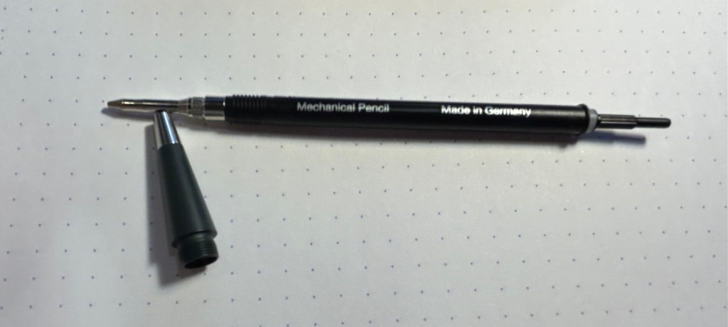
Here you can see where the leads go in:
The Drehgriffel Nr. 2 is a 0.7 mechanical pencil and it comes with HB leads inside. It’s a great pencil with a classic, sleek design, and a very solid and unique mechanism. The size is plus as it makes it ideal for everyday carry, and it doesn’t have the silly little eraser that certain mechanical pencils have and is always terrible. The only minus to this design is that to add more leads to it you basically have to take the pencil apart. That’s no big chore, but the end bit (the little pole thing) is very small and would be easy to misplace. I’d suggest doing the refilling in batches of a few leads at a time, and being careful to not lose sight of the mechanism end bit.
Otherwise this is an excellent mechanical pencil, a solid and handsome little workhorse that’s a joy to use and would make for a great gift even for people who are not great pencil lovers.
While most of my fountain pen collection consists of vintage fountain pens, I understand that for many people purchasing vintage fountain pens is too risky. You might get a pen that needs repair, you might misjudge the value of the pen and overpay considerably, you might be buying a fake. As even the cheapest of vintage pens isn’t just a few bucks, making a mistake here could end up being very expensive.
Yet there’s a joy in vintage items, in seeing the craftsmanship, design and care put into them, in learning their history and placing them on a timeline, and in the knowledge that you saved something from the landfill. If you want to experience some of that joy with less of the risk of buying vintage fountain pens, vintage pencils are your friend. Flea markets are full of vintage pencils, pencil tins, pencil sharpeners, leadholders, etc that are usually very cheap to buy, and hold little to no risk.
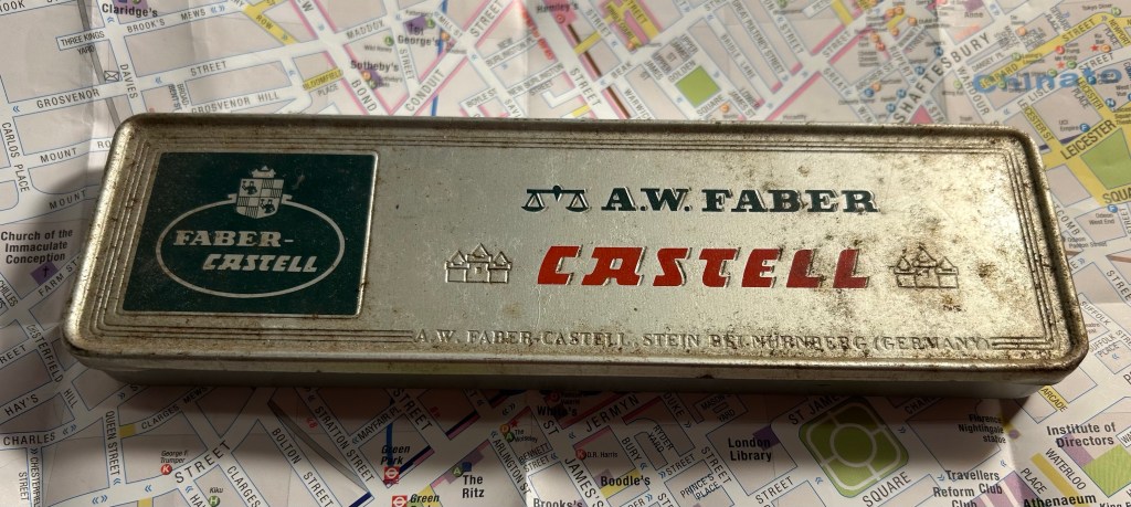
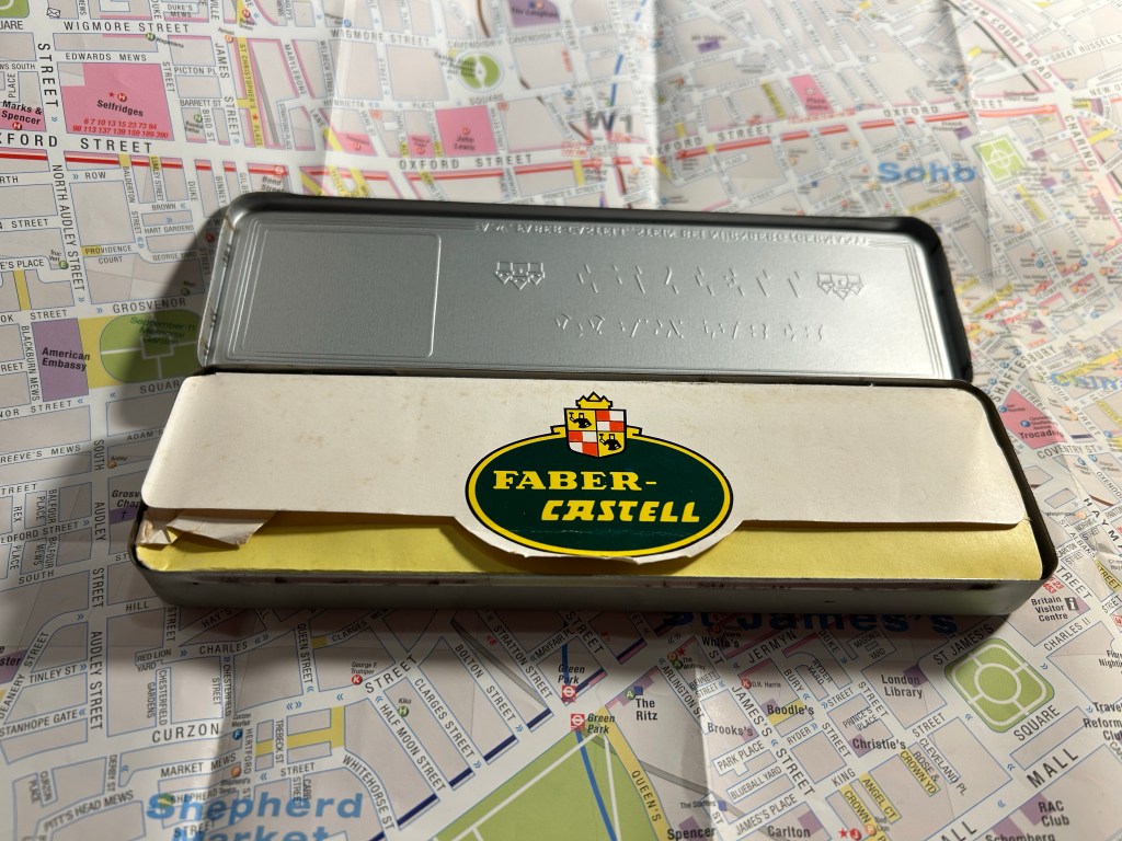
When I was in Spitalfields market, buying vintage books, I saw this tin propped up against a bookshelf in the stall I was purchasing my Arthur Ransome books from. This is how it looked:
Grimy but not full of rust or beaten up A.W. Faber Castell pencil tin.
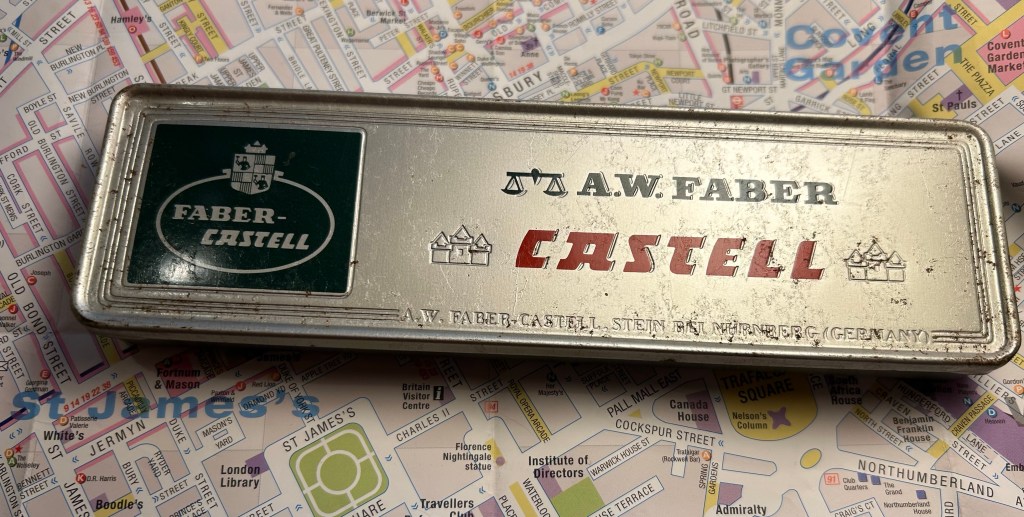
It’s an A.W. Faber Castell pencil tin, and after just a few minutes with some wet wipes it already started to look better:
A bit cleaned up.
The tin and the pencils inside cost me only a few pounds, and truth be told I would probably have purchased the tin even if it was empty. The design and typography are absolutely delightful:
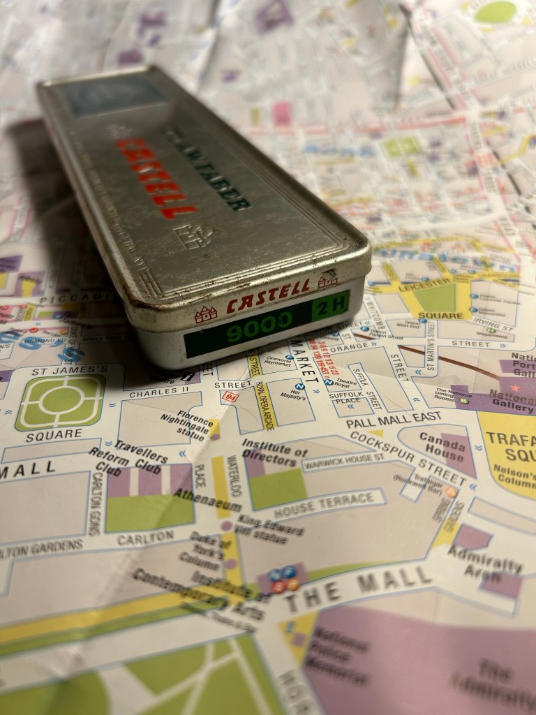
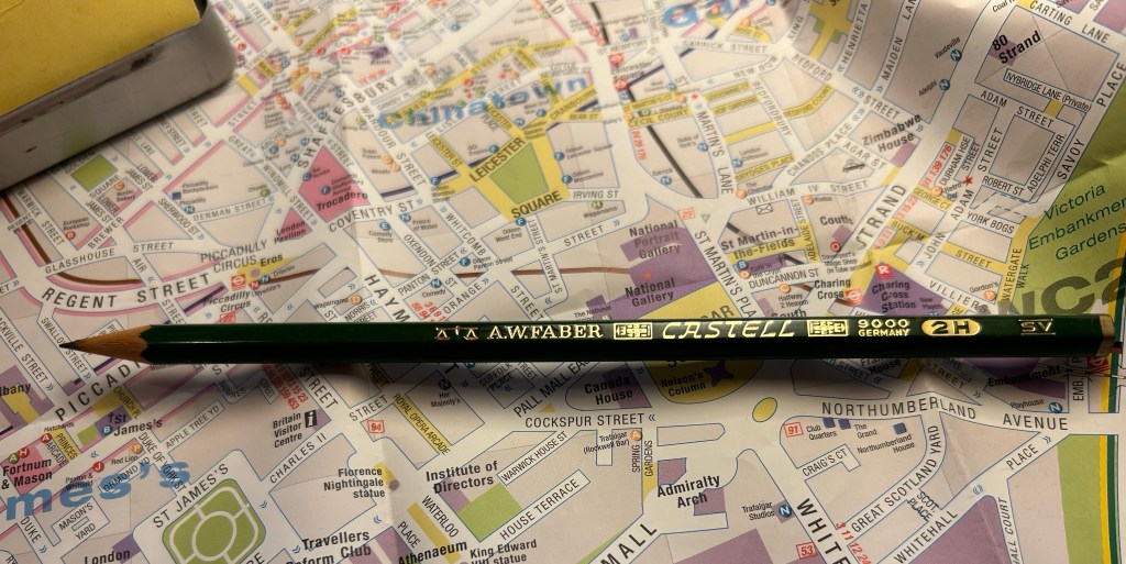
Castel 9000 2H. I can imagine having a stack of these in different lead grades on a shelf.
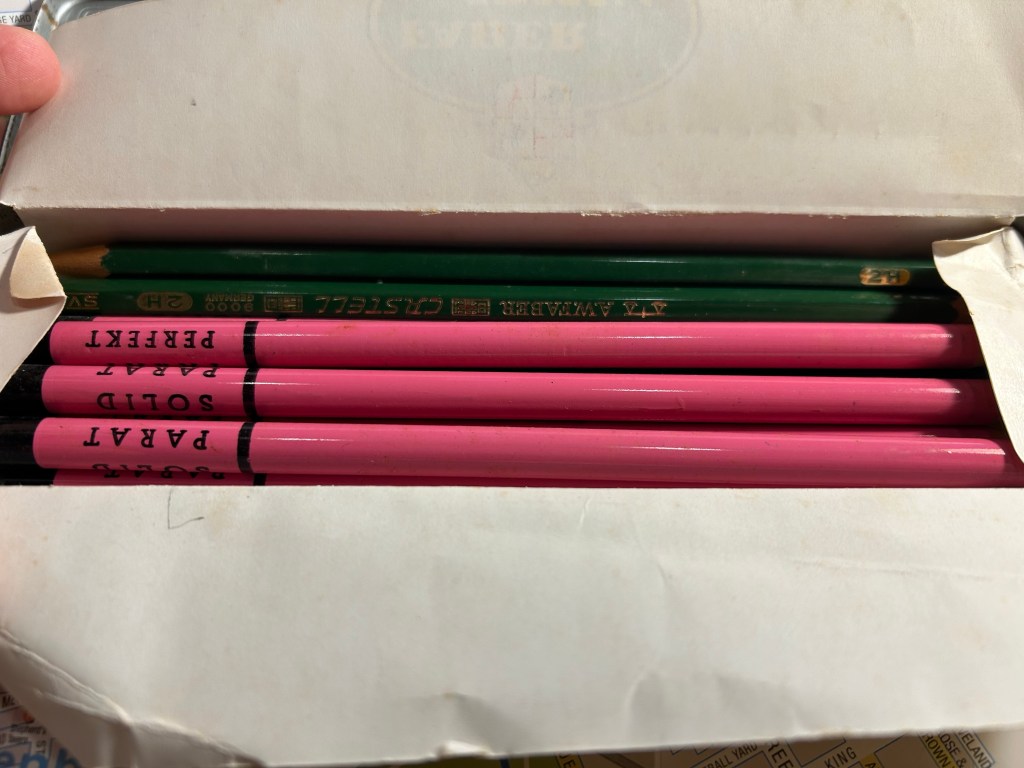
The over packaging continues inside – you wouldn’t want your pencils rattling around in the tin, would you?
Paper insert to protect the pencils inside.
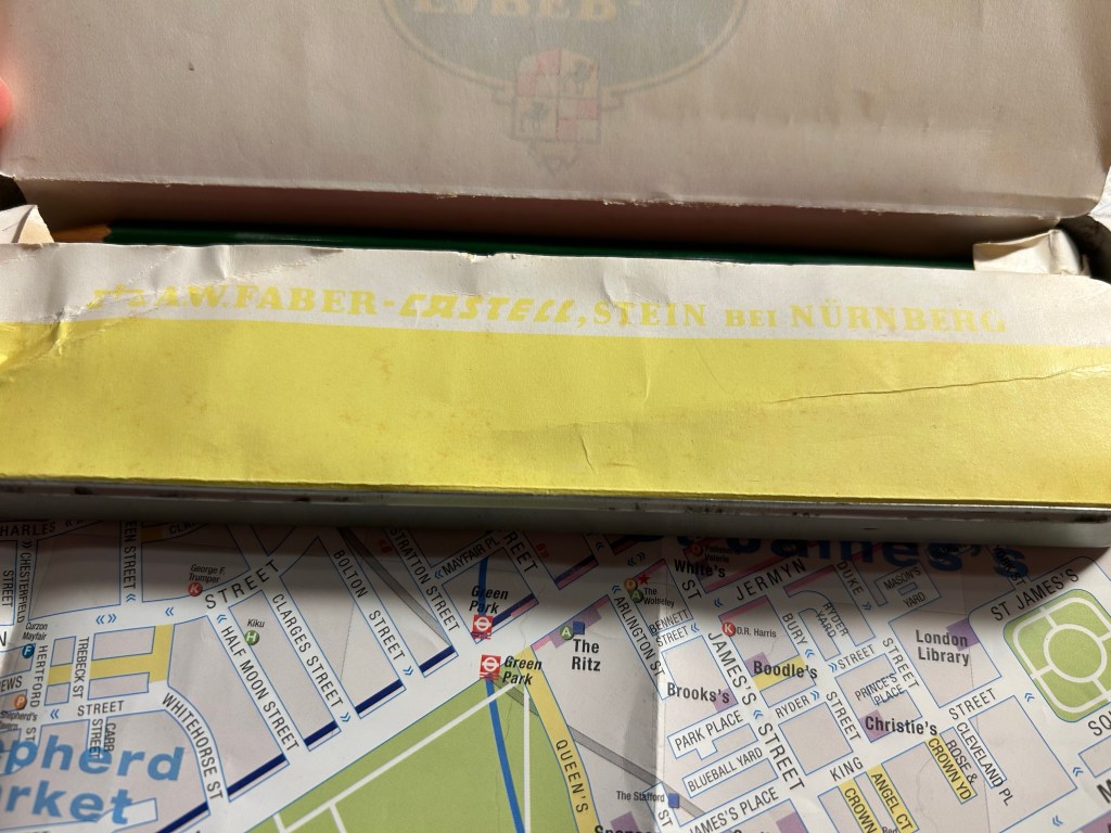
Faber Castell’s factory in Stein proudly represented on the outer tin and here too:
A.W Faber-Casterll, Stein Bei Nürnberg
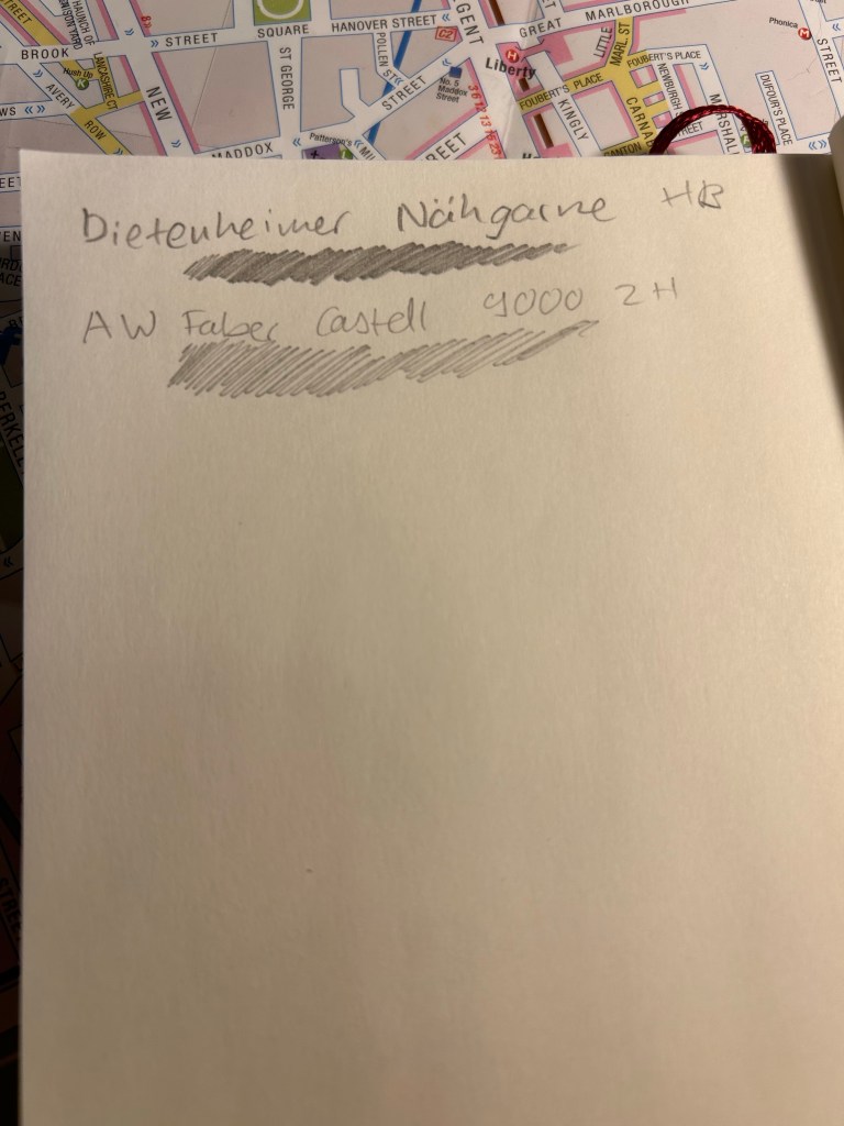
Inside were about half of the original Faber-Castell 9000 2H pencils, and half pink advertising pencils for a thread company that I think no longer exists.
It’s like opening a box of chocolates – you never know what you get
Faber-Castel 9000 are excellent artist pencils, and the vintage ones are just as great as the current ones in production, only they’re usually cheaper and have much better typography and logos on them. Look at this little masterpiece:
Vintage pencils always have a ton of stuff stamped on them. You needed the INFO, right?
The pink pencils were round advertising pencils, for a German thread making company that seems to no longer exist. They are solid HB pencils, and have an 80s sort of vibe to them.
Advertising pencils.
The great joy of vintage pencils is that they of course write just as they used to when they were originally made. If they have erasers they’re going to be unusable (these pencils don’t), and sometimes the wood is a bit brittle and dried out so a bit more care needs to be taken whilst sharpening them (these pencils are in excellent condition), but otherwise time affects pencils very little.
Writing samples
So next time you’re at a flea or antique market, rummage around its hidden corners for some cool old pencils to try out. You never know what you’ll find — I picked up some Sanford Noblots from a giant jar of pencils that way.
P.S. If you’re wondering, 2H pencils are perfect for watercolour under-sketches, as so long as you keep your pressure light, they disappear beneath the paint.
Over the past 24 hours things have gotten very depressing and very scary here. To distract myself a little bit, I decided to start working on a new project: Going Shopping in My Stationery/Art Supply Stash. I have a lot of stuff. I don’t use enough of the stuff that I have, to the point where I don’t even remember what I have. As I’ve significantly cut down on buying new stationery and art supplies, I’ve decided this would be a good time to go “shopping” for new things to use in whatever it is that I already have.
I bought this fancy looking A5 composition notebook from Choosing Keeping in London this April, after eyeing their gorgeous notebooks the last time that I was there.
Such a great looking notebook. Yes, the cover has gold foil on it.
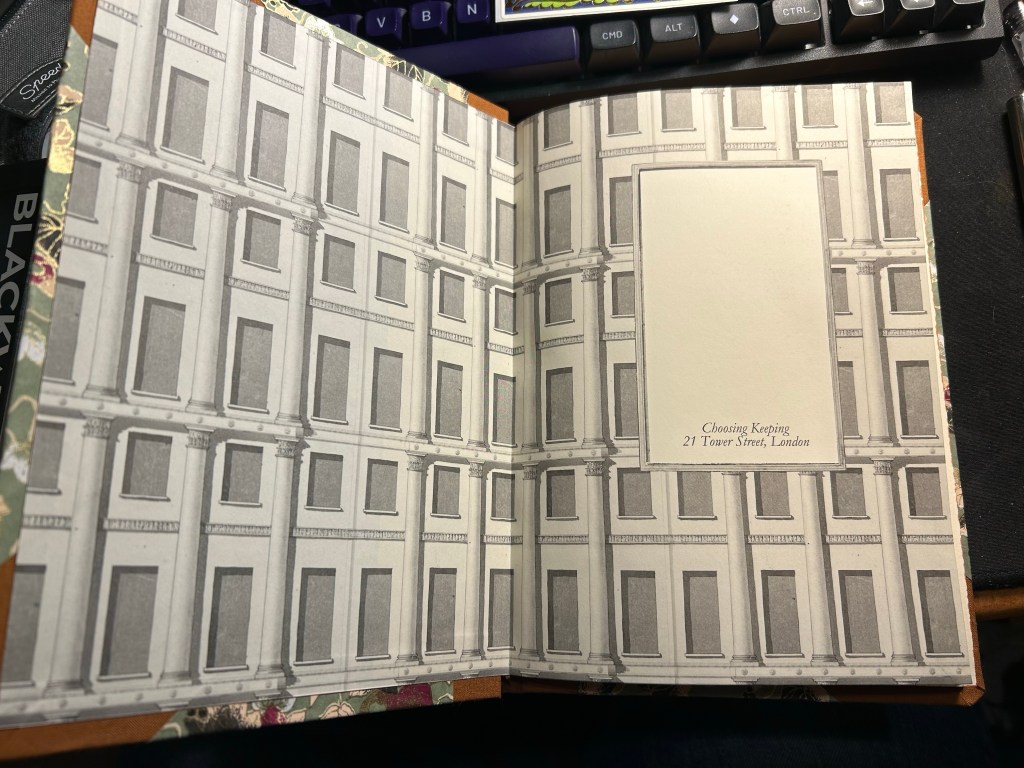
The endpaper is also very good looking:
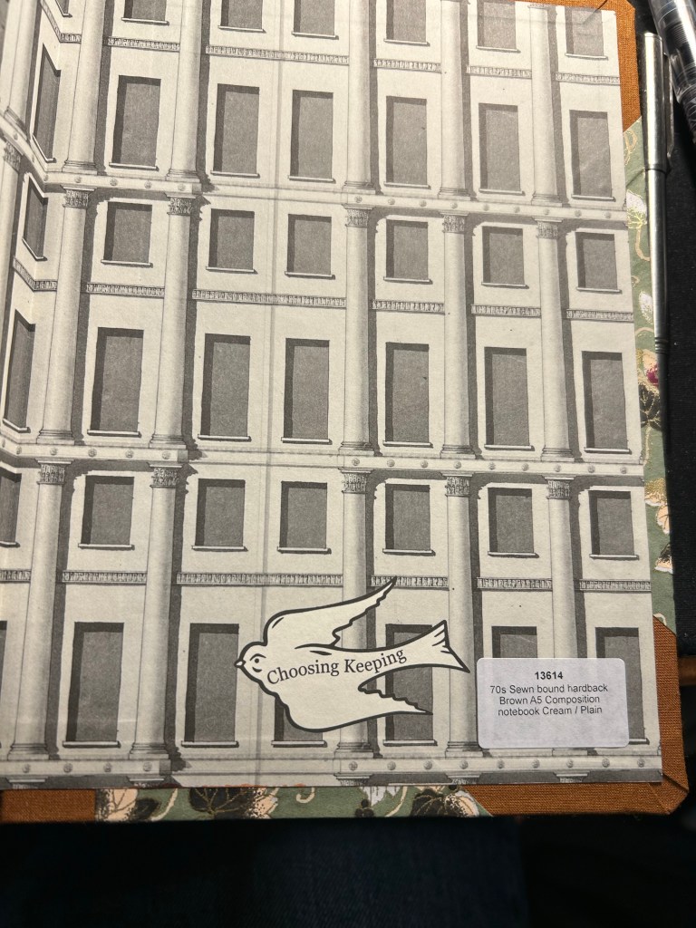
Front endpaperBack end paper with the Choosing Keeping bird sticker, and details on the notebook.
The paper is cream and unruled, and the edges of the paper are mottled brown. It is one of the best looking notebooks that I have:
I was planning on using it as a journal, but the paper was an utter disappointment. It is not fountain pen friendly, which really surprised me — the ink spreads and feathers and bleeds through. I could have used a gel ink pen with this notebook, but it somehow seemed incongruous with how fancy and special (and expensive) the notebook is.
Ink test page
So I shelved it and I haven’t touched it in months, until today. My eye caught it as I was looking for a notebook to sketch in, and I remembered that the paper had some tooth and texture to it.
Closeup on the paper and the ink results.
It’s a soft, velvety kind of paper, which made me thing that it might work with pencil quite well. I also had some pencils I wanted to try out, so it seemed like a good opportunity to not let a fancy notebook go to waste.
Massive bleed-through
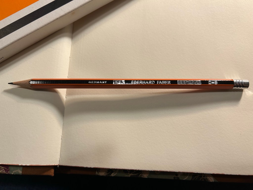
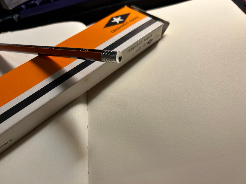
Enter the pencil that I wanted to try out most: the Eberhard Faber EFA 1000 vintage pencil in 2=B grade. I know, it’s weird. I don’t get it either. 2 is supposed to be HB. I bought a box of these beauties at during my last visit at Present and Correct, and I’ve been wanting to use them since. They’re made in Germany, the lead is a B grade (slightly softer and darker than HB), very smooth and it retains its point surprisingly long for a soft pencil.
Eberhard Faber… with the Star. I love everything about the design of this pencil and this box.
The pencil comes pre-sharpened, and has an orange and black body that looks a bit like the Staedtler Noris, but in orange instead of yellow. It has “Germany”, “EFA”, “Eberhard Faber”, “EFA 1000” and “2=B” embossed on it silver foil. The fonts used look very futuristic and modern, which makes me think that this is a ‘70’s pencil.
Very fetching design
The biggest issue with vintage pencils is the eraser, which is always dried up and completely unusable. For this reason I prefer vintage pencils that don’t have erasers, or better yet, those that have endcaps. Well the EFA 1000 gets lots of bonus points for not only having an endcap, but having a really good looking one. It’s also silver in colour, and it features three rings and a concave top.
The endcap
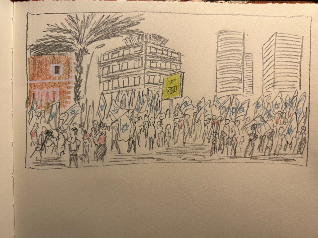
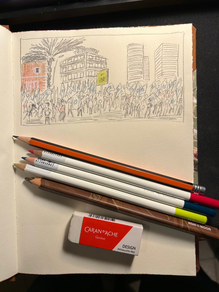
I then sat down to create this quick sketch of the latest round of pro-democracy protests. The pencil was a joy to use, and it worked very well on the paper. I was very happy with the feel of them both, and with the sketch results:
I added some colour with three Tombow Irojiten coloured pencils and a Koh-I-Noor brown Magic Pencil. The Tombow Itojiten was an utter disppointment. The green pencil crumbled twice, the others were mediocre at best. The Koh-I-Noor was a lot of fun, but brown works best with other coloured pencils layered on top, to give it some life.
Tools used here. Eberhard Faber EFA 1000, Tombow Irojiten, Koh-I-Noor Magic Pencil, Caran d’Ache Design eraser
All in all this first attempt at shopping from my own stationery stash was a success. The EFA 1000 is staying on my desk, I learned things about the Tombow Irojiten (I’m glad I only have three Itojiten pencils and not a box of them), and I got to use a notebook that I’d thought would just gather dust. This is definitely something I will try to do again.
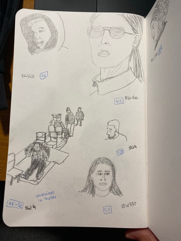
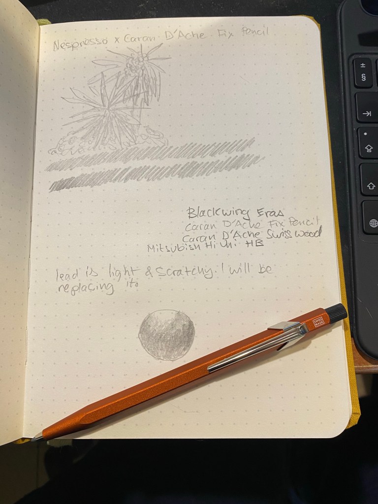
As I expected I didn’t reach 100 people sketches in 5 days, but I still intend to get to 100 sketches, so I’m plowing on. My hands are still wrecked with neuropathy so today’s sketches are all pencil sketches, all of them using various Blackwings. Hopefully tomorrow I’ll be able to get back to ink and watercolour, but if not I’ll break out my vintage pencils and give them a spin.
My hands have been absolutely dreadful today, and it’s been a real pain to draw. I used a Sanford No-Blot pencil to get at least a few sketches done, and hopefully tomorrow I’ll be able to get a few more done.
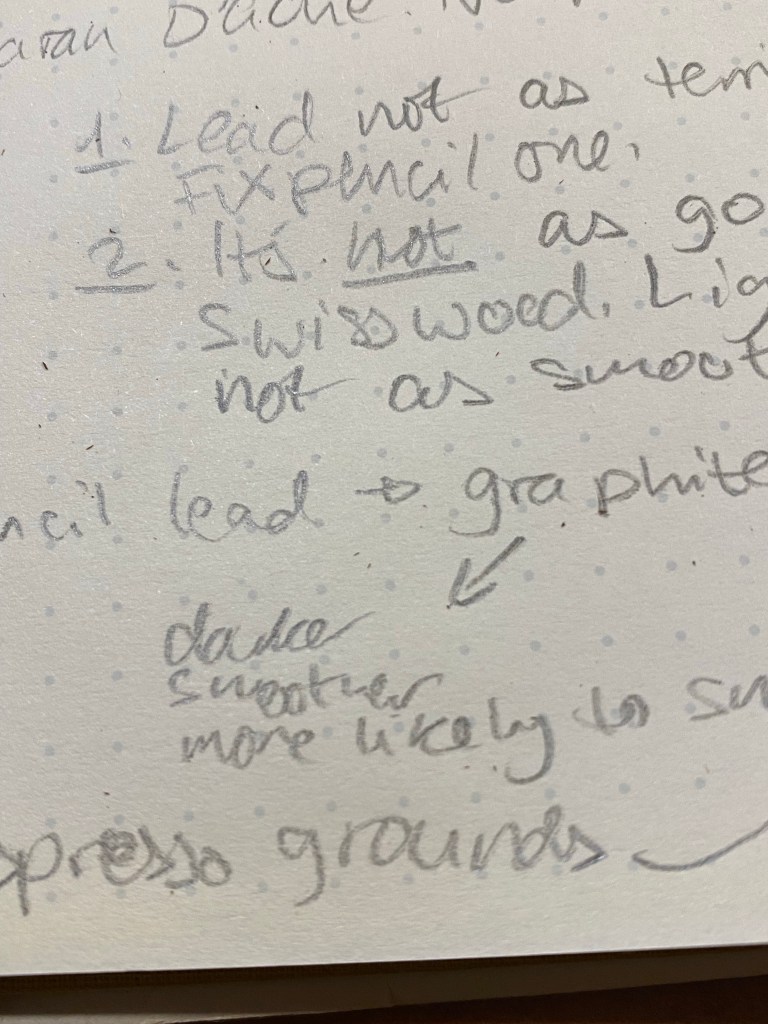
The Caran d’Ache Swiss Wood is one of my favourite pencils. There are those who hate its burnt caramel smell and have nicknamed it “the stink wood,” but I am not one of them. I love how the Swiss Wood smells like, how it looks like, and especially how it writes like. The pencil is a joy to hold, the tip lasts forever, and it puts down a dark and smooth line that is great for writing and sketching. Its only real downside for me is its price — the Swiss Wood is expensive, and only getting more expensive with time.
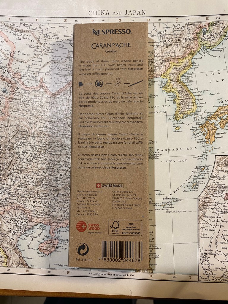
So when I saw that Caran d’Ache was creating a Swiss Wood in collaboration with Nespresso, I added it to my Cult Pens basket together with the Nespresso Fixpencil. What can be more cool that the Swiss Wood with a Nespresso theme and some added recycling thrown in? This three pack of pencils was very expensive, but I decided to treat myself.
Boy do I wish I hadn’t.
The front of the recycled box.
As with the rest of the Caran d’Ache x Nespresso collaboration, the pencils come in a 100% recycled box. The box is cleverly designed with coffee bean shaped cutouts that show glimpses of the pencils inside, and debossing that shows off the pencils’s shape and coffee beans to highlight what the recycling story in this collaboration is about. The rest of the “recycling story” is in the pencils’ lead, which is made of 25% coffee grounds. The pencils are made of FSC certified beech wood, which is the same as the normal Swiss Wood. You can find all this information on the back of the box:
The back of the box.
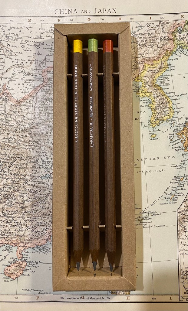
Inside the box are three very expensive pencils. They look (and smell) just like the Swiss Wood except for the imprint on the pencil body, and the dipped end-caps.
Three very expensive pencils.
The end-caps are metallic, and come in golden yellow, light green, and a bronzish red. They aren’t metal end-caps, but simply end-caps dipped in paint, just like the red Swiss Wood end-cap, only in different colours.
Closeup on the end-caps.
The imprint on the pencil is very similar to the original Swiss Wood, with the addition of the Nespresso logo, and the sentence: “A Recycling Story is in Your Hands”. The imprint is very crisp, and I like the font they chose for it.
The imprints on the pencils.
Here is where things started to go downhill. The clever and beautifully designed box that holds the pencils chipped into one of them, taking out a chunk. Not great for such an expensive set.
Damaged expensive pencil.
The end-cap is only dipped in paint. For this collaboration, especially considering the price, I expected the end-caps to be made of aluminium from recycled Nespresso pods. As it is, painted end-caps are a disappointment. Here are a bunch of modern and vintage pencils that cost much less and have better end-caps than the Nespresso Swiss Wood:
End-cap comparison.
Here’s a close up of the end-caps. From top to bottom they are: Nespresso Swiss Wood, Tombow Mono 100, Eberhard Faber Colorbrite (vitage), Mitsubishi Hi Uni, General’s Kimberly, Eberhard Faber No Blot (vintage). If they could do it why couldn’t Caran d’Ache?
Caran d’Ache Swiss Wood painted end-cap vs cheaper, more premium end-caps…
Here’s the Caran d’Ache Swiss Wood next to the original Swiss Wood. They look very much alike, apart from the imprint and the colour of the end cap. However, it’s not what’s outside that makes or breaks the pencil (pun intended) — it’s the core.
Caran d’Ache Nespresso Swiss Wood (top) vs the original Swiss Wood (bottom).
The core of the Nespresso Swiss Wood is made of 25% recycled coffee grounds from Nespresso capsules. The Nespresso Fixpencil had a similar recycled coffee ground core and was terrible. Is the core in these pencils as bad?
Writing sample of the Nespresso Swiss Wood vs the original Swiss Wood. Written on a Baron Fig Confidant.
It’s not that bad, but it isn’t great. The original Swiss Wood has a dark and smooth core that holds a point for a long time. The Nespresso Swiss Wood has a fragile core that is scratchy and lighter than its counterpart. It isn’t unpleasant to use to the point of being unusable, but it feels cheap, it looks cheap, it’s everything but a premium pencil in a world full of excellent premium pencils that cost less. There are actual white streaks in the writing it produces. If I want white streaks in my writing I can pick up a cheap ballpoint. For the price of these pencils I expect a better writing experience than the Swiss Wood, not a worse one.
Close up the writing, where you can see the white streaks.
The Caran d’Ache x Nespresso 849 collaboration produced some stunning pen designs. So far the pencil part of the collaboration hasn’t gone so well. I’d buy the Nespresso Fixpencil and toss out the lead, but I’d utterly avoid the Nespresso Swiss Wood. You get a worse pencil for a higher price, and the veneer of being good for the planet. Reduce, reuse, recycle are said in that order for a reason. In this case reduce, as I wish I had.
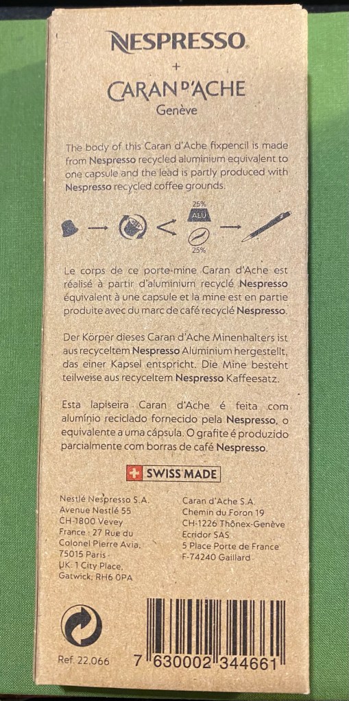
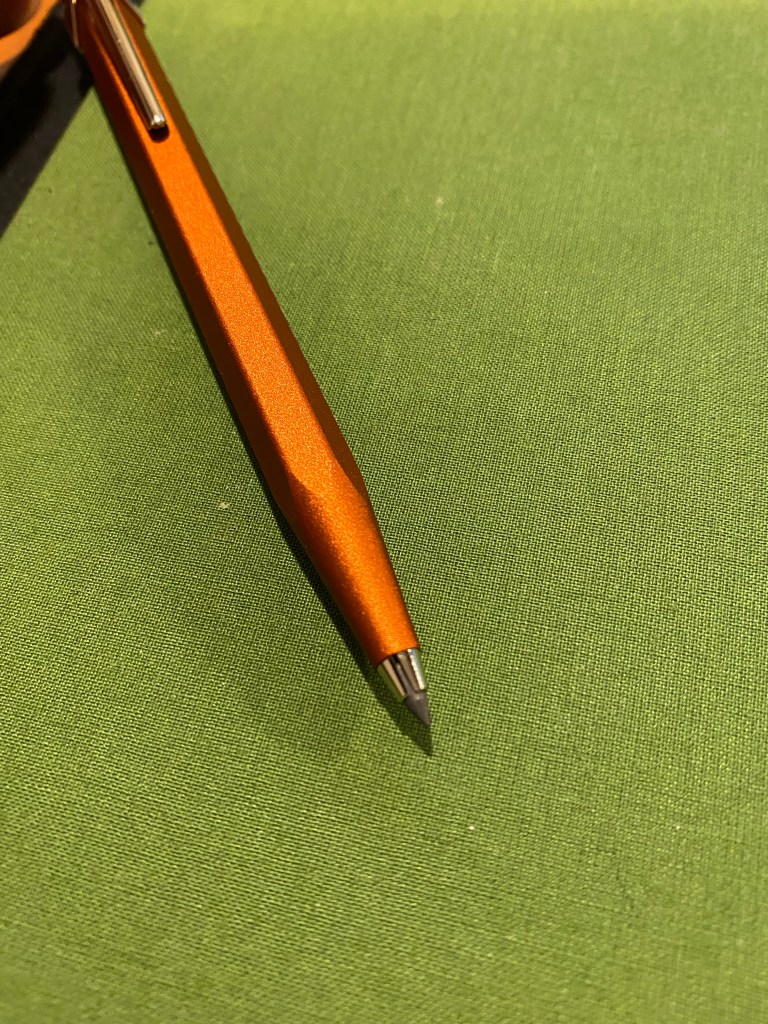
Caran d’Ache’s Fixpencil is their legendary clutch pencil offering. While the classic Fixpencil has a plastic body, the Fixpencil 22 is made of aluminum, giving it both an added weight and a more luxurious finish. The Nespresso Fixpencil 22 is also made of aluminum, hence the 22 in the name, but it’s aluminum body is partially made from a recycled Nespresso capsule, and it comes with a lead that’s partially produced from recycled coffee grounds. Just like the previous Caran d’Ache x Nespresso849pens, this brand collaboration is all about recycling with class.
The front of the Caran d’Ache Nespresso Fixpencil box.
The box that the Nespresso Fixpencil arrives in is similar to its 849 counterparts: it’s made of 100% recycled cardboard and there’s a Nespresso capsule shaped cutout in the box that shows off the colour and texture of the Fixpencil. Clever embossing and tasteful design and branding make this a superb gift to give to someone who enjoys using pencils (with a caveat that I’ll get to later). The box is the most recycled thing about the product (being 100% recycled), but at least Caran d’Ache is honest and transparent about the quantity of recycled materials inside the fixpencil and lead: 25% of each, respectively. So there is a fair bit of “greenwashing” going on here.
Back of the Caran d’Ache Nespresso Fixpencil box.
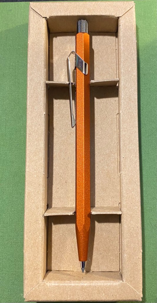
The clever design of the box continues once you open it. It really shows off the beauty of the Fixpencil design and just how vibrant and warm the orange “ochre” colour is. It glows. You can also see the subtle texture the Fixpencil has.
Gorgeous orange Fixpencil nestled in a cardboard box.
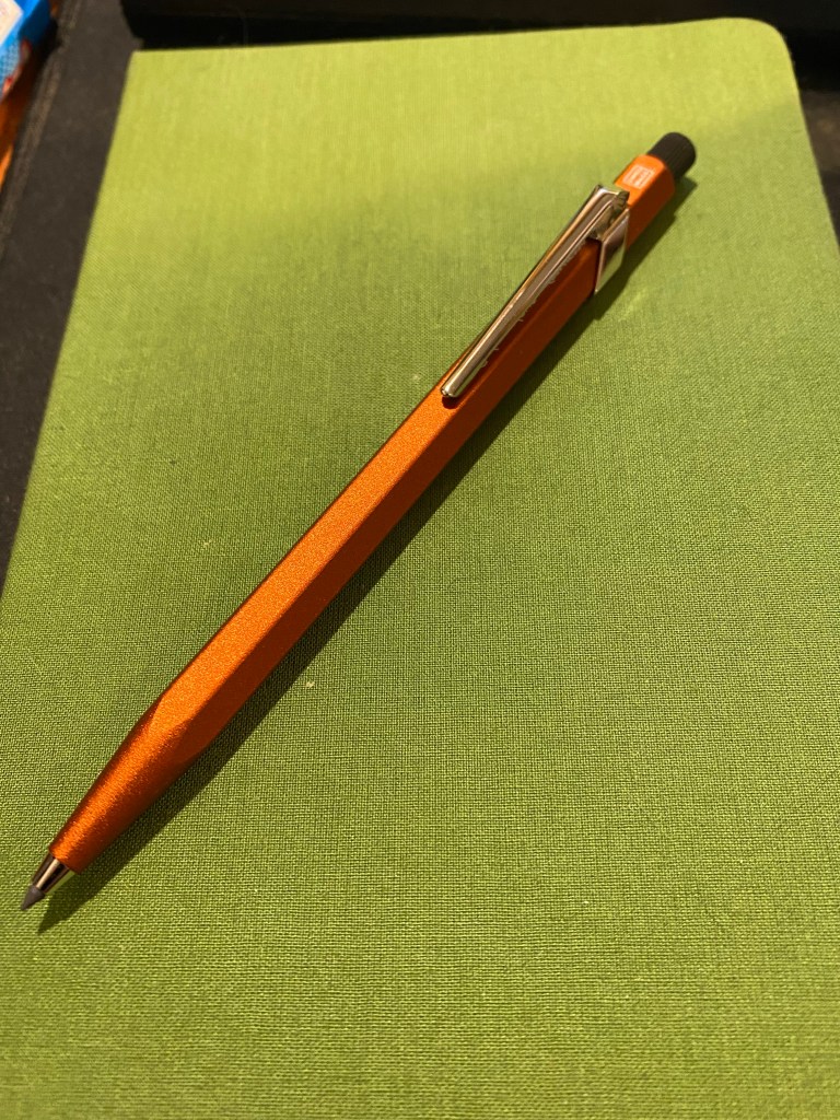
Here is my first, albeit minor, quibble with this product: it’s not ochre. It’s reddish orange. It’s mandarin. It’s anything but the yellowish brown that ochre brings to mind. I have no idea why it was so poorly named.
Fixpencil ochre? More red than yellow by far to be called that.
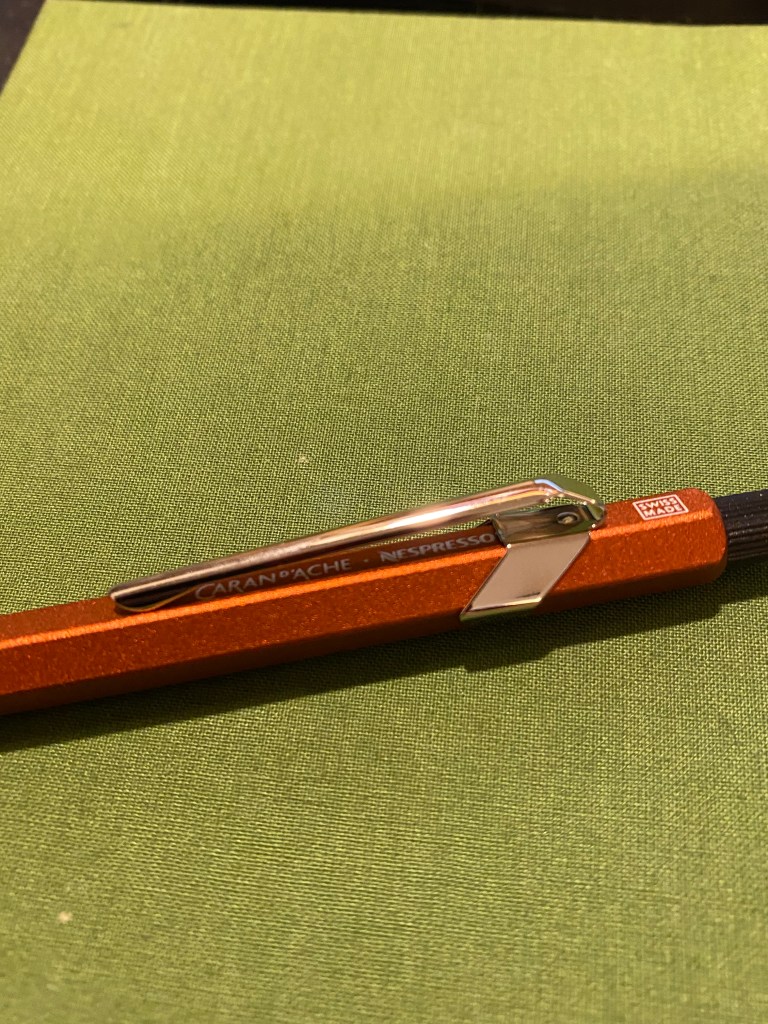
Caran d’Ache 849s and Fixpencils normally have very little branding on them. The Caran d’Ache brand is tucked discreetly under the clip and generally all that you see is the “Swiss made” with a white border around it just above the clip. The Nespresso collaborations are different in that Caran d’Ache adds an additional imprint to the pen/pencil: “A Recycling Story is in Your Hands”.
A recycling story (of sorts) is in your hand.
Of course the normal logos are where they usually are, with the addition of the Nespresso logo to the Caran d’Ache logo under the clip.
Logos discreet and visible.
The Fixpencil is a joy to use because of its form factor, which is just like the 849, and the wonderful finish on the pencil body, which adds subtle texture that makes the Fixpencil fun and easy to hold.
A close up on the Fixpencil’s texture.
And now we come to the worst part of this collaboration: the pencil lead. The Nespresso Fixpencil doesn’t come with the normal fabulous Caran d’Ache pencil leads. Instead it comes with a pencil lead that has 25% coffee grounds in it and is supposedly a B grade lead. It’s terrible. The lead is scratchy, so light that it writes like an F or even an H grade lead, and hard to erase. After testing in on my standard pencil testing Baron Fig notebook, I threw it out and replaced it with a standard 2B lead from my regular stash. Not recycled, but actually usable.
Terrible pencil lead in action.
Here’s a close up where you can see in the word “scratchy” where the lead actually dug into the paper.
Closeup on the scratchy writing and some lead comparisons.
The Caran d’Ache Nespresso Fixpencil is a joy to use and will make for a fabulous gift once you pair it with a box of good quality B or 2B pencil leads. It’s a beautiful take on an already great product that I just wish also included the normal Caran d’Ache lead lineup.
Today is national pencil day, which is just an excuse to showcase my latest vintage pencil finds from visiting a very old local stationery shop. Oftentimes shops like these still have new old stock of vintage pencils, and in my case I’m usually looking for local Jerusalem Pencils, but I often find other interesting things along the way.
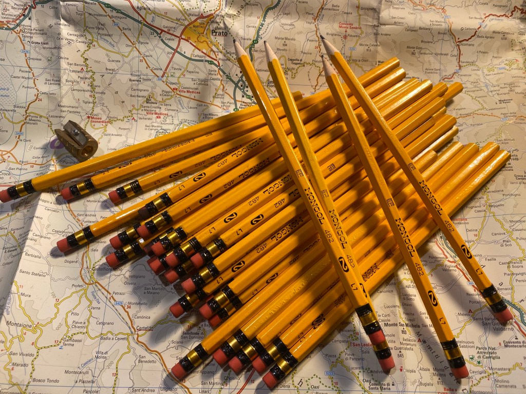
Eberhard Faber Mongol pencils.
In this case I got a very large haul of Eberhard Faber Mongol #2 pencils, which I think are really good looking in terms of typography and ferrule design. Most of them are unsharpened, which is a bonus treat, although as usual with vintage pencils time has rendered their erasers unusable.
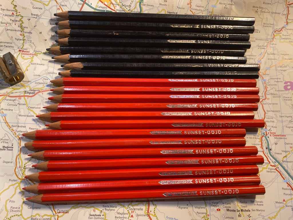
The real find for me were some very old Jerusalem Pencils (based on the logo), in this case coloured pencils (black and red). These are very waxy with relatively little pigment, but I don’t intend to draw with them anyway, and it just tickles me that didn’t translate “sunset” to “שקיעה” (or sunset in Hebrew) but rather chose to transliterate it, to give the pencil a more cosmopolitan feel.
Jerusalem Pencils Sunset coloured pencils.
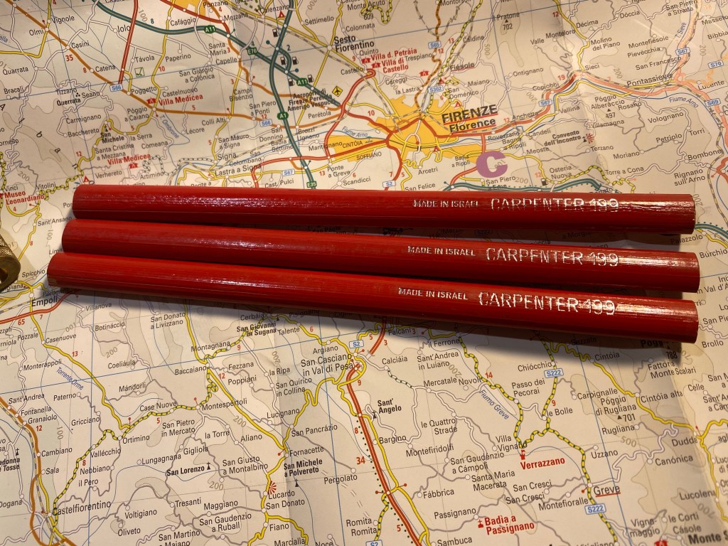
Carpenter pencils are something I rarely find in stationery stores but do sometimes find in flea markets. In this case I lucked on three perfect Jerusalem Pencils Carpenter 199 pencils.
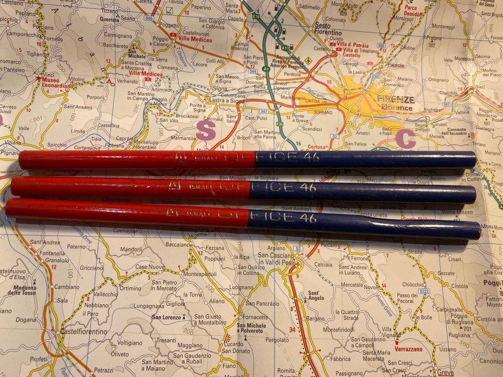
Even rarer for me are these Jerusalem Pencils Office 46 red and blue dual pencils. One of them is badly warped and another is slightly warped, but they still have their handsome imprint with an art deco-y font.
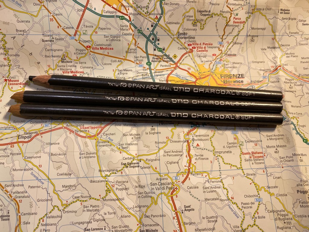
These are more modern, as they have the Pan Art imprint, which means that they were likely made after Jerusalem Pencils was forced to rebrand itself after its bankruptcy. They’re charcoal pencils, and it will be interesting to give them a spin. I love the font selection here as there’s a lovely flow to it.
Pan Art Charcoal Soft pencils.
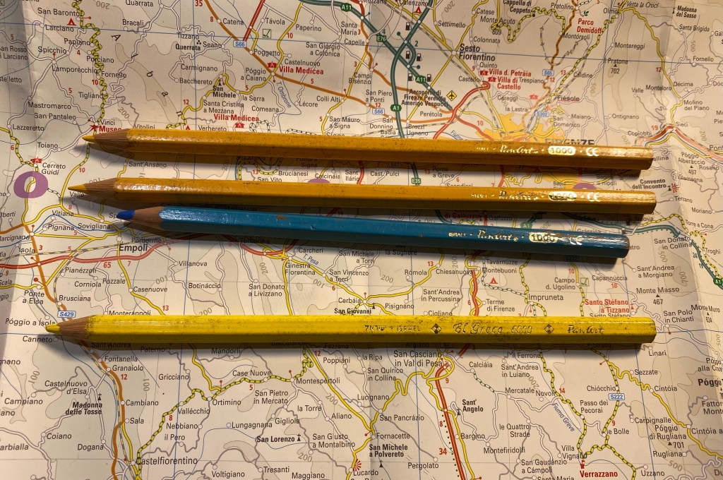
These are the last Jerusalem Pencils of the bunch, Pan Art coloured pencils from the 1000 and the Al Greco 6000 line. These are quite modern but I still haven’t seen them too often so I added them to the pencil pile.
Pan Art 1000 and Al Greco 6000 coloured pencils.
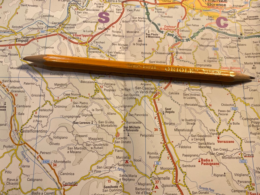
Here’s a pencil that I’m pretty sure was made by Jerusalem Pencils, but there’s no telling it if was under that name or Pan Art. It was sharpened at both ends so you can just make out that it’s an HB pencil, and enough of the imprint is left to know that it was made in Israel and is called Oriole.
Oriole pencil.
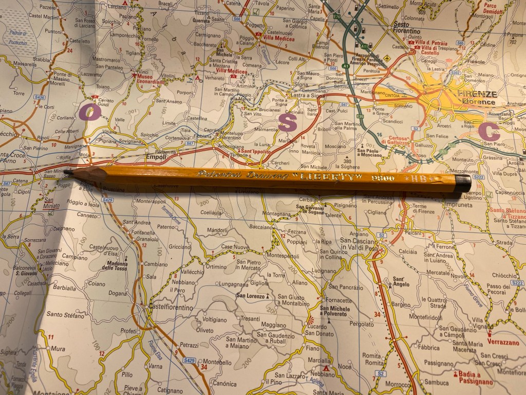
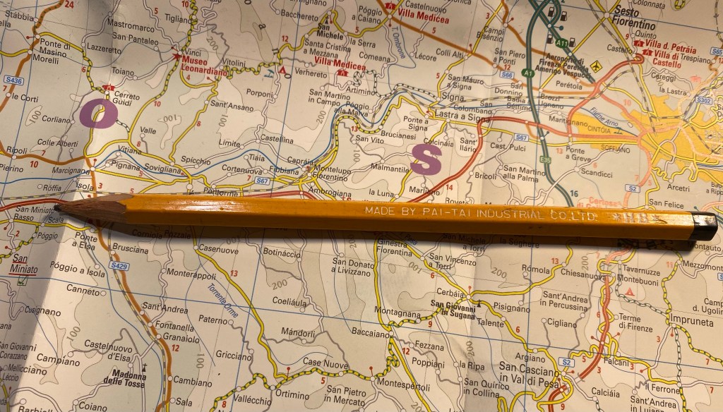
And here we enter the realms of the unknown pencil brand, where I just bought pencils for their imprint and style, such as this Patented Drawing “Liberty” pencil:
Patented Drawing “Liberty” pencil.
Which was made by the Pai-Tai Industrial Co LTD.
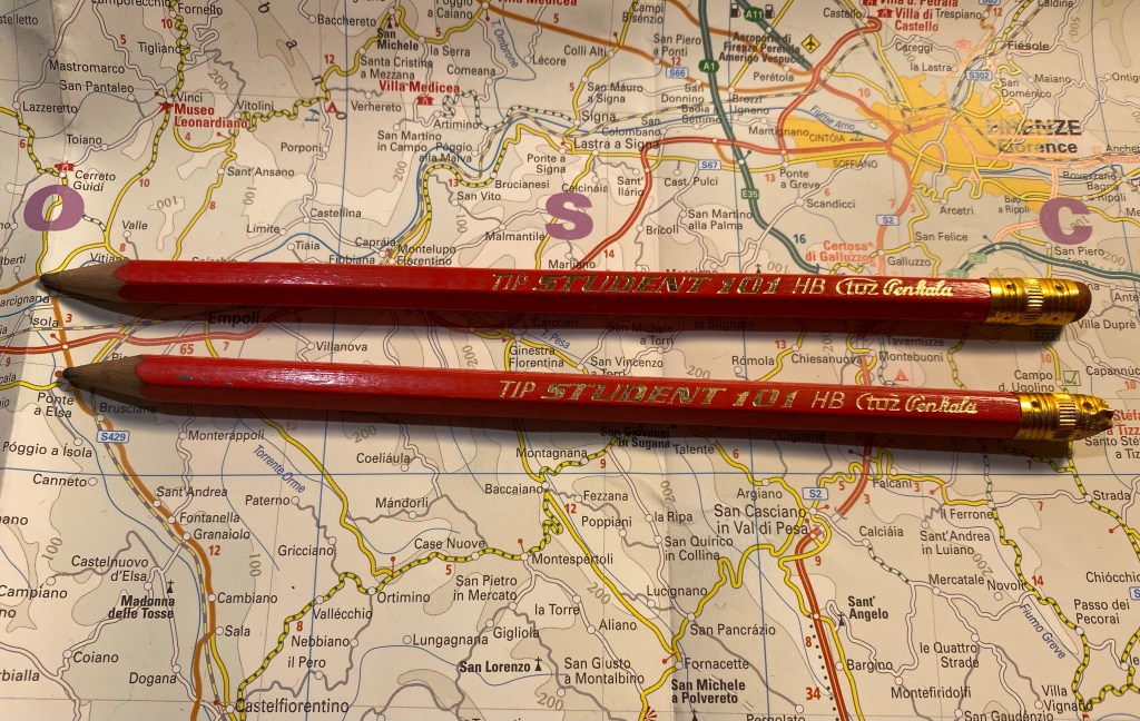
These Student 101 pencils from a Croatian company called TOZ Penkala (thank you to a penaddict slack user for helping me with this):
TOZ Penkala Student 101
These L&C Hardtmuth Studio 941 7 and 18 pencils that just have the best imprint font and logo:
L&C Hardtmuth Studio 941 7 and 18 pencils.
These Marco 4100 coloured pencils which I bought for the Comic Sans “Superb Writer” imprint, it made me laugh.
Marco 4100 coloured pencils.
And these random pencils all bought for their imprints: Springer, Factis “Eraser Pencil” 3012, and Warm Heart Color Pencils.
Of all of these I’ll probably only be using the Mongols, but I find having the others fun, and I may be able to swap a few of them for some other vintage pencils that I can enjoy.
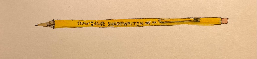
If you follow any makers on YouTube you probably saw this ugly yet somehow charming little mechanical pencil in action. The Paper Mate SharpWriter is a strange beast, full of surprises. It’s a mechanical pencil with a twist mechanism in the tip instead of a click mechanism under the cap, it actually has a serviceable eraser, and it’s non-refillable. It’s as if Paper Mate saw the “Think Different” ad and said, “yes, but how can we apply that to a mechanical pencil?”
Paper Mate SharpWriter.
First of all, you can buy the Paper Mate SharpWriter in many different widths, as long as they’re all 0.7mm. This has the added value of saving Paper Mate the need to indicate the lead width on the pencil, because there’s only one width to rule them all. I can’t honestly fault them for that. It’s a pencil that’s meant for students and bills itself as having less lead breakage, and so 0.7mm is the way to go.
There are some interesting things going on with the business side of this pencil. First and foremost, that’s where the lead propelling mechanism is, which caught me by surprise. It’s a twist mechanism, and it’s pretty sophisticated as it allows you to easily extend and retract the lead to suit your needs. The second part is the “lead cushioning mechanism” which means that the lead springs up and down as you right, preventing you from breaking it if you exert too much pressure. It works, but I’m not a fan as it makes me feel as if the lead is broken inside and I have to extend it to get rid of the small broken piece and reach the “real” lead left inside. It’s going to take some time for me to get used to it.
Writing and erasing sample.
The eraser is downright phenomenal, as it actually erases things quite well, and doesn’t tear into the page. The lead itself is a solid HB 0.7mm lead that is smooth and on the slightly darker side of HB.
The Paper Mate SharpWriter isn’t a pretty of fancy mechanical pencil, but it’s comfortable to hold, lightweight, and has a playful colour scheme that recalls a woodcase pencil. And like a woodcase pencil, it’s disposable, which is where my only real beef with this pencil lies. Yes, this is a student pencil, and so it’s likely to get lost or somehow broken (it’s far from flimsy, but where there’s a will, there’s a way), and if the pencil won’t be lost, the leads will, and yet… The last thing the world needs is more plastic waste.
So, do I recommend the Paper Mate SharpWriter? No, and not because there’s anything wrong with the pencil, it’s just that there’s very little justification for a disposable mechanical pencil when there are cheap, good and even great refillable options to be had in the market.
But I do understand the makers who have fallen for this ugly duckling.