My Planner Setup for 2025
It’s the beginning of 2025, so it’s time to go over my full planner setup for both work and home. None of this setup is truly new, as I’ve used much of it during part or all of 2024, but there are a few tweaks and minor adjustments that I’ll highlight. As I use a 13 week year (or a quarter) in my planner, I started Q1 of 2025 on the 29th of December and not the 1st of January.
Home Planner Setup
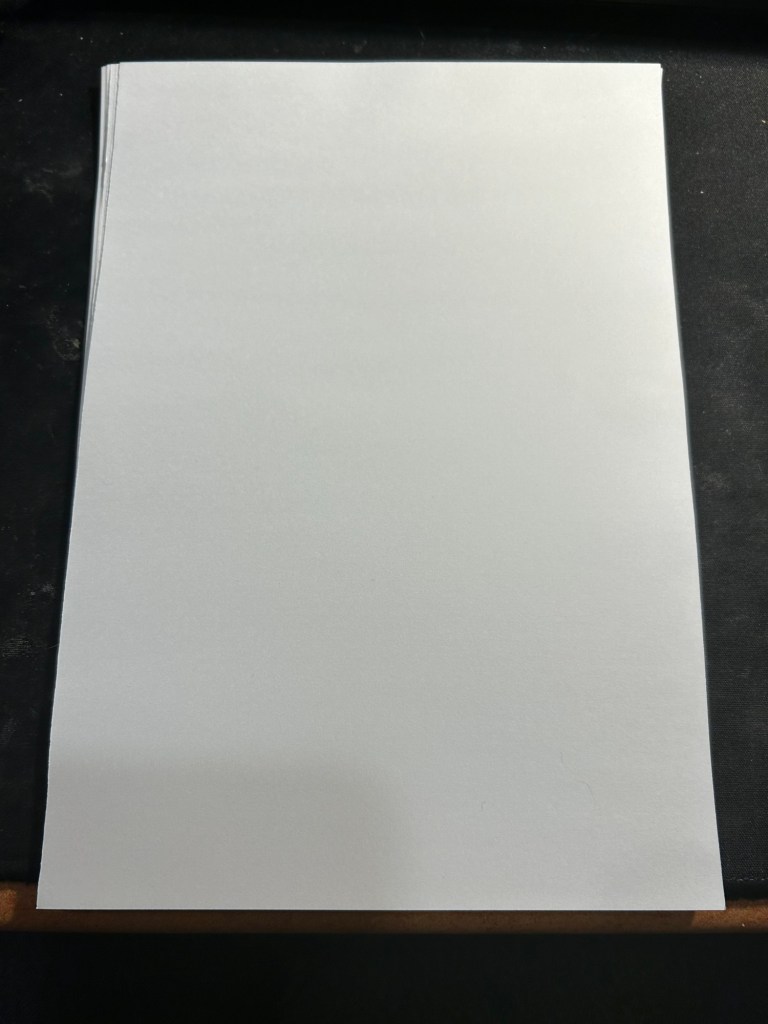
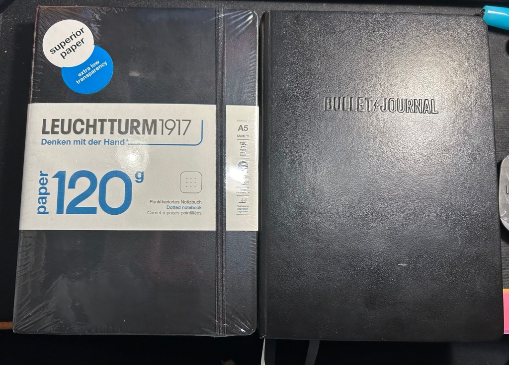
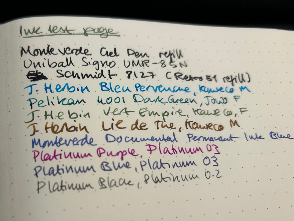
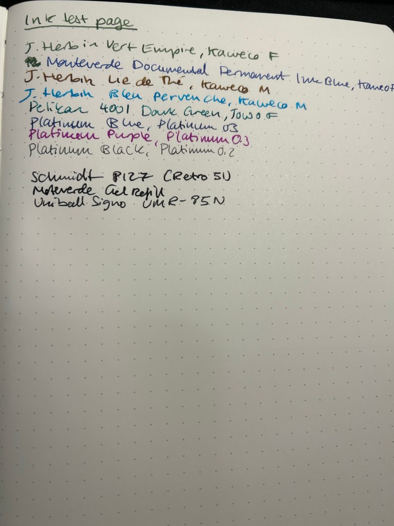
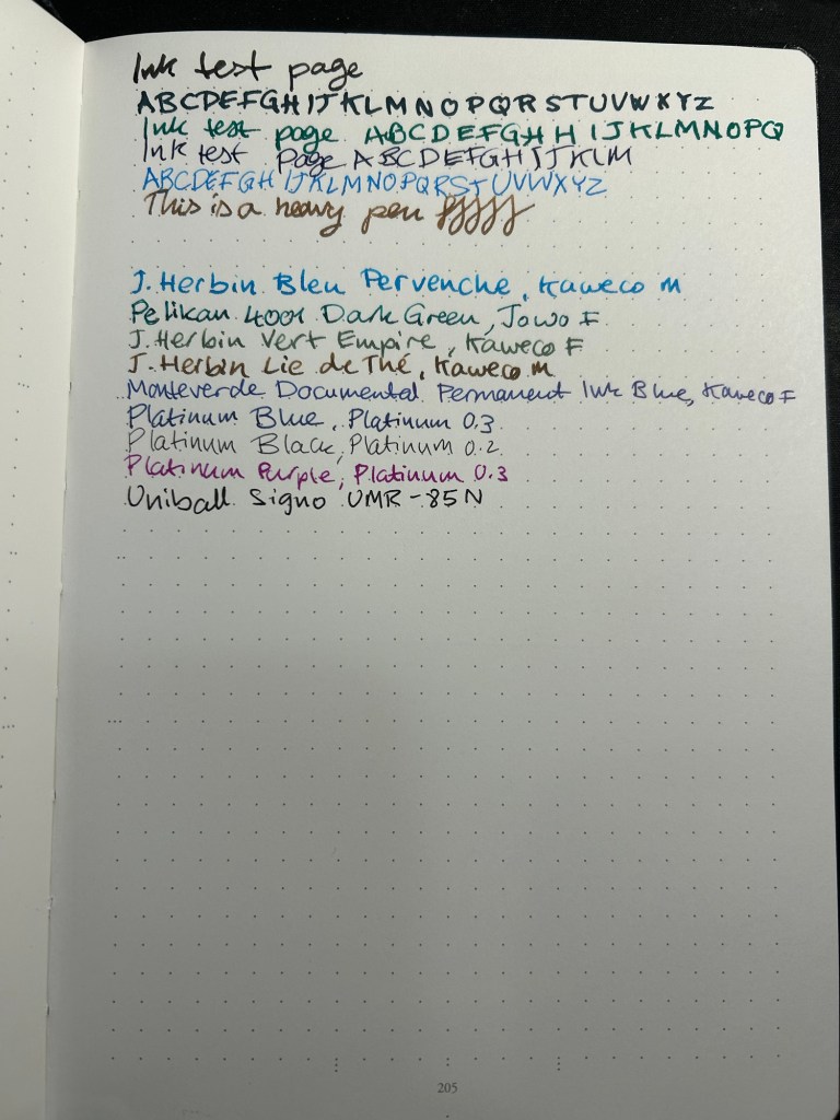
The planner setup I use while I’m at home includes a Leuchtturm1917 Bullet Journal as my weekly planner, a Well Appointed Desk Rebel Plans pad as my monthly planner, and a stack of Kokuyo KB A4 paper that I cut in half to make A5 sheets.
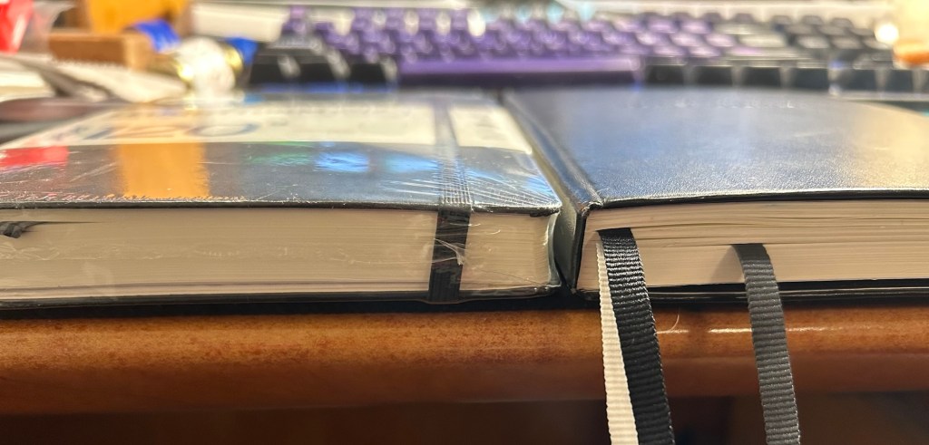
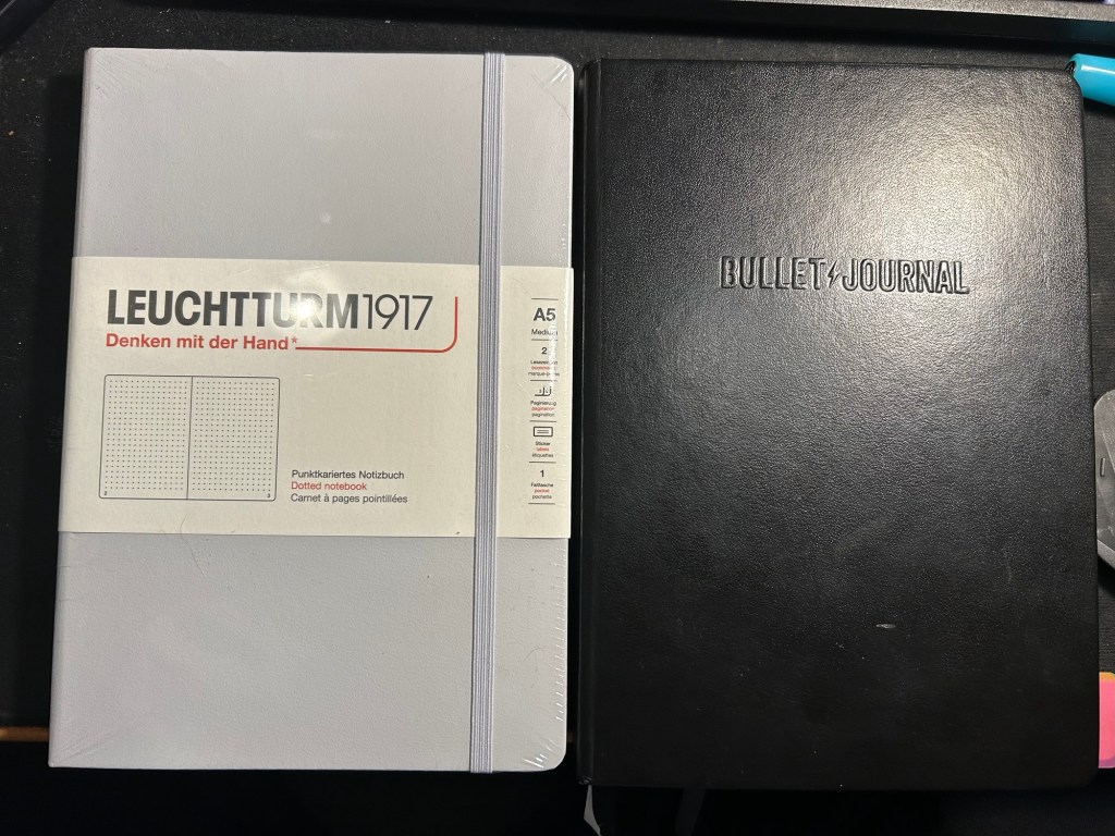
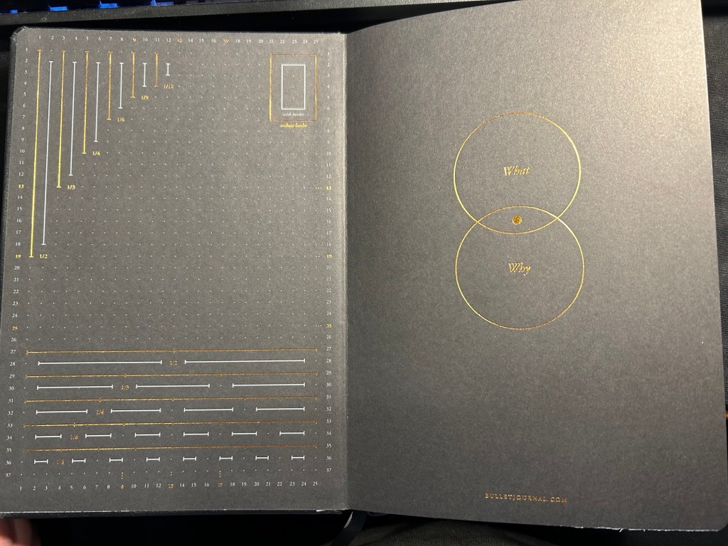
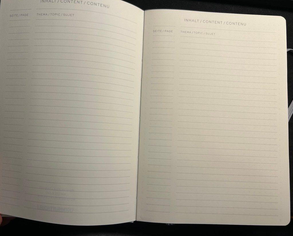
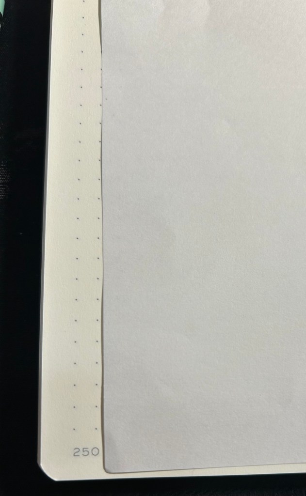
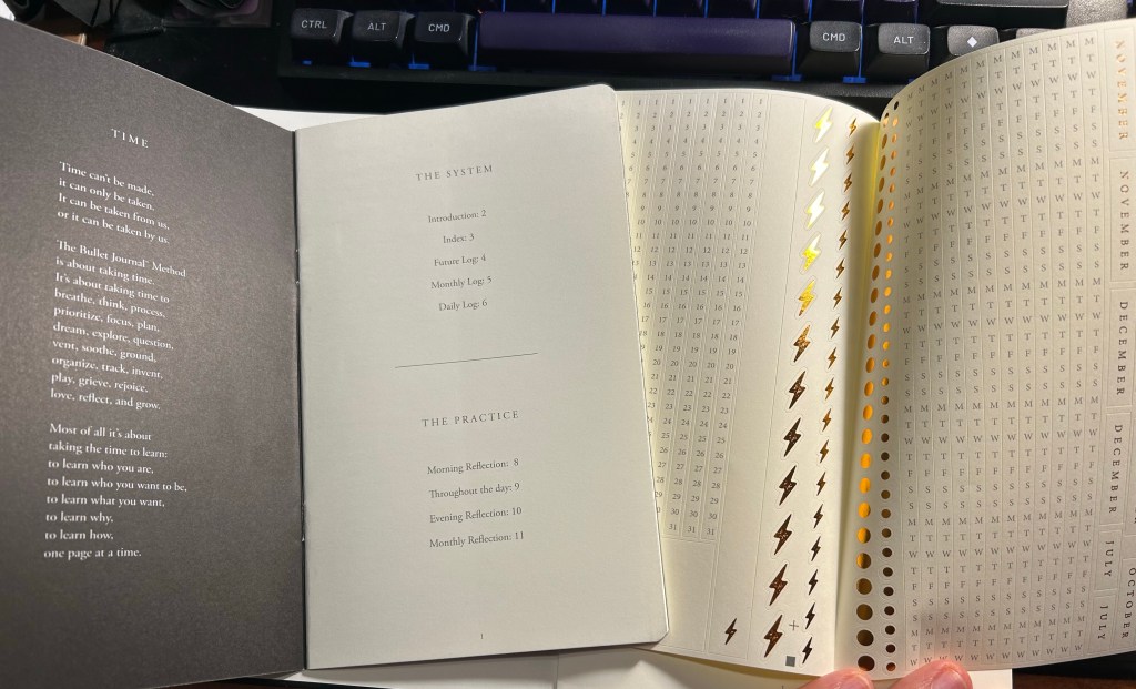
The heart of the system is my weekly planner. I started a new one in 2025, and after some deliberation I decided to splurge on a Leuchtturm1917 Bullet Journal and not just the 120gsm edition because I like the endpapers and it was only a few dollars more.
The setup of this planner is divided into two parts:
Lists
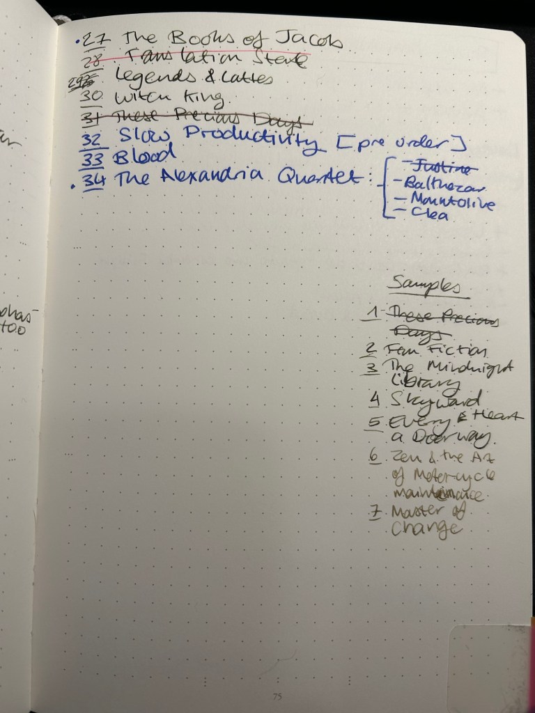
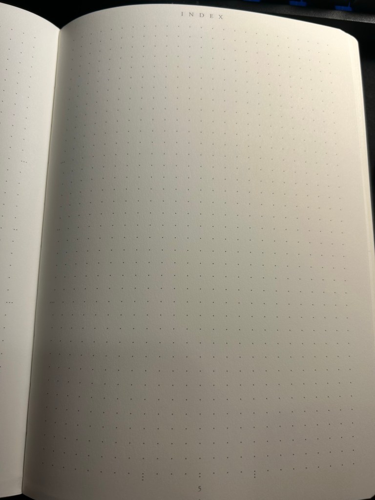
I crossed out all the bullet journal related headers and created list pages of my own from page 3 to (potentially) page 75. Currently they include: Unread Books on My Kindle, Mindful Consuming (a list of things that I actually want to watch, not algorithmically recommended), Conversations not Connections (A list of people that I want to invest time in, not just like their Facebook posts. This makes sure that I don’t fall out of touch with people, but actively initiate phone calls, meetups or skype/zoom calls for those that are abroad), List of Courses that I’ve Enrolled To (I started this list during Covid, and it tracks which online courses I’ve enrolled to and need to complete), Things from Abroad (a running list of packages that I’m expecting. Yes, I know there are apps for this, but writing it down helps me be more aware and careful with what I’m buying and how much), Blog Post Ideas (self explanatory), Books to Review (self explanatory), Medium Post Planning (as part of my focus on work, I decided to make my work more visible by writing more Medium posts this year). I will be adding to these lists over the next year, and copying them over to the next notebook once I finish with this one.
Quarterly and Weekly Planning
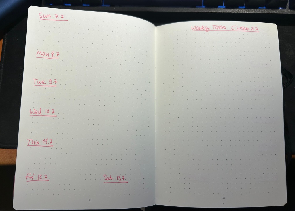
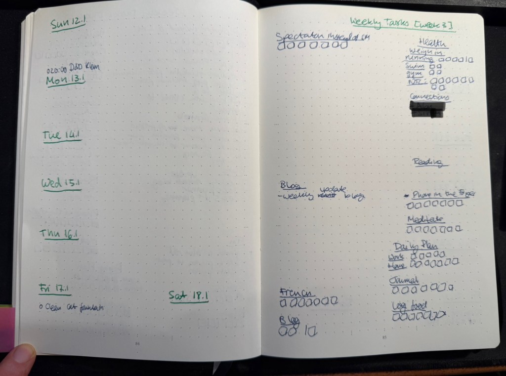
Starting at page 76, this section will include four quarterly plans and four 13 week double spreads. Each quarterly plan can take up to four pages (Q1’s plan takes 2.5 out of the 4 currently, but that’s OK. The extra is in case something major happens and I need to work out a pivot or significant change into my plans), and is divided into various subsections. I’ll write a separate post about my Q1 plan and how I worked on it, but you can read about the process here.
Then come 13 weekly spreads, each one taking two pages. The left side of the page has the weekly calendar, with events on it plus my exercise plan for the week. It’s also where I note things that I want to remember that need to happen on a certain day that week. Every week on Friday or Saturday evening I plan the next week, and for this side of the weekly plan I mark significant weather events, plan my running, swimming and gym schedule, transfer important events and meetings from my calendar (these are all things that I need to prepare for actively), and set reminders (like clean the cats’ water fountain on Friday, or replace filters on things, etc).
The left side of the page is taken mostly by various trackers, and by my weekly goals (they go in the empty spot in the middle) which I select from my quarterly goals each week. Any goals that can be managed by trackers are managed by trackers – either trackers in my planner, or trackers in the Streaks app. The reason I don’t track everything in an app, is to make sure that I have to reference this planner at least once, likely twice a day, every day. That helps keep the weekly goals, which are tied to the quarterly goals, top-of-mind.
I use two different colours of ink for these pages – when I plan the quarter I create 13 weekly spreads with just the dates and the “Weekly Tasks” title with the week number. Then I work everything else in on a week by week basis with whatever fountain pen I am using at the time. That helps keep things clearer for me without me having to spend a lot of time “prettifying” my planner.
Daily Plan
Every day I take a sheet of A5 Kokuyo KB paper and write the day and the date on top. Then I write a running list of tasks that I want to complete that day. This includes chores, daily routines, and tasks that I’ve pulled from my weekly planner. I cross them off as I go along, and at the end of the day either I flip the page and create another daily planner for the next day on the other side of the page, or I crumple the page up (if it’s used on both sides) and throw it into the recycling bin. I don’t keep these pages, since anything important in them is already in my journal.
I recently started tracking if I prepare a daily plan for every day at work and at home, and the reason is that I’ve discovered time and again that if I don’t have a plan, I am liable to just get back from work and veg out with a book or silly YouTube videos.
Monthly Plan
The monthly planner is tiny, and its only goal is to give me a better feel for how my month looks, and what major events lay ahead. It also tracks some things – books (which I track on a monthly basis), running (I track this twice because I also want to get a feel for my monthly load), swimming (the same – tracked on both weekly and monthly basis to get a better feel for my training load), gym (which doesn’t appear in the photo below because I haven’t finished creating the page), blog (how many blog posts I’ve written this month), and there’s usually an Apple challenge tracker.

What About Projects/Backlog Items?
Most of my long term projects are tracked as part of the quarterly plan. For instance, I’m working on getting a certain professional certification this quarter, so I have that certification listed under my professional goals. The breakdown of this headline to individual tasks is something I do in the project specific notebook that I’m using for my study notes, tips that I’ve collected about the exam, etc. I then can just reference the headline task (the certification name in this case) in my weekly and daily plans, and reference what exactly I’m supposed to be working on next in my project notebook. It saves having to copy a lot of things over and over.
As for general “backlog” items (shopping lists, packing lists, travel plans, things I want to get to sometime in the future but aren’t part of my quarterly plan, recurring tasks tied to various medical checkups, etc) – these are all managed in the Things app. It’s easier to manage recurring and long term tasks like these in an app, and when it comes time to actually do them I reference them (or sometimes copy them) into my weekly and daily plans. I have very few tasks in Things, and sweep of the tasks there once or twice a week is enough to ensure that I haven’t forgotten anything.
Work Planner Setup
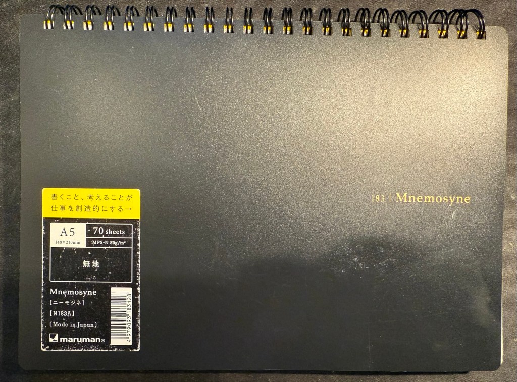
This consists of a Leuchtturm1917 dotted A5 hardcover notebook that I bought at the local art museum, and Maruman Mnemosyne A5 with blank paper (though I also use the squared paper Mnemosyne indiscriminately, if that happens to be what’s available). As I work 3 days a week from an office and 2 days a week from home I needed a setup that’s as simple and as light to carry as possible, and after some trial and error this is what I’ve been using for over a year.

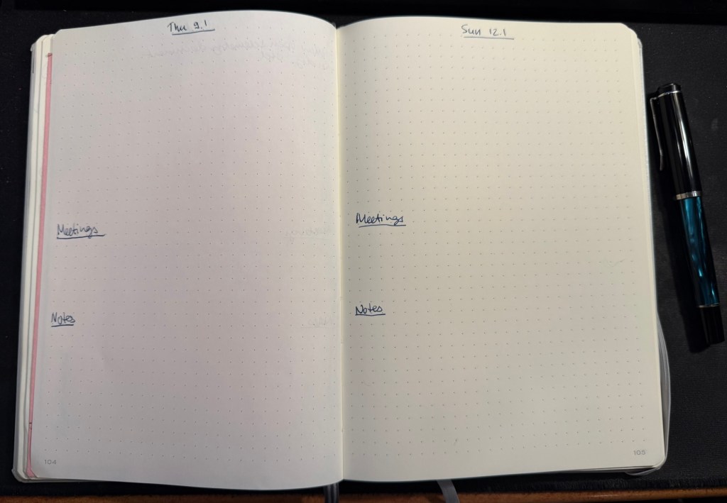
The work planner, my Leuchtturm, is a daily planner, with each day divided into three parts. The top of the page has the day and the date, and the upper third part of every page is for the tasks I plan on working on that day. I deliberately make sure that less than half of the A5 page is left for tasks, because otherwise I’ll just jam in much more than I can do in a day and then feel bad at the end of the day for no good reason.
The last thing I do before signing out at work is to fill in the next day’s page. That includes pulling out the next tasks I plan on working on from Jira (we use Jira to plan tasks and projects at work), and leaving about half of the task area open for things that will pop up during the day. The nature of my job is that I’m constantly working on about 50% unplanned things, so I have to leave myself enough room to take that into account.
Next come the meetings, which I track under a separate heading. I set them apart so that they don’t disappear into my ever changing task list. This is also useful for me to reference when I’m planning my day, both in terms of how many tasks I think I can get to, and in terms of preparing for certain meetings.
The Notes section is where I write down things that I need to take into account or remember that day. If a team member is taking a day off I note it here to remind myself not to message them. If I am on “on call” duty I note it here so that I can significantly reduce the number of tasks I’m working on that day. I also look ahead a bit, and if I see a project deadline looming, I’ll note it in the notes section, so that I remember to prioritize my tasks accordingly.
The Mnemosyne serves as my “dashboard” and catch all. If I’m working on a project, this is where I’ll plan out the project before inputting whatever relevant tasks there are into Jira. I reference and work with this page while I’m working on the project, and that’s why I view this notebook as the “dashboard” for my current work.
The Mnemosyne is also where I keep a running list of things I want to get to. All of these things will have to be formalized into Jira tasks before I can work on them, but it’s useful for me to have them down on paper first because I think better on paper.
I don’t use scrap paper at work as I want to be able to reference these things in the future, and as a rule I don’t journal about my work tasks.
That’s my full planner setup for 2025, and as all of it has been in use throughout 2024 with great success I doubt that it will see much change.
What are your planner plans for 2025?