Black Eraser Showdown

Black erasers have become more common in recent years, with the Boxy perhaps being the most well known of the bunch. I have a few that I use regularly, and a few that just lounge in my stationery drawers waiting to be used. As I’m streamlining my sketching kit and the boxy is now the eraser I carry in it, I decided to test it out against the competition, starting with other black erasers.
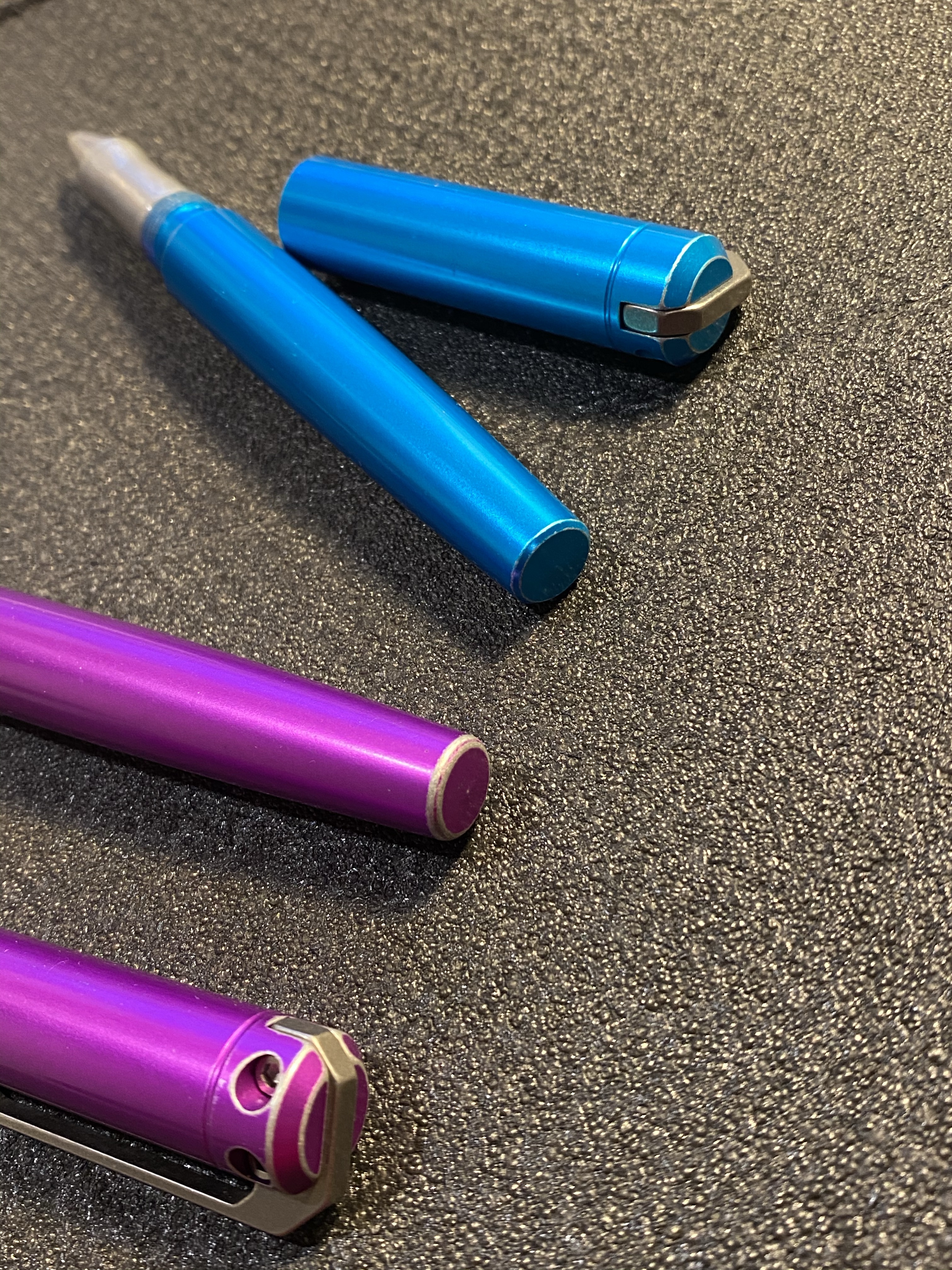
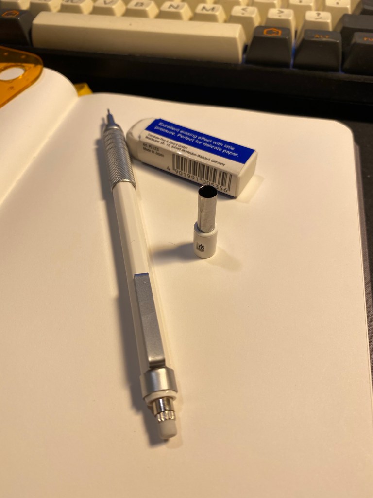
Here’s the lineup:

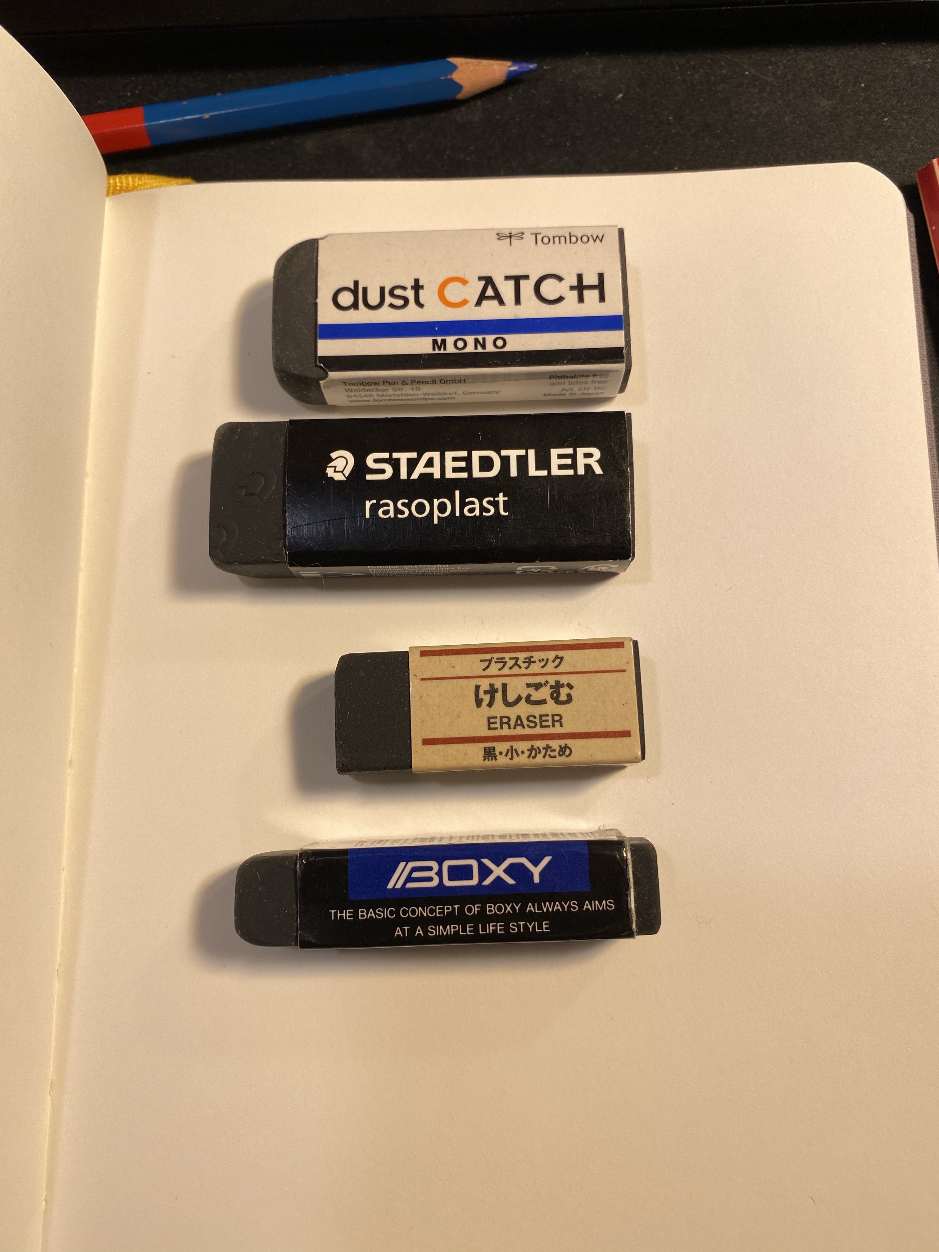
In terms of price they’re all around the same price range with the Muji eraser being the cheapest of the bunch, and the dust catch and boxy being on the more expensive side of things.

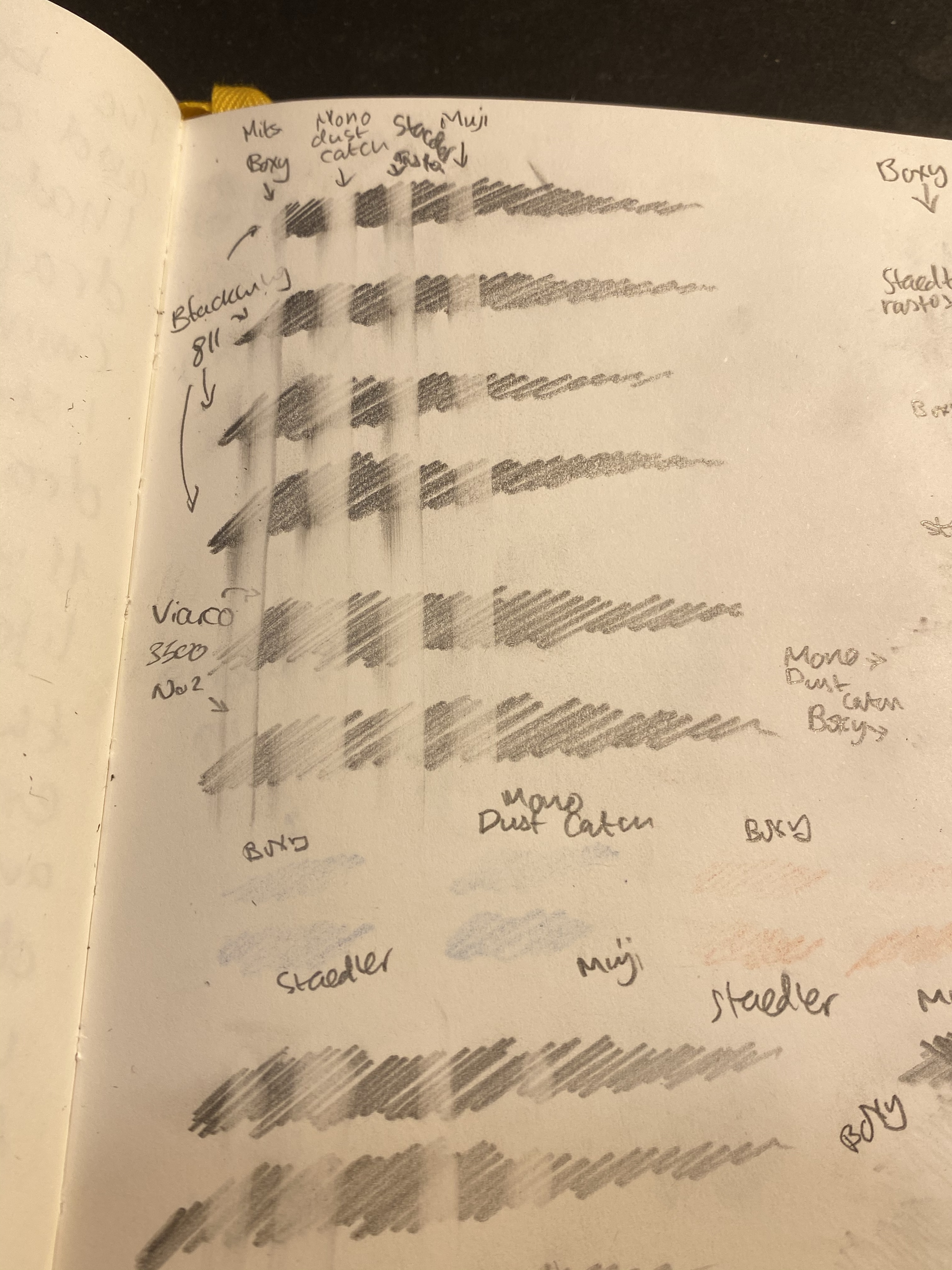
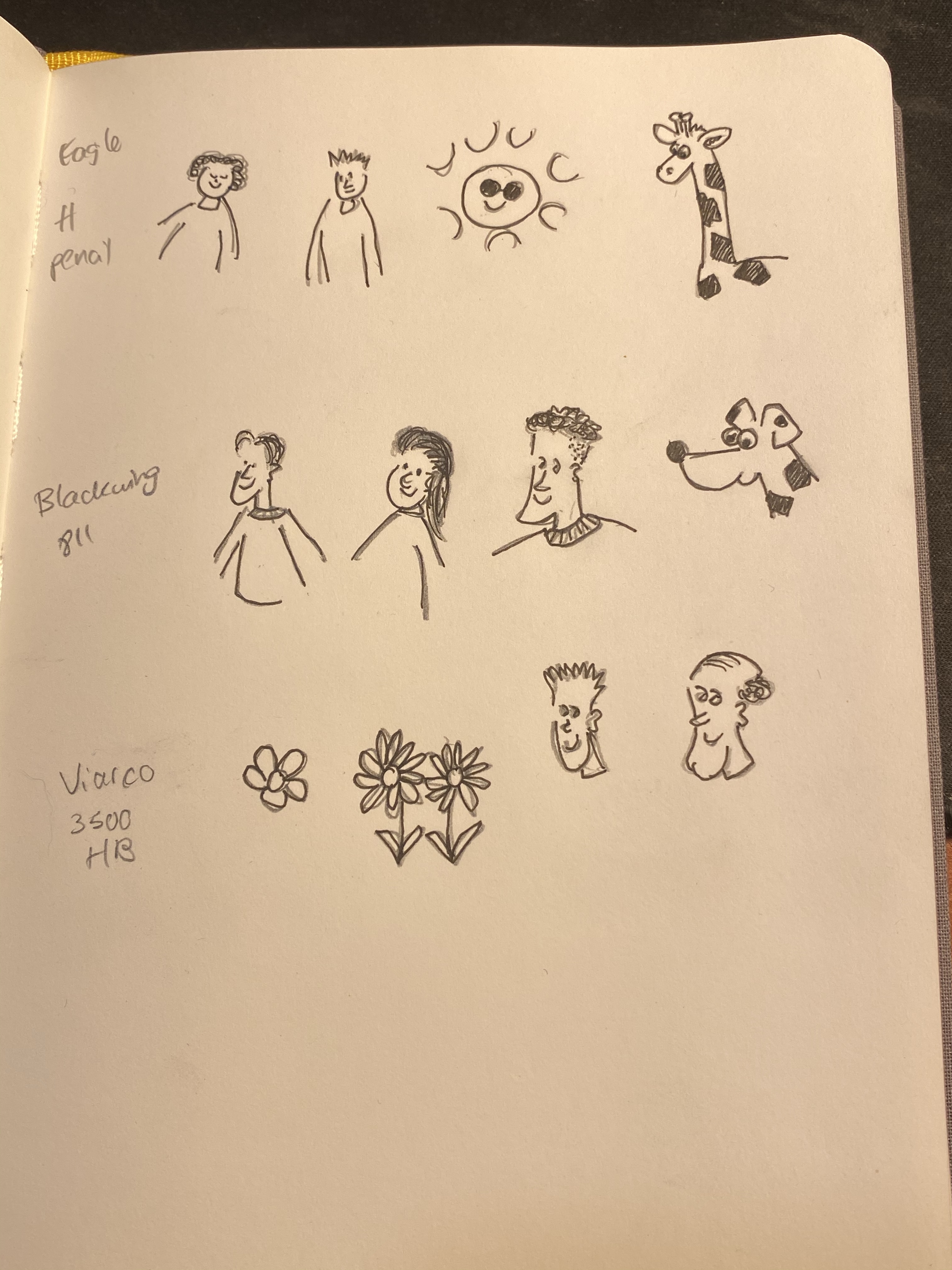
I took out my Baron Fig Confidant, since I do all my pencil tests on it, and scribbled in it in a variety of pencils and even using a Caran d’Ache red blue pencil, though I don’t expect regular erasers to do well with coloured pencils.

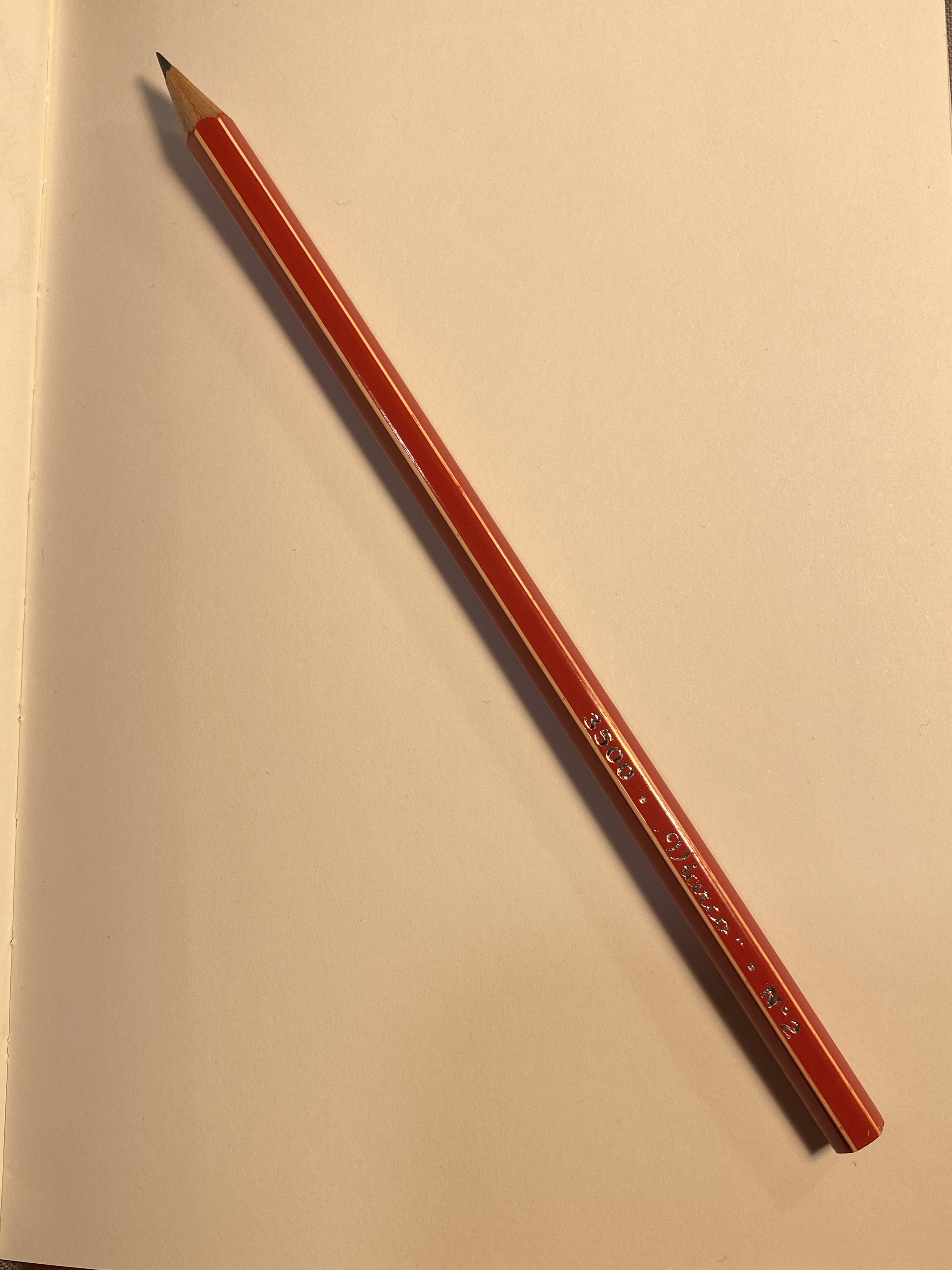
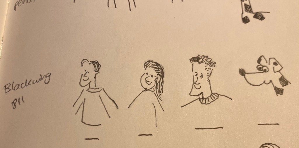
The pencils that I used were the Blackwing 811 (a darker, softer pencil), a Viarco 3500 No. 2 (a standard HB pencil) and a vintage Eagle “Chemi-Sealed” Turquoise H pencil. These seemed like a fairly representative bunch of general writing pencils, at least in terms of graphite behaviour. Though I did later check them for art use, these erasers are meant to be used when writing more than when drawing.

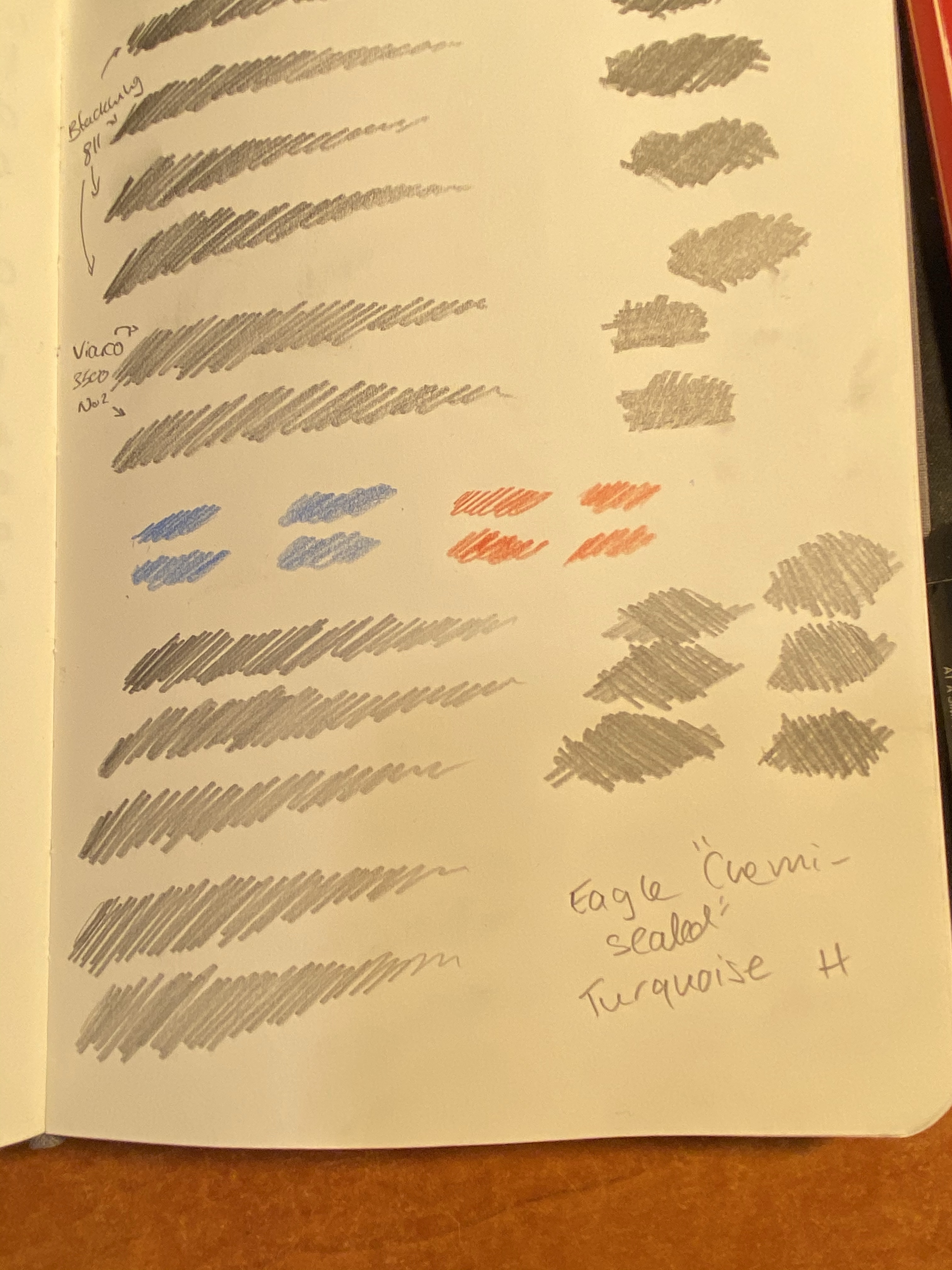
I did a single eraser pass on the left hand side of the page, and on the right side I split each scribble into two and tried to erase it completely (leaving an untouched graphite barrier in between each side).

Then I tried to erase the coloured pencil, which I wasn’t expecting much success in, and here are the results:

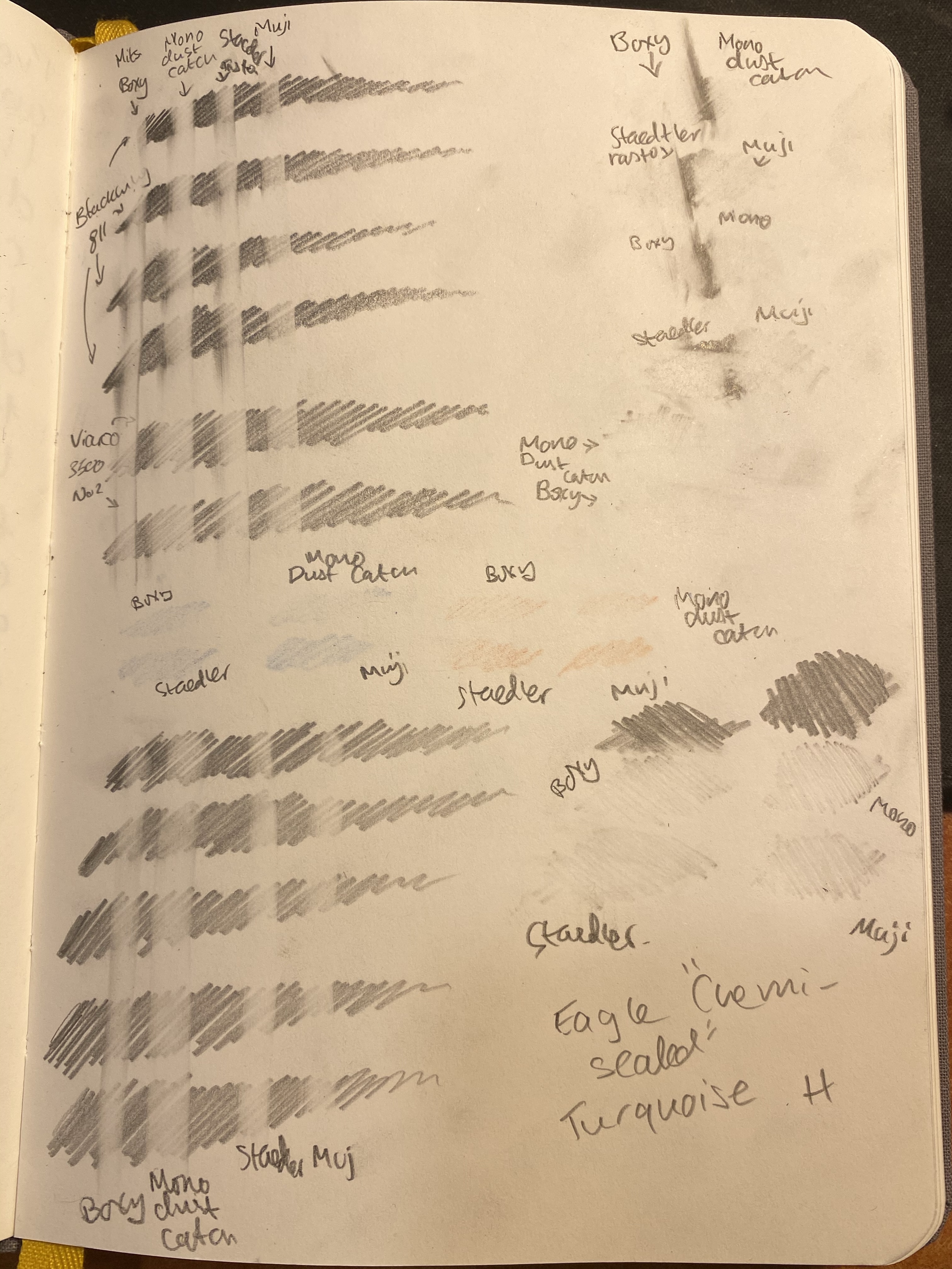
A closeup on the one pass side. You’d normally not erase this way, but it does give a good indication of how good the eraser is going to be:

From left to right: Boxy, Dust Catch, Rasoplast, Muji.

A closeup on the H pencil one pass attempt. I deliberately pressed down on the H pencil, because from my experience H pencils are easy to erase when you apply little or no pressure to them, but they’re pretty tenacious if you apply normal or strong pressure on them.

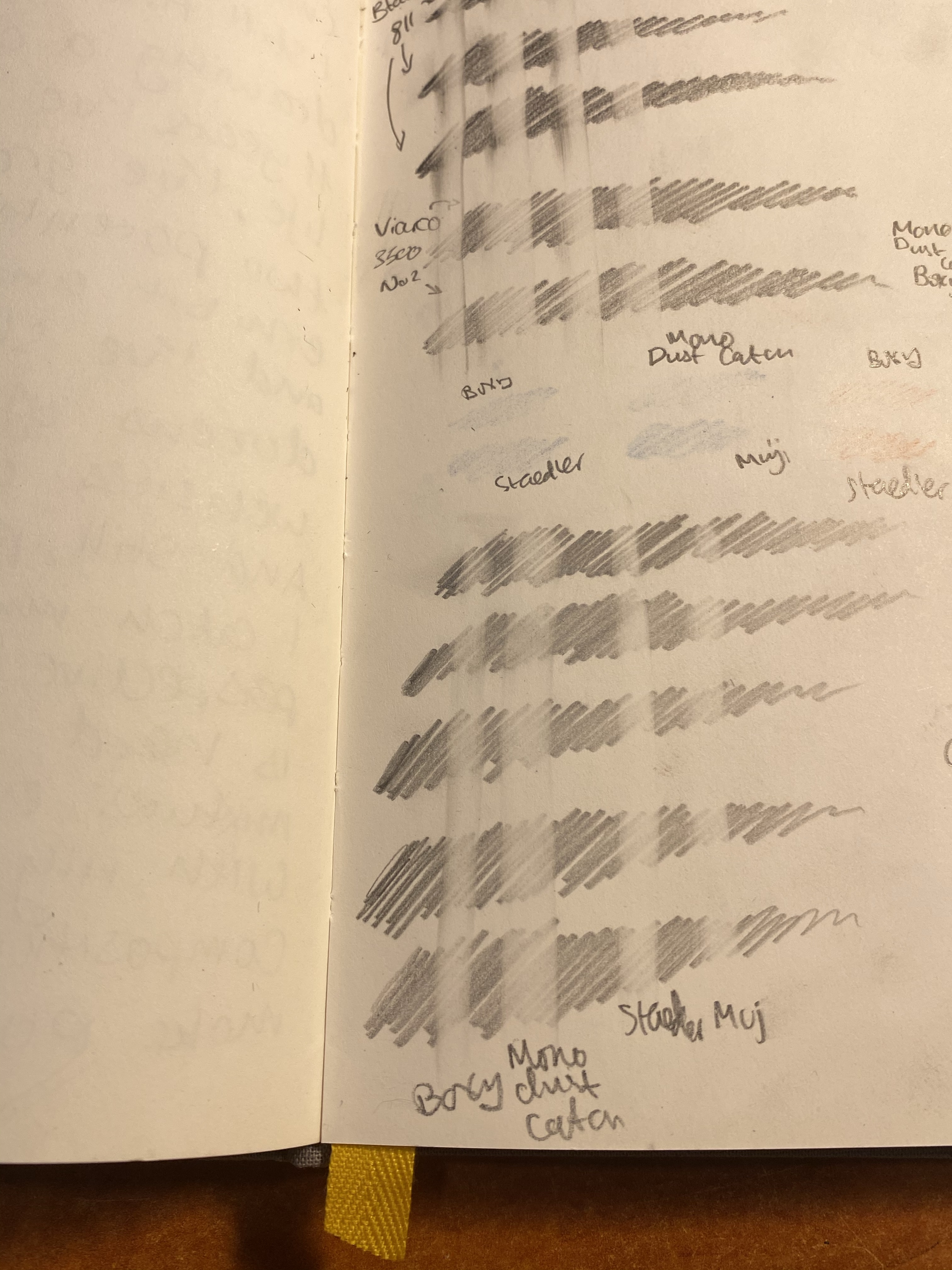
Here’s the split scribble test above and the H scribble test below:

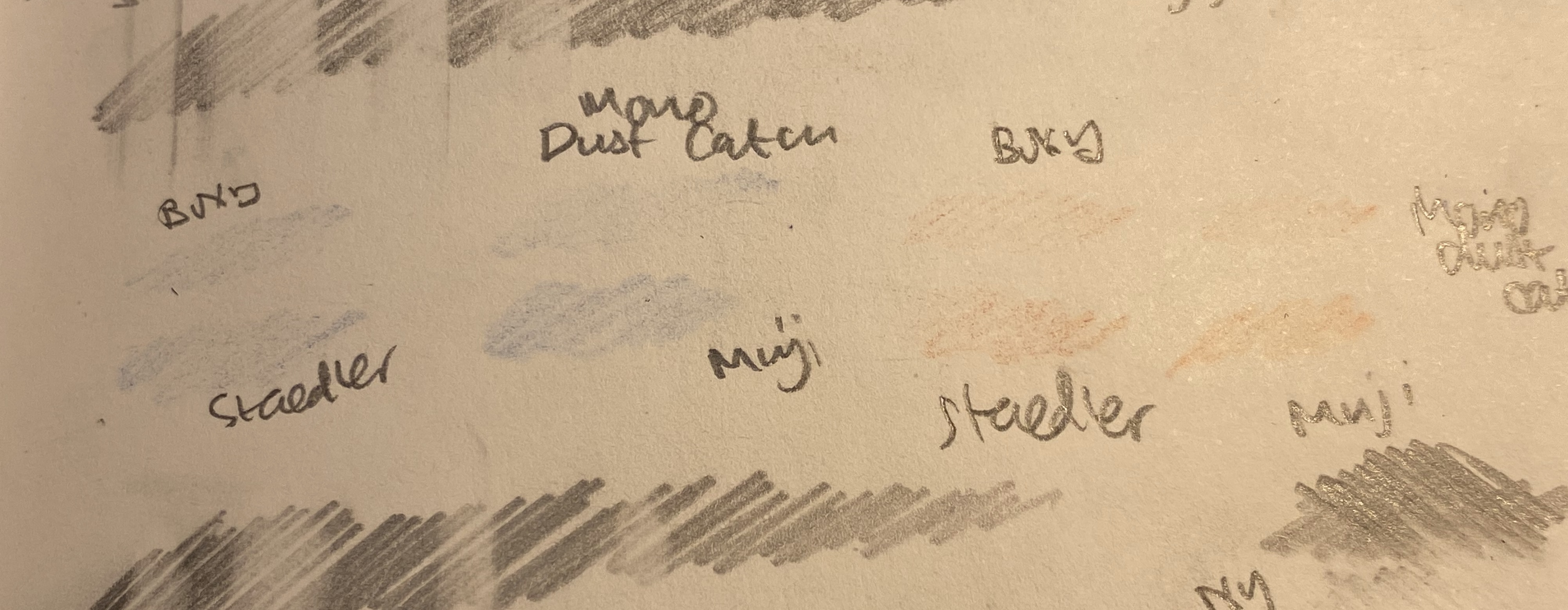
Finally the Caran d’Ache red/blue eraser test:

At this point I was ready to give the victory to the Boxy, with the Mono Dust Catch a pretty close second, the Staedler Rasoplast in third place and the Muji eraser trailing behind. The Boxy and the Dust Catch also had the easiest “eraser crumbs” to clean (long threads of the stuff, easily brushed aside), and the Muji had the smallest and the worst. None of the erasers damaged the paper, which perhaps isn’t surprising considering that they’re all pretty soft.

I’d also point out that none of these erasers are what I’d call “best”. They’re good erasers, but even the boxy left graphite ghosts behind. There are better erasers on the market, but these in general behaved better than average (even the Muji), and the Boxy and Dust Catch are pretty good. They held up well even against the Caran d’Ache red/blue pencil, which surprised me.

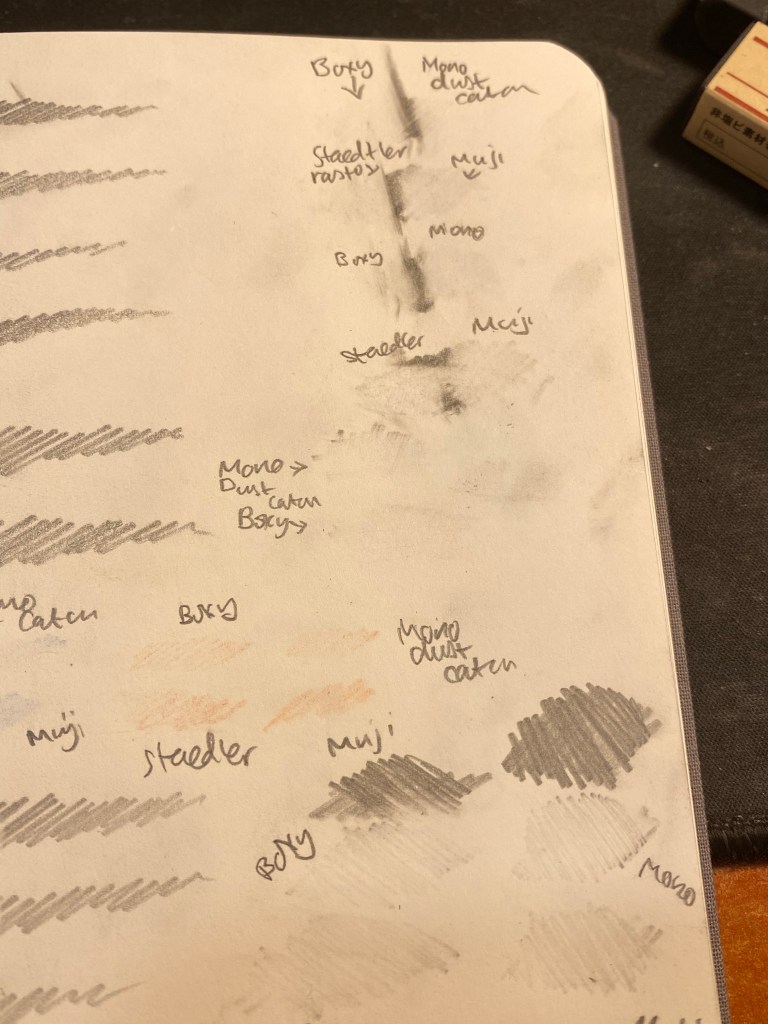
Even though these aren’t “art” erasers, I decide to try to draw some doodles in pencils, ink them with a fine liner and check how much ink each of these erasers lifted.

The pencil doodles.

Here’s the inking. You can see the pencil marks beneath, and I waited for the ink to completely dry before trying to erase the underdrawing.

Inked in.

The results were “ravishing” as to be expected:

All the erasers lifted a significant amount of ink, leaving the resulting ink grey and muted.

You can look at the closeup below and see just how much ink was lifted. These are all terrible for art use, which again, isn’t surprising. I drew an ink line for reference under these, just so you can see how much ink was lifted. Also the top line of left hand dude’s sleeve wasn’t erased so you can compare that too:

The Muji erased faired the best at this part of the test, although I still wouldn’t recommend using it to erase underdrawings.

Of the four erasers that I tested, the Boxy and Dust Catch are the best, and of these two the Boxy is the one I would choose, because of its compact size and its slightly better performance. None of these erasers are terrible, but if you’re investing in a good box eraser (and you should) the Boxy is definitely one to consider.

And why are these black? Presumably to not show dirt, though I find that both frivolous and counterproductive. If the eraser shows dirt, then you know that may need to clean it on a bit of scrap paper before using it, so that it won’t transfer that dirt onto your clean paper. However, I suspect that the real reason is that black erasers just look cool, and the rest is just plain marketing.

30 Days of Drawing: Days 6-10

I decided not to take part in Inktober this year. Instead I’ll be drawing at least one page a day in my Stillman and Birn Pocket Alphas. You can see days 1-5 here.

I had some failures and some successes with my drawings this week. I did a very quick and not very accurate drawing of my gong fu table, and with that finished my first Stillman and Birn Pocket Alpha.

The green spot in the right corner is a nasturtium leaf test that I did for another drawing earlier in the sketchbook.

I’ll probably write a post about the Pocket Alpha, maybe later this week. In any case, the sketch above didn’t come out great and I considered not even investing in painting it, but then I figured out that while I learned from my mistakes in sketching the gaiwan proportions (I’m not using a pencil under drawing because I’m trying to speed up my process), I wouldn’t get a chance to improve my watercolour skills if I didn’t watercolour it. So the result was an OK watercolour, and another proof that paint can cover a multitude of sketching sins.

The next sketch took my two days, mostly because I was busy. It’s a “flowers of the urban desert” spread, and I created the top left sketch on day 2 and the rest on day 3. I’m trying to get myself used to composing pages, and this one will probably get some text added to it later.

We’ve just entered our second lockdown, and I got nostalgic to the office and to our little escapes to our excellent local coffee shop. Found a photo of this latte from one of my final pre-Covid visits there and decided to draw it.

This drawing, of the excellent Paul’s Café in Jaffa, took me the longest to draw, and that’s after I edited out a ton of details. It was fun to do and reminded me of better times. I hope that they pull through and I’ll be able to go back there someday soon.

Drawing Insights and the Viarco 3500

I was going to write a blog post reviewing the Viarco 3500, and so I started writing a page of notes in my usual pencil review notebook (the Baron Fig Confidant). Once I started writing I realized two things:

  1. The Viarco 3500 is a good looking but boring pencil. It’s an HB/No. 2 pencil that’s slightly gritty, slightly dark and soft and not much different than other branded pencils of its kind, like the Ticonderoga or the Palomino Golden Bear.
  2. I wanted to reflect about the difficulties of drawing.
Pretty but dull, the Viarco 3500 No. 2 pencil.

So here’s my page of notes on the Viarco turned into reflections on the drawing process:

This isn’t a “woe is me” post. It’s a “embrace the suck and take courage” post. Perspective is HARD. But it’s worth learning. And learning again. And learning again. And boy is it worth practicing. Why? Because while nobody is born knowing how to draw in perfect perspective, practically everybody can tell when the perspective is “off”. You can tell yourself that it’s an “aesthetic choice,” however, I do believe that you are cheating yourself out of something when you don’t even try to get the basics down. I know, I tried to do that for literally years. I have good enough hand-eye coordination that I could cheat some people some of the time. Then I tried learning it from books. I drew the boxes, the shaded ball, the room with the door and window, and I told myself that since I copied them so well, I now “knew perspective”. Hah. The minute a teacher sat me down and told me to draw the corner of a room, a still life of some boxes and a vase, and an old shoe the truth was all too apparent. I didn’t grok the principles behind those boxes and skylines and spheres and so I couldn’t extrapolate from them to the real world. I now have 11 plus years of knowing groking those principles and I still tell you that it’s hard.

Can you catch the perspective mistakes here? This is from 2009 and it makes me cringe.

You can cheat, and I did and sometime do cheat, the eye with colour and crosshatching, but it doesn’t take an art critic to point out that something is “off” in the drawing. The same goes for poor composition choices, muddy pigment mixtures, colours that unintentionally clash and cause unease. These are all very technical skills that require a good amount of studying and a great amount of practice to master. It doesn’t help that most of them are difficult to learn from books and tutorials and are still best taught in a live art class. It’s also frustrating that you usually work and work and work with little or no progress for some time and then suddenly your hand and eye and mind click and you jump forward a level or two. It’s so easy to give up before that. I have several times in the past. Then I found a new teacher and I got back to the grind.

Why do it? You don’t have to. Instagram and Facebook likes are independent of your drawing skills, and more related to tags, followers and how colourful and eye catching your work is. If you’re doing it for that, then there’s no point in doing it. But mastering the basics allows you to advance all your drawing skills at once, with great leaps and bounds. Every breakthrough I had with the basics allowed me to draw better, faster, with more confidence and to tackle subjects and locations that I otherwise would have avoided.

So, the Viarco 3500… It’s a good looking pencil to have around. Perspective, colour theory and composition? If you have any interest in drawing I highly recommend investing in mastering them.

30 Days of Drawing: Days 1-5

I decided not to take part in Inktober this year. Instead I’ll be drawing at least one page a day in my Stillman and Birn pocket Alphas. It happens that there are just a few pages left in my first pocket Alpha, the one I got gifted by Stillman and Birn as part of their sponsorship of Gabi Campanario’s Urban Sketches Porto 2018 symposium class. I use multiple sketchbooks at the same time, and finishing and starting a notebook is always the hardest part for me. So I decided to challenge myself to finish my old Stillman and Birn pocket Alpha and start on a new one, by challenging myself to draw at least a page a day for 30 days straight.

I will be batch uploading these 5 days at a time, so here’s what I drew on the 17th of September until today, the 21st of September:

Karas Kustoms Battleworn Ink 2.0 Rollerball

I am a big fan of Karas Kustoms machined pens, and up until recently I owned all of their lineup except for the Ink rollerball. So when Karas offered a grab bag of matching battleworn Ink 2.0 rollerballs I decided to roll the dice and purchased two of them. There’s always a risk when buying grab bag pens, but I had some tremendous luck and got two pens that are not only in some of my favourite colours, but also in colours that I don’t yet own. I was also fortunate enough to get one pen with a tumbled aluminum grip and one with a regular one, which means that I had a chance to experience both of my preferred grip styles in these pens.

Beautifully designed machined pens.

First thing’s first: the anodization on these pens is spectacular. The colours are really vibrant, and the Battleworn finish does not take away from that. They pop out in any pen lineup, rivalled only by my Spoke pen in terms of brightness:

From left to right: Karas EDK, original Render K, Battleworn Render K, Retrakt V2 , Ink 2.0, Retro51 Dino Fossil, Spoke Pen Orange Crush, Ink 2.0, Caran d’Ache 849

As you can see from the lineup photo above, the Ink 2.0 is a big, chunky pen. It’s larger than any other pen that Karas offers, and while it’s about the same length as the Spoke Pen, it’s much wider. Even so, this is not an overly heavy pen, and the added girth does make for a pleasant writing experience. This is a workhorse pen, built to last, and build to accompany long writing sessions.

The Ink 2.0 uncapped.

There’s quite a distance between the tip of the pen and the threads, and so there’s little chance of them getting in the way of your grip. Despite that, Karas has taken the precaution of ensuring that the threads aren’t overly sharp. Do take into account though that despite the 2.0 name, this is the older version of the Karas Ink rollerball, and so it has the old version of the threads and the cap. The threads on the new Ink V2 (I know, the naming could have been better, but at least it’s consistent across their lineup) are shorter, and have a flat area before them. This serves to even further place your fingers away from the threads, and is required for their Sta-Fast cap system. This system adds an o-ring to the cap, and prevents the pen from unthreading itself. My Ink 2.0s don’t have this system, and so they unthread themselves rather too easily, although nowhere nearly as bad as the original Render K. Again, this is a problem that you won’t encounter if you’re purchasing a new Ink V2 from Karas site right now, and they do a good job of clearly pointing the differences out.

You can see the differences in the tumbled grip and the regular aluminum grip.

The grip on the Ink rollerball is really where the pen’s design shines. It has such a unique profile, with the flare right before the tip cone. It makes for a very comfortable grip section, with added “grippiness” provided by the tumbled finish, should you choose to get it. The grip also comes in black anodized, brass and copper.

Unusual but beautiful design.

A closeup on the old threads shows the difference in the levels of Battleworn finish between these pens. The cyan pen was clearly less tumbled than the magenta one, so I am considering switching the grips between the two, to complete the extra Battleworn look.

The new Ink V2 threads don’t look like this.

Here you can see even better the different levels of Battleworn finish between these pens:

My pens arrived with a Pilot G2 large 0.5mm gel ink refill, and so far I haven’t replaced it. It’s very easy to unscrew the section and replace the refill with anything else that you like, and Karas does a fairly good job on their site, listing popular refills that fit their pens.

I think that the Karas Ink is one of their most beautiful and well designed pens, and there’s a good chance that I’ll buy the Ink V2 once I see a colour and finish combo that catches my eye. Everything from the robust clip design, the placement of the visible screws on the cap, to the length and girth of this pen and especially the grip design is well thought out. It’s clearly a step up from the (excellent) Render K, and if you’re looking for an impressive yet practical machined pen, the Karas Ink V2 is probably the pen for you.

Shana Tova!

Shana Tova! May the coming year be a thousand times better than the past one.

The Cancer Notebook

My most important notebook is this Rhodia pad:

In the middle of 2018 my mother was hospitalized and then diagnosed with a very serious, advanced, life threatening condition. Six months of constant battle, second, third and fourth opinions, and a lot of reading of medical papers later I managed to pull her out of the “you’re fat and that’s why you’re sick” sinkhole and to get the doctors’ full attention. She was re-diagnosed, this time with two, possibly three, types of cancer. In the end of 2018 my mother was taken off the transplant list and rushed into biological cancer treatment. She had an extremely rare condition, and her doctors didn’t know if the treatment would help. It ended up saving her life, but this is not what this post is about.

This post is about stationery. It contains no pretty templates, no flashy colours, no glitter pens. It’s just a few insights into small, pragmatic little things that I wish someone had told me when my life fell unexpectedly to pieces and I took on a new, additional, full time job: a seriously ill family member’s advocate.

September is childhood cancer awareness month(please donate to St. Jude here). Cancer is not something you plan for but statistically speaking its something that the large majority of us will have to deal with at some point or another. It’s also far from the only serious disease or condition a family member can fall ill to. Here are a few things that I wish I knew going in, stationery related things that would have saved me a lot of time and worry:

  • Get a large folder, larger than you think you’ll need. Find a permanent place for it in your house. If you don’t have a printer, get a printer. This is a must. Print out every test result, doctor’s summary letter, referral, application form, etc related to the disease. You need these in hardcopy (oftentimes more than one copy), as you’ll be bringing them into doctor consultations with you. These things may be digital now, but that’s not good enough. If you go get a second opinion, the doctor may not have access to the computing systems of your previous doctor. You may want to change health providers along the way, and you need to make sure that your new doctor has all the required information at hand. Put CDs with CT, MRI, US, and PET-CT results in that same folder. Make sure that you get a copy on CD of any imaging test you take.
  • Get a simple but good quality writing pad, and a ballpoint or gel ink pen to go with it. I use a staple bound Rhodia 16 pad, with a clip to keep it shut. It needs to be clearly marked as your “doctor notes” notebook. It needs to have a permanent place in your house, just like the folder. Why? Because you never know when you might have to rush to the hospital, and the last thing you need is to waste time searching for your folder and notebook lifeline. Because this notebook will become your lifeline.
  • The ruling on the notebook doesn’t matter, but I really recommend using a top bound notebook, and keeping it very simple and professional looking. You’re going to have enough of an uphill battle, let this notebook be a helpful tool, and not a distraction. I also recommend forgoing pocket style notebooks, or A4 sized notebooks. An A5 size (or equivalent) is best. Why? Because you’ll be using this in doctors’ offices and in hospital waiting rooms, not just while researching things in the comfort of your home. More often than not you’ll be balancing the notebook on your knees, sometimes while standing. You also want to have enough room to write, without being encumbered by a too large notebook. A5 means that you’ll likely devote a page for each doctor’s visit, so all the relevant information will be in front of you when you reference it later.
  • Use a ballpoint or a gel ink pen, don’t use a fountain pen. This is not the time nor place for that. I used the Ti Arto for most of my notes. Why? Because I easily wipe it clean with alcohol wipes after each visit to the hospital, because it’s dependable and not flashy, and because it doesn’t have a click mechanism, so I can’t fidget with it.
  • Take the notebook with you to every doctor’s visit, every exam, every consultation, every hospitalization. Take notes of EVERYTHING. What the doctor says, even to themselves or a colleague (write stuff down phonetically and ask for clarification about it later), what books they had on their shelves, how many kids they have and what their name is (part of your job as advocate is to remind the overworked doctor in front of you that your family member is a person. A good way to do that is to treat the doctor as one too.), what is the name of the secretaries, tips that you get from other patients (be extra nice in waiting rooms: there’s a mine of information around you), information about aid and support programs, names of other doctors, nurses that the best at taking blood tests, physical therapists that are extra patient and positive, etc. There will be times where doctors tell you that you don’t have to write everything down, they’ll write it in the summary letter for you. Smile kindly at them and continue to write. They’ll never write down everything that you will, trust me on this.
  • Refer back to this notebook when you’re at home. Use it to help with any research you’re doing (patient rights, finding support groups, finding other doctors to consult with, etc), to help you keep track of what was said when at which doctor’s office, and to generally keep you grounded. Also, if you didn’t have time to write everything down when you were in the doctor’s office, write down what you missed as soon as you get home.
  • Use it to vent. The back pages of my notebook are full of curses. That may or may not work for you, but it certainly helped me not lose my mind during the darkest hours of my mother’s ordeal.
  • Don’t forget digital tools. You’re going to need a spreadsheet to track the family member’s weight and crucial, disease indicating test results. Which results are important to track? It depends on the disease, and that’s what your notebook is for. As soon as possible get that information from the doctor, and write it down. Don’t trust them to do the day to day tracking for you – they have hundreds, sometimes thousands of other patients. Track whatever is crucial yourself, and raise flags with your doctor when things change.
  • Don’t forget to share the information in your notebook with others (if your family member approves, of course).

Spoke Roady Gecko Pen Review

The Spoke Design Roady Gecko pen about a week ago, and I’ve been using it constantly since then. The Roady is an EDC pocket pen made of machined aluminum that is built around the Uni-ball Jetstream SXR-600 refill. Unlike its predecessor, the excellent Signo DX compatible Spoke Pen, the Roady is capable of accepting a wide variety of Parker style refills, including the Fisher Space Pen refill, much beloved in EDC circles.

I don’t usually go for flashy pens, but something about the design of the Roady and the colour options offered made me grab the Gecko. This charmingly named colourway has a lime green cap, an orange barrel and finial, and rainbow coloured grip and clip. The result is even better in person than it is in photos – a pen that makes you smile and is bound to draw attention to itself.

Capped the Spoke Roady is tiny, and ought to fit comfortably in your pockets, if you have some.

There are a few other colourways with similar rainbow patterns on their grip and clip. The result is gorgeous, and I’m glad that Spoke Design haven’t offered these only as limited edition pens, or charged an additional markup for them. That is commendable and impressive, particularly in today’s machined pen market.

Rainbow clip.

Trying to write with the Spoke Roady unposted is asking for trouble, as it’s verging on golf pencil short in its body length. This is a pen clearly designed with posting in mind.

Too short for comfort unposted.

When posted the Spoke Roady becomes a viable EDC pen, although it’s still on the short side. This means that it’s great for short notes on the go, which is what it’s intended for, and not the best for long note taking sessions. The Roady posts using magnets, making a satisfying click when posted. It’s not as great a fidget toy as the Spoke Pen is, not that this should ever dissuade you from purchasing it.

Capped and ready for work.

For some reason the refill came shipped in a separate sleeve and not inside the pen. This is a peculiar choice since the refill came in a Uni-ball refill bag, but with the spring and o-ring already installed, and for some reason a bit of tubing meant to be used as a spacer of some kind? It’s not really clear. Also, while you get a cool sticker and generally nice packaging with the Roady, you don’t get an explanation of any kind with the pen. That’s a shame because it assumes that everyone will know how to handle the refill when it comes to changing the pen’s refill. It feels like a missed opportunity for Spoke.

The refill, Jetstream SXR-600

Here’s the Spoke Roady next to the Spoke Pen. If you can only afford one pen and you’re out and about a lot and like wild colours, then I’d recommend getting the Roady. Otherwise, get the Spoke pen, especially if you like writing in fine lines. Both are good pens, just each one is suited for a different use case.

Roady on the left, Spoke Pen on the right.

Writing sample on Rhodia paper. The Jetstream SXR-600 in 0.7 is an excellent refill choice in the Parker refill category, and the Parker style refill itself is a great choice for an EDC type of pen.

The Roady is a great little pen to have handy, and it’s reasonably priced for a machined pen. I won’t be surprised if I end up buying one or even two more.

Painting Minis

ReaperCon started yesterday and for the first time ever I’m actually able to participate. Yesterday I just listened to the classes, but today I jumped back in to painting minis.

This is the Reaper Bones Townsfolk Rioting Villager. After I took these photosI went back and softened the shading on his face a bit. I gave him a dirty, rusty pitchfork, and I tried not to take too much time on him (it still took longer than I would have liked). I also had a bad time with cutting off the mold lines, so I gave up after a few tries. In any case he’s not a display piece, but meant to be used in a game (when I can return to in person games).

He looks scary, right?

I made a wet palette out of an old takeout box, some paper towels and a bit of parchment paper. I’ll later improve on it, but for now it gets the job done. I’m also experimenting with a new of taking painting notes in a notebook, but l’ll see if it works before I write about it.

Wet palette.