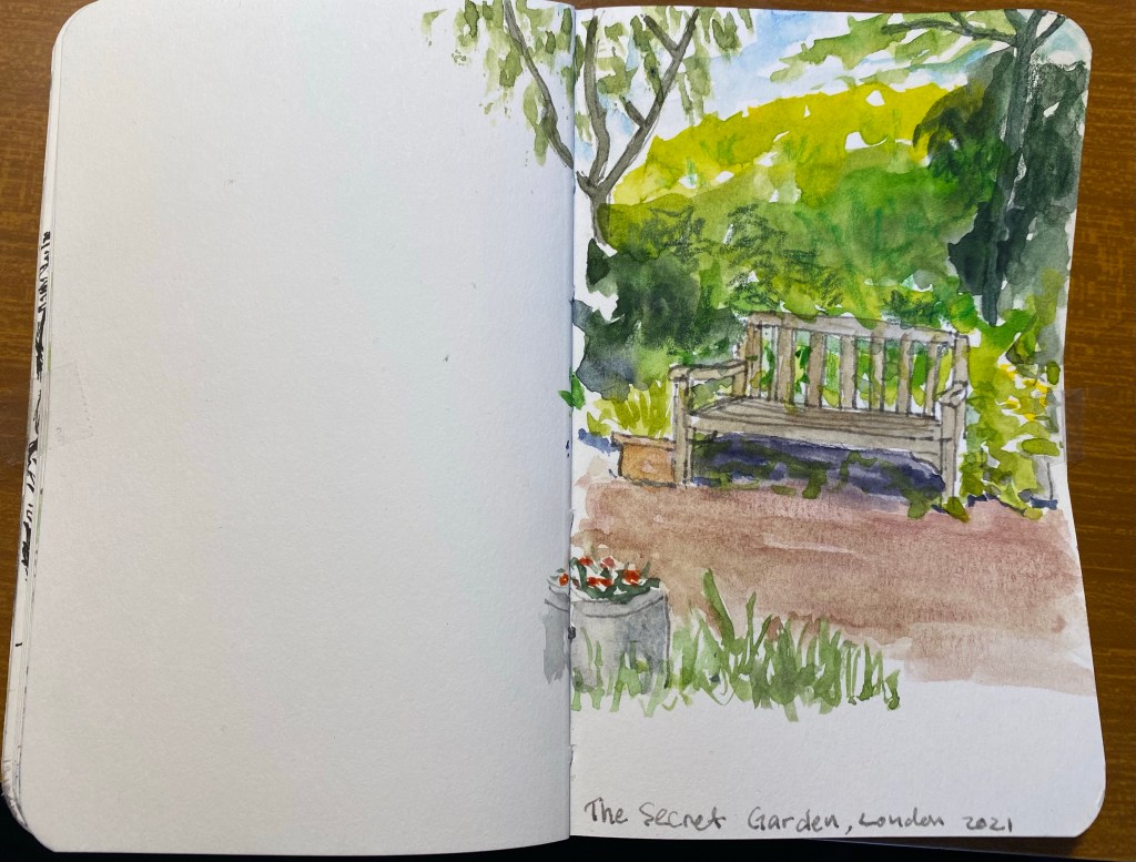
In the middle of London’s West End there’s a beautiful secret garden, the Phoenix Garden. Ever since I accidentally discovered it, it has been my number one favourite place in London. There’s something about the green and the peaceful quiet in the middle of one of London’s busiest areas that is mesmerizing. During the rough parts of my latest hospitalizations I shut my eyes and transported myself to my favourite bench there.
So I decided to create a very quick sketch of one of the benches there, and try to work on my plant textures. This is clearly something that I still need to work on, but it’s good to know where I started.
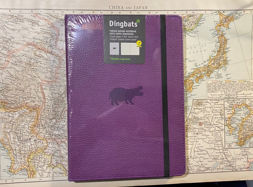
During my trip to London this year I managed to buy a few Dingbats Wildlife notebooks (the elephant, tiger, hippo and deer). They appealed to me because they present a vegan friendly, fountain pen friendly journaling option, with a unique take on the classic “Moleskinesque” notebook.
Front cover
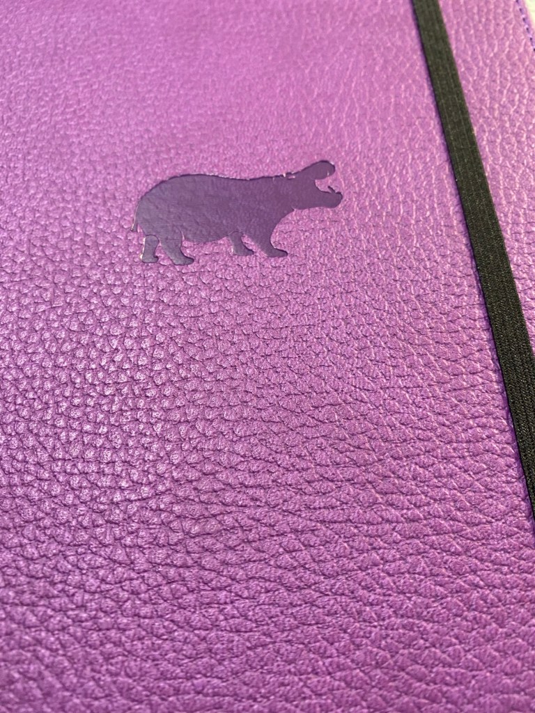
So while the Dingbats A5+ Wildlife notebook has rounded corners, an elastic closure, a back pocket and a ribbon bookmark, the textured vegan faux leather cover is here to make a statement. There’s a different animal debossing and different cover colour for each animal. Currently there’s a Cream Wolf (new), Grey Elephant, Green Deer, Orange Tiger, Purple Hippo, Blue Whale, Brown Bear, Black Duck and Red Kangaroo. Once again, I got a little carried away and bought the Elephant, Deer, Tiger and Hippo – all the Dingbat notebooks that I saw in WH Smith in Heathrow Terminal 5. If I had to choose just one I would go for the hippo or the tiger, depending on how much attention I felt like drawing to myself carrying the notebook around.
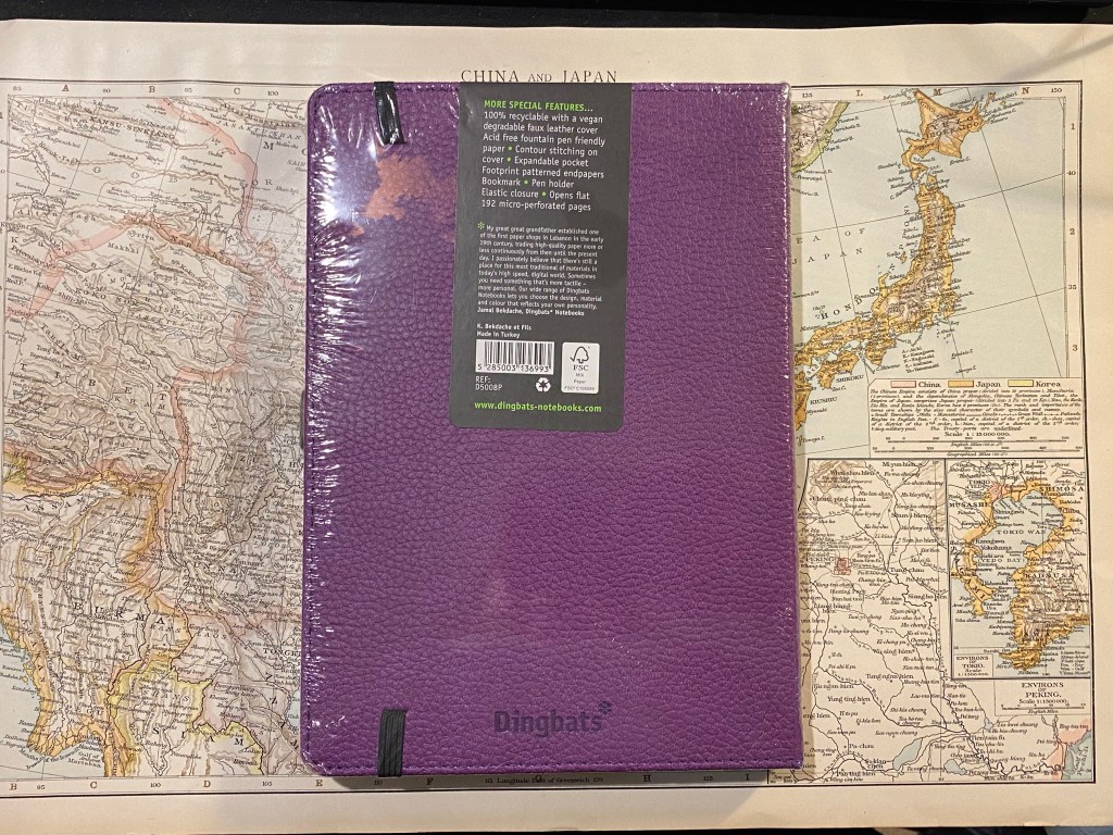
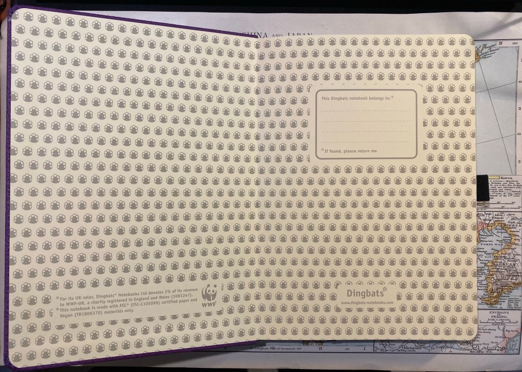
Back cover with a sticker explaining everything there is to know about the notebook
The faux leather cover has a nice texture to it, and the debossing makes it stand out from more generic faux leather notebooks that you might find in stationary shops. It’s clearly there to call attention to itself.
Hippo on a purple faux leather, textured cover.
The front endpaper has hippo footprints on it (they differ by animal), a “This Dingbats notebook belongs to” box to write your details in (always to that. Here’s why), the Dingbats logo and two notices: one that 2% of its UK revenue is donated to the WWF, and another that the notebook is made with FSC certified paper and vegan materials only.
Front endpaper.
The back endpaper also comes with the hippo footprint, and it has a back pocket. The Dingbats Wildlife notebook also comes with a pen holder which can hold standard pens just fine but is too small to hold most fountain pens.For a notebook that caters specifically to fountain pen users that’s a strange oversight.
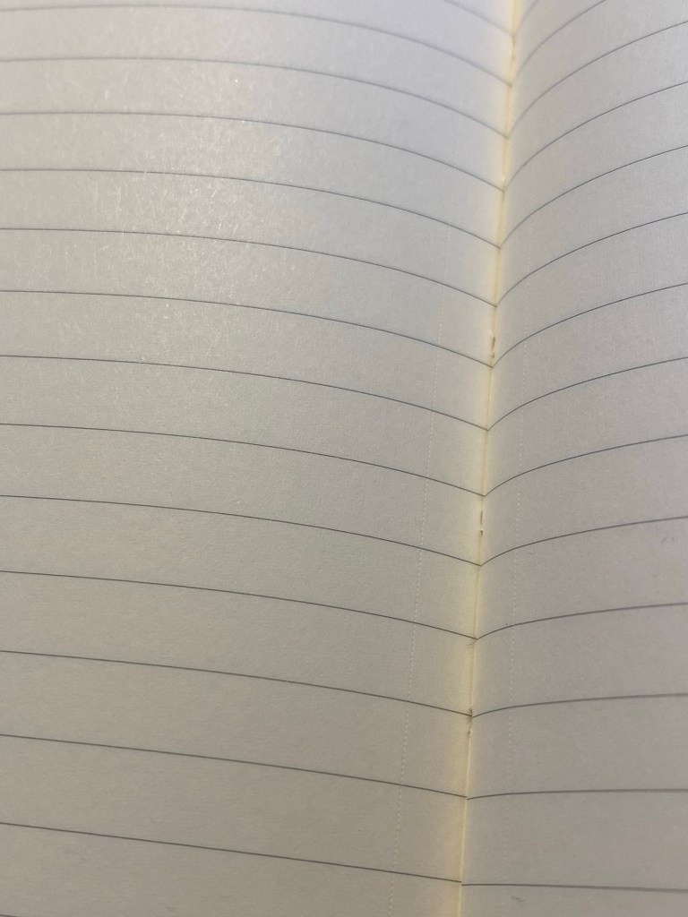
The notebook has 100 gsm very smooth acid free fountain pen friendly paper. There are 96 sheets (192 pages) in the notebook and all of them are micro-perforated. The pages can have either 7mm lines, a 5mm grid, a 5mm dot grid, or be blank, but in the WH Smith that I was in the only option was lined. The lines are printed in a neutral grey that isn’t too obtrusive but is also clearly visible.
Close up of the micro-perforated paper and the grey lines.
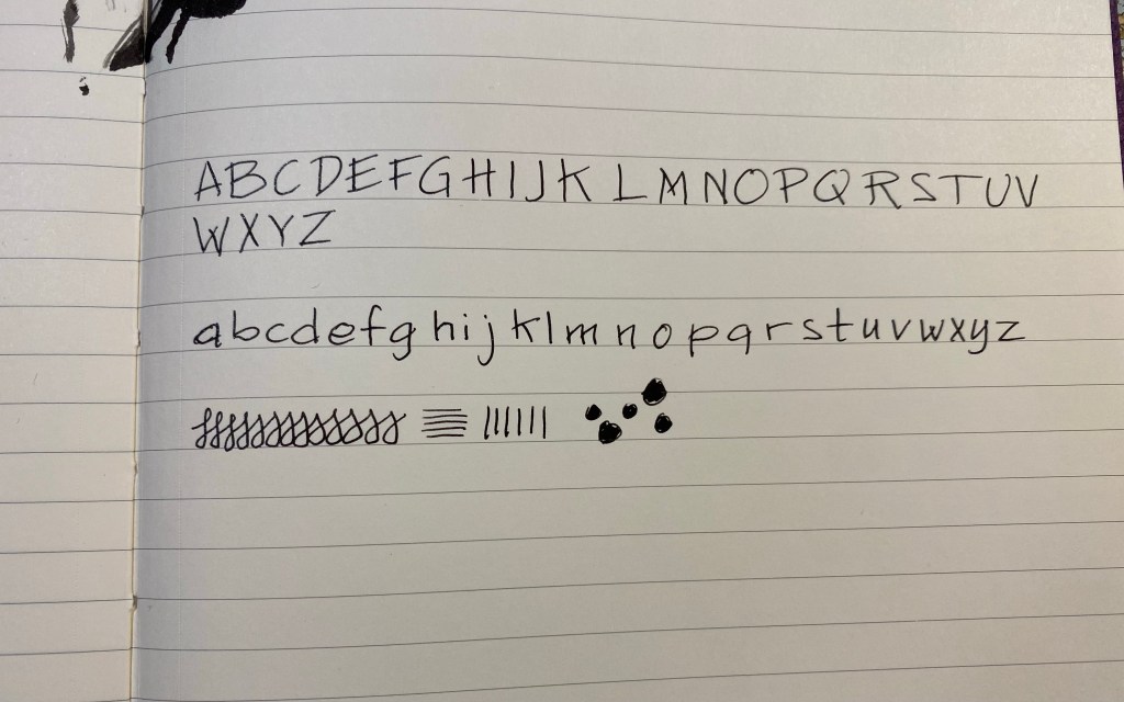
This is an expensive notebook (around £16 per notebook), and so I wouldn’t bother using gel ink pens, rollerballs, ballpoints or pencils in it (if you want to see a test page of that, you can find it here). There are cheaper alternatives for that. The Dingbats Wildlife notebook is built for fountain pens, and it handles them very well. The paper isn’t as glossy as Rhodia paper, but it’s still silky smooth and ink takes several seconds to dry on the page. I don’t have a lot of pens inked up at the moment, and I spread the ink tests on multiple notebooks, but I can assure you that there is no feathering or bleed through with this paper, and there’ very little show through. It’s a fountain pen friendly notebook, as advertised. Here’s a small sample written with a TWSBI Eco fine nib and Diamine Inkvent Solstice, which is a very saturated ink.
I spilled some ink at the top of the page, and that made a mess but also assured me that there really is no bleed through with fountain pen ink.
If you are looking for a fountain pen friendly, eco friendly, fun notebook, or if you want a notebook full of perforated pages, then I highly recommend the Dingbats Wildlife notebook. It’s not a cheap notebook, so if pencils are your thing, maybe look into a cheaper alternative with toothier paper.
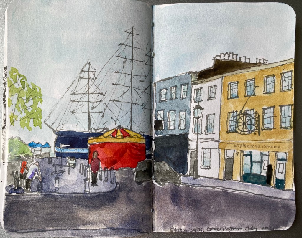
When I visited London in June Greenwich ended up being one of the biggest disappointments of the trip. The place was hard hit by the pandemic, and everything that made it so special to me seemed to have been wiped out because of it. There was no vintage and antique market next to the movie theatre. There were no grandmas selling baked goods for charity in the movie theatre foyer. Nauticalia, the maritime themed shop on zero longitude, had shut down. A good third of the stores around the Greenwich Market were permanently closed, and there was a general dismal aura around the place. The Maritime Museum required pre-booking an entrance, and so not many people visited it. Greenwich is a place that needs tourists to thrive, and with a pandemic and pandemic restrictions it felt deflated, a shadow of its former, sparkling self.
What still is vibrant and lovely is the place itself, and to remind myself of its potential and of my potential to visit it again someday in better times I created a quick sketch of the road leading to the Cutty Sark.
Schminke and Daniel Smith watercolours, Noodler’s Lexington Grey ink, Stillman and Birn Pocket Alpha.
Since my last post on the subject about a month has passed, and boy did a lot happen during that month.
The super traumatic biopsy I went through didn’t yield results, so I had to be hospitalized again (for the third time) to get a mediastinal biopsy under full anaesthesia. My first ever operation.
The procedure went well, but my recovery took more time than planned, and the results of the biopsy took two weeks to arrive (hello, Grey’s Anatomy with your very realistic “8 minutes for a biopsy result”). By the time the results arrived I had more and more difficulty breathing, to the point where on the day of their arrival I came into the hospital to be hospitalized for the fourth time, this time because I just couldn’t breath.
I never thought about my breath so much as I did during those few days. I was connected to oxygen and pumped full of steroids and still had to consciously think and struggle for each breath, for every inhale and exhale. You can’t talk, you can’t sleep, you can barely eat, you just breath, breath, breath.
Luckily the biopsy results were better than any of us could anticipate: I have Classic Hodgkin’s Lymphoma. It’s very treatable, and though it requires chemotherapy, the course is less intense than I had anticipated.
Two days after my biopsy results arrived I got my first chemotherapy treatment (ABVD, for those interested), and an hour and a half after treatment I could breath independently. I didn’t need oxygen. I could speak in whole sentences. I could be released home.
I have to replace my runs with walks now, but luckily I live in a place with nice walking views.
I have a chemotherapy treatment every two weeks. I’m slowly rebuilding my routine around those treatments, and so hope to start posting more often now that my life isn’t a complete chaos of hospital/home/hospital/home. There are things that I won’t be able to do for a long while (such as running, which is a heartache), but luckily most of my hobbies and all of my work are things that I can do indoors, at a computer or a desk.
Take a good, long, deep breath for me and appreciate it. It really is precious.
I haven’t posted a Moleskine limited edition review in a while, mostly because I stopped journaling when my mother was diagnosed with a new kind of cancer in the beginning of the year. Once I realized that I had cancer I chose the nicest Moleskine limited edition that I could see, grabbed a Kara’s Kustoms Render K and started writing.
This is the notebook I chose:
Moleskine I am New York
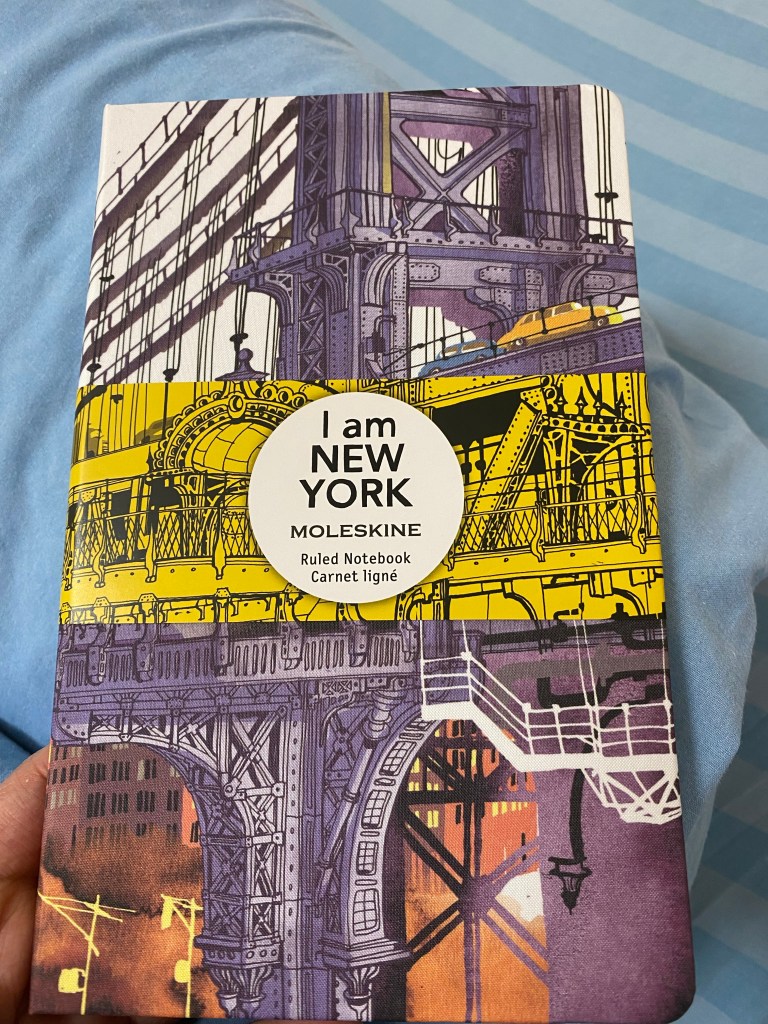
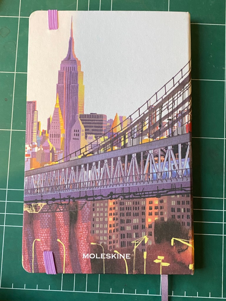
The Moleskine “I am New York” is the second of the “I am” series that I’ve tried out (the first being “I am London” which I bought in the Moleskine Covent Garden store). There’s another notebook which I haven’t been able to purchase, the “I am Milan” one. In any case the cover design on these notebooks is stunning, with a vibrant illustration of an iconic architectural aspect of the city they represent. In the case of New York, it’s Brooklyn Bridge.
Front Cover Illustration.
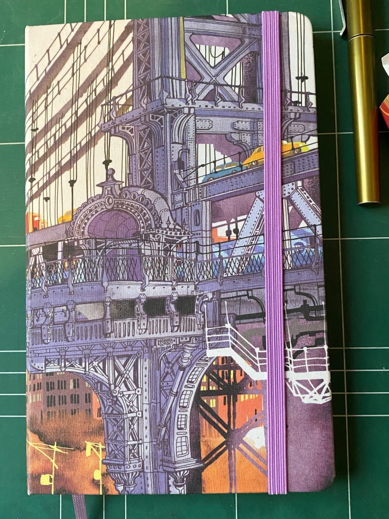
The covers are made of fabric, which Moleskine has excelled at in recent years. This one is no different – the cover is very well made.
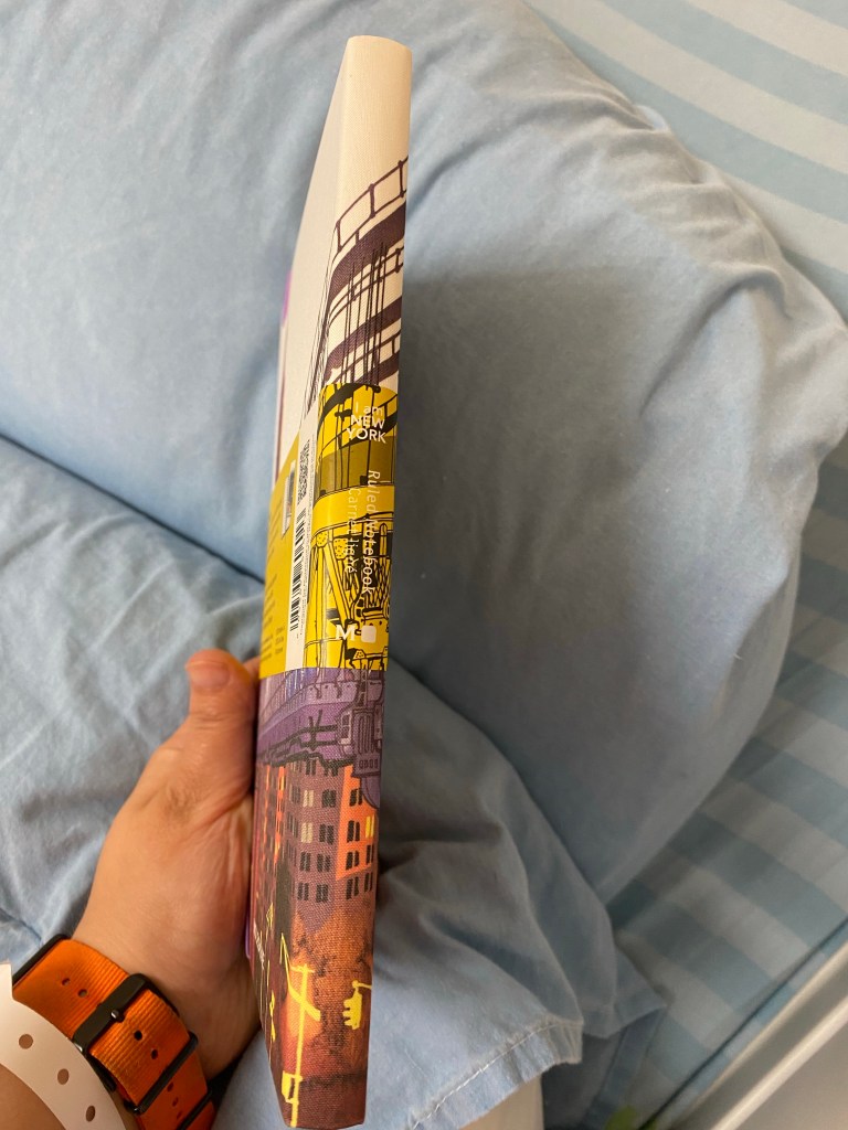
The spine. Can you guess where these photos were taken?
Here’s a look at the cloth covers without the yellow paper band. You can see how well the elastic band’s colour and the ribbon bookmark fit with the design even though lavender may not have been the most obvious choice.
Front cover.
Here’s the back cover and ribbon:
Back cover with ribbon bookmark.
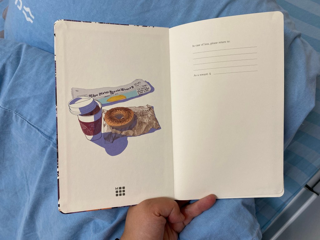
Here’s the front endpaper. It features the New York Times, a take away coffee and a bagel on a brown paper bag. Remember the bagel, we’ll be returning to that later on.
Front endpaper.
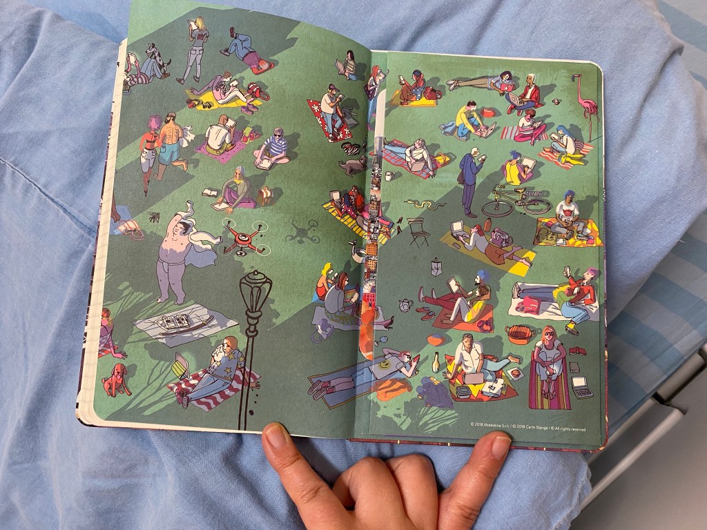
The back endpaper features a very imaginative summer scene in a city park, with various denizens of the city enjoying a lounge on the park lawn.
Back endpaper.
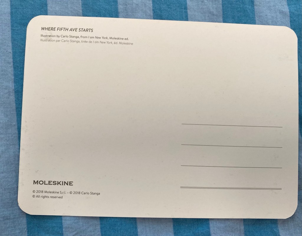
The Moleskine “I am New York” comes with a lovely postcard in the notebook’s back pocket, with a drawing by Carlo Stanga(who also illustrated the front cover) titled: “Where Fifth Ave Starts”.
Where Fifth Ave Starts postcard.
It’s a functional postcard, but I’d just hang it as a small work of art in my cubicle or on my fridge.
Functional postcard if you need it.
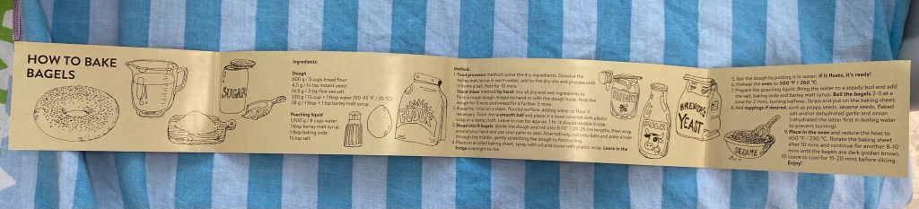
The B-side of the paper band has a bagels recipe (remember the bagel from the front endpaper?). I haven’t tried it but it’s well drawn and a cute addition to this already great notebook.
I’m going to be using the Moleskine “I am New York” as my daily journal through these next few tough months, and I can’t think of a better notebook for the job. It’s a beautiful notebook that makes me smile whenever I pick it up.