Back to the Bakery
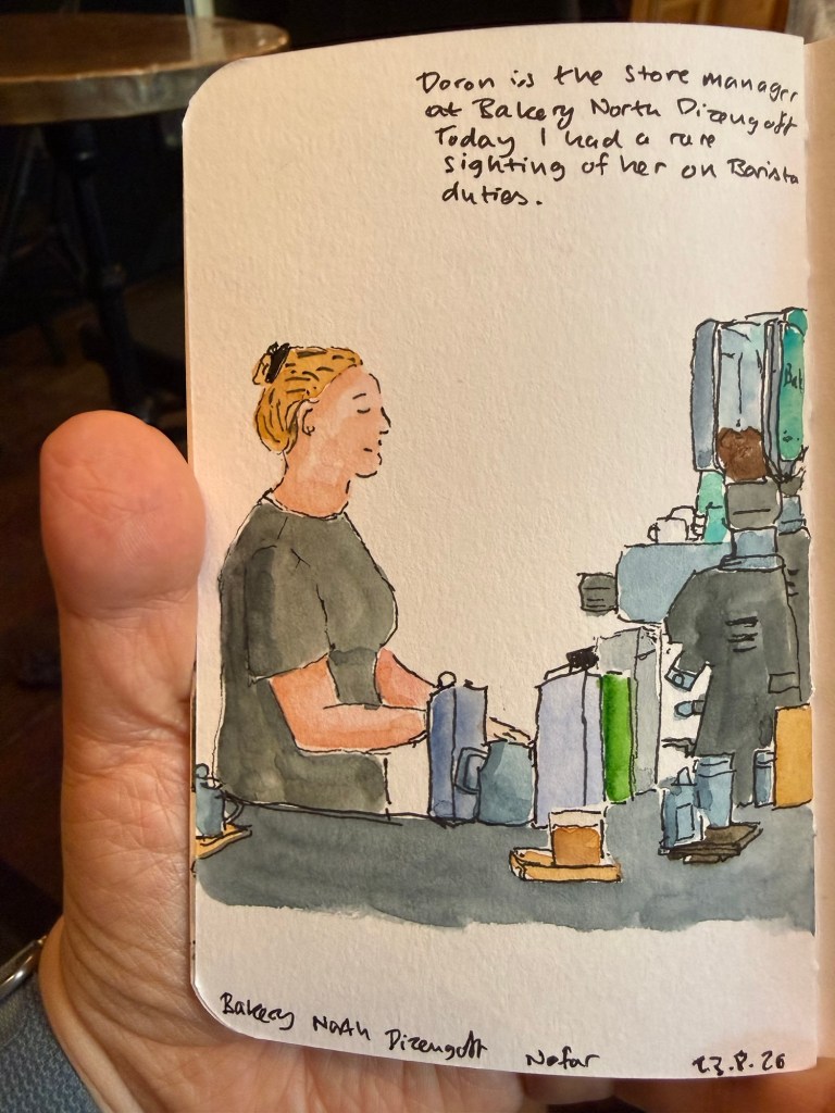
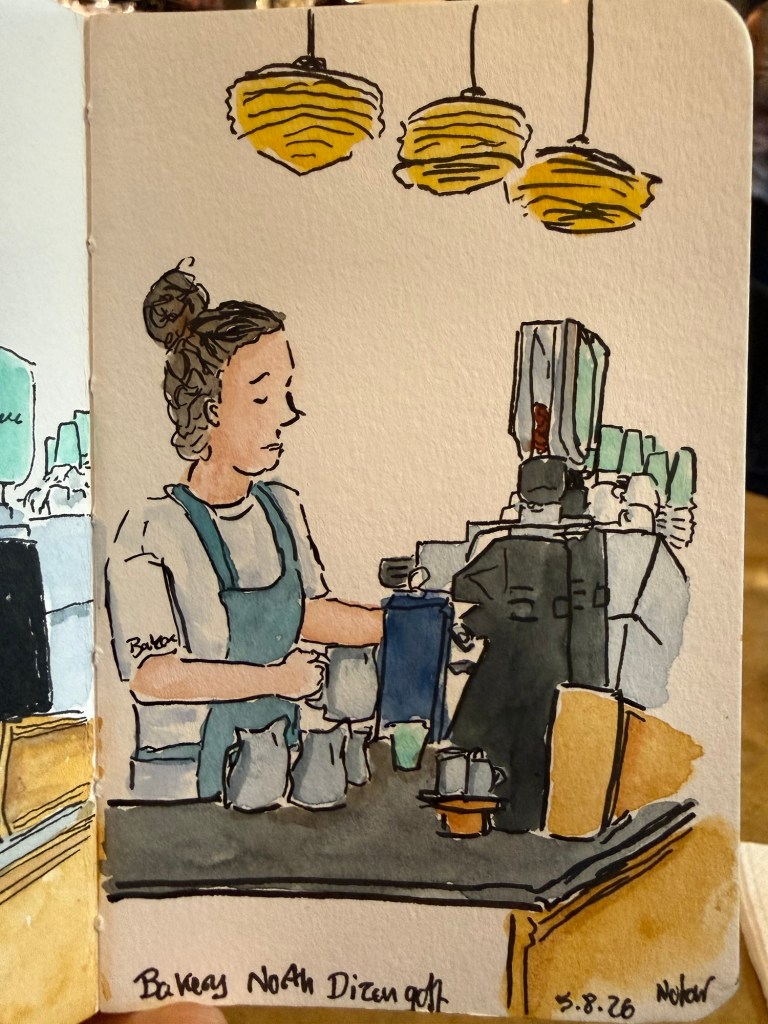
Back to my usual haunts – went on a short run and then a quick sketch of my favourite barista.
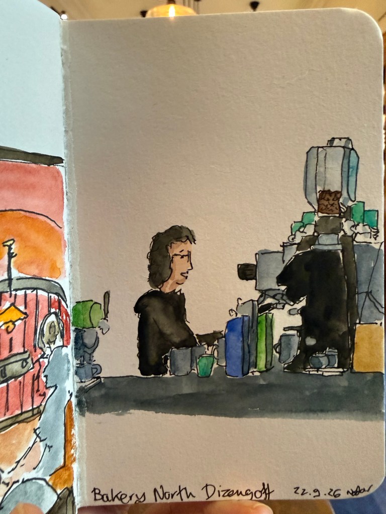
Stillman an Birn pocket beta, Windsor and Newton 0.5 fineliner and Schmincke and Daniel Smith watercolours.
A blog about writing, sketching, running and other things
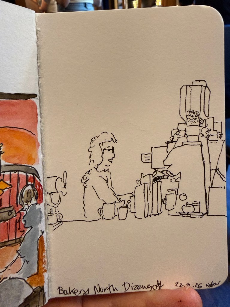
Back to my usual haunts – went on a short run and then a quick sketch of my favourite barista.
Stillman an Birn pocket beta, Windsor and Newton 0.5 fineliner and Schmincke and Daniel Smith watercolours.
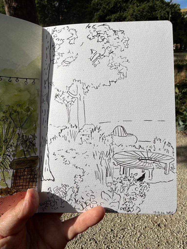
Quick sketch of the renewed Grosvenor Square garden in London.
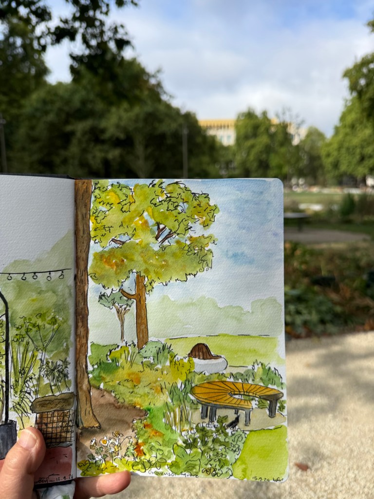
Sketched on a Hahnemuhle A5 watercolour sketchbook.
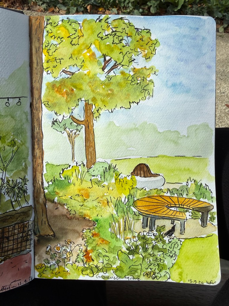
The line sketch was done with a brush pen.
Happy new year, full of peace and blessings to us all.

I’m travelling to Paris and London and I’m trying to both sketch much more and journal more consistently. The first leg of the trip is a four day stint in Paris and I just completed it.
Here are the sketches that I made:
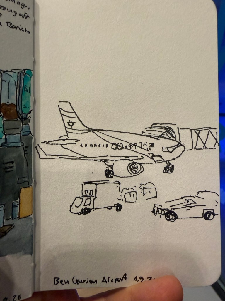
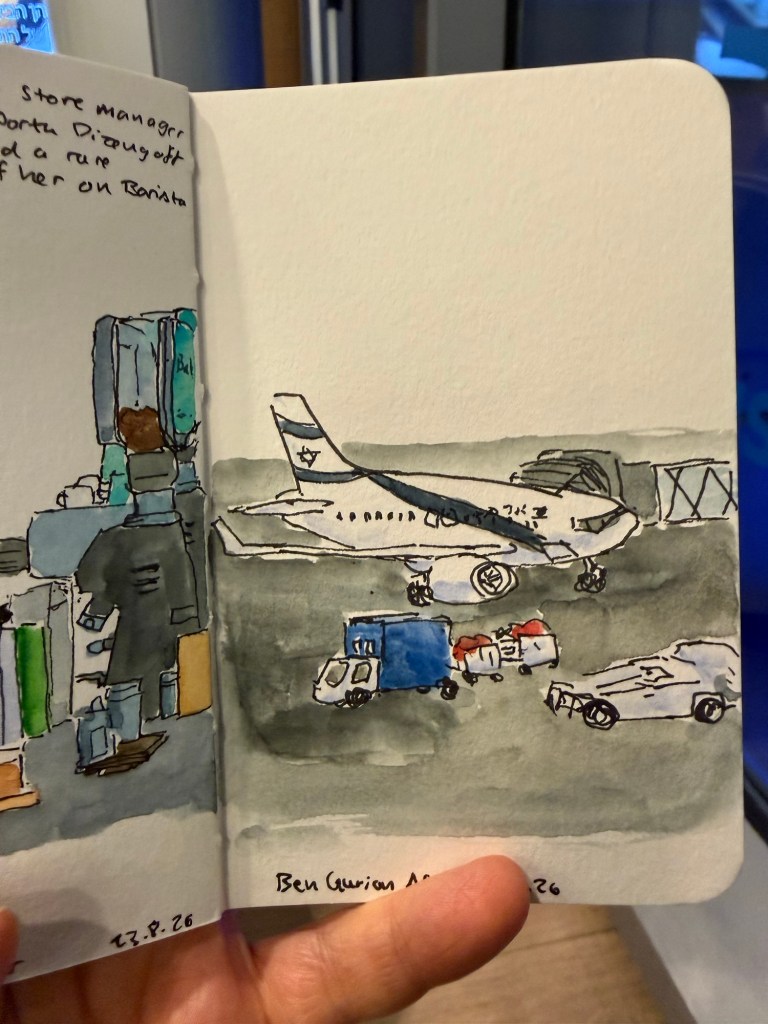
I was tired and this came out wonky but I don’t mind as it captures the moment well and I had less than 10 minutes to get it done.
Sketch of the wonderful lunch at my favourite cafe:
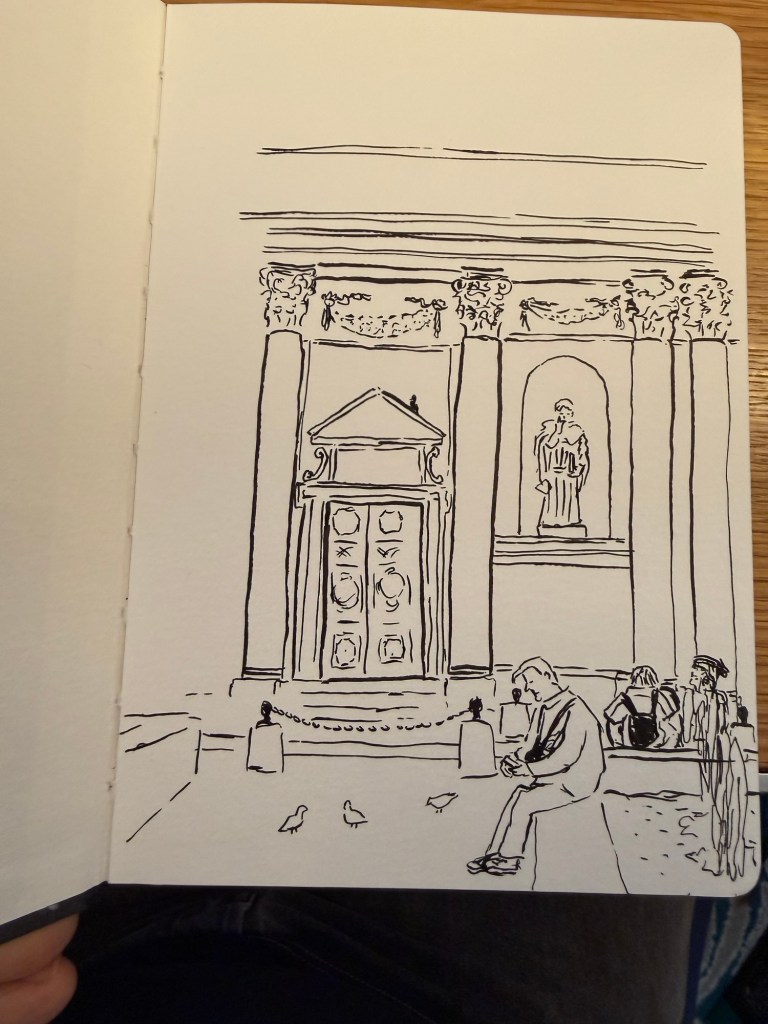
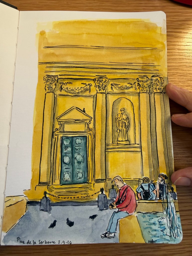
I bought a Hahnemuhle A5 watercolour sketchbook and a new set of Uni Pin fineliners. This sketch of Place de la Sorbonne was done in situ with a brush pen but I ran out of time so I took reference photos and added the watercolour later.
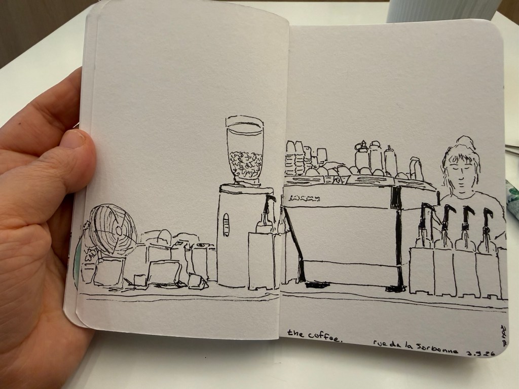
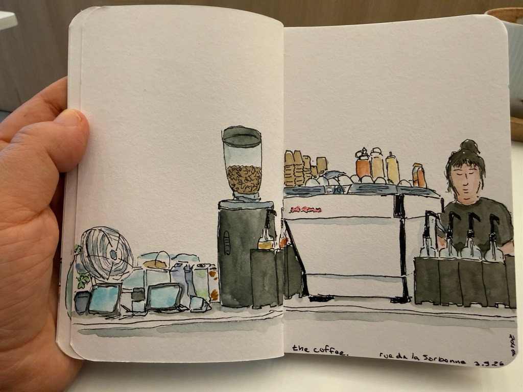
I went to The Coffee, one of my favourite local cafes. I sketched the shop and the barista:
And had enough time to add watercolour. I was hesitant to show it to the barista once I was done but in the end I mustered the courage and did and she liked it.
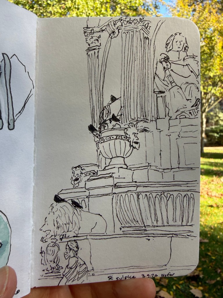
Had about 10 minutes to sketch in the St Sulpice square which was enough to get some quick line work done and take some reference photos for later.
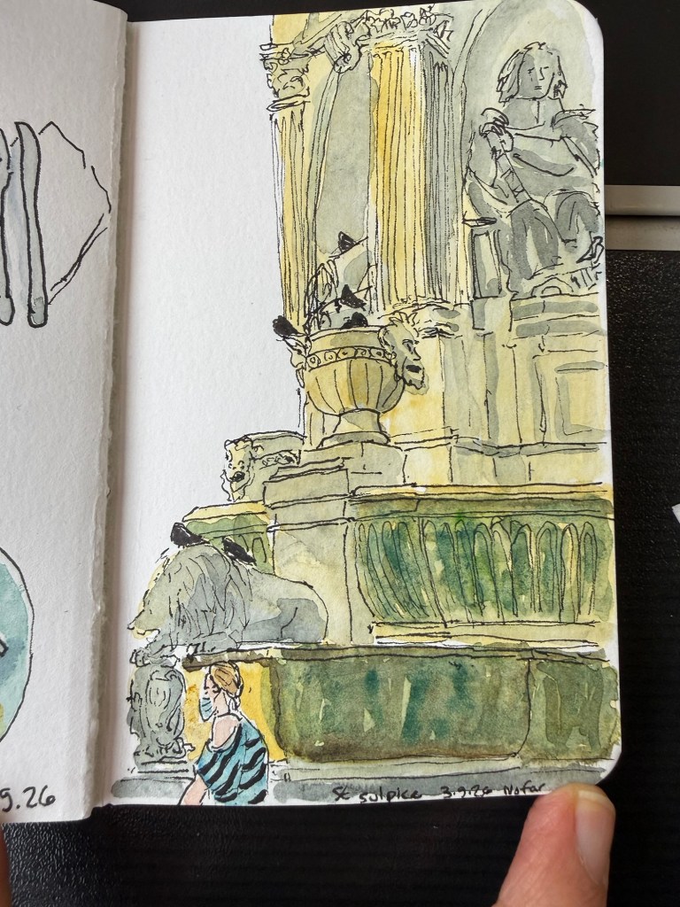
Finished it later:
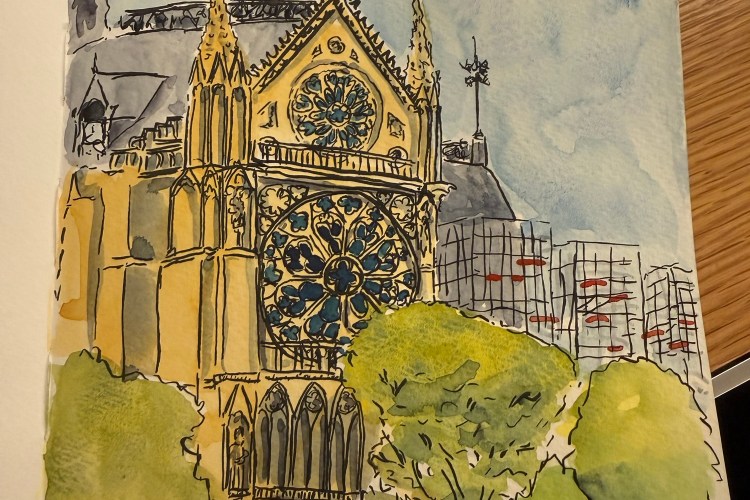
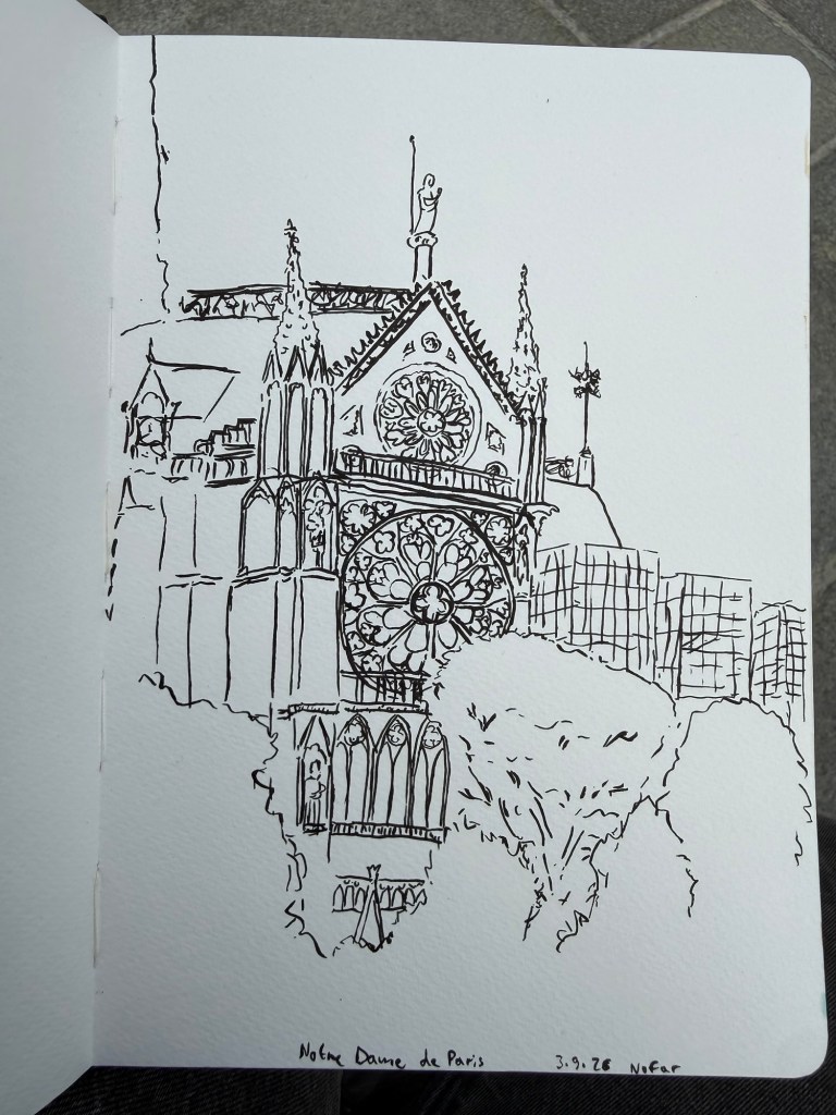
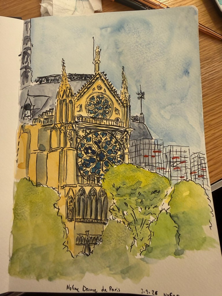
Yesterday I went to the Notre Dame, my favourite, and managed to get a line sketch in my Hahnemuhle A5 watercolour sketchbook but then the heat and crowds were too much for me so I completed the sketch in my hotel room later that evening.
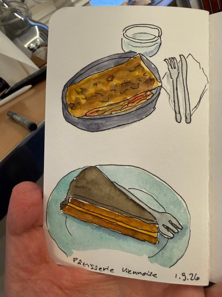
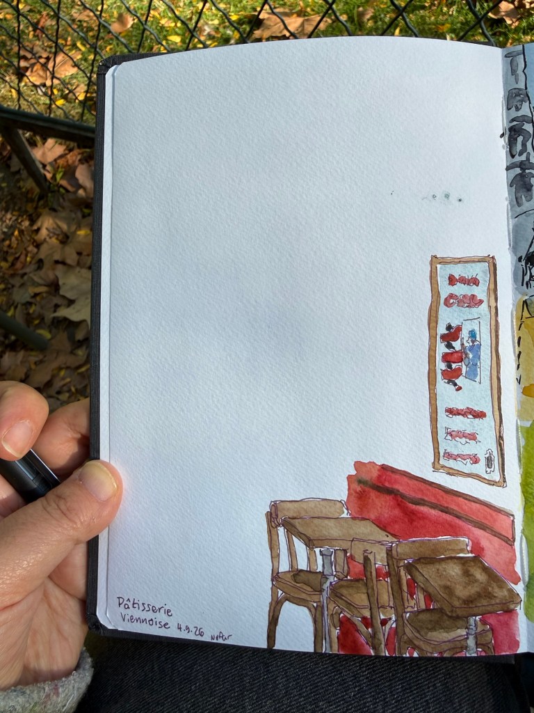
I tried sketching the interior of Patisserie Viennoise, my favourite cafe, this morning but didn’t find an inspiring angle so I just created a brief vignette in my Hahnemuhle:
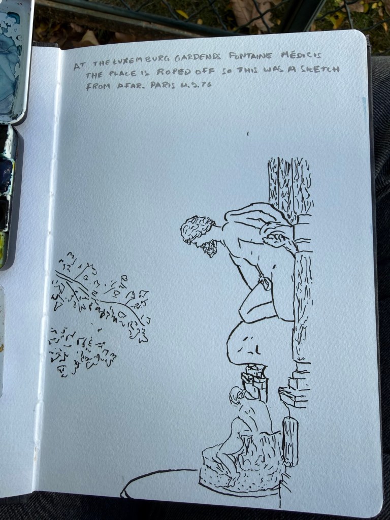
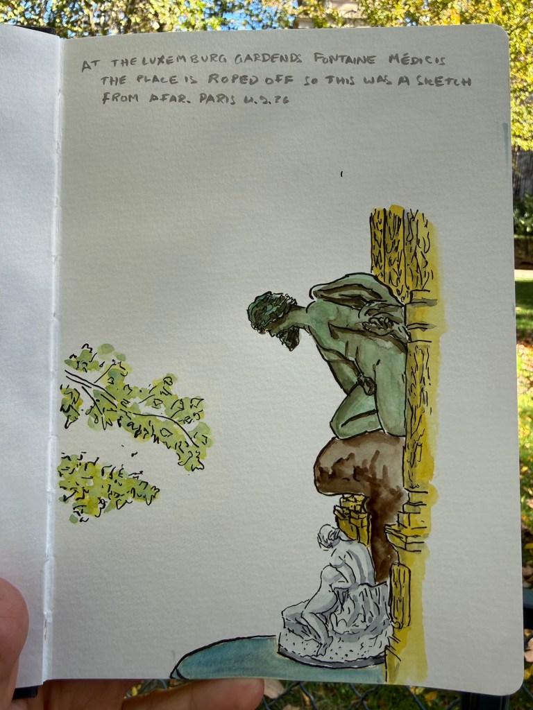
Later I went to the Luxembourg gardens and sketched the Medici’s fountain. It was closed off to visitors for some sort of maintenance so I sketched it from a distance.
The complete sketch:
Bought an A5 Moleskine sketchbook on sale and made this sketch on the bumpy train ride from Paris to London:
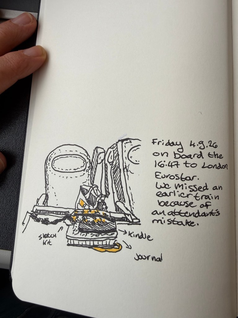
So far I have managed to sketch and journal daily. London’s schedule is more hectic so we’ll see how things go there.
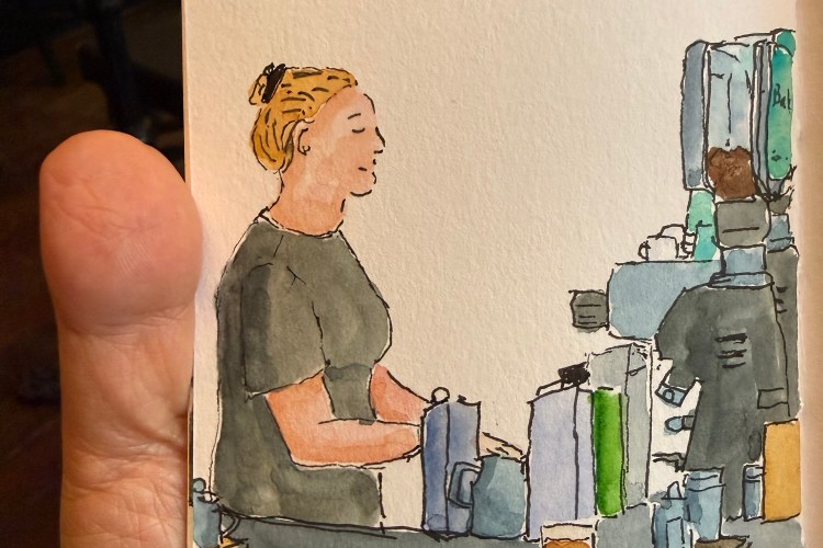
A rare sketch of the shy store manager at my favourite deli/cafe. The place was busy so she chipped in with barista duties.
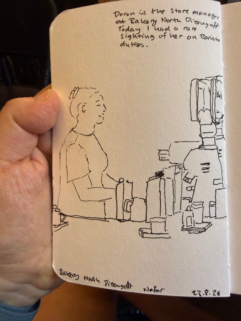
Here it is with watercolour:
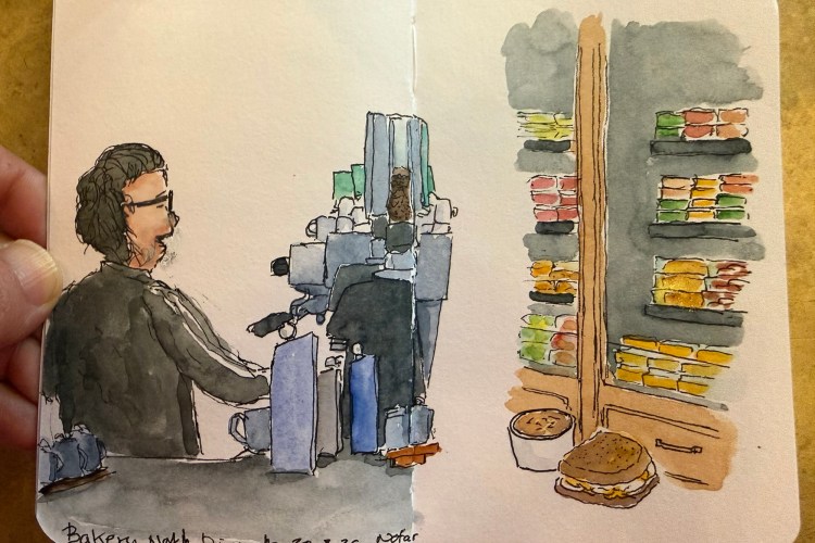
After finishing my previous Stillman and Birn pocket Beta sketchbook I started a new one. I normally use the first page to draw my palette, but this time I just skipped the first page and started a full page spread. I was sketching in my favourite cafe after a hot and humid run and for a change I decided to also sketch the fridge full of deli food.
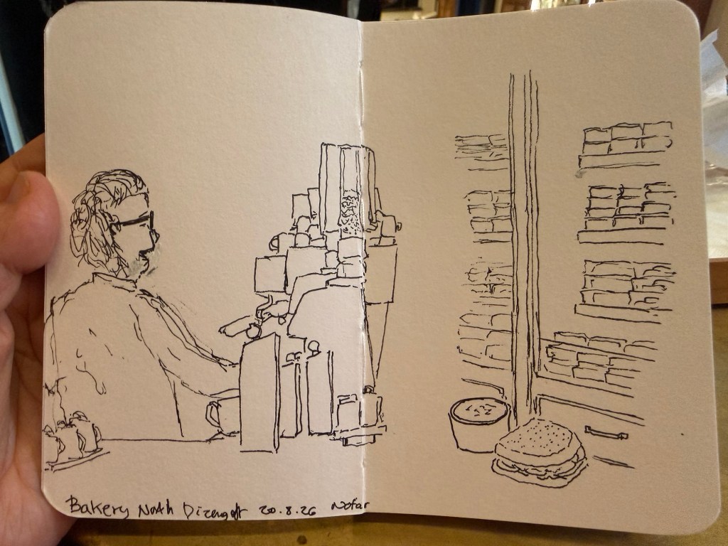
I made a few mistakes with the original barista sketch, which I erased with a white gel pen. It’s not the cleanest, but that’s the nature of urban sketching. I also forgot to colour in the tomatoes in my sandwich – an omission that I’ll correct later.
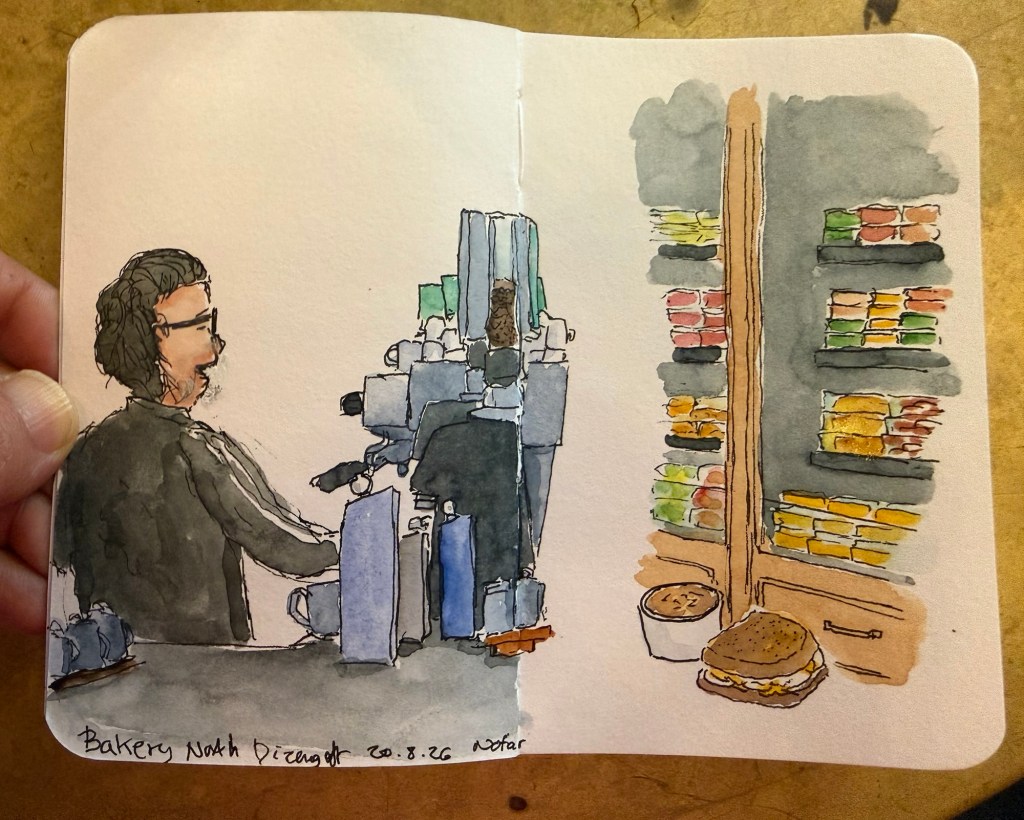
It’s a bit of an unusual spread for me, but I like it enough to continue experimenting with spreads like it in this sketchbook.
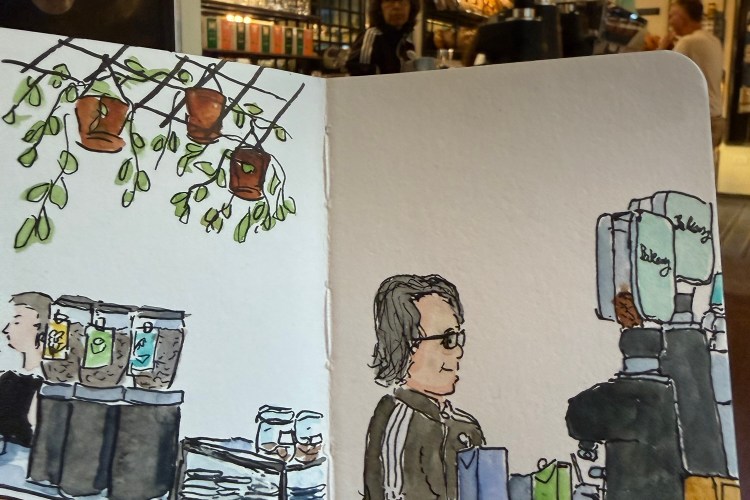
I filled the last page of my Stillman and Birn pocket beta today, a bit less than a year after starting it.
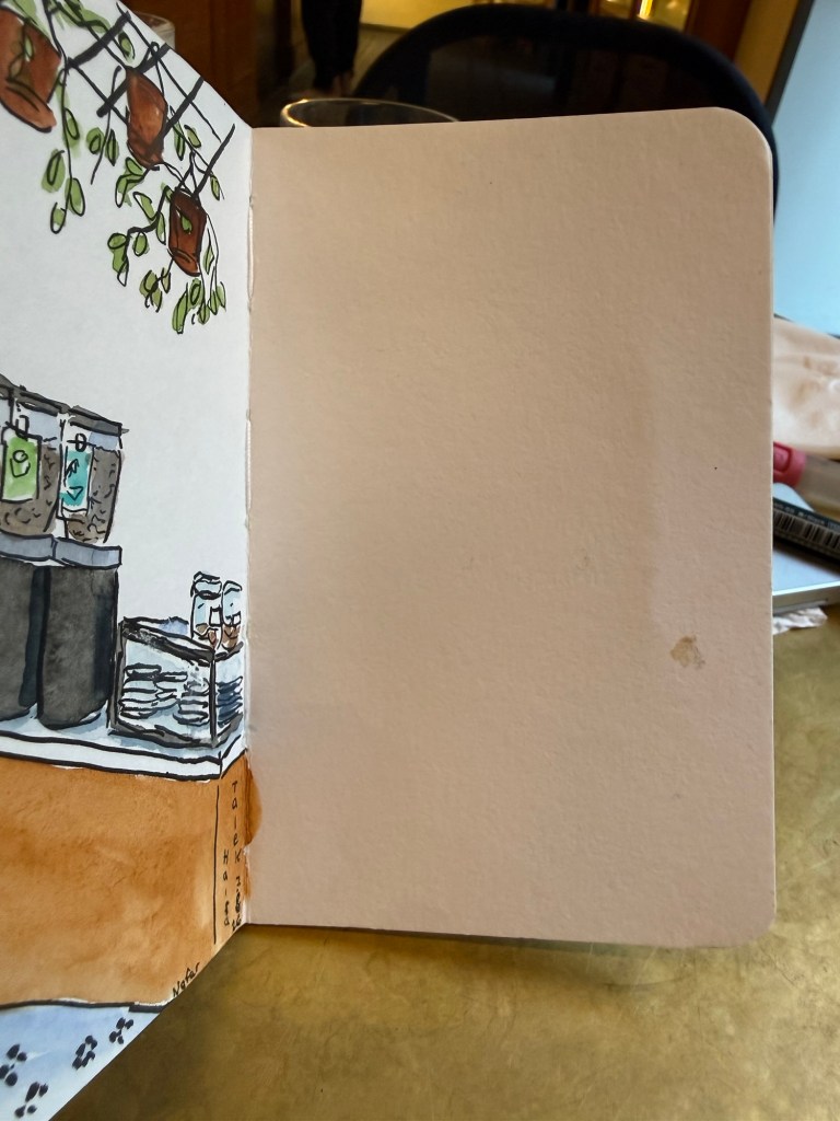
After a hot and humid run this morning I went to my favourite cafe and sketched Orit, my favourite barista. The line drawing was done with a Staedtler 0.8 pigment liner pen.

Then came the watercolours- Schmincke Horadam in a tiny art toolkit palette.

And here it is with Orit in the background.

It’s been a while since my last update, and though I drafted a post in my blogging notebook over a month ago, I didn’t get to posting it here.
I got a new job! The process was much quicker than I expected both because of my excellent friends and colleagues network and because I aggressively pursued new employment opportunities. I was getting three interviews a day plus sending several applications a day despite being sick and having another “delightful” rocket round from Iran to deal with. In the end it took me two and a half weeks to find a new (and better) place, and I learned a lot from the process.
I had a little time off before I started my new job (I started two weeks ago) and I spent most of it on catching up with friends, getting on top of doctor’s appointments, decluttering and honing my technical skills. I didn’t get half of what I planned on doing done, but that’s the nature of the beast. I am very glad that I prioritised meeting friends because it was so energising and fun and fulfilling to be able to do that. It made me realise yet again just how important real life meetings with friends are.
I finished the NYT Summer Reading Challenge on the 6th of August, well before the deadline. I enjoyed the challenge and I’m glad that I participated as it got me reading books that have long been languishing on my reading list. I decided that I will review each of the ten books that I read, so expect those reviews up shortly.
I saw the new Spiderman movie (Spiderman: Brand New Day) and it’s very good. It reminded me of The Thunderbolts, which I loved. It was well written and performed, and Florence Pugh and Jon Berenthal steal every scene they’re in they are so magnetic.
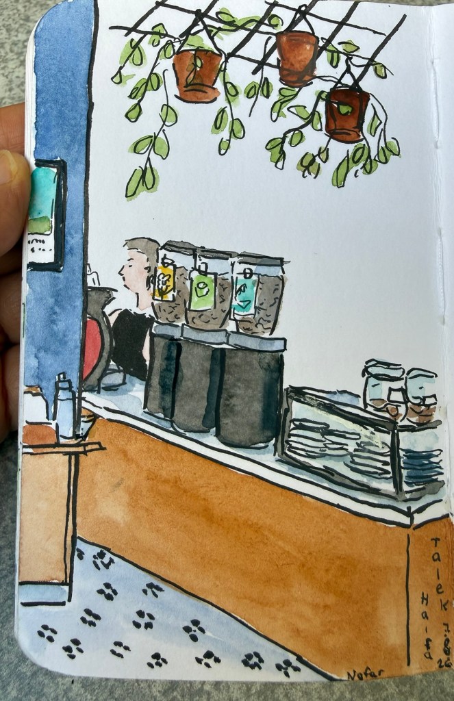
I’m almost done with my Stillman and Birn pocket beta sketchbook and I might post a flip-through here. I normally take ages to finish a sketchbook because I have so many sketchbooks running in parallel, but this one took about a year, which is super fast for me. Most of it is full of cafe sketches, because I’ve put a focus on sketching people on the move. I do plan on getting back to more landscape and other sketches in my next sketchbook.
I’m still struggling with my journaling, and I also have a large pile of notebooks that I was planning to review but I’m not so sure how to go about that. Standard reviews take a lot of time and I’m not sure that they’re that enjoyable or interesting to read. I don’t want to spew a fact sheet of information on paper weight and binding types as you can find more accurate information on the manufacturer’s website these days. Even Moleksine, who had been elusive about their paper weights in the past, now publish all the relevant details on their website. I think it would be more interesting to read about why I selected a notebook, who I think would enjoy it, and who I think should steer clear of it. What do you think?
I wasn’t feeling well earlier this week, so I decided to sketch close to home and to simplify my setup. I was feeling the “Toulouse Blues” (where you’re part of the urban sketchers community but miss out on the urban sketchers symposium in Toulouse), so I wanted to sketch to cheer myself up.
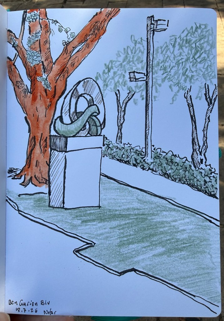
The setup was unusual for me on all counts:
I kind of like the result, and I’ll try to create more experiments like it in the future.
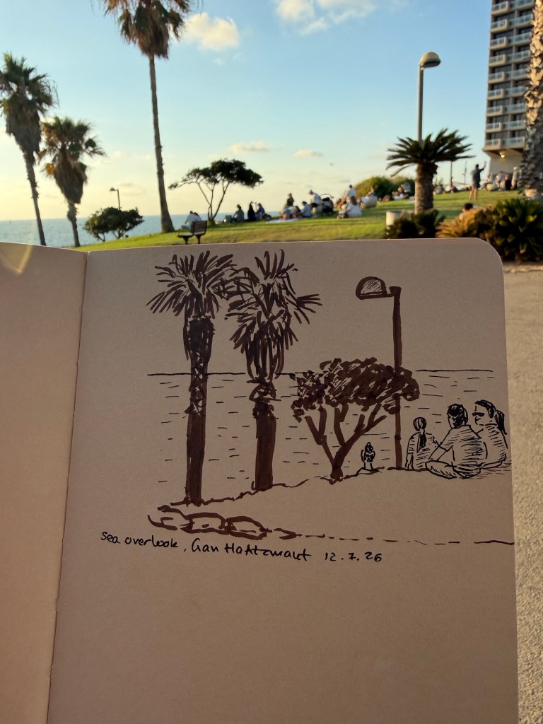
I had about 10 minutes to sketch yesterday, so I took my new Stillman & Birn Nova sketchbook (5 1/2 in. x 8 1/2 in.) a fineliner in sepia and black and a sepia brush pen and sketched this:

I edited out the bench in this scene as the people were more interesting.
I’m trying to get back into regular sketching, and I think that simplifying both the scene and my selection of tools will help. This experiment sadly badly failed – I put so many restrictions on myself that I got paralyzed into not sketching at all.
We try. Sometimes it works, sometimes it doesn’t – but the point is to keep on trying. Sketch on!

