Since November 2023 I have picked up a new habit of sorts – writing letters without posting them. I address them to people I know, some alive, some no longer so, and they’re usually short – an A5 page or two at the most. I write them with no intention of ever posting them, and I deliberately phrase them as letters to a specific person.
Why would I do that?
This started because I wanted to write about certain things with a particular person in mind, and I knew that with the state of our local post office they would never be posted. This was fine by me as I didn’t have the time and mental capacity to start and maintain a true correspondence with someone.
I wanted to write a letter and not a journal entry because I wanted to address my thoughts to someone. When you write a letter you find yourself shaping your thoughts, points, ideas to fit to the person you’re addressing – whether you’re trying to convince them of something, explain something to them, let them know what’s going on in your life, or argue with them. The writing needs to be clear, poignant, convincing and oftentimes entertaining.
I can be sloppy in my journal writing, but letter writing requires more discipline and care. It’s a good writing and thinking practice even if you have no aspirations of being a writer.
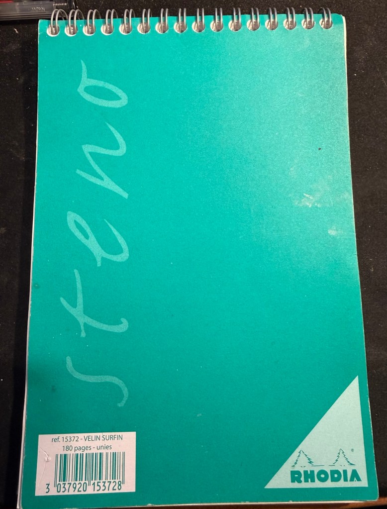
The pad that I use
Who do I address the letters to?
Mostly dead people. Dead mentors, dead relatives, people that are no longer in my life. I keep them posted on what’s going on, wonder what their opinion would be of current events, and through writing to them I work out what I think of what’s going on in my life and the world. Occasionally I’ll write to people that are alive and well and in my life – just things that I want to get off my chest but that are better off unsaid. Unlike what social media would have you think, not all thoughts are worth publicly airing.
I use a Rhodia blank steno pad and whatever fountain pens I have in rotation. The medium is less important than the actual practice. I tend to write about one or two letters a month, although there are months that I write more letters in and those where I write none at all.
I’d recommend giving this idea a try, and start by writing to people you know and not celebrities or famous people. It’s easier addressing someone you’re familiar with – like a grandmother, aunt, cousin or teacher. You can destroy the letter after you wrote it – the point of this exercise is the writing process of the letter itself, not the resulting letter.
I think you’ll find that it will give you some clarity and peace of mind.
I wrote about my newest notebook, my “Work in Progress” notebook here. It’s basically a notebook that I use for self improvement, dedicated for various exercises in focused meditation, working through gnarly personal issues, and for more intense personal journaling.
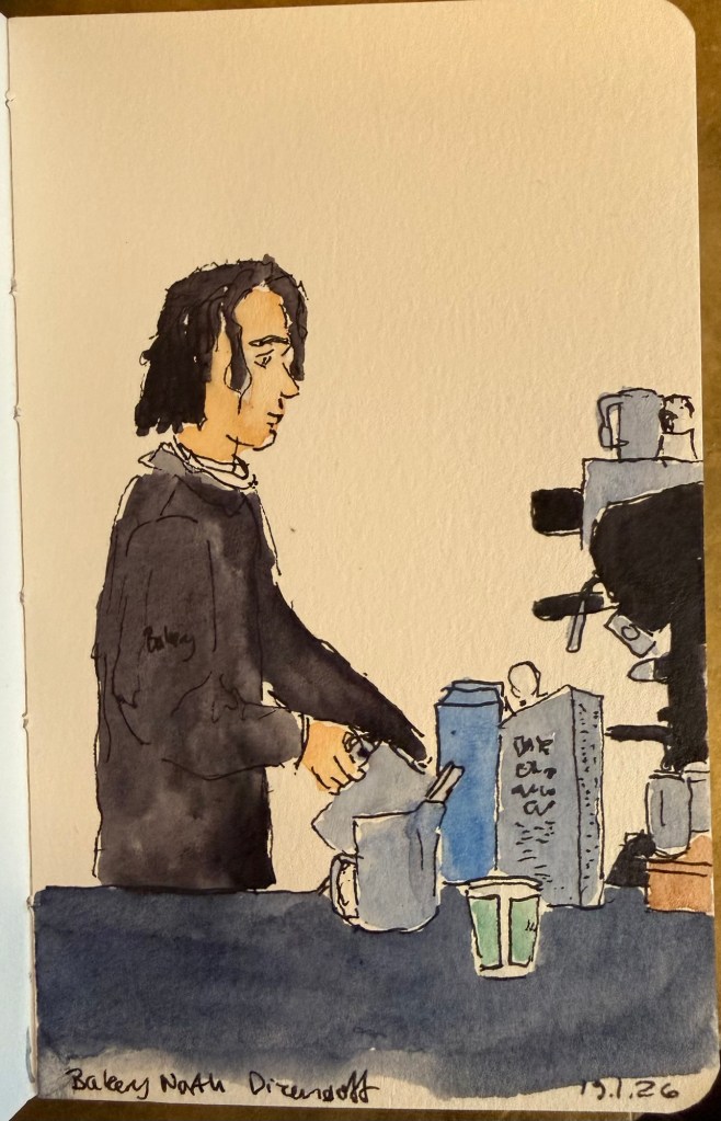
Barista sketch because people need pictures in posts or they get bored.
One of the things that I do as an ongoing exercise in this notebook is keep a list of people that I personally know (so no celebrities or influencers) and what I learned from them. The idea came to me as I was reading Marcus Aurelius’s Meditations.
The book starts with a list of people that Marcus is indebted to – from his immediate family, then onwards to friends, teachers and advisers. This inspired me to create a similar list of my own, also starting from my immediate family and expanding onwards from that.
Some people are kind, inspiring, provide a good example and so they were easy to add to the list. Others were more challenging, but I forced myself to confront my relationship to them, and to find the valuable lessons that I learned from them. The point isn’t to be vicious, cynical, or facetious, but rather to take a second look at people and relationships that you have labelled in a certain way. So the terrible boss taught me what I value in myself and in my managers, certain mean people taught me how to recognise hypocrites, and bad teachers taught me to appreciate good ones and to learn on my own.
I highly recommend doing this exercise and returning to it. It will make you appreciate and feel grateful for the people in your life, and you may even be moved to thank a few of them, even though that’s not the point of this. The point is to realise that:
No man is an island,
Entire of itself;
Every man is a piece of the continent,
A part of the main.
If a clod be washed away by the sea,
Europe is the less,
As well as if a promontory were:
As well as if a manor of thy friend’s
Or of thine own were.
Any man’s death diminishes me,
Because I am involved in mankind.
And therefore never send to know for whom the bell tolls;
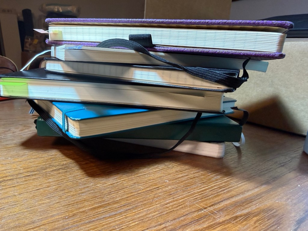
From top to bottom: single project notebook (blog drafts), single project notebook (study notes), single project notebook (D&D planning), work-in-progress notebook, work planner, personal planner, journal
Hi there, do you have a big stack of beautiful, brand new notebooks just waiting to be used? Do you have goals and plans for the new year? Do you want to improve your life in many different areas? Great! This post is for you.
Go grab a handful of those notebooks. We’re going to take the dust off them and get them to work for you. Remember: a beautiful notebook looks even better once it’s full. Notebooks are meant to be used as tools, not stared at like art objects.
Here are a few kinds of notebooks you should keep in 2026:
Journal – this is an absolute must for everybody. I know it’s hard to be consistent – believe me I struggle with it daily – but journaling is a habit that is guaranteed to pay back dividends. I start mine daily with a list of things that I’m grateful for, and end with a mini review of the day (did I fulfil my five ACT values?). In between is a running log of the day, and sometimes a section where I work things out on the page. Don’t post your opinions and thoughts on social media – write them in your journal instead. A journal will give you peace of mind, perspective, joy and a safe place to vent. Don’t take it out on people, put it on the page. I currently use a Stalogy 365 B6 for my journal, though for years I have used limited edition lined Large Moleskine hardcovers, and I may yet return to them.
Work In Progress notebook – this is the newest addition to my notebook rotation and I wish I had started a notebook like this sooner. What is a Work In Progress notebook? It’s where I spend time working on things in my life that I want to reflect on and change. You can do this in your journal, but as I’m dedicating time and effort this year to make some significant behavioural changes I wanted the place to work through these things. This is also a place where I reflect and take notes about the non-fiction, history, philosophy and self-help books that I’m reading, and it’s a place where I take time to consider my values and purpose in life. Heady stuff that we’ve been encouraged to abandon in this cynical and commercial age – much to our detriment. You can change and evolve, it’s worth investing time in trying to become a better version of yourself, and consistent daily work and reflection in this area is worth doing. I highly recommend keeping a notebook dedicated to this endeavour.
Planners – I believe that the best planner is the one that you customise for your needs. This is why I recommend not buying a pre-formatted planner, and instead making a planner yourself. I keep a work planner and a personal (home) planner and I recommend that you do the same – keep work at work and home at home whenever possible. Take into account that you’ll have to experiment to see what works for you, and that there will be a level of compromise that you’ll have to grow comfortable with. There is no “perfect” planner – there is a planner that works for you. Planners don’t replace reminders or calendar appointments – they’re there to give you a broader view of your week, month and year, and let you make some long term plans.
Single Project notebooks – “Single Project” notebooks are exactly that – a notebook dedicated to a single project or area in your life. It can be a hobby (I have one dedicated to my D&D plans, and I used to have one dedicated to my running), an actual project that you’re working on (I’m studying for a certification so I have a dedicated notebook for my study notes), or an idea that you want to develop. I try to select a notebook that fits the project that it’s dedicated to in terms of size, format, cover and number of pages. My running notebook was a Field Notes, my study notebook is a Midori MD notebook. If it’s something that you’re working on for a while and that’s important to you, I recommend dedicating a notebook for it.
Daily To Do List – I don’t use a notebook for this at the moment, but I used to use a large squared Moleskine for this. I currently use Kokuyo KB A4 loose leaf paper that I cut in half to A5 size. These lists are disposable to me, so I have no problem crumpling the daily list away and tossing it into recycling. You can use a notebook, index cards, loose leaf paper – but I recommend keeping a hardcopy, analog version of your daily to-do list. Why? Because to-do apps give you excuses to pick up your phone, because writing things down makes you stop and consider what you’re committing to, and because you’ve got all those pretty notebooks and pens and it would be a shame not to use them.
Scratch pad – keep one at hand to doodle on, for quick capture and to test out pens and inks.
Hopefully this will help you get more enjoyment and use out of that big pile of notebooks in your closet. Let me know if this helps or if you have more ideas on how to use your notebooks.
It’s been a while, mostly because life has been hectic, not because I don’t have things to write about. Here’s to trying to get more posts in, even if they aren’t perfect or particularly long.
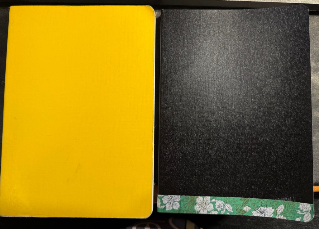
I’ve just finished another journal (the yellow one on the left in the photo below) and have set up my new one. Both are Stalogy 365 B6 notebooks, and both have a similar initial setup:
1.I flip the notebooks upside down so that the header with the dates is on the bottom and out of the way, as I don’t use it.
2. I use the front endpaper to write an “in case of loss” message (my name, email, phone number and a request for the finder to do the right thing).
New journal on the right, old journal on the left.
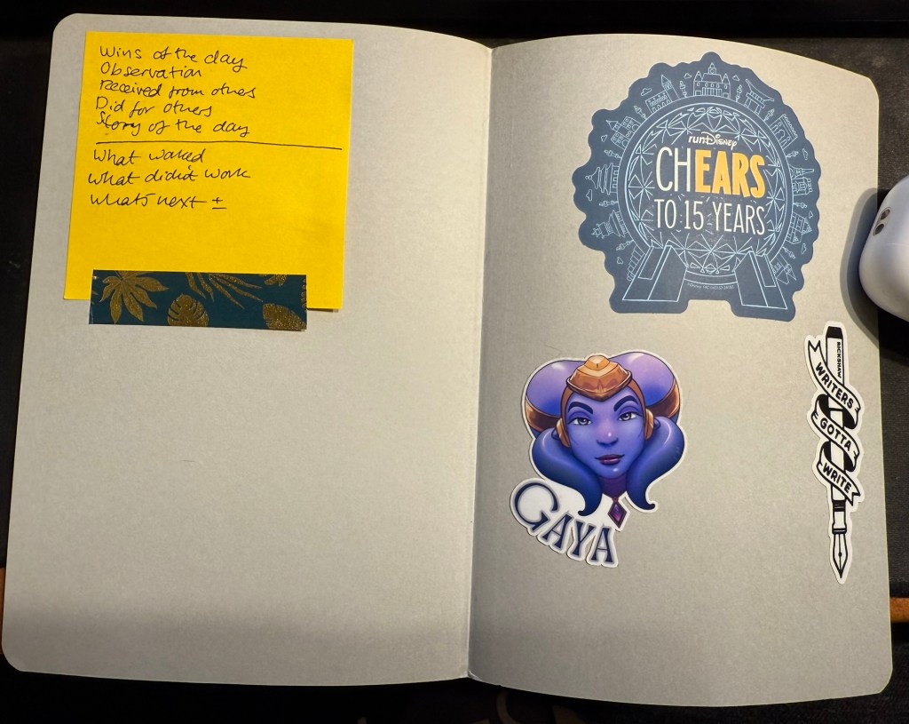
3. I use the back endpaper as a sort of “dashboard”. One side gets stickers on it, the other gets a post it with some journaling and review prompts.
Endpaper view of the new journal.
My new journal’s cover was damaged in transit, so I covered the worst of the damage with washi tape. It adds some character to the black cover, and if it gets too grimy or peels off I can always replace it.
My old journal lasted me for 5 months, which is about what these notebooks last for. My Moleskine journals lasted for 3-4 months because they had fewer paged and I used them for scrapbooking as well.
In other news “Writing at Large” is 10 years old. I never thought that I’d be publishing it for so long, but I’m glad that I started it way back in July of 2015, and I hope to keep it going for many years more. I’ve been through a lot over the past decade, and this site reflects a tiny part of that. If I can recommend something it’s to invest your time in your own site and your own work instead of on social media. If you persist, it pays dividends.
Reading
Finished The Day of the Jackal by Fredrick Forsyth and found it fascinating. I’m planning on reviewing it here.
Started on We Solve Murders by Richard Osman and I’m working on some Ulysses posts.
Health and Fitness
It’s getting hard to run outside, harder than it ever was, in this heat and humidity. Global warming is making treadmill runs more attractive. I’ve started using the NRC app‘s guided treadmill runs and they are pretty good and making treadmill running more bearable.
A smorgasbord of stuff for your delectation. You can read part 1 here.
13. Big bold announcement: next month is Bloomsday, and after much hemming and hawing i’ve decided to reread James Joyce’s Ulysses and blog about it as I go along. I’ve read Ulysses three or four times between 2009-2013 but I haven’t touched it since. While I still have some of my notes on this book, my goal isn’t to reconstruct them or to lecture on the topic, but to enjoy a very good book, and see how my memory of it fairs post-chemotherapy (which has affected my memory). Why should you join along? Because Ulysses is a phenomenally good book that is enjoyable to re-read (but very challenging to read for the first time). It’s funny and touching, profound and full of adventure. It’s just built on very well crafted layers of language, meaning and context, and it’s paradoxically a book that is meant to be re-read, not read. Hopefully I will make it a bit easier and less scary to read for the first time for those brave enough to join me.
14. I have been switching my podcast listening queue around lately, which means that I got to listen to this wonderful two part episode of Alie Ward’s “Ologies”: Salugenology (Why humans require hobbies). Guest Julia Hotz talks about the things that we need to be happy as humans, and the conversation is fun to listen to and enlightening. I highly recommend it, and the “Ologies” podcast in general.
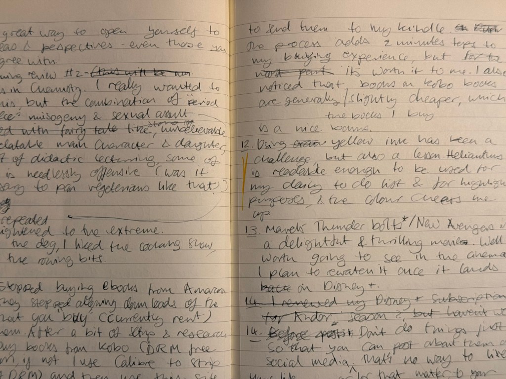
15. I’ve stopped buying eBooks from Amazon after they stopped allowing customers to download the books that they purchased (so you basically don’t own the book that you paid for if you buy in from Amazon now). I still use my Kindle Paperwhite, but I’m buying books from Kobo. I buy them DRM free where possible, and if not I use Calibre to strip them of DRM and then this site to transfer them to my Kindle (if they are DRM free you just use the sendtokindle site to upload them to your Kindle). It took me 30 minutes to get the setup working the first time, and it now adds 1-2 minutes tops to every book purchase, which is plus for me. It means that I don’t mindlessly purchase books that I don’t intend to read, and I actually think through each book purchase. I also noticed that the books I’m interested in are priced slightly cheaper on Kobo, which is a nice little bonus.
16. Using yellow ink (Rohrer and Klingner Helianthus) has been a challenge but also an education. Helianthus is readable enough to be used for my daily todo list, but thanks to this ink I’ve been learning to enjoy using a fountain pen for highlighting purposes. It’s more subtle and better behaved than traditional highlighters, and the colour pops on the page without resorting to neon shades.
17.I am thinking about the next inks to put into rotation, which is a bit unusual for me as I normally start with the pens that I want to fill, and then go find inks that go well with them. I want a blue-black for practical reasons, a cheerful green, a pink or orange, and a turquoise or teal. How do you select which pens and inks you use?
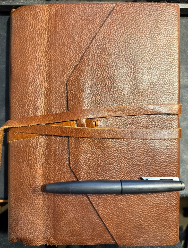
18. A bit of behind the scenes: I draft these posts longhand in a Dingbats notebook and a fountain pen. I think better on paper and it’s a way to use the pens and inks that I have. There are no AI/LLM agents/bots involved in this blog, and that’s the way it will remain. I enjoy writing, I created this blog as a hobby because I enjoy writing, and while I use AI agents as part of my job, I have no intention of letting them take away any part of the creation of this site.
Draft of this post Well worn Dingbats blogging notebook
19. Journaling tip #1: If you’ve been feeling down lately, take the time at the end of each day to review your day and score it. It doesn’t matter what scoring system you choose, but I recommend that you keep it simple and not too granular: -1, 0, +1 or 1, 2, 3, or “great”, “OK”, “meh”, “terrible”. You just want a quick way to know if the day was a good day, an average day, or a bad day. At the end of every day for a week or two think back on what happened throughout the entire day, give it a score, and explain the score in no more than a sentence or two. So for me today was: “OK – was super tired at the start, but I managed to get two naps in and recovered enough to get most of what I planned done”. At the end of the week, when you do your weekly review and plan ahead what you want to stop doing, start doing and keep doing, use these scores as an input for your decisions. Repeat this whenever you feel the need to recalibrate.
20. Journaling tip #2: if you’ve stopped journaling and want to restart, don’t attempt to backlog the days that you missed. Forgive yourself the journaling “debt” and start fresh. This is easier to do if you switch something up in your journaling routine – use a new pen, pencil or ink, a new notebook, or write in a new location.
21. A dear friend and colleague has moved to a new job in a different company. While I’m happy for him and I wish him the best of luck, I already miss working alongside him. This brings me to the following journaling tip:
22. Journaling tip #3: Take a journal, either your usual one or a new one for a special journaling “events” and write down a list of names of people that have inspired or taught you something that you are grateful for, and write down what it is they taught you. Start with those that affected you by their positive actions (kindness, encouragement, setting good examples), and then challenge yourself to journal about those that taught you by being negative presences in your life. Did an office bully teach you to be kind? Did the talentless brown-nose teach you about how much you value your integrity? You can write about both people you personally know and those in the public sphere, and you can return and edit or add on to this list whenever you want. It’s a good reference in troubled times to remind you of who you are, what you stand for, and where you want to be.
Manufactus notebook that I plan on using for journaling tip #3
It’s been a long while since I’ve posted a weekly update, and it’s my birthday week, so to celebrate I decided to write 43 points (split up to several posts to make them more manageable), in no practical order:
After a bit of drama I have managed to enrol to the 2025 Urban Sketchers’ Symposium in Poznan, Poland. I will be posting about my sketchbook and art supplies packing list later on, but do let me know in the comments if you’ll be there.
Rising tariffs and shipping costs have made online pen, ink and paper purchases prohibitively expensive for me. This may not be a bad thing, as it should encourage me to use the large stash of “stuff” that I already have.
I have been gifting people nice notebooks and pens lately, and it’s been a surprisingly heartwarming success. Giving people a notebook that matches their style and needs, coupled with a pen that suites them and an encouragement to start journaling about their lives has been one of the joys of my life in recent months.
Moleskine came out with a cool Peanuts collection of notebooks and Blackwing pencils (plus a backpack and set of pins). It’s refreshing to see them use the XL cahiers for a limited edition, as I don’t think they’ve done that since the Art collection about a decade ago.
Lightening Book Review #1 (I have a huge pile of books to review and not enough time to write a dedicated post for all of them): When the Moon Hits Your Eye, John Scalzi. Scalzi is normally very good at humorous sci-fi, but this book is not one of his successes. It’s an overtly silly, very lightweight book that is not on par with the other books he groups in this loosely thematic trilogy, The Kaiju Preservation Society and Starter Villain. It really suffers from the constant jumping around amongst a giant cast – the plot loses momentum, and you find it hard to connect to any set of characters. While it was not great hardship reading it and it’s a decent light read, feel free to skip this one and wait for the next instalment of his “Old Man’s War” series.
It’s OK to splurge and buy yourself flowers every once in a while, if you enjoy flowers.
I’ve started rucking, which is basically walking at a brisk pace outside with weight on your back. I use an Osprey hiking daypack weighed down mostly with water, but also with a giant cookbook, my journal and kindle, which brings it to around 10kg of weight. I take a break about 15 minutes into my session to sit outside and journal or meditate. If you’re curious, start with a bag that has a waist belt and not too much weight for too long, and skip the $400 overhyped specialized bags and weight plates.
Go see a play (not a musical or comedy) at your local theatre. It’s a great way to open yourself to new ideas and perspectives – especially those that you don’t agree with.
Lightening Book Review #2: Lessons in Chemistry, Bonnie Garmus. I really wanted to like this book, but the combination of graphic, repetitive and unrelenting “period piece” misogyny and sexual assault coupled with a frankly unbelievable, non-relatable and largely unlikable heroine made it impossible. Couple this with an even less believable daughter and dog (though the dog is cute), lots of didactic and condescending lecturing that is so blatantly not period true and can at times be needlessly offensive (was the vegetarian bashing necessary?) and this was a book that I didn’t really enjoy. The cooking show, dog and rowing bits were nice, though.
Marvel’s Thunderbolts*/New Avengerts is a delightful, touching, thrilling and generally great movie. It’s well worth the cinema visit, and I plan to rewatch it once it lands on Disney+.
Please don’t do things just so that you can post about them on social media. That’s no way to live your life. It’s the equivalent of voluntarily turning yourself into one of the Matrix human batteries – for AI training models’ and advertisers' use.
I used to be a heavy Twitter use. I discovered the service pretty early on through webcomic artists like Scott Kurtz, and I found the challenge of crafting short tweets to be a fun writing exercise. Yes, I was among those disappointed when they raised the character limit – half the fun of the service was trying to be as clear and concise as possible.
When Twitter stopped supporting third-party clients like Tweetbot, and started becoming an unpleasant place to hang out, I left. It hasn’t gotten better in the interim years and as I have largely cut social media out of my life so I have no plans of ever going back. However, while I don’t miss Twitter (not as it is, not even as it used to be) I do miss the challenge of crafting short and punchy snippets of text: the haiku like nature of tweets. I also have a large pile of unused Field Notes pocket notebooks, and a not insignificant stock of really cool gel ink pens, rollerballs and ballpoints that are all seeing very little use.
Could I put these together to achieve an analog version of what I enjoyed most about Twitter?
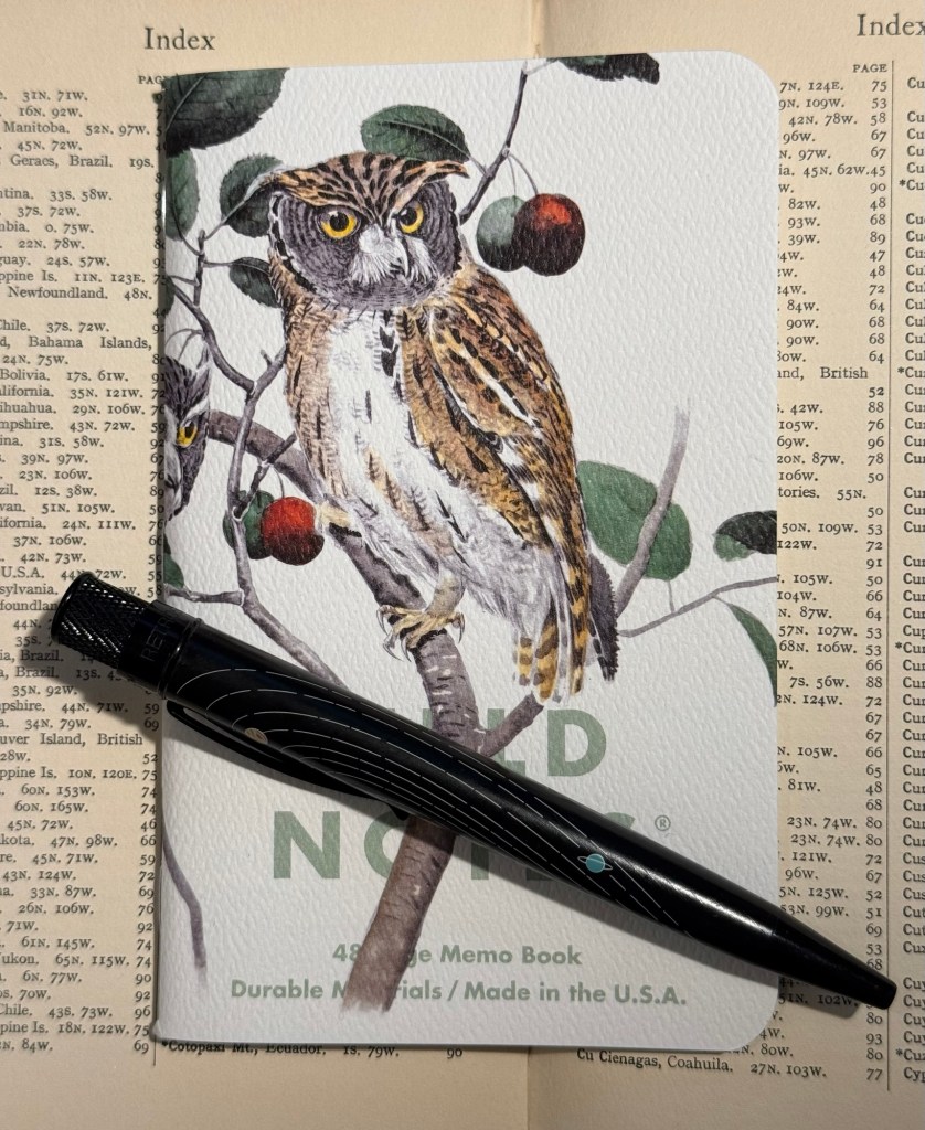
The Birds and Trees of North America, Fall 2024 seasonal edition of Field Notes.
Yes, I could and I did and it has been glorious.
I selected a Field Notes notebook out of the the Fall 2024 “Birds and Trees of North America” edition because it’s a beautiful edition, it has lined paper (which I rarely have use for in pocket notebooks), and it seemed appropriate. I randomly selected a Retro 51 Tornado – The System limited edition one which has Uniball Jetstream SXR-600-05 hybrid ballpoint refill in it instead of the original Schmidt refill which I don’t like. Then I started writing down “tweets” in it throughout the day.
Rocky Mountain and Mexican Screech Owls Field Notes notebook (illustrated by Rex Brasher) and Retro 51 Tornado The System limited edition pen
I’m not dating them, I’m not counting characters, I’m just limiting myself to a few rows for each entry, and I’m writing them as if I would be publishing them. The writing style is therefore different than what I would write in my journal, and so far it’s also focused exclusively on things that I don’t write about in my journal (mainly reactions to things I did or saw or read). I have no intention of ever publishing anything in this notebook, but I do enjoy the challenge of writing it as if it would be something that I would post somewhere.
So I get to practice my writing skill in a new way, I get to use some of my wonderful Field Notes stash, and I get to use some of my great standard pens. All this without filling the pockets of various billionaires with my work, and without encountering the bots and the foaming hordes of professional haters and rabble rousers online.
I highly recommend this practice, whether you do it with a fancy Field Notes or just any pocket notebook you have on hand. Using a notebook of this size will remind you to keep your entries short, and it’s something that you can easily carry with you and use in waiting rooms, boring meetings, or when you need a little break between tasks throughout the day.
It’s the beginning of 2025, so it’s time to go over my full planner setup for both work and home. None of this setup is truly new, as I’ve used much of it during part or all of 2024, but there are a few tweaks and minor adjustments that I’ll highlight. As I use a 13 week year (or a quarter) in my planner, I started Q1 of 2025 on the 29th of December and not the 1st of January.
The heart of the system is my weekly planner. I started a new one in 2025, and after some deliberation I decided to splurge on a Leuchtturm1917 Bullet Journal and not just the 120gsm edition because I like the endpapers and it was only a few dollars more.
The setup of this planner is divided into two parts:
Lists
I crossed out all the bullet journal related headers and created list pages of my own from page 3 to (potentially) page 75. Currently they include: Unread Books on My Kindle, Mindful Consuming (a list of things that I actually want to watch, not algorithmically recommended), Conversations not Connections (A list of people that I want to invest time in, not just like their Facebook posts. This makes sure that I don’t fall out of touch with people, but actively initiate phone calls, meetups or skype/zoom calls for those that are abroad), List of Courses that I’ve Enrolled To (I started this list during Covid, and it tracks which online courses I’ve enrolled to and need to complete), Things from Abroad (a running list of packages that I’m expecting. Yes, I know there are apps for this, but writing it down helps me be more aware and careful with what I’m buying and how much), Blog Post Ideas (self explanatory), Books to Review (self explanatory), Medium Post Planning (as part of my focus on work, I decided to make my work more visible by writing more Medium posts this year). I will be adding to these lists over the next year, and copying them over to the next notebook once I finish with this one.
Quarterly and Weekly Planning
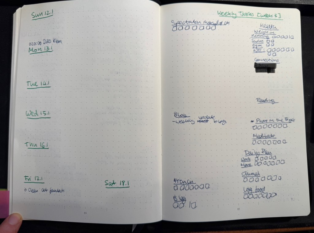
Starting at page 76, this section will include four quarterly plans and four 13 week double spreads. Each quarterly plan can take up to four pages (Q1’s plan takes 2.5 out of the 4 currently, but that’s OK. The extra is in case something major happens and I need to work out a pivot or significant change into my plans), and is divided into various subsections. I’ll write a separate post about my Q1 plan and how I worked on it, but you can read about the process here.
Then come 13 weekly spreads, each one taking two pages. The left side of the page has the weekly calendar, with events on it plus my exercise plan for the week. It’s also where I note things that I want to remember that need to happen on a certain day that week. Every week on Friday or Saturday evening I plan the next week, and for this side of the weekly plan I mark significant weather events, plan my running, swimming and gym schedule, transfer important events and meetings from my calendar (these are all things that I need to prepare for actively), and set reminders (like clean the cats’ water fountain on Friday, or replace filters on things, etc).
The left side of the page is taken mostly by various trackers, and by my weekly goals (they go in the empty spot in the middle) which I select from my quarterly goals each week. Any goals that can be managed by trackers are managed by trackers – either trackers in my planner, or trackers in the Streaks app. The reason I don’t track everything in an app, is to make sure that I have to reference this planner at least once, likely twice a day, every day. That helps keep the weekly goals, which are tied to the quarterly goals, top-of-mind.
I use two different colours of ink for these pages – when I plan the quarter I create 13 weekly spreads with just the dates and the “Weekly Tasks” title with the week number. Then I work everything else in on a week by week basis with whatever fountain pen I am using at the time. That helps keep things clearer for me without me having to spend a lot of time “prettifying” my planner.
Weekly page in my home planner
Daily Plan
Every day I take a sheet of A5 Kokuyo KB paper and write the day and the date on top. Then I write a running list of tasks that I want to complete that day. This includes chores, daily routines, and tasks that I’ve pulled from my weekly planner. I cross them off as I go along, and at the end of the day either I flip the page and create another daily planner for the next day on the other side of the page, or I crumple the page up (if it’s used on both sides) and throw it into the recycling bin. I don’t keep these pages, since anything important in them is already in my journal.
I recently started tracking if I prepare a daily plan for every day at work and at home, and the reason is that I’ve discovered time and again that if I don’t have a plan, I am liable to just get back from work and veg out with a book or silly YouTube videos.
Monthly Plan
The monthly planner is tiny, and its only goal is to give me a better feel for how my month looks, and what major events lay ahead. It also tracks some things – books (which I track on a monthly basis), running (I track this twice because I also want to get a feel for my monthly load), swimming (the same – tracked on both weekly and monthly basis to get a better feel for my training load), gym (which doesn’t appear in the photo below because I haven’t finished creating the page), blog (how many blog posts I’ve written this month), and there’s usually an Apple challenge tracker.
Monthly planner
What About Projects/Backlog Items?
Most of my long term projects are tracked as part of the quarterly plan. For instance, I’m working on getting a certain professional certification this quarter, so I have that certification listed under my professional goals. The breakdown of this headline to individual tasks is something I do in the project specific notebook that I’m using for my study notes, tips that I’ve collected about the exam, etc. I then can just reference the headline task (the certification name in this case) in my weekly and daily plans, and reference what exactly I’m supposed to be working on next in my project notebook. It saves having to copy a lot of things over and over.
As for general “backlog” items (shopping lists, packing lists, travel plans, things I want to get to sometime in the future but aren’t part of my quarterly plan, recurring tasks tied to various medical checkups, etc) – these are all managed in the Things app. It’s easier to manage recurring and long term tasks like these in an app, and when it comes time to actually do them I reference them (or sometimes copy them) into my weekly and daily plans. I have very few tasks in Things, and sweep of the tasks there once or twice a week is enough to ensure that I haven’t forgotten anything.
Work Planner Setup
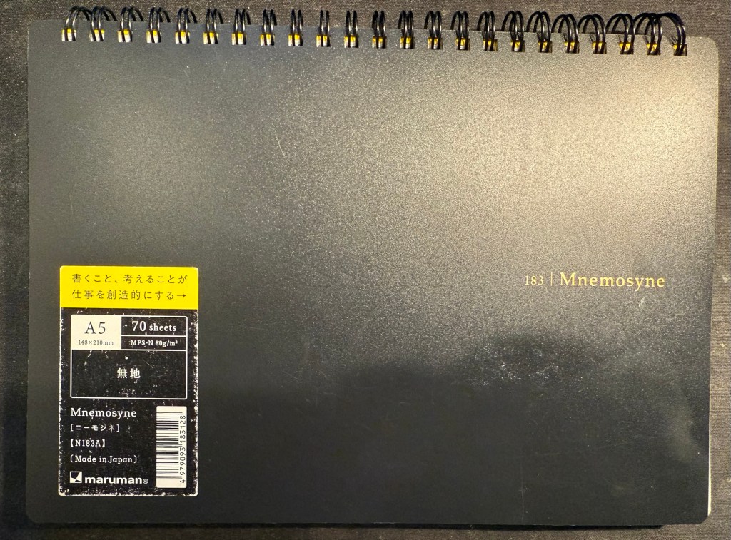
This consists of a Leuchtturm1917 dotted A5 hardcover notebook that I bought at the local art museum, and Maruman Mnemosyne A5 with blank paper (though I also use the squared paper Mnemosyne indiscriminately, if that happens to be what’s available). As I work 3 days a week from an office and 2 days a week from home I needed a setup that’s as simple and as light to carry as possible, and after some trial and error this is what I’ve been using for over a year.
My work planner and a piece of blotting paper – a must with this paper
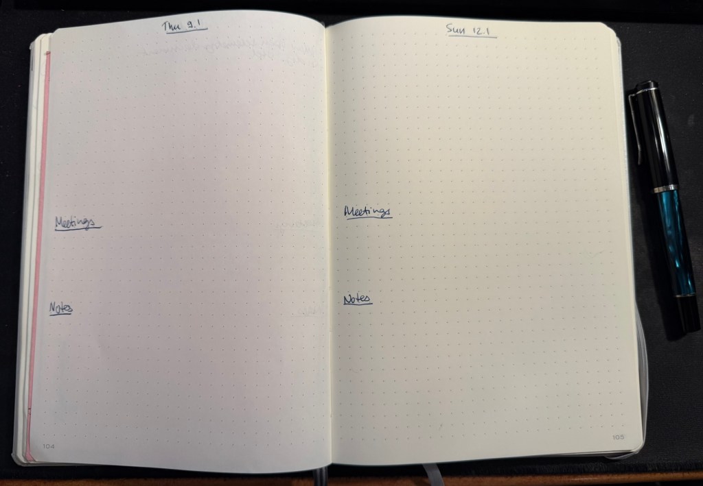
The work planner, my Leuchtturm, is a daily planner, with each day divided into three parts. The top of the page has the day and the date, and the upper third part of every page is for the tasks I plan on working on that day. I deliberately make sure that less than half of the A5 page is left for tasks, because otherwise I’ll just jam in much more than I can do in a day and then feel bad at the end of the day for no good reason.
The last thing I do before signing out at work is to fill in the next day’s page. That includes pulling out the next tasks I plan on working on from Jira (we use Jira to plan tasks and projects at work), and leaving about half of the task area open for things that will pop up during the day. The nature of my job is that I’m constantly working on about 50% unplanned things, so I have to leave myself enough room to take that into account.
Next come the meetings, which I track under a separate heading. I set them apart so that they don’t disappear into my ever changing task list. This is also useful for me to reference when I’m planning my day, both in terms of how many tasks I think I can get to, and in terms of preparing for certain meetings.
The Notes section is where I write down things that I need to take into account or remember that day. If a team member is taking a day off I note it here to remind myself not to message them. If I am on “on call” duty I note it here so that I can significantly reduce the number of tasks I’m working on that day. I also look ahead a bit, and if I see a project deadline looming, I’ll note it in the notes section, so that I remember to prioritize my tasks accordingly.
Daily spread in my work planner
The Mnemosyne serves as my “dashboard” and catch all. If I’m working on a project, this is where I’ll plan out the project before inputting whatever relevant tasks there are into Jira. I reference and work with this page while I’m working on the project, and that’s why I view this notebook as the “dashboard” for my current work.
The Mnemosyne is also where I keep a running list of things I want to get to. All of these things will have to be formalized into Jira tasks before I can work on them, but it’s useful for me to have them down on paper first because I think better on paper.
Maruman Mnemosyne “Dashboard”
I don’t use scrap paper at work as I want to be able to reference these things in the future, and as a rule I don’t journal about my work tasks.
That’s my full planner setup for 2025, and as all of it has been in use throughout 2024 with great success I doubt that it will see much change.
Just as I wrote a post about Moleskine no longer making store exclusive limited edition notebooks, my brother went to Paris (during the Olympics) and found not one but two store exclusive limited edition notebooks. Moleskine have officially cooperated with the Paris 2024 Olympic games and they have outdone themselves.
The first notebook is a large lined hardcover notebook that could be purchased standalone, or as part of a set that included three Olympics themed charms (in the colour of the medals) and a pen. The box was sold out, as were the charms (and yet it was still on display in the store window, because reasons). The notebook was still available and it is glorious, a perfect example of Moleskine’s design prowess.
This is the notebook still in the wrapper:
Wrapped notebook from the front
The front facing part of the wrapper has a discreet Paris 2024 logo sticker on the right side. The back part of the wrapper is anything but discreet. There are games logos, games sponsors, multiple designations of the officialness of the notebook, as well as pictures of the notebook cover and the lined interior with its bookmarks (more on them later). It’s busy back here:
Wrapped notebook from the back.
Removing the wrapper reveals the notebook itself. The Olympic logo is given its pride of place, and the rest of the cover is given over to a celebration of the Paris 2024 font. The only colours here come from the foiled gold of the flame and the Olympic rings. It’s a classic and sleek design:
Front cover unwrapped.
I expected the back cover to just be more of the Paris 2024 font in black on white. Instead there’s a set of letters that are gold foiled, and I really like the effect. It’s chic, classy and very well thought out. The Moleskine logo is there, but it doesn’t call attention to itself, and the black rubber band almost disappears from view:
Back cover unwrapped
Inside the front endpapers have the usual in case of loss section, the Paris 2024 logo prominently displayed, the Moleskine logo, small and discreet, and a letter in French:
The front enpapers
Here’s the letter, from Tony Estanguet, the head of the organizing comittee for Paris 2024 and an Olympic champion. Note that it, unlike the “In Case of Loss” part uses the Paris 2024 font. It’s written in French and is a celebration of the Paris 2024 games and their uniqueness (first opening ceremony not in the stadium, first games with gender parity, first games with Breaking, 100 years since the previous Paris games, first event open to participation by the general public – Marathon for All). It ends with a celebration of the notebook in your hand, which is a nice touch.
Close up on the letter.
The back endpapers have logos of the various Olympic events. As usual, these are well placed and the back pocket and the endpaper prints match perfectly. It’s the little details that matter in these notebooks, and Moleskine always nails them.
Back endpaper
Inside the back pocket are some Olympic themed treats: four sticker sheets, and a folded map of the event locations.
Stickers and folded map
The stickers feature the Phryges, the Olympic mascots for the 2024 games, participating in various sports:
First two sticker sheetsSecond two sticker sheets
Then there’s a stylized map of the various events locations in Paris, France and Tahiti:
The map.
Finally, inside the notebook are not one, not two, but three ribbon bookmarks in the colour of the Olympic medals:
The bookmarks.
All in all this is an extremely well thought out design, one that takes pride in the games and cares about every little detail. It’s a worthwhile memento of the event, and it just shows what Moleskine can do in terms of localized special editions when they put their minds to it.
The second notebook is a soft cover cahier created for those who want a cheaper, more colourful and lightweight alternative commemorative notebook from the event. Here it is wrapped:
Wrapped front cover
Here’s the back cover. Again, lots of info here (the price was half that of the hardcover).
Wrapped back cover.
The front cover features a very colourful illustration of Phryges doing various game related things alongside iconic Paris monuments and symbols. There’s a lot of playfulness here, and it’s a delight to look at all the little details here:
Front cover.
The cover has a pleasant texture to it. The back cover has a Phryge in the back waving hello above the Moleskine logo in white:
Back cover
Moleskine clearly love the Paris 2024 font because it is once again the star in both front and back endpapers, this time with only the numerals in use:
Front endpaper
There’s a pocket in the back:
Back endpaper
The paper is blank, and it’s stitched using blue thread – very fetching. It lies flat with little effort:
Paper and stitching
Here’s a writing sample on the paper (both notebooks feature the same standard Moleskine paper – 70/gsm ivory coloured acid-free paper:
Writing sample
Close up on the writing. Fountain pens show the same strange mottled pattern that they do in this kind of paper, and wider, juicier fountain pens will spread:
Closeup on the writing sampleCloseup on the writing sample
There is see through and bleeding with the fountain pens and the rollerballs. This paper works best with gel ink pens, ballpoint pens, fineliners and pencils:
Back of the page
All in all these notebooks are well worth their price in my opinion. They are well designed, provide a lovely memento of the Paris 2024 games, and they are unique to the Paris Moleskine stores. I only wish that Moleskine would create more of these for their stores. They were clearly a success in Paris, for good reasons.
What do you think about these notebooks? Would you purchase one or both of them?
My brother went to Hamburg to see the Taylor Swift Eras concert, and while he was in the city he went to the Mokeskine store and bought me these two embossed Moleskine pocket softcover blank notebooks:
They were already embossed, even though it was clear that the embossing had been done manually in store and not in a factory. How can you tell? Look at the Hamburg coat of arms notebook (the left one in the picture). Can you see how it was embossed and then the notebook moved and it was embossed again, causing a double outline? Also the left part of the embossing is fainter than the right one.
I don’t mind it – it gives the notebook character and a human touch. It makes it less precious on the one hand and more unique on the other, as it’s literally a one of a kind notebook now. But it’s this embossing that got me thinking about the Moleskine store experience again.
I used to love going to Molesking stores. There wasn’t one locally so everywhere I would travel to I’d check if there was a Mokeskine store in the area and make a point to visit it. This was for two reasons:
Moleskine stores used to have store exclusive limited editions of their notebooks. It usually meant that one of the their limited edition collections had a specific notebook design that was only available for purchase in a Moleskine store.
Moleskine store used to have large rubber stamps specific to that store that you could freely use to personalize your notebook.
Both things are no longer true, but the second of these – the stamps that Moleskine no longer puts in their stores – is what I want to focus on.
The stamps were a great idea: there was a standard Moleskine logo stamp, but there was also a local stamp (similar in concept to the design embossed on the notebooks above). Those were the best, as you could mark your notebook with a memory of the place you visited. What was even better was that you didn’t have to purchase anything or even use the stamp on a Moleskine notebook. I had a Moleskine pocket reporter that I travelled with and stamped, but I also stamped Field Notes notebooks.
Lots of people came into the store for the stamps, even those who were clearly not regular Moleskine users. And while you’re in the store, you browse the notebooks, you check out the pens and the bags, and you usually leave with a few of them. If you’re a Moleskine collector you of course pick up one of the store exclusive designs.
Lord of the Rings Gates of Moria notebook that was my journal from July 6th 2019 to November 16th 2019
So what happens today when you go into a Moleskine store?
Well there are no store exclusives anymore, and instead of the free stamps you can purchase add-on personalizations to your Moleskine. Note the word purchase – these add-ons aren’t for free. You can add patches and hot foil printing (of the kind done on the Hamburg notebooks), or add charms to your notebook’s elastic closure. You can only do it on a Moleskine product, and even then not all personalizations are available for all notebooks (you can’t foil print on certain covers, for example). Also to make a notebook like the little Hamburg ones you are talking about almost doubling the price of the notebook. Yikes.
I don’t understand why Moleskine don’t:
have at least one or two limited editions only available in store. It seems like they have enough stores to justify this.
keep the free stamps in store as well as offer personalization services for those who want them.
The stamp overhead in particular seems to be negligible, particularly in comparison to the foot traffic it drove into their stores and the delight it gave to their fans. In an age where we are constantly being pushed to make impersonal purchases online, a touch of something kind, creative and whimsical like the Moleskine stamps is much needed and appreciated.
Moleskine store stamps in the Lord of the Rings journal