Valeria Luiselli’s “Lost Children Archive” could have been a great novel. All the ingredients are there. And I mean ALL of the ingredients are there. There’s a solid and enticing plot. There are potentially interesting an unique characters. There’s an obviously intelligent and accomplished author behind the scenes. There’s a hauntingly beautiful (and at times chilling) setting.
And it all falls flat.
Like an artist that doesn’t know when to stop painting, or a baker that doesn’t know when to stop embellishing, or a designer that has to add “just one more frill”, “Lost Children Archive” is extremely overworked. The result is at times barely readable, and at all times airless, stodgy, bloated. There are too many references layered onto a plot that would have been excellent if it had only been given a chance to flow freely. The characters, potentially excellent, become so iconic they are no longer relatable, realistic, living human beings.
This is such a tremendous shame, because all the ingredients are there, and with a little bit of tweaking and pruning this could have been a powerful novel about migrant children, families falling apart, genocide, memory, loss. As it is, it’s reads like an overly worked “New Yorker” piece – so cerebral it’s lost all its heart and momentum.
I read this as part of the Tournament of Books 2020contest, where it’s up against the phenomenal “Girl, Woman, Other,” and I will be stunned if Evaristo’s book will not trounce it. Read this only for the potential.
After reading Bernadine Evaristo’s “Girl, Woman, Other“, I have to say that Atwood’s “The Testaments” better be a flawless novel to justify giving it the joint Booker prize with this masterpiece.
“Girl, Woman, Other” is a perfect gem. She manages to pull off one of the most daring tightrope acts in modern literature:
Create a unique narrative in a unique narrative voice that oftentimes flows into poetry, yet still remains very readable.
Give voice to those who are rarely, if ever, heard, yet not turn them into iconic stand-ins, but let them be individuals. And oh what an ensemble of glorious individuals they are.
Render a plot that is packed full of fascinating, realistic action, and yet that is non-linear, tying disparate characters from widely varying backgrounds and generations in a web of past-present-future reality. A plot that brings the historic and iconic with the present and personal, the petty with the epic, and brings them all together under the title of “life”.
Bring slices of everyday London, the UK, Africa and the US to life in a way that makes each character grounded in their background and yet also universally relatable. A school is this particular school, but it’s also all high-schools everywhere.
Talk about the darkest parts of the human experience, the worst deeds, the worst mindsets, and yet retain a measure of hope, empathy, understanding for those who experienced the worst and those that inflicted it.
“Girl, Woman, Other” is an absolute must read book, and I’m thankful that I “had” to read it as part of the2020 Tournament of Books challenge.
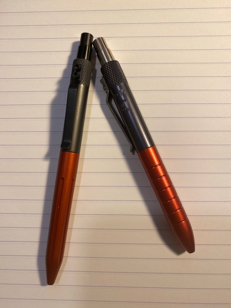
Back in 2016 I purchased the 2016 Anniversary edition of the Karas Kustoms EDK. It was a Parker refill machined pen (i.e. relatively short) that came with a Schmidt P2186 rollerball refill (and a Rickshaw bag pouch with a notebook which I won’t review here).
You can see that pen on the right, with it’s grey red finish and its Karas logo with the year 2016 engraved into the barrel:
The 2019Anniversary Retrakt is the pen on the left, and when I first saw it during Karas end of the year sale I fell in love with the sleek design. The 2019 anniversary Retrakt fits a Pilot G2 refill (astrix. We’ll get to that later), comes in a matt finish with a black click mechanism and clip, and a “fluted” grip. Unlike the 2016 edition, it’s completely unbranded.
Both pens have a distinctive and attractive industrial design, and both are built like tanks. The anodization is fantastic, and both the clip and click mechanism are rock solid. The pens are fairly priced for the quality you get, they have good heft and balance, and are a joy to use. I personally found the fluted grip slightly less comfortable for use in long writing sessions than the regular grip, but I have a tendency to go “grip of death” sometimes. The fluted grip just reminds me to let go a bit, the pen isn’t going anywhere without me.
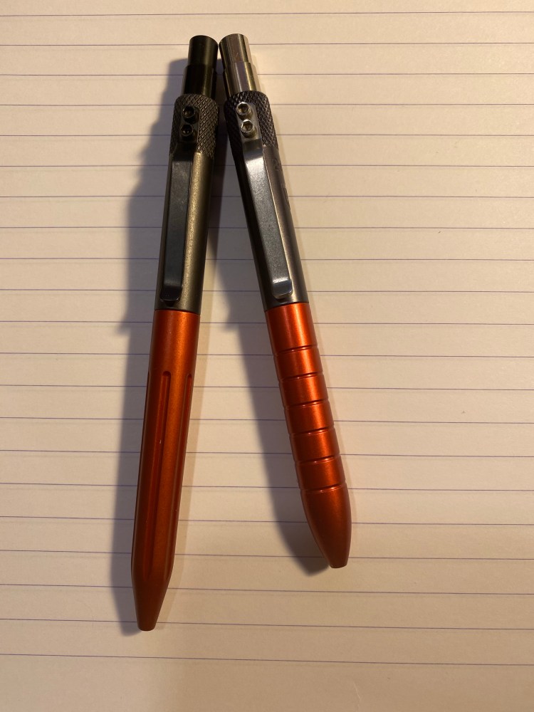
2016 Anniversary Retrakt on the right, 2019 Anniversary Fluted Retrakt on the left
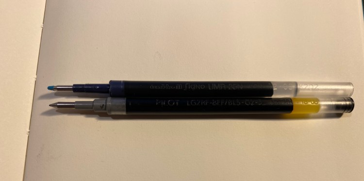
This brings us to the refill situation on the 2019 Anniversary Retrakt. As soon as I got it I took out the Pilot G2 refill it came with and tried to replace it with my favourite G2 compatible refill, the Uni-ball UMR-85. It’s something that I do automatically with every G2 compatible machined pen. The click mechanism wouldn’t engage. The plunger went down but didn’t stay down, the tip of the refill never saw the light of day. This has never happened to me with a G2 compatible pen before, so I grabbed the original refill and placed it side by side with the Uni-ball one:
Uni-ball UMR-85N on the top, Pilot G2 on the bottom
This was when I realized that the Retrakt V2 must have somehow been designed to accommodate the Pilot G2 tip configuration and only the Pilot G2 tip configuration (unless you purchase a Parker style conversion kit from Karas). This was a big disappointment to me.
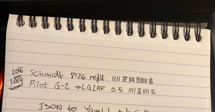
Schmidt vs Pilot G2 Retrakts
I probably wouldn’t have purchased this pen had I known this going in. I don’t hate the Pilot G2 refills, but I’m also not a huge fan of their tendency to be globby or stop working while they’re still half full. This means that I’ll be trying to hack a Uni-ball refill into this pen one way or another. Here’s hoping that I succeed because this the 2019 Anniversary Retrakt is a handsome and well made pen that I would really like to have in my rotation.
Writing a satire that is also “good high fiction” (i.e. not trite, full of one dimensional characters, in a world lacking verisimilitude) verges on the impossible, partially because of the demands of the genre.
Maurice Carlos Ruffin comes damn close to achieving the impossible in “We Cast a Shadow“. The nameless main character, a black father obsessed with demelanating his son in an extremely racist “post-racial” American South, is a stand-in for desperate black parents tormented by the responsibility of raising a child in a world so hostile to them. Yet he’s also a fully realized character, in inadvertent “monster” created out of good intentions, love, trauma, despair, and an attempt to navigate that which can’t be navigated. If you don’t understand his fears, acknowledge your privilege and read the news. If you think demelanization isn’t a thing, listen to Tan France speak up against it.
The plot is where “We Cast a Shadow” shows its rough edges. Most of it is excellent, some of it gets carried away in the need to find literary legitimacy by pulling in references. There’s a noticeable amount of literary callback in the writing as well. Some of it is called for, some of it just pulls you out of the narrative. “We Cast a Shadow” lacks the polish and flow of “The Sellout” (and it’s not nearly as funny), which is why I think it got less attention from the public and the press. It’s still an accomplished, good book, well worth the read.
Unlike “The Sellout”, in “We Cast a Shadow” Ruffin doesn’t set a clownish character in motion in a contemporary setting. His is a dystopian near future, one that may very well be realized. For the sake of the Nigels and Pennys of the world, let’s hope it doesn’t.
I read “We Cast a Shadow” as part of the Tournament of Books 2020, where it’s in the play-in round against “Golden State” and “Oval“, two other 2019 dystopian novels. While “We Cast a Shadow” is the least speculative of the three, it’s my opinion that it’s the best.
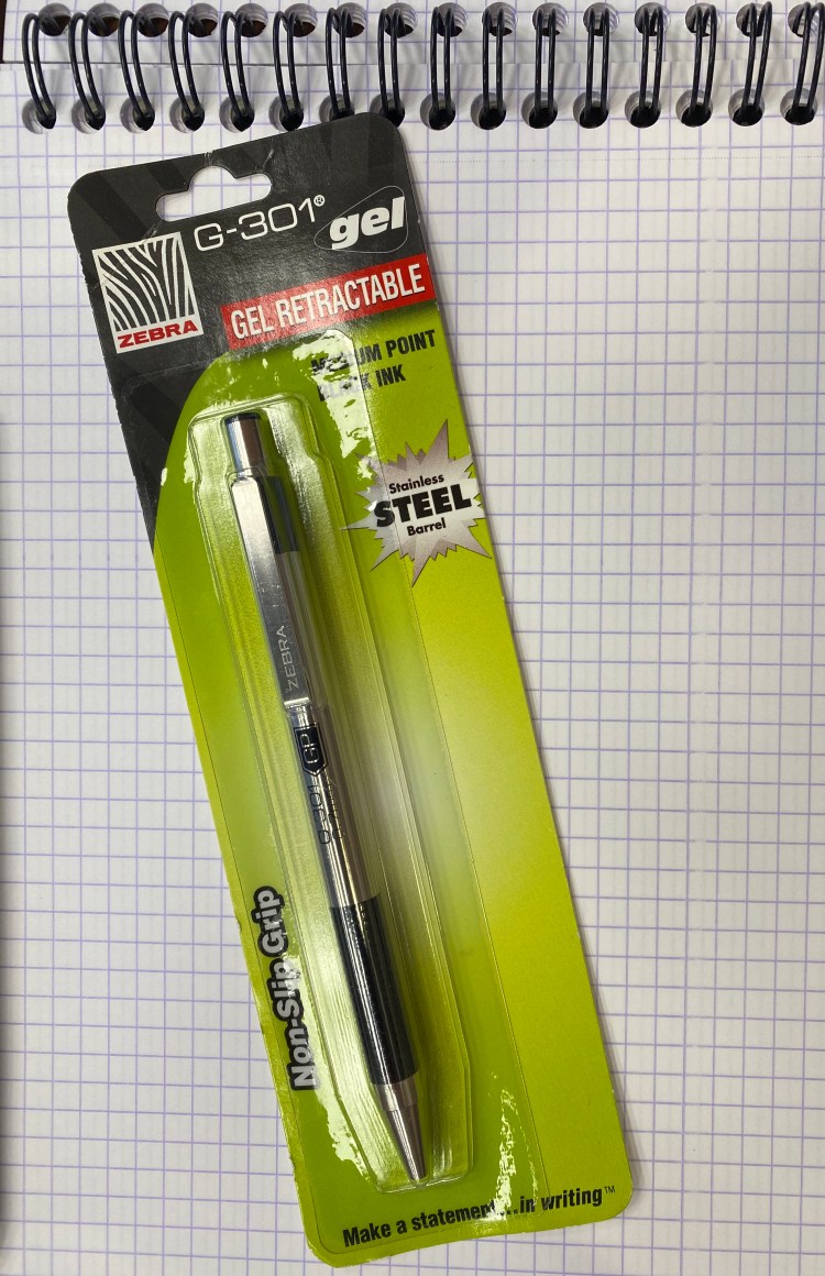
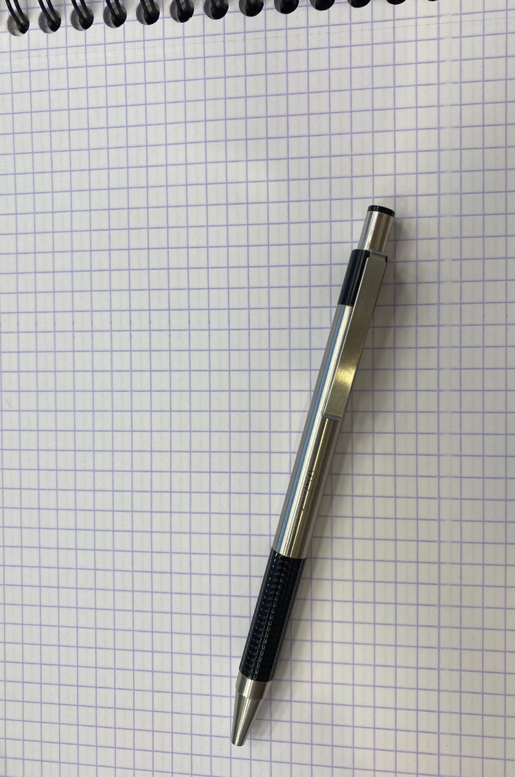
In 2013, while I was at a convention in Boston, I went into the FedEx at the convention centre to collect a package. As I was waiting in line my eye caught the Zebra G-301 pen on a rack near the till. I’d heard good things about the Zebra F-301, but it’s a ballpoint pen and I wasn’t a fan of those. The Zebra G-301 was a gel pen. In stainless-steel. For just a few bucks.
Of course I bought it.
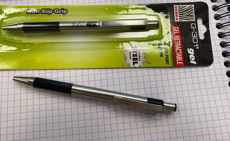
Fast forward six (!) years and that same Zebra G-301, the exact same one, is still on my desk, and is still my daily workhorse pen in the office. Here’s how it looks now:
Impressive, right? The imprint is almost gone (mine didn’t have the Zebra logo etched into the clip, so it now looks like an unbranded pen), and the plastic grip is a little worn with use, but otherwise the pen looks practically brand new.
The pen costs $2.5 on JetPens. I’ve been using it for my daily to do list and for general planning and meeting notes every day for six years. It just shows that a pen doesn’t need to cost hundreds of dollars to be a good, solid workhorse that’s a joy to use.
Oh wait, I haven’t actually reviewed it yet…
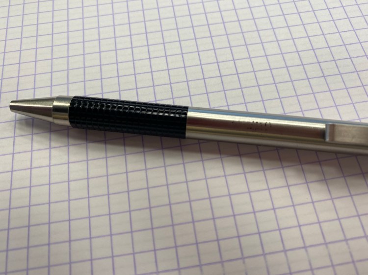
The Zebra G-301 has a stainless steel body that is durable, gives it more heft than a plastic bodied pen, and yet isn’t too heavy to be uncomfortable to use or unwieldy. The plastic grip has no give, so if you like mushy grips it’s not for you. Otherwise it gets the job done. The branding is classy (one font, understated, sleek and modern), and well suited for office use. The pen is durable, and the click mechanism isn’t mushy and lasts for years.
New and Old
The only possible downside of the Zebra G-301 is the refill. It’s proprietary, on the expensive side (a pack with two refills costs $1.90 on JetPens, almost as much as the pen), and they don’t last long if you write a lot with them (I get about 2 months out of each refill). I also only use the G-301 refills (theSteel JK 2 pack), so they come only in black or blue, and only in 0.7mm. JetPens also notes that the Zebra Sarsa JK refills fit the Zebra G-301, which come in 0.5 and also in green and red, but they cost a little more per refill. As I view the Zebra G-301 as an office use pen, I don’t mind the ink limitations.
Writing Sample
I never thought when I picked up this pen back in 2013 as an impulse buy that I’ll be using it six years later. I like it so much that I bought a backup a few years ago, because I was sure a $2.5 pen wouldn’t last for long and I didn’t want to be stuck without it. The replacement is still in its blister pack, as you can see in the photos above, and the original G-301 is still going strong on my desk. I wonder if I’ve accidentally stumbled on the modern equivalent of the Esterbrook Dollar Pen.
Dystopias are rarely boring. Dystopias rarely make you think, “meh”, when the characters meet the horrors of their world. Dystopias rarely lack plot, drive, an every calling telos. The world of dystopia may be hedonistic but the characters rarely are: after all, what’s the point of creating that kind of world if your character are too nihilistic, hedonistic and selfish to care what is going on around them?
Elvia Wilk’s “Oval” manages to be all that: a boring, bland, myopic, pointless dystopia full of nihilistic and selfish characters that don the mantle of social awareness and environmentalism as nothing more than a status symbol. I hesitate to call “Oval” a speculative novel, since so little speculation happens in it. Corporations are going to be ever more powerful at the expense of governments? That’s a known truth in 2020. The housing crisis is a thing worldwide? No kidding. Economic disparity, young people despairing from the political system, partying your way to the end – it’s not just that there’s nothing new here, it’s also that Wilk didn’t even try to dress it differently, give it an interesting or thought provoking spin. After reading “Oval” to the end I felt like I felt after watching “Star Wars: The Phantom Menace”: was this all that it’s for?
I don’t like feeling cheated as a reader, and “Oval” wears the mantle of a high brow novel while providing less satisfaction, interest and down to earth character moments than works like Corey Doctorow’s wonderful “Radicalized”. Go read that instead.
In a dystopian California, obsessed about the truth and capturing every moment of reality, a detective in the lie-detecting “Speculative Service” encounters an accidental death that may be more than it seems. Ben H. Winters’ “Golden State” is a clever mirror of “1984”, built for our cynical and surveillance heavy world, and it has a lot to say about truth, fiction, human relationships, guilt and objectivity. There’s something very “Caves of Steel” about it, and yet Winters’s characters are actual characters, and not robots-in-flesh as in Asimov’s work. This isn’t just a novel of ideas, but also a novel of people, of Lazlo dealing with pain, guilt, ambition.
A clever speculative novel that is worth reading even if speculative novels aren’t your thing.
I read this as part of the 2020 Tournament of Books Play-In round, where it’s up against “Oval” and “We Cast a Shadow”.
Moleskine’s Spring-Summer 2020 catalog is finally available online, and as usual, it’s chock full of new products and updates to existing ones. I recommend that you go spelunking in this massive tome (173 pages!), as you’re bound to find something in it that speaks to you. I’m going to try to cover most of the main changes, but this post is far from a comprehensive review of all that Moleskine Spring-Summer catalog has to offer.
Classic Notebooks Expanded are getting two new colours (their first): Scarlet Red and Sapphire Blue. I’m assuming that this means that they have been a success, although judging by the choice to keep the squared and dotted rulings only in black, some options have likely been more successful than others.
Classic Notebooks Hardcover get two new seasonal colours (Hydrangea Blue and Lemon Green), as has been Moleskine’s custom in recent years. I’m guessing that Hydrangea Blue is going to be as big a hit as Reef Blue was, but I’m still disappointed to see them limit the new colours to their most popular rulings only: ruled and plain. In other news, the Classic XXL has been discontinued, which isn’t really surprising as the A4 size has largely gone on to replace it. The strange thing is that in the Classic Notebooks Softcover lineup the opposite has happened: the XXL is staying on and the A4 is no longer available. Why? Looking over the rest of the catalog there appears to be a major and bewilderingly inconsistent reshuffling going on in the larger sized Moleskines. Some lines kept the XXL, some kept the A4 (the XXL is smaller than the A4), and I’m guessing that the only thing guiding Moleskine’s decision is which size gets purchased more per each line. In any case, if you’re a fan of the larger notebooks I recommend looking over the catalog to make sure that your favourite notebook isn’t getting discontinued. It takes a while for stores to run out of stock, so if you love the Classic XXL for instance, you still have time to stockpile a few while they’re still out there.
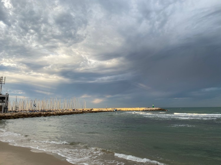
On that note I’m still disappointed that the squared reporter notebooks haven’t returned. I was in Porto, Portugal last year and I found a shop that not only had large squared reporter notebooks, but also the Moleskine Van Gogh notebooks that started their whole limited edition lineup, so I filled half my suitcase with those.
Moleskine is fully embracing its phenomenally good fabric cover skills with the addition of the Blend collection as part of its regular lineup. There are two notebooks on offer, both in new colours (Harringbone Purple and Harringbone Blue), in ruled and dotted (!) options. The Blend covers are some of the best that Moleskine has produced in recent years, but they photograph pretty poorly. These are notebooks to see (and feel) in person, and I have no idea what the colour of the Harringbone Purple really is. Even if you’re not a Moleskine fan I recommend getting one of their fabric covered notebooks (the Two-Go notebooks for instance are also fountain pen friendly and have a cool blank on one side lined on the other side setup), just to see how good fabric covered notebooks can be when done properly.
Planners are a giant chunk of the catalog, but I’m not going to go over them because that’s where madness lies. I’ll just point out that the 2021 limited edition planners are Alice’s Adventures in Wonderland, Peanuts, Little Prince (which were all featured in previous years), and the brand new Maneki-Neko. This is the first glimpse in the catalog of the growing Japanese influences on the Moleksine lineup this year (and over the last year or two), a theme that will repeat itself in the limited edition notebook lineup. Also, this is the first year in a while that hasn’t featured Star Wars planners, although the fall catalog may yet rectify that.
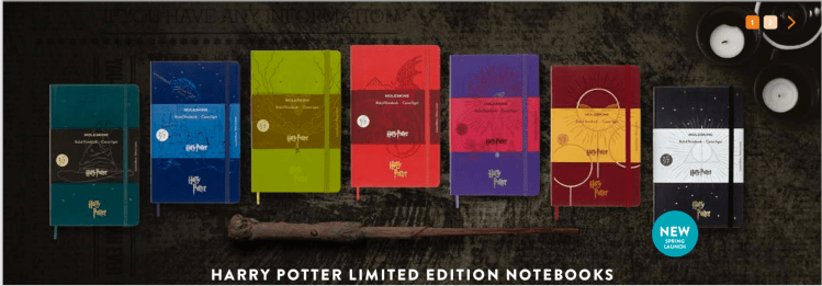
This brings us to the most interesting part of the catalog for me, the limited edition notebooks. Here is where Moleksine flexes its design prowess, and the results are always unique, and oftentimes stunning. This year they’ve completed their Harry Potter limited edition lineup, with each HP book getting its own notebook design. You’d be shocked to know that these were super popular and so last year’s four notebooks are hard to find at reasonable prices. I expect this year’s three to sell just as quickly.
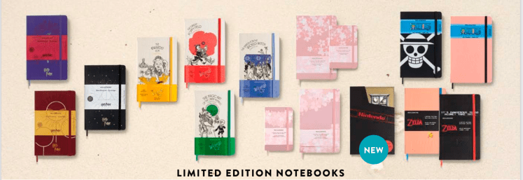
That leaves four other limited editions for this year, with only one not having direct Japanese ties:
The Wizard of Oz – These are four large notebooks, two ruled (the green and the red), two plain (the blue and the yellow). They each come with a set of themed stickers, and I love their design. These four and the Sakura are a must buy for me, if I can get my hands on them (thank you, Book Depository, for messing up my Harry Potter pre-order. You’re the best). They feature original artwork from W.W. Denslow and the title of a chapter on the cover, and it looks like they are fabric covered, which is excellent news.
Sakura – this is the second time that Moleskine has come out with Sakura themed notebooks, and the previous round was stunning. I think that this edition is a little plainer, but again, fabric covered notebook in still a lovely design, so I’m probably going to get these, at least in the large size. These come in large and pocket, both ruled and plain, and they include a set of themed stickers.
The Legend of Zelda – in the video game/geeky part of the limited edition notebooks, it’s Nintendo’s Legend of Zelda that gets the Moleskine treatment this time. Again, themed stickers included, but no fabric cover. There is embossing on the cover, and nostalgic, pixalated graphics throughout. This edition also features a numbered (4,999 copies) box, and two large, ruled notebooks. This would have been a great edition for a squared ruling, but Moleskine will be Moleskine, I guess.
One Piece – a manga themed edition of two large notebooks, both ruled, with designs that are really difficult to see properly in the catalog. It comes with a set of themed stickers, and they appear to have gone for wildly different designs with these two notebooks. One appears to have a bold rendering of the Jolly Roger flag, and another is very subtly embossed on a peach cover.
Maneki-Neko – there’s just one notebook here, maybe because the cat of good fortune got its own planner lineup. This appears to be the least imaginative edition of the lot, in the least imaginative ruling (ruled, of course, what else?). There are stickers included here too.
And there’s a fifth limited edition that Moleskine claims is a spring launch, but as I purchased it from a Moleskine store in September, I beg to differ. It is gorgeous though, so I’ll give it a mention anyway:
I am New York – the city themed limited edition notebooks that Moleskine has been issuing in recent years (and at first were only available in Moleskine stores) are some of their best designed notebooks, and that’s saying something. The graphics on the outer cover, the central park scene on the back endpaper and the new your breakfast on the front endpaper are just perfect. I plan on writing a review of this edition later this year, but I can already say that it’s one of my all time favourites (did I mention that it has a fabric cover?).
Now on to the Pro selection of the catalog:
A4 Pro Notebooks are discontinued, but the new Pro Project Planners range comes with Large, X-Large and A4 size and not the XXL. Again, not sure what the thinking is here. As for the Pro Project Planners themselves, these aren’t planners in the traditional sense of the word, but rather planners that have various productivity bits stuck in (there’s brainstorming, project tracking, structured note taking and to do list sections, as well as labeling stickers, goal pages and more). These are clearly business oriented, which explains Moleskine’s choice to produce them only with black covers.
Others:
The City NotebooksPocket Box is no longer available. I imagine that it wasn’t popular enough for them to keep stocking it.
There are a few additions to the Smart Writing System notebooks. I don’t plan on buying into the system, so I’m not going to cover it here.
Discontinued Go Click Ballpens
The Classic Cap Roller Pens and Classic Click Ballpen in white, tide green, and charcoal grey are being discontinued. The Go Click Ballpen in Pattern Cyan, Magenta Green and Yellow are also being discontinued. These are among the best looking Moleskine Go pens, so that’s a real shame. What’s worse is that Moleskine is discontinuing all of its roller gel (and ballpoint) refills. Their gel refill is Parker size and pretty great, so I really wish they would continue producing it. As it is I’m planning to buy one or two to keep around while I still can (they aren’t cheap).
I personally am a bit disappointed in Moleksine’s Spring-Summer lineup this year compared to their previous Fall-Winter one, but that’s just a matter of taste. There are some real lookers here, and the choice of seasonal colours for their notebook lineup (Hydrangea Blue and Lemon Green) is great. There are a lot of options that are getting discontinued, hopefully to be replaced by others in the future, so it’s worth taking some time to make sure that your favourite combo hasn’t been axed. Old stock of discontinued items will stick around for a while, but if there’s something that you really can’t do without and it’s marked as “no longer available” or “while stocks last” then it’s worth stocking up on it while you still can.
Taffy Brodesser-Akner’s “Fleishman is in Trouble” is a readable book. The pages fly by as you absorb them, looking for something, anything, more than superficial, entitled, dull misery. I kept waiting for the promises humour to appear. I kept waiting for the novel to get to even the basic insights in David Foster Wallace’s “This is Water” as it dug into the daily grind of its rich, white, healthy, able-bodied, cis-gendered, supremely selfish and childish characters. I kept saying, “so what, who cares?” and the novel didn’t answer. What things it had to say about women’s place had been said much more poignantly by authors with a better story to tell.
There is some attempt at narrative sophistication, but that doesn’t land. Akner chooses to use the second person for parts of the narrative, but she doesn’t commit, doesn’t fully create a witness account. Then there’s an attempt to mirror a fictional narrative within the narrative, a magazine article like telling of a divorce falling apart. Again, Akner pulls her punches, the comparison of “divorce story as written by a man vs. divorce story as written by a woman” doesn’t land. At some point I started hoping that she would pull off a trite move like revealing that she’s gender switched the narrative all along, just so I could have something to look forward to. Toby talks about rich people not knowing how to deal with tragedies or hardship in a novel devoid of any tragedies or hardship, as a character, in a cast, that has never truly dealt with the terrors of the world. The only character that has the potential for some depth, Rachel, is rendered as a selfish, driven, social climber with no empathy to anyone but herself.
The novel, like its characters, is pleasantly whiling the time as the world around it burns and it eats beef lo mein.
I read this book as part of the2020 Tournament of Books, where it’s up against Jami Attenberg’s “All This Could Be Yours” in the first round. Both novels are about rich, white people going through a crisis of sorts, but Attenberg’s novel has a depth to it, the darkness of Victor vs. the light of its post-Katrina New Orlean’s residents, that makes it worth spending some time with.
If you’re looking for a “Sex in the City Post Divorce” type of book, “Fleishman is in Trouble” may be what you’re looking for. Otherwise, I’d avoid it.