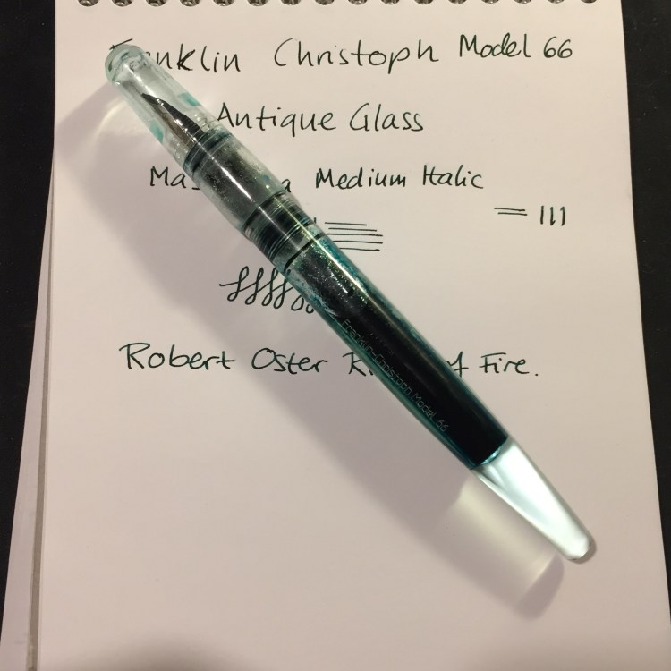
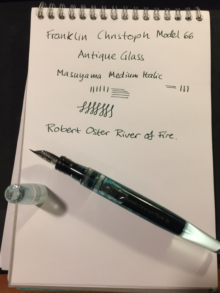
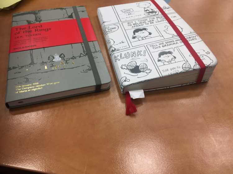
Zebra Mildliner Review and Journal Comic

I love highlighters, so long as they’re not the blindingly neon ones, as I find them distracting. So when JetPens first offered the Zebra Mildliner Double-Sided highlighters, I had to give them a try. Theoretically, like all highlighters, they are supposed to help you organize your notes. In reality they just add a little colour to my usual mess.

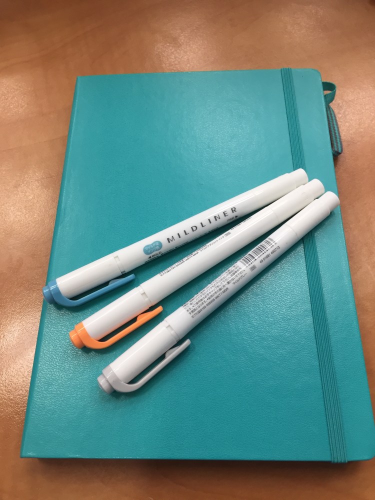
Highlighter pen bodies tend to be on the chunkier side, oftentimes square shaped. The Zebra Mildliners are just slightly thicker than usual pens, and very light. If for some reason you have hours of highlighting ahead of you, these ought to be pretty comfortable to use.

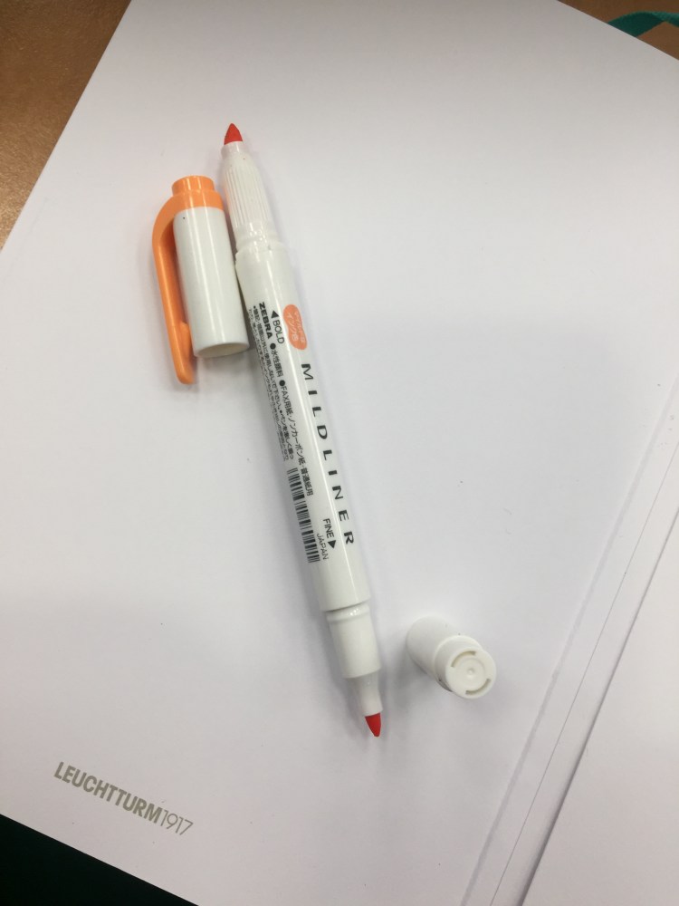
As their name suggests, these highlighters are double-sided. One size is a small chisel tip, and the other is an even smaller bullet tip. I had a hard time achieving coverage with the chisel tip in one go, but I’m not a stickler for these sort of things so it didn’t matter much to me. I was more interested in the Zebra Mildliner’s muted, and rather original colour palette.

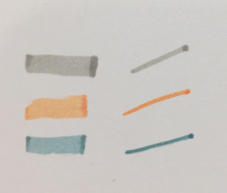
This is a close up of the three Mildliner colours that I got: Mild Grey, Mild Orange and Mild Smoke Blue.  None of these colours are standard: the orange looks more like a peach than a traditional orange, the mild smoke blue looks like a muted teal or a light blue black, and I’ve never heard of a gray highlighter before. It sounds like an oxymoron: grey highlighter. But here it is, and it’s pretty cool (no pun intended, plus it’s a warm grey anyway).

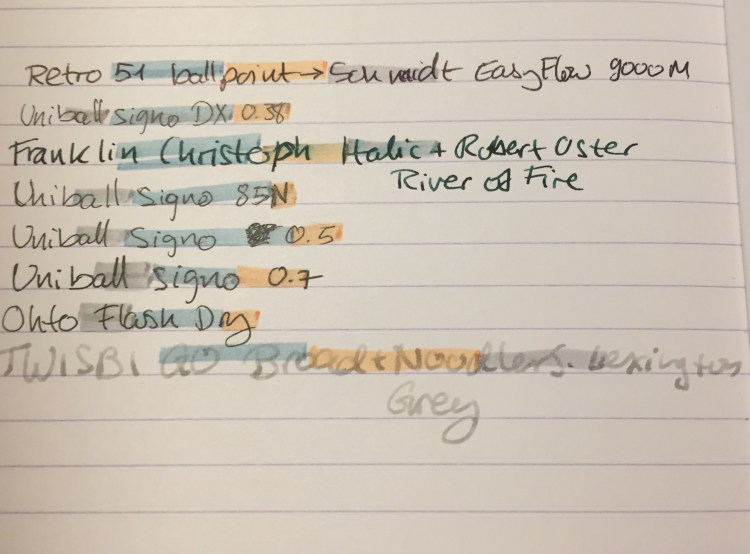
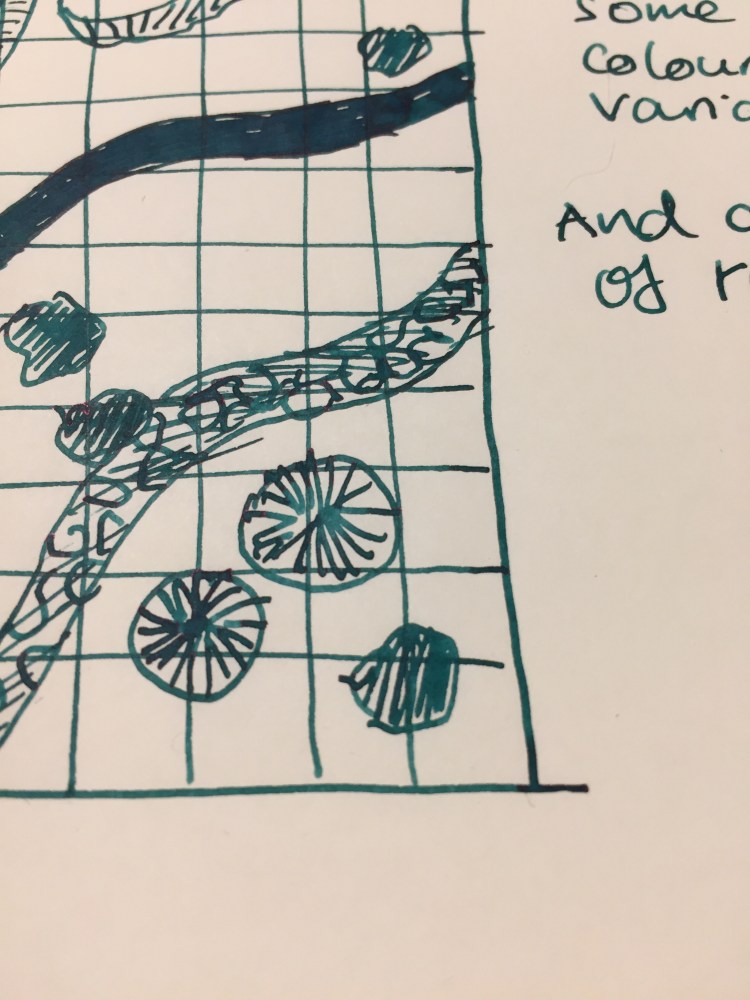
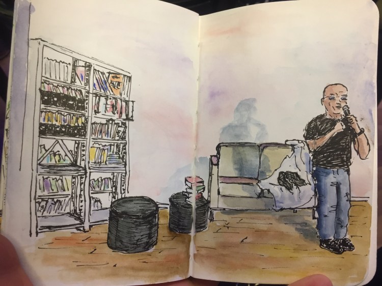
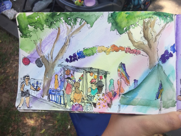
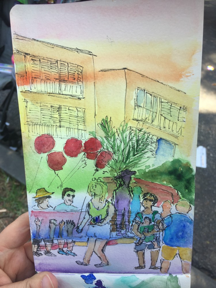
Apart from having fun with these in the journal comic above, I tried these on a variety of pens and inks. I’ve been using these highlighters for over six months now, but I don’t highlight over anything but gel pens normally. As expected, these behaved the best with fineliners (see the comics above) and with ballpoint pen. This being Clairefontaine paper may have made the Uniball Signo gel refill drying times long enough for the highlighter to smudge the text a bit even after a full minute. The Ohto Flash Dry is just a miracle refill, but the Noodler’s Lexington Grey just floored me. I never expected to see a fountain pen ink stand up to highlighter so well, so quickly, especially with such a broad nib and on this paper. Phenomenal.

The Zebra Mildliner Double-Sided highlighters come in 15 colours. I don’t recommend buying them all; find yourself a “standard” colour, a “wild” colour, and another that’s your favourite. Despite what I personally may think, you can have too many highlighters.

Franklin Christoph Antique Glass Model 66 and Robert Oster River of Fire Review

Every once in a while Franklin Christoph comes out with a batch of their pens in “Antique Glass”, a clear acrylic with a bit of a green tint to it that makes it look like an old coke bottle. The material is both minimalist and beautiful. It allows you to show off the ink that you’re using while still having a pen that has more character than a run-of-the-mill demonstrator. Franklin Christoph’s pens and the nibs that they use are excellent and very well priced. The result is that these limited runs having a waiting list (from which a 100 names are drawn), and there’s a good chance that you won’t be able to even get on that. I had to wait for two years until I was able to purchase mine.

The wait is worth it though.

img_0226

The Franklin Christoph Model 66 is a long and sleek pen that can’t be posted. The pen is light but still substantial, because of the extra acrylic in the finial. I was worried at first that it would be top heavy, but the Model 66 is perfectly balanced, and one of my favourite pens for long writing sessions.

img_0221

The Model 66 is a demonstrator pen that is built to be eye-droppered. Yes, you can use the supplied converter or cartridges, but what’s the point of having a pen that looks like this if not to eye dropper it? Franklin Christoph even supply the requisite o-rings and silicone grease, making it super easy to transform it into an eye dropper.

img_0224

The pen body is made of smooth acrylic on the outside, but is pebble textured on the inside. The result shows off the ink colour and the pen colour even more, but it also means that staining inks have even more surface area to stain. I decided early on to use only turquoise, teal, blue and green inks in this pen, as even if they stained the pen it would work well with its “natural hue”.

img_0225

You can see the greenish “antique glass” tint best in the cap.

In terms of design, this is a desk pen and is designed as one, so it has one flat side which keeps it from rolling off the table even though it’s a clipless pen.

There’s a wide variety of Jowo nibs that you can order with your pen, and I decided to pay a little extra for a Mike Masuyama medium italic nib. The nib is buttery smooth, and the feed keeps up with flow. This italic isn’t super sharp, which is a plus for me, and together with the large ink capacity that an eye-dropper pen offers, it’s writing heaven.

img_0223

The Franklin Christoph Model 66 Antique Glass with a Mike Masuyama medium italic (what a mouthful) is build to show off interesting inks. Although I would never use shimmering inks in it, it’s great for inks that shade or sheen. And Robert Oster is the king of sheening inks.

The River of Fire is a dark teal ink that has significant red sheen and a good amount of shading.

I felt like drawing a D&D map here, I don’t know why.

As usual with inks of this kind, the paper and nib affect how much sheen or shading you see. This nib is perfect for that, and the paper I used here is Tomoe River Paper, which brings out the best in every ink.

You can see a bit of the properties of the ink here, particularly the shading, but this ink really does have a lot of sheen. It’s just difficult to photograph, so you can only see a bit of the golden red that happens where the ink pools.

This is such a pretty ink. Look how much variation and interest it offers:

So, if you can get on one of the Franklin Christoph antique glass waiting lists, I highly recommend it. As for the Robert Oster River of Fire, I think that it’s a gorgeous ink, but it’s not unique enough in Robert Oster’s large ink offering. If you have something in the turquoise or teal shade in their lineup, then there’s probably no need to buy the River of Fire. If yo don’t then I recommend this ink since it’s wild and yet dark enough to “pass” in an office setting.


Moleskine Lord of the Rings Moria Limited Edition Review

A few years ago Moleskine came out with a series of rather plain Lord of the Rings limited edition notebooks. This year they’ve had a redo, and this time they’ve decided to invest a little more in the cover designs. The result is a series of notebooks that really does the LotR justice.

The Moleskine Lord of the Rings Moria limited edition is a proof that even if you choose grey as your colour scheme, you don’t have to create a dull product (I’m looking at you Blackwing volume 10).

Notice how even the font on the paper band has been changed to fit the LotR design sensibility.

Every little detail counts, including the choice of colour for the paper band (it just pops), and the Tolkien symbol on the spine.

I’ve decided to use this notebook as my next journal. You can check out just how many things I pack into my journals by comparing the two notebooks’ thickness. They’ve got the same page count (192).

The front cover features a drawing of the entrance to Moria, in dark grey on a light grey background. The drawing continues on the spine and the back. You can see members of the fellowship (in gold foil) standing in front of Moria’s gates, the monster about to attack from the lake, and the carving of the two trees and the entrance runes. A description of the scene is given in gold foil, also in the LotR font.

The back cover. You can see the gate rune to Moria in detail, and the Moleskine logo hardly at all. It’s just debossed into the cover. The elastic band matches the dark grey of the drawing.

Inside the front and back cover is some of Moleskine’s finest work in terms of endpaper design. The front features a sketch of the Misty Mountains and lands to the south and the east, and also the “In case of loss“. You can see Tolkien debating which name to use for various places.

The back includes a contour map of the Misty Mountains around Mirrormere. Again, the drawing is perfectly aligned with the back pocket (it might not seem so in the photo, but trust me, it is), a small but not trivial design feature.

This is a lined notebook, with a light grey ribbon. The paper works well with pencil, ballpoint, gel ink pen, fineliners and Noodler’s Bulletproof black.

The add on to this edition is also unique: an insert with the Cirth alphabet that Tolkien invented.

Inside the insert:

The B-side of the paper band includes a timeline for the Lord of the Rings trilogy, focusing on Frodo and Sam’s journey.

If you love the Lord of the Rings this edition is a no brainer —  I highly recommend it. Even for non-fans this is a very well designed, grey/red/black and white edition that proves that you can create beautiful things even with a limited palette.


Golden Master Pencil Review

A box of these beauties was languishing together with other art supplies in a stall in London’s Spitalfields market. I saw the box, saw their name, “The ‘Golden Master’ Pencil” and I couldn’t resist.

Just look at this design:

Who doesn’t want “Silken Graphite”? Or “A High Grade Pencil in Hexagon Cedar”? I’ve rarely seen a company take such pride in a pencil, outside of the Japanese market.

British made, from an era where Britain made things — and in London, too!

The pencils aren’t really Golden Master HB, but 2B (a bonus from my point of view). They’re labeled as such on the pencil, and strangely enough as two Bs on the box. I’ve never seen 2B pencils labeled that way. I wonder if they printed six Bs for their 6B pencils. I doubt they’d have room on the box.

In any case, the pencils slide out of the box in a sort of cardboard tray that is pretty robust. It works just like an old Eagle Pencil box, and I wish that more modern pencil makers would use this design.

The pencil itself has a good coating of yellow lacquer that has withstood the test of time, and has “Made in England”, “Golden Master”, “Silken Graphite”, “Pencils LTD.” and the grade stamped on it in gold foil.

The hexagonal shape is sharper, has sharper edges, than more modern pencils do. It doesn’t cut into your hand, but you feel it, and I have a feeling that without the lacquer this pencil wouldn’t be as nice to use.

The pencils come unsharpened in the box, and they’re a standard pencil size. As you can see there’s no eraser and no ferrule, but I don’t mind that. I rarely use pencil erasers, but rather keep a block eraser on my desk, or scribble things out if I’m writing.

I drew a journal comic with this pencil. It’s very smooth and holds a point forever, but it’s not a 2B pencil in terms of darkness. It’s closer to a standard B, but there’s a chance that time has done wonky things to make the graphite lighter. It erases well, and every core in the box that I have is perfectly centred. If you can get your hands on these, I recommend giving them a try. They’re great pencils, and I wish that they were still in production today.

Journal Comic 21-6-19.jpeg

Helicopter Sunset: Tonight’s Run

Yesterday’s long run was kind of uneventful so I didn’t take any pictures. This evening though made up for it with a glorious sunset and an unexpected helicopter landing.

Go run. You never know what you’ll see out there.

Field Notes: In and Out

Out: Firespotter, In: Campfire, Dawn. Somehow very fitting. I love how these notebooks look when they’re used.

Tel Aviv Pride Parade 2019

Went to the Tel Aviv Pride Parade 2019 with the wonderful Tel Aviv Urban Sketchers group. Met a lot of lovely, joyful people in the crowd, and managed to draw two watercolour sketches before the heat and crowds got to me.

People were so kind with their remarks and the vibe and music was just awesome. Tel Aviv Pride is just one more reason to love my city.

Beautiful, happy people:

Happy Pride day!

In Case of Loss

One of the most iconic things about Moleskines is the “In case of loss, please return to” on the front endpaper. You are supposed to write your name and address on the supplied four lines, together with an enticing, but not too enticing reward. According to Adrienne Raphael this feature of the Moleskine sees little use. If you’re Casey or Van Neistat you label every notebook cover with Whiteout, offering a cash reward.

img_0125-1.jpg

I just write my name and email, and with “let’s talk” in the reward line. I started filling the “In case of loss” at first because at the time I could barely afford to buy a Moleksine and they were really difficult to obtain, so I wanted a chance to get them back if I ever misplaced them. Over the years filling these lines has become a habit, a ritual that makes the notebook mine instead of just another notebook. I never thought that I would come in use.

Until last year.

I used my Moleskine to journal during a night flight from London to Tel Aviv. In the rush out of the plane I didn’t notice that I forgot my notebook in my seat pocket, together with my beloved Ti Arto. I got home at around 3 AM after a sleepless night, and crashed to sleep. When I woke up a few hours later and realized that I lost my journal you could hear my howl around the block. I beat myself up and then contacted the airline (the brilliant British Airways), as well as the Ben Gurion and Heathrow lost and found, in the faint hope that someone found my notebook and didn’t toss it out with the garbage.

A few hours later, while I was still mourning my loss, I got an email.

The Customer Service Manager on my flight had found my notebook, saw my email address on the “In case of loss” page, and had emailed me. There are good people in the world, and one of them was the manager on my BA flight.

Two weeks later my journal arrived through the mail, and I nearly cried when I saw it.

You see, when I first filled that from page this wasn’t a special notebook. I had bought it on sale, it wasn’t a favourite limited edition of mine, and I had just randomly selected it from the shelf when I filled my previous Moleskine.

But then I wrote in it.

By the time I lost it the notebook contained memories of my dog, which died two months before, notes from my London trip, ideas for a short story, and a lot of snippets of everyday life. It had become meaningful, irreplaceable.

So when you crack open a new notebook, any new notebook, take a moment to jot down your name and email at least. You may plan on only using it for grocery lists right now, but you never know what the future holds.

This Week’s Long Run: Baby Ducks, Baby Geese

First long run in over a month (I count only runs 7k and further as long runs). Set out a bit later than I probably should have, but the heat wasn’t too bad. This sort of mistake is not something that I’ll be able to afford in a few weeks, so I have to start getting used to getting up and out of the house in the pre-dawn again.

The Tel Aviv port almost always has something going on in the summer months, and this week was no different. A local gym chain set up a pop-up outdoor gym, which looked pretty impressive. I might swing by, if only for the experience of working out in this view.


I missed seeing the river in the morning: low tide, Egyptian geese, fishermen trying their luck. In the evening the swallows flit between you and any other passer by, but at this time of day they’re gone and even the geese are sleepy.

That is unless you’ve got a family to feed. Mom and dad Egyptian geese kept a close eye on the toddlers as they groused near the bike lane. There are very few bikes around at this hour and the two that passed them were very respectful and gave them a wide berth.

In the water two mallards were taking their family out for a swim. It appears that one of the little ducklings is a little adventurous.

That’s it, another week, another run. It’s good to be back.