Moleskine James Bond Titles Limited Edition

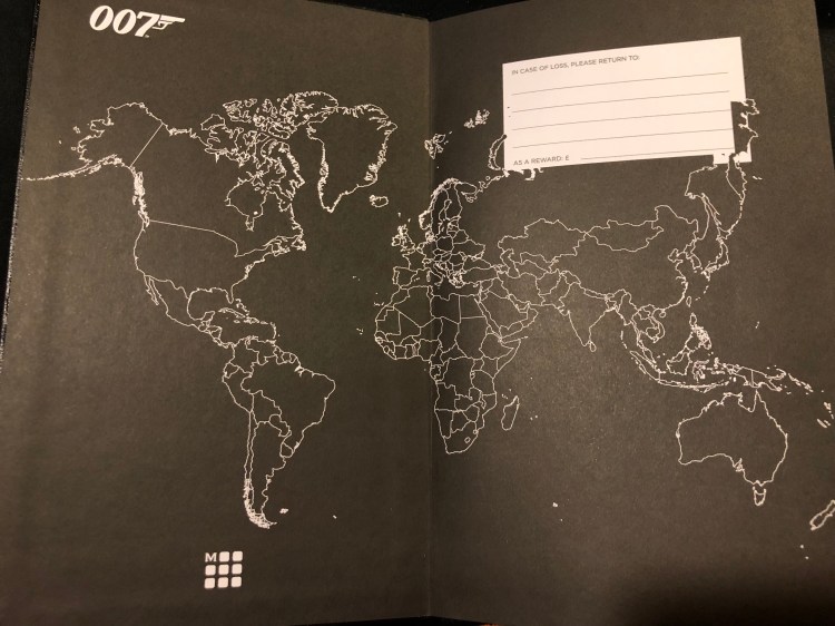
Moleskine recently came out with three James Bond themed limited edition notebooks, and after a bit of scrambling, two orders that were cancelled on me, and a bit of trouble with the post office I finally got them. To be honest, if I had that much trouble getting any other recent Moleskine limited edition, I would have probably given up already, but this one is special, for two reasons. The first and main one is my dad. He introduced me to James Bond, we watched all the movies together (some on TV, the later ones in the theatre), and it’s our “thing”. The second one is that I have a thing for maps, and once I saw the map on the endpaper, I knew I had to have them.

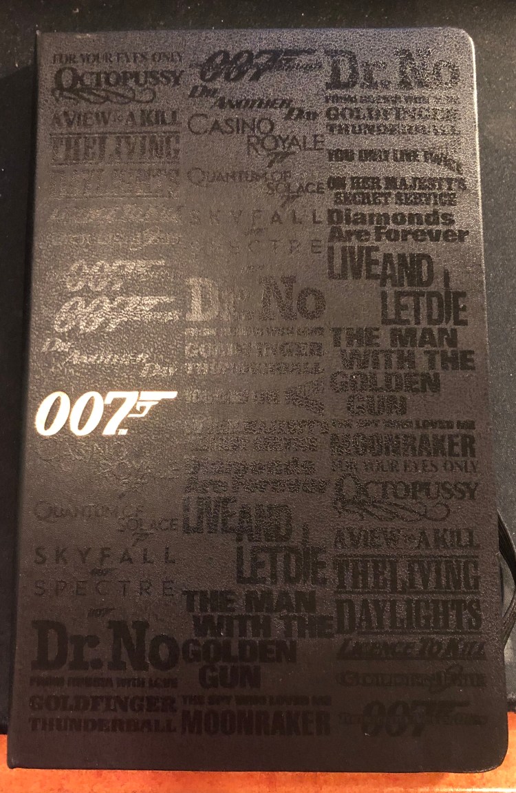
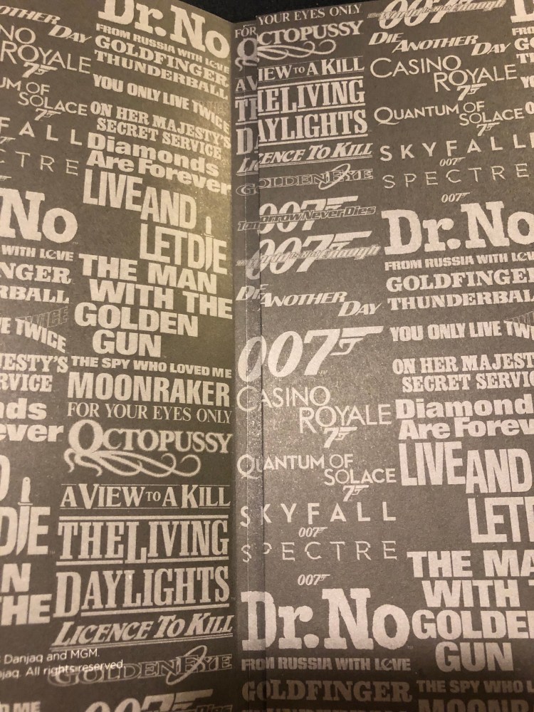
All three large notebooks are pretty great, but the Titles edition is probably the weakest among them. The front cover (and only the front cover) has a print of shiny black on the usual matt black of all the James Bond title logos. It’s so interesting seeing them together, with their various fonts and embellishments . It’s also hard to photograph because the gold 007 embossed on the cover of all three editions reflects so much light. Shiny!

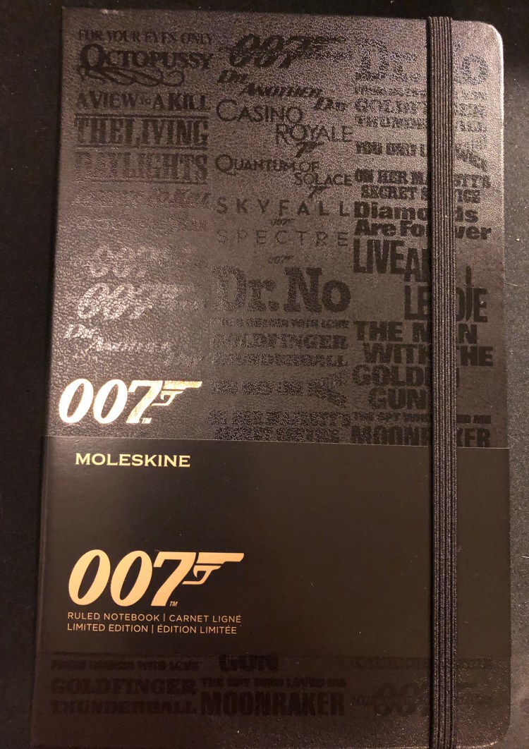
But there are two minuses here: one, the design doesn’t wrap around the notebook, it’s only on the front cover, and two, the titles only appear to be embossed, in reality they add no real texture to the notebook. This is such a shame because the other two notebooks in the series, the Carbon and the Box Set are so very tactile. It takes this notebook down several pegs, from the “great” to the “just OK”. It’s on par with the Star Wars Ships and Lightsaber Duel editions for me. Another very good edition that missed becoming excellent by so little that it becomes mediocre.

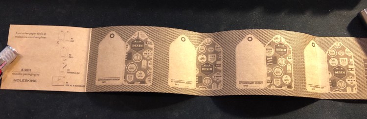
Everything else about this edition is stunning. I love the map, and the idea of having it there and tying it to globetrotter Bond through the B-side of the paper sleeve around the notebook (keep reading, I’ll explain it all later on). You could easily use a white pen to mark your own travels if you are planning to use this as a travel journal.

The back end paper is also great, with the titles cover design printed on it. Can you imagine now how much better this notebook would have looked like if it had this design on the spine and back cover too? Embrace the typeface, embrace the titles Moleskine!

They do get extra browny points for aligning the pocket with the type on the endcover. That is not something trivial to do, and it gives it all a nice touch.

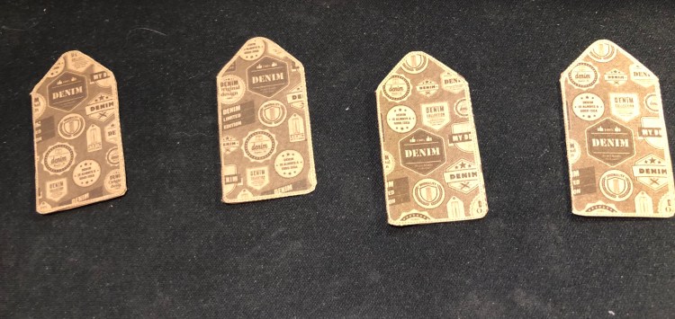
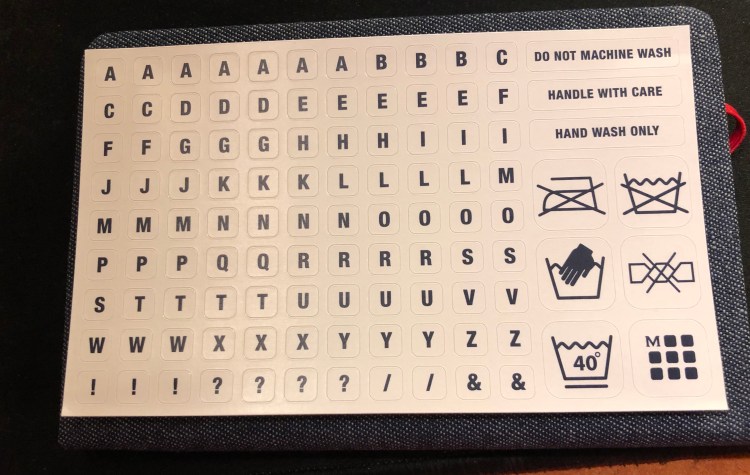
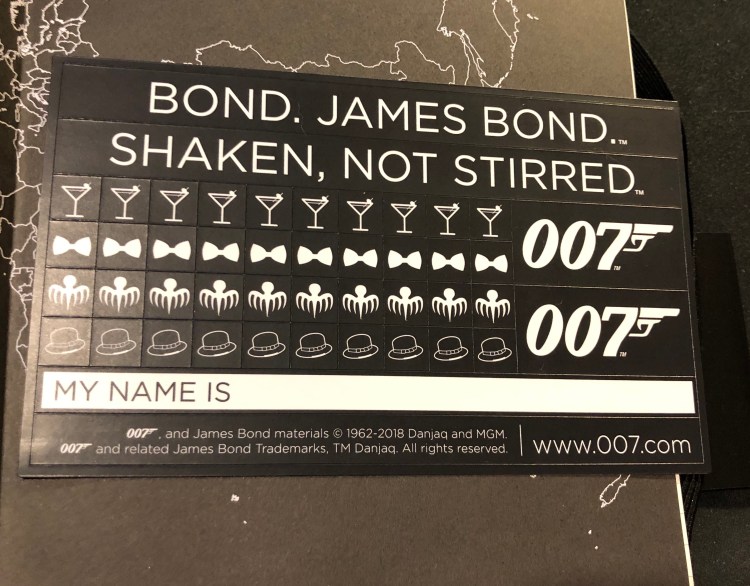
Like most Moleskine limited editions, this one comes with stickers which are pretty understated, and would probably come in handy if you’re planning to use this notebook as a personal or a travel journal.

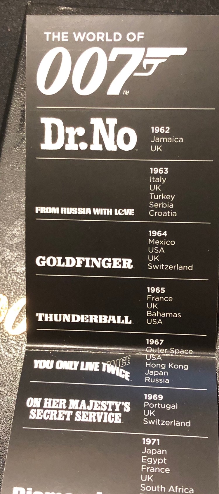
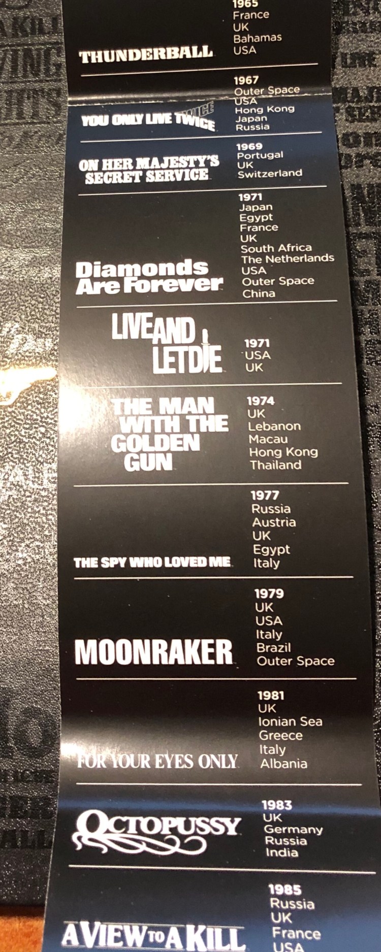
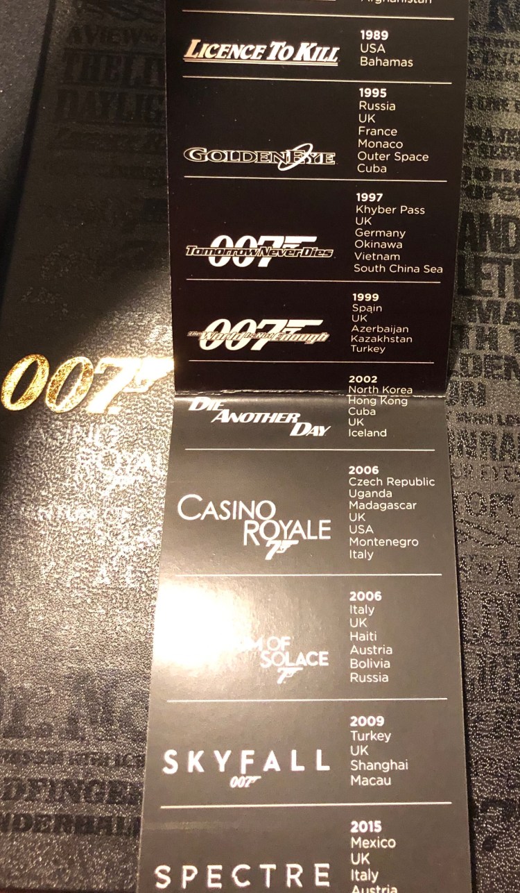
Remember the map on the front endcover? Well if you’re a huge James Bond fan, you can mark his travels on that map using the B-side of the sleeve. It has a list of James Bond film titles printed on it, with the date it came out on and the places the movie takes place in printed on it.

So, should you get this notebook?

If you’re a James Bond fan, then yes. If you’re looking for an interesting travel journal or a gift for a cool dad, then also yes. If you’re just looking for an alternative with a twist for your run-of-the-mill Moleskine large hardcover notebook, then I’d recommend the James Bond Carbon for a more understated but unique look, or one of the more colourful limited editions that Moleskine has issued lately.

Wait, what about the paper? It’s the same Moleskine fair of recent years. Expect significant ghosting and some bleed through to the other side of the page, no spreading but a little bit of spidering when using fountain pens, and a very smooth surface that may cause darker pencils to smear. It’s great for ballpoint, gel pens, highlighters (no spreading!), and certain kinds of fountain pen ink (Noodler’s black, Waterman Blue and Blue Black, and too many Diamine inks to list. Avoid J. Herbin and other watery inks like the plague) with medium or finer nibs. I don’t mind the ghosting (it’s the same as on Tomoe River Paper) and use both sides of the page, but that’s obviously up to you.


Journaling for Instagram

This is just a quick reminder to myself mostly, with the hope that it may connect with others:

  • You are doing your best and your best sometimes isn’t perfect, but it’s still your best. That’s all you can ever do under any circumstances.
  • Your journals and planners and notebooks and sketchbooks are for you. They may not be Instagram pretty, but if they work for you, don’t change them one iota. Some people create BOJO pages for social media, others create messy, working pages for themselves in terrible handwriting. Don’t let the first make you feel inadequate about the second.
  • If you think that tool X, bag Y or pen Z will make you a better writer, artist or human, think again. If you think that they will help make creating more of a joy, then feel free to treat yourself to them. It’s hard enough to sit down and start working as it is, so if you’ve discovered something that will give you joy in the process, feel free to silence any criticism, internal or external, and move on.

This week’s long run: cormorants

It’s funny going on a morning run and seeing the moon for a good part of the way.

Sunrise wasn’t too far away though, and with the waves and the clouds it painted a very pretty picture:

In the park a pair of hoopoes was shy enough to keep their distance, but I still managed to get a shot of one of them. Their colouring seems so bold until you see them by the mud of the riverbank.

Then it was cormorants all the way, from their usual tree, to a fishing pair in the river:

They really can dive, and I spent a minute or two trying to guess where they’ll emerge next.

All in all a good 10k run in pretty chilly weather.

Some pencils keep getting better

I did not like the Blackwing 530 when it came out (too much bling for my taste), but now that pencil that I’ve been using has gotten worn down and dinged a bit an underpainting of verdigris has been revealed, and I love the effect. It’s just a little reminder that I should give things a chance even if I didn’t fall in love with them at first glance (also this pencil is super difficult to photograph, because of the bling, so forgive me for the potato quality photo).

Moleskine Denim 12 Months 2019 Pocket Weekly Planner review

The Moleskine Denim 12 Months 2019 Pocket Weekly Planner arrived today, and it is a beauty.

I’m not a big planner user, but over the past year I’ve used a weekly planner just to get a better idea of how my week looks like and how to plan ahead accordingly. The slim, minimalist setup of the Moleskine Pocket Weekly planners is perfect for this.

Beyond the regular planner editions, Moleskine offers a wide variety of planners in their various limited edition designs (Harry Potter, Star Wars, Peanuts, Le Petit Prince and more), among them in their Denim collection, which is one of my favourites.

The covers are covered in Denim fabric, with jeans-like labels on them. The craft sleeve around the planner turns with a few minutes of work into bookmarks perfectly sized for the planner:

The endpapers are really nicely designed to evoke various denim labels, and the red elastic closure is echoed in the small back pocket:

As usual with Moleskine limited editions, it comes with a little something extra in the back pocket, this time stickers:

As for the internals, it’s the same as other Moleskine weekly planners, with a weekly schedule on the left side of the spread and a ruler page on the right, monthly calendars and information pages at the beginning of the planner, and a few general planning pages.

If you’re looking for a pocket weekly planner that’s beautiful, lightweight and not overly structured, I highly recommend this planner.

This week’s long run: seagulls and Serial

For the first time ever I ran two 10ks in a week, and my legs kind of hate me right now.

I listened to the last episode of season 3 of Serial and it was heartbreaking, as was this entire season.

Seagulls in the sunrise:

And ducks:

Not sure if you can see them there, but here are some baby Egyptian geese with their parents:

Seagulls perched on boats, which is pretty unusual, as they normally don’t fly this far up river.

A kingfisher perched on a wire:

And finally some Egyptian geese grazing near the path:

Market stall sketch

Decided to stick to a limited palette on this one. Zebra and Faber Castell brush pens on paper bag, drawn during an Urban Sketchers sketch walk.