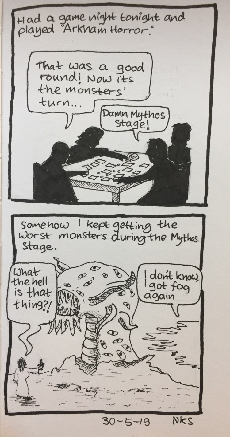
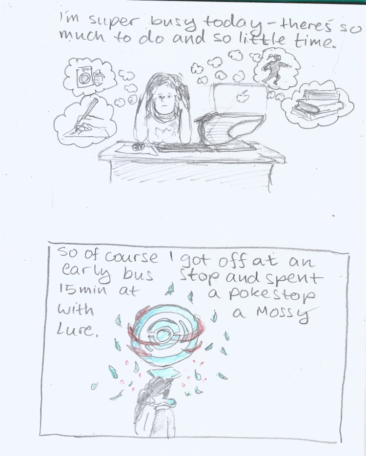
Why Do The Monsters Like Me? Journal Comic 30-5-19
A blog about writing, sketching, running and other things

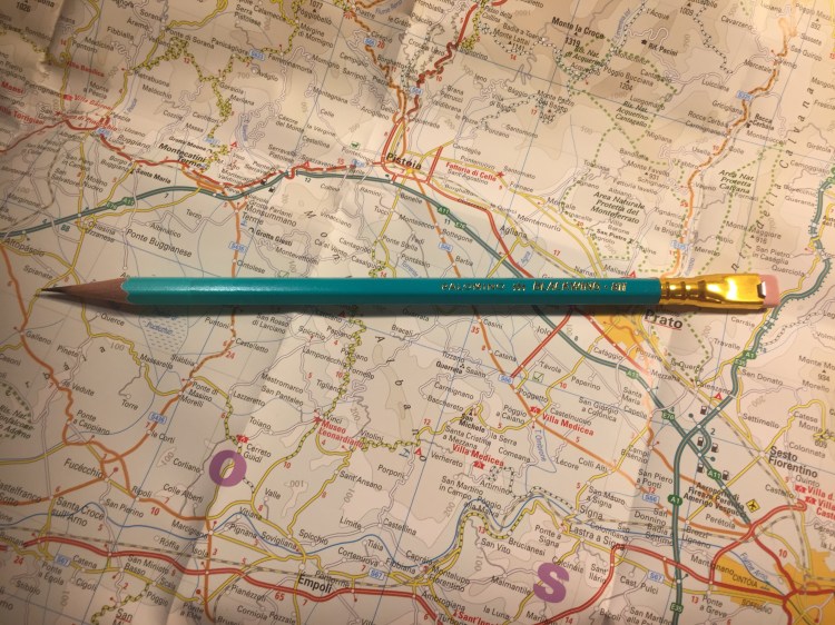
It’s the insane, glow in the dark Blackwing, and I managed to snag a box!
OK, enough with the hype. Plenty of other reviewers have given this limited edition pencil a spin, but my experiences and thoughts about “The Library Pencil” seem to be different enough to warrant a few quick words about the Blackwing 811.
First of all, the pencil is attractive. It’s darker than a banker’s lamp (I have one, so I checked), and the gradient is very well done. This could have looked cheap and tacky but it doesn’t. I would have liked a darker ferrule and I think that the pink eraser is ugly, but even so it’s a pretty attractive pencil.

The lighter part of the gradient disappears for the most part on the first sharpening, so that’s a shame. The coating on the pencil is grippier than the coating on the Blacking 54, 56, 24, 725 and 530 (and lacquered pencils in general), but less grippy and gritty than the coating on the Blacking 4. It has a matte feel.
It’s got a “firm” core, which means it has the Blacking 602. I absolutely hate that Blackwing doesn’t write its firmness on the barrel, or use “standard” hardness ratings, or makes it easy to see what the core grade is on the box or on their site. That’s like buying a fountain pen and not knowing whether you’ll get a fine or a broad. It’s bad enough that manufacturers play fast and loose with pencil grades within the standard 10H-10B range. Having a company invent its own grade and not even have it make sense, and then not even make it visible is a big no-no in my book.
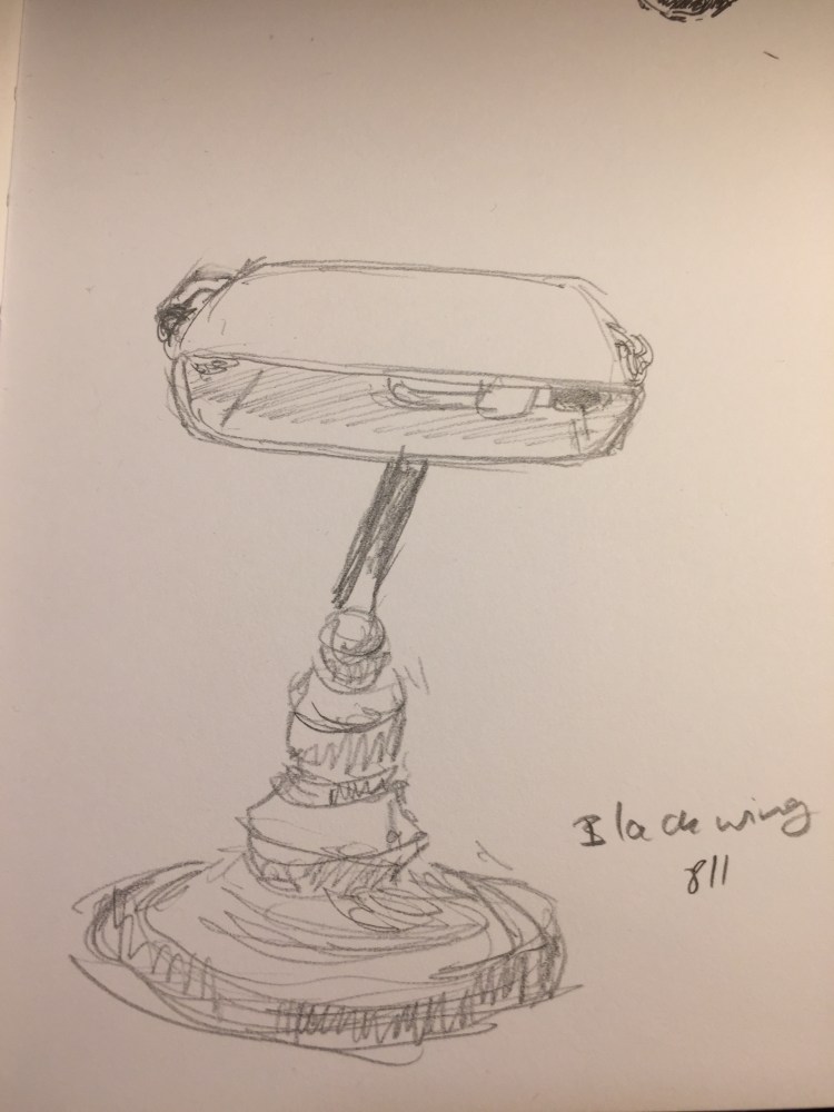
Here’s a sketch of my banker’s lamp (which is a bit wonky after my cat dropped a giant pile of books on it) done with the Blackwing 211. I’d say it’s a B or a 2B, depending on the maker, but in no way is it a pencil that I’d call “firm”. It’s great for quick sketches, but I wouldn’t recommend it for under-drawings.

After a month off due to injury and a cold, it’s good to be back.
