Dare to Dream: Eurovision 2019 Tel Aviv Euro Village
A quick sketch on location of the Eurovision 2019 Tel Aviv Euro Village as it was filling up.

Leuchtturm1917 Sketchbook, Super5 0.7 fountain pen and Rohrer and Klingner Lotte ink.
A blog about writing, sketching, running and other things
A quick sketch on location of the Eurovision 2019 Tel Aviv Euro Village as it was filling up.
Leuchtturm1917 Sketchbook, Super5 0.7 fountain pen and Rohrer and Klingner Lotte ink.

Moleskine has issued their Fall 2019 catalogue and it’s even more interesting than their Spring 2019 one. As usual, here are the highlights:
That’s it for me. I’m not interested in the “Smart” stuff or the accessories, and there’s enough here as there is. It looks like 2019 is going to be an excellent year for Moleskine, and I can’t wait to get my hands on several of these notebooks.


Leuchtturm1917 Sketchbook, Tombow Mono 100 2B and Pentel Color Eno 0.7
I finished reading the last Tournament of Books novel a few weeks ago, but I waited with the review until I could gather my thoughts about the whole experience. That’s a little unfair to what’s turned out to be one of the best books in the tournament, so my apologies to Urrea. The “The House of Broken Angels” by Luis Alberto Urrea was up against “So Lucky” by Nicola Griffith in the sixth round of the competition.
To call “The House of Broken Angels” heartwarming seems somehow insufficient. It is a heartwarming tale of a man celebrating the last days of his life with his extended family. It’s also an immigrant story, a story of overcoming abuse, poverty, racism, and your own preconceptions even when you’re on the verge of death. It’s a story of one generation passing the torch on to another. It’s a story of women finding their voice in a world of men. It’s a story with tremendous tragedy and a lot of humour. It’s a story about the poetry of everyday life.
But most of all it’s a story of family and love, created without cynicism or cliche: unique, realistic, flawed, and intensely powerful.
In two days life, in its mundanities and most profound and heroic moments, unfolds before your eyes and leaves you at times laughing, crying or merely breathless with anticipation. Urrea moves you from past to present, from one character to another, effortlessly and seamlessly. It’s one of the few cases that I’ve seem where a complex narrative structure feels like a light read simply because it’s so well created.
This is a must read, especially these days, when the Mexican and Latino population in the US is constantly under attack.
There’s not much in common between “So Lucky” and “The House of Broken Angels” apart from them both being centred around people who have fallen seriously ill. “So Lucky” deals with the first days of dealing with illness, and the “The House of Broken Angels” with the last. The protagonist in “So Lucky” is a lone woman, and in “The House of Broken Angels” it is a man surrounded by a large, loving family. The trick lies in reading the acknowledgements in the end, as it is then that you discover that both narratives are based on the true life experiences of the authors. That adds impact to the stories in some ways, but I think that it mainly creates a level playing ground where they both have a similar gravitas and you can simply judge them by their merits. I highly recommend reading both, but that being said “The House of Broken Angels” is a much better work of fiction. It’s also more enjoyable to read despite its oftentimes tough subject matter, and unlike “So Lucky”, it’s a literary novel and a story of its time that is also timeless. Imagine comfort food that isn’t boring and provides you with all your daily nutritional needs and you’ve got “The House of Broken Angels”.
Have you not read it yet, mijo?
In the early 2000s the Tombow Object fountain pen was one of the recommended beginner fountain pens on the market. That was in the pre-Pilot Metropolitan and pre-TWSBI days, when the beginner fountain pen choices were pretty sparse. I have the Tombow Object fountain pen and I’ll review it at a later time, but a few years ago I saw its rollerball counterpart on clearance sale, and so I risked the purchase.
I’m not a rollerball person, since they tend to behave like the worst of fountain pens (ink spreading, feathering, bleeding through and leaking out of the pen) without the good parts (line variation and versatility in ink colour). But the Tombow Object rollerball intrigued me because it shares the same body as the Tombow Object fountain pen but is significantly cheaper, and so I was hoping that even if it turned out to be an annoying pen to use, I could just use it as a way to get some colour variety with my Object fountain pen.
And why would you want that, you ask? Well, just look at that anodization:

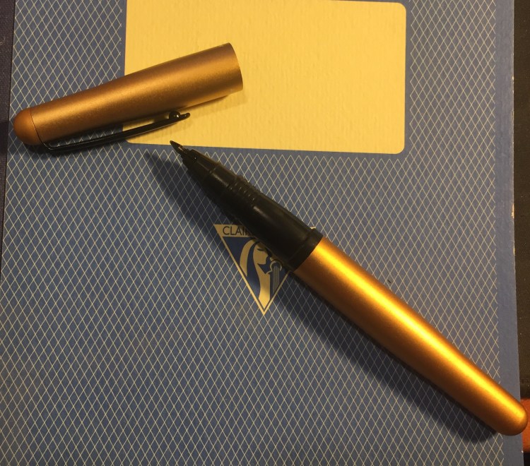
The Tombow Object is a metal bodied pen (brushed aluminum body and cap that gives it a great texture) with a plastic section and a steel clip. That gives it some heft, but still keeps it light enough to be comfortable to use both capped and uncapped. There’s a satisfying snap when you cap the pen, and it stays on very securely. The tip doesn’t rattle or wiggle around, and the clip does an admirable job of being a good pocket clip and preventing the pen from rolling about. The pen has a beautifully designed taper on both ends that gives it a bit of character, and an unobtrusive “Tombow” and “Japan” printed in white on the cap. Although this colour is called gold, it’s a coppery-gold, close to a champaign colour you can sometimes see on cars.

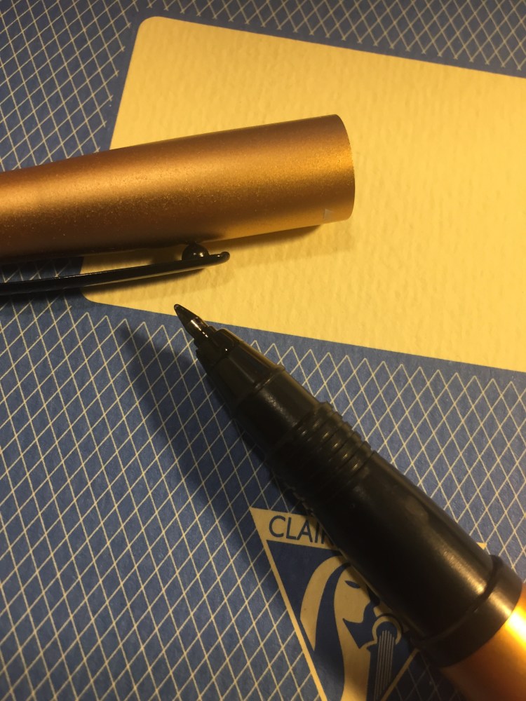
The appeal of the Tombow Object has always been the fantastic anodization colours that were offered, each one really vibrant (except for the silver, which was boring). As you can see from the photo above, like all aluminum pens, it can be dented and nicked. This is probably a pen that you want to keep on your desk and not bashing around in your bag or pocket.
Another reason to keep this pen on your desk is that it tends to leak. There’s a slip mechanism in the cap that both prevents the ink from drying out and from leaking beyond the tip of the pen, but as you can see in the photo below, you need to be careful when you start using the pen where you grip it, or just accept ink stains on your fingers (or keep a paper towel at hand).
The pen uses a proprietary Tombow Object refill, which is always a shame. I wish that I could just pop in any fountain pen ink cartridge in there instead.

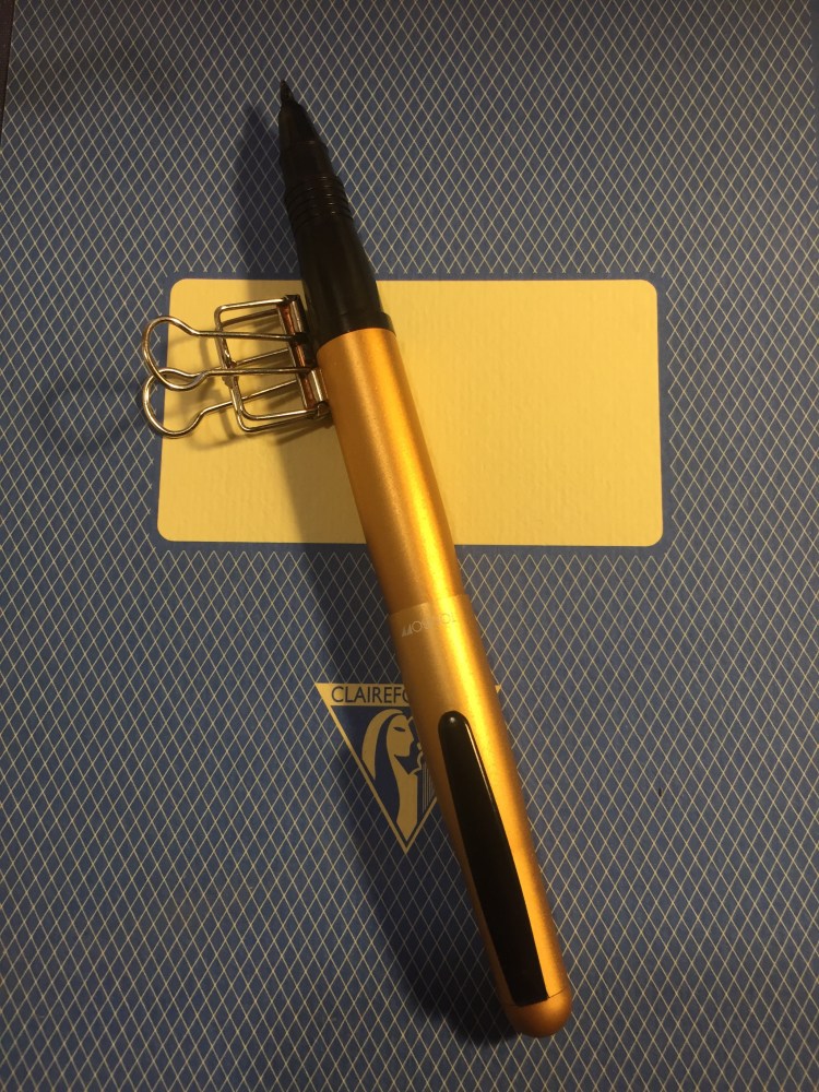
The slip cap also allows you to easily post this pen, although I don’t recommend it. For one thing, it isn’t necessary as the pen is long enough as it is, and for another, because the pen leaks into the cap you’ll just spread ink on the pen body.
It’s ink test time! Here’s a sampling of how the Tombow Object rollerball behaves on different kinds of paper:


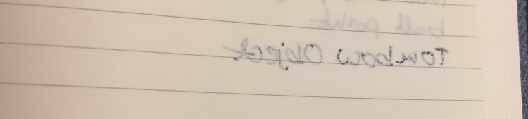
None of this is great, but to be frank, this is generally in keeping with rollerball behaviour, and one of the reasons that I really don’t like the Retro51 Schmidt rollerball refills. The Object behaved best on the Clairefontaine paper, and even displayed some fetching line variation. It’s still a “one side of the page only” type of pen though.
As for the cap-and-body switching hack, it only partially works. You can take the body of a Tombow Object rollerball and switch it with one from a Tombow Object fountain pen, but the plastic insert in the cap that prevents the ink from drying up or leaking is incompatible between models. The pen just won’t snap shut with the “wrong” type of cap. It does still allow for some crazy cap/body combos, but that a whole different ballgame.
So would I recommend this pen? It is beautifully designed, looks great, is comfortable to use and you can find it on the secondary market for the price of a Retro51 or slightly cheaper. The enormous downside to this pen is that it uses a proprietary refill (I have not yet tried to hack it to see if it can accept other refills). So if you like this pen I would recommend stocking up on those refills, because Tombow might not offer them for sale forever. The Tombow Object and the Tombow Egg which use them have both been discontinued for a few years now, which is a great pity.


Following the success of the excellent Moleskine Denim limited editions, Moleskine has added two Denim notebooks to their regular lineup. Yay! The first of these is the Moleskine Denim Antwerp Blue, which is a sort of classic mid wash, blue jeans coloured cover.
The notebook cover is wrapped in denim, and it looks and feels exactly like a well worn pair of jeans. The band is black, unlike the white in the limited editions, and there’s no white print on the cover. I think that the Denim limited editions are more striking and better looking because of these white highlights, but that Molskine made a deliberate choice here to keep these notebooks more muted and office friendly.

The front endpage, with the “In case of loss” covered up because I’ve been using this notebook and so my details are there.

The back endcover with the famous pocket. 
The back cover is where Molskine allowed itself to have a little fun. Their logo is printed on a grey fabric band that looks and feels like the kind of labels that you have inside jeans (the ones with the washing instructions on them).

The band is orange, and that adds a welcome pop of colour to the notebook. This notebook uses 70 gsm paper like most of Moleskine’s lineup and there is some show through with gel ink pens and ballpoints. If you are a very heavy handed writer, you can really put a dent into this paper, so take that into account.

Moleskine does not claim that this paper is fountain pen friendly, and it clearly aims it for standard pens (gel ink pens and ballpoints) plus pencils, but their recent standard lineup has featured more fountain pen friendly paper. The Moleskine Denim is no different from the new dot-grid notebooks in my experience in that there is no more of the strange spidering or the over absorbency of the paper that left certain inks looking weird, but there is show through and with wetter nibs also bleed through.
Here’s an example of some pens in use in order from top to bottom:
I didn’t test a ballpoint or a pencil because they all work well, and the gel ink is there as a benchmark.

There’s a B-side to the band that comes with the notebook, and this one is a ruler.

This is one of my absolute favourite notebooks in recent years. The cover texture is fantastic — much softer and thicker than the one that Baron Fig uses, and it gets worn like a pair of jeans the more you use it (i.e. it gets even softer, and the colour fades a bit in the edges). It’s subtle and serious looking enough to fly under the radar in office use, and it is just fun to use. The fact that I can use most of my fountain pens in it is just a little bonus.
It’s Diana time again! I reviewed the blue Moleskine Wonder Woman limited edition here, and now it’s the red notebook’s turn.
This is the notebook with the band still on it. Take a look at that yellow and red Wonder Woman logo on the band — would it not be nice to have a bit of that yellow on the actual cover print? Say on the logo and the yellow parts of Wonder Woman’s outfit? I think that it would make the cover pop more.

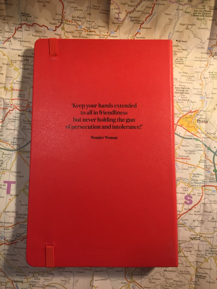
The back cover, with the band still on. That quote is pretty great.

Diana in all her glory. I really wish that Moleskine would have been more playful with it, maybe done a screen print like design or an action shot, like they did with the excellent Batman Moleskine limited editions.

The back cover, sans paper band. Kudos to Moleskine for keeping their branding subtle.
The front and back endpages are exactly the same as the blue Wonder Woman limited edition, and a little meh in my opinion.

Wonder Woman doing what Wonder Woman does… but with no foe in sight. Why? Batman got a great punch scene in the Batman Moleskine limited editions.

This edition comes with stickers, exactly like the blue edition.

And the B-side of the band shows the various tools that Wonder Woman uses, exactly like the blue cover edition.

I’m not sure which of these editions I like more, the Lasso of Truth edition (the blue one) or this one, but I am sure that this edition is not all it could be. If you’re a Wonder Woman fan you’ll likely love it, but I don’t see this edition appealing to a wider audience. It’s closer to the weird Marvel Avengers editions than to the great Batman and Superman editions.
My Nasturtiums have finally decided to flower and they’re gorgeous.


