Daily Sketch: Wooden Planter

A blog about writing, sketching, running and other things
The past two weeks were a bit hectic, with various social gatherings (I’m not used to meeting people after being isolated for so long due to Covid and chemo) and getting ready to leave my old job and start my new one. The weather is still pretty good, and I’ve been relishing it: running, walking, and sketching a lot. As I’ve gotten used to writing and sketching with this level of neuropathy, I’m trying to take advantage of the pre-summer-heatwave weather to get as much outdoor on location sketching done as possible. I also have a backlog of London and Paris sketches to go through, complete where necessary and post.
I’m back at the gym (I had to freeze my membership during treatments), and enjoying getting back to lifting weights. And I went to see a movie for the first time in more than two years. “Dr. Strange and the Multiverse of Madness” was pretty good, but it had a few too many horror elements for my liking. Another first after a very long time was an evening out at an escape room with my friends. It was a lot of fun, and something that I really missed.
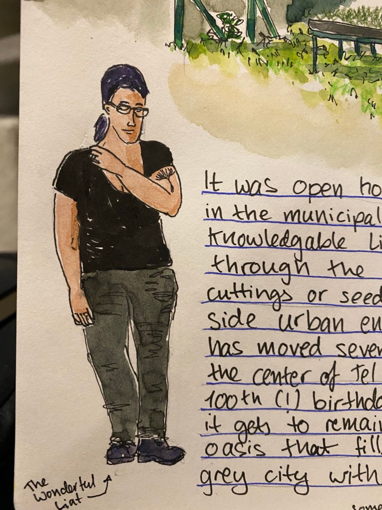
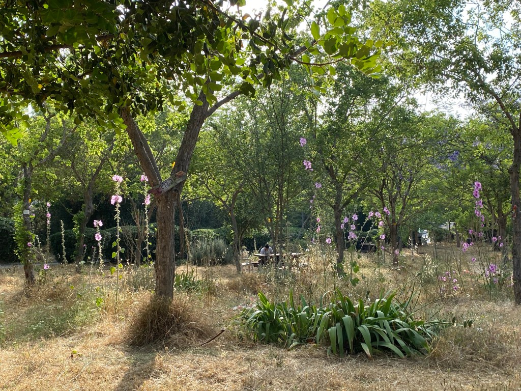
Yesterday I went an Open House Tel Aviv event at the municipal plant nursery. I learned that the nursery serves a wide variety of organizations and gardens all over the city, that urban environments, and particularly seaside urban environments are rough on plants, that the nursery is one of the few of its kind in Israel, and it has been around for 100 years. We saw plants grown from cuttings, talked about plants that can survive the salt and sand and harsh sunlight of beachfront gardens, as well as plants that can thrive in the shade. We saw plants that are pollinator friendly, and talked about local plants vs. imported and invasive plants in the city. It was fascinating, and I could have spent the entire day there. The nursery isn’t normally open to the public, so visiting it and getting such a wonderful insight into it was a real treat.
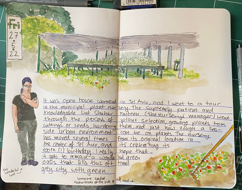
Here’s a closeup of Liat, who manages the nursery and was our fantastic tour guide for the day.
I’m 3/4ths done with “Our Country Friends” by Gary Shteyngart and I’m probably going to give up on the Tournament of Books reading list once I’m done. I have so many good books that I want to read, that I don’t feel like chancing another tiresome one. What will come next is Ali Smith’s “Companion Piece”, and then “The Mirror and the Light”. There are a few classics that I want to catch up on, and some very good sci fi that’s waiting for me, so as much as I’ve discovered some fantastic books through “The Tournament of Books”, I think that this is where our ways will part, at least for a while. Oh, and Agatha Christie is an excellent writer, and very addictive. I may return to her books in the near future.
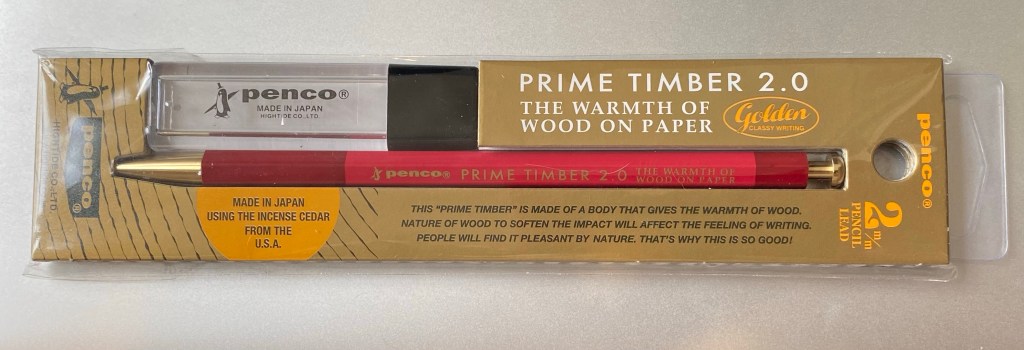
I’m exploring various ways to manage my projects, and so far I’m unhappy with all of them. When I was in London I picked up this Penco leadholder and some leads (I have another one in shades of green that part of a sketching kit that I don’t want to break up), and I’m giving the good old PigPogPDA another try while I work things out. This is always my “palate cleanser” system, something that I use while I tweak other, more complex systems into relative perfection. I’ll be using this leadholder and a Moleskine plain pocket reporter.
I’ve enrolled to Liz Steel’s Watercolour course. It’s starting a runt through on the 8th of June, and as I’ve had such a long sketching break while my hands were bad, I thought that it would be a good way to refresh my skills and pick up a few tips and techniques along the way. I like Liz’s loose, non standard watercolour style, and her courses are excellent.
Next week on Tuesday is my last day in my old job, and the week after that I start my new job. Exciting times 🙂
Quick sketch of people making cocktails in the dark. Uni-ball Jetstream Edge 0.38 on a Stillman and Birn pocket Alpha.

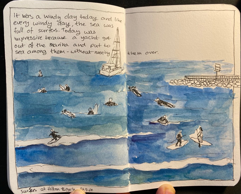
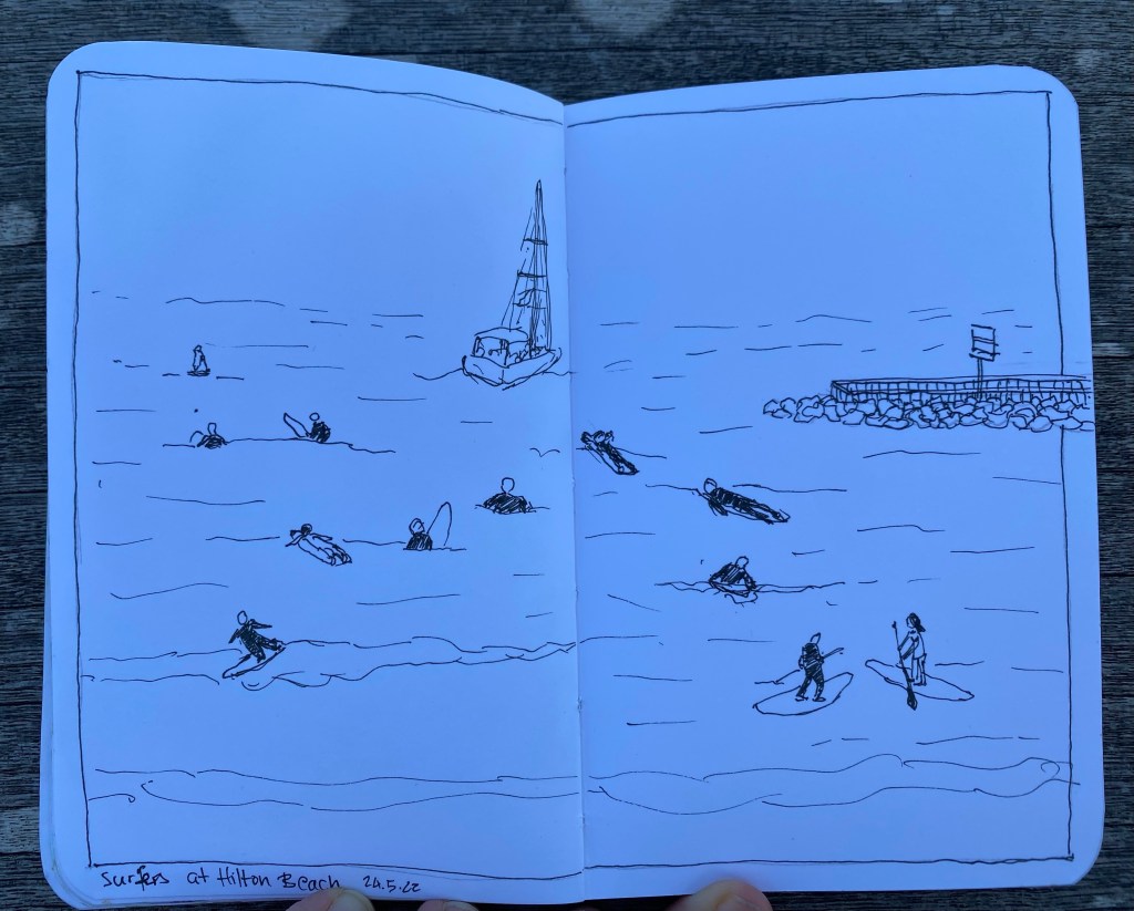
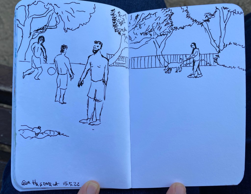
I went on a walk this morning, and as the wind was up, the surfers were out in full force. I decided to take a quick break and sketch them in my pocket Stillman & Birn Alpha sketchbook, and I used a Staedler 0.05 fineliner for a change. I used to love the 0.05 for the fine line it gave, but I haven’t used it for years, and while my neuropathy was bad I couldn’t have used it. As my neuropathy is improving with the weather, I decided to give the 0.05 a spin.
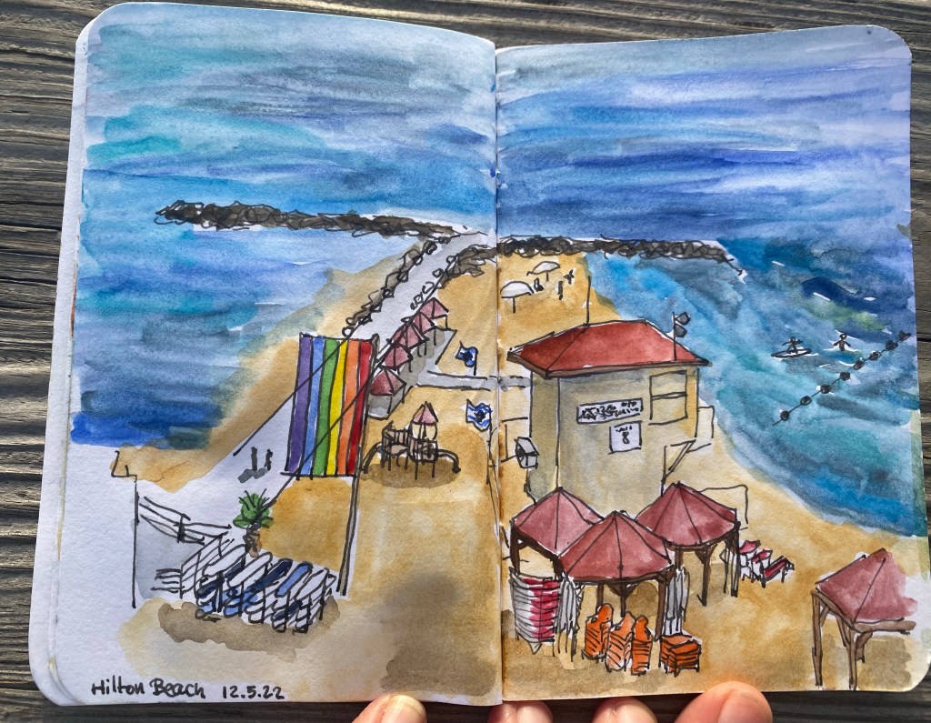
This was sketched on location and painted later on.
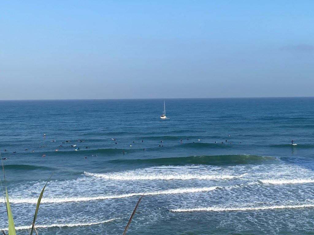
The sketch as it was on location:
And the original scene once I finished sketching:
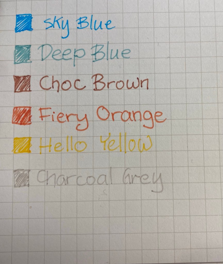
On my last day in London I went to Paperchase, a local stationery chain, and “splurged” on some stickers and a set of fine liners. I say “splurged” with velociraptor quotes as Paperchase branded products are generally inexpensive, even if they do tend to be of middling quality. This set of fine liners proved to be no different: they can be described as OK at best. The caps require some force to snap back on, the clips quite easily (and unintentionally) pop out, and the colours are muted and pale. They would work well as muted, fine lined highlighters, but if you’re planning to sketch or colour with them, I’d opt for something from Staedler instead.

The set that I got had the following colours: Sky Blue (which is a turquoise), Deep Blue (which is a teal, and not at all deep or blue), Choc Brown (which is a reddish brown, and far too light to be named after chocolate), Fiery Orange (which is very reddish and not at all fiery), and Hello Yellow (the only aptly named pen of the bunch). You can see a writing sample on Maruman Mnemosyne paper.
I was inspired to sketch a scene from one of my runs this week using only these fine liners and a used paper bag from the local farmers’ market (it had peppers in it). The set doesn’t have a green, so I layered the Deep Blue on the Hello Yellow to create the green that you see here. I kind of like the result, and as I have a few more used paper bags laying around I may play with them as well.

Quick sketch with watercolour pencils and watercolours.
A quick fountain pen sketch with my vintage Waterman 52 fountain pen and Waterman Havana Brown ink (now called absolute brown) on a Stillman and Birn pocket Alpha.
This week was busy and filled with milestones. On Sunday I celebrated my 40th birthday. That’s not something that I was sure that I’d get to celebrate: in June and July last year I thought that I was dealing with a much more aggressive form of lymphoma, and I was unsure if I’d live to 40. Being where I am right now in terms of health and life in general makes me feel lucky and blessed.
On Wednesday I participated in my first race since 2019 (I missed a race in early 2020 due to Covid concerns, and then all the local races were cancelled until late 2021, when I was dealing with cancer). I was worried about the crowds triggering my post trauma, and the start of the race was challenging, but then the crowds cleared up and I had a great time.
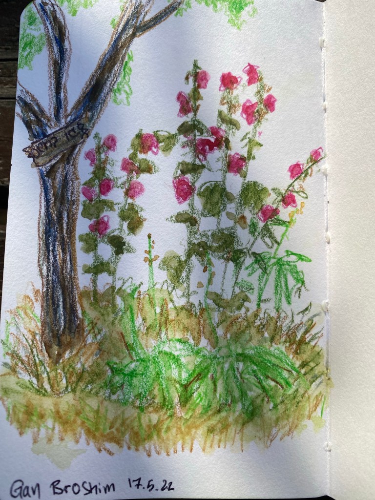
I sketched a bit this week, working with watercolour pencils and watercolours. I’m still experimenting a lot, and still trying to work out how to sketch plants and foliage. Here’s a very quick sketch from a local garden, done with ballpoint, Faber Castell Albrecht Durer watercolour pencils and watercolours (Schmincke Horadam and Daniel Smith) on a Stillman and Birn pocket sketchbook. I didn’t feel like sketching so I just did a quick study of some rocks and plants, experimenting with textures.

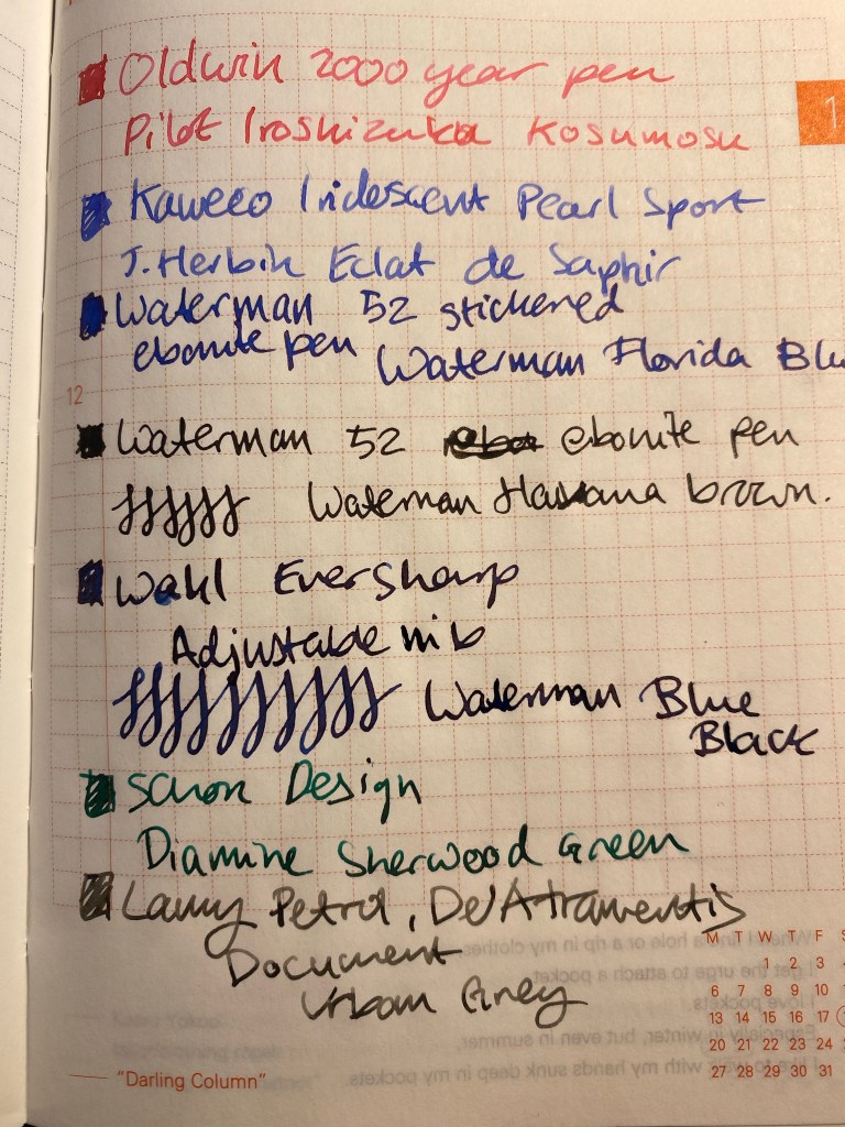
I’ve inked up all of the fountain pens that I bought on my latest trip. That’s an Oldwin 2000 Years of History pen in silver (gorgeous, with a fantastic nib, but very heavy as it’s large and has a silver body), two Waterman 52s, with lovely flexible nibs. One of the pens is still stickered, and yet in the spirit of use the good china, I inked it. There’s also a Wahl Eversharp in the Kashmir colourway. I think that it’s an Equiposed that somehow got an adjustable nib on it, but I bought it for the phenomenal nib, not the pen body as much. All four pens were bought at Mora Stylos in Paris, and I am very happy with them.
I also popped a J. Herbin Eclat de Saphir cartridge into the Kaweco Collection Sport Iridescent Pearl pen that I bought in Present and Correct in London. It was very difficult not to buy up that entire shop, especially since I visited it twice.
The other two pens were inked up before my trip and are probably going to be written dry this week or the next: a Lamy Safari Petrol with a fine nib that I use for sketching as it has De Atramentis Urban Grey document ink in it and that’s waterproof, and a Schon Design Pocket 6 in 3D Teal that has a Diamine Sherwood Green cartridge in it.

The Oldwin is inked with Pilot Iroshizuku Kosumosu, a new ink that I got as a gift from the lovely Mr. Mora. I don’t have many pink inks so it will be nice to give this ink a try.
I still am having terrible luck with J. Herbin inks. Their regular lineup is so watery and desaturated, it’s always been a bit of a let down, especially when compared to the vibrant colours on their labels.
All the vintage pens are filled with Waterman ink, as it’s safe on vintage pens and very easy to clean out. There’s Florida Blue (now called Serenity Blue), Havana Brown (now called Absolute Brown) and my desert island ink, Waterman Blue Black (now called Mysterious Blue).
In terms of reading, I finished reading Ben Aaronovitch’s “Amongst Our Weapons” and it was a really fun read. His previous novel in the “Rivers of London” series, “False Value” got me a little worried that he’d lost his touch (it wasn’t bad, it just wasn’t nearly as good as his previous seven books), but “Amongst Out Weapons” is a return to form.
I’ve also finished reading Agatha Christie’s “A Murder is Announced” and boy does she know how to write. The characters, setting, period come to life, and you can sense an intelligent and keenly observing mind at work.
I’m now back with the Tournament of Books, this time with “Our Country Friends” by Gary Shteyngart. If I find this book tiresome, I may yet give up on the Tournament of Books list as I’ve got more than enough good books that I can’t wait to dig into.
Next week is very busy, so I’m not sure if I’ll have time for any long posts. In the meanwhile, please remember to take a break from social media and enjoy your life: call a friend, take a walk, listen to a family member, be kind to someone, volunteer in some way. And if you are on social media, please be kind.
Quick watercolour and fountain pen sketch done on today’s walk.
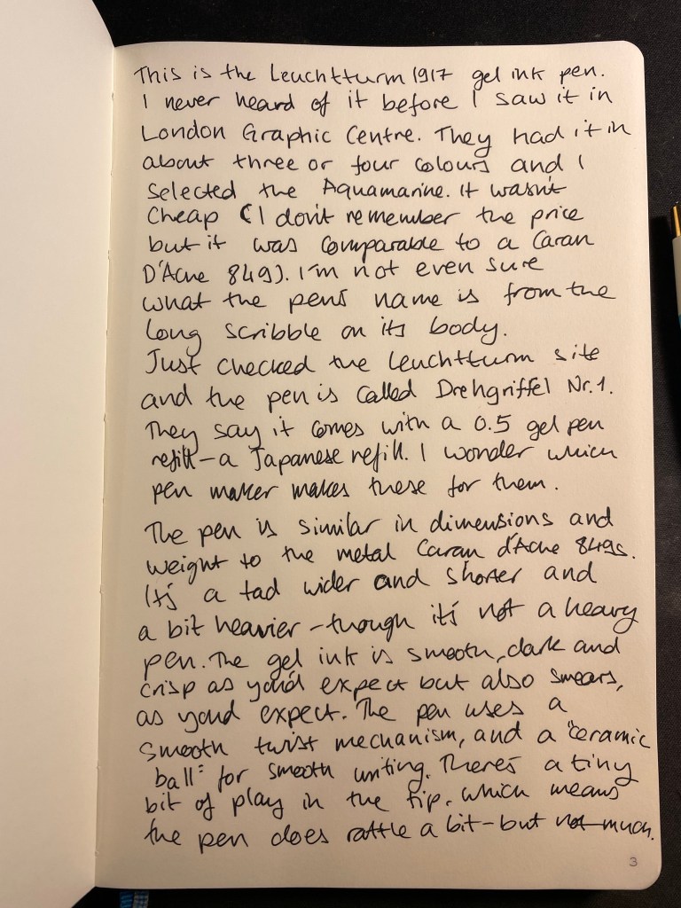
London Graphic Centre is one of my favourite stores in London. It’s tucked away in the corner of a street off of Neal street in Covent Garden, and it’s a real haven for artists, designers, architects and anyone who loves stationery and art supplies. I visit it several times whenever I’m in London, and I never fail to find something new and interesting there to try out. This time was no different, and one of the first things that caught my eye while I was there was this:
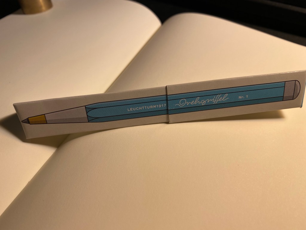
It was just above the Leuchtturm1917 notebook display, and there were just three or four colours available, but it was obvious that this pen was designed to match the colours on offer in the Leuchtturm notebook lineup. I assumed at first that it was a ballpoint, in which case I wasn’t really interested in it, until I saw that it was prominently labeled as a gel ink pen. Now that was intriguing.

The box was a bit confusingly marked as both “Gel” and “Gel ballpoint”. Checking out the Leuchtturm site clarified that this pen (we’ll get to the name in a minute) is indeed a gel ink pen, with a Japanese refill and a “Ceramic Ball” tip. The refill itself looks very much like the Monteverde Capless Ceramic Gel ink refill. My guess would be that this is the same refill, but more on that later.

Somebody really took the time to design this box, but really didn’t consider how illegible the pen’s name is:
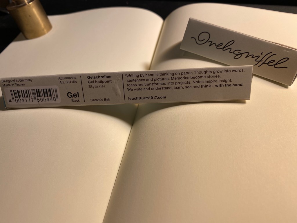
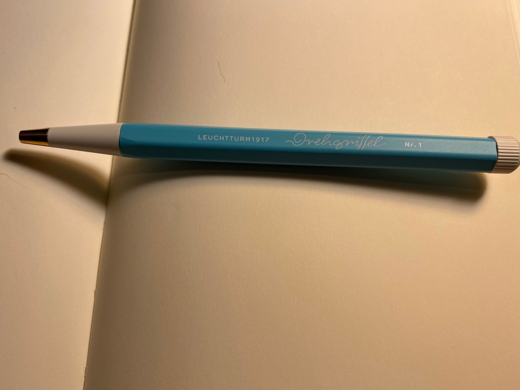
The pen is called Drehgriffel Nr. 1, a bit of a mouthful. Apparently Drehgriffel means “rotary stylus”, which probably refers to the pen’s twist mechanism.
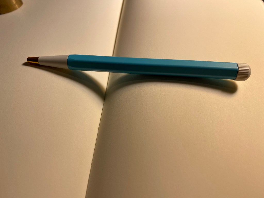
The pen has an aluminum body, a white twist nob at the end and brass pen tip. It’s well balanced, heavier than a plastic pen but lighter than a Retro 51 or a machined pen. It’s slightly heavier than a metal bodied Caran d’Ache 849, but if they were put in a boxing ring they’d both be in the same weight category.
The Drehgriffel has a very 60’s look, which I happen to like, but other people may find to be dated. Also, the Nr. 1 is a weird designation when you don’t have any other pen on offer. Will there be a Nr. 2? A Nr. 3?
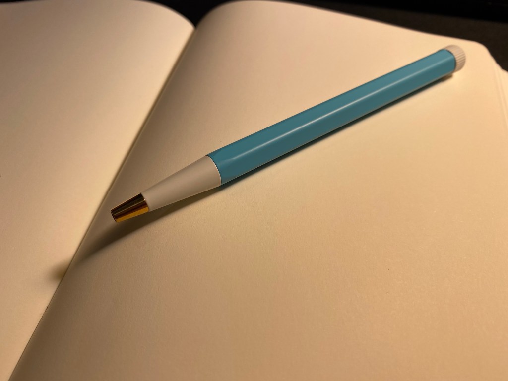
Here’s the pen’s refill and parts. It’s weighted slightly towards the tip because the tip is brass (and, of course, the pen tip will tarnish with time).
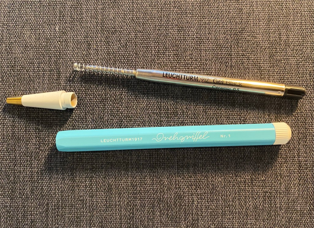
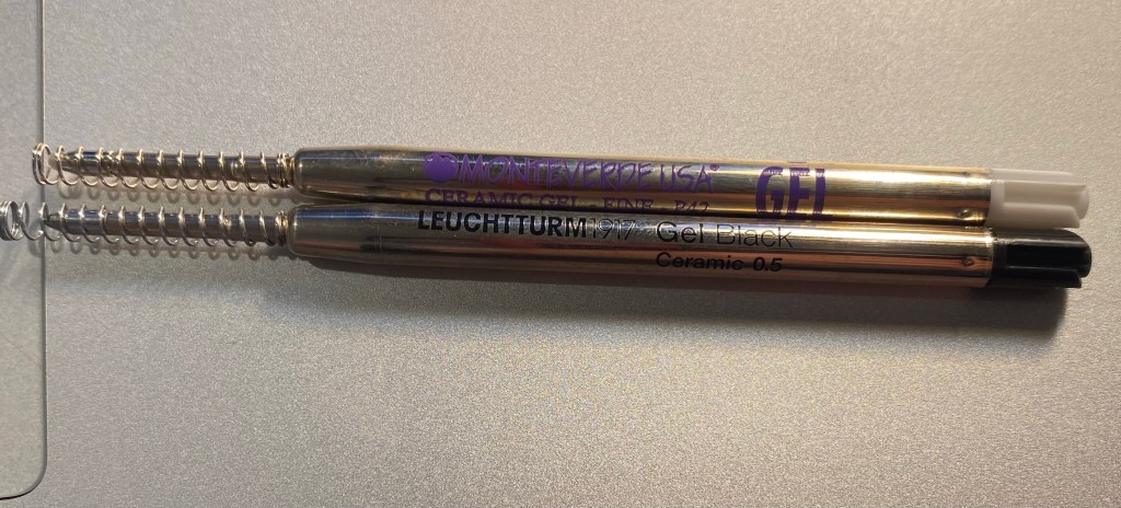
Here’s the Drehgriffel refill side by side with a Monteverde Capless Ceramic Gel refill, and they are exactly the same. Good to know if you’re looking to replace refills, although I suspect that it will take a while to write this pen dry.
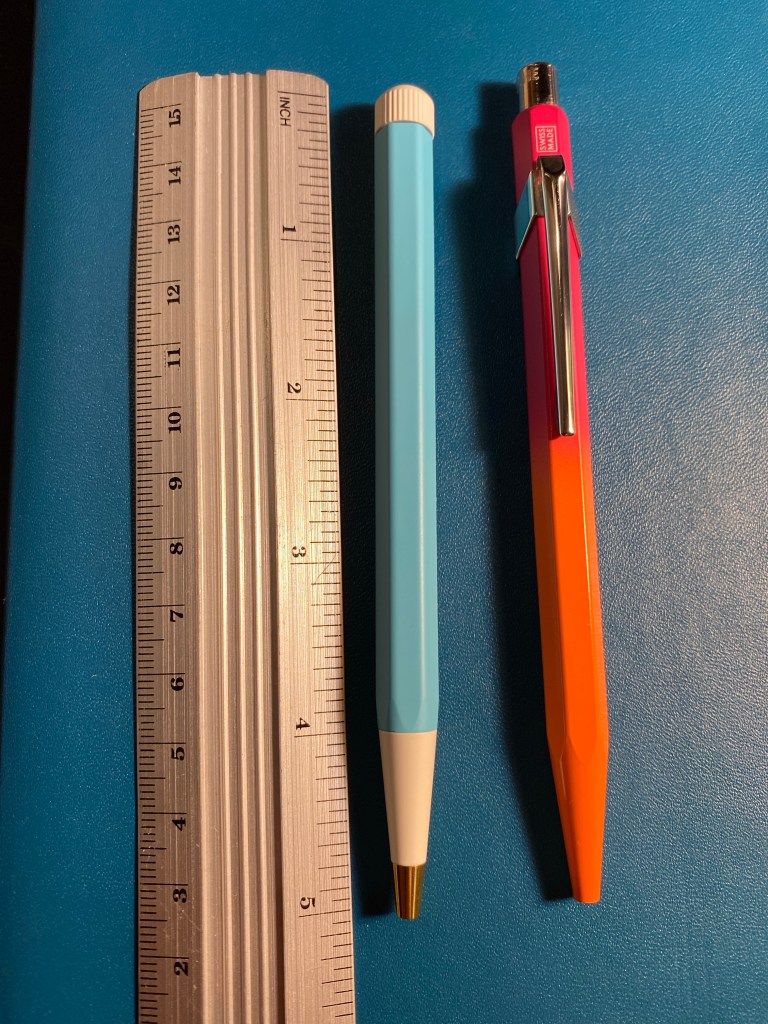
The Drehgriffel is similar in size and weight (and price) to the Caran d’Ache 849 metal barrelled pens. It’s a smidge wider and heavier than the 849, but they are very much in the same ballpark. Here they are side by side:
Here’s a writing sample of the Drehgriffel against a few other gel refills. It’s noticeably wider than Japanese 0.5 gel in pens, and is closer to 0.7 gel ink refills. I tested it on a Moleskine squared notebook (and further down you can see it on a Leuchtturm1917 notebook).
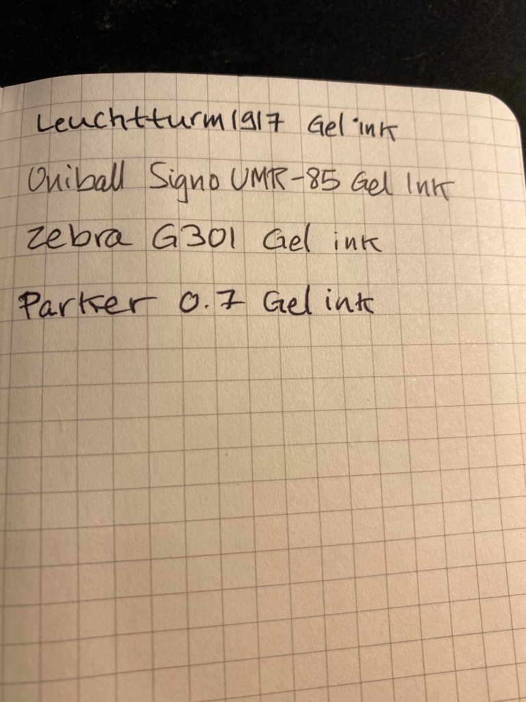
Here’s the reverse side of the Moleskine page. The Drehgriffel bled a bit more than its counterparts:

Here’s a writing test on a Leuchtturm1917 80gsm blank notebook:
Here too there was visible show through an some bleed through, although there was less bleed through than the Moleskine.
The Drehgriffel writes smoothly, but there’s nothing in the pen’s smoothness that justifies the advertising. It’s a nice pen, that comes in a variety of colours and that has an interesting design and good refill. In my opinion it would have been more popular if it came with a click mechanism and was a little cheaper, but I still appreciate the fact that Leuchtturm chose to come out with a gel ink pen first and not the more obvious choice of a ballpoint. I like the look and feel of my Drehgriffel, although I would have liked it better if it would have been a little bit wider. As it is if I use it for more than a page or so without pause it causes my hand to ache and cramp up.
Now I’m wondering if there’s going to be a Drehgriffel Nr.2 with a click mechanism perhaps?
