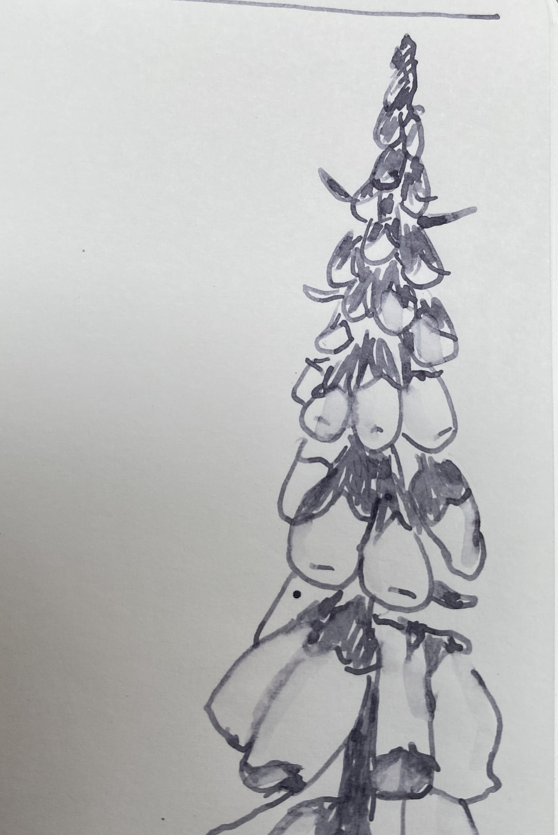
Our Old Friend Joe

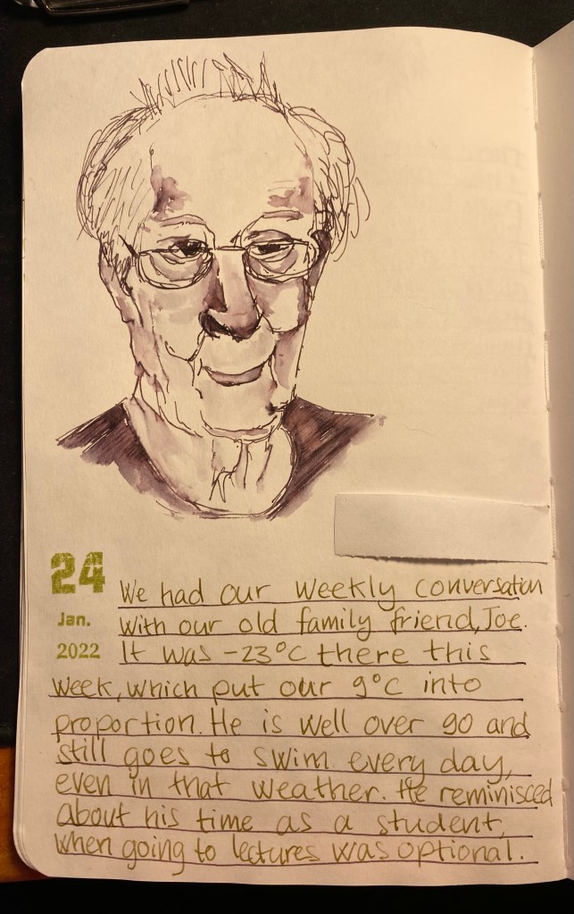
We had our weekly zoom call with our old family friend, Joe. I did my best to sketch him while we talked. It was slow, hard work and came out only so-so, mainly because my neuropathy is really bad lately (which is also why there’s been a dearth of posts). Still, I’m glad that I tried.

Sketch of our old friend, Joe.

Drawn with a Lamy LX Palladium, fine nib, filled with Diamine Harmony (an Inkvent 2021 ink).

Writing done with a PenBBS 535 Year of the Ox, RF nib, filled with Pilot Iroshizuku Ina-Ho.

The sketchbook is a Stillman and Birn Alpha 5.5’’ x 8.5’’.

Uni Jetstream Edge Review

I’m not a fan of ballpoint pens. Their refills tend to streak and glob, the ink they use isn’t ass dark or vibrant as their gel ink and rollerball counterparts, and something about them (probably the lightness and inconsistency of the refill) makes me grip them with “the grip of death,” which inevitably brings on hand cramps and pain. They are, however, useful at times, so I am constantly on the lookout for new and better ballpoint pens and ballpoint refills.

Enter the Uni Jetstream Edge, a ballpoint pen with a strikingly modern design and the world’s first 0.28mm ballpoint refill (there’s also a 0.38mm refill option but I won’t review it here).

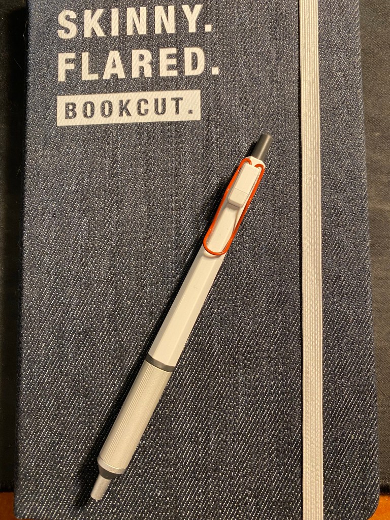
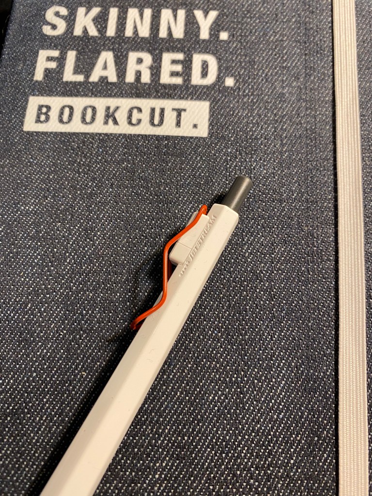
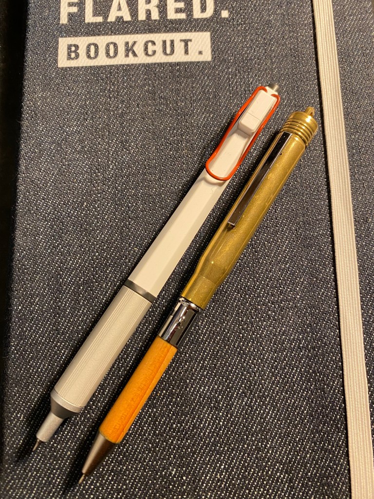
Uni Jetstream Edge white and red body with 0.28 mm refill on a Moleskine Denim.

I love the design of this pen. The body is plastic, but the grip area is metal and relatively wide, which makes for a very well balanced pen. The bent wire shape of the clip adds to its modern and clean aesthetic, and I like that chose to make it red and not black or silver in the white edition of this pen. The clip looks like it would be a fun and springy fidget tool, but it’s quite inflexible and immobile. That’s great if you plan on using it to clip it to a shirt pocket, but the unusual clip shape means that clipping it to paper will likely crumple and even tear the paper. I don’t normally clip my pens to things, so that’s not going to be an issue for me, but YMMV.

The clip, and the subtle Uni Jetstream branding.

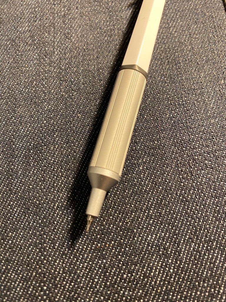
The Jetstream Edge grip section is metal and round, unlike the plastic, faceted pen body. There are grooves carved into it that make it comfortable to hold, and the refill sits very snugly in the pen sleeve. This is a pen that’s not going to rattle while you write.

Jetstream Edge grip and business end.

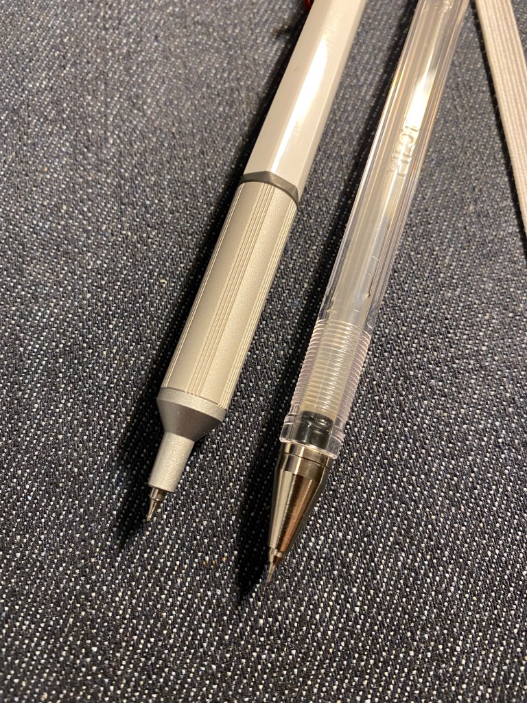
The 0.28 mm Jetstream ballpoint refill has been designed so that the tip won’t suffer the usual “bent out of shape the moment you breath too hard on it” fate of the Pilot Hi-Tec-C refills. Its sturdy but still keeps a tapered, fine tip, which means that you can use it with rulers and templates if you so desire.

Jetstream Edge on the left, Hi-Tec-C on the right. Note the difference in the tip and nose cone design between the two, and that the Edge grip is wider.

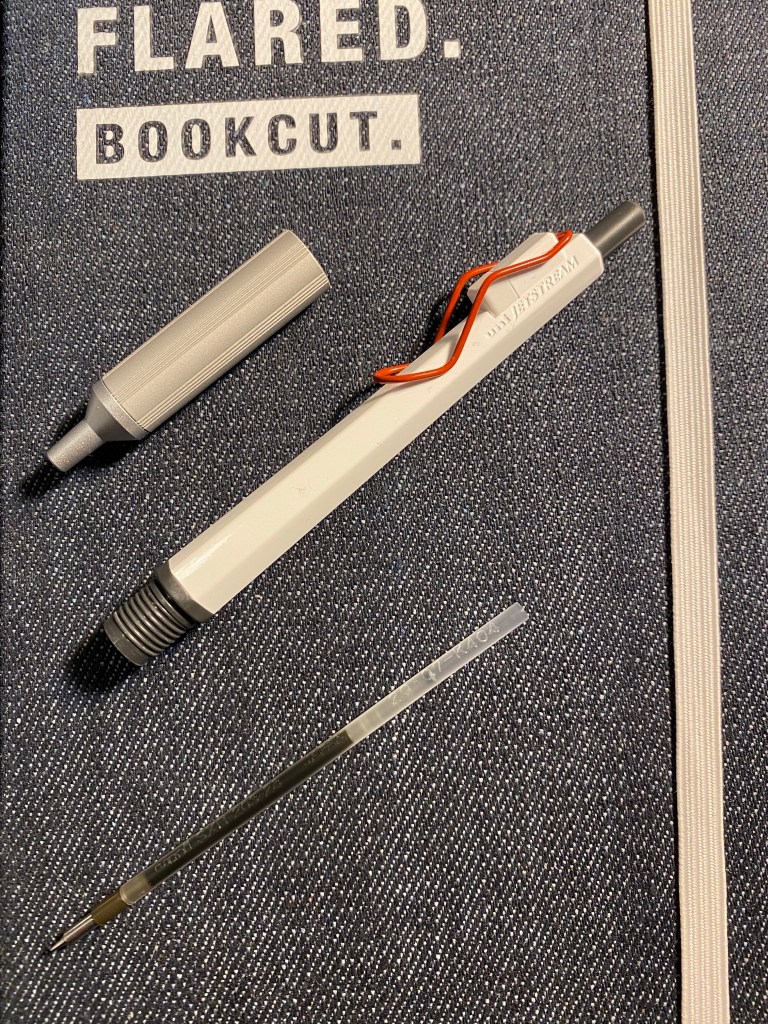
The refill the Jetstream Edge uses is the SXR 203-28 for the 0.28 mm or the SXR 203-38 for the 0.38mm tips size, although it appears that can also accept the Uni SXR-80 line of refills used for Uni-ball’s multi-pens. If so, that could open a wider range of refill colours and tip sizes.
The original, SXR 203, refill is very slim, which would have been problematic if it was a gel ink refill (you’d have written it dry in a day), but shouldn’t be a problem with a ballpoint refill. That being said, I doubt that this refill will last as long as a standard Parker one, not to mention the Caran d’Ache Goliath.

The Jetstream Edge dismantled with the refill on the side.

While Uni-ball brags that the Edge uses the first 0.28mm ballpoint refill in the world, there are other brands that use ultra fine ballpoint refills not far from it in size. My Midori (now Traveler’s Company) Brass Ballpoint pen has a refill that is around that size, so I thought I’d compare the two.

Jetstream Edge on the top left, the Traveler’s Company Brass Ballpoint is on the bottom right.

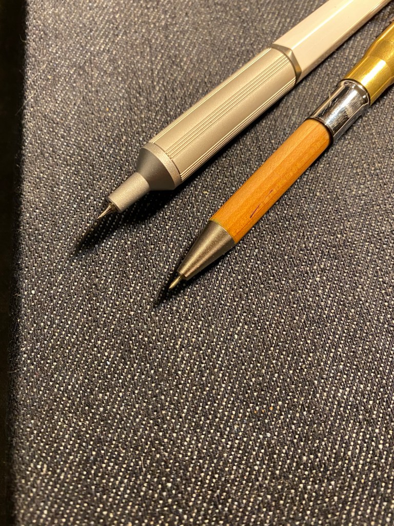
Here are the pen tips side by side. The barrels, grips and cones are very different but the refill tups are very much alike.

Jetstream Edge on the top, the Traveler’s Company Brass Ballpoint is on the bottom.

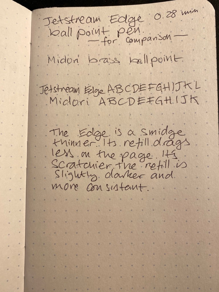
Below you’ll find a writing sample of the Jetstream Edge, and one of the Midori/Traveler’s Company Brass Ballpoint for comparison. Perhaps unsurprisingly, being a Jetstream refill, the Edge’s refill is better than the Midori’s even though it is slightly thinner. It lays down a more consistent and slightly darker line (although nowhere near as dark as a gel ink pen’s line).

I wrote seven full A5 pages with the Jetstream Edge, to see how consistent the line is over time, and to see if it would cause hand cramps after prolonged use. While I was writing I made a concentrated effort to keep a light grip on the pen. The barrel design helped with this, and the pen’s light weight and front heavy balance made it nice to hold and write with. But the Jetstream Edge is a pen with a sweet spot, not unlike certain fountain pens. Angle it too much and the refill starts to skip, so you need to write with the pen as vertically as possible. That slightly awkward writing angle may have been the cause of my hand cramps, but whatever the cause may be, this is not a pen that will work for long writing sessions for me.

So, do I recommend the Uni Jetstream Edge? If you’re a ballpoint fan and an ultra micro tip fan, then yes. Otherwise, there are cheaper and better ballpoint pens out there, even within the excellent Uni-ball Jetstream line.
Will I be using the Jetstream Edge? Yes, although not for long writing sessions. I love the line it lays down, and I like the aesthetic of this pen. Then again, I’m a fan of the Pilot Hi-Tec-C

Karas Kustoms Steampunk Bolt V2 Quick Review

I wasn’t planning on reviewing the Karas Kustoms Steampunk Bolt V2 pen because I was sure that it would be sold out by the time I got to it. Somehow, however, there appear to be a few still on sale on the Karas Kustoms site.

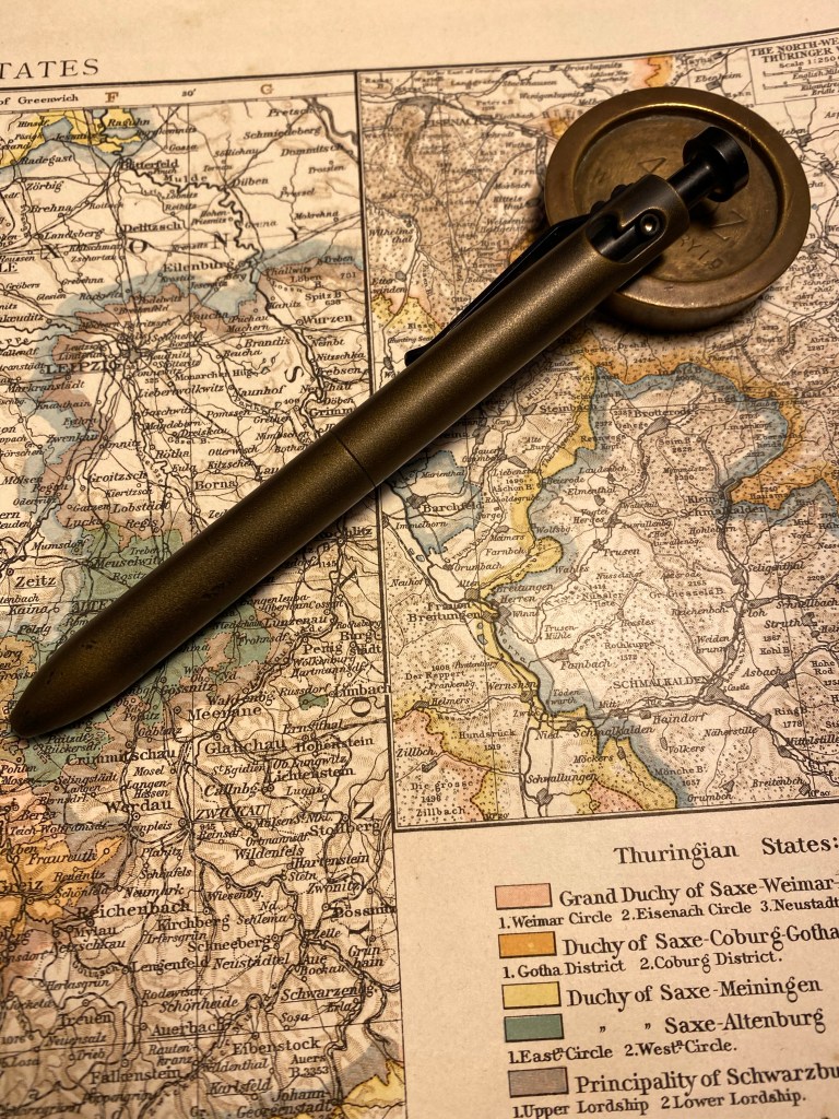
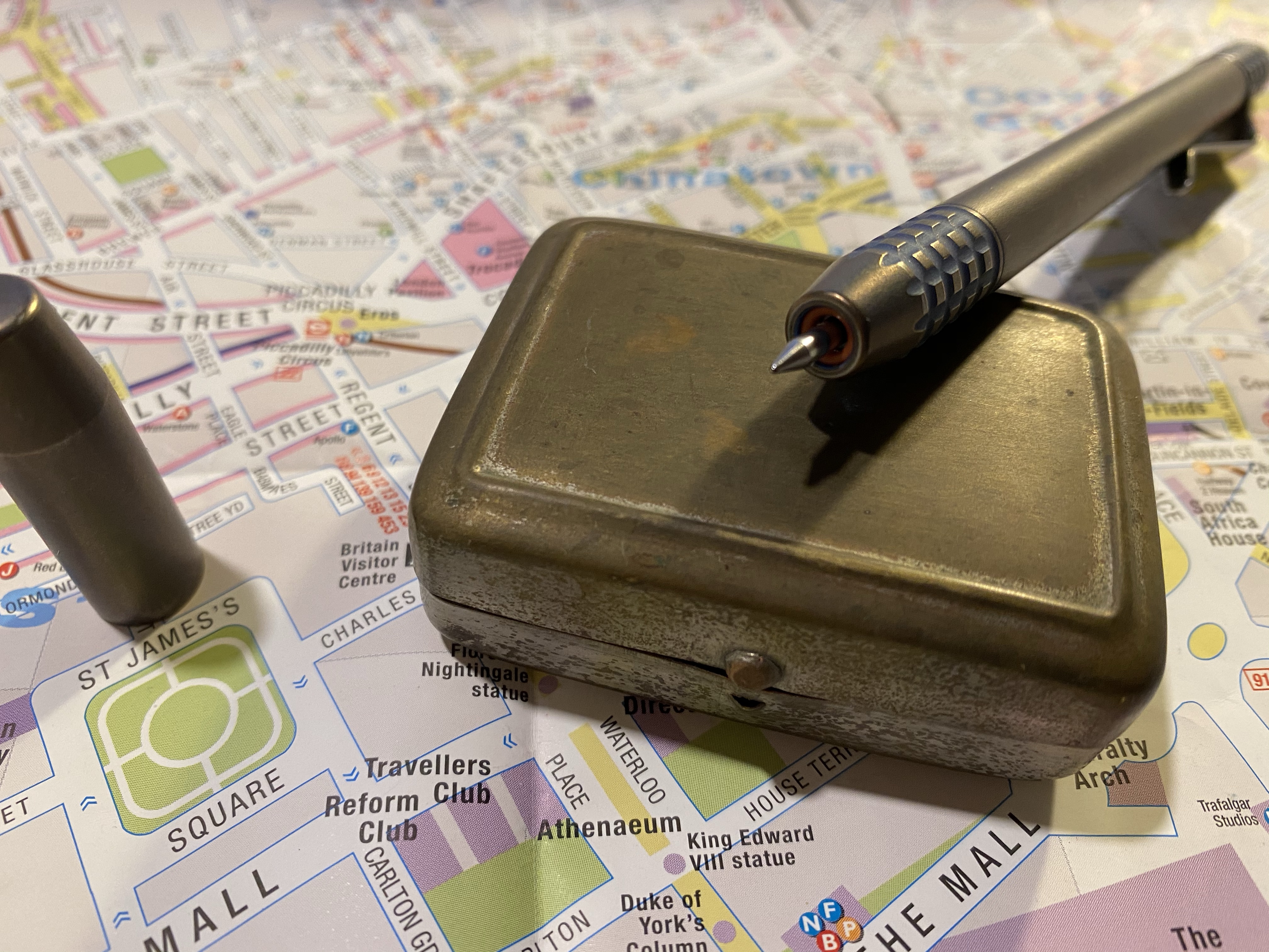
Dinges and Cerakote finish work together to create a really unique pen.

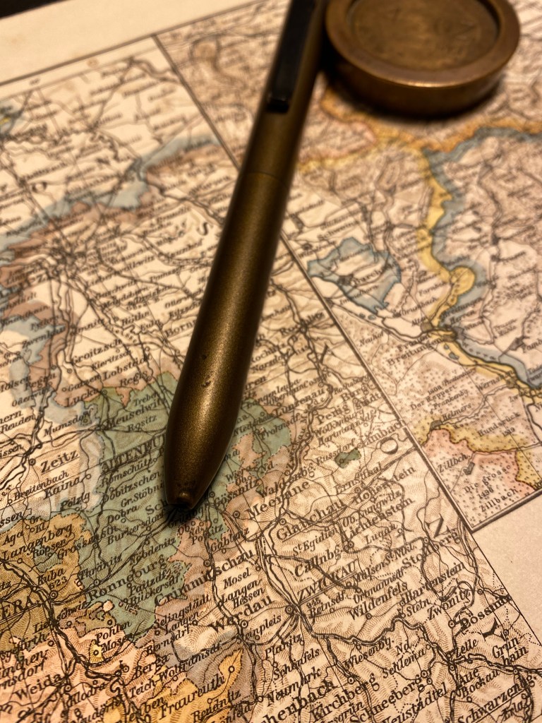
The Steampunk Bolt v2 has the same aluminium body and shape as the anodised Bolt V2, but it’s gotten a distressed bronze treatment in Cerakote. The basic Bolt pen has been dinged before the Cerakote finish has been applied, and the result is fantastic. The pen really earns the “Steampunk” title.

Big dent in the end of the pen, smoothed over and covered with bronze coloured Cerakote.

The Cerakote finish is smooth but not slippery, and really fantastic to hold. It’s also nothing like any other Cerakote finished pen that I’ve seen so far: it really gives the pen a bronze look without the bronze weight or smell. The pen is light (for a machined pen – don’t compare it to plastic), and well balanced. The black anodised bolt mechanism is as smooth to engage as ever, and works well with this finish.

Every ding adds to this pen’s looks. It’s just going to look better with time, I think.

There are two caveats to take into account with this pen (and other Karas Kustoms Bolt V2 pens):

  1. The pen comes with a Pilot G2 LG (as in large) 0.5 refill. I haven’t been able to customise it to work with my beloved Uni-Ball UMR-85 refills (the bolt won’t engage). It’s a decent enough refill, but I wish that it had been built around the standard G2, and so had more customisation options.
  2. There is a slight amount of play in the tip which makes it faintly click at times when you write.

All in all this is a very good machined bolt action pen, with a fantastic and very unique finish.

Finished a Pilot-Hi-Tech-C Refill

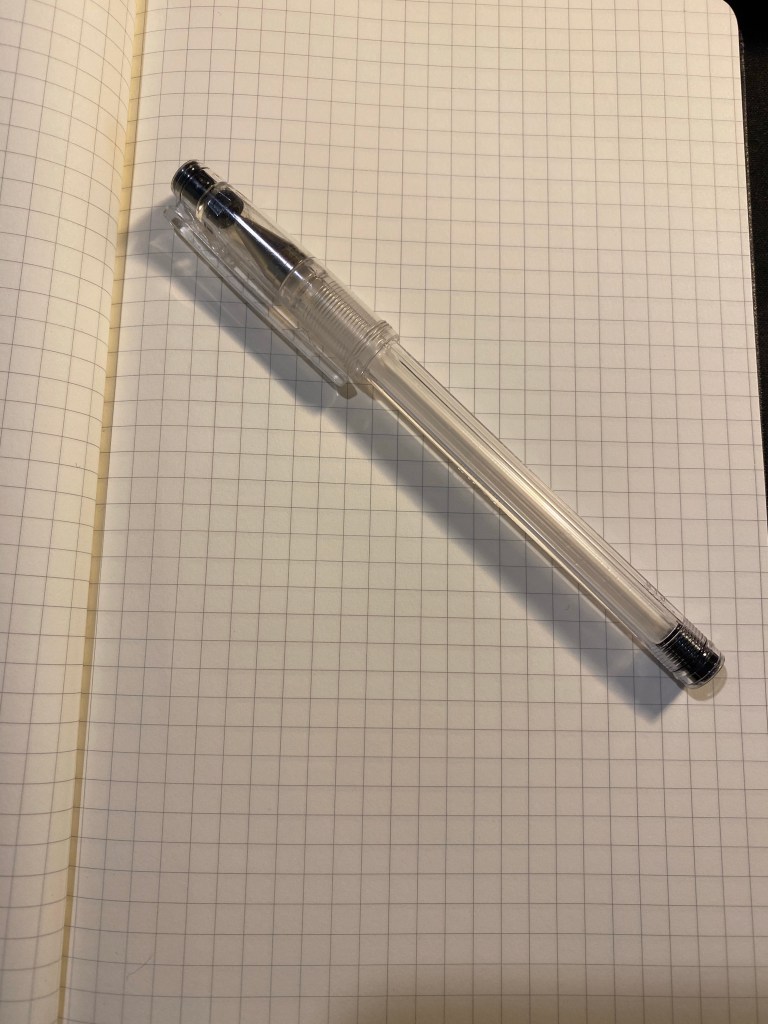
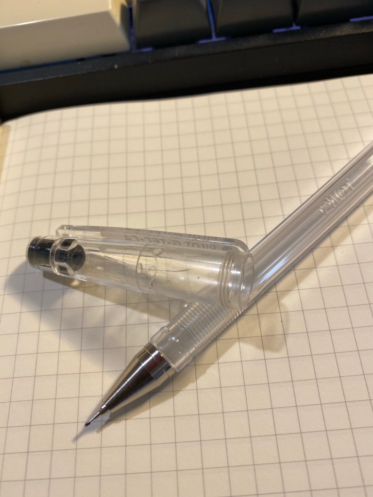
For the first time ever I managed to write a Pilot High-Tech-C (also known as G-Tech-C) refill dry. The tip didn’t bend to death because someone breathed on it wrong, the refill didn’t have strange bubbles that meant that it just decided not to write any more, and the ball in the tip didn’t break off (thus rendering the pen into a particularly terrible rapidograph). This feels like an achievement and I am going to celebrate — by picking up a brand new High-Tech-C of course.

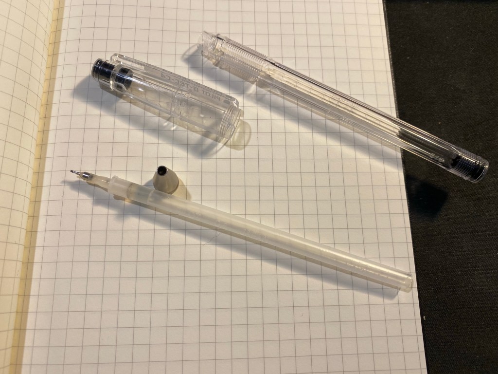
Empty pen refill.
Just a single crack on the cap from a fall early on, that’s all the damage this pen took.
Empty refill. Didn’t believe that it could be done.

We are not amused

My brother’s cat was not amused when he tried to take his laptop back from her.

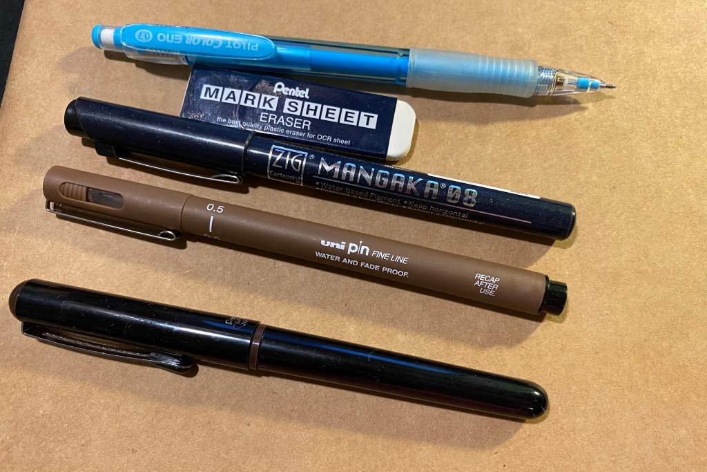
Sketched with a non-photo blue Pilot Color Eno 0.7 mechanical pencil and inked with a Pentel GFKP Sepia, Uni pin 0.5 sepia fineliner and Zig Mangaka 0.8 fineliner (for the writing) on an Artcoe Frisk Sketch Book. Could have done it all with one pen and no underdrawing but I’m experimenting with my setup at the moment.

A Pen Hack, a Field Notes and the Hi-Tech C

I had an issue with my Ti2 Techliner where my favourite gel ink refill (the Uni-ball UMR-85) and basically all gel ink refills dried out and stopped writing a few words after I uncapped the pen. While ballpoint refills like the Jetstream faired better, they also would “fade out” after a few lines, and then, after some coaxing, return to normal. It couldn’t be that the refill was drying out, as after capping the pen, it wrote well enough again for a few words. It was a refill problem, as the same refill wrote perfectly fine in a different pen.

I tried searching for answers and asked around in the Pen Addict slack but got no answers. It was frustrating, since I liked the pen, but couldn’t use it because it wouldn’t work with my preferred refills. I had a feeling that the magnet at the tip of the pen was what was causing the ink flow issue, but it only yesterday did I figure out how to bypass the very thing that was holding the pen together.

What I did was change the order of the parts in the front section of the pen. The original order was refill, plastic spacer, red o-ring, magnet and then the section screwed over that. What I did was reverse the o-ring and the magnet so now it’s: refill, plastic spacer, magnet, red o-ring, and then the section. The result is kind of pleasing to the eye, and more importantly it fixed the flow problem completely, and now I can actually use this fetching pen.

You can see the red o-ring around the tip of the pen.

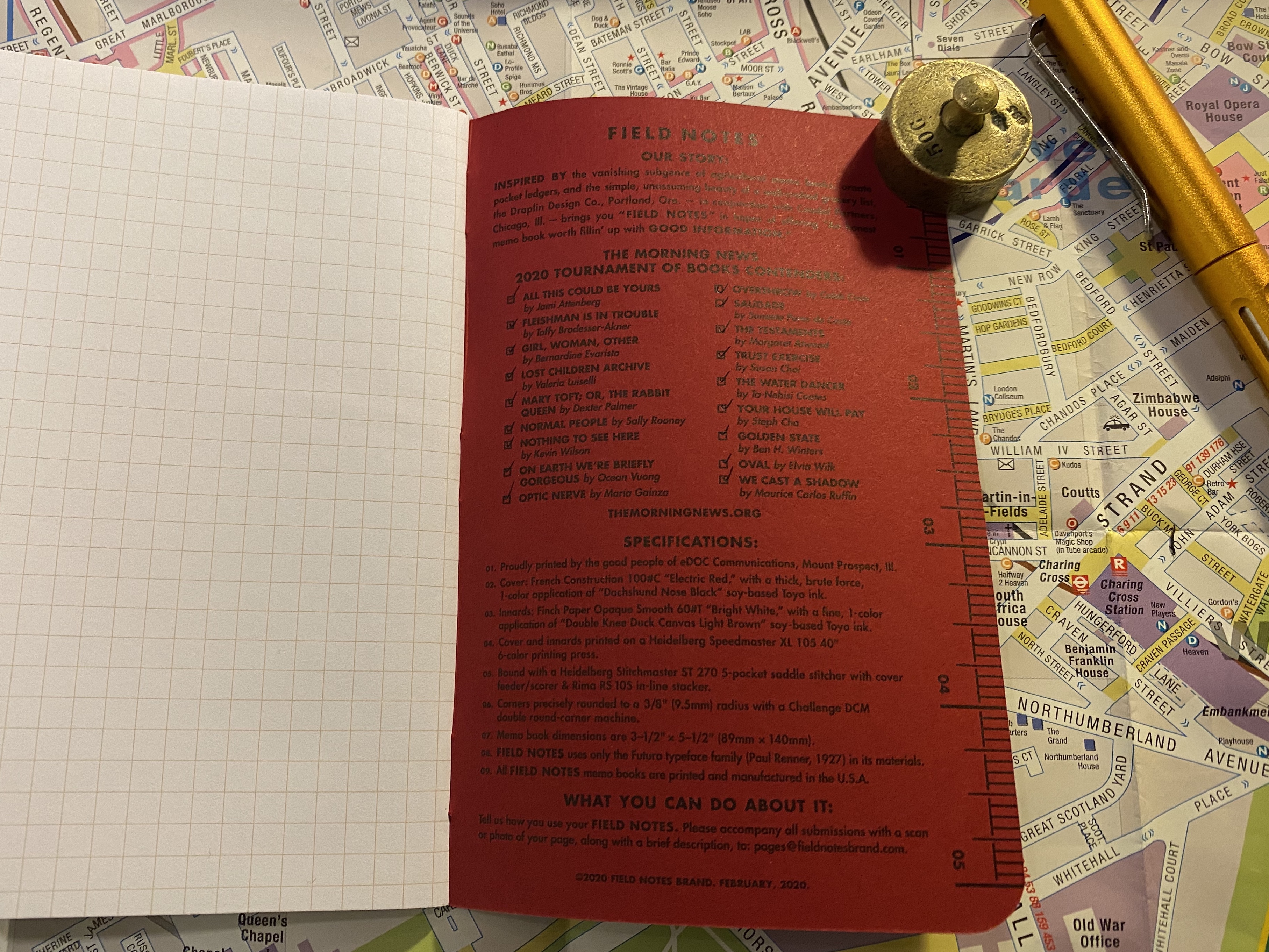
I tend not to review Field Notes because they arrive so late to me (due to postal issues, not Field Notes issues) that it seems irrelevant to review last quarter’s edition when everyone already has the new one at hand. Covid-19 has made the postal problems even worse, and so only now, and after contacting the wonderful Field Notes people and getting a reshipment, have my Vignette notebooks arrived.

What also arrived were my Field Notes Rooster 2020 notebooks, which are part of Field Notes’ yearly sponsorship of the Morning News and the Tournament of Books. I read all of the books in the Tournament of Books shortlist this year, for the second year in a row. I didn’t post reviews of them all in this site as I didn’t enjoy the last 3-4 books, and I didn’t feel like posting negative review after negative review.

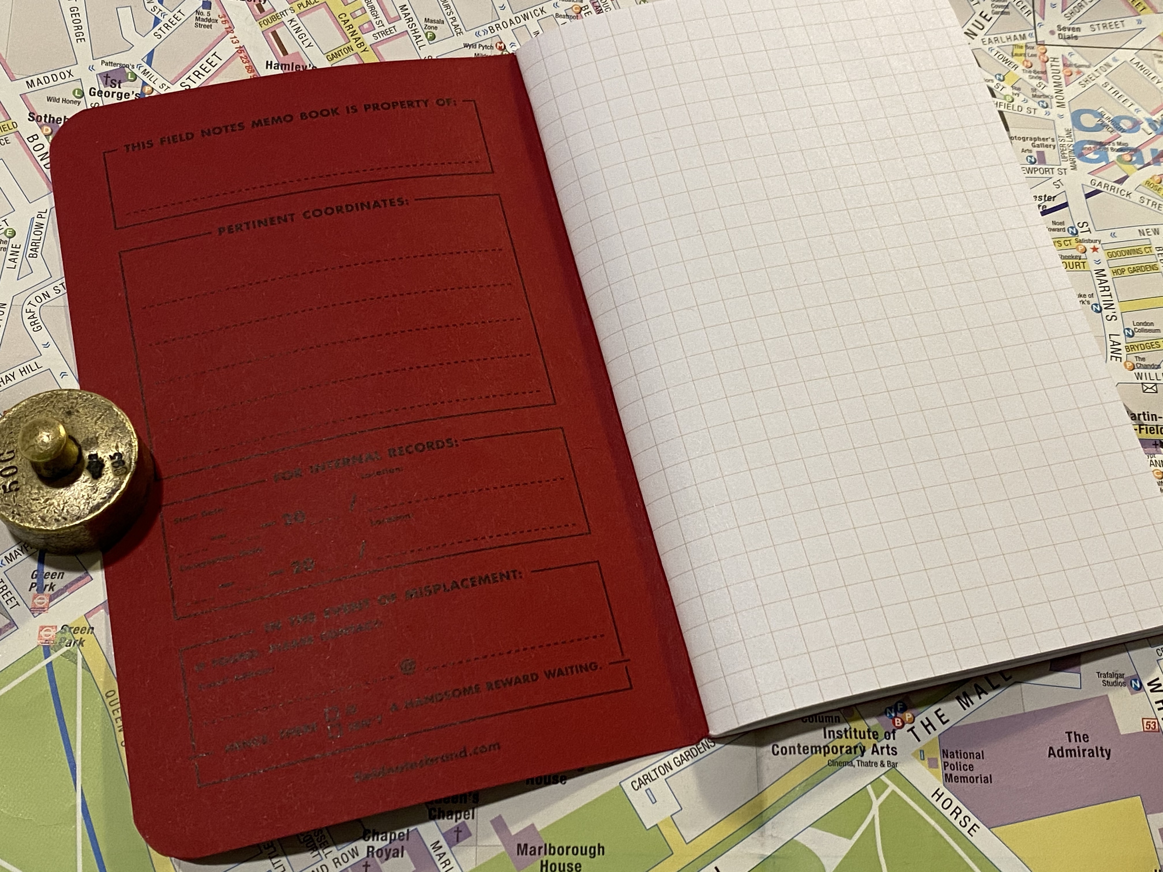
I did, however, love this year’s Field Notes Rooster special edition notebook, and it is by far my favourite Rooster special edition notebook that Field Notes ever issued. It is a squared notebook, and not lined, for the first time ever, and the bold red and black print on the cover is much more striking than their usual craft or cream choices for this series.

Bold, bright colours on the cover.

The fact that these notebooks (sold as singles, with the proceeds going to literacy related charities) arrived so late means that I have a had a few months to think about the Tournament of Books 2020 reading list.

Squared notebook.

I enjoyed the 2019 reading list more, but the 2020 list was overall a good, interesting list of contemporary writing that I for the most part would not have read otherwise. There were a few mediocre books on it, and a few that I really disliked, but as a whole it wasn’t a bad list. I may try reading next year’s list too.

The list. There are 18 books on the list, 4 books that I though weren’t worth reading, of them two were a silly, bloated waste of time and two were infuriatingly bad. There were 7 books that I thought were real gems.

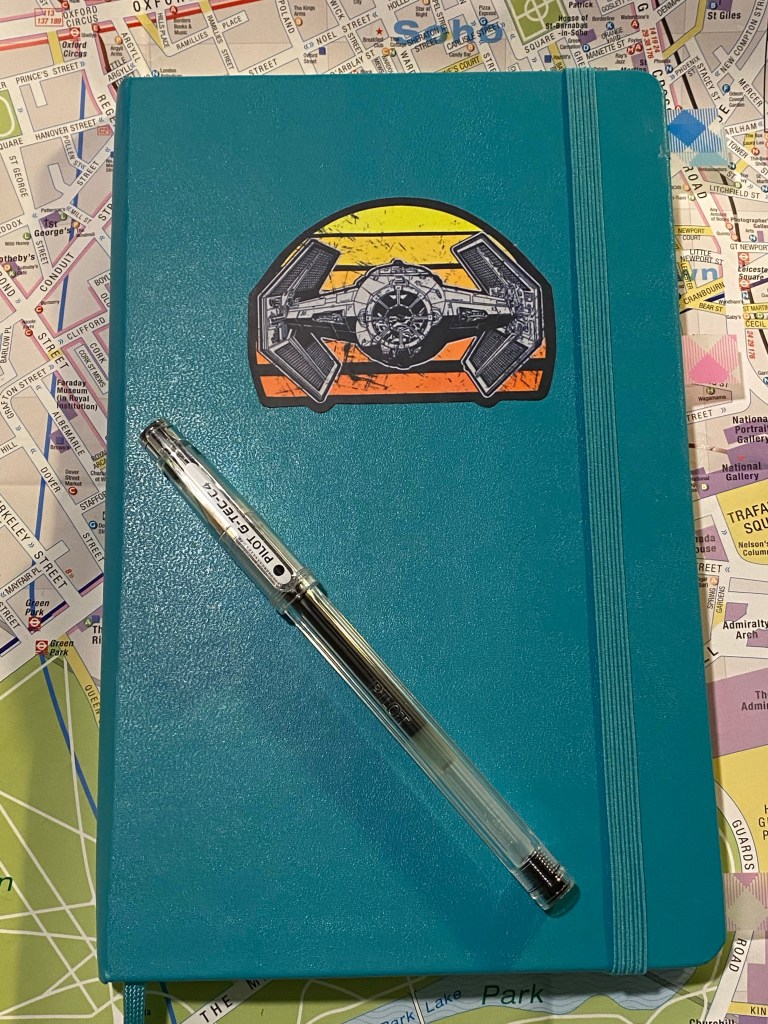
I wrote a few weeks back that I was struggling with my notebook setup, and things have changed since then. I’ve settled on using a blank large Moleskine hardcover in Reef Blue and a Pilot Hi-Tech C 0.4 for a running list of work projects and related notes.

I’ve customized the cover with a Star Wars decal to make it pop and let me easily identify it.

I use the right hand side for a running tasks per project (I still manage major project points in the Things app), and the left hand side for related points, reminders and ideas. Each project has at least one spread, and I drop in pages with ideas and things to remember in between the project pages.

The Pilot Hi-Tec-C (also known as the G-Tec-C4) is not a pen that I would recommend because it’s so very delicate and unreliable, but I used to be a fan years ago, and in a burst of nostalgia (and against my better judgement) I’ve gone back to using these pens. There’s something about the barrel design of this pen, combined with it’s needle tip that makes me enjoy writing with it. Again, I wouldn’t recommend it, as you’ll rarely see a refill through (the tip will bend, or it will become to scratchy to use, or it will dry out and become unusable) and in general the Uni-ball Signo DX are much better 0.4 tipped gel ink pens. But the heart wants what the heart wants, and this is what I prefer for daily work use right now.

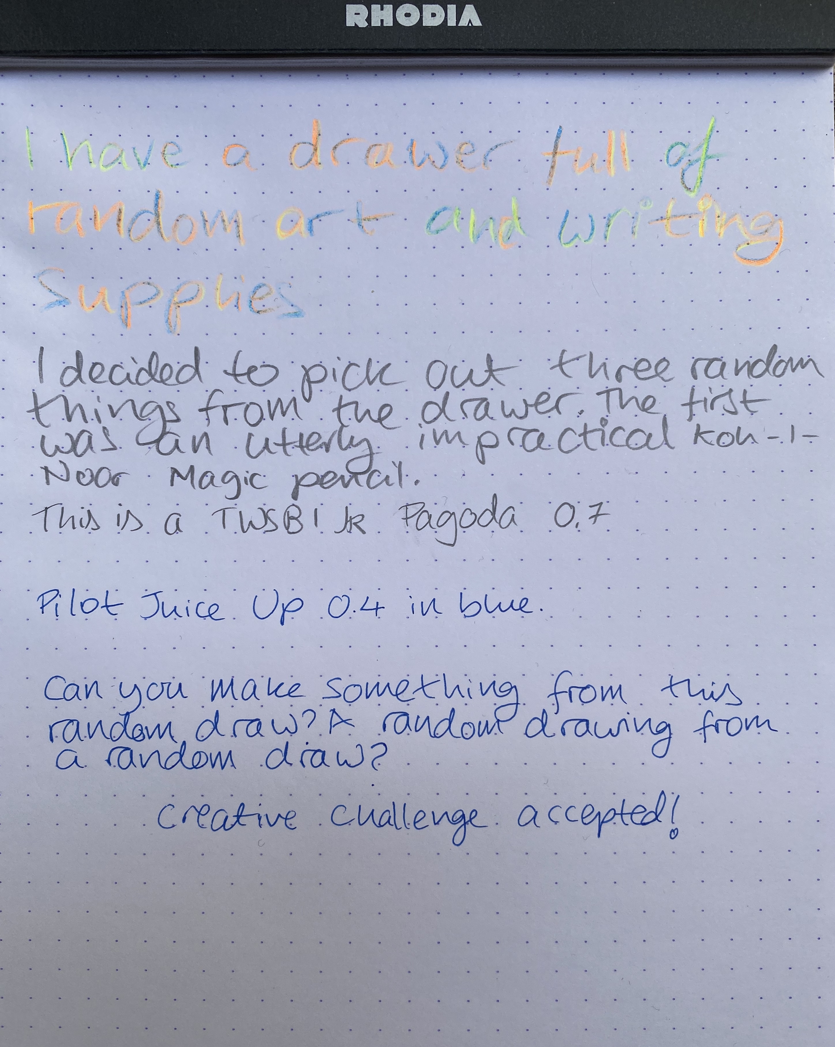
Creative Draw: Koh-I-Noor Magic pencil, TWSBI JR Pagoda 0.7 and Pilot Juice Up 0.4

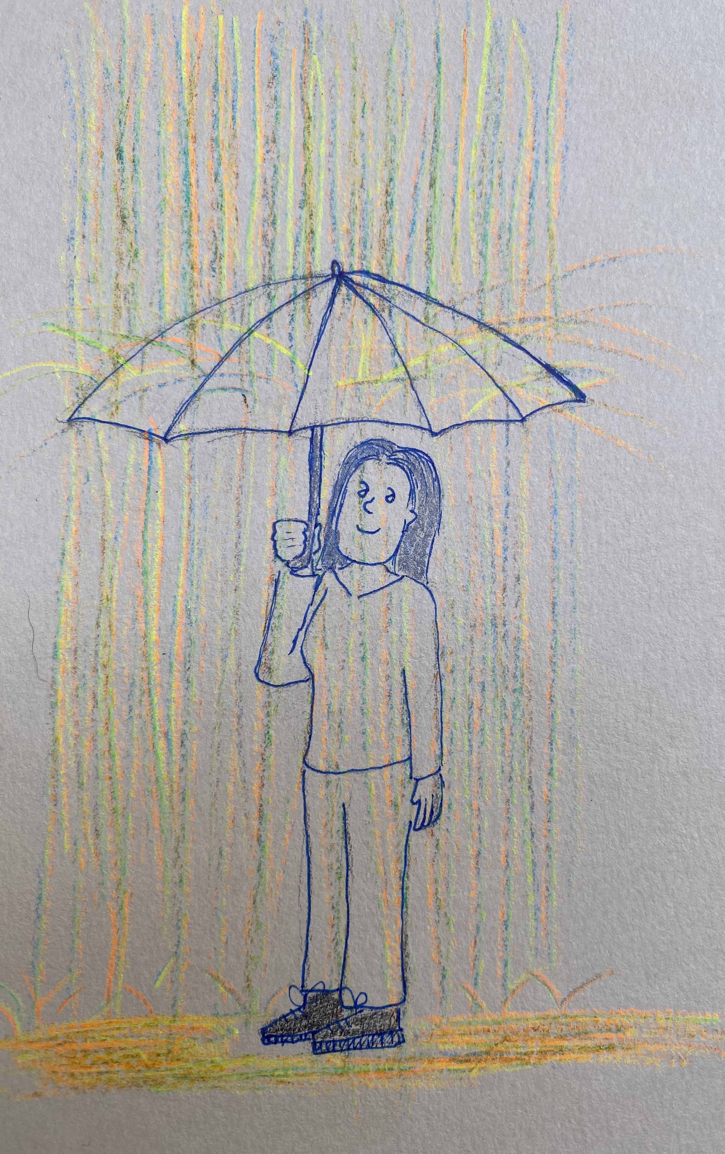
Things have been tough lately and I haven’t been in the mood to draw anything, write anything, post anything. So I decided to make myself create something, as silly and small as it could turn out to be, just to see if I can draw myself out of the funk.

I dug into my largest art and stationery supply drawer, and picked out three random items: a Koh-I-Noor Magic pencil, a TWSBI Jr Pagoda 0.7 mechanical pencil, and a Pilot Juice Up 0.4 in blue ink. Nothing good could come out of this random draw, I thought to myself, but I’ll draw something anyway:

The Koh-I-Noor Magic pencil comes in many varieties, some of the actually pragmatic. This Magic pencil is just ridiculous. It’s a giant, glittery, neon mess that makes me smile.

The TWSBI Jr Pagoda is a solid mechanical pencil, but in the battle against the Uni-ball Kuru Toga or any kind of drafting pencil it is always going to lose. I enjoyed using this underdog, and I think that design-wise it’s a very good mechanical pencil.

The Pilot Juice Up is excellent, and Pilot should replace all of its Hi-Tec-C pens with this refill (and perhaps even with this design). The refill gives Uni-ball gel refills a run for their money, and the barrel design is both sleek and ergonomic. This is a phenomenal pen that I really need to use more.

This turned out to be a fun exercise in creativity, and it made me smile for a bit. Will I do it again? Perhaps, perhaps, perhaps.

PenBBS 456 Smog RM and Pilot Iroshizuku Fuyu-Syogun

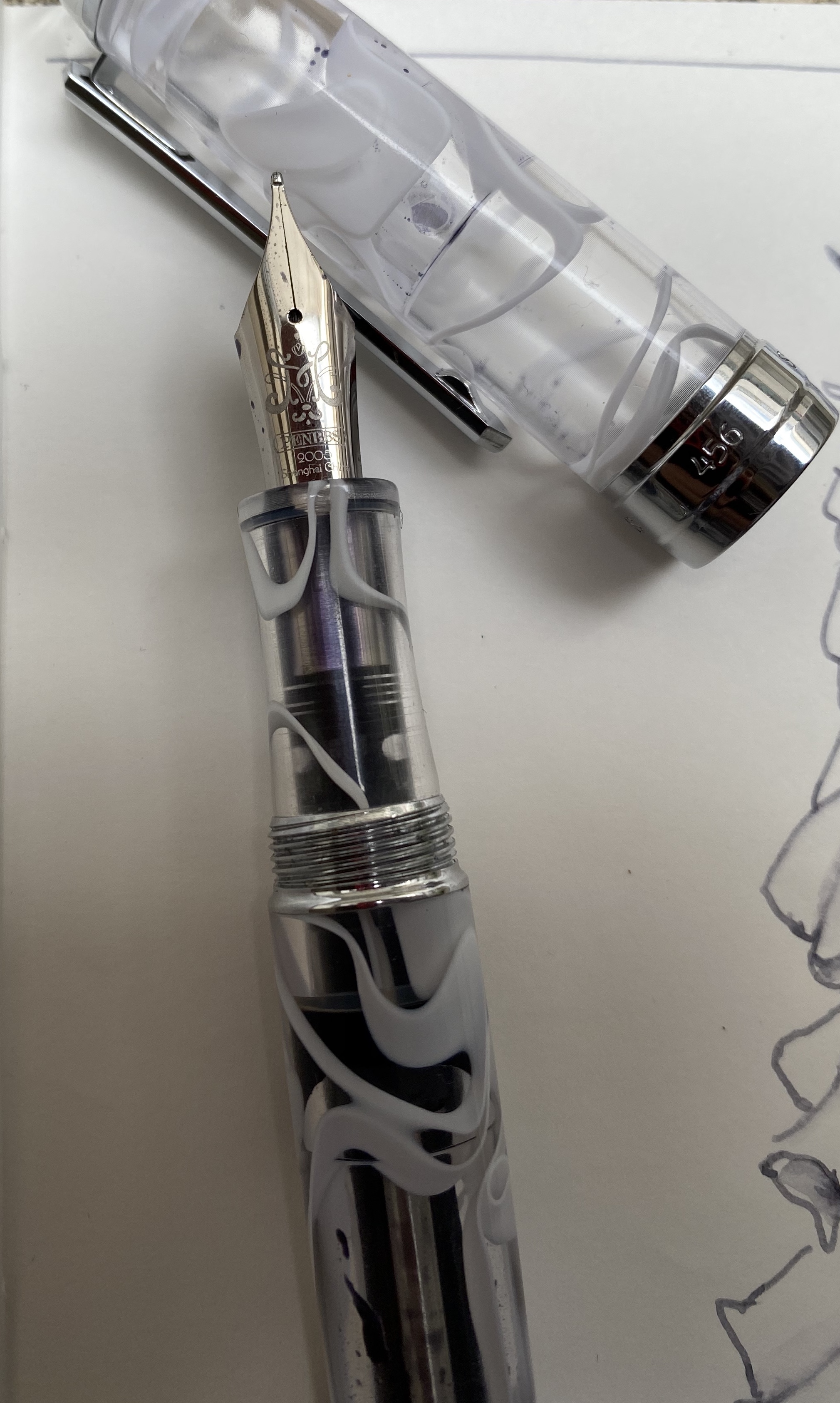
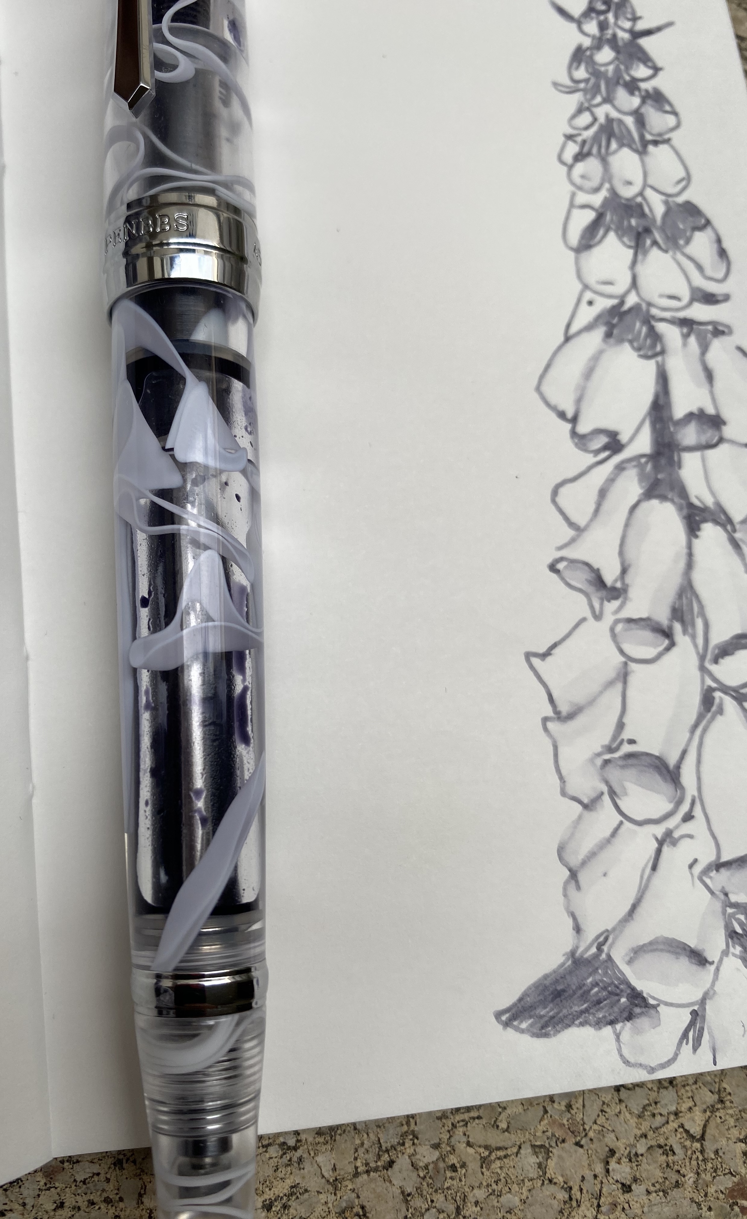
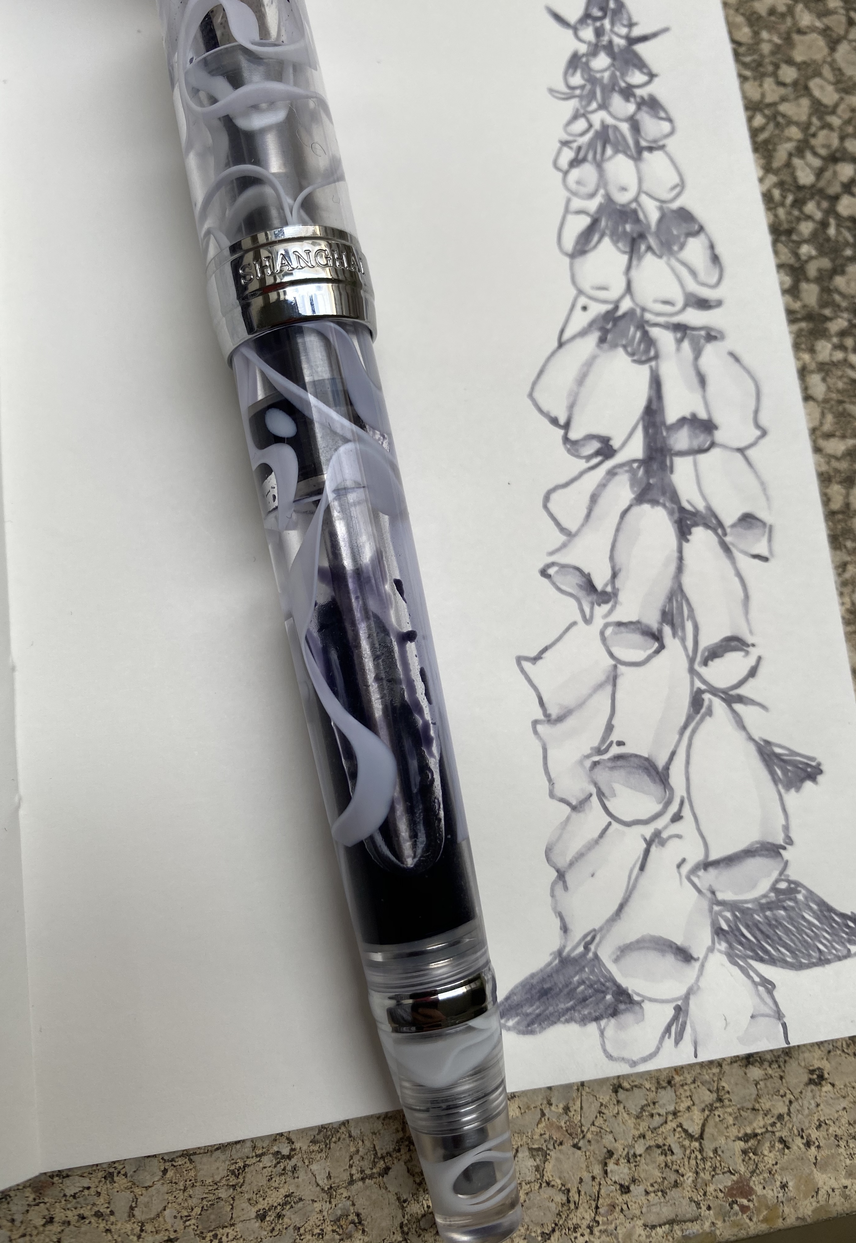
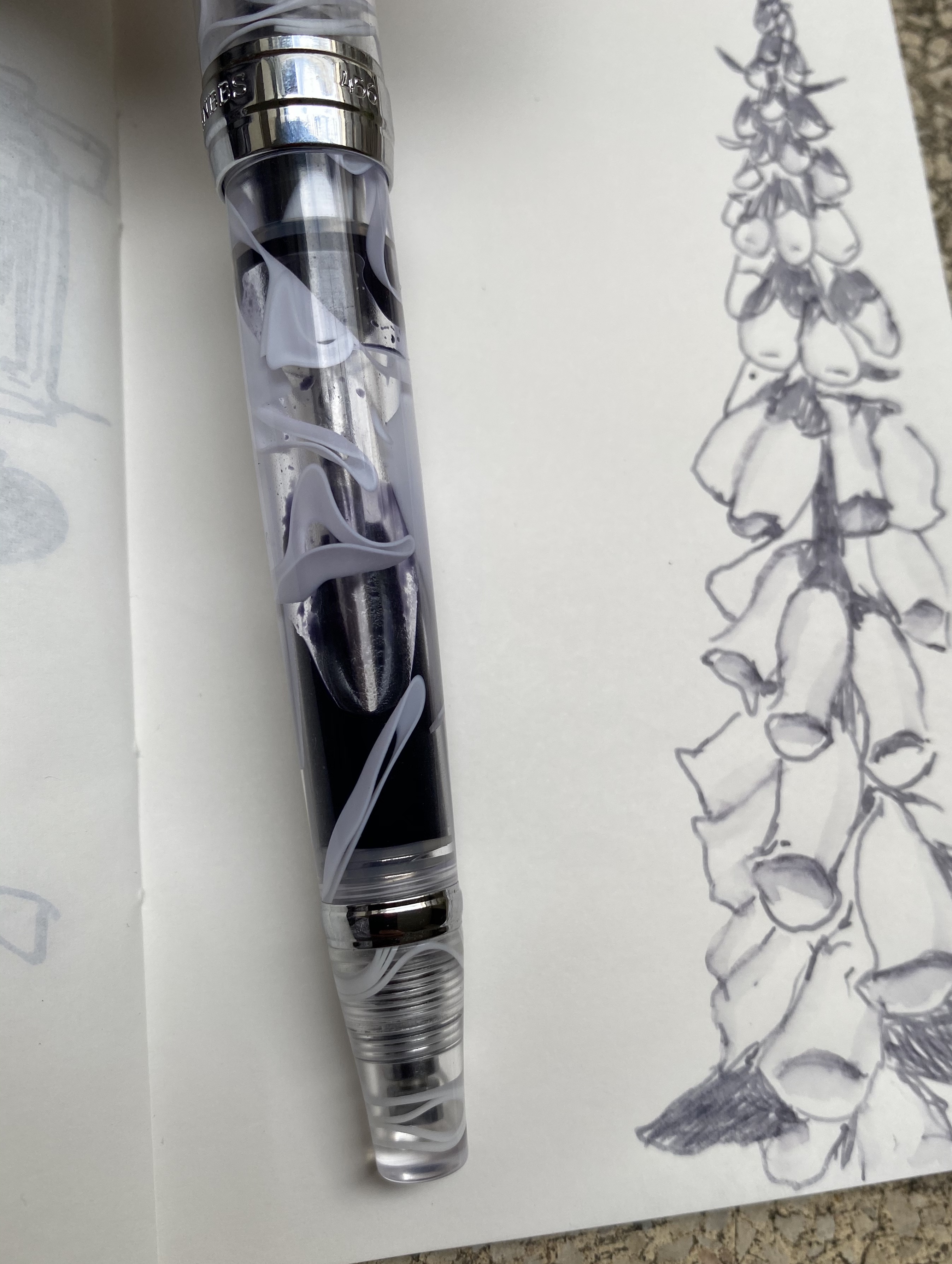
I ordered the PenBBS 456 Vacuum Filling Smog 54 RM at the same time I ordered the PenBBS 500, because I was intrigued by the filling system, and I wanted a PenBBS 500 with the Smog design but there weren’t any available. I was expecting to like the PenBBS 500 more because from the pictures it seems to have a more classic design, but the PenBBS 456 is the perfect example of how pen pictures often misleading.

The 456 is a much sleeker pen than its chubby 500 counterpart. There’s also significantly less hardware on the 456, which makes it both lighter and better looking. Massive chrome details on fountain pens just seem to cheaper their look in my eyes. If the cap band had been about half the size then the 456’s design would be better, but as it is it’s not a pen that I’d be ashamed to carry, and it looks more expensive than it actually is.

The steel nib on this is a medium, and it writes at about a 0.7mm line, as described. The nib design itself is elegant and clever, with a calligraphy “M” designating its width. The nib itself is smooth with some feedback, and has little or no give.

I purposefully filled this pen only about a third of the way up once I realized what a massive ink capacity it has. The filling mechanism is somewhat elaborate, like all vacuum fillers, but it works, and unlike the end-cap on the PenBBS 500, the PenBBS 456’s end-cap doesn’t twist off unintentionally.

The smog material is really beautiful, and it’s a way to get some of that Visconti vacuum-filler, London Fog feel without breaking the bank. This pen proves that you don’t have to pay hundreds and hundreds of dollars to have a nice pen that you enjoy writing with.

Some more closeups on the overly large cap band (if only it had ended on the line below the “Shanghai”) and the lovely smog material. You can also see the filling mechanism clearly:

The material looks even better when the pen is filled up with ink, but I just wasn’t willing to dump out so much ink, and I knew that I would be forced to do that if I topped the pen up:

Pilot Iroshizuku Fuyu Syogun was one of the first Pilot Iroshizuku inks that I splurged on. It shades beautifully, and is a lovely cool (i.e. bluish) grey that is utterly not waterproof, and so can be “stretched” and reworked as you can see in the small sketch that I did:

This was drawn on Tomoe River paper, but you’ll see shading on Rhodia and Clairefontaine paper as well. Of all the grey inks I own, this one is still my favourite. It’s dark enough to be readable (and appropriate for office use), and offers a lot of interest and drawing potential with its shading.

Like all pens that aren’t cartridge converters, cleaning this pen out will take a bit of effort, and vacuum filling pens are more difficult to clean out than piston fillers or lever fillers (only button fillers are worse IMHO). It just means that you’ll need to have patience when filling and cleaning this pen out, and that you probably shouldn’t put shimmering inks or inks that are difficult to clean out (or stain the pen body) in a pen like this. Then again, the pen costs $32, so if worst comes to worst, you haven’t ruined an expensive pen.

I wish that PenBBS would pick a naming convention that is easier to remember than the one it is currently using. But other than that and the not great cap band, for double the price the PenBBS would still be a great buy.

One month in

PenBBS 456 Vacuum filler Smog RM nib with Pilot Iroshizuku Fuyu-Syogun on Rhodia dot pad.

Pilot Vanishing Point Matte Black and Colorverse Selectron Review

There’s something about black fountain pens and black ink that make them popular beyond what common sense would dictate. The blacker they are the more popular they are, especially if you add the word “stealth” somewhere in their name or the copy. Apparently everyone wants to be a ninja.

There’s so little nib and so much nib creep that investing in a black coated nib unit for this VP seems pointless to me.

Colorverse Selectron is a pigmented ink that I obtained as part of the Electron/Selectron Multiverse box. Colorverse have lately started to sell some of these paired inks as individual bottles, and so if orange isn’t your thing (Electron is orange, don’t ask me why) you may be able to obtain just Selectron soon enough.

I bought this Matte Black Vanishing Point from Goulet Pens in 2013 I think, but it hasn’t seen much use in recent years. As part of my move to both use my fountain pens more and see if there are any that I might want to part with I dusted this one off and filled it with an “appropriately” coloured ink.

Is this not a handsome pen? Yes it is. Just don’t look too close.

I’ve written about Colorverse Selectron before as part of other reviews. I initially thought that it would be a perfect drawing ink, as it’s pigmented and fountain pen friendly I was hoping that it was also waterproof. As you’ll see later on, it is not.

In terms of the ink itself, there’s nothing remarkable about it. It’s a solid black with some sheen when layered and no variation, which is what you usually want from a black ink.

Ugh! You looked too close and now you can see where the coating has rubbed off! 😦

The Matte Black Pilot Vanishing Point is a VP like all VPs: a pen with a great nib, a body design that you either love or can’t use (depending on how you grip your pen) and a solid click mechanism. It still has a converter that holds about a drop and a half of ink and is annoying to fill, and it still suffers from nib creep.

The novelty here is in the matte finish, which is both very nice and not very durable. I hardly used this pen and already the coating is becoming glossy where I usually grip it. It’s a shame because the coating feels great and looks great when it’s unblemished, as in the body of the pen:

Pretty, pretty matte coating.

Like some other pigmented inks, the Colorverse Selectron is Moleksine friendly: there’s no feathering, spreading and bleed-through with fine/medium nibs (show through is going to be there no matter what). It’s also a fun ink to draw with:

I started watching “The Mandalorian” and I love it, can you tell?

And here are the results of the waterproof test:

Look at this mess… Not at all waterproof. You’ll be able to read your notes after a spill though. 

Matte coated pens are difficult to do well, and Pilot haven’t done a stellar job with this Vanishing Point. Black fountain pen inks are a dime a dozen, and Colorverse haven’t done much beyond packaging and copy to create one that stands out. If I could have tested these in person they would have probably both remained on their respective shelves, but the online hype of the time swept me away. I’m much more wary of it and FOMO in general over the past two years.

Invest in things that will stand out and stand the test of time. And take care of yourselves (and your pens) in these troubling days.