Every once in a while Franklin Christoph comes out with a batch of their pens in “Antique Glass”, a clear acrylic with a bit of a green tint to it that makes it look like an old coke bottle. The material is both minimalist and beautiful. It allows you to show off the ink that you’re using while still having a pen that has more character than a run-of-the-mill demonstrator. Franklin Christoph’s pens and the nibs that they use are excellent and very well priced. The result is that these limited runs having a waiting list (from which a 100 names are drawn), and there’s a good chance that you won’t be able to even get on that. I had to wait for two years until I was able to purchase mine.
The wait is worth it though.
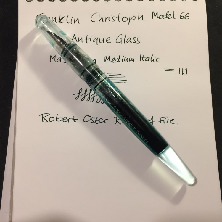
The Franklin Christoph Model 66 is a long and sleek pen that can’t be posted. The pen is light but still substantial, because of the extra acrylic in the finial. I was worried at first that it would be top heavy, but the Model 66 is perfectly balanced, and one of my favourite pens for long writing sessions.
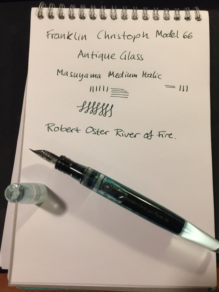
The Model 66 is a demonstrator pen that is built to be eye-droppered. Yes, you can use the supplied converter or cartridges, but what’s the point of having a pen that looks like this if not to eye dropper it? Franklin Christoph even supply the requisite o-rings and silicone grease, making it super easy to transform it into an eye dropper.
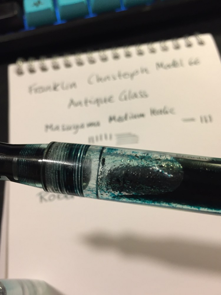
The pen body is made of smooth acrylic on the outside, but is pebble textured on the inside. The result shows off the ink colour and the pen colour even more, but it also means that staining inks have even more surface area to stain. I decided early on to use only turquoise, teal, blue and green inks in this pen, as even if they stained the pen it would work well with its “natural hue”.
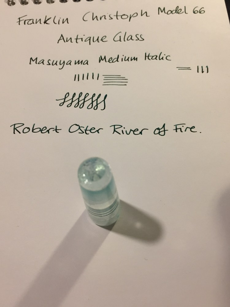
You can see the greenish “antique glass” tint best in the cap.
In terms of design, this is a desk pen and is designed as one, so it has one flat side which keeps it from rolling off the table even though it’s a clipless pen.
There’s a wide variety of Jowo nibs that you can order with your pen, and I decided to pay a little extra for a Mike Masuyama medium italic nib. The nib is buttery smooth, and the feed keeps up with flow. This italic isn’t super sharp, which is a plus for me, and together with the large ink capacity that an eye-dropper pen offers, it’s writing heaven.
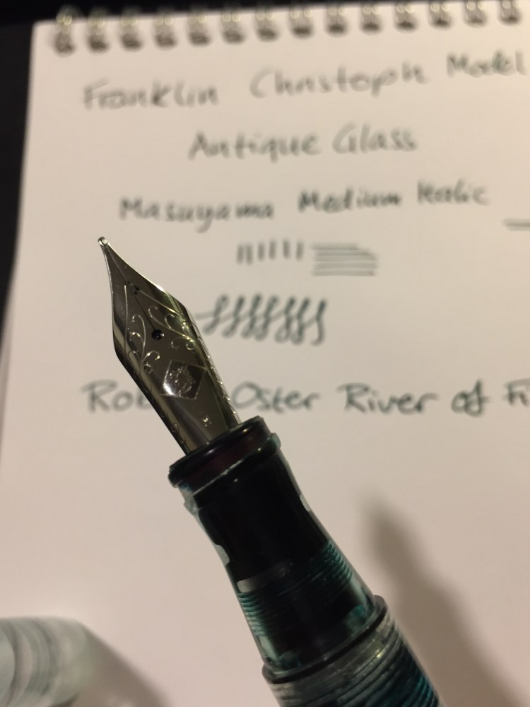
The Franklin Christoph Model 66 Antique Glass with a Mike Masuyama medium italic (what a mouthful) is build to show off interesting inks. Although I would never use shimmering inks in it, it’s great for inks that shade or sheen. And Robert Oster is the king of sheening inks.
The River of Fire is a dark teal ink that has significant red sheen and a good amount of shading.
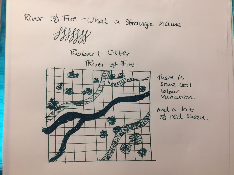
As usual with inks of this kind, the paper and nib affect how much sheen or shading you see. This nib is perfect for that, and the paper I used here is Tomoe River Paper, which brings out the best in every ink.
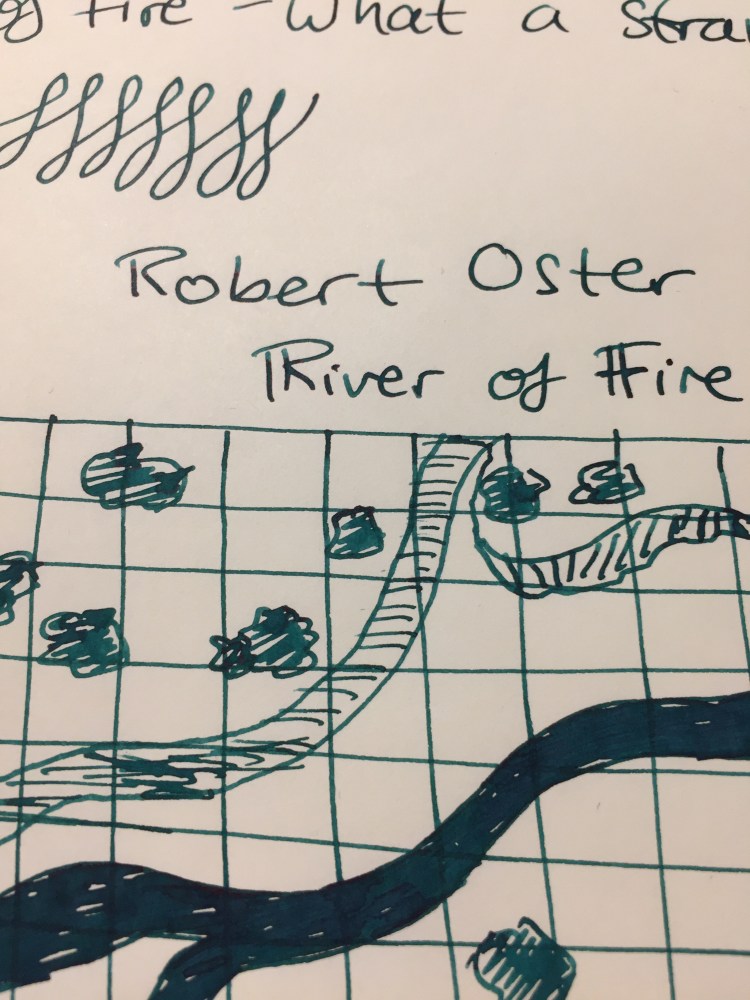
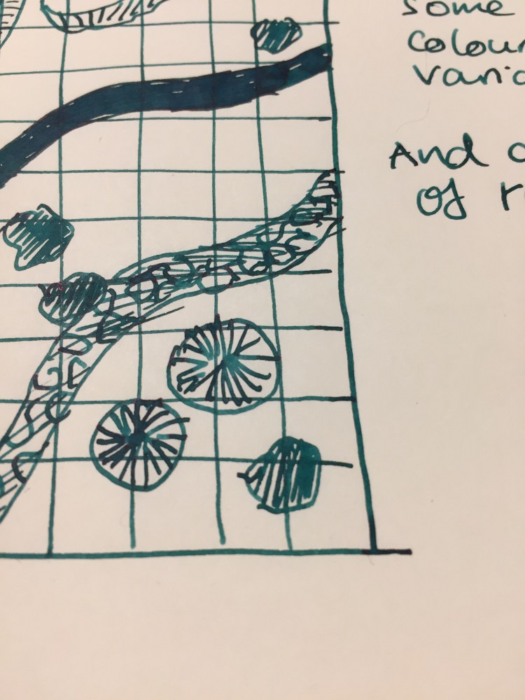
You can see a bit of the properties of the ink here, particularly the shading, but this ink really does have a lot of sheen. It’s just difficult to photograph, so you can only see a bit of the golden red that happens where the ink pools.
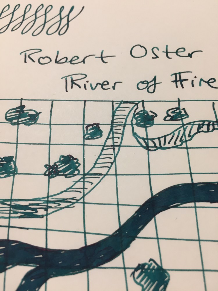
This is such a pretty ink. Look how much variation and interest it offers:
So, if you can get on one of the Franklin Christoph antique glass waiting lists, I highly recommend it. As for the Robert Oster River of Fire, I think that it’s a gorgeous ink, but it’s not unique enough in Robert Oster’s large ink offering. If you have something in the turquoise or teal shade in their lineup, then there’s probably no need to buy the River of Fire. If yo don’t then I recommend this ink since it’s wild and yet dark enough to “pass” in an office setting.